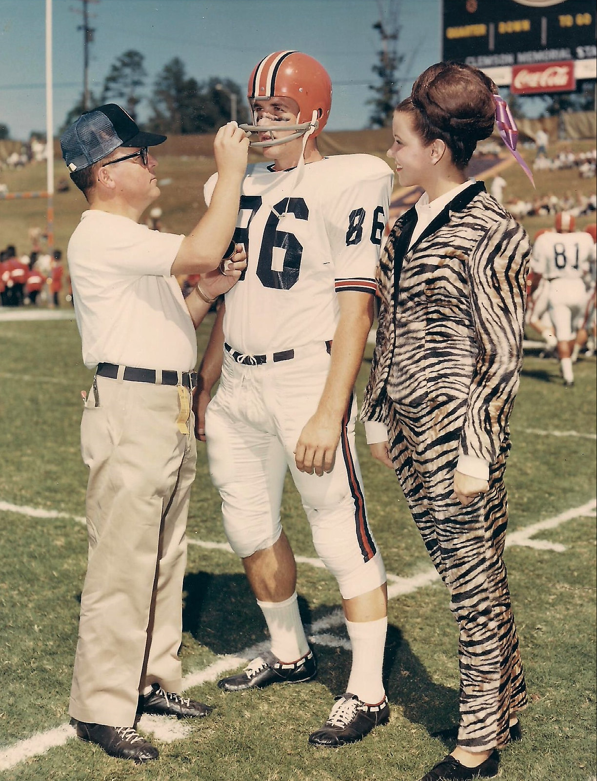
Click to enlarge
Nowadays, Clemson’s football program is associated with the paw print logo and lots of purple trim. But it wasn’t always that way.
Uni Watch reader Bryan Hoover’s father, Fred Hoover, was Clemson’s head athletic trainer from 1958 through 1998. The photo above is from 1960, and shows Fred Hoover applying what Bryan describes as “a cold cream-based eye cream” to an unidentified player. There are lots of other noteworthy details, including the following:
• The helmet being worn by the player does not match the design shown in the Helmet Project’s database (scroll down to the Clemson section from that link). I’ve forwarded the photo to the Helmet Project people.
• Assuming this was a game-day photo (which appears to be the case — note the marching band in the background, just behind Hoover’s shoulder), Clemson was wearing white at home.
• Right next to the marching band, look at the goalpost — check out that striping!
• Note the little tag dangling from Hoover’s belt loop. Bryan says that was a sideline access pass. That’s an accessory I will forever associate with John Madden, from his days coaching the Raiders.
• Both Hoover and the player are wearing classic Riddell footwear.
• Bryan doesn’t know the story behind the woman in the tiger suit, but that’s some outfit!
• “If you look in the backround, you’ll see that the Hill is practically empty, which was the norm on those days,” says Bryan. “It was not the spectacle that it is today. In fact, the Hill was the most practical way to get into the stadium from the old Fike Field House, which housed the locker room and training room, and the players casually walked down the Hill to get to the field.”
Great stuff. Thanks for sharing, Bryan!
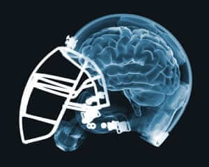
Concussion discussion, continued: Here’s something I missed from last week: ESPN.com published a faaaaascinating Outside the Lines piece about how the mounting evidence linking football to neurological disease has led an increasing number of insurance companies, which at one time were happy to cover football teams, leagues, and helmet manufacturers, to abandon the sport and refuse to cover it.
One source quoted in the story says, “Insurance coverage is arguably the biggest threat to the sport.” Another says, “People say football will never go away, but if we can’t get insurance, it will.”
The story is long but extremely well-reported — highly recommended. Check it out here.
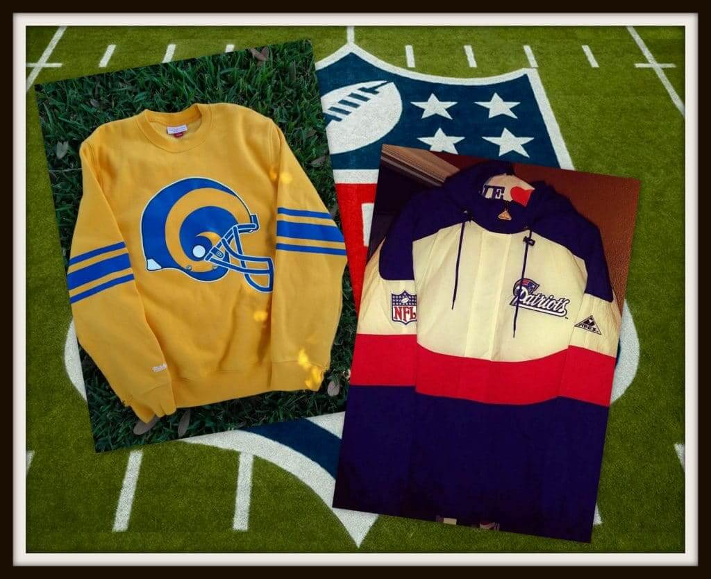
Click to enlarge
Collector’s Corner
By Brinke Guthrie
The Los Angeles Rams will face the New England Patriots in Atlanta in two weeks for the Lombardi Trophy, so we’re leading off with those two teams. Up above, we’ve got a retro-ish Rams sweatshirt from Mitchell & Ness, featuring the No. 55 of Rams Hall of Famer Tom Fears, who played for them from 1948-1956. (He also wore No. 80.) And for the Pats, a 1990s Patriots parka made by Apex, who usually always came up with great designs. We’ve also got a set of 1970s Patriots bicycle helmet hubcaps, though it looks as though Pat might be stuck on there rather poorly — can’t tell if the decal is just laying on there or is stuck on.
Now for the rest of this week’s picks:
• In the “What might have been” category, here are a couple of Chiefs items: a nice-looking 1990s Chiefs hoodie from Starter (I had a Bengals version and loved it, except the flocking on the chest script tended to pick up bits of lint and whatnot floating in the air as you can see in the close-up photo) as well as a 1970s Chiefs ceramic cup/stein shaped like, of course, a football.
• These 1970s Eagles sketches are from artist Jack Davis, best known for his work with Mad magazine.
• This 1960s “Sports Waving Ball Car Decoration” has “Cincinnati” printed in red. Must have been an unlicensed Reds item.
• Wow, a very nice-looking 1960s San Francisco Giants bobblehead right here.
• Keep your 1970s O-Pee-Chee NHL hockey cards in this cardboard “storage locker,” divided into Eastern and Western divisions.
• How about the Seattle Pilots-style scrambled eggs on the bill of this NFL Alumni cap?
• This 1970s Chargers sweater made by Garan is about as bold a yellow as you can get.
• Got a neat-looking baseball model kit here, of all things. AMT made this “Hang Out 3 Dimensional Action Scene” diorama called “Big Hit?”
• The Steelers helmet logo looks a bit off when it’s rendered in all yellow, as on this 1970s seat cushion.
• I like the powder blue/burgundy trim on this Phillies cap (definitely not 1970s, more like 1990s) made by American Needle.
• This 1970s “Official Major League” baseball glove came with the Chicago Cubs logo on the strap. It’s made of “Top Grain Cowhide” and comes with a “Pro Pocket.” “Flex-Action, too!”
Seen an item on eBay that would be good for Collector’s Corner? Send any submissions here.
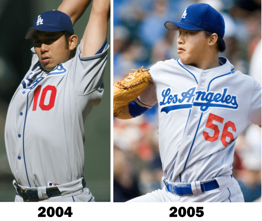
Little things mean a lot: In 2005, the Dodgers made a small adjustment to their road jerseys: They changed the buttons from blue to clear. It may seem like a minor thing, but it really changed the visual feel of the jersey.
I recently made a similar change to a piece of my own clothing, and I’m so pleased with how it turned out that I’m going to tell you about it today.
So: A few years ago I bought this vintage plaid coat. It’s big and heavy, warm enough for winter wear, and right in my color wheelhouse (click to enlarge):
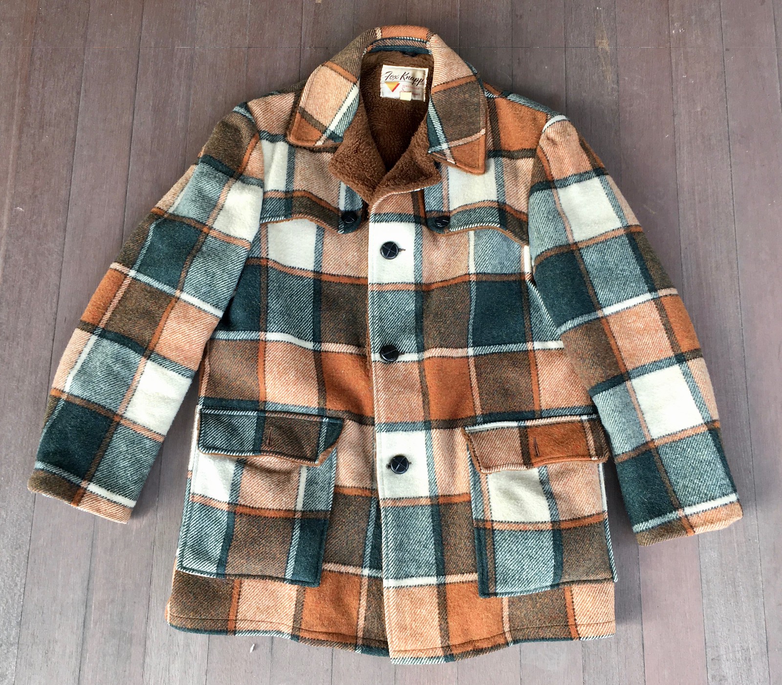
It had shank buttons, which seemed fine at first, but then the buttons kept coming off, so I kept having to sew them back on, which was a pain in the ass. When I wore the coat, I found myself instinctively altering my posture and movements so I wouldn’t put stress on the buttons, which was annoying. At some point last winter I pretty much stopped wearing the coat altogether.
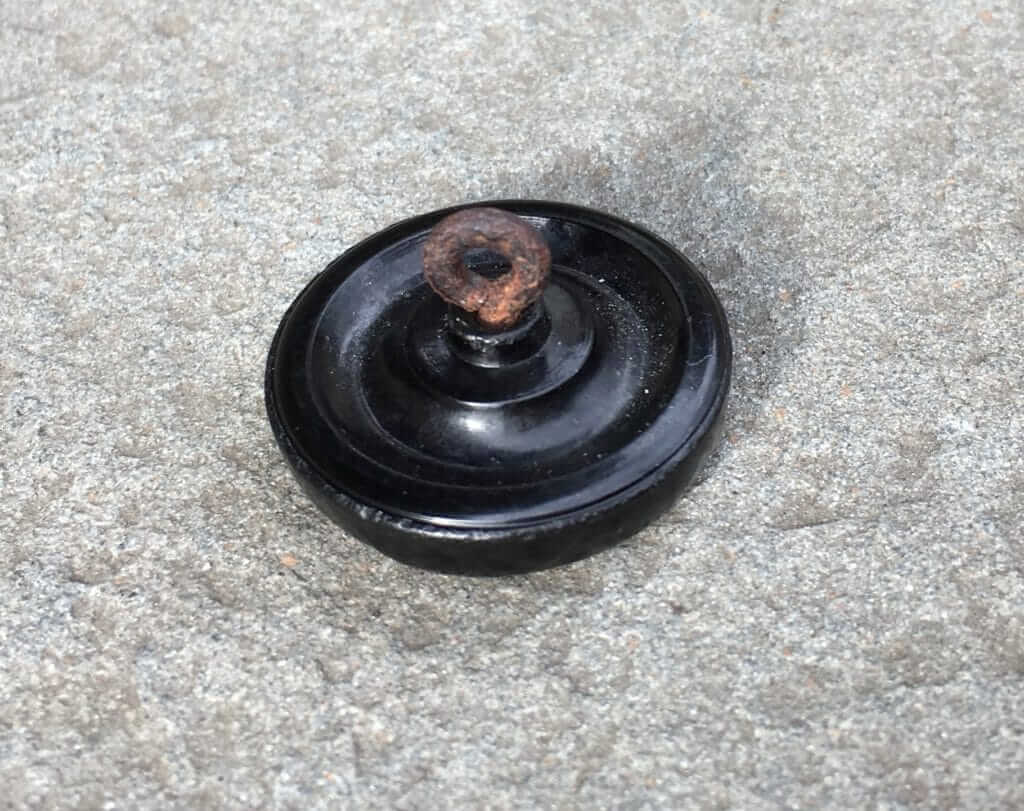
Eventually I realized that problem was that the buttons’ metal shanks had gotten rusty, and the rusty surface kept tearing through the thread that attached the buttons:
So I decided to get fresh buttons. At first I thought I’d just try to match the old ones, but then it occurred to me that brown buttons would be much better than the original black ones.
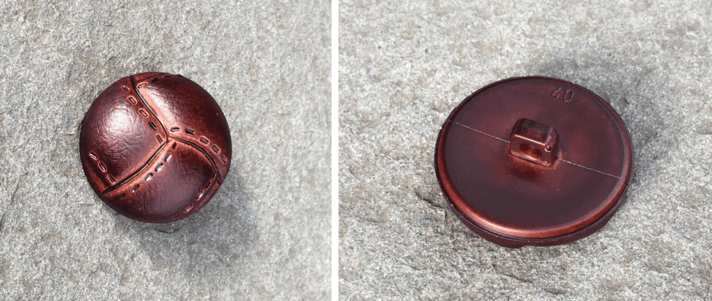
I went to M&J Trimming in Manhattan, which has a huge button selection, and found some brown faux-leather buttons that matched the size of black originals. And these had plastic shanks, so there’d be no rust issue to worry about (click to enlarge):
Then I swapped out the old black buttons for the new brown ones — looks so much better! Old version on the left, new on the right (click to enlarge):
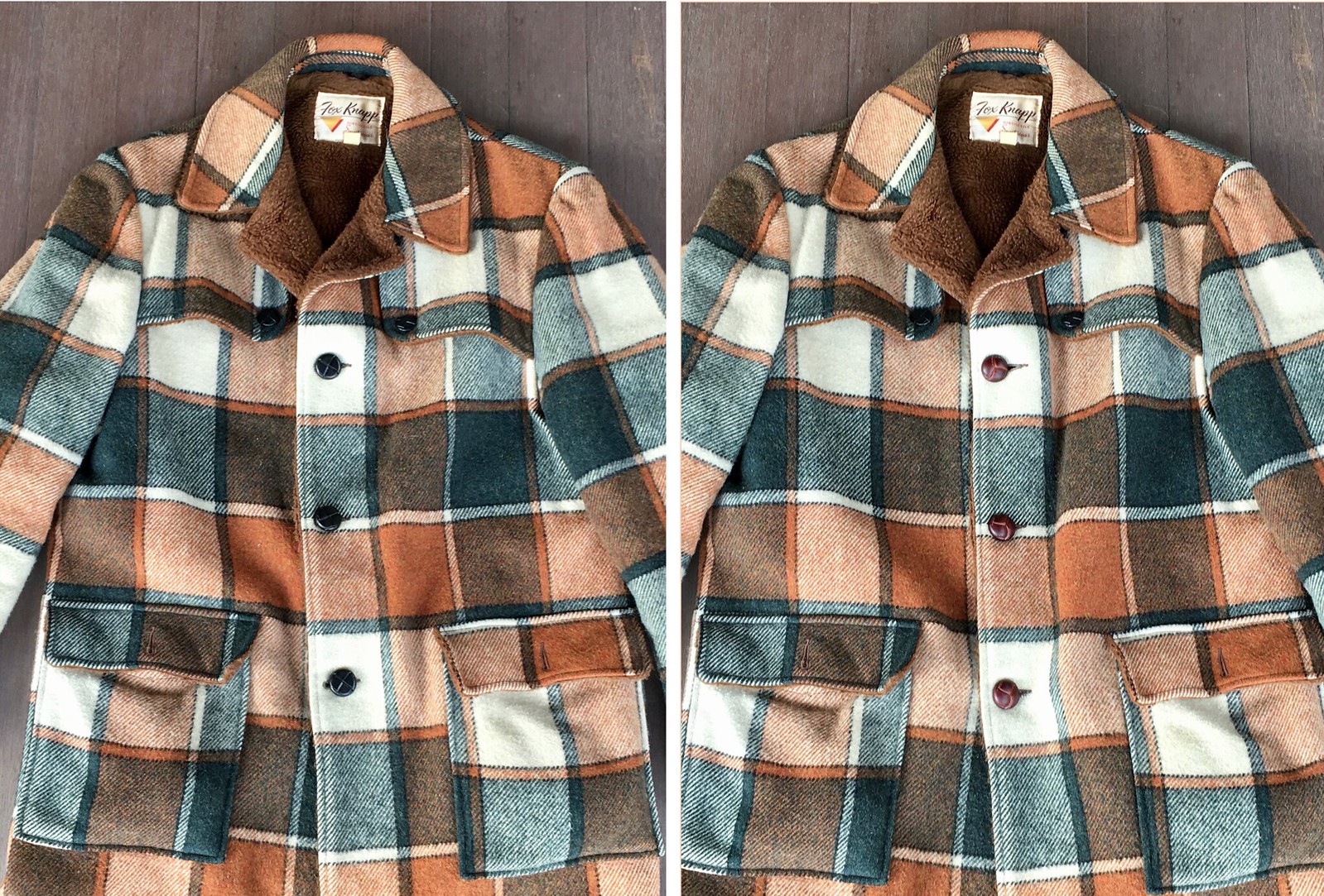
Very satisfying to have solved the button problem and improved the coat’s look. A win-win! So interesting to see how replacing three buttons can make such a big visual difference (at least to me).
The more eagle-eyed among you may have noticed that there are still two oddly placed black buttons on the upper chest. Those are just decorative, but I’ll probably swap them out as well. They’re a bit smaller than the main buttons, so I’ll have to go back to M&J Trimming to match the proper size. But for now, I’m very pleased with the new primary buttons, and I’ve already begun wearing the coat again, which feels like being reunited with an old friend.
And as long as we’re talking about my wardrobe ..: It’s not often that I find myself envying or coveting another guy’s item of mass-produced apparel. But I was out seeing music on Sunday night and saw a guy wearing a T-shirt that I liked a lot — so much, in fact, that I asked the guy if I could photograph it (click to enlarge):
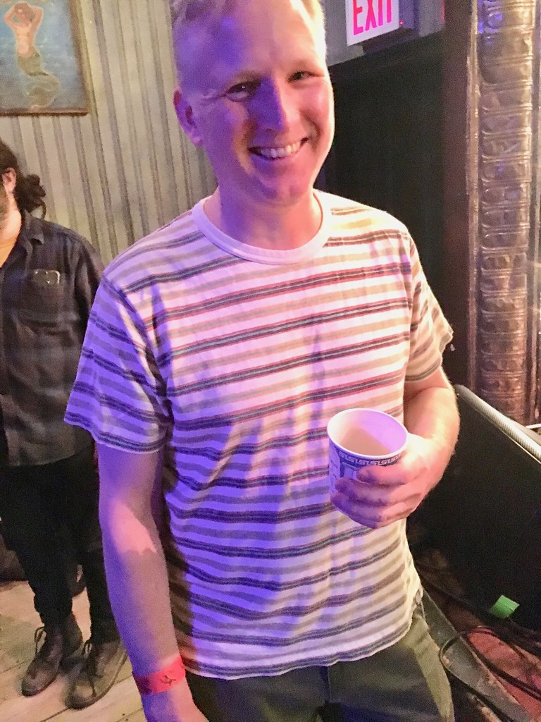
The lighting in the club was awful, and I had to punch up the levels on that photo quite a bit. Here’s a better look at the striping pattern, which the guy sent me the next day:
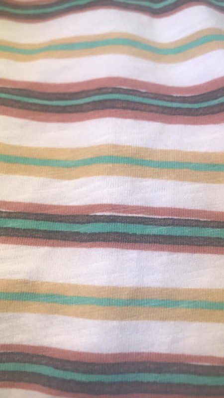
Swoon. Is that gorgeous or what? Those are totally my colors.
The guy (whose name, by coincidence, is Paul) said he bought the shirt about five years ago at Uniqlo, which is funny, because about the only thing I know about Uniqlo is that their clothing supposedly falls apart after about three wearings.
Anyway, I looked on eBay, Etsy, and a few other places to see if I could find the shirt — no dice. If anyone knows where I can find it in a medium (and/or if anyone has such a shirt and is willing to sell it), you know what to do.
Infinite regression: Everyone loves a good infinite regression, right? Here’s a really good one:
That’s pretty awesome. Reminds me of the similarly awesome Infinite Cat Project.
(My thanks to the Tugboat Captain for this one.)
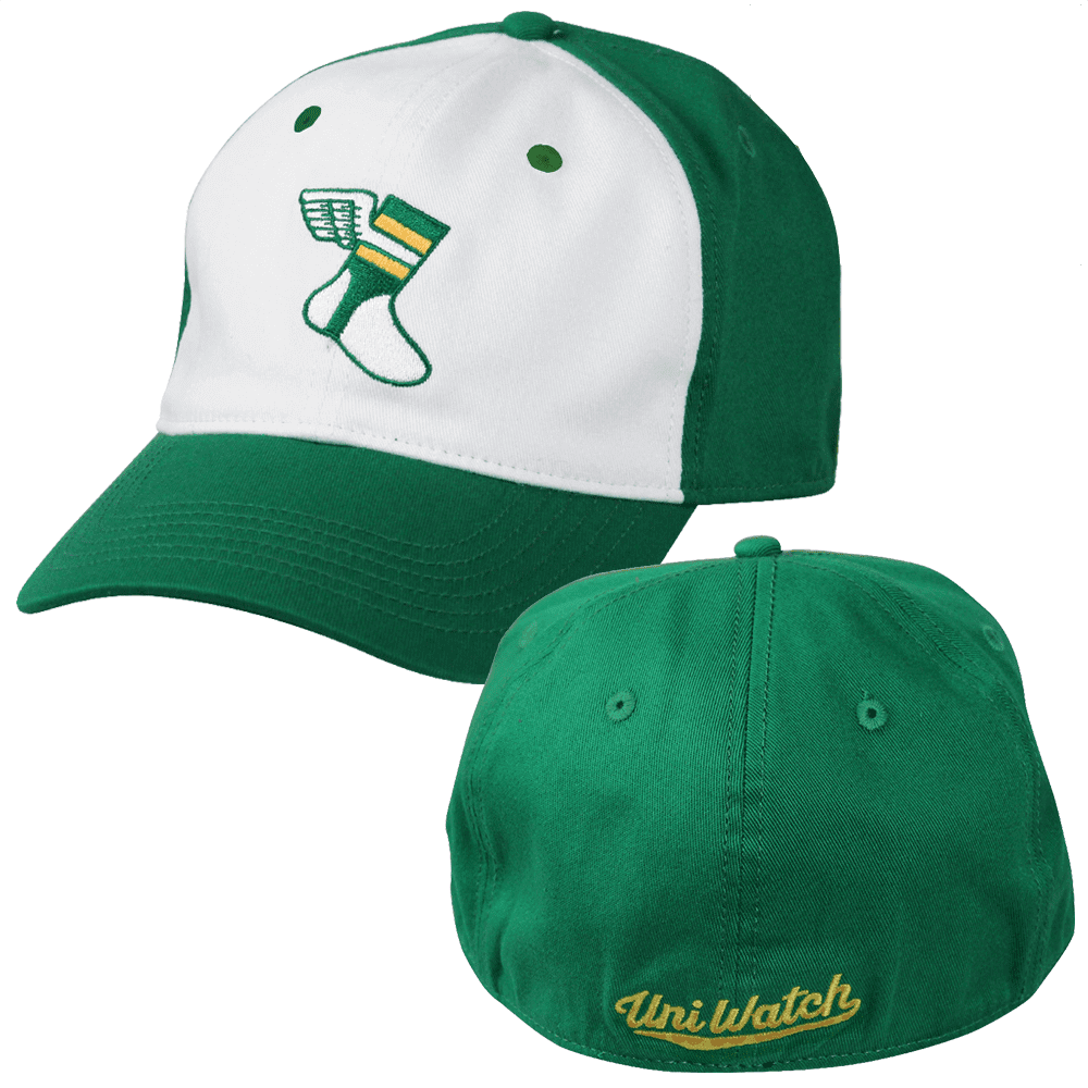
ITEM! Cap update: Yesterday I asked how many of you would be willing to pre-order one of our S/M flex-fit Uni Watch Alternate Caps at the cut-rate price of $10.99 plus $4 for shipping (for more details on why I’m doing this, look here). The response was, frankly, better than I’d expected — thanks!
For those of you who responded affirmatively, now it’s time to put your money where your mouth is. If you want one of these caps, please do one of the following:
1. Send me $14.99 via Venmo, using @Paul-Lukas-2 as the payee. (This is my preferred payment method, because there are no fees.)
2. Send me $14.99 via Zelle, using plukas64@gmail.com as the payee. (Again, no fees.)
3. Send me $14.99 with this Amazon Payments button (if you don’t see the button, refresh the page):
Whichever payment method you choose, please email me and give me your shipping address after making your payment.
Sorry, American customers only for this deal.
I should be able to ship the caps in early February. Thanks for helping me move this inventory.
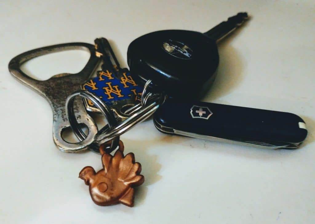
KRC update: The latest installment of Key Ring Chronicles is about a little turkey charm. Check it out here.
The Ticker
By Alex Hider

Baseball News: The Astros are establishing a team Hall of Fame. The Hall’s initial class will include players whose numbers have already been retired and those who have been honored on the team Walk of Fame (from Ignacio Salazar). … Also from Ignacio: Astros OF Josh Reddick is a big wrestling fan, so when he tied the knot over the weekend, the reception included a WWE-style entrance, complete with robes and championship belts. … The birds on the bat of this ’80s vintage Cardinals jersey look hypnotized! Matt Henderson spotted that on an eBay listing for an obviously counterfeit Lou Brock jersey. … Lots of new gear for Creighton (from @Perez_Cristian3).

NFL News: Here’s our first look at how the Super Bowl LIII patch will look on a Rams jersey (from Matt Lally). … Remember that obviously fake/Photoshopped photo of Rams RB Todd Gurley swapping jerseys with a ref, which ran on lots of media outlets, including Uni Watch, yesterday? Radio yakker Mike Francesa thought it was real.
College Football News: Florida State’s social media team ended up with egg on its face yesterday when it tweeted an insensitive graphic of Martin Luther King Jr. wearing a football glove (?) and performing the tomahawk chop. Yikes (from Kurt Esposito).

Hockey News: Reader Mandy Lopez spotted this Wayne Gretzky Kings jersey with an upside-down sleeve number at a Dick’s Sporting Goods. … The Stockton Heat of the AHL gave away a bobblehead of Stockton mayor Michael Tubbs wearing a Heat sweater, a Stockton Ports baseball cap, and Stockton Kings basketball shorts and shoes (from Pádraig T. Watson). … The ECHL’s Cincinnati Cyclones wore Paw Patrol-themed uniforms on Sunday. Here’s how they looked on the ice (from Brian Henke). … A few child actors from the Mighty Ducks movies, now fully grown up, donned the Ducks’ throwback sweaters while taking in a Ducks/Isles game on Long Island over the weekend. The jerseys were personalized with the actors’ movie personas (from Michael Lopez). … Here are the stories behind the Blue Jackets’ uniform numbers (paywalled) (from Jason Hillyer).

NBA News: The D League’s Texas Legends went with MLK-themed uniforms yesterday. Jordan maker’s mark, too (from Zak Buncik). … The latest from NBA uni numbers guru Etienne Catalan: New Pacers G Stephan Hicks will wear No. 17, new Wizards PG Gary Payton II will wear No. 4, and new Rockets F/C Kenneth Faried will wear No. 35. … Great look at Dr. J in a classic old 76ers warmup top (from Pro Football Journal).

College Hoops News: Pretty rough black-vs.-GFGS matchup between Colorado and Utah on Sunday (from Perry Sailor). … Virginia Tech went BFBS on the road yesterday against North Carolina (from Andrew Cosentino).

Soccer News: Man City ST Sergio Aguero rolled down his socks on Sunday against Huddersfield, and lots of fans noticed (scroll about halfway down the page) (from Sean Kautzman). … Forward Madison FC of USL League One has inked a deal with a uniform advertiser and says their uniforms will be unveiled in the coming weeks (from JohnMark Fisher and Ed Zelaski). … New away shirt for Vasco da Gama (from Ed Zelaski). … Reprinted from last night’s comments: New sleeve sponsor advertiser for the German Bundesliga club Schalke 04.

Grab Bag: The National Lacrosse League has already announced that the Rochester Knighthawks will relocate to Halifax after this season. Apparently, the league has filed trademarks for new logos and for the team name “Halifax Thunderbirds” (from Jack Goods). … Sen. Kamala Harris announced her presidential campaign yesterday — 47 years to the day after Shirley Chisholm became the first black woman to do so. Harris’s campaign colors are red and yellow, a nod to Chisholm’s campaign. … Mississippi’s current state flag still includes the Confederate battle flag. But proposed legislation could replace that design with one that doesn’t include Confederate imagery — and was designed by the granddaughter of one of the state’s most ardent segregationists. … David Firestone came across these race car diagrams in a racing press kit. … The school district in Hurley, Wis., has voted to stop using “Midgets” as the name for the district’s sports teams at the end of this school year. A new team name will be chosen in time for the start of the following school year (from Jerry Nitzh).
I didn’t know that Clemson’s football program ever used purple typography on any of its tops. Great find!
To me, the highlight of that Clemson pic is the woman’s hair. Not sure if it’s all real but man, you gotta love that style. It screams early 60’s!
The numbers and trim on the Clemson uniform are actually navy blue. Though the school’s official colors are Orange and Purple, the athletic teams mostly wore orange and navy throughout the 60’s, 70’s, 80’s and into the 90’s. It wasn’t until the late 90’s that the athletics department decided to make the colors uniform across the board.
Correct. I thought the blue numbers/trim were pretty self-evident. That’s why the first graf says that Clemson is currently known for “lots of purple trim,” but “it wasn’t always that way.”
That hair bow is purple though?
Sometimes a purple hair bow is just a purple hair bow.
I guess Clemson looked more similar to Syracuse than I thought. I didn’t know Clemson had an issue with keeping its programs’ colors uniform across the board. Thank goodness Clemson cleaned that up!
My first thought was, “that looks an awful lot like Illinois”. Very cool photo…
What is the Rams’ endgame for 2020? I know they are delaying their new uniforms (and new jersey sales) until then to align with the new stadium. But I assumed all along that the new uniforms would be the throwbacks that everyone seems to love. If that’s the case, why did they go out of their way to wear the throwbacks as much as they did this year? It seemed to defeat the purpose of what they were trying to avoid. Is my assumption wrong? Will the 2020 uniforms be completely different from the throwbacks? Maybe they’ll go with another throwback design (yellow jerseys or royal/white)? Just curious.
My assumption is that they are going back to blue and yellow, but it won’t be the throwback design. I’d prefer they just color swap blue and yellow onto the navy and gold design, but that probably wont happen. Odds are it will be some overdesigned nike nonsense in blue and yellow.
I thought they were going to pretty much an all white and blue scheme. Getting rid of any yellow/gold. White horns on the blue helmets and white and blue jerseys, with opposite colors for the numbers. Then the yellow horned alternate will still be worn with these super bowl uniforms at times.
Awesome vintage photo. Definitely takes you back to when college football, and I suppose all sports, seemed less like a polished product for TV consumption. People sitting on hill and such, good stuff.
Also catching up on yesterdays entry, a lot of the MLK content struck me. I guess it never really registered with me how young he was when he was killed. Maybe his actions and words always had this great wisdom to them that you rarely associate with someone so young. Also am not sure I have ever heard him referred to as history’s greatest American. As I thought about it, surely outside the founding fathers and Lincoln, who else could get that title. I wouldn’t have expected uni-watch to be the place that I’d have gained even more admiration for the great Dr. King.
This is an admittedly picking thing to point out, but I appreciate how in the ticker you guys stated that Josh Reddick had “WWE-style entrance, robes, and championship belts.” In the link the CUT4 author describes the belts as WWE belts, but they are obviously not. I get that most people equate WWE to wrestling, but it’s like Kleenex is to tissue. WWE is a pro wrestling company, not another name for pro wrestling.
As a wrestling fan, I hear you. WWE might be the biggest, but they are far from the best, and don’t represent pro wrestling as a whole. To me, anyway. But to most people, sadly they don’t know the difference.
In the link…..
What’s the deal with the background player wearing #81? His numbers seem much thinner than the player in the foreground (#86) and his helmet stripe seems to just be a thick white one with no blue/orange. Optical illusion?
There seems to be a lot of disdain towards Uniqlo on this site for some reason. Brinke totally bashed it in his tennis write up of Fed moving from the swoosh. And now their clothes fall apart? Seems very disingenuous and odd at the same time.
Well, that’s what I’ve heard (not just about Uniqlo but about most fast-fashion brands). As noted in today’s text, I freely admit that I have zero experience with their product.
Could you please explain how that’s “disingenuous”?
I used the wrong word, sorry English is not my first language.
I wouldn’t personally put Uniqlo into the same fast-fashion category as F21, HM, Zara, etc. To me I feel like they are more comparable to the Gap. I have a few cashmere sweaters from there that I wear fairly regularly (probably once every couple of weeks each or so) that are still going strong 6-7 years after I bought them.
I live in Japan and, at least here, Uniqlo has the reputation of being cheap but good quality. I have a Uniqlo coat that I’ve been wearing since 2002 and only now is it starting to show signs of wear and tear. I’ve had lots of other Uniqlo items including socks and shirts that have held up really well over the years. While I would still classify them as a ‘fast fashion’ company, they’re definitely not like the H&M’s of the world that really do put out clothing meant to be worn for a season and then trashed.
Got it. Thanks! (But nobody has given me a lead on that T-shirt, grrrrr.)
I do not own any piece of Uniqlo clothing but I’ve been in their store a couple of times and to me both quality and style seemed better than H&M but not as “good” as GAP.
All I know for sure is that for most brands(including H&M and GAP), the style number can be found on (one of) the tag(s) that’s inside the T-shirt, the one that is usually sewn directly into the left seam of the T-shirt towards its bottom…
I have a few questions about that plaid coat though :
-Why do you feel like you need to match the size of the two decorative buttons? Why not use the same size as the functional ones, do you feel like you want to stick to the original style even though it’s not original anymore since you’ve already “altered” it with some news buttons?
-The front pockets have button holes but you didn’t tell us about THESE buttons, so what’s up with those?
-The coat looks in really-really good shape, was it new old stock or had it only been worn slightly when you bought it and would you mind telling us about how much you paid for it?
-Not a question but the coat does indeed “look(s) so much better” with the brown buttons.
Why do you feel like you need to match the size of the two decorative buttons?
There are buttonholes there, so the full-size buttons wouldn’t fit thru those holes.
The front pockets have button holes but you didn’t tell us about THESE buttons, so what’s up with those?
They were small and black, like the upper-chest buttons. I removed them a while ago, because I never button the pockets and therefore found the buttons annoying.
– Bought the coat at a flea market. No idea if it had been worn before. Don’t recall what I paid for it, but probably somewhere around $35. Definitely less than $50. Yes, it’s in very good shape!
“There are buttonholes there”: do you mean that the two square parts that go from the breast to the shoulders are actually flaps not directly sewn in but instead buttoned to the main part of the coat (if so it’s the first time that I see such a style) or are the buttons simply there to tie the collar through holes that we can’t see on the photo?
Let me know if you were able to find the style number of the T-shirt on the inside tag.
Yes, those are flaps, but the flaps serve no purpose. That’s why I described those buttons as “mostly decorative” — they’re functional buttons, but they function without any purpose.
RE: Uniqlo. When Fed was with Nike, I could walk into the SF Niketown and see a wall of RF Nike. I walk into the Uniqlo store which is massive and just a block away, and there is -0- product, and you get a blank look from the clerk. Roger who? Fed has long been connected with lux items such as Rolex and Mercedes. He wants to be a fashion icon post-tennis. Nike screwed up letting him walk. You don’t say so long to the Jordan of the sport. You just don’t. I look at the Uniqlo site now and they have one shirt and one short; almost all sizes sold out. They may be big but they can’t market a sports star at all; see Djokovic,Novak if you need proof.
From what I can tell, Forward Madison FC signed a kit manufacturer deal, not a advertiser deal (although, the maker’s mark is indeed an ad).
Re: 1960 Clemson FB photo. That trucker style hat on the coach’s noggin existed in 1960?
That Clemson uniform looks like a Cincinnati Bengals prototype.
There is the possibility that the Clemson picture is from a game that may have been played at Virginia. Both teams have orange and UVA also has a hill at one end of their stadium, so it may have been a gameday photo of Clemson v. UVa in Charlottesville, VA
The text at the bottom of the scoreboard pretty clearly states “Clemson Memorial Sta[dium],” so I think we can safely assume the photo was taken in Clemson.
RE the obviously fake Brock jersey: that seller has lots of obviously fake products, including a Seattle MARINERS road jersey from 1969! Wrong material, wrong color, wrong stripes, just horrible. Has China stopped even trying to get it right?
On the Gurley jersey exchange, he’s not the only one: Mike Lombardi of the Athletic and Ringer didn’t automatically dismiss it, either. Apparently neither one could see the player pants and socks on the “ref”, nor the fact that Gurley was “holding” a seriously outdated official’s shirt…. still on a hanger!
Before reading the text under the photo in Key Ring Chronicles, I quickly saw a Mets-themed key and a mitt.
Roy Williams’ shoes last night looked like Jordan 1’s
link
link
But they were a $775 pair:
link 722565827739649?s=19
Thanks for the link to the story about the “Stennis Flag”. It’s a good read.
Re: the Clemson photograph
Could be that it was a junior varsity or a freshman game. Back in the bouffant days, southern college went all-out for every football team, regardless of level. Well, except for certain accoutrements on the helmets.
. . . and the helmet does look like the ’66 or ’67 but for the side decal. the young lady’s appearance also would seem to fit 1967 to a tee
Clearly the woman in the photo is wearing Zubaz, looks like an early prototype :-)
The Rams throwbacks are some of the best in all sports other than the shoulder horns needing to be thicker. I can’t think of a single reason they wouldn’t make them their permanent unis when they move stadiums. I’d they ditch them in favour of some multi panelled Nike nonsense then shame on them
*if they ditch them
Get ready to sell a lot of “I’m still calling it Miller Park” T-shirts. I assume they’re probably already in production.
link
We don’t do shirts that honor corporate names. Only non-corporate names.
Clemson alum here and lifelong Clemson football fan. That’s definitely a Clemson home game. The Hill (it’s capitalized) is clearly seen in the background. If you look just under the scoreboard where the Coke ad is, you’ll see the rug the players ran down when making their entrance. Notice the colors there are orange and purple. As others have noted, Clemson wore orange and blue until relatively recently. Due mostly to purple not being colorfast on natural materials. The official name of the color back then was “Northwest purple” now called “Regalia”. The old blue/purple was never consistent and sometimes it looked more purple and sometimes more blue or even black. Glad the colors are consistent now. And yes, except for no C on the helmet that looks a lot like the 66-67 helmets.
I had that Cubs glove from the Collector’s Corner, and used it all the way up through my seventh grade year of little league. It was actually a damned good glove. I wish I knew what happened to it.
I had never noticed that change in button color on the 2005 Dodgers road jerseys — I was too busy noticing the much more important (to me) removal of NOBs! I think they added a gray layer between the blue numbers and white borders, too.
Just a small note, those aren’t the Ducks throwbacks but their new alternate uniforms (that the Mighty Ducks stars were wearing).