
Photo courtesy of the Atlanta Braves; click to enlarge
The Braves held their annual winter fan-fest yesterday (as you can see above, it has a regrettable name that they should really retire already) and unveiled changes to four of their five uniforms — all but the home whites, which are unchanged.
Before we get to the changes, it’s worth mentioning that no MLB team needs five uniforms. The best thing that could have been done to some of these designs would be to eliminate them. But since they didn’t do that, here’s what they’ve done instead.
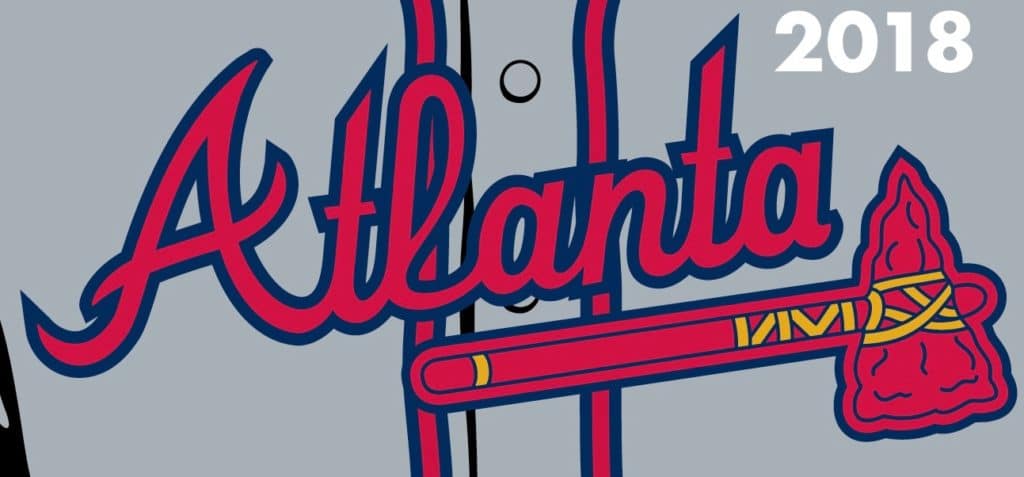
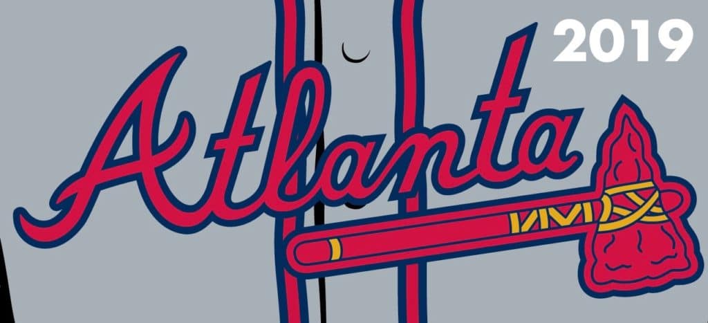
The Road Greys
The chest script has been tweaked a bit to feel more like the script on the home whites. Here’s a comparison of the old road script and the new script as they appear on jerseys in the official MLB Style Guide (for all images, click to enlarge):
And now here’s a comparison of the scripts as they appear on jerseys in the official MLB Shop:
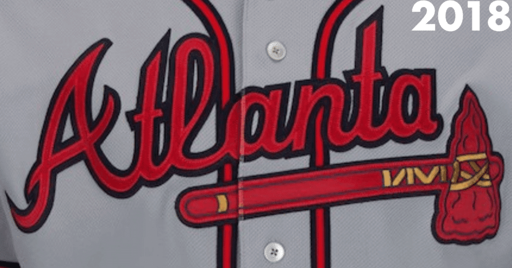
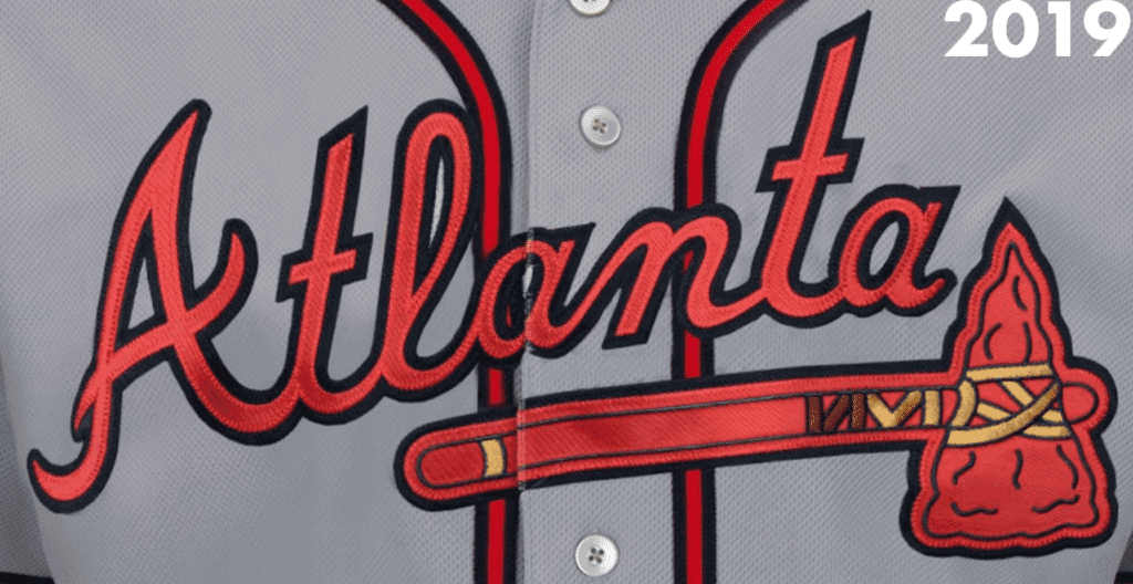
This isn’t a major change, obviously, but I do think it’s an improvement. Reminds me of the similarly subtle change they made to the home script back in 2016.
The Home Cream Alternates
Another really small change here, as they’ve added piping to the sleeve cuffs. Here’s a comparison — old version on the left, new on the right (click to enlarge):
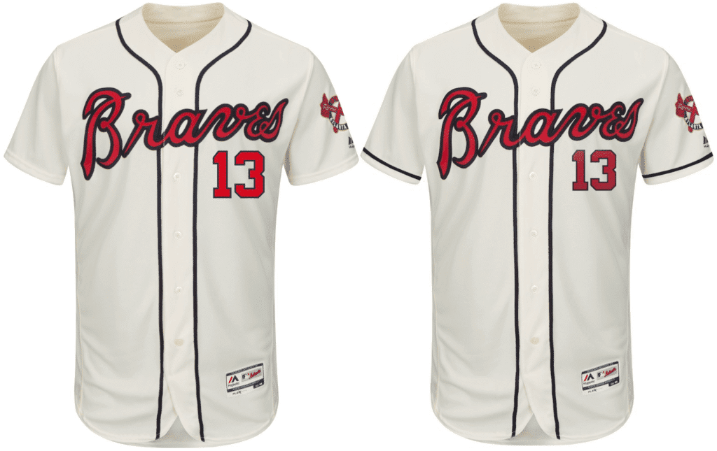
I can’t say I ever thought to myself, “You know what that jersey needs? Sleeve piping.” But now that I see it, it feels like an improvement. (And yes, I know the number looks smaller in the new version, but I think that’s just the retail mock-up. No change to the official number specs.)
Also: This uniform, which had previously been worn on no particular schedule, is now being designated as the Sunday alternate.
The Blue Road Alternates
Aside from a slight tweak to the script three years ago, this jersey has been unchanged since its introduction in 2008. But now they’re making some serious adjustments. Check it out — old versions on left, new on right (click to enlarge):
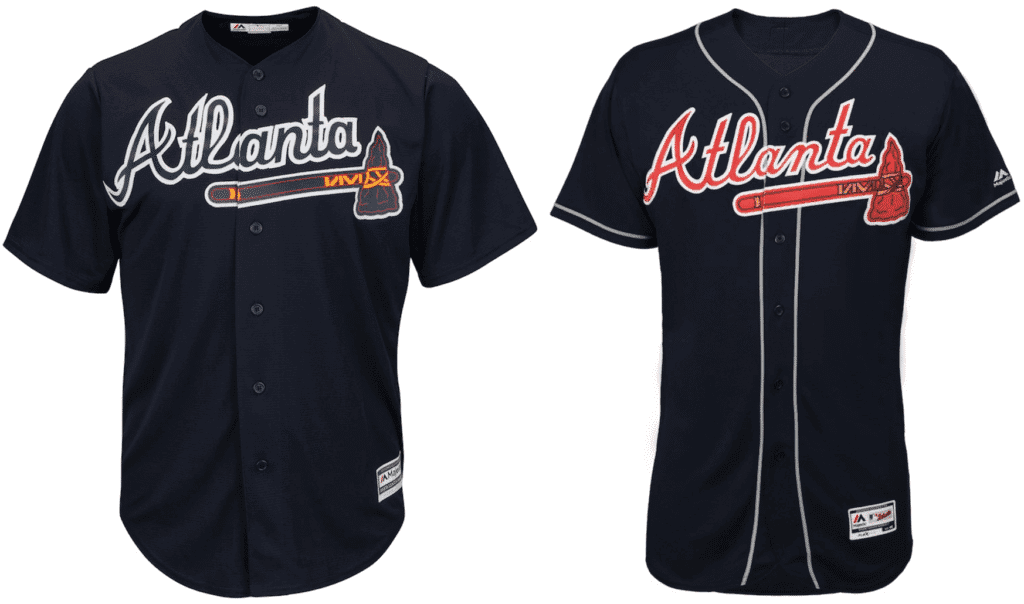
Obviously, this is a major improvement. The blue-on-blue design has always struck me as more of a BP look. Interestingly, the changes they’ve made are almost identical to a concept from Uni Watch reader Britton Thomas, which was linked on the site way back in 2010. After seeing the new design unveiled yesterday, Britton said, “I’ve never felt more vindicated.”
The Red Home Alternates
From 2005 through 2013, the Braves had a garish red alternate jersey. In 2014 they modified it with a star-spangled script. Now they’ve gone back to something close to the original version, but with more subdued piping (click to enlarge):
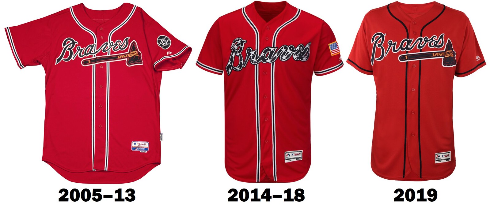
The new version is clearly the best of the three, although I don’t like seeing the Braves in red. They’d definitely be better off scrapping this one.
This jersey will be worn for Friday home games.
———
Overall: Four changes, all for the better. I still think they only need one alternate (the blue one would suffice), and of course they need to scrap the Native American imagery. But within their current confines, they’ve definitely improved their look.
Click to enlarge
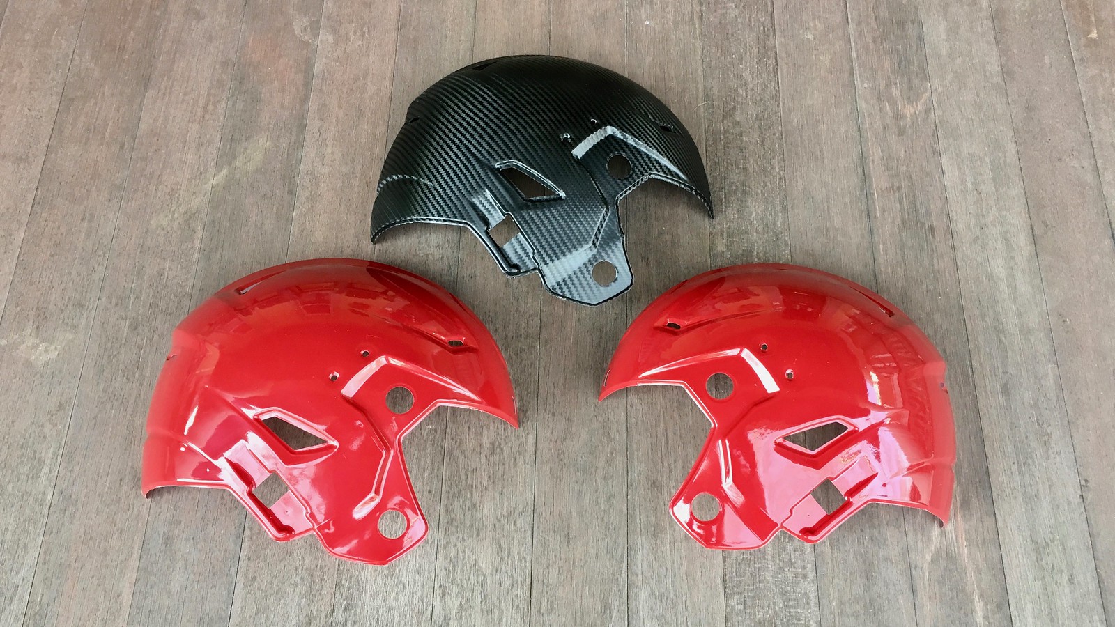
ESPN reminder: In case you missed it a few days ago, I have a new ESPN piece about a very interesting new product that could solve the NFL’s one-shell problem and also make multiple helmet designs widely available even to cash-strapped high school teams. Check it out here.
The Ticker
By Paul

’Skins Watch: Long before the advent of Chief Wahoo, there was a hockey team called the Cleveland Indians (additional info here, complete with a headdress-centric jersey crest (nice find by Steven Schapansky).

Baseball News: MLB posted a photos of the Yankees’ new bullpen acquisitions Photoshopped into their new uniforms, but they neglected to remove the Majestic logo creep from Adam Ottavino’s jersey (good spot by Ken Weimer). … We’ve shown this before, but once more won’t hurt: Ski jumping at Wrigley Field! … Check out this shot of Philadelphia A’s OF Lou Finney on Opening Day, 1934, at Yankee Stadium. Sure looks like his “2” is actually an upside-down and backwards “5”! (Good spot by @brianspeaksnow.) … The NHL’s Dallas Stars wore Texas Rangers-themed jerseys for pregame warmups last night. Here are some shots of them in action (from @esqurred, Mark Coale, and idkman5678).

Football News: I wasn’t too worried about the Chiefs possibly going mono-red for today’s AFC Championship Game. But if you were, you can rest easy. … The video showing the making of the helmets for the Polynesian Bowl offers a good look at how hydro-dipping works (from @vicious155).

Hockey News: New mask for Penn State G Peyton Jones (from Chris Grosse). … Check it out: A cement truck with a big Canucks logo, circa 1982 (from Dean McGee). … Caps C Evgeny Kuznetsov appears to have been trying to stretch out his jersey prior to Friday’s game against the Islanders (from Michael Alper). … Don Cherry-inspired jerseys last night for the Edmonton Oil Kings (from Wayne Jones). … Cross-listed from the baseball section: The Stars wore Texas Rangers-themed jerseys for pregame warmups last night. Here are some shots of them in action (from @esqurred, Mark Coale, and idkman5678).

NBA News: The Pacers used their “We Grow Basketball” logo at center court yesterday for “Basketball Day in Indiana” (from Jarrod Campbell and D.A. Ellis). … Speaking of the Pacers, they wore their Hickory throwbacks for that game — their first time wearing them with the new ad patch. Yeah, nothing says old-school Hoosier hoops like a big corporate jersey ad (from @tasty_magic). … Rockets G Chris Paul has Jordan bowling shoes (from @zanerzas). … Latest one-game makeover comes from the D League’s Northern Arizona Suns, who became the Northern Arizona Rodeo Clowns last night (from Blane Ferguson).

College Hoops News: New powder blue alternates for Creighton (from Patrick Marshall). … Detroit Mercy and Oakland went color vs. color yesterday (from Braxton Crisp). … Utah has new BFBS alternates with a retro feel (from Ramy Ahmed). … Memphis wore Memphis State throwbacks yesterday (from @MattyMok). … Weird-looking game in Blacksburg, as Virginia Tech and Wake Forest went white vs. light-grey, apparently the result of a mix-up on Wake’s part (although I still don’t understand why the host Hokies didn’t switch to a dark uni). … Auburn F Horace Spencer, who normally wears No. 0, changed to a No. 55 blood jersey after receiving a nasty cut over his eye in yesterday’s game. … New BFBS alternates for Oklahoma (from Sam McKinley).

Soccer News: Gross: The U.S. men’s national team has new training jerseys with a big, honking Volkswagen ad (from Scott Trembly). … The New York Red Bulls’ new kit may have leaked (from @zanerzas).

Grab Bag: Here’s a look at the current state of tennis endorsements. Additional info here (thanks, Brinke). … Pro golfer Steve Marino has been mixing his cap and shirt manufacturers. … D-III Fontbonne University has very cool volleyball uniforms (from Jim Vilk, who also found this volleyball-themed foot stool at a shop). … Light-heavyweight boxer Badou Jack was badly cut during last night’s bout against Marcus Browne. And if that looks like a lot of blood, look how much blood the ref ended up wearing (from Griffin Smith).
Nice small improvements by the Braves however I would have really liked to see them bring the red brim back to the road hats
Could not agree more. Never been a fan of the solid navy hat. The hat is completely missing red yet there is much red in the road grey uniforms.
Agreed. Everything about the new jerseys is an improvement, some hugely so. But the red brim was such a signature element of the Braves look for so long that it’s a shame to see the all-blue cap persist.
Still, the old blue alt jersey was so bad, and the new one so good, that even with the wrong road cap, the Braves will be back among the best-looking teams in MLB. Sadly, for this longtime hater of the team!
Only the cream jersey is good. The others still need to Respect The Placket!
*Volkswagen
Typos may seem like a nit picky thing but proper spelling helps with the internet searches.
Never apologize for pointing out an error, James. I want the site to be as accurate as possible.
In that Yankees graphic, only Ottavino needed to be photoshopped. The other 3 were all Yankees last season…
Further to the Don Cherry-inspired uniforms from the Edmonton Oil Kings. G Todd Scott had a Don Cherry-inspired mask for the game.
link
link
link
Never liked the Braves but always liked their uniforms since this current batch was brought back in the 1980s. All of the tweaks on this set are improvements. Now, if only the Angels would get the hint that ghosted numbers look bush league, we’d be getting somewhere.
That VPI/Wake white/gray mess is much worse than the recent Sixers/Pacers game in Indy. This is part of the problem with sports as fashion show – when you have 5 sets per team, you give teams too many options and these things happen. Now, get off my lawn, whippersnappers.
Now, if only the Angels would get the hint that ghosted numbers look bush league, we’d be getting somewhere.
YES!
Their name is bush league too. Just go back to what I still call them, the California Angels.
I can’t hear “The Los Angeles Angels” without thinking that when translated completely to English, comes out “The The Angels Angels”. Makes me cringe!
Ski Jumping In Wrigley? Believe It
by Staff Writer / Chicago Blackhawks
December 24th, 2008
Facebook Share
Twitter Share
Link Share
Email Share
Wrigley Field in January. The snow glistening in the sun, the ancient park quiet and still …what a beautiful sight, and one not often seen by the general public.
The Bridgestone NHL Winter Classic 2009 (1 p.m. ET, NBC, CBC, RDS, NHL Radio, XM Radio), surprisingly, is not the first time that a sporting event has been held in the 94-year-old park in the dead of winter. But it is a new experience to all but the most venerable of Chicago sports observers.
It’s been 65 years, in fact — all the way back to World War II —since anyone held a January competition in Wrigley Field.
In late 1943, the Norge Ski Jump club of suburban Chicago, a non-profit organization founded in 1905 and dedicated to spreading appreciation of the sport, asked Cubs owner P.K. Wrigley if they could use Wrigley Field for their annual mid-winter ski-jumping competition.
The meet, which was open to both men and women from around the United States, was usually held in the Chicago suburbs. But the gasoline rationing mandated by the U.S. War Production Board during World War II meant that many prospective fans wouldn’t be able to drive the long distance to attend.
Wrigley, losing money on the Cubs during the War and also supporting his brainchild, the All-American Girls Professional Baseball League, was happy to have someone in the park when he wasn’t using it, because he could then sell concessions to the visiting customers.
The media was informed of the tournament on Jan. 3, 1944. To bring in more customers, the Norge club announced that proceeds from the event would be donated to local servicemen’s societies.
The club, headed by Karl Nilsen, experienced unexpected friction over the event, however. The resistance came not from the park’s neighbors, nor the Chicago winds, but rather from Illinois’War Production Board.
The WPB, which held control of all licenses for entertainment activities during the war years, was concerned that the materials needed to build a new ski jump at Wrigley were critical to the Allied effort, and that it would additionally be wasteful to use gasoline to transport lumber and workers for a “non-essential event.”The WPB officially rejected the event on Jan. 12.
Following some intense and speedy lobbying with the Board, the Norge club were allowed, on Jan. 14, to rent pre-existing metal and concrete material from a local concern and hurriedly construct the ski slide. The event was held on consecutive Sundays, Jan. 23 and 30.
The tournament featured contestants coming from most Midwest states and some from as far away as Colorado. Jumpers climbed atop a 90-foot-high artificial hill constructed near the backstop and slid toward home plate. The skiers then took off into air, soaring toward the iconic center-field scoreboard that was constructed in 1938 and remains at Wrigley Field today.
The January 23 series of jumps drew 6,000 fans, while the next week’s conclusion of the competition brought in some 5,000. Brooklyn-born Army Sgt. Torger Tokle, serving at Camp Hale, Colorado, was the overall winner of the Class A division, which pitted the tournament’s top jumpers. Beginning adults competed in Class B, youth in Class C, and senior citizens (!) in a special class.
While the Norge club considered running future events at the Cubs’ballpark, they never did. Following the end of the Second World War, P.K. Wrigley eventually wound down his non-baseball and non-football events, which at one time had included basketball, wrestling and boxing.
The 1944 ski-jump tournament was the only athletic event ever conducted in January at Wrigley Field …until now.
Very Cool
Ski Jumping was and is an X sport, long before the term existed.
Next……Barrel Jumping
And it’s safer than all the new X sports. Especially these days. The original and still the best.
I liked the blue-on-blue Braves jerseys. Why? because no one else was doing it. It was distinctive.
I guess the new one is an “improvement”, if your idea of improvement is looking just like the Cleveland Indians.
Correction:
The screenshot of Lou Finney on the A’s was actually from the Yankees home opener on April 24, 1934.
link, including a funny bit of snark at the 1:28 mark from Babe Ruth when asked to pose for photos while swinging a bat.
Right. Fixed.
Please correct spelling on Creighton “alternte”.
Done.
2019 East-West Shrine Game played on Saturday in St. Petersburg. Uniforms were altered compared to last year. Went color vs. color this year:
link
You guys are probably aware that I keep an eye on Canadian university football and the uniforms there. The Shrine Game is intriguing as a football fan to me due to the inclusion of players from the Canadian university game. 4 players from U Sports football in the game this year. Like DL Joel Van Pelt from the Calgary Dinos out of the Canada West conference:
link
Intriguing as the players have played Canadian rules and have to go down and play America rules just for this game. A defensive lineman like Van Pelt would normally play a yard off the ball at the line of scrimmage and would have to adjust to not having to do that in this game.
*correction – 2 U Sports players.
So, I finally googed today why Pacers wear/honor Hickory jerseys instead of Milan. Has always annoyed me. Wow. Do they have some stupid people in Indiana, or what?
Not sure what you’re implying about Hoosiers (proud one checking in from Bloomington here) but the idea is to use an all-encompassing motif to honor the rich and storied history of high school basketball throughout the state, not just one specific school or event. In this case, they went with a movie which is easily accessible and recognizable to basketball fans everywhere so it wouldn’t seem exclusive toward people who may not realize just how much basketball means here. If you’re having trouble grasping that I don’t think natives of Indiana are the ones struggling with comprehension.
What gets me is that the Pacers have many good or interesting designs from the past that they could draw inspiration from for an alternate uniform.
I half expected to see the Braves new uniform under “Skins Watch”.
RE: Braves Home Cream Alternates
Text says this uni “had previously been worn on no particular schedule”, but it was worn for Saturday and Sunday home games.
link
As a Braves fan, I’m fairly sure this was the standard protocol since the cream alts were introduced into the rotation, though I did notice a few weekend home games last year in the regular Home Whites, so perhaps the protocol changed for 2018. I could be wrong, of course, but I can’t recall ever seeing the Braves in the cream alts on a weekday, and until 2018, seeing the regular home whites on weekend was very rare.
I’m hoping they go back to wearing these on Saturday as well, as the cream alts are by far the best uni in the Braves set, IMHO. (They’d be better if they dropped the crossed tomahawk sleeve patch, but I digress.)
I confess that I was going mostly by what they said at the unveiling (which I was watching on a live stream). And I’m pretty sure they said something like, “Unlike in the past, it will now have a permanent home on Sundays.” But maybe I got it wrong.
Jacket18 is correct; when they were originally introduced, the cream uni’s were used on Saturdays and Sundays (which relegated the original red jersey to Friday, where it had been a Sunday only uniform). I’ve tracked the Braves uniforms for several years now and noticed last season that the cream uni’s had been relegated to Sunday only without any fanfare.
To me, with the logo slanting a bit more, it reads more like ATLAMTA
link
Saints posted these images of Drew Brees’ cleats for today (not sure if during game, or just pregame). W logo is his high school, Austin Westlake, names are his wife and kids. Assuming the DB/40 are his initials and age.
Re: Drew’s shoes. If the swooshie wasn’t so darn big, he could have really done somthing nice. Great design, anyway
Lifelong Braves fan here. I couldn’t agree more with all of you saying they need to use the red brim on the road. No need for two hats when you have a classic look. One big issue not mentioned poibably because it wasn’t noticed. The navy jerseys have white outline around Atlanta but gray piping. It won’t jump out but when that gray and white intersect in the chest it’s looks wrong.
Thanks for what you do Paul. I’ve enjoyed the site for years.
Mark
Drew is wearing all-white shoes, at least for the first series
Isn’t today the first time a team (Rams) has worn two different helmet designs in the same NFL playoff season?
The Tomahawk should never go away.
Agreed!
From your ESPN column on Game Day Skinz:
But Schutt’s director of marketing communications, Glenn Beckmann, took one look at the Game Day Skinz installation video and said, “Once you add a third-party product like this, our position is that you void the helmet’s warranty.”
Related question: who provides the teams with the decals for their regular helmet logos? If it’s not the helmet manufacturers, couldn’t they just as easily argue in that case that the helmet’s warranty is voided because a 3rd party item was applied, even if only for cosmetic sake? Because of that, I’m inclined to think it’s a load of crap because they don’t want the gravy train from the Power 5 conferences to stop.
who provides the teams with the decals for their regular helmet logos? If it’s not the helmet manufacturers, couldn’t they just as easily argue in that case that the helmet’s warranty is voided because a 3rd party item was applied, even if only for cosmetic sake?
Well, yes, that’s basically what the Game Day Skinz founder said in the next paragraph of the article.
Atlanta’s baseball club’s fan event does indeed have an unfortunate name. Offensive.
How so?
I noticed Jim Nantz and Terry Romo the last couple of weeks have been wearing CBS jackets. I actually thought this was a thing of the past. Is this something recently resurrected, or have I just missed the boat on this?
The numbers on the Braves cream unis always look way too high for me. And they ahould have the same outline as the lettering
With the saints losing,the streak of no team With a memorial patch has won a Super bowl continues.
Not quite – the 86 Bears wore (and still do wear) the GSH for George Halas. He died in 1983, But would still be considered a memorial patch.
Ravens had the “Art” patch for Modell when they won XLVII, I’m pretty sure.
link
The home jersey for the Braves has also changed, even though it is not as obvious of a change as the road script. The new home script is also more slanted and thinner than the previous version. The fill and outline on the script has also been thinned out, as is the case on the road script. Hopefully, this update will eliminate my biggest gripe about the previous home script, which was the negative space in the lower-case “a” in “Braves” being filled in by the navy and red on the piping instead of the white of the jersey.
Also, it appears as though both of the new jersey scripts are based off of the scripts on the official Braves letterhead.
Actually, they specifically stated at the unveiling that no changes have been made to the home whites.
Thanks for the shoutout here, Paul. That 2010 Microsoft Paint mockup is bringing back a wave of nostalgia. Happy to see the Braves make improvements across the board here, but I agree that the red jersey should be scrapped.
There must be a clause in the agreement between Adidas the NHL stating something like, “while we will refrain from putting three stripes on the game-worn uni’s, we’re free to slap them onto any warm-up/practice/specialty jerseys PLUS add the big honkin’ logo on the front”
I happened to see the Jack/Browne fight at a bar. A couple notes:
1. They should have had Jackson Browne sing the anthem, or “Running On Empty,” or something.
2. Those pictures do not do justice to just how much blood there was. You kind of had to see it. Both boxers and the ref were covered in it. I read tweets that said the folks sitting ringside might want to throw out their clothes, too.
3. The reason they didn’t stop the fight, best as I could tell, was because the cut came from an incidental head butt delivered by the guy who was clearly winning late in the fight. If you stop the fight because of that and either give the fight to the head-butter after he just did something he shouldn’t have, or declare it no contest when one guy pretty clearly won, justice wouldn’t exactly feel served. I actually didn’t mind the decision to let the fight continue. Sure, all that blood is dangerous, but so is boxing in general.
4. The worst part was when the fight was over. The gash was so big, you could see it opening and closing when the dude breathed. It was disgusting.
I was once at an NCAA tournament game where a woman passed out in the stands because a player got cut badly and was bleeding all over the floor. Nowhere near Clint Malarchuk levels or anything, and nothing like this. I’m a little surprised no one passed out at the MGM Grand. It was a bloody mess.
I’ll take the penis mightier for $400 Alex. -Sean Connery, probably
The new Utah alternate uniforms are GFGS, not BFBS.
Not sure what is wrong with the name “Chop Fest?”
The tomahawk chop and its assorted variants are seen by many of us as being misappropriations of Native American culture. It all needs to go.
Someone needs to tell FSU. That’s where ATL got it.