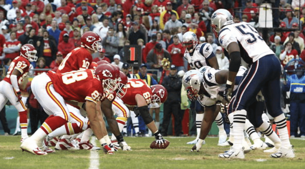
The photo above is from a 2005 Chiefs/Pats game. The two teams’ uniforms have barely changed in the intervening 13 seasons, so this is roughly how this Sunday’s AFC Championship Game in Kansas City will look. Not a bad-looking matchup, aside from the Pats’ side panels, right?
Unless, that is, the Chiefs choose to do what they did the last time these two teams played at Arrowhead, in 2014:
That was the second time the Chiefs ever went mono-red. I certainly don’t expect them to do it this Sunday (jeez, let’s hope not), but I never would have expected them to do it in the first place either.
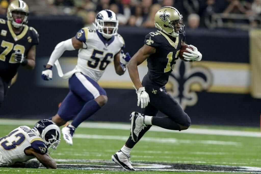
As for the NFC Championship Game, the Saints and Rams played in New Orleans just two months ago (the Saints won, 45-35). Here’s how it looked:
I’m assuming that the Saints will once again go mono-black (sigh). The Rams could go with white pants, instead of blue. Either way, it’ll be a grim-looking game. I hope everyone will be rooting for the Rams, because (a) we don’t want to see a mono-black team in the Super Bowl, and (b) if the Rams win, they’ll presumably wear their throwbacks in the big game.
A few other notes:
• Saints running backs Alvin Kamara and Mark Ingram II wore gold visor clips yesterday (click to enlarge):
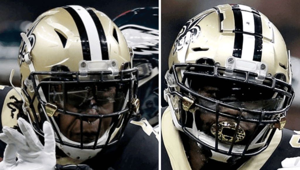
That was new — they had previously gone with black.
• Speaking of Kamara: As you can see in that last photo (he’s the one on the left), he has a septum piercing and wears it on the field. If the Saints win on Sunday, would he be the first such player to appear in a Supe? I’m not aware of anyone else having done so.
• Saints quarterback Drew Brees has been wearing an unusually large number of jersey patches this season:
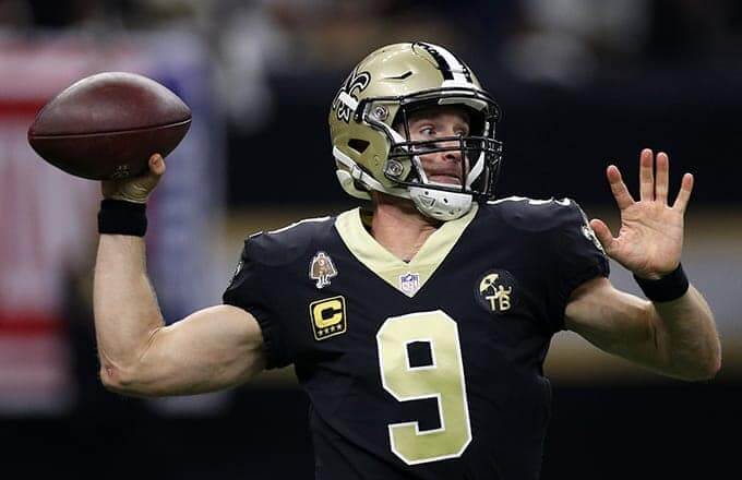
If the Saints beat the Rams, how will they fit the Super Bowl patch on his jersey? Will they scrap one of the other patches (maybe the “C”) to make room?
• After all four of the winners in the Wild Card round wore white jerseys, all four winners in the Divisional round wore colored jerseys.
• If the Saints and Chiefs win this Sunday, we’ll have the unlikely spectacle of both Super Bowl teams wearing blank nose bumpers. There are only three blank-bumpered teams in the league (the other one is Washington), so the odds of two of them meeting in the Supe are pretty long.
• All four teams in the conference championship games have two-word geographic locators: New England, Kansas City, New Orleans, Los Angeles. The last time that happened was in 2008: New England, San Diego, New York, Green Bay.
(My thanks to Adam Triesler, Joey Harvey, Robbie Margason, and @HelmetStalker for their contributions to this section.)
Click to enlarge
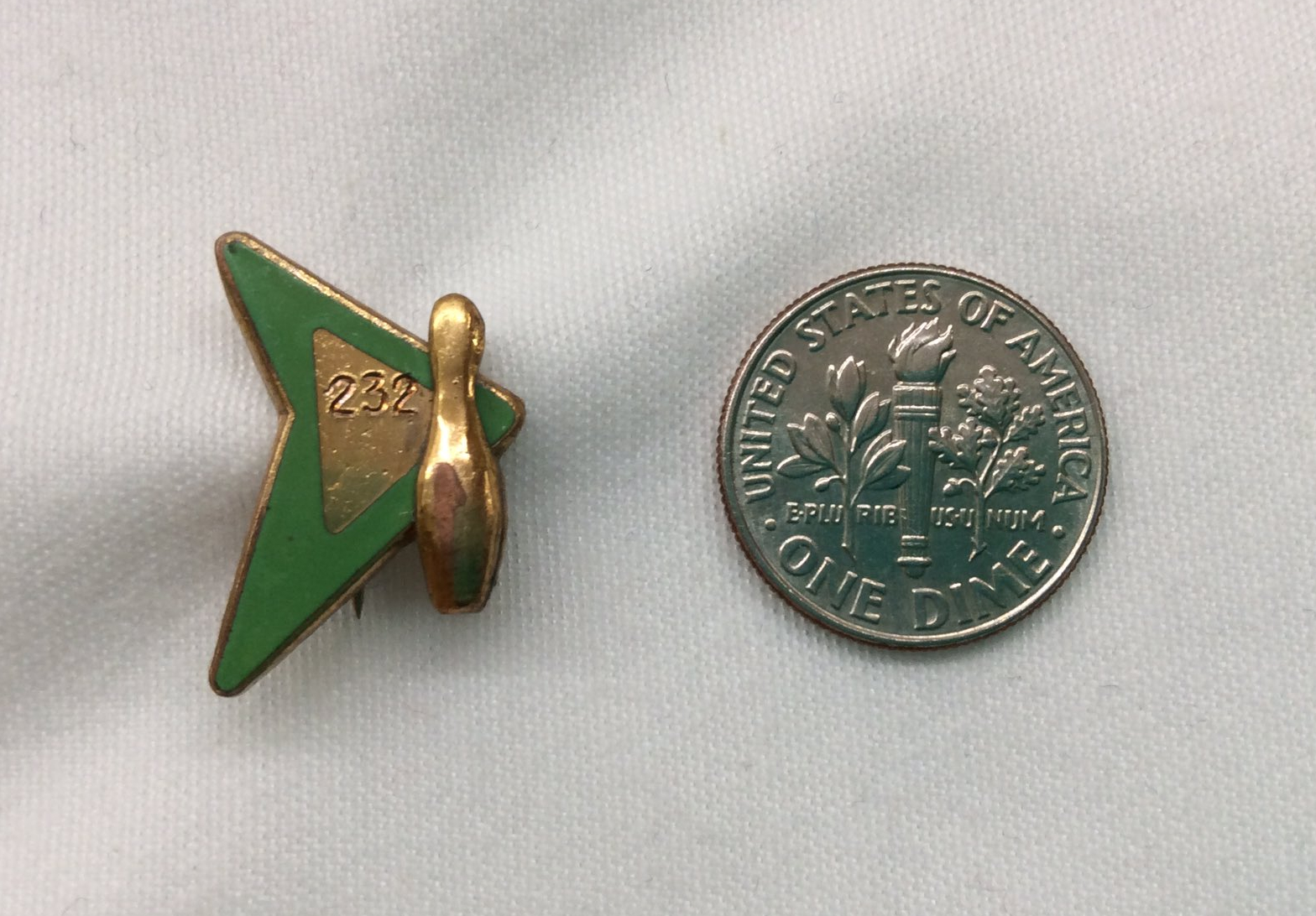
Too good for the Ticker: There are bowling pins, and then there are bowling-themed pins! DIY genius Wafflebored recently scored one of the latter. Is that spectacular or what? Looks like it was presented to someone who tossed a 232 — one pin more than my high game. So this pin is something for me to aspire to, in more ways than one.
It was particularly nice of Wafflebored, who’s Canadian, to use an American dime for scale. Thanks, man!
The state of criticism, continued: I’ve written before about the role of cultural criticism and my own role within that world. Now movie and music critic Rob Harvilla has written a good piece for the Ringer about the role of the pan (i.e., the negative review). Lots of interesting stuff here — worth reading.
To my surprise, though, Harvilla’s piece does not mention what I consider to be ur-pan of the past decade or so: New York Times restaurant critic Pete Wells’s controversial 2012 takedown of Guy Fieri’s restaurant in Times Square, which went viral and is probably the thing for which Wells is best known. I like and respect Wells, but I’ve always thought it was a huge mistake for him to have written that review (among other issues, nobody who goes to Guy Fieri’s tourist trap cares what the NYT’s food critic thinks of it, and nobody who reads NYT food criticism would ever go to Fieri’s tourist trap in the first place, so the whole exercise seemed masturbatory). Seems like a big omission in Harvilla’s otherwise solid Ringer piece.
While we’re at it: New York Times film critic Manohla Dargis recently ran a very interesting piece on what it’s like to be a female film critic. Also recommended.
(My thanks to longtime reader Jason Hillyer for bringing Harvilla’s piece to my attention.)
The Ticker
By Jamie Rathjen

Baseball News: Looks like the Braves’ “Chop Fest” event, which takes place this Saturday, will feature a uniform unveiling (from David Welch). … Also posted in hockey: The ECHL’s Worcester Railers wore Red Sox-themed uniforms, because the Triple-A Pawtucket Red Sox are planning to move to Worcester in 2021 (from MB Whitehead and Zach Pearce).

Football News: Reader Art Savokinas found a website that uploads original broadcasts of old Steelers games and sent us an example picture showing the Browns’ one-off orange numerals from the 1984 preseason. … FNOB alert! That’s Falcons OL Brent Adams in a 1977 game against the Bills. Interestingly, he was the only Adams on Atlanta’s roster that year, but the roster also included Bob Adams in 1976. So this jersey was apparently a holdover from the previous season and they didn’t bother to update the nameplate (from Dave Buchanan).

Hockey News: The OHL’s London Knights wore throwbacks — with a different shoulder yoke — to the 1994-2002 “Spiderknight” era, when they wore the same purple and teal as the then-Mighty Ducks and had a cartoonish logo. The Knights’ colors have otherwise always been green and gold, and in the ’80s they wore these helmets with a frontal stripe and logo (from Wade Heidt). … More from Wade: The QMJHL’s Shawinigan Cataractes have also been wearing throwbacks (white and blue). … The ECHL’s Wheeling Nailers and Indy Fuel dressed up like SpongeBob and Mr. Krabs, respectively, even using the show’s font for their numbers (from Yancy Yeater). … Cross-listed from the baseball section: The ECHL’s Worcester Railers wore Red Sox-themed jerseys, because the Triple-A Pawtucket Red Sox are planned to move to Worcester in 2021 (from MB Whitehead and Zach Pearce). … Tris Wykes sent us this picture of a New Hampshire youth team using the old Thrashers template.

Basketball News: A huge Jazz fan who passed away this summer got his entire family Donovan Mitchell jerseys, which they received at Christmas (from Mike Chamernik). … In this 1960-61 team picture of now-Division II Elizabeth City State, they’re wearing jerseys with names-on-front (from Jerry Pemberton). … Here are the uniforms from yesterday’s Chinese Basketball Association All-Star Game.(from Jeremy Brahm).

Soccer News: An English amateur team in Leeds believes it’s the first to wear an anti-gambling shirt “ad”. … West Ham United’s women’s team have been wearing a proprietary, but plain, number font this season that I believe hasn’t appeared on the men’s team. … Japanese top-tier teams to have released kits or shirts recently include Shonan Bellmare, Sanfrecce Hiroshima, and Yokohama F. Marinos (first, second, and a local cities-based sleeve patch). … Two of the great shirt numbering-style idiosyncrasies of the past can be seen in this picture from Scotland: Celtic’s no-numbers-on-back and Airdrieonians’ tiny numbers shrunken to fit inside their trademark red chevron.

Grab Bag: Loud curling pants are now becoming a thing outside the Norwegian national team (from Ted Arnold and @ohhhsourry). … The NLL’s Colorado Mammoth wore solid black alternates (from Wade Heidt). … There’s a company that’s promoting mental health awareness by creating caps for a “sports league” with “teams” representing different disorders, such as anxiety or bipolar disorder, with “expansion teams” to come (from @bryant_rf).
Typo in the “two-word geographic locators” – Los Angles
Thanks. Got it.
I’ll be cheering hard for the Rams and the Chiefs. Simply because that Super Bowl uniform matchup will look way better than any other possible matchup.
The Chiefs beat out the Pats for me only if the Chiefs wear contrasting color pants. If it’s going to be mono-Chiefs, then I’d rather look at New England. I’m kind of indifferent between the Rams and the Saints: The Rams are an absolute mess that look good in only one uni combo and terrible in all other uni combos. Whereas the Saints are a good looking team except for one terrible uni that they seem to wear a lot. I could only choose between them if I knew in advance what the specific uniforms each proposed to wear is. Rams in their throwbacks? Yes please. Rams in anything else? I’d rather watch Tampa Bay. Saints in mono-black? I’d rather a Tampa Bay home/road scrimmage.
With NFC as home team, thinking Rams would wear throwbacks. This might be similar to the situation in 1994 season when the 49ers were able to wear their alternate throwbacks in the playoff and Super Bowl.
Rams seem to be a unique situation and would think the alternate would be allowed. Unless NFL does now have a rule now against teams wearing their alternates specifically in the Super Bowl.
Typo: nose buumpers
Got it.
I think in the women’s premier league, the individual clubs wear their own number fonts (I seem to recall this was the case for Manchester City’s women’s team when they signed Carli Lloyd). As for City their font matched that (when playing in European/League/FA Cup) of the men’s team.
Most do, but not everyone. Among the other top tier teams:
Do wear their own font: Arsenal, Bristol City, Birmingham City, Chelsea, Manchester City, Liverpool, Yeovil Town.
Don’t wear their own font: Brighton, Everton, Reading.
Holy shit those London Knights…those just surpassed the Grant Hill/Jerry Stackhouse Detroit Pistons for the most random, gratuitously 90s color change. How jarring!
The Worcester Railers’ two-in-one stirrup socks in the ticker look awesome. Too bad you can’t get a better look at them in that pic.
You can see them better if you scroll through the pictures at the top of this article. They do look pretty cool.
link
Might I add that I think those fall into the category of Red Sox-themed uniforms, as opposed to just Red Sox-themed jerseys as they’re described in the ticker.
Excellent point. Fixed!
Agreed. Would be the best match up in years. Probably since we had Colts vs Saints a while back (when the Saints actually wore their gold pants). Which is interesting because in the guest column yesterday they criticized that uni match up.
Also given the way the Chargers left San Diego I find myself actively rooting for the Rams to do great so the Chargers are an afterthought in that city. Too the point that they have such embarrassing attendance and support that ownership has to tuck its tail, and sell the team to someone who will return them to SD.
Which is interesting because in the guest column yesterday they criticized that uni match up.
“Nice but not stellar” isn’t exactly a negative criticism…I liked it, just didn’t love it. Saturday’s matchups, on the other hand, I loved.
That article about negative reviews is good, but I’m flabbergasted that the writer appears to think that This Is Spinal Tap is an actual documentary.
As a Saints fan I personally detest the black on black look. From what I have read a team can wear its Alternate Uniforms only once in the playoffs so the rams would be done. I have heard the Saints want to wear their Beautiful color rash uniforms for the NFC Championship. Also I think that you have to wear either your primary away or primary home uniform in the Super Bowl. That’s why the saints wore White on Gold in 2009. If the Saints make it back, I’d expect them to wear it again
From what I have read a team can wear its Alternate Uniforms only once in the playoffs so the rams would be done.
Rams’ throwbacks have been given a waiver. Their throwbacks are their de facto primary colored uniform.
NFC is home conference in the Supe this year. If Saints are in, they’ll almost certainly choose mono-black, since that’s what they’ve worn for much of this season, including yesterday.
Well that would be disappointing
Would love for the Saints to wear their “color rash” uniforms against the Rams. This would be the best option, since the Rams could then wear their royal blue and yellow throwbacks. It would be a visually great looking game. However I’ll be surprised if they go with anything but the awful mono-black look. Have the Saints given any reason they wear this terrible look? I heard the fans vote and decide. I hope not, since this wouldn’t reflect very well on the Saints fans. Their gold/black/gold look is my favorite uniform in the NFL. The black pants knock this down towards the bottom. Also I’d love to see them go with the color rash jerseys as their permanent white jersey. This would also look great with gold pants.
I think the all black is the look the team likes the best, that’s why they wear it so much … and then they won so many games wearing it this year, it became their look. I don’t love that look or the black pants with white jerseys, but they’ve pretty much abandoned the gold pants this year. I would hope that they’d try to match the 09 Super Bowl if they get there and go with the white jerseys/gold pants, but I think we’ll see black on black.
Saints haven’t lost a game wearing white jerseys this season
I don’t think one Super Bowl appearance and win is enough of a trend to decide to wear white as the designated home team.
They went with gold pants in every preseason game
I joked with many friends about the ur-pan that we should go and see if it really were that bad since, you know, none of us would ever just go to a Guy Fieri establishment.
Nobody took me up on that offer.
As a matter of fact, I went with a friend to the Guy Fieri Times Square restaurant for that reason. I’m disappointed to report that it was just…eh. Not good, but not horrendously bad. Just mediocre chain-restaurant food that was a little overpriced. I wished it was either surprisingly good or somehow worse than expected.
I don’t know anything about bowling, would 232 be considered a really good score?
Yes! To put it in context, here are the top *averages* (not top individual game scores) from the Pro Bowlers Association tour in 2017:
link
Pawtucket Red Sox moving? Say it ain’t so. That like there being no Hershey Bears.
I know television rules, but wish the New England/Kansas City would be played in daylight.
Paul, overall rather restrained on the LA Rams/New Orleans match up – it will be well beyond “grim” :)
i am still calling them the paw sox
link
“Curtis Mayfield” sighting in the bottom right front row of the “Elizabeth City State Teachers (!) College 1960-61 Basketball Team” picture
Isn’t it true that the NFL makes the players use only one helmet which is supposed to be safer? That means the Rams equipment guys repaint the ram horns from white to yellow or vice-versa almost every week. I think their white horn uniforms look awful and I’d rather see Saints mono-black than that.
I guess since the Eagles finally won an Super Bowl in a non-white jersey, that the white jersey in the SB jinx is supposedly over? This superstition really gained ground with the Broncos choosing white in SB50 win and the Falcons non-white jersey collapse in SB51. Then the Patriots picking white in SB52, but having it backfire. White team has still won 13 of last 15 SBs.
With the NFC “home” SB team, I wouldn’t rule out Saints or Rams choosing white jerseys.
The Rams don’t repaint anything. They swap out the ram horn decals.
The Rams’ horns are decals that are applied to the helmet (like every other NFL helmet logo), not painted on. They still need to remove the decals and apply new ones every time they switch colors, but probably not as labor intensive as repainting would be.
I guess these are decals that are curved to match the contour of the helmet. Looks like they change from blue to white facemasks every time the ram horn color changes too. Still very busy for the equipment team.
I don’t believe any NFL team has changed it’s helmet design this many times in a season before.
Hey, Phil. There’s a youtube channel I found called the SFL (Simulation Football League.) It’s actually an eSports league, but none of the players are actually controlled by people. Full-length games, streamed live on YouTube, all within the game known as NFL 2K8. Basically, it’s like watching NFL games, but entirely virtual. they’ve got some really nice team logos and uniforms. Oh, and there’s 21 teams currently in that league. It’s really good stuff for Uni Watch, in my opinion.
I’m pulling for the Saints. It would be interesting to see how they handle the SB logo for Brees who already looks like a NASCAR driver. I doubt they’d make him wear a sleeve, so maybe they’ll move one of the items to the loop of the 9
Adam Gase wore team color tie at his introduction today, although the weird facial expressions kind of stole that show.
More on the Shawinigan Cataractes blue and green throwback. They were wearing them on the road at Cape Breton in the ticker photo.
Some differences compared to the original. The striping on the socks different. The pants were missing the stripes. As well, the edge of the blue along the shoulder/arms used to dip down at the back into the nameplate, but that is not the case with the throwback:
link
There have been differences in the number and nameplate colour design with this jersey template over years, including a white-based ghost number on a white jersey:
link
This throwback uniform is a much better look than their current navy blue and yellow primary set. Keep this as the primary white, bring back the royal blue uniform as the dark.