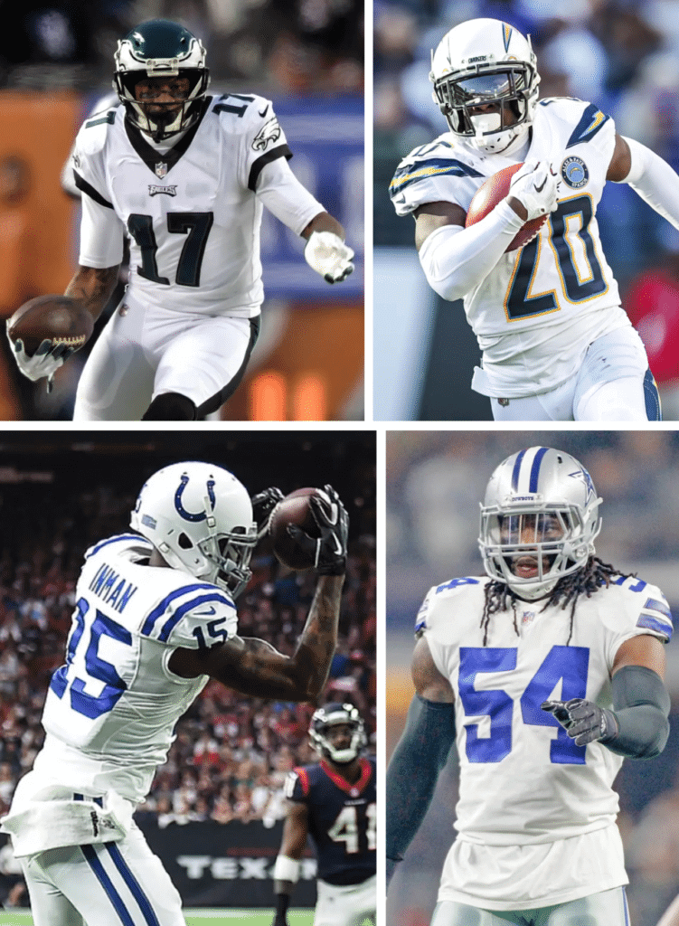
Interesting development during the NFL’s Wild Card weekend, as all four winners wore white jerseys. In fact, three of them wore mono-white. Would anyone care to research the last time the winners of four NFL playoff games in a given weekend all wore the same color jerseys?
Looking ahead to the Divisional Playoffs, here are the matchups for this weekend:
• Saturday early game: Colts at Chiefs. A classicist’s delight, with the Chiefs in red and Colts in white.
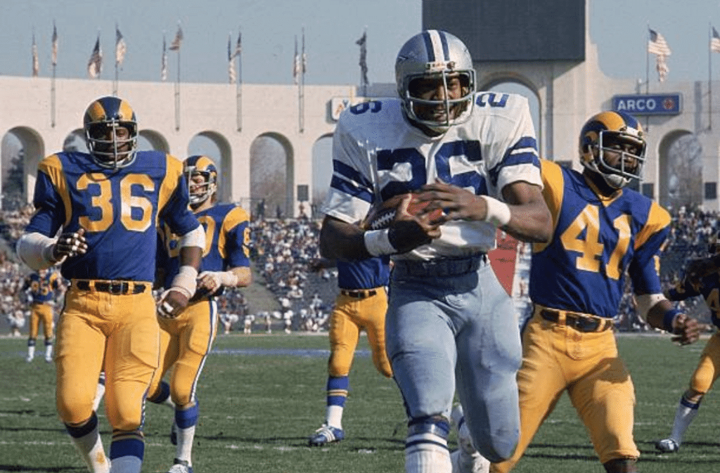
• Saturday late game: Cowboys at Rams. Looks like the Rams will be wearing their blue throwbacks (not a surprise, since that’s what they’ve worn for most home games this season), so Dallas will wear white — at the L.A. Coliseum. That means we could see a recreation, or at least a reasonable approximation, of the 1976 NFC Championship Game:
If, on the other hand, the Rams wear their white jerseys for this game, Dallas would have to wear blue. It would be their fourth time wearing the blues this season. According the Gridiron Uniform Database, the last time they wore blue jerseys that many times in a single season was 2009, although two of four instances that year were blue throwbacks.
• Sunday early game: Chargers at Patriots. The Pats will wear their standard home uniform and the Chargers will either go white-over-blue or mono-white — I’m guessing the latter.
• Sunday late game: Eagles at Saints. There’s the very real possibility of this game being mono-white vs. mono-black — woof. In addition, there’s something about the lighting and the turf in the Superdome that I can’t stand — football just doesn’t look good in that building.
A Close Look at FA Cup Sleeve Patches
By Jamie Rathjen
Almost every team playing in the third round of England’s FA Cup wore the competition’s sleeve patch on the right sleeve. This is a substantial increase from last year’s third round, when only a handful of teams, mostly corresponding to the six games on TV in the UK, did so. However, this year all 32 games were available to international viewers, which may explain the increase.
The left sleeve was given over to sleeve ads. Most Premier League teams already have sleeve ads, but perhaps 15 or so lower-league teams trotted out new ones. For teams that didn’t have a sleeve ad, the left sleeve was usually blank.
Since at least 2009-10, the competition’s rules have had an interesting provision that allows teams to skip wearing the sleeve patch if their shirt advertiser is a competitor of the FA Cup’s main advertiser, which is currently a Middle Eastern airline. This provision now specifically applies to Manchester City, whose advertiser is a different Middle Eastern airline.
The rule is supposed to apply starting in the semifinals, at which stage the patch is mandatory, but guess which Premier League team didn’t wear the sleeve patch in the third round:

An ad-free version of the sleeve patch, last seen in 2014-15, was apparently not possible. Teams are required to have the FA Cup’s logo — advertiser included, of course — on other places in the stadium, on social media, etc., and City did so.
City also didn’t wear the sleeve patch last season, the season before, or in 2015-16, the first season with the current FA Cup advertiser. The last time they did wear the sleeve patch was in the 2013 final, when there was a different Cup advertiser.
Returning to this weekend, the other teams not to wear the sleeve patch, likely for logistical reasons, were the two teams remaining from outside the top four tiers: fifth-tier Barnet, who wore their league patch on both sleeves, and sixth-tier Woking, who wore one league patch and one ad.
Three other lower-league teams — Accrington Stanley, AFC Wimbledon, and Newport County — wore on the left sleeve mixtures of either the FA Cup sleeve patch or the left-sleeve English Football League patch, which is yellow and contains a gambling-addiction message, instead of an ad.
Click to enlarge
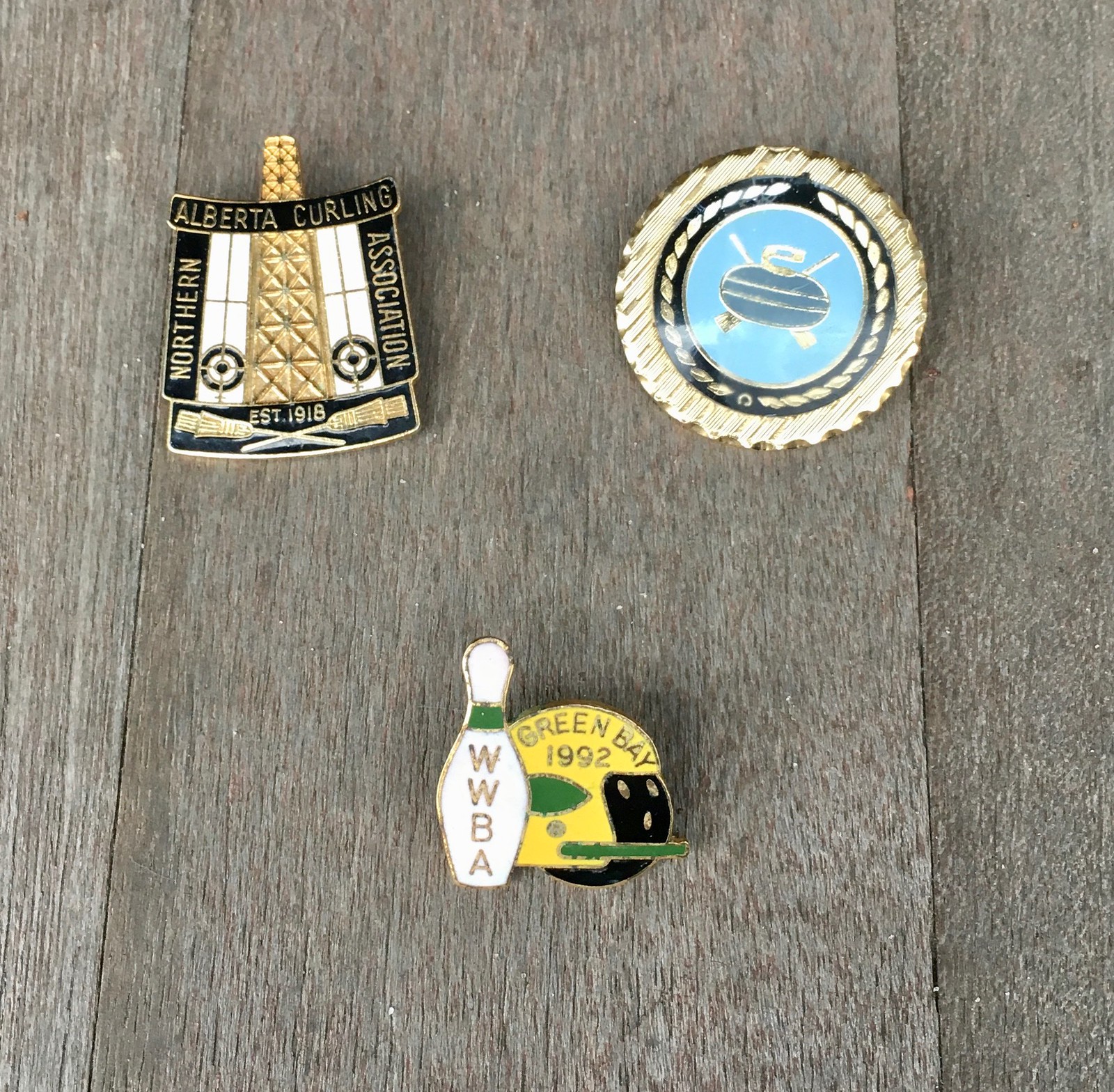
Pin-nacle: Got a nice package in the mail from longtime reader/pal Jim Vilk, who sent me this trio of very nice enamel pins. The two curling pins are nice, but the real prize is the Green Bay bowling pin, which shows an ersatz Packers helmet being worn by a bowling ball! The green striping on the neck of the bowling pin, instead of the usual red, is another nice touch.
Jim explains the story behind like so:
The bowling pin was given to me by a member of the Wisconsin Women’s Bowling Association (or at least I assume that’s what the “WWBA” lettering stands for). I was covering Akron Zips basketball and staying in the same hotel as the WWBA members. A Zips assistant and I met two of them in the lobby and we had a nice chat. Anyway, this pin just seems to be made for you, doesn’t it?
Indeed. Thanks so much, Jim!
By coincidence, there was some lapel pin news in the NFL yesterday, as CBS studio analyst Bill Cowher’s American flag lapel pin was upside-down at one point (click to enlarge):
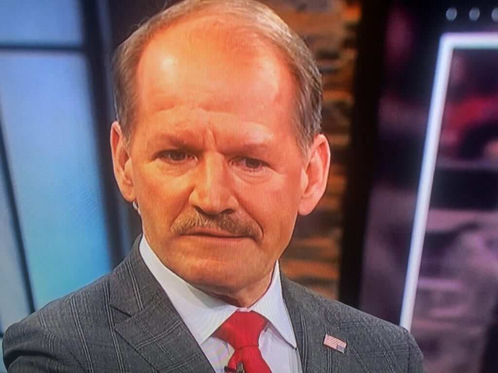
All “distress signal” jokes aside (let’s please not go down that road, thanks), anyone who’s ever worn a lapel pin can tell you that they sometimes pivot or rotate. Reader Dan Pfeifer says, “Buddy of mine gave me a tip once: You cut off the end of a pencil eraser and put the pin through that, then put the pin on. The rubber keeps it from moving around.” Nice.
(My thanks to Mark Johnson for the Cowher screen shot.)
Click to enlarge
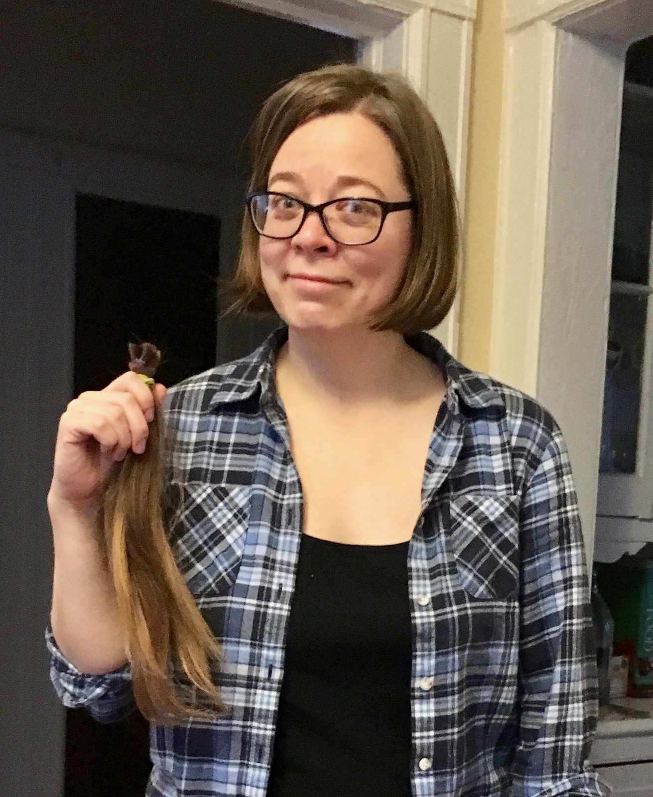
New year, new ’do: The Tugboat Captain got a haircut shortly after I met her in 2015 — and didn’t get another one until a few days ago, when she went and got herself a very nice bob. She had them save the cut hair so she can donate it to a wig-making charity.
It’s a little weird for my girlfriend with long hair to suddenly become my girlfriend with short hair (although not as weird as it is for her, I gather), but I really like the new cut. On the Uni Watch good-to-stupid scale, this redesign is very, very good. (And no, that doesn’t mean the old cut was stupid. Just means the redesign was a success.)
The Ticker
By Jamie Rathjen

Baseball News: Longtime Reds broadcaster Marty Brennaman posted a photo of this Reds wristwatch, which says was given to the team’s pitchers in the 1970s. Instead of the standard 1 through 12 numbers, it features the pitchers’ uniform numbers — a clever design (from our own Brinke Guthrie).

Football News: Clemson’s combo for tonight’s national championship game is white jerseys and orange pants, which means Alabama’s in red/white. Also mentioned in that article is that Clemson has added captaincy patches (from Dan Gheesling). … The College Football Playoff people made a collage of Levi’s Stadium using 5,000 photos from social media (from James Gilbert). … Reader Michael Tomassi was watching a 1978 Oilers/Steelers game and noticed some numbering-style inconsistencies, especially on the Oilers, but also the Steelers.

Hockey News: The Penguins gave members of their 2009 Stanley Cup team period-correct jerseys, including what looks like a special patch (from Noah Kastroll). … The Sharks’ black jerseys have a very hidden “SJ” in the sleeve stripes (from Justin Wiltron). … New Utica Comets (AHL) goalie Alex Sakellaropoulos has a very long NOB (from multiple readers). … The Sabres held a skills challenge yesterday and had the players wear special uniforms. Here’s what they look like from the back (also from multiple readers). … The ECHL’s Greenville Swamp Rabbits wore autism-awareness jerseys.

Basketball News: The Marquette retired number banners in Milwaukee’s new arena are in the style of uniform the player wore (from Ray Barrington). … Illinois-Chicago became the latest Chicago team to wear city flag-themed alternates, though we’ve seen the corresponding court before. … Michigan and Indiana went color-vs.-color (from Blaine Williams). … The concept of city-themed jerseys has spread to the NBL, the eight-team pro league in Australia and New Zealand. Here’s a closer look at the one for the Perth Wildcats (from Adam Rylewski and James Bingaman).

Soccer News: The Asian Cup got a new trophy for the 2019 edition in the United Arab Emirates, meaning holders Australia wore two different versions of the trophy on their patches: the new one on the sleeve patch, and the old one on their center-of-shirt 2015 champions patch (from Chris Hockman). … The MLS ball for next season appeared at the league’s rookie combine this weekend. … NPSL team Ozark FC is letting fans vote on their shirt (from Ed Żelaski). … Other items from the FA Cup: West Bromwich Albion center-back Mason Holgate debuted in his team’s match wearing No. 68, something which I’m not sure is intentional or a coincidence, as the team pointed out it’s the year they last won the FA Cup. … The competition has a new match ball which features the trophy. … Some Premier League teams wear a different number font for cup games than the league’s standard font, and the Championship’s Brentford did so as well Saturday.

Grab Bag: The Perham (Minn.) High Yellow Jackets use Georgia Tech’s logo, but pay them a nominal fee which apparently recently doubled to $2 (from @prpdad). … Last night’s Golden Globe awards featured a redesigned GG trophy that has a “cylindrical base, rather than cuboid, therefore improving ergonomics to ensure that winners do not obstruct the Golden Globe when holding the award” (from Kristopher Terrell). … Speaking of the Golden Globes, many performers wore “Times Up” wristbands and ribbons last night.
Re Mason Holgate – not only was ’68 the year West Brom last won the FA Cup, but it was against Holgate’s parent club Everton!
ugh- 3/4 photos at start of poast feature players in crop-tops. i guess i should be glad they’re not wearing contrasting undershirts.
BTW big thanks for an early morning post.
Crop-tops, or just untucked?
fair point as to the Cowboys’ jersey, but the others look too short to be tuckable
If the Rams do the expected and wear their royal blue tops and yellow ram horns and bottoms, the game would look more like the 2nd-round game from the 1985-86 NFL Playoffs (Eric Dickerson’s record-setting performance) due to the Rams wearing navy face masks instead of gray ones.
1986 would have been in Anaheim (if a Rams home game). This one’s going to be back at the Coliseum, like the posted pic.
It was a Rams home game in the O.C. They earned a shutout win before being shut out themselves the following weekend.
The Rams played the Cowboys at Anaheim Stadium on 1/4/1986.
The next day the Raiders lost to the Pats at the LA Memorial Coliseum.
Just checked to make sure I’m not going nuts!
link
I absolutely agree that the turf in the Superdome always looks so bad on TV. So shiny and weird. Ugh. The mono black is bad, too.
I always liked the lighting in the Superdome. Reminds me of when I used to kick field goals in the dining/living room or make slow motion diving catches with the only illumination being our Christmas lights and the television. But yeah, if the new turf is shinier…that would be a downgrade.
Yep, (said this before) the Superdome has never broken the association, in my mind at least, with the bad things that happened there after Hurricane Katrina. The fact that the stands are so poorly lit, always gives that disquieting reminder of that bad time. In addition, the Saints going with their black track pant look, also provides the sense of “emergency dressing”, i.e. the guy that shows up at work in shirt and tie but with running shoes. i.e. half dooded up for work, half it’s the weekend. And the field looks terrible….. somewhat washed out with than unfortunate sheen, that looks like they took it to a cheap dry cleaners too many times.
There is one great paradox, whenever the Saints kick a FG or PAT they show the happy fans in the first few rows, backs turned to the field, waving to the camera, they look so happy and friendly.
The turf there always looks “fluffy”? I’m not sure if that’s the best way to describe it but it looks like thick grass. It’s amazing the different turf looks in the league, where Seattle’s is almost an olive green, ATL looks fine but the logos never seem saturated enough, and Dallas who’s field always looks great and the graphics even for one time events are saturated with no remnants of previous graphics.
Dallas just looks great on TV
Even NFL films could not make the Superdome look bright. When they start binging on the SB highlights in a few weeks, notice how dull the Superdome game films look compared to any outdoor or other dome games. Best example was SB XII btw Dallas and Denver. My 2 cents.
FYI, I never hear the University of Illinois- Chicago referred to as “Illinois-Chicago”. It is always “UIC”, which you see as the center court logo in that photo that was tweeted. I understand that people who aren’t from around here might not know what UIC stands for, but Illinois-Chicago just looks and sounds weird.
It’s not unusual for people not near a state-city university to not use the abbreviation.
Like how people outside Texas call UTSA Texas-San Antonio and people outside California call UCLA California-Los Angeles.
I doubt anyone calls it “California-Los Angeles.”
I agree,
Growing up in So Cal, I too found it odd about the distinctions between the University Systems – University of California at and the California State Universities (CSU) caused some of the issues about what the differences were. If you take all the snobbery and ego out of the equation, it goes something like this.
UCLA, University of California at Los Angeles…and California State University Los Angeles.
The dark secret of the whole system was this – most solid classes (freshman and sophomore) of the curriculum were transferable – a class at a community college, let’s say Cypress Community College, would be acceptable at UCLA, Stanford or even UCSC, go Naner slugs!
So one could take all their solids at a low cost community college, then move on to a name university that accepted you because you met the grade and financial standards.
My HS guidance counsellor helped me gather credits using this method since I worked full time and had to attend night school. With a tight schedule to say the least, I could take solid courses for specific nights and times. Very helpful.
Oh and I attended CSU Fullerton or Cal State Fullerton or as we called it…
Cal State Disneyland.
I understand that people who aren’t from around here might not know what UIC stands for
That’s exactly why, plus I would rather use fewer acronyms if possible.
Illinois-Chicago wouldn’t even be proper parlance. The name of the university is actually the University of Illinois AT Chicago. I added the emphasis on the ‘at’, but that is the name.
Far easier to just say UIC.
Wasn’t it called(U of I) Chicago-Circle at one point? I seem to remember basketball jerseys reading “Circle.”
Agree. It’s rare for anyone in Chicago to call it anything but “UIC.”
With that said, that court is hideous. I love the Chicago flag. Those six-pointed stars are unique and just one of them can scream Chicago. The ubiquity of the flag and its elements are fine with me, but this court seems like it wants to love it more than anything else loves it. Total overkill.
So strange how the Saints have one of the best uniforms in the NFL but constantly choose to wear those back pants which make them one of the worst.
With how often the Rams wear the throwbacks now, I wonder how they would look if they just kept the yellow horned helmets full time and wore them with their white set. I tend to think the yellow horns would work better with the the gold trim white jersey than the white horns do.
Has anyone heard any reasoning as to why the Seahawks went blue over gray for their uni combo on Saturday night? When I heard that’s what they were going to be wearing, I immediately panicked. Obviously that wasn’t the reason we lost (that responsibility would fall onto our boneheaded OC), but Seattle never seems to do as well when they change up their classic uni combos.
Actually if you look up last few times Seattle has had to wear blue tops on the road, they always pair it with grey pants (the ones I can think of off top of head is previous two matchups with Carolina, and maybe one matchup against LAR although it seems LAR always wears their throwbacks against the hawks.
Was wondering the same. It looked really odd to me.
Well it certainly looks better than their mono-navy set. I think they should go with gray pants full time, both with navy and white jerseys.
Agree with you Greg for the Seahawks as per my comments yesterday. Navy over grey as primary dark combo. Though I would prefer to keep the navy pants to wear with the white jerseys only.
I can’t recall/find the source, but the Seahawks have reserved their all blue look as a home uniform only.
If the other team is wearing white at home, they will go Blue top with either White or Grey pants. I’ve seen (can’t find) a W/L record in each uniform combination, and as I recall, Blue/Blue/Grey has one of the worst records of any of their uniform combos.
Was that a recent change Tim? Because even the Seahawks @ Cowboys game Week 16 last year had the Seahawks in mono blue. I do notice that it’s not often the Hawks go with mono blue away from home, but it’s not strictly the case
The blue over gray is the worst look for the Seahawks since the 1976 team with the plain silver helmets.
Well, other than the all neon green uniform of course which I try to block out of my mind.
worst look for the Seahawks since the 1976 team with the plain silver helmets.
Stop. Just stop.
The Cowboys-Rams NFC championship game to which you refer is actually the 1975 NFC Championship Game. Even though the game was played in 1976, it occurred after the 1975 regular season so that’s why it’s the 1975 NFC Championship Game.
When referring to football champions, here’s an example of this in action: The 1974 and 1975 Steelers are considered champions even though the Super Bowls they played in occurred in 1975 and 1976.
link
Basketball and hockey treat this differently because the majority of their season occurs after New Year’s Day. Not so in football.
I’d be shocked (and giddy) if the Rams don’t force my Cowboys to wear navy this weekend. I thought it was almost a certainty that they would. Dallas is 0-3 in those this year, though the navy set is my favorite uniform in all of pro sports.
Also:
3 of 4 games this past weekend feature a team in a navy blue jersey versus a team in white while the 4th is a team in purple vs. a team in white.
6 of the 8 teams who played this weekend have a blue jersey as 1 of their 2 primary jerseys and 5 of those are navy blue: Colts, Texans, Seahawks, Cowboys, Chargers, Bears.
Interesting point, but I don’t really consider the Colts shade of blue to be navy; it’s more of a slightly dark royal or Dodger blue.
Correct, he was saying 6 of the teams were blue, Colts being one of them, and 5 of those 6 were navy blue. He listed 6 teams, the Colts are the single royal blue team.
Are the Chargers and the Bears navy blue’s the same color?
No.
Colts are royal blue.
“Would anyone care to research the last time the winners of four NFL playoff games in a given weekend all wore the same color jerseys?”
2015 season, Wild Card Weekend winners (Chiefs, Steelers, Seahawks and Packers) all wore white jerseys:
link
Thank you!
It looks like the Buffalo Sabres wore St. Louis Blues socks for their skills competition.
You beat me to it!
A lot of enamel pins these days are starting to come with a rubberized backing instead of the old butterfly clasp.
If I were the Rams, I’d wear white at home and make Dallas break out those blue uniforms they don’t like wearing.
The Colts/Chiefs game will be good looking ONLY if the Chiefs wear white pants. If they choose to go mono-red, it will look ridiculous.
Did Mary release a statement in regards to the new do? Lighter for a better performance on her feet? Reduced wind resistance to allow for a quicker reaction time? Improved range of motion and vision?
Was the hair cut representative of the shortened daylight hours experienced in New York winters?
That is enough from me. Looks good.
Well done. :)
3 of those 4 teams wearing white looked great. Not a fan of the Eagles uniforms, including their white. Their green almost looks black, which I bet was their idea when they switched to this shade of green. They really should go back to kelly green.
I love the Colts in royal blue, but my favorite look for them is all white. I would love for the Cardinals to have something similar with red obviously in place of the blue.
Couldn’t agree with you more. The Eagles set would look great if they just switched to the shade of green back to kelly green.
Cardinals uniforms are such a mess, another example of a downgrade by trying to do something new instead of keeping a simple and traditional design. The modernized logo was good, but there was no need to go crazy on the uniform design.
Agree about the slight change in the Cardinal logo being good, but their uniforms are terrible. Their BFBS is probably the worst in all of the NFL and CFB. Again, they would look great in something like the Colts uniform.
Nice catch with the all four in whites, if I were the teams going into next week, I would be pushing for whites!
I would never have noticed, but did like the looks of the games.
You sound like a man should pose it, “your haircut looks great, even better than before”. As opposed to “hey, your hair looks better” which is prone to opening it up to “I guess you didn’t like it before”
That watch has to be only time Jack Billingham received top billing over Tom (11 o’clock) Seaver.
Hit the nail on the head with this weekend’s FA Cup notes. Watching City without the patch felt off and I didn’t really know why we didn’t have it…
Was kind of interesting that it wasn’t that noticeable in the past, because the patch wasn’t ubiquitous, but this time it stuck out.
Think you missed something about the buffalo Sabre’s skills challenge. The Sabres have been under rumors about returning to royal blue. The fans want it for the most part. Could this have been a test? Why wouldn’t buffalo have kept their current navy blue for something home grown it would have been cheaper and reflect a desire to establish navy as their color. Just a thought.
Sabres are definitely teasing something with those Skills Challenge unis. They have potential but they need some tweaks. The stars on the sleeve stripes obviously need to go. The blues largely work just fine, otherwise. The whites are similarly good, but the gold numbers don’t work for me. Blue would pop better.
That said, I’d prefer they use this design for a gold alternate with blue and white stripes. Then just use their current unis swapping the navy back to royal. Or just a return to their classic 70s/80s/early-90s design.
But that’s just my opinion.
The rumor mill has been pointing to a return to royal blue and gold from various articles if caught a glimpse. The alternate idea is probably spot on. With the anniversary season coming up you’d figure more of a throwback than a new alternate. I like the design and totally agree that the stars are a no go. To me if the stars go it’s just a recolored canadians jersey so I hope this was just a color tease and not a uni tease.
Any reason the Eagles aren’t wearing their green pants this season?
I like the stickers on the Clemson helmets. Does the NFL forbid “merit” stickers? I ask because the Browns helmets would look great with brown paw print stickers!
Thank you for pointing out that the Superdome looks terrible on tv.
I feel the playing surface is often overlooked. It plays a huge role in the overall look of the game. I can’t be the only one whose turned off by visible seams, and poorly brushed field turf. Not sure if that’s more of a brand issue or the maintenance/cleaning equipment leaving marks.
I think it’s charming how much Paul obviously cares about his girlfriend. As a lonely bachelor, it’s a nice model of what a relationship could look like.
Secondly, I’m in complete agreement that football looks awful in the Superdome. I actively root against the Saints because, between their all black uniforms, field, and lighting, the aesthetic of their success is a burden on us all.
Looking at that Reds watch, I’m wondering who number 4 is. I thought it might be a rare single-digit pitcher, but the Reds at that time were big followers of the semi-standard numbering system that the Cubs also used (single digits for manager, coaches, and catchers; 10-19 infield, 20-29 outfield, 30-49 pitchers), so now I’m thinking it must be the pitching coach. Nice to see him get equal billing with the pitchers!
I’m wondering who #51 is. Bullpen coach/catcher?