For all photos, click to enlarge
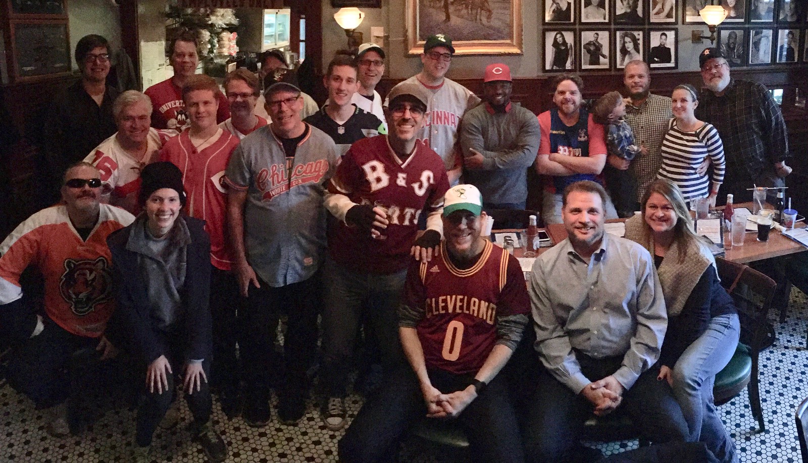
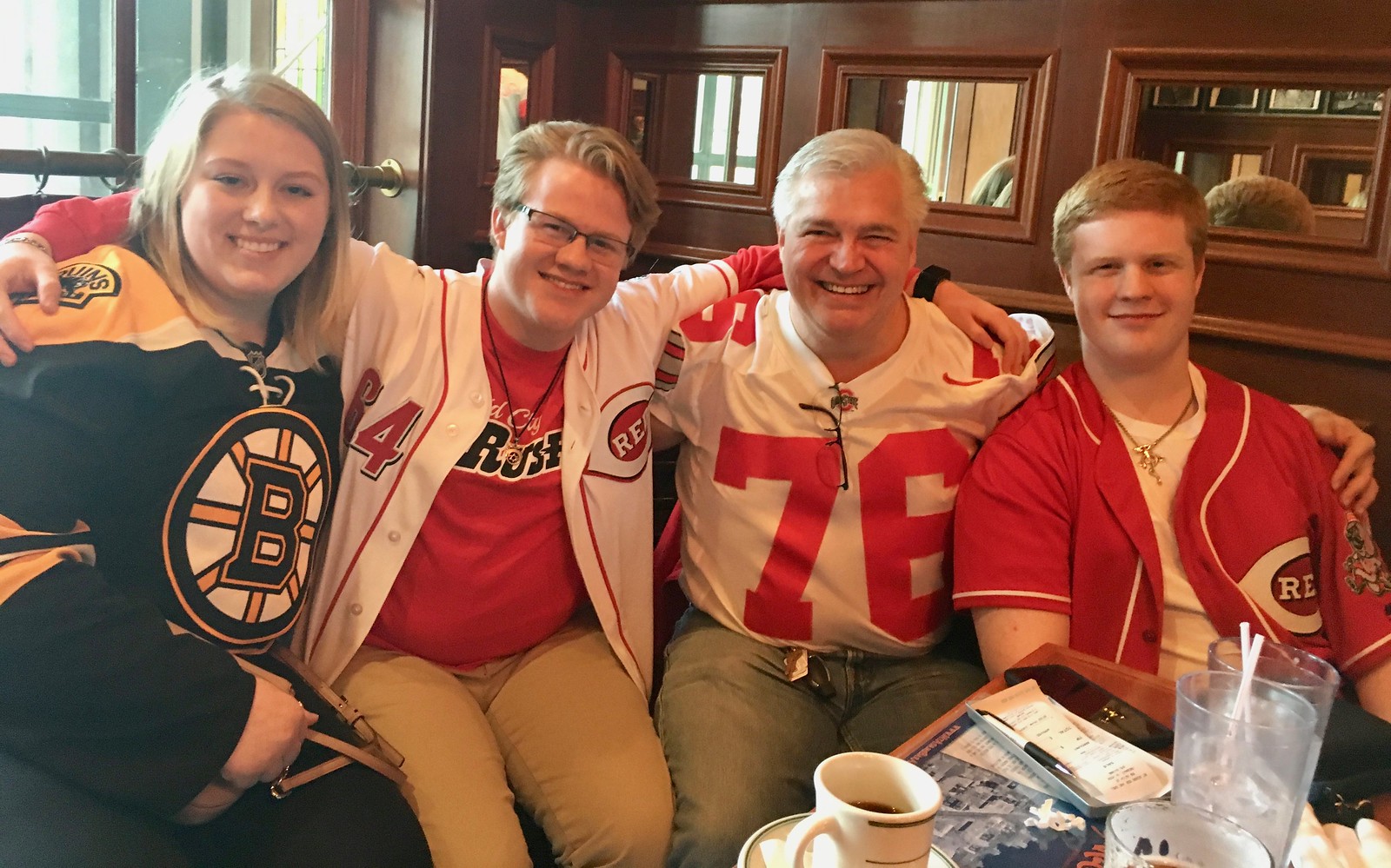
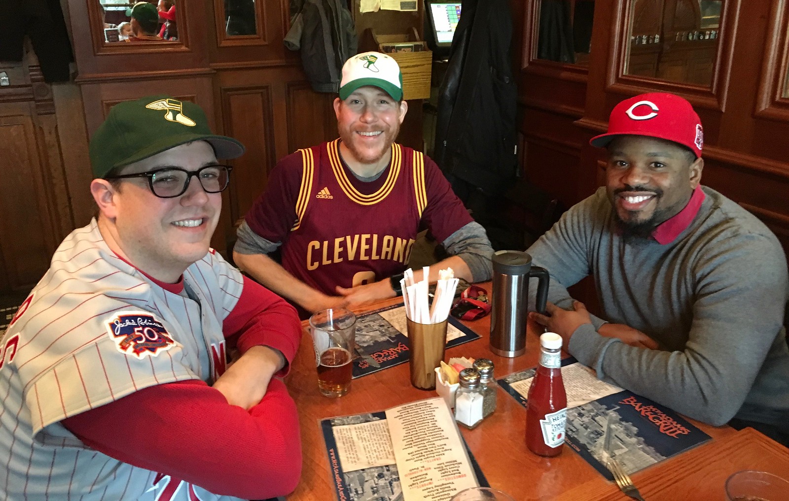
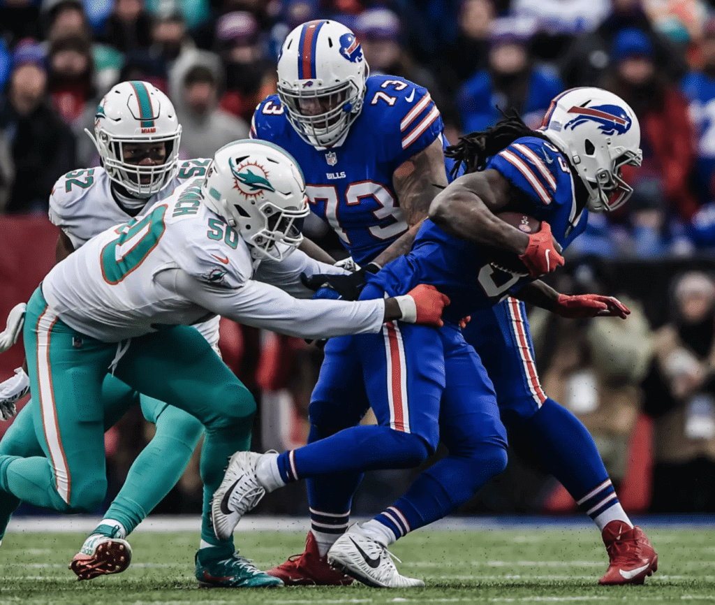
Great turnout at yesterday’s Uni Watch gathering in Cincinnati, as about 30 people showed up. About two dozen of them are shown above — lovely folks, one and all. Here are some of them, and what they wore for the occasion (with apologies for the bad lighting in some of the shots — tough conditions!):
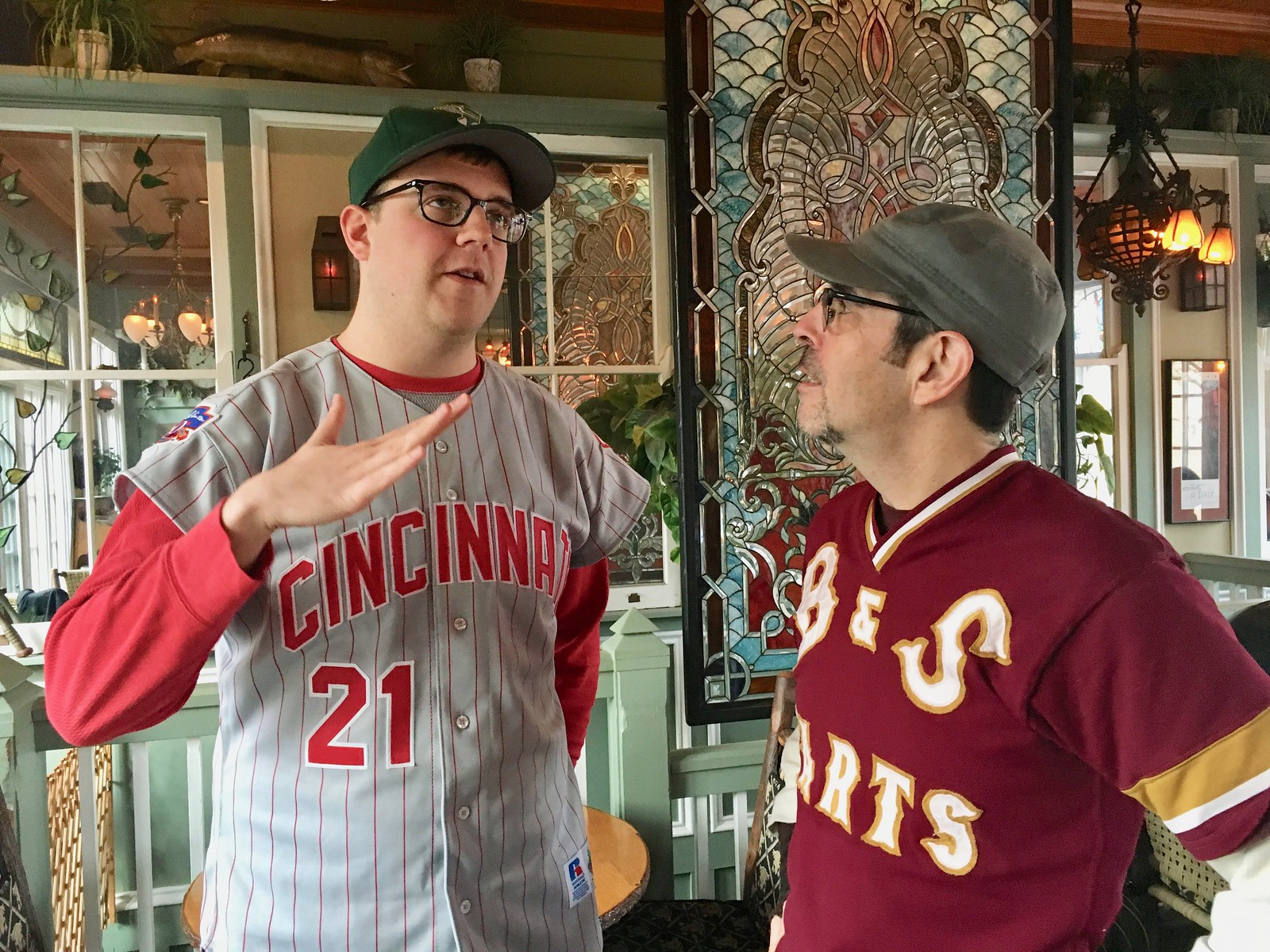
• Alex Hider has been writing Tickers and occasional ledes for the site for several years now. Along the way, he’s become a good friend, and it was a treat to finally meet him in person. He wore a 1997 Deion Sanders Reds jersey, complete with the shortened sleeves and the high-positioned sleeve patches (and a Uni Watch cap!):
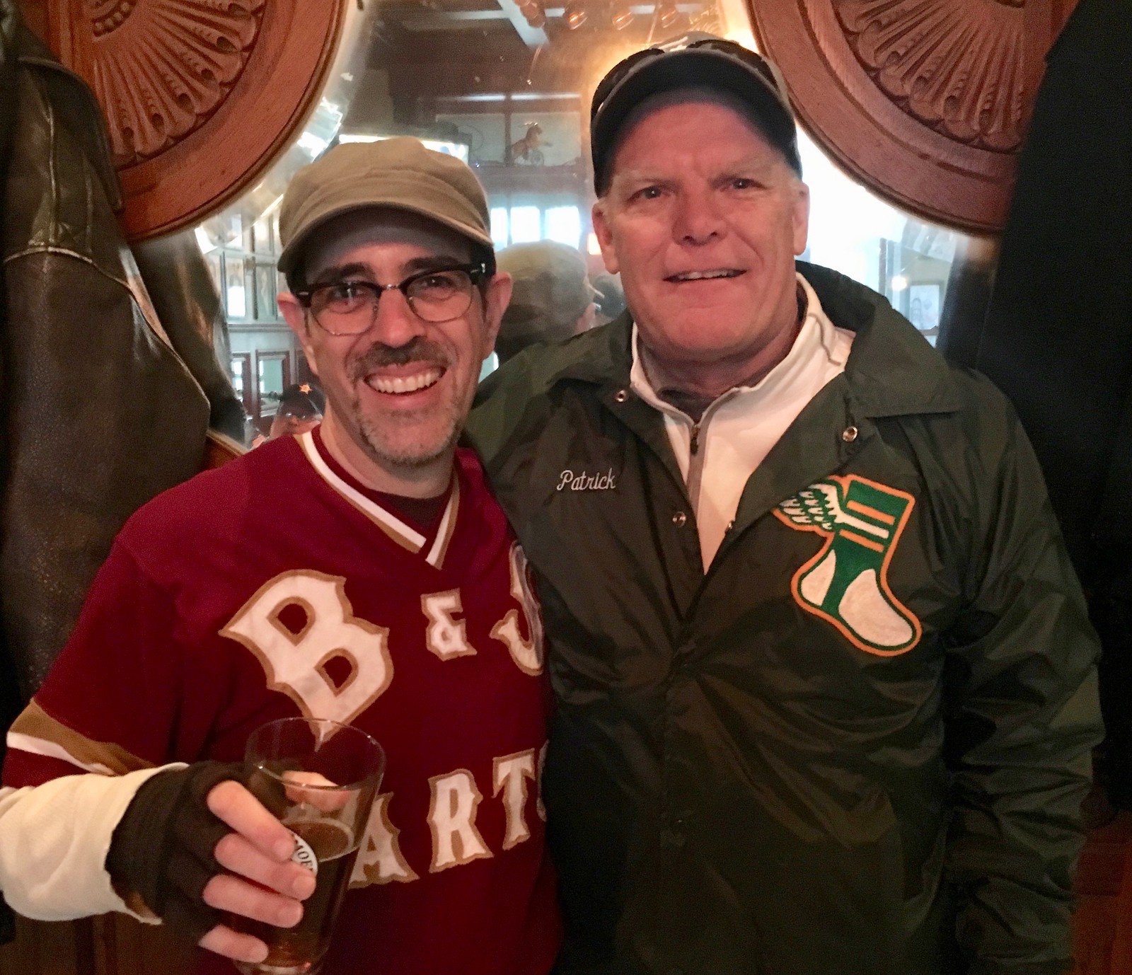
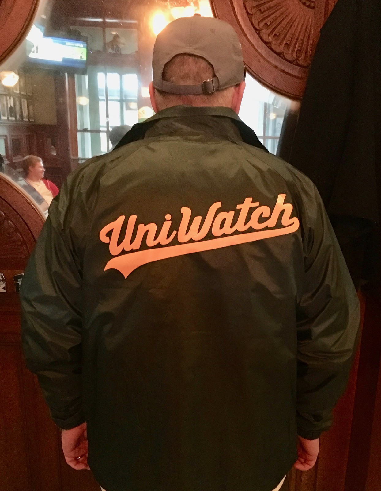
• Patrick O’Neill has been a Uni Watch reader/contributor for over a decade. He recently purchased one of our chain-stitched logo patches, which he got sewn onto a windbreaker — plus he had the Uni Watch script printed onto the back:
• Alan Topolski wore one of my favorite items of the day — a Seattle Pilots knockoff jersey that for some reason came with a totally bogus and totally awesome chest logo. Check this out:
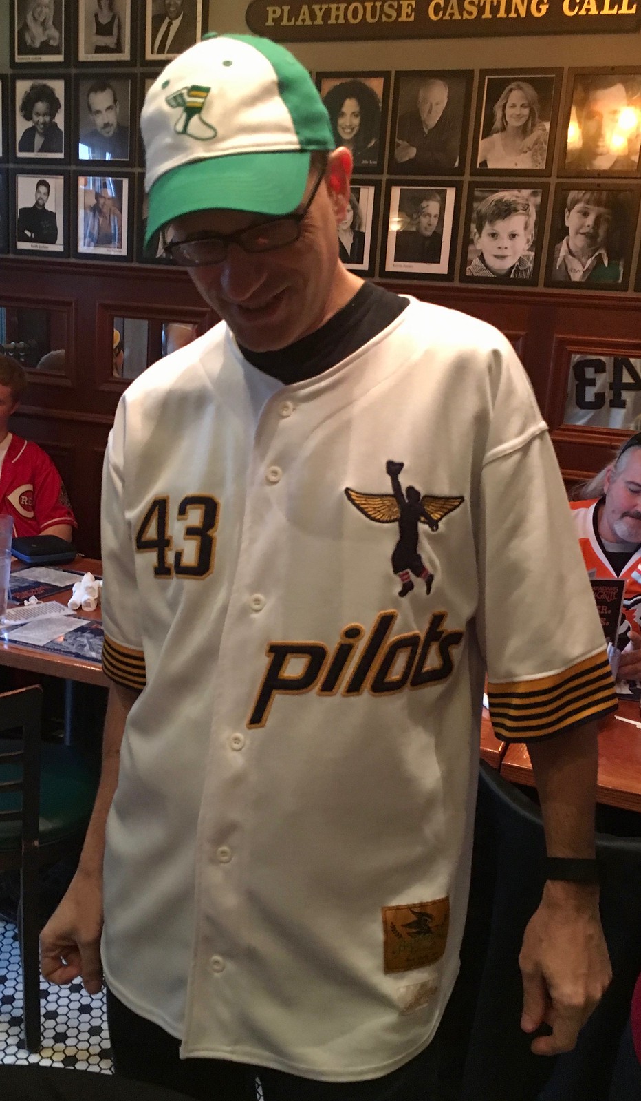
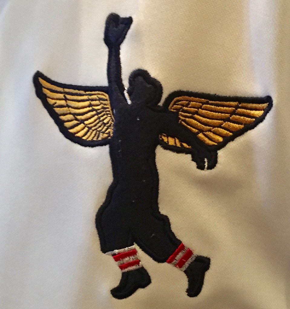
Naturally, I love the striped socks!
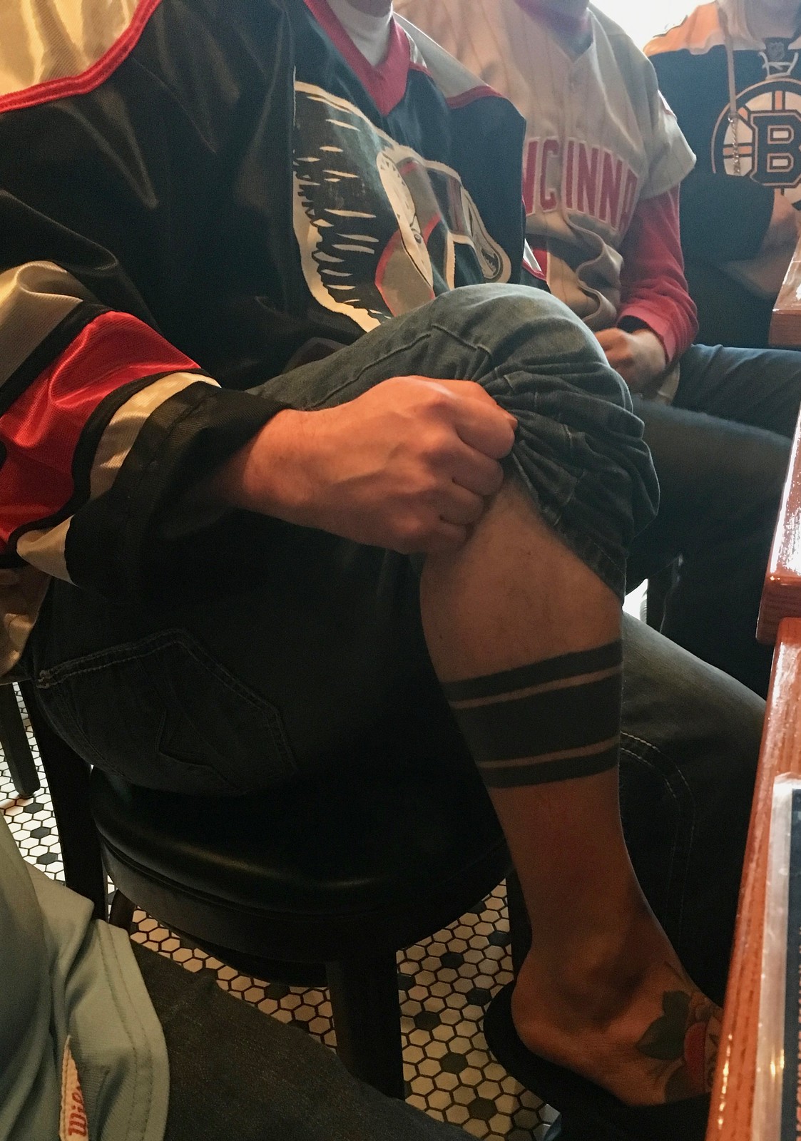
• Back in 2011, I did a blog entry about a guy named Adam Walter, who’d recently gotten a full wraparound tattoo of a Northwestern strip on his right shin. Yesterday I got to meet the tattoo in person:
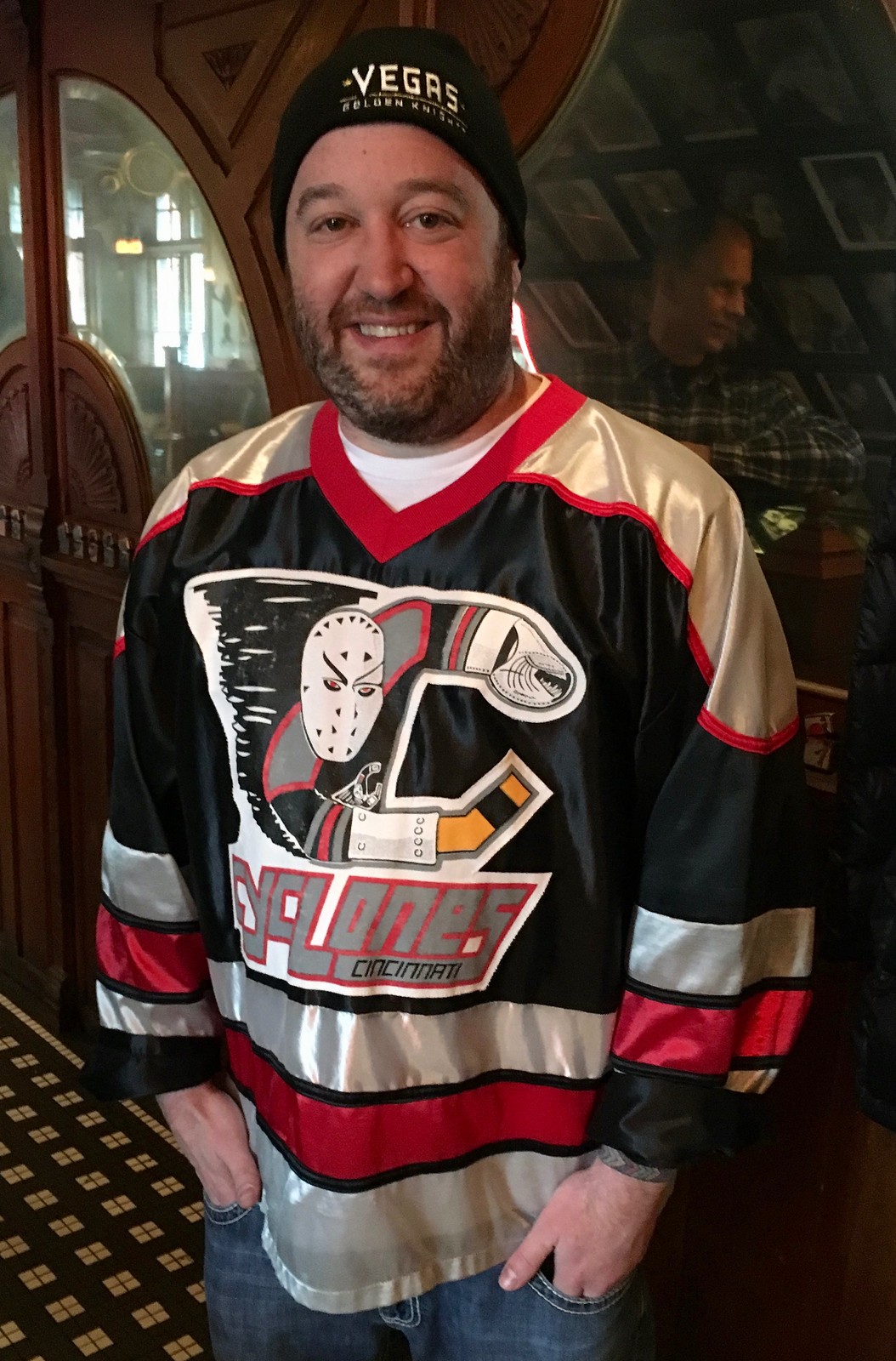
Adam also wore a very cool Cincinnati Cyclones jersey (with an infinite regression!):
• Longtime reader Frank Bitzer has been bugging me to visit Cincinnati for many years now (and in a bizarre Uni Watch connection, he also dated Collector’s Corner columnist Brinke Guthrie’s sister when they were all in high school). He showed up with his sons, Griffin and Quinn, and Griffin’s girlfriend, Maddy Kunkel:
• Gary Moore wore a beautiful game-worn 1974 White Sox road jersey (over a Uni Watch T-shirt!), along with an Everett Aquasox cap:
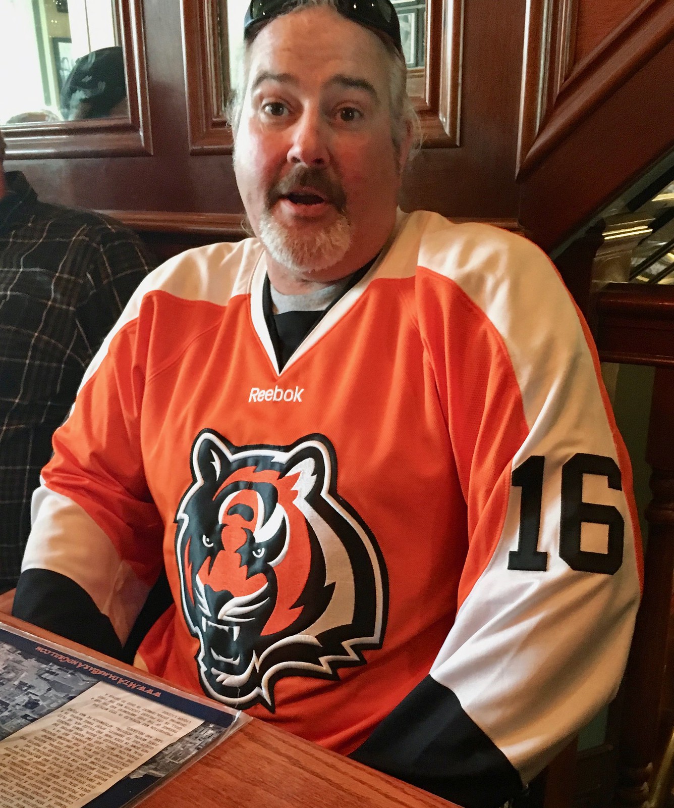
• Chris Cole wore something you won’t often see — a Bengals hockey jersey (actually a blank Flyers jersey with a Bengals crest that he got his mom to sew onto the front):
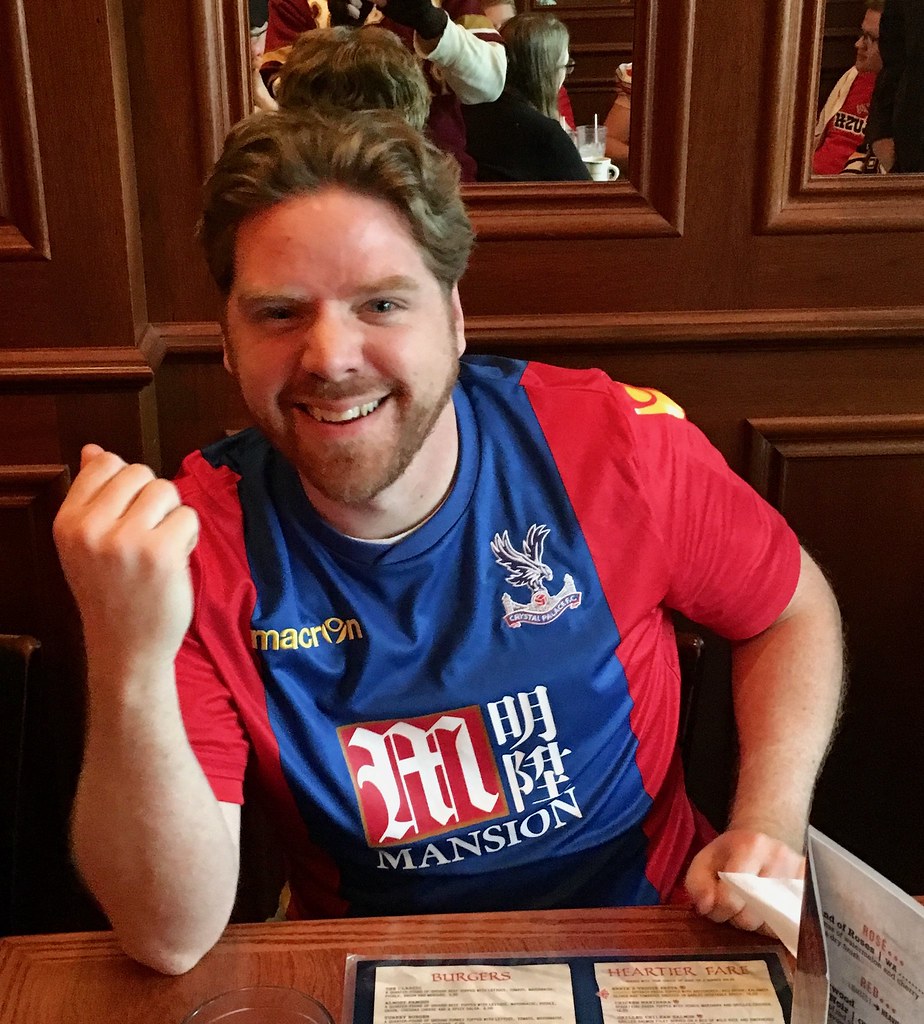
• I confess that I don’t know what jersey Jared Pike was wearing, but it was a looker (plus he gave me a very nice Purdue cap — thanks, Jared!). Update: Our own Jamie Rathjen informs me that it’s a 2016-17 Crystal Palace design:
• Here’s Alex again, this time with K.C. Kless (in the Cavs jersey) and Ryan Garry (in the Reds cap):
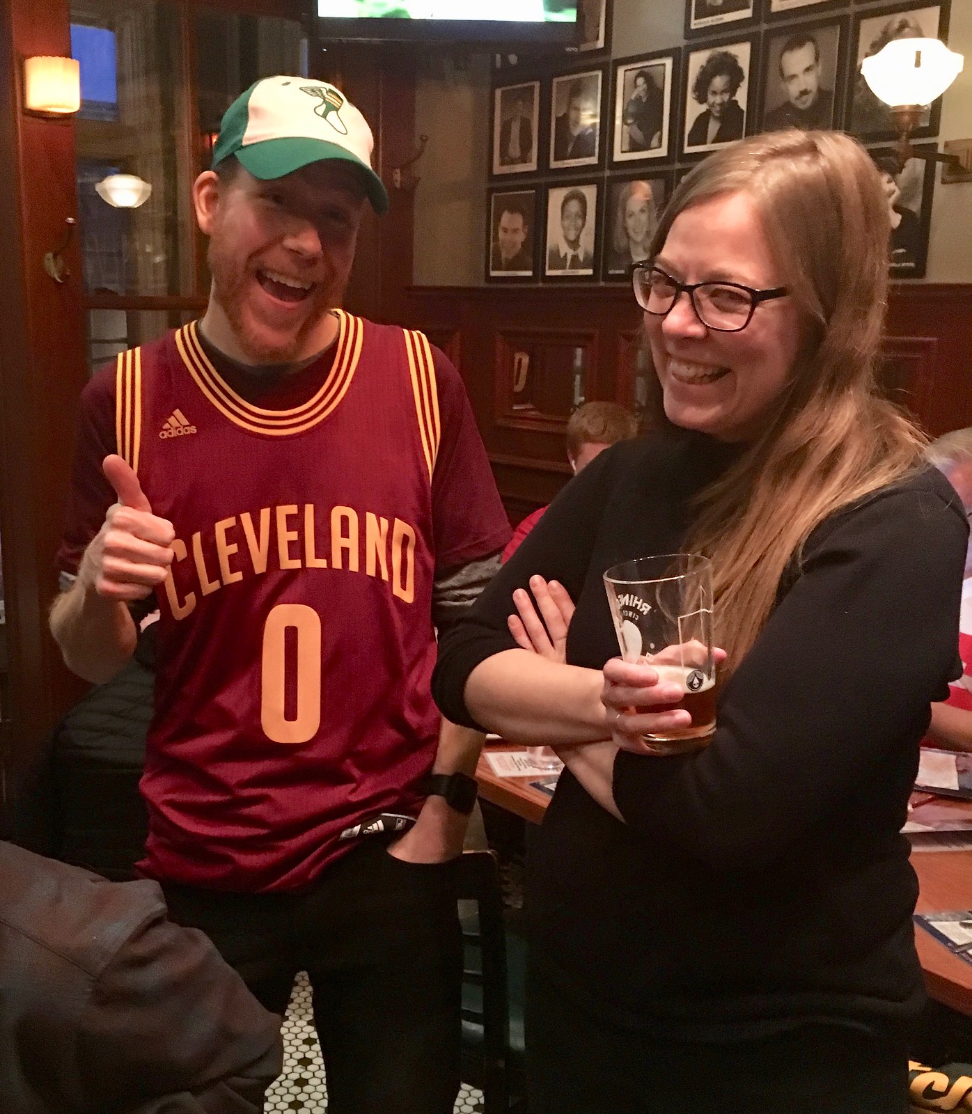
• And here’s K.C. again, this time with the Tugboat Captain, who enjoyed her first out-of-town Uni Watch party:
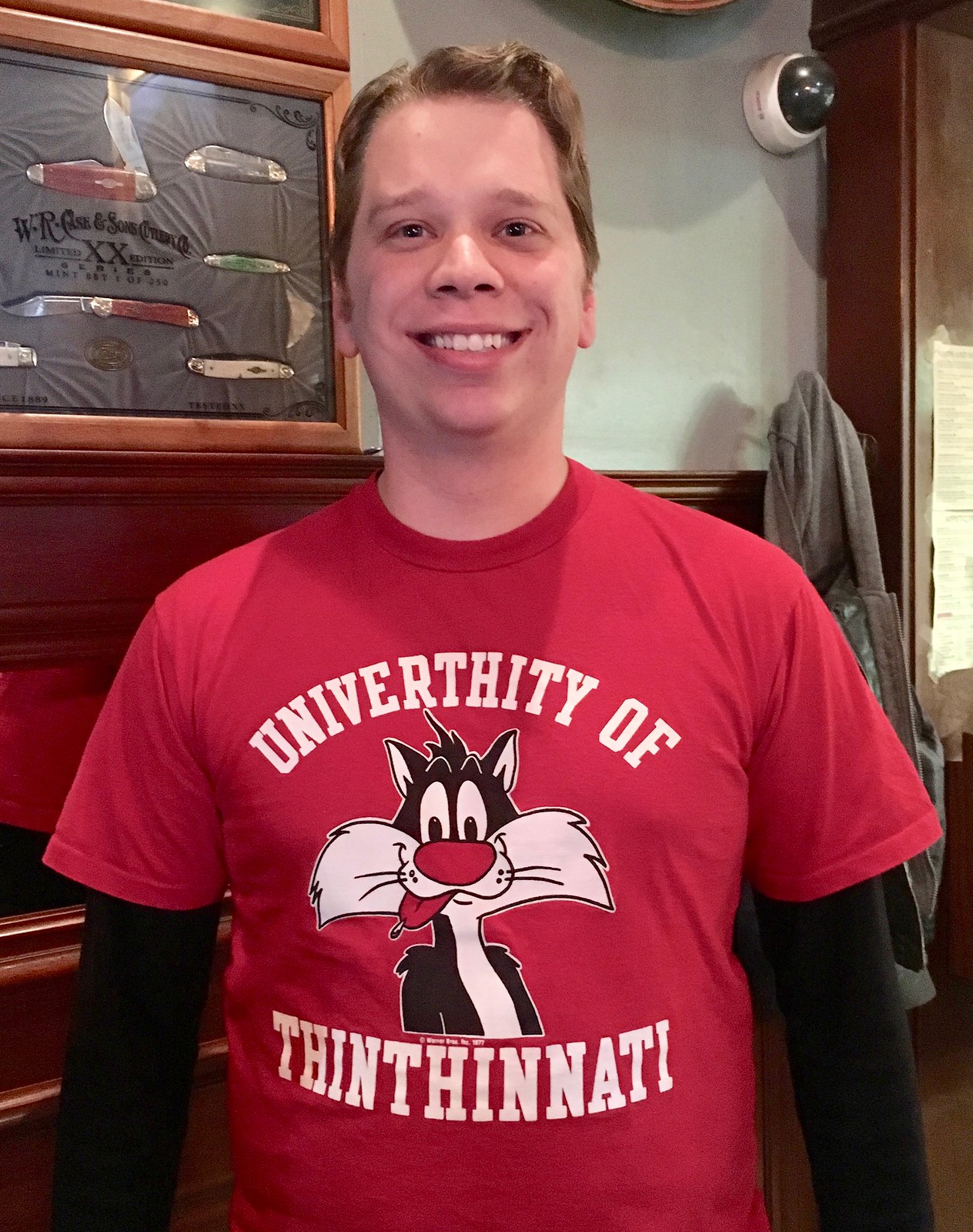
• I got a kick out of Will Hughes and his T-shirt:
There were lots of other people who I didn’t get photos of, including Jason and Allson Hillyer (who drove down from Columbus); David and Jillian Sonny and their birthday boy, Dylan (who turned four yesterday); Tristan and Rob White; Graham Gray; Kia Cummins; Chris Cole; and probably a few others I’m forgetting. You can see more photos over on the Uni Watch Facebook page.
Another Cincy guy who I really wanted to meet was C. Trent Rosecrans, who was contributing Ticker items way back in the Page 2 days, before this blog existed. He later went on to become the Reds beat reporter for The Cincinnati Enquirer and now has that same job for The Athletic. He couldn’t make it to the party but we met up with him later on in the evening. Smart guy, thoughtful guy, charming guy. And he wore a Tokyo Kyojin cap, too:
Major, major thanks to all these folks for making me feel so welcome in their town. I’ll be flying home today and will have more to say about my Cincinnati visit soon.
(Doubleplusthanks to Frank Bitzer and David Sonny for going above and beyond in various ways yesterday. Greatly appreciated.)
For all photos in this section, click to enlarge
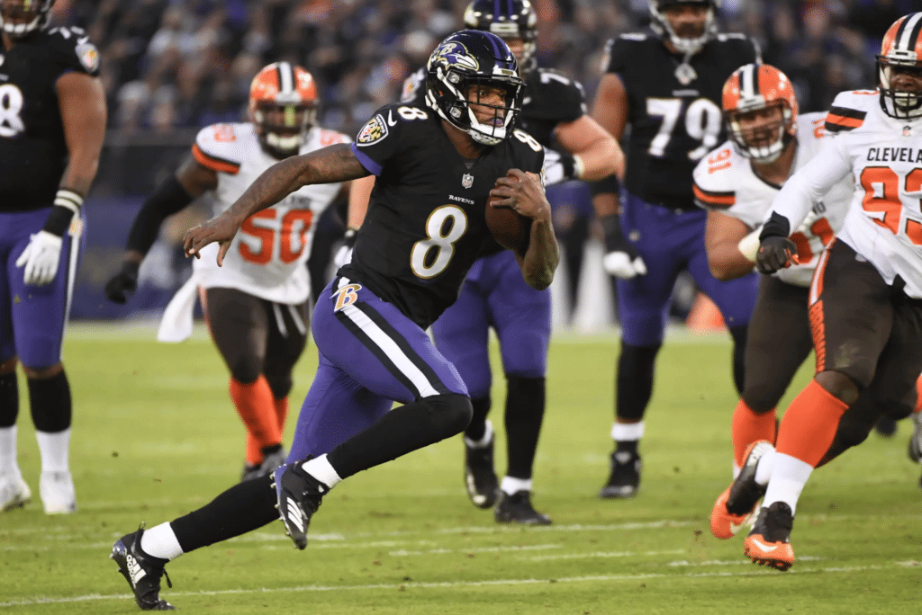
Monday Morning Uni Watch: Over the years, we’ve seen the Ravens wear their black alternate jersey with black pants and with white pants, but I’m pretty sure yesterday was the first time they paired the black top with purple pants. Lots of additional photos here.
In other news from around the league yesterday:
• All season long, people have been asking me if the ’Skins have officially retired their yellow pants or just opted not to wear them. I’ve said all along that their official wardrobe has not changed, and they demonstrated that yesterday by finally breaking out the gold britches for the first time this season:
Update: Reader/commenter Rich Loup has some interesting analysis on why Washington may have worn those pants yesterday:
Regarding Washington’s mustard pants, they’ve long been a favorite of team president Bruce Allen (son of late ’Skins coach George Allen), who just survived a power struggle in the front office [WaPo link]. Washington hired Brian Lafemina from the NFL office in March to run Washington’s business ops, and there was some thought in Washington that Allen would be on his way out.
The ’Skins wore burgundy jerseys and white pants all season at home instead of the mustard pants they wore in previous seasons. But Lafemina and three of his staffers were fired the day after Christmas, and perhaps not coincidentally, the ’Skins show up in mustard pants Sunday. I don’t think that’s a coincidence.
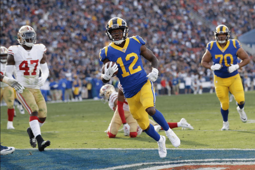
• The Rams wore their throwbacks:
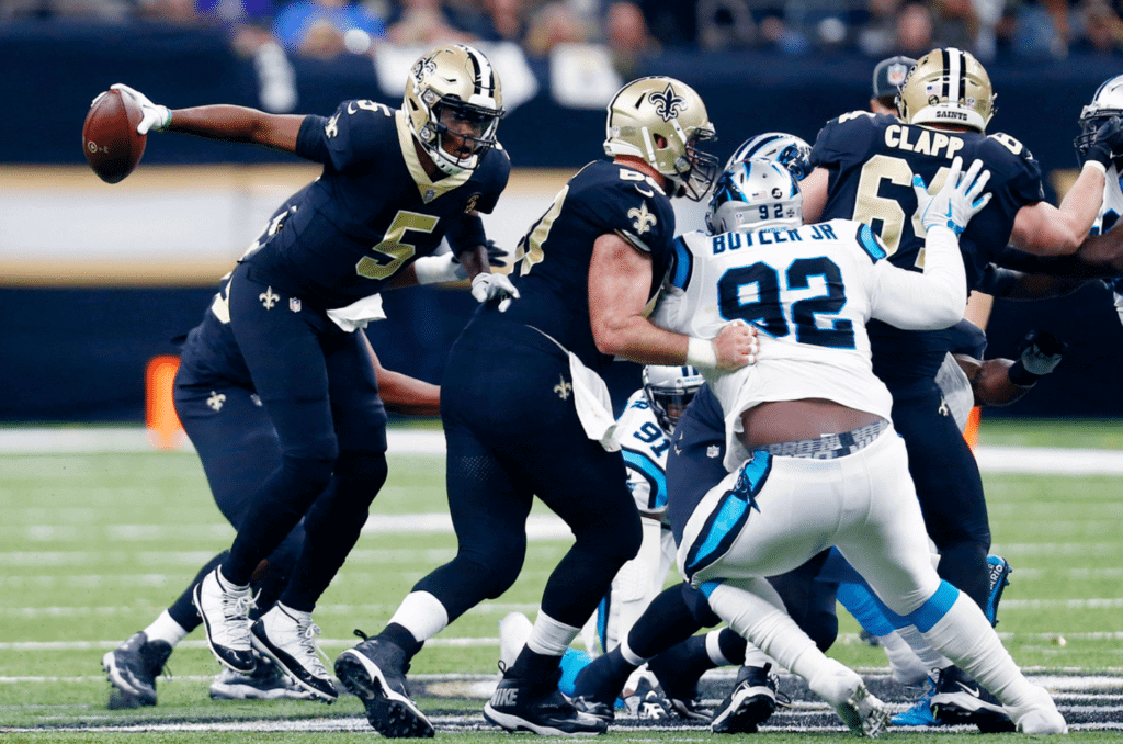
• The Saints once again went mono-black. It’s disappointing to think they could go with this look all the way through the Super Bowl:
• The Bills went mono-blue:
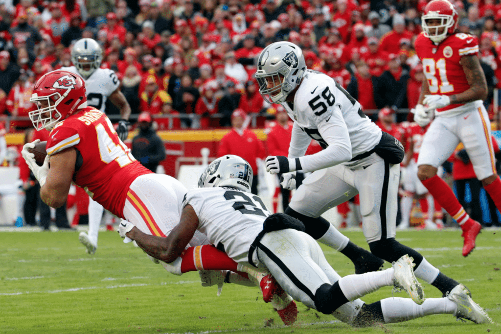
• Let’s thank the Chiefs and Raiders for providing such an eye-pleasing game:
And that’s a wrap for the 2018 regular season. Next up: Wild Card weekend.
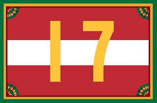
Membership update: If you made a New Year’s resolution back in January to finally get a Uni Watch membership card already, today is the last day for you to make good on that promise. Or maybe you want to a get a jump on your 2019 resolution. Or maybe you don’t care about resolutions but you just want to help support Uni Watch (like Jay Jones, whose new card, shown at right, is based on the 1973 Atlanta Apollos). You can do any or all of those things by signing up here.
Remember, a Uni Watch membership card entitles you to a 15% discount on any of the merchandise in our Teespring shop. (If you’re an existing member and would like to have the discount code, email me.) As always, you can sign up for your own custom-designed card here, you can see all the cards we’ve designed so far here, and you can see how we produce the cards here.
The Ticker
By Jamie Rathjen
College Football News: Virginia backup kicker A.J. Mejia wore No. 28 for the Belk Bowl, instead of his usual No. 95, to honor a high school teammate who passed away recently. Mejia didn’t appear in the game, but he’s in the lower left corner of this picture. … Pitt added No. 79 memorial patches for OG Bill Fralic for the Sun Bowl (from @CoachsWifeASU and Mark Lancia). … Kentucky’s helmets for the Citrus Bowl will be chrome (from Josh Hinton).

Hockey News: Canada wore black at the world juniors against the Czech Republic, something they seem to do at least once in every tournament (from Wade Heidt). … The ECHL’s Reading Royals wore Flyers-themed uniforms Saturday, including one shoulder patch of the AHL Lehigh Valley Phantoms’ logo (from @RealJesseLee). … Reader Kevin Vautour sent us this team picture of the 1946-47 Bruins, and had quite a lot to tell us about it; the player wearing No. 18 is actually winger Eddie Barry.

Basketball News: Stephen F. Austin wore memorial ribbons yesterday for former school president Baker Pattillo (from Chris Mycoskie).

Soccer News: There were two blue-vs.-blue matchups in Scotland, between the Premiership’s Dundee (darker) and St. Johnstone (lighter) and the Championship’s Ross County (darker) and Inverness CT (lighter). … Mildly interesting color-related stat: as both of Arsenal’s clash shirts this season are different shades of blue, that means they’ve gone two consecutive seasons without wearing yellow for the first time since 1965-66 and 1966-67. … Australian women’s team Perth Glory gave a full debut this week to 17-year-old midfielder Jacynta Galabadaarachchi, who wears her entire 17-letter NOB.

Grab Bag: NLL items from Wade Heidt, reprinted from yesterday’s comments: The Rochester Knighthawks are celebrating their 25th season and introduced black uniforms, which they’ve apparently worn in the past. Their opponents, the expansion Philadelphia Wings, wore their white uniforms for the first time. New England and Saskatchewan also went color-vs.-color. … English rugby union team Harlequins hosted their annual year-end Premiership game at Twickenham Stadium called the Big Game yesterday. They always wear a special kit, which is usually black (and this year, also reflective), and forced opponents Wasps to change as well.
And that’s another year in the books. Thanks for coming along for the ride. See you in 2019. Peace. — Paul
Jared’s wearing a 2016-17 Crystal Palace shirt.
Thanks. Text now adjusted!
Yeah, I think the words “Crystal Palace FC” on the crest are a dead giveaway. :-)
Always loved the 16-17 Palace kits … incedentally, they happened to best Liverpool, Arsenal, and Chelsea that season. Coincidence? I think not!
Regarding Washington’s mustard pants, they’ve long been a favorite of team president Bruce Allen (son of late Redskins coach George Allen), who just survived a power struggle in the front office (link). Washington hired Brian Lafemina from the NFL office in March to run Washington’s business ops, and there was some thought in Washington that Allen would be on his way out.
The ‘Skins wore burgundy jerseys and white pants all season at home instead of the mustard pants they wore in previous seasons. But Lafemina and three of his staffers were fired the day after Christmas, and perhaps not coincidentally, the ‘Skins show up in mustard pants Sunday. I don’t think that’s a coincidence.
I do like old school striped socks on football uniforms as the Redskins wore yesterday (like the Bears, Dolphins throwbacks, etc.).
I don’t mind this look for the Redskins. However, I do prefer the Redskins with the burgundy over white rather than over yellow. It just appeals to me more. It may have to do with the sleeve striping matching the pant striping better with the white pants. It may have to do with my earliest NFL memories being during the back-to-back NFC titles with Joe Theismann quarterbacking. That was the design then.
I’m an old guy, so *my* early memories are of Larry Brown, Jurgensen, etc. So I prefer the gold pants.
“Frank Bitzer … also dated Collector’s Corner columnist Brinke Guthrie’s sister when they were all in high school.”
My mother loves to use the phrase, “It’s a small world,” and as much as her over usage of that phrase gets to me I do love little moments like this that prove that adage to be true.
He “dated” her. I bet he “dated” the hell out of her, wink wink.
Hey now!!!! Erin was a sweet girl and is, 37 years later, still a good friend!
Are any of you guys trying to go to the Reds game June 30th, when they’re wearing the red pants? I’m thinking about making the trip.
I haven’t purchased tickets yet, but I’ve had that game circled on the schedule since the unis were unveiled.
Looks like a good time in Cincinnati. I’ve always been a fan of that Bengals head logo (as well as the full body logo as a secondary). How is it received among Bengals fans? I wish they used it on their helmet instead of the tiger stripes.
Also that faux Pilots logo would be a pretty great secondary logo for the Angels.
Hi Greg,
I’m a die-hard, lifelong Bengals fan, and I love the Bengal head logo. In my opinion, the old logo (the current primary logo is now the striped “B”) along with the old field design (seen here: link) is much preferable to the striped B that we currently have. I have an old Reebok hat with the head logo and I love it!
The leaping tiger on a solid black helmet with an orange center stripe has long been a dream of mine.
At first glance, I thought that was a Medicene Hat Tigers hockey sweater.
A similar idea to old late 70s or early 80s when the Tigers had the orange jersey with tiger head crest for a brief period.
The current, longstanding Medicine Hats Tigers uniforms are an iconic look as far as WHL uniforms go.
So good in black:
link
Or in white:
link
*Medicine Hat*
-Looks like fun at the party in Cincinnati. You were a really well-dressed group.
-Ravens in black over purple. Seems strange looking at first, but I like it. Better than the mono-black with ballerina black pants/socks look. For sure better than the Ravens wearing the mustard pants again.
I agree on both accounts.
Was there ever any explanation for why the Reds had the front number on the wearer’s right side in the late 1990s? It just looks “wrong”, in that most teams with lettering put it on the wearer’s left, if there is one there at all. teams with monograms put the number on the wearer’s right.
It’s consistent with the home uniforms of that time. Those were white pinstriped vests with a left breast logo, so the numbers were on the right. But yes, I’ll admit it looks weird to have numbers on the right under scripts.
Ravens black over purple: Not a bad look. Might be even better if pants stripes were black-gold-black or gold-white-gold.
Washington looks so much better in burgundy-over-yellow than burgundy-over-white it’s almost a tragedy that they stayed away from it this year.
And it would be a tragedy if New Orleans goes mono-black through the postseason.
Yesterday may also have been the last time we see the New York Football Jets in an actual football uniform instead of whatever clown costume Nike has come up with to outfit them for the next five years at least. Although I was thinking about it over the weekend and I did find one reason to hold out hope that it won’t be a complete train wreck, as there’s a fair possibility they might stick with plain block numerals to match the link link on link link, which would be a very Nike thing to do.
Yeah this has the potential to be really bad, I’m quite frankly scared of what they will come up with. I’m not a Jets fan but I always loved their current logo and uniforms. I always assumed that it would be their forever uniform, like the Raiders, Chiefs, Packers, etc. I’m just hoping for some kind of happy marriage of the current design and the 80’s design, but realistically that aint happening. We’ll see…
Everyone seems to want “the ’80s design” (which is actually a very link) but that design is even plainer than (and IMHO, inferior to) the current and 1965-77 version and the franchise had very little success in it (3 playoff wins in 20 seasons, counting the black-trimmed 1990-97 variant which saw zero playoff wins and the Kotite nadir). But for the stupid one-shell rule they could wear it as a throwback; accordingly I’m hoping they keep the white helmet so they can wear the 1965-77 version as a throwback.
I can’t see the Jets reverting to the 1977-89 (or ’90-97) design if for no other reason than it would be counterintuitive. One of the promo videos on the Jets website has a Nike person talking about “a new look for the Jets”; a reversion to an old look would obviously not be that.
I could live with adding silver or grey (or both) to the color scheme (and the concomitant ’70s-’80s Eagles comparisons) to represent the color of military jets, and tweaking the shoulder/sleeve treatment (designed in 1963 for longer sleeves) a bit. What I’ll be dreading until April is a clown costume along the Bucs-Titans-Seahawks lines.
As I’ve said repeatedly, the Jets need to be mindful of the fact that they are a New York team, every one of which right now is wearing either a its original uniform or the one it wore in 1965. That’s not an accident. We all know link when a New York team adopts a “new look” for the sake of a “new look”.
I agree; it should have been.
While keeping the Namath-era look would have been good, the bastardized current set is no good. The color is all wrong and that jersey just doesn’t work as a tank top.
Best thing they could do is to return to a vibrant shade of green. Worst thing they could do is an overwrought twee logo and wacky curlicues a la the Falcons.
Lots of lime green graphics being used on the Jets website. A lot of double green. Worse case scenario if they go clown suit is that the team colours may be double green.
I may be jumping to worse case scenario conclusions but this may be a hint if the worst is to come.
I think the current set would be fine if they could correct the green, reverse the shoulder inserts (i.e., green-white-green on the green jerseys and vice-versa), and make the TV numerals a bit bigger, moving the Nike swoosh below them or somewhere else. Ironically, Nike did a better job with the shoulders than Reebok ever did, but the 1998 Starter version is still the best. I’ll definitely miss this uniform, and again hope they keep it as a throwback.
Paul comes to Cincinnati and the city is blessed with a long awaited coaching change. There is no coincidence here. THANKS!
I was just thinking the same thing. Paul, did you confer with Mike Brown any? ;)
Who Dey!
I am bummed I couldn’t make the Cincinnati gathering! Family all came down with some bugs. Kept me in isolation.
No photo of the Purdue hat?
Extra bonus: looks like that Cyclones jersey is one of the Hi Li Ice Sheen versions, which is worth noting as a really unusual hockey jersey material.
I love those jerseys. The only one I have however, Binghamton Whalers, is like size XXL and I just can’t wear it, way too big.
I had the Cyclones and Vipers which was a teal/burgundy disaster.
Because that material has no stretch, they had to cut them really boxy so as not to restrict player movement. One of the many awesome features of these weird jerseys.
You are absolutely correct wafflebored. It is an authentic HiLi icesheen. You know your stuff!
For Reds fans. My wife comes home from a neighborhood walk yesterday. Santa Rosa Ca. Says “You’ll never guess who just gave me a ride home”. Gilian the basset and I didn’t guess. “David Bell”. Name didn’t resonate with either Gilian or me. We were regripping a tennis racket. A few minutes later. Bingo. He and his wife live around the corner. My wife can awesomely now say she’s given a ride to Ivan Lendl in our VW Rabbit and received a ride from Gus Bell’s grandson.
I’m curious as to how this came about?
Sylvester shirt was Will Hughes
Pleasure meeting everyone yesterday! Patrick and I were talking about the amazing little niche you’ve created Paul!
Sorry for not recalling your name, Will. Now included (and great meeting you!).
Great meeting you too Will (and everyone else)! Paul, Mary is a gem. Safe travels back to NYC.
Love your shirt, Will!
It was a brief mention but I was wondering when the Saints black uni-tard look would be brought up. With the NFC the designated home team this year, they will get to choose their uniform should they reach the big game… And they have a good chance at making us suffer through that look.
Interesting how many people are dead-set against the all black Saints look. I know this is the unpopular opinion but I love the mono-Black look—not many teams can pull it off but personally I think they do.
As a lifelong Saints fan I think it’s a terrible look.
Leave the all black look for Tad Gormley or Pan Am Stadium.
Saints should wear gold pants at all times (I like the all white Color Rush unis, but the white britches make me think of the coke-fueled early 80’s teams). Frankly, we should wear white over gold throughout the playoffs. Why mess with the look that got us the Lomabrdi?
– Ravens wore black alternate jersey at home for third time this year (they did the same three times last year too – I thought the rule was maximum two times per season???).
– The Ravens alternate black jersey was worn against their AFC North divisional foes in games played in Baltimore this season, but the team wore different color pants for each opponent/game (black jersey on white pants for pissburgh, black on black for Cinci, and black on purple yesterday against cleveland).
I know this is a few days old, but the Ravens website was listing them as wearing purple jerseys before the game. I think they may be getting a fine from the NFL.
The Saints have let the fans vote for what pants they wear for each game this season except the opener and the Color Rush game.
Despite my best efforts the fans always vote black instead of gold.
I was not aware of that. Does the voting take place on Twitter? Elsewhere?
They do the polls on their Instagram stories. I’ll try to take a screenshot if they put one up next week.
It was a pleasure meeting everyone — Paul included — at the party yesterday! Thanks to everyone for coming out!
Happy New Year, Paul! Thanks for the great content on the site everyday!
IMHO the Saints uniforms are the best in the NFL when wearing gold pants, and one of the worst when wearing black pants, especially with black jerseys. Teams with gold, yellow, or silver helmets should stick with pants that match the helmets.
Yes, but then they run into Nike’s problem of doing a poor job with coming up with old gold/metallic gold on their uniforms. Not to mention the fact that they can’t match the color across the helmet, jersey, and pants.
I’d like to see the Saints go throwback; it seems that jersey’s Gold letters matched the helmet a bit better.
The Jets are as far a NY team as you can get. They don’t have anything to do with NY other than the name (don’t say that Cortland counts…it doesn’t)
The practice in NJ, their HQ is in NJ.
NJSE leases the land to them…NJ tax payers are on the hook for that Stadium…they play in NJ…so explain to me how it’s NY’s team?
When the Nets ans Devils where there, they were NJ’s teams…I get a ticket in the Meadowlands / East Rutherford…it’s my problem in NJ…not NY.
They need to simply drop NY and just be “The Jets”
Couldn’t much of this be said about the Giants? They practice in NJ. Their HQ is in NJ. The taxpayers of NJ are on the hook for them as well. They play in NJ. They also left New York first.
Wanted to see Peter’s response to this.
It’s the same thing.
The Giants we not being discussed though earlier as a “New York” team specifically.
The topic was on the Jets.
If you want to depth on how stupid the lease is and how in time one of the teams in time (likely the Jets) could and would opt out in 25 years (given the avg. life of stadiums this generation)…then somehow get suckers on the hook for yet another stadium and PSL’s…then maybe, they could be a NY team again.
Looking at that Reading Royals jersey just makes me think about how much I miss the Flyers’ 2nd generation (1982-2007) uniforms.
I know Paul doesn’t like purple, but the Ravens purple pants look awesome with their white jerseys, pretty good with black jerseys but bad with purple jerseys. The key is the black upper socks (no leotard effect).
I would vote for Ravens white jersey and purple pants as new best road uniform in the NFL. Honorable mention goes to Steelers, Chiefs (red pants, not white), Eagles (green pants, not white)and Bears (blue pants, not white).