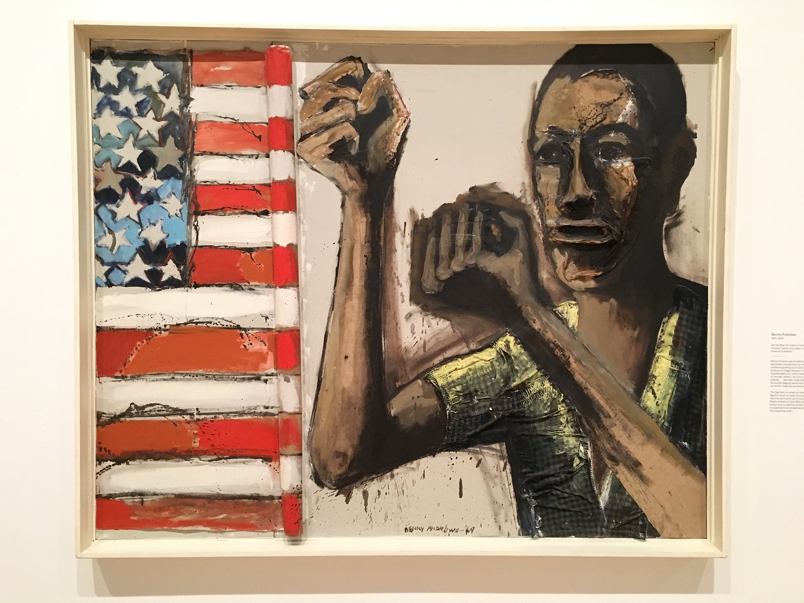
You probably know about the gonzo trumpet-themed uniforms that the Blues were going to wear until GM/coach Mike Keenan supposedly nixed them (although that story may be apocryphal). You might also be familiar with the original prototype jerseys that were worn by Blues execs Lynn Patrick and Sid Salomon III when the team’s NHL franchise was awarded in 1965 (here’s a color shot of the white jersey).
But it turns out that there’s another prototype Blues design floating around out there — one that I hadn’t known about until the Twitter account @STLBlueshistory recently posted something about it.
Let’s start with this: On Nov. 27, 1983, The St. Louis Post-Dispatch published an item about Blues then-owner Harry Ornest and his wife, Ruth:
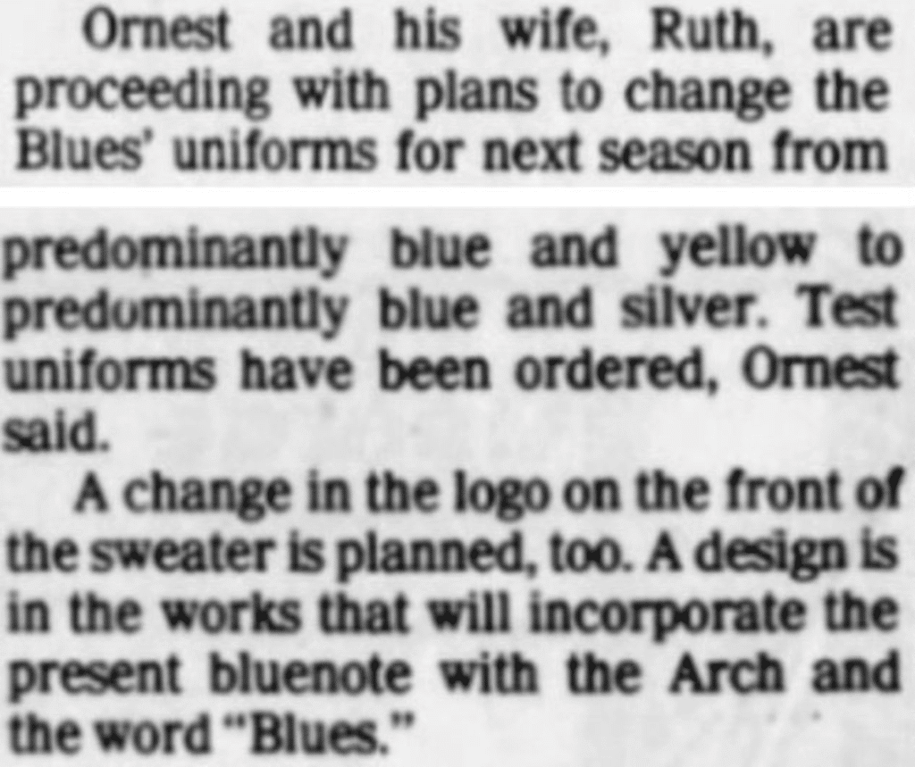
Okay — a blue/silver color scheme with a design that includes the blue note and the Gateway Arch. What might that look like?
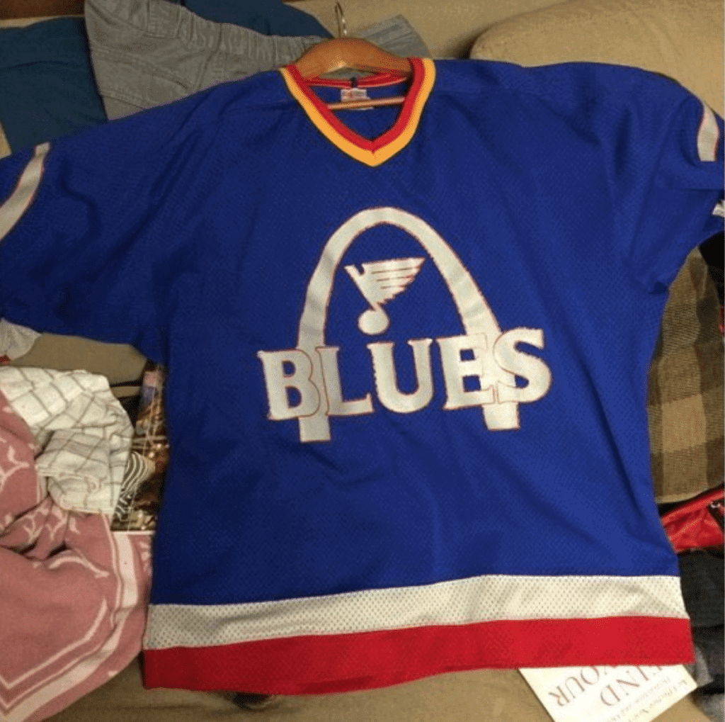
This:
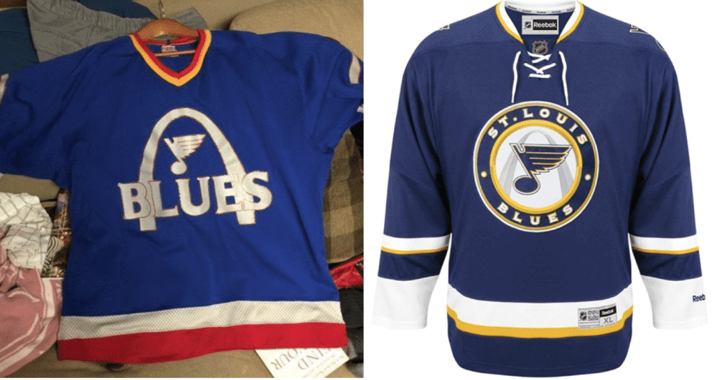
I suppose you could say that the design is vaguely similar to the one that the Blues eventually launched as an alternate uniform in 2008, although I suspect that’s more of a coincidence than a direct lineage:
The 1983 prototype was made by Liebe, the venerable St. Louis-based outfitter that still does lettering for many pro sports jerseys. And they still have the original sketch for the jersey stencil (click to enlarge):

According to @STLBlueshistory, the jersey never made it onto the ice because the silver color caused production problems. After that, Liebe stopped working with the Ornests.
I’d never seen or heard about any of this. Was I just asleep at the switch, or is this a genuine surprise to you serious hockey people out there? Either way, interesting stuff!
(My thanks to @mrmichael21 for bringing @STLBlueshistory’s tweet to my attention.)
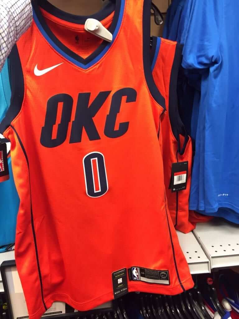
NBA and Nike give everyone a new round of leaks for Christmas The Thunder’s new “Earned” jersey (aka the Participation Trophy jersey) leaked yesterday, the first of what will presumably be a flood of similar leaks. According to this Thunder blog, the plan was for the team to debut this uniform on Christmas Day, but the opposing team — the Rockets — will be wearing red that day, so instead the OKC uni will debut on Dec. 30.
Click to enlarge
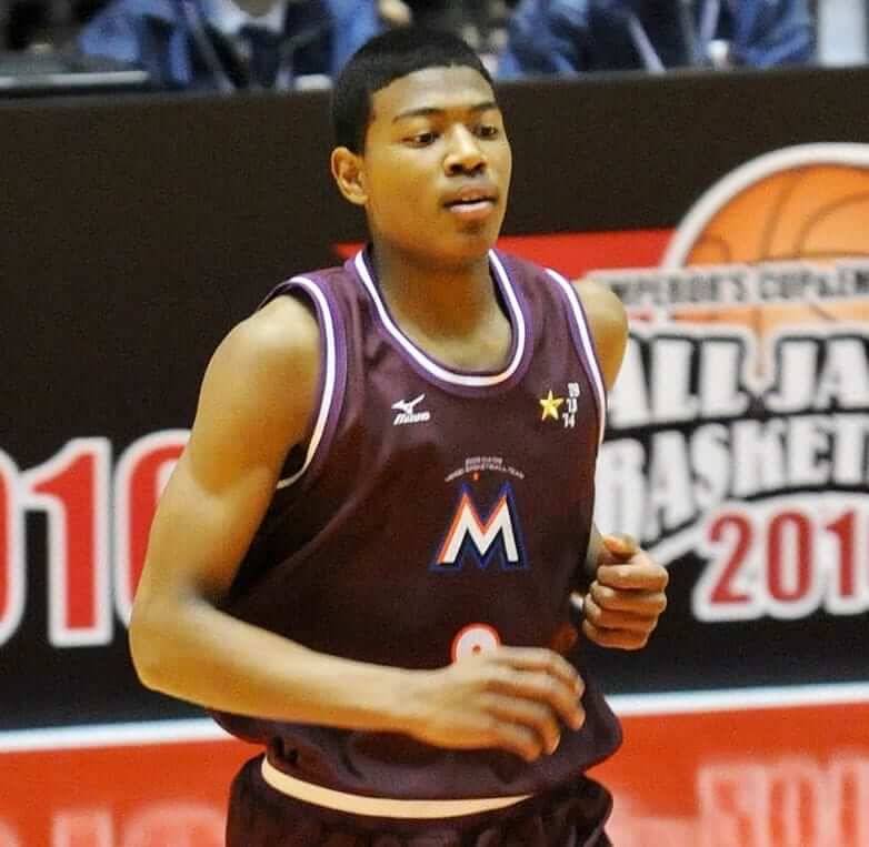
That’s a long way from Miami: As you may be aware, Gonzaga forward Rui Hachimura grew up in Japan, where he attended Meisei High School. His Wikipedia page has a photo of him in his Meisei uniform, which inexplicably features a variation on the Miami Marlins’ now-mothballed logo (the colors are slightly different).
What an odd logo choice! I did some quick photo research and found the white uniform version (click to enlarge):
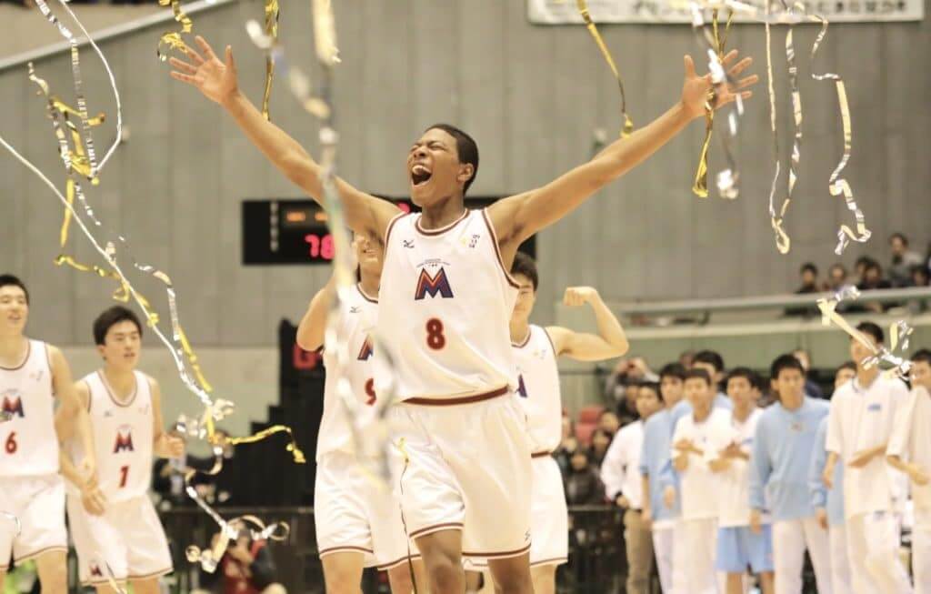
Even weirder, I couldn’t find any evidence of the school’s baseball team wearing the Marlins-style logo. Instead, I found this:

Very strange!
(Big thanks to Gabriel Luis Manga for this one.)
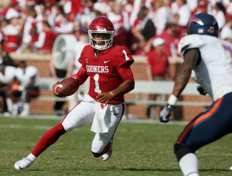
The one (1) and only: Oklahoma quarterback Kyler Murray was named the AP’s College Player of the Year yesterday. According to Tulsa World beat writer Eric Bailey, if Murray follows that up by winning the Heisman Trophy on Saturday, he would be the first Heisman winner ever to wear No. 1.
Last year’s AP winner was also an Oklahoma quarterback: Baker Mayfield. He went on to win the Heisman, becoming the first Heisman honoree to wear No. 6 (which doesn’t have quite the same ring as being the first No. 1, eh?). When’s the last time two consecutive Heisman winners wore numbers that had never been Heisman-honored before?
(My thanks to Devon Kuckenbecker for bringing Bailey’s tweet to my attention.)
Click to enlarge
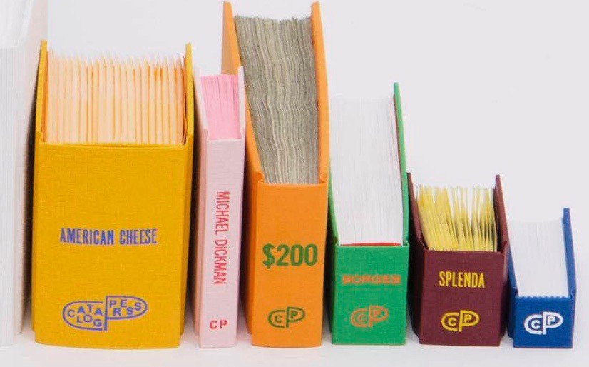
Making book(s): Yesterday I wrote about the new Andy Warhol exhibit at the Whitney, which I attended last Sunday. In the gift shop, I was particularly amused by one of the items available for sale: a “book” of 192 $1 bills bound in a hardcover case — a riff on Warhol’s 192 One Dollar Bills painting. At the gift shop, the bound bills were priced at $384 (i.e., double their face value), and produced in a numbered edition of 192 “copies” (they’re not truly copies because they’re real bills and therefore have unique serial numbers). It’s all very clever, very pleasing, and very Warholian.
I noticed that the book was published by an operation called Catalog Press, which I’d never heard of before. Great name, though — I love catalogs! Fun logo, too. So when I got home I looked up their website.
It turns out that Catalog Press is the personal imprint of a 26-year-old artist/designer named Ben Denzer, who’s been creating all sorts of interesting things since he was a little boy growing up in Kansas City. For Catalog Press, he’s made a series of very clever limited-edition “books.” Some of them, like the book of dollar bills, consist of small, ordinary objects bound together into a book cover: 30 napkins from the Plaza Hotel, 20 packets of Splenda, 200 fortune cookie fortunes (that’s my favorite), 20 slices of American cheese (here’s a good article about how a copy of that book was acquired by the University of Michigan library), and 15 paperback books (very meta). Others are more traditional printed books but are unconventional in other ways, like a flip book of photos of a flip book of photos of a flip book of photos of a flip book (meta again, and quite brilliant) and a short essay printed with one word per page with each word in a different typeface. Very good stuff!
Catalog Press is just one of Denzer’s creative projects (you can see some of the others here). He seems like someone worth knowing, so I shot him a note. Heard back almost immediately — turns out he now lives in NYC, so we’re going to get together for a beer after the holidays. Can’t wait!
News flash: People like cheap stuff that sounds cheap: In the week leading up to Cyber Monday, we reduced the price of our flex-fit Uni Watch Alternate Cap from $24.99 to $19.99. It worked — we sold a bunch of caps. Huzzah!
After Cyber Monday, we restored the price to $24.99. Sales pretty much went dead. Boo!
So then we offered free shipping, which was almost the same thing as bringing the price back to $19.99. Sales remained v-e-r-y slow. Double-boo!
Conclusion: People respond more to a low price point than to free shipping. So we’re gonna go back to that. As of today, the price is back down to $19.99. But you do have to pay for shipping. It’s more or less the same thing as $24.99 and free shipping, but it feels better to see that $19.99 price point, right? Or something like that. (And no, we can’t do the lower price and free shipping. Sorry.)
Incidentally, we’re now down to only about 20 of the L/XL caps. So if you want one, move fast. Order yours here.
Meanwhile: All of our fine Uni Watch products, including a few that you may have forgotten about, are listed on this one handy page.
The Ticker
By Yianni Varonis

Baseball News: The Athletic has ranked every MLB uniform from worst to first. Here is part one, and here is part two (both paywalled). … The Double-A Mobile BayBears, who will be moving to Madison, Ala., unveiled a farewell logo.

Football News: The Browns donated a large sum of money to help a local school district provide uniforms to students who chronically miss class because they lack the appropriate attire. … Notre Dame will unveil its College Football Playoff uniform today. … Update: They’ve now unveiled it. … The College Football Hall of Fame has a display honoring the service academies with mannequins half-dressed in military formals, half-dressed in football uniforms (from James Gilbert). … Each week this season South Carolina released a video unveiling the uniform the team would be wearing. This article compiled each video and ranks them. … We already have the AAF and the XFL in the works, and now yet another new football league, called the FFL, plans to launch.

Hockey News: Blue Jackets HC John Tortorella looked like he was on an NFL sideline last night, coaching his team’s game in a hoodie (from Alan Kreit). … Wisconsin has unveiled a new third jersey (from local reporter Todd Milewski and Garrett Van Auken). … The Atlanta Gladiators of the ECHL will pay tribute to the city’s professional hockey history with a new alternate uniform. … The Kings wore Lakers-themed warmup jerseys last night. … Here’s a review of the new book about the Islanders’ fisherman logo. That book was also featured in Paul’s recent holiday gift guide.

NBA News: The latest NBA2K 2019 patch will automatically add new uniforms and shoes and improve players’ likenesses, including more authentic faces as well as updates to their hair and tattoos.

College Hoops News: The logo for the 2020 Final Four in Atlanta was unveiled. … A few years ago, Paul wrote about the trend of some college basketball players rolling their waistbands. Catering to that trend, an apparel company created basketball shorts with waistbands meant to be rolled. … Both Iowa/Iowa State basketball games were color (or non-white)-vs.-color, as Iowa wore black at home for the women’s game and grey at home for the men’s game (from our own Jamie Rathjen). … This video tribute to Utah’s 1944 national championship team features actors dressed in era-appropriate uniforms (from @B_handy). … Fairfield wore throwbacks last night (from Mark Nemec).

Soccer News: Barcelona’s new home kit featuring an anomalous checkerboard pattern may have leaked, and fan response has been mixed. … The United Soccer League’s newest expansion team, Hartford Athletic, unveiled its crest yesterday (from multiple readers). … It was announced that North Texas Soccer Club would be the team name of FC Dallas’ USL League One affiliate (from Josh Hinton). … This article discusses gambling advertising during soccer matches, including the fact that 60 percent of teams in England’s top two tiers have gambling company shirt sponsors. Could that be changing? (From Kevin Fox.) … THere’s a rumor that the Seattle Sounders may have a pink and black away kit in the works (from Markus Kamp).

Grab Bag: Here’s an in-depth and thoughtful opinion on why the Amtrak station in Philadelphia shouldn’t replace its mod flipboard sign with a digital version (from William Yurasko). … Here is a look at what high-end collectors wore at this year’s Fall Art and Design Fair in New York (NYT link). … Luxury brand Balmain has modernized its logo for the first time in nearly 70 years. … The Google logo went dark on Wednesday in honor of President George H.W. Bush. … The U.S. Army Futures Command, which was created this year with the aim of modernizing the Army, has a new shoulder patch. This article does a nice job of detailing the design elements. … Teachers at an Pennsylvania middle school unearthed a box containing an authentic World War I uniform that had been tucked away behind the auditorium. … The Colorado Mammoth, of the National Lacrosse League, introduced their “Lacrosse Out Cancer” uniforms (from Zeke Perez Jr.). … More lacrosse: New orange jerseys for the New England Black Wolves (from Pat Gregoire).
Click to enlarge

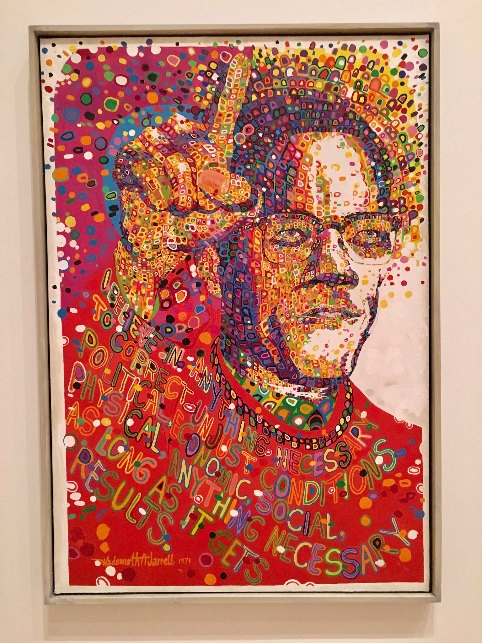
What Paul did last night: My friend Carrie and I went out to a Caribbean joint last night for some jerk chicken, and then we went to the Brooklyn Museum, which is open late on Thursday nights (with free admission to boot). We wanted to see a big exhibit that recently opened there, called Soul of a Nation: Art in the Age of Black Power, which looks at African American art from 1963 through 1983.
It’s fucking awesome. My favorite piece was the Malcolm X portrait shown above (called Black Prince), by Wadsworth Jarrell. If you take a closer look, you can see that it’s comprised of lettering, much like the sports calligrams by artist Dan Duffy. The exhibit had a similar (and similarly awesome) portrait of Angela Davis.
There were also lots of collages, photographs, illustrations, and sculptures. Here are a few that I particularly liked (for all of these, you can click to enlarge):
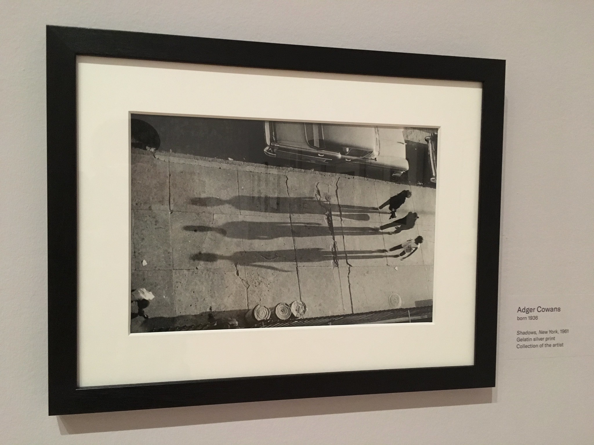

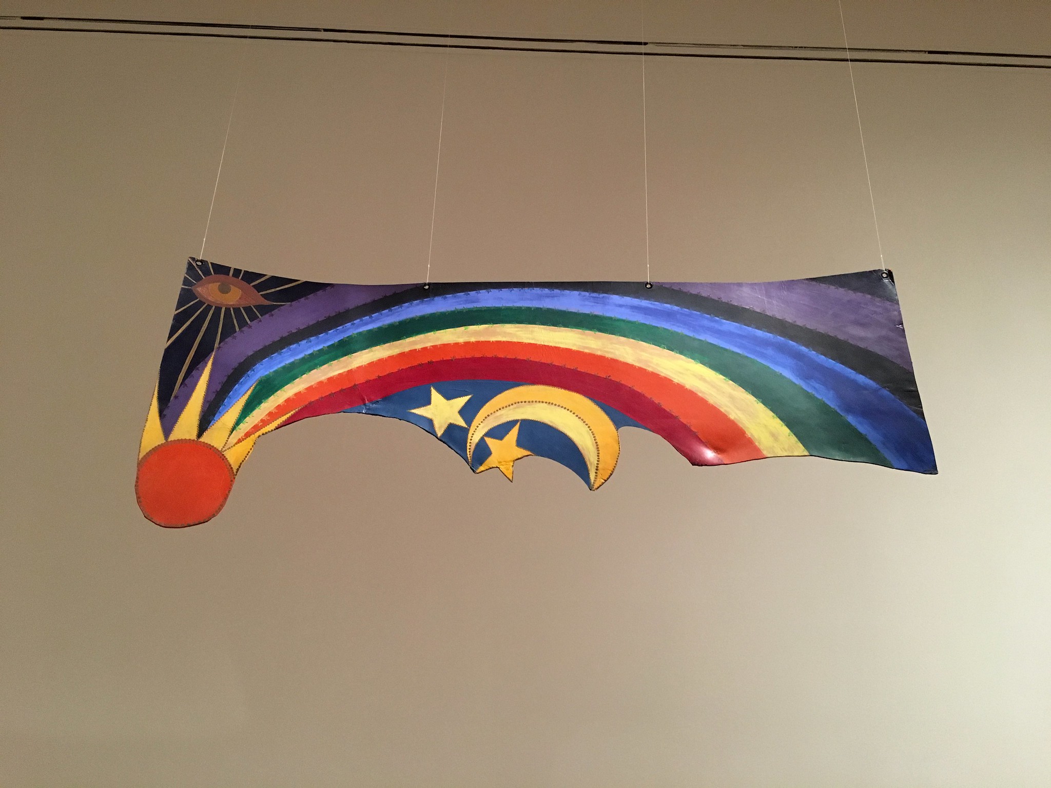
You can see several dozen more pics here. The show, which I wholeheartedly recommend, is on view at the Brooklyn Museum through Feb. 3.
Something’s gone wrong again: Word came down yesterday that Pete Shelley, frontman of the seminal UK pop-punk band the Buzzcocks, had died of an apparent heart attack at the age of 63. I don’t know much about Shelley except that he and his mates made some of the catchiest, most infectious rock music of the late ’70s. None of the music he made after that was particularly notable, at least to my ears, but the Buzzcocks’ early work still holds up four decades later.
I saw the Buzzcocks once, in the late 1980s. They were already past their prime and settling into the grind of being an oldies act, with little of the raw urgency you can hear in their early recordings, but the tunes were still great. Here are two of my favorites. R.I.P.
The Blues jersey is new to me (I think), so I don’t think we can accuse you of being asleep at the wheel, Paul.
Alternate link to the Barcelona item for people who don’t want to give a certain tabloid clicks: link
I used the uni-watch search feature and found nothing here, yet I swear I’d seen that jersey photo before, as the odd stencil-looking font and all white patches kinda stand out. Funny thing is, if it wasn’t through uni-watch, I’m not sure where I’d have seen it.
I’m at work now and our filters are weird so I can’t look – anyone check Creamer’s site with this?
An arched version of the wordmark (minus the Gateway Arch) actually was on the Blues’ uniforms at the time, but they weren’t white. Maybe that’s what you were thinking of?
I found a thread on Creamer’s site that sounds like it’s about the 1965 prototypes Paul mentioned, but it’s from 2008 so the link given doesn’t work.
link
The WW1 uniform was discovered at Trexler Middle School in Allentown, PA- ticker states school was in upstate NY.
Just trying to help, since the ticker has yet to be updated, and reiterate that the WWI uniform was found in Allentown in Eastern Pennsylvania while York is in South(eastern) Pennsylvania. Not sure how the ticker came to say that all happened in upstate New York.
Fixed.
Torts was wearing a hoodie over many layers since he was extremely ill.
link
Also, the Browns exclusively wear their orange alts for public appearances despite it being the least worn on the field (only 4 times since debut) The right sleeve usually has a “#give10” on it, which is their community effort to have everyone volunteer 10 hours. I always find it interesting that they go with their least iconic look for any appearances in public. Maybe the orange makes them stand out in pictures?
my guess is that they made one set of (cheap) “community service” jerseys and will keep using them as long as they can. I doubt they’d fetch much price from collectors, so there’s no motivation to make others.
Never seen that Blues jersey.
Of course, Harry Ornest was leader of the ownership group that stepped in after the NHL blocked attempted to move the team to Saskatoon in 1983:
link
Of note, Harry Ornest was the new owner of the Toronto Argonauts who helped make a massive uniform change flub when he purchased the club. Deciding to change from the “football with sails” logo, as sported here by current CFL commish Randy Ambrosie:
link
Deciding to change it to this in time for 1989:
link
RIP Pete Shelley. Never saw the Buzzcocks in person but got into them in college.
Were those Blues sweaters meant to have a silver crest but gold/red trim at the hem and neck? Yeesh.
At least the insane trumpet 3rd was so out there as to become endearing in its craziness.
This prototype looks like a beer league team took a mistakenly sewn template from the factory and slapped a boring silk screen of the Arch and the blue note on there. Thankful these did not see the light of day.
Saw that Blurs prototype a while back but I thought everyone had! Surprised you hadn’t seen it Paul. Pay attention!
2006 Troy Smith #10 and 2007 Tim Tebow #15 were both the first time for those numbers.
(Slow morning at work)
Dang, I should have looked at the comments before I did my own research, but I agree.
Archie Griffin’s double 1974 and ’75? #45 hadn’t happened before nor has it since. . .
I live in Madison Alabama and I am so proud of the Rocket City Trash Pandas name—said no one ever.
Brandiose is ruining minor league baseball
Those books are amazing, and the cheese one just cracks me up, possibly due to my complete disdain for individually packaged cheese slices. I wonder how long they last in there.
Also that, I guess you might call it flag, with the sun, moon, stars, etc is so eye catching, wonderful design!
I cataloged the cheese book for the University of Michigan Library. We have a lot of unusual artists’ books; I never knew this one would get such traction.
The curator and our preservation librarian spent a while trying to figure out what will happen to this book. They decided to put it in a container to keep out pests and to protect nearby books, but are not refrigerating it. They have accepted that it is not a work for the ages, but they do expect it to last a number of years.
Whoa — what are the odds that the person who cataloged this “book” is a Uni Watch reader?!
Awesome.
Been a a huge fan of Wisconsin hockey since a little boy. 3rd jersey = kinda cheesy (pun or no pun intended – not sure)
I do have the previous rendition of that jersey and will be making it into a Christmas sweater for a holiday party.
Will send photos so you can compare my DIY against the new candy cane 3rd jersey.
Nice tribute to the Hartford Whalers in the new Hartford Athletic crest. In the negative white space of the A there is a little whale tail similar to the Whalers’ old logo.
link
I saw the Buzzcocks at Coachella in 2012. They absolutely shredded their set and I was so blown away with the energy they brought and so excited that this legendary punk band didn’t just mail it in. It was in my opinion by far the best set any band played that weekend.
That Blues word mark on that stencil makes me think of an old Labatt Blue label. I suspect it’s the serifs on the “B.”
Paul, regarding your blurb on the mailbox the other day, I’m wondering if your girlfriend gets permission and paint from the Post Office, or if her beautification activities are vigilante in nature. Either way, I love it. Cliff Claven would be proud.
It was part of a neighborhood-cleanup campaign. Official USPS paint was provided by the local community board. Not sure if specific permission was requested or needed.
Wonder why Blues prototype worn by 2 execs in ’65 was number 35. Were they trying to woo Hawks Tony O?
Tony Esposito wasn’t a Black Hawk until the 1969-70 season.
link
I wonder if Notre Dame will go NoB for the Cotton Bowl. The unveil video showed NNoB.
I’m not an expert on ND’s standard white jersey, but this looks like their usual design. Not complaining since I don’t like alternates, but what is different here? Are they just trying to hype up the green gloves and shoes?
Basically, yes.
The trim on the numbers and, presumably, the monogram on the side will be shinier than usual, better matching the new shine helmet which has been around since 2011.
I think it looks good as a whole. Different but the same. I agree that the hype around it would’ve made you think that they were doing green numbers ala 1978 Cottom Bowl aka the Chicken Soup Game.
It beats pinstripes.
Regarding the Meisei High School uniforms, I believe it’s pretty standard for Japanese schools to have different colors and logos for each sports team. As I understand it, they operate as separate clubs rather than a unified sports program. I worked at a junior high school in Japan years ago, and even the boys’ and girls’ teams for the same sport had totally different colors and designs. There was no notion of school colors.
It should be noted that the Blues uniforms that did come about after Ornest got the team may not have incorporated silver, but they did add red, and they also still had a nod to the Arch, with the “Blues” wordmark being radially arched above the bluenote.
(I’d post an image link, but I’m posting from my phone and don’t have the time or means to track any down right now.)
I think this is the one you mean
link
News to me in regard to the Blues. Maybe it’s just the lighting, but it appears to be a very light shade of silver.
The Kings adopting silver was only 5 years away from this.
Watching a nationally televised sports talk show in Canada, one of the pundits said the colors of Seattle new hockey team will be “clearly red, black and white”
Say it ain’t so! I hope not, but was thinking possible if the team would be called the Sockeyes. They pretty much need to be wearing red with that name.
Some speculation around that they could use red and black with teal as another trim colour. Would fit in with a Sockeyes identity. NHL version of WHL’s Kelowna Rockets 3rd uniform colour scheme.
link
Another intriguing Murray Question and the Heisman:
If he chooses Baseball over Football, will he have a greater level of success in his chosen sport of Baseball than Charlie Ward did when he chose Basketball over Football?
Are farewell season logos for teams common? I know many teams have farewell season logos for their ballparks, but for the team itself seems a bit weird. But perhaps not.
The Winnipeg Jets 1.0 had a farewell season logo.
Meisei baseball photo looks like it’s from the TV adaptation of Touch, a high school baseball manga.
link
link
Good call. It looks like the real Meisei HS does not have a regular baseball team, though they have a small club for “soft baseball,” a variant played with a rubber ball. Here’s a photo showing the uniforms: link
Cam Newton wore 1
He wore 2 at Auburn
OH yeah. He did
I absolutely hate the idea of the Seattle Sounders using pink and black! Has not some other team already adopted this color scheme?……oh wait! yeah, Inter Miami has those colors! Please Sounders don’t be like the Seahawks, who ditched classic colors they were founded upon and went overused navy fetish and snot action green! So many teams in the NFL are ditching clean traditional branding to market to 14 year olds! Just because something seems trendy does not mean it is right for certain teams brand! Pink for a Florida team, yes! For a team in the Pacific Northwest, ridiculous!