Click to enlarge
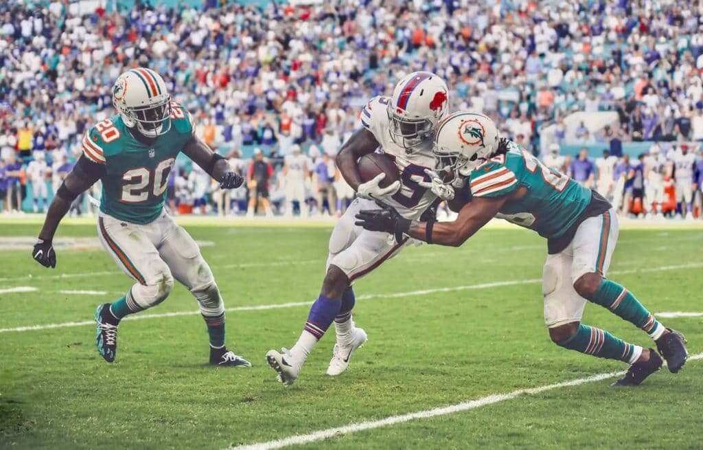
It was throwback vs. throwback yesterday in Miami, as the Dolphins and Bills both went retro, re-creating an old-school AFL matchup. Yes, yes — they should both go back to wearing those uniforms full-time, especially the Dolphins. We know, we know. Lots of additional photos here and here.
In other news from around the league yesterday:
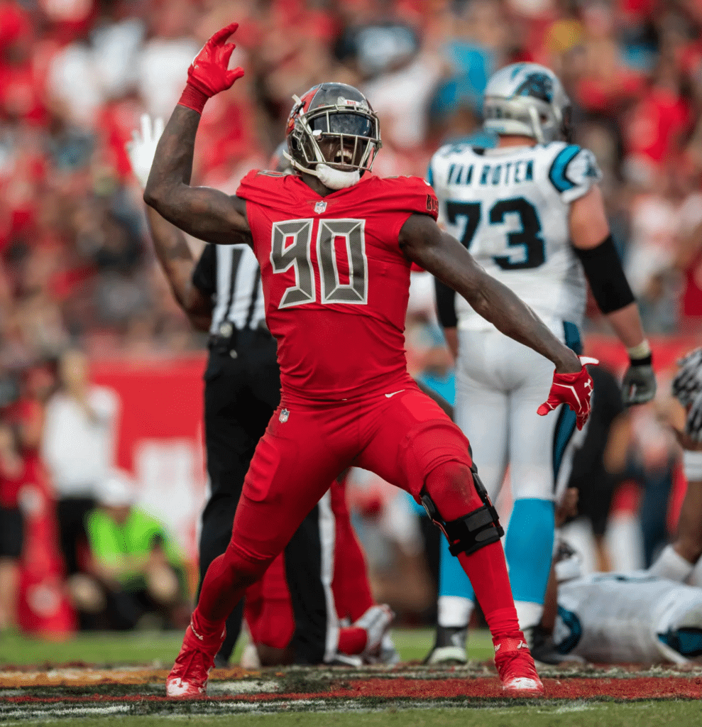
• The Bucs went mono-red:
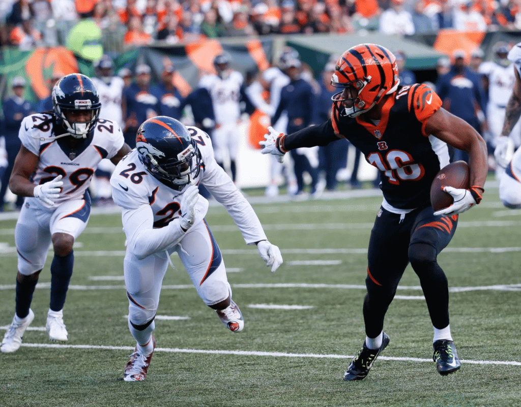
• The Bengals went mono-black:
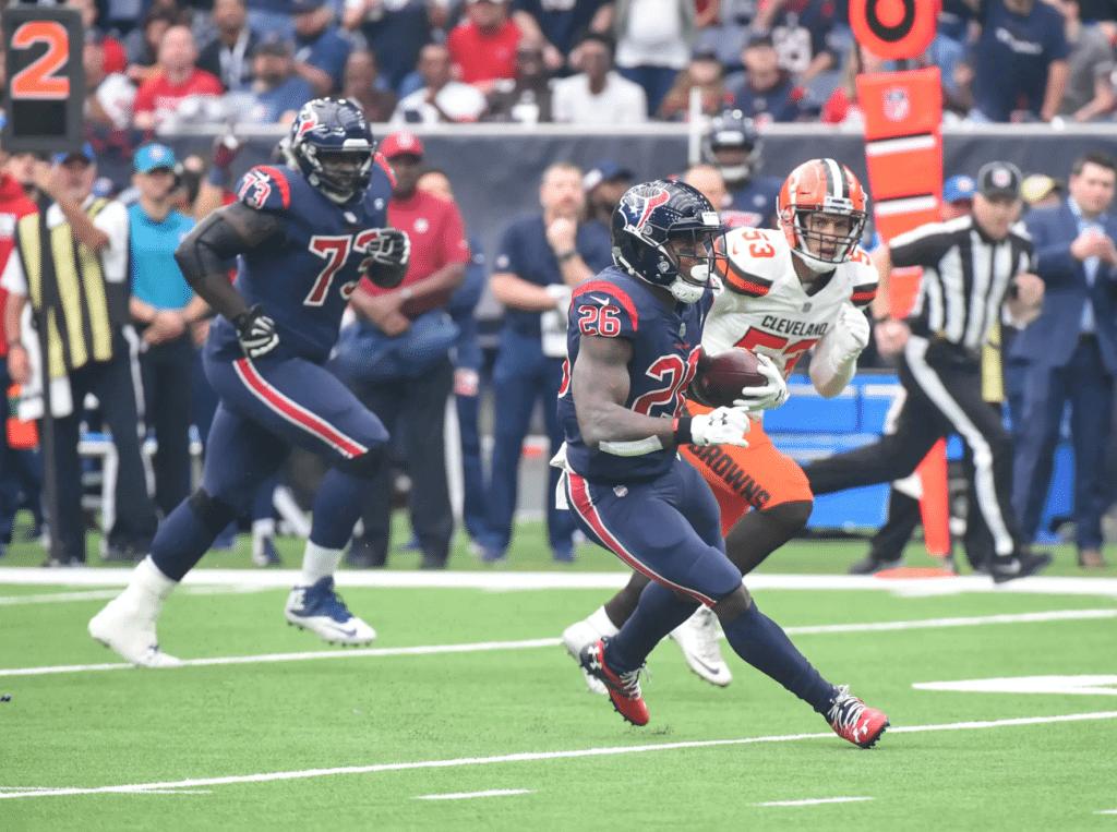
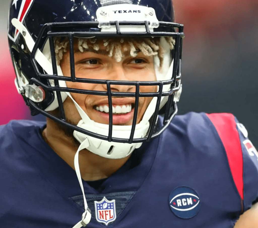
• The Texans went mono-navy. They also added an “RCM” memorial patch for owner Bob McNair. Last week they only had a helmet decal for him (which they kept this week while adding the patch):
• The Jets usually wear their green pants with white socks, which is as it should be. But yesterday they went with green socks, producing the dreaded leotard effect:
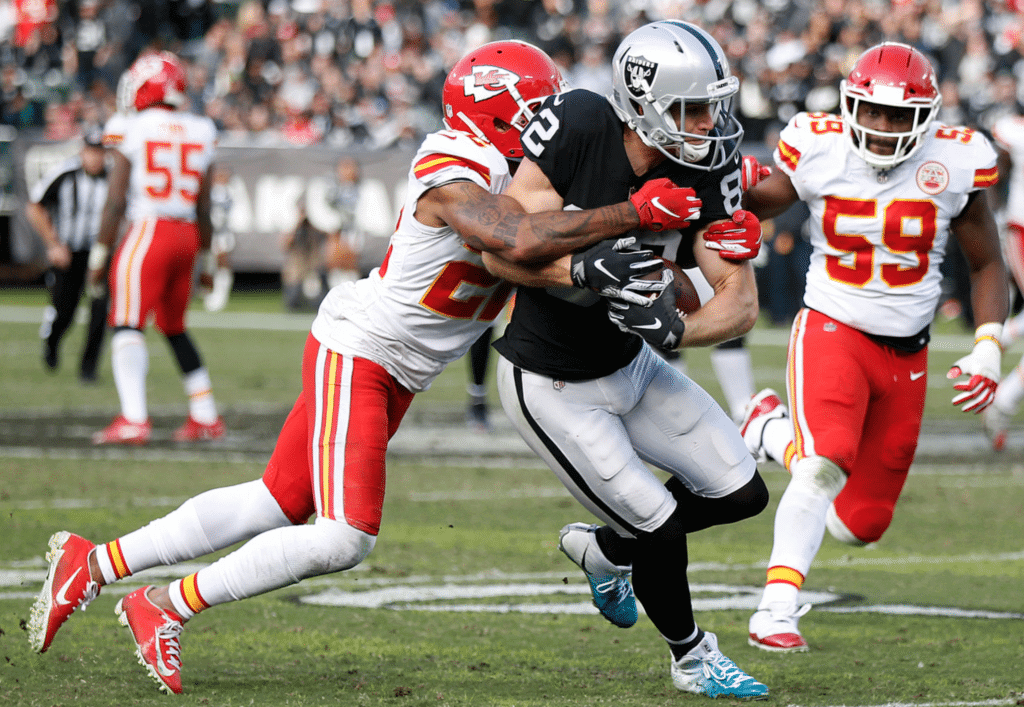
• Nothing uni-notable about the Chiefs/Raiders game, except that it was, as usual, one of the best-looking uniform matchups the league has to offer:
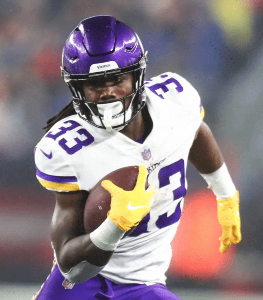
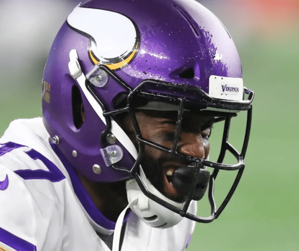
• The Vikings have matte-finish helmets — or do they? Two different readers got in touch to say that some of the Vikes’ helmets appeared to be going glossy in the Foxboro rain. I didn’t watch this game, but I looked at several dozen photos and it appears that it was just a combination of the rain and the lighting:
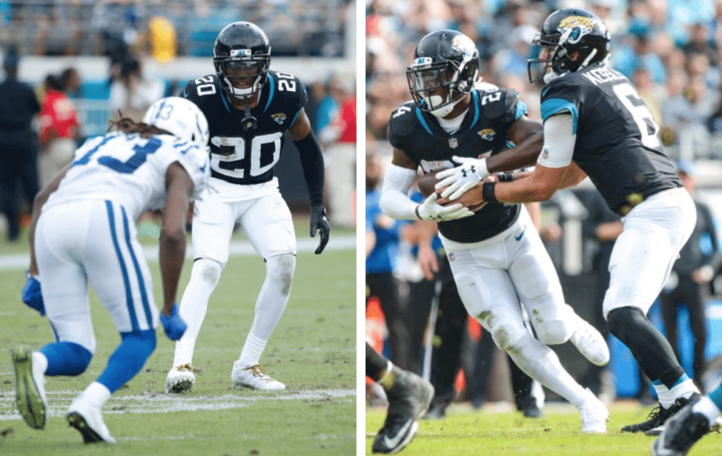
• At least two Jaguars players — defensive back Jalen Ramsey and running back T.J. Yeldon — wore white tights, without any black:
• Falcons kicker Matt Bryant’s left-side helmet logo seemed to have been rotated too far counterclockwise:
Who was in charge of putting the sticker on Matt Bryant’s helmet? #BALvsATL pic.twitter.com/H1Qbrc0CSz
— Derek Wagner (@wagski7) December 2, 2018
• The Nike logos on Cardinals cornerback Patrick Peterson’s jersey are still facing the wrong way:
@UniWatch once again the Nike logo on Patrick Peterson's jersey is pointing in the wrong direction. pic.twitter.com/fbogrEuQ53
— Moe Khan (@MoeKhan19) December 2, 2018
• Colts offensive lineman Quenton Nelson had a bit of striping tape malfunction:

• Not a single home team wore white.
• Finally, this was the “My Cleats, My Cause” week, but there was very little fuss or hype about it this year.
(My thanks to Braden Claassen, Justin Hicks, Mark Howell, Jacob Martin, Rob Petsch, Chris Roberts, and @True2Atlanta for their contributions.)
Click to enlarge
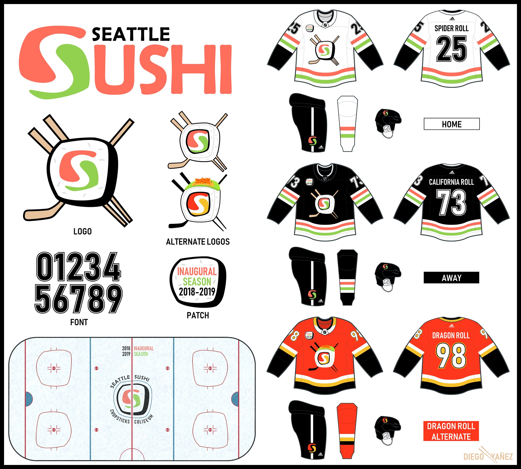
NHL Seattle contest results: The results of my latest Uni Watch design challenge, to create an identity for the new NHL franchise in Seattle, will be posted on ESPN.com today (or possibly tomorrow, but I’m pretty sure it’ll be today). We got a lot of really excellent entries for this one, including Diego Yanez’s concept for the Seattle Sushi, shown above.
Link coming soon. Meanwhile, you can see all the entries we received here.
Update: I’m now being told that it’ll be published tomorrow.
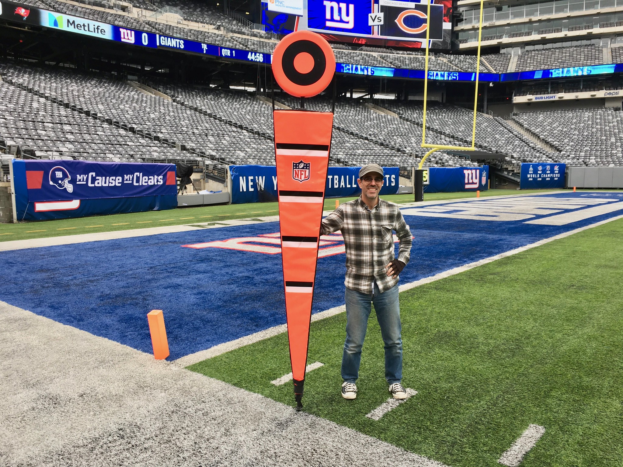
Photo by Tom Quinn; click to enlarge
Back on the chain gang: I was out at the Meadowlands on Friday to interview Tom Quinn, longtime head of the Giants’ chain crew, for an ESPN story I’m working on. While I was there, I decided to pose with one of the sticks — they’re surprisingly enormous! Also surprisingly light (except for the one with Dial-a-Down — that one’s heavy).
Anyway: Fun stuff, and Quinn had all sorts of interesting tidbits to share about his job. More soon.
A powerful win for UNI & Joel Rosario in the G1 Matriarch Stakes @DelMarRacing! pic.twitter.com/ubFIeJ6vXS
— TVG (@TVG) December 2, 2018
A new kind of Uni Watch: It was brought to my attention yesterday by Twitter-er @QuantCoach that there’s a thoroughbred horse out there named Uni! Not only that, but she’s really good — she won yesterday’s Matriarch Stakes Del Mar, Cal., capping off a perfect 2018 in which she won all four races she entered. Listen to the race call in the embedded video above to hear her name repeatedly invoked with gusto by the announcer — sounds great!
Even better, Uni was wearing a prime number (13). Too bad her jockey, Joel Rosario, had neon-toned silks, but I can live with it.
I hereby declare Uni to be the official thoroughbred horse of Uni Watch. We’ll have to keep our eye on her — after all, it’s right there in our name.

Ask me anything: It’s been a long time — almost a year and a half — since our last round of Question Time, the AMA-style forum where you can submit questions about whatever you like and I’ll do my best to answer them. So let’s do that again.
In case you’ve forgotten, here’s how it works: Send one question to the Question Time address (please note that this is not the usual Uni Watch email address). Your question can be about uniforms, sports, or anything else, although I reserve the right not to answer questions that are too personal. One question per person — this rule will be strictly enforced! And if you want to see which questions I’ve already answered, you can see the previous eight installments of Question Time here.
I’ll answer this latest round of questions either later this month or in early January. Thanks!
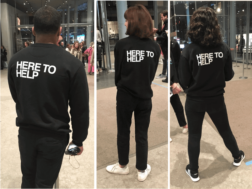
Uniforms in the wild: Yesterday we went to the Whitney to see the new Andy Warhol exhibit (I’ll have more to say about that in a day or two). I love that the guides at the museum wear shirts that say, “Here to Help” — such a simple, friendly, welcoming message. It seems to me that every institution should dress its service staffers this way, don’t you think?
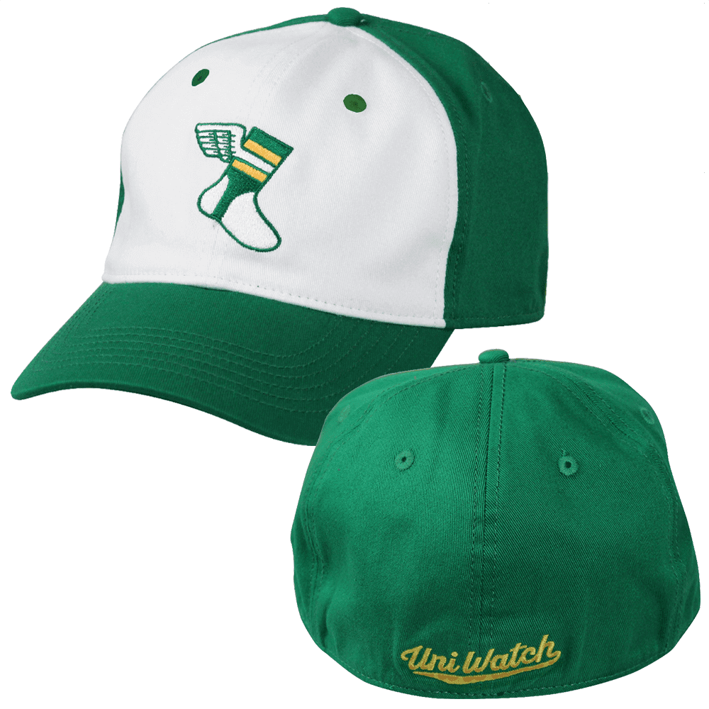
Free shipping reminder: In case you missed it last Friday: We recently offered a one-week additional $5 price break on our flex-fit Uni Watch Alternate Cap, knocking the price down to $19.99. While the price has now gone back to $24.99 (still cheaper than the original $29.99), we’ve decided to offer free shipping, which is more or less the same thing as maintaining the price break. If you’re thinking, “Wow, he must really have a lot of unsold caps that he’s trying to move,” you’re right! Get yours here.
Meanwhile: All of our fine Uni Watch products, including a few that you may have forgotten about, are listed on this one handy page.
Keypad chronicles: Have you ever noticed that the 10 numbered keys on a phone and on a calculator are laid out differently? I recently came across a video that explains how the phone keypad design was developed, and it’s faaaaascinating — really interesting design story. Definitely worth the seven minutes of your time.

Rookie of the year: In 2008, when Tavi Gevinson (that’s her at right) was 11 years old, she started a fashion blog called Style Rookie that got tons of media attention and made her into something of a child media celebrity. At 15 she launched an online magazine, called Rookie, which was less about fashion and more about teenage girl culture. It had a staff, advertisers, and so on.
Gevinson, who’s now 22, announced on Friday that Rookie is closing. The short version is that online advertising was no longer enough to pay the bills; the longer version (and it’s quite long, but still worth reading, because Gevinson’s an absolutely fantastic writer) touches upon, among other things, the larger media economy, the line between art and commerce, the line between reader and consumer, how to grow a personal project you love without turning it (or yourself) into something you hate, how to balance dedication to something you love with the need to grow in other directions, and so on — subjects that I think about all the fucking time. Here are a few excerpts from Gevinson’s farewell announcement:
In one way, this is not my decision [to shut down Rookie], because digital media has become an increasingly difficult business, and Rookie in its current form is no longer financially sustainable. And in another way, it is my decision—to not do the things that might make it financially sustainable, like selling it to new owners, taking money from investors, or asking readers for donations or subscriptions.
[…]
It has sometimes felt like there are two Rookies: There’s the publication that you read, that I also love reading, writing for, and editing; and then there is the company that I own and am responsible for. The former is an art project; the latter is a business. Each one needs and feeds the other, but when I started Rookie at age 15, I saw the two as mutually exclusive. Rookie had been founded, in part, as a response to feeling constantly marketed to in almost all forms of media; to being seen as a consumer rather than a reader or person. In my black-and-white view of the world, the idea of capitalizing on an audience seemed cynical, selfish, and something only evil adults do. It would be misleading to say I was a total purist, though, because I also thought Rookie was really good, and that it should reach people rather than be small and struggling.
[…]
[Early on,] it was possible for Rookie’s audience to grow organically, which means not without any luck/hustling/strategy whatsoever, but without spending money on jobs or services that most companies do for very obvious reasons: audience growth, business development, reader engagement, marketing. Now that I know what those jobs entail, I would not call them devil’s work or even necessary evils. They require understanding people in ways that I do not and using your brain in ways that I can’t. But from ages 15 to probably 20, I bristled at any mention of those words, at the idea of hiring someone to do any of them, of a five- or even two-year plan, of meeting with investors or possible buyers, of crowdfunding or asking for donations. … I didn’t want Rookie to become a source of stress, or to feel like I was doing it more for a money-minded partner or owner than I was for myself and its readers. I needed time and space to grow up. I feared waking up in my 20s and finding that I’d produced 1,000 corny videos for a website that was once my baby and was now under the control of a guy named, I don’t know, Bryce.
[…]
Nowadays, social media gets more of people’s eyeballs than publications do. Publications can use social media to promote their content but it is rare to get people to actually click out of an app and look at it. Also, Twitter, Instagram, YouTube, etc., now exert more control over what you see, based on which accounts are best at posting according to those platforms’ ever-changing algorithms. Maybe [this doesn’t describe] your internet habits. But it describes those of enough people that most, if not all, digital media companies have suffered in the last few years trying to keep up. According to the Bureau of Labor Statistics, half the jobs in the information industry ceased to exist from January 2001 to September 2016. Some companies have rearranged themselves around social media algorithms, even when they were based on very flimsy understandings of the kinds of content people want to see. And, in the midst of all this, digital ad sales—Rookie’s main source of income—became less valuable.
[…]
We started meeting with venture capitalists and pitching them on Rookie in fall 2017. My Bryce problem had calmed down; now, I even wanted their money, and was ready to channel my inner Bryce to get it. If some clickbait-y website could raise tons of money from investors and then eventually sell for tons more money, why not something that’s actually good? (In most cases, this question answers itself.) We had put in the work, Rookie was already influential; if this was what we could do organically, imagine what we could do with more resources.
Younger-me would be skeptical and then relieved to hear that we didn’t encounter that many Evil Bryces. We met a lot of Good ones, and Good Hayleys, and hell, even a Good Spike. (My idea of Good and Evil also got a little more nuanced.) A bunch of founders and investors were enthusiastic, happy to give advice or introduce us to other people who could help. I did not have to make Rookie sound like something it wasn’t and I didn’t feel gross telling people they should fund it.
[…]
But one problem with thinking you know what you want, with being good at locating words, and with being praised a lot for both of these things, is that it is hard to notice when you are evading the truth. It is hard for the people around you to notice, too, because it seems you have never been wrong before. Even if I knew that I would eventually need to not be as responsible for Rookie-the-business, I was still the person who’d started Rookie-the-art-project, and I was ready to compartmentalize my anxiety/stress until the art project and business were both where I wanted them. I wasn’t a Bryce at heart, but I thought I could pretend for a few meetings or years in order to keep the art project alive and get myself some financial reward. I thought I could make my essential qualities malleable. I didn’t see that the life one truly wants probably wouldn’t require such shapeshifting.
Then, one week this summer, after sending our financial modeling to an angel investor who had already expressed interest, I couldn’t get out of bed for days. I couldn’t stop crying. I couldn’t keep my food down. I threw out all the old explanations for how I was feeling until it could no longer be denied: I was worried she’d say yes, not no.
Okay, I’ll stop there. Sorry for the long scroll that you probably don’t even care about, but Gevinson is such a self-aware and interesting writer, and so much of what she’s describing is stuff that I think about all the fucking time, that I wanted to share.
No, I’ve never had investors who wanted to buy Uni Watch, but these issues come up in other ways. A year or two ago, for example, there was a TV producer guy — really nice, really smart, a regular reader of the site (hi, Dan!) — who wanted to pitch a TV version of Uni Watch. I had a lot of misgivings, mainly because a TV version of Uni Watch would entail a lot of corner-cutting and dumbing-down and compromises, but I was also excited by the possibilities. So we worked for months on a pitch deck, I hired an attorney to review and negotiate my contract with the producer guy’s company, blah-blah-blah. In the end, for a variety of reasons, we weren’t able to sell the show — and I felt equal parts disappointment and relief.
Anyway: Gevinson is a much better writer than I am. Her entire farewell note is worth reading even if you don’t care about fashion or teenage girl culture or 22-year-old media phenoms, because it touches on issues that affect everything we read online, and also touches on issues that creative people wrestle with every day. Check it out here.
The Ticker
By Jamie Rathjen

Baseball News: Here’s the front of a blue alternate for the Auckland Tuatara, a New Zealand expansion team in the Australian Baseball League (from @tuatarabaseball). … New grey jersey for Stephen F. Austin (from Chris Mycoskie). … New jersey for Edison (Minn.) HS, whose nickname is the Tommies (from Jason Sellers). … New uniforms for Texas A&M (from @atxaggie07). … Here’s some tremendous color footage of some 1938 White Sox pregame activities.

Football News: Army revealed their uniforms for the Army/Navy Game, and they’re based off the insignia of the 1st Infantry Division. Phil will have a more in-depth look at this uni design, and also Navy’s uniform, this Saturday. … Reader/painter Gene Sanny did a painting of ’70s-era Raiders DL Otis Sistrunk. … The Sun Belt championship game between Appalachian State and Louisiana-Lafayette was color-vs.-color (from multiple readers). … A junior college bowl game between Iowa Western (whose nickname is the Reivers) and Snow (Utah) College was also color-vs.-color (from Scott Nuzum). … Here’s longtime reader Marty Hick wearing a helmet with the logo of a St. Louis record store.

Hockey News: The Rangers retired No. 11 a second time for winger Vic Hadfield and the team wore a patch for the occasion. The team had previously retired No. 11 for Mark Messier (from Alan Kreit). … The Hurricanes are wearing their red uniforms for all three games of an upcoming California road trip, including a color-vs.-color game against the Ducks (from multiple readers). … Michigan/Michigan State was also color-vs.-color (from Patrick Flynn). … Notre Dame wore 50th-anniversary uniforms this weekend (from multiple readers). … The ECHL’s Kansas City Mavericks wore Iron Man-themed uniforms (from Adam Stilley).

Basketball News: Arizona wore red uniforms with metallic golden numbers against UConn (from @TodayInSports3). … Color-vs.-color college games from the past few days included Iowa/Wisconsin, Minnesota/Oklahoma State (from Chris Lather), and Ole Miss/Louisiana-Monroe (from Archie Breland). … There was also grey-vs.-grey between junior colleges Western Wyoming CC and Rexburg (Idaho) United (from Jeff Atkinson). … New mascot costumes for Houston.

Soccer News: Former Liverpool midfielder Steven Gerrard wore No. 08, a variation of his usual No. 8, for at least one game in 2005-06 (from Moe Khan). … On the same subject, Scottish striker Derek Riordan wore No. 01 – which was supposed to be No. 10 backwards – for Hibernian in 2008-09. … English amateur team Caversham United, of the Reading and District Sunday League, are having a choose-a-kit contest with some very good choices (from @CrystalPalaceDC). … Not to be outdone by the Panthers, this weekend the Premier League’s Fulham wore their eighth different combination, including four shirts, of this season. … New USL League One team Greenville (S.C.) Triumph signed a kit deal with Nike (from Josh Hinton and Ed Żelaski).

Grab Bag: BYU and Utah’s women’s volleyball teams normally play color-vs.-color, says Jim Vilk, but BYU wore white for an NCAA tournament game Saturday. … Cycling’s Team Sky revealed their kit for next season, which is a return to dark colors after they wore white last season (from Cody Dannen). … Barbarian F.C., an invitational rugby union team assembled a few times a year, got new shirts with each number featuring the names of players to have worn the number for the team. The Barbarians’ traditional uni-related quirk is that players wear the socks from their club team. … The Netherlands and Malaysia both wear orange in field hockey, but changed to black and white, respectively, when meeting at the men’s World Cup in India. Additionally, Australia are the only team there wearing sleeveless shirts. … Ed Hahn was out with a friend who was wearing a ca. 1940s wool cloak that was part of her grandmother’s nursing uniform at Emory University.
My wife, who I subject to quite a few uniform questions, described the Bucs all red look yesterday as follows: “It looks like they’re wearing onesies. I think being red as opposed to another monochrome look, contributes to that comment.
Yep that’s a great show with the yardage stick, and surprising.
MY wife said “Christmas onesies”.
In that Bucs picture you can also see Jason Pierre-Paul’s mangled hand. I’m assuming that the team equipment manager makes the necessary modifications to his gloves? Kind of a weird thing to think about considering he likely wears a new pair each week.
I believe Nike makes special gloves for him.
link
when with NYG, the medical staff created a four-fingered glove for Pierre-Paul to wear when he plays.
“to help him lift weights, Pierre-Paul had a special wrist strap designed for him with hooks. He plans to use a special glove, according to SI.com, custom-fitted by Under Armour, for his right hand in 2016”
link
Why didn’t they make his knee brace red as well? :-P
I couldn’t help but notice the guy in the background, Greg Van Roten, complementing the Tampa Bay uniforms. Hie name is hybrid Dutch-German for “of red”!
On the surprisingly lightweight yard marker, looks like the horizontal lines are a foot apart from each other starting at 3′ off the ground. Any idea why those are there?
Great post today. The phone button video and Rookie excerpt were awesome bonuses. More of those kinds of things, please!
Glad you liked — thanks!
Agreed on the Phone Button post. I’ll be using that video with some of my engineering design peers.
Funny, though, that the “calculator” layout is what is on a 101 key keyboard, and we now use that to dial a phone calls via our computers. Unless, of course, you choose use the Skype smart phone buttons (which have the telephone layout).
Sigh…
I agree. Anything Paul says is good writing I take time to look at.
I agree also. I really appreciate your work Paul.
Thank you!
America needs more high schools with athletic nicknames like the Tommies, fewer Eagles and Patriots. And good on the Tommies for making their example uniform #42. That should be the default in baseball, unless a pro team has a particularly franchise-identifying player number.
surmised
there are some great unique ones in outstate Colorado: Rocky Ford Meloneers, Fort Collins Lambkins, Brush Beetdiggers being faves
Noticed the striping on the socks for the Miami Dolphins throwbacks a little different this year. The sock stripes did not exactly match the sleeve stripes like they have in prior years. There is usually a larger white stripe in the centre between the 2 aqua stripes.
link
And yet, no one seems to notice that the Bill’s “throwbacks” are just awful. Completely wrong. As in: the Bills never wore red and blue strips on their shoulders until the team decided, “Good enough. Who’s going to notice?”
What I noticed about the Dolphins’ jerseys is the filled-in zero on the sleeve numbers. Was it like that in the old days?
I agree on the Bills white throwbacks – I never understood how Reebok screwed the stripes up when they got the stripes right on the blue ones the Bills wore from 2005-2010. The white ones should just have had the stripes – blue with thin red outlines.
Regarding the Dolphins TV numbers- I don’t think they were like that in the 1960s but the numbers were like that on the stripeless ones worn from 1970-72.
One question on the yardage stick that might be worth asking, as the stadiums have gotten bigger I assume they’ve increased the size of the stick, when was the last time the NFL increased the size?
There are some terrific hand drawn submissions for the Seattle hockey team. Great job to all those who submitted!
I seem to recall that Steven Gerrard wore 08 in order to promote Liverpool as City of Culture 2008. I think the Everton player wearing 8 (can’t remember who it is) also wore 08 in the same game for the same reason – the Merseyside derby.
Excellent memory. Here’s the story – link
strangely the photos accompanying the article show both players in their normal 8 shirts from a different game. Also, Gerrard only lasted 18 minutes before being sent off.
The Everton 08 was James Beattie
link
I noticed last night that Chargers DB Derwin James has 2 mouthpieces (but only uses 1). One hung from his facemask that he never used. The other was a clear one he put in/out each play.
Hard to see here but it the best photo i could find this morning.
link
Here you can see his attach mouthpice flapping away as he runs.
link
Paul, it looks like you are holding the “unofficial” first down marker (the one that is across the field from the chains) that marks the approximate first down. I don’t see any chain linkage at the bottom.
Or could it be the “drive began here” stick.
Am correct at all?
Yes, I have the “O” marker that would be used on the far side of the field.
That Seattle Sushi design is great, not that I would ever want to see that team suit up, but simply from a creative design perspective.
Also, any reason why the here to help shirts are aligned that way?
By “aligned,” you mean flush-left? I’d say it’s that way because most text in our culture is flush-left.
You could make a case for it being centered, which is probably how I would’ve handled it.
Yeah, that is what I was getting at. I tend to think on shirts, banners, and such when you have so few words you see the alignment being centered. Having it aligned left looks off on shirt, but it is certainly eye catching. Perhaps that is why they did it. Wasn’t sure if there was something Warhol specific that made them choose that format.
Personally,I like the left-alignment on the shirts. It’s hard to explain, but I like the aesthetic. I think phrases are too often center-aligned when they don’t need to be (i.e., when it’s not a title).
The eyebrows on the old Houston female mascot look like they were made the same way you make turkeys by tracing around your outstretched hand. The new mascots look much better; still mascots, though.
Is it wrong that I wish the “HERE TO HELP” shirts had “HELP” centered rather than left-justified?
Nuts. My comment was beaten while I faced a delay in typing. Sorry, guys.
Related to telephone layout, but going back to the old rotary / pulse dialing phones. Did you know that area codes were assigned as a result of rotary dialing? Cities that were bigger (and more likely to be called) got area codes that contained lower numbers (NYC: 212, LA: 213, DC:202, etc.). That allowed those phone numbers to be dialed relatively more quickly than say a 909 area code. I’d have to look up the source for that, since I heard about it anecdotally, but it seems reasonable to me.
Also, Bell Labs was mentioned in that video a few times. I have listened to some lectures from former Bell Labs Scientists and it’s absolutely amazing how prolific they were. So many things in Science, Mathematics, and everyday life came from Bell Labs. Fascinating stuff.
Those in the telephony industry call them colloquially “Bell Heads”.
Thank you to all the contributors to the Seattle hockey design contest. Those are some of the best entries for this type of contest I’ve seen in a while.
Agreed! If the real team looks anywhere near as good as the best of the entries, I may be forced to adopt the new Seattle team as a fan. I mean, I already root for three MLB teams, so I suppose I could add a third NHL team to my Wild/Caps fandom.
My father was a high school ref and worked on the Panthers’ chain crew for the first 20 or so years of the team’s existence. He held the “alternate box”, which is the term used for the stick that shows what down it is. There are two of them, but only one is considered “official”.
The Panthers’ crew also worked a lot of the college games at the stadium, and I got a chance to do a game with them (East Carolina vs. NC State about ten years ago). My job was to pick up the orange first down marker and move it ten yards downfield when appropriate. The main thing I remember is that you really can’t appreciate how big the players are and how fast the game moves until you’re right there in the middle of it. Also, the sidelines seem a lot more chaotic that you’d expect, with all the coaches constantly yelling and scrambling to make sure the right players are in the game, etc.
Paul, looking forward to your piece on the Giants’ crew, curious to see if they do things much differently than the Panthers do…
Cool clip on formulating the touch tone phone layout. Now it has me thinking of why calculators or adding machines or the keypad on the right of the computer keyboard are just so. Makes all the sense in the world. Check out this cool article on Benford’s Law
link
Basically, the more digits your mystery number can have, the more likely that it should start with a low number like 1 or 2. That’s a relatively comfortable type, while reaching up with the ring finger for the 9 is a bitch. Then, of course, the 0 gets twice as much room, and deservedly so if you report even dollars without cents on your taxes. On the computer, that’s a pretty comfortable flick of the thumb.
Sparkychewbarky’s Totems & ChristianLegault’s Kraken designs are my fav
Great read from Tavi Gevinson. Regardless of the topic, introspective work by a self-aware author is always worth reading IMO.
Paul, thank you for sharing the excerpt from Gevinson. I have never owned a business nor earned income from something as personal as writing, and I appreciate you helping me understand what your experience is like.
Has there been any decisions made regarding the previously mentioned (potential) move to a subscription model?
Patreon. Soon. Or soon-ish.
Re: the Jets wearing green socks… Paul would it be possible for you to track down who made that choice?
Players? (Which ones?)
Coaches (I doubt it)
Nike?
The owners?
The equipment personnel?
With the amount of teams that wear socks that match their pants color, there is somebody that thinks this looks good. I’d like to know who/what is driving this trend.
Thank you…
Lee
I’ve wondered the same thing, along with the mono jersey/pants combos. Paul has said he believes the mono jersey/pants started in Buffalo (when they had the horrendous navy uniforms) with the players pushing for it, so I assume it would be the same for the socks.
Just to clarify: I’ve said that the Bills were *one* of the first instances I can recall, and the players were definitely pushing for it.
I’m not so sure the players care so much about which socks get worn. In this case, I suspect it was the equipment manager.
Is it possible for you to request clarification from the Jets?
(I am not demanding you do so, I am just curious myself)
Lee
Tampa Bay wore orange socks with their orange pants well before Buffalo.
I’m interested in how the green socks were chosen for the Jets yesterday, since they actually have socks especially designed to go with the green pants.
So someone had to specifically say “hey, lets create a leotard look when we don’t even have to!”.
The Vikings, for example, only have purple socks, so they don’t have a choice (in theory, they could easily design and implement contrasting socks) when they wear purple pants.
My guess is that it was player driven also.
I really dislike this trend, I am shocked thats it has become so pervasive.
Lee
Tampa Bay wore orange socks with their orange pants well before Buffalo.
Lots of teams wore leotard-effect socks. My point about Buffalo is that they were among the first to wear a monochromatic jersey/pants combo — the mono-navy look. And that was because the players requested it.
Try to pick my spots with picky little questions like this. I mean, I don’t think it’s picky, but the Jets’ PR staff will. Not sure I want to spend that bullet right now.
TBH, I dislike socks + pants being the same color when the shirt is also the same color. Like, I don’t mind the Seahawks all blue get-ups they wear at home, but do dislike when they wear the same thing but with white tops on the road.
Anyways, no worries about asking the Jets, thanks for at least considering.
Hates the Jets in white tops + green pants + green socks!
Lee
“Here to Help” — such a simple, friendly, welcoming message. It seems to me that every institution should dress its service staffers this way, don’t you think?
I could dig that. And I would MUCH rather hear, “Hi, if you need anything I’m here to help” than the standard retail phrase I’ve come to loathe, “Finding everything OK?”
My employer, a big box retail store, rolled out a mandatory-ish policy for using the phrase “can I help you find something?” 12 or so years ago. I’m assuming it was to combat against lazy-sounding questions like, not to mention narrowing in on the “something” the customer would be looking for. I feel like I’ve seen or even had t-shirts with that phrase on it since then, but they’re certainly not sticklers about it now the way they were then, so long as you’re attempting to make contact with customers one way or another.
I think Matt Bryant’s helmet logo aiming down is just a symptom of him wearing his helmet pulled down too far in front. If you look at the neck bumper it’s riding really high.
Forgot to submit my Seattle Traffic Uni Concept.
Main logo is a Prius and/or a Tesla sitting on a road with the Space Needle in the background.
Uni-crowd,
I thought the NFL was nuts about uniform conformity. When Jalen Ramsey chooses to not follow the established dress code, is he just fined? Do they actually make players fix issues in game?
Asking for a friend (actually not, I want to know).
Thanks
They may fine him. Does it really matter? Whatever the fine might be, it’s pocket change to the player.
Policing socks and other hosiery (tights, leg warmers, etc.) has become a losing game of Whac-a-Mole.
The anthropomorphic tree playing hockey in the Seattle contest has to be my favorite piece of artwork in any of these contests. I was hoping Seattle went with Emeralds, but now rooting for Evergreens just so they can adopt that logo. And if not Stanford’s club hockey team should do so.
Tom Bierbaum, who created that design, always comes up with really good logo mascot characters.
So Army’s going to wear uniforms base on “The Big Red One” and they’ll be mono black, because of course, why not? O_o
[edit] actually based on that pic I don’t know if it’ll actually mono black…so far just black helmet and black jersey.
(where’s that edit feature, Paul?)
While I do like the idea of the “Here to Help” shirts, the decision to dress the “helpers” in all black is a puzzling one.
To me at least, this makes them much less approachable than if they had been dressed in, say, red shirts and khakis. At first glance somebody in an all-black uniform registers to me as one of those militarized police officers, and “HERE TO HELP” almost comes across as sarcastic.
Dan, Dan, Dan … it’s an art museum in NYC, not Office Max. *Everyone’s* wearing black.
:-) :-) :-)
In re: the Whitney — their style is not limited to their work uniforms; their museum league softball team (the Whitney Houstons) has the best uniforms in the city, arguably.
Just when you thought the ugliest uniform in pro sports couldn’t get any worse, the Bucs out do themselves by breaking out those ridiculous red abominations.
Re: Seattle Sushi, a great concept and excellently executed. Not that it stands a chance in hell for real, but probably better than whatever actually happens.
Re: Edison HS, not clear that it’s Minneapolis Thomas Edison HS. Meanwhile, Minneapolis Theodore Roosevelt is the Teddies. And while someone dissed “Patriots” I feel it’s perfectly appropriate for Patrick Henry HS, also in Mpls. Also props to those keeping high school baseball going in the City of Minneapolis when it’s nobody’s idea of a northern, urban sport at this point.
The Cowboys wore white at home versus the saints.
That was on Thursday, not Sunday.
Paul you say KC and Oakland is always a great looking matchup, but you forgot about the always great looking game you attended. Giants vs Bear, always looks great.
Not sure why you think I attended that game, but I didn’t.