The Alliance of American Football, which is slated to begin play this February — and which is also slated, I’m fairly certain, to soon become the latest defunct league left in the NFL’s wake — released its inaugural uniforms yesterday. We probably won’t get to see these for very long, so let’s take a good look while we can.
Before getting into the team-by-team breakdown, here are some general observations:
• The uniforms were designed by Starter, whose maker’s mark appears on the jersey sleeves, not on the chest — NFL-style, not college-style.
• There are no advertising patches.
• Each of the eight teams released just one uniform design yesterday. Seven of those feature colored jerseys, while the other has a white jersey. It’s not yet clear, at least to me, when — or if — additional uniforms will be revealed. (Update: I’ve now been told that the teams will only have one uniform apiece, so most games will be color vs. color.)
• Seven of the eight jerseys feature contrasting sleeves or yokes. Lots of contrasting collars, too. In short: The AAF is not big on solid-colored jerseys.
• Only one monochromatic uniform was released yesterday. The other seven feature contrasting jerseys and pants.
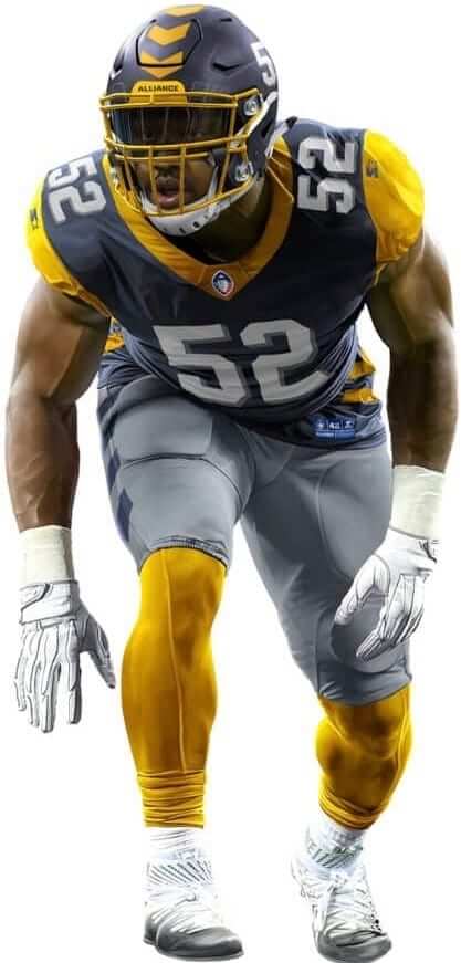
• The jerseys are completely devoid of chest wordmarks. No team logo patches, either — just numbers. For me, this is the single biggest surprise about these uniforms.
• While we’re at it: No inaugural-season patches. (Update: The retail jerseys have a league-wide inaugural-season patch, so I guess they’ll all wear that. Odd that they didn’t include them in the unveiling images.)
• Four of the eight helmet designs feature TV numbers on one side, plus another has the uni number on the back.
• Aside from the one mono design, all of the uniforms feature contrasting socks (or leggings, or whatever).
Okay, enough preliminaries — let’s have a look (for all images, you can click to enlarge):
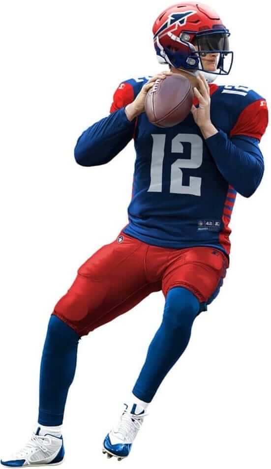
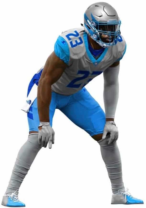
Arizona Hotshots
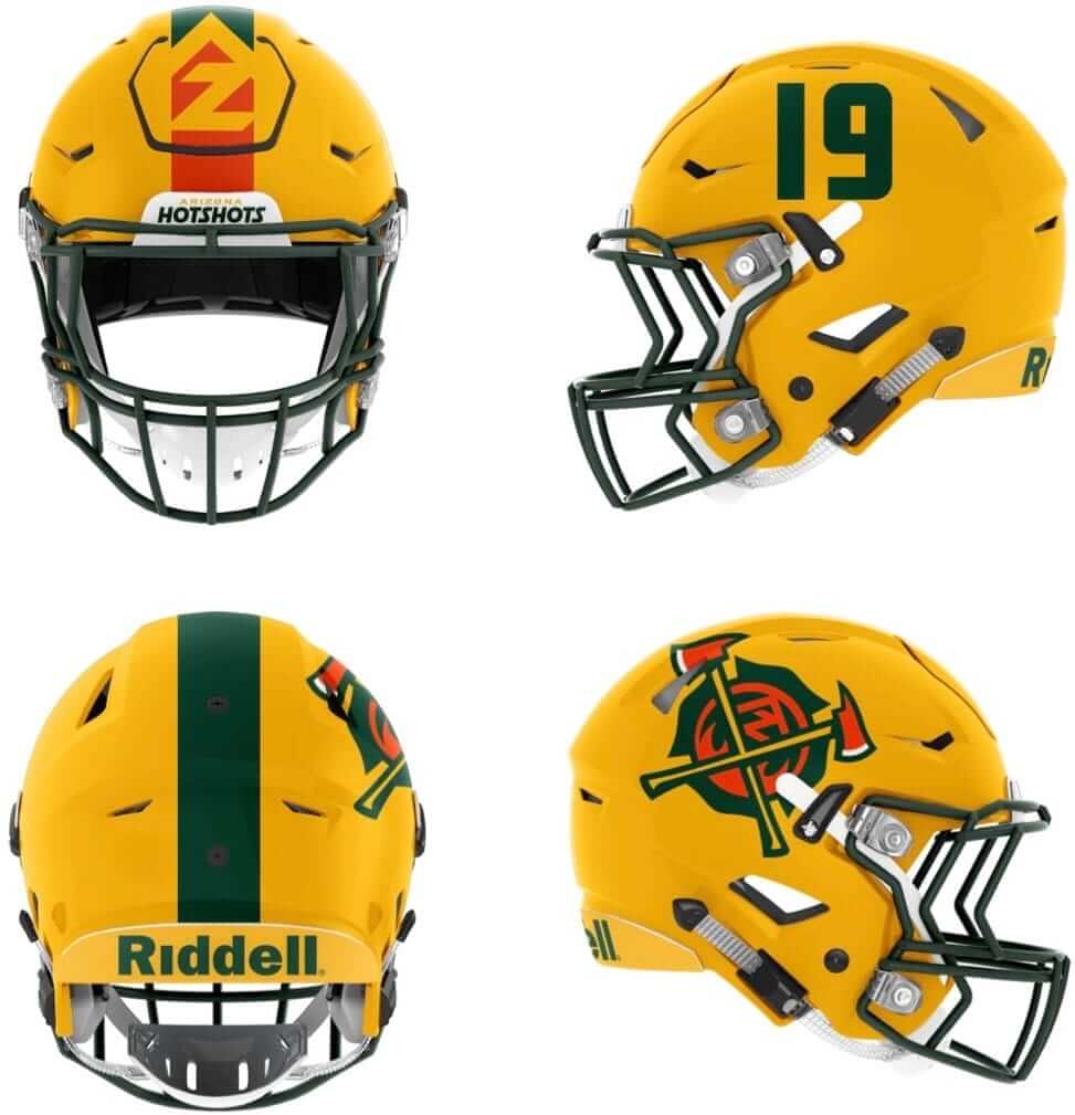
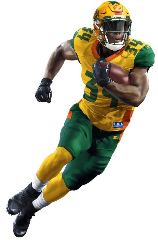
Quick thoughts: Love the color scheme, obviously. … Don’t love how the colors are deployed, though. The bright yellow jersey feels a bit garish, no? … TV numbers seem crowded. … Interesting to see the full team name, including the geographic locator, on the nose bumper — does any other pro or college team do that? … As with all of these uniforms, one photo doesn’t provide enough data to allow for a full assessment.
Atlanta Legends
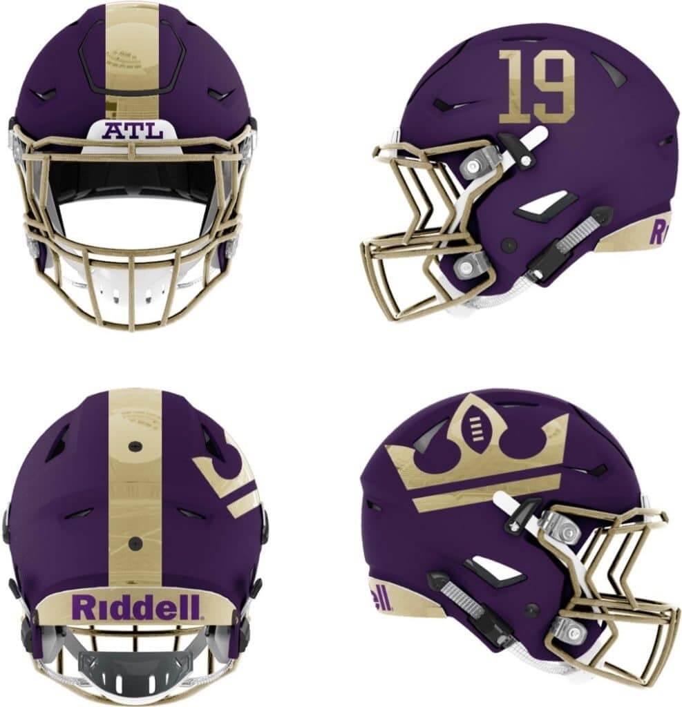
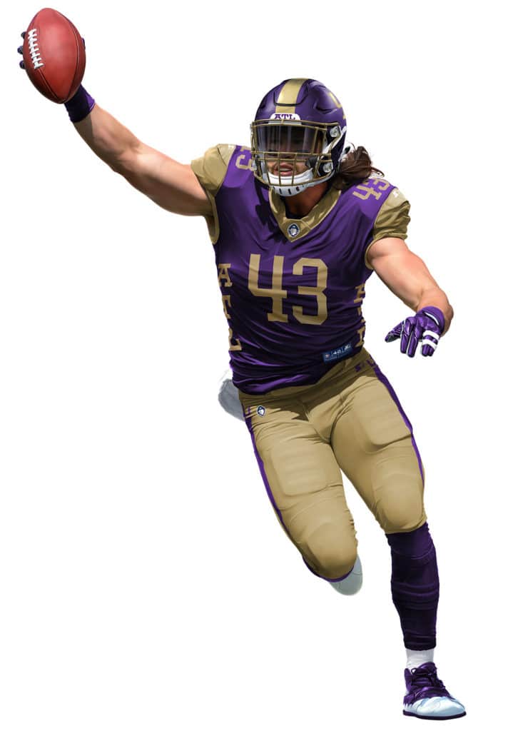
Quick thoughts: Ewwwww, those colors (but you knew I was gonna say that). … Crown logo almost looks like it was designed to fit around the SpeedFlex helmet’s vents. … Again with the cramped TV numbers. … The “ATL” lettering up the sides of the jersey is a bad joke.
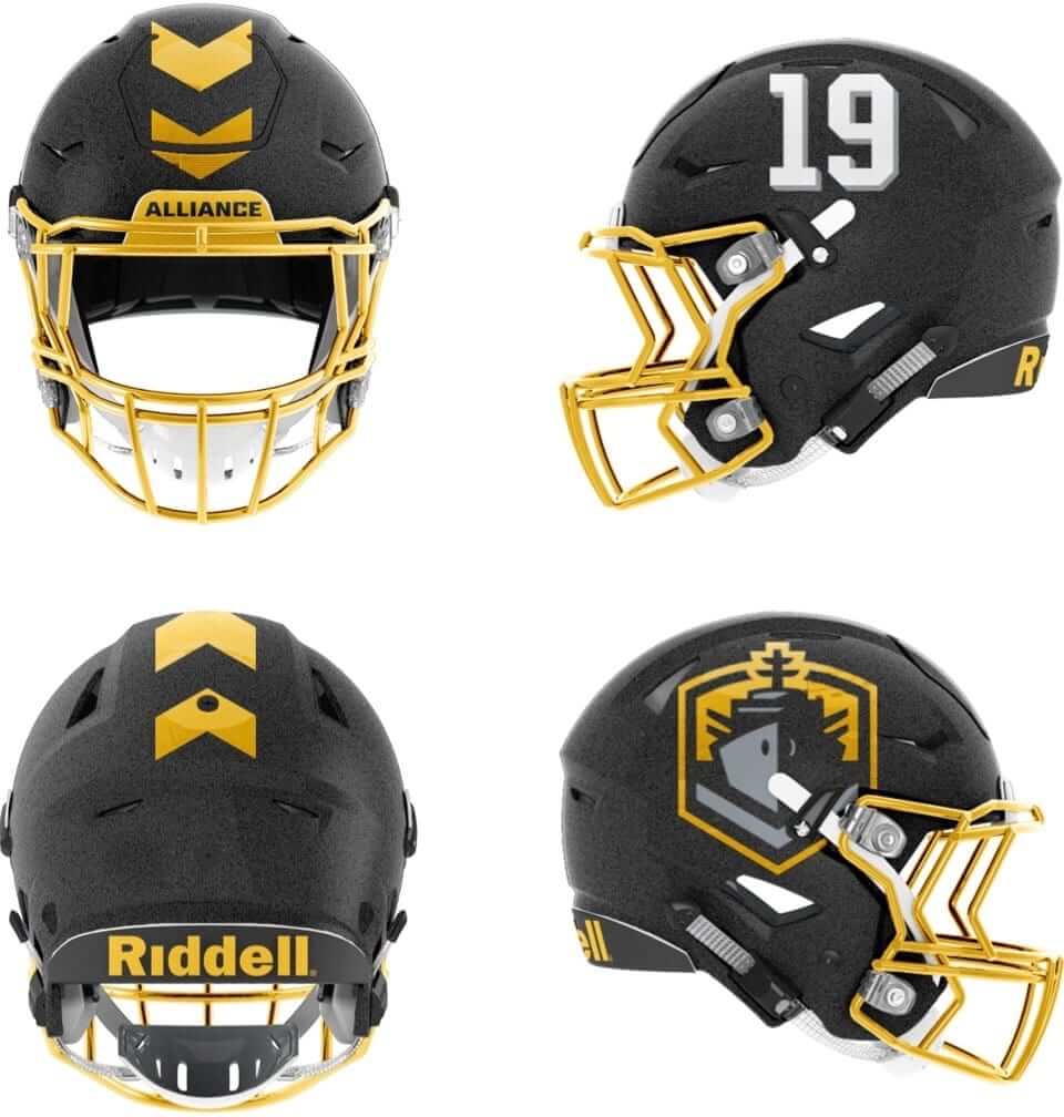
Birmingham Iron
Quick thoughts: No helmet logo. I guess that makes them the Browns of the AAF. … If you have to go mono, I kinda prefer black to any other color. … Hmmm, speaking of mono-black: How hot does it get in Alabama in February and March? … Interesting that they put “Alliance” — a reference to the league — on the nose bumper. Maybe that’s just a placeholder until they come up with a team-oriented graphic to put there.
Memphis Express
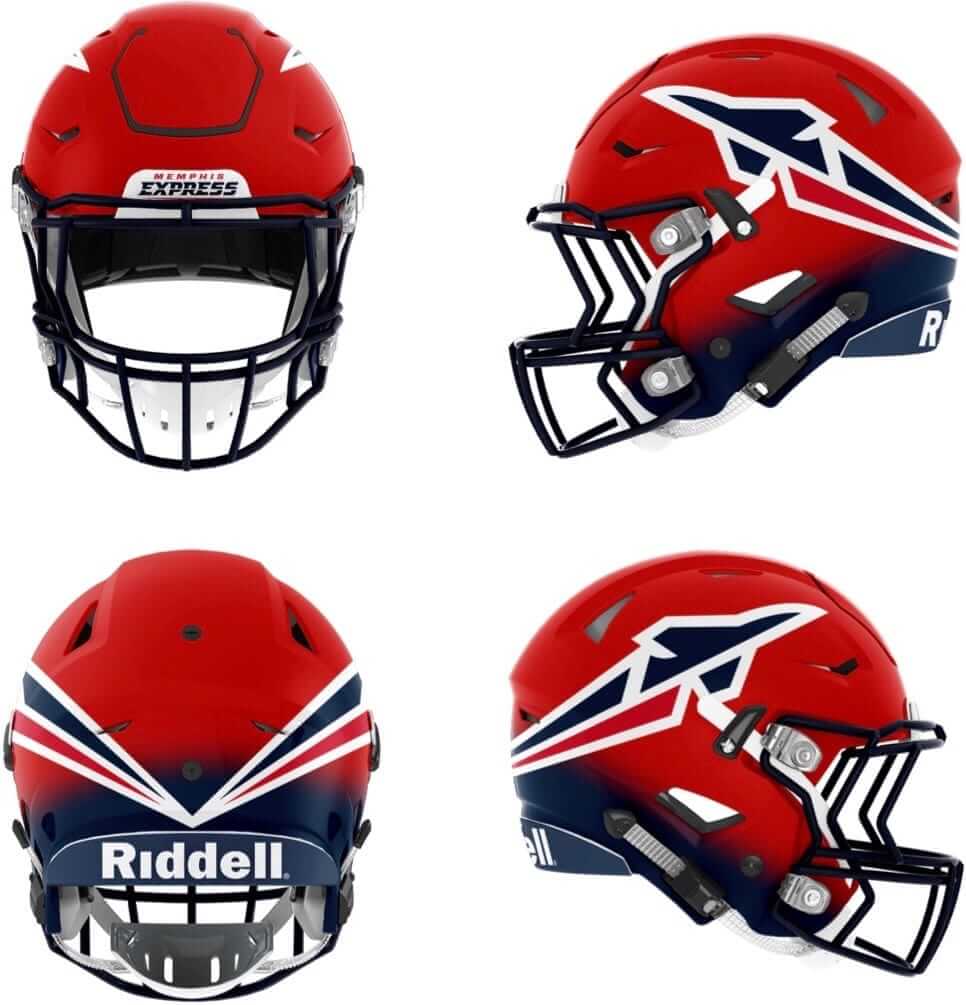
Quick thoughts: Team name seems like an obvious nod to FedEx, which is headquartered in Memphis. … I’m generally a big fan of barber pole striping, but those side panels are gonna look ridiculous. … Colors seem like they might vibrate. … Hate the custom font with the gratuitous little notches.
Orlando Apollos
Quick thoughts: Okay, something doesn’t add up here, because the helmet images appear to be navy/charcoal, while the uniform image shows more of a royal helmet. The team’s website shows lots of navy, so does that mean the helmet won’t match the rest of the uni elements, or that the royal uni elements will actually be navy? … Such an odd team name — is there any other team with a plural deity’s name? The Thors? The Herculeses? The Zeuses? The Jesuses? … Based on the one image, this is easily the best-looking uniform of the bunch — but not if they change all the royal elements to navy. … The number on the back of the helmet seems like a bit much. … Again with “Alliance” on the nose bumper. … The drop shadow on the jersey numbers doesn’t seem right — it appears on some parts of the numerals but not on others.
Salt Lake Stallions
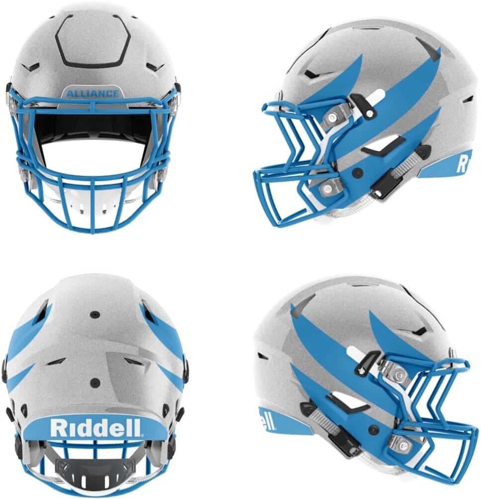
Quick thoughts: Not sure which I dislike more — all that grey, or the two shades of blue. … Helmet seems kinda understated. Like, is it supposed to be a mane, or what? … There’s something really disappointing about knee-high grey socks.
San Antonio Commanders
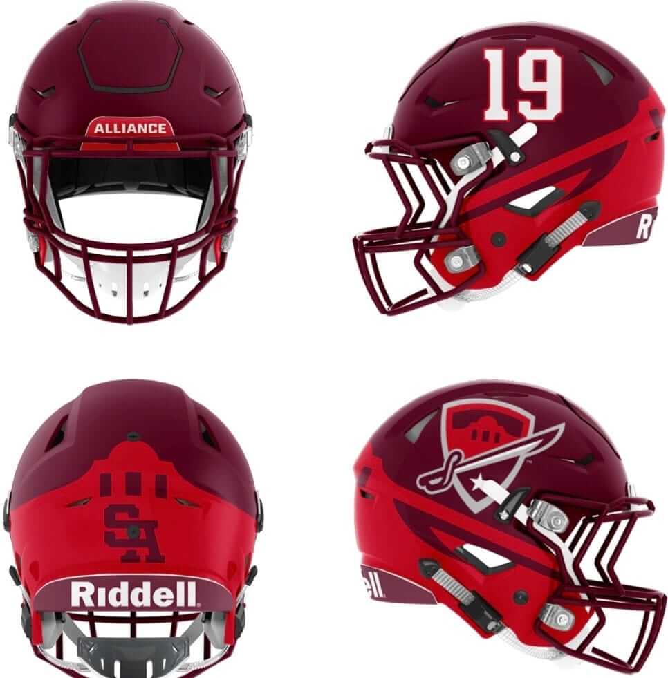
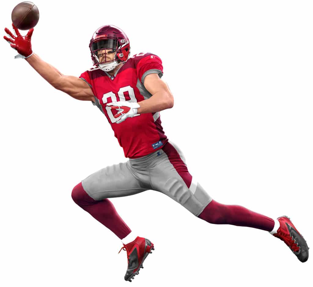
Quick thoughts: Surprised by how much I like the two shades of red, and the grey works really well here. … Helmet logo seems like a bit of a dud. The wraparound Alamo graphic isn’t bad, though. … Couldn’t they have positioned the interlocking “SA” on the back of the helmet so that the air nozzle fit right into the center of the “A”?
San Diego Fleet
Quick thoughts: Surprised by how much I like this color combo, which works quite nicely. … Hmmm, is that barber pole striping on the side panels? … While the battleship helmet logo seems kinda boilerplate, I suppose we should be happy to see a military-based team that doesn’t use camouflage on its uniforms.
Overall: A mixed bag, but certainly not as clownish or gimmicky as some other upstart leagues, and most of these are better than what the Cardinals and Falcons have been wearing for years.
One final thought: Why do all the player shots show the jerseys with the jock tag exposed? Longtime readers may recall that this was actually a thing for the Eagles in 2006, when we dubbed it “Philly tag.” Hmmmmm.
The first and quite possibly last AAF season begins on Feb. 9, just six short days after the Super Bowl, wheee! Meanwhile, since you can never have enough quixotic leagues, the new version of the XFL just announced its first team location (spoiler alert: rhymes with “St. Louis”). That league is set to debut in early 2020, right around the time the second AAF season will be starting. Oops, I forgot, there probably won’t be a second AAF season! Well, maybe the AAF and XFL can merge or something. I hear that worked for two other football leagues way back when.
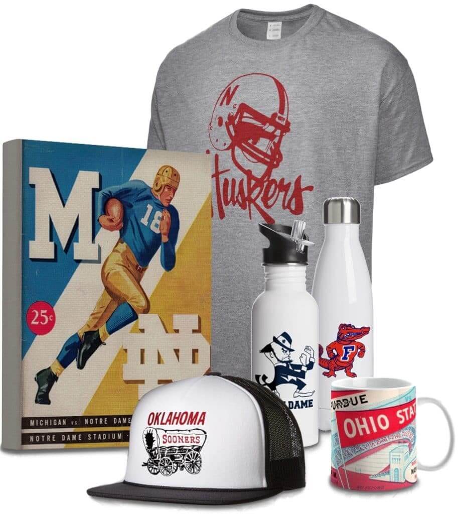
Raffle reminder: In case you missed it earlier this week, we’re doing another raffle with the folks from Vintage Brand, who specialize in retro-styled sports stuff (like the items shown at right; click to enlarge). The winner will get to choose anything from the Vintage Brand site.
To enter the raffle, send an email to the raffle address by tomorrow, Nov. 29, 7pm Eastern. One entry per person. I’ll announce the winner on Friday.
In addition, Vintage Brand is offering a site-wide 30%-off sale. The discount will automatically be applied to your order at checkout — not bad!
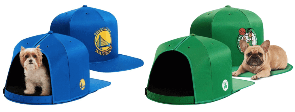
One last plug for the Gift Guide: In case you missed it on Monday, my annual Uni Watch Holiday Gift Guide, featuring tons to fun uni-related gift ideas (including these oversized caps for your pooch, shown above), is now available. Check it out here.
Less, but better: A new documentary about the awesome German industrial designer Dieter Rams, called Rams, is opening today in NYC. Even if you’ve never heard of Rams, you’ve almost certainly seen some of his products (he was the design director for Braun for many years) and you’ve definitely seen products that reflect his influence (Apple’s entire approach to design is basically a Rams tribute — or, if you prefer, a Rams rip-off).
Rams’s mantra, which is apparently repeated several times in the movie, is “Less, but better.” The uni-verse could learn a bit from that, eh?
You can see reviews of the movie here (NYT link) and here. It opens today at the Metrograph, and I plan to see it sometime in the next week.
The Ticker
By Lloyd Alaban

Baseball News: 3B Josh Donaldson signed with the Braves on Monday. To celebrate, he posted a picture of his new home jersey on Twitter (from Tim Dunn). … Stephen Krupin spotted a guy on the streets of Banff, Alberta, wearing a sweatshirt with a skateboard company logo featuring the Nationals’ script W. … If you’re old enough, you probably remember this photo of legendary Red Sox LF Ted Williams, and its various uses throughout the years. Turns out George Woodruff, a Boston-area photographer, originally snapped the original picture (from @BeautyOfAGame and @nyyankeesfanforever). … Ignacio Salazar found this pair of tequila sunrise Astros shorts that comes inside a matching container. … Double-A Yankees affiliate Trenton Thunder will revive their pork roll identity for 10 games this upcoming season (from John Cerone).

NFL/CFL News: The NFL is launching its annual My Cause, My Cleats campaign this week, where players raise money and awareness for causes they have personally chosen. You can see lots of the custom-painted cleats by following the hashtag #MyCauseMyCleats on Twitter. … In these community event photos, the Ravens’ mascot, Poe, is wearing the team’s Color Rash jersey, while the players are going NNOB (from Marcus Hall). … Eagles WR Alshon Jeffery is wearing a sweet-looking Eagles bicycle helmet in this video (from Sam McKinley). … In a crass move, Washington owner Dan Snyder is selling a Sean Taylor doll (from our own Alex Hider). … Players from the Calgary Stampeders of the CFL wore cowboy hats at their Grey Cup championship parade. Fittingly, Calgary is nicknamed Cow Town (from Wade Heidt). … Here’s what happens to the losing team’s championship merch at the CFL’s Grey Cup (from @gilmore03). … The New York Times ranked the 15 best touchdown celebrations so far this season.
![]()
College/High School Football News: Cal will wear a helmet decal honoring the victims of the Northern California wildfires for Saturday’s Big Game against Stanford (from @thechrondawg). … Here’s a behind-the-scenes look at Florida’s equipment managing team (from our own Phil Hecken). … Also from Phil: Notre Dame could be the first school in the CFP to not wear Nike and primarily wear blue. … Here’s a look at every uniform Kentucky has worn this season, along with a poll to vote for your favorite (from Josh Hinton). … Virginia Tech is using a graphic showing players in non-matching jersey templates (from College Sport Design). … Here are some of the helmets for the teams set to compete in Colorado’s 5A and 4A high school football state championships (from Rob Montoya).

Hockey News: The following three items are from our own Phil Hecken: Some tradition-rich NHL teams are eschewing the captain’s “C” on their sweaters. … The San Antonio Rampage of the American Hockey League will have Ugly Sweater Night on Dec. 14. … The Fort Wayne Komets of the ECHL will wear these Star Wars-themed uniforms on Dec. 8.

Pro Basketball News: Here’s a behind-the-scenes look with Jazz equipment manager Adam Klauke (from multiple readers). … The Harlem Globetrotters have revealed their first new uniforms in over 20 years. … The Bucks’ team store is selling a retro-styled Christmas T-shirt featuring the team’s original mascot character (from Johnny Oeleven).

College Hoops News: Penn State men’s wore their black and pink alternates last night against Virginia Tech. Black and pink are the school’s original colors (from Blake Fox). … Look like Nevada men’s is doing some uni-tracking of their own in their media game notes (from Scott Held). … San Diego State wore their turquoise N7 uniforms last night (from @tommycubillas).

Soccer News: New kit for the Orlando Pirates from South Africa (from Ed Zelaski). … Also from Ed: New shirts for Piacenza Calcio 1919, a club in Italy’s Serie C.

Grab Bag: Here’s a weird situation: The apparel company Rowing Blazers — which, as you’d expect, makes rowing blazers — has now signed on to make team blazers for the USA Rugby. The blazers carry the Rowing Blazers logo, which happens to be a wordmark, so the net result is a bunch of rugby players wearing blazers that say, “Rowing Blazers.” … Austin Gillis stumbled upon this concept for Oglethorpe University athletics. … The Toray Arrows, a Japanese professional volleyball team, will wear blue for their Saturday match and yellow for their Sunday match (from Jeremy Brahm). … Here’s an article about the various military camouflage patterns used by different countries (from Anthony Nuccio).
I like how the AAFL has no wordmarks. The NFL should follow suit. We all know who the teams are, no need to have “BROWNS” on the uniform. It looks stupid. I mean the NFL did well without this for the first 75-80 years or so until the Cowboys did it.
The rise of wordmarks on jerseys is, like so many other things, tied to retailing and merchandising. Fans (or at least *some* fans) don’t want to wear just a red jersey with white numbers; they want to tell the world they’re repping the 49ers.
Like I’ve been saying all along, we’d be better off without retail jerseys.
I assumed the rise of wordmarks on jerseys was primarily to stifle the sale of knockoffs. Anyone can legally sell a red shirt with white numbers.
another thing i noticed that reflects the retail market is the contrast sleeves. nike and many college teams seem to consider the color blocking at the sleeve/shoulder area as though it were a true sleeved tshirt, which sells at retail (and some QBs and kickers still use this structure) which makes the sleeve pattern or color blocking look sloppy once it gets tailored down to nothing but a cap sleeve. though there is only one pic and each player is in motion which makes it hard to be certain, these seem to have been done in a way that ignores the existence of the full-sleeved variation on the jersey. plus none of them have any sleeve stripes or patterns which helps keep things looking clean and sharp in the face of extreme tailoring.
also, most of these models are going full bike shorts.
Seattle’s jersey sleeves look horrible on the retail version. The design is well, designed for the tailored Jersey, so the retail one has a lot of blank space underneath to the end of the sleeve.
As bad as most of those AAF uniforms look, none are as bad as the Tampa Bay Buc’s abominations.
the XFL link seems like it might not be right
also confusing that “Alliance” is on most of the bumpers, but you just just called out the once
XFL link fixed.
I figured my comment for the first instance of “Alliance” would basically speak for the subsequent instances.
my bad just me being dense
Forget Sean Taylor (Actually, don’t; RIP). Better they should make Wayne Brady dolls to give to the winners of the Publishers Clearing House sweepstakes.
The Braun aesthetic was the foundation for Apple product designer Sir Robert Ive’s ripoff, I mean inspiration, that drives Macintosh design to this day.
link
I was a Ram fan decades before I saw Apples take on them, so it was easy to spot and talk about with design Noobs.
Great article Paul.
Jony Ive, not Robert
Sir Jonathan Paul Ive,
Not enough coffee this am… thanks
Really interested to see how those Memphis Express unis look on the field. Feel like that barber stripe is a feature that, had it been on a classic team for 45+ years, could be considered classic but feels weird since it’s being debuted now. So, a modern classic?
The Arizona uniforms are the real deal.
The Red/Blue fade shell seems to work for the Memphis helmets.
Not the fail that the Jags had.
Colors work better and it is top/bottom as well.
a lot of elements work for these teams that aren’t working or haven’t worked for the traditional pro teams. the helmet fade is definitely one of them. if nike had used any of these designs in place of the nfl teams that they so clearly nike-fied, the nfl would be a lot easier to look at. aside from the atlanta kit, which smacks of “lesser alternative league” design, there isn’t really a dog in the bunch, just some that are fine-not-great. the commanders could definitely show the cardinals a thing or two and their burgundy sword crest is showing the cavs how it’s done (which is about par for the cavs these days), and their two-tone helmet looks loads better than some (not all) of the colleges that have attempted that. the stallions are a much more tolerable version of the nike-fied lions (nike needs to learn to stop over-designing “minimalist” looks). and the apollos are a positive evolution of the broncos kit.
the hotshots are just an all-around legit uni combo. it’s a shame this whole league is going to be nothing more than a “remember when” post on this blog in a few years time.
I assume the “Apollos” are named after the space program, since they are in Orlando – and maybe they didn’t want to get in trouble with NASA?
It does seem weird.
Yeah, pluralizing a mythological figure does seem strange. I mean, there’s the Titans, but the titans of myth were a group to begin with, of course. “Saturns” might work. And my wife thinks “Athenas” would be a good name for a women’s team.
It does look as though the AAF unis were designed so you could have 1 uni per team, but I certainly wouldn’t want to referee an Iron vs. Fleet game with those unis.
The University of Waterloo women’s sports teams used to be called the Athenas – before amalgamating with the men’s Warriors team name.
link Logo
sadly according to this press release it does not
link
That’s sad.
The Vermont Lake Monsters are named after a single individual mythical creature. There’s only the one lake monster, Champ, after whom the team is named. Exactly the same situation as the Apollos. And high school and college sports are replete with similarly named teams.
Champ spontaneously generated?
Fun Fact: Apollos was one of the original proposed names for the Houston Texans, along with the Bobcats, Stallions, or Toros. Hard to believe Texans was the BEST choice they had, but here we are.
They weren’t allowed to use the best choice, which is Oilers.
Houston Apollos was the name of a minor league hockey team back in the 1960’s.
We had a “Harlem Apollos” in one of our computer leagues. Different inspiration, of course.
link
I don’t think I’m a fan of the decal placement on the Legends helmets.
Seems too rakish.
It’s too large.
Moving the crown to front and center (ala the Birmingham Bolts)and ditching that center stripe would not help either with those SpeedFlex helmets.
the inaugural jerseys for retail look atrocious.
In defense of the Hotshots yellow over green color combo which you called “garish” – That is a direct homage to a real Hotshot Firefighter’s uniform, which is traditionally yellow over green. I think they pulled it off. Thumbs up.
Exactly. And in a world in which the garish design-vomit of the Oregon Ducks is tracked and celebrated, the Hotshots uniform is a pillar of restraint.
The Alliance uniforms all have some details that work better than others, but on the whole each is good, and the league’s design quality average is well above the NFL. That, plus the lack of advertising (so far) and the modest maker’s marks makes the Alliance unis worth a bit more critical attention than the doomed-to-fail-so-who-cares framing here. I mean, not even the NFL has figured out how to make spring or summer pro football profitable, but that’s one of those things that will be true until it isn’t. (Or until winter pro football also ceases to be profitable at its current scale, which seems likely in the medium term.)
As to the one-uni-per-team thing, the reasons seem obvious. And a league of this size can just barely pull it off. But I’ve gotta figure that if the league lasts more than two seasons, it’s likely to plan to expand. Any expansion would all but require teams to adopt a second uni, and if the league remains a going concern, it will surely want to take advantage of the potential merchandising opportunities of second jerseys.
Update: I’ve now been told that the teams will only have one uniform apiece, so most games will be color vs. color.
Interesting. On one hand, it makes sense. On the other hand, there are teams with white jerseys, light gray jerseys, dark gray jerseys, and black jerseys. Seems like there is high potential for clashing issues, unless they think different helmets and pants are sufficient to keep teams apart.
Yep – like have purple jerseys vs. navy blue jerseys really does not work (Legends vs. Express). They are banking on the differences in pant and helmet colours for these teams to help with the clash issues.
The matching Astros container for the shorts really appears to be a beverage cup. It was probably bought at an Academy sporting goods store, and it’s probably an Rtic brand cup. Note the mismatched fonts on the cup compared to the shorts.
AAF unis have a USFL feel to them. SL Stalions look quite Orlando Breakers-ish. Also, I’m a little surprised Orange isn’t used more. Can’t wait for the soon-to-sell-out Birmingham vs Salt Lake Classic
Also, 25% of the teams use old USFL nicknames. We have the Stallions and the Express.
3rd iteration of an ‘Express’ pro football team (Jacksonville WFL, Los Angeles USFL); Memphis AAF looks to have the best uniforms out of all of them.
Bite your tongue :) maybe in color, but not in piping and weird side panels and capped sleeves. The USFL was close to the classic nfl look of uniforms as far as no light color jersey matched with dark color pants and fully colored sock… this is all the “modern” look… mismatched and crazy. The usfl just had a few wild things like flames instead of stripe on the pants, but the chargers used lightning, so that’s even close… the AAF is more like the XFL if anything.
Sharpstown High in Houston has been the Apollos for as long as I can remember. I always assumed it was a nod to NASA, but I don’t know whether the school predates the Johnson Space Center.
Atlanta Legends signed Troy Polamalu … who knew?! -C.
I thought he was a league administrator.
I actually like most of these jerseys. A new league is the perfect time to try out some crazy designs. Fleet or Stallions are the best of the bunch.
I know it is highly unlikely this league will succeed, but you Dan be certain I’ll be watching. Who doesn’t want more football, honestly?
“Who doesn’t want more football, honestly?”
Thats what I thought when the XFL came along. Then I watched and was bored stiff.
I was a big follower of the USFL its first 2 seasons. But they had actual good players. The XFL had crap players and it showed.
Lee
“who doesn’t want more football, honestly?”
if it’s honestly football, i’m for it. XFL was a sideshow of mostly hip-hop and wrestling with a dollop of football. if AAF broadcast is mostly football without crotch-grabbing and chest-pounding, I’ll watch it. If it’s going to be like XFL was, I won’t.
In related news, the Orlando Apollos have a picture of head coach Steve Spurrier in a very badly photoshopped Opollos visor and polo shirt on their website. If you zoom in on the picture you can also notice that he is wearing a South Carolina Gamecocks belt, so apparently the picture was taken when he was the head coach there.
Here’s the link: link
I love color vs color when there is enough contrast. Some of these games won’t have enough.
Also another interesting thing about the Arizona Hotshots is the AZ incorporated into the vertical center stripe on the front of the helmet.
Update: Judging from the retail jerseys (which I hadn’t see until now), there will be a league-wide inaugural-season patch:
link
Paul- I’ll bet you a dollar the AAF lasts more than one season. It’s TV programming. My guess is that it will take more than one year for the experiment to be judged. In the meantime, if we see some innovative things it will be a bonus. (PS- I’m not a basketball or hockey fan, so a couple games in February and March can’t hurt.)
One season, two seasons, whatever. I wish them no ill will, but I’ve lived thru the WFL (one of their teams practiced at my summer camp), the USFL, the WLAF, the XFL, the UFL, etc., so you’ll forgive me for maintaining a healthy skepticism.
They do have one advantage that those other leagues lacked: legalized gambling. I figure the type of people who’ll watch any football game no matter how bad it might be are the same people who’ll wager on anything, so that might provide a certain kind of fan base.
As for “innovative things,” I’m all for innovation — if it’s genuinely innovative. Doing something differently is not necessarily innovation — it’s just different (and sometimes worse).
Hal Mumme has been involved in lots of innovative things on the field and he’s running the offense for Mike Singletary’s Memphis team. They should be fun to watch.
Hugh Freeze and Rick Neuheisel are innovators of a different sort coaching the Phoenix team.
Hal Mumme isn’t going to be a couch for Memphis after all.
I read an article earlier this year about how the NFL likes competitor start-ups – the competitors (XFL, WFL, etc.) often try innovative new ideas in gameplay that allow the NFL to see what works and what doesn’t work, risk-free. I did my best to find the article and came up short.
That was literally about the only good thing that came out of the WFL back in 1974-75, was some rule tweaks.
– The goal post will be moved to the rear of the end zone.
– Missed field goals will be returned to the line of scrimmage except when attempted inside the twenty.
– The hash marks will be moved in toward the center of the field.
The NFL adopted all of those after seeing them implemented by the WFL.
Lee
Of course, the WFL had other rule changes that were *not* adopted by the NFL.
When the New York Stars held their summer workouts at my summer day camp on Long Island (I was 10 yrs old at the time), we would get autographs from them and the staff would give us little handouts and brochures promoting the WFL. I remember being on the bus home and reading this handout that explained “why the WFL is a more exciting brand of football!” For some reason I remember that one of the rules was that you couldn’t hit the QB after he’d released the ball, which I guess was supposed to open up the passing game. Obviously, the NFL decided that a better way to open up the passing game was to tie the secondary’s hands while preserving crowd-pleasing hits on the QB.
Yeah, the WFL also had the “Action Point” and you only needed one foot in for a catch.
I didn’t know about the WFL’s version of not being allowed to hit the QB after he’d released the ball.
I wonder how that actually played out during games. The 70’s in general didn’t seem like player safety was a big issue.
Of course there is almost no game footage of WFL games that I have been able to find, so I can’t check out that rule myself.
Lee
No doubt that’s true. The XFL introduced the on-field cameras that the “sky” cameras every network uses are based on. They also had a few other more minor things that have since been adopted.
What was the field goal rule before?
Following up on Paul’s comment about the New York Stars of the WFL, I always thought it was interesting that I believe after one season the team moved to Charlotte and became the Hornets. In the early 70’s, Charlotte was nowhere near the size city it has become now so it’s odd that a team would have chosen to move here.
I also recall reading that the Hornets made the WFL playoffs one year but literally couldn’t afford to have the team travel so their spot went to another squad.
Precedent for “Apollos” as a team name: link
Boy, was that a negative opening paragraph or what. I like them, they’re fun. Who cares if the league fails. More football, more uniforms, more better.
It’s interesting to see how many in today’s comments just want “more.” No apparent interest in quality, just quantity.
As for the opening graf, I apologize for the negativity. I meant to say that the AAF will cure cancer and deliver a basket full of puppies to every American home. Must have been a typo!
More football always sounds great in theory. But then nobody watches on TV, nobody goes to the games (at high school stadiums probably), and the start ups die. Paul is being realIstic. Maybe supporters can wal the walk to help this league survive more than one year. I’ll be real, I won’t.
actually they’ll be playing at college stadiums
Atlanta Legends Georgia State Stadium
Birmingham Iron Legion Field
Memphis Express Liberty Bowl Memorial Stadium
Orlando Apollos Spectrum Stadium
Arizona Hotshots Sun Devil Stadium
Salt Lake Stallions Rice–Eccles Stadium
San Antonio Commanders Alamodome
San Diego Fleet SDCCU Stadium
It’s a great point Paul. With no tie to any of these teams and not a gambler, if the games don’t hold my initial interest I will tune out. Regarding quality, the AAF has an interesting mix of NFL royalty and credible TV executives, but it has a fair amount of retreads. If they don’t put a good product on the field, it won’t work.
A good first step is that their uni’s are not cartoonish. Personally, I would rather not have innovation come from uniform design. I’d rather have the teams look decent, play reasonably well and have the game last less than 3 hours.
HAHAHA, Paul, that was hilarious.
I know that’s not your typical “quality” comment and just adding to the “quantity” of comments, but I couldn’t help myself
I have a feeling the AAF (run by Dick Ebersol’s son) and the XFL (Run by Vince McMahon, who was best friends with Ebersol for years) are planning a merger eventually. And lest we forget, the USFL worked fine…until they tried to compete in the fall. Spring football worked ok from 83-85. I’m being optimistic, it’s just how I roll.
As for unis, I like San Antonio the best.
It’s was almost miraculous that the league lived to see 1985.
As a whole the USFL was plagued with financial problems (stemming mainly from team ownership/management) well before the pie-in-the-sky merger plans, i.e: the move to a fall season and anti-trust lawsuit. But those teams were sure dressed well despite the lackluster on-field play in mostly empty stadiums.
I don’t know Paul, not like you to be that cynical. Almost like you’re taking it personally. Smile! :)
At least this league isn’t just going to “one jersey template for the entire league” route that the UFL did. It’s nice that they’re making an effort? I guess?
I like San Diego’s best. I just don’t understand Orlando’s color scheme…the helmets don’t match the jerseys at all…or should I say the jerseys don’t match the helmets? Its just awful
I have them ranked:
1. San Antonio
2. Orlando
3. Arizona (I agree with Paul. Love the color scheme. They could have done better with the execution.)
4. Memphis
5. San Diego
6. Birmingham
7. Salt Lake
8. Atlanta
None of them are all that bad. IMO all (maybe excluding Atlanta)are better than the worst NFL unis: Baltimore, Carolina, Jacksonville, Seattle.
The better image of Donaldson yesterday was him losing a battle of wits with his new jersey
link
(stolen from Cork Gaines’ twitter feed)
Somebody woke up on the wrong side of the bed this morning. I get that the league doesn’t have a great chance of success, but that didn’t seem to stop you from happily reporting on the BIG3 uniforms. link
Also, Birmingham isn’t actually all that hot in March. link
I get that the league doesn’t have a great chance of success…
Right, and that’s all I said. So we agree.
Like I already said in another comment thread, I’m old enough to have lived thru the WFL (one of their teams practiced at my summer camp), USFL, WLAF, XFL, UFL, etc., so you’ll have to forgive me for maintaining a healthy skepticism about the latest much-ballyhooed football league vying for our attention.
As for the BIG3 story, it had two things going for it that made it newsworthy: the involvement of Todd Radom (who’s a celebrity in the uni-verse) and Ice Cube (who’s a celebrity everywhere else).
I would have loved to see Todd do the uniforms. That would be something and interesting for all of us.
My memory of your BIG3 coverage was what caused me to post the comment. It’s fair that Ice Cube’s involvement in the creation of the BIG3 uniforms created a worthy story uni-wise, and as you pointed out we agree that the odds of success aren’t strong. I just felt that the tone of this article was a complete 180 from that of the BIG3 coverage, when both ventures have television deals, deep-pocketed investors and celebrity involvement.
One of my biggest football pet peeves is having a number on one side and a logo on the other. I hate it for college teams, and I hate it just as much here. I really thought it would have died out by now.
Hey Paul, thanks for the AAF uniform review. The one question I have: how do you think the league will fare? You were kind of vague on that issue. :)
Seriously, though, all in all I thought the AAF uniforms were surprisingly well designed, they managed to look distinctive and modern without, for the most part, being too “clownish”.
I particularly like the Birmingham logo-less helmet for some reason. Kind of a bold decision and it’s pulled off nicely.
On the other hand, as one of the few Uni Watchers who hates 99% of “color on color” games in any sport, I think the decision to not include a white jersey option was a big mistake. My prediction: if the AAF does last a second year, they’ll remedy this.
Oakland Athletics released stadium/ballpark news. Looks a lot like UW daily entry!
Just saw the pictures, looks like a really unique and cool design, a departure from the cookie-cutter “retro” parks of late…
You can see them here:
link
I agree, it looks great! Very original, I hope it goes through. So many questions, is that grass area around the stadium “walkable”?
Striping on the side of the San Diego uniform actually looks like it might be chevrons, echoing the helmet striping (chevron-ing?).
Inverted chevrons on the pants may be a bit much though.
I’m pretty impressed with Alliance’s design.
The Arizona Hotshots logo and color scheme is especially fantastic.
• The jerseys are completely devoid of chest wordmarks. No team logo patches, either — just numbers. For me, this is the single biggest surprise about these uniforms.
By applying team logos with city names on patches/chest wordmarks, the AAF can’t reuse the jerseys when the teams move cities, which happens a lot when neg w leagues launch.
Making the jerseys as generic as possible allows the freedom to simply ship the uniforms to their next new home… it was done as an economic issue.
The AAF has enough money and support to last at least a few seasons supposedly, and it’s not like it is competing with the NFL, it’s more of a bridge between college football and the NFL.
So, hopefully, it will last a lot longer than one season.
Has a captainless team ever won the cup and if so, was there a predetermined player (from among the assistants I imagine) who would pose with Bettmam and begin the skatearound?
Trying to imagine an A on that uniform for that pic and something about it feels wrong.
Nope. First team to even win a conference without a real captain were the 2014 Rangers, having flipped Ryan Callahan for Martin St. Louis. Would have liked to see Price and Lundqvist all the way in that series. I’m not bitter at all over Krieder “mistaking” Price’s leg for second base.
Man. Those AAFL jerseys look a lot like the uniforms and logos you see when you dig deep into Madden. Whether it’s computer generated teams in franchise mode, or limited time uniforms they release in the Ultimate Team mode, to me they look like garbage, but I tell you, the kids really like flashy, bright uniforms and pay real money for them.
There are probably shots of other teams around but all the photos you shared above are bad photoshops (which has been all the rage with this league). The Apollos (as in the God of the sun in the sunshine state) had a party last night so you can find a video of the uniform in person (here link). The blues seem to match wayyyyy better than above. The helmet appears to be matte finish. I’m not a fan that they chose orange and blue to honor the old ball coach though…
I used the photos they provided. If they chose to provide lousy photoshops, that seems like a pretty dumb move.
Oh wait, now someone will say I’m being too negative again…..
I’m not blaming you for the poor photoshops! I love your write-ups and agree with everything you said. I was trying to be helpful with a slightly better view of the helmet and jersey!
They have digital billboards up all over town with horribly photoshops of The Ol’ Ball Coach in various positions wearing Apollo gear on the sidelines of games that have never happened.
I am still hoping that the new XFL reincarnates the old Orlando Rage.
Yep, agree on the double red. Who would have thought. Dont think anyone else mentioned based on quick scan of comments and maybe this is just me but the Salt Lake uniform seems to be a distant cousin of the old Boston Breakers uni.