Photo by Ben Axelrod; click to enlarge
Busy day on the MLB front yesterday, as the Indians and Cardinals both unveiled some additions to their wardrobes.
Let’s start in Cleveland, where we’ve known for a while now that the Indians would be scrapping Chief Wahoo for 2019. Yesterday they made it official, announcing a series of uni-related moves for next season. One at a time:
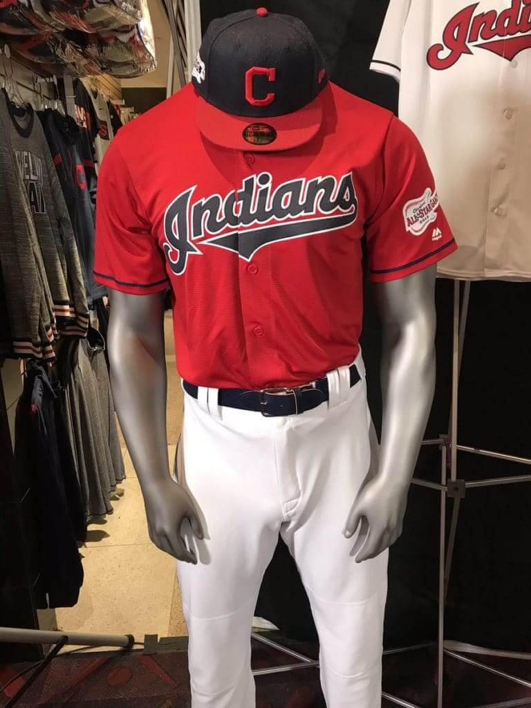
1. As you can see above, they’ve added a new red alternate home jersey and a new red-brimmed block-C cap.
2. The red-brimmed cap shown in that same photo above is the new designated home cap, replacing the Wahoo cap.
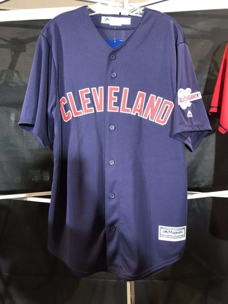
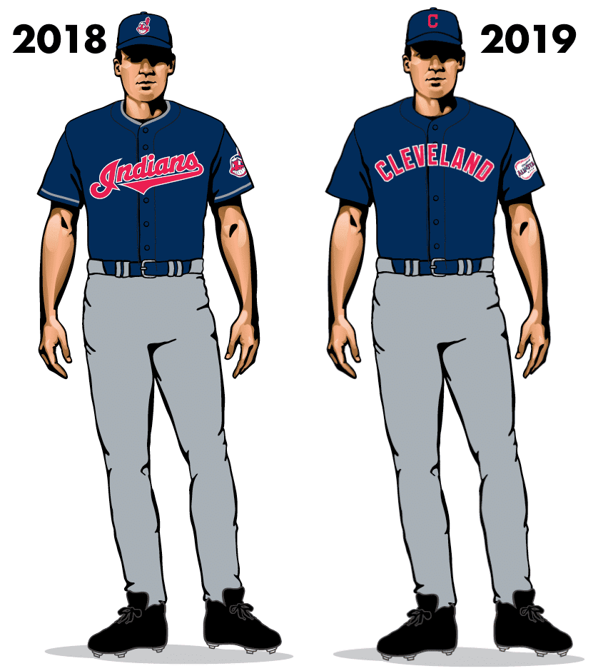
3. The navy alternate road jersey, which had featured a script “Indians” insignia, will now have “Cleveland” lettering. Here’s the new jersey, following by a before/after comparison:
4. As you’ve probably noticed already, all jerseys will carry a 2019 MLB All-Star Game sleeve patch. Caps, too. We’ve seen the logo before, but here’s a closer view at how it looks as a patch (both photos via @923TheFan; click to enlarge):
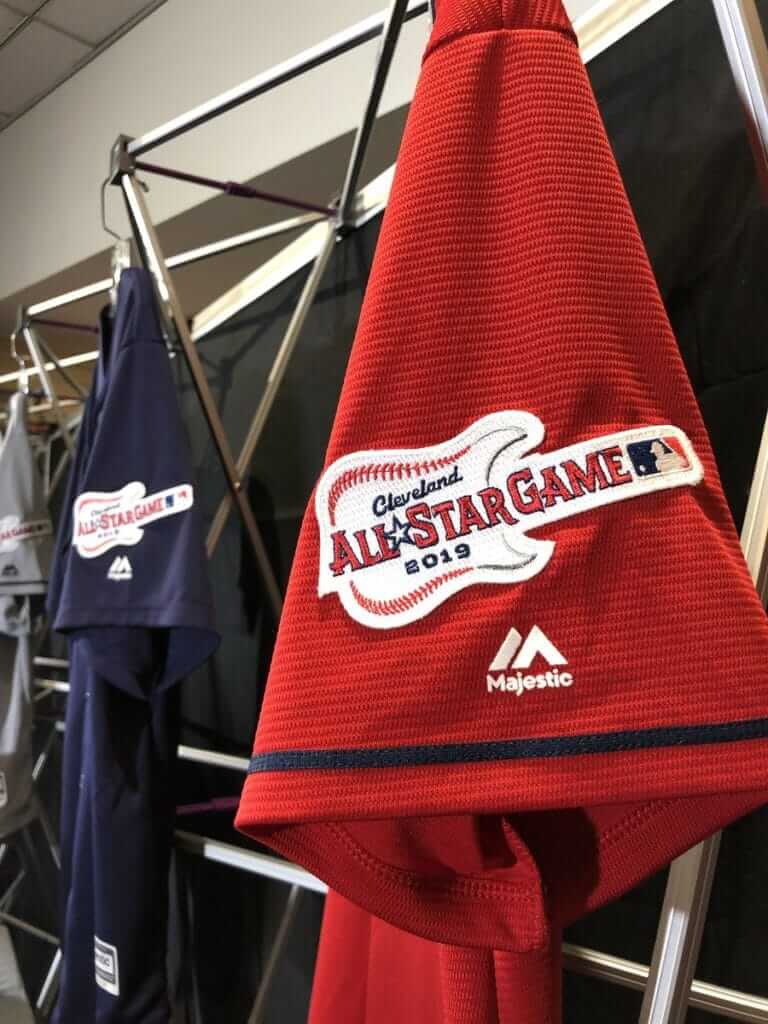
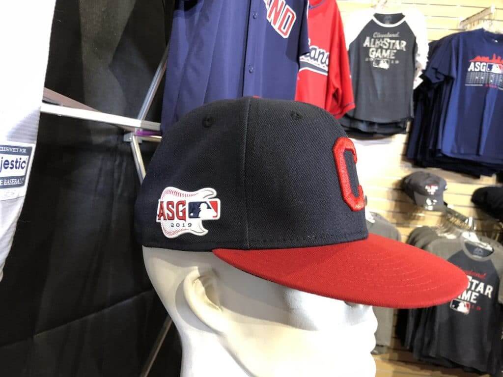
They’ll come up with a new sleeve logo for 2020.
5. The red alternate cap has been scrapped.
———
All in all: Nothing too earthshaking. One thing that really jumps out at me is that the ASG sleeve patch looks great. Lots of logos lose something when rendered in embroidery, but this one seems to gain something. I really like it.
I know many of you Cleveland fans think the block-C is boring and plain, and I agree with you. Wahoo’s demise was long overdue, but the team deserves a more dynamic logo than this. Here’s hoping they come up with one soon.
Meanwhile, in St. Looey, the Cardinals are bringing back the powder blues — sort of. They’ve added a Saturday road uniform, which is basically the same as their cream Saturday home uniform — but in powder blue:
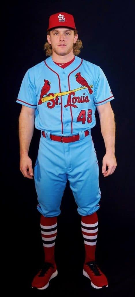
The Cards have been hinting at this one for a couple of weeks. Unlike their original powder blues from the 1970s and ’80s, which featured pullover jerseys and sansabelt pants, this uniform will have button-front jerseys and belted pants. And as with all Cardinals jerseys, the birds on the bat will be chain-stitched.
I’ve known about this one since the summer, when team owner Bill DeWitt III (who’s a big uniform guy) got in touch with me to pick my brain about the project. At the time, he was uncertain about whether he’d go forward with it, but he eventually decided to pull the trigger.
Contest reminder: In case you missed it last week, ESPN.com’s hockey editor has asked me to have a design contest for the potential new NHL franchise in Seattle. Here’s the skinny:
• Your entry must include a team name, a primary logo, full home and road uniforms (jerseys, pants, socks, helmets), and an inaugural-season logo that can be worn as a patch. If you like, you can also include secondary logos, an alternate uniform, and a center ice design, but those aren’t required.
• You can draw upon Seattle’s rich hockey history or start from scratch. Up to you!
• Your designs can be created in any digital or analog medium (Illustrator, Photoshop, crayon, whatever) and can be submitted in any standard digital format (JPG, PDF, TIFF, etc.). You can also create a video presentation, upload it to YouTube, and submit the YouTube link as your entry.
• The files you submit should be named after yourself (PaulLukas.jpg, for example). If you’re submitting multiple files, please either number them (PaulLukas1.jpg, PaulLukas2.jpg, etc.) or use some other designation (PaulLukas-homeuni.jpg, PaulLukas-logo.jpg, etc.). Files that don’t follow this format will not be considered.
• In keeping with longstanding Uni Watch chromatic policy, entries with even a hint of purple will not be considered.
• Email your entry to Uni Watch HQ (note that this address is just for contest submissions — please don’t use the usual Uni Watch email address). If you have more than one concept, feel free to enter as many times as you like.
• Deadline: Monday, Nov. 26, 7 p.m. ET.
The best entries will be showcased in one of my upcoming ESPN columns. Good luck!
ITEM! Pre-holiday sale: In my continuing attempts to sell through a big pile of unsold caps find the right price point for our flex-fit Uni Watch alternate cap, we’re running a one-week sale. The cap, which originally sold for $29.99 and was then reduced to $24.99, is available for only $19.99 from now through Cyber Monday (i.e., next Monday, Nov. 26). Move fast to get it at this discounted price.
While we’re at it: Our Uni Watch classic cap, available exclusively from Ebbets Field Flannels, is currently in stock in all fitted sizes plus the adjustable version. Get it here.
Also: In case you missed it yesterday, we launched some new Marquette-colored Naming Wrongs shirts for the Bradley Center, and you can see all our Uni Watch product conveniently listed on one page here. My thanks, as always, for your consideration of our merchandise.
Uniforms in the wild: Scott M.X. Turner, who designs our membership cards and Naming Wrongs shirts, is a superb photographer who posts lots of really interesting photos on Facebook. The other day he posted a doozy, and it happened to be uni-centric:
So much great stuff going on in that shot! I mentioned to Scott that I wished I could see what was going on in the areas that were cropped out, and he said, “Here’s an earlier shot, with an even more unbelievable element on the right side of the frame”:
The Ticker
By Alex Hider

Baseball News: With the Indians’ new threads ready to go, here’s a look at the Tribe’s uniforms through the years (from Phil). … The Colorado Springs Sky Sox are moving down to the rookie-level Pioneer League, and will now be known as the Rocky Mountain Vibes — complete with anthropomorphized s’mores logo mascots (thanks to all who shared). … The Wisconsin Timber Rattlers of the Midwest League have a new 25th-season logo (from Brian Kerhin). … The Single-A Potomac Nationals had hoped to build a stadium in the DC suburb of Woodbridge, Va. After the local authorities put the kibosh on the deal, the team has its sights set on Fredricksburg, Va. The team is currently using a generic “Fredricksburg baseball” logo in emails to fans (from R. Scott Rogers). … The mascot for the Orix Buffaloes of the Japanese Pacific Leauge wears No. ∞ (from Jeremy Brahm). … After the Yankees traded for P James Paxton last night, MLB.com Photoshopped him into a Yankees uniform — but neglected to Photoshop out his beard, which would be a serious no-no with the Bronx Bombers (from Andrew Gordon). … Here’s one writer’s five simple rules to eliminate clutter from MLB uniforms (paywalled link).

NFL News: The Rams and Chiefs went mono-yellow vs. mono-white last night. Many coaches and players on both sidelines wore LAFD caps (complete with New Era logo creep) and other emergency responder caps, to support the efforts to fight the California wildfires. More on the caps here. … The Bills will be wearing their standing buffalo throwback uniforms on Sunday against Jacksonville (from Mike Chamernik). … The Broncos will be going with their Color Rash jerseys on Sunday (from Phil). … Steelers WR Juju Smith-Schuster was wearing custom thigh pads with his number and the Steelers’ logo on Sunday (from Jeff Perilman). … This time-lapse video shows how one designer photoshopped new Eagles WR Golden Tate into his new jersey (from James Gilbert). … Lindsay Resnick was at a sporting goods store in Georgia and spotted this Falcons banner that had the team’s current logo and old wordmark. … Texans S Tyrann Mathieu had T-shirts made for his teammates on defense, inspired by the NWO logo (from Ignacio Salazar).
College and High School Football News: Florida State will wear garnet jerseys and pants with gold helmets this weekend (from Phil). … West Virginia offensive lineman Joe Brown had a backward Big XII logo on his jersey on Saturday (from Brian Young). … Washington State WR Calvin Jackson wore some nice striped socks — or is that tape? — on Saturday (from Jay Jay Dean). … There’s a controversy over a high school game in Illinois, where a parent of one of the players showed up in a referee’s uniform and apparently affected the game’s outcome (from Jason Hillyer).

Hockey News: Rangers backup G Alexandar Georgiev was caught on camera chewing on his sweater (from Al N. Kreit). … St. Lawrence and Clarkson are playing a Thanksgiving game in Lake Placid, and have a logo to mark the occasion (from @OlegKvasha). … The Brandon Wheat Kings of the WHL will wear wheat-themed sweaters on Friday night (from @TeebzHBIC and Tyson Kehler).


NBA News: Heat SF Josh Richardson was ejected from a game on Sunday for throwing his shoe into the stands (from Mike Chamernik). … The Grizzlies and Mavs went blue vs. blue last night (from Ernad Selimagić).
College Hoops News: Minnesota wore BFBS jerseys on Sunday night (from Tommy Everson). … Here’s another look at the throwback uniforms Ohio State will wear on Friday in St. John’s Arena — the school’s old basketball stadium (thanks to all who shared). … Brian Bowen, the high school player whose recruitment opened an investigation into payments from apparel companies to high-profile recruits, is suing Adidas. He’s seeking damages and a restraining order that would prevent the company from sponsoring DI programs (from Josh Hinton). … Navy is giving away “ugly Christmas sweater” T-shirts to fans at an upcoming game. … The Virginia Tech women debuted their new “Hokie stone” uniforms last night (from Andrew Cosentino). … Nevada’s Instagram page has a photo that appears to show several unreleased jerseys (from @Jorgy_26).

Soccer News: Aldyr Schlee, who designed Brazil’s iconic uniforms, has died (from Ryan Swift). … No photos, but according to this story German club Borussia Dortmund will wear one-off uniforms on Dec. 21 that read “Danke Kumpel” (thanks pals) to commemorate the closing of the last coal mine in the region (from Anthony Zydzik). … Madison FC of USL League One has a new logo (from Diego Bauzá). … Nike is now selling American football jerseys for prominent soccer clubs. Here’s PSG’s version (from @florian_mcgill).

Grab Bag: This blew my mind: Did you know there’s an “8” hidden in the negative space on the eight of diamonds? … Some female Marines have been issued new dress blues (from Tim Dunn). … R. Scott Rogers went down a YouTube rabbit hole and found this video of a Scandinavian aviation blogger explaining the history and elements of a pilot’s uniform. … There’s a new book featuring great shots of Muhammad Ali in his hometown of Louisville (NYT link). Additional info and photos here. … The midterm elections truly were a blue wave (WaPo link), at least in terms of campaign logos and signage, which featured a disproportionate amount of blue. … House Democrats may propose new guidelines that would allow representatives to wear religious headwear on the House floor, which would overturn a 181-year-old ban on hats. … Not uni-related, but curling fans will appreciate this story: A Canadian gold medalist was kicked out a Calgary curling club because he showed up to the rink drunk and began breaking brooms (from Ted Arnold).
How come when I view this on the Ipad, a lot of the pictures / links do not appear?
No idea. Is this a longstanding problem for you? Just started today? I don’t own a tablet, so I don’t know how to troubleshoot this.
Can you send screen shots of what you see? Email them to me at plukas64 at gmail.
I guess it just happened the last few days? It could be just the pictures you embed up at the top. I see the links in the ticker, for example. Odd.
Here’s a picture/article on Borussia Dortmund’s special shirt from the team.
link
I love the victory blue Cards uniforms! I think staying with the Saturday alt style while only changing the color was a good move.
Can’t help but wonder if this “road only” jersey will creep into making a start at home.
The Cardinals should scrap their grays and go with the powder blues full time.
So should the Royals, Rays, and Brewers, among others.
I was wondering why the Cardinals couldn’t find anyone who knew how to wear baseball pants.
The Tyrann Mathieu shirts look to be more of a rip of the old “New World Order” wrestling stable logo, rather than anything to do with NWA.
I agree, looks like a nWo shirt from WCW during the 1990s/early 2000s.
Came to agree.
Love the Cardinals Blues.
Being a Cardinal Fan, pretty cool that DeWitt reached out to you.
No wonder I read Uniwatch daily.
I like the new Cards alternates but I wish they’d just try the St Louis script on the basic road gray.
Can someone post a link or explain as to how powder blue road uniforms came about?
They were a reaction to the development of color TV.
Two interesting tidbits, about TVs in the US:
1. The number of sets in the country climbed from about 10,000 near the end of World War II to about 6 million by 1950. (That’s only like 4-5 years!)
2. The sales of color TVs in the US didn’t surpass the sales of B&W sets until the early 1970’s.
The reaction to the development of color TV can be viewed across the entire American (and beyond of course) culture really starting in ~1965.
Lee
Looks like the all star game patch is in the form of a guitar. Nice connection to the rock n roll hall of fame.
Paul – Do you often get consulted by teams on their uniform projects? That’s awesome.
Almost never. And just to be clear, Bill did not ask for my feedback on the design itself (nor would I offer such feedback if asked — that would create a conflict of interest once I had to write about the uniform). But he had some questions about historical background, fan perceptions, and a few other things.
Considering the Cardinals tend to be traditional when it comes to uniforms it makes sense they would contact Paul for feedback, as that tends to be his wheelhouse. Counter to that, when a team is bucking tradition or trying out a completely new design element they probably wouldn’t bother reaching out to him, and I tend to think those same teams are the ones who just let Nike run wild.
Actually, I think it’s more because I’ve interviewed Bill in the past and we’ve maintained some communication since then.
Not sure if you are able to elaborate, but I would be interested to hear more about the discussion. I think that would be a great story to tell.
But that’s still very cool. Hope Jimmy Haslam gives you a shout.
Those powder blues look great. It will probably start a trend with other teams going full powder blue, but hopefully no more than a couple of teams do this.
One thing I wish Cleveland would do is bring back the 2 thin stripes on the pants like they had in the 90’s.
I’d be ok if these teams wore powder blues (for road games only, please):
AL: Royals and Blue Jays. And the faux-back Rays I guess.
NL: Brewers and Phillies.
Improve the Indians road uniform/alt’s by using the block C in the “Cleveland” lettering?
The Rocky Mountain Vibes logo is a soulless by-product of committee thinking. You can’t be cool just by spouting a bunch of worn out buzzwords.
It’s clearly a weed reference, right? It has to be
they had a “name the team” contest that included Happy Campers, Throttle-Jockeys, Lamb Chops, and Punchy Pikas (all as Colorado Springs) and Rocky Mountain Oysters. I thought those five were bad, but they found a way to outdo themselves.
Given the heavy military presence in the Springs, a weed reference isn’t a great way to broaden the fan base. I would not be surprised if they re-brand pretty quickly.
Maybe they could get the ballpark (Security Service Credit Union Field, doncha know) annexed to the suburb of Security and become the Security Blankets?
The better situation would have been to not relocate and remain the Helena Brewers.
I guess I’m in the minority in thinking the Cardinal’s powder blue unie looks lousy. The old pullover version was great, but this one just leaves me cold.
I’m with you buddy. I think it looks completely asinine.Hey, maybe the A’s will too.
The Big 12 logo is probably upside down (not backwards).
Teeeechnically, the Colorado Springs Sky Sox didn’t move down to the Pioneer League.
The Sky Sox franchise moved to San Antonio where they took on the Missions identity, which was left behind when the Double-A Texas League franchise moved to Amarillo. Then the Helena Brewers of the Pioneer League moved into vacated Colorado Springs and became the Vibes.
(I am fun at parties)
They should stay in Helena. Also, The Grand Junction Rockies need to return to the Butte Copper Kings.
Minnesota Golden Gophers basketball team wearing BFBS against Texas A & M took place in my home in Vancouver, BC.
The Vancouver Convention Centre has been transformed into a temporary arena this week for a tournament featuring men’s and women’s NCAA Division I teams. Here is an article about the transformation to a basketball arena:
link
I am going to my first NCAA Div 1 basketball game tomorrow. Will be checking out those Golden Gophers against Washington Huskies. And I’ll be rocking my Vancouver Grizzlies hat.
Nice to see that Mr. DeWitt is using the blue on the road.
Minor correction: Woodbridge, VA doesn’t have a town or city council. Woodbridge is governed by the Prince William County Board of Supervisors, or the county board. That’s the body that put the kibosh on the Potomac Nationals new ballpark in Woodbridge.
Forgive me if this has been hashed out ad nauseum, as I am an occasional reader…
I’ve loved the Rams royal+yellow unis since I was a ‘70’s kid. Some deviances since then just irritate me:
– ditch the white… you can’t have two concurrent color identities; pick old school or new school (but not that horrible gold that St. Louis introduced)
– yellow should always be a secondary color… to do otherwise always looks awful, even moreso in a monochromatic look
– I can’t get past the fact that the Rams go with a navy helmet, with royal unis… is anyone else bothered by the mismatch? Royal all the way… navy is boring.
Am I alone in my thoughts?
Agree on all fronts. It bumps me in any sport when the helmet shade is slightly off from the rest of the uni. See the Redskins’ throwbacks and the Minnesota Wild’s greens
Yes, hopefully when they do their full rebrand upon moving into their new stadium they’ll be blue and yellow (as most people expect), and a uniform design pretty similar to the throwbacks they wear now. I could see them keeping the navy helmet for tradition sake, but hopefully they do a blue helmet with a matte finish. As has been discuss on here before, the reason the Rams (as well as Chargers and Giants) had navy helmets rather than ones that matched their blue jerseys was because the helmets weren’t painted but rather manufactured in colored plastics, and the only blue colors were navy, or the royal blue the Broncos used to wear, which was lighter than the Rams’ (and other teams’) jerseys so they opted for the navy helmets.
Never knew the background history… Thanks for the lesson!
I agree with you that the blue and athletic gold is the Rams best look by far, but I actually like the navy helmet. I’ve seen mockup done with a royal blue helmet and it just looks odd.
I don’t know if it’s the color so much as material. The ’70s were powder blue polyester. Now if these were powder blue satin (or whatever that shiny satin like material was back in the day…), I think I’d have a different reaction.
Sorry, wrong placement. Should have been under the Cards’ discussion.
Grew up a Rams fan and I love the all white look of the Roman Gabriel era. They wore white at home. The Royal/Yellow days are a close second. Also the yellow jerseys with white pants was a past look of the 1950s I believe, and also a good look. They could wear this almost every game with a color on color game.
I think the thing I don’t like about the Card’s new powder blue is that it’s a 1930’s look with a 1970’s blue. The two design elements just don’t work well. Removing the spoon would be a huge improvement.
That’s a really good critique. I was trying to put my finger on what didn’t feel quite right, and you nailed it.
I was heading here to say that very thing. Something was just not right with it and I had concluded that it was the 30’s look/tailoring with a 70’s color element.
. . . also the sleeve piping. The powder blues they used to wear had a red/white/blue band at end of sleeve rather than monochrome piping about 3/4″ above end of sleeve
Yes, spoon neck is a major flaw. It looks especially bad here clashing with all the elements of the bird on bat wordmark. Drop that and it would be pretty great.
I understand why people might consider the post-Wahoo Indians identity “boring and plain.” What I don’t understand is why I’m hearing this opinion from so many people who have not previously been outraged by the Cleveland Browns’ visual identity of not having any logos or marks at all. “Boring and plain” is either a virtue for a team in Cleveland or it is not. If it is, then kudos to the Indians for adopting such a distinctively Cleveland look. If not, then shame on the Browns for inflicting the plainest visual identity in pro sports on Cleveland for decades.
Personally, my complaint about the 2019 Indians set is that the Indians script is too busy. Plain and straightforward are virtues for a Cleveland team in my book, so the almost industrial simplicity of the block C caps and the block Cleveland lettering appeal to me, while the legacy Indians script feels overdecorated and out of place.
There’s a big difference between a boring logo and the *absence* of a logo, Scott. That’s true anywhere, not just in Cleveland.
I think there are plenty of people not too thrilled with the Browns look as well. The Steelers do the industrial thing just fine. Agreed that the Indians script doesn’t work with the block C though.
The Browns’ uniforms are unpopular because they suck. The Browns’ lack of a logo is popular because it’s unique.
I would say the difference is the Browns tradition now is being logo-less, that is their thing, people accept it. Though that doesn’t mean they like. The Indians ditched their logo, replaced it with a non-logo, in that not only do they not have a logo and are using their cap letter, but that cap letter is completely nondescript. Add to that the Browns having a unique color scheme, whereas the Indians have one of, if not the most common color scheme in MLB and the big four sports as a whole. They are completely generic now.
I seem to be in the minority but I love these uni changes with the Indians.I like the block letter Cleveland on the roads and script on the homes. Block C caps have always looked great to me, and I love the All Star patch. They should consider keeping the Guitar patch for 2021 and beyond!
Correction, for the ticker. The logo that the Tyrann Mathieu t-shirts is based upon is for the professional wrestling faction, the NWO, not the rap group NWA
Yeah, its pretty much a mash up. NWO logo but NWA acronym.
It’s nWo not NWO
Wouldn’t mind seeing the Mariners go back to a powder blue uniform. Get rid of the navy blue jerseys, and just use the old powder blue instead.
Use the ones with the racing stripes, and the Sunday Blue hat. I think it would look good.
Regarding the hidden 8 in the 8 of diamonds…the person asked how old we were when we discovered the hidden 8. I was Today years old when I found that out.
Me too!
Either 20 or 24 on the Kansas City Chiefs had the same custom thigh pads as well.
Chiefs in all-white at the Coliseum, like Super Bowl I
THUMBS WAY UP for the Chiefs White over White look last night paired with the red topped striped socks. Usually they go with plain white with red/yellow/red stripe socks. Now that’s a much better look than the ketchup red clown pants they wear on the road. The Rams need to ditch the yellow tops. Would have been a perfect uniform night had they worn the blue and yellow tops but oh well, at least Kansas City got it right.
Agreed. Red pants are awful. Always.
I’m not a fan of the Color Rush program at all, but in my opinion the two teams who look the best are the Broncos and Chargers. (Although in the Broncos case, it may be the revival of the gorgeous D logo that makes it work for me.)
I really like the new Cleveland baseball cap, actually.
Agreed.
Three times in the last ten minutes, while viewing the site, my phone got hijacked by fake Walmart and Amazon promotions saying I won a new phone. Is anyone else having this problem? Samsung phone, Android.
That annoyance pops up on me every now and then, but not with U-W. Seems random on my phone.
grumblegrumblegrumble
I experience this often
As I look at the Cardinal powder blue, I’m again reminded that UCLA’s current blue is referred to as “powder blue”, yet hasn’t been true powder blue for some time. UCLA’s blue is now very close to a light royal blue. Sorry, but for some reason it drives me nuts.
It was called “powder keg blue.” Now, they often refer to it as “True Blue” (or it might be “UCLA Blue”)
Regarding the 5 ways to declutter a baseball uniform article..that’s tongue in cheek, right? I mean, there are some valid points raised but it’s so over the top that it has to be satire. But the Athletic isn’t known for satire, so it’s pretty hard to tell.
Only one thing wrong with the Tribe’s new unis, but it’s a REALLY BIG thing: the split d on the script jerseys irritates me to no end. Seriously, they couldn’t resize the lettering just a tad?
C’mon Cleveland, Respect. The. Placket.
Its funny how the white outlining on the script on the Cleveland alternate jersey really makes the whole thing pop. That’s a great looking jersey.
Kind of the opposite of the hat, where the red on blue without outlining really doesn’t pop at all.
I think that’s the reason why I kinda actually like the hat… it seems super-old-school because of its simplicity.
Brandon Wheat Kings Ag themed jersey are really just their old regular jerseys from the aughts with different logos.
They had a white version:
link
Black version and even a yellow third in this design:
link
Paul, in your discussions with Mr. DeWitt, has the navy cap ever come up?
Several years ago, when they switched to the red caps as their primary cap for both home and road they ran a poll. The navy cap on the road won overwhelmingly, however DeWitt decided to relegate it to a rarely worn alternate. Many Cardinals fans would like to see that hat return to the primary road cap, rather than one that is worn only when the home team happens to have a red cap.
I don’t recall talking about that with him — sorry.
Re: new Cardinals’ powder blue roads. I would also ditch the head spoon and also the socks. Bring back the stirrups!
I wonder how the Cardinals will handle wearing this uniform against other red-capped teams. Typically they wear navy blue caps and accessories on the road against the Reds, Phillies, Nationals, etc. I’m guessing this uniform will supersede that policy on Saturdays?
FWIW that monday night game was the first time the Rams have worn yellow home uniforms in the Coliseum since the ’50s!
I’m feeling fine with the Indians tweaks overall. I’ve always loved the block C, personally. For me, it’s classically simple, as opposed to boring. The one thing I find odd is the navy “Cleveland” jersey lacks the neck and sleeve piping that the previous navy “Indians” jersey had, and that all three of the other current jerseys still have.