A few weeks ago we raffled off a print by artist Dan Duffy, who specializes in doing awesome sports-related illustrations comprised of words, which he sells under the brand name Art of Words. You can see him describing his work in the video embedded above.
I wanted to learn more about Duffy and his work, so we recently did a phone interview. Here’s how it went:
Uni Watch: Let’s start with some basics. How old are you and where do you live?
Dan Duffy: I’m 38, and I live just outside of Philadelphia. I grew up near here, too.
UW: Do you make a living from your artwork?
DD: Yep, yep. In fact, we have two full-time employees as well, which is kind of mind-boggling.
UW: Did you go to art school?
DD: I did, after a failed rugby career at a state school. Actually, the rugby career was going well, but my academics weren’t. So after two and a half years — and I think I may still have been a freshman — they said maybe it was time to move on. So I went to Hussian School of Art, a very small school in Philadelphia.
UW: Did you have a particular specialty there?
DD: Graphic design. Making logos, brochures, playing around with Photoshop and Illustrator — that was gonna be my career. I was lucky because I had an aunt who worked for Golf World magazine, which was associated with Golf Digest, and I designed their special four-page pullouts for the Masters, the U.S. Open, all of that. It was a lot of drop-shadows, lots of pie charts showing birdies to bogies to double-bogies. That was my first gig.
UW: How did you start doing your word art? That’s what you call it, right? “Word art”?
DD: I do. I kinda thought I invented it, but it turns out that there’s a whole category of art called calligrams, which are basically what I do. When I found out, I was like, “Oh no, people have been doing this forever!” But I figured I’d come up with my own style, my own focus.
UW: How did you make the shift from graphic design to word art?
DD: I got a job as a magazine designer, and it wasn’t a great of a life as I imagined it would be. I had this beat-up car, and I wasn’t making much money, and I realized my boss wasn’t going to retire anytime soon, which meant I’d be stuck making that same amount of money, and I was trying to date this girl. She was from the rich part of town, and here I am with this beat-up car, and I was trying to impress her. This was in 2008, and the Phillies were really good. So I did my first “Road to the World Series” piece, with the date, opponent, and score of every Phillies game that year. And she was like, “Wow, this is cool. You should make prints of this. You could definitely sell them!”
So that’s how it started. In 2009, we’d go to Phillies games and sell ’em to people who were tailgating in the parking lot for 10 bucks. At one point we got busted by these guys from Major League Baseball who were looking for people selling bootleg caps and stuff like that. They said, “Just so you know, you can’t really be selling this stuff. You have to pay licensing fees.” And I said, “What do you mean? This is my artwork?” And they said, “You see that ‘P’ on the cap?” And I said, “That’s not even a ‘P’ — it’s like 18 other letters in there!”
UW: Did they confiscate your art?
DD: Nah. I mean, these guys weren’t the police. They’d kind of harass us and we’d go on our way. But it worked out in the end, because it led me to look into how that stuff worked and now we do have an MLB license.
UW: When I look at your work, it reminds me of pointillism, and it also reminds me of a halftone, with all the screened dots of varying sizes that form an image, but it also seems to be very much its own thing.
DD: I like the concept of small things that get revealed when you keep looking closer. And truth is, one of my favorite movies is Ferris Bueller’s Day Off, and there’s that scene where he’s in the museum looking at that famous pointillist painting by [Georges] Seurat, and he realizes it’s all dots.
So yeah, that was definitely an inspiration. I’m also a big fan of Chuck Close, and there’s some influence there as well.
UW: Did you know from the start that this type of art was something you could sell as prints, as opposed to something that could hang in a gallery?
DD: Yeah, pretty much, and that’s what I’m more comfortable with anyway. I’d rather sell to electricians, teachers, middle-class people, like those tailgaters in the parking lot.
UW: You’re a man of the people!
DD: It’s not that I’m opposed to fine art, but I wanted my work to be affordable.
UW: Can you describe your process? Like, do you start with a photo and then write on it, or what? How much of what you’re doing is digital and how much is analog? Also, when you decide you’re going to do a piece that includes, say, the name of every player who ever played for the Cubs, or the score and date of every Houston Astros game from 2017, how do you block it out that it all fits? Like, how do you know how big to make the letters so that the amount of content you want to include actually fits properly in the space? Do you ever miscalculate and have to start over?
DD: I don’t like to duplicate an image that everyone already knows. So I try to find different photos of a player, or a stadium, from several different angles, and try to take the best parts. I’ll use three to four photos that are similar but different, and use the best part from them to create a composite that I then draw from, if that makes any sense.
So for a stadium piece, maybe I like the sky in one photo, but I prefer the field in another photo, and the crowd in a different photo. Same with batting stances. Maybe the player’s face looks great in one photo but his swing was a little low because that’s where the pitch was, so I find another photo where his swing was perfectly in balance.
Then I do a pencil drawing. And then the tough part is taking all the words and then dividing them up — how many words do I need per line, how many lines are there gonna be.
UW: So there’s some math involved. A lot of calculations.
DD: Yeah. Right now I’m doing the University of Maryland basketball team’s 100th anniversary. It’s going to include the names of every player who’s ever played for them. I have a printout of all the names — it’s 39 pages! So I mark the points where it’s a quarter of the way through the list, halfway through, and then I kinda check myself to make sure I’m on track. Sometimes maybe I have start writing a little smaller or a little bigger.
UW: Are you doing all this in paint, or markers, or pens? And what’s your “canvas”?
DD: I use a nice bristol board, gouache paints, acrylic paints, lots of different markers and pens, some regular old Bics — so it’s really a mix.
UW: How big is the original art?
DD: Most of my originals are 28″ x 22″.
UW: And how long does it typically take you to do one of these?
DD: For the first five or six years I was doing this, they usually took about 40 hours. Recently, I’ve been doing more ambitious pieces, which seem to get more reaction, and those have taken 150 to 200 hours.
UW: And then do you clean things up digitally, or correct any mistakes? Do you “fix it in post,” as they say in movies?
DD: One time I did a piece where the words were things that people loved about Philadelphia. And one of those things was Bill Cosby. So that had to be Photoshopped out. Got replaced by “Pork Sandwich.”
UW: Do you do other kinds of touch-up?
DD: Not unless it’s a really blatant mistake. I think one time, in my Yankee Stadium piece, I misspelled Joe Girardi’s name, so that had to be fixed. I felt bad about that — but not really. You know, 2009.
UW (suddenly flushed with anti-Yankees hatred): Yeah, fuck those guys! But aside from fixing errors, you don’t do any digital touch-up?
DD: Maybe if the paper isn’t the brightest white, I’ll do the classic photography adjustment of making the whites white and the blacks black. Just playing with the levels to make it pop a little bit more.
UW: When you were a kid in school, did you have good penmanship?
DD: No, definitely not. And I couldn’t spell, either!
UW: So did you have to refine your lettering technique?
DD: For a little while I used to work for Starbucks, and they let me do the chalkboards, so I worked on my lettering there. But I’m an artist, so I learned to draw a font. I basically started trying to draw Arial, because it’s simple, easy to read. Sometimes I’ll mix it up — like for my Wrigley Field piece, I thought cursive would be better for the ivy on the outfield wall. That’s definitely something I can expand upon — more kinds of lettering.
UW: I’ve seen in photos and videos of you that you’re right-handed. Do you think this would be a much harder thing to pursue for a lefty, because of the classic lefty problem of the hand dragging behind and smearing the ink?
DD: Without a doubt. You’d have to go really slow, so the ink would dry before the hand got there. So yeah, I’m really thankful I’m not left-handed. Those people can’t be trusted anyway.
UW: Careful, man, I’m left-handed!
DD: Figures. Only a lefty would have thought of that question!
UW: True! Here’s a question anyone could ask: Do you get writer’s cramp?
DD: Yeah, that’s kinda my biggest fear — like, old rugby injuries messing with my hands. My right middle finger really takes the brunt of the pressure from the pen — that top joint. I’ve experimented with putting little Nerf balls on top of the pens, to provide a cushion. And there are these things you can buy, probably for people much older than me.
UW: What’s the most challenging piece you’ve done so far, and also your favorite piece that you’ve done so far?
DD: They’re one and the same: the Eagles championship parade, which features the date, opponent, and score of every Eagles game in team history. That one took over 200 hours.
UW: You mentioned earlier that you have an MLB license. So I assume that explains why your MLB pieces show team logos, but you don’t show team logos in your NFL, NBA, or NHL pieces.
DD: Exactly. I’d love to get those other league licenses eventually, but for now my goal is to focus more on the stadiums, which people really seem to like.
UW: Do you want to keep doing word art for the foreseeable future, or do you have other goals, or what?
DD: This is it, man — the rest of my life. I can’t do anything else! I don’t even remember enough of Photoshop to go back to being a graphic designer, so this is it.
UW: One last question: The girl you were trying to impress when you started doing this, how did that work out?
DD: Married her! So I guess it worked.
———
Great stuff. As you can probably tell, Dan appears to be a peach of a guy. Check out more of his stuff at his website.
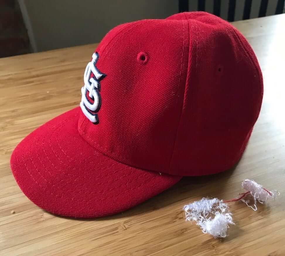
Cap company can no longer be bothered to have cap factory: When I criticize the recent addition of the New Era maker’s mark to MLB caps (or when I applaud someone who’s removed the logo with a seam ripper, as shown at right), I sometimes hear from people in the Buffalo area who say, “Stop picking on New Era — they employ a lot of people around here!
New Era will employ a lot fewer of those people come next March, when their factory in Derby, N.Y., will be shut down, putting 219 people out of work.
According to that Buffalo News story (which is excellent, by the way — worth reading all the way through), the Derby factory produces between 2 and 4.5 million caps per year, including all of MLB’s on-field caps. The company’s contract with MLB specifies that the on-field caps must be made in the USA, so production of those caps will shift to a New Era screen-printing facility in Miami. (No, this doesn’t mean the caps will suddenly be screen-printed, although it may mean that the on-field caps end up being made by employees who’ve never made caps before.) The rest of the Derby work will be outsourced overseas. Interestingly, the Derby plant is unionized while the Miami facility is not, and of course the overseas outlets also are not. Hmmm.
New Era is a good example of what’s happened to the uniform business in recent years. For many decades they were essentially a sportswear manufacturer, much like the legacy sporting goods brands (Spalding, Rawlings, Wilson, etc.). But as the world of retail merch has grown, they’ve reinvented themselves as a lifestyle brand, more in line with Nike or Adidas.
The Buffalo News article says the shuttering of the Derby plant “represents a ‘pivot’ in New Era’s business model.” Here’s the key passage:
[Company officials said] New Era is shifting more focus to social marketing, e-commerce and quick turnaround times for customer orders. They expect that orders will be shifted around their global supply chain — “from whomever can make it,” one said. In that context, they said, a plant with a fixed capacity and a single product line — baseball caps — was no longer viable.
So a cap company having a plant devoted to caps is not viable. But that same company buying the name of the Bills’ stadium is viable. Mm-hmmm.
By ridiculous coincidence, I happen to be attending a New Era media event later today. I’ll try to find out more about the production of the on-field caps.
Oh, this is just too awesome — check it out (click to enlarge):
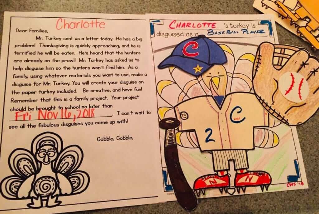
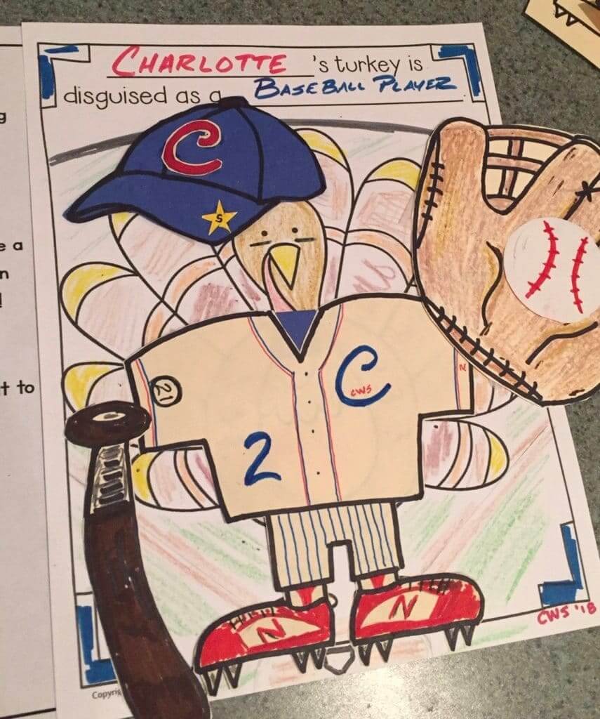
Nice job, Don. I think I speak for everyone reading this when I say that Charlotte’s future appears to be in very good hands.

ITEM! Queen City trip in the works: Normal people go someplace warm in the winter, but the Tugboat Captain and I have decided to make a late-December visit to Cincinnati — a town I haven’t been to since 1997.
This trip will be a bit different than the ones I’ve documented in my various travelogues over the years. I usually like to spend a lot of time on the road, preferably in rural areas, but for this trip we’ll mostly be in one city (although I imagine we’ll explore the surrounding area a bit). We have a busy itinerary planned, and our Google map is already filled with more virtual pins than we’ll probably have time to pursue.
Anyway: We have a bunch of longtime readers in Cincinnati (Hi David! Hi Patrick! Hi Trent!), plus Cincy is home to Ticker assistant Alex Hider (who I’ve never met in person, amazingly enough), so I’m thinking it would be good to convene a Uni Watch party while I’m in town. It will likely take place on Sunday, Dec. 30, in the late-ish afternoon. The venue hasn’t yet been finalized, but I have a few places in mind. For now, save the date.
I look forward to seeing lots of you Cincinnati folks there. And Columbus, Indianapolis, and Louisville are all less than two hours from Cincy, so maybe we’ll attract some readers from those burgs as well. A good way to ring out 2018!
By Lloyd Alaban

Baseball News: OF Bryce Harper recently became a free agent. SI did a good job of photoshopping him into different uniforms (from our own Brinke Guthrie). … Here’s another teaser of the Marlins’ new uniforms (from Mike Chamernik). … Also from Mike: This Cubs-related image lampoons the cringeworthy trend of today’s uni-marketing mumbo-jumbo. … This ESPN writer wonders (as some of us also might have): Why are baseball managers so short? (From John Muir.) … The Astros announced their new radio deal with KTRH using a custom logo incorporating Houston’s 1977-93 logo (from Ignacio Salazar). … The new minor league team in Amarillo, Texas, slated to be a Padres Double-A affiliate, will be known as Amarillo Sod Poodles. Here are all their logos). … A local radio station debuted the Nashville Sounds’ new logo ahead of Thursday’s official reveal. The Sounds are the Triple-A affiliate of the Rangers. … The High Point Rockers, a team that will begin play next year in the Atlantic League of Professional Baseball, unveiled their inaugural season logo (from Jason Gray). … A rare sight, but it occasionally happened: The great Pirates OF Roberto Clemente wearing a batting glove (from Jerry Wolper).

NFL News: Interesting note from @Champs8690, who wrote: “Not sure if you saw the end of the Monday night’s Giants/49ers game, but postgame jersey-swapping is taking a turn. Giants WR Odell Beckham Jr. was carrying out jerseys with him to hand out. Saw him and 49ers CB Richard Sherman taking a picture with a blue Giants jersey — but the Giants wore white that night!” … Saints head coach Sean Payton lost a golf bet to Eagles head coach Doug Pederson during the offseason. Their betting stakes were their home colors, so this Sunday when their two teams face off, the Saints will be wearing their gorgeous white Rash uniforms at home. So I guess in the end, we all won (from several readers). … The Seahawks invited military members to their facilities on Monday to place Salute to Service decals on players’ helmets ahead of this Thursday’s game (from our own Phil Hecken). … This article about technology in football includes several uni-relevant items (from Joe Werner). … Pro Football Journal found this old photo of the Dolphins bench with inconsistent number fonts and number outlining. … According to this football writer, the future of football helmet innovation lies with startups (paywalled link) (from our own Alex Hider). … Here’s a look at the Steelers helmet car for the upcoming Steel Curtain roller coaster coming next year to Kennywood Park, an amusement park in Pennsylvania. Additional details here (from @DarinWithOneR and Mike Rosenberg). … Several black military veterans and police officers offered their perspectives on the NFL protests during the national anthem. … The Rams and 49ers will be auctioning off game-worn jerseys to benefit victims of the California wildfires (from Phil).
College Football News: Notre Dame will be wearing their Yankees-inspired uniforms costumes for this Saturday’s game against Syracuse in Yankee Stadium (cue audible groan). Meanwhile, Syracuse will go mono-white (both from our own Phil Hecken). … Ohio State will be wearing these fauxbacks against arch-rival Michigan Nov. 24. The uniform will follow the same design as the one worn during the Buckeyes’ run to the 2014 national title (and as an alternate during the 2015 and 2016 seasons), but on the Vapor Untouchable template instead of Mach Speed (from @Believeland1994). … @mikeobs found this fabulously-detailed wedding cake featuring models of the stands of Texas A&M’s stadium and Florida’s stadium.

Hockey News: If you buy the Fanatics replica version of the Blackhawks’ Winter Classic jersey, the 2019 Winter Classic patch will appear on the jersey’s left shoulder. But if you purchase the more expensive authentic Adidas version, the patch is positioned properly on the right shoulder, just like on the actual, on-ice sweaters. Seems like a crummy way of punishing people who go for the budget-priced model (from Tony Caliguiri). … Retired Devils goalie Martin Brodeur received his Hockey Hall of Fame sweater at a ceremony before last night’s game against the Penguins (from James Beattie). … The Greenville Swamp Rabbits of the ECHL will be wearing G.I. Joke-themed uniforms for Saturday’s game (from Lane Helmer).

Pro Basketball News: Here’s the story behind the Nuggets’ iconic rainbow skyline uniforms (paywalled link) (from Ryan Hess). … In a related item, the Nuggets showcased their new rainbow skyline-inspired City Edition set last night. Here’s a time-lapse video of the matching court being set up. … The Harlem Globetrotters have a new uniform deal with Champion (from Eric Wright). … Here’s how NBA teams are using real estate development and tech money to take over downtown districts across the country.

College Hoops News: New unis for Miami men’s (from Adam Apatoff). … New unis for Quincy men’s. … Arkansas men’s will be celebrating the 25th anniversary of their national championship win by featuring their old “slobbering Hog” logo at their center court this season (from our own Phil).

Soccer News: The Poland men’s national team will wear some gorgeous throwbacks to celebrate the Polish centennial (from multiple readers). … Mexican League club Chivas introduced a new shirt for the FIFA Club World Cup (from Ed Zelaski). … Here’s every Premier League match ball since the 2000-01 season (from Josh Hinton). … Great detail catch by James Gilbert: UNC’s men’s team has two stars for their two NCAA national championships above the Tar Heel logo on the back of their shirts. Soccer teams often wear stars on their shirts to signify how many championships they’ve won.

Grab Bag: New logo for the ATP (from our own Brinke Guthrie). … Top Fuel driver Steve Torrence won all six Countdown races to win the NHRA Mello Yello Drag Racing Top Fuel Championship. He received a title belt for his achievement (from David Firestone). … Virginia Tech developed a new system to test bike helmet effectiveness. … Here’s the sneaky way clothing brands hooked men onto stretch jeans (from Jason Hillyer).

What Paul did last night: It’s been about two and a half months since I moved in with the Tugboat Captain, and we’re not totally sick of each other yet and I’m still exploring my new environs. One place I’ve been meaning to check out is a bar called Michelle’s Cocktail Lounge, so last night the Captain and I agreed to meet there after she got off work.
Michelle’s is about a mile and a half from Uni Watch HQ. I could have taken the bus or my bike, but I decided to walk because the route would take me down some blocks I hadn’t yet checked out, so I figured I’d see some interesting stuff along the way. Sure enough, at about the 10-minute mark I passed an exterminator with this great sign (click to enlarge):
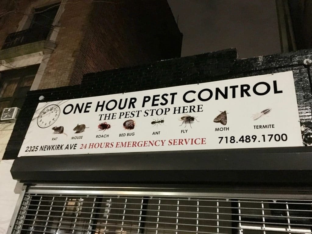
I love all the illustrations and their accompanying captions, like it’s a textbook or a manual or something.
After another 15 minutes or so, I passed this old Sears. It’s in a somewhat overlooked neighborhood, so it’s not as famous as it deserves to be (click to enlarge):
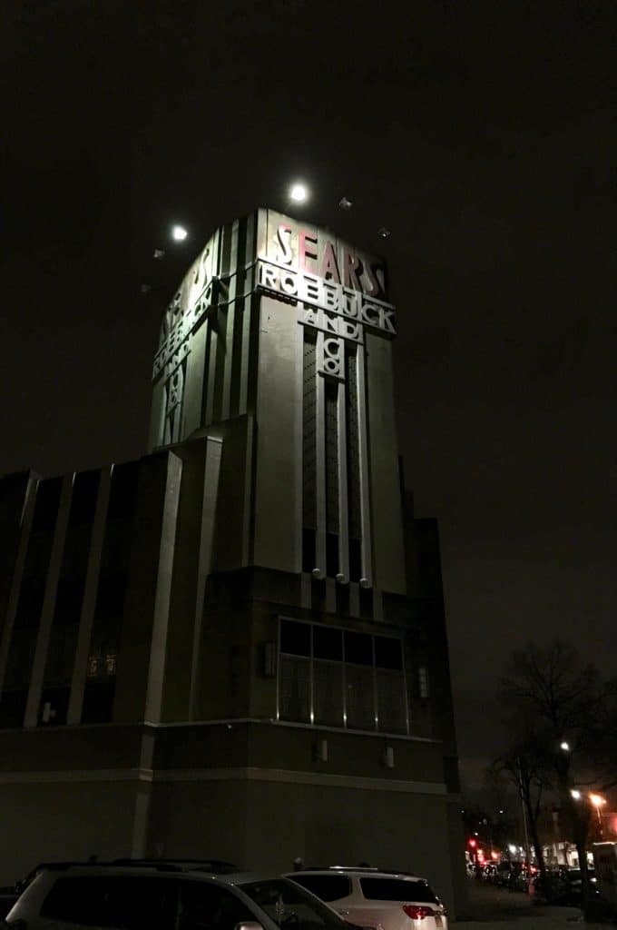
Is that gorgeous or what? Kinda blows my mind that this kinda thing still exists in Brooklyn (although probably not for long). So beautiful!
I eventually made it to Michelle’s, where I had that tense/exciting feeling of walking into a promising bar for the first time. It’s like unwrapping a present — you don’t know what you’re going to find inside. Michelle’s, like most bars that interest me, is a place where I “don’t belong” (in this case because I was the only white person there), but the barmaid welcomed me warmly and the woman I sat down next to quickly said hello and let me know that I could get free chicken wings just by asking at the kitchen. A few minutes later, the Tugboat Captain arrived and we settled in for a few rounds.
By the time we prepared to leave about an hour and a half later, we’d had some beers and some chicken wings, made some new friends (one of whom even offered to give us a lift home, although that seemed overly generous, so we politely declined and took the bus instead), and decided that we’ll definitely be back. A very nice evening!
I love marble race videos! Hadn’t seen that one in a while.
Good stuff.
“Pro Football Journal found this old photo of the Dolphins bench with inconsistent number fonts and number outlining. ”
Also, Csonka does not have stripes on his sleeves.
I beleive that’s from the 1973 undefeated Dolphins season. If you look at footage of Super Bowl VII, you’ll see various Miami jerseys with and without the sleeve stripes.
Typo “Saints head coach Sean Payton lost a golf bet to Vikings head coach Doug Pederson during the offseason.” Eagles head coach.
Great story on the word art, I have his Dawkins piece, love his stuff. And great follow up question at the end. Awesome that he married the girl that help facilitate his successful career.
Fixed. And thanks!
Nice touch making Bryce clean-shaven when he’s in a Yankees uniform!
If New Era weren’t dead to me already, they certainly would be now.
“I was lucky because I had an aunt who worked for Gold World magazine…”
I assume that should be Golf World.
Yup. Fixed!
Typo: “I basically started trying to draw Aerial…”
Not a typo. That’s a real font name.
link
link
So I’m right — Aerial is a real font. But you’re even *more* right, because Duffy was clearly mimicking Arial (link), not Aerial. Will fix!
In College Football section, Ohio State plays Maryland this Saturday, not Michigan.
You beat me to it!
Sorry for the double post. Didn’t refresh to see this comment before leaving mine.
That Sears is very noir. I’d almost expect to see Dan Duryea or Richard Widmark coming out the doors.
Saw the Rams/Seahawks game again last night on the NFL Network, and it made me think how hard the Rams’ uniform guys must be working given the one shell rule, constantly switching the horns back and forth.
Especially given the nature of the horn logos. Certainly more complicated than adding and removing simple helmet stripes or logos. I had not thought of that. Given what they have worn so far they have had to change the horns 5 times, and based on what the gridiron database is showing for the rest of the year, they’ll wear the throwbacks twice more on nonconsecutive weeks, taking the total of switches up to 9. Then depending on the playoffs and whether or not the NFL allows them to wear the throwbacks during the postseason it could be even more.
“If you buy the Fanatics replica version of the Blackhawks’ Winter Classic jersey, the 2019 Winter Classic patch patch will appear on the jersey’s left shoulder. But if you purchase the more expensive authentic Adidas version, the patch is positioned properly on the right shoulder, just like on the actual, on-ice sweaters. Seems like a crummy way of punishing people who go for the budget-priced model (from Tony Caliguiri).”
Last year the more expensive Adidas jersey didn’t even come with a shoulder patch, while the cheaper Fanatics version had the patch and in the correct location.
IF I wanted to get one of this year’s Blackhawks’ Winter Classic jerseys, I’d prefer it without the patch at all.
I’d rather have the jersey closer approximating the late 20’s/early 30’s look. The patch sticks out like a sore thumb; on top of that its placement choice is questionable.
“Ohio State will be wearing these fauxbacks against arch-rival Michigan on Saturday.”
Ohio State doesn’t play Michigan until 11/24. The Buckeyes take on Maryland this Saturday.
Fixed.
I probably will be around Cincinnati (where I live now) on December 30! Count me in for the hangout. Not sure what holiday plans are yet, but I’ll make every effort to get there.
Enjoyed the interview with Dan Duffy. He does excellent work (I have a print of the Eagles SB parade).
Great piece on Dan’s work! His work just blows me away. It’s nice to get an idea of how it comes together.
Don, your daughter does great work!
I think my favorite line today is “Offering a ride seemed OVERLY generous”…I don’t know why that made me chuckle.
I’m always eager to hear where people are going when they say they are visiting “the Queen City.” It will always be Charlotte to me, but I recognize the argument for Cincinnati.
link
Let’s also not forget that the PILOT program (payment in lieu of taxes, that is) for the New Era factory has run out. link
What? No pics of Michelle’s Cocktail Lounge? Not even the outside even if you didn’t want to/couldn’t take any of the inside?
C’mon Paul.
Lee
Definitely didn’t want to photograph inside, and I neglected to do so outside. Sorry.
I looked it up… definitely a place I’d drink at!
What material is the bar made of? I have never seen (or recall seeing) anything like that.
Lee
The physical bar itself? Maybe Formica..?
Yeah… online it looks either like cement, or a huge chunk of formed plastic.
Cheers!
Lee
Good reporting on New Era. I appreciate the information. I also appreciate the even handedness of how you presented the facts. This is a blog, and opinions should be expressed, but it’s really helpful to understand the basis for them.
That said, I’m saddened to hear the news. Not only because some very skilled folks are losing their jobs, but also because New Era is part of Buffalo’s identity.
Love the picture of the Sears & Roebucks building. I am fascinated with architecture and uniforms and logos. The architecture mostly manifests itself in different stadiums and arenas ( I cannot even tell you how much I love the Vikings new stadium), and I wonder if being into uniforms and logos makes you more likely you’d like stadiums and things of that nature.
When I saw the photo of the Sears building, I kind of wondered if it was a leftover set piece from Tim Burton’s Batman movie…
i recall getting this SI at my house in the pre-PhotoShop days. Good old Charlie Hustle didnt mind posing with hats for other teams.
link
“Pro Football Journal found this old photo of the Dolphins bench with inconsistent number fonts and number outlining.”
That picture is from 1972 and the Dolphins sported that same inconsistency all season. The jerseys with the sleeve stripes were made by Sand Knit and the jerseys without stripes were made by Wilson. Looking at the 1972 Dolphins highlight film, Csonka is the only Dolphin I remember to wear both versions during the season. Bob Griese wore his old Wilson jersey the entire year (first five games before he broke his leg plus AFC Championship and Super Bowl) while Kiick, Warfield and Morrall wore the Sand Knit versions. The Sand Knit jerseys had the thin numbers while the Wilson jerseys had fatter digits with the center of the sleeve numbers filled in with orange (rather than just outlined). There are a couple of outliers, however, as Marlon Briscoe wore a jersey with striped sleeves (Sand Knit?) with Wilson numbers as did one of the defensive linemen (Vern Den Herder, I believe). This applied only to the white jerseys. The two times the Dolphins wore aqua that season (against the Bills and the Cardinals) the jerseys were Wilsons with fat, filled numbers and no sleeve stripes.
That Sears is gorgeous. Hopefully whatever happens to Sears in the US, the building is preserved
link
I actually didn’t realize it had been landmarked. Thanks, Mike!
They’ve got Bryce in a Chief Wahoo cap. Whoops.
I’ve been living about a mile away from that Sears for three years. I had no idea it was still open…well, not for long…
I’m leaving the New Era logo on all my caps. (I have three 5950’s) Sorry, it’s just a dumb thing to fuss over.
I think you can disagree with people who choose to remove the logo from their caps without calling them dumb, don’t you?
Im leaving my New Era logos I think it kinda cool
Paul,
Sounds like you found the source of all the littered Newports from your pollution project. Did you count the # of butts in the ashtrays or is NYC is smoke-freee?
Man, it sure does look like that Winter Classic patch says Notre Lame Stadium, doesn’t it?
I remember my mother taking me to the that Sears (I think it was on Beverly Road) when I was a kid in the 60s. I also remember a pipe bomb exploding inside the store in the early 70s. Thanks for the memories.
Don’t think the Winter Classic sweaters presented by the teams are what the players will wear on the ice. The ones in the pictures are Made in Indonesia, while the players have Made in Canada versions.
I’ll be attending the Official Unveiling of the new Nashville Sounds logo tonight and will try to get some pics and tweet them out to you Paul.