Click to enlarge
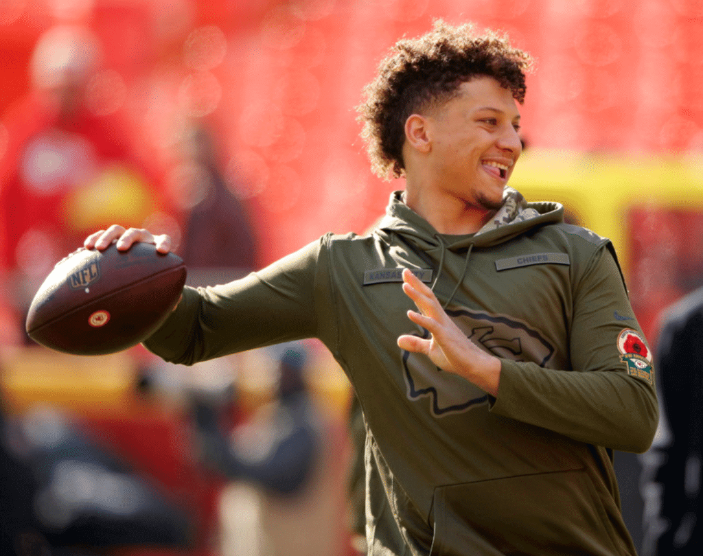
Amidst all the G.I. Joke nonsense, the Chiefs did something interesting yesterday. They partnered with the National World War I Museum and Memorial, which is located in Kansas City, to wear a patch during pregame warm-ups to mark the centennial of the WWI armistice. You can see it there on Patrick Mahomes’s left sleeve. Here’s a closer look (click to enlarge):
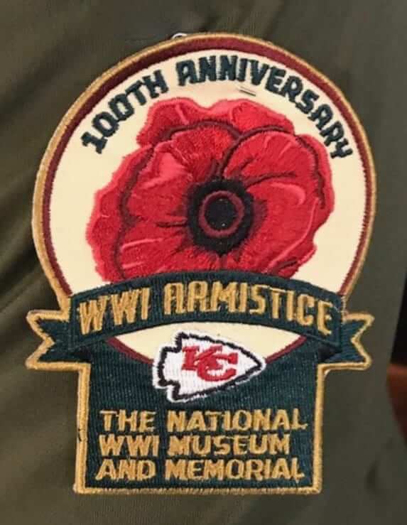
Would’ve been nice if they’d worn it for the game, instead of just for pregame, but it’s still a nice gesture.
In other news from around the league yesterday:
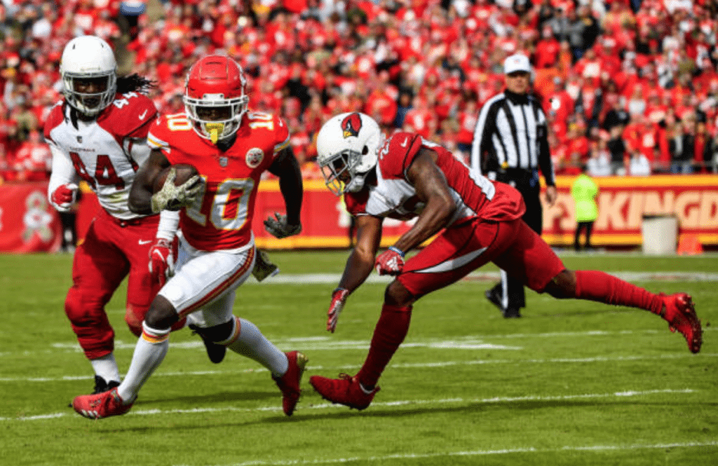
• The Chiefs’ opponents yesterday, the Cardinals, wore their white jerseys with red pants — the first time they’ve worn that uni combo since Dec. 19, 2010:
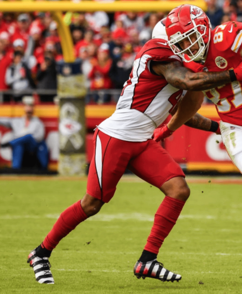
• From that same game, I don’t usually get too worked up about footwear, but check out what Cards safety Antoine Bethea was wearing:
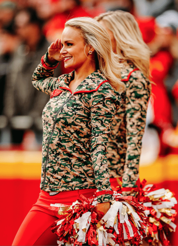
• Also from that same game, the Chiefs’ cheerleaders didn’t just wear G.I. Joke costumes — they also saluted Sigh:
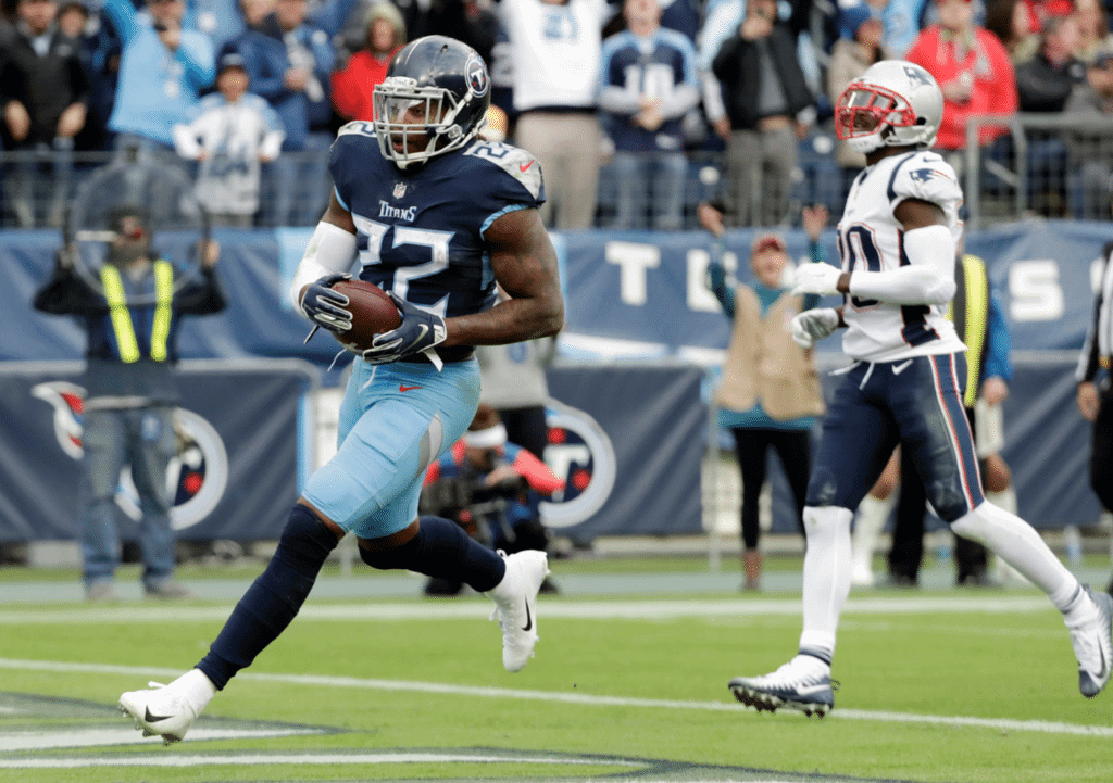
• The Titans wore navy blue over powder blue — the first time they’ve worn that combo since adopting their new uniform design (click to enlarge):
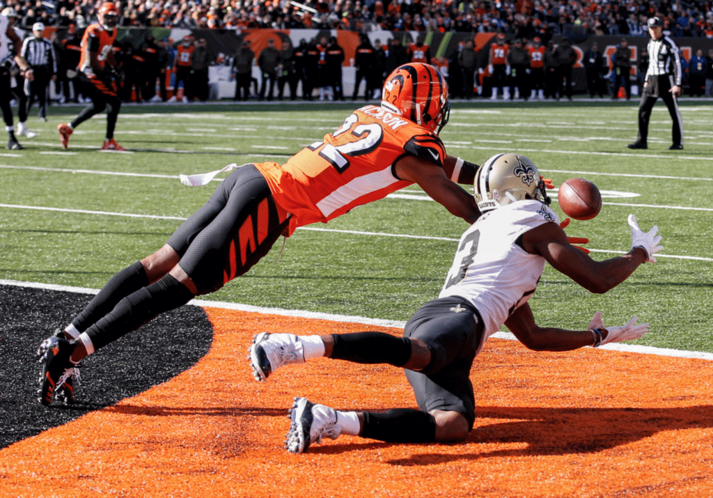
• The Bengals wore their orange alternate jerseys (click to enlarge):
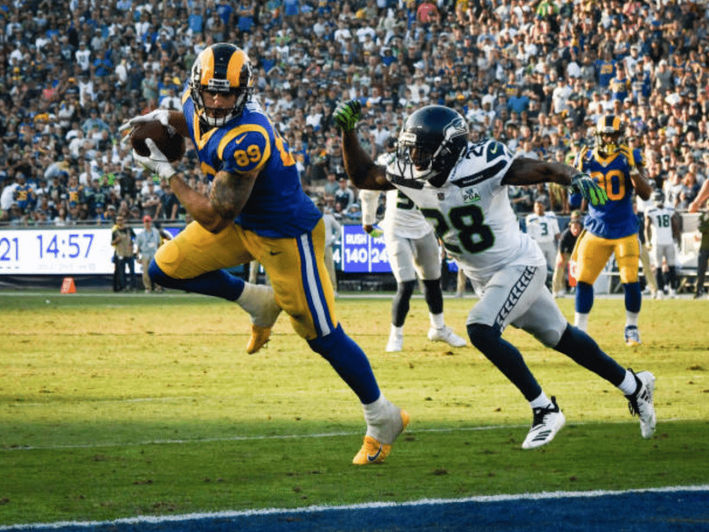
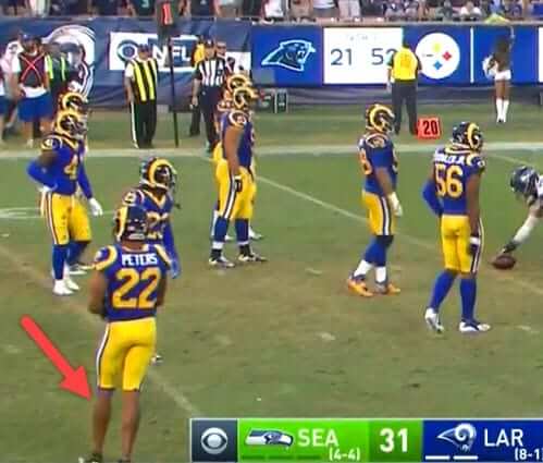
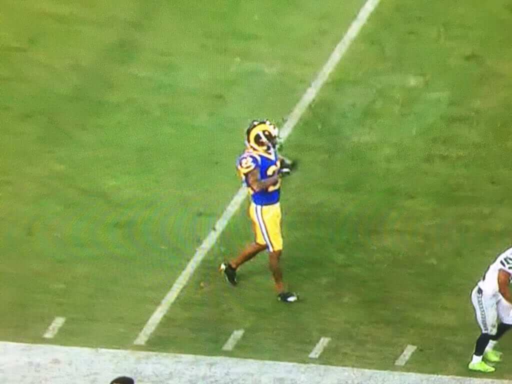
• In L.A., the Rams wore their throwbacks and the Seahawks wore their gray alternate pants:
• In that same game, Rams defensive back Marcus Peters appears to have played bare-legged:
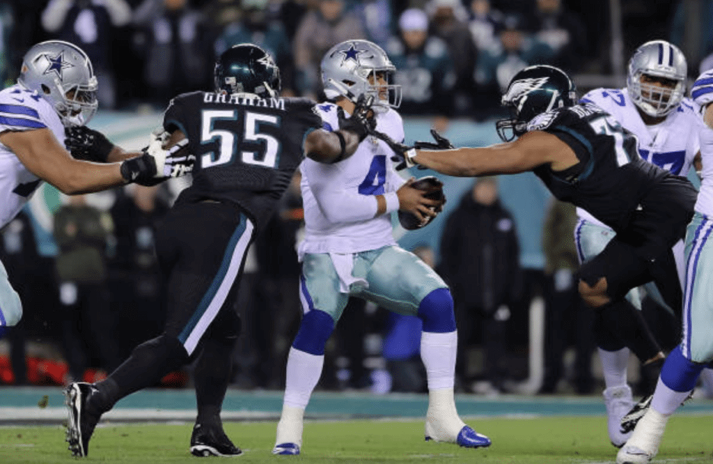
• The Eagles wore their mono-black alternates:
• The Browns beat the Falcons while wearing brown over orange:
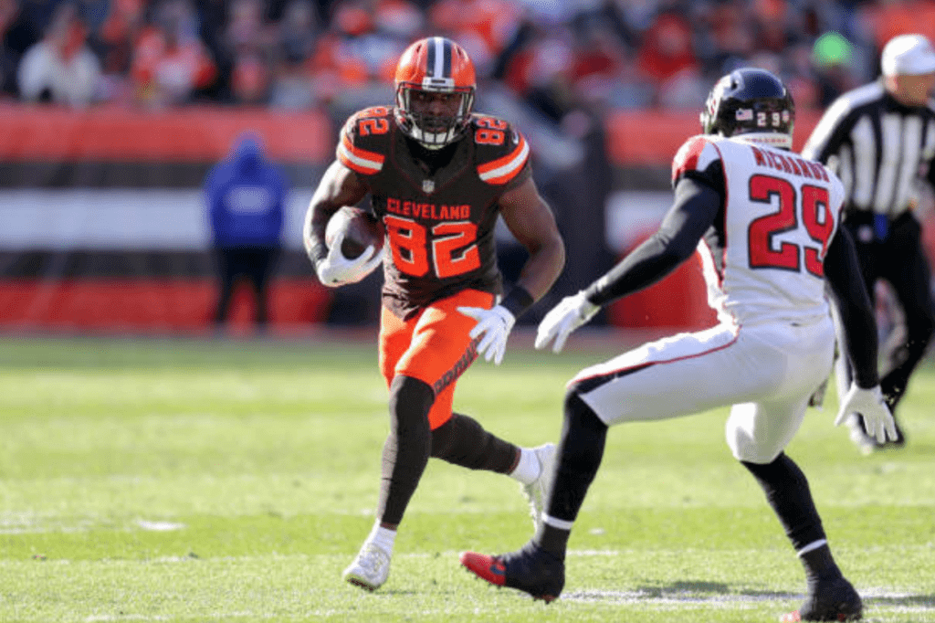
According to reader Joseph Bailey, it’s the first time the Browns won while wearing that color combo since Dec. 18, 1983, when they beat the Steelers. “It was Brian Sipe’s last game,” says Joseph. “I was there, and after the game I got onto the field and grabbed a clump of orange grass. I still have it in a baggie in my attic.”
• Typo alert! Bears defensive back Prince Amukamara had his name misspelled on his NOB, prompting him to change jerseys midgame (screen shot via @ajj421):
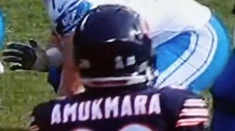
This was the second time Amukamara has been victimized by a jersey typo. The first time was in 2016, when he played for the Jaguars.
• In Oakland, poor air quality from the California wildfires prompted the Raiders to issue dust masks to fans at the game:
My grandfather went to the Chargers v Raiders game in Oakland. As a result of the poor air quality stemming from the wildfires, fans were issued masks during the game pic.twitter.com/0PIpXsZtJ4
— Matthew says… (@Klimberginho) November 12, 2018
• One team wore white at home: the Bucs.
(My thanks to all contributors, including Michael Bochum, Frank McGuigan, Pro Football Journal, Robert Turning.)
Poppy Roundup
By Jamie Rathjen
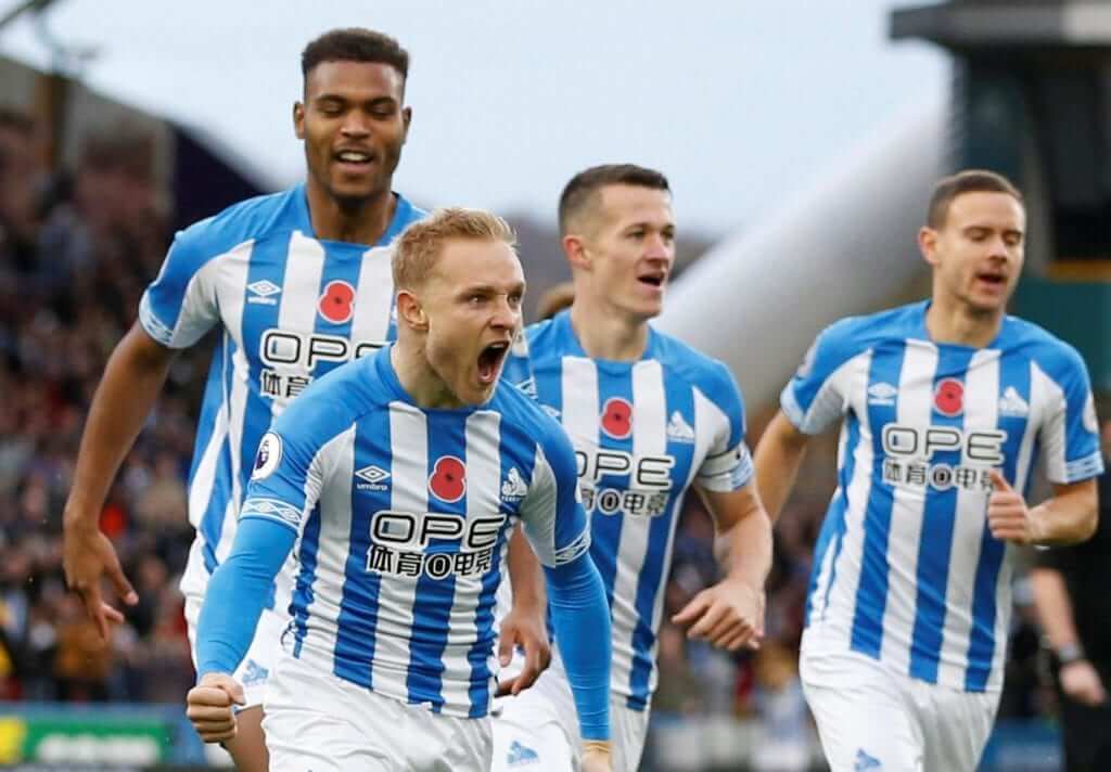
Remembrance Sunday is now marked in a variety of uni-related ways, invariably poppy-themed, in many different sports. Here’s a rundown of some of the poppy action, starting with soccer, where almost every English and Scottish top-tier team wore poppy patches this weekend:
• Leicester City only wore the poppy for half of their game, because the first half featured shirts honoring owner Vichai Srivaddhanaprabha.
• Scottish team St. Johnstone wore their own patch instead of the standard Scottish patch, and added the insignia of the Black Watch military regiment as well as a military decoration, but which one wasn’t immediately clear.
• Also in Scotland, Celtic and St. Mirren did not wear the poppy, while the first picture shows that Celtic’s opponents Livingston wore the English poppy.
• Tottenham Hotspur striker Harry Kane posted a picture of an actual poppy pin — the kind people buy to commemorate the holiday — pinned to his England shirt. Whether the four British national teams would be allowed to wear the poppy was controversial in each of the past two years, when Remembrance Sunday fell during international breaks.
• England’s women’s team played yesterday and wore a poppy on black armbands, which was the compromise FIFA and the national teams came up with last year to circumvent FIFA’s ban on political statements on national teams’ kits. Some of opponent Sweden’s players wore plain black armbands.
• National rugby union teams wearing poppies on their sleeves included England and New Zealand, Wales and Australia, and Scotland.
• Australia’s women’s cricket team wore pinned-on poppies at the Women’s World Twenty20 in the Caribbean.
• In Canada, poppy helmet decals could be seen on the Canucks and in both CFL division semifinals.
(Thanks to Josh Hinton and Wade Heidt for their contributions to this section.)
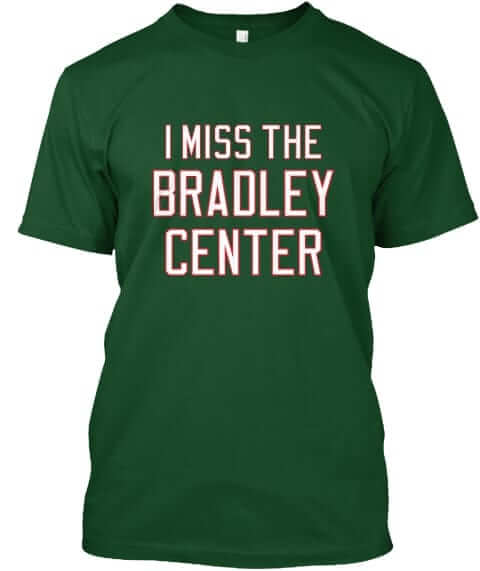
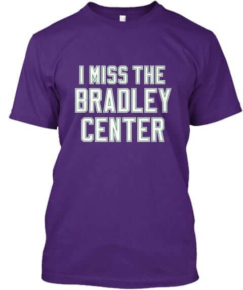
Naming Wrongs update: With Milwaukee now home to a new corporate-named arena, we’ve added some shirts for the Bradley Center. This one’s available in green, purple, and green with purple lettering:
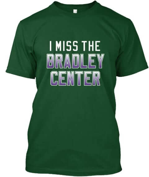
We’ll be adding some Marquette-themed Bradley designs as well.
These shirts are now available in the Naming Wrongs shop. My thanks, as always, for considering our products.

Gift guide reminder: I’m currently working on my annual Uni Watch Holiday Gift Guide, which will run on ESPN.com later this month. If you know of any cool uni-related items that might be good for me to include (aside from the usual mass-market retail slop, of course), please feel free to send tips my way. Self-promotion is fine, so if you have an awesome product or project that might make the grade, don’t be shy about telling me.
Also: Next month I’ll be doing my annual year-end raffle, where I give away the freebies I’ve accumulated during the year. If you have any goodies that you’d like to contribute to the raffle (one reader has already donated something very, very special), get in touch and we’ll discuss. Thanks.
The Ticker
By Jamie Rathjen

Baseball News: Nationals OF Juan Soto has been wearing the team’s home cap with their road uniform while he is with the MLB all-star team touring Japan (from William F. Yurasko). … “Did we know that the clean-shaven Pirate of the ’70s had a family?” asks Mike Ortman. That is, that picture appears to show female and child versions of that incarnation of the Pirates logo.

Football News: In the CFL division semifinals, the Saskatchewan Roughriders wore their alternates, while the Hamilton Tiger-Cats wore mono-black (from Wade Heidt). … Multiple readers sent in the NFL’s Red Zone giving the Browns and Ravens the same logo.

Hockey News: The OHL’s Flint Firebirds did camouflage night Friday (from Wade Heidt). … Also from Wade: Canucks G Jacob Markström has a new mask. … Good luck telling Latvia’s B team (maroon) and Japan (black) apart in this picture. That was the final of a tournament called the Baltic Challenge Cup, which also featured Estonia, Lithuania, Romania, and Belarusian top-tier team Metallurg Zhlobin (from @CT4_LV).

Basketball News: Tulane wore sky blue at home against Florida State (from James Gilbert). … The 76ers reportedly traded for G Jimmy Butler, who will wear No. 23, while the current occupier of that number, Landry Shamet, will switch to No. 1 (from @PhillyPartTwo). … A company in Texas poached the Jazz’s old wordmark (from Rodney Gilbert). … Southeastern Louisiana has vertically striped warm-up pants (from Chris Mycoskie). … New uniforms for Division II’s Quincy (Ill.) University.

Soccer News: England women’s center-back Steph Houghton made her 100th international appearance, which was commemorated on the bottom and inside collar of her shirt. As Houghton captains England, she wore two armbands yesterday, including the poppy one. … Manchester United midfielder Paul Pogba has a phone case with a picture of himself in United’s second-choice pink shirt (from Josh Hinton). … Also from Josh: All the lights at Sporting KC’s stadium were tinted sky blue the night before yesterday’s playoff game, despite that the game was in the afternoon and SKC wore black at home, as they have done several times this season. … New third kit for the English Championship’s Leeds United.

Grab Bag: The Maine-Endwell (N.Y.) High field hockey team manages to wear both grey and an Oregon-esque number font at the same time (from Al Mattei). … Twitter-er @Titan4Ever2488 was at a craft show and found a booth that sold artwork of patent applications, including applications for sports equipment.

What Paul did last night over the weekend: Sometimes you manage to pack a punch of really good stuff into a short time frame. That’s what happened to me during a 24-hour flurry that began late Saturday afternoon, when the Tugboat Captain and I drove to another part of Brooklyn and had dinner at Fan Fried Rice Bar, a new-ish Taiwanese place that, as its name implies, specializes in fried rice. We got (clockwise from top left) Taiwanese sausage fried rice with edamame, popcorn chicken, and pastrami fried rice with peanuts and Sichuan peppercorns, all of which was really, really good (for all of these photos, you can click to enlarge):

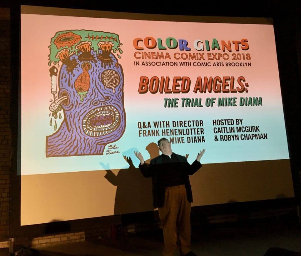
From there we went to a screening of Boiled Angel: The Trial of Mike Diana, a documentary about the cartoonist Mike Diana, the first (and I believe still the only) American artist ever to be convicted and jailed on obscenity charges, thanks to his notorious early-1990s underground comix zine, Boiled Angel. The case remains one of the major low points in recent U.S. legal history. Here’s the trailer:
At the screening, which took place at a Brooklyn soundstage space, the film was introduced by its director, Frank Henenlotter. He made his name decades ago directing B-level exploitation flicks like Basket Case and Frankenhooker but has more recently moved into documentaries:
The film was hilarious, fascinating, upsetting, excellent. It doesn’t yet have a distributor, so screenings are rare. Definitely worth seeing if you have the chance.
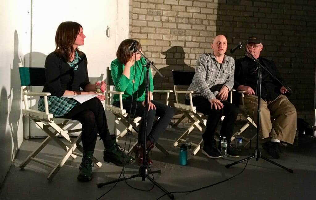
After the screening, there was a panel discussion with Henenlotter and Mike Diana himself, moderated by Caitlin McGurk, who’s an associate curator at the Billy Ireland Cartoon Library & Museum at Ohio State University. That’s Diana — convicted purveyor of obscenity — second from the right:
I was doing my own zine in the 1990s (a copy of the first issue is briefly shown in the movie, in fact, which was a fun surprise) and was following the Diana case as it unfolded at the time. It was really important to those of us in the zine world, and to anyone who cared about First Amendment issues. Personally, I always thought the content in Boiled Angel was pretty juvenile, but it certainly wasn’t criminal and was ultimately just drawings on paper, printed in a zine with a circulation of just a couple of hundred copies.
Twenty-five years later, it was really interesting to see the infamous Mike Diana in person. He’s very reserved, not all that articulate, and seems to have little interest in the larger political issues surrounding his case (according to Wikipedia, he also doesn’t vote), all of which makes him an unusual poster boy for the First Amendment. He mostly seems to want to be left alone to pursue his art career — fair enough. The kicker, of course, is that he probably wouldn’t have a career to begin with if prosecutors hadn’t gone after him and effectively turned him into a free speech martyr, so he gets the last laugh.
So that was Saturday. Yesterday I went to Comic Arts Brooklyn, an annual comics expo. Walked around, bought a few comics, bumped into a few friends, and mainly absorbed the fun feeling of being surrounded by interesting, creative people and their creations. The best part was this guy who was doing drawings with a gigantic fountain pen:
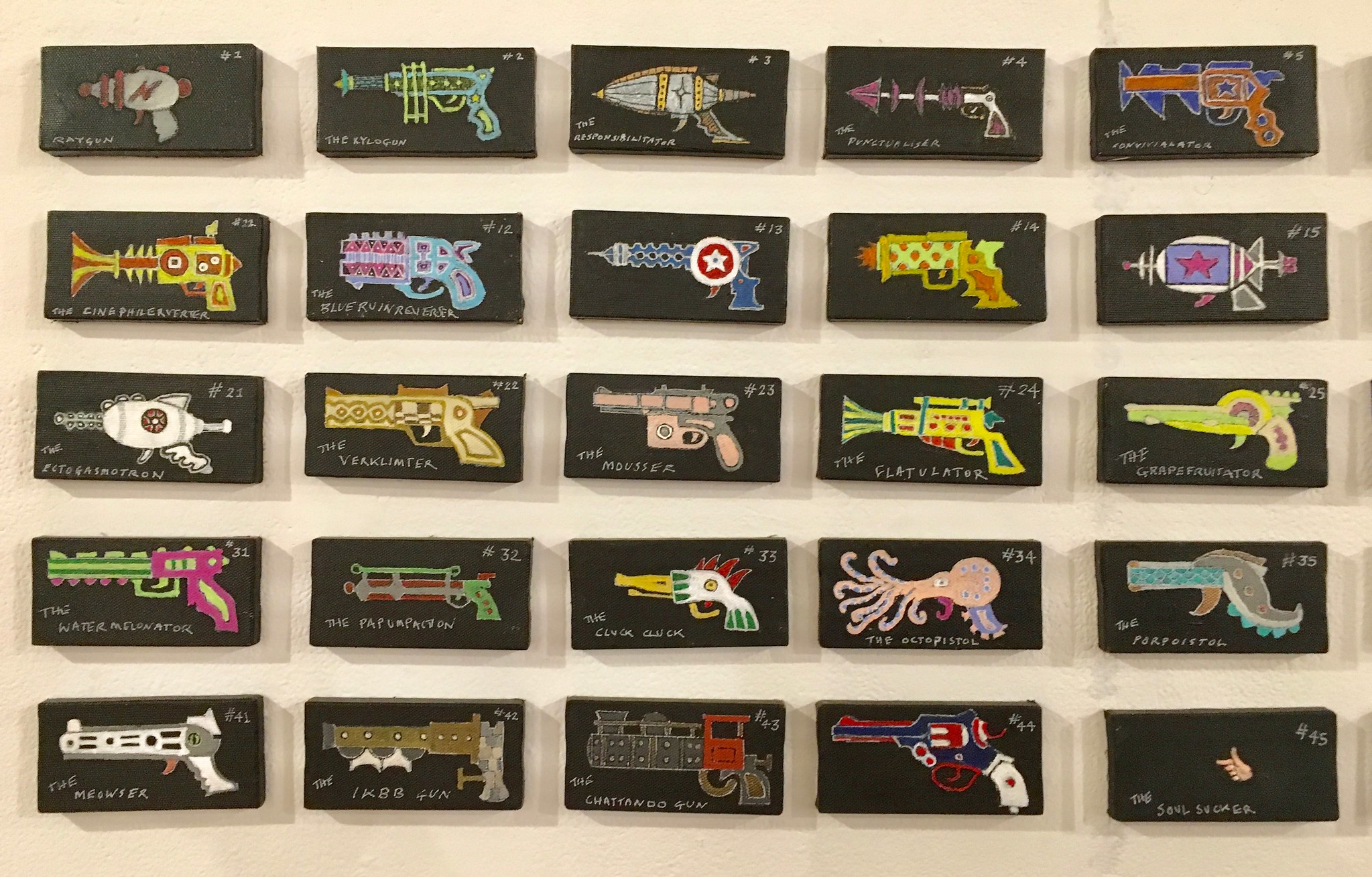
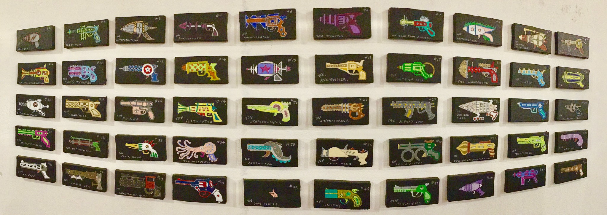
I had to leave after about 90 minutes because I was due to meet up with the Tugboat Captain at a Manhattan art gallery, where our friend Robert was showing his work as part of a group show. First he had a bunch of very small paintings of rayguns, each with a different design and a different name — and, if you happened to be standing near Robert, a different explanation for how each one worked (for all of these, you can click to enlarge):

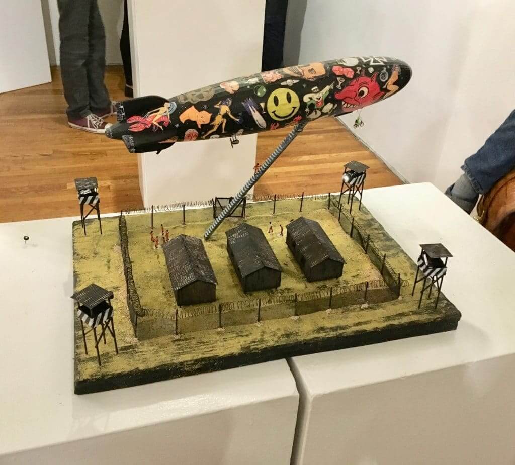
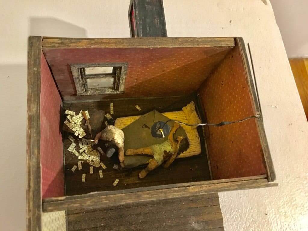
Robert also makes these super-intricate dioramas. Photography doesn’t really do them justice, but you can still get a sense of what an endearing weirdo Robert is from this shot:
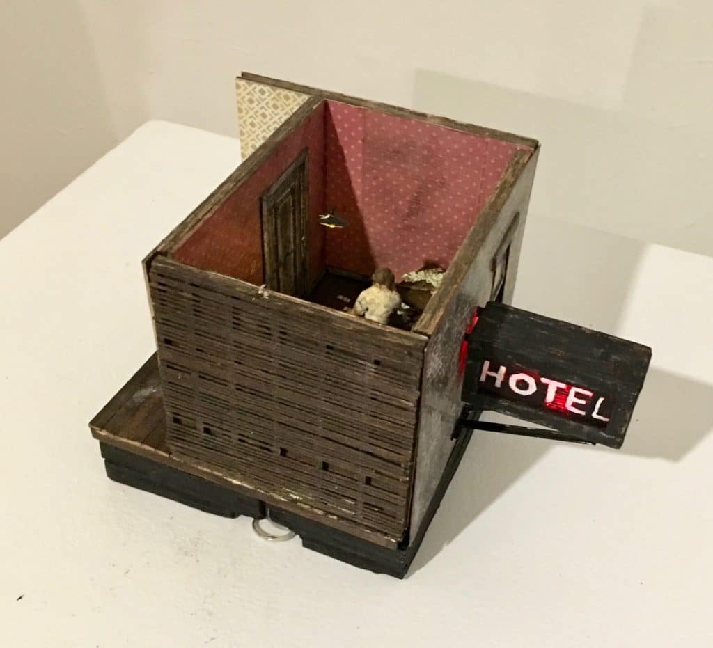
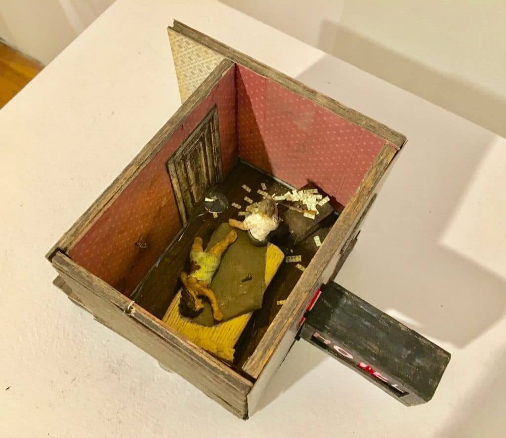
And then there’s this one, which is a fairly conventional film noir-ish tableau, but still plenty enjoyable:
From there, the Captain and I went off to the Corner Bistro for burgers and beers, and then we went home, where I spent the next couple of hours putting today’s entry together.
Now that, people, is a full weekend. Hope yours was just as good.
Today is the observed date of Veterans Day. If you are a military veteran, please accept my thanks for your service.
“In Oakland, poor air quality from the California wildfires prompted the Raiders to issue surgical masks to fans at the game”
Actually, those are dust (or respirator) masks–not surgical.
Thanks. Fixed.
Actually they are particulate N95 respirators.
In addition to the Canucks, all the Canadian NHL teams wore poppies this weekend. Regular occurrence. Small sample of some of the other Canadian team wearing poppies yesterday:
link
link
link
i love the brown over orange look for the Browns.. i wish that was their default look
also this isn’t the first time since 83 they wore brown over orange since the 80s. they wore it a few years ago when they lost to the Ravens on a last second blocked FG
link
nm: didn’t catch the “won” in that sentence..my mistake
They also wore it link.
i knew there was one other time…i hated that one because they wore orange socks with orange pants
I prefer the brown over white, but I also like their brown over orange. Gives a bit of a throwback nod to the late 70s, early 80s look. Is great as a second dark uniforms look at home. Browns have to quit doing the brown over brown at home.
They wore the brown socks with the orange pants too which looks good. Did not look good some time back when they wore the orange pants with orange socks.
Totally agree with the socks comment.. for that look to work it has to had color contrasting socks
seems to me it would be a good idea for them to be kind of seasonal with the pants
– exhibition and early season, white pants always
– Oct and early Nov, orange pants with brown or white jersey, brown pants with orange jersey
– late season, brown pants with white or orange jersey, orange pants with brown jersey
“Typo alert! Bears defensive back Prince Amakamura had his name misspelled on his NOB, prompting him to change jerseys midgame”
It’s spelled Amukamara.
Ay-yi-yi. My own typo alert! Now fixed.
I wasn’t sure if it was intentional!
Weird note about Peters. He played at least some of the game in “socks” (which actually appear to just be tights going down to his ankles).
link
There was also a sock inconsistency in the CFL playoffs this weekend for some reason unknown to me. In the Western Semi-Final, Roughriders QB Brandon Bridge was wearing white socks below the knee rather than the green socks which is part of the uniform.
link
I can’t believe you are offering a purple shirt!
We’ve offered lots of Naming Wrongs shirts in purple. It’s not a Uni Watch product; it’s a Naming Wrongs product.
“Amidst all the GI joke nonsense” –
if you’re ever near KC, you absolutely have to visit the WW 1 Museum (along with the Negro Leagues Museum).
Terrific museum, really tells a great story of how many – literally – lived in trenches during the fighting. Certainly a good reason for some civic pride.
Star-Bellied Sneetch?
link
Do veterans actually appreciate all of this pandering? The GI Joe cosplay is disingenuous and turns the military uniform into nothing more than a costume.
I appreciate it. Better than watching them kneel during the anthem.
I prefer an all white Cardinals look, and wish they’d get rid of the red shoulders. The red pants are OK, but not against another team that is wearing red. Not enough contrast.
I am convinced that NFL wear what they do without even the slightest bit of thought what their opponents wear.
You’re correct, why would the cardinals decide to wear red pants for the first time in 8 seasons against a team also wearing red??
Lee
Still hoping the Jets come to their senses and decide not to change the uniform next year.
That said, it should be noted that the Jets are winless in their primary (and best-looking) uni combinations this year; their only wins came with alternate facemasks (white and gray) and in the awful green-over-green. Their worst losses have come in their best uniform.
Sadly, the team’s overall ineptitude will probably increase enthusiasm for the uniform change to go with the inevitable coaching change. That’s too bad.
They need to fix the shade of green on the jersey but I hope they don’t completely overhaul it. If they can some how merge the sack exchange era with Broadway Joe era that would be excellent. But there is one thing that needs to go no matter what, get rid of the green face mask.
While seeing the highlights from yesterday, I have to share the same feeling. The only thing that bothers me is that they do not wear kelly green. Otherwise, I thought it was great when they switched to this design back in ’98. Nothing wrong with the design and a fear new design could screw up a good look.
However, if these prototypes that surfaced on social media are close to the real deal, I dig these uniforms a lot and would not have problem with change. Enough time has passed that a modern version of sack exchange era unis would be welcomed by me:
link
link
I agree. I really like those prototypes. The helmet stripe is really not needed. Hope they lose it.
England played New Zealand in a Rugby League international on Armistice Day also, both sides wore poppies on their jerseys.
link
I was listening to the start of the Eagles game on my way home last night on the radio. The announcer was describing the uniforms in detail (which I love by the way) and he said the Eagles were in dark green tops and pants. I was shocked as I didn’t know that was an option and chalked it up to color rash. Now I see that they were actually in black. I don’t have audio, but I found it interesting. It wasn’t a neutral broadcast by the way.
PROOFREADING: Something went very wrong in the poppy roundup:
“England’s women’s team played yesterday and wore England and New Zealand, Wales and Australia, and Scotland.”
No idea what that’s supposed to mean. The first link is broken, and the other links have no women, so they don’t appear connected to the beginning of the sentence.
Yeah, there was a coding error there. Fixed it a few mins ago. Refresh your page and it should be good.
I really liked the Titans Navy over Columbia Blue look (minus the weird pant striping). There are only a few colors that I think you can pull off doing a color jersey over color pants, and to do it the pants must be one of the following colors: Metallic (Silver, Gold, Pewter), Athletic Gold (think Rams, Packers, and Steelers), Orange or Columbia Blue. For the Orange and Columbia Blue your jersey color choices are limited. Orange needs a black or brown jersey, and Columbia Blue needs navy.
Completely agree on the Titans Blue over Columbia Blue. It looked OK with white helmets in prior years, but the Blue helmets made for a great combo (as long as they keep the Blue socks)
I also liked the look (The Titans have a number of interesting looks this year), but I’m trying to reconcile with myself why I liked the Titans look yesterday and not the Jaguars look in Dallas of a few weeks ago, does a few shades closer to each other make that much of a difference?
I’m still a fan of the Titans’ initial color scheme, but this look is fully acceptable. Weird how the team keeps tinkering with virtually everything but the overbusy helmet logo.
Not sure if it was just a typo. But it looks like the Browns last Brown over Orange win was December 18, 1983. Not the 8th. Here’s some youtube footage link
and the NFL uniform database for 1983 link
As someone who lived in Milwaukee for years and watched many games at the Bradley Center, I find it hard to imagine that anyone will miss that arena. It was a symbol of mediocrity for its entire existence. It wasn’t impressive even on the day it opened.
That said, I like the shirts.
Here, read this:
link
One of the best college hockey games I ever saw was there in the Bank One Hockey Showdown – Wisconsin vs. Maine in 1991.
Plus, I mean, more than 17,000 fans for an Admirals game with The Village People in concert afterwards. Great stuff!
As a side note, I’d like to hear stories from peope who went from a team’s old stadium to the new stadium and thought it was honestly a downgrade, nostalgia aside. In this era, it probably almost never happens. But in the 1970s, it could have been a frequent occurrence. I can imagine someone walking into The Vet, Three Rivers Stadium or Riverfront Stadium and saying “yeah it’s new, but this sucks.” More recently but to a lesser extent, I can see someone reacting negatively about the transition from Old Comiskey to New Comiskey.
Although we have sentiment attached to old buildings, since the 1990s most new ones have been very nice, and you are less likely to walk into a new ballpark/stadium/arena and think “this sucks.” But I can imagine that it was possible it happened in the past. Did anyone ever feel like that going to a new venue? Or were you enamored by the newness no matter what the case?
I don’t like Miller Park because of the sightlines, so, to that extent, I would take County Stadium and its poles any day. The poles were a brief issue as the play went past, but (depending on the seat) weren’t a big issue to me.
Most everywhere at Miller Park, you can’t see down into both corners by the foul poles. And, in many spots of the 200s, the overhang prohibits you from seeing the scoreboard.
And, the old beer barrel and slide is better than Bernie’s slide now. (Though I do like the ‘shoutout’ to Uecker’s home run call.)
County Stadium was a classic ballpark, Miller Park is a retractable dome. Of course County was a better place for baseball…
I know it’s in the addendum, but damn, those ray guns really scratch an itch I didn’t even know I had. Those are really great. I don’t have the kind of space, or an indulgent enough spouse, to get those, but a poster print with all of them would really be intriguing to me.
I love when you share stuff like that because it really opens my eyes to stuff I didn’t even know I would like!
I don’t have the kind of space…
The individual raygun paintings are really small — maybe 2″ x 4″ at most, probably a bit less. Trust me, you have space!
(The spouse, however, I can’t speak for. ;) )
Does Robert have someplace/way I can contact him (I assume the ray guns are for sale)? I’m not exactly close to New York (Fresno, CA to be exact), but I am interested.
Just fyi, I believe the Raygun price was something like $135 each. Each one comes with its own little slipcase and license/certificate.
You’d need to contact the gallery, which is called Westbeth. This is the show that Robert (whose full name is Robert Ross) is part of:
link
Oddly, I can’t see to find a phone number on the Westbeth website. But here’s a contact email: link
If you can’t track down the right person, I can put you in touch with Robert. But start with the gallery.
Check that, this appears to be the phone number for the gallery: (646) 391-4821
Not certain if I’ve overlooked notice of this elsewhere here, but Safeco Field is no more.
link Not like the Kingdome is no more, thankfully.
Safeco was a rare good corporate match for the location and game. “Safe!” is good news for the home side, and even more so when our media culture finds selling fear so lucrative. No word yet on which brand will replace the first.
In the meantime, just a little to the north Key Arena is still the moniker of the home for the Seattle Storm and the departed Sonics, now the Oklahoma City Plunder; despite Key Bank not having renewed their contract since the end of 2010. It’s now closed for remodeling into an improved concert/basketball/and likely NHL arena, no doubt it will acquire a new name before it opens.
I don’t know if it’s the specific hues of the colors or the striping or the garbage number font or maybe something else, but man, I really dislike those new Titans uniforms.
If you want to do a Bucks naming wrongs, it should be I Miss MECCA. I don’t think anyone is too broken up over leaving the BC.
Every time we do a shirt, some chucklehead who presumes to speak for an entire fan base inevitably feels the need to say, “Nobody misses that place.” It’s as predictable as it is tedious.
I’ll tell you what I always say in these situations, Kevin: Several people specifically asked for this shirt, and several people have already purchased it today.
We may do a MECCA shirt as well.
Thanks for that. I’m done.
I beg your pardon?
My initial comment was qualified – “I DON’T THINK anyone is too broken up over leaving the BC.” I certainly wasn’t speaking for an entire fanbase. Not gonna continue to visit a site by someone who calls me a chucklehead. Enjoy your Bradley Foundation t-shirts!
Oh, please. In other words, you “thought” you were speaking for the whole fan base. Right.
Suit yourself.
A MECCA shirt would be nice, but maybe it’s a “I still call it” the MECCA… UWM plays basketball there and took over the naming-rights deal from US Cellular, and the AHL Admirals play there.
The Titans uniforms are absolute trash.
Sorry if you’ve already dealt with this question, Paul, but have you had enough requests to contemplate an “I Miss Turner Field” tee?
We’ve had shirts for “The Ted” for a long time:
link
link
link
link
No – in YOUR words. I am a designer who has participated in a number of your contests and loves the idea of this site. But I am shocked that you are so sensitive about this.
Think whatever you like, Kevin. But back here on planet Earth, saying, “I think [X]” is the same as saying, “[X].”
I THINK you should stick to commenting on the world of uniforms and leave outreach to someone who has a better feel for people.
And now you’ve done what people on the internet always do when they can’t win an argument on the merits: They resort to personal insults. Disappointing, if somewhat predictable.
First we lost the neck
Roll in football equipment but now there are no more vertical face masks in football?