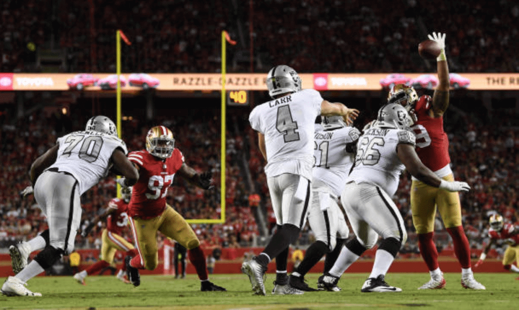
The Raiders and 49ers played the last-ever Battle of the Bay last night. Perhaps to commemorate that occasion, or perhaps just for the hell of it, the Raiders did something interesting. They wore their Color Rash jerseys — the ones with the silver numbers instead of their standard black numbers — but instead of pairing them with the white pants and socks, they wore their usual silver pants and black-topped socks, creating a de facto throwback look.
In another uni-notable move, the Niners wore captaincy patches:
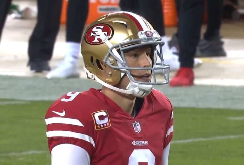
According to Twitter-er Chris Kirkegard, this is the first time the Niners have worn “C” patches since 2010. I haven’t been able to confirm that date, but they definitely hadn’t worn them in a while.
Anyway: Good-looking game. And the 49ers actually won! That means my two favorite teams (SF and NYG) now have a combined three wins this season. Is life one big party or what?
(My thanks to Brinke Guthrie for the Niners captaincy patch screen shot.)
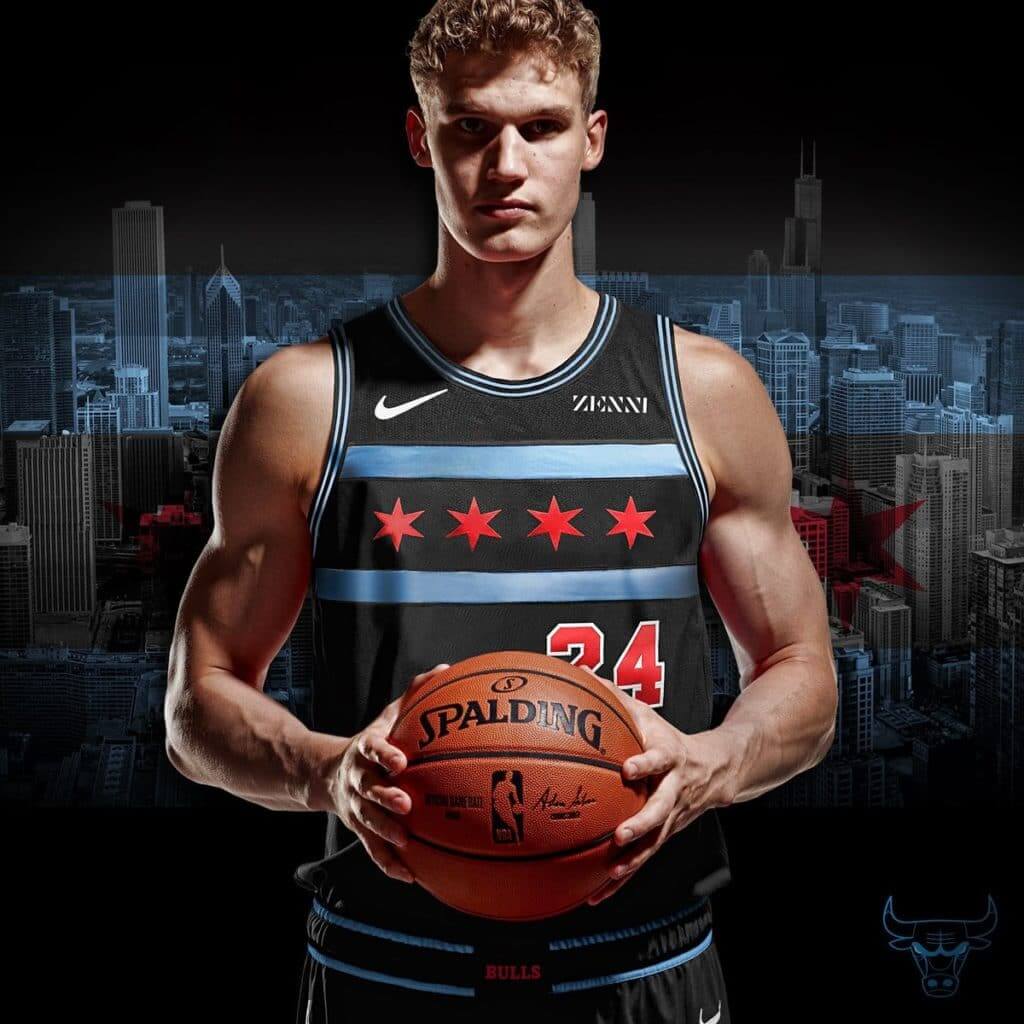
NBA leaks stop (for now), unveilings begin: As expected a bunch of NBA teams unveiled their new City alternates yesterday (including the Bulls, as shown above). You can read my assessment of them in this ESPN piece, which came out yesterday afternoon.
Every team except the Jazz is slated to get one of these new designs, and we’ve already seen leaks for a bunch of them, so more unveilings are presumably on the way, possibly as soon as today.
And then there were two: The Wizards this morning became the latest NBA team to sell out to a corporate uniform advertiser. As usual, I will neither show the ad patch nor name the advertiser, but I will show how an ad patch on a Wizards jersey looks like shit:
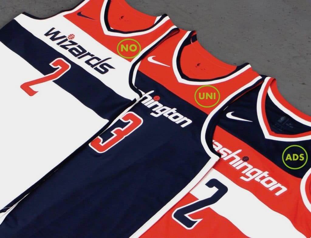
There are now 28 ad-clad teams and two ad-free teams — the Thunder and Pacers.
(Doubleplusthanks to Nic Schultz for his lightning-fast Photoshoppery.)

EXCLUSIVE — NFL centennial logo update: Remember that crummy NFL centennial logo that was revealed a few weekends ago? A little birdie now tells me that it will not be worn as a conventional jersey patch next season. Instead, it will replace the NFL logo at the base of the collar.
The exception to this rule, according to my source, is the Bears. They’re celebrating their own centennial next season, so they’ll keep the standard NFL logo on their collar and wear a centennial patch. It’s not yet clear if that patch will be strictly Bears-themed or if it’ll somehow incorporate part of the NFL centennial mark. Stay tuned.
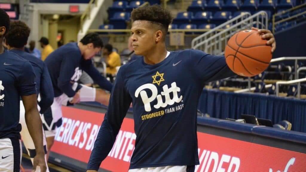
Photo by Alan Saunders; click to enlarge
Star of David, continued: The Pitt basketball squad became the latest team to respond to last Saturday’s act of domestic terrorism at the Tree of Life synagogue by wearing the Star of David (albeit on their pregame shooting shirts for last night’s exhibition game, not on their game uniforms). The visiting team, Pitt-Johnstown, also wore the shirts.
It’s worth mentioning that several readers got in touch with me yesterday to voice their concern about many of these team-worn Stars being yellow, because the Nazis forced Jews to wear yellow Star of David badges.
This issue came up briefly in Monday’s comments section, after I suggested that the Steelers should wear this Steelers-based design. But reader Michael Cooperman — one of those readers who emailed me yesterday — pointed out that Pittsburgh sports teams face a particular challenge in this regard, because the city’s pro and college teams all use yellow or gold in their color schemes. It is, in Michael’s words, “an interesting color conundrum.”
(My thanks to Pittsburgh sportswriter Alan Saunders for being on top of this one.)
Click to enlarge

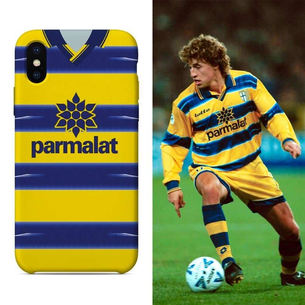
LAST CALL for the raffle and discount: Today is the last day to enter the raffle for a free soccer jersey-based smartphone case from our friends at Nostalgia Cases. To enter, send an email to the raffle address by 7pm Eastern tonight. One entry per person. I’ll announce the winner on Monday.
Today is also the last day to take advantage of Nostalgia Cases’ 10% discount offer. To get the discount, go to the Nostalgia Cases site and use the checkout code UNIWATCH.
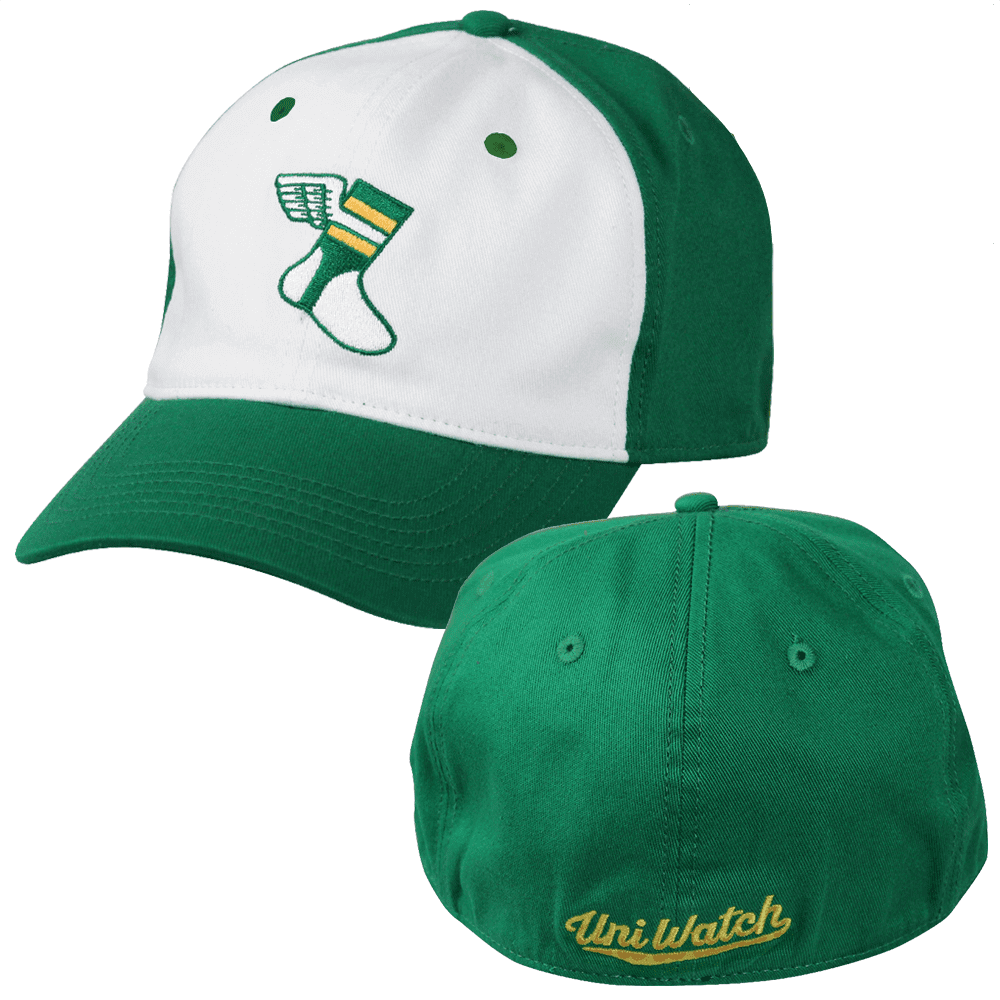
While we’re at it, please keep in mind that we’ve recently reduced the price of our flex-fit Uni Watch alternate cap (shown at right). It was originally $29.99 but is now $24.99, and you can order yours here.
And as long as we’re talking about caps, our Uni Watch classic cap, available exclusively from Ebbets Field Flannels, can still be ordered in all fitted sizes, we’ll have the adjustable version back in stock early next week. Get yours here.
The Ticker
By Paul

Baseball News: Several Red Sox players wore their red softball tops to last night’s Boston Celtics game (from Tim Johnson). … This is pretty great: For Halloween, former MLBer Carlos Beltrán and his kids dressed up in the uniforms of the teams Beltrán played for (from Mike Chamernik). … The minor league Nashville Sounds are rebranding. No, wait, they’re remixing. No, wait, they’re remastering. No wait, they’re doing a brand refresh. Whatever the fuck they’re doing, it’ll happen on Nov. 15. … Way back in 1936, the Cubs tried a TBTC promotion, sort of (from Bob Gassel).
College and High School Football News: Vicis — manufacturer of the highly rated Zero1 helmet — has launched its first youth helmet. … Here are this week’s uni combos for Houston, Ohio State, Virginia Tech, Utah State, West Virginia, and NC State (from Andrew Cosentino, Ben Jamin, Josh Claywell, and Phil). … Here’s a video report on Oklahoma State’s mascot, Pistol Pete (from Sam McKinley). … Two Pennsylvania high schools — Penn-Trafford and North Hills — will wear “Stronger Than Hate” decals tonight in response to the Pittsburgh synagogue massacre. Unlike the the other patches and decals that have carried that wording, these decals will not include the Star of David (and as you can also see at that link, Penn-Trafford has poached Florida State’s helmet logo, grrrrr). … TE Dalton Keene will be the VaTech player wearing No. 25 this week (Andrew Cosentino again). … Here’s how the reflective highlights on UCF’s space-themed uniforms looked under the lights last night. … New orange end zones for Florida.

Hockey News: The Ducks wore their infamous Wild Wing jerseys during last night’s pregame skate. The game has Wild Wing pucks, too. … The Senators and Islanders debuted their new alternates last night (from Wade Heidt). … Pink in the Rink uniforms for the Prince George Cougars. … Remembrance Day jersey for the Kitchener Rangers. … And so it has come to this: The NHL now has an official military appreciation partner sponsor advertiser. … A Glasgow-based hockey team wore excellent skeleton-themed uniforms for Halloween.

NBA News: The Nets now have their own JetBlue plane livery. … Cross-listed from the baseball section: Several Boston Red Sox players wore their red softball tops to last night’s Celtics game (from Tim Johnson). … Speaking of the Celtics, F Jayson Tatum says he wears No. 0 as a shout-out to Gilbert Arenas (from Mike Chamernik). … The 76ers wore red last night as a tribute to Allen Iverson.

College Hoops News: It happens every year: As soon as my annual college hoops preview comes out, there’s inevitably a flurry of late-breaking news from schools that hadn’t gotten back to me. It’s too late to add them to the preview (I already taxed my editor’s patience with a bunch of last-minute updates in the hours leading up to the piece being published), so they’ll end up here in the Ticker instead. Ready? Here we go: New court design for Cincinnati. … New uniforms for Valpo (from Joel Mathwig). … New uniforms for Memphis. … New uniforms for Davidson (from Ethan Faust). … Southeast Missouri State will wear grey at home this season. … North Carolina-Wilmington has a new black alternate. … New uniforms for Purdue Fort Wayne. … New uniforms for Oral Roberts, which also has a new practice court and a new live mascot. … New court design for Georgetown. Additional info here. … New uniforms for Indiana. … New practice jerseys and warm-up tops for Northwestern.

Soccer News: “Scottish team Kilmarnock has released a 150th-anniversary crest,” reports our own Jamie Rathjen. “Since we’ve been talking about religious symbols on uniforms lately, Kilmarnock’s crest has featured a subtle one — a hand in a sign of benediction — for most of the team’s history, although it did not appear on the jerseys until 1977.” … Premier League teams are wearing black armbands in response to the Leicester City helicopter crash. … New official ball for the AFC Asian Cup UAE 2019 (from Josh Hinton).

Grab Bag: The police force in Painted Post, N.Y., is getting new uniforms. … A Canadian artist came up with an interesting logo for Transgender Awareness Month. … Interesting piece about political T-shirts (NYT link) and other political clothing. … New uniforms for Army lacrosse (from Griffin Smith). … Everyone’s making money off the NASA logo except NASA. … Fans of the Australian rugby league team New South Wales Blues are upset about a new alternate jersey, which they’re denouncing as a money grab. … Pro golfer Bryson DeChambeau, taking advantage of a new rule change, plans to putt with the pin still in the hole in 2019. … Speaking of golf, a safety expert says golfers should start wearing helmets (blame Phil).
Why are NBA sponsors called advertisers but UniWatch sponsors are called friends?
Because Nostalgia Cases is neither a sponsor (they are not providing essential support) nor an advertiser (they have not taken out an ad). They are, literally, friends.
The NBA is a massive corporate entity that needs no sponsorship but chooses to partner with other corporations in order to generate more revenue. UniWatch is a free website with a small staff that uses advertisers in order to continue bringing you free daily content.
Surely you could have seen the difference yourself.
Thanks, Paul. I wrongly assumed they were paying to mentioned daily. My apologies.
For the record, I would never accept money from an outside party in return for a daily mention in the text.
You forgot to close an italics tag (probably after the word Photoshoppery in the Wizards ad patch lament), and now everything below is hard to read.
Thanks. Fixed!
“Speaking of golf, a safety expert says golfers should start wearing helmets.”
Let’s all wear helmets!!
That article makes no sense. It says golfers should wear helmets, but all of the injury examples they cite are of spectators, not golfers.
It also ends with a statistic about the number of amateur golfers that are injured every year (16-40%?) and compares that to the number of rugby players injured.
Surely the vast, vast, VAST majority of those golf injuries are orthopedic injuries caused by swinging the club and not by actually getting HIT by a ball (which is extremely rare). While it’s an interesting statistic, it’s hardly relevant to an article about golfers wearing helmets.
I thought ORU was going to have a live eagle in the arena. Looks like it’s just a new costumed mascot.
Seems like a 4 vs. 4 QB matchup is fairly rare in NFL.
Dallas vs Houston a few weeks ago.
Broncos-Texans on Sunday.
By my count there are already at least three NBA teams basically recycling their “story” element from last year’s City jerseys – Orlando, Chicago, and Miami (if the leaked jerseys are accurate). Of those three, I’d say only the Heat’s second take is an improvement. The single season nature of these uniforms really just kind of kills any enthusiasm I might muster for the better designs. I think Denver and OKC’s are better than their regular uniforms, but it doesn’t matter because they’ll be worn a handful of times and then discarded next season so Nike can keep turning a profit. Sad, really.
Thanks for raising my hopes, Paul, but the new Oral Roberts mascot is still a COSTUMED mascot.
link
Not worth changing the ticker, but Carlos Beltran’s PETS also got in on the Halloween fun, including the fish, if you look closely at his photo.
In the Nets/JetBlue promo, some of the models are sporting arm sleeves and accessories with that “Brooklyn Camo” pattern (seen in pics #1, 12, & 16). Any word if these will be worn in games by players too?
link
A couple of the new alternate uniforms in the NHL hit the ice last night.
Ottawa Senators old NHL 100 Classic uni is now their regular alt and will be worn at home on Thursdays:
link
New York Islanders sported their new alternate uniforms last night in Brooklyn:
link
Thanks, Wade. I’ll add those to the Ticker (and credit you, of course).
There seems to be a coding error where these items were added.
Fixed.
Islanders 3rd doesn’t look half bad
The Isles’ 3rd doesn’t look very good to me. It would be better if the shoulder yoke was replaced by the standard team logo. Also, something about orange numbers contrasting the big white crest doesn’t look right to me. I think white numbers with orange trim would be an improvement. I don’t know…
The Senator’s 3rd is far better than their regular crappy sweater but not as good as the previous barber pole alternate which was absolutely gorgeous.
Best 3rd the Islanders ever had (by default as there have been some not great ones).
Could use some minor tweaks to improve. More traditional shaped round white shoulder yokes instead of the squared ones. Put the striping around the hemline in the more traditional style, instead of the thin stripes along the bottom edge. Done and done.
I would argue for the 2008-2010 third jersey being their best to date, particularly since that one got promoted to full-time jersey afterward, putting an end to the Islanders’ navy blue era. Although the warped sleeve stripes of the Edge template do kind of detract from it a little (thankfully that’s one thing Adidas fixed with the Adizero template).
Yeah Rob, totally didn’t think about the current dark uniform previously being a 3rd back then. That was their best 3rd.
Why is “Zenni” advertisement visible in the Bulls image?
Because, as I have explained many, many times, the uni ads only get ad-blocked when they are *new* uni ads being announced for the first time (like the Wizards’ ad today), not for their subsequent appearances.
I’m definitely anti ad on NBA unis, but I’ll tell you I recently got a great set of glasses from Zenni for like $60, and that’s only because I have terrible eyesight and get the high index lenses, otherwise they’d be cheaper. My eyesight had been pretty expensive until I got these.
-The Anaheim Ducks’ Wild Wing jersey in the pregame skate last night was not true to the original. It was missing the shoulder patch. As well, the original had a triangular shoulder yoke.
link
-NFL game looked good last night. I prefer the Oakland Raiders in the silver numbers on the white jerseys rather than the black number.
Ryan Getzlaf now looks exactly like Mark Messier
It also didn’t help putting the Adidas maker’s mark right where the captain’s C should have gone, forcing the letter onto the graphic. And they didn’t even get the collar colors right!
I agree with Wade on the Raiders.
That SF/OAK game looked so good.
Apostrophe Catastrophe in the Beltran ticker item. “teams” should not have an apostrophe.
Thanks. Fixed.
One thing that stands out to me which is somewhat overlooked is cleat colors. For instance, as displayed in the picture above, last night SF players were seen to be wearing three different cleat colors (red, white, black). I find it an eye sore to see SF’s beautiful unis paired with more black or rash-like red. I also find uniformity to be superior, so I would prefer all SF players to wear white cleats.
As for OAK, black or white matches fine, but again, uniformity.
I miss Oral Roberts’ old dead mascot.
The Raiders should go with this for their regular white jersey. This and the Saints Color Rash jerseys are better than their regular white jerseys.
I don’t know if you were watching the game but the Raider’s uniform didn’t look great before the sunset. It should become an alternate for primetime games.
Personally, I’d prefer they have thicker black outlines, like they had back in 63-64. That would probably help with the daylight issue. They had the thicker outlines for the 2009 throwbacks.
The 1994 throwbacks also had thinner black outlines – I remember Keith Olbermann complaining on SportsCenter, “I CAN’T SEE THE NUMBERS!”. I’d love to see that 1994 segment of him reviewing the throwbacks again, if I could ever find it.
Absolutely agree re: the Raiders and the Saints. Come on owners…do the right thing!
I thought the Chicago flag was white.
To me, everyone wearing a gold star patch on their clothing reminds me of the actions of US Army MSgt Roddie Edmonds: “We are all Jews here.”
link
In case you didn’t see this or it hasn’t already been posted, NHL players were asked about their favourite sweaters. The classics win!
link
Not a coincidence the Stars of David are gold.
Stay woke!!!
Anyone catch UCF’s Space Junk uniforms last night, NOB font in particular awful.
Remain impressed with the bottomless budgets of athletic departments with all the cash they have for one-off uniforms and helmets.