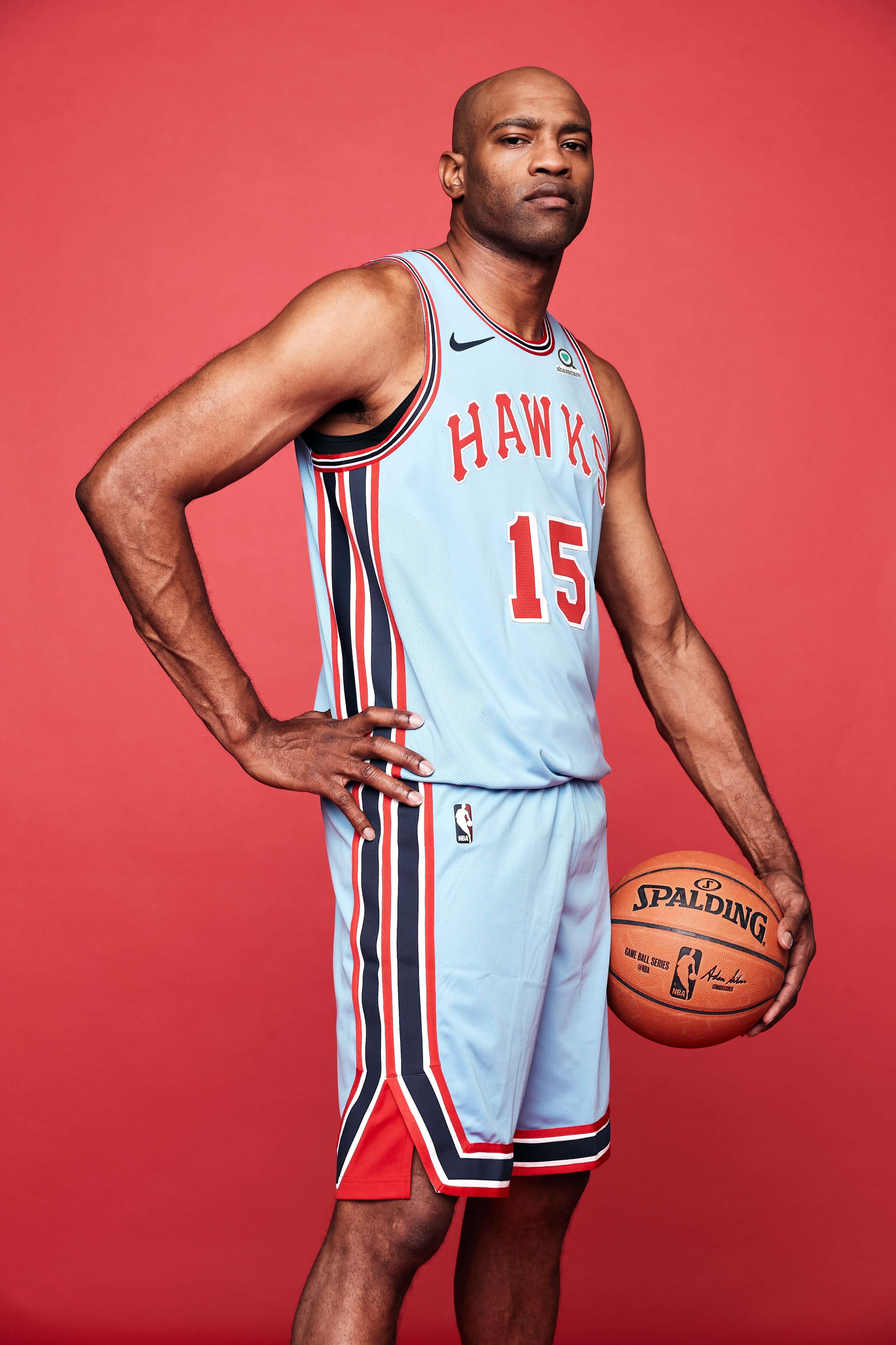
Click to enlarge
Last week I tweeted a photo of the Hawks’ 1968 throwback uni (shown above), which the team will wear for select games this season. That prompted one of my Twitter followers, J. Reuben Clark, to ask, “Why do throwback unis almost always seem to be an improvement on the regular ones?”
I gave my standard response: “Because old uniforms were designed to answer the question, ‘What looks good on the field/court/ice?,’ while new uniforms are designed to answer the question, ‘What will 18- to 34-year-olds want to buy?’ Simple as that.”
Later, while I was out for my daily bike ride, I thought a bit about that. Are old designs really better? it’s certainly true that when many teams break out their throwbacks, lots of fans (including me) say, “They should go back to wearing that full-time!” But is that just nostalgia? Are there any teams whose new uniform designs are better than any of their old ones? Or to put it another way, are there any teams whose current uniforms are the best they’ve ever worn?
This question is similar to Phil’s long-running “What’s Your Sign(ature)?” series. But my goal here is not to single out the most definitive uniform from a team’s history. I simply want to know if a team’s current uniform is its best uniform. How many such teams are there?
I decided to crunch those numbers, one Big Four league at a time. We’ll start today with MLB. But first, one quick ground rule: I think baseball generally looked better in the high-cuffs/stirrups era, so I guess you could say all of today’s uniforms are worse than all of ones from the 1970s, simply by virtue of how they’re worn. But the way I see it, that’s a style problem, not a uniform design problem. So I’m not going to hold the players’ low-cuffery against today’s designs. (Similarly, I preferred football uniforms when the jerseys had sleeves, but that’s more of a performance/style issue, not a uniform design issue.)
Again, here’s our operative question: Is the team’s current uniform set — for the sake of this exercise, we’ll stick to basic home whites and road greys — the best the team has ever worn?
Here’s my team-by-team answer to that question:
National League East
Braves: Yes. But it’s an old design that they went away from and then revived. (It’s also a problematic design because of the tomahawk, but that’s another issue for another day.)
Marlins: No.
Mets: Yes. But it’s basically their inaugural design from 1962, which they went away from and then revived.
Nationals: Yes. But the team has only existed for a dozen years.
Phillies: Yes. But it’s an old design that they went away from and then revived. (I’m aware that many people prefer the 1970s-80s design, but I really like the Phils’ current look.)
National League Central
Brewers: No.
Cardinals: Yes, but it’s an old design that they’ve been wearing forever.
Cubs: Yes, but it’s an old design that they’ve been wearing forever, at least for the home whites.
Pirates: No. (I happen to think the Pirates are a good-looking team right now, but I’m partial to vests, and I also liked the bumblebee era.)
Reds: No.
National League West
Diamondbacks: No.
Dodgers: Yes, but it’s an old design that they’ve been wearing forever.
Giants: Yes, but it’s an old design that they went away from and then revived.
Padres: No.
Rockies: Yes, but it’s basically the only design they’ve ever had.
American League East
Blue Jays: Yes.
Orioles: Yes, but it’s an old design that they went away from and then revived.
Rays: No.
Red Sox: Yes, but it’s an old design that they went away from and then revived.
Yankees: Yes, but it’s an old design that they’ve been wearing forever.
American League Central
Indians: No.
Royals: Yes, but it’s an old design that they went away from and then revived.
Tigers: Yes, but it’s an old design that they’ve been wearing forever. (I’m going to overlook the change in cap logo size and the change in jersey logo, both of which I think were slight downgrades. The design is essentially the same as it’s always been.)
Twins: No.
White Sox: No.
American League West
A’s: No. (To be clear, I like Oakland’s current look quite a bit. But I like their 1970s look even more.)
Angels: No.
Astros: No.
Mariners: Yes, but they’ve been wearing this basic design, with some tiny tweaks, for 25 years.
Rangers: No.
———
So from my perspective (which I realize may not necessarily match yours), there is exactly one MLB team — one! — with a new-ish uniform that qualifies as the best in team history. That would be the Blue Jays, and they should get an asterisk, because their current design was meant to reference and echo their inaugural uni from the 1970s.
Most of the other teams fall into one of four categories: Either their current look sucks (D-backs, Padres), or they got it right decades ago and have been smart enough to stick with it (Yankees, Cardinals, Dodgers), or they got it right, then veered off-course, and then saw the error of their ways and righted the ship (Mets, Phillies), or they look pretty good these days but used to look even better (A’s, Pirates).
So yeah, that’s why throwbacks usually look better than the current uniforms — because in many cases they were better than the current uniforms.
I realize many of you may disagree. Feel free to have at it in today’s comments, but with one condition — please restrict the discussion of “Is the current uni the best uni?” to baseball. I’ll cover the other Big Four leagues soon, so we can argue about them then. Thanks.
In case you were wondering…: The site was hit with some sort of spike yesterday — just as I was heading out the door to deal with some errands followed by evening entertainment. I’m not tech-savvy enough to understand what happened, but it took webmaster John Ekdahl several hours to deal with it, and most of yesterday’s comments that had been posted up to that point had to be scrapped in the process, unfortunately.
Sorry about all that, and thanks for your patience. Hopefully it’s just a one-time thing.
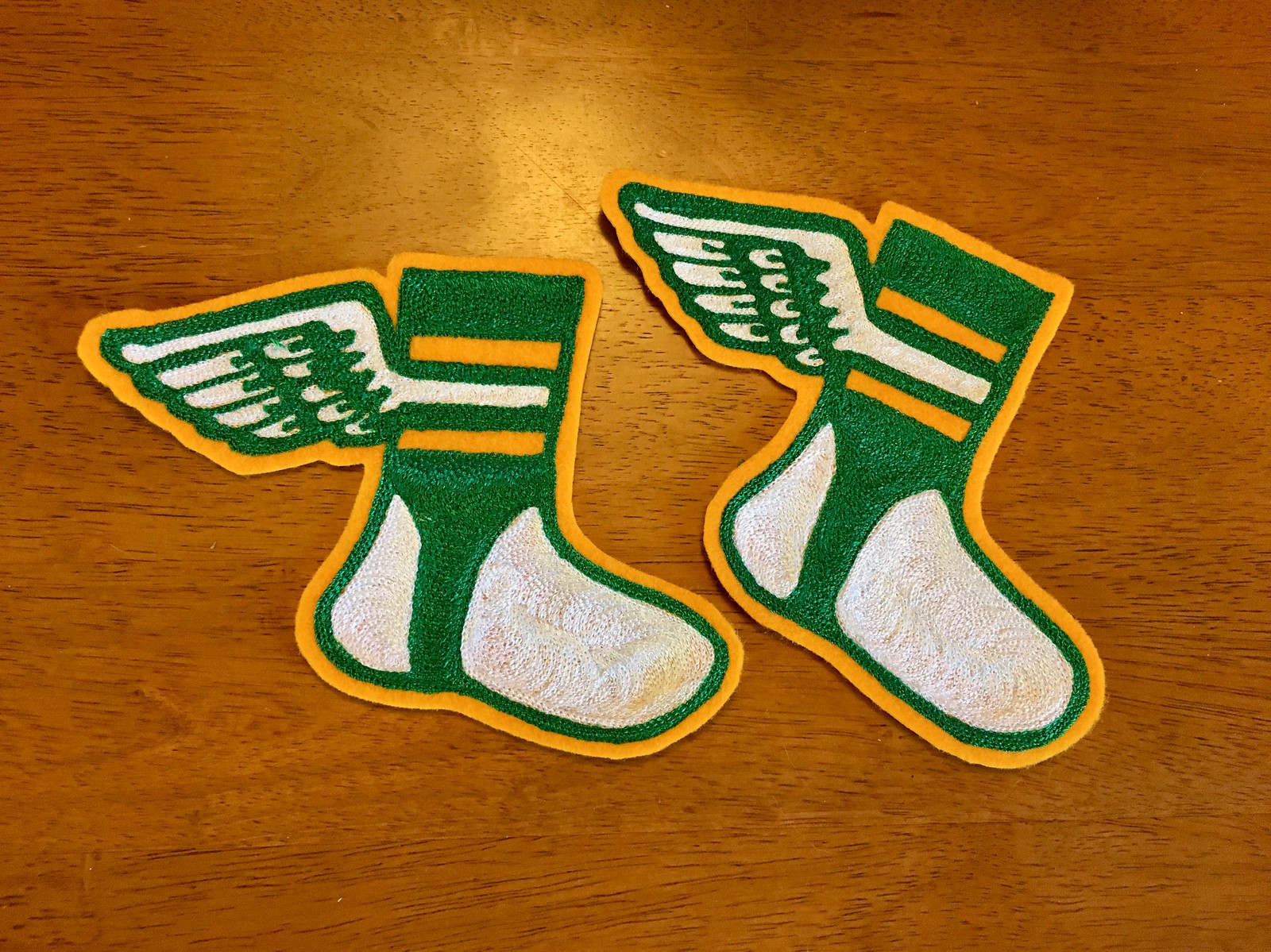
Click to enlarge
Chain-stitch update: I just received a couple more chain-stitched Uni Watch logo patches from master embroiderer Amy Bengtson (who I interviewed last month). These patches will ship out today to the readers who ordered them.
If you want your own patch, the price is $35 apiece (80% of which goes to Amy). That includes shipping. They’re hand-embroidered, so no two are quite the same. If you’re interested, give me a shout and I’ll make the arrangements.

Click to enlarge

LAST CALL: Time is running out on a few items of note:
• Our friends at Nostalgia Cases, a company that sells smartphone cases with designs based on old soccer jerseys (as shown above), are offering a 10% discount to Uni Watch readers, but today is the last day to take advantage of it. Full details here.
• Today is also the last day to enter the raffle for one of artist Dan Duffy’s awesome sports prints. Art of Words artist Daniel Duffy. Full details here.
• We recently lowered the price of our flex-fit Uni Watch alternate cap from $29.99 to $24.99. Get yours here. Okay, it’s not the last day for that. But still — buy a cap already.
The Ticker
By Yianni Varonis

Baseball News: Reader Richard Gregg was listening to the World Series on ESPN Radio when he heard one of the broadcasters note that check-swing appeals are called strikes more often when the batter holds a darker-colored bat and wears a lighter-colored uniform. The broadcaster cited no evidence or stats, although the idea seems intuitively appealing. … Japan recycles broken baseball bats by turning them into chopsticks (NYT link). … In suburban Trenton, N.J., local high schools have adopted elements of the Michigan State, Georgia Tech, and former Astros logos (from Robert Brashear). … There’s an annual contest for groundskeepers and turf managers to show off their best baseball grass-mowing designs (from James Gilbert).

NFL News: A compelling article about—and video of—a young fan’s emotional response to receiving the jersey of Seahawks LB Shaquem Griffin, who, like the young fan, has only one hand. … The Bills will retire Thurman Thomas’s No. 34 during halftime this Monday night (from Mike Chamernik). … In advance of their game in London, Eagles players were given beautiful throwback jackets featuring the British flag and the London skyline (from multiple readers). … Reader Rudy Gutierrez points out something that Uni Watch has never noticed before: In 1994, the throwbacks that the 49ers wore sometimes included the NFL logo on the collar, while at other times, they did not. … After this Sunday’s game, Ravens QB Lamar Jackson wants Panthers QB Cam Newton’s jersey so he can “man cave it.”
College Football News: The Big Ten reprimanded Michigan because, among other reasons, one of its players used his cleats to tear into Michigan State’s midfield logo during pregame last week. … Inspired by former Alabama HC Bear Bryant, a jockey will wear houndstooth silks while riding a horse named after Alabama QB Tua Tagovailoa. His race will take place the same day as the Alabama/Auburn Iron Bowl (from Griffin Smith). … Here’s what some Oklahoma State players had to say about their new throwbacks. … Texas State also will wear throwbacks (from multiple readers). … Here are the other uniform combinations this week for Washington State, South Carolina, Arkansas, Houston (from Ignacio Salazar), Syracuse (from James Gardner), Stony Brook, and Colorado and Iowa State (both from Kary Klismet), the latter of which made a helmet tweak. … Pitt will wear “AO” helmet decals in support of former OL Alex Officer, who is currently battling bone cancer (from Jerry Wolper). … No. 46 looks really odd when rendered on Georgia Tech’s new uniforms.

Hockey News: Not exactly something to celebrate, but the North Stars introduced ads on the boards to the NHL 40 years ago yesterday (from @MDMambo). … A new throwback mask for Islanders G Thomas Greiss featuring a fisherman more intimidating than this one (from (@OlegKvasha). … The San Antonio Rampage of the American Hockey League will wear these Latino-inspired uniforms for Día de los Muertos (from David Kemper).

Basketball News: According to these articles, Pacers fans aren’t thrilled by their team’s possible GFGS alternates, and Lakers fans dislike the BFBS piping on their purple uniforms. … Here is an oral history of the Raptors’ inaugural uniform, which this writer believes is the “GOAT” (from Tom O’Grady). … The Warriors have buried a Rick Barry bobblehead beneath center court at their new arena, which is set to open next season (from our own Brinke Guthrie). … The Bulls’ D League affiliate, the Windy City Bulls, will wear “deaf awareness night jerseys” that will be auctioned off for charity (from Adam Johnson). … Also in the D League: The Cavs’ affiliate, the Canton Charge, has a new jersey advertiser. … New uniforms for Manhattan.

Soccer News: The Bob Marley-inspired jerseys that Uni Watch mentioned earlier this week prompted this newspaper to look back on some of the worst soccer kits in history. … It is common for soccer teams to have match info added to the front of their jerseys. Wembley Stadium in London, where the English national team plays, mimicked this tradition to promote an upcoming Pink concert at the venue (from Mark Johnson). … Polish club Zagłębie Lubin will wear these kits to celebrate the 100th-anniversary of Poland’s independence from the German, Austrian, and Russian Empires (from Ed Zelaski).

Grab Bag: Pro tennis player Roger Federer discussed his split with Nike and his optimism that he’ll one day be able to use his “RF” logo again, the rights to which Nike currently owns. … Here are all of the ways that, technically, we’ve been misusing the American flag, including wearing it on sports uniforms. … As mentioned in the college football section: Inspired by former Alabama HC Bear Bryant, a jockey will wear houndstooth silks while riding a horse named after Alabama QB Tua Tagovailoa. His race will take place the same day as the Alabama/Auburn Iron Bowl (from Griffin Smith). … New Zealand’s national rugby union team will unveil new black jerseys next week (from Ted Kerwin). … This StubHub frankenjersey goes further than any I’ve seen before, featuring elements of every professional team in Boston (from @GuySmileys). … Just in time for Halloween: New logo and package design for the candy Smarties (from Pete Woychick). … Vogue details the recent trend in the finance industry of men wearing grey- and navy-fleeced vests. … Also in Vogue, a look at some of the unusual baby gifts England’s Prince Harry and Meghan Markle have received, including a mini-lifeguard uniform. … Here’s a heartbreaking photograph of the daughters of a fallen trooper with different parts of his uniform. … Amazingly, a centuries-old colonial newspaper featuring the historic “Unite or Die” snake was discovered at a Goodwill processing center in New Jersey. … Speaking of which, here’s a visual history of the American military uniform from 1776 to the present. … This is a nice read about the 100th anniversary of the Tour de France’s iconic-yellow jersey and its importance in the aftermath of World War I. … Worried about the stock market’s recent slide? No problem — invest in sneakers (from Jason Hillyer).

What Paul did last night: Last night I met up with my friend Carrie to see The Guilty, a Danish thriller about a cop working at an emergency call center who gets a call from a kidnapping victim. The entire movie takes place in the call center (hey, that’s one way to keep your budget low), and it’s absolutely riveting, with several twists and turns. I doubt the film is currently playing anywhere besides New York and L.A., but it’s Denmark’s entry for the “Best Foreign Movie” category in next year’s Oscars, so maybe it’ll get a wider release if it gets nominated. Definitely see it if you can — great stuff.
Afterward, we walked over to Otto’s to see the mighty Susquehanna Industrial Tool + Die Co., who were doing their annual Halloween show, full of masks, werewolves, and spooky sound effects (click to enlarge):
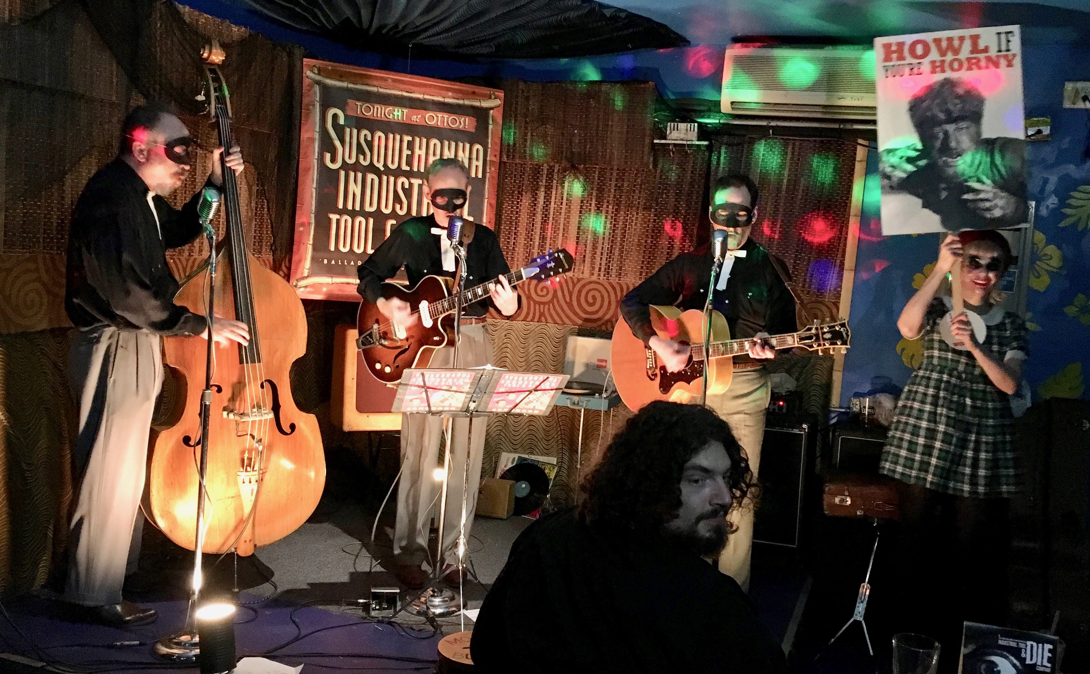
The smiling gal holding the werewolf sign is my friend Sara. It’s hard to tell from that photo, but she was actually wearing a full-face mask. Here’s a better look:
The creepy thing — and you’ll have to take my word for this part — is that that’s pretty much what Sara looks like without a mask. Spoooky.
Anyway, a really fun night, and a good warm-up for next Wednesday night, when I look forward to sitting on my porch and eating cand — er, giving out candy to the neighborhood youth.
last link in college football section is wonky
Thanks, Gregg. Got it.
Heya — quick question (and I think I know the answer, but don’t want to assume, as you know what that does…)
Your actual name is “Denver Gregg” (first name “Denver”) correct? Like, Denver is not an adjectival/locational nickname descriptor and your last name is actually “Gregg” yes?
Feel free not to answer if you feel it’s too personal…I just always like to (if possible) get the names of our readers correct.
Thanks!
real first name is Gregg. I am a Denver native and am fortunate to live in Denver these days, though in the early days of the internet I had the misfortune to live in the northern suburbs of Tijuana. My last name is a highly unusual one that gets butchered frequently, so I’ve used that nym for quite a while
Gotcha — thanks!
DC’s best home look was the 1959-1960 Senators and best away look was the 2009 or 2010 Nationals
I was thinking about this. There’s something really nice about the “transition” DC Away jerseys that they wore c.2010, where it had the new script “Washington,” but the older drop-shadow-gold numbers and “DC” logo patch on the arms.
Personally, I like the current look better than the initial one generally speaking, but I do lament the loss of the gold highlights. It gave the team something different compared to the other myriad Navy-White-Red teams in the major 4 sports.
I’m also quite partial to the “DC” logo we used to have. Always thought that should’ve been used more. My actual favorite Nats jersey is the c.2008-9 Red Alt, with the “DC” logo on the chest. It looks very classy and put together for a softball top (rare these days).
Personally, speaking as a DC native, I really like the current Nats jerseys, but I agree with you on the 2009-2010 transition away jerseys, which had the current “Washington” script and layout but the older drop-shadow-gold numbers and the “DC” logo on the sleeve. To be fair, I’m biased against roundels as a very cookie-cutter solution to a patch, so I dislike the current sleeve logo. I’m also partial to the gold highlights the Nats used to have, since it set them apart from the myriad other Navy-Red-White teams in the major 4 sports. I’d love to see them re-incorporate that color somehow into their color scheme.
I’m also a fan of the seriously-underrated “DC” logo from the initial set. It was really well-done. My favorite all-time Nats jersey is the c. 08-09 Red Softball Alts, with the “DC” logo on the chest. It’s really well-put together for a softball top (which says a lot about the state of design nowadays).
I think throwbacks generally speaking look and seem to be better designs because teams for the most part only use good designs as throwbacks. In other words, we (usually) only “throwback” the best designs and not the worst.
Exactly. It’s the same reason why most people over the age of 16 like oldies, classic-rock, or “mix” radio stations more than they like top-40 stations. There’s a lot of crap music in the pop charts any given week, and the stations that play older or more eclectic music mostly ignore the crap and play only the songs of more lasting quality. Pop music wasn’t any better in the past than it is today; it’s just that we only listen to the better music from the past.
Flash forward to 2039. Does anyone expect to see the Arizona Diamondbacks wearing their uniforms of today as every-Sunday throwback alternates? Unlikely, right?
Actually, I bet today’s D-backs unis eventually move into the “so bad they were good” pantheon and become nostalgic faves. Just a hunch.
So more like the pinstripe-era Brewers uniforms? Possibly. I feel like the D-Backs would need either to win a few NL pennants or host a beloved HOF-caliber player while wearing the uniforms for that to come to pass, however.
On the other hand, if cap-fabric decoration/sublimation catches on with other teams, perhaps the D-Backs unis will simply be remembered as a mediocre first draft of an influential trend.
as I like to say, time is a good editor. there was lots of rotten music in past centuries that has been lost forever. the worst music written today is inescapable.
I think if you take a look at the Billboard Top 100 from 1964 through 1968 you might find that pop music was a little better than what we have today.
PL – question: what is the best look in Indians history if the current look isn’t? Setting aside the entire Wahoo debate, the current look has been around in one form or another for 25-30 years and somewhat recalls jerseys from previous eras.
I like the vest look from the ’60s.
I’m from that suburban Trenton county. Actually the one school with the Astros styles N used to wear Michigan helmets – specifically because they wanted the Steinert Spartans to be their rival, and Steinert had a very derivative look of Michigan state
I am also from that suburban Trenton county. The blue and gold team did wear winged helmets, but when you looked at them from the front, it looked like the top half of a star.
The county also had a team using the St. Louis Cardinals’ logo for the football team, and another team had rams’ horns on their helmets for a short time. I think their hats have a ram head on them now.
Nostalgia seems the overwhelming factor in determining the ‘best’ uniforms. All the “Yes’s” excluding the new teams are based on older 60s era designs (except the A’s). It’s an idea that baseball design improvement stopped about 30 years ago.
I find it similar to when old players like Charles Barkley say that basketball players were better skilled in his era, when that’s just not the way human advancement works generally.
Nostalgia seems the overwhelming factor in determining the ‘best’ uniforms. All the “Yes’s” excluding the new teams are based on older 60s era designs (except the A’s). It’s an idea that baseball design improvement stopped about 30 years ago.
Yes, it’s possible that this is attributable simply to my sense of nostalgia. But it’s also possible — whether you choose to acknowledge it or not — that baseball design improvement really *did* stop about 30 years ago.
MLB had some terrific new designs in the 1980s, 1990s, and into the 2000s. (Also some clunkers, which is the nature of a more experimental approach.) I do think that MLB design has become more staid, and therefore less interesting and successful. Although the recent Astros redesign is terrific. Whereas ten years ago, years could pass between NBA uniforms changes that I didn’t hate, whereas today the NBA’s designs tend to be both interesting and good. And the NHL is on a bit of a run of good design too. The NFL, like MLB, seems to be in a bit of a rut of hyper-caution leavened with occasional stuntish outliers. So perhaps there’s either something cyclical at work, or possibly we’re seeing something more indicative of league cultures than any meaningful past-vs-present dichotomy.
I think basketball players definitely were better SKILLED in Barkley’s era, they are more athletic now. There is a big difference there. In sports the progression always seems to be towards more athletic (stronger, faster, etc) as training and exercise science improves and we continue to place more value on athletic talent in our culture. But skill in particular things doesn’t necessarily improve, especially when you consider that the more athletic you are the less precise you need to be in your skill to succeed. In baseball for example, if a pitcher is more athletic and thus can throw harder and sustain that speed for longer, that can make up for less accuracy and/or an inability to throw a variety of pitches.
“That’s not the way human advancement generally works”
The idea that human societies are always “advancing” is as biased a viewpoint as chalking it up to nostalgia.
Take architecture. Nearly every culture has adopted the either the big box or whimsical geometric feature, and none can hold a candle to Medieval architecture of 500 years ago. Same with painting and sculpture. There is nothing made today approaching a Da Vinci or a Michelangelo. Have you ever seen an illuminated manuscript from that error? Nothing published today comes close.
I submit that both style and design are a function and reflection of the culture, and I further submit that cultures can and do regress. Discuss.
Well, I think throwbacks often look better because you are wearing a popular design, right? Teams usually don’t wear throwbacks of ugly designs from their past, they pick the good ones. So I guess the question is, if that is a good and popular look from the past, why isn’t it the full time look?
And I agree with Paul regarding the Phillies, I think people like the 70s/80s design because it is unique and has great (and unique) colors for baseball, but as a whole, their current look is better.
“Teams usually don’t wear throwbacks of ugly designs from their past, they pick the good ones.”
I still wish the 2009 Denver Broncos had stuck by that rule, and not been the exception.
I completely agree with your list. I prefer the Pirates in the vests too. I thought they got it right when they moved into PNC.
I like the Mariners set, however those slight tweaks to the numbers and lettering takes it down a notch.
Honestly, the Pirates have not had many bad unis over the years. Even the black sleeveless jersey with red undershirt was kind of cool in a funky way IMO.
I think it was a red vest with black sleeves, but either way, I kind of liked it myself.
You’re right. My memory is failing me too young…
I only have a quibble or two with the MLB list, the biggest of these being the Mariners. I always loved the Trident era with the classic royal blue and athletic gold. This color combo has fallen out of favor for some reason (I’m looking at you, Brewers) and I have always found it rather pleasing to the eye.
I love the blue and yellow combo for sports, and am happy to see the Rams bringing it back. I think in the late 90s it fell out of fashion as teams moved away from bright colors, so blue and yellow would become navy and gold. I hope the Brewers bring it back too, or at the very least dump gold for yellow, even if they stick with navy.
I prefer the Mariners in navy and green, I think that color scheme just suits Seattle well, and it would be great if all teams in the city keep some variation of it, similar to Pittsburgh being black and yellow.
It is good to see the Rams returning to royal. As a Chargers fan, I’m in the minority thinking their “Air Coryell” set was their best look. Most prefer the powder blues. I had been hoping against hope for a return to the royal and athletic gold, but now that they are sharing LA with the Rams, that is not happening.
I’m in that same minority. Royal blue tops, yellow gold pants and bolts and facemasks.
I’d still place the powder blue set at the top, but the royal blue with yellow pants is second. Only problem I have with that set it is a bit derivative of the Rams blue and yellow. I like each team to have a distinguishable identity. And not only is the powder blue set great looking, it is distinguishable as the Chargers.
100% nostalgia
Would you care to elaborate on that?
For the most part, the NFL throwbacks in 1994 did not include the league logo on the collar. However, the 49ers’ throwback jerseys were essentially the exact same as their regular jerseys, just with a different style of numbers applied. So when they decided to go throwback full-time from week 6 onward, and presumably needed to rotate in a fresh supply of jerseys as the season went on, they probably had already used up their allotment of throwback blanks without the collar logo, and just put the throwback numbers on their regular stock.
Or, it may have been that having the shield on the collar was a condition of the NFL allowing the Niners to wear their throwbacks for the rest of the season.
Just throwing possibilities out there.
Can’t agree about the Baltimore Orioles. I like the solid black hat with the full-bodied bird better.
link
IMO, the Orioles should always be black crown/orange bill.
Lee
The lakers purple unis remind me a little of the knicks late 90s road uni with the side black stripes
Paul,
I think what makes current uniforms lesser than their predecessors is over design. You refer to it a lot as story telling. When a team tries to sell me on a number font inspired by a river’s current as it bends, heading towards a rock that the city founders excavated in 1689… well… it jumps the shark. As with most things in fashion and design, one or two accents work… 39 clutter. A unique font is one thing, but when it then gets an outline and a drop shadow, again it clutters. New designs try to outdo the last and cram too much into a very small visual space.
Nostalgia definitely plays a role in the appeal of throwbacks, but I don’t think it’s entirely responsible either. As you pointed out in the beginning of the story, current uniforms are typically designed with an eye (or both of them) on selling merchandise and “storytelling,” while older designs just had to look good. Teams with older designs like the Yankees, Packers, Bears, and Celtics have been wearing them for decades, and will probably continue to do so for decades more. They’re “simple,” but iconic.
Curious—what’s your favorite White Sox jersey? Please don’t say Batterman!
Soooooo many to choose from! But I like all of these:
link
link
link
link
link
link
They all have more color than the current set.
Paul, what do you consider the White Sox primary color to be? Given their name, and the difficulty in making white the primary color, I’ve always found their simple black and white combo to be ideal, as opposed to red or blue options from the past. Though I don’t think the current logo or uniform design in black and white is particularly good.
They’ve changed so often that they don’t have one.
Dick Allen smoking and juggling. That’s the best. link
This is the team I was curious about too. I consider them to be one of the few modern classics. They apparently do to since the uni’s have been unchanged for over 25 years.
They have such a long and diverse uni history though that “best” is simply going to be a matter of personal preference.
I disagree about the Tigers’ tweak they made last year. It’s very noticeable and still look like shit to me. The jersey was essentially the same from the Greenberg and Gehringer era until this year. Change for the sake of making a buck. Yuck.
I personally preferred the hat logo over the jersey logo, but it is still weird to see the hat logo on the jersey.
The Tigers tweak is, like you said, very noticeable. It’s not even a tweak. Make the cap logo the same on the jersey, then enlarge the cap logo so people can see it? It’s a dung-heap at best. Honestly, they don’t even look like the Detroit Tigers anymore, but some college or high school team. In my book, they now fall out of the most classic sets in MLB, which now includes the Red Sox, Yankees, and to some extent, the Dodgers.
Here is an oral history of the Raptors’ inaugural uniform, which this writer believes is the “GOAT” (from ).
Missing the credit for this item.
Coding glitch. Now fixed.
I think the design and production limitations that existed when most of the ‘classic’ uniforms were designed lent itself to better designs
Excellent point. Sometimes it’s better to have more narrow parameters to work within.
add to that the current emphasis on “pushing the envelope”. the worst recent NFL uniforms use swirls and piping that are completely innovative . . . and ugly.
the Virginia Tech uniforms they wore last night looked pretty darn good though – would be better if they didn’t have such a clunker color combo
Maybe that’s true for movies as well. Before, say, Jurassic Park (or Titanic), in terms of visual effects filmmakers were limited by what could be physically built and photographed, and thus had to rely on things like storytelling, writing and acting to engage the audience. Now, there are no limits to what can be visualized on-screen, which arguably have, in the aggregate, undermined those other things.
I remember once years ago I ordered and received the Blu-Ray discs for two movies at the same time: Mud, and Star Trek: Into Darkness”. I remember holding up both boxes and thinking, This is why I don’t watch as many movies as I used to; too many movies like Star Trek: Into Darkness, and not enough movies like Mud.
It may be a specious comparison, but I think there’s at least some correlation, bound by the old aphorism, Just because we can, doesn’t mean we should.
The “Unite or Die” cartoon in the Ticker also illustrates Paul’s lead thesis today. Ben Franklin designed the original cartoon in the 1750s with the title “Join, or Die” to promote colonial cooperation against Native Americans on the frontier. It was widely copied and dusted off during the imperial crises of the 1760s. Then when another round of imperial crises seemed headed toward possible separation in the early 1770s, the cartoon was “updated” to “Unite, or Die” to promote the more active political unionism of the Continental Association and the the Continental Congress, and the shape of the snake (and the number of its segments) commonly tweaked. So it’s kind of like the Detroit Tigers uniform of political cartoons: An old design that they’d been reprinting forever by the time of that 1774 masthead.
RE: Rays. Current uni design was meant to be kind of retro, given that they started with rainbow colors bleeding, then went to the green vest look (which I liked also).
The main call against ALL of today’s designs is the mfr’s logo on all of them, which get back to the idea of retail sales.
Tend to disagree with the idea of simpler times meant simpler designs- the old-time Dodger uni picture shown the other day had a checkerboard look to it, and you could never say the Cardinals logo was simple or simplistic.
The green vest Rays era was a good lesson in how uni’s are judged on more than just aesthetics. That set was beautiful to look at, but never made an impact on the field or with the fans. (I live in Florida, and yes Rays fans do exist)
Then once the made the World Series in the first year of the new set, the green vests are gone never to return.
I think the White Sox, Twins, Angels, A’s, Astros, and the Orioles pre-retro look were all their best.
I really think it’s just generational. I tend to dislike most throwbacks because they look trememdously dated. Different strokes and all that.
Re: Nostalgia Cases
Can someone explain to me how a company like nostalgia cases can just put what seems to be IP for other teams/companies onto a product and sell it?
I don’t understand IP/product development well, but have always been curious…
Paul, what is your favorite Angels uniform? I’m thinking that I don’t like the current uniform because it’s predominantly all red, and I miss the navy and red combination, especially the hats. I really like the old halo on top. But just from an pure aesthetics stand point, the current uniform seems very good. Maybe my only beef is that there is no mention of the location, what with the whole name changes over the years.
Seems like a good example of a team that could bust out throwbacks and not have people say “they should wear that full-time”.
The 70’s to 90’s set that most people would probably associate with them wasn’t particularly attractive and they never won anything in it.
Maybe fair to say they haven’t found their classic look yet.
I’m thinking in 20 years this current uniform will be considered their best. Not having “Los Angeles” or “LA” anywhere is understandable considering the whole Orange County/Anaheim thing, but they may be the only team with no mention of their city/state/region. Thought when they switched from Anaheim to Los Angeles of Anaheim and now just Los Angeles, they should have changed to “Southern California”. Named after the region like New England, Tampa Bay, or Carolina.
As an Angels fan since 1976, I do tend to look at the current uniform as my favorite, though a lot of that could do with the fact that the team had its most successful era in those uniforms, and the fact that it replaced the winged-A, periwinkle-trimmed set, which was horrible.
I don’t mind it so much, but I do understand the complaints about ‘too much red.’ I think sometimes if they just went back to the navy crown and red bill, with the current logo and unis, that would be perfect. On the other hand, I think now the crowd at Angel Stadium tends to stand out better when most of them are wearing red, and I’ve always liked the concept of the Angels being the red team in the area as opposed to the Dodgers being blue.
I am hoping that the Sports Turf Management Awards are known as the “Tomas”.
Paul, another way of looking at the Are Throwbacks Better might be to explore the designs teams do NOT throwback to, either because they were bland or just ugly. Love the think piece, though.
I feel that in general, the “best” looking uniforms tend to be the simplest ones that stand the test of time and most people can probably look at them and agree it’s a clean look. The not-so-great-looking ones tend to have a very period-specific design influence to them.
The Hawks for example, the current neon is clearly a 2010s-only look, while the throwback is much simpler (though the powder blue may be a dated color).
BFBS is probably another ’90s phase that wasn’t so great looking.
Yeah — but just to play devil’s advocate, the Hawks’ best uni is probably the Dominique-era design, which isn’t simple at all.
I’d call the O’s current set a combo of old and new. The hats are retro but the jerseys/pants themselves are not the same as the 70’s/80’s era and are a major improvement.
This 100% true.
The jerseys have and “Orioles” script that only goes goes back to 1998. Moreover the black-orange-black soutache is only a decade or so old in itself.
It’s really not a retro look.
You say that (in your opinion) the number of teams now sporting a “newish uniform that qualifies as the best in team history” is one. Presumably you could take a snapshot of some previous MLB season, apply the same test, and come up with a higher number. And presumably some previous season would score the highest number ever. I’m wondering what season that would be?
Also, if you’re taking a snapshot of 1965, for example, would you not count the Mets, Astros, and Twins, given that they were wearing their original designs? Or would you take all their future designs into consideration?
I have a question in response to your question: Why do you always present your opinions on the aesthetics of uniforms as though they are facts? It happens every day here. I get that it’s your blog, and perhaps that is the reason you have decided that journalistic standards do not apply here (although apparently you consider yourself a journalist?). But you seem to exhibit a blithe disrespect for your readers’ differing sensibilities by presenting matters that, of course, can only be, like *just* your opinion, man (ie, can only be a matter of opinion), as though they were somehow simply reality (eg, colour rush uniforms are ugly, and should be *described* as “colour rash”).
Why do you always present your opinions on the aesthetics of uniforms as though they are facts?
Not facts — just beliefs. That’s a critic’s job (like a music critic saying, “This record is great!” or a restaurant critic saying, “This food sucks!” — both of which I’ve done in my previous capacities as a music critic and a food critic). And whether you realize it or not, cultural criticism is a very real and valid branch of journalism.
The reality is that most people have no problem with journalists voicing opinions and beliefs as long as they align with the reader’s own beliefs. But when they don’t align, then people like you start chirping about “journalistic standards,” even though you appear to have little idea of how journalism actually works.
Also: Today seems like an odd day for you to raise this objection, since I went out of my way to acknowledge that the readers’ perspectives may differ from my own and encouraged everyone to have at it.
As for this:
eg, colour rush uniforms are ugly, and should be *described* as “colour rash”
The term “Color Rash,” as used on this site, is not merely descriptive (although it is beautifully descriptive). It is also a response to the corporate newspeak that the NFL and Nike were trying to force-feed us. These uniforms have little to do with design and a lot to do with bullshit marketing, so I invited the readership to come up with a better term than the official corporate term. Someone (I now forget who) came up with “Color Rash,” which is perfect — a very simple and effective form of mockery. Excellent cultural criticism.
Hey, you asked.
P.S. Here, read this:
link
I decided not to read this because it misses my point: The quality of the criticism is poor because it is inartfully mixed with factual presentation. If you want to get defensive about the criticism instead of trying to understand it (which is particularly ironic, because that’s what you’re asking of your readers), that’s fine. Just know that I’m not coming back for a discussion, because like your opinion, mine isn’t going to change. I know poor writing when I see it, and you’re not a good writer.
I know how journalism works. That’s how I know you’re not very good at separating your beliefs from how you communicate information, a key flaw for anyone who aspires, as you apparently do, to call yourself a journalist. Although cultural criticism may be a “valid” form of journalism, you’re also poor at that for the aforementioned reason. Indeed, it’s the low quality of the criticism that keeps this blog marginal and the content weak. Too bad there isn’t another source for the information that gets so often lost here — it would be instantly better than Uni-Watch.
Honestly and truly, Chris, you do not know how cultural criticism works. Now you’re just trolling.
If you find that this site doesn’t meet your needs, feel free to look for another one. Or start one of your own!
Fine, Paul. Since you didn’t give me an opportunity to reply, let me just say this: You don’t know how cultural criticism works.
Sigh. Chris, that will certainly be news to the many media outlets that have hired me to be a cultural critic.
Let’s try a different tack. Please tell us the names of some cultural critics you admire — presumably ones who don’t base their writing on their beliefs. I look forward to hearing who they are.
Paul, it seems every day someone is complaining about you giving your take on something uniform related. This is odd. Obviously this isn’t simply a news site (Team X releases new uniform, here are the photos). I understand people who get very upset when journalists mix in their opinions or bias in straight news stories. But this website obviously isn’t it.
Additionally, uniforms being good or bad, like all fashion, is somewhat subjective, so your opinion can’t be avoided. And there are certainly things (Browns current uniform set, the BFBS in the Lakers uniforms) that seem pretty objective to make comments on when it comes to uniform design. This says nothing of you voicing your opinion as “fact” when it represents the consensus, as is often corroborated in the comments section and other parts of the uni-verse. If nobody goes to see a big movie, it isn’t a writer’s opinion to say it bombed, neither is it really just your opinion when your comments reflect the consensus of reactions to a new uniform. If these people are simply looking for information on new uniform releases, why even come here, just set up a google alert for new uniforms and be done with it. I think I speak for 99% of your readership that comes here specifically for your editorial takes and whimsical asides.
It’s OK, Greg.
Lots of people, like Chris, get upset when they see opinions that don’t align with their own, and/or get upset when they see someone else with a platform that they feel, for whatever reason, is unearned. So they act out. It happens. None of that bothers me — it pretty much comes with the job for any critic. Every single movie critic, restaurant critic, book critic, etc. has dealt with this type of response.
But I am bothered by people who try to lecture me about journalistic standards when they have have little to no concept of what those standards are, or who somehow think they get to tell me what my job is, or who think they get to define what Uni Watch should or shouldn’t be.
It comes down to the difference between a reporter and a critic. Paul is not a reporter in this context – he’s a critic, so the ethical concerns you seem to have about including his opinions are badly misplaced.
And calling Paul a bad writer is just plain absurd. It would be pretty difficult for a bad writer to forge a 20+ year career as an independent freelance writer.
You need to learn how to handle criticism
“[P]eople, like Chris, get upset when they see opinions that don’t align with their own”
I am not upset. And I did not say that we don’t agree about the opinions you express here. That was never the point of my message, and you know that very well. You’re just attempting to dismiss my criticism by setting up a straw man.
“…when they see someone else with a platform that they feel, for whatever reason, is unearned”
Still not upset. Don’t care about your platform. Simply called you poor at what you’re trying to do. Straw man again.
“So they act out.”
You sound here, and generally seem, very thin-skinned about criticism. I get that I can go elsewhere, and don’t worry, I will. But don’t say BS like I’m acting out. I’m just telling you what I think, quite calmly and appropriately.
So, in other words, this was your only point. Yes?
Is this what you do, every day? Go from website to website, tell their writers how poor they are at what they’re trying to do, anonymously, without having anything else to say? What purpose does this activity serve?
Asking for a friend.
The best part of that whole exchange was “I decided not to read this because it misses my point.”
How exactly did the guy know it missed his point if he didn’t read it?
In regards to color rash, I’ve always wondered: why do you think monochrome uniforms in football is bad whereas in basketball/baseball is good and/or acceptable?
I bring this up because last night I was watching the Texans and I started to think – dang, these actually look pretty good! I used to be very anti-monochrome unis but now I’m second guessing myself.
If you liked last night’s Texans uniforms, good for you! Personally, I disagree.
Different sports have different histories, heritages, traditions, etc. Different tailoring, too. For football, where the uniforms tend to be skin-tight, a monochromatic uniform has the effect of looking like a bodysuit (or a superhero costume, which is clearly the intent with the Rash program), which I don’t care for. I like seeing some contrast between the elements.
Hmmm, to me it’s interesting that you chose today to go off on Paul. I personally feel he did an outstanding job of framing the lede to be his opinion, and then taking the time to welcoming our own collective opinions.
Dunno man, sounds like you… got a thing.
Lee
If an opinion is obviously an opinion, and if the context is one in which opinion is appropriate to be shared, then opinions do not need to be labeled as such. You don’t have to shout, “But that’s just, like, my opinion, man!” every time you state an opinion in such a case. Think of how tiresome that would be to read! So simply saying something like, “The Phillies wore their best uniforms in the burgundy era, but their current retro-inspired red pinstripes have a lot going for them,” is just fine. I just wrote those words in exactly the same tone that I would write an assertion of objective fact in a different context, but because an aesthetic judgment is necessarily a statement of opinion, and because a blog comment is an opinion medium, it’s OK to use that wording and tone to state my opinion. In fact it would be odd, and potentially confusing to the reader, to do otherwise.
“You’re stating your opinion like it’s a fact!” is only a valid critique if it’s not apparent that the opinion is, in fact, an opinion. To state the objection, therefore, is to falsify it.
I feel like there’s no need to defend Paul, it’s obvious he does his job well. I think the main issue at hand here is that Paul is so good at debating issues, that it encourages chaps like Chris to take a stab at him. Like a “who will be the one that takes down Paul” kinda thing. I’m sick of it, which I why I periodically take breaks from reading the comments, chose today to come back (sigh). The only way these people think they can attack Paul is personally, which I’ve expressed to Paul in the past annoys me royally. Besides all that, this guy uses Color Rash uniforms as a main point? Really?
Thanks, Pedro.
What this often comes down to is that a lot of people simply don’t understand — or in some cases don’t like the existence of — cultural criticism. I think that’s the case today with Chris. Note that when I invited him to come up with some of his favorite cultural critics who don’t base their work on their beliefs, he went silent.
“What this often comes down to is that a lot of people simply don’t understand — or in some cases don’t like the existence of — cultural criticism. I think that’s the case today with Chris.”
No, Paul, I said I don’t like your cultural criticism. The people whom I like is another attempt to distract from my point.
“You’re stating your opinion like it’s a fact!” is only a valid critique if it’s not apparent that the opinion is, in fact, an opinion.”
I disagree with this. I said it was poor writing. You disagree with that. Who cares?
“So, in other words, this was your only point. Yes?”
No, obviously not. Did you read what I wrote? My criticism was simply the reason Paul became upset and started insulting me.
“How exactly did the guy know it missed his point if he didn’t read it?”
I read the title, understood the point Paul was making, and decided not to go further because it did not relate to the point I was making. Are you dense? Aren’t you just trolling me because your buddy was exposed as a thin-skinned name-caller?
It’s worth noting that this thread is a microcosm of what people typically do when they lose an argument on the internet (or in the Uni Watch comments section): They abandon their original argument and resort to personal invective.
Chris’s original complaint, way up at the top of this thread (scroll up and see for yourself), was that I presented opinion as fact, showed blithe disrespect for my readership, and did not adhere to journalistic standards. When he lost that debate, he moved the goalposts and claimed that his real complaint was that I’m a poor writer — an issue that was completely absent from his first post. He then repeated the “poor writer” insult several times, as if mere repetition could somehow redefine his original point. Now he has added that I’m a “thin-skinned name-caller.” (I don’t think I’ve called him any name, incidentally. I’ve simply pointed out, accurately, that he does not understand standards of journalism or cultural criticism, as is fairly apparent from his commentary.)
This is what people do when they initiate a debate that they are ill-equipped to actually engage in. They stop arguing in good faith and instead default to personal attacks. The internet in a nutshell.
I freely admit that I am not as good a writer as I would like to be — lots of room for improvement. One day, I hope, maybe I’ll be good enough for Chris.
Thanks for playing, Chris. Better luck next time.
Aside from the Jurassic Park movies, doesn’t anyone notice the references to hip-hop music and the first syllable of the city?
RAP – TOR
I think the Indians best look is this link
Followed by this look from the 80’s link
I would argue that the Rangers have never had a strong uniform set. I love the old script “Rangers” logo for the jerseys, but the “block-T” caps never seemed to work with that style. Then, the redesign elements (cap, jersey font) in ’94 looked okay, but the switch to the sheer amount of red was shocking and never felt right to me. Now, the uniforms are just boring.
I would love a good redesign that incorporates the 80’s-early 90’s script “Rangers”, but I don’t know if that’s going to happen.
Anyway, FWIW.
Love these
link
Absolutely, but not with this cap. It never worked for me.
link
I always loved that jersey but never noticed how bad the hat sucks. You are absolutely right.
As a Rangers fan, the best singular jersey IS the Nolan Ryan script home jersey. But the aways and the hat are no bueno. I think their best look is being worn now. I like Texas on home and away and the sometimes red look. Their best hat is the current one.
I agree on today’s hat and the mix of blue and red is better, but I’d like to see that script “Rangers” on a jersey somewhere. For some reason, today’s total uni package is uninspiring to me. They could be spiffed up (so could our pitching).
I don’t know about nostalgia. When I was young, it was the era of polyester pullovers (think Big Red Machine, the Cardinals powder blues..) and I have no desire to go back to then. If anything, I prefer the uniforms of an era I didn’t actually experience, the 40s, 50s and 60, with the button-downs. Going back to the button downs is one of the best uni developments of the last 30 years, while the pajama pants and softball tops are among the worst.
In football, I just wish teams, especially college teams, would stick with an actual uniform. I like being able to turn on my TV and know instantly who’s playing.
Re: Why Do Throwbacks Always Look Good?
I think it’s also important to consider how uniform manufacturing has changed and its influence on uniform design.
In the early 20th century, teams often created their designs in-house and employed their own seamstresses to actually stitch together the uniforms. With such a labor and time intensive process, teams didn’t really have the manpower to experiment with their designs. Just look back at how long it took to create the chain stitching on the Ebbets Field Flannels. So what do you do? You stick to design elements that are uniformly loved. For example, Northwestern stripes. A design element that is appealing to most and relatively easy to create. That’s why you see such a heavy prevalence of this uni-design in throwbacks.
As uniform manufacturing became more efficient and quicker, we start to see more alternate jerseys. The process to create new designs becomes cheaper and easier, which lends itself to more risk taking in design. One only needs to look back at the Phoenix Suns sublimated jerseys and quickly the flood of questionable jerseys designs in the 90’s. And this holds true today. Teams take more risk with their uniform designs because it doesn’t necessarily cost that much to create a new design. And with the number of jerseys and alternate uniforms teams now sport, if a design falls flat teams just scrap it. Try telling that to a seamstress who just spent hundreds of hours stitching each letter on your uniform.
To summarize, I think throwbacks tend to look better than current designs because uniform manufacturing at the time limited teams to sticking to tried and proven uniform elements, while current designs are more likely to take risks opening up the possibility of bad designs.
I don’t know why, but so far every team that LeBron has been on since his first championship with the Heat— has had black elements in their uniforms. In the case of Nike, they’ve been shoehorned in (originally the color pallete of the Cavs was navy, wine and gold, but the Swoosh has added those facepalmingly unecessary black and gray jerseys, which ironically would gain popularity after LeBron’s Cavs beat the Warriors in the Finals that one year…)
As a Lakers fan, I am very disappointed and angry. I tolerated the Hollywood Nights/Kobe Bryant Lore Series jerseys because the gold trim outlined the dark side panels and numbering. However, these new purple jerseys that the Lakers are wearing this season makes me want to cry. Those black panels are *the* worst decision that Nike has done to my Lakers this year. They don’t even mesh well with the numbers. I think someone at Nike fell asleep on the “fill” button.
Sidenote, but tangentially related: I think that the pinstripe Magic Johnson jerseys are terrible. I honestly like the gimmick of the Lore Series for the Lakers (I hope next year Kareem or Jerry gets their turn so the Lake Show can get some nice baby blues) but a gimmick inside of a gimmick is too much. I’ve seen custom jerseys that would make better uniforms than this “tribute” to Magic Johnson.
God help the NBA’s current aesthetic.
That Instagram site on fleece vests in the corporate world left me on the floor. Never knew this species existed! -C.
I personally think it is highly unlikely that the dynamic you’ve observed here about throwbacks always being warmly received does not have a significant amount to do with nostalgia. I used to have a joke with a friend who I would discuss this kind of thing with, where we’d use the term “ERIG” for shorthand – standing for “everything retro is good.” I think you see this on the flipside as well – I think it also explains why people are so quick to criticize new designs. It’s the safe, easy call to make.
This might be extremely cynical but I feel that for a lot of people (not all, obviously) the reason for this is simply that they don’t actually have particularly strong thoughts or opinions about design and so they just kind of default to what they think is the right way to think – ERIG, and ENIB.
Maybe — but remember, as I mentioned at the outset of today’s entry, that older uniforms were created with a different function in mind (looking good on the field) than today’s uniforms (selling at retail). When you start out with different standards and goals, it’s not surprising that you may end up with different results.
I feel like the “looks good on field/appealing as merchandise” idea is something of a false dichotomy though. Like, as a thought experiment, imagine if for some weird reason teams were legally prohibited from selling licensed merchandise today. Are we to assume that that means teams would stop making the kind of designs they have now and return to a more retro aesthetic? I don’t think so, because teams would still be trying to “sell” the team by establishing their visual identity as what they’ve calculated to be the most appealing one to most fans (even if it isn’t what’s most appealing to you or me).
I would also point out that since we have gone plenty far enough into the “merchandise era” that designs clearly made with merchandise in mind (from the late ’80s and ’90s, for instance) to now be regarded as some dimension of “retro” or “throwback,” there is often huge enthusiasm for those as well despite them being utterly panned at the time.
Like, as a thought experiment, imagine if for some weird reason teams were legally prohibited from selling licensed merchandise today. Are we to assume that that means teams would stop making the kind of designs they have now and return to a more retro aesthetic?
Maybe not retro, but definitely fewer bells and whistles, less “storytelling” bullshit, fewer custom typefaces, fewer nonsense fashion trends like BFBS and GFGS, fewer alternate jerseys and caps that have no reason to exist except to sell merch, etc.
So yes, I think the overall aesthetic would be very different — contemporary, perhaps, but not race-to-the-bottom miserable — and I don’t think that’s a false dichotomy at all.
It’s an interesting quandary, throwbacks may look better to us because they’re not “trying too hard.” Today’s uniforms tend to have an odd dichotomy… they’re all about “the brand” but really have no brand identity as foundation. The designers create a “story” but it typically rings pretty hallow and isn’t, as Paul has stated, just about looking good on the court/field.
Example of this dichotomy — the rise in ‘custom’ numerals (Vikings, Bucs, Oregon to name a few) contrasted with the ubiquitous ‘aggressive’ type treatments for name logos. Teams want to stand out with fancy numerals, yet they’ll hire the same firms who churn out the same ol’ logos. Same colors (blue, red, black). Aggressive instead of fun/whimsical. Meanwhile, back in the day, not as much public though was put into it. Not as many vendors to source from. Not as many templates to choose from. And not as much hand-wringing from staff thinking it’s some vital decision that needs a committee of decision-makers.
MLB teams currently wearing their best-ever uniforms:
Dodgers
Yankees
Blue Jays
Red Sox
White Sox
Giants
Angels
Cardinals
Reds
Royals
Tigers
MLB teams currently wearing uniforms roughly equivalent to or about as good as their best:
Astros
Mets
Braves
MLB teams wearing maybe not their best uniforms, but that lack a history of significantly better uniforms:
Nationals
Rockies
Rays
Brewers
Paul, I think I agree with all of your assessments with the exception of the White Sox and the Marlins. I HATED the current Marlins design when it came out, but it’s really grown on me, especially with their recent propensity to wear the road grays (and the smaller cap logo was a nice tweak). It’s a design that would be terrible for most (all?) other teams, but it somehow fits the Miami aesthetic. And personally, I never thought their older sets were ever that great anyway. Being as they were a product of the “teal” trend in the 90’s, they may have been an early example of design based upon what sells at retail, rather than what looks good on the field.
If an image of a weapon is offensive, then I’m deeply offended that the Vegas Golden Knights are appropriating European culture with their secondary logo featuring crossed medieval swords. My culture is not a costume.
Paul, I tend to lean towards the “nostalgia” explanation as well, at least as the most prominent reason.
I have a personal anecdote for this…when I was a teenager growing up in Charlotte, we got our first major league sports team, the Hornets. As most of us know, fashion designer Alexander Julian was hired to design the uniforms. What he came up with was pretty different from your standard uniform of the time, especially since they featured very bold pinstripes on the jerseys (but for some reason not the shorts).
Trust me, the reaction in town was overwhelmingly negative. I thought they looked awful as well.
Thirty years later, the original designs have returned as throwbacks. Now everybody loves them, even non-Hornets fans, and they are referred to as “classics”. A lot of fans would love to see them return as the main uniforms.
So why the change in popular opinion?
For older fans at least, I’d say that it’s because they remind us not only of players we used to cheer for, but also of the the general feeling Charlotte fans had simply because our sleepy town was put on the map by the Hornets, and because the excitement of playing in the NBA was so infectious that the Hornets were regularly leading the league in attendance despite never being that good.
Not to much longer, it all went south, literally, as the team and city had a falling out and the Hornets bolted for New Orleans. Then we were stuck with the dreadful Bobcats for a bit before MJ wisely recognized the city’s nostalgia for the Hornets name and colors.
Short version: if it’s true that we just really “root for the laundry”, then the uniforms are perhaps the main element of a team that fans are going to form a long-term emotional attachment to.
Since we’re mostly talking baseball here, seems to me that most Uni Watchers are going to judge a baseball uniform by how closely it sticks to the formula for what a baseball uniform is supposed to look like. Anybody could design a “good looking” uniform from scratch by following these steps:
1. Pick a primary color, which should be blue, red, or black.
2. If you want, choose a secondary color that compliments it or just stick with the primary for a true “classic” look.
3. Your cap will be the primary color. Put the first letter of your city’s name on it. If your city’s name consists of two words, put the two initials on top of each other.
4. Your home uniform is white. Put team nickname across the chest in script or block letters.
5. Your home uniform is gray. Put city name across the chest in block letters
6. For the numbers, be sure to use the standard block font.
That’s it. You have a classic look that everybody will love.
And you are correct, that is how to make a good looking baseball uniform. With the standard being home white and road gray they really arent supposed to be all that different, just minor quirks in each one that make them good. That said, I think most people, even traditionalists, are sick of the overuse of blue, red, black, and navy. Plenty of traditionalists clamor for the Marlins to go back to teal, the Padres to brown, the Rays to go back to green, the Astros to make orange their primary, or some team to adopt columbia blue as their primary color.
Of course for #5 I meant “away” instead of home.
And actually, I do agree with you Greg on all points.
There is still room for a distinctive look even if you stick to the basic formula, as you mention by using a color or color combo that no other teams use. Padres going back to brown especially. I would add to this that the Phillies should consider returning to maroon.
While I agree that blue & red are overused, I’m not exactly dying to see the Rays go back to their old shade of green (hunter green?). When I think Devil Rays throwbacks, I think of the combination with black, and the dome they play(ed) in, and it all felt very dingy to me.
A lot of people have mentioned how nostalgia is one of the reasons we perceive throwbacks to be preferable to current unis, and there probably is some truth to that. However, I am of the age that I never saw the baby blue Phillies or pinstripe “St. Louis Rams colored” Brewers as standard, everyday unis, but I wholeheartedly agree that these are much better than many of the current designs. I’m pretty traditional when it comes to the design of unis, so I defy the norms of my age range, which is probably why I prefer older unis to newer, flashier ones.
“Because old uniforms were designed to answer the question, ‘What looks good on the field/court/ice?,’ while new uniforms are designed to answer the question, ‘What will 18- to 34-year-olds want to buy?’ Simple as that.”
I don’t really understand this line of thought. Presumably 18- to 34-year-olds will be more apt to buy something that they think looks good. So at the end of the day, aren’t teams still designing uniforms with the intent of producing something that looks good? Or are you making a distinction between looking good ON THE FIELD vs. looking good on Joe Customer?
Or are you making a distinction between looking good ON THE FIELD vs. looking good on Joe Customer?
Yes, that’s a big part of the distinction. But selling something to a customer often involves adding lots of extraneous bells and whistles (custom typeface, “storytelling” details, etc.) that don’t help the design (indeed, they often *hinder* the design) but do seduce gullible customers into thinking they’re getting something more substantial for their $200 than a mere polyester shirt.
That’s a fair point, but I think Paul’s point is that what looks good on the field and what looks good on the rack at Modell’s are often two different things. [I’m just using “field” here to mean field, court, ice, pitch, &c., so bear with me.]
A couple of reasons why: On the field, you have an entire team wearing the same thing (hence the word “uniform”), whereas unless he’s at a game the average consumer is probably the only person in the room wearing it (and probably hoping to be). Meaning, athletes wear jerseys on the field to blend together; consumers wear jerseys on the street, in school, at parties, w/e, to stand out.
Also, jerseys worn on the field have to be functional in ways that retail jerseys don’t. Particularly in the NFL where today (as opposed to 30 years ago) there’s so much tailoring going on to make them skin-tight and maximally-functional, trying to match the on-field jersey to the retail jersey or vice-versa is often a design disaster. (Look at the sleeves on the current NY Jets retail jerseys, compare to the on-field version…)
Finally, and Paul and I have discussed this before, sports jerseys and the design thereof is not (or should not be) in the same realm or category of what we typically think of as “fashion” (think Devil Wears Prada); I’ve taken a lot of grief from friends who don’t Get™ my uni obsession that I’m into “fashion” (with all that that connotes) when I’m not; “fashion” doesn’t interest me in the least. Designing jerseys with an eye on the retail market causes “fashion” to intrude in a place where a lot of us think it doesn’t belong.