Click to enlarge
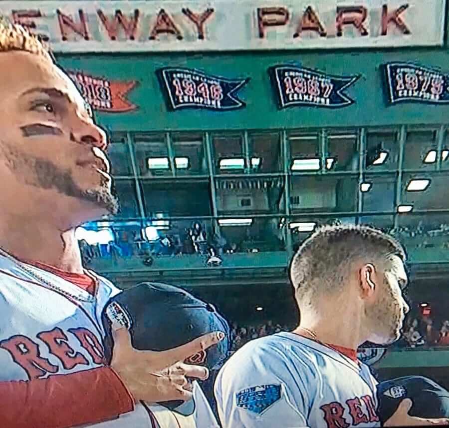
There was a uni-related anomaly in last night’s World Series opener even before the game started, as Red Sox shortstop Xander Bogaerts (above left) had a cap with the Postseason patch, rather than the World Series patch (as shown on the cap of teammate J.D. Martinez, above right), during the pregame introductions.
Interestingly, Bogaerts had also been wearing a Postseason cap — but a World Series hoodie — during Monday’s off-day workout. I’m not sure he switched to a properly patched World Series cap for the beginning of last night’s game, but he had definitely made the switcheroo by the 7th inning.
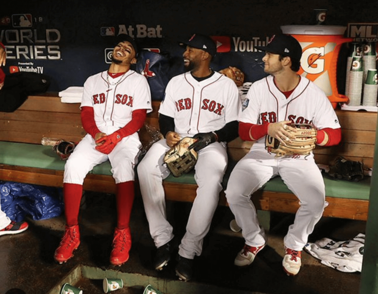
Bogaerts cemented his status as the last night’s most uni-notable player by wearing a 2013 World Series undershirt:
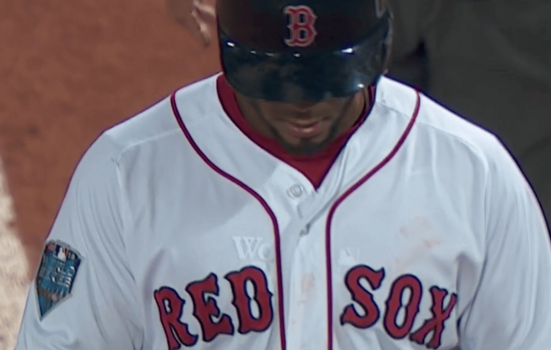
Bogaerts did play in the 2013 Series, as a 20-year-old rookie. He must have saved his undershirt for his next Fall Classic appearance!
In non-Bogaerts news from last night’s game:
• The Dodgers’ 60th-anniversary-in-L.A. patch, which was worn in the regular season and the playoffs, has been removed for the World Series. Here’s a side-by-side comparison — NLCS with Postseason and anniversary patches on the left, World Series patch all by its lonesome on the right (click to enlarge):
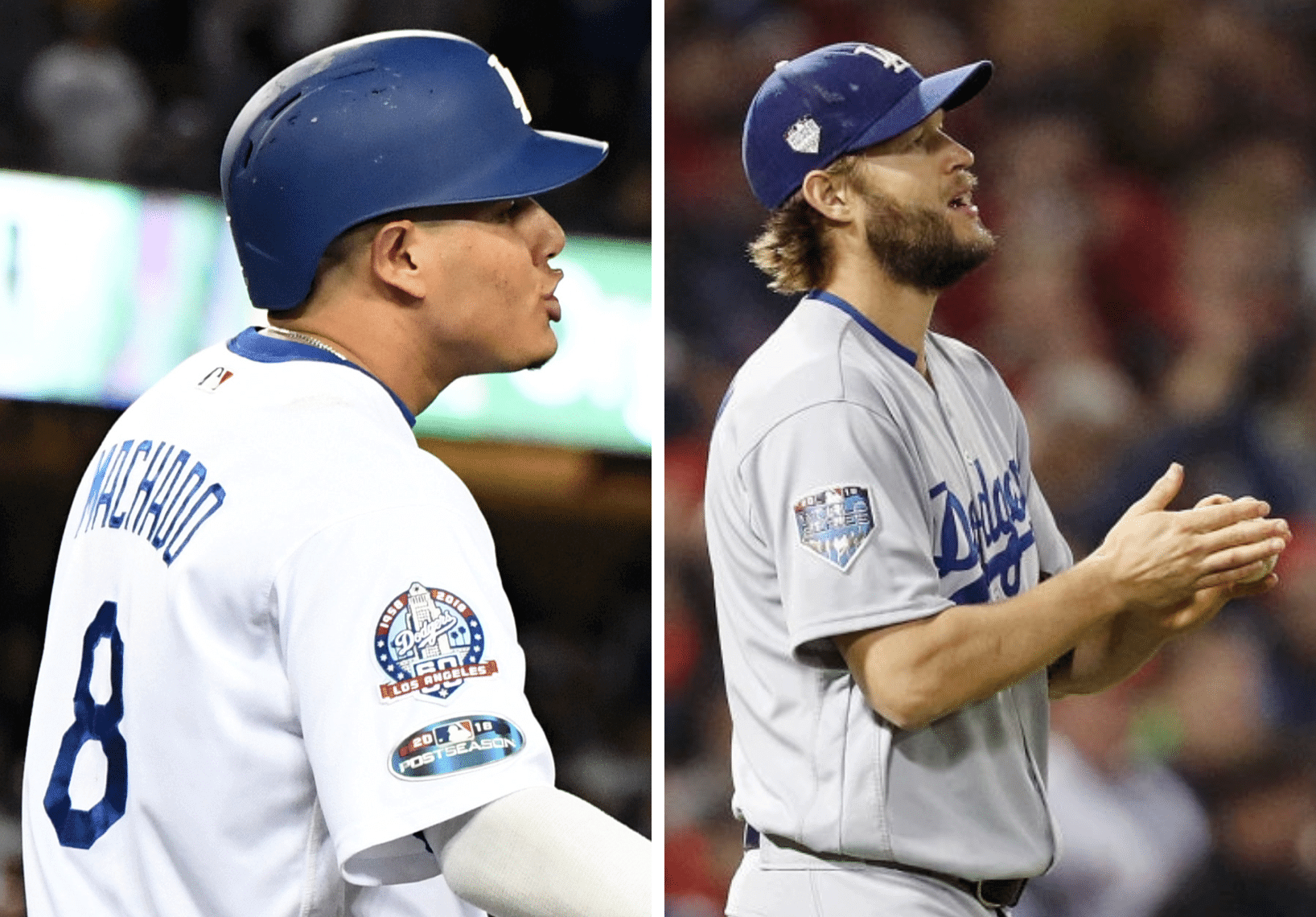
I asked Dodgers design director Ross Yoshida about this. He said, “I believe it’s an MLB call. New sets of jerseys are issued. The previous set was the same set used at the end of the regular season, so they moved the anniversary patch up and applied the Postseason patch.”
Wow — I’m super-surprised to hear that they didn’t issue new jerseys for the playoffs. Not saying they should have, just surprised to learn that they didn’t.
Meanwhile, I’m trying to think of other examples of a team-specific commemorative patch being removed for the Series. Has this happened before?
• The Red Sox wear red base-layer undershirts. But outfielder Jackie Bradley Jr. wore black, instead of red:
That’s not uncommon for Bradley, but I was wondering if he’d continue to do it in the World Series.
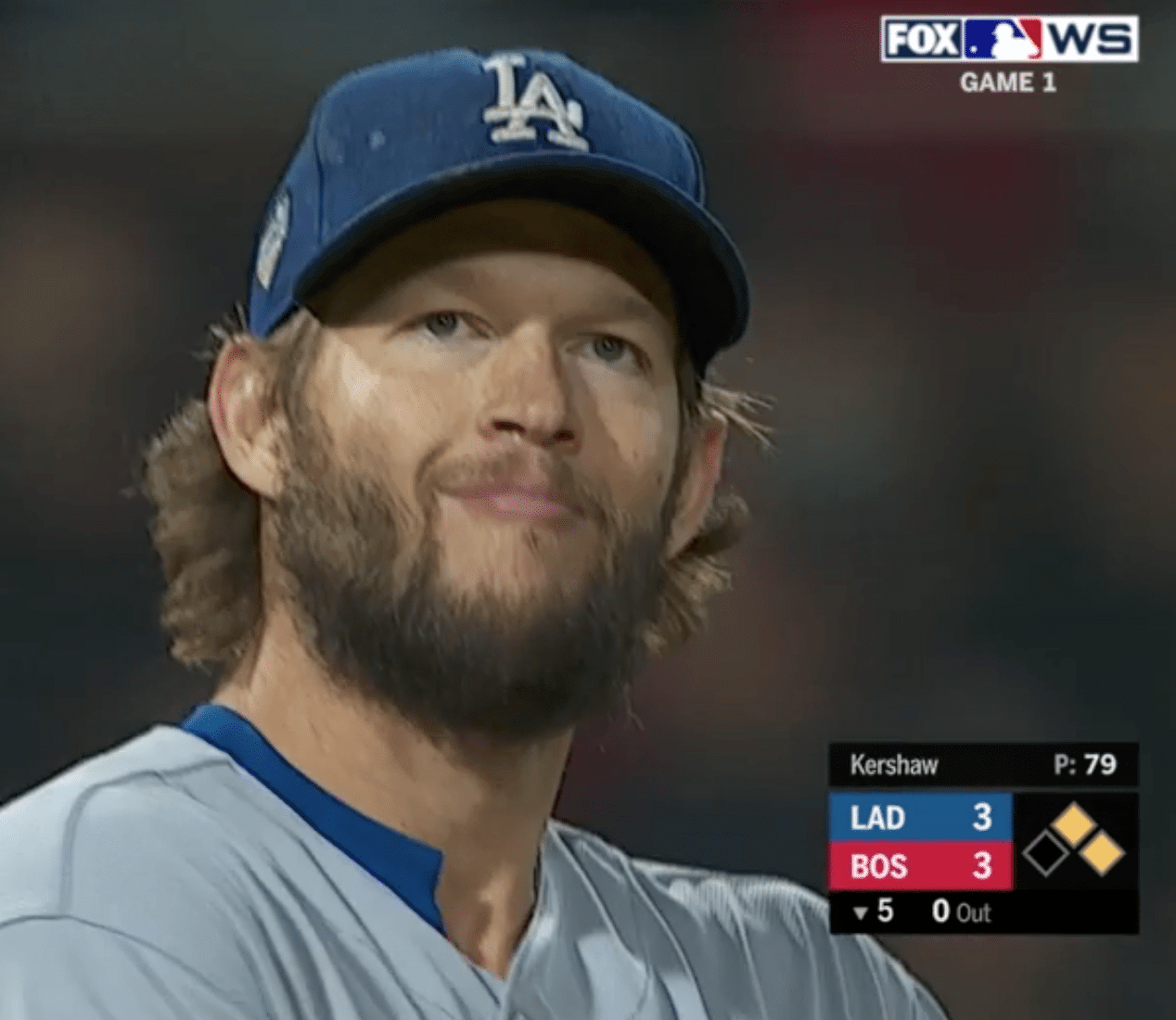
• Speaking of undershirts, Dodgers pitcher Clayton Kershaw continued his usual practice of breathing Ethier:
• Each team had a bespectacled pitcher work the 6th inning — Joe Kelly for the Red Sox and Julio Urías for the Dodgers (click to enlarge):
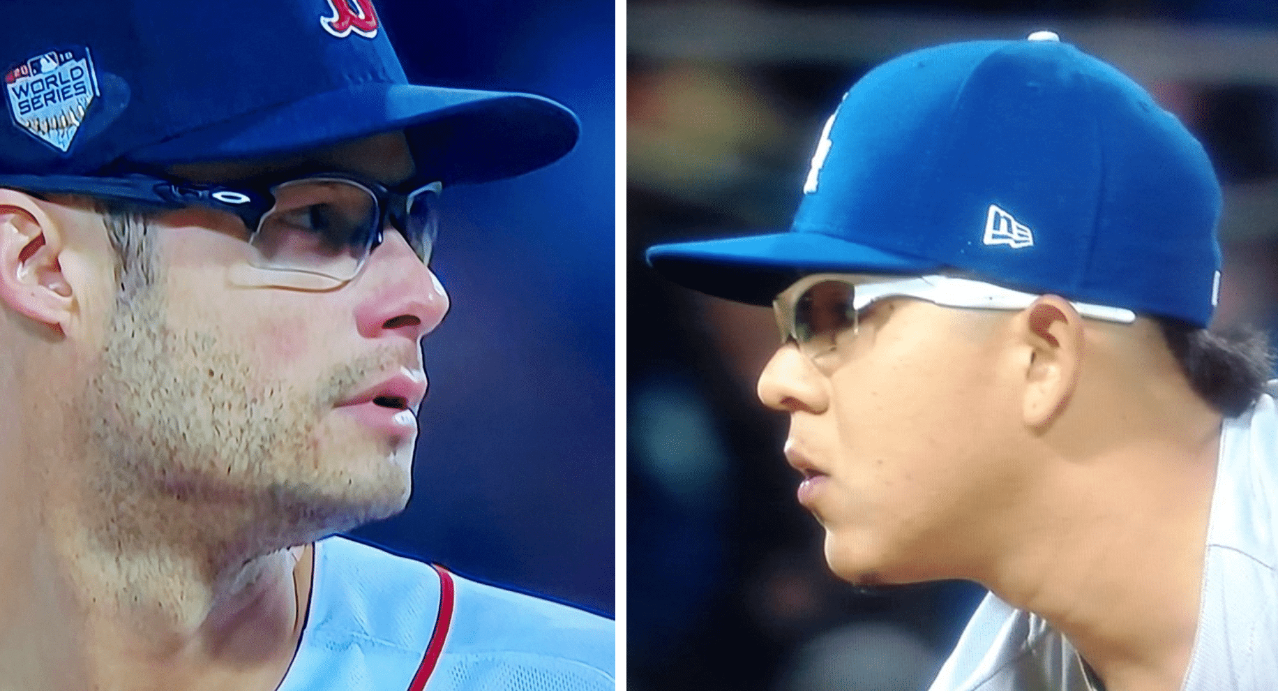
• In that screen shot of Kelly, you can clearly see the ghost of his Postseason cap patch. He must be superstitious about his headwear.
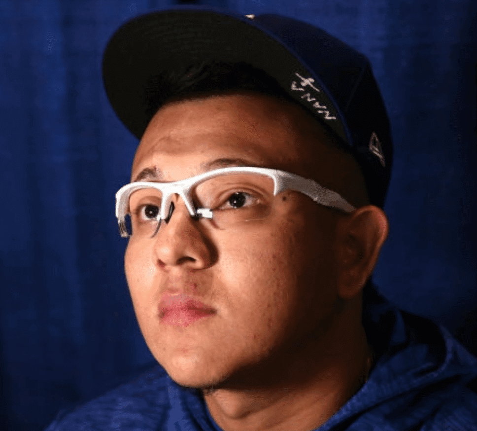
• Dodgers beat reporter Fabian Ardaya says Urías had “Nana” written on his underbrim as a shout-out to his late grandmother, who passed away after Game Six of NLCS. I couldn’t find a game photo of this, but the inscription is clearly visible in this shot from Monday’s off-day media session:
• I’d never noticed this before, but Red Sox outfielder and Tennessee native Mookie Betts has a detail from the Tennessee state flag on his batting gloves:
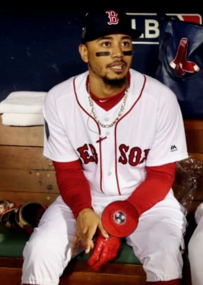
He’s apparently been doing this for a while.
That’s a pretty good amount of stuff for a single baseball game, right? Game Two is tonight.
(My thanks to all contributors, including Tim Cooper, Mark LaFountain, Patrick Lavery, Jordan Mayblum, @Brevity_Wit, @SenatorCalhoun, @ttriblazor, @ShyMarcus, and, especially, our own Anthony Emerson. Thanks also to Lloyd Alaban for working later than usual on Ticker duty last night so I could concentrate on the Series.)
Click to enlarge
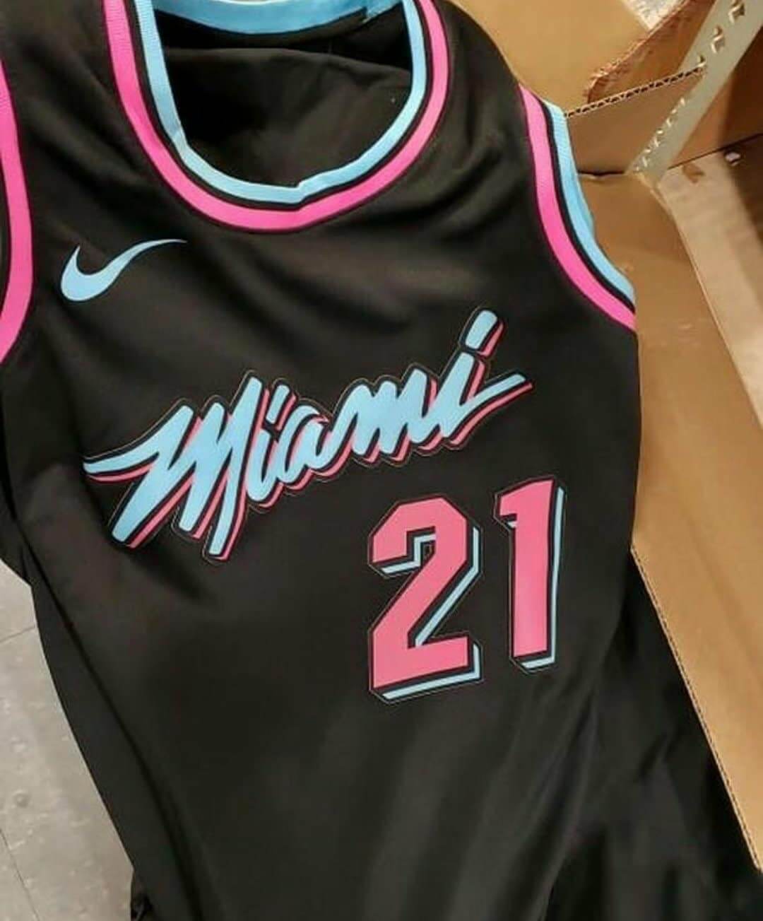
Still more NBA leaks: We now have a better look at what is apparently the Heat’s upcoming City alternate. This matches the blurry leak we had seen earlier. It’s not clear where this photo originated; it was brought to our attention by Mike Chamernik, who saw it on a Reddit thread.
Also: Yesterday I posted the leaked jersey for the Timberwolves’ upcoming Prince-themed alternate. Now we have the matching shorts:
The @Timberwolves Prince inspired City Edition uniforms have been leaked.#uniswag pic.twitter.com/iSNQKIAY0D
— UNISWAG (@UNISWAG) October 23, 2018
Also-also: The Bulls have announced that their new alternate will be unveiled next Thursday, Nov. 1. It’s not yet clear if that will be a league-wide date for unveiling all of the new alternates, or if the new designs will be rolled out on a team-by-team basis.
Click to enlarge

Assorted reminders: In case you’ve missed it over the past few days, here are some things to keep in mind:
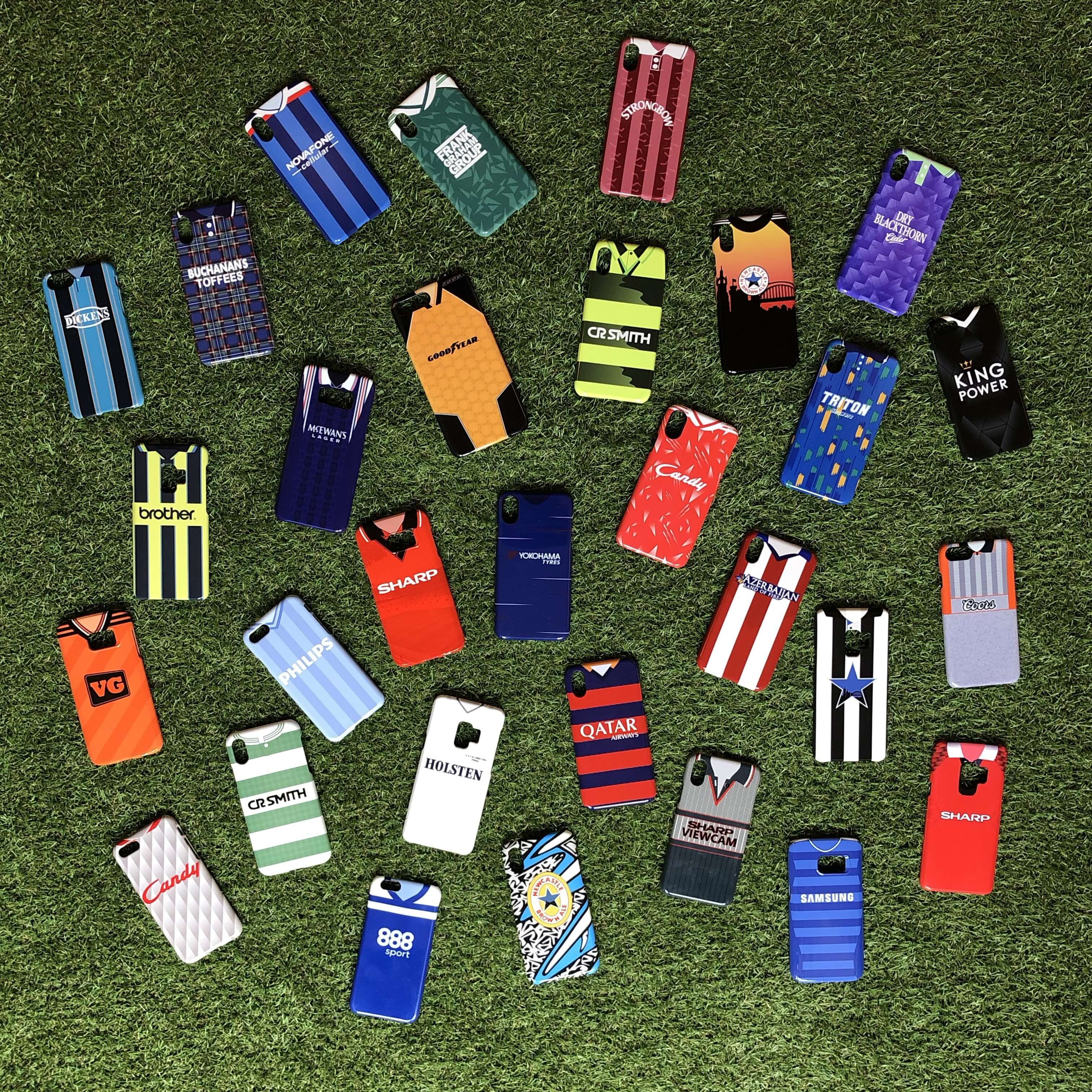
• Our friends at Nostalgia Cases, a company that sells smartphone cases with designs based on old soccer jerseys (as shown above), are offering a 10% discount to Uni Watch readers this week. Full details here.
• I’m currently raffling off a free print from Art of Words artist Daniel Duffy. Full details here.
• We recently lowered the price of our flex-fit Uni Watch alternate cap from $29.99 to $24.99. Get yours here.
The Ticker
By Lloyd Alaban

Baseball News: Speaking of the World Series: The chief of the L.A. Fire Department has authorized firefighters to wear Dodgers caps while on duty for the duration of the World Series (from Hugh C. McBride). … Niko Goutakolis observes that this Series is taking place in two ballparks that haven’t sold their naming rights: Dodger Stadium and Fenway Park. … Baseball dump from @BSmile: The last time the Red Sox and what would become the Dodgers met in the Series was 1916. Here’s a photo of two child mascots shaking hands at a game from that WS. … Here’s the cover of the “1916 World’s Series Souvenir Score Book.” … Here’s how the Brooklyn Robins (soon to be Brooklyn Dodgers) looked in that Series. … One more WS-related item: A program from the 1903 World Series — the very first Series — is being auctioned off next month. There are only two other known copies — one owned by the National Baseball Hall of Fame and a second copy that sold for nearly $250,000 at the 2011 Louisville Slugger Museum auction (from Samuel Heller). … Turns out the 1920 World Series program used the same template as the 1916 Series (from @History_Cle). … A very interesting read: When baseball card makers Topps and Bowman caught wind of the St. Louis Browns moving to Baltimore in 1954, the companies had to make new baseball cards for the relocated franchise. Here’s how they did it (from Jeff Katz).

NFL News: Left over from Sunday: Chargers QB Philip Rivers has adopted the Riddell SpeedFlex helmet (right picture). He previously wore the now-league-banned Riddell VS4 helmet (left picture). Players who have worn the VS4 include Patriots QB Tom Brady, Saints QB Drew Brees, Chargers TE Antonio Gates, and Washington RB Adrian Peterson (from Daniel Torres). … The NFL tweeted a Madden video game clip featuring Cowboys WR Amari Cooper in his new team’s uni. They didn’t get his number correct, though: Cooper wore No. 89 with the Raiders and will wear No. 19 with the Cowboys, not No. 88, a number he has never worn in the NFL (from Joel Mathwig). … The Steelers will wear their 1970s throwbacks this Sunday (from Phil). … Yet another look at the fascinating job of equipment managers — this time it’s Bills Director of Equipment Operations Jeff Mazurek (from several readers). … Bears logos, Blues Brothers silhouettes, and an anti-Packers bumper sticker. Can this van be any more Chicago? Side note: Check out the old-school NFL logo (from Seth Winnie). … From Pro Football Journal: Rams LB Mark Barron and S John Johnson III both decided to stick it to the Rash and wore blue hosiery against the 49ers on Sunday. … Also from Pro Football Journal: The 49ers used to have huge TV numbers. According to some of our Twitter followers, this photo is from the 1974 season. … The Chargers’ equipment room apparently has a calendar that includes little helmet magnets — many of them outdated — to track the team’s upcoming opponents. That comes from the 0:30 mark of this video (from Jack Barteck).
College Football News: West Virginia is going blue/blue/gold this Thursday against Baylor (from our own Phil Hecken). … Dozens of high school senior players received their All-American Bowl jerseys this week. Here’s a photo of what they look like (from Josh Claywell).

Hockey News: Retired C Ron Duguay spotted rapper Fabolous wearing his jersey in an old photo (from Alan Kreit). … The Toledo Walleye of the ECHL will celebrate Marvel Super Hero Night on Nov. 2 and 3 by wearing Black Panther-themed jerseys. Fans can get their own replicas, if they’re willing to shell out the big bucks (from Steve Johnston). … Missouri State is going with a Star Wars-themed sweater for their Nov. 3 matchup (from David Beerman).

Basketball News: A Michael Jordan fan got MJ’s Bulls jersey tattooed across his back. Whether you like the idea of a jersey tattoo or not, you have to admit that is one well-detailed tat (from Griffin Smith). … The Texas Legends, the Mavs’ D-League affiliate, have a new logo (from Ahmad K.). … New unis for Buffalo and Appalachian State.

Soccer News: Possible leak of Mexican League club Pumas’ Dia de los Muertos shirt (from Ed Zelaski). … Not quite the same Puma, but here’s a shot of soccer legend and Puma spokesperson Pele in a gorgeous jacket (from @Throwback_Sport).

Grab Bag: Two University of Miami students have started a petition to update school mascot Sebastian the Ibis’s tobacco pipe to a vape pen (from Kary Klismet). … WWE celebrated Pinktober on Monday by handing out custom pink championship belts to some fans in attendance who are breast cancer survivors. The pink belts are based on the Raw Women’s Championship and SmackDown Women’s Championship belts.
Was it just me, or did it seem like every angle of the pregame festivities at the WS last night prominently displayed the ads at Fenway, be it Hancock, Citgo, Foxwoods, etc? Perhaps they are so ubiquitous it can’t be avoided. But I noticed it more last night than in other games I have watched this year in any park.
Also, changing the Miami logo to include a vape pen? I hope those two students are mocked endlessly by the rest of the student body.
I think the students that started the petition are cartoonists and aspiring comedians/satirists. I think they even referred to their own petition as “dumbass”.
Wearing contrasting socks with the Color Rush uniforms makes them look so much better, especially when the helmets are already a different color.
Maybe they can give Sebastian some face tattoos while they’re at it?
That is one of the few non-white mono looks that works. Maybe because the helmet is darker and yellow is such a light color. But with the contrasting blue socks that is probably one of the best mono looks you could come up with.
The New York Rangers jersey work by Fabolous would have been Ron Duguay’s rookie season of 1977-78. The Rangers changed their uniforms the next year.
If I ran the Rangers, this would be the regular third uniform. Of course, would also want the Bruins to wear the uniform in this shot as their regular whites (with a white stripe on the pants).
link
OMG, what a fantastic looking game that was and would be! The Winnipeg Jets also looked good in that John Ferguson-era Rangers and Jets sweater. The Bruins never looked better than they did in those 1967-74 sweaters.
For sure! The old Rangers and Jets template still looks good with today’s uniform tailoring. OHL’s Windsor Spitfires keeping it around as an alternate:
link
That jersey was worn by NYR again as a heritage/3rd jersey in the mid-2000s (Jagr era). Not knocking Ron Duguay, but that very well could be a Sandy McCarthy or Ville Nieminin jersey.
The Pumas “Día de Muertos” jersey is a shame. Not only it is lazy, but that logo with the crossbones is the same the Rebel (an animation group in the style of ultras and argentinian supporter groups) created long ago.
Hopefully they don’t do it.
Here’s a picture of that logo being used by the Rebel in one of their banners
link
Now that is how you do an event for Pinktober.
Kudos to WWE.
Not specifically for the series, but the O’s got rid of their 60th Anni’ patch in favor of the postseason patch in 2014, but kept the Tom Clancy memorial patch below both
link
link
JBJ’s base layer always looks black to me.
Bradley’s undershirt is against the rules, I believe. I think the rules say whole team must use same color for the part of the shirt that shows and goes down past the elbow. Red, in the Red Sox case. David Wright famously liked orange undershirts, but they were always short-sleeved.
Correct. The rule, for better or worse, has not been enforced.
“Turns out the 1920 World Series program used the same template as the 1916 Series ”
You mean “World’s” Series, right?
I know there’s only one flag of Chicago, and only so many ways it can be put on a uniform, but the Bulls’ teaser looks like they have been beaten to the flag-on-black-shirt punch by the Red Stars by a couple years.
More specifically, these two incarnations:
2015: link
2018: link
Hard to tell but Jackie Bradley jr actually wears a black undershirt, to match his all black gloves and cleats
Fixed.
Why would the Game Program cover for the 1916 WS indicate the “BROOKLYN DODGERS”, when we’ve also heard the they were known as the BROOKLYN ROBINS”?
I didn’t think that those names were interchangeable at that time.
They did have interchangeable nicknames, as did several teams during that era.
Many of the team (such as the Cleveland Naps, Chicago Colts, New York Gothams or whatever the local papers donned in the headlines). Nothing was official, only the “XXXXX Baseball Club” in most instances
it’s kind of odd that all of today’s ticker references above use the “xx Baseball club”, but the comment (from @HistoryCle) about similar templates shows a mint condition rendering of the 1916 program with the word Dodgers.
FWIW, Wiki lists “Trolley Dodgers” as a name before this time, with “Dodgers” coming in use in 1931.
The Chicago Cubs, having been founded before all the other ball-using sports became professionalized, are officially the “Chicago National League Ball Club”, which I think is wonderful.
I wonder if that’s at all related to the fact that their jersey logo has the registered trademark ‘R’ in it?
Corporate naming rights story:
Duquesne University announced a renovation plan for their basketball arena, along with a new corporate sponsorship from UPMC – the University of Pittsburgh Medical Center. Last year, Robert Morris University announced plans for a new arena with the same corporate sponsor.
That means 2 Pittsburgh area college arenas are going to be named for a competing university in the same city. Mind boggling.
Advertiser, not sponsor. ;)
The Duquesne University press release describes UPMC as a “long-term strategic partner.” The $2 million that UPMC is paying is being called a “donation.”
It’s remarkable to see the linguistic gymnastics these people will engage in just to avoid using the word “advertising.”
Douchebags.
A donation is not necessarily taxable income, which a college would very much want to avoid. Revenue from advertising is taxable. So there may be a rationale behind this beside mere “douchery” (still not a good thing)
Paul, I know you have addressed this before, but I cannot remember your answer. At what point do you consider a business a sponsor? For pro and other money making teams (top NCAA for example) obviously they pay for themselves and don’t need the money, hence they aren’t sponsors. What about rec league teams, youth sports, etc, where a business gives them money to operate that otherwise would have come from the pockets of the players / fundraising?
I hate advertisers in top level sports, but actually miss the days when the youth teams in my town were named for small local businesses who sponsored them, rather than copying the names of various pro teams. In that case I felt like it boosted the sense of community in the town.
Fully spelled out here:
link
Thanks Paul!!!
These days I fondly remember my days of playing for Bay Ridge Seafood, Home Reporter and Apple Express in youth baseball – though at the time I envied my friends who played in leagues that just used MLB team names.
I played for Ullman’s Laundromat and Le John’s Liquors! Can you imagine that today?
I gotta admit, though, I think it would be pretty awesome if Duke signed a similar deal for Cameron and started playing in the “UNC Hospitals Indoor Stadium”.
The Steelers will wear their 1970s throwbacks this Sunday (from Phil).
+++++++++++++++++++++++++++
Aw, no bumblebee outfits? I liked those.
That Red Sox photo reminds me how much better a black or navy sleeve looks with Boston’s uniforms. The red accents on the jersey pop so much more.
The 1916 World’s Series cover lists them as the Brooklyn Nationals not Robins.
…but it also list the “Boston Americans”. Probably not the real team name.
See the Ticker picture (Here’s) above which also has a title of “1916 Brooklyn Team”.
In this case, the nicknames referred to the league each team represented. That was a common practice at the time.
Reminder that WWE’s championship belt design was changed to be literally just a giant company logo specifically for the purpose of pimping their brand. It’s effectively a giant advertisement in belt form. And their charity work, which I’m sure does good things for people in need, remains nothing but a self-serving advertising campaign as well.
The Tweet that keeps on giving: link
I felt the same way when Steph and Triple H announced Connor’s Cure. Like you said, I know they do great work, but Connor’s Cure just reeked of self-serving charity work when they announced it — everything from their little vignette after WM30 to their monthly do-good segments on Raw. Even their push for Roman Reigns to be the top face of the company so he could appear at charity events. Talk about pimping your brand.
/end cynical wrestling rant :)
Re: Team patches being removed for the series. The Yankees dropped their 100th anniversary cap patch for the 2003 WS patch. (Retained the jersey patch). Interestingly, the next time they wore a cap-patch was 2009 for the opening of Yankee Stadium III, which was on the back and therefore remained through that year’s WS. I’ve always wondered if the team took that into consideration when planning the location of the 09 patch.
The Texas Legends play in the G League, as it is not known as the D-League anymore.
We continue to call it the D League here, because the other name is just a corporate ad.
I guess the Dodgers L.A. script road jersey is the new alternate, hasn’t been worn at all during the playoffs same as last year, I like tradition, road team wears city named jersey unless you’re St.louis or Philly to name a few
Team names on gray away jerseys are arrogant, IMO. Just like not having player names on away jerseys.
The WS logo has 2 flags again, just like 04, 07, and 13 when the Red Sox won.
Corporate Naming Rights Story – Safeco Field
link
“There will be no announcement on a new naming rights partner until the Public Facilities District that oversees the stadium votes on the 25-year lease extension currently on the table, which is expected to happen in late November or early December.
So it sounds like December at the earliest to finalize that process, at which point the Mariners will be in a race against time to design and make new signs, get the proper permit approval and then install all the signage at the park before the March 28 home opener against the Red Sox.
Safeco does own the naming rights through Dec. 31.”
Not on topic for today, but does anyone know why the Packers striped their end zones this year instead of the usual “Green Bay” on one end and “Packers” on the other?
Part of their centennial celebration. Old-school look.
Thanks Paul
Regarding the 1916 scorebook.
Any idea why the game was played at Braves Field?
Kevin
Seating capacity. The Braves’ stadium could fit 5,000 more people.
Where’s Paul