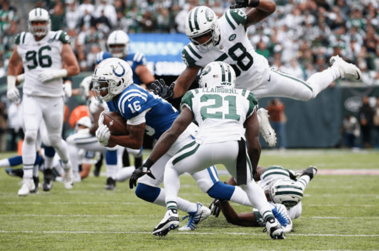
Good-looking old-school matchup yesterday at the Meadowlands, as the Jets celebrated the 50th anniversary of their 1968 championship season by wearing white at home — with grey facemasks — against the Colts, thereby creating a visual rematch of Super Bowl III. Lots of additional photos here.
At first I thought to myself, “It’s pretty amazing that the two teams from SB III are still wearing essentially the same uniforms they wore 50 years ago.” But then I realized that the teams from the two previous Supes — the Packers, Chiefs, and Raiders — are likewise wearing pretty much the same thing that they wore in those two games. Interesting!
In other news from around the league yesterday:
• The Panthers wore white jerseys, black pants, and blue socks:
We see you @ThomasDavisSDTM 👌 pic.twitter.com/fKb4V9KCqd
— Carolina Panthers (@Panthers) October 14, 2018
They wore this same combo two months ago in a preseason game, but yesterday was the first time they’ve worn white jerseys and black pants in the regular season. It’s also only the second time in Panthers history that the white jerseys have been worn with non-white pants. (The other time was in the final game of the 1998 season, when they went white over grey.)
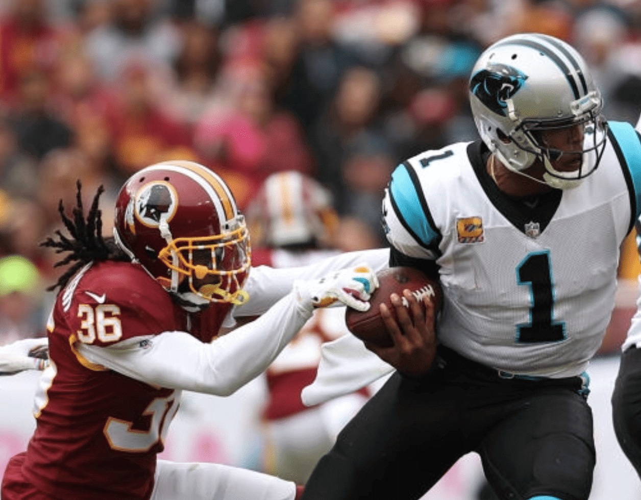
• In that same game, Washington running back Adrian Peterson broke a tackle when his shoe came off and became wedged in an opponent’s facemask:
Adrian Peterson finding new ways to break tackles in the twilight of his career pic.twitter.com/YbsTLpEUQL
— For The Win (@ForTheWin) October 14, 2018
• Also from that game, Washington defensive back D.J. Swearinger had his facemask taped up, à la Sean Taylor:
• And still more from that game: Pinktober lives! Check out the outlining on the wordmark in the Washington end zone:
QB1 to Funch for the TD 🔥 pic.twitter.com/QuWy9d62PE
— Carolina Panthers (@Panthers) October 14, 2018
• In another franchise first — and hopefully last — the Jaguars paired their black jersey with teal pants. Woof! (Lots of additional photos here.)
Run @Dak run…all the way to the 🏡
QB1 gets the score #JAXvsDAL pic.twitter.com/Fr16X8tuAf— Dallas Cowboys (@dallascowboys) October 14, 2018
• The Bears wore their orange alternates:
12-yard TD for #12!#CHIvsMIA | #DaBears pic.twitter.com/eY0mEQHUz7
— Chicago Bears (@ChicagoBears) October 14, 2018
• The Bengals went mono-black:
.@ericksona86 starts the second half with a 51 yd kickoff return!#PITvsCIN #SeizeTheDEY pic.twitter.com/8OZKk6o7OS
— Cincinnati Bengals (@Bengals) October 14, 2018
• The Chargers went mono-navy:
WHAT. A. CATCH. 👏 pic.twitter.com/WkKdH5s0Rx
— Los Angeles Chargers (@Chargers) October 14, 2018
• The Texans wore their red alternates:
Incredible.@DeAndreHopkins | #BUFvsHOU pic.twitter.com/uWSZZTixB6
— Houston Texans (@HoustonTexans) October 14, 2018
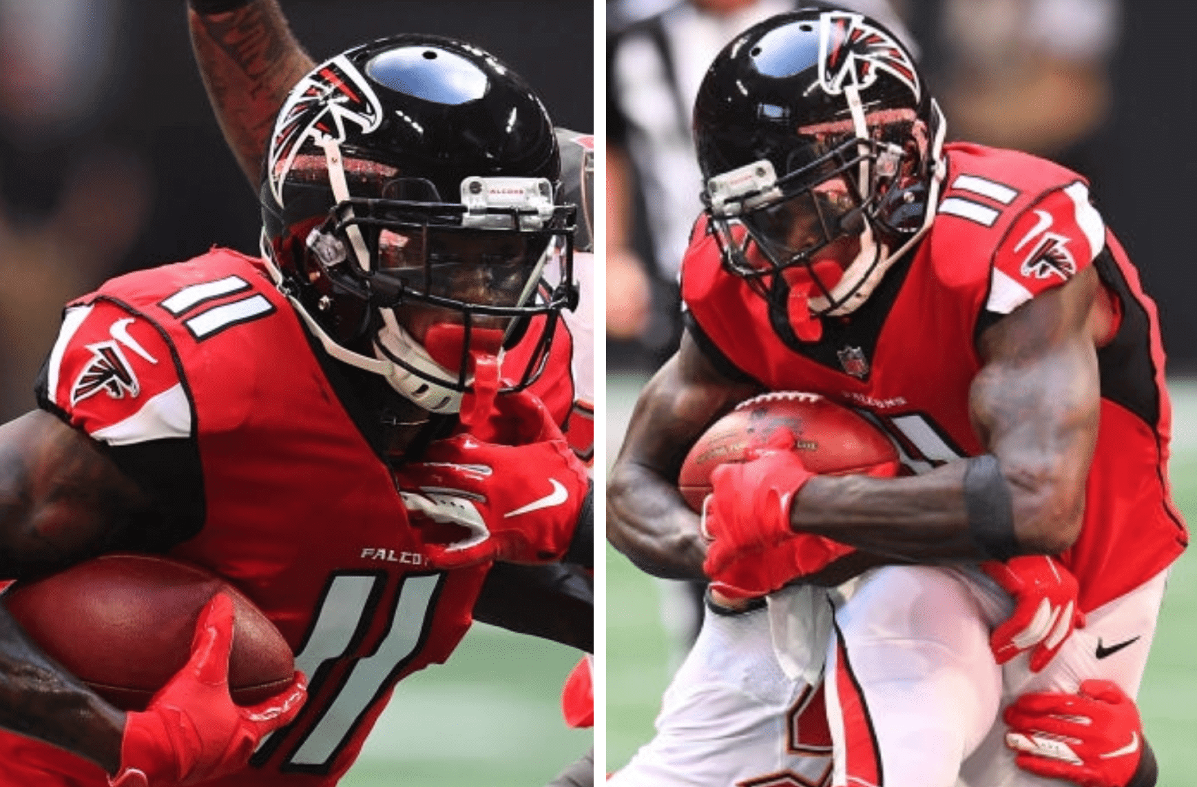
• The maker’s marks on both of Falcons wideout Julio Jones’s sleeves were facing the wrong way:
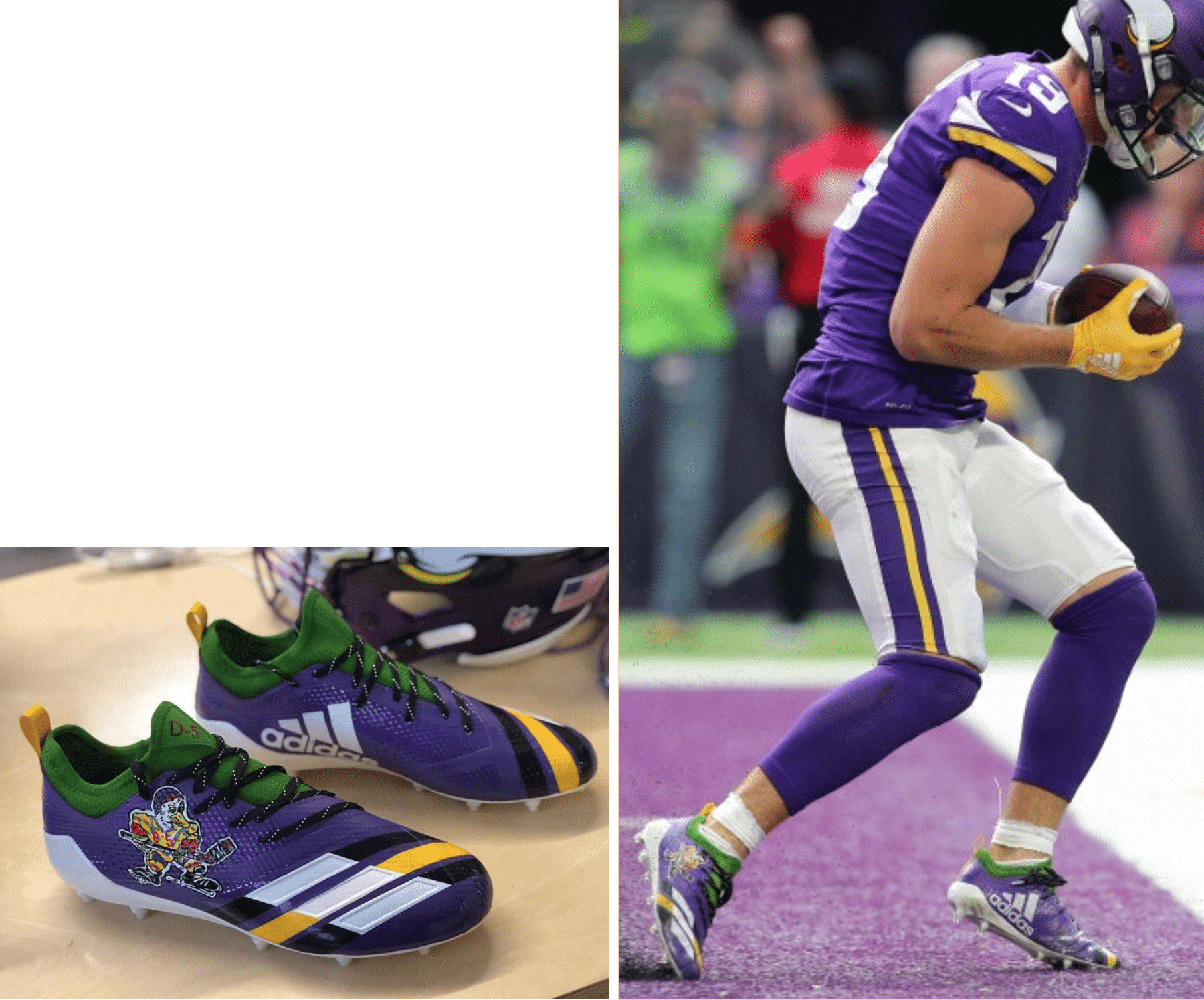
• For reasons that aren’t clear, at least to me, Vikings wideout Adam Thielen wore Mighty Duck cleats. Anyone know why? Look (click to enlarge):
• Patriots wideout Julian Edelman adjusted one of his gloves while running his route and then caught a TD pass:
.@Edelman11 fixing his glove mid-route on that TD throw 🧤 pic.twitter.com/A52gPqeeX7
— The Checkdown (@thecheckdown) October 15, 2018
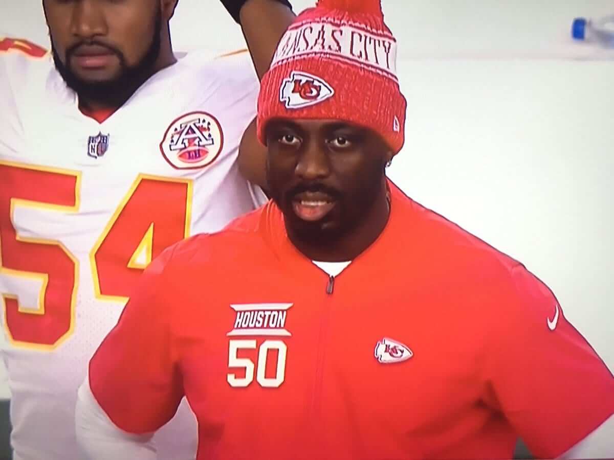
• This is interesting: For inactive players who are on the sidelines, the Chiefs have pullovers with the players’ names and numbers, as seen here on injured linebacker Justin Houston:
• Four teams wore white at home: the aforementioned Jets, plus the Dolphins, Browns, and, of course, the Cowboys.
(My thanks to all contributors, including Mike Chamernik, Gabe Cornwall, Mike Foster, Jason Hill, Sam Kissel, @SkolBros, and our own Alex Hider.)
Click to enlarge
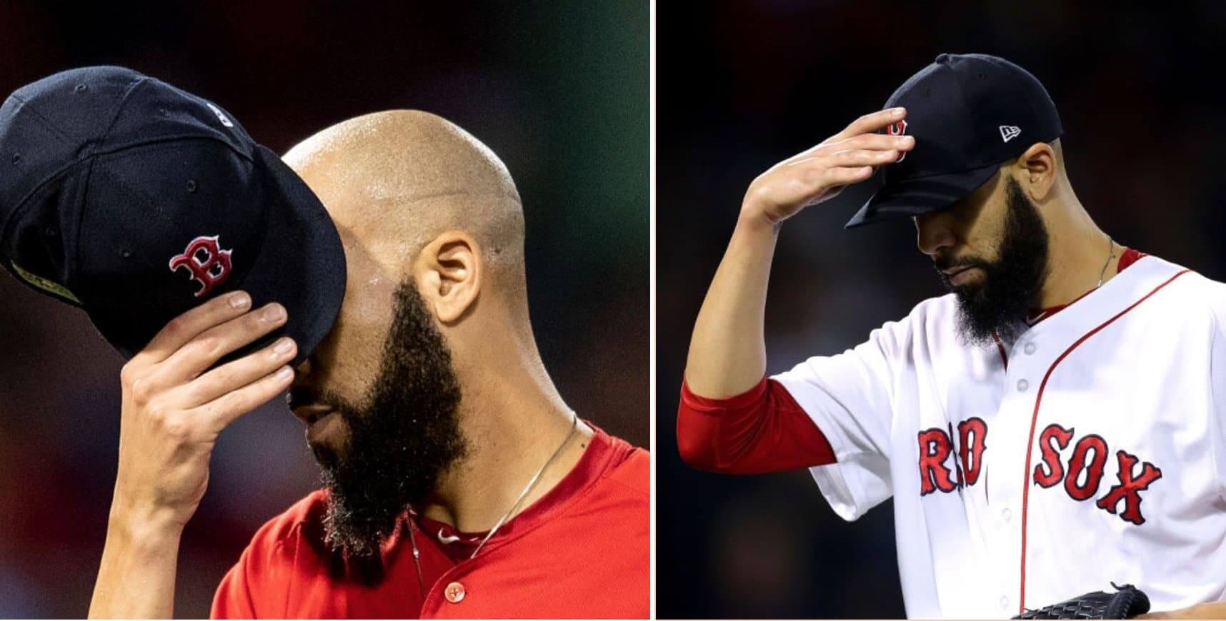
Look who’s got the button: Red Sox pitcher David Price has been removing his cap squatchee — or as he calls it, “the ouch button” — for years now. His cap was squatchee-free during his start in Game Two of the ALDS on Oct. 6 (above left), for example.
But for last night’s ALCS game against the Astros, Price’s headgear was clearly squatchified (above right). Shocking!
A few folks immediately speculated that Price, whose postseason woes are well-documented, might have gone squatchee-clad as a slump-buster move. If so, it didn’t work, as he gave up four runs in his first three innings (although he did break his streak of postseason starts resulting in losses, so I guess that’s something).
(My thanks to our own Scott Turner, who was the first to bring this to my attention.)
Click to enlarge
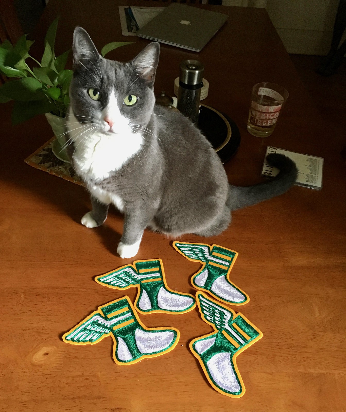
Chain-stitch update: I’ve received four more chain-stitched Uni Watch logo patches from ace embroiderer Amy Bengtson (who I interviewed last month). They’ll ship out today to the readers who ordered them.
If you want your own chain-stitched Uni Watch patch, the price is $35 (80% of which goes to Amy). Each one is made to order by hand, and no two are quite the same. Caitlin not included. If you’re interested, give me a shout. Thanks.

For all photos, click to enlarge
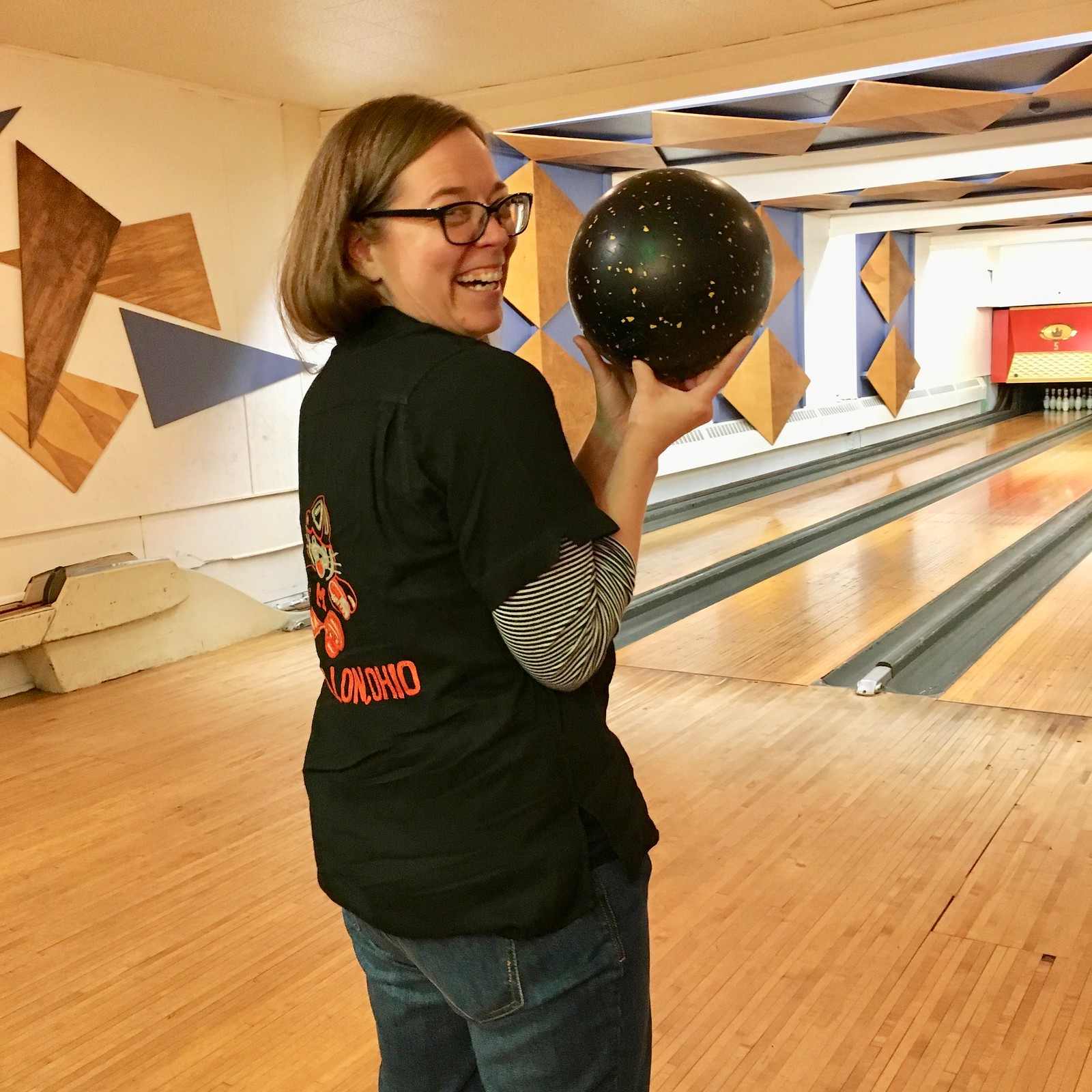
And speaking of chain-stitching…: The Tugboat Captain and I went bowling in New Jersey on Saturday with our friends Kathleen and Gaylord. Gaylord is a DJ at the mighty WFMU and recently had a WFMU bowling shirt made to his own very exacting specifications. Check out the spectacular chain-stitched design — magnificent!
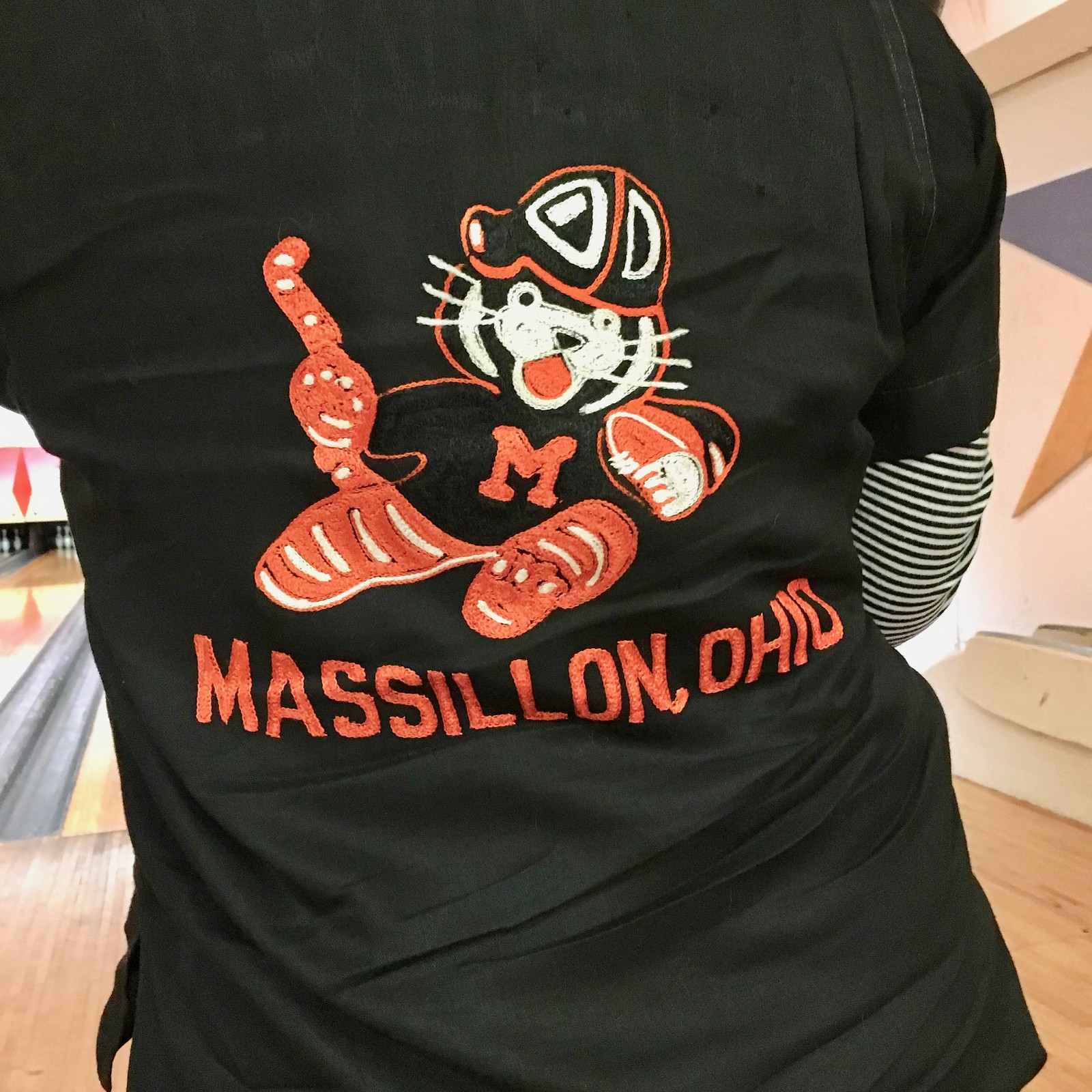
And that wasn’t the only chain-stitchery on display that afternoon. The Tugboat Captain wore a very nice bowling shirt featuring a chain-stitched version of Massillon (Ohio) HIgh School’s football-playing tiger:
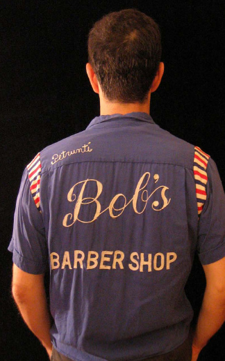
As for me, I wore my Bob’s Barber Shop bowling shirt, which has some very nice chain-stitching as well (plus some excellent barber pole-styled gusset panels), but nobody got a good photo of me, so here’s an old photo:

Click to enlarge
Hot diggity: While we were bowling on Saturday, I walked past the kitchen and noticed that the two hot dogs on the grill had flared tips. I asked the grill woman about it, and she said the boss likes it done that way “because it makes them look bigger or something.” She added that the dogs are longer than the buns, so the flared tips look good sticking out of each end. I said, “Oh, like they’re literally ‘bursting with flavor’!” She paused and said, “Yeah, okay.”
I’ve never seen this before. Anyone else..? Might have to try it at home.
The Ticker
By Jamie Rathjen

Baseball News: Behold the sight of former Yankee Alex Rodriguez in a Red Sox jersey, because he lost a bet to David Ortiz on the outcome of the Red Sox/Yankees ALDS. It’s particularly intriguing because A-Rod was going to be traded to the Bosox in 2003, although the deal was later voided (from Andrew Cosentino).

Football News: Reprinted from yesterday’s comments: the goalposts at the University of Ottawa’s field are a few yards deep in the end zone, instead of on the goal line as is usual in Canada, because they have “a longer support beam for the posts than normal,” says Wade Heidt. … As we’ve mentioned, Iowa State wore BFBS uniforms Saturday. However, team colors were still visible on everyone’s shoulder pads (from Kevin Shaw). … Central Michigan had two different NOB variations on display. The bolder one is apparently correct (from @AVKingJames). … FCS Prairie View A&M had to change uniforms at halftime after being told that their mono-grey set with purple numbers would cost them a timeout (from Chris Mycoskie). … Speaking of high school ball, check out the crazy Pinktober set worn by Del Mar High School in California.

Hockey News: The OHL’s Peterborough Petes wore special jerseys for an alumni homecoming (from Wade Heidt). … Bridgeport Sound Tigers (AHL) G Jeremy Smith has a Hurricanes-themed mask. Smith was with the ’Canes last season but never made an appearance for them, only for the AHL’s Charlotte Checkers, and signed with the Sound Tigers in the summer (from Stan Capp). … Saturday’s edition of the syndicated newspaper puzzle Daily Jumble had what looks a lot like a partially obscured Stars logo (from Steve Prudente).

Basketball News: We featured this possible new Thunder logo in Friday’s Ticker. Reader Zack Bush, who says he works at a Lids store in Minnesota, tells us that the logo is “one in a series of logos created for every team by New Era called ‘combo logos.'” These logos are all new, “but they aren’t actually going to be used by the teams themselves,” he says. … New uniforms for Missouri and Siena (from Kacen Bayless and John Dougherty). … An all-star team from the Big Baller Brand-run Junior Basketball Association is currently touring Europe and started out using essentially the U.S. Soccer Federation crest on their uniforms, but the font was changed at some point before yesterday’s game against Russian team Zenit (from @MakersofSport).

Soccer News: D.C. United wore black armbands for winger Paul Arriola’s father, who passed away last week. However, DCU already wear black, so the armbands were only visible because they covered one of the MLS sleeve patches, except on goalie Bill Hamid. … English women’s top tier teams Bristol City (purple) and Birmingham City (yellow) both changed against each other, while in the second tier, Aston Villa’s shirts are ad-free. … Women’s college teams wearing Pinktober shirts this weekend included Iowa and LSU. … Also posted in basketball: An all-star team from the Big Baller Brand-run Junior Basketball Association is currently touring Europe and started out using essentially the U.S. Soccer Federation crest on their uniforms, but the font was changed at some point before yesterday’s game against Russian team Zenit (from @MakersofSport).

What Paul did last night two nights ago: After we went bowling on Saturday, we went to White Eagle Hall in Jersey City, where the Feelies played a 90-minute set of Velvet Underground covers.
As an art project, this one wasn’t particularly challenging. I usually think a cover version should tell us something new either about the song or about the artist covering it, but this set did neither — the Feelies’ musical debt to the Velvets has always been fairly obvious (so this set taught me nothing new about the Feelies), and they played the arrangements really, really straight, with no reinterpretations or artistic license (so it also taught me nothing new about the songs). So by that standard, I’d say this was something of a failure. But as entertainment, it was a blast — one of my favorite bands covering another of my favorite bands. So much fun!
Notable detail: Feelies frontman Glenn Mercer was very faithful to all of Lou Reed’s lyrics — except on “There She Goes Again,” where he twice omitted the line “You better hit her.” Probably for the best.
Here are two video clips — the first one by me and the second by my friend Vicky, who was sitting upstairs:
The show was inspired by the new Velvet Underground exhibit that opened here in NYC last week. The Tugboat Captain and I are seeing it in two weeks, when her brother and sis-in-law are coming down from upstate to join us. Full report to follow.
By the time most of you read this, I’ll be on my way to cover the taping of the Puppy Bowl, so I won’t be available to respond to comments, emails, or tweets for most of today. Play nice while I’m away, okay? Thanks. — Paul
The numbers on the gray Prairie View High School jerseys appear to be purple, not black.
Fixed.
And isn’t it a college not a high school?
Fixed again.
The bizarre thing is that Prairie View’s sports Twitter (link) has pictures from both halves and casually fails to mention that they changed uniforms.
Should be ‘Teal’, not ‘Team’.
• In another franchise first — and hopefully last — the Jaguars paired their black jersey with team pants.
Fixed.
Re: the hot dog.
I help out at a homeless shelter, one of the guys who lives there and assists with the food services used to own a restaurant. Whenever he makes hot dogs he “finesses” them in a similar fashion to that. He always tells me that is ups the presentation.
I might be alone, but I don’t hate the Jaguars teal pants with the black tops. Not exactly a ringing endorsement, I know, but I’m still getting used to not just flat out hating whatever the Jaguars are wearing.
Otherwise, you would barely see a stitch of teal on the Jaguars. I was shocked to see the combo, but I didn’t mind.
My wife commented when she came in the room that she liked the teal pants with the black jerseys. I liked them, too.
Kind of reminds me of the San Jose Sharks.
It is not worst, but not good. I think it isn’t awful because it is a lighter color pant, with a darker color helmet/jersey. That is generally an ascetically pleasing way to set up a uniform. If I were to rank Jags dark jersey possible uniform combos, I’d go with the following:
teal jersey, white pants
black jersey, white pants
teal jersey, black pants
black jersey, teal pants
black jersey, black pants
teal jersey, teal pants
Agree that the teal jersey, white pants is their best look.
I was overall “a woff” on yesterday’s look. From a far, it just seemed to clash too much, I.e somewhat analogous to what some high school kid would wear with no fashion sense.
You’re not alone in not hating them, but I might be alone in LOVING them. Only possible better combo the Jags have is teal jerseys with black pants. Loved their look yesterday.
I like the black over teal for the Jaguars as well.
I thought if I slept on it, my mind might change, but nope.
Didn’t and still don’t like the link. The opposite, the link (still not worn on the field), I have higher hopes for.
I’d like it better if the helmet was teal. I think matching helmets and pants is usually the best look.
I just want to say that I really love Jacksonville’s helmet. I think it looks just great.
Lee
We went to the game and I thought they looked great. So do everyone around us. Seems like the best option with black jerseys. White would be too plain, black would be ugh.
Totally agree. I’m a little surprised at the negative reaction.
Count me in. I liked it. Now, if we just get some gold in the mix beyond the helmet logo…
I never understood the removal of gold from the jerseys and pants.
Yep, I loved the black over teal too. Too many teams have the black or navy blue helmet and jersey combo, it’s good to see one of them do something different to set themselves apart from all the others.
My best educated guess for Thielan’s Mighty Ducks themed cleats is that the original movie (MD1) takes place in Minnesota.
But I thought the whole point that the players were highlighting a ’cause’ that they believed in.
Lee
It’s my understanding that they simply loosened the restrictions in general. But I could be wrong.
Perhaps he supports local attorneys looking to complete their community service punishment for DUI by coaching youth sports?
Well done.
Exactly. But it goes deeper than that: Thielen grew up in MN, went to college there, etc. Mighty Ducks has always been a point of pride for any kid raised there in the 90s. It was kind of our “Sandlot” movie, if you will.
As you might expect, I absolutely love those cleats.
The mighty ducks movie was filmed in Minnesota so that’s probably why.
Re: hot dogs, the cafe where I work splits them even further for kids eating lunch with their parents and calls them octopus hot dogs. Regarding Super Bowl uniforms still in use today, you could add Chiefs/Vikings in SB IV and Colts/Cowboys in SB V.
The Vikings? I feel they have changed way too much to qualify. Heck, even the purples aren’t the same shade.
Lee
The Cowboys’ ‘bad luck blue’ set has gone through several changes since SB 5.
The 20th-century uniforms worn by the Redskins, Raiders (SB 18), Packers and Broncos (SB 32) closest mirror what those teams wear today.
The current Cowboys blue jersey is also significantly different (for the worse, IMO) vs the one worn in SB V (shade of the pants worn is different too, I think).
That should have been “the cafe that operates at the company where I work.” I don’t happen to work in a cafe.
It does seem odd that Jeremy Smith hasn’t had his mask updated in any way, considering he signed with Bridgeport back in July.
Then again, I have no idea what the turnaround is on a custom mask for a non-NHLer, though I would think he could have at least have a plain one ready.
Tugboat Captain Bowling Shirt note: Massillon, Ohio, is where NFL legend Paul Brown grew up and once coached. That’s why the two NFL franchises he founded (the Browns and the Bengals) both started off as black and orange. Of course, after Art Modell fired Paul Brown, the Browns changed the colors to orange and brown to focus on the color brown instead of the family name of Paul Brown.
and the tiger’s name is “Obie”
Something else I have always found interesting is that the name of the high school is Washington HS I believe, but they always go by Massillon Tigers, forgoing the actual name of the school.
Browns have always been brown, not black, feel free to check the gridiron database. At times the brown has been darker, but they have always been brown. The Bengals look similar to the Browns because when Paul Brown started the Bengals he wanted them to look like the team he used to work for.
One of the Seahawks had his jersey stretch tested in London yesterday! link
Further to the football goal posts at U. of Ottawa. The crossbar and uprights are still at the goal line. With the support beam longer, it gives a yard or 2 or extra space between the goal line and the base of the goal posts.
Otherwise, with standard goal posts you see in most stadiums, it would look like this for the space on the goal line. Will use the example in Calgary, a team that still does paint its goal posts in team colours instead of yellow. Though this shot is from a few years back as Stampeders in white pants at home:
link
Darn it Paul… if Caitlin is not included, then I just won’t get a patch.
That Prairie View ticker item should be college not high school. That was an FCS football game against Southern University and Prairie View A&M University.
Best thing about the Panthers’ new ownership is no more sexual harassment and racist comments (we hope). Second best thing is allowing the team to mix and match with its uniforms.
(Granted, the former is much more important than the latter.)
Will that Jerry Richardson statue ever be removed?
Panthers fan and Charlotte resident here. According to new owner David Tepper, he is “contractually obligated” to keep the Richardson statue in place. I have no idea if there is some kind of time frame involved there, or if once Richardson passes away (he is 82) if Tepper will have the option to move or remove the statue.
It says a lot about Richardson’s ego that he would insist as a condition of the sale that the statue stay in place.
One thing that has also ignited controversy in Charlotte is that the UNC-Charlotte 49ers play in a stadium named for Richardson (he donated a large chunk of money to construction a few years back). At this point, the stadium still bears his name.
Personally, even though Richardson had worn out his welcome in more ways than one, I don’t mind the statue as I’m not a big fan of whitewashing history or saying that we can only honor people if they are morally pure. Otherwise, all the statues honoring Martin Luther King, Jr., need to come down as he was an adulterer.
If you’re a football fan in the Charlotte area, you certainly have to believe that Richardson’s contributions to the city and region outweigh his personal indiscretions. Bringing the team to Charlotte has really helped but the city on the map and given the area a greater since of civic pride and helped to give residents something to unite over.
The long closed but fondly remembered Lincoln Del restaurants in Minneapolis area served its jumbo sized beef hot dogs with the ends flared. Because of the smaller area the occupied as oppposed to the ends being left whole, each of the four flared tips per end would be better done and have an interesting and firmer texture compared to the rest of the hotdog. My mom always said it cooked them faster too. This particular restaurant served them on egg buns and they were delicious. There is a science of sorts to how deep you make the cuts and I’ve never been able to make them uniform in appearance when trying it at home. The cuts would end up too shallow and the flares would not spread out enough. I’m inspired to get some dogs and egg buns in order to give it another try.
Here is the link for the Combo Logo NBA hats.
link
Some of them aren’t that bad.
Hey Paul, try cutting two spirals from end to end in your dog before grilling or frying. I dont know how, but it makes it taste better
2? That would call for some pretty good knife-work.
Paul Culinary Corner’ed the spiral dog a few years back:
link
“I was all excited when I took my first bite and discovered … that it tasted like a hot dog.”
Thielen is from Minnesota which is the state of hockey. It just so happens that the 2/3 of the Mighty Ducks color scheme coincides with the Vikings so he wore them bc he wouldn’t get fined. Probably not much more to it than that
Ravens wore their purple pants with their white jerseys. These are a new addition to the uniform choices. I think this is a much better look than their black pajama pants. The addition of the side striping makes them fit the uniform much better.
link
And the Titans went mono-navy. I’m surprised this game wasn’t mentioned at all.
Definitely agree that it’s an improvement over the black pants/black socks combo.
I think if the Ravens black pants had side stripes and wore striped or purple socks (like in their first season) then the black pants would be great. The problem isn’t black pants, it is the tights look because they are plain and paired with black socks.
The Great Gaylord! And those shirts! Obviously a foursome of impeccable taste. Caught up with him a couple months ago at an FMU matinee with The Jay Vons and Miriam at Union Pool. One of the finest people among many fine people in the NYC garage thang.
Gaylord Fields, the foremost authority on “Fake Beatles,” is terrific. I recently heard him on the world’s greatest music experts segment of WFMU’s Michael Shelley show. It was like the music version of Uni Watch.
Gaylord and Michael are both longtime friends of mine — great people. (And Gaylord is a card-carrying Uni Watch member!)
Reading the first story this morning ( the Jets/Colts game), got me to thinking (always a dangerous thing), so i did a bit a research (remember folks, Google is your friend), and discovered that of the 8 original AFL teams, ALL of whom have played in a Super Bowl, ONLY the Chiefs and Raiders have NEVER made a MAJOR change to their unis.
On the NFL side, (again, only ORIGINAL franchises), no team has been guilty of major changes (although i suppose one could argue that both the Rams and eagles have).
Before I get yelled at, I did not include the Dolphins and Bengals since they were not original, founding, AFL teams
I disagree. Both the Chiefs and Raiders made major changes in their earliest years. Though they haven’t made major changes since the first AFL-NFL World Championship Game.
. . . also I’d say that the Redskins made major changes to their uniforms in the 60s, 70s, and 10s. You’re not counting Browns as original NFL either, as they’ve never so much as sniffed a superb owl
The Browns were not an original NFL team, they were member of the All-American Football Conference which merged with the NFL in 1949 I think it was.
The Jets wore the wrong socks. In SB III they wore their green topped socks as they should with white pants.
Those Jags and Panthers uni combos were atrocious.
I haven’t watched Mighty Ducks in a long time, but wasn’t it set in Minnesota? Maybe that’s the connection.
thielens cleats every sunday
link
The tiger is PLAYING football, not LAYING it. Don’t know what he does off the field though…
Speaking of Tigers, Mizzou’s new hoops uniforms are close to perfect, including piping that goes all the way around the armholes. Why can’t Nike/Jordan do this for their other designs in NCAA/NBA? And are they getting away from the cut that looked like women’s racerback gym tops? Something where you could add a last name longer than 5 letters maybe?
Football pants should NEVER, EVER be darker than the jersey… the few exceptions are yellow, gold, powder blue, gray… basically a hue that too, is very light in nature. Black, Navy, Burgandy, etc those dark colors look awful with white jerseys. Dump those pants Carolina!
I think dark color pants with white jerseys only work if they match the helmet. For example, the Bears navy pants, Chiefs in red, or the Ravens in black pants. However, if the dark pants don’t match the helmet color (especially if the helmet is white, silver, or gold) then it looks weird.
Of the first 11 Super Bowls… who isn’t essentially wearing the same unis today? Once you get to Denver…
I think the changes that Miami has made are much less subtle than any of the other teams involved. And that’s even giving a pass for changing facemask colors, since gray was the only thing available for a long time.
To my eyes the Redskins looked a lot different with George Allen than with Joe Gibbs. different pants and stripes, just same basic colors
J’ville and Carolina tie for the worst looking uni combos ever.
I think I’d have to put the Bucs and their digital number fonts at all time worst.
After their 40-7 pasting by the Cowboys, it is hoped that the Jags push their ugly Black/Black/teal combo to the dark recesses of whatever closet is used to store such monstrosities.
Ugly is as ugly does. And shouldn’t do again.
Have this ever been talked about:
I was farting around on the White Sox auctions site. They have a few helmets up for sale, and I was checking out how the C flap was attached:
link
But check out the third image, showing the back of the helmet. Sox also use a 3D printed MLB logo. I cannot see any other team with the 3D team logo also using a 3D MLB logo on the rear. Sox the only team doing this?
This may have been previously discussed, but I’ve never noticed the Brewers gold under the jersey buttons more than tonight. Between the w and the a. They don’t put an “a” on the button side that would go under the side with the holes, so it’s just a solid gold bar. For whatever reason it’s just really visually jarring tonight.
Also, Yelich looks to be wearing one of the built in c flap helmets
The Jets should have stuck with the gray facemark instead of the green one they have been using since 1998. That was a great looking game against the Colts! I do have a weakness for throwbacks.
The Jags messed up what could have been another nice looking game with the teal pants. Mono black, mono teal, or the teal/white combo would have been a nice complement to the Cowboys. I hate the black over teal look but a teal jersey with black pants, that might be pretty sharp, I think they did it a couple of uniform cycles ago when Brunnell was still QB.
I am surprised there is no mention of the Titans/Ravens. The Ravens brought out the purple pants again which look very nice on the road and I think are an improvement on the solid black pants they have been using.. Let’s just hope they never go mono purple with them! The Titans, eek. I am a fan of the new helmet but I think they are ruining what could be a very nice uniform set by going mono blue. That new set screams for a blue top and white pants or even the light blue alternate pants. The mono look just absolute kills it and sucks the life out of what should have been an improvement.
Not sure what the rest of you think about the Panthers, but I am a fan of them using the black pants on the road and with their Carolina blue alternates. It works well for me and does not feel like a BFBS look that we see in the college ranks. I would like to see them wear the black jersey over the white pants once, I think that would really pop especially if they play a team who wears a colored bottom as well. But I think we need to ask a question about the Redskins: are the gold pants gone for good? Those looked sweet with the burgundy jerseys and helped create a solid 1970s throwback without the gray facemask. I prefer the burgundy pants with the white jersey however.
RE: Hot Dogs.
In our house, we call that cut ‘Gold Coast Dogs’ style. The best!
Gold Coast Dogs / Chicago:
link