As you may recall, back in March the NBA announced the existence of LockerVision, a website that shows what each team will be wearing for each game of the season, all of which, it turned out, had been scripted well in advance.
I hadn’t yet gotten around to seeing if the uniform scripting for the 2018-19 season had been loaded into LockerVision, but some other folks did that yesterday, which resulted in some interesting finds that began bouncing around on Twitter.
The biggest discovery is that the Christmas Day games will feature a new kind of uniform called the “Earned Edition,” which will only be worn by teams that made the playoffs last season (a classic Nike move of creating a First Class-vs.-steerage dichotomy; click to enlarge):
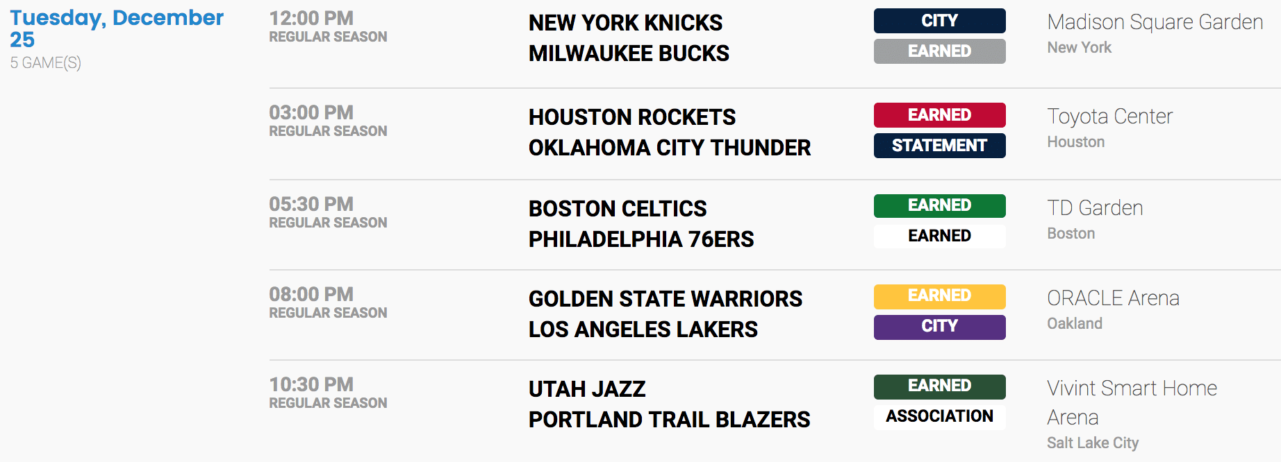
This confirms what I reported back in May, when I passed along this news from a source:
[T]he [previous season’s] 16 playoff teams [will] get the additional uniforms. They’ll debut, I believe, if the team plays on Dec. 25, but they will also be able to wear them whenever they want after that. I’ve seen 14 of the 16 jerseys — all except the Pacers and Jazz. Those two teams won’t be available at retail till February ’19, however.
So some teams will be debuting new uniforms on Dec. 25, and others — the ones that didn’t make the playoffs last season — will not. (Two of last season’s playoff teams — the Thunder and Trail Blazers — will not be debuting their new uniforms on Dec. 25, even though they’re playing that day, due to color-contrast issues with their opponents.) Playoff teams that aren’t scheduled to play on Christmas will debut their new designs at a later date.
While we don’t yet know what these new uniforms will look like, we can tell from LockerVision what colors they will be. The Bucks’ new design, for example, will be grey (ugh), and the Celtics’ will be green.
LockerVision can be used to glean some other info. For example, Twitter-er Casey Vitelli managed to find a listing of all of the new “City Edition” colors. I’m not sure how he unlocked this (I poked around quite a bit and couldn’t find a way to produce the same list), so take it with a grain of sodium chloride, but it looks legit:
Found colors for the new "City Edition" uniforms. Also found colors for a new uniform, known as the "Earned Edition" uniforms. Only 16 teams will rock the "Earned Edition." (quick glance its all the playoff teams from last year) pic.twitter.com/Wiql4emaMO
— Casey Vitelli (@caseyvitelli) October 4, 2018
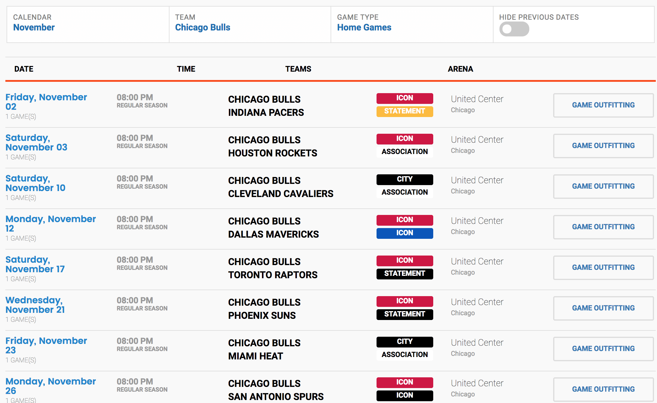
Another LockerVision tidbit: Last season the Bulls wore red as their primary home uniform. Earlier this week they wore white for a home preseason game, which got me wondering if they were changing their home uni protocol for this season. I was going to contact them to ask about this, but instead I just plugged their home game schedule into LockerVision, where I found that they’re sticking with red at home (plus some occasional games with their black alternates):
In additional NBA news:
• We now have video game confirmation of the recent Raptors leak:
Higher quality pic.twitter.com/BI7PIg3Hjf
— theRAPZKNG (@theRAPTORSKING) October 2, 2018
• And a video game has also provided our first look at Golden State’s new throwback:
@conradburry @uniwatch 👀 ss from nba 2K19. seems like this will confirm the gold classic edition the warriors will don next season. with the nike and rakuten logos. pic.twitter.com/jm1fwwnuDq
— Carl L M Jacla (@CLJacla) October 3, 2018
• And then there are the Heat leaks that have been floating around for a few days (click to enlarge):
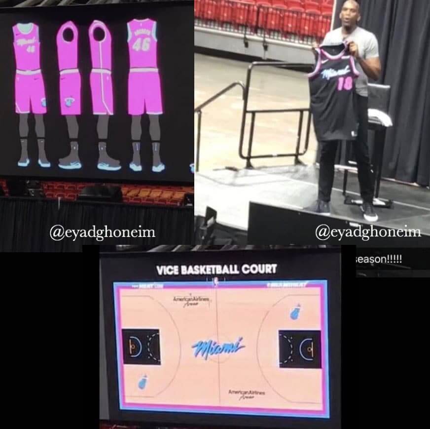
We had this in the Ticker late last week, but I didn’t have more to say about it because I couldn’t confirm its legitimacy. Now, however, we can see that the colors of the two uniforms shown in the leaked photos — pink and black — match up with the LockerVision-indicated colors for Miami’s new “Earned” and “City” designs.
I’ll have my annual Uni Watch NBA Season Preview next Friday, Oct. 12. The season tips off on Oct. 16.
Update: Shortly after today’s entry was posted, longtime reader/commenter R. Scott Rogers posted a devastatingly effective comment that neatly sums up the problems with the “Earned Edition” uniforms. I wish I’d had the time and clarity of thought to include something like this in today’s entry, but I didn’t. Fortunately, Scott did:
“Earned.” The real problem is not so much the winners/losers imposition of artificial class structure and privilege, but the more basic notion that making the NBA playoffs is A) A mark of merit, and B) Relevant to the following season. Half the league makes the playoffs! Making the playoffs in the NBA is a participation trophy for playing .500 ball. There’s no particular honor or achievement in merely making the NBA playoffs. An NBA team “earns” a spot in the playoff about like how a citizen “earns” a summons to jury duty. Congratulations — you voted or registered to vote in the last decade and you haven’t died yet!
But even if making the NBA playoffs were a sign of merit, it means nothing the following season. The one team that wins the championship is welcome to go hog-wild with their uniforms, since they are the reigning champions for the duration of the following season. And it’s actually kind of fun for opposing fans to think of regular-season games in giant-killing terms of playing against the best. But every other team that made the playoffs is just a random team that lost when it counted at the end of the last season. That’s why records start at 0-0 for the new season instead of carrying over cumulatively. If you didn’t win the championship, last season doesn’t matter. It’s a closed book. Players should be embarrassed, even a little ashamed, to be told to wear special uniforms celebrating the fact that their team lost in the playoffs last season.
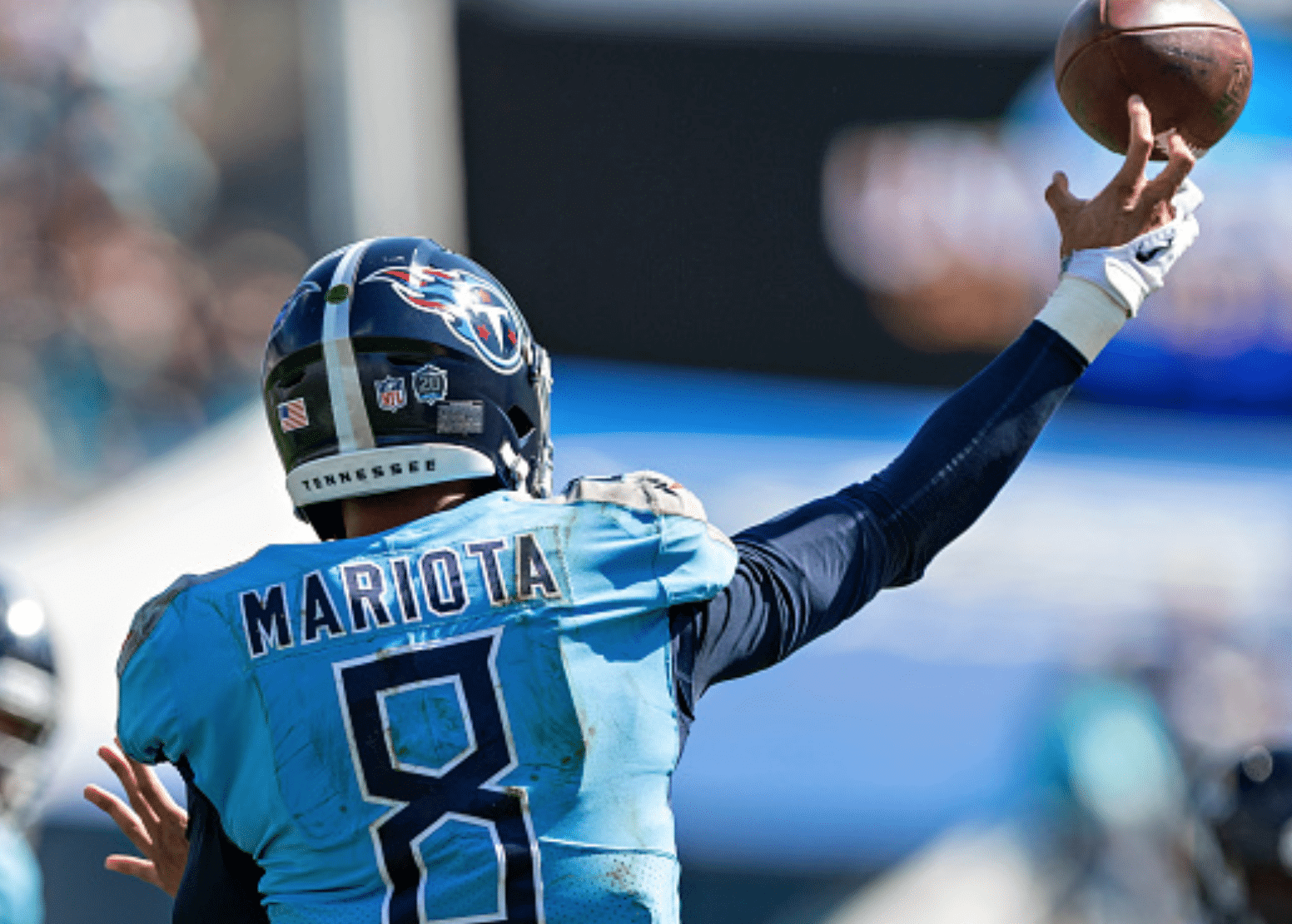
Glove story, continuned: We’ve talked about NFL quarterbacks wearing gloves, placekick holders wearing gloves, receivers not wearing gloves, and more. But reader Derek Linn has noticed yet another glove-related variation: Titans quarterback Marcus Mariota has been wearing a partial glove on his throwing hand. It covers his ring finger and pinkie, but the part that would normally cover his thumb, index finger, and middle finger has been cut away.
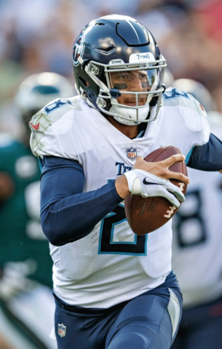
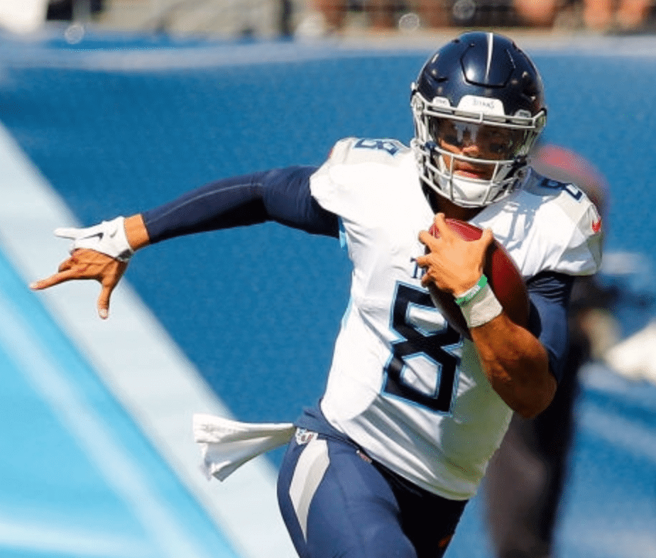
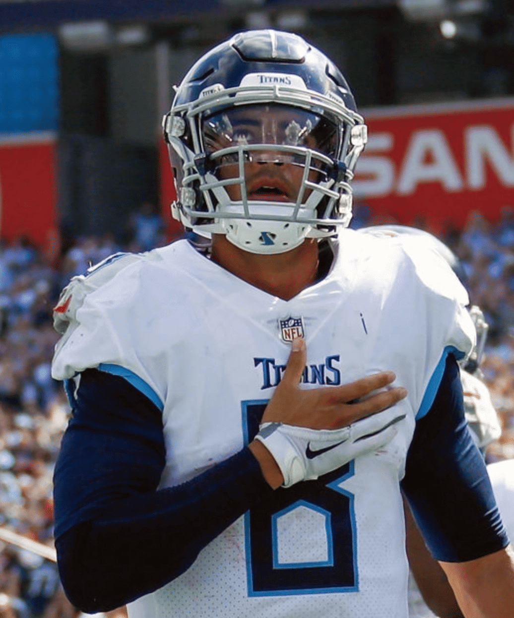
Here it is from a few other angles (for all of these shots, you can click to enlarge):
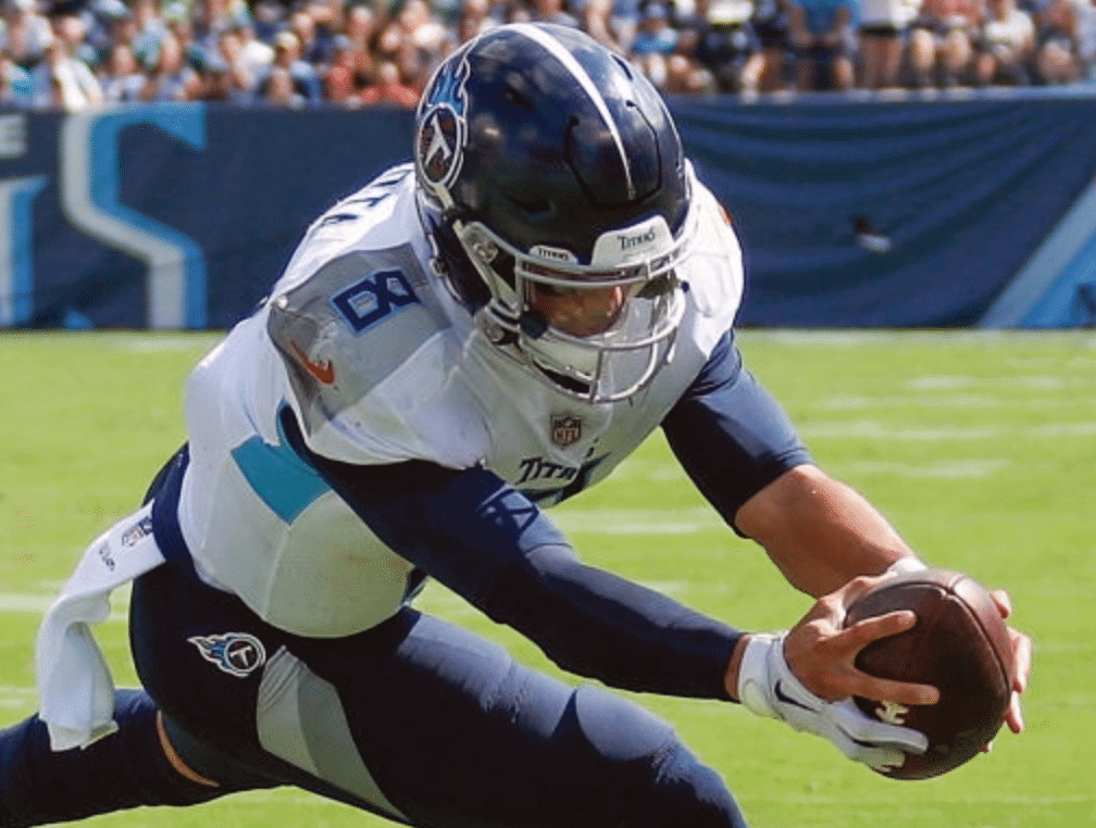
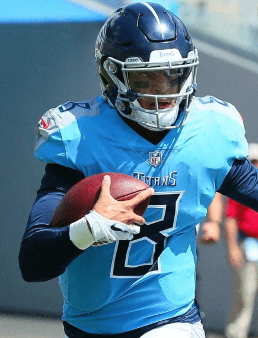
Some preliminary photo research indicates that Mariota has only been wearing this modified glove for the past two weeks. Prior to that, he went bare-handed.
Also, depressingly, of note: Look where the maker’s mark is on that glove. If you look at the full range of Nike football gloves, they never put the maker’s mark in that spot (at least not that I could find). So the Titans equipment staff didn’t take an existing glove and modify it — they had a special glove made, and Nike repositioned their logo for maximum visibility. Sigh.
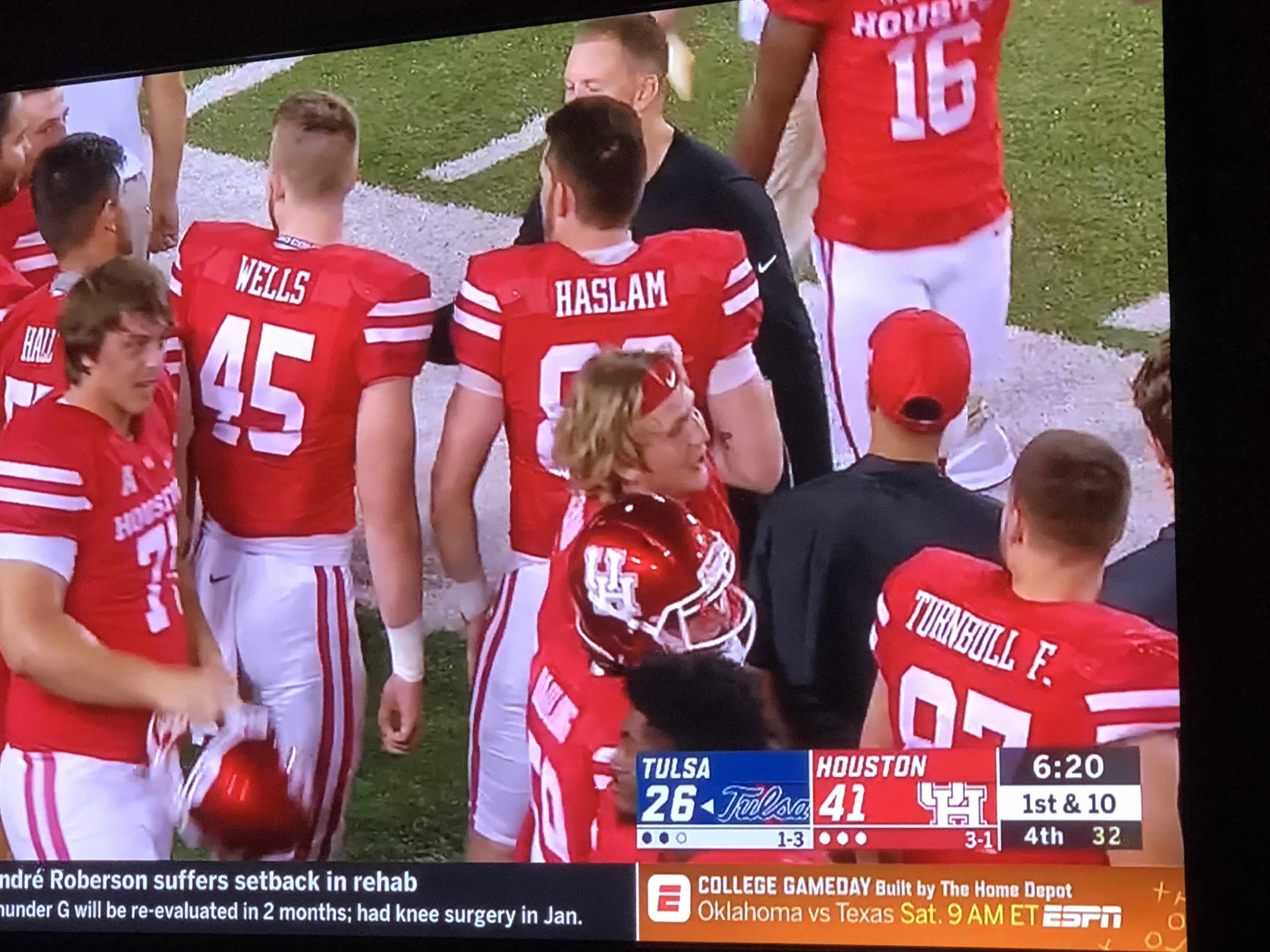
Name game, continued: Check out the player at lower-right in the screen shot shown above, which is from last night’s Houston/Tulsa college football game. At first I thought it was an unusual FIOB format — like, the guy’s name was probably Frank Turnbull, or Fred Turnbull, or whatever. This has been done before by the Chargers and Browns, among others, but it’s still pretty rare.
But then I checked the Houston roster to find out what the player’s name actually is. Turns out it’s Sid Turnbull-Frazier. So this isn’t a FIOB at all — he’s just wearing a shortened version of his hyphenated surname (which is confusing), and the shortened version doesn’t include the hyphen (which is doubly-confusing!).
(My thanks to Tyler Evans for the screen shot.)
Click to enlarge
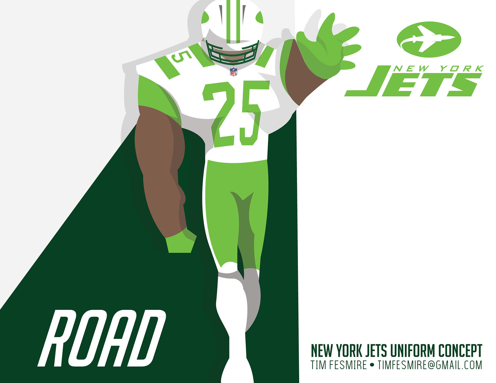
Jets contest reminder: In case you missed it yesterday, the results of our Jets-redesign contest (including Tim Fesmire’s entry, shown above) are now available for your enjoyment over on ESPN.
The Ticker
By Yianni Varonis

Baseball News: According to this Milwaukee-based sports-radio host, the Brewers will wear their blue jerseys for most of the playoffs and won’t wear their pinstripe uniforms again until next season (from the show’s producer and co-host, Armen Saryan, and multiple others). … Former MLB P and Texas alum Roger Clemens tweeted a rear-view photo of what Texas will wear against Oklahoma during the 2018 Red River Celebrity Softball Game (from Ignacio Salazar). … In partnership with MLB, Louisville Slugger is auctioning off autographed and gold-commemorative bats to raise awareness and funds for pediatric cancer. … While the Rockies and A’s put the Postseason sleeve patch above their anniversary logos, the Dodgers have chosen to put it below their anniversary patch (from Michael Olguin).

Pro Football News: Pats QB Tom Brady took Color Rash to a new level last night by wearing a colored waistband towel. … ESPN accidently put the new University of Wisconsin-Green Bay logo on its Packers homepage (from Taylor Warntjes). … Speaking of ESPN, a recent episode of Pardon the Interruption used this outdated graphic of a Browns helmet with a white facemask — something the Browns haven’t worn since 2005. … Ottawa’s major-junior hockey club, the 67’s, will show support for the local CFL team by wearing alternate Redblacks-inspired uniforms later this month (from Matthew Walthert).
College Football News: This is pretty great — in anticipation for this week’s Red River Shootout between Oklahoma and Texas, an Oklahoma-grocery store built a soda-pop display that spells “Boomer Sooner” and features an upside-down-Longhorns logo. … Florida presented rapper Pitbull with football and basketball jerseys with the No. 305, which is both his nickname and the area code of Miami, where he’s from (from Dan Wunderlich). … Professional golfer Josh Teater is showing his Wildcats fandom by engraving “SNELLYEAH#26” to his wedge in reference to Kentucky RB Benny Snell. … This article reviews what Arizona State wore last week and previews the maroon-heavy uniforms the team will wear this week. … Minnesota will wear “golden” helmets vs. Iowa … South Carolina will go mono-garnet vs. Missouri. … Wearing No. 25 for Virginia Tech this week will be DB Kalil Ladler (from Andrew Cosentino). … This is what Stony Brook is wearing this week. … A really nice tribute to friends and family battling breast cancer by the Pearl River Community College football team in Poplarville, Miss. (from Wil Bailey).

Hockey News: Many NHL arenas have new boards this season. The move was done to cut down on player injuries but it’s also leading to lots of unpredictable puck bounces, which the players are having a hard time adjusting to (from Joe Werner). … Flames G Mike Smith will wear this unique mask in honor of former Flames G Mike Vernon, who won a Stanley Cup with the franchise in 1989 (from Moe Khan). … This article details how Blackhawks players came to wear their sweater numbers (from Charles Noerenberg). … As was mentioned in the NFL ticker, Ottawa’s major-junior-hockey club, the 67’s, will show support for the local CFL team by wearing alternate Redblacks-inspired uniforms later this month (from Matthew Walthert). … A Uni Watch reader has made a helpful graphic of every alternate uniform that will be worn this upcoming NHL season (from @Nas).

NBA News: With Lakers SF LeBron James and Hornets PG Tony Parker beginning a new season in new uniforms, this article shares other examples of iconic NBA players looking odd in uniforms we might not remember them wearing (from Mike Chamernik). … Well, this is interesting: Spotted in a German bathroom is a tattoo-parlor logo that mashes together the original Hornets logo, the Wu Tang Clan logo, a record, and that guy from The Simpsons who wears a bee costume.

College Hoops News: In a study, psychology researchers sought to determine if uniform colors affected the performance of recent NCAA tournament participants. Their conclusion (paywalled) is that they didn’t (from Rolf Degan). … As was mentioned in the college football ticker, Florida presented rapper Pitbull with football and basketball jerseys with the No. 305, which is both his nickname and the area code of Miami, where he’s from (from Dan Wunderlich).

Soccer News: Two items from Josh Hinton: Boca Junior’s new third kit may have leaked, and the new USL club in El Paso, Texas, will be called El Paso Locomotive FC and will wear this badge. … This isn’t seen often in soccer: During Europa League play, Rapid Vienna goalie Richard Strebinger wore eye black as well as protective headgear (from our own Jamie Rathjen). … The San Diego Sockers of the Major Arena Soccer League unveiled this 40th-anniversary logo.

Grab Bag: Uni Watch shared earlier that Pitt would wear retro-blue-and-yellow uniforms across all sports this week. This article asks if this is a precursor to a permanent change in color scheme (from Chris Weber). … A good interview with apparel brand Canada Goose CEO Dani Reiss, on his “love-hate relationship with counterfeiting.” … As was mentioned in the college football ticker, pro golfer Josh Teater is showing his Wildcat fandom by engraving “SNELLYEAH#26” on one of his clubs in reference to Kentucky RB Benny Snell. … Well-researched piece from Vox that asks: “Hooters is closing restaurants. Is its offensive uniform to blame?” … A man is alleged to have robbed a Texas bank by wearing a fake security uniform. … Because a rare skin disease keeps a Georgia elementary school student from playing outside during recess, a school resource officer bought the child his own “police uniform” so the two can walk together on patrol during that period. … This is fun: a Declaration of Independence diagram that “combines U.S. history with graphic design” (from Dark Wahlberg). … In Colorado, “the thin-blue line is turning bright-pink” as a local police force will wear modified uniform patches in honor of breast-cancer-awareness month (visual of the patch is in the adjoining video). … Speaking of Pinktober, the Iowa State women’s volleyball team recently wore pink jerseys in its match vs. Oklahoma (from Kary Klismet). … While eating lunch at a Baltimore restaurant, Brandon Sillaman noticed that the restaurant’s logo was rather Uni Watch-esque. … Mount View High School in Welch, W.V., has cleverly modified the Mountaineers logo (from Brice Wallace).
Speaking of the Bulls, if LockerVision is indeed accurate, it looks like their City uniform will now be black, which means their flag-inspired set may be history. That’s disappointing, as I think that was one of the best sets. On the flip side, it looks like the Celtics won’t be wearing grey for their City set, so I suppose it’ll all balance out.
I believe Mariotta is wearing the partial glove on his right hand because of his elbow injury which has resulted in numbness in some of his fingers.
Yup. Plus, I suspect he’s got some “in’s” with Nike (aka “Big Uni”) from his Oregon Duck days.
In case it’s never been mentioned before, the script and colors on the Heat’s “Vice” unis are taken from their original home, Miami Arena.
link
Long Island University will merge its two university’s athletic programs (Brooklyn & Post campuses) into one athletic department. They will upgrade their Football team from D-II to FCS. LIU Brooklyn was known as the blackbirds and had a Black and gold color scheme. LIU-Post had a Green and yellow color scheme and were known as the pioneers. Whats weird is the quote from the press release “In order to honor LIU’s strong tradition of athletic excellence, the university announced the new program will combine the traditional colors of both campuses into a united blue and gold.” But neither school has blue in the color scheme. Does anyone know where the idea of blue came from?
link … aspx?path=
As an LIU-Brooklyn undergraduate in the mid-1960’s I remember the school colors being a light blue (lighter than Columbia blue is the best I can describe it) and white. I am not sure if this is the blue they are referring to.
Taking colors from both schools would not be feasible. Black and yellow would look like the Steelers, and green and gold would still look too much like Post. Black and green? Yellow and gold?!!
I’m guessing that basketball will stay in Brooklyn, but baseball, softball, soccer and lacrosse will move to Long Island. The latter will solve the problem of LIU Field, where all the outdoor sports were crammed into the small space. Having passed by the area on occasion, and attending a ballgame a few years ago, I’m going to miss the place if it gets redeveloped. It’s the first place I saw “artificial dirt” in a baseball diamond.
Both have gold in common, so that’s an easy choice. Having chosen a color each has in common, it becomes basically impossible to add either black or green. So the second color has to be one neither currently uses. So blue is an easy choice.
“an Oklahoma-grocery store built a soda-pop display that spells “Boomer Sooner” and features an upside-down-Longhorns logo.” This being the Internet, an upside-down Longhorns logo was certainly not the first thing I think of when I saw that.
I love that Mike Smith mask. Bringing back the helmet and cage look while still wearing a mask. Look forward to seeing that in action.
Okay…I have officially reached the point where I wish the NBA would just go back to teams having a home and away uniform, with everybody wearing white at home and dark on the road.
I am willing to grandfather in the Lakers’ gold, but that’s it.
And please remove yourself from my lawn.
+1
“Earned.” The real problem is not so much the winners/losers imposition of artificial class structure and privilege, but the more basic notion that making the NBA playoffs is A) A mark of merit, and B) Relevant to the following season. Half the league makes the playoffs! Making the playoffs in the NBA is a participation trophy for playing .500 ball. There’s no particular honor or achievement in merely making the NBA playoffs. An NBA team “earns” a spot in the playoff about like how a citizens “earns” a summons to jury duty. Congratulations – you voted or registered to vote in the last decade and you haven’t died yet!
But even if making the NBA playoffs were a sign of merit, it means nothing the following season. The one team that wins the championship is welcome to go hog-wild with their uniforms, since they are the reigning champions for the duration of the following season. And it’s actually kind of fun for opposing fans to think of regular-season games in giant-killing terms of playing against the best. But every other team that made the playoffs is just a random team that lost when it counted at the end of the last season. That’s why records start at 0-0 for the new season instead of carrying over cumulatively. If you didn’t win the championship, last season doesn’t matter. It’s a closed book. Players should be embarrassed, even a little ashamed, to be told to wear special uniforms celebrating the fact that their team lost in the playoffs last season.
^^^^ This. Every word of it. I wish I’d had the time and clarity of thought to include something like this in today’s entry. In fact, I like it so much that I may add it to today’s entry!
Paul, just wondering what your thoughts are on the Raptors alternates. I get the need to have the black and red jersey (and it kinda sorta works) but what about the “North” jerseys? Do you have any sources to back up the fact that the Raps will have two such jerseys this year (city and earned)?
SportsLogos.net has confirmed that the white design is legit. I think it’s fine from a general design standpoint, although I think the whole “North” thing is silly.
I think this will be a lot of people a) not noticing, and b) wondering if Team A did in fact make the playoffs last year, as in “the Pelicans were in it last year?…Huh.”
And I assume they’ll have them taken away when they don’t make it this year?
Well said, though now I’m a little bummed that I still have yet to earn my summons for jury duty.
Also, the concept of the “Earned” uniforms assumes that every team desires additional alternate uniforms. Nike is saying, “We’ll reward your accomplishment by giving you yet another uniform to add to your wardrobe.” As if four sets isn’t enough. It just seems like a bit of hubris on Nike’s part to assume that teams will be grateful to them and that teams that missed the playoffs will try harder next year so that they too can have an extra Nike clown suit.
Logo Creep Anger Fatigue. While I tire of Nike, et. al. overtaking the tradition and image of a given league or team with uniform stories and themes (Earned, City, Glory, Salvation, Apotheosis, etc.) can we just ease up on the logo creep anger?
Companies make equipment. They put their logo on said equipment. Paul’s beloved Brannock Device prominently features its name on its products. The shoe store doesn’t make the device, so is it logo creep that Foot Locker has measuring devices made by an entity other than Foot Locker?
Mariota wears a Nike glove with a Nike logo…so what? Maybe, in a less cynic world, some player somewhere has a similar need and can now approach Nike for that type of equipment.
The NFL doesn’t make pants or uniforms or shoes or helmets, so why would a manufacturer’s mark be out of place for equipment? And why would it cause such anger if it was? Can a company like Nike overshadow the team identity, yes, and sadly it does? Can the logos be more aesthetically placed and designed, yes? But to hate the logo out of sheer inclusion or simple spite has become tiresome.
can we just ease up on the logo creep anger?
Actually, if you go back and re-read what I wrote, you’ll see that it was sadness, not anger.
And no, I won’t be easing up on that. Let’s please move on. Thanks.
This is a small thing but that diagrammed Declaration of Independence should probably be attributed to Pop Chart Labs, the designer of the poster, not Mental Floss. Pretty sure Mental Floss is just promoting or posting about it.
Yep. Pop Chart Lab’s listing for the print doesn’t attribute it to Mental Floss, so this is just Mental Floss posting about a cool thing made by Pop Chart Lab.
Fixed.
Bumblebee Man. The name is Bumblebee Man.
That Mike Vernon mask (Calgary Flames) is incredible. Its so perfectly done it doesn’t look real.
Mike Smith will look a lot like Mike Vernon when wearing this with the throwback alternates. Just a heck of a lot taller than Mr. Vernon!
Day Two of me digging all the Jets redesign entries. My favorite Uni Watch feature! Lotsa likable stuff in there. Great job, all who participated. I especially love the different stripe patterns and those new modern helmets. The uniforms which added some of that NY Titans gold actually worked well, too. Hope next year’s real redesign look as good as some of these.
Does Triblive.com know the Urban Dictionary/Pornhub definition of tribbing?
It also looks like the glove is a standard glove with three fingers cut off.
From the link of Nike gloves, it looks like it’s the glove that is 6 rows down on the far left.
Here is a link to that glove:
link
I’m sure I’m late on this and it’s been previously covered, but I notice the Pats’ color rush jerseys have no TV numbers. I thought those were required. I can’t remember any other NFL team wearing a non-throwback with no TV numbers.
Yes, we all jumped all over that when that design was first released. TV numbers are indeed required, but for some reason the Pats (or Nike) got a waiver for this particular design. not sure why.
Thanks for the quick response, I was sure you had noticed. I think they look fine without them, can’t believe it didn’t jump out to me previously
re: final item in ticker
West Muskingum High School in Zanesville, Ohio, does a similar thing: link
Noticed that myself last night. And yes, I am pretty sure they are required (well, usually I guess).
What’s unfortunate is that the Pats’ color rush jerseys would be much improved if they had put the TV numbers under the UCLA stripes and just left off Flying Elvis.
Pretty sure Mariota is wearing that glove as he got injured a few weeks ago, had nerve damage in his right arm and couldn’t grip a football due to a lack of feeling in his hand. Mariota suffered an elbow injury during their 7+ hour season opener in Miami, missed the second game, then came in relief as Blaine Gabbert sufffered a concussion in the third game.
Mariota has been wearing the glove because of numbness and weakness in his pinky and ring finger. He damaged his ulnar nerve and keeps exacerbating it throwing and putting it on strain. Had to sit out week 2 because of it.