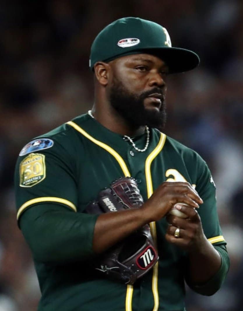
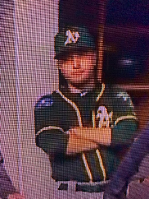
I think we can all agree that this year’s MLB Postseason patch looks like shite. (For that matter, I hope most of us can also agree that the very idea of a postseason patch is unnecessary and that they should just stick to World Series patches.) But A’s pitcher Fernando Rodney somehow found a way to make his cap patch look even worse in last night’s American League Wild Card Game in New York.
By interesting coincidence, MLB has just released a commercial that ridicules the sport’s “unwritten rules” and maxims and celebrates various “Look at me” behaviors by young players. The voiceover, which is by Junior Griffey, lists the various truisms that are being made fun of: “Don’t stop and stare. Don’t flip your bat. Respect the jersey” (emphasis mine). Maybe they can put Rodney and his cap in the next commercial.
A few other notes from last night’s game:
• If you look again at that photo of Rodney, he appears to be wearing a wedding ring on his glove hand, which is usually a no-no for pitchers (cue the Whitey Ford story).
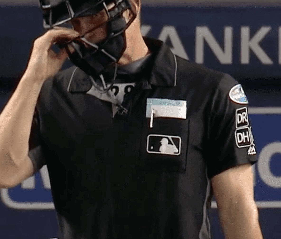
• The Postseason patch also looks pretty brutal on the umpires’ sleeves, because it has to compete with all of the umps’ memorial patches:
• A’s pitcher Jeurys Familia was wearing a two-tone belt — green on one side and yellow on the other:
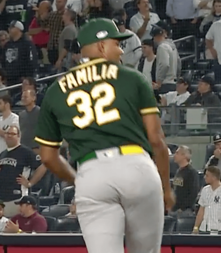
Some quick photo research reveals that Familia has been wearing this belt at least since Sept. 24, but we hadn’t noticed until now. I’ll see if I can find out more from A’s equipment manager Steve Vucinich.
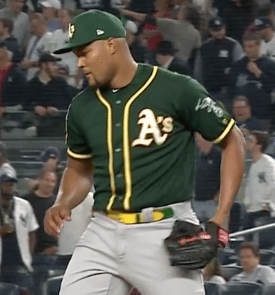
• Someone in the A’s dugout — not sure who — was missing his anniversary patch:
(My thanks to Mike Miller, Jonathan Shaw, and @BerrysAthletic for this contributions to this section.)

Click to enlarge
Jets contest results: The results of our Jets-redesign contest are now available for your enjoyment over on ESPN. I’m showcasing this entry by Tim Fesmire mainly because I love his presentation format, which looks like something out of a storyboard for the next Incredibles movie.
You can see all of the entries I received here.
Click to enlarge
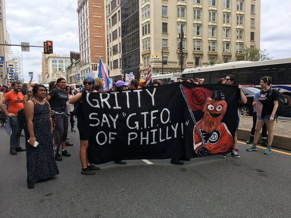
Occupy Gritty: Bizarre development this week in Philly, where Gritty — the new Flyers mascot that has been widely ridiculed as being the stuff of nightmares — was adopted by people protesting a visit by President Trump. A left-wing activist even set up a rather amusing IWW-style Twitter account called Fellow Worker Gritty, in which Comrade Gritty declaims on weighty subjects from a socialist mascot’s perspective:
I wanna talk to my steward. #1u #gritty pic.twitter.com/4BG2qijmX6
— Fellow Worker Gritty (@FellowGritty) October 3, 2018
The kicker is this Daily Beast article, which concludes with this deadpan gem: “The Philadelphia Flyers did not return a request for comment on Gritty’s political alignment.” No word on whether they tried to get a quote from the Philly Phanatic.
(Big thanks to our own Anthony Emerson for bringing this one to my attention.)
The Ticker
By Paul

’Skins Watch: A Canadian youth hockey team called the Northwest Warriors currently uses the Chicago Blackhawks’ logo, but the team is working with members of the Tsuut’ina First Nation tribe to come up with a new logo that will portray First Nations people “in a positive light” (from our own Yianni Varonis).

NFL News: Did you know the Bengals wore a bicentennial patch during the 1975 (not ’76) Hall of Fame Game? (Good find by Stephen, who didn’t give his last name). … The Titans will wear white over blue this week against the Bills (from Eric Wright).
College Football News: Louisville coach Bobby Petrino, whose team is preparing to play Georgia Tech this weekend, says he finds Tech’s uni numbers difficult to see when watching game film. … Here are this week’s uni combos for Wofford, Troy, and Virginia Tech (from Ryan Bohannon and Andrew Cosentino). … Florida’s equipment truck caught fire the other day, which has created a major challenge for the team’s equipment staff (from @fitzsimmons22).

Hockey News: Don Cherry-themed uniforms are returning to the WHL this season (from Wade Heidt). … The Capitals raised their championship banner last night, although many observers noted that they essentially whitewashed any mention of former coach Barry Trotz from the proceedings.

NBA News: Looks like the Warriors will have a new throwback this season. … Corporate theater is so tedious: Suns rookie DeAndre Ayton recently signed an endorsement deal with Puma, but his new sneakers weren’t ready in time for his first preseason game, so he wore Nike’s with the logo taped over. … Yesterday’s Ticker had a note about how the jerseys that the Nets wore at their Media Day event had a little “T” at the base of the collar. But then I was looking at the Mr. Yuk-ified Suns photos that Nic Schultz prepared for me and noticed that they seem to have an orange “T” or cross in the same spot. So then I went back and noticed that Grizzlies appear to have it as well. This is apparently some reinforced stitching to cut down on all the jersey rips that we saw last season.

College Hoops News: New uniforms for Oklahoma. … New “Flyin’ Illini” throwbacks for Illinois (from Don Drever). … Whoa, look at the shorts worn by Mississippi Southern in 1954-55 (from Josh Manck). … New uniforms for UConn.

Soccer News: La Liga side Valencia was flagged for a kit violation due to a small maker’s mark on their neck warmers. … New 90th-anniversary shirt for League of Ireland team Sligo Rovers (from our own Jamie Rathjen). … Here’s a look at the one-off shirt that Louisville City will wear against North Carolina FC. “First monochromatic badge in club history,” says Josh Hinton, and I’ll take his word for it!

Grab Bag: Senator Chris Coons, while discussing the current Supreme Court situation, invoked a uni-related metaphor. According to that article, “Coons called for ‘reduc[ing] the frequency with which we describe judges as wearing red or blue jerseys.'” … New uniforms for the Japanese volleyball team Oita Miyoshi Weisse Adler (from Jeremy Brahm). … A Sikh endurance cyclist is challenging the sport’s mandatory helmet rule because it would prevent him from wearing his turban. … Sheriff’s deputies in Summit County, Colo., are wearing Pinktober patches. … New logo for DuPont. … Did you know there was once a record label called Uni? It’s true — great label design, too.
DeAndre Ayton was wearing the same taped up Nikes (the Kobe AD Mid) during Summer League as well, allegedly for the same reasons he currently is. Puma only has one model so far, and all of their other endorsers have been wearing it on a regular basis. Interesting.
I give last night an ‘F’ – The game was virtually over in the first inning after ONE hit… yeah, it was a HR but still, after 162 contests to see that, well, what the heck is it all for anyway? I’d rather there NOT be a “wild card” if it’s one and done. This isn’t football and “winner take all” contests in Baseball need to be reserved for Game 7’s.
Junior Griffey never wore his hat backwards during a game, so far as I know. And that’s fairly common to wear a cap. Fernando Rodney, on the other hand… that’s never been a good look. One rung below flat brims on the ladder.
Hear, hear.
About that…
link
If it doesn’t come through, just Google “Ken Griffey Jr Turn Ahead the Clock.”
I have a question about Ken Griffey Jr. Was it/is it common to refer to him as “Junior Griffey?” I see it used on this site but I don’t recall seeing it elsewhere. I’m from Seattle and was 11 years old his rookie year, and I only remember him being referred to as “Junior,” even when his dad played for the Mariners alongside him. “Kid” was another, less commonly used nickname. Maybe my memory is faulty or maybe “Junior Griffey” was used more outside of Seattle?
That’s what I’ve always called him. I have no idea how common it is.
I’m 87% as old as dirt and have not spent even an entire week in Seattle. I remember him routinely being called “Junior Griffey”.
I heard “Junior Griffey” all the time, but assumed it was just a Hawk Harrelsonism. I guess it wasn’t.
I respectfully disagree with you about how baseball should “just stick to World Series patches” because they shouldn’t have those either!
I agree. World Series patches are unnecessary. Somehow, we all got along just fine without a jersey or cap patch until the 1987 World Series.
I wish we could go back to those days, including the 26 teams, no wild cards, four divisions instead of six, Astros in the National League and the Brewers in the American League.
4 divisions of 6… and 26 teams? I know I was a liberal arts major but that don’t seem right… ;)
Brian, Rich is referring to a time when there were four divisions INSTEAD of six (divisions), not four divisions OF six teams. The era of 26 teams was from 1977 to 1993, when the AL had 14 teams (2 divisions of 7 teams each) and the NL had 12 teams (2 divisions of 6 teams each). What I want to know is, what does Rich have against baseball fans in Miami, Colorado, Arizona, and Tampa that he wants to take their teams away?
ah dammit… just read it too quickly… my bad and my apologies
There’s an interesting story about Rodney and his cap. This from a 2017 Fox Sports story:
Rodney says he wears his cap tilted to the left side of his head as a tribute to his father — Ulise Rodney — who died six days before Fernando made his major league debut with the Tigers in 2002. Ulise was a fisherman in the Dominican Republic and wore his cap tilted to the side because “that’s the side the sun hits his face.”
He also says the tilted cap can be confusing for both hitters and base-runners. “The hitter looks for your eyes. It’s like a dog. When you go somewhere, the first thing (a dog) looks at is your eyes and how you move.”
Oh, I know why he does it. I just don’t think it looks good, and the patch really accentuated that last night.
I did that with my baseball hat a few times when I was baleing hay. But then you go back the other direction and have to move your hat around. But then I figured out a cowboy hat projects you from both sides. It just kinda fits better with the job too.
Maybe we’ll get a pitcher with one of those giveaway cowboy hats someday…
I think you should’ve given an honorable mention to Wafflebored for “link“.
Spearing with those helmets wouldn’t just be a 15-yard penalty, it would be a felony!
Just went through EVERY design in the Jets contest. Wow, hard for you to pick a winner I imagine, but Charles Noerenberg’s design for me was by far the best. A fantastic and unique striping across the front with a polished/evolved logo that looks like a real progression from their current one. Not a fan of green pants that he included, but I’ll give him a pass since it looks like EVERYONE save for 1 or 2 had green pants (which look awful)
Diego Menocal’s nose-art helmet design was a clear winner for me. One of my favorite football concepts ever. I’d root for the Jets if they wore a helmet like that!
Surprised to hear that from you, Scott. I gave it low marks, for three reasons:
1) It’s basically a copy of similar helmets that Air Force has worn in recent years:
link
2) The planes that had this type of nose art were not jets. They were propellor planes.
3) We have soooooooo many teams throughout the sports world using military-inspired uniforms. The last thing we need is to move the Jets into that category.
Fair points!
1. I basically don’t count anything that happens in NCAA football as a uniform anymore, since it’s so dominated by single-game stunts, gags, and schtick.
2. That type of nose art was quite common in the first three decades of jet aircraft as well. It’s all but disappeared from U.S. forces, other than some A-10 units, but it’s still common in some foreign air forces.
3. Fair point, but the team is named the Jets. Say the word “jet” to people, and a few geeks like me will picture a civilian airliner, but most people will picture military aircraft. So despite the NFL Jets’ historical use of civilian aircraft iconography, I wouldn’t regard this as a meaningful increase in military iconography in sports. I mean, when the Jets decide they want a pregame aircraft flyover at the Meadowlands, do they call Delta or Department of Defense?
A fourth point I’d make would be that a big part of my personal objection to military iconography in sports is how ugly it tends to be, especially when imitated in civilian contexts. Aviation nose art is an exception for me. (Also, naval “dazzle” camouflage. If the Seattle Mariners dressed themselves in dazzle camo, I wouldn’t complain.) You’ve mooted the idea of teams dressing in actual military sports uniforms if they want to pay tribute to the armed forces, which strikes me as a brilliant idea. Nose art seems to me to be closer to that than to the dreary, common practice of military camo jerseys.
Good back-and-forth! But we’re gonna have to agree to disagree on this one.
“I mean, when the Jets decide they want a pregame aircraft flyover at the Meadowlands, do they call Delta or Department of Defense?”
Don’t forget that when they were at Shea, they got plenty of civilian flyovers from nearby LaGuardia.
Isn’t Maryland’s football helmet basically dazzle camouflage?
link
I may be a uni I traditionalist, but I gotta say that I strongly support doing away with most of the unwritten rules. Let baseball be fun!
Those patches, on the other hand are horendous…
The “unwritten rules” are based on one thing: respect. For your opponents and the game. It’s sad that the MLB has come around to thinking, hey, that sh*t is costing us money!
Big fan of the NickTriangle design. I’m also always partial to hand drawn, so grain of salt.
link
link
My favorite part of the Jets design contest article:
Amen.
Yeah, but I think the Jets would benefit more from a uni-tweak than a total re-design/overhaul.
That said, I think Jake Golden’s home and road treatments fit the bill nicely, though I’d like to see the football-shaped decal (the logo he rendered) on the helmets.
Not a fan of the green pants look at all!
My vote for the Jets’ redesign goes to Daniel Vasquez. That’s strong, clean, and easily recognizable as the NY Jets.
My suggestion for the Jets redesign is more retro:
1. Fix the current jersey stripes so they don’t look off-kilter
2. Go back to the lighter shade of green
3. Wear the green helmets they wore from 1978-1997
Done!
Better idea: Fix the shoulders, fix the green, make the helmet logo football-shaped like the 1965-77 version (but with current graphics), ditch the green pants and white socks, bring back the white sock stripes.
N.B.: The Jets wore two different green helmets between 1978 and ’97; one with a plain paint sheen, white facemask and plain white decals (1978-89), and one with metallic paint sheen, black facemask and black-outlined decals (1990-97).
The team wore the green helmets with the 1977 uniforms in a couple of pre-season games in ’78, and it was link. But I much prefer the classic white helmet with this design and never liked having a wordmark as the helmet logo.
I’m with you. As a lifelong Jets fan, those contest entries scared the heck out of me. I pray we see nothing like that.
Those green helmets were AWFUL.
Besides ignoring Trotz, the Caps had a separate introduction for the players who were scratched, but introduced Tom Wilson with the “dressed” players, even though he was suspended for 40 games earlier in the day
Those weren’t entirely the scratched players, they were three of the players on the current roster not considered part of the Stanley Cup-winning team (Jayson Megna, Dmitrij Jaskin, and Travis Boyd).
The fourth, Pheonix Copley, stood in as the backup goalie.
Michal Kempny was dressed and part of the ceremony as well even though he’s currently injured.
I can see not including Trotz, but why should Wilson not be included? He’s still around and was part of the team.
As you stated, various A’s players have been wearing yellow and two tone belts for a while. believe this started with “player’s weekend,” when all players had yellow or two-tone belts. Some guys liked them and kept wearing them. Khris Davis had been wearing his yellow belt regularly, for instance, but dropped it last night. I think they look okay, but am mildly annoyed that players are just allowed to incorporate elements of the player’s weekend look into their normal uniforms.
Another note – Is this the first time that the Playoff Patches on hats and jerseys have been markedly different in terms of design? I agree that these are a generally unpleasant design in the first place, but the horror is upped exponentially by the fact that the design isn’t even consistent across the two patches. The cap patch is on a white background, while the patch on the sleeve incorporates a weird blue fog effect. Brutal.
Side note: I’m a lifelong A’s fan and attended my first ever MLB playoff game last night at Yankee stadium. The A’s disappointed me mightily, but the atmosphere of a game in October is totally different than anything during the regular season and something everyone should try to experience in person. Even if you do so while watching your team collapse in front of millions of people.
Francisco Rodney has the ability to look grimy and disheveled in anything he wears, exacerbated by how he carries himself. He probably gives Johnny Depp a run for his money when it comes to that… how you butcher an A’s uniform is beyond me.
Agreed on the postseason patches. I’m surprised they don’t have special “wild card game” patches. Do these patches drive sales? I’m a die hard Cleveland Indians fan and I only bought a cap with the World Series logo on it because it had been discounted from $39.99 to $10.99.
I like the idea of Playoff caps and patches from a visual standpoint, despite the fact that this particular set is atrocious. To me, seeing the teams with that minor uniform embellishment just hammers home that the playoffs are something different and special. It’s why I really don’t like that they eliminated the NBA Finals logo from the floor during that series. I remember making Playoff patches out of paper and taping them to my jersey as a kid when playoff time came around and imagining what different NBA courts would look like with the floor logo. It just made it feel special.
In terms of retail, I’m sure there are certain diehards who will buy a playoff cap every year. Though I feel like these are the same people who buy the Father’s Day, Mother’s Day, etc. caps. I doubt they have MUCH appeal to hat buyers who aren’t completists.
I admittedly don’t wear baseball caps regularly, but have one normal, home A’s cap that I’ve been wearing at various points for ten years. I don’t personally see the appeal of having a lot of special, occasion specific caps, but maybe I would if I were an everyday hat type of person.
The playoffs patches don’t seem particularly appealing from a consumer perspective because either your team makes the world series, in which case you’d generally rather have the WS cap or they are eliminated, in which case you’re likely to want to forget the whole thing ever happened. I’d absolutely go back and buy a World Series cap if the A’s ever won the WS, but playoff caps hold no value to me since they usually just remind me of bad experiences. Even then, I’m not sure that I’d ever wear the WS cap if I bought it.
Heisenberg’s Hat
What would these “wild card game” patches like?
How about a Joker from a deck of cards slightly modified with a baseball theme?
Just wait until the advertising appears on MLB jerseys…It’ll look like a European Hockey Jersey soon.
Baseball has the dignity that the NBA doesn’t. In other words, not going to happen.
This is the winner of the contest
link
Some entries have specific NY graphics on one side of the helmet but no mock-up of how they would pull off the lettering when it’s mirrored on the other side. Aside from that, great job.
As a traditionalist I find the MLB video celebrating the ‘let the kids have fun’ mantra frustrating.. While the sport is designed for enjoyment almost all of the behavior in the video is not allowed/penalized/frowned upon at the HS level. While MLB strives to be ‘cool’ and reach the younger generation of fan they are actually setting many up for a reality check when they get to HS level ball. One that as a HS coach I have to address every season.
I also couldn’t help but notice the omission of the Rougned Odor video flattening Jose Bautista with a right hook a few seasons ago as payback for an outrageous bat flip.
Petrino knows that things can be tough to see, especially curbs and ditches, and especially when you have your graduate assistant employee mistress hanging on…
And last time I checked, they didn’t design athletic uniforms for the convenience of opponents, did they?
How about fans in the stands?
We’re talking about Georgia Tech, remember?
OTOH road rash on the face is pretty easy to see
Very fond of Tom Juettner’s concept for the Jets’ uniform (roughly midway through page three).
Those unwritten rules are so contrived. “Don’t stop and stare. Don’t flip your bat.” But when a pitcher strikes someone out he loses his mind and yells and screams with excitement… Give me a break. Can’t wait for more young dudes to stare and triple flip their bat every time they go yard.
Interesting that only one entry had a New Jersey reference even though the Jets have been there for more than 30 years. The shape of the state could have served as the letter “J”!
The Uni Records logo was fantastic – and also an abbreviation, in this case for “Universal”. The photo in the link shows one of the label’s most groundbreaking recordings. Desmond Dekker’s “Israelites” was his follow up to “007 (Shanty Town),” which was one of the first rocksteady or reggae songs to chart in the UK. “Israelites” made the top 10 in the UK and US, demonstrating to many that this new Jamaican music was more than a novelty genre or one-hit-wonder act. “Israelites” was also one of the first songs that made overt reference to Rastafarian philosophy to chart outside of Jamaica. Uni Records deserves a fair bit of the credit that Trojan usually gets for popularizing Jamaican music and culture. “Israelites” is worth a listen: link
Israelites is a good song. Not as good as most Laurel Aitken, but good.
I think I remember the Foundation’s “Build Me Up Buttercup” being on Uni.
Tom Bierbaum’s Jets wordmark is worth a mention:
link
Smiling cartoon logos > snarling cartoon logos!
Thanks, BvK1126, I was really rushed so didn’t get the chance to polish up that sketch of “J.J. Jet,” but felt it wouldn’t be right to let a re-design contest go by without some sort of cartoon mascot.
Some truly deserving winners in the Jets re-design contest, and I was also really impressed by several other entries. I was floored by Randy Miller’s logo (a jet comprised of a silhouette of the Empire State Building with the letters “N” and “Y” forming the wings), and I really like the concept and overall look of John Mindiola’s pilot-based design in the Titans blue-and-gold colors. And honestly, Waffleboard’s “throwback uniform” was the funniest thing I’ve seen in a long time. Brilliantly executed.
DuPont’s new logo would look great on the hood of stock car.
Maybe under a rainbow?
That not exactly the Blackhawk logo that the Hawks use. The logo pictured looks more like the Blackhawk logo meets Chief Wahoo.
As nice as Hix Myrick’s Jets’ logo is, I can’t help but get an Intel Inside vibe from it.