
Click to enlarge
I rarely write about soccer, because I know so little about the sport. But I have a really fun new soccer-centric piece up on ESPN — it’s a look an exclusive behind-the-scenes look at the creation of the crest for David Beckham’s new MLS franchise, Inter Miami, with lots of developmental sketches (see above) and inside info. It was really fun to work on, and it even has some quotes from Beckham (although I didn’t get to interview him directly — had to deal with an intermediary, grrrr). Check it out here.
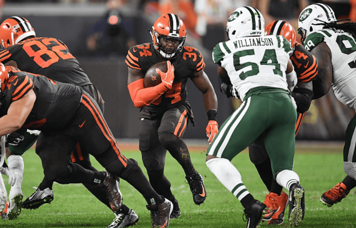
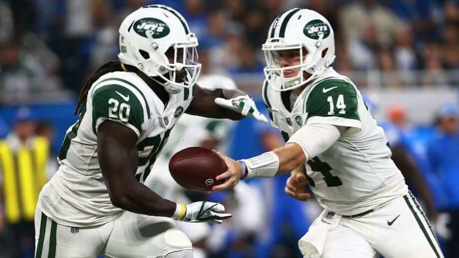
Living up to their name: The Browns’ mono-brown Color Rash uniforms finally made their on-field debut for last night’s game against the Jets and looked about how you’d expect. Can’t say I’m a fan, although at least they don’t have the big honking wordmark on the pants.
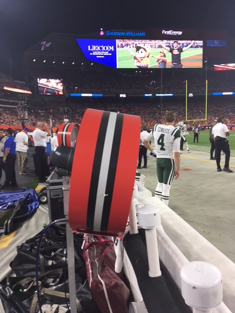
I am a fan, however, of the Browns’ new striped end zones — although I’d be a much bigger fan if the old Browns script weren’t bleeding through the stripes (click to enlarge):’
Speaking of stripes, the stadium’s sideline fans have a Browns helmet design theme — even for the visiting bench:
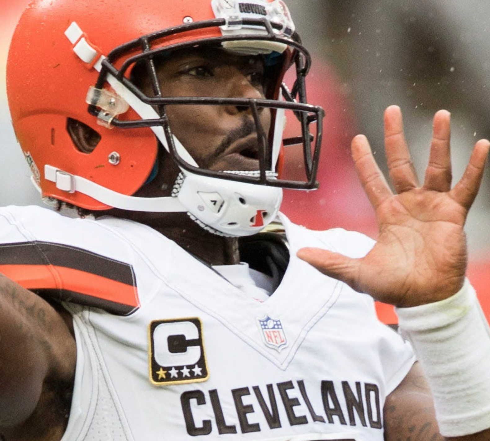
In that same game, several people noticed that Browns quarterback Tyrod Taylor’s captaincy patch had two stars. The stars are supposed to represent how many years the player has been a captain for his current team, and this is Taylor’s first year with the Browns, so there’s no way he should have two stars. And yet:
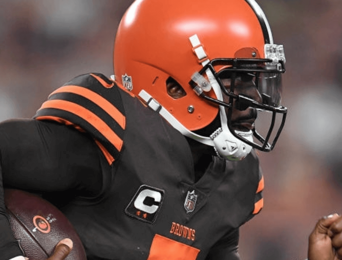
I did some quick photo research and discovered that Taylor had two gold stars — which, again, doesn’t make sense — for last Sunday’s game against the Saints, but none of us noticed (for all of these pics, you can click to enlarge):
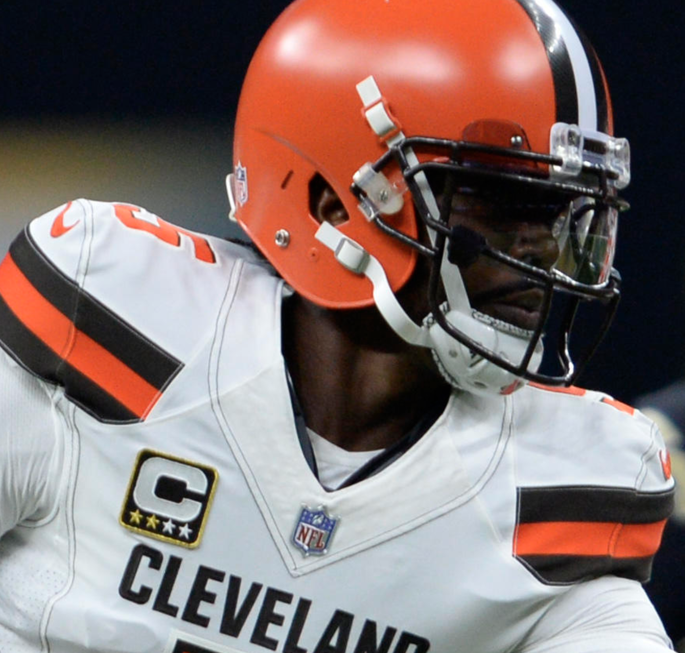
But Taylor had only one gold star for the Browns’ season opener against the Steelers:
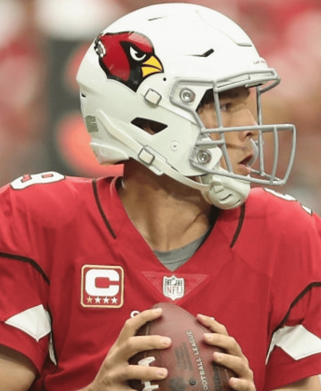
Taylor isn’t the only NFL quarterback with captaincy patch issues. Reader Clifford Baxter notes that Cardinals quarterback Sam Bradford, who’s in his first season with Arizona, had three gold stars last Sunday:
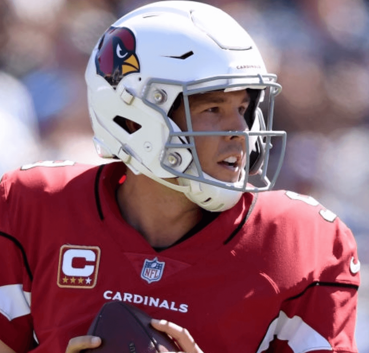
But for the Cardinals’ season opener against Washington a week earlier, Bradford had only one gold star:
Just to compare some recent examples, when Peyton Manning moved from the Colts to the Broncos in 2012, he went back to wearing one gold star. Ditto for Brett Favre when he joined the Jets and Vikings. That’s how it’s supposed to work.
Speaking of the Vikings, quarterback Kirk Cousins joined their roster this year. Sure enough, just one star. Well done, Vikes.
(My thanks to Billy King for the end zone shot and Kenny Kaplan for the sideline fans shot.)
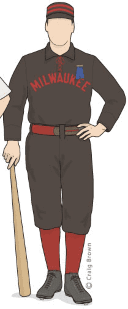
Early uni ad: The excellent Threads of Our Game site, which documents pre-1900 baseball uniforms, recently came up with an interesting example of ads on unis. It seems that in 1894, the Milwaukee team in the Western League — that was a short-lived minor league — wore blue ribbons on their road uniforms as a nod to Pabst Blue Ribbon beer, which of course was brewed in Milwaukee. At the time, PBR’s packaging featuring actual blue ribbons on the bottles, so the ribbons on the uniforms were a very literal evocation of the product.
So far, there are no photos of this uniform, but Threads of Our Game historian Craig Brown has turned up several written descriptions of the ribbon-clad unis and used them to create the mockup shown at right. Brown’s research also turned up an 1894 article with this passage:
The team is backed by a brewery, and its players are advertising the same on their uniforms. There have been advertisements on jockey’s jackets at Latonia [a local horse racing track], but never before on a ball-player’s back.
That indicates that there may have been a rear-jersey ad in addition to the blue ribbons, and also suggests that uni ads were unheard of up until that time.
Fascinating stuff. For additional info, check out Brown’s full report.
Last call: Today’s the final day to get your entries in for my Jets-redesign contest. As usual, the best entries will be featured in one of my upcoming ESPN columns. Full details here.
Naming Wrongs update: We had previously done some Riverfront Stadium shirts in Reds colors. But with the NFL season underway, we had some requests for Bengals-colored versions. They’re now available in black with white lettering, black with orange lettering, and orange:
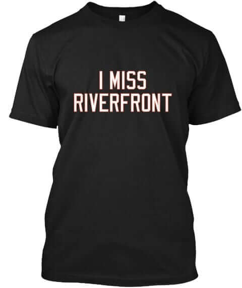

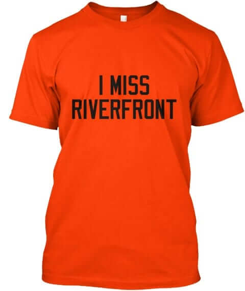
These designs are now available in the Naming Wrongs shop. They’re also cross-listed in the Uni Watch shop, where card-carrying members can get 15% off. (If you’re a member and need the discount code, send me a note and I’ll hook you up.) My thanks, as always, for your consideration.
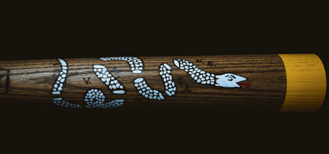
Bat giveaway: One of our steady advertisers, the Pillbox Bat Co., is raffling off one of their “Join or Die” bats (the barrel of which is shown above). Full details here.
The Ticker
By Brinke Guthrie, pinch-Tickng today

Baseball News: No polo pony here, but that is indeed designer Ralph Lauren wearing a Yankees cap with his signature on the bill. Looks like the cap is using the jersey version of the “NY” (from @GuffMichael). … The Round Rock express are now affiliated with the Astros and have new logos and uniforms. … When the Twins used to play at the Met, the grounds crew would chalk up the visiting team’s logo on the fungo circle (from Chris Hickey).

NFL News: Reader Alan Topolski was in a Los Angeles Ralph’s supermarket and took note of the store’s Rams balloon display. “They had a display of Rams helmet foil balloons. I was surprised that they were using the outdated style that they stopped wearing during the 2016 season.” … Jason Brooks created a set of Eagles concepts. …A Browns fan came up with a new NOB for a Browns jersey after last weekend’s kicking woes. … The NFL is closing its NFL Experience store/exhibit on Times Square. Paul had written about it earlier this year. …@IHSAState wants to know if there’s a cooler football helmet anywhere than this one for the Fisher (Ill.) HS Bunnies. … Deadspin published a piece on how the NFL uniform code “needs to be destroyed” (from Eric Bangeman). …The Bengals are wearing their home black over white when they visit the Panthers this Sunday (from Joshua Hinton).
College Football News: Syracuse will retire Joe Morris’s No. 47 on Saturday (from Phil). … Virginia Tech will wear white/orange/white at Old Dominion this Saturday (from Andrew Consentino). …Clemson to wear white jerseys at Georgia Tech for the first time since 2007 (from Benji B). … Hard to believe, but the University of Oregon is cutting back on uni combos (paywalled, from Jason Hillyer). … Oklahoma will wear a “thunderbird” decal on their helmets this Saturday vs. Army, and Tennessee will go orange over white against Florida (from Phil). … The Force is clearly with Temple University (from Phil).

Hockey News: The Sabres tweeted “there’s a story behind every (goalie) mask.” …Chris Creamer has a history of the NHL All-Star Game logos following the 2019 ASG reveal for San Jose. …The Shawinigan Cataractes (Quebec Major Junior Hockey League) will wear these throwback jerseys for Oct. 7 and 13 home games (from @PThomas19). …The AHL San Antonio Rampage will use this logo for their first-ever “Dia De Los Muertos” game. The team will be known as “Los Chimuelos De San Antonio” (from @StrosBros1).

Basketball News: Virginia Commonwealth University showed off its new home whites (from Tommy Turner). …Nike has released the new Air Jordan XXIII.

Soccer News: Jimmy Lonetti says, “Minneapolis City SC of the NPSL has created an alternate logo that honors the Minnesota Kicks of the old NASL”.

Grab Bag: Roger Federer is using a new red version of his Wilson signature racket for this weekend’s Laver Cup in Chicago. … If red’s not your color, Head has released a yellow 25th-anniversary edition of the Andre Agassi Radical rackuet design. … Naomi Osaka, who won the women’s title at the U.S. Open, has scored a huge payday from Adidas. … How tech times have changed: Teams and leagues used to send Uni Watch confidante/logo designer Todd Radom info on floppy discs! . … An Italian clothing company is selling battered-looking sneakers that are intentionally distressed and critics say they are “mocking poverty”. They also cost, er, $530 (from Jason Hilyer). …”Hank Steinbrenner bought into Indycar’s Harding Racing, to form Harding Steinbrenner Racing. His son George IV races for Indy Lights. The kicker, next year we’ll see Yankee pinstripes on an Indycar,” says Tyler Scott
Happy birthday to DIY genius Wafflebored, who turns 50 today. Have a good one, buddy. By coincidence, today is also my half-birthday, so Wafflebored and I are both equinox babies. The 21st is a very good day on which to be born!
The Browns’ uniforms looked great. [EOM]
I liked the Browns’ Thursday uniform, except that the white stripe on the helmets did not match the non-white jersey and pants. Would the NFL have allowed a brown only stripe? I know teams alter their decals for throwbacks. I also think a cream stripe (rather than white) would look great with that look.
They could’ve done anything they wanted to the helmets – changed/removed decals, changed face masks – so long as they kept the shell.
They looked like a team named the “Browns” for sure. Iconic classic look that was refreshing to see.
Paul, is this your first ESPN column about soccer? I thought it was great.
Not my first, but my first in a long time! Glad you liked, Jamie.
Yes, really good work.
Did the designers say anything about the inclusion of a shield and roundel? For the kits it would look much better with only the herons and the eclipse
Excellent article. It was especially nice to learn the official values for their black and pink colors.
Nice piece with a lot of interesting detail. I found this quote particularly interesting:
“When you go down there, you realize it’s not just flamingos and Miami Vice,” he says. “That’s the caricature version, the Hollywood version…”
And what did they ultimately end up with? Something straight off the set of a 2018-esque Miami Vice episode! Nothing wrong with that. Yet, all that “research” and strategy took a circuitous route right back to an identity that represents exactly what most people (even outside of) Miami think of the city. Funny how that works. D&C (and the city) should own that realization.
Week 2 vs the Saints, week 1 vs the Steelers. You have them flipped
Ugh, my bad. Fixed!
FWIW, yea the all-brown probably isn’t their best look, but I’d say last night’s options all around look infinitely better than their regular all-brown look with their standard brown jerseys and standard brown pants; which they’ve also worn a handful of times in previous years.
Clarification – The current junior team in Shawnigan is the Cataractes and the jersey is a throwback to their days as the Bruins
…. and the city name is Shawinigan – not Shawnigan.
Fixed.
Shawinigan Bruins/Dynamos/Cataractes have experienced a few colour schemes over their 50 years.
My favourite? Loved their look in the blue and green in 1980s and 1990s:
link
Especially cool were the half blue/half green helmets:
link
Excellent. My favorite era of Junior hockey uniforms too. Well, pretty much any uniforms actually! But so many great looks in the CHL then.
While I wasn’t able to enjoy any junior hockey, I have been to Shawinigan. I ate at Le Globe Steakhouse and drank at Jos Terrase Bar.
As a Californian, so far I am the only person IRL I know that has been there.
Lee
Typo: When the Twins used to play at the Met, the grounds crew would chalk up the visiting team’s logo on the FUNGO circle.
And what team is that supposed to be anyway, the Yankees?
The catcher’s socks (presumably red with navy and white stripes) suggest otherwise. My guess would be the Washington Senators.
I believe the catcher is Gus Triandos of the Baltimore Orioles. The photo is from 1961 the only year Billy Martin played for the Twins. So, what is the logo supposed to be?
Yep it’s the Senators (source link):
link
The groundskeepers could have made their job easier by just putting down a block W.
I’ve seen that version of the Yankees logo that’s on Ralph Lauren’s cap on Cooperstown Collection caps.
I thought the uniforms looked fantastic. I’d love to see that shade of brown and pants template used as a foundation of their uniform moving forward. The austerity of the orange on brown was sharp and has a place as an alternative, but a white number with orange accent would be nice attire for Sunday dinner.
I agree. I think white numbers would look better while all everything else stays the same.
For this particular set, what you describe is what I would also do if I had the say.
But as for regular uniforms, what the Browns had before their inexplicable redesign was fine, and perfect for them.
Lee
I agree. I think the solid brown pants with white top looked the best (esp for guys wearing their stripped socks up). Classic, clean look. Balanced. Folks have a very un natural hatred for brown as a uni color. I’d like the see the Browns really embrace it. That uni indescrobed woukd be a great look at home (so most raod games too).
link
Here’s Cribbs wearing it (ugh…the socks on his forearms…could take it or leave it).
The Oregon item from the ticker is behind a paywall, but I’m glad to see them cutting back on uniform combinations, if that is indeed what it says. Their current set definitely looks best as mono sets, since all four feature a different shade of green.
formating on the link for the NFL EXP store is jacked up
Yeah, we had a bunch of coding issues today. Now fixed.
Still missing a lot of images in that section. Have to agree, the mono Tootsie Roll look is an improvement because of all the stupid Browns elements that don’t appear on it.
As for Captaincy patches, Alex Smith was wearing the all gold 5+ year patch this past weekend for the Washington football team in his first year.
link
Gotta say the carrot merit stickers on the Bunnies helmet is fantastic. Brilliant idea!
I despise the Browns current uniform set and the shade of orange on the helmet. I cannot wait until 2020 when they release new uniforms provided they are a return to the classic look of the past. The Browns should always be in white or brown jerseys with white or orange pants ala the Kardiac Kids era.
That being said-while not a fan of the all brown look the jersey is far and away the best of the current uniform options as are the pants. Maybe it’s not a coincidence they won a game while dressed like an NFL team.
Its highly unlikely they will go back to the previous look, i wouldn’t hate doing last nights unis with different pants though
They should keep the overall concept of last night’s jersey, switch the orange to grey and have grey pants. Yep it would be a gritty look, but Cleveland is tough, gritty town.
I really dig the Browns’ uni last night. I feel like they really need to slid into who they are and play it up. That and the all white set up should be the norm for them.
Very minor ticker correction in the NFL section: there’s no apostrophe in Ralphs. (It was founded by a man named George Ralphs, and the full name of the company is Ralphs Grocery Company.)
I’m not sure if you have written anything about this but Ralph Lauren has launched a line of Yankees items including a baseball jacket, a New Era baseball cap, a Wilson baseball glove, and Rawlings commemorative baseball.
link
Sorry, you did have a link about it on Wednesday. Please excuse me, I was out that day for a Jewish holiday.
Calgary Flames thirds are out. It’s a straight up reprise of the inaugural jerseys in red, give or take allowances for Adidas template elements. I normally insist on one team wearing white, but a red vs blue with the Edmonton Oilers would look stellar. Doubt it will happen though. :-/
Is color-vs-color a thing in the NHL? I don’t watch enough to know.
Lee
The Toronto/Detroit Winter Classic in Michigan Stadium, Ann Arbor was color on color. Before that, I tend to recall one random Habs/Rangers game went color on color in like 2001 (with the Habs at home forced to change to white helmets to easier count five on five). Aside from that, no it isn’t really a thing.
I think the browns rash unis would look so much better if the white stripe was not on the helmets… that little pop of white, to me, just throws off the uniform… I actually like the unis much better than the standard issue ones that have… I try not to judge how ‘Good’ a uniform is with color as a factor… that’s total opinion.. some like red, others like blue… but I will choose my favorites based on color… you can have a great uniform but shitty colors … if that makes any sense
RE: The PBR ad on the 1894 Milwaukee Brewers jersey. The Western League was not exactly a short-lived minor league…it was renamed in 1900 as the American League. The 1894 version of the Brewers is the decedent of the current Orioles franchise. (Brewers moved to St. Louis in 1902 and then to Baltimore in 1954.)
Thanks for that info!
The field itself in Cleveland not in the greatest of shape.
Was hoping for Browns in throwback white and Jets in green to celebrate 48th anniversary of first MNF game.
But it was Thursday.
Tne new Round Rock Express logos and uniforms still look pretty Texas Rangersy…
Probably being nit-picky, but to say George Steinbrenner IV races for Indy Lights makes it sound as if he’s a driver, doesn’t it?
He was the owner of an Indy Lights race team, independent of his dad (or so I thought), which he then partnered with Andretti Autosport last season…a technical partnership which may carry over to the new IndyCar operation.
Harding-Steinbrenner Racing will field 2 cars next season, so we might see both bearing pinstripes to some degree (pending primary sponsorship?), but if they switch from Chevy I would not expect Dale Earnhardt Jr. to be too pleased if they continued to use ‘his’ number font on Hondas.
And in an amusing turn of events…since UniWatch talked about pizza yesterday and Papa John’s, my UniWatch ads are all Papa John’s today. Who would have thought…come to UniWatch, get Papa John’s ads…
Question: Could the Browns use the brown pants they wore last night instead of their regular pants (with the Browns word mark) with the white tops or would this be illegal ala NFL rules?
As far as I know, yes they can wear whatever pants as often as they choose. I believe the NFL rules are such that they could even have Nike make their current pants with a full stripe instead of the wordmark.
They could get some fully striped pants for their white jersey, update the current set to the vapor template to get rid of the flywire and the weird stitching, and wear the color rush set as their primary dark jersey and actually have a decent uni set until the redesign.
Proofreading: “…discovered that Taylor two gold stars…”
Missing ‘had’?
Yup, thanks. Fixed.
Got to admit, I really like the Browns CR uniforms. I was pretty surprised to like a mono-brown uniform that much. Maybe it’s because they are such an improvement on the current set but they looked great last night. Oddly enough I didn’t even mind the mono look that much, though I am sure they would have really popped with Orange socks. I really like the orange numbers with no white.
The Browns stuff is awful. Sorry. And next year when they get “new” uniforms it will be more of the same.
Pretty sure Alec ogletree of the Giants has a 2 star patch and being his first year with the giants. Too lazy to look it up though.
Paul,
Just wanted to say that I loved the Miami MLS badge post!
Thanks, Josh. Coming from a big soccer fan like yourself, that’s high praise!
Now I’m picturing 1800s Paul hand-drawing a Mr. Yuk on a daguerreotype of the 1894 Milwaukee baseball unis.
I know I’m in a miniscule minority here, but I really don’t like that Calgary Flames throwback. Never have. (I didn’t even like it when I was a kid in the ’80s.) Say what you will about BFBS, but that jersey could use some black to balance out all the brightness. Every time I see it, I feel like I’m looking at the sun and I have to turn away to protect my eyes.
Thank you…I’m a huge Flames fan, and I just don’t understand why fans love this uni. It’s too red for me. I do like the white version of this one though.
I think the captaincy stars on Tyrod Taylor and Sam Bradford’s jerseys might represent how many games they will be captain this year before they are benched! Do we know if there are any NFL captains who are backups?
Ticker correction:
“Nike has released the new Air Jordan XXIII”
Should be the new Air Jordan XXXIII.
Great content today, Paul.