Click to enlarge
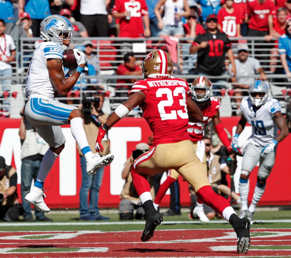
The Lions wore white over silver-ish for yesterday’s game against the 49ers. It’s the first time they’ve worn that uni combo since establishing their current uni set last year. In 2017, all of their white-jersey games featured blue pants. Lots of additional photos of yesterday’s game here.
In other news from around the league yesterday:
• Speaking of new uni combos, Washington went burgundy over white for the first time since 2012 (or 2013, if you count preseason games):
Two games, two sacks for @MattIoannidis. 💪#INDvsWAS | #HTTR pic.twitter.com/WtdbkYUWn7
— #HTTR (@Redskins) September 16, 2018
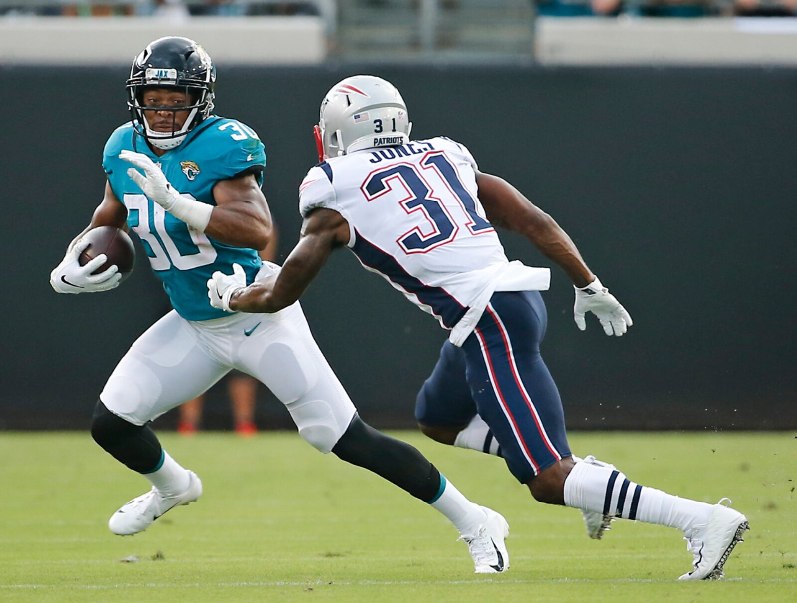
• The Jags wore their teal alternates against the Pats, and they looked great — or at least as great as this set can look, given the unfortunate lack of gold trim. Here’s hoping they redesignate the teal as their primary jersey next season (click to enlarge; lots of additional photos here):
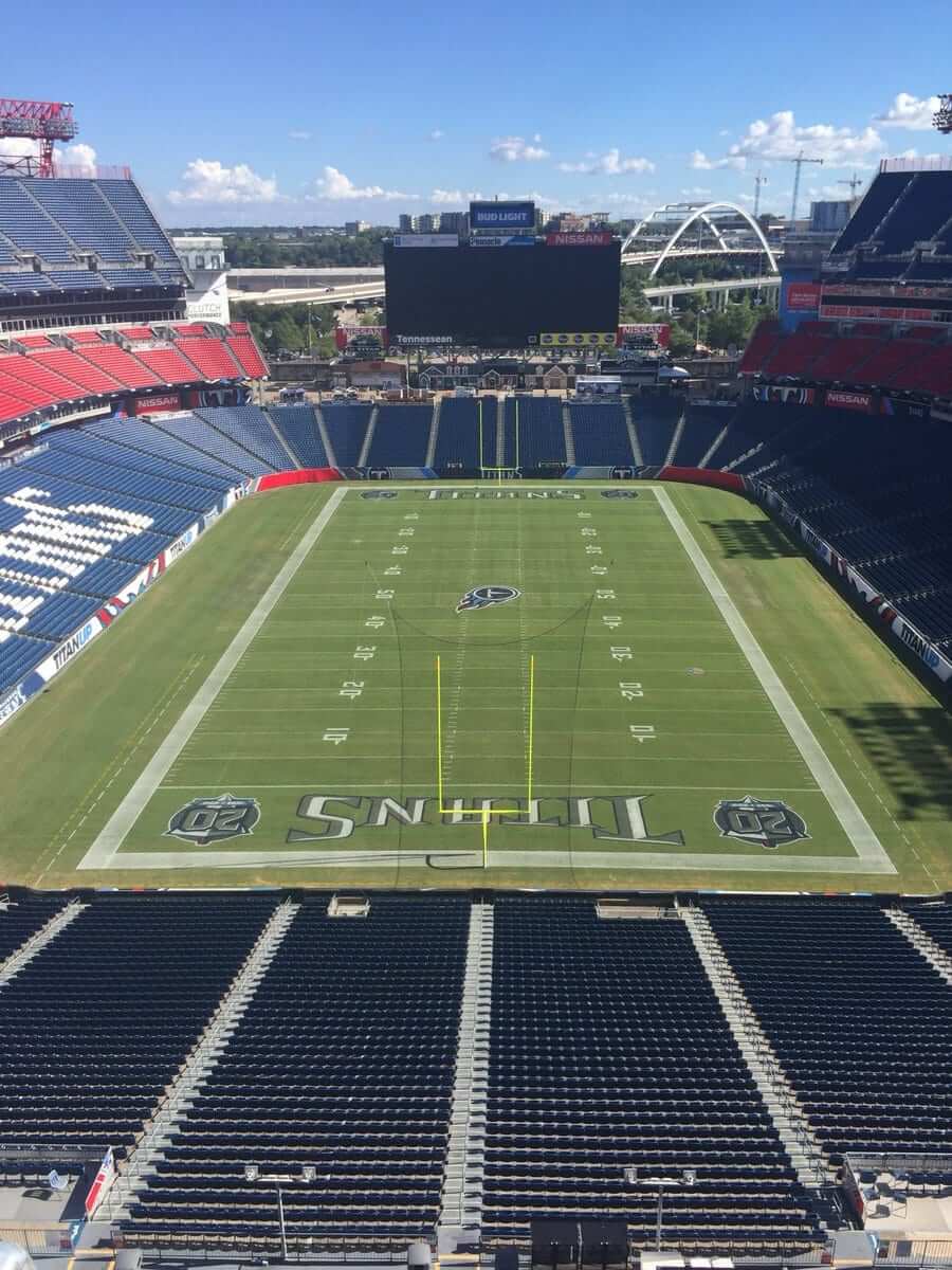
• Two field-design changes for the Titans, who had their home opener yesterday: They’ve added their 20th-anniversary logo to their end zones, and their yard markers are now rendered in the team’s jersey number font (click to enlarge):
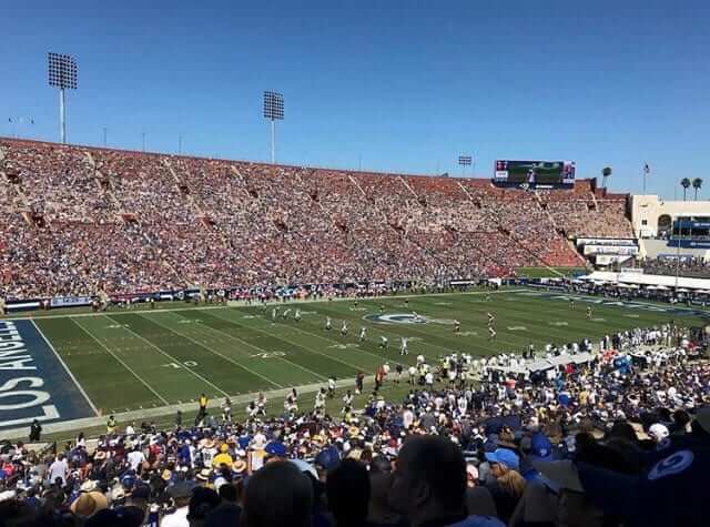
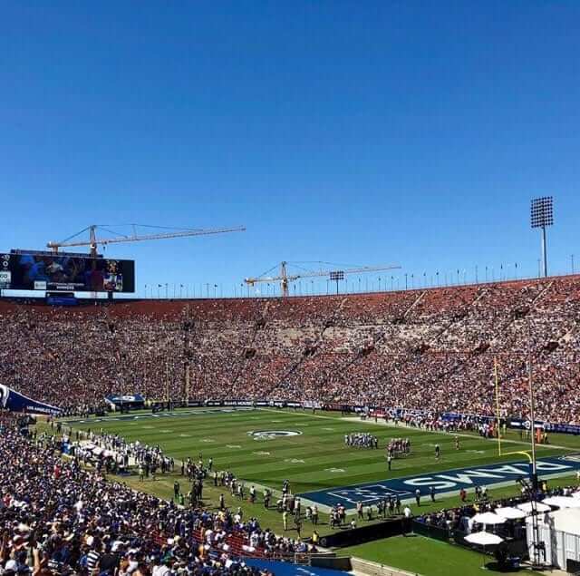
• Speaking of field design, the Rams had their home opener yesterday as well, and they showcased new end zone lettering (click to enlarge):
• For the second consecutive week, the Panthers went mono-white with black socks, instead of the usual blue. Perhaps this is their new standard protocol..?
• The Saints went mono-black against the Browns. Boooooo!
• Five teams wore white at home: the Rams, Titans, Bills, Bucs, and, of course, the Cowboys.
• Only a handful of players protested during the national anthem.
And that’s it. Pretty quiet week. The Seahawks play the Bears tonight in Chicago, which should be a fairly decent-looking game.
(My thanks to all contributors, including Gabe Cornwall, Bill Fenbers, Joe Friedli, Lee Wilds, and Jim Wyatt.)
Home theater: Before smart phones, before YouTube, before television, there were only two ways to see moving pictures: at the movie theater and via flipbooks, the latter of which are every bit as illuminating and charming today as they were generations ago.
Imagine if you were a kid in 1937 and the only way you’d seen Joe DiMaggio was in newspaper photos and the occasional newsreel at the neighborhood cinema. With these flipbooks, you could watch his swing over and over, pattern your style after his, and so on. So cool!
(Big thanks to longtime reader Jon Solomonson for this one.)
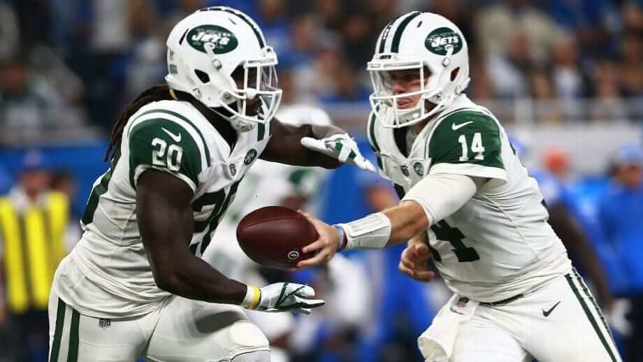
Contest reminder: Remember, I’m currently running a Jets-redesign contest. As usual, the best entries will be featured in one of my upcoming ESPN columns. Full details here.
The Ticker
By Jamie Rathjen

Baseball News: Part of the reason Astros 3B Alex Bregman wears No. 2 is that he was the second draft pick because the Diamondbacks passed on him. He previously said he also wears the number in honor of Derek Jeter (from Mike Chamernik). … Red Sox 2B Dustin Pedroia gave retiring Mets 3B David Wright a No. 5 from the Fenway Park scoreboard (from Kevin McLaughlin). … The Reds wore red away from home possibly for the first time since 2013 (from our own Alex Hider). … Reader Eric G. found this 1990 White Sox prototype that’s new to us. Jersey historian Bill Henderson said it looks legit to him.

Football News: Left over from Saturday: New metallic orange helmet for Bowling Green and new black helmet for Buffalo (from Blaise D’Sylva). … Akron’s backup long snapper Kyle Bauman was missing his NOB. “Also worth noting many members of the kicking squad had jerseys made from shiny mesh material (similar to the old NFL Reebok template),” says John Koziol. … Back in 1983, Auburn K Al Del Greco had the wrong color facemask.

Hockey News: The Islanders moved their pants maker’s mark to the side stripe. Here’s a better look (from Jason Greenberg). … Here’s some NHL/NBA uniform mashups (from Adam Gignac). … The Sharks now have three Karlssons in training camp — defenseman Erik, forward Melker, and center Linus — but they won’t wear initials with their NOBs. … Finland’s national team is to have a new logo and uniforms for their 90th anniversary next year. … The 2020 AHL All-Star Game was awarded to Ontario, Calif., and there’s already a logo (from @TheLAKnight). … The Kings wore new “LAK” jerseys for an intrasquad scrimmage. “Wonder if it might be a third jersey logo preview?” says Jack Wade. … If you’ve always wanted to own an EA Sports hockey jersey, here’s your chance (from Lucan Denfield).

Basketball News: Division II Alaska’s women’s team wore the white versions of 1985-86 throwbacks originally worn by the men’s team for a Senior Night photo shoot, suggesting those uniforms might appear at the end of the season (from Tony Robillard). … Also posted in hockey: here’s some NHL/NBA uniform mashups (from Adam Gignac).

Soccer News: Liga MX team Santos Laguna wore 35th anniversary shirts against Club León, but the referee made them change midway through the first half to create more contrast with León’s white/green/green kit. Santos changed to their black and green second shirt and at halftime also changed to black shorts and socks (from Lucan Denfield). … Elsewhere in Mexico, Monterrey (left) and Chivas wore shirts that were both predominately white on the back and were deemed not to clash (from Josh Hinton). … Also from Josh: Everton wore shirts with their advertiser’s charity initiative on the front yesterday. … Fulham wore this season’s second-choice kit for the first time this weekend, so they’ve now worn four kits in their first five Premier League games. … English top-tier women’s team Yeovil Town received their own solid green Nike kit this season; Yeovil’s men’s team wear green and white hooped shirts from a company called TAG. … The Europa League ball is now made by Japanese company Molten. The competition had used Adidas since it became the Europa League in 2009-10; before that, when it was the UEFA Cup, the ball was whatever the home team used. … Aston Villa’s jersey sales are way up, thanks in part to a deal with fashion designer Luke Roper (from Lucan Denfield).
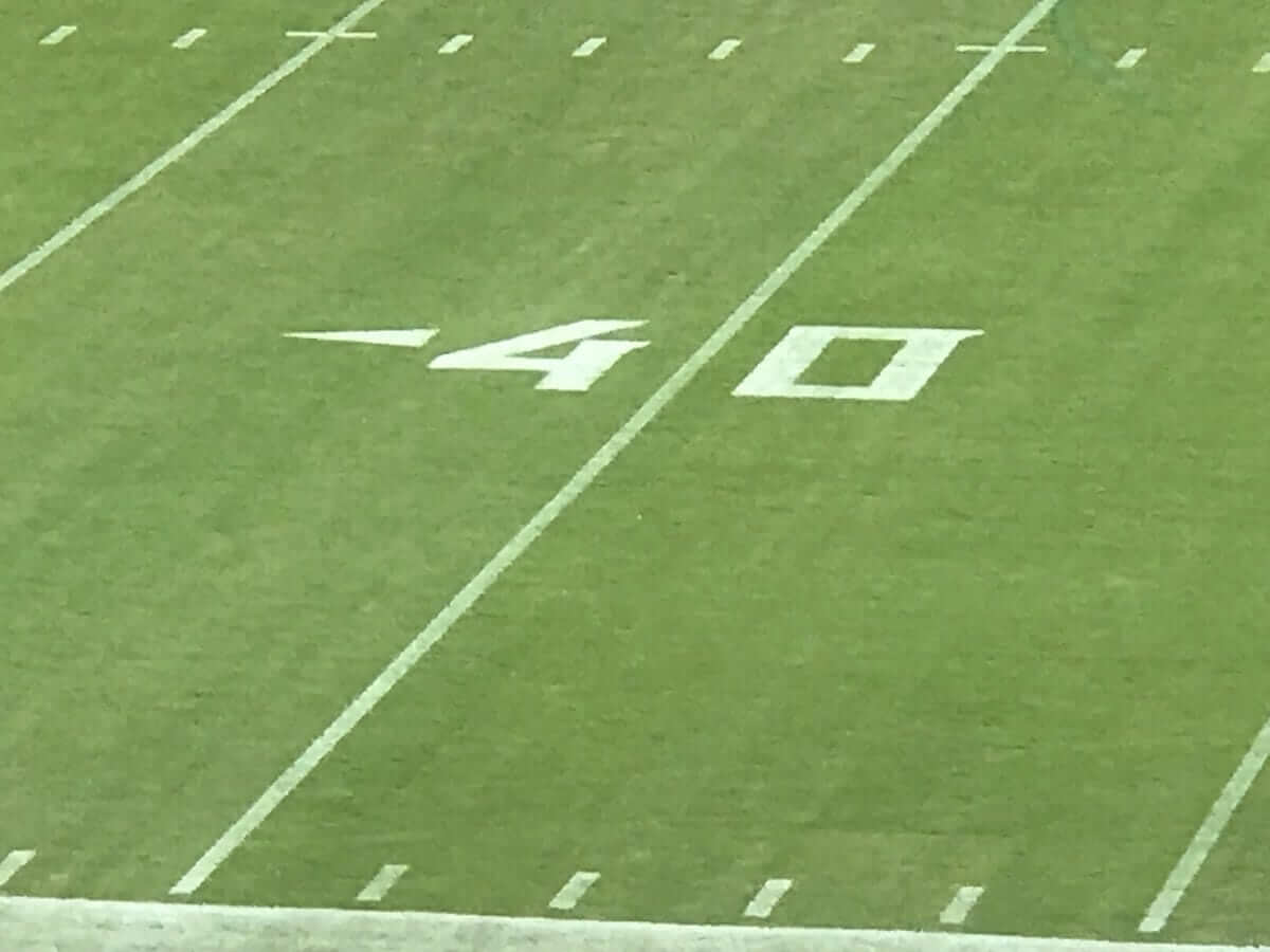
What does Nike have against a number 4 with the top closed into a triangle? Oregon, Titans, Jags, Arizona Wildcats… almost every recent design has had the open 4. It’s become regularly irregular.
Nike’s (2nd) motto….
“The pointier, the better” TM
Excellent point! Not to mention that those teams you mentioned have some of the worst number fonts in NCAA and NFL.
We all know why the Islanders have the smaller maker’s mark on the pants now on the side. It is not surprising. That is a Lou Lamoriello influence.
Yes, the submitter called it the “Lou effect” or something like that.
I’m pretty sure the Rams changed their midfield logo as well.
Used to be the NFL logo at the Coliseum so far.
Why is it that teams that use a helmet as midfield logo, or in the endzone, use a helmet and facemask from the early 90s? Can no one make a stencil of a modern helmet?
New York Giants wore blue over grey, as they wear their grey pants on the road.
I do like seeing the Giants in blue over white better than blue over grey.
Otherwise:
-Love the Redskins in burgundy over white.
-Jags teal jersey should be the primary dark.
-Good to see the Lions with white over silver again.
-Maybe not popular, but I do like the Browns in the white over brown.
You were batting a thousand until the Browns.
I hate the ‘Skins in white pants. Never. Never. oh, and Never!
Wrong.
Nope, Dumb Guy is right on this one.
Better still if they were old/mustard gold, and a darker shade of burgundy.
Didn’t the NFL have a rule that teams can wear only 3 different pants in a season (not including color rush)? Assuming the Redskins plan on wearing their gold pants at some point, and if they wear their throwback alternates, that’s 4 pairs.
I don’t believe there is actually any restriction on pants.
Which begs the question why the Browns don’t immediately change theirs.
Because NFL and Nike are all about the hype videos and nonsense associated with new uniform releases. Rather than teams actually looking good they just want something shocking to get people talking, and have new jerseys to sell every so often.
Maybe, but the NFL allows teams to change their pants in between uniform cycles; the Rams and Ravens have both done that. So did the Redskins, now that I think of it; the gold pants were part of a throwback uni and they just started using them with their regular unis without any fanfare.
So, I don’t buy this as a reason not to change the pants.
Those “LAK” jerseys seem to be specifically for the Kings’ Inter squad game.
They’ve got “Kings vs Kings” patches on one shoulder, and got auctioned off after the game.
To further that hypothesis, the word mark is Kings where Adidas should be, and that specific Tanner Pearson picture has him wearing his own jersey autographed by himself. Looks like a special one-off for charity indeed.
Here’s some NHL/NBA uniform mashups (from Adam Gignac).
The Capitals/Wizards mashup could work, but the mock-up shown has the logo up way too high. It helps that those two teams have the same color scheme.
The Red Wings/Pistons mashup doesn’t look too bad, in part because the Wings’ logo is kept in its actual colors.
All the other mock-ups are just crap. Especially the Panthers one based on the Miami Vice Heat unis.
Vikes at Packers kinda surprises me every year by what a good-looking game it is. Just about the best possible matchup in the NFL. And these are two teams with terrific throwback options, so unless they play on a Thursday night, it’s a guaranteed beautiful game.
The Vikings ruin it with those purple-topped socks.
If only they had another option (plain white?).
It used to be a thing of absolute beauty when the Vikings still had the best road uni in the NFL
link
Yeah, that was a great road uniform and awesome match up. I’d say Raiders vs Chiefs, was a top uniform match up with either team at home or away. The Colts in blue against the Saints in white with gold pants back in SBXLIV was also an great match up.
THIS was the best Vikings road uniform: link
I agree the tv number on the sleeves was better, though I do like the yellow trimmed numbers of the newer version.
I was happy to see detroit in silver pants… much better that the unitard look with the socks.
It’s a shame the Titans uni numbers aren’t as thick as the field numbers… would help the look… not much could help it, but it would be a start.
White over white is not officially a “unitard” – it must be color over same colors. i.e. Saints
I meant blue pants with blue socks.
link..0l5.4676.8182..8642…1.0..0.201.1213.10j2j1……0….1…….3..41.OVBissS5y88#imgrc=1VQ6LL_dIA5xqM:
I generally don’t consider the same color pants and socks to be a “unitard” look if the pants have stripes, which is the case for the Lions’ blue pants.
The Detroit set seems unfinished to me. The Lion logo is trimmed and accented in white, which is fine and looks good. But the stripes on the helmet and down the pant leg aren’t. For me, it would look a lot better and “pop” more if the gray (silver?) portions of the stripes were white as with the Lion logo itself. Seems like an obvious omission that would make the set look better.
This…and a blue facemask.
I don’t know as it was an omission, bur rather a step away from their old helmet stripes, which some people say was reminiscent of the Cowboys.
I left this comment on Saturday’s entry, in response to the Jets’ 3rd jersey unveiling, but the weekend crowd is a bit thin around these parts, so I wanted to post it again just to see what kind of response (if any) it generates:
At the risk of sounding overly dramatic, I think we might be on the cusp of a golden era of NHL unis. The last vestiges of the absurd Reebok Edge designs are almost gone, and virtually every uni change that has happened in the last ten years has been an improvement. (San Jose would be the one notable exception.)
At this point the only teams whose unis are genuinely bad are Ottawa (the one remaining absurd Edge design) and San Jose (boring with random orange highlights). The Devils’ latest change was a bit of a downgrade, but it’s still not bad per se – just kind of meh. And there have been so many upgrades over the last few years:
Carolina bringing back the black and the storm flag pattern.
Arizona reclaiming an identity instead of looking like a desert-ified version of the Red Wings.
Buffalo and Calgary removing the silly piping from their otherwise-nice jerseys.
Colorado bringing back the mountain stripes.
Dallas going green and (finally) putting an actual logo on their jerseys.
Florida moving to a more adult look.
Edmonton going orange (good move in my book).
Minnesota going green with a more vertically-balanced home jersey.
The Islanders finally having a 3rd jersey that isn’t ridiculous.
Philadelphia doing literally anything different from their Edge jerseys, which might have been the ugliest in league history.
Pittsburgh and Tampa Bay getting rid of the silly color panels that can only be seen from behind.
St. Louis ditching the apron strings.
Winnipeg adding a 3rd jersey that’s way outside the box for them but at the same time not ridiculous (a combination NHL teams often struggle with).
I don’t disagree with most of this. But there is one great big glaring problem with the current Adidas jerseys – those ridiculous collars. Terrible. Just terrible.
I actually think the Coyotes’ current home and road unis are more “inspired” by the Red Wings (with the contrasting sleeves) than their 2003-15 set, which I always felt reminded me of the 1930s Montreal Maroons.
I’ll agree on Buffalo, but Calgary’s unis are still way too busy and still have way too much black for my tastes. They really need to get rid of the flag patches.
Concur with Dallas. They went from dazzling star-pattern unis that looked great to the blandest uniforms since the plain white Maple Leafs jerseys of 1927-32. Their current set looks pretty great (aside from the Adizero collars, though I think only Boston, Detroit, Edmonton, New Jersey, Ottawa, and St. Louis actually got their collars “right” on both their home and road unis.)
I can see your point with the Coyotes. The main thing for me is that they added a new color (black) rather than just red and white. (I know they always had that “sand” color in their logo, but it was never very noticeable in the context of the whole uniform.)
Calgary needs to go back to their original uniforms. Using the current deeper red color with that design would be very nice.
Regarding he LA Kings….they have a new glove design for this year. See my tweets tagged to you from a few days ago.
The Detroit road uniforms against SF yesterday were beautiful. A great step towards a more traditional look for the Lions.
Now if they could just win a game.
Agree; I thought the white-over-grey looked really good.
New Independent League team. Milwaukee Milkmen.
link
Have to say I’m loving the teal look for the Jaguars. Not overly fussy, just nice and simple with clean lines. Big mistake not to designate the teal as the primary jersey though!
Agree on the Jags, no piping on the numbers gave it an old school look but with a modern color I.e. teal. Really looked good yesterday.
I was disappointed with the Jags’ unis when they were first announced but damn, they look great on the field.
What would the Jets 3rd jersey look like with their current logo on their primary jersey?
Seahawks going white over white is pretty uncommon for them, right? I feel like they almost always wear white over blue.
With this thing going on where teams make the yard numbers on the field match their jersey font, did Jacksonville use the number style from their old jersey set on the field Sunday or are the fonts similar enough to make it appear that way?
Those Wild/T-Wolves and Bruins/Celtics Jersey mashes are pretty good, all the other ones are various stages of bad. The Wings/Pistons is the most egregious.