[Editor’s Note: I’d originally hoped to run this article during Paul’s August sabbatical, but due to space limitations, it got bumped. I’m running it today. The review of the new Winnipeg Jets third sweater follows. Enjoy — PH]
By Phil Hecken, with Joseph Gerard
Follow @PhilHecken
Today we’ll check out a subject that I’m not sure we’ve ever covered on Uni Watch — the uniforms of Professional Wrestling (quite possibly because it’s not considered a “real” sport — but that’s not to say the competitors don’t have uniforms, as it were, and one can make a strong argument that, banned substances aside, the participants are most certainly in shape). So without further ado, allow me to introduce today’s guest author, Joseph Gerard, who’ll take us through the finer points of the unis or pro wrasslin’. Here’s Joseph:
The Uniforms of Professional Wrestling
By Joseph Gerard
Yes, professional wrestling is scripted with predetermined results, but that’s not to say that the wrestlers themselves aren’t athletes–aren’t cheerleaders and dancers athletes too? Besides, multiple mainstream sports outlets cover WWE now. One thing about professional wrestling, unlike other athletic events, is that wrestlers tend to wear unique ring attire as opposed to a standard uniform.
What I’m submitting here is the different types of ring attire that wrestlers wear, for those who don’t follow wrestling either by choice or, well…most people that don’t watch it don’t by choice. But its still an interesting tidbit.
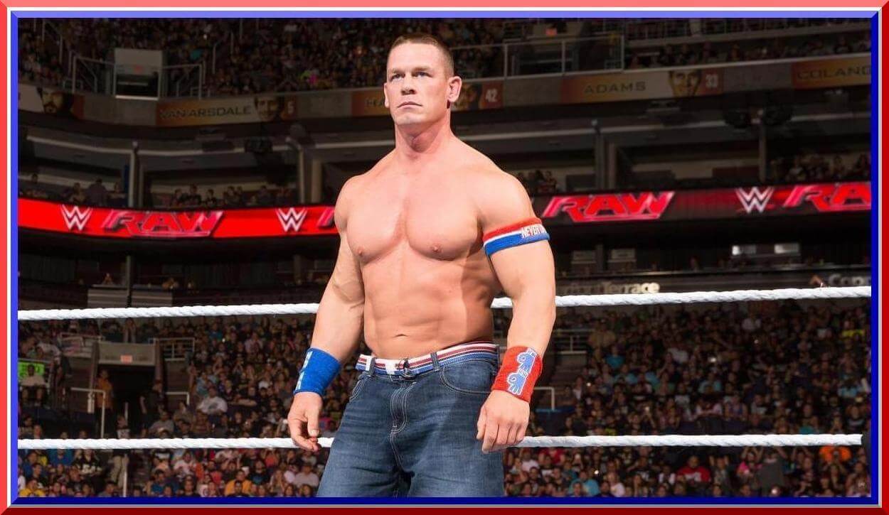
One thing I will mention is gear that is generally worn by every wrestler. That would be boots (or if you’re John Cena, Reebok Pumps), knee pads, and elbow pads. All wrestlers also have their wrists taped, though part of that was once done to hide razor blades when wrestlers would blade themselves–something that is now strongly discouraged due to the spread of blood-borne illnesses as a result of blading. I also won’t get too much into detail about women’s gear since there is only so much that can be mentioned on them, but there will be some tidbits. Finally, robes won’t get mentioned as they really aren’t a thing anymore due to merchandise sales on t-shirts and are nowadays associated with one wrestler and his daughter. That being said, here we go!
Perhaps the most common ring attire on a wrestler are traditional short trunks. Short trunks date back to the early days of the art, and were worn back when wrestling was seen as a legitimate sport. Vince McMahon, who has been big on muscular physiques for decades, reportedly prefers short trunks because “it shows off their legs”. A prime example of this would be his real-life son-in-law, Triple H: HHH would wear short trunks before he was in WWE, then wear full pants during his early WWE run as a Connecticut blueblood and his days with the first incarnation of D-Generation X before switching back to short trunks just as he assented to main-event status. While simple, it also helps the wrestlers have more flexibility moving around the ring.
Notable wrestlers with short trunks: pretty much 90% of the main event stars you see in any wrestling organization. It’s also the generic look with jobbers–the guys who consistently lose to make their opponents look better.
Singlet

By far the closest aesthetic to amateur wrestling are the singlet. Many wrestlers with amateur backgrounds wear singlets, while others like Andre the Giant wore singlets for back support. The singlet gives more of a “real” feel to wrestling. There are also variations of the singlet, including the single-strap that Andre wore, as well as the singlet cut like short trunks.
Notable wrestlers with singlets: Kurt Angle, The Big Show, Christopher Daniels.
Long tights

Another popular option. Like singlets, because they cover more they allow more customization, depending on the wrestler.
Notable wrestlers with long tights: Shawn Michaels, Edge, Seth Rollins.
A hybrid of the last two, it’s a style not seen as much anymore. But it’s still around on occasion. For obvious reasons, the style is occasionally worn by women, too.
Notable wrestlers with long tights and a singlet top: Bret Hart, The Undertaker, Molly Holly.
Thong

Ummm…yes. Some wrestlers will wear a thong as part of their ring attire. I’m not talking about what they wear UNDER their ring attire–the thong IS their ring attire. At least Yokozona (who is in the photo above) wore tights underneath his thong–and his gimmick was that of a sumo wrestler, so at least in his case a thong made sense. Then there is his real-life cousin Rikishi, who became VERY WELL KNOWN for wearing a thong–and the signature move that came with it.
Partially for sex appeal, women wrestlers have also worn thongs.
Notable wrestlers with thongs: Chyna, Lita (via her early 2000’s whale tail), ummm…the aforementioned Rikishi.
One-piece

Something worn by both men and women: the one-piece. It differs from the singlet due to the design. Usually worn by men due to the requirements of their gimmick or–in at least one case with convicted felon-turned-wrestler MVP–to cover up offensive tattoos.
Notable wrestlers with one-piece: Mark Henry, Goldust, The Fabulous Moolah.
Street clothes

Pretty self-explanatory here. Usually worn when it’s gimmick-related.
Notable wrestlers with street clothes: Dean Ambrose, the infamous Right to Censor faction, The Undertaker during his redneck biker phase.
Usually worn when the wrestler is portrayed as a “shoot-style” fighter, though WWE does have a notable exception.
Notable wrestlers: Brock Lesnar, Josh Woods, the aforementioned exception that calls himself John Cena.
“Gimmick-related attire”

Not really a specific term here, but some wrestlers wear attire that is a part of their gimmick but yet isn’t exactly street clothes or a one-piece. And yes, I did feature the Undertaker for a third time during his Satanic “Ministry of Darkness” phase, which just shows the longevity of his career.
Notable wrestlers: Roman Reigns, Bray Wyatt, Mick Foley in his various incarnations.
That’s really all I got for right now, but always interesting to see which wrestlers wear what. If nothing else, watch any wrestling program and take a look. WWE by far has the most options available (through USA Network and its streaming WWE Network) and is the most well-known. Other options include Impact Wrestling (formerly TNA) on Pop!, New Japan Pro-Wrestling on AXS-TV, Lucha Underground on El Rey, and my personal favorite, Ring of Honor Wrestling on various stations owned by ROH’s parent company Sinclair Broadcast Group. (Yes, THAT Sinclair.)
Wow. Thanks, Joseph. Who knew pro wrestling had so many different “uniforms” (other than those who watch it, of course)? Nice rundown. Readers — whether or not you feel that Pro Wrestling is a legitimate sport, what do you think?

Winnipeg Jets Unveil New Third
As expected last evening the Winnipeg Jets unveiled their new third sweater (with some quick views of the full uni seen in the hype video below). It’s pretty much exactly like what had already been leaked and which Paul mentioned yesterday.
So, it was a bit of a letdown to see the new jersey unveiled last night, since we basically knew exactly what it looked like yesterday. But anyway, here’s the hype video:
I have a few thoughts on the new uni, but I’ll save them for the last section. But here’s a hint: aside from that wordmark, I may be the only one who likes them (at least based on the limited reactions I saw on social media).
Let’s take a closer look at the few photos that were released. Ignoring the advertisement in the upper left, here’s a clean peek at the jersey:

As you can see, the jersey uses the current accent blue of the home unis as the base color of the new jersey (which as we’ll see below is called “Aviator Blue”). The script “Jets” wordmark is new, and is obviously different than the current and beautiful roundel the team uses on their home and road unis. There’s a thick white stripe bordered by two narrow stripes on the sleeves and base of the jersey. The collar has the phrase We Are True North embroidered on the inside.
Let’s see how the Jets/Adidas set it up:

Hmmm. Not much information there. At least we learned the lighter blue is called “aviator” blue and the stripe is an homage to the original Jets (that jersey was worn 1990-1996). The “We Are True North” is a “call back to [their] fans.” OK then — but the fans do yell “TRUE NORTH” during games, so this is their “answer”.

The team released a couple more photos. While we see plenty of the full uni in the hype video, we don’t really get a good look in the promo pics. The breezers are navy blue, and the socks are “aviator” blue with a similar stripe (dark blue/white/dark blue) pattern as the jersey.

Here’s a short video explaining the new jersey’s design:
You’ll note the designer talked about the Jets wordmark. In their promo materials, the Jets were kind enough to give a logo history, from the original Jets (who moved to Phoenix in 1996 and became the Coyotes) to the current team. Pretty neat:

Since the team “returned” to Winnipeg in 2011, I’ve never liked their wordmark (but LOVE LOVE LOVE the roundel on the current sweater), and I’m not sure this one is any improvement. I wish they would have either gone retro (that 1974 logo would have been perfect) or used the current roundel. The Jets script (to me) almost ruins what is otherwise a really nice alternate sweater. I like the use of the lighter blue and it’s simple and clean. Even with the “Jets” wordmark, this one is solid.
The NHL had been going heavy on throwbacks for third jerseys (or fauxbacks), but this is a pretty sweet new design that definitely give hints of the former Jets jersey, but doesn’t overdo it (though they could have gone with a logo instead of a workmark). All in all, though, and obviously it will need to be seen on the ice, I like what I see.
Finally, if you really want, the corporate-speak (which I didn’t read until I’d finished this review):
Inspired by the simplicity of the 1990-96 Winnipeg Jets uniforms, the Winnipeg Jets Aviator jersey combines a classic look and feel, with modern adizero innovation, design and craftsmanship. The new tonal blue colour scheme takes a fresh approach by reversing the team’s current colour palette, now featuring aviator blue as its base. The team’s official new wordmark includes a Jets script that draws from a long line of team wordmarks that have incorporated Jets shapes and motion. Emblazoned inside the neckline are the words “We Are True North.”, a call back to our fans who passionately yell “True North” each game.
The team will wear these alternates 14 times: October 14, October 20, October 24, November 11, November 16, November 27, December 7, December 11, December 29, January 11, February 2, February 14, March 16, and March 25.
Your thoughts?
NEW Uniform Design “Contest”

Got a note from an old friend, Catherine Ryan, who readers may remember for her stint as the “5 & 1” college football uni matchup lady a few years back. She’s a Villanova grad, and wanted to invite readers to submit designs for a Villanova “third” jersey. I’ll let Catherine explain:
Hello, Uni Watch readers! Some of you may remember me from my stint as the resident 5-and-1 columnist a few years back. Well, I’m here again to propose a fun opportunity to create some unique uniform concepts!
I am a graduate of Villanova University and one of the editors of www.VUhoops.com the leading Villanova basketball blog on the interwebs. As you may have heard, we have won two of the last three National Championships and, as a result, are enjoying a great deal of attention concerning, among other things, our uniforms!
Recently, we’ve been wearing our 1985 white throwbacks as our home uniforms, with the modern blue unis on the road. Villanova rarely takes risks beyond it’s navy/white palette but has occasionally dabbled in sweat backs, bizarrely tiny wordmarks, and this. Also, whatever these are. As you can see, many of these “risks” have completely missed the mark. However, rumors are abound about Nike creating a third alternate jersey for the program this year.
So, I thought I would offer the Uni Watch readers a chance to submit their own ideas for a third alternate uniform for the Villanova Wildcats men’s basketball team. I will post all the submissions on VUhoops.com. We have an engaging and active community over there that would love to discuss all of your ideas!
If you’re interested, just send me your ideas at Catherine.M.Ryan10@gmail.com by September 28, 2018. Feel free to submit as many proposals as you’d like. Be creative! Or be traditional! Or be completely reckless! Take a shot at redesigning the logo if you want!
College basketball is right around and the corner and we’d love to have you all help us kick off our 2018 coverage!
Thanks, Catherine!
OK, readers — you know what do to. Just make sure to send all your submissions to Catherine (address listed above) and not me or Uni Watching. Good luck to everyone who submits!
Contest reminder: Paul here, reminding you that I’m currently running a Jets-redesign contest. As usual, the best entries will be featured in one of my upcoming ESPN columns. Full details here.
The Ticker
By Anthony Emerson

Baseball News: Why did Mickey Mantle once say he wished he had saved his underwear, of all things, from the 1960s? Forbes found out, in a great piece that dives deeper into the market value of Mantle unis on the auction block (thanks, Phil). … The Astros and D-Backs both wore Hispanic Heritage jerseys last night in Houston (from Ignacio Salazar). … Also posted in the NFL section: Rockies players wore NFL jerseys during their flight to California. I actually counted the visible jerseys: 15 Broncos jerseys, three Niners, three Panthers, two Browns, two Pats, two Giants, two Cardinals, two Seahawks, two Lions, one Cowboys, one Steelers, one Raiders, one Falcons (from Rob Montoya).

NFL/CFL News: The Titans are using their uni number font on yardmarkers at Nissan Stadium (from @TitansUni). … Christian M. Zummer found this awesome c. 1996 NFL poster, featuring the helmet designs of every team in the league that year. … Cross-posted from the MLB section: Rockies players wore NFL jerseys during their flight to California. I actually counted the visible jerseys: 15 Broncos jerseys, three Niners, three Panthers, two Browns, two Pats, two Giants, two Cardinals, two Seahawks, two Lions, one Cowboys, one Steelers, one Raiders, one Falcons (from Rob Montoya).
College/High School Football News: A group of Iowa fans have turned an old combine harvester into a tailgate attraction (from Kary Klismet). … Troy has new away jerseys, which they are debuting today, while going “chrome”-white-maroon (from Thomas J. Gleaton). … Temple will don alternate helmets today (from Blake Fox). … Southern Miss has added a memorial decal for Alex Wilcox (thanks, Phil). … Houston will go red-white-white today (from Ignacio Salazar). … Mizzou is going all white tonight (from Connor Cape). … Fresno State is going red-white-red (from @DanielinFresno). … Purdue is debuting new salute to service helmets today (from Blaise D’Sylva). … Youngstown State is going red-red-black against Valpo (from Robert Hayes). … The rest of these are all from Phil: Florida is going orange-orange-white. … Ole Miss will go navy-navy-white today (thanks again, Phil). … Northwestern is going with purple lids today. … Washington is going gold-white-purple today (thanks, Phil). … North Hardin (KY) High has added “954” memorial decals to their helmets, the badge number of fallen Kentucky State Trooper and North Hardin alum Cameron Ponder. The team also signed a special “954” helmet and presented it to Trooper Ponder’s father (from Josh Claywell). … Kent State is going white/white/blue against Penn State today (from Noah Kastroll).

Hockey News: The Ducks are going to have their (awesome) 25th anniversary logo on their helmets this season (from Tommy Cubillas). … While the Habs have changed the Bell Centre’s center ice from double logos to one large logo, they’ve retained the double logos at their practice facility (from Moe Khan). … The Huntsville Havoc of the SPHL have revealed their new alternate sweaters (thanks, Phil). … Princeton head coach Ron Fogarty had every player sign the 2018 ECAC Championship banner (from @OlegKvasha).

NBA News: The Warriors’ new San Francisco arena has topped out (thanks, Brinke).
.

College Hoops News: Indiana State alum Drew Gentry tried to place the star in his school’s logo closer to its actual location in the state of Indiana, in the city of Terre Haute. The star in the actual logo is closer to Bloomington, and IU. … UNI has a new court (from Aaron Wigg).

Soccer News: Hartlepool United has suspended their kit deal with the manufacturer BLK after the company failed to provide the club with kits. Hartlepool are the second English side to not receive their kits this season after League Two’s Forest Green Rovers (from Josh Hinton). … The next issue of the Dutch magazine Staantribune will rank the 25 best kits in football history (from @holdwig). … Scottish side Celtic announced a four-year contract extension for forward Leigh Griffith with an odd jersey (from Ed Żelaski). … A youth soccer team in Monroe, WI seems to have poached the Toronto FC crest (from CB Mallow). … Nike may be releasing a special Inter Milan jersey to celebrate their 20 year partnership with the Italian club (from Josh Hinton).

Grab Bag: US Open champ Naomi Osaka is close to signing an historic deal with Adidas (from Blake Fox). … Makers Mark whiskey is releasing a special bottle in honor of Justify’s Triple Crown, designed like jockey Mike Smith’s silks (from Josh Hinton). … Long Beach State is moving away from the “49er” mascot (from Chris Cruz). … A 12-toed Indian heptathlete will get custom shoes from Adidas (WaPo Link) (from Tom Turner).
The two things that strike me about the Jets’ corporate speak (I’d say amaze me, but I’m sadly not amazed at all):
– they’re inspired by the “1990-96 Winnipeg Jets uniforms”, which means they’re outright admitting that they were inspired by the uniforms of another NHL team. Can’t wait to hear about how the Cubs incorporate red in their next third jersey because they so admire how fetching the Cards look in it
– the neckline text that’s a callback to the fans who passionately yell “True North” every game. Of course, they yell that during O Canada, which is beyond ignorant but apparently worth rewarding
More like if the Brewers announce a third with piping reminiscent of the Milwaukee Braves.
Technically, the Brewers are named after other teams that had that name, including the franchise currently operating as the Baltimore Orioles. And the Orioles took their name from past franchises, including the current New York Yankees.
Or–and bear with me, this is REALLY crazy–if the New York Mets had an interlocking orange “NY” on their caps because that’s what the New York Giants had.
I don’t see a problem with the fans shouting “True North” during the anthem. That’s their way of honoring the anthem. The fact that it doesn’t align with your particular cultural sensibilities doesn’t make it ignorant.
Sean,
I just have to say……you are a real idiot.
That Winnipeg Jets wordmark looks a whole lot like the 1970s Johnstown Jets logo of the Eastern Hockey League. The Jets were the basis of the Johnstown Chiefs in Slap Shot.
Looking at that 1996 NFL helmet poster, by my count 17 teams out of 30 (at the time) have changed their helmet designs since then, at least to a minor degree…
If you count some minor changes to logos (i.e. Vikings, Saints, Cardinals), I am thinking it is more than 17.
I did not include the Saints, did they change their logo at all since 96?
Others:
Cards
Vikings
Panthers
Jags
Oilers/Titans
Ravens
Bucs
Bills
Dolphins
Chargers
Falcons
Giants
Jets
Broncos
Seahawks
Rams
Lions
Re: Saints. They added the black and gold outline around the white trim on the helmet logo.
I did count the Colts too. Not technically for a “helmet” change, but they switched from the blue mask to grey.
Depends on what you mean by “change their logo”. Have the Rams changed their logo? Have their horns changed? I’m guessing their logo is the same, except for color changes.
I was careful to use “helmet design” instead of “logo change” in order include color changes like that done by the Rams, Chargers and Bills.
Good call on the Saints, I had simply forgotten about the one. As well as the Pats changing from royal blue to navy.
As for facemask color, yeah, since this Uni Watch, we’ll count even the smallest detail.
So this puts us at what, 19 out of 30. Then when you add in the expansion Browns and Texans, it means the NFL has 21 new or modified helmet designs in roughly 20 years.
The Patriots darkened the blue in the logo. Does that count? If so the answer is 22. If not 21 teams changed helmets.
The shape of the Fleur de Lei on the saints is different. It’s not hard to miss once you see it.
Yeah, you’re right on both counts, good catch especially on the Patriots.
Randy ‘Macho Man’ Savage when he first came to the WWF with his large sequined robes and pastel trunks with the 3 stars across the front was the coolest ‘heel’ to pull for in the mid-1980’s. I actually wore a pink ‘Macho Man’ t-shirt to school, which for a middle school kid was taboo because 1. it was pink and 2. he was a villain. Oh the memories.
Also, Macho Man had the tassels around the footwear, which has been sported by a few wrestlers.
Wrestlers who pay homage to that style today include Matt and Nick Jackson of the Young Bucks:
link
Great wrestling feature. I would add that the classic short trunks are nowhere near as prevalent as they used to be. For example, the “classic era” staple of Wrestlemania 3 had 34 wrestlers (not counting managers) in the ring, of which 18 had short trunks. The most recent Wrestlemania had about 40 take the ring (Including women wrestlers) with only 10 wearing short trunks.
Fun entry today. Great effort. Seems like a missed opp to mention folks like Stone Cold Steve Austin with the jorts in the street clothes category.
Or aadding a “formal wear” category with Miss Elizabeth, Million Dollar Man Ted Dibiasi, Mr. Fuji, etc.
Also missing a “team” category that includes coordinated uniforms in pairs for the likes of Road Warriors, DX, NWO, et al.
Fun stuff. That Rikishi mention cracks me up.
Did Austin wrestle in the Jorts though? He usually wore trunks in official matches. AJ Styles is a big omission in the tights category. KO (Kevin Owens) is an interesting case, with the shoot fighting/street clothes hybrid (unless someone else has a better description).
Quick fix: Hartlepool United actually play in the National League, which is the fifth tier of English football. Forest Green Rovers are one step up on the pyramid, in League Two (fourth tier).
Sorry, fixed. The article itself has the same error, which is mind-blowing.
Seen a lot of people saying Ole Miss is going Navy-Navy-White but the pants they show in the promo are gray.
Mississippi is definitely navy-navy-grey.
So long as LBSU’s baseball team keeps the Dirtbags name …
The Staantribune cover reminded me of (because it mentions) former Celtic player Jan Vennegoor of Hesselink. He wore his entire last name as his NOB:
link
A missing element of professional wrestler uniforms is masks. Would have made a great addition to “Gimmick-related attire.”
I’m with the pissed-off Long Beach alumni here. Postmodern hissy fits by spoiled people without any real interest in sport, history, tradition or honor claim another victim. Sad.
I’d like the Jets uni much better if they had used a number font that was similar to the word mark on the front. Big, curvy, retro-ish, etc.
I like the colours but it feels like it’s lacking a couple of ingredients. It feels incomplete to me.
I would like the sweater more if Winnipeg was written in the tail of the “s” as in the first leaked photo I saw. Also, shoulder patches of some sort would have been a nice addition to a very bland jersey.
I like this uniform. It has a classic, grassroots feel. It is the type of uniform you would expect to see when you walk into those grand old arenas in small towns in the Western Canadian Prairies with the arching wooden roof. Those type of rinks where you can still see your breath when you are on the ice.
Troy wears cardinal. Not maroon. Stop that shit. Compare what Miss St wears to what Troy has…
I’m not up to speed on the official definitions of colors, but I can tell you that what Troy wears is a lot closer to maroon than it is to the color of an actual cardinal.
Great post on wrestling. Matt Riddle would also be a great example of former amateur wrestler/former MMA fighter who has adopted trunks into his attire.
At the risk of sounding overly dramatic, I think we might be on the cusp of a golden era of NHL unis. The last vestiges of the absurd Reebok Edge designs are almost gone, and virtually every uni change that has happened in the last ten years has been an improvement. (San Jose would be the one notable exception.)
At this point the only teams whose unis are genuinely bad are Ottawa (the one remaining absurd Edge design) and San Jose (boring with random orange highlights). The Devils’ latest change was a bit of a downgrade, but it’s still not bad per se – just kind of meh. And there have been so many upgrades over the last few years:
Carolina bringing back the black and the storm flag pattern.
Arizona reclaiming an identity instead of looking like a desert-ified version of the Red Wings.
Buffalo and Calgary removing the silly piping from their otherwise-nice jerseys.
Colorado bringing back the mountain stripes.
Dallas going green and (finally) putting an actual logo on their jerseys.
Florida moving to a more adult look.
Edmonton going orange (good move in my book).
Minnesota going green with a more vertically-balanced home jersey.
The Islanders finally having a 3rd jersey that isn’t ridiculous.
Philadelphia doing literally anything different from their Edge jerseys, which might have been the ugliest in league history.
St. Louis ditching the apron strings.
Winnipeg adding a 3rd jersey that’s way outside the box for them but at the same time not ridiculous (a combination NHL teams often struggle with).
I pointed this out the last time the subject came up, but the reason why CSULB teams have been called the 49ers is because the school was established in 1949. The California Gold Rush of the post Mexican War era was several hundred miles from Long Beach which wasn’t established until nearly 50 years later.
As a CSULB alum, I’ve always felt that it was a lazy nickname. Change the official nickname to Dirtbags and be done with it.
When the Warriors move to their SF Arena, will they return to being called the San Francisco Warriors (making their “The City” moniker relevant again)?
I always thought Catherine was super hot!
Not really sure this is the best forum for THOSE type of aesthetics… not that she wasn’t lovely.
Finally a pro wrestling entry? Yes! Yes! Yes! Yes!
The circa 1996 NFL poster is 1996. The Ravens 1st season was 1996, and it was the last season of the Oilers in Houston.