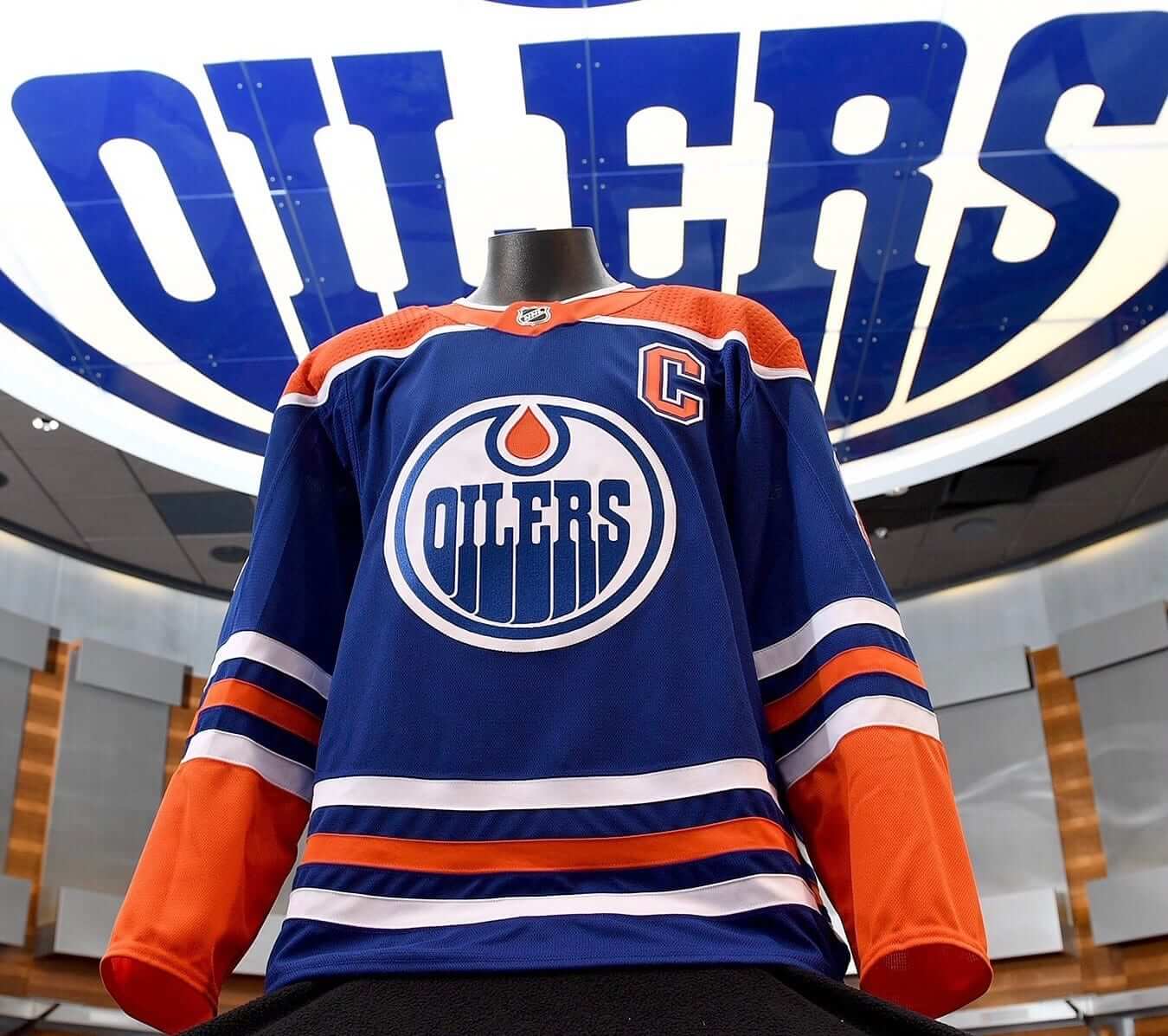
For all photos in this section, click to enlarge
Don’t look now, but the NHL preseason starts in only 10 days, and the regular season starts in four weeks, so we’re starting to see more uniform releases. The latest one came yesterday from the Oilers, who announced that they’ll be marking their 40th anniversary by reviving their blue uniform as a throwback. You can see the front of the jersey above, and here’s how it looks from the back:
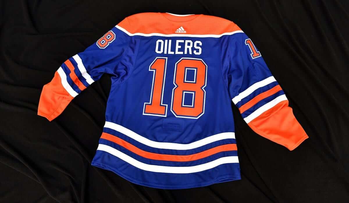
As is so often the case these days, they didn’t bother to show the entire uniform — just the jersey. Gee, I wonder why.
This design will be worn four times: Nov. 29 (against the Kings), Dec. 9 (Flames), Dec. 31 (Jets), and March 7 (Canucks).
In addition, the Oilers unveiled a 40th-anniversary patch, which will be worn on the shoulder of all three of the team’s jerseys. It’s a busy design, featuring the franchise’s five Stanley Cups and six retired numbers, along with an insane amount of outlining and shadowing, all crammed into a small patch:
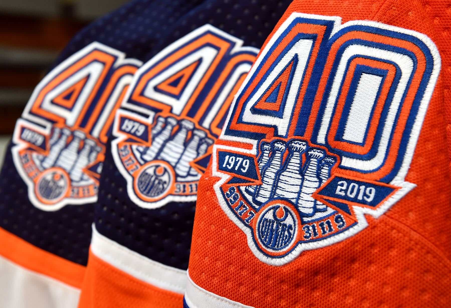
The retired numbers are an interesting touch. Have we ever seen an anniversary patch with that element before?
Also: Take a close look at the “ribbon” that has “1979,” “2019,” and the retired numbers. The way it folds, it sort of implies that the ribbon is blue on one side and orange on the other. But if that was the case, then the portions of the ribbon with the two years and the retired numbers should all be the same color, because those elements all appear on the same side of the ribbon. Yet that’s not the case.
Speaking of the NHL, in case you missed it over the weekend, the Islanders’ new alternate jersey leaked:
PSA: I interrupt this College Football Saturday with the leaked #Isles third jersey. Anon source says this is the legit design. pic.twitter.com/5LIgrdMK7C
— James Trotz (@TwoTurtleDuffs) September 2, 2018
SportsLogos.net has confirmed that the leaked design is legit.
And in yet another piece of NHL news, the Rangers announced the date when they’ll be retiring former captain Vic Hadfield’s No. 11 on Dec. 2. (Update: Reader/commenter Rob S. points out that the Rangers had already retired this number for Mark Messier. This is the second time they’ve retired a number for two different players, the other being No. 9 for Andy Bathgate and Adam Graves.)
ESPN reminder: In case you missed it yesterday, my annual NFL season preview column is available now over on ESPN. Enjoy.
Click to enlarge
Collector’s Corner
By Brinke Guthrie
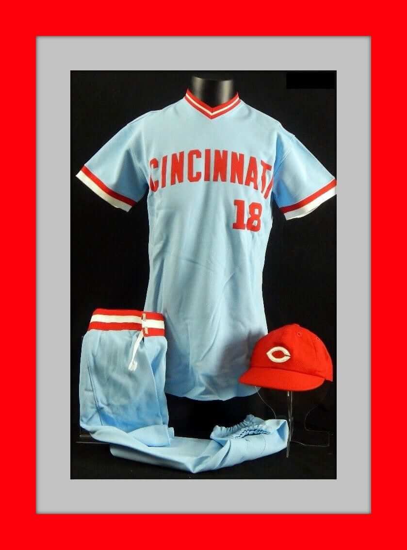
Leading off this week with an interesting Cincinnati Reds uniform set. I’m just gonna quote the eBay seller: “Near complete uniform with jersey, pants and hat. After the Reds’ 1978 Tour of Japan, the Mizuno corporation tried to get the Reds to switch and use Mizuno products. The uniform is unused and the jersey has no number on the back. The uniform comes from the Bernie Stowe collection. Bernie Stowe worked for the Cincinnati Reds from 1968 – 2013 and was the senior clubhouse manager.”
Now for the rest of this week’s picks:
• This 1960s 11″ by 17″ Coke promo poster emphatically states, “Look for Y.A. Tittle and all the NFL Stars Under Coca-Cola Caps!”
• Nice 1970s football graphics on this Avon “First Down” soap-on-a-rope.
• This 1970s Houston Astros golf shirt was offered in yellow, from Goodman’s of Los Angeles.
• This 1970s Zippo lighter with the NFL shield has never been removed from its box. “It Works or We Fix It Free.”
• Aqua Velva was the sponsor of this 1970s NFL booklet, Behind the Scenes of Pro Football. It offered the “inside story of the nation’s top pro sport” and included “insider comments.”
• Going back a few years, this Milwaukee Braves felt “mini pennant flag” (though it resembles neither of those things) was sponsored by Bazooka and Blony. Blony was another brand owned by Topps.
• Bill Glass, who played ten seasons in the NFL with the Browns and Lions, was the original owner of this vintage NFL Alumni garment bag.
• The Royals have a classic look, we’d all agree. It’s gone largely unchanged through the franchise history save for that rather dismal and distressing BFBS period. This is their shiny 1970s dugout jacket, made by Felco.
• If you were a Brewers Booster in the 1970s, this pennant may have hung proudly in your bedroom. (Anyone know what that “graf/s” term was about? A search proved inconclusive.)
• Check out this 1960s NFL “Go With The Pros” helmet kit for the “N.F.L. West.”
• And from reader Will Scheibler, check out this 1972 Hamilton Tiger Cats Grey Cup lunchbox.
Seen an item on eBay that would be good for Collector’s Corner? Send any submissions here.
Ticker intern reminder: In case you missed it on Tuesday, I’m currently in the market for a new Ticker intern. The position would require being on Ticker duty on Thursdays and creating the Tickers that appear on Fridays.
Full details are available here.
StripeRite update: Customers are receiving their new StripeRite socks, and the response so far has been very positive. Check it out:
The new footwear arrived just in time for the start of the season. @AmericanTrench @UniWatch pic.twitter.com/i7bkqFOEyR
— David Stephens (@cheezbleeder) September 4, 2018
Thanks @AmericanTrench & @UniWatch the socks look great! pic.twitter.com/qj9SM9vwiq
— Alex Allen (@aallen65) September 5, 2018
I'm all ready for the #Packers regular season, courtesy of @UniWatch. pic.twitter.com/Nz2r7Qhdfw
— Scott Hurley (@WLUK_SH) September 5, 2018
Want to get in on the footwear fun? You can order your own StripeRites through our friends at American Trench.
The Ticker
By Alex Hider

Baseball News: Blue Jays P Marcus Stroman didn’t play last night, but he was wearing the wrong cap in the dugout (from Jeff Peters). … Mets Police poobah Shannon Shark has come up with a plausible theory of how some new merch releases may indicate that MLB is planning a series of throwbacks for baseball’s sesquicentennial in 2019. … The Red Sox recently called up 2B Brandon Phillips. He’ll wear No. 0, as his preferred No. 4 has been retired for Joe Cronin (from our own Anthony Emerson). … The Nationals made 2018 All-Star Game rings and gave them out to season ticket holders (from Mike Rosenberg). … A Brewers fan was wearing a Mr. 3000-inspired Rex Pennebaker No. 31 jersey at Miller Park last night (from @phoenixfire8282). … This slideshow ranks every MLB team’s uniform (from Phil). … There was a blue-on-blue matchup Monday between the Binghamton Rumble Ponies and the Portland Sea Dogs of the Eastern League. … There was a Seinfeld moment in the Pirates’ dugout last night.

NFL News: The Cardinals’ stadium has a new corporate name. At least now it won’t sound like they play at a college field (thanks to all who shared). … Tom Brady has been wearing a new helmet this preseason, but he was wearing his old helmet model during practice yesterday (from Joe Giza). … Speaking of Brady’s helmet, Joey Ellis points out that Brady wore a different helmet model once before — in 2012 when the Pats wore throwback uniforms. … Workers at the Eagles’ stadium are preparing a Super Bowl banner, which will be unveiled Thursday (from Moe Khan). … Speaking of the Eagles, a couple of Philly mix-ups: Dunkin’ Donuts restaurants in Boston were supposed to give out Pats cups this week for the start of football season, but someone accidentally shipped the restaurants cups honoring the World Champion Iggles. Also, a Pennsylvania Costco was selling a cap with an Eagles logo and a Texans wordmark (from Christopher Hickey). … It took one hell of a photoshop job to turn Luke McCown’s Cleveland Browns uniform into a Bucs uniform for his 2005 football card (from Michael Trubinsky).
College Football News: Michigan has been wearing Jordan uniforms for over a year, but coach Jim Harbaugh still hasn’t replaced his Nike long-sleeved shirt. He simply put a Jordan patch over the Nike logo (from Phil and Hunter). … Florida State will sport a more traditional look this weekend (from @broc1984). … Kentucky has added a helmet decal to honor two Wildcats currently battling cancer (from Josh Hinton). … Also from Josh: Here’s what the college football imperialism map looks like after one week of games. The thought goes that teams acquire other teams’ pre-determined “territory” as the season goes on. … This piece looks at what some teams in the MEAC will be wearing this season (from Ron Peterson, Jr.).

Basketball News: It’s probably an understatement to say that NBA players are excited to have more footwear freedom this upcoming season (from Mike Chamernik). … A mayoral candidate for the town of Leitchfield, Ky., is playing both sides of the Kentucky/Louisville rivalry (from Josh Hinton).

Soccer News: Tons of stuff from soccer expert Josh Hinton: No photo yet, Louisville City FC of the USL will wear pink uniforms for cancer awareness on Oct. 9. … Here’s a review of all the Bundesliga kits for 2018-19. … Atlético Madrid’s third uniforms have leaked (also from our own Jamie Rathjen). … A new UEFA rule requires all jerseys that are striped or patterned on the front to carry that same pattern on the back — of course, with solid space for numbers (also from Moe Khan). … Adidas will no longer make Bosnia and Herzegovina’s jerseys. … Italy’s Serie A will now allow teams to carry a sleeve ad. … Fulham of the EPL wore their away kits from 2017-18 Saturday against Brighton on Saturday (thanks again Josh). … Gamers playing for Team USA in the Overwatch World Cup — a video game tournament — will wear soccer-inspired jerseys during gameplay (from Redleg Runner).

Grab Bag: Reader Michael Goldberg found some spiffy old pennants at an antique store over the weekend. … Poland’s Volleyball league has a new logo and abbreviation: PLS (from Jeremy Brahm). … More from Jeremy: Toray Arrows, a Japanese women’s team, has new uniforms. … Also, Jeremy spotted this photo of a curling cake, fit for Paul or Phil. … Repost: Gamers playing for Team USA in the Overwatch World Cup will wear soccer-inspired jerseys during gameplay (from Redleg Runner).
Miami MLS announced named and crest:
link
Digging their crest. Fairly certain they’d be the first major, top level US pro team to have pink as one of their team colors, no? Considering it is Miami, and it will probably be just their accent color, I like it.
I don’t like it. The colors are fine, if not boring, but that crest.
Lee
What a cultural botching their name is.
To answer Brooke’s question about the Brewers Booster pennant, Graf’s was a regional brand of soda in Milwaukee and Wisconsin. Grandpa Graf, an old German, was its mascot.
Indeed. Arguably not as good as Jolly Good soda…
Apparently graf/s was a soda company in Milwaukee
link
link
Atlético Madrid’s third kit was actually released. It’s not a leak.
Also, let’s give credit (because Footy Headlines didn’t) to the guy whose tweet about the new UEFA shirt rules they’re likely referring to: link
If there’s one thing that I can’t stand about Footy Headlines, it’s that they always watermark their exclusive images but never give credit to others. And the poor grammar on the site. And the double-standard regarding templates. I could go on and on…
“It took one hell of a photoshop job to turn Luke McCown’s Cleveland Browns uniform into a Bucs uniform for his 2005 football card ”
They could have gotten rid of the helmet stripes though. And a white facemask???
I love that they used a snowy game to Photoshop him into the Tampa Bay home uni!
It should be noted that the Rangers have already retired the number 11 for Mark Messier, and are simply adding the honor for Hadfield. It’ll be the second time the Rangers have retired the same number a second time, though the first time (#9 for Adam Graves and Andy Bathgate), the ceremonies were only weeks apart.
Good point. I’ll add that to the text.
The Rangers announced that Hadfield’s number would be retired last February. All they did yesterday was announce the date.
Thanks, Alan. I’ll update the text accordingly.
There’s also the Winter Classic leak that went up last night at Icethetics, which has probably hit the UW mailbox several times by now: link
Actually, no, it had not. Thanks for the tip.
Might be the first modern NHL special event with worse-than-a-regular-game unis. The leaked Bruins uni is meh but not terrible, but good gosh that Hawks uni is dreadful dreck. I root against the Blackhawks with a passion, and that uni pretty accurately illustrates my mental image of the team. If your uni looks like something a fan of one of your team’s rivals would design to show how ugly they think your team is, you’ve got a problem.
Anyway, the pair breaks the NHL’s recent run of good-to-excellent Winter Classic and Stadium Series for me. The NHL is still doing much better than any rival league as far as special-event uniform quality, but the leaked 2019 Winter Classic unis seem closer, in quality, to Color Rush than to previous NHL outdoor game unis.
I try to avoid griping about editorial decisions, but a couple of clicks into the MLB uniform ranking article we find the Twins described as wearing “orange” script on their home jerseys. If a listicle is so poorly written as to suggest that the writer has not actually seen the uniforms, or possibly even the sport itself, then maybe it would be better not to include it in the ticker. Don’t reward dreck like that with a link and clicks. (Several of the entries before the Twins also contained errors of fact as well; the orange-clad Twins was just the final straw for me in this instance.)
I think a rule of thumb should be if it’s on the Sportster website, just ignore it. The next well-researched or knowledgeable article I see on that site will be the first.
Interesting that Damian Lillard mentions being warned, but not fined for wearing crazy colored shoes previously. Players have definitely been wearing stuff that doesn’t fit the rule for a couple seasons, but perhaps the difference is they won’t have to bother with warnings any longer.
Quick proof: When mentioned in the MLB ticker about the blue-on-blue game, there shouldn’t be a ‘p’ in Binghamton.
Also, a quick added nugget about the NYI third: According to Art Staple, who covers the Islanders for The Athletic, he said he expects an actual unveiling of the Isles’ third ‘sometime in the next few days.’
As a SUNY-Binghamton alum, I’m ashamed to have missed that while editing today’s Ticker!
Looking at pictures Harbaugh is wearing an adidas era skinny M sweatshirt. The nike tag is an undershirt. Nike hasn’t made any gear with the “skinny” Bo style M. The Jordan patch is covering where adidas put their logo.
Did that come from the same site as the infamous “forgotten uniforms for each MLB team” article that was linked here a couple of weeks ago? I think there was general agreement here that that was the worst uni-related article ever written, but this one comes close.
Also, I’m pretty sure the text was written by a non-native English speaker — and quite possibly someone who’s never watched baseball.
Sorry, this was meant to be a reply to RS Rogers. In case it’s not clear, I was referring to the baseball uniform ranking article linked in the baseball section.
Something else from this past weekend that I’m surprised has flown under the radar (I just found out about it myself this morning):
link, which were worn on Saturday. link has a decent picture of the back of the jersey in play.
A lot of stuff fell thru the cracks over the weekend, because the entire UW team, myself included, took the weekend off. It happens!
I tweeted that and a whole mess of other stuff out over the weekend. Readers can (and should) always follow Paul’s or my twitter feed for breaking uni news that (depending on who’s doing the ticker — or not doing it in this instance) sometimes makes the next day’s ticker.
Another brutal 3rd jersey for my Isles. They really put little to no thought in their 3rd jersey design.
Let’s reserve judgment on our boys’ thirds until we see them in real life. At first blush, I don’t like that the shoulder yoke doesn’t extend past the seams, that the yoke is empty, and that it’s basically a slightly updated version of the 2014 Stadium Series jersey. BUT, a picture (presumably taken on a Nokia brick phone…seriously, what the heck??) of a flat mock up isn’t the best judge of what it will look like on the ice.
As you said, though, Isles don’t have a lot of good will built up in the third jersey department.
Unfortunately I didnt care for the stadium series jersey either. Eventually we will see it. 29 days till the puck drops for real.
Isle 3rd jeresy is nice. Definitely an improvement over the black ny jeresy.
I’ll never understand the Oilers celebrating their “founding” as 1979. They were founded in 1971 and played their first game in 1972.
I know the other WHA teams legacies are a muddied by relocation, especially the Jets, but the Oilers still have clear line of sight to 1971.
The AFL teams get this right. The ABA teams get this right. I don’t get the WHA teams .
It is a bit strange. The original Jets did acknowledge their WHA years – celebrating their 10th and 15th seasons (1981-82 and 1986-87, respectively), and commemorating their entire history (1972-1996) in their farewell season.
The Oilers did acknowledge their WHA days with the old orange third jerseys, to be sure, but they’ve otherwise never commemorated their WHA days in an anniversary.
Not every MLB gets it right… sometimes the Brewers include the Pilots season for its anniversaries, sometimes they don’t. They should, but…
Celtic will be very happy with the new UEFA rules, meaning they can drop the plain backs and go for something more like the great link efforts they wore
Would be nice, especially with green numbers, not black.
Though, as Celtic’s European shirts up to this season aren’t 100% solid white on the back, just with a very large white patch, it seems to me they would fit the new rule as it’s written.
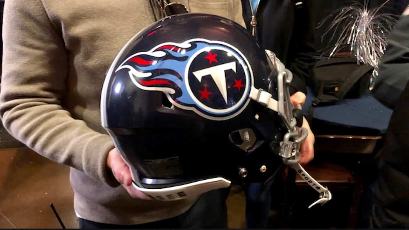
Seeing the pic of [someone] holding the Titans new helmet just solidifies my belief that they missed a golden opportunity to FIX/CHANGE that awful fire logo. It’s never been a good look. Overall I think the helmet is better, but it could have been a home run with a better logo.
Lose the thumbtack and move the flames toward the front.
Maybe have it actually be a proper torch design that actually shows the flame coming off the top of it.
Part of the problem with the logo seems to be that they’re beholden to include the Tennessee flag’s three-stars-in-a-circle design in some way.
Come to think of it, the only other major-league team I can think of that has ever had a primary logo incorporating a design element based specifically on an element of a state flag is the NHL Colorado Rockies, and they actually did theirs quite well.
The Rangers have used the Texas flag in several logos.
Texas Rangers?
Columbus Blue Jackets have the Ohio state flag as part of their logo too.
Forgot about the Blue Jackets, you are correct, ChrisH.
As for the Texas Rangers, they haven’t really done so as a primary logo.
The Houston Texans do as well.
I guess one could argue that the star on the Dallas Cowboy’s helmet is at least a reference to the “lone star” on the flag if not a direct use of the flag design.
I agree. Being traditional and a fan of simple, I would suggest just a white helmet, the logo simplified to a columbia blue circle, navy fill, white T, and the three red stars. Logos don’t need a lot of gimmicks to work. In fact so many of the NFLs prominent franchises have incredibly simple logos; Cowboys, Packers, Bears, 49ers, Giants, Colts, Steelers…
In regards to MLB’s sesquicentennial in 2019, has anyone heard if The NFL will be doing something similar to their 75th season in 1994 for their 100th anniversary next year. I imagine the “one shell rule” will negate complete throwbacks but it’s odd that there hasn’t been any news of what they intend to do as of yet. An HD update of the 75 Seasons video would look pretty sweet on blu ray to be sure!
Brady has worn the Revo Speed another time against the Seahawks.
Regarding the Milwaukee Brewer’s pennant; Graf’s was a soda company located in Milwaukee and this is one of their promos.