[Editor’s Note: Paul is on his annual August break from site. Deputy editor Phil Hecken is in charge from now through the end of the month, although Paul is still on the clock over at ESPN and may be popping up here occasionally.]
By Phil Hecken
Follow @PhilHecken
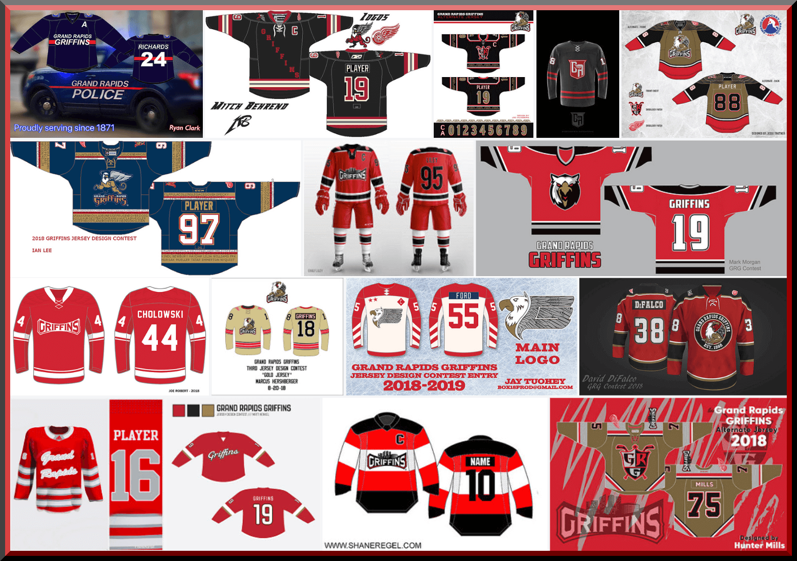
The moment you’ve waited for is finally here. Today we begin voting on the first group of contestants for the third annual Grand Rapids Griffins design contest. In case you missed it, the contest parameters and rules were laid out here.
While last year I received almost 120 entries, this year was only about half that: 61. Based on how that shakes out and how the voting was announced, it will be broken down as follows. Today: First 16 entrants; Tomorrow: Second 15 entrants; Monday: Third 15 entrants; and Tuesday: Final 15 entrants. Unlike previous contests, the entries will NOT be listed alphabetically; they were randomly selected and include submissions received throughout the deadline period. The TOP THREE contestants receiving votes in each group will move on to the final group (for a total of 12 finalists — three from each group), from which the Griffins will make a decision and declare the winner who I will announce on Friday, August 31.
We’re using a new polling system, which we hope will eliminate (or at least drastically reduce) any fraud or shenanigans. You will be permitted to vote for as many designs as you would like, but you may only vote ONCE. The poll(s) will close approximately twenty-four (24) hours after being posted — the TOP THREE vote recipients will move into the final group (the winner of which will be chosen by the Griffins).
Today the lede will focus on the first 16 submissions. Subsequent days the designs and voting may be a sub-lede, so please be sure to check back and check the full post each day.
You will also notice the polling system looks different — I want to give my great thanks to Larry Torrez, who worked with me to come up with the poll you’ll see below in an aesthetically pleasing format as well! Great work ElTee (of DC)!
REMINDER: The Griffins set out the following parameters for designing an alternate jersey. Please use them to guide you as you make your decision(s) below:
• Create a brand new design for a Griffins alternate jersey (remember: you are ONLY designing a jersey, not a full uniform).
• While your design work must be original, you MAY use current or previous Grand Rapids Griffins logos.
Therefore, while some of the submissions you see below may include gloves, helmet, pants, etc., you are ONLY voting on the jersey design. Please keep that in mind when casting your vote(s).
OK? That’s about it. First I’ll display all the submissions for today, which will be followed by the new (sharp-looking and hopefully cheat-proof) poll. Click to enlarge any image below.
My thanks to all who submitted and best of luck.
A: Ryan Clark

B: Mitch Behrend

C: Joe Hilseberg

D: Matthew Harvey

E: Jesse Trattner

F: Ian Lee

G: Emily Liley

H: Mark Morgan

I: Joe Robert

J: Marcus Hershberger

K: Jay Tuohey

L: David DiFalco

M: Patrick Thomas

N: Matt Henkel

O: Shane Regel

P: Hunter Mills

And there you have it. Your first 16 submissions. And now, to vote, here’s the poll — to start, click “ENTER” or hit “SUBMIT”; once you start the poll, the reader design will appear next to the name and you may select as many designs as you like. Once you have finished voting, be sure to scroll to the bottom and hit “ENTER” or click “SUBMIT” to make sure your vote(s) are counted! That’s it!):

Eagles To Wear Supe Patch on Jersey
In a (not so surprising) move yesterday, the Philadelphia Eagles, your reigning Super Bowl Champions and slayers of Brady, will begin the season wearing a patch designating their status as Supe Champs. It’s a pretty basic looking patch, based off the Super Bowl LII (52) logo:
Eagles to wearing Super Bowl champs patch for season opener vs. Falcons on Sept. 6 (h/t @PhilHecken). pic.twitter.com/u7cn74Zk1I
— Paul Lukas (@UniWatch) August 22, 2018
That’s the green jersey (and presumably the jersey they’ll wear to open the season at home for the Thursday Night Football kickoff September 6th, against the Falcons), and the linked article in the parent tweet below says it will only be worn on the jerseys for one game (similar to what the Patriots have done in recent seasons). Yet, also in the tweet below, it looks like Sporting Goods stores are selling the black version of the Eagles jersey, also with the patch. Does this mean the Eagles will wear it for more than one game — or is this just another merchandi$ing maneuver? My money is on the latter.
Saw this at my local sports store pic.twitter.com/Edm6uEOacr
— JacobEye (@Jayblue0014) August 22, 2018
It’s not a bad looking patch, per se, but it doesn’t show much creativity. Of course, if they’re following the lead of the Patriots, they didn’t exactly show a ton of creativity themselves.
Spurs Get Advertiser Patch
Yesterday, the San Antonio Spurs added an advertiser patch. You’ll have to bear with me as my photoshop MS Paint skills are somewhat limited:

I’m not even able to ascertain how many NBA teams now have ad patches, but it’s at least 20. Believe it or not that sort of information isn’t that easy to obtain via a simple google search. Almost every article dealing with ad (or, if you prefer, “sponsor”) patches is basically from last season, and ad patches have been added since then. One article mentions “19” (and that was as of November 13, 2017) — I think at least two, including the Spurs, have been added since then. Maybe it’s more. It’s 20 too many in any event.
If you’re actually curious as to what the advertiser is (and also the “rationale” for using them), click here.
You can read more about the deal here.
The Ticker
By Anthony Emerson

Baseball News: For the past several years, MLB teams have placed a small American flag patch on their caps on the anniversary of Sept. 11 terrorist attacks. This year, it appears MLB and New Era are dropping the flag for a memorial patch (from @ajenkinsCLE). … On Tuesday night (way past Uni Watch’s bedtime), D-Backs pitching coach Mike Butcher wore a cap with the team’s 20th Anniversary logo on it, which of course the D-Backs stopped wearing earlier in the season (from Michael Olguin). … Brewers 1B Jesús Aguilar was examining his broken belt when a pickoff attempt went flying by his head (from Mike Chamernik). … Also posted in the hockey section: The Blackhawks gave White Sox debutante Michael Kopech a custom sweater. Kopech’s MLB debut coincided with Blackhawks night at New Comiskey (from Griffin Smith). … Speaking of the White Sox, their “home run chain” is the best thing I’ve seen all summer (from Ryan Andrew). … New Cub Daniel Murphy will wear No. 3 (from Joe Ringham). … The Orioles gave away Virginia Tech-themed hats as part of their University Nights series of promotions (from Andrew Cosentino). … Also posted in the NFL section: The Lehigh Valley IronPigs will honor the Super Bowl Champion Eagles with a special midnight green uni (thanks, Phil). … Cap on a cap alert! (from James Gilbert).

NFL News: New Vikings safety George Iloka will wear No. 28 (from Mike Chamernik). … Cross-posted from the baseball section: The Lehigh Valley IronPigs will honor the Super Bowl Champion Eagles with a special midnight green uni (thanks, Phil).
.
College/High School Football News: Also posted in the college hoops section: Louisiana State University of Alexandria has unveiled a new bull terrier logo (from @_7ate9_). … UMass have slightly altered the decal on their white helmet, and have added a “PG” memorial decal for Director of Football Operations and former coach Paul Gorham. Full gallery of both helmets here. … The University of Delaware is going with blue pants instead of yellow for the first time since at least the 1940s (thanks, Phil). … Columbia’s helmets will feature the Manhattan skyline on the back (from Mark Calveric). … Traditionalists, look away: here’s a retrospective of the last decade of Oregon unis (thanks, Phil). … Speaking of Oregon, here’s a “completely subjective” list of college football’s 10 ugliest unis, with many *ahem* questionable choices (thanks, Phil). … Josh Claywell’s alma mater, LaRue (Ky.) County High, has nine uni combos this year, almost enough for a different one for each regular season game. … New numbers for the Illinois incoming (from Illini Football).

Hockey News: It’s the end of an era, as the Montréal Canadiens are going with a single logo at center ice for the 2018-19 season, instead of the two they’ve had for many, many years. The Flyers are the only team left with double logos at center ice (from @ImAnimated and Moe Khan). … Cross-posted from the baseball section: The Blackhawks gave White Sox debutante Michael Kopech a custom sweater. Kopech’s MLB debut coincided with Blackhawks night at New Comiskey (from Griffin Smith). … The Canucks are very, very happy with the return of alternate unis to the NHL. So happy, they’re going to have two alternates for the 2018-19 season (from Brock Jackson). … The Toledo Walleye of the ECHL have revealed their tenth season patch (from Mark Kunz). … Minnesota State has teased their new sweaters (from Dylan Krahling).


NBA & College Hoops News: Something called Presidential Parking Services has stolen the Trailblazers’s logo (from J. Max Weintraub). … Cross-posted from the college football section: Louisiana State University of Alexandria has unveiled a new bull terrier logo (from @_7ate9_). … Ever wonder why Kentucky unis have a checkerboard pattern? Here’s your answer (thanks, Phil).

Soccer News: The Philippine men’s national team is having a kit design contest (from @phillipsukke). … English fourth tier side Forest Green Rovers still haven’t received their new kits from Hummel, so they’ve cut ties with Hummel and have revealed completely new kits with their new provider, Player Layer. For the record, here are the kits Hummel released, here are the makeshift light blue ones they’ve been wearing in the interim and here are all three Player Layer kits (many thanks to our own Jamie Rathjen for his intrepid following of this story, as well as everyone else who sent this in). … Russian side FC Rostov has unveiled a limited edition fourth kit based (or entirely made up of) on a Rostov supporter bringing his rug to a match last week (from Bob Hille and Max J. Rosenthal). … Classic Football Shirts has produced a graphic of the primary kits of the previous thirty Serie A winners. Naturally, an awful lot of Milan, Inter and Juventus (from Josh Hinton).

Grab Bag: Durham County, North Carolina, is allowing resident to vote on new “I Voted” stickers. In my opinion, No. 20 is head and shoulders (from Casey Hart). … New kits for Gloucester Rugby. The club is known as the cherry and whites, but apparently Gloucester forgot that (from Uni Watch Rugby Correspondent Eric Bangerman). … Here’s a look at what Lacoste-sponsored players will be wearing at the forthcoming US Open. … A golfer at Letchworth Golf Club in Hertfordshire, England, was turned away from playing because of the color of his socks (from J. Max Weintraub). … The Library of Congress has massively downgraded its logo. Remind anyone else of Cynthia Nixon’s gubernatorial campaign logo? (From @DubsPapa).
Regarding the Eagles SB patch, the patch on the Black Jersey is the patch both teams wore in the Super Bowl. They’ve been selling merch with that patch since before the game was played; you can get Patriots gear with it as well.
It doesn’t look the same as the patch promoted by the Eagles, which adds the “Champion” title beneath the logo.
Correct, that is the Superbowl patch, not the superbowl champions patch.
Either way, the Eagles sure have gotten a lot of mileage out of the win and the trick play.
Do other championship teams celebrate with so many merchandise options, sports-crossover promotion, and the like these days?
Perhaps it’s because I live near to the Philadelphia area and this stuff seems to be everywhere I turn (my head, the TV dial, etc…).
I took George Carlin’s words to heart and started wearing brown ribbons…
Regarding George Iloka: link
Re: Canucks alternate uniforms ticker piece. The Skate jersey will likely fall under the heritage jersey category while the not yet revealed jersey will fall under the regular third category.
I am annoyed we will have to wait until 2019-20 to see the Canucks bring us an alternate. Was hoping to see one revealed for this season in the next month or so. Guess I’ll have to wait much longer.
Needing assurance… Voted for Griffins design, after voting decided to refresh page, it let me vote again – no word saying my vote had already been tallied, just thanks! Hoping on your end this is not the case. No stuffing of the ballot boxes, please. Win fair and square this time!
Anonymous,
We are tracking all votes in real time, and at the end of the days contest, all attempts at vote stuffing will be purged from the database.
The Uni Verse hates vote rigging, so we will do our best to ensure a clean (or as clean as we can make it) contest.
1. As a fellow MSPainter, I love what you did to block out that logo
2. the link in ” A golfer at Letchworth Golf Club in Hertfordshire, England, was turned away from playing because of the color of his socks (from J. Max Weintraub)” opens my GMAIL!
I hope people click on the Jerseys before voting. Some have wonderful details not visible in the list of designs. Love the “ghost wings” on Joe Robert’s simple, clean but beautiful design. Thumbs up!
Ps. I’m not Joe Roberts!
Well said sir or ma’am!
I hope people click on the Jerseys before voting. Some have wonderful details not visible in the list of designs.
Yeah, that’s kinda why I always show (with the “click to enlarge” feature”) all the designs BEFORE the voting, so readers will do just that.
Another thing about Forest Green Rovers is that I’m not sure if their sky blue third shirt was supposed to exist or if Hummel just gave it to them because they didn’t have anything else to give them, so FGR were like “okay we have a third kit now.”
Also, on the Gloucester Rugby shirt, there’s a couple of ads for Hartpury College, which itself has a team in the second tier of English rugby union, a league below Gloucester. So it’s essentially one team’s logo appearing on another team’s shirt as an ad.
Seeing the Spurs add a patch really bums me out, especially after they managed to go through all of last year without one.
On the Spurs corporate logo: despite the frosty reception on this website, I think they will get better net results this season on jersey sales when they toss the ball to the fans for purchase…
Amazing they were able to get through a season without a jersey “sponsor” and not go bankrupt!
Devils Advocate: Ever think that if NBA Jerseys had advertising patches on them from the league’s inception and went the other way and started removing them, with some teams doing it and others not, we’d be pining for our team to keep doing it. “Look, [Team A] is no longer supported by [Product/Company] on their jersey – are they no longer worthy of endorsements?” I bring this up because I’m believe it’s more of a people not liking change thing than it is a logo creep thing.
Much like the naming wrongs for stadiums, how dare they slap a corporate sponsorship on my beloved stadium! – But hey, I love Wrigley Field!
I doubt it. Consider stadium advertising. In baseball, outfield walls were covered in advertising in the years before WWII, and then advertising started to disappear. There were a very few ads with charm (“Hit Sign, Win Suit”) that people missed, but for the most part nobody was begging for those eyesores to come back.
You know why that is right?
TV broadcast sponsorship rights with no-compete clauses?
Ding ding ding.
TV (and to a much lesser extent radio) adverts made outfield wall (and other ballpark ads) obsolete. Until they discovered they could make still more $$$ by returning the ads AND getting people to pay for cable AND still sit through commercials. It’s been a one-way ratchet for some time now.
I’ll expect ads plastered on seat backs, railings and aisles pretty soon, if they’re not already.
I’d say no. Of course it’s anecdotal but I grew up watching the soccer team I root for have ads. Loved to see a clean jersey the few months they went without an ad.
…and the guy’s name was “Wrigley”. There’s no one with the last name “Citibank” or “Sports Authority”
Yes, a corporate named stadium like Raymond James, Levi’s, Miller, based off of a name, are definitely preferable to something like Suntrust or Bank of America. Even names like Tropicana, Hard Rock, or Gillette are bearable in comparison.
Hey now!
The Canucks have said they won’t have any thirds this season.
Both of those jerseys are for
‘19-‘20, as is stated in the linked tweet.
Regarding the Forest Green Rovers item in the soccer section, there is a cool detail in the string of tweets announcing the manufacturer change:
“All designs will include FGR’s internet-famous three stars – one filled in to signify the club’s promotion to the Football League in 2017 – with two greyed-out to represent the chairman’s ambitions to reach the championship.”
So only one star can be seen from afar, but up close there are three stars. Kind of similar to the NFL captaincy patches, but instead of years to fill in the stars, the club has loftier Football League aspirations. I like the concept, especially for a small club looking to punch above their weight.
Those were on the Hummel kits, too. I think part of the reason they’re calling the stars thing “internet-famous” is that it came in for a decent amount of criticism from Internet people calling it pretentious.
I can’t seem to access the poll on my Android phone. Is there something I should be doing differently?
Yeah, I couldn’t get the poll to work on my phone, either. I had to do it on my computer at work (don’t tell my boss).
I just asked Larry if he could look into this. Thanks for bringing it to our attention.
MD,
Typeforms can be viewed and completed using the following platforms / browsers:
Windows and Mac computers: IE9+, and latest versions of Chrome, Safari, Firefox, Microsoft Edge, and Opera.
Tablets: iPads running IOS 8.4+ and Android tablets running 4.4+.
Smartphones: iPhones running IOS 9.1+, Android smartphones running 4.4+, Opera Mini (latest version) and IE Mobile (latest version).
I couldn’t get the poll to work on my (Android) phone while embedded in today’s post but was able to browse directly to the poll (link) and vote. So that might be an option for others who are having problems.
I tried to vote multiple times, but every time all I got was the start screen. For the record, had my vote been accepted, it would have been for. ‘K’ and. ‘L’.
Mark,
Will include your choices in the overall count pending PHILs Phinal approval.
I really like these hockey sweaters and can’t decide which to vote for!
One thing I would love to see: lots of them have shoulder yokes, which is great, but NOBs look so much better when they go link.
Clarification: The Gloucester kit is the away kit. If I didn’t specify that in my email, I apologize.
Trail Blazers. Two words.
Here is an interesting article about baseball player nicknames, which somewhat relates to the MLB Players Weekend uniforms. I have noted before that there is a difference between the boring but camaraderie building nicknames that your teammates call you (things like “Mac” and “Smitty”), and the great literary nicknames that sportswriters, broadcasters, and fans use (like “The Splendid Splinter” and “The Big Hurt”).
link
Sports Business Daily reported that Grizzlies 22nd team to get ad patch, so Spurs 23rd, just seven more to go!
You mean up to 23 to turn back.
Is anyone else having trouble voting? I click on the link and it only takes me to a green screen with UW logos in the background, but no voting mechanism.
I noticed it sometimes takes a few moments to load, but the voting mechanism always appears. You might just need to be patient with it. I can tell you it’s definitely recording votes, and I’ve refreshed the tally several times, and each time there have been additional votes.
NBA teams without ad patch.
Bulls – Suspect holding out for lucrative deal.
Rockets – See Bulls
Thunder – No word, but would not be surprised.
Pacers – Team said in 2016 they were seeking sponsor.
Blazers – Said they were looking in May.
Wizards – No news, but major East Coast market.
Suns – Suspect will wait until on-court product back on upswing.
Note – Lakers only getting $12-14 million per year from Wish, that ends in 2020, I say they fetch at least $50 million per year with next deal.
Columbia used that sticker on the back of their helmets last year as well. Great detail!
link
Why are there patches of any kind on MLB caps on the eleventh day of next month? What kind of jersey patches did NFL teams wear the week of December 7, 1958? Seventeen years is a long time. For some of us, the trauma of 9/11 will remain fresh and especially painful on the anniversary for many more years, perhaps for the rest of our lives. But that’s a private, individual matter. Commemoration of that trauma has no place on a sports field, or really in any entertainment medium anymore.
Because we said we would never forget.
Yes, and I found it especially disturbing to see the stacks of caps that will be for sale and the reference in the tweet to 9-11 merch. Even if they donate 100% of the proceeds to a worthy charity (I don’t know whether they are or not), it just seems very inappropriate to be selling special merchandise with a patch to commemorate a tragedy like this. So I would add on to your statement that “Commemoration of that trauma has no place on a sports field, or really in any entertainment medium anymore.” with saying that commemoration of that trauma also has no place on a merchandise rack.
Library of Congress new logo: I know a bit about why LoC redesigned its visual identity. The top-line logo is a definite downgrade, as dated as the old logo had become. (Excellent graphic, but very stale typography.) But the rest of the package serves the LoC’s new initiatives and programs very well.
The LoC logo and the Nixon for NY logo are deeply flawed in the same way, but for different reasons: LoC unnecessarily breaks up a single word, and in ways that violates normal conventions of pronunciation. The Nixon logo confusingly combines two different words into an apparent one-word string of CYNTHIANY.
Doesn’t seem wrong to insist that the advertisers on NBA and soccer jerseys be referred to as such rather than as “sponsors,” yet the ticker refers to “Lacoste-sponsored” tennis players?
Center ice at The Forum in Montreal (I refuse to call it the, well you know), is just plain wrong without two Canadiens logos.
Will you say who is the top 3 voted Jerseys at the end of the day?
Does anyone know if the University of Iowa football and other teams wear a ribbon to commemorate the tragic death on Mollie Tibbetts?
As far as wearing the Players” Weekend unis on Thursday, I wonder if the Tigers and White Sox got an early start on them because the Tigers are planning on retiring Alan Trammell”s number on Sunday, and maybe possibly want to wear their regular uniforms that day? So by wearing their PW unis on Thursday, they can get the 3 days in.