[Editor’s Note: Paul is on his annual August break from site. Deputy editor Phil Hecken is in charge from now through the end of the month, although Paul is still on the clock over at ESPN and may be popping up here occasionally.]
By Phil Hecken
Follow @PhilHecken
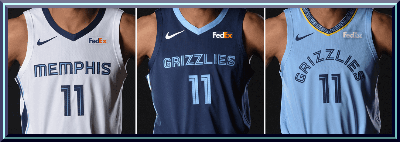
The Memphis Grizzlies unveiled new uniforms yesterday evening — three of them — plus a couple tweaked logos, a couple courts, and a new ad patch. In what now constitutes par for the course these days, there’s a “story” surrounding all of the uniforms and changes. More on that at the end of each section. But for now the main stuff and some corporate speak.
WHITE UNIFORM


There’s a lot going on here for what appears to be a pretty minor set of changes to the white. First, here’s how the team describes the changes:
The asymmetry of our uniform represents not only our geography, with the Mississippi River anchoring our City and state on one side, but also the unique and unconventional cultural history of Memphis and the Grizzlies. The clean, long flowing lines that fall down the side of the jerseys and wrap around the shorts are reminiscent of the intersection of road, rail, river and runways, taking its line forms from the evolved inline wordmark.
The wordmark is new, though it’s similar to the previous one, as are the numbers. On the belt is one of the brand new logos, a stylized “MEM” (which I like a lot), and the jerseys and pants have stripes running down the right side, while the left side of the jersey is blank and the left side of the pants have the new (slightly tweaked) logo. And the team, which had no advertiser patch last year, has added one.
DARK BLUE UNIFORM


While the white jersey says “MEMPHIS,” the dark blue one reads “GRIZZLIES,” and the dark uni contains a slim strip of gold. Beyond that, the two unis are very similar in style. On both, the NOB is below the number. More corporate description is below:
Both uniforms draw focus to one of our core brand attributes – our blue collars. Beale Street Blue will now draw attention to the collars of the Icon Edition. The oversized bear icon on the left side of the short nods back to both our first seasons in Vancouver and Memphis.
Our new stylized shipping container mark will be showcased on the belt line of each uniform. All uniforms will feature our newly-designed inline type that represents the vibrancy of Beale Street neon signs in the names across their chests and reintroduces the inline to the number sets for the first time since 2010.
Yeah, OK. But hey, someone gets paid to write that copy. Anyway, the changes from the prior uni set aren’t major but they are noticeable. The “MEMPHIS” and “GRIZZLIES” now swap places on the white and dark blue unis (last years set is on the left, the new set is on the right):

The wordmark has gone from arched to straight, the numbers are smaller (and in the new, what I’ll call “Blue Jays-esque” font), and the navy uniform has a light blue collar.
LIGHT BLUE UNIFORM


The new light blue uniform is similar to the dark blue, but this one features the new “MEM” logo as a design element on the collar and belt, as well as a stripe on the bottom right hem of the pants. Here’s how the team describes the light blue uniform (note the “GRIZZLIES” is arched here):
Our new Statement Edition uniform will continue to showcase the base color of Beale Street Blue, along with our iconic inline type and blue collars, representative of Memphis entertainment and culture.
As with the Association & Icon Editions, this uniform creates an asymmetrical silhouette and utilizes the oversized bear icon on the left side of the short for strength and weight. The asymmetry is created by utilizing a pattern of the shipping container mark through the collar, belt and right short hem, similar to the Pacific Northwest trim used in Vancouver in 1995/96. This pattern is further highlighted by the use of Grizzlies gold accents along each piece.
“REFRESHED” LOGO

The “refreshed” logo is barely different from the previous incarnation (as you’ll see in the side-by-side below). Basically its a slightly different shade of light blue and now a gray outline. But there is still a story attached:
The refreshed primary Bear Icon replaces our lightest ‘smoke’ blue within the nose & mouth area with our Beale Street Blue, enhancing the ferocity of the Grizzlies Gold in the Bear’s eyes. The Steel Gray outline introduces a color that is complementary to our intense blues while also bringing depth to the icon.
The old is on the left, the new is on the right:

NEW WORKMARK & NUMBERS


They tweaked the font slightly and removed the arch. As mentioned above, the numbers (which had been solid last season) are in the same font family.
The evolved wordmark and numbering system represent a more progressive and modernized take on its predecessor, while maintaining and deepening the connection to the Beale Street neon-inspired inline.
The straightening of GRIZZLIES in the full global logo gives weight to MEMPHIS and strengthens the collective wordmark to the icon.
NEW CLAWBALL LOGO


The “clawball” logo is also slightly changed from the previous iteration. Basically they put the ball in the opposite paw (left now, versus right, previously) and slightly tweaked the colors. They also rotated the angle from which the grip is shown. But wait…
From the shores of the Pacific Northwest to the banks of the Mississippi, the ‘ClawBall’ has maintained its home in the Grizzlies brand identity for over 20 years. This reimagined version brings the past forward and integrates it seamlessly into the new identity system with some of the same tactics used in the primary icon: the increased use of Beale Street Blue, the introduction of a Steel Gray outline and the more equitable weights of the claw and fur shapes.
This reimagined, redrawn and rotated version attacks the ball and showcases a stylized ‘M’ shaped by the three middle claws clutching the ball.
Here’s the previous iteration and the new one:

NEW “MOVING MEMPHIS” LOGO


On the surface, I LOVE this. However, when you find out the new rationale behind it, you might find it a bit cringeworthy:
Memphis is moving. It always has been. Since 1819 — whether by river, rail, road or runways — Memphis has been the hub of the country and the world.
This stylized mark integrates the Grizzlies’ neon-inspired inline and our city’s airport code into a design inspired by shipping containers that can be found on the rivers, roads, railways and runways of Memphis today. Memphis is America’s Distribution Center — but beyond cargo, Memphis packages and distributes its culture and soul to the world today.
And those shipping containers are also conveniently located in front of the Griz’ arena (at least temporarily). So, while it’s not quite an additional uni ad, when you know the “story” behind it, you won’t be able to unsee it. Not everyone sees shipping containers, however:
I guess the designer of the new @memgrizz unis is a @PaulMcCartney fan? @sportslogosnet @UniWatch @PhilHecken pic.twitter.com/S76YFoOYq4
— Jordan Foreman (@Choreoanimator) August 3, 2018
Kudos on that spot.
NEW COURT

According to this article (which has more cringeworthy corporate speak throughout), there are two new courts, but only one was “unveiled” last night and that’s the one you see above. It is possible that second court is the new practice facility court.
The Grizzlies put out the standard hype video as well:
THE WAIT IS OVER 👀 pic.twitter.com/sAy6CbLrAZ
— Memphis Grizzlies (@memgrizz) August 2, 2018
Prior to the unveiling, the team also released a look at the progression of unis throughout the years:
#ThrowbackThursday pic.twitter.com/dUgYV2a8pq
— Memphis Grizzlies (@memgrizz) August 2, 2018
Overall, the tweaks (which is all they really are) aren’t bad but these uniforms aren’t all that different from the ones they are replacing. With the exception of the new “MEM” wordmark, most of the changes are cosmetic (slightly different wordmark & logos, different color hues). I love navy and powder blue together, but I’ve never loved the way the Grizzlies have worked with them. The gold plays a very insignificant role, but I’m wondering if the new “fourth” uniform (second alternate) will be a gold version of the powder blue. You’ll recall Memphis had an awesome MLK-inspired fourth uniform last year (which I hope they keep). My understanding is that all teams will have an option to add a new fourth uniform this year — with some teams keeping their previous one, giving them a “fifth” option. I use the terms “fourth” and “fifth” in lieu of the ridiculous names Nike and the NBA have given each of the white and dark uniforms the teams currently wear. We can’t even refer to them as “home” and “away” since those terms no longer apply. I’m disappointed with the addition of the ad patch, of course, although no one should be shocked at whom Memphis has chosen.
Your thoughts?
Football Is A Country

Reader Robert Brashear sent in this great story — which I’m reprinting in full below. You guys will enjoy this one for sure!
To celebrate the World Cup, the people at Jacobin, a Brooklyn based socialist journal, came up with the idea of creating a unique jersey for their readers and fans. It’s theme would be “Football is a country,” inspired both by Eduardo Galeano’s Futbol a sol y sombra (Soccer in sun and shadow), perhaps the best book ever written about soccer, and Africa is a country, an eclectic internet space for progressive art and culture from all of Africa and the African diaspora. The idea seemed to be that football the game creates a reality that is beyond boundaries where the beauty of the experience of the game transcends any national loyalties. And we could wear this jersey while watching the games in celebration of that idea.
The jersey itself was intriguing. In the upper left, instead of a team crest, the Jacobin “J” in the journal’s distinctive font.

The main image is essentially a post modern deconstruction of World Cup brackets and in small print,

the nicknames of 8 teams:
Super Eagles: Nigeria
Les Bleus: France
La Albiceleste: Argentina
The Three Lions: England
Die Mannschaft: Germany
Les Lions de la Teranga: Senegal
La Furia Roja: Spain
Selecao: Brazil
So…why 8? Why these 8?
On the back a graphic for ‘Football is a country” borrowed from “Africa is a country” and a MNOB (magazine name?) “Jacobin” with a stylized “18.”

Altogether an interesting creation and worthy of a bar conversation or two. I ordered it immediately and anxiously awaited its arrival. But, perhaps inevitably, there were “problems with production” and the jerseys finally arrived Monday, July 30th, two weeks after Word Cup final. I will leave it to others for finding any metaphors in the story.
(Happily all proceeds did go to Africa is a country…)
— Bob Brashear

And now a few words from Paul: Turns out my August break from the site came just in time, because on Tuesday night I came down with a nasty stomach bug. I’ll spare you the details, but let’s just say that the past few days have not been fun. I also haven’t been able to spend much time preparing for my move, helping to coordinate my mom’s care after her recent hospitalization, or doing my actual job (i.e., working on my college football and NFL season preview columns for ESPN). In a word: ugh.
If you want to make me feel better (or at least score yourself some nifty headwear), please consider ordering a Uni Watch alternate cap. It’s available here.
Meanwhile: Did I mention that I have a nasty stomach bug? So if you’ll excuse me….
The Ticker
By Kris Gross

Baseball News: The Diamondbacks wore 2011-era throwbacks last night (from Ed Kendrick). … The Phillies broke out the powder blues last night, and OF Rhys Hoskins had shoes to match (from John McMunn). … Not sure if it’s a baggy jersey or low NOB and number, but something doesn’t look right here (from Frank McGuigan). … We missed this earlier in the week, but when Jose Reyes pitched for the Mets on Tuesday, he used Jacob deGrom’s glove (from Michael Keane). … Cubs bullpen coach Lester Strode gave new pitcher Cole Hamels his No. 25, which means Strode will be first Cub ever to wear double zeroes (from Ariel Shoshan). … The Brewers will honor Negro League legends as part of their African American Heritage Night this evening. … 80 years and two days ago, the Dodgers and Cardinals experimented playing with a yellow baseball (from @smagula). … The Potomac Nationals are hosting Sandlot night tomorrow. … The Daytona Tortugas will hold Bob Ross Weekend, and wear Bob Ross-style jerseys next Friday.

NFL News: Here is your jersey matchup from last night as preseason games officially kicked off. … The helmet on the left side of this video gives a good look at the Titans 20th anniversary logo (from Eric Wright). … The Cowboys will wear blue jerseys three times this season (from Ignacio). … This photo of Matt Ryan from training camp was passed along by Nicholas Rath along with the note that Ryan has the NFL Equipment logo on his pants, instead of the NFL shield. The explanation from Paul is that all practice gear has had the NFL Equipment logo on it since Nike took over the uniform deal in 2012. … @NFLJerseys7 has put together this handy uniform schedule for the Chargers this year. … Tom Brady signed a girl’s arm, then she got his signature tattooed. … Interesting note from Jon Solomonson: the Ravens’ website has a picture of QB Robert Griffin III in a Reskins jersey, not a Raven or Browns jersey. … An elementary school in Kentucky poached the Bengals logo and font, but not the name! (from Michael Berry).
College Football News: It looks like Notre Dame will wear green in their home opener (from Mike L). … Baylor will wear the Vicis ZERO1 helmet this season (from Josh Lassiter). … Texas is going back to black shoes at home this year (from Jeff Far). … The retired No. 2 jersey for Washington is no longer retired (from JayJayDean). … At least one player at Duke’s practice had a name sticker on the front of his helmet (from Nate Smith). … Northwest Missouri State will wear warning labels in the outline of the state helmet decals. … Western Kentucky celebrates 100 years of football with a centennial logo. … Liberty will use an inaugural season logo to commemorate their first season in the FBS. … Athlon ranked the SEC’s home uniforms from top to bottom. … Combining the look of old-school and modern helmets is, well, hilarious (from David Weuste).

Hockey News: The Humboldt Broncos new goalie honors the players who lost their lives last year with his new helmet (from Ted Arnold). … Arizona State and Adidas unveiled the new ADIZERO jersey (from Cameron).

College Hoops News: North Carolina is naming the floor after Roy Williams (from William I. Wells).
.

Soccer News: Here are some soccer notes from Josh Hinton: Manchester City’s third kit leaked. … These are all the kits for the upcoming Liga MX season. … New away kits for Millwall FC. … New USL team Birmingham Legion has found their jersey advertiser. … Mitre will now be the official ball provider of the FA Cup and FA Women’s Cup, replacing Nike. … New shirts for Clemson Men’s Soccer (from Scott M. Trembly). … “Newcastle United have had their kits made by Puma for the past eight years but never in that time has the logo been in black – the reason being that Newcastle’s rivals Sunderland are nicknamed The Black Cats,” writes Denis Hurley. “Similarly, while Sunderland traditionally wear black shorts – though likely to change to red this season – the adidas stripes on them are never white, as Newcastle wear black and white stripes.”

Grab Bag: There’s a new table tennis league in Japan, here’s a look at their jerseys (from EP Conrad). … New jerseys for Munster Rugby. … For Paul and all the purple haters out there, this one’s for you (from James Atherton).
while i know most of the folks affiliated with this site are on the bandwagon to force the DC NFL team to change its name, using “reskins” in the ticker is silly and strange if it isn’t a typo
re·skin
rēˈskin/Submit
verb
replace or repair the skin of (an aircraft or motor vehicle).
most??
Are you questioning the word choice or the accuracy of the statement?
Probably a typo. Not a huge deal
Best suggestion I heard for a new RedskIns name was a letter to SI about 30-35 years ago. ‘Change the team name to the Americans. Leave everything else the same.’
Perfect.
Are we ignoring the part where the Grizzlies are running the wood against the conventional grain? Normally the boards are arranged parallel to the length of the court.
Memphis is always going against the grain. It always has been. Since 1819.
Yeah, we’re cool like that around here. :)
Separate question: are the Phillies the first MLB team to have 2 pkayers wearing numbers in the 90s at the same time? Tommy Hunter gave up #40 for Wilson Ramos, and he is now #96. Pat Neshek took #93 for his second tour of duty in Philadelphia, since Rhys Hoskins and his sweet blue cleats wear #17 these days.
Joe Beimel (97) and Manny Ramirez (99), Los Angeles Dodgers, late 2008.
Also, Hyun-Jin Ryu (99) and Odelki Garcia (98) for the Dodgers in September 2013. Garcia’s MLB debut was a relief appearance in a game Ryu started on 9/11/13.
Beimel again (still 97) and James Jones (99) for the Mariners in 2014 and 2015.
Also, Alfredo Aceves (91) and Brian Bruney (99) for the Yankees in 2009, though Bruney is also listed as having worn 38 in that season.
Finally, Felix Heredia (94) pitched to Todd Hundley (99) in early 2001, before Damon Buford was released in May and Hundley took over Buford’s 9.
Strong work. Thanks much.
Eh, I had the time to kill to pull up Baseball-Reference.com.
Is this the first jersey ad to be the same as the arena name?
Also why couldn’t they have the ad be white on the navy like the light blue? (and navy on the white).
Anyways, meh this is the most attention the grizzlies will get for another 10 years so who cares. The light blue looks the best by far. They either need to lengthen their letters or arch them like they were.
Different sport, but Toronto FC (MLS) have BMO (Bank of Montreal) as shirt advertiser and play at BMO Field
Different sport again, but CFL teams have small jersey ads on the upper corners of the chest. Similar placement to NBA teams.
Currently, 3 teams have a jersey ad that shares their stadium name:
Ottawa Redblacks – TD Place Stadium (TD Bank)
Winnipeg Blue Bombers – Investors Group Field
Hamilton Tiger-Cats – Tim Hortons Field
I meant in the NBA they are the first, but thanks for the other examples! Interesting.
Agree. The Fedex on the white is purple and orange, and navy jerseys are white and orange. At least with the light blue it’s white. When the league approved ads on jerseys they should have required the ads match colors, or at least be neutral.
RE: League should have required ads to match colors.
That might cause a serious decline in revenues, as some corporate entities have policies of always using specific colors (so the viewing public knows FOR SURE who’s advertising.)
MasterCard and UPS are examples of this on the PGA Tour, producing many color atrocities. If they tweeked the logo to match the shirt colors, it might “disappear”, be unrecognizable, “lessen the value of the investment, and be “bad branding”.
Yea, also I beleive it was only a couple months ago FedEx changed all their different services to be purple and orange, so everything can have a unified look.
The Griz’ new gear is sharp. I like the double blue and I like the Jays font. The one thing I don’t like is the last name on the bottom. Never cared for it.
For NBA I believe that the Grizz are the first to have the building sponsor be the uniform sponsor. The Patriots practice jerseys are sponsored by Gillette for what that’s worth.
Hopefully they’ll bring back the MLK jerseys if only for one game.
I wish the Grizzlies had made the inside of the lettering on the two blue uniforms gold instead of the same color as the jersey, but at least they used it in the striping, unlike on the white set. I also like how the light blue set pays homage to the original uniform set. However, the “explanation” behind everything is one of the most cringe-inducing bits of copy that Nike has ever penned, and that’s saying something. Not to mention that the NOB below the numbers is not going to age well.
Not to mention that the NOB below the numbers is not going to age well.
I think the opposite; the NOB below the numbers looks so much better than the “regular” way, particularly with that annoying NBA logo sitting on top of everything. Look how much more balanced it now is: big number in the center, little logo above, name below.
Every team with a collar logo should do this.
I’m not a fan of last name under the number but you make a good point.
I used to love the Kings’ quirk of having the name under the number, so I’m glad to see it making a comeback.
Disagree. It makes more sense in the WNBA, as most of the players have longer hair.
Nothing wrong with Cabrerra’s powder blues. It’s the way the jersey is pulled down to the left.
I think there’s way too much space between the collar and the NOB. NOB lettering is typically 4 inches tall, right? There’s more than 4 inches between the collar and the top of the NOB. Traditionally jerseys with only a number on the back have that 4-inch gap; with an NOB it should be smaller than that.
Also, the border around the 1 is much thinner than the border around the 3; I don’t think this is an artifact of the photo.
I see two M outlines on the clawball logo. There’s one formed by the claws and another formed by the seams of the basketball.
Over all, good Uni set, but couldn’t the name go above the number? I also liked the White and Black Grizzlies Uni from last year. My fav Uni on this set: Baby Blue.
I’m surprised that none of the recent NBA uniform designs have gone with shorter shorts. Thinking closer to the length of Michael Jordan’s customized longer shorts from the late 80s which hit around mid-thigh.
It seems like a very obvious move to update the look of the uniform and would also reflect current style.
Athletic shorts are not quite as baggy as they were in the 90s and early 00s, but still almost as long. It’s not a bad look, I don’t think. Casual shorts (not exercise wear) have definitely trended even shorter.
It’s a bit of a stretch, but – technically, there *is* purple in today’s lede, even if it is just on the ad patch for the Grizzlies’ white jersey.
I hope whomever wrote the text didn’t get paid much. I would love for a team to just show the uniforms, say “Here they are!” and be done with it. “Memphis is the hub of the country and the world”? News to me. I always thought of it as the #2 city in an otherwise unremarkable state. I’m sure the world has yet to realize it revolves around Memphis.
It’s *not* the hub of the world for people who don’t use a particular shipping company.
True that, it just seems like so much marketing busy work. And would it have killed them to mention Elvis, Sun Records, etc?
Misuse of ‘whomever’ – 10 yard penalty – 1st down
So the Cowboys will wear blue at home for a non Thanksgiving Day game this year? I hate it.
I am so tired of every design element having a “story” behind it.
Yeah. How about just saying we like the way it looks.
Take 1/2 cup of Villanova Hoops uniforms + 1/2 cup of Toronto Raptors claw logo = (Yawn) Memphis Grizzlies “new” outfits
zzzzzzzzzzzzzzzzzzz
adidas uniforms for USF women’s soccer. They beat the football uniforms by a country mile!
link
Agreed! Not sure the lime green does much for me, but they STILL are much better than the football unis.
USF has used those lighter shades of green along with yellow as part of its SoFlo line of uniforms and I guess some vestiges of it carried over to its deal with adidas.
Small correction: Lester Strode is giving up #35, not 25, for Cole Hamels. I love his choice of #00; more teams should give it (and 0) out instead of letting numbers get up into the 40s. This season, I think every team has already given out a number in the 60s, and we’re not even in September call-up season yet!
A lot of the high numbers is about guys wanting to stand out, I think. What they want is that when you think of 12 you think of Tom Brady (41 today). 99 is Wayne Gretzky forever. These guys are looking to be identified with a number.
For you old schoolers on here remember Rene Gonzalez? He played for the Orioles and Jays and wore no’s 88 and 89 I believe. I said in an email to my friend ‘You’re NOT Jerry Rice; GET A NEW NUMBER!’ He just about died laughing. The fact Rice wore 80 didn’t matter.
That’s happening with some of them (Jorge Soler’s 68, Quintana’s 62, that guy on the White Sox with 79, Gsellman’s 65 which looks like the unusual first two letters in his name), but I think the vast majority of 60s these days are assigned by teams. There are too many players being shuttled between AAA and the majors, plus the real culprit of there being too many retired numbers.
I love seeing the Cowboys wearing their navy jerseys because their silver and blue on their helmets will actually match those on their jersey and pants.
I like seeing the blue too, but not at home. Home games for the Cowboys are white. Period. Blue is reserved for those games the Eagles or the Skins want to be asses and make the Cowboys wear their unlucky jersey.
Exactly how lucky are those jerseys for the Cowboys???
Truth. At some point they need to let go of the “luck” part of it. Say it is tradition if you want, but the Cowboys are so far removed from legit success that whatever luck might have been tied to the uniforms died a generation ago.
And ditto on the pants matching the helmet. Not sure why they can’t just change the helmet to match the blue-silver of those pants if they are so fond of it.
So by that logic, in 1994, after the Yankees had been awful since at least 1984, they should have taken the field on some Sumer day that year in a pinstripe-less uniform and everyone would have said “that’s what they get for being irrelevant for 10 years”. The Cowboys blue jersey has nothing to do with win/loss or relevancy. If you are a Cowboys fan, you would realize that the nick name for the blue jersey is the unlucky jersey. It came from Super Bowl V. It has nothing to do with luck, in fact the Cowboys have won some close games in the blue jersey.
Cole Hamels is wearing 35, not 25.
Socialism on Uni Watch? I’m shocked, shocked…
Except when Paul needs money…and then needs to turn a profit selling merchandise right? Every one is equal until they are broke…ads are bad..ads are EVIL!! But I will put them on MY website because I need money…
Pretty much.
You know that nobody is making you read this blog, right?
I love this site. Paul does great work. I even totally agree with him about uni ads and corporate overbranding. What I detest is his pathetic hypocrisy about 1. patriotism, 2. the military, and 3. his own advertising. Hell, I’d probably pay for a private subscription to this site if he was less of a weasel about certain things, because when it comes to his profession he’s an absolute pro and a gift to all of us who love uniforms.
Gosh, it’s like you don’t even read this blog!
Lee
Whatever happened to Mr Yuk over the corporate intrusions on NBA jerseys?
1) That’s a Paul thing
2) Pretty sure he only does that when a new advertiser is announced.
You know that nobody is making you read this blog, right?
ASU hockey uniforms are basically the Vegas Golden Knights. Color blocking and cuts lines are the same, just swap the colors.
Wait! Hold everything! The grizzlies things about the claw ball logo says “from the shores of the Pacific Northwest”…… should that not be the Pacific SOUTHwest? Being from Canada, the northwest would be the Yukon territory.
With everything possible about Memphis being represented on the new uniforms and with colors and stripes equalling speed, strength, diversity, progressiveness, etc., how will they ever be able to change the uniforms again? How will they explain the next uniform if this one covers everything already?
Check out the range map on this page …
link
Grizzly Bears are not in Tennessee, nor have they ever been in Tennessee.
Don’t get me started on the Utah Jazz or the LA Lakers.
Check out the range map on this page …
link
Grizzly Bears are not in Tennessee, nor have they ever been in Tennessee.
Don’t get me started on the Utah Jazz or the LA Lakers.
excellent! i was gone for 2 weeks and missed a lot of content. In a way, thank you, Paul, for having the unfortunate stomach bug but the alternate hat has been ordered! I look forward to getting it.
Those Diamondbacks jerseys have to be close to the top of the lists of worst jerseys ever. The rip off of the old Astros brick color (which made sense for them) the horrible contractionesque nickname, which I refuse to say, and the worst of the worst; Count Chocula font. That is brutal.
EVERYTHING but the logo tweak is WORSE than before for the Grizzlies… and even the logo tweak is debatable.