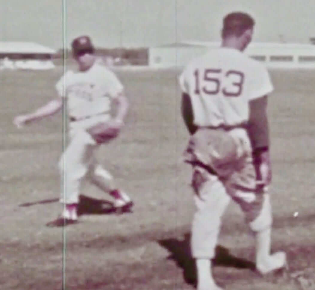
It’s a long-running joke that the most marginal players in spring training — the ones least likely to make the final roster cut — end up with the highest numbers. Until now, though, I’d never seen a spring training player with a three-digit number.
That screen shot is taken from the Astros’ TV broadcast of yesterday’s game against the Rangers. They were showing lots of historical footage interspersed throughout the game, including a short segment showing players doing sliding drills during spring training. One such player did his slide, then got up and walked away with his back to the camera, revealing that he was wearing No. 153.
There are lots of possible explanations for this. Maybe the three-digit numbers were routinely given to non-roster invitees, for example, or to minor league players who were invited to the big league camp. Still, I’ve never seen anything like this before.
It’s not clear who the player was, or when the footage was shot. The uniforms match what the ’Stros wore from 1965 through 1970, so that narrows it down. If anyone knows more, you know what to do.
(Big thanks to Houston-obsessive reader Ignacio Salazar for letting me know about this one.)
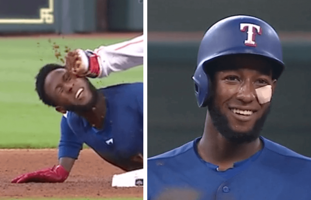
Ouch: Rangers infielder Jurickson Profar got spiked in the face by Astros second baseman Yuli Gurriel while sliding into second during yesterday’s game. After briefly leaving the field to receive medical attention, he emerged with a bandage on his cheek.
You can see video of the play here:
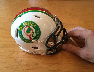
ITEM! Mini-helmet news: As you may recall, last winter we partnered with the good folks at Rocker T Collectibles to offer a Uni Watch mini-helmet (shown at right, now sold out). Now we’re thinking of doing a second design, but we’d like to have your input and feedback.
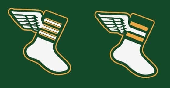
Here’s the deal: I want this new mini-helmet to feature Bryan Molloy’s excellent winged stirrup logo. But stirrups aren’t a football thing — they’re a baseball thing. (Yes, I realize NFL players did wear white crew socks over stirrups once upon a time, and stirrups were even shown in the NFL Style Guide at one point, but that was many decades ago, plus most people aren’t aware that it ever happened.)
So here are our options:
1. We could stick with the basic winged stirrup. After all, stirrups aren’t just a baseball thing or a football thing — they’re a Uni Watch thing, and the winged stirrup is the symbol of Uni Watch, even if it’s appearing on a football helmet.
2. We could modify the winged stirrup to look like a winged football sock (similar to what bobblehead restorer Chris Callan did when he made a Uni Watch bobble for me). Bryan has made two versions of this modification — one with the basic striping and one with more involved, old-style striping:
3. We could add a cleat to the sock. We chose to depict an old-school Riddell model (like this):
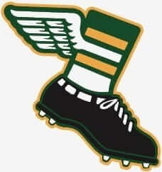
That one might need to be tweaked to make the white part of the shin a bit longer, but you get the idea.
Remember, our goal here is not just to create a good logo but to create a logo that looks good on a Uni Watch mini-helmet. Also, keep in mind that we haven’t yet decided about any of the other design details (shell color, facemask color, center striping, etc.). For now, we’re just trying to get the best logo for the sides of the helmet.
With that in mind, please let us know which option you think is best:
[totalpoll id=”99151″]
Thanks for your feedback — much appreciated.
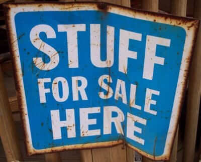
Even more cool stuff for sale: I’ve continued to add more photos of stuff that I’m trying to sell before I move in late August. You can see everything that’s currently available in this Flickr set, and I’ll continue to add a few more each day. I’m also removing items as they sell.
Please click on the thumbnails to see larger versions and, more importantly, to read the descriptions of the items, which among other things indicate whether the item is something I’m willing to ship or if I’m only offering in-person pickup. (You can see even larger versions of each photo by clicking the download icon and choosing “View all sizes” from the resulting popup menu.)
If you’re interested in any of this stuff, please get in touch and make me an offer. I’ll continue to add more items to this photo set each day, so stay tuned. Thanks for listening.
The Ticker
By Jamie Rathjen

Baseball News: In this quiz, guess the ballpark from the minimalist illustration of one of its distinctive features (from Larry Torrez and Matt Shevin). … “A New Hampshire American Legion junior state tournament game was delayed by lightning Saturday night in Portsmouth,” says Tris Wykes. “During the delay, one team drew a tic-tac-toe grid on a ball and chucked it across the diamond to their opponents. The ball wound up covered in Xs and Os and comments.” … There’s an upcoming vintage (as in 1864) base ball game Aug. 11 in Atlantic Highlands, N.J. (from David Peltz). … Rockies reliever Seunghwan Oh may have hidden a profane message in his uniform number (from Paul Dalton). … The Chicago Tribune printed a facsimile Hall of Fame plaque showing Jim Thome wearing a Chief Wahoo cap, even though Thome had made it clear that he wouldn’t have Wahoo on his plaque.

Football News: The Jets are getting new uniforms for 2019. That article also mentions that the Jets will wear their Color Rash uniforms on Oct. 21 against the Vikings (from multiple readers). … The CFL’s Hamilton Tiger-Cats wore white at home against Ottawa (from Wade Heidt). … The officials at the Kansas Shrine Bowl, an annual state high school all-star game, wear red and green-striped uniforms to match the teams (from Matt Newbury). … We had William and Mary’s new logos, etc., earlier last week, but it’s perhaps logical that the football helmets were updated as well, including the nose bumper.

Hockey News: Also posted in Grab Bag: Part-time NASCAR driver Ryan Ellis is wearing a Capitals-themed helmet for the Xfinity Series race at Road America (in Elkhart Lake, Wis.) Aug. 25. Ellis, from Ashburn, Va., has previously worn other Capitals-related stickers on the back of his helmet (from Jeff Lagro).

Soccer News: New kits for the English Championship’s Reading (left to right: second, first, GK, women’s team) and Norwich City (third), German 2. Bundesliga team Hamburger SV (second), and the Republic of Ireland national team (second, the version on the field won’t have an ad). … The Vancouver Whitecaps and Minnesota United both wore rainbow numbers Saturday (from Wade Heidt). … When I said I wanted women’s teams to be subtly distinguished from affiliated men’s teams through their kits, I didn’t mean by a different advertiser. … That’s Liverpool Ladies, whose new defender Sophie Bradley-Auckland has already had both an abbreviated and non-abbreviated NOB. … Scottish Premiership team Hamilton Academical recently signed a stadium naming-rights deal with a manufacturer of products containing cannabidiol. After all that, I’m still calling it New Douglas Park. … The Egyptian top-tier team formerly known as Al-Assiouty was recently taken over by a Saudi businessman and renamed Pyramids FC (from @leaaves). … Also posted in Grab Bag: IndyCar driver Graham Rahal, who is from Columbus, added a “Save the Crew” sticker to his helmet for this weekend’s race at Mid-Ohio (from @nordeckian).

Grab Bag: In English rugby league’s second-tier Championship, which includes the Canadian team Toronto Wolfpack, there was a white-vs.-white matchup between Toronto and Featherstone Rovers (from @bumkz). … As Team Sky have now won the Tour de France in six out of the past seven years, they continued their now-annual tradition of yellow-accented special uniforms for the final stage, as well as a matching bike for winner Geraint Thomas. Closer pictures here. … IndyCar driver Graham Rahal, who is from Columbus, added a “Save the Crew” sticker to his helmet for this weekend’s race at Mid-Ohio (from @nordeckian). … Part-time NASCAR driver Ryan Ellis is wearing a Capitals-themed helmet for the Xfinity Series race at Road America (in Elkhart Lake, Wis.) Aug. 25 (from Jeff Lagro). … U.S. field hockey midfielder Erin Matson was wearing a watch during the Americans’ World Cup game against India.
link
here’s the LA Times article about the artist who did the images used in the minimalist stadium quiz
Jets uni link 404’s
Try it now.
Still getting the 404.
Even after refreshing the page? Link is working fine for me.
It’s working for me at this time.
Interesting to see what the Jets do with the new uniforms. I like their current ones and I would probably just change the shade of green on them, but I’m guessing this will be a major overhaul.
I was surprised (and I probably shouldn’t be) on how many people responded on Twitter asking for a black jersey.
I submitted this a couple weeks ago, not sure if it made The Ticker: link
My guess is it had something to do with this: link
Seunghwan Oh uni number progression: 26, 22,…
Toronto rugby league match is played on a field that contains the markings for rugby league. Could rugby league be played on a Canadian football field? After all, the goalposts are situated in the same place, above the goal line/try line.
I guess they could, theoretically, play on a CFL field. It’s roughly the same size as used for rugby league, with the caveat that the CFL uses yards and rugby league uses meters to mark the field.
I’ve seen video of a rugby league match that was played in the U.S.
link
The field is marked for rugby league, but the college football goalposts are used in their regular location. With a match of international implications, they couldn’t get a set of rugby league goalposts and install them at the try lines? It’s not like they would get in the way.
Speaking of Oh’s uni number, we apparently have our first KSWOB (Korean Swear Word on Back)
link
Someone didn’t read today’s Ticker very carefully!
Oh, no.
I will reserve judgment until they come out, but needless to say this had better not be a Nike clown suit. An incremental upgrade — viz., correct the green, tweak the shoulder/sleeve treatment, make the logo football-shaped — would be fine, but a custom font, goofy graphics and a third trim color might force me to do the unthinkable and become … gasp … a Giants fan.
The Jets need to take heed that right now, every New York team (except the Nets) is wearing essentially the same uniform it had in 1965, many having reverted thereto over the last couple of decades. New York teams in particular have not done well with “modern” looks and designs which, when tried, have never lasted; the mid-70s Giants and Rangers and mid-’90s Islanders being prime examples.* If the Jets and Nike are smart — which the former we know are not — they’ll hew as closely to the 1965-77/1998-2018 design as they can.
[* – Mets in black is, I think, the exception that proves the rule, although the short-lived “swoosh-tail” design of 1993-94, while not “modern” in any sense, is another example of a major change that didn’t last. The Jets’ 1978 redesign, when you think about it, only “modernized” the primary logo; the rest of the uniform was even more subdued than its predecessor. The black-trimmed version of 1990-97 also held on a bit longer than it should have, as did the black-trimmed Knicks.]
I think the simple solution would be to incorporate the winged wordmark from the 1980s into the existing logo. Maybe make the shade of green less drab (but not go full kelly green, hopefully they Eagles go back to that). Also I think you just dump the different color shoulder caps / sleeves and go solid green and solid white respectively. Figure out a way to tastefully add the wing into the sleeve stripes, ditch the chest patch logo, and there you. Keep the white helmet.
I agree with all this except the inverted sleeves; that’s always been my favorite feature of this uniform. I just think it’s cool to have both white-on-green and green-on-white numerals on the same jersey.
Completely agree.
I would personally like the Jets to revert back to a green helmet, as it would give them a more distinctive dome than their white one. There are a lot of white/silver helmets in the NFL and not many darker-colored ones, so in the spirit of the Titans, a Jets’ change to a colored helmet would do them favors. I’m agnostic on the logo, even though for me, the ’78 logo is what I think of when I think about the Jets.
As for the uniform redesign…wouldn’t it be bitter irony if Nike figured out its green jersey issues, and applied them to the Jets before the Eagles?
I never liked the green helmet; the wordmark is fine by itself but to me, having a wordmark instead of a logo on the helmet is way too high school. I also grew up with the green helmet but when I first saw the “old” white helmet in pictures from Super Bowl III I thought it looked much better and should be revived.
I think in the Jets’ case the white helmet works well with the current uniform (as it did from 1963-77), particularly the striping treatment, and the fact that there’s no third/trim color. Having a dark-colored helmet for the sake of having a dark-colored helmet is not a great idea; see: Titans. (I also never cared for the Bills’ red helmets vs. white, but I know a lot of fans disagree.)
I’d be fine with incorporating the 1978-97 wordmark into the current logo, although I wouldn’t clamor for it.
I think the Bills white helmet looks better than red. BUT, they look too similar to the Colts with that, and the red helmet is both distinctive and reminiscent of their most successful days (even if they couldn’t close it out in the Superbowl). They are both good looks, white is better, but red is more distinctive, which I think is also important, that a uniform be easily recognizable and not easily mistaken for other teams. I think that is why the Titans navy helmet is a big fail, they’ll look way too similar to Chicago and Seattle.
I had heard that the Bills switched to the red helmets for then QB Joe Ferguson who was color blind. The AFC at that time had 4 of 5 teams with white helmets (Pats, Colts, Phins, Bills). By going to red, Ferguson had an easier time distinguishing DB’s from his receivers.
I don’t think the Bills look similar to the Colts at all; the logo is bigger and covers more surface area, the stripes are thicker, and they have a third/trim color (red) which the Colts don’t. In fact I think the Jets look more like the Colts than the Bills do; change the green to blue and the only difference is the helmet stripes and inverted sleeves.
I don’t think having a similar color scheme as another team is a sin; look at the Bengals and Browns from ~1968-80 (which was quite deliberate), the Jets and Eagles from ~1985-95, and the Chargers and Rams from ~1974-84, to name a few. The Jets’ current uniform is also very similar to the Packers’, which doesn’t bother me at all.
The idea “that a uniform be easily recognizable and not easily mistaken for other teams” is how we got custom numeral fonts (that, along with making it harder to make a DIY jersey at your local Champion outlet) which, to me, are a scourge upon the NFL. Regardless of what else they do, the Jets had better not do that.
By look similar I just meant on first glance. You’re watching a game, the players are small, you see a team with a white helmet, blue jersey, and white pants, who do you think of first? I think Colts first, but that might just be because the Bills wore the red helmet for my whole childhood up through my late 20s.
Anyway, my point being that with football teams can do a lot of different things with the helmet, jersey, and pants, as compared to other sports where uniforms are more monochromatic from head to toe. I don’t think custom fonts have much to do with that, it is more the color schemes of the uniforms that make teams identifiable than particular elements of the jersey. The Packers are yellow and green, the Raiders silver and black, Steelers black and yellow, Saints black and gold, Niners red and gold, etc.
Again, to me the Bills and Colts don’t look “similar … on first glance” because one has red trim and one doesn’t. On second glance I see very different shoulder/sleeve treatments, helmet logos and pants stripes, and on third glance I see things like the Bills’ widening helmet stripe vs. the Colts’ huge rear-helmet numerals.
Some teams do have unique colors or color schemes, and are readily identifiable thereby, but I don’t see that as a general rule that every team has to live by. I honestly don’t think I’ve ever turned on an NFL game and thought I saw one team that turned out to be another.
Re: Jets uniform. Just give me kelly green. Otherwise, I could be cool with lots of design options. I do like the current uniform design but it would be a whole lot better if it was kelly green.
For a redesign – Maybe an updated version of the original jet logo on the helmet which lasted just that first season?
White helmet fine. Kelly green helmet would be great too. We need a kelly green helmet in the NFL and if the Eagles aren’t going to do it – then go ahead Jets.
If that Jamal Adams tweet was a legit prototype, I think it would be a good look with some tinkering:
link
Can I please purchase just a decal, for whatever is chosen for the helmet. I’ll add it to the guitar case.
Congratulations on the move in Paul.
Thank you
Idea re: the mini-helmet. Add PEA CRABS as award decals on the back! The pea crab needs to find a place in uni watch iconography.
Wow! I love that.
Not sure about the cleat logo… while I am a sneaker head and think the cleated logo looks the best, we really don’t get into shoes that much on here… our shoe mentions are more about coloring or uniformity not so much about the shoe… I feel by adding the cleat it draws the attention to the shoe and not the winged stirrup, which should be the focus…
Oh and a hotdog is a sandwich, I don’t care what anyone says …
Correct (about the cleat part). When I saw it all of my attention was drawn to the cleat and away from the rest of a the logo. Maybe it has to do with the black coloring, possibly be better with white cleats? But I agree, the focus of the logo should be on the beautiful sock stripe design with the wing, after all, the meaning behind it is the love of old fashioned stripe hosiery.
Moreover, baseball players also wear cleats, and there was no need for them on the logo for the ball cap.
I’d like to see the cleat in green.
When I played 3rd base in my high school days we would always draw a tic-tac-toe grid in the dirt and play against the other team
What about the winged logo on a white cleat?
This is the variation I would vote for. Otherwise, I much prefer the incongruity of the apparently baseball-specific logo on a football helmet. That’s the kind of oddity that would make a good Uni Watch lede, whereas a nicely designed football-centric logo on a football helmet is just … nice. It’s a ticker entry that few even bother clicking on because the linked description text tells the whole story.
I love the Riddell snug-tie, but isn’t it a little weird to have ground traction when you can fly?
COTD.
You have to land eventually.
I hope the Jets go back to kelly green. Not sure why kelly green fell out of favor for sports teams. I’m one who likes white helmets, but with 3 of the 4 AFC East teams having white, a kelly green helmet would look great. I actually like both logos, so why not combine them. Have the oval with NY in the background, and “Jets” with the supersonic jet over the top.
Regarding the mini helmet:
What about using just the wing a la Philadelphia Eagles and then using a few of the full logo for merit stickers on the back?
Probably too much work for the project but fun to think about the potential!
This is brilliant… don’t know why it didn’t get traction. I like the idea. The stirrup idea on a helmet is just dumb. Socks with no cleats not as dumb… The cleat logo is the only logical choice but the “wings” only helmet is for someone “who gets it”
Dumb is a tad harsh, considering that a professional team doesn’t even have a logo on their helmet.
minimalist ballparks quiz on most difficult level was still easy, 30/30.
The helmet should be the old 1960s single bar style.
I might be late to the party, but did you catch the new TNF on Fox logo? It’s on Erin Andrews’s IG story
Reeeaaaally hoping the Jets don’t revert to the logo from the 80s. Absolutely hate that logo and the boring-ass uniforms that went with them. I’ve always liked the current set and hope they keep the shoulder/sleeve features (white sleeves on green jersey, green sleeves on white jersey). I’d agree something closer to kelly green would be nice as well. But no black, no black out lining crap. How ’bout actually having a jet on the helmet, eh? I’ve seen a bunch of mock ups with that idea, and have liked most. Also, no stupid wording on the pants like the Clowns. Now, get off my lawn hooligans!
Agreed. Also hope they ditch the chest patch and don’t go with gray facemasks, no matter what the helmet color may be.
Stirrups are obviously more associated with baseball than football, but in the past football officials did wear them…
link
That Profar picture made me immediately of the (in)famous Bloom County gag with Oliver Wendell Jones wearing the “flesh colored” band aid.
Trade ya for a burnt umber.
I see the uniwatch alt cap is available! For sizing clarification, would you say it is more like a ’47 brand broken in relax fit hat, or more along the lines of the lower profile Nike or New Era flexfits? Thanks
I think the latter.
The film clip of the Astro player wearing #153 reminded me of former pitcher Bill Lee’s request to wear #337, so that when he did a handstand, his last name would be on the back of his jersey. Old stick in the mud Bowie Kuhn wasn’t in favor of it, though.
Have you considered a mini baseball helmet with the winged stirrup logo instead of a mini football helmet?
Do people really collect mini-baseball helmets (ice cream versions notwithstanding)? Seems like a less interesting object than a football helmet. I mean, if there’s demand for it, I’d consider it, but it hadn’t occurred to me that there’d be any demand.
When I was younger, I had the mini helmet sets for all of the Power 5 football conferences as well as the MLB mini helmets. I think I still have all of them in my room, in storage, somewhere.
It shocks me just how often athletes get injured within a couple of centimeters from their eyeball. Every time I see these, I can’t help but think that, if the stud came up a little higher/lower…
I would love to see the Jets mash together the Sack Exchange era with the unis they wore during Super Bowl 3. Go back to the kelly green and perhaps use a sleeker Jets logo from 80s in green on a white helmet with the the green stripes and perhaps even take the black face mask from the late 80s early 90s. Use black as accents on the numbers, name plates and pants piping. Go back to the single stripe piping from the Sack Exchange era. Tweak the current top just a bit, mainly the shoulder stripes. By keeping the white helmet they can then add a throwback to the set (remember the NFL’s one helmet rule) and even do a black alternate if they wanted too since it would their third color.