A few weeks ago I published an entry about a bunch of early-1970s rejection letters that had been sent by various NFL teams to a guy named Richard, who was desperately seeking a tryout to be a placekicker. Today we have another batch of letters from Richard’s files, picking up where we left off chronologically and proceeding from there.
Just like last time, I’ve removed all identifying details to preserve Richard’s and his family’s privacy. I won’t be revealing anything else about them, so please don’t ask. Thanks for understanding.
If you missed the earlier entry (or if you just want to refresh your memory), you should definitely read it before reading today’s post.
In each case, you can click on the photo of the letter to see a larger version. Ready? Here we go.
Feb. 23, 1973: Rejection Letter from the Cardinals
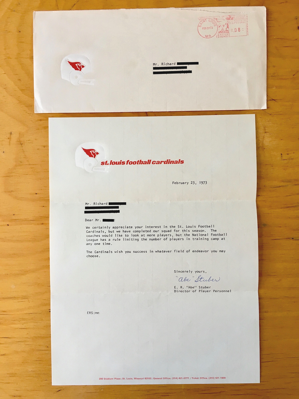
Dear Mr. [REDACTED]:
We certainly appreciate your interest in the St. Louis Football Cardinals, but we have completed our squad for this season. The coaches would like to look at more players, but the National Football League has a rule limiting the number of players in training camp at any one time.
The Cardinals wish you success in whatever field of endeavor you may choose.
Sincerely yours,
E. R. “Abe” Stuber
Director of Player Personnel
This is identical to the letter Richard received from the Cardinals less than a year earlier.
Feb. 26, 1973: Letter from the Rams
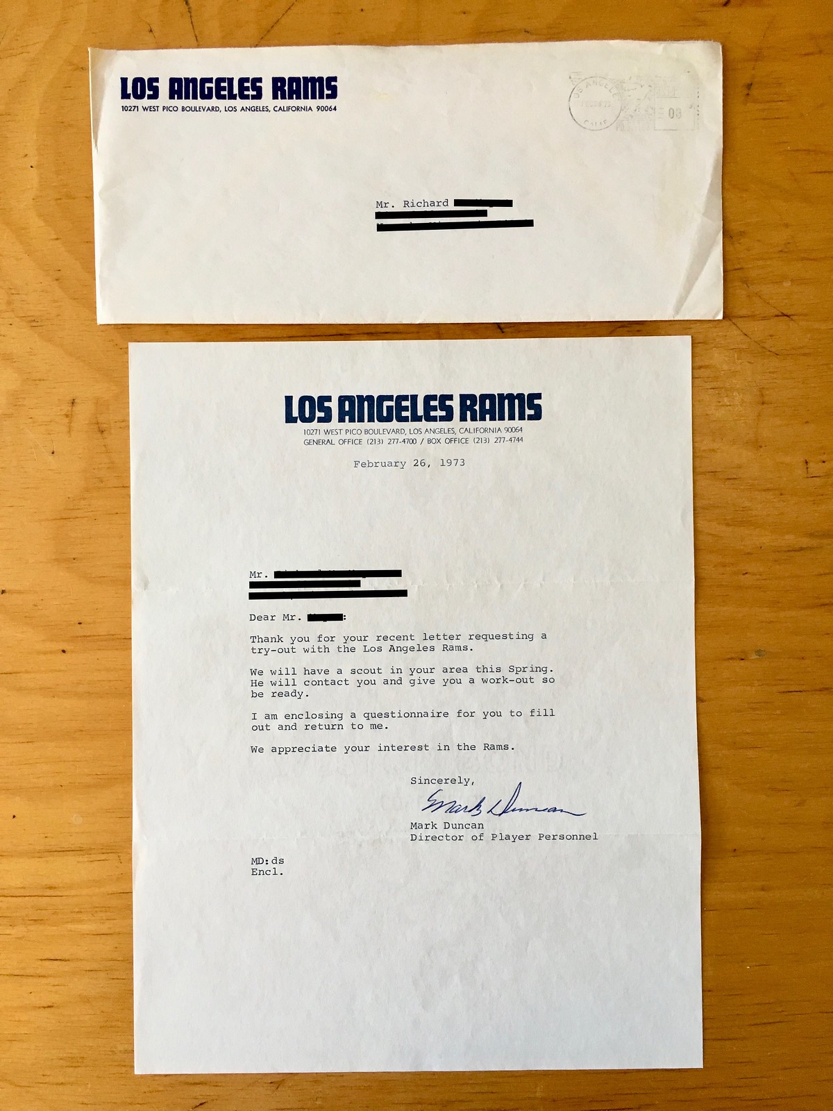
Dear Mr. [REDACTED]:
Thank you for your recent letter requesting a try-out with the Los Angeles Rams.
We will have a scout in your area this Spring. He will contact you and give you a work-out, so be ready.I am enclosing a questionnaire for you to fill out and return to me.
We appreciate your interest in the Rams.
Sincerely,
Mark Duncan
Director of Player Personnel
The rare non-rejection letter! I’d love to know what sorts of questions were on the questionnaire, but it wasn’t included in the envelope, so Richard presumably filled it out and sent it back to the Rams.
Feb. 27, 1973 (date taken from postmark): Rejection letter from the Saints
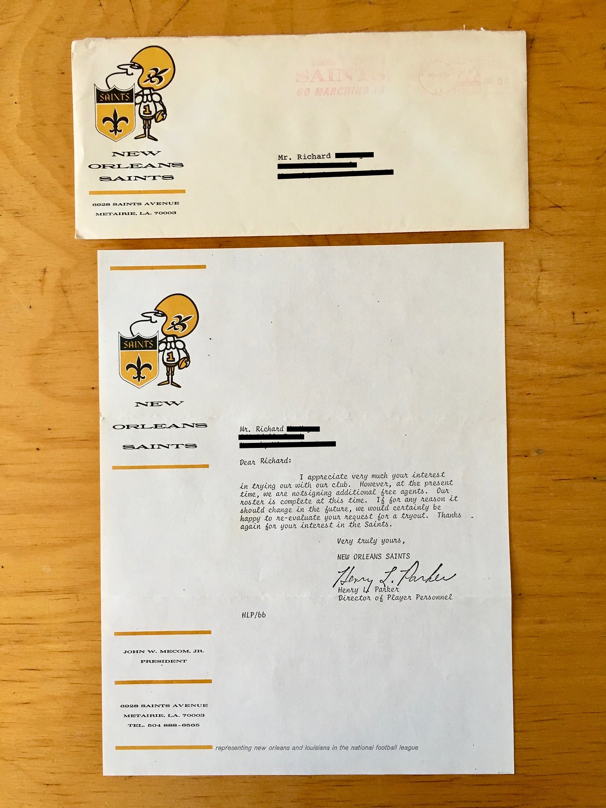
Dear Richard: I appreciate very much your interest in trying our [sic] with our club. However, at the present time, we are notsigning [sic] additional free agents. Our roster is complete at this time. If for any reason it should change in the future, we would certainly be happy to re-evaluate your request for a tryout. Thanks again for your interest in the Saints.
Very truly yours,Henry L. Parker
Director of Player Personnel
This letter is notable for several reasons. First, as you may recall from last time, the Saints had dangled the possibility of a tryout about a year earlier, but apparently nothing came of that. Second, this letter has a few typos — something rarely seen in Richard’s batch of letters. And third, the Saints had upgraded to a script typewriter!
Feb. 27, 1973: Rejection letter from the Falcons

Dear Richard:
Thank you for your interest in the Atlanta Falcons and your recent inquiry to become a player.
At this time we do not have anything to offer you along those lines. We shall keep your letter on file; and, if you should pursue your football career further, please feel free to rewrite us.
Sincerely,
Tom Braatz
Director of Player Personnel
As you may recall from last time, this letter is identical to one that Richard received from the Falcons about a year earlier. (The Falcons changed their stationery in that time, however.)
March 1, 1973: Rejection letter from the Oilers

Dear Richard:
Thank you for your recent letter of inquiry regarding a tryout with the Houston Oilers.
We have a full roster including our draft choices, free agents and returning veterans and will not be adding any additional players this year.
This letter is in no way intended to discourage you in your quest to pursue a pro football career. The best of fortune to you in finding a niche in the pros and in making the best of it.
Again, thank you for your interest in the Houston Oilers and please accept our good wishes for a bright future.
Sincerely,
Bill Peterson
Head Coach
The Oilers had sent Richard a similar rejection letter about two years earlier, but that one was from the player personnel director; this one was from the head coach. Interesting to see that they both went out of their way to sugar the pill by giving some Richard some encouragement, something most of the other teams didn’t bother to do.
March 2, 1973: Rejection letter from the Chiefs

Dear Richard: Your recent letter to Coach Stram in which a tryout was requested has been referred to my office for compliance.
Since we have two of the outstanding players in your specialty, place kicking and punting, I really must discourage you from a tryout here. I am certain there are other National Football League teams who are looking for players with your ability where you would have a much better opportunity to express your ability and perhaps make their club. So, we cannot bring you here for a tryout.
Good look and best wishes.
Sincerely,
Tommy O’Boyle
Head Talent Scout
Ouch — so much for encouragement. O’Boyle was presumbably referring to Chiefs kicker Jan Stenerud and punter Jerrel Wilson, who were indeed among the best in the league at that time.
March 13, 1973 (date taken from postmark): Rejection letter from the Saints
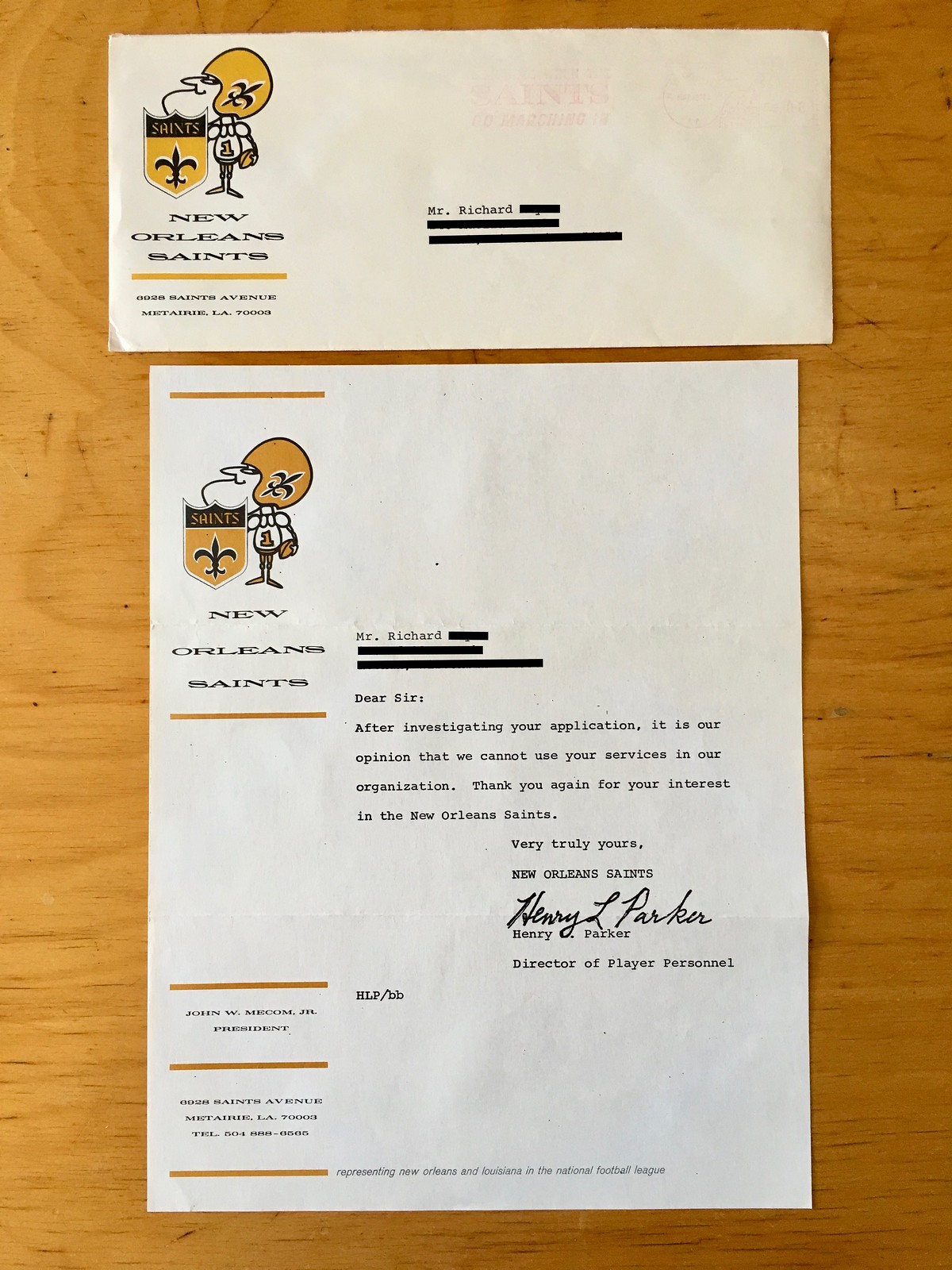
Dear Sir:
After investigating your application, it is our opinion that we cannot use your services in our organization. Thank you again for your interest in the New Orleans Saints.
Very truly yours,
Henry L. Parker
Director of Player Personnel
This letter is apparently referring to the questionnaire that the Saints had sent to Richard back in 1972. No script typewriter for this one!
March 16, 1973: Rejection letter from the 49ers
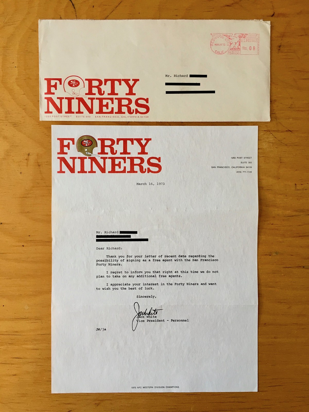
Dear Richard: Thank you for your letter of recent date regarding the possibility of signing as a free agent with the San Francisco Forty Niners.
I regret to inform you that right at this time we do not plan to take on any additional free agents.
I appreciate your interest in the Forty Niners and want to wish you the best of luck.
Sincerely,
Jack White
Vice President – Personnel
Interesting that the 49ers consistently spelled out their name, and also that they did so without a hyphen — on the envelope, on the letterhead, and within the text of the letter itself. I like the use of the helmet within the wordmark. Also like the unusual positioning of the return address on the envelope.
Feb. 11, 1974: Rejection letter from the Falcons

Dear Richard:
Thank you for your interest in the Atlanta Falcons and your recent inquiry to become a player.
At this time we do not have anything to offer you along those lines. We shall keep your letter on file; and, if you should pursue your football career further, please feel free to rewrite us.
Sincerely,
Tom Braatz
Director of Player Personnel
Another year, another identical letter from the Falcons. Poor Richard!
Feb. 14, 1974: Letter from the Saints
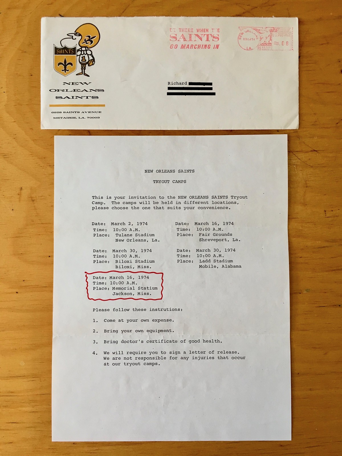
NEW ORLEANS SAINTS TRYOUT CAMPS
This is your invitation to the NEW ORELANS SAINTS Tryout Camp. The camps will be held in different locations, please choose the one that suits your convenience.
Date: March 2, 1974
Time: 10:00 A.M.
Place: Tulane Stadium, New Orleans, La.Date: March 16, 1974
Time: 10:00 A.M.
Place: Fair Grounds, Shreveport, La.Date: March 30, 1974
Time: 10:00 A.M.
Place: Biloxi Stadium, Biloxi, Miss.Date: March 30, 1974
Time: 10:00 A.M.
Place: Ladd Stadium, Mobile, AlabamaDate: March 16, 1974
Time: 10:00 A.M.
Place: Memorial Stadium, Jackson, Miss.Please follow these instrutions [sic]:
1. Come at your own expense.
2. Bring your own equipment.
3. Bring a doctor’s certificate of good health.
4. We will require you to sign a letter of release. We are not responsible for any injuries that occur at our tryout camps.
Well, now — that’s more like it! It’s not clear if this notice came in response to a new inquiry from Richard or if the Saints simply had him on their mailing list. Either way, an exciting development! How did it turn out? Perhaps we’ll find out next time — stay tuned.
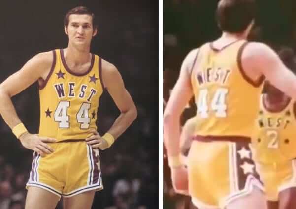
Friday Flashback: With the Lakers set to unveil new uniforms on Monday, my latest Friday Flashback piece for ESPN takes a look at some uni-notable moments in Lakers history (including Jerry West wearing his name on the front and back of his All-Star jersey, shown above). Check it out here.
Click to enlarge
With a wedge of lemon, please: You’ve heard of shrimp cocktail, and you’ve heard of a cocktail dress. But last night my friend Pam was wearing a shrimp cocktail dress. How cool is that?!
There’s a word for merging two terms into a compound like that, but I can’t remember what it is. Anyone..?
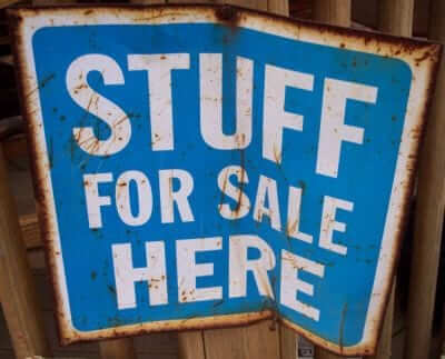
Still more cool stuff for sale: I’ve continued to add more photos of stuff that went unsold during last Saturday’s moving sale but that I’m still trying to sell. You can see everything that’s currently available here, and I’ll continue to add a few more pics today.
Please click on the thumbnails to see larger versions and, more importantly, to read the descriptions of the items, which among other things indicate whether the item is something I’m willing to ship or if I’m only offering in-person pickup. (You can see even larger versions of each photo by clicking the download icon and choosing “View all sizes” from the resulting popup menu.)
If you’re interested in any of this stuff, please get in touch and make me an offer. I’ll continue to add more items to this photo set each day, so stay tuned. Thanks for listening.
The Ticker
By Alex Hider

Baseball News: A fan at Wrigley Field had to go to the hospital Tuesday after a metal pin from the center field scoreboard fell and hit him in the head. It could have been worse, but the fan was reportedly wearing a bucket on his head (from Mike Chamernik). … Johnny Garfield found this photo of Expos P Dennis Boyd in a pullover version of the team’s racing stripe jerseys. I suspect this is a spring training shot, can anyone confirm? … Lots of rare Reds memorabilia is up for auction right now, including 1919 World Series tickets and an Andy Warhol silkscreen of Pete Rose (from Steve Heller and Brice Wallace). … The Avett Brothers played a postgame concert at the Braves’ stadium last night, and made a slick baseball card poster to promote the show (from Greg Schutt). … The Reno Aces are honoring former SS Didi Gregorius with a bobblehead that has him half in Yankee pinstripes, half in an Aces uniform. Interesting, given that the Aces are a Diamondbacks affiliate (from @HatOnHeadWearer). … Lots of nickname options for North Alabama’s new minor league baseball team, slated to begin play 2020. … Yesterday’s ticker mentioned the Crushers, a new baseball team in southern Australia. Turns out they just poached their logo from the Frontier League’s Lake Erie Crushers. Lame (from John Lesnik and @MiLBPromos). … Lots of notes on the Iowa high school baseball tournament from Kary Klismet: West Des Moines Valley has at least three different stirrup/sock styles and wears the manufacturer’s logo on their batting helmets. Cedar Rapids Washington, Treynor, and Mason City Newman all have striped stirrups. Finally, Neola Tri-Center wears a T-shirt-style jersey with a large Twins logo. More photos here for anyone interested. … The Clearwater Threshers will become the Clearwater BeachDogs for one game on Aug. 24. “When Spectrum Field opened in 2004, the Clearwater Phillies were renamed the Threshers by fan vote, but BeachDogs came in a close second, so the evening has been deemed a ‘what might have been’ promotion,” explains John McMunn.

NFL News: Dolphins QB Ryan Tannehill has “Tannehill 2.0” written on his knee brace. … Looks like Saints QB Drew Brees has switched to a new helmet model, and reporters asked him about the change after practice (from Nick Lenfestey). … Paul has created a Flickr set showing all of this year’s home and road NFL sideline caps. … Patriots rookie QB Danny Etling wore No. 58 to practice yesterday. Pats rookies don’t get permanent numbers until they make the final roster (from Matt Fedorka).
College Football News: Cool piece from Eleven Warriors writer Andrew Lind, who had players at B1G media days design alternate uniforms for their teams. … At least one Wisconsin player, LB Pete Monty, had a “Wisconsin” wordmark between his helmet stripes during the 1996 Copper Bowl (from Nate Neumann). … El Paso Austin High School (Texas) is poaching both Purdue’s and Penn State’s logos (from Marc Burgess). … This October will mark 25 years of Nike outfitting North Carolina teams (from James Gilbert). … A few subway station signs in Boston are decorated in the style of vintage CFB programs/posters (from Andrew S.). … Looks like Ohio is ditching the shoulder stripes (from our own Alex Hider, who’s an Ohio alum and is not happy about the loss of the stripes).

Hockey News: Golfer Dustin Johnson wore Wayne Gretzky’s sweater while warming up prior to the RBC Canadian Open in Ontario yesterday. Johnson is Gretzky’s son-in-law (from Mike Chamernik). … A courier company in Edmonton is repurposing the AHL’s Manitoba Moose’s old logo as its own (from B.Q. G.).

Soccer News: New third jerseys for Burnley (from Josh Hinton). … For Arsenal’s friendly against Atletico Madrid in Singapore, Arsenal wore jerseys with kit numbers designed by Singaporean artist Mark Ong (from Andy Riley). … Rangers FC of the Scottish Premiership have already revealed three kits for this season, but wore a plain red and black training kit for their Europa League game yesterday (from our own Jamie Rathjen). … It appears Tottenham’s new stadium will not carry a corporate name. The team also unveiled a logo for the stadium yesterday (also from Jamie Rathjen). … An oldie, but a goodie: Spanish football club La Hoya Lorca wore broccoli-themed uniforms during the 2013-14 season. … The gradation/fade toward the bottom of Tottenham Hotspur’s new jerseys creates the illusion of the players shorts being pulled up too high.

Grab Bag: The Milwaukee Bucks have sold naming rights to their new arena (from Brian Kerhin). … After a few rough quarters, Under Armour topped financial forecasters’ expectations in the second quarter — though they still have a long way to go to get to Nike and Adidas’ market share (from Tom Turner). … Joshua Exline took his son to a concert in Pittsburgh and found a boutique that uses baseball cards instead of price tags. More here. … You know how lid supports — the little plastic thingies that keep the pizza box from smushing into the pizza — look like miniature tables? A pizzeria in Canada is serving its pies with tiny chairs surrounding the “tables” (hard paywall) (from @PureLipschitz). … F1 news: Ferrari is paying respects to former chairman and CEO Sergio Marchionne this weekend with a black stripe on the top of the cockpit and black armbands. More on Ferrari’s “mourning liveries” in this thread (from @bdh_photos and @dmoon).
There’s a word for merging two terms into a compound like that, but I can’t remember what it is. Anyone..?
portmanteau plural portmanteaus or portmanteaux \pȯrt-ˈman-(ˌ)tōz\
1 : a large suitcase
2 : a word or morpheme whose form and meaning are derived from a blending of two or more distinct forms (such as smog from smoke and fog)
(source: Merriam-Webster
Oops, forgot to link.
Yeah, but as the smog example shows, that’s a different thing.
Example one: “Shrimp cocktail” and “cocktail dress” become “shrimp cocktail dress.”
Example two: One of my favorite 1990s bands was BrickLayerCake.
Example three: I once had a set of cufflinks that looked like handcuffs, so I called them my “handcufflinks.”
There’s a term for that kind of merging. Can’t remember what it is.
Wheel of Fortune uses that style as one of the categories for their puzzles. They call the category “Before & After”. Here’s an example where the solution was Cattle Ranch Dressing.
link
I think that’s called a compound.
Dammit. Now I’m going to have the King Crimson song “The World’s My Oyster Soup Kitchen Floor Wax Museum” in my head all day.
Brilliant comment!
It’s a phrasal overlap portmanteau. Or anyway that’s the best I can find in the linguistics literature that I’m aware of.
It’s called “before and after” on Wheel Of Fortune :)
My thoughts exactly!
Baseball uses a 40 man roster. NFL final rosters are set to 53 and only 45 are active on GameDay.
Fixed.
I hope old Richard didn’t attempt the tryout in Jackson – it would be difficult to find!
My bad – I neglected to transcribe “Memorial Stadium” as part of the location. Now included.
After seeing these NFL Rejection letters, I don’t feel as crazy now for keeping the rejection letters that I received for jobs that I was turned for in my field. As a former teacher, I attained my Master Degree in School Administration and then began the process of applying to schools for Principals positions. There were positions that I applied for and went on interviews for that I knew that I had no chance to get but I went on the interview and through the process. It gave me experience and a perspective. There were also positions that I received second interviews. Each time, I received letters stating that decision was hard and that I was not chosen. I kept all of those letters and taped then inside of my closet door at school. Finally in 2018, I did get a position. Those rejection letters served as an inspiration to me.I still have them today and it makes me appreciate where I have gotten to in my career.
Regarding the Tottenham items in the soccer section:
— Ooof! Those new gradient tops are hideous on the field. Old men pulling their pants halfway up their torsos hideous.
— I wouldn’t get too attached to “Tottenham Hotspur Stadium.” That seems a placeholder until a corporation ponies up enough £££. Interesting they aren’t using the White Hart Lane name. Even though it’s going to look nothing like the old one, it was built at the same location (give or take 50 yards).
Yeah, I was just going to say that I wouldn’t phrase it like “will not carry a corporate name,” because the “will” implies that it always will be called Tottenham Hotspur Stadium, which we don’t know and which I wasn’t trying to say yesterday. I just said there was an ad-free name for now.
Can understand it not being called White Hart Lane, though, because it’s a separate building.
You could argue that Tottenham Hotspur Stadium is itself a corporate name, as they advertise their own brand instead of someone else’s.
Even if it gets a corporate name, it’ll probably be referred to as Tottenham Hotspur Stadium for UEFA Champions League games or if it should ever host a World Cup game.
Example: The Etihad is called “City of Manchester Stadium” for Champions League matches.
“I’m calling it White Heart Lane” for our London brethren??
I miss WHL? Could do a whole soccer batch: I Miss Upton Park (West Ham) as well as several others.
RE: Saints upgrading to a script typewriter.
They probably had an IBM with interchangeable “font balls”.
Back in the day, there were various choices (12,14 Pica, Courier, Italic, Orator for presentations, etc.)
At that time, it was probably as “high-tech’ as you could get.
Looks like you inadvertently fixed yet another typo by the Saints secretary. The letter reads: “Please follow these instrutions:”
Ah, so I did! I’ll un-fix it.
I love how the human brain automatically reads things correctly even when misspelled. That this can happen unconsciously is such a fascinating aspect of how language and the printed word works in our mind.
A couple of typos in your transcript for the Forty Niners letter as well:
‘we do not play to take on any additional free agents.’ – plan
Jack white – White should be capitalized.
Thanks. Fixed!
“Stadium” is “statium” at one point too.
As an Ohio Alum I too am unhappy with the loss of the shoulder stripes.
Dustin and Paulina aren’t married. Not Wayne’s son in law yet.
I didn’t think they were married yet.
Wonder if they will go the Kurt Russell/Goldie Hawn route.
The NFL sidelne caps seem to have a lot of inconsistencies within the design. Some teams have the jersey stripes on the side panel, but some teams (Eagles, Jags) don’t. Some teams have the city/state name on the contrived shield on the gray caps, other have the team name or wordmark. Some teams have their name on the side, others have a nickname, still others have the city/state name, still others have the city/state’s 3-letter abbreviation. Surely this wasn’t an oversight?
Are you actually complaining about them not having imposed a blanket template?
Yeah, I think it’s a good thing to allow some variety and flexibility within the template. I thought it was funny that the Cardinals used a solid red stripe on the side of their red cap.
I’d rather there not be a blanket template, but there certainly is a blanket template. There are a few inconsistencies in the implementation of it. Now it might just be a I have a slight OCD for this sort of thing, but if they are going to impose a template like they have, the little inconsistencies are very odd. It is sort of like how in those NBA hats there was no real rhyme or reason into what year they used as the established date for the franchise.
Poor Richard! I wonder in his quest to pursue a pro football career if he attempted to get a tryout in the Canadian Football League. No rejections letters (and no placekickers in the league named Richard in the 1970s).
Would have been worth the attempt. Salary between CFL and NFL much more similar back then. Though there would have been another tough obstacle. With the CFL import ratio, a lot of times the placekicker will be a Canadian who was a good kicker in Canadian university football.
But there was another professional football league back at that time…I could be wrong, but a quick Google search leads me to believe we’re in for a happy ending with one of the more interesting backstories of an athlete…Then again, I could be very, very wrong.
I’m pretty sure you’re right. Nostrovia!
If your friend sprayed her garment with non-stick cooking spray and kept it a particular piece of bedroom furniture, might that piece of furniture be Pam’s Pammed shrimp cocktail dress dresser?
(I’m so ashamed)
And I believe “Shrimp cocktail dress” is an example of an Open Compound Noun. But that is a boring answer. There should be a funnier name for funny ones.
“Dennis” Boyd? Only his mother and the United States government call him that.
So did Bob Sheppard, the PA announcer at Yankee Stadium.
Good on Richard for keeping the letters and envelopes. They are absolutely fantastic. I’m sure that, as disappointed as he probably was when he received the rejections, he is now very happy that he held on to them.
Oops…I forgot that he sold them on eBay. Oh well, at least he didn’t throw them out when he received them. They’re still fantastic.
With respect to the Lakers colors, it was always referred to as “Forum Blue and Gold” when Jack Kent Cooke owned the team.
Someone didn’t read all the way to the end of the ESPN piece…. ;)
I wish the Los Angeles Kings would wear “Forum Blue and Gold” again. Enough time has passed. If the Lakers can make it cool, the Kings can do the same.
Prefer this:
link
Compared to this:
link
IMO the best of the purple-and-gold (sorry, I’m not calling them blue, no matter what JKC said) Kings unis was the one they wore from 1980-81 through 1986-87, before they decided to celebrate Wayne Gretzky’s arrival by getting super ugly.
Unfortunately, the team has rarely thrown back to that set in recent years, preferring to go with their earlier, simpler designs. They wore them for a few games during the 2003-04 season, and that’s been it so far.
Interesting item somewhat tied in with this thread. There is a current jersey out there that is influenced by a combination of the Kings’ old and new look molded into one.
Ticker and comment readers know I follow box lacrosse. The Coquitlam Adanacs of the Western Lacrosse Association (WLA) wear the current Kings’ jersey striping template. However, the Adanacs have a long history wearing purple and yellow.
Adanacs in white:
link
Adanacs in purple:
link
Transcription error in first letter:
You wrote “but the National Football League has a rule limited the number of players in training camp at any one time.”
It actually said limiting.
It is odd that the Saints sent two letters, two weeks apart. I think you could give that slightly more analysis and maybe put those two as a combined entry. But overall, love this feature!
Fixed!
Looks like the 49ers wanted to use up its old stationery before updating it. It notes their 1970 division championship on the bottom of their stationery but no mention of their 1971 and 1972 wins.
Spurs supporter here, the animosity towards this year’s kits is quite overwhelming. Really makes me wonder what the team officials were thinking when they chose those Nike designs.
Also, I’m still holding out hope that the new stadium will be an homage to the old WHL once they get a corporate name. Something like “Nike Stadium at White Hart Lane” would be better than nothing I suppose.
Same here. The tops are a complete dud. Here’s hoping they become classic for winning a trophy.
The stadium is still next to the train station and street called White Hart Lane (from what I can tell on Google maps, that is), so I’m guessing supporters will still say they’re going to The Lane.
In any case, the stadium looks cool. The south end single-tiered wall of seats looks like it will be amazing.
I saw the second kit recently in pictures from a Spurs XI/Enfield Town preseason game and I actually liked it. The lighter blue socks contrast well with the dark blue.
I’ll show myself out.
They’re not terrible, but they are the exact copy of Barcelona’s training tops and look similar to France’s blue tops. I’m excited for the potential third kit, looks like it’s seafoam green with the topographic map of the Tottenham marshes on it.
link
Dustin Johnson was not wearing Wayne Gretzky’s sweate, which would be a sweater that belonged to Mr Gretzky. He was wearing a Wayne Gretzky replica jersey, which is something else entirely.
From the Lakers Piece referring to mismatched shorts:
“The reason for this has never been satisfactorily explained (Different laundering techniques? Different perspiration rates? Different manufacturers?), but it sure looked weird.”
If you analyze the mismatches, most had a bluer jersey over purple shorts, except Magic Johnson in first photo had purple over bluer. My thoughts are that it was probably on a year to year basis that they received slightly different shades. I’m pretty sure that if they received their uniforms for the year mismatched from the start, they would have complained. Mismatches were probably using jerseys or shorts from different years and possibly using different manufacturers in different years. Sorry Paul, but to me the more purplish shade is the one I identify the Lakers with.
Looks like Austin High School quit using those logos. Not sure when that photo is from as there is no date on the story, but the logo looks like the modified Kansas State’s wildcat.
link
Since we can’t ask for specific answers regarding Richard’s quest to become an NFL kicker, I don’t have much to ask or add… But MAN! that stationary! Outstanding, the lot of it.
In the late 70s/early 80s I used to write to various sports teams asking for pocket schedules and stickers (how presumptive!) and most teams would send something back.
Naturally all of it now gone, but it was so cool to have these awesome logos in your hand.
I wrote mostly to MISL teams as their logos were the most interesting to me as a teenager.
But I also wrote to the Expos asking “what did their logo mean?”, and they answered. I don’t remember exactly how they explained it, but I do remember I was vaguely disappointed with their answer. I had up until then thought it was separate E, L, B which combined became a stylized M.
Thanks Richard (and Paul)!
Lee
I did that too, with NHL teams! And as with you, mine are presumably all gone. (My parents do still have a lot of my old junk buried somewhere. Might have to go searching for them next time I visit.)
I don’t know if Ohio has announced that as an official change, but they wore a white version of that a few times last year, notably in the Bahamas bowl.
That green version has a sublimated pattern like the Miami Hurricanes.
link
That green jersey in the ticker was an alt last year.
Is it just me, or is anyone else bothered that the Flicker thumbnail and first hat are of the Washington Football Team? As someone with a “W” last name, I enjoy reverse alphabetical every once in a while. This one bothered me though. It was not even a throwback arrow or anything.
Just a note to say these NFL letters are wonderful, as is Richard’s quest.
Like others, I used to get awesome surprises in the mail from all the teams I sent postcard requests to as a kid, memories which these letters bring back.
While this might be Tannehill version 2.0, that label on the brace is just coincidence. Tannehill said in an interview that he has 5 knee braces that were custom built for him all labeled 1.0, 2.0, 3.0, 4.0 and 5.0. This was the version that fit him best and he was most comfortable with. Just so happens to be 2.0, which he was also amused by.