By Phil Hecken
Follow @PhilHecken
Back in 2016, I began undertaking a series of entries looking at a team’s “signature” uniform. Loosely defined (and subject to interpretation) a “signature” uniform would be a uniform which one might definitively associate with a team, the one which stood out the most over the years. A signature uniform is not necessarily a team’s best uniform, or one which the team has worn the longest (although either of those could still apply), but rather the one uniform that, when you think of how a team looked at their most distinct, you have their signature uniform. Earlier this year, I resumed the series with the Montreal Expos, the Arizona Diamondbacks, the Oakland A’s, the Kansas City Royals, the Washington Nationals, the Atlanta Braves, the Colorado Rockies, and the Miami Marlins.
If you missed the previous 2016 entries in the series, you can see them at the following links: Indians, Pirates, Astros, Mets, Rays and Padres.
The Mariners were a 1977 expansion team — the second major league team for Seattle — joining the Toronto Blue Jays in entering the American League. The previous Seattle team, the Pilots, were a one-and-done in the town, moving to Milwaukee after just one season. That team failed for several reasons, most of which were a shaky financial system and an unsatisfactory stadium. However, Seattle remained committed to attracting a major league team (as well as an NFL one), and opened the Kingdome in 1976, bringing both the Seahawks and Mariners into prominence. Major League Baseball had finally found a permanent home in Seattle.
I have always felt the 1969 Seattle Pilots unis were some of the best in baseball, which featured a fairly radical for the time home uni and an absolutely gorgeous powder blue flannel roadie, and what you might argue was the best cap ever, featuring the “scrambled eggs” design on the brim. Could the new team come up with unis as purdy?
Not quite. But that didn’t mean the inaugural unis weren’t still good…
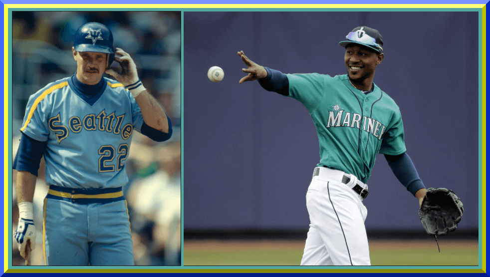
1977-80 Home

The home jersey was simple and elegant, featuring the (popular at the time) pullover and sansabelt look, with “Mariners” in lower case with a vertically arched font, and a beautiful upside down trident forming the “M” (a logo repeated on the cap). The colors were royal and gold, which were the same colors used by the ill-fated Pilots. All jerseys were NOB (simple blue letters) while “Mariners”, as well as front and back numbers, were blue outlined in gold. Simple piping of blue/bold/blue adorned the sleeves, neck and sansabelt pants waist. The left shoulder would receive a patch in 1979 (when the team hosted the All Star Game) featuring the trident “M” atop a star.
1977 Road

By contrast, the 1977 roads weren’t as lovely. The unis were powder blue (still very popular in MLB, and also what was worn by the Pilots, albeit those were flannel and not polyester doubleknit), with “Seattle” spelled out in lower case in a VAL style, with royal blue lettering and outlined in white. Front and rear numbers were in this style, with the NOB in solid blue. The sleeves, collar and sansabelt had a three color stripe of white/gold/royal. These would last only for the inaugural season.
1978-80 Road

The replacement set for the inaugural roads were a slight improvement. The “Seattle” wordmark was improved and instead of white outlining, these were blue trimmed in gold (numbers would get a simplar treatment). The collar would be a v-neck with a blue/white/gold trim, while sleeves and sansabelt were changed to a modified-northwestern striping pattern of gold/blue/white/blue/gold. The jerseys would receive the 1979 ASG patch as well.
1981-86 Home

Changes were afoot for the 1981 season when the uniforms got a minor overhaul. The homes would ditch the sleeve hem striping and add a blue/gold/blue racing stripe from from neck to sleeve end (a pattern repeated down the pants leg), while the neck would have a solid blue collar stripe. The “Mariners” wordmark changed to a thicker blue/gold/blue and numbers followed suit. NOBs would still be solid blue. The sansabelt remained and also followed the blue/gold/blue pattern. Caps now featured the “M/Star” logo which had been introduced for the 1979 season, when the team hosted the ASG. This was basically the quintessential “look” though it lasted only six seasons.
1981-1984 Road

The 1986 roads were, depending on your perspective, a thing of beauty or an eyesore. I opt for the former. The “Seattle” wordmark, like its “Mariners” home counterpart, was thickened with blue/gold/blue (the gold having a more prominent thickness than on the homes) while numbers received the same treatment as the homes. Racing stripes of gold/blue went down the shoulders and sleeves (as well as down the pants legs), and a solid blue collar was in place. The sansabelt striping differed from the blue/gold pattern, featuring a blue/gold/blue waistband. Despite it looking like something pure-80’s (then and now), I loved this look. Sadly, it would mark the end of the powder blue era in Seattle when it was last worn in 1984.
1985-86 Road

There would be a few changes to the 1985 roads, aside from changing from powder blue to gray. “Mariners” replaced “Seattle” as the wordmark, and the gold would be slightly less prominent. The collar remained the same, as did the numbers, but the racing stripe pattern changed from blue/gold to blue/gold/blue (similar to that on the previous set of pants) and went from neck to sleeve end, as well as down the pants legs. NOB would be unchanged.
Once 1987 rolled around (a seminal uniform year according to Todd Radom), the sansabelt/pullover period would end. They would usher in the classic belted/button front uniforms which had returned to full prominence in MLB…
1987-92 Home

While the Mariners would retain their gold and royal colorscheme, the new uniforms were completely different from their predecessors. “MARINERS” (in all caps) would be come the new arched wordmark, with blue/gold/blue outlining. The jersey was plain white, save for a tink blue headspoon/piping, and would be button front instead of a pullover. Numbers and NOB would all be solid blue. A thin blue stripe (in the same width as the headspoon) would run down the pants legs. Actual belts replaced sansabelts. A new cap, solid blue with a block “S” was also introduced. The cap would feature a thin blue stripe outline with a solid “S” and block shadow element.
1987-92 Road

The road uniforms would be mirror images of the homes, with identical elements. The only difference was the gray color. Button front jerseys and belted pants replaced the pullovers and sansabelts. The pants received the same thin piping on the headspoon and down the legs as the homes.
After a decade and a half in their classic royal blue/gold color scheme, there would be big changes afoot that would take the M’s into the mid-90s and beyond. They just needed to add a new trendy color…
1993-2014 Home

Gone was the classic blue/gold colorscheme, replaced with a dark navy, metallic silver and teal “Northwest Green,” a shade resembling the (then hot color) teal. The wordmark was changed, and “MARINERS” (with the M slightly larger than the other letters) across the chest would be in navy, double outlined in northwest green and metallic silver. Letterforms would be pointier than previously. A “compass rose” logo was added above the “M”. The jerseys had no front numbers and back numbers would have the navy/green/silver outline. For the first time, NOB would no longer be solid, with the letters taking on the same outline as the wordmark and numbers. Sleeves remained free of any striping, and a navy headspoon was used. Pants also had this thin blue piping as well. New caps would be introduced with a green brim and blue crown, with a new “S” in silver, outlined in blue/green, with a compass rose logo. For a team which went through new uniforms at a fairly brisk clip, this one would last more than 20 years.
1993-2000 Road

Like the new homes, the 1993 roads were full of changes. “SEATTLE” (in a similar style to the new wordmark) would be arched across the jersey, in navy, outlined in green and white. The “S” in Seattle was plain (it does not have the compass rose like the cap — that would be added later) and NOB/rear number were navy with just a green outline.
1994-96 Northwest Green Alternate

The M’s would join the alt-jersey craze in 1994 with this one. In 1994, the “Mariners” wordmark would be metallic silver woutlined in navy and white, while in 95-96 the wordmoar would lose the white outline. The compass rose logo was placed atop the “M” in Mariners. NOB and number would both the metallic silver outlined in navy. A thin navy headspoon was on the jersey.
1997-99 Navy Alternate

In 1997, the M’s would drop the teal, er green, alternate and replace it with a navy alternate. This was basically the same as the green alternate, except it lacked a headspoon. Wordmark and numbers were metallic silver with a green outline, as were NOB. The team wore these until they moved from the Kingdome to their new corporately-named ballpark in the summer of 1999.
1997-99 Alternate Home Vest

This vest, actually a sleeveless jersey, was identical to their regular home jersey, save for the lack of sleeves. It was worn with a navy undershirt. The club sometimes paired these with a solid blue cap.
1998 Road Vest

For one season (and rarely) the club went with a gray sleeveless jersey, which was identical to the road uniform, except lacking actual sleeves.
1999-2000 Navy Alternate

The Mariners would tweak their navy alternate when they moved from the Kingdome to theirnew ballpark. The navy was even darker than the previous iteration, this would say “SEATTLE” across the front with silver letters, then a blue and green outline. A thin white headspoon was also added. NOB and number would not have the additional blue outline, instead being silver with a green outline. They wore this at home during the 1999 season, then on the road in 2000.
2000-2002 Navy Alternate

This one was similar to the above, except it said “MARINERS” instead of Seattle on the front.
2001-14 Road

While it would not be a major change by any means, in 2001, the Mariners tweaked their road jerseys. That change? They added the compass rose logo to the inside of the “S,” thereby matching the cap and helmet logos. Everything else about the road uniform remained unchanged.
2003-11 Navy Alternate

Apparently the Mariners were never happy with their blue alternate, because they kept tweaking it. In 2003, they again removed the headspoon. The Mariners wordmark would have the three color treatment (silver lettering with a navy and teal outline), and this time the NOB and rear numbers would also get the three color treatment.
2011-present Northwest Green Alternate

In 2010, the M’s wore their 1994-96 northwest green jerseys in a throwback game, and the reaction was so positive the team decided to return the look for 2011. The front “Mariners” wordmark was identical to the 94-96 versions (silver with navy outline) with a slight change to the compass rose logo atop the M. Letters/numbers/NOB would all be silver with blue outline. Trendy in 94-96, the teal has become pretty much a signature color/look for the current team.
2012-present Navy Alternate

When the team reintroduced the teal alternate in 2011, that basically relegated the navy alternate to road status, so in 2012, the team again tweaked them to return “Seattle” to the front of the jersey. Unlike the prior navy jersey which had Seattle across the front, this one added the compass rose logo to the “S”. Numbers would be added to the front of the jersey (the only one the team currently wears to have front NOB). Also, instead of the normal standard block numbers, these jerseys have numbers rendered in the same fancy font as the “Seattle/Mariners” font. NOB would also have this font instead of regular block.
2015-present Home

In 2015, the Mariners would tweak their (classic?) uniforms. The new home jerseys would see new wordmarks with reversed outlining — instead of the previous navy/green/silver, the outlines became silver/green (making them somewhat harder to read). This treatment would also be given to numbers and NOB.
2015-present Road

Just like the homes, the roads also got the inverse outline treatment on the wordmark, NOB and numbers. Nothing else from the previous set changed. But the big change would come with the introduction of a new home alternate…
2015-present Home Alternate

Although only introduced as a new “Sunday” alternate, the new uniform was a return to the Mariners original colorscheme of royal and gold, and instead of a pure white uniform, this one was cream. And it’s gorgeous. If you’re interested, I wrote a detailed piece on the new uniforms here back when they were first introduced. While the wordmark remained the same as the current one, these had no NOB and added a thin royal piping to the sleeves. There was also a thin royal headspoon and pants piping, but other than that, these uniforms are classicly restrained. Back numbers are royal with a double outline of gold and royal, and the cap is also royal with a gold “S”. While not really throwbacks (or even fauxbacks), these uniforms combine the modern elements (wordmark, compass rose) with classic colors to create a beautiful uniform. Too bad it’s only seen on Sundays at home!
So, what’s the teams signature then? I usually hint at it as we go along, and for this team, it’s not an easy call. While several teams have used royal and gold over the years, no other team has incorporated the northwest green as much as have the Mariners. Their early uniforms changed often, but the 1981-84 powder blue roads were definitely unique. For this squad, even though they’ve had longevity with their current set (discounting the outline reversals — the home/road have basically been worn since 1993), they don’t really stand out. The teal/NW Green alt does however, have a unique look and appeal to the Mariners. So, lets say if the team has a signature look, it would be the northwest green alternate top/white pants for a home look, and the 1981-84 powder blues for the road. Both of these easily shout “Mariners” at you when you see them. If you have to have a signature look, these would be it.

Anaheim Ducks Unveil New Third Sweater

Yesterday, and without (any?) advance warning, the Anaheim Ducks unveiled a new third jersey they will wear for the 2018-19 NHL Season.
The new jersey, which is among several adidas is introducing this year, also happens to coincide with the Ducks 25th anniversary season. Naturally, it’s a throw/fauxback.
Here’s a look at the full jersey:

This new sweater features the original “Mighty Ducks” crest with eggplant and jade striping from the (then-Mighty) Ducks original 1993-94 season.
According to the Ducks,
Linking the team’s past and present, the jersey incorporates new into old with a touch of the Ducks current orange coloring represented in the crossed hockey sticks of the team’s original mark. Anaheim’s current jersey number and letter styling is used in the new third sweater, providing a cohesive look to the team’s 2018-19 uniform kits, while the interior collar denotes the franchise’s 25th silver season. The first of its kind to subtly incorporate each of the seven colors (Eggplant, Jade, Anaheim Ducks Orange, Anaheim Ducks Gold, Anaheim Ducks Silver, White and Black) the Ducks have worn throughout the club’s 25-year tenure, the jersey also features silver as a primary accent color in both the triangle of the crest and yoke, paying tribute to the team’s generational milestone.
Here’s a look at the adidas hockey tweet with video of the new jersey:
Quack Quack.@anaheimducks ready for the Silver Season.#adizero #NHL pic.twitter.com/SQc3L6EFC6
— adidas Hockey (@adidashockey) July 21, 2018
You can read more about the new jersey here, which also includes lots of photos.
I like it (as I’ve liked all the new third jerseys announced so far — and we’ll have a bunch more coming fairly soon). I’m generally not a fan of the mashup/fauxback, but this one is pretty tastefully done, and nicely incorporates the 1993-94 elements and blends them with their current look. Now if they’d just go back to the original look permanently, and ditch the black and orange with the terrible duckfoot crest.
Your thoughts?
[My thanks to Pablo Murphy and Wade Heidt for their assistance with this section]

Old Time Base Ball Photos
Readers will recall I featured Ronnie Bolton (who posts on Twitter as @OTBaseballPhoto and who you should definitely follow) earlier this year with some great football played on baseball field photos and writeups, some MLB Opening Day specials, and more recently with some old baseball stadia (here and here). Most recently, Ron took a look back at past All Star games. As his twitter handle implies, Ronnie’s specialty is old baseball photos.
Today, Ron has several colorizations by Don Stokes (who I hope to feature at some point in the near future) — he’s another of several tremendously talented colorizers of old photos. Ron also has a blog he runs with Gary Livacari, and the two of them combined their talents for the writeups on these colorizations.
Enjoy. Here’s Ronnie (and Gary and Don):
1912 Brooklyn Dodgers

The 1912 Brooklyn Dodgers
The 1912 Brooklyn Trolley Dodgers, managed by Bill Dahlen, finished seventh in the eight-team National League, with a record of 58-95 (.379), 46 games behind the pennant-winning New York Giants of John McGraw. They played their home games at Washington Park (III), and drew only 243,000 fans for the entire year. On a largely forgettable pitching staff, their ace was the fine hurler, Nap Rucker, who went 18-21, with a 2.21 ERA. In a 10-year career, Rucker compiled a 134-134 record with a 2.21 ERA for mainly second division Brooklyn teams. Their best hitter was Jake Daubert (.308), who also led the team in RBIs (66); while Red Smith’s four home runs were tops on the team.
There were a few other notable players on an otherwise woeful team: Otto Miller, who is remembered for being tagged out by Bill Wambsganss for the third out in the only unassisted play in World Series history (1920); Eddie Phelps, the Pirates’ starting catcher in the first World Series game (1903); and a young rookie backup outfielder named Casey Stengel who appeared in 17 games. Manager “Bad Bill” Dahlen had completed a 21-year playing career and still holds the major league record for total chances by a shortstop (13,325). The team had two Hall-of-Famers in Zack Wheat and “Wee Willie” Keeler.
Player IDs:
Front row: Eddie Stack, Red Smith, Sandy Burk, Bill Dahlen, Ed Phelps, Otto Miller, Zack Wheat, Herbie Moran; Second row: Syl Breen, John Hummel, Earl Yingling, Eddie Dent, Bob Higgins, Dolly Stark, unidentified; Third row: Enos Kirkpatrick, unidentified, Bob Coulson, Bert Tooley, Bill Schardt, Red Downs, unidentified, Jud Daley; Fourth row: Tex Erwin, Pat Ragan, Bill Davidson, Willie Keeler, George Cutshaw, Nap Rucker, Frank Allen, Jake Daubert.
1903 New York Highlanders

1903 New York Highlanders
The 1903 Highlanders, managed by Clark Griffith, finished in 4th place in the American League (72–62). They played home games at Hilltop Park. Their top pitchers were Jack Chesboro (21-15, 2.71 ERA), Jesse Tannehill 15-5, 3.27 ERA), and player-manager Clark Griffith (14-11, 2.70). Their best hitter was “Wee Willie” Keeler (.313); while the best run producer was Jimmy Williams (.267, 3 home runs, 82 RBIs). In the top row fourth from the left is John Ganzel, who hit the first homerun for the Highlander/Yankee franchise on May 11, 1903.
Jack Chesboro was coming off a 1902 season with Pittsburgh in which he went 28-6 (.824), with a 2.17 ERA. He followed the 1903 season by posting a phenomenal record in 1904 of 41-12 (.774), 1.82 ERA, with an unbelievable 454.2 innings pitched!
Player IDs:
Top Row L-R:Ernie Courtney, Herman Long, Bill Pounds, John Ganzel, Monte Beville, Dave Fultz, Jimmy Williams, Jack Chesbro and Lefty Davis.
Bottom Row L-R: Herm McFarland, Jack O’Connor, Clark Griffith, Willie Keeler, Wid Conroy and Jesse Tannehill.
1911 Washington Senators

1911 Washington Senators
One of my favorite all-time colorizations by anyone, not just Don. Not only are the uniforms a classic, but those sweaters! Why MLB does not bring these back is a mystery, they’re sitting on a gold mine. Another great element in the image is the location of the photo being at Hilltop Park in Manhattan. Those buildings in the distance are still standing today and in place of Hilltop Park is Columbia University Medical Center.
As for the Senators, 1911 would be their 11th season in the American League and like the previous ten it would be a losing campaign. They finished with a 64-90 record, good enough for seventh place. The only thing the team from our nation’s capital had going for them was the lad right of center with his hands on his hip – Walter Johnson. The 23-year-old would post a 25-13 record with a 1.90 ERA and a league-best six shutouts.
Player IDs worked on by Don Strokes and Gary Livacari:
Top row: Charles Conway, unknown, Dolly Gray, Wid Conroy, Bill Cunningham, Tom Hughes, Jock Somerlott, Walter Johnson, unknown, Gabby Street, Bob Groom and George McBride
Bottom Row: Germany Schaefer, Dixie Walker, Kid Elberfeld, Doc Gessler, Eddie Ainsmith, Jack Lelivelt and unknown
Thanks, Ronnie. He’ll be back periodically with more wonderful old photos and the backstories that go with them.

Got An Idea…
…For a Uni Watch Article?
Hey folks,
Today is my last day doing the weekends until after Labor Day.
Once August 1 hits, I’ll be taking over the weekdays for Paul for the month, while Paul enjoys his much-deserved (and needed) yearly sabbatical. So while I have a few ideas for some articles, and there will be the inevitable unveilings of NBA, NHL and NCAA Football unis (plus assorted breaking uni news), I’m always scrambling to fill out the month with good stuff.
So, if any of you out there are interested in seeing a topic addressed, or would like to work with me on an article, I’d love to hear from you. If you’ve followed me on the weekends, or any of the past few Augusts, you know I frequently work with others, and the upcoming month will be no exception.
So, let me hear from you! Please shoot an email to phil.hecken@gmail.com with your thoughts for pretty much anything uni-related and we can go over the details. If your pitch is good, I’ll be happy to work with you to bring your topic(s) to the blog!
Thanks, and I’ll see the rest of you again on Jerry Garcia’s birthday.
Uni Watch News Ticker
By Phil

Baseball News: We start off with this KILLER submission from Brandon Hamburg, who writes, “Picked this (1975 Houston Astros Program) up from the Astros Authentics shop at Minute Maid earlier this season…The first thing that caught my eye was the awesome cover (and I’m a sucker for anything rainbow uni related). The second thing I saw right away? The prototype A at the top! Apparently it was more common than I thought. The schedule with the Astrodome incorporated is fantastic.” … Reader Mark Gonillo noticed this Thurman Munson baseball card and was immediately struck by the fact Munson is sporting a beard. This photo must have been taken right at the beginning of Spring Training, because the Yankees had (and still have) a strict no-beards policy. … Here’s an article about the seamstresses of the South Bend Cubs. … Speaking of Cubs (the Chicago version), R. Scott Rogers saw this Cubs Grave Marker in a Catholic cemetery in Cedar Rapids, IA. “The Cubs logo is some kind of thick plastic or ceramic disc, not just a sticker,” Scott adds. … “Was having dinner with my son today and we came across a youth baseball team with the most interesting uniforms I’ve seen on a youth team in a while,” says Joshua Exline. “‘Charlie West Hustle’ (a play on both Pete Rose’s nickname and the name of their home city; Charleston, WV aka Charlie West). And, yes, a rip off the current Golden State logo too. The dome in the center is a tribute to the dome of the West Virginia capital building in Charleston.” … Paul Dillon sends in this link to webpage for radio program Only a Game on NPR yesterday regarding Military in Sports interview with Astore Francona fired by the Mets. On the page is the link to the audio version. … Here’s a bit more on that (from Paul Friedmann). … Because MiLB doesn’t have enough Star Wars jerseys, here’s one for the Syracuse Chiefs (from Mike Held). … Here’s a jersey I’ve never seen: a Adidas Comic Relief 8 jersey, from an HBO sponsored Crystal/Goldberg/ Williams fundraiser, 1998 (from Paul Friedmann). … Scott Gurrola noticed a member of the on-field security was sporting a batting helmet in KC last night. … The Toledo Mud Hens wore these eggs jerseys (here’s the back last night vs. the Lehigh Valley Iron Pigs (from John Wagner). John didn’t say it, but I’m pretty sure this is part of the “ham and eggs” series these two squads have been playing the past several years. … The Birmingham Barons took on the MonStars last night as they look to avenge getting their All-Star Outfielder abducted over 20 years ago (from MiLB Promos). … I don’t follow bats or batting equipment, but Dwight Ternes noticed at least one Astros player uses a gray bat. That prompted Charlie Welling to note that Mookie Betts uses one too. … Eddie Vedder wore a batting helmet to throw a first pitch for the Mariners’ Pearl Jam Night.

NFL News: Pretty much everyone agrees the current Tampa Buccaneers jerseys are their worst, and possibly the worst in the entire NFL. But what are the favorite Bucs jerseys? … And just how bad are the Bucs current unis? Because it’s that time of year again, here’s an article, Every NFL Team’s 2018 Uniforms, Officially Ranked. It’s not click-bait, and it’s not a terrible list, though I have a few major quibbles. … “Apparently the Ravens QBs wear dark numbers on their jerseys in training camp??” questions Jon Solomonson. “Not sure if this is new or not.”
College Football News: As you may be aware, the University of Nevada Wolf Pack have ditched Nike as their uni supplier and are now with adidas. So here’s a look at their jerseys for this fall. … The Minnesota Gophers have new jerseys (I’m pretty sure we’ve already covered this) for next season (from 1370 KSUM Sports).

Hockey News: The Canadian Premier League is a professional, Tier 1, FIFA-sanctioned soccer league which will begin play in the spring of 2019. Wade Heidt notes the seventh founding club was introduced on Friday. Pacific FC will be based in the Victoria, BC suburb of Langford.

Soccer News: Remember the Thai kids who were trapped in that cave for like 3 weeks? Of course you do. Well, the Croatian National Team sent them a bunch of jerseys. Cool move. … Here are some new shirts for Rayo Vallecano (from Ed Żelaski). … Also from Ed, new shirts for Wisła Kraków SA.

Grab Bag: I’m not sure if he is there or not, but Henry Yu (who posts on Twitter as Sons of Johnnie LeMaster) notes “the merchandise tent at the Open Championship is weak. No flexfit or fitted caps … adjustable only. Overall very disappointing.”
The picture of the current Mariners home alternate shows a name on the back. That’s a picture of a replica retail jersey as the actual game jerseys do not have names on them.
Overall, I like the new third uniform from the Ducks, but have some mixed feelings. Like the surprise. Was just expecting we would see an orange uniform.
Positives:
-The return of eggplant, jade and silver on a regular rotation as a third. Looks fine as trim colours on the black jersey up close.
Concerns:
-From a distance view, eggplant not a good contrasting colour to black. I realize the jade and teal are different, but this could look like a San Jose Sharks third jersey from the nosebleeds.
-The shoulder patch is their current primary logo. I do not like the shoulder patch using the orange and gold. It does not match well with the rest of the colour scheme for the uniform. Should have considered changing the colours up on the shoulder patch for the third to better match the uniform.
It looks OK. Their entire set could be simplified.
If the Anaheim Ducks got the Vegas gold on the jersey by slapping the shoulder logos on like bumper stickers, can you really call it “incorporating?”
Love that old crest, but that shoulder yoke is just so out of place. I’ll try to reserve judgment until we see it on the ice, but purple accents just don’t tend to work so great on black.
I hate that the Ducks Jersey is black. Just give us the real throwbacks like the Coyotes did!
How is the Canadian Premier League story hockey news?
everything Canadian has a hockey component eh?
Eddie Vedder looks like he’s wearing a Sunday alt helmet.
The number fonts being different on the back of the jersey and the sleeves is super annoying. Plus the Boston shoulder yoke feels weird. Tits down, looks pretty solid.
Hens jerseys are from the “bacon and eggs” series against the pigs. Not ham and eggs.
When I think of the Mariners, I think of the current set. While their early jerseys were unique and stood out, they are from when the team was terrible. The current uniforms (give or take the minor changes over the years) are what say Mariners to me and are what I think of when I envision the team. This is especially so since these are the uniforms worn by Griffey (for the most part) and Ichiro, their most iconic players.
I would also consider the look since 1993 (home white and road grey, with minor alterations) as the signature look. The colour scheme is distinct to the Mariners in MLB and were wearing the uniforms during the brightest times in franchise history.
Though I absolutely love the present Sunday thirds and would push for that to become a full time uniform.
I do recall the Mariners had a teal hat in their uniform rotation in 1994 as well. Usually was worn with the teal jersey:
link
link
The section in between military stuff and the new Syracuse chiefs jersey in the ticker is a little bit wonky. It’s showing up as though its a link when you mouse over it, even though it isn’t.
The Mariners are the perfect example of too many alternates muddying the waters. During the team’s successful years, I have a hard time thinking of a signature look simply because the unis were all over the map.
Love this series, Phil!
Best part of the 1977 looks, both home and road – the form of the number 2. Its different enough without being showy about it.
Read the Sportster ranking of NFL uniforms. Generally not bad but I have a few quibbles as well. Why are the Cardinals and the Titans in the top 10? The writer thinks the mono-black leotard look for the Saints makes then look better, and should be in number 2 spot?
The writer is entitled to their opinion, but I have a major quibble about misrepresentation of facts, especially as a Canadian football fan. This is a NFL article, maybe the writer should avoid mentioning the CFL when they have not done any basic homework.
Mentions in the item about the Packers that the Edmonton Eskimos “have the most championships north of the border”. That is plain wrong. The Toronto Argonauts have the most Grey Cups with 17. The Eskimos have 14. Besides, though the Eskimos and Packers wear similar looking uniforms for decades, the Eskimos starting to wear green and gold in 1949 has nothing to do with the Packers.
There were a number of things I didn’t care about with this particular ranking…
1. On a few teams, the author comments about the uniforms as a whole but on most of them he seems to concentrate on just the jerseys.
2. On some of the lower-ranked teams, he complains that the design is too plain or conservative (Panthers, Texans) but then goes on to rank a lot of very simple jersey designs as his favorites.
3. The sheer number of grammatical and punctuation errors is distracting. Example on the Patriots entry: “This look is very simple but what is really about it is that they have been able to insert their beautiful and iconic logo on the jersey too.” Say what?
4. He considers the Flying Elvis logo to be “beautiful”.
Ducks alt looks like they just wanted to avoid having to change helmets, pants, and gloves.
Although, to me, all black is one of those looks that isn’t good in hockey (Also looking at you white hockey pants)
have to disagree about this “signature” – it looks too similar to old marlins’ teal jersey imo
RE The Ducks Jersey—As a Ducks’ fan the only word I can use is YUCK! How many colors can you use on one jersey? I count eight—gold, white, black, jade, yellow, silver, eggplant and yellow. It looks like something Wild Wing threw up! Pick a color scheme! You want to honor the 25th anniversary of the franchise, use jade, silver and eggplant with the Wild Wing crest and employ the current uniform template or go throwback. How difficult is it??
I think it looks fine besides the mismatched shoulder logos. Everything else is coherent. It’s the same color scheme they used when they entered the league.
Having lots of colors on a jersey isn’t necessarily bad as long as they all work together. The Blackhawks have eight colors on their jersey, and they’re almost universally regarded as the best-looking team in the NHL.
In Thurman Munson’s autobiography, he said that at the time the card’s photo was taken (which was the beginning of spring training), he was having some issues with team management. “People think I grew the beard to cause trouble,” he said. “The truth is, I like beards.”
I think he wasn’t being honest. Passive-aggressive move.
Mariners uniforms hold a very dear place for me. Born in 82, in the northwest, Dad was a big baseball fan, and I caught the bug at a young age. The trident with the star logo sticks out to me, as I have a picture of me when I was little wearing a sleeveless M’s shirt.
Also, I remember when those teal jerseys came out. I went back to school shopping at the mall and BEGGED my mom to buy me the teal jersey. It was the authentic, it was like 200, had no name or number on it. Back then I didn’t think anything of it, but I realize now Mom was too cheap to get a name and number put on it, lol. I wore that jersey on the first day of school, and on picture day.
Unfortunately, over the years, I seem to have misplaced it. Not sure what ever happened to it.
link
Not sure who the Mariner is in the powder blue uni at the beginning of this article, (Richie Zisk possibly?) but it looks like the logo on his helmet could use some readjusting. Unless, of course, it’s that way on purpose because of the superstition of the tridents pointing downward.
Ravens have used practice jerseys like that since at least 2015.
link
The Mariners signature uniform is probably the 1993-2014 version. Now signature by no means implies “the best”. The best Seattle Mariners uniforms were the 1981-86 home, the 1985 & 1986 road and the 1977-80 home.
I think my favorite Mariners hat was the purple with front white panel and the trident inside the star.
Best mariners uniform by far is the current Sunday Alternate.
I distinctly recall the 1981 Mariners’ home uniforms having player names in blue with yellow and blue trim. This may not have been true for the road blues. Perhaps this made them difficult to read, because they were dropped for 1982.
I distinctly recall the 1981 Mariners’ home uniforms having player names in blue with yellow and blue trim.
Not according to Bill Henderson’s guide:
link
I didn’t get here yesterday , so I’m a day late. It appears no one brought up the “Brooklyn” player in the front row wearing a non-Brooklyn uniform evidenced by his socks. Caption says it’s Eddie Stack. Apparently the Dodgers didn’t have time to get him a Dodgers uniform. Wikipedia says Stack played for the Phillies in 1910-11 and the Dodgers in 1912-13.
I love that Anaheim Ducks sweater, their logo are just so cool