By Phil Hecken, with Scott Rogers
Follow @PhilHecken
Most of you who follow Uni Watch know we try to include as much Minor League Baseball uniform news as we can — and as I’m sure you’re aware, MiLB teams go to no uncertain lengths to try to draw in as many folks as possible to their games, including breaking out many gimmicky uniforms (no offense, but if I see another team break out another Star Wars-themed jersey, it will be too soon) and holding many themed nights that are based off their name/identity or a local hook (cuisine seems to be a big hit). Often, we’ll see teams change their name for a single game, adding new unis, a goofy mascot, or even having a uber fan of said promotional evening throw out a first pitch. Or five. While I haven’t attended but a handful of Minor League games, I hope to hit a bunch this summer. And I’ve built up a bit of a collection of minor league caps (especially “theme” caps), my favorites being the Fresno Tacos and Lehigh Valley Iron Pigs.
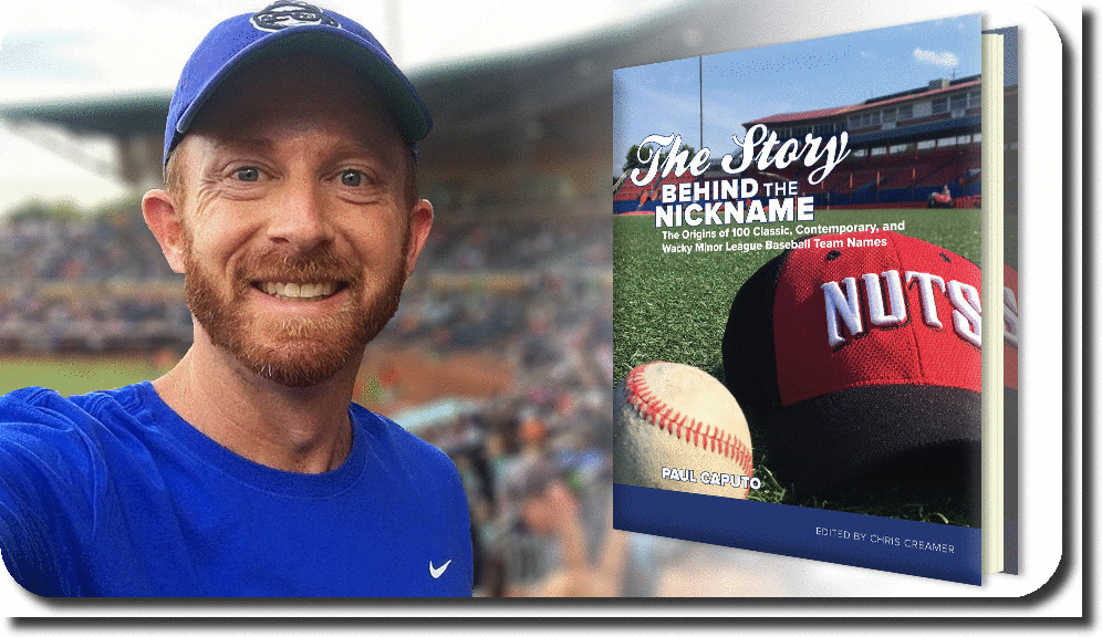
So, when my pal and long-time Uni Watcher Scott Rogers (ArrScott) approached me with an article reviewing a brand new book that looks behind the scenes at the nicknames of Minor League teams, I jumped at the chance to have it brought to the pages of Uni Watch. The book is called The Story Behind the Nickname: The Origins of 100 Classic, Contemporary and Wacky Minor League Baseball Team Names written by Paul Caputo. Sit back and enjoy Scott’s book report!
What’s in a Nickname?
By R. Scott Rogers
“French-born philosopher Jacques Barzun famously wrote, ‘Whoever wants to know the heart and mind of America had better learn baseball.’ I might be biased, but I’d argue that if you want to know North America even better, you’d better learn the stories behind minor league baseball nicknames.”
— Paul Caputo, “The Story Behind the Nickname”
That which we call the Suns by any other name would be as sweet. Or would it, if instead of Suns we called a team the Jumbo Shrimp?
That question forms the subtext of a new book that tells the story behind the names of 100 minor league baseball teams. And, spoiler, the book’s answer is “yes.” On the surface, The Story Behind the Nickname: The Origins of 100 Classic, Contemporary, and Wacky Minor League Baseball Team Names offers an episodic journey around baseball’s farm teams, with chapters organized around not-quite-chronological themes.
The book tells two stories at once, and they’re both well told. Most apparently to readers who flip through the book and read a few nickname accounts at random, The Story Behind the Nickname offers a well-researched origin story for each of the 100 clubs profiled. Author Paul Caputo has traveled widely around North American baseball, so his accounts for each team include interviews with team officials, local fans, and often the designers who crafted the team’s logos. (And yes, there are a lot of interviews with Jason Klein of Brandiose and Dan Simon of Studio Simon in the book.)

But read a few of the team profiles in sequence and you’ll encounter a deeper story of the evolution of minor league team names. Caputo, who describes himself as “A Minor League Baseball enthusiast, graphic designer, collector of sundae helmets, and eater of ice cream,” organizes his team profiles into four not-quite-chronological chapters: Classics; Renaissance: The Minors Reborn; Rise of the Minors; and The Wacky Era. While scientists might debate whether we currently live in the late Holocene or early Anthropocene geological era, there’s no arguing that Minor League Baseball is deep into its Wacky Era. Behind these four eras looms Minor League Baseball’s long epoch of most teams calling themselves after their parent clubs, with nicknames changing every time development contracts shifted with no regard for local fans’ sense of team identity.

Rather than listing years for each of the four chapters, a sampling of team nicknames explains the nature of each: Bulls, Mud Hens (Classics); Kernels, Knights (Renaissance); TinCaps, River Cats (Rise); Rumble Ponies, Baby Cakes (Wacky). Generic to local to unique to quirky.

“What I was trying to do was match the chapters to what I felt the industry trends were,” Caputo told me in a Skype interview last week. (Full disclosure: Caputo was a close childhood friend and a teammate on my first youth baseball team. We still keep in touch, and I like and admire the guy immensely. Also, I just can’t keep up the pretense of calling him “Caputo,” so it’s Paul for the rest of this article.) “Early on in the 1990s it was enough to maybe just have a brand that was different from anything else that was out there. Then it morphed into this thing where it’s got to be crazier than anything else that’s out there already.”
That touches on my biggest concern approaching The Story Behind the Nickname as a reader: Won’t I just get bored with the dreary sameness of all these recently named or branded teams, with their over-the-top wacky nicknames and their me-too snarling cartoon logos with thick black outlines and mascots swinging props like baseball bats? How many times can I possibly read yet another story of the City Adjective Nouns and their kitschy Brandiose/Simon graphics? About a hundred times, it turns out. Paul situates each team in its local community in a way that breaks through this uni-watcher’s cynicism. Nicknames like RubberDucks or IronPigs or four dozen other variations on that format may feel like old hat to those of us who follow the industry as a hobby, but few fans or even team insiders experience team names and logos in that context.

In covering the independent Lincoln Saltdogs, Paul tackles the City Adjective Noun format directly. “It was a matter of whether we were going to be called Saltcats or Saltdogs,” team president Charlie Meyer said. “And our owner has dogs.”
Paul approaches the nickname stories almost as an exercise in oral history. By letting team officials and community members who participated in naming or rebranding each team tell the story from their own recollections, the book gives readers a refreshing perspective on each nickname. We see each team as its own tree, rather than as part of the forest.

“As observers of the industry, it’s easy for us to be like, ‘Oh, man, we’ve seen this so many times before.’” Paul told me. “But we have step back too and remember that if you’re a fan of the Jacksonville Suns, and they become the Jacksonville Jumbo Shrimp, unless you’re a follower of the industry, you’re probably not aware of the Baby Cakes or the RubberDucks or the Chihuahuas. If Minor League Baseball is becoming more and more hyper-local, so long as it’s working in the local market, it almost doesn’t matter what the larger industry thinks of the trend.”

The flip side of approaching each team’s nickname origin as a sort of oral history is that the book offers an enthusiast’s take on the subject, not a critic’s. Do not open The Story Behind the Nickname looking to see which team names Paul trashes, or which team execs or designers he throws under the bus. When I pressed Paul about that, and the growing backlash against design houses like Brandiose and Studio Simon, Paul pointed to the redesigned Eugene Emeralds and their swinging sasquatch logo. “It’s new to Eugene, Oregon, right?” he said. “The fact that they’ve got sasquatch swinging a pine tree, it’s new to minor-league baseball fans in Eugene, Oregon, even if it’s not new to people who follow the industry. Brandiose is working for that local market.”
The book grew out of columns Paul wrote first for a now-defunct blog; he later transitioned his series on team names to Chris Creamer’s SportsLogos.net, where he continues to cover new developments in Minor League Baseball nicknames and branding. There, his work points to what might be the post-Wacky Era in minor-league nicknamery: Temporary hyperlocal rebranding, like the Fresno Tacos or Staten Island Pizza Rats. Which are still actually pretty wacky nicknames, so maybe this will be another stage of an extended Wacky Era.

“In terms of what’s next, I think of the temporary rebrands,” Paul explained. “Teams will keep their main identities in place for the most part, but we’ll start seeing more and more of this outlandish stuff. A team like the Staten Island Yankees, they didn’t want to totally abandon their brand, because they’re the Yankees. They’re riding the coattails of probably the most recognizable brand in all of sports, so why abandon that? But they also want to take part in the marketing frenzy that’s going on in Minor League Baseball. Every year, Minor League Baseball is breaking records for merchandise sales.”
The trend of temporary rebranding has been percolating among a few teams for several years now, but Paul argues that it’s exploded this season and seems to be becoming entrenched at all levels of the game. Teams aren’t just adopting these temporary nicknames for one-off events; they’re doing it repeatedly throughout the season (such as all Saturday home games) and maintaining the same alternate nicknames from season to season.

The most critical note Paul strikes in The Story Behind the Nickname appears from time to time when he asks team officials if fans know the nickname origin stories they’ve just told him. In too many cases the answers range from “I don’t know” to “Probably not.” Professionally, Paul works in the field of heritage interpretation, which he defines as “Explaining a natural, cultural, or historical resource to someone who may not know about it.” Think of an interactive sign at a zoo exhibit, or a plaque beside a scenic overlook in a national park. In the Wacky Era, baseball teams like the Yard Goats risk sounding like they just have a silly nickname. Fun as the name may be – and let’s be honest, Yard Goats is a darn fun nickname – even in the Wacky Era team nicknames usually tie into real, meaningful, and specific aspects of local history or culture. If fans know that connection, they’ll form deeper emotional connections to a team.
“In many cases, there are opportunities for the team to really embrace the reason that they’re called a thing, and it would create even more of a connection to the local community,” Paul told me. “A lot of times, teams don’t take advantage of that.”

Examples from the book include the Winston-Salem Dash, who are named for punctuation. “The wrong punctuation,” Paul noted to me. “They’ve got a hyphen and they call it a dash and we’re just going to have to let it go.” The Dash in the team’s nickname references the hyphen in Winston-Salem, which itself reflects decades of local efforts to unify the community. Or the Lehigh Valley IronPigs, whose riveted porcine mascot can obscure the nickname’s play on the pig iron produced by the smelting industry that once dominated eastern Pennsylvania.

If teams want advice about how to go about explaining their nicknames better to their fans, I know just the guy. He literally wrote the book on the subject, and he’ll work for helmet sundaes. As for fans of sports aesthetics, The Story Behind the Nickname is a valuable addition to the bookshelf. In our interview, Paul described his joy at getting to know more about small-town America and said that for each nickname history, “I got to learn a thing about a place.” Paul’s enthusiastic curiosity informs the book, such that I enjoyed reading his accounts of even my least favorite nicknames. The book is available in softcover now, with an expanded and updated Kindle/ebook edition expected this fall.
The Story Behind the Nickname: The Origins of 100 Classic, Contemporary, and Wacky Minor League Baseball Team Names by Paul Caputo, edited by Chris Creamer. 2018, SportsLogos.net.
Thanks Scott! Excellent report and a book I will definitely pick up. You can follow Scott on Twitter here and Paul on Twitter here.

Colorize This! Returns…
…with some beauts by George Chilvers
Long time readers know that for years I’ve run a feature on Uni Watch called “Colorize This!” which feature the colorization efforts of Uni Watch readers, most often run as a sub-lede. Lately I haven’t had any submissions for this, although I have done a few ledes with new colorizers being featured.
Today, long time friend and colorizer (colouriser) extraordinaire George Chilvers is back with some fantastic soccer (football) colorizations, now that the World Cup is in full swing. Great to hear from George and pleased he’s made a triumphant return! Click to enlarge both the colorized photo as well as the original that is beneath it!
Here’s George:
Hi Phil
Long time, no speak, as they say.
I have had a little hiatus from sending you colourisations (with a “u” and an “s”) as I’m not sure the appetite is there from most of your readers. But I’ll put these out there, and maybe make a few converts.
+ + + + + + + + + + The first picture, with a World Cup theme, is from 1930, the first World Cup. In this game Argentina are playing Mexico. I’m afraid there isn’t a lot of narrative to this – Argentina won 6-3, which I suppose is noteworthy in itself.

+ + + + + + + + + + The second is another World Cup picture, this time the final in 1954. Hungary at the time were one of the greatest teams the world has ever seen. They had demolished England at Wembley the previous year 6-3, with a skill and panache never before seen. They were red-hot favourites in this game in Bern against West Germany. You can guess what happened. In German circles it is still called “The Miracle of Bern”, and there is a film of the same name.
+ + + + + + + + + + The next picture is a pre-war game in Krakow in Poland where the teams of Wisla Krakow and Chelsea from England do the pleasantries before the game.
+ + + + + + + + + + And finally we have an English league club, Norwich City, at home in an FA Cup game against Corinthians, bastions of the amateur game, in 1929. Norwich (in the yellow and green) played at The Nest, and this ground was built into a quarry, and in this picture you can see what that meant in practice and current proponents of health and safety would be fainting at the sight.
+ + + + + + + + + + Best wishes,
George


Thanks George! Great stuff as always.

Kreindler’s Korner
I had the distinct pleasure of featuring the wonderful artwork of artist Graig Kriendler on two occasions over the summer and fall of 2017.
For those who don’t wish to click the links, Graig paints baseball heroes (and regular guys) from the past, and is an immense talent.
Occasionally, I will be featuring his work on Uni Watch.
Here’s today’s offering (click to enlarge):

Title: “Mathews”
Subject: Christy Mathewson, 1900
Medium: Oil on linen
Size: 12″ x 18″To this day, Christy Mathewson is one of my favorite subjects to paint. He’s always been so incredibly appealing to me for a number of reasons, be it his tremendous abilities, his virtuous nature, or being the rare college-educated athlete in a sport populated by very few of them. Perhaps his matinee good looks have a lot to do with it, too – especially when they’re compared to those of the players around him on the Giants. And that’s not saying that McGraw’s men were ‘ugly’, but they had a rawness to them that was very in tune with the look of ballplayers of the era. They were hard men. Mathewson brought something very different to the bigs, aesthetically speaking.
This particular image of him dates back to before his days with the Giants. In 1899, he was signed to the Norfolk Phenoms (named after manager Phenomenal Smith, a former Major League pitcher) of the Virginia League for the 1900 season. Mathewson became an immediate success story with the Phenoms (even if his name was often misspelled as ‘Mathews’ in local papers), amassing a 20-2 record by mid-July. It was on July 17 of that year that he made his debut with the New York Giants.
At that time, he was not yet 20 years old. And I thought that the image I worked from made that abundantly clear. He clearly appears to still be in his teens, with his slick parted hair, huge blue eyes and skin that has yet to suffer the sun damage that the ballplayers of his era were known for. Combined with the crisp home white uniform, laced collar and a stylized ‘N,’ I thought it could have the makings of a really unique painting from the get-go.
Thanks, Graig! You can (and should!) follow Graig on Twitter.

Old Time Base Ball Photos
Readers will recall I featured Ronnie Bolton (who posts on Twitter as @OTBaseballPhoto and who you should definitely follow) earlier this year with some great football played on baseball field photos and writeups, some MLB Opening Day specials, and more recently with some old baseball stadia (here and here). As his twitter handle implies, Ronnie’s specialty is old baseball photos.
Normally, I try to matchup Ron’s great old time pics with a theme from the main article, but today Ron wanted to Go Big. Big walls, that is.
Enjoy. Here’s Ronnie:
Baker Bowl, Philadelphia, 1915

How many photos have we seen of this iconic right field wall from inside the Baker Bowl? Well, here is rare image taken from outside the ballpark on Broad Street. It’s also a great example of why some ballparks looked like they were shoehorned into neighborhoods like here, the dimensions of right field was just 280′ but as you can see it wasn’t by choice.
Griffith Stadium, Washington D.C, ca 1935

In the middle of these 27 advertisements on the 31-foot high right field wall extending to center field, is a manually operated scoreboard that was once manned by future baseball commissioner Bowie Kuhn, he was paid the rate of $1-a-day.
Fenway Park, Boston, 1936

Shortly after right-handed slugger Jimmie Foxx joined the Red Sox a 23-foot tall netting was built on top of the 37-foot left field wall, baseballs hit into the netting still counted as home runs, but it would now protect businesses on Landsdowne Street. After the game a groundskeeper would climb a fence affixed to the wall to retrieve the baseballs. In 2003, the netting would be replaced by the “Monster Seats”
Thanks, Ronnie. He’ll be back periodically with more wonderful old photos and the backstories that go with them.
Uni Watch News Ticker
By Phil

Baseball News: Interesting observation from John Muir who writes, “Noticed today that the Nats home on base circle is rendered in the road colors, not in either standard home or alternate colors. The visiting circle has the MLB logo on matching navy blue.” He adds, “Is this so they stand out and match? Coincidence? It couldn’t be left over from RFK…could it?” … The Atlanta Braves wore their Hank Aaron ’74 throwbacks again yesterday. A couple readers watching the broadcast noted during the top of the 4th inning of the Braves/Orioles game, the Braves broadcasting team interviewed Wayland Moore, who was the original designer of the Braves 70’s feather uniform. Joseph Culverhouse got the 2:08 minute version. Meanwhile, Michael Rich went to great lengths to make an audio of the entire 5 minute interview, “plus I appended about 2 minutes of uniform chatter between announcers Chip Carey and Joe Simpson in the bottom half of the inning.” Great stuff, you guys need to listen to this! … Speaking of those throwbacks, the AJC asks readers if they like the unis (some photos & video there too). … Nice old photo of Roidger Clemens in his UT Longhorns uni (from Goat Jerseys). … Of this Arkansas Razorbacks jersey, Eric Gamborg asks, “Now what is this look called? Armpit flair?” … The Rays became the Devil Rays again yesterday vs. the Yankees (from Goat Jerseys). In that same game, Matt Shevin noticed the Tampa Bay visitors’ ball boy wears a helmet with a face mask, but no logo. … Nice tweet from Bruce Menard who writes “Young Japanese boys proudly pose in their baseball uniforms. (Wire photo: June 23, 1950).” … Pacific rim correspondent Jeremy Brahm notes the Japanese Women’s Softball team font gives \ with their zeros for player numbers. I think there’s a name numeral-ology for that but it escapes me. … EWWW: Not a sammich, and probably not even food: The Erie Seawolves declared “It’s Sugar Rush night at UPMC Park! You can get a Smith’s hot dog with a cotton candy bun topped with nerds!” Thanks, I think, to Mike Styczen. … These are not sammiches either (from PawSox).

NFL/CFL News: A couple of CFL items from Friday night games, from Wade Heidt: (1) The black pants of the Hamilton Tiger-Cats now feature their uniform numbers near the right hip. Same as the change with the white pants from last week. This appears to be their thing now, so would expect to see the numbers in the same place on the yellow pants when they wear them; and, (2) The Montreal Alouettes wore the uncommon uniform combination of red jerseys over blue pants for the home opener. Of course, the first time their current home uniforms combined with the vintage style helmet featuring the classic red wings. … I’d need too many words to describe how awesome this is, so I’ll just leave you with the title and link: “That Time the NFL Paid Jack Kirby to Design an Intergalactic Super Bowl,” (from Phil Lawson). … It appears the NFL won’t allow Kansas City Chiefs guard Laurent Duvernay-Tardif to add to his already lengthy last name on game days. The league rejected Duvernay-Tardif’s request to add “M.D.” to his jersey, according to Andy Mailly-Pressoir of TVA Sports (from Ted Arnold). … Reader/tweeter/design contest winner Dan Kennedy says a local Potbelly sandwich shop had some cool Lions nostalgia on the walls. … Tweeter Coleman Brockmeier spotted, in the upper right of this photo from the KC Chiefs’ equipment dept., a Dallas Texans helmet with the state of Missouri and Kansas City instead (of the Texans Texas State and Dallas Star). … Somebody at Fox26 Houston has the grail Htine phone (from Ignacio Salazar). … Tweeter Chad Fields writes, “Heres something odd. I passed this billboard on Kingston Pike but also found a picture of it online. It shows the Titans wearing their color rush jersey w/ navy pants. A combo I’ve not seen mentioned. Could we see it on field?”
College Football News: “I found this on Google Images from theundefeated.com,” writes Phil Lawson. “The biggest matchups from college football’s kickoff weekend as …”. Phil notes the images may be subject to copyright.

Hockey News: Tyson Kehler, an independent graphic designer, who goes by Dynamic Lights on the twitter, started a new series where he’s taking NHL logos and simplifying them. “Simple for every team is slightly different. I started with the @NHLJets my home team.” Here’s one he calls “Pilots Wings”. … We missed this one with the unveilings of the new third sweaters for the ‘yotes & ‘canes on Friday: The Ducks revealed their 25th anniversary patch on their sweaters Friday night (from Louis).

NBA News: As the Miami Heat were preparing to enter the NBA, the
Miami News’ readers voted for the team’s logo. Here were the twelve finalists. What’s your pick? Submitter Peter Kirschenbaum notes this was the rare case where readers got the vote right. … Two trademark websites have the new Grizzlies logos online now, so here’s Conrad Burry‘s “rough attempt at colorizing their filing images, based on what we’ve seen from the draft hat and draft graphics.” If you know anything about Conrad’s work, he’s usually spot on (and amazingly adept at sniffing out leaks too!).

Soccer News: As always, we have several items of interest from Josh Hinton: (1) Here’s a look at Newcastle United’s home kits over the years including this year’s leaked image; (2) New sponsor for Swansea City AFC; and, (3) In the Penn FC starting XI photo, some players are wearing kits with a sponsor in the top left, and some aren’t. … Because everyone has an opinion on such things, a Saskatoon fashion expert provides insight into the best and worst jerseys at FIFA World Cup 2018. … More reviews: “Bad performance in 2018 World Cup? It’s not you, it’s the kit.” … Good New York Times article here: “World Cup Soccer’s Spanish Accent Mark: For Mexico and a Times Editor, It’s a Win-Win.” Thanks to Paulina Chavira, an editor at The New York Times en Español, the Mexican national team’s jerseys are finally correct (thanks Brinke). … This is actually kinda cool: a behind the scenes look at a World Cup photoshoot.

Grab Bag: “Pee Chee meets pop culture.” Kevin Kleinhans notes that artist Alex Campos has released a mashup of pop culture figures and Pee Chee folders. Very cool!
I have to admit that “Saskatoon fashion expert” is a phrase I would have never expected to see.
Saskatoon fashion expert would probably state this is a hot fashion trend :)
link
I can kid – Saskatchewan born, but I am from Regina originally.
-Enjoyed the article Scott. Thanks! I am more a fan of the classics and renaissance names in the minors. Our minor league team here, the Vancouver Canadians, thankfully has not decided to change a name with a history in favour of a food item. Though we do have sushi that race around the bases each game.
link
-I have seen the Tennessee Titans’ new Columbia blue jersey described as an alternate in the media rather than as Color Rash. The Titans have 3 sets of different colour pants with the new uniforms. Could see much mix-and-match. Would not be surprised to see the Columbia blue over navy, which would be a decent look for them.
Thanks, Wade! Paul covers the Canadians in his “Rise of the Minors” chapter. The story of the team’s evolution with redesigns in 2005, 2008, and 2014 is covered in depth, and Paul offers some of the highest praise in the book for a team identity he calls “downright sophisticated” in the context of the Northwest League.
Typo: “Nats home on DECK circle”.
And if the Sugar Rush hot dogs are too much for you, wash ’em down with a little Hot Dog Water:
link
They don’t fix typos on the weekend posts here…
As to the Pizza Rats check out this drama on Staten Island:
link
here’s the entire video of the Wayland Moore interview re: 70’s braves design
link
Are they even “nicknames” anymore?
Long gone are the days where newspaper writers or others would throw out nicknames for the baseball club and some would “stick”.
From a practical standpoint (I’m guessing in many modern cases even from a legal standpoint ???) I would think that aren’t the teams’ “nicknames”, these are the teams’ names.
For me at least nicknames are takes/short forms on team names (e.g. ‘Habs’ for Montreal Canadiens)
While I admire the creativity of many of the more unusual minor league baseball team nicknames, I sometimes wonder how professional, adult players feel about having to wear uniforms with some of the goofier team names?
Makes me kind of glad that my home team (the Charlotte Knights) choose a dignified if somewhat bland name for the team (who were originally the Charlotte Orioles).
A professional adult should feel no sillier about wearing a jersey that says “Jumbo Shrimp” than he feels about playing a child’s game for money. If a person embraces the fundamental silliness of playing a game for a living, then there’s really no grounds to feel any loss of dignity based on the colors of the uniform or the name on the shirt. Even the silliest name or uniform is given dignity when players play with skill and sportsmanship and when fans cheer the team with fervor.
Besides, is “Knights” really more dignified than “Rumble Ponies”? Is Charlotte governed by a feudal system with a liege lord instead of a mayor, a noble round table instead of a city council? If not, then calling a local team the “Knights” is the very height of frivolity. Which is OK, because after all the whole deal is we’re paying grown men to play a child’s game in colorful costumes. Silly is kind of the heart of the enterprise, no?
Since when is baseball or any other sport, a “child’s game”? It was invented by an adult man and first played by adults.
It’s an interesting point. I agree that sometimes we all take these games too seriously, as they are supposed to be fun after all.
At the same time, I do think “Knights” is a pretty dignified name (it’s a tie-in to Charlotte’s “Queen City” nickname) and I certainly would feel better if I were a player and wore this uniform:
link
rather than something like this:
link
(And I love SpongeBob!)
you really dont see the difference in a “rube shelling out $150 to wear the jersey and name of a boy half his age” vs an “elite athlete earning double digit millions each year due to an exclusive skill he posseses”?
reallly
Hey George,
I just wanted to say that I loved the soccer colorizations! I’m a huge soccer fan and I love looking at stadiums and soccer kits! Seeing these really show just how far along the beautiful game has come. In fact, I’m doing an online arts and humanities course (it’s a graduation requirement, or I would’nt be doing it) and I had to write a response to a prompt that asked what elements of the Baroque period are used today. I compared a painting’s use of chiaroscuro to your Norwich City 1929 colorization!
That’s about as far off the wall as I could imagine. Great stuff!
Great to see new stuff from George C!
Soccer news: Los Angeles FC wore their away kits at home vs. Columbus Crew (who went mono-black instead of yellow because the referees wore yellow).
That Kirby intergalactic QB’s face looks like Fran Tarkenton to me.
$31 for a paperback? Too steep for me.