Click to enlarge
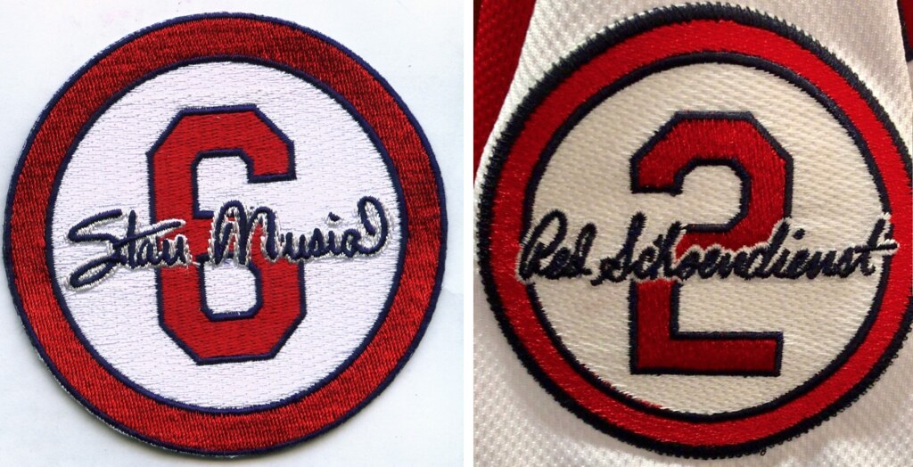
The Cardinals announced yesterday that they’ve added a memorial patch for longtime player, coach, and manager Red Schoendienst, who died last week at the age of 95. The patch will be worn for the balance of the 2018 season. And as you can see above, the Cards took the interesting route of modeling it on the Stan Musial memorial patch that they wore in 2013.
A few thoughts:
• Obviously, many teams have had multiple memorial patches that just featured the honorees’ initials, or uniform numbers, or whatever. So you could say that those patches had the same basic formats or templates. But in terms of more “designed” memorial patches, this is the first instance I can think of in which a team has used the same basic design format for multiple people. Uniformity for this uniform element!
• In between the Musial patch in 2013 and the newly revealed Schoendienst patch, the Cards wore one other memorial patch. That was in 2015, when they wore a simple “OT” patch for Oscar Taveras. (As you may recall, that patch was somewhat controversial because of how Taveras died.) So it’s reasonable to conclude that the Cardinals are only using the number/signature patch format for special occasions — Hall of Fame memorials, so to speak — not for every occasion. I’d rather not be so morbid as to speculate about specific people’s deaths, but it’s not too hard to imagine which other St. Louis greats might eventually qualify for this treatment.
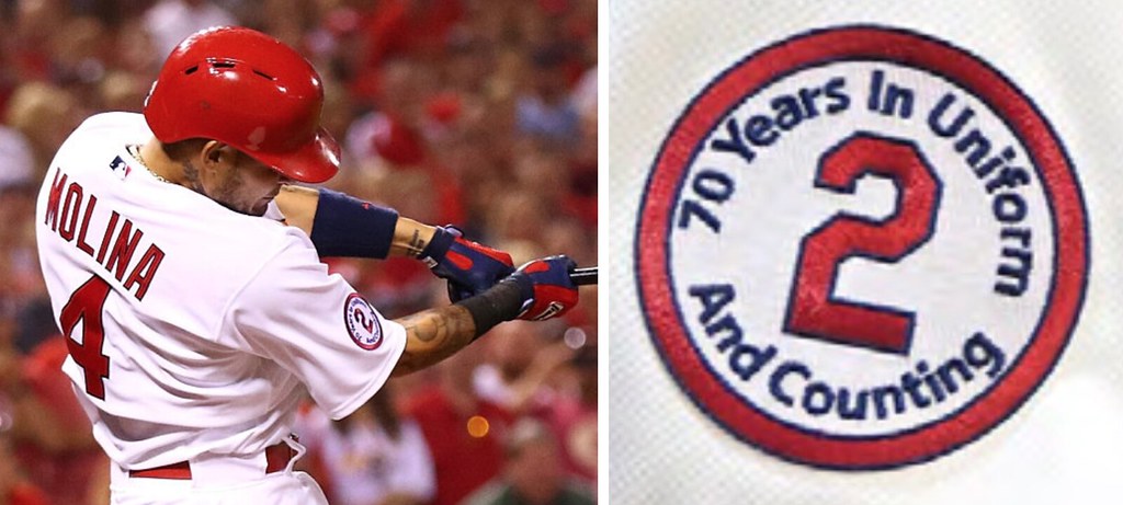
• This isn’t the first time the Cards have worn a patch featuring Schoendienst’s number. They did it once before, on April 17, 2015, when they wore a patch to celebrate his 70 years in uniform (click to enlarge):
• The most surprising thing about this new patch is how long it took for the Cards to start wearing it. Schoendienst died on June 6, but the patch didn’t debut until June 11 — a near-eternity in the world of modern uniform memorials, where teams often add patches within a day or two. (Just to be clear, I am not criticizing the Cardinals for taking too long, and I fully understand that they may have wanted to wait until they finished their road trip so the patch could make its debut at home. I’m just expressing surprise, not outrage.)
• The patch design has also been added to the Busch Stadium outfield wall:
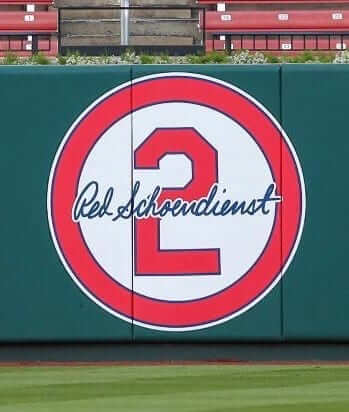
I don’t recall if they included the Musial patch design on the wall. Anyone..?
Schoendienst was, by all accounts, a peach of a guy. RIP.
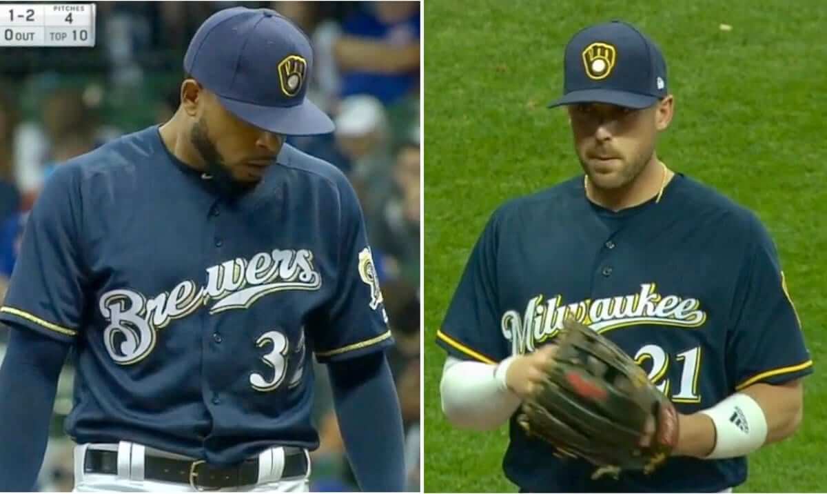
At least he wore the right cap: It was a tale of two jerseys last night in Milwaukee, as Brewers reliever Jeremy Jeffress wore the team’s “Brewers” jersey (above left) while the rest of the team was wearing the “Milwaukee” design.
Obviously, no team needs two navy alternate jerseys to begin with, so file this one in the “Serves ’em right” category.
(My thanks to the literally dozens of people on Twitter who brought this one to my attention last night.)
StripeRite update: My thanks to everyone who participated in yesterday’s StripeRite poll — we really appreciate your feedback.
Based on the polling, the next batch of StripeRite socks will feature the Houston, Cleveland, and Pittsburgh designs. But I want to run something else by you: The Pittsburgh design — a black sock with gold Northwestern striping — is based on the socks that Pittsburgh wore in the 1960s, and also as part of more recent throwbacks. But as several people pointed out to me, the team’s current sleeve striping is much more iconic than any sock striping they’ve ever worn. So what if we put their sleeve striping on a sock? Here’s how that would look, compared with the sock design I showed you yesterday — original sock on the left, sleeve-themed sock on the right (click to enlarge):

Just to be clear, the team has never worn the sock design on the right. But it’s arguably more Pittsburgh-y than the design on the left.
What do you think? You can vote here. Just like yesterday, please vote only if you think you might actually buy these socks. Thanks!
[totalpoll id=”97812″]
Collector’s Corner
By Brinke Guthrie
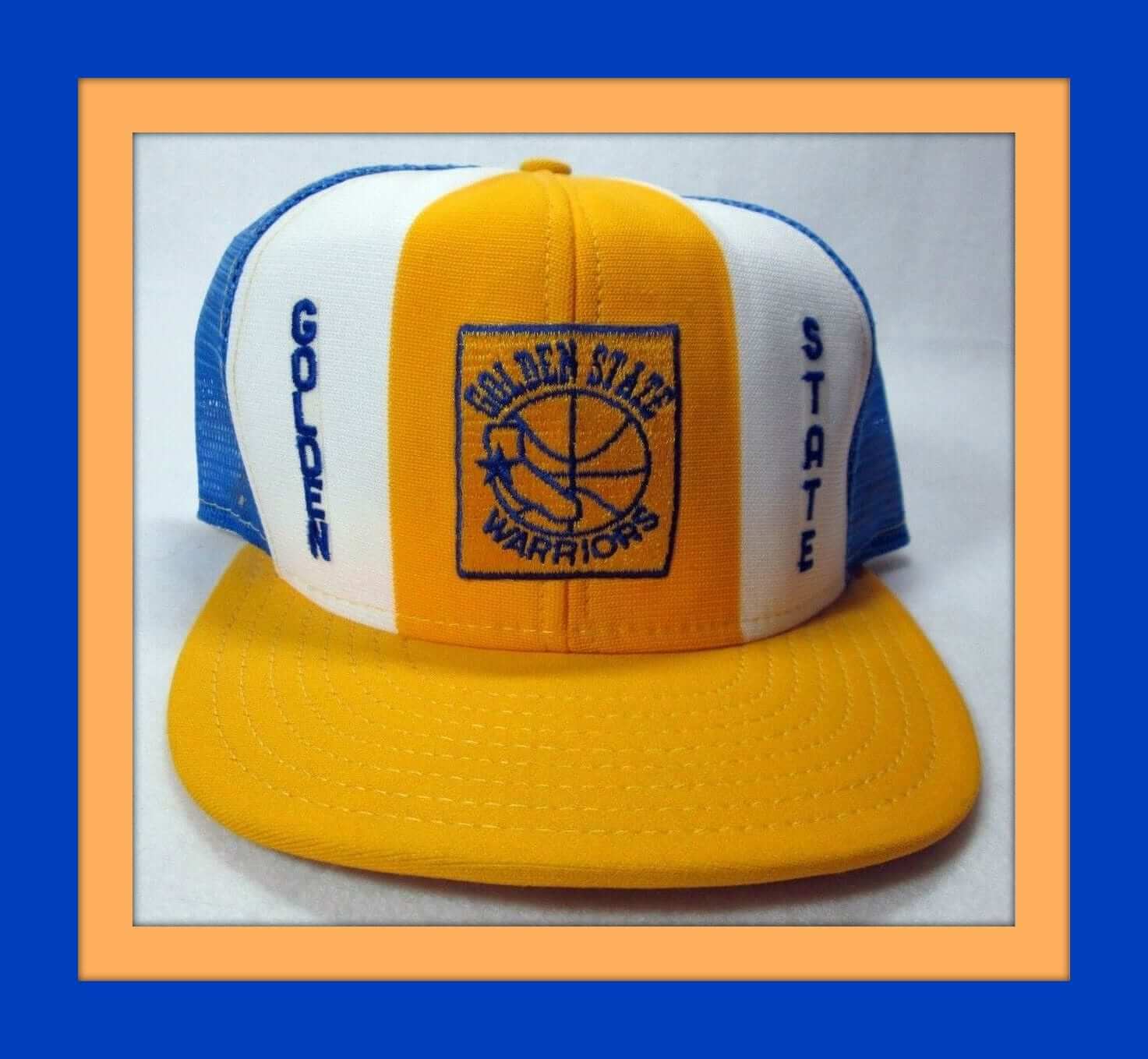
Today at 11am Pacific Time, it’s the annual NBA championship parade in Oakland, following Friday night’s Golden State Warriors dismantling of the Cleveland LeBrons. They’ve got one more year in Oakland, then over to San Francisco and the new arena, which just passed the 50% completion mark. On that note, please check out this 1980s AJD “Lucky Stripes” mesh snapback trucker’s hat. Pair this with some Zubaz pants and you’re all set! (Or go for this Zubaz Warriors cap.)
Now for the rest of this week’s picks:
• Take a look at this Chargers jersey. The tag says, “Big League Threads, Scarsdale, New York” and “Designed and Tailored Exclusively for Pro Action by Medalist Sand-Knit.”
• Might not have even wanted to wear these: a cool pair of 1970s canvas sneakers featuring MLB team logos on the outsole. This one is from 1972 at the earliest, since it shows the Rangers.
• Eight different NHL stars are featured on this 1970s zippered pencil case.
• This 1970s Reds tie was offered by Burkardt’s Fine Stores for Men in Cincinnati.
• Here’s a 1970s Montreal Expos bracelet charm.
• This 1970s quilted Vikings jacket looks very nice. No maker’s mark on it, but the seller includes “West Wind” in the title.
• Nice treatment on this 1970s Oakland A’s pennant. Notice the logo is set inside the “O.”
• Check out the striping action on this photo of Eagles QB Roman Gabriel (which sounds just as out of place as “Rams QB Joe Namath” or “Chargers QB Johnny Unitas”).
• Not sure what “Wolfpack” refers to on this 1970s Chiefs jacket — maybe a fan club?
• This 1970s 49ers medallion is still sealed in the bag.
Seen an item that would be a good candidate for Collector’s Corner? Send any submissions to uniwatchcollectorscorner@gmail.com. Thanks.

And now a few words from Phil: Sunday is Father’s Day, and I’ll be continuing my annual tradition of posting photos of “Dads in Uniform.” It’s something I began doing in 2013, and continued in 2014, 2015, 2016, and again last year, and I’m looking forward to keeping it going strong.
This year, based on a suggestion from reader Bill Hetrick, I’ve decided to add photos of equipment your father used and passed down to you. For more details on that, look here.
If you’d like to have a photo of your dad (or uncle or granddad!) featured this Sunday, or if you have a piece of equipment he passed down to you, please send me an email along with a photo (just one, please) and a short description (100 words or less) by this Thursday, June 14, midnight Eastern. I’ll run all the submissions this Sunday. Thanks.
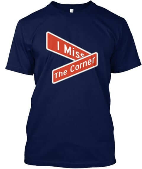
Naming Wrongs reminder: In case you missed it yesterday, we have new Naming Wrongs designs for the Corner (shown at right) and for two CFL stadiums. Full details here. In addition, in case you missed it last week, we also have new designs for the Georgia Dome, the Omni, and McNichols Arena. You can get the scoop on those here.
This will likely be our last round of Naming Wrongs shirts for a while, in part because designer Scott M.X. Turner is busy getting ready to move across the country and in part because we’ve now crossed off every stadium and arena we had on our list. We may still do more designs if we get specific requests for them (or if some new corporate venue names are announced), but this should hold us for now. My thanks to everyone for their support and enthusiasm for this project.
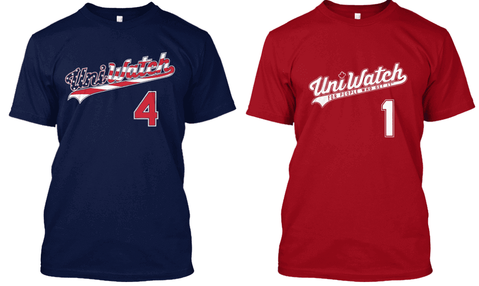
Holiday shirt reminder: Although our respective heads of state aren’t exactly presidents of each other’s fan clubs at the moment, the United States and Canada remain close allies with lots in common.
That includes the two major holidays that we celebrate in early July — Canada Day on July 1 and Independence Day on July 4. You can get Uni Watch shirts for either holiday (or both holidays!) by ordering now — the Independence Day shirt is here and the Canada Day shirt is here. Thanks.
The Ticker
By Alex Hider

Baseball News: IHOP is temporarily changing its name to the International House of Burgers, and the Phillies had some fun with that announcement (from Andrew Cosentino and Mike Chamernik). … Little League baseball now has a Q&A section on its website about C-flaps (from Justo Gutierrez). … Giants P Derek Holland has been wearing Steph Curry basketball shoes with cleats (from Brinke). … Brady Phelps, a podcast host and San Diego sports fan, is producing caps with the Padres’ unused “proto-Friar” logo. He says he will tweet details when they are again available (from Borchert Field). … Ernie Banks served as the honorary captain for the NL at the 1983 All-Star Game at Comiskey Park. He wore a jersey with a NOB (which the Cubs didn’t add to their jerseys until ’93) and the wrong number font (from @MBDChicago). … Zac Brown Band released a whole bunch of MLB-themed merch (from Ignacio Salazar). … The Staten Island Yankees will play as the Pizza Rats for Saturday home games. The name is inspired by the 2015 viral video. … The Lakewood BlueClaws will wear military appreciation caps on June 14 (from John Cerone). … The Schaumburg Boomers of the Frontier League will also wear military appreciation jerseys on June 14 (from Steve Johnston). … Frisco RoughRiders players couldn’t decide which color belt to wear last night (from Chris Roland). … The Rangers have an upcoming Beatles promotion that includes Rangers-themed Beatles giveaway caps (from Ignacio Salazar).

NFL News: The 49ers are opening a team-branded public gym in San Jose (from Brinke). … Reader Bill Kellick came across some 1960s Giants photos on eBay that appear to show players wearing “LIB” decals on at least one side of their helmet. According to Pro Football Journal and Adam Prince, that stood for the Long Island Bulls, an Atlantic Coast Football League team with whom the Giants had an affiliation. … O.J. Simpson once went FNOB in an RC Cola ad (from Pro Football Journal). … Oilers DT Curley Culp had a white facemask back in the day when the rest of his teammates wore grey (from Pro Football Journal). … Houston rapper Travis Scott recently released a pair of limited-edition Houston Oilers Jordan sneakers. Reader Rodney Flores has a buddy who owns a sneaker shop, so he made some Oilers-themed T-shirts for the sneakers’ release.

Hockey News: The DC Metro has unveiled a special edition fare card in honor of the Capitals’ Stanley Cup championship (from William F. Yurasko). … The ice at Bowling Green’s hockey arena is already ready for next season (from Pat Dougherty).

NBA News: Magic Johnson’s purple jersey and shorts aren’t the only mismatch in this photo — Sixers Steve Mix and Mo Cheeks have completely different number fonts on their jerseys (from Tom O’Grady).

Soccer News: As usual, we have a lot of kit unveilings and leaks from Josh Hinton, including Watford’s new home kit, Olympique Marseille 2018-19 home kit, Juventus’s 2018-19 third kit, Middlesbrough‘s 2018-19 home kit, and new Adidas cleats for the World Cup. … Deportivo La Coruña, a Spanish team who was recently relegated from La Liga, unveiled their new home uniforms yesterday (from Ed Zelaski). … Here’s an in-depth look at the world of soccer apparel (from Mark Coale).

Grab Bag: This is what golfer Justin Thomas will be wearing at the US Open (from Griffin Smith). … Domino’s Pizza is going to towns around America and making corporate-advertised pothole repairs. KFC had a similar program nine years ago (from @OlegKvasha). … Savino Del Bene Scandicci, an Italian women’s volleyball team, has some pretty wild zebra-striped uniforms (from Jeremy Brahm).
In 2013, the Cardinals had a memorial for Stan Musial on the outfield wall, probably in the same place as the new Red one. The memorial for Stan was on for the whole season so it will be interesting to see what happens with Red’s.
“Not sure what “Wolfpack” refers to on this 1970s Chiefs jacket — maybe a fan club?”
Well, K.C. Wolf is the Chiefs’ mascot, and according to Wiki he was named after “a group of boisterous fans who sat in temporary bleachers at Municipal Stadium.”
Still doesn’t really tell us why “wolf” is the word/animal of choice though.
Still, I guess the Wolfpack is/was a real thing!!
link
Well, here’s more to the Wolfpack story……
link
link
Interesting that the Musial patch on the wall had the background to match their Saturday alts.
The Zach Brown MLB merch seems weak and lazy to me.
Yes. Pearl Jam took a more proactive approach applying sports iconography to their shirts and posters. PJ set the gold standard in that respect.
No way….
Aligns w other ZBB merch, looks legit, while embracing the 18 tour.
Curley Culp, #78, Houston Oilers
Fixed.
“1960s Giants photos on eBay that appear to show players wearing “LIB” decals on at least one side of their helmet….for the Long Island Bulls, an Atlantic Coast Football League team with whom the Giants had an affiliation”
What about the WB on the coach’s jacket???
Westchester Bulls? That would have been 1967.
The Sixers has mismatched fonts through most of the early 1980s. Find any footage of the 1983 championship – Moses Malone’s #2 and Andrew Toney’s #22 are different.
That was an era when you couldn’t find any sort of authentic replicas unless you knew where to go. I think they were all one-offs made by Mitchell & Ness or Gold Medal.
I also remember when Maurice Cheeks had a perfectly round zero on his number 10 jersey then it suddenly was a rectangular Athletic Numeral zero.
For some reason, Mo Cheeks’ number was rendered in the NCAA Gothic the Sixers left behind when they switched from the gaudy blue uniforms to the plain red ones.
Fun fact – the NBA tightened rules on uni changes in part due to the Sixers, who changed their unis damn near every year in the 70s (once even changing midseason!).
Technically, isn’t it against the rules for players to be wearing a different uniform? (cf. Brewers) Could the umpires eject the player or impose some other penalty?
Technically? Yes.
But there’s a difference between violating the letter of the law and the spirit of the law. No ump would penalize a team for this type of honest mistake.
I believe the only “penalty” for such an infraction is requiring the player to change. Which has happened from time to time, mainly when pitchers make uniform mistakes. If the opposing manager noticed and complained to an umpire, the umps would no doubt have required Jeffress to change.
The fact that the umps and the opposing manager either didn’t notice or noticed but didn’t object underlines how ridiculous Milwaukee’s dueling navy alternates are.
I’m not saying they should, I’m just wondering whether there is something on the books.
Disappointing that the Blue Claws and Boomers are both going with military appreciation and wearing camo on June 14, which is Flag Day. This would be the occasion when you wear your stars and stripes outfits.
I think I remember reading Culp brought that white facemask, if not his whole helmet repainted, with him from the Chiefs, who wore white masks by then.
Correct.
I was wondering if that type of facemask (“bird cage”) was ever offered in any color other than white.
I loved Big League Threads!!! I still have one of their hats!
Big League Threads!! That was my favorite store when I was a kid. My Dad and I spent many Saturday afternoons hanging out there, and going home occasionally with a new jersey =)
I expected to see “Orenthal” on the back of O.J. Simpson’s jersey. Didn’t he actually go FIMIOB?
It’s tricky, since his “full name” is Orenthal James Simpson, but for all intents and purposes, his “first name” is OJ. It’s kind of FNOB (where his first name happens to be initials), mixed with a touch of FIOB (where the “I” stands for initials, plural). I’d favor the former for this instance. If it said Orenthal, waybe we’d call it GNOB (Given Name On Back)? Is there an official Uni-Watch stance on this Paul?
From the Holiday shirt reminder: Nitpicky, but the prime minister is not our head of state. That would be Queen Elizabeth II (although I can’t imagine she’s the president of Trump’s fan club, either).
I think its more correct to say our head of state is the Governor General, not the Queen. She signs legislation, exercises the reserve powers of the Crown, prorogues parliament, is commander in chief of the military, etc.
Its a cool time to be Canadian, because our current head of state is an astronaut.
Queen Elizabeth II is Canada’s monarch and head of state. The Governor General is the monarch’s representative.
link
Its a good question and its not without doubt.
I take my lead on this point from my constitutional law professor.
I mentioned the reserve powers of the Crown above – if there were a constitutional crisis of some sort, say around selecting a prime minister – the power would be exercised by the Governor General and not by the Queen. The Queen has no authority to intervene in Canadian parliamentary affairs. Similarly, the Queen has no authority to intervene in provincial parliamentary matters (that authority is held by the Lieutenant Governor of each province). That makes the GG (or LG) the head of state.
This was a live question in the prorogation crisis a few years ago (whether the Queen had any authority to prorogue Parliament). It never had to be tested as the crisis resolved first.
mike, the Governor General’s website (link) and the Government of Canada (see the link in RS Roger’s comment) disagree with you. Happy to read something to the contrary, though.
No, the Queen is the head of state. The GG is her representative in Canada and is authorized by her to exercise the powers of the Crown.
Interesting indeed. An ornate template to memorialize St. Louis Cardinals with retired numbers. I don’t disagree that it’s the most designed template, but only two things come close:
New York Yankees: they’ve had a few recent exceptions that stick out like sore thumbs, but the formula was simple: memorialized retired numbers on the sleeve, but anybody else from the Yankees family got the black stripe.
Minnesota Twins: both deceased owners, Carl and Eloise Pohlad, were memorialized with their signatures.
Picture of a baseball player in today’s Philadelphia Inquirer of a baseball player from Eastern High School (Voorhees, N.J.) wearing serious rugby stripes (second picture down).
I have never seen horizontal rugby stripes on a baseball uniform in the history of ever.
Story here:
link
Hoops are a great look for a baseball uniform! Props to Eastern for the strong design. A big logo, centered, is the way to go with hoops.
Are there any other teams that have two alternate jerseys in the same color in baseball? The Brewers’ seems especially stupid since they are same aside from swapping out the nickname and city wordmarks. Oh for the days of white at home and gray on the road.
Off the top of my head:
Mets have two different royal blue alts.
Nats have two different navy alts.
Reds have two different red alts.
There are probably others I’m overlooking.
The Cubs used to have 2 grey jerseys, but scrapped the alternate.
Also Dodgers have 2 road grays
The Cubs also used to have two royal blue alternates which looked absolutely identical from the front, but the home version had only a number on the back with the road version having a NOB.
I suppose there was never a snafu with those because clubhouse managers hang jerseys in people’s lockers with the back showing, not the front. So you’re going to have the Milwaukee and Los Angeles mix-ups because both versions have NOBs and look the same from behind.
What’s the 2nd red alt for the Reds?
The Los Rojos alt. It’s officially considered part of their regular wardrobe rotation, not a one-off.
Does the Los Dbacks jersey also count for Arizona? Also gotta count their double white/double gray rotation.
Los D-Backs is not technically an alternate jersey; it’s just a one-off. (Los Rojos, by contrast, is listed as an alternate in the MLB Style Guide.)
I realize these distinctions may seem esoteric. I’m just explaining how MLB categorizes things; I’m not necessarily arguing that those categorizations make sense.
One thing that hasn’t been brought up. Monday’s “Milwaukee” jerseys were navy and yellow (and looked so great). The “Brewers” navy has metallic gold.
Not really uni-related.
Red Schoendienst was the oldest living Hall of Famer. With his passing, Tommy Lasorda is now the oldest.
Where can I purchase the Red Schoendienst patch?
The team sold Musial patches in 2013. I’m guessing they will do the same this year for Red. Check the team merchandise site in the coming weeks.
Thanks for including the ProtoFriar cap in the Ticker! It means a lot to have a project recognized in any way. We are indeed looking into the possibility of producing more (the inaugural run had all been spoken for well prior to landing).
Count me in! I have never seen that logo before, but I must have it.
“The ice at Bowling Green’s hockey arena is already ready for next season”
Is it that unusual?
Several arenas in my city open over the summer.
Rinks are usually open all year, but get new sheets of ice a few times. Logoing the whole thing now mean with a lot of wasted expense, or they are not going to lay a new sheet before the season which means the logos wont be as clear looking when the season does start. The logos themselves will still be fine but the constant resurfacing will degrade the upper ice visually to a degree.
Re: the kit launches. Watford’s qualifies as a relatively big deal because they’re wearing black and yellow stripes for the first time ever (though the internet tells me they wore black and white stripes on the 1910s and ’20s).
It’s pretty rare for UK teams to change the basic pattern of their first shirt (as in solid, hoops, stripes, etc.) if they have a set one that they use, and if they do the change is usually negatively received.
The front stripes look great, IMO. Better than the yellow-to-black gradient they did a few years back.
I’m a fan of their solid yellow top / black shorts /red socks home look.
The beautiful link has been uploaded to YouTube — at 49:10 you can see “Don’t adjust your set; we know the game is in black and white. It’s just for a few innings so relax and enjoy.”
And both teams’ uniforms look that much better in color!
USF’s arena, the USF Sun Dome, will become the Yuengling Center for the next 10 years after the Lightning’s owner struck a deal with the company that has a brewery a mile south of the university’s main campus in North Tampa.
link
I wondered why the Phils were wearing their weekend alts on a random Tuesday, and…
From Twitter:
“The Phillies will wear their cream jerseys and blue helmets for a night game because the league’s vendors have not delivered a red double-flapped helmet for Rhys Hoskins. Whacky.”
link
If you want sleeve stripes then buy a jersey!
Sock stripes should be sock stripes!
Seeing that Charger jersey for sale on EBay from the old Big League Threads in Scarsdale,NY brings back great memories! I grew up in that area and frequented that store in the early to mid 1980’s. It was one of the first sport themed stores that sold authentic NFL, MLB and NHL jerseys and apparel.