For all photos, click to enlarge
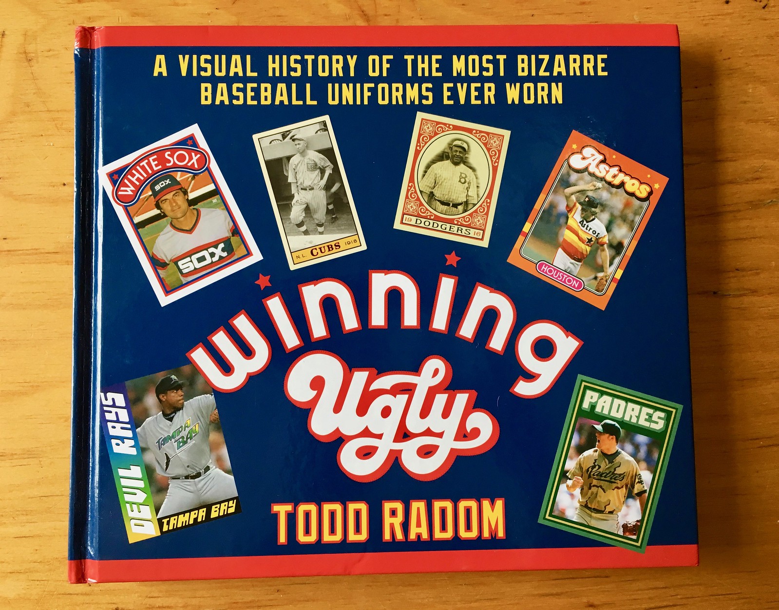
Let’s start this off by saying that I’m hardly an unbiased observer when it comes to Todd Radom. I’ve known him for over a dozen years, we’ve become good friends, we occasionally hang out, we recently collaborated on that limited-edition print (still available!), and more. But believe me when I say his new book, Winning Ugly: A Visual History of the Most Bizarre Baseball Uniforms Ever Worn, is really, really good.
In fact, the worst thing about the book is its title (which was probably the publisher’s idea, not Todd’s). This isn’t really a book about ugly uniforms; it’s a book about uniforms that were different, that broke the mold, that pushed boundaries. Some of them were indeed ugly, but others — like the A’s early-1970s look, or the Astros’ tequila sunrise — are now recognized as classics of their era.
In fact, one of the best passages in the book comes when Todd quotes a 1908 item from Sporting Life, as follows: “Within the last few years there has been a tendency toward the garish in base ball uniforms. There’s too much of this insignia and curlicue business. The only really artistic diamond apparel brought out in recent seasons was that of the Pittsburg club.” In other words, tradition was going to hell and all these newfangled designs were ruining the look of the game. As Todd then notes, “Strip away some of the florid language and you essentially have an online comment that would not be unfamiliar today.” Or to put it another way, “ugly” has always been a very relative concept.
Todd is mostly known as a graphic designer. But if you’ve read his work in The Sporting News or on his own website, you know he’s a very good writer, and that definitely comes through in this book, which has lots of very solid text, good analysis, and insights from primary sources who Todd interviewed.
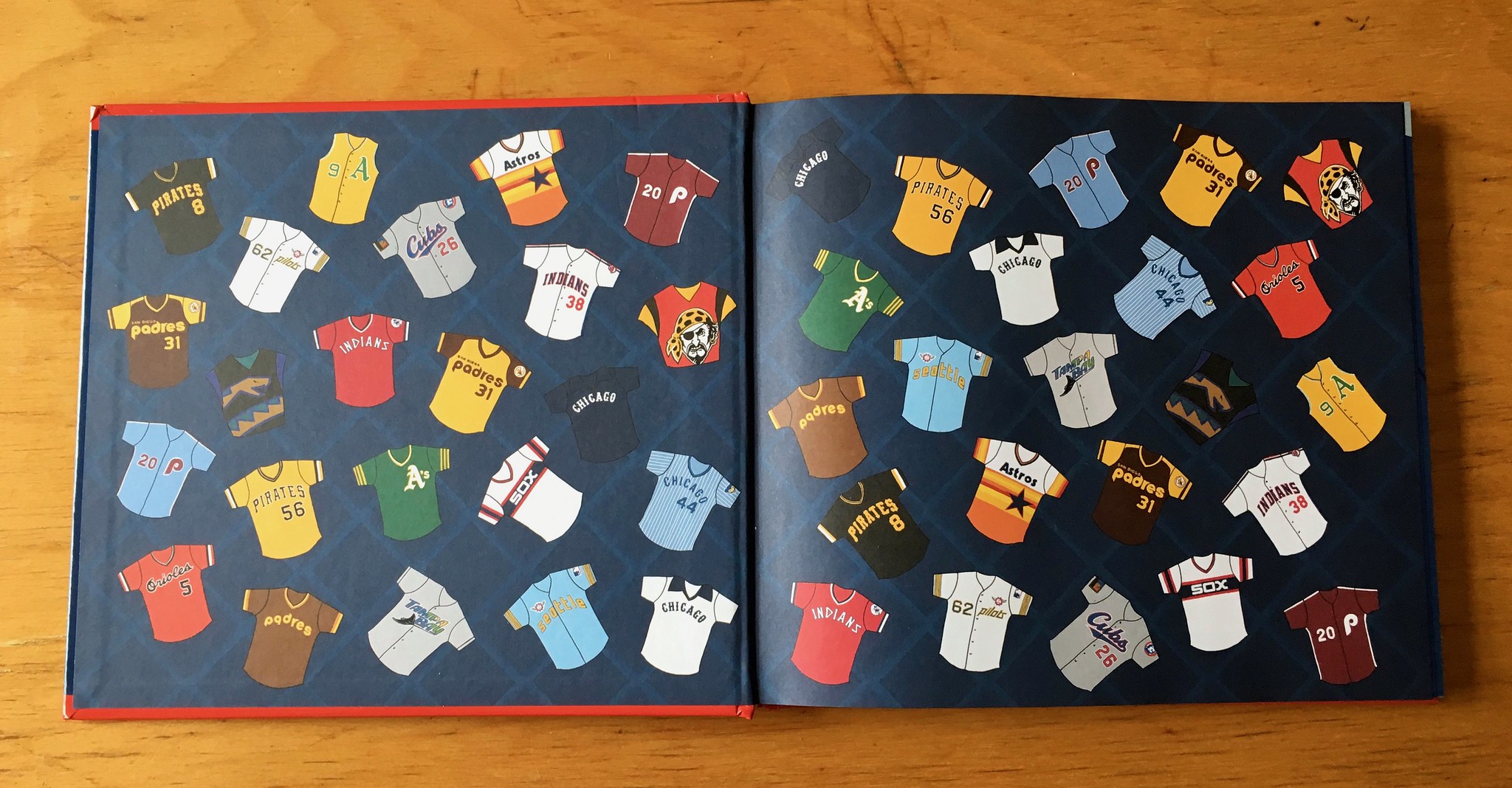
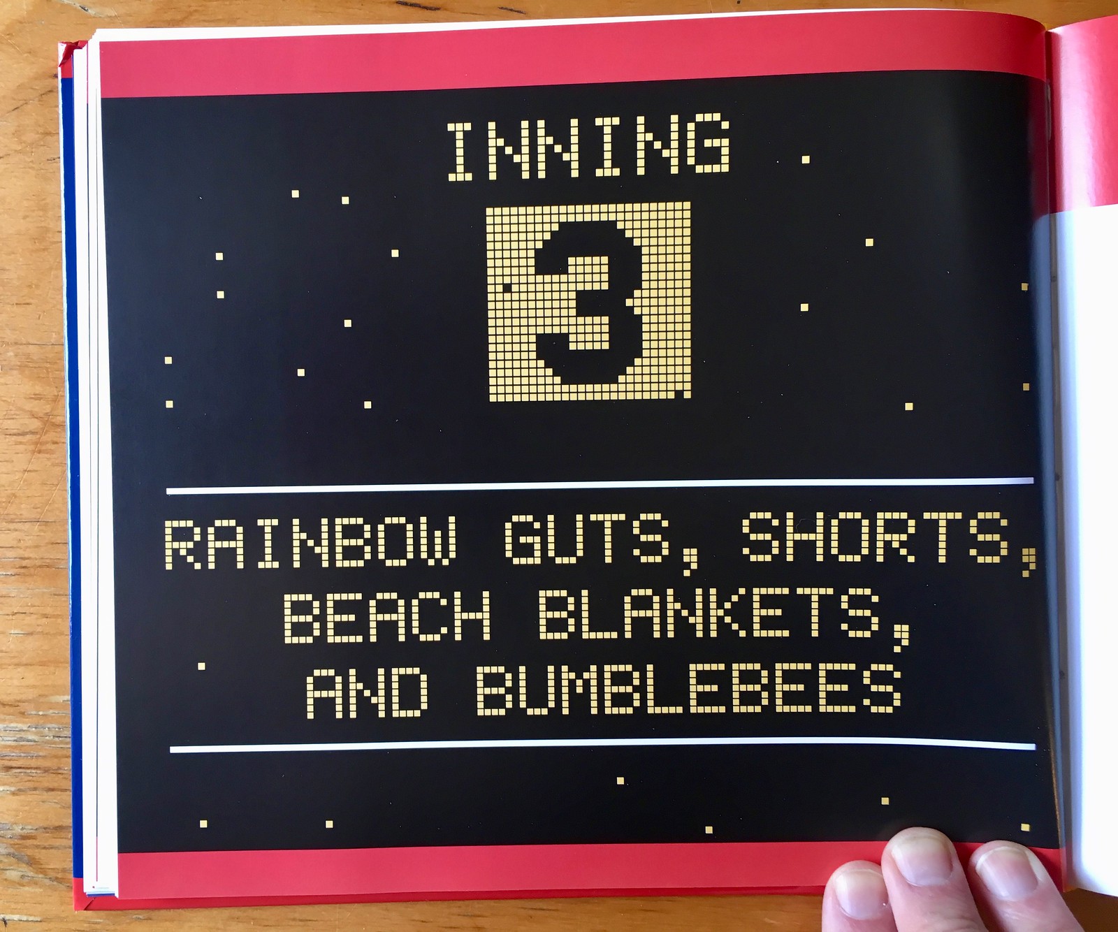
But as you’d expect from a Todd Radom production, there are lots of visual pleasures. The endpapers, for example, are decorated with lots of jerseys, and the chapter openers are designed like a 1970s scoreboard, complete with a few stray malfunctioning bulbs:
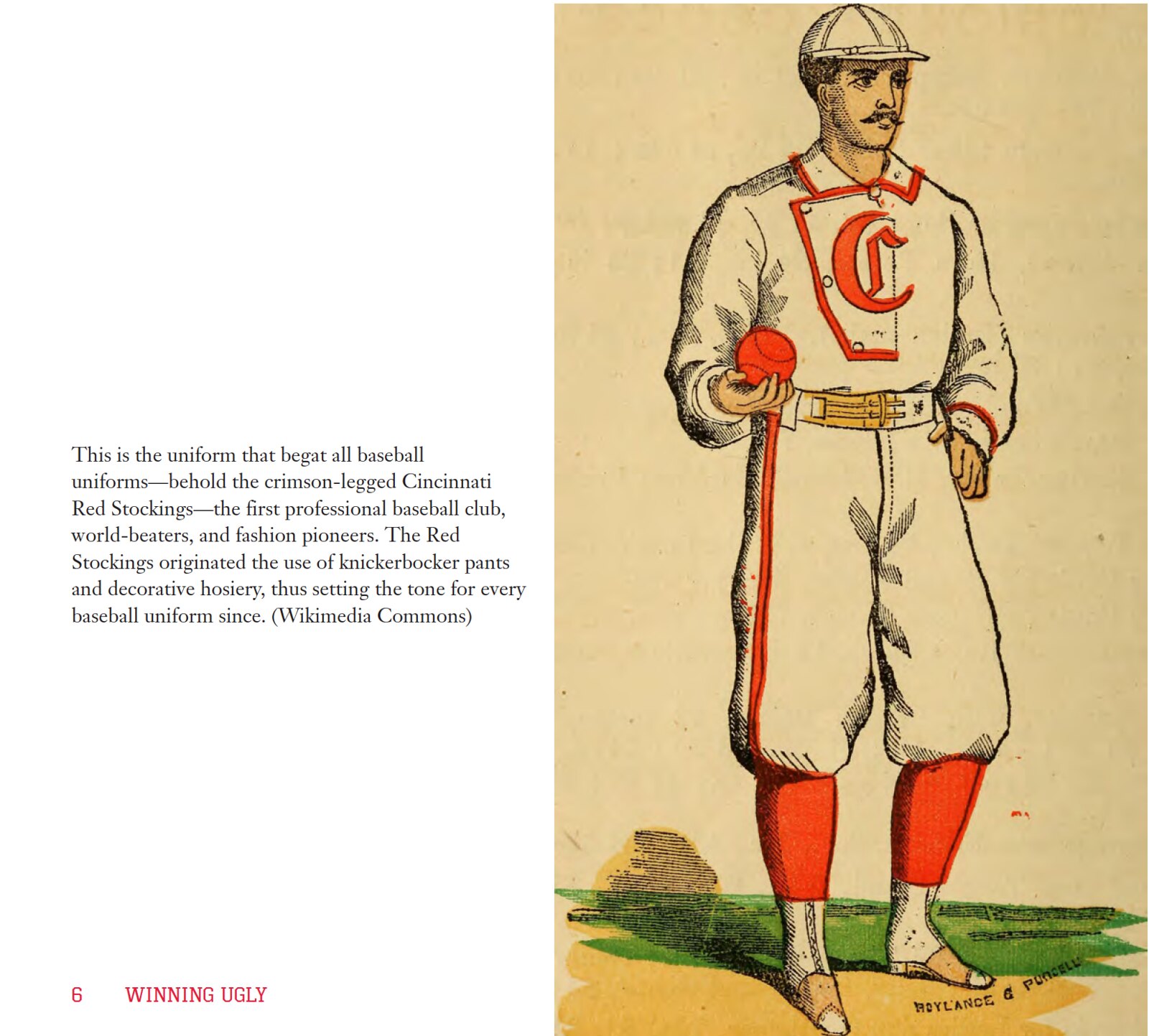
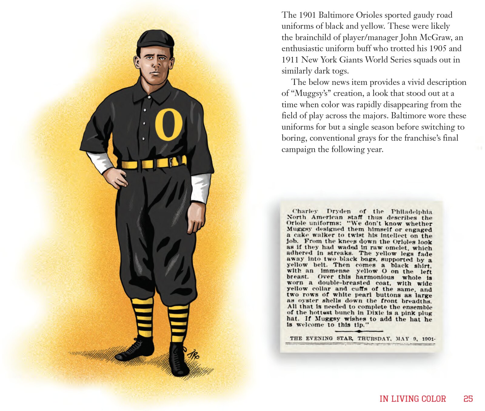
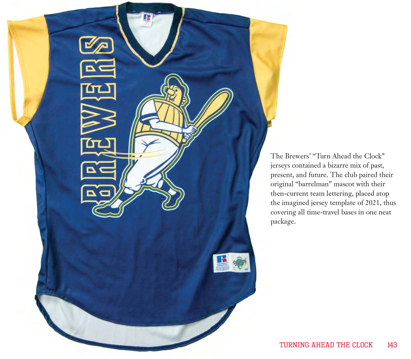
Although you might think the book is all about the 1970s and ’80s, some of the early chapters focus on the baseball uni-verse’s early days:
When documenting the doubleknit era, Todd had assistance from doubleknit collector/guru and fellow Uni Watch pal Bill Henderson, many of whose jerseys appear throughout the book:
Todd supplemented the photos with some illustrations, many of which have a touch of whimsy. Look how he hid his signature in the jock tag of this Seattle Pilots illo, for example:

There’s a bit of coverage of throwbacks, and MLB’s 1999 futuristic uniforms get their own chapter:
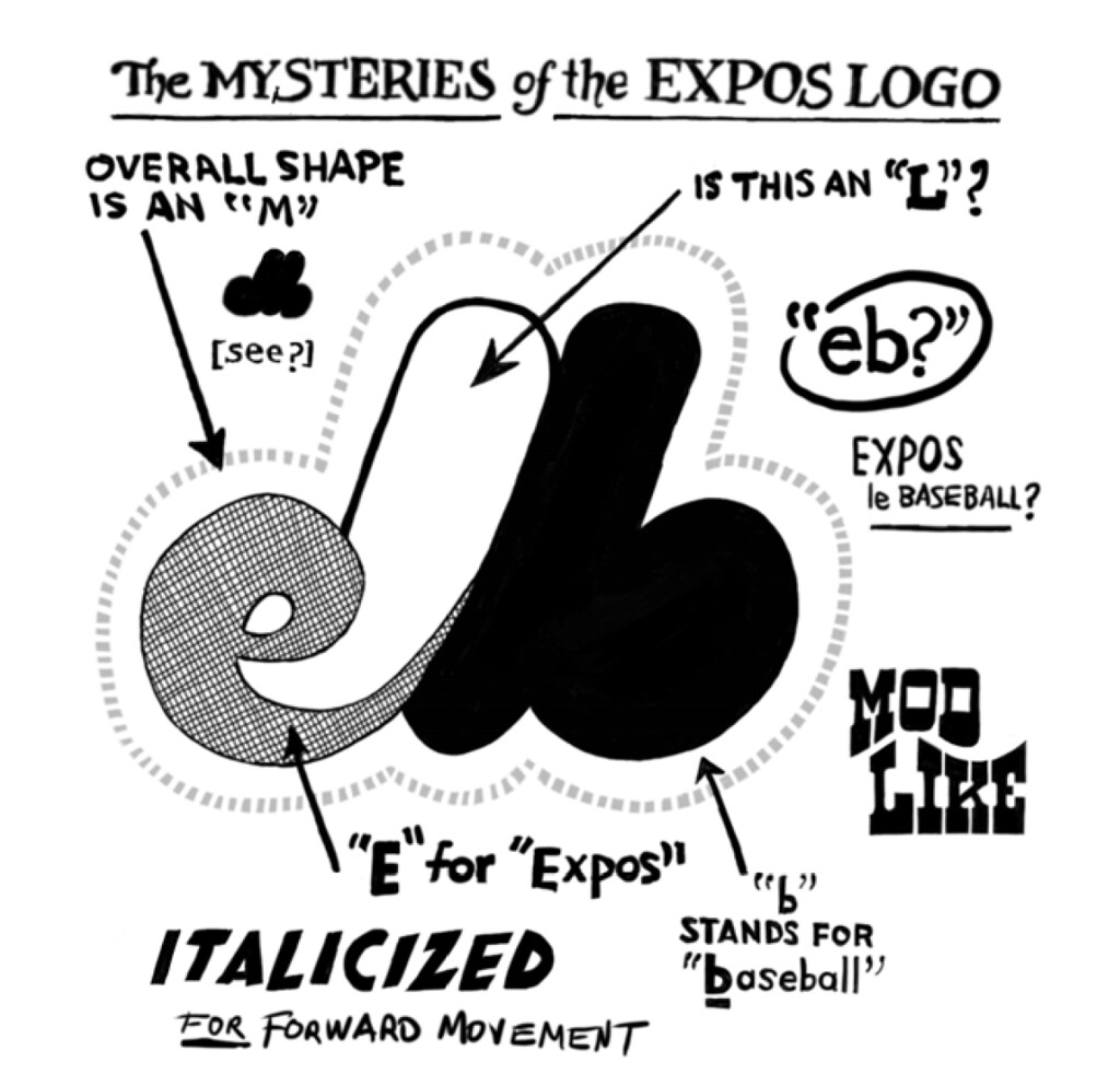
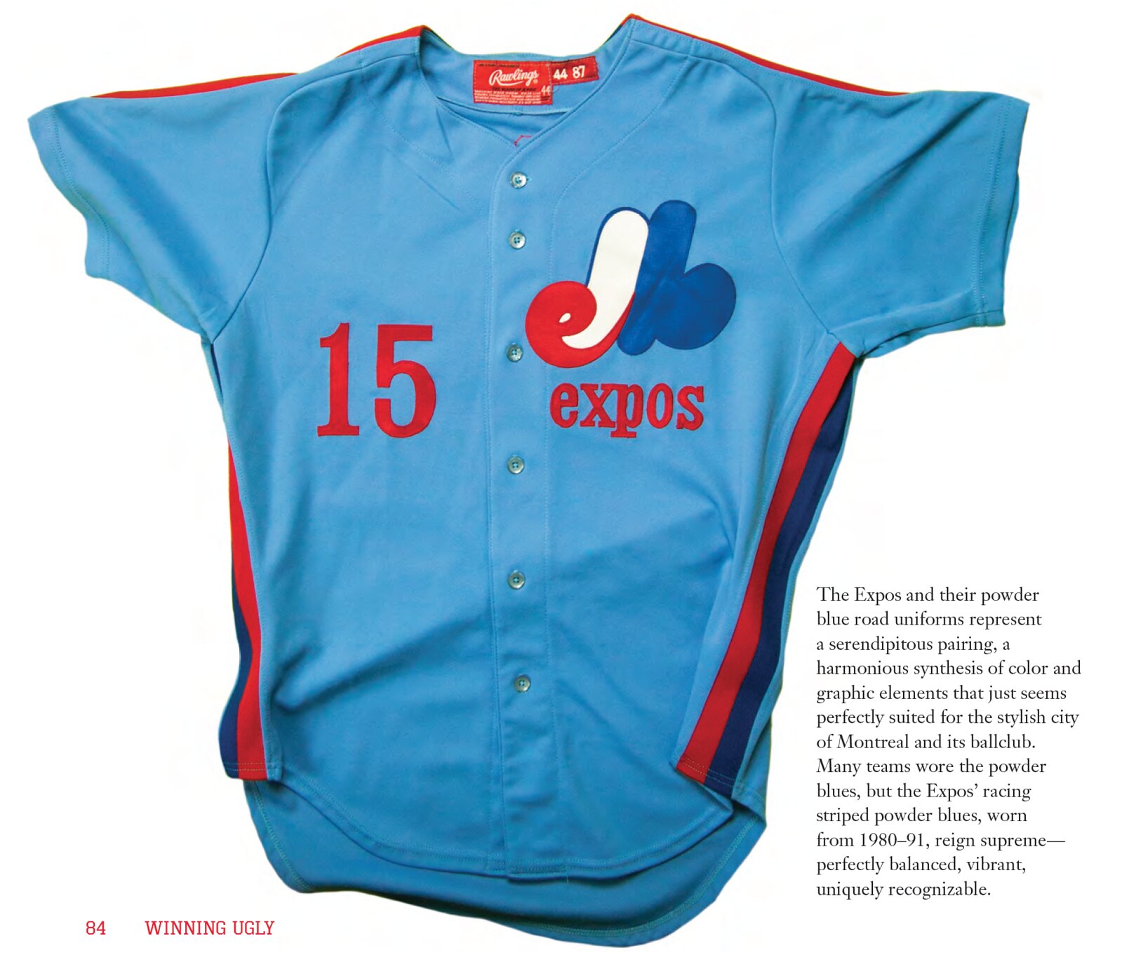
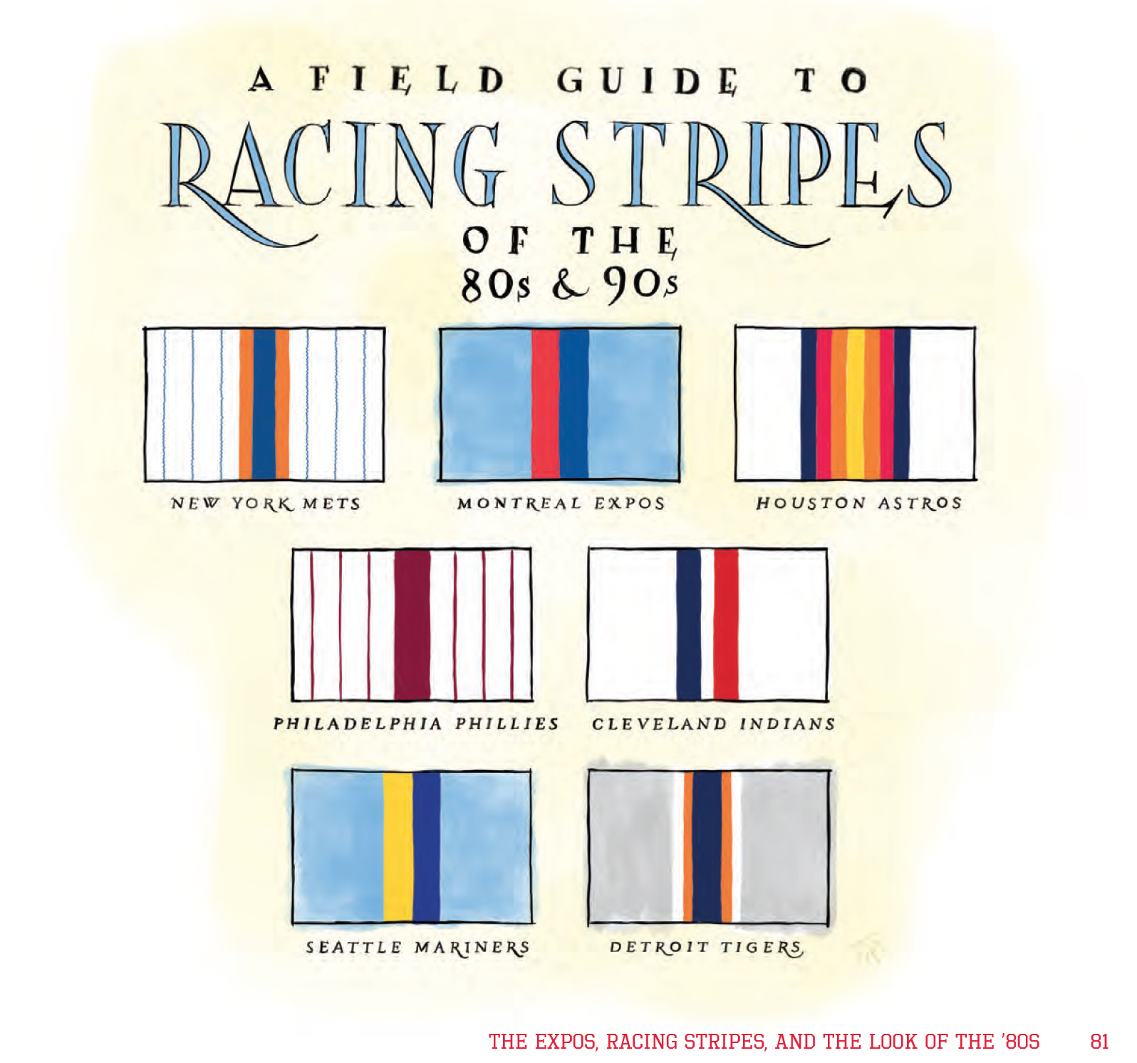
I wouldn’t call the Expos’ uniforms ugly (and I’m pretty sure Todd wouldn’t either), but I’m glad they got some coverage in the book:
As many of you know, I love catalogs and catalog-like designs. So I was particularly pleased to see this page:
The book is a winner. It’s available from Amazon (and all the other usual places), plus Todd is offering signed copies and a few bonus items on his website. Enjoy.
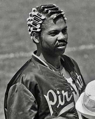
The gift who keeps on giving: To the casual baseball fan, Dock Ellis is that guy who threw a no-hitter while on acid. To the knowledgeable Uni Watch reader, he’s the guy who wore curlers at the ballpark (as shown at right). But reader Jerry Wolper has found another uni-notable chapter from Ellis’s storied career.
The incident in question comes from a Pittsburgh Post-Gazette recap of the Pirates’ 9-8 victory over the Expos on May 15, 1973 (45 years ago yesterday). Here’s the key passage:
Rare incident in the Buc sixth. Doc[k] Ellis, wearing a warmup jacket, was sent in to run for [catcher Milt] May. First base umpire Nick Colosi told Ellis to remove [the] jacket because only pitchers who are in [the] game can run with jackets. Ellis wasn’t wearing a Pirate shirt underneath [the] jacket, so Bob Moose ran for him. A pinch-runner for a pinch-runner without a pitch being thrown.
Ah, Dock — you were the best.
Sweaty business: Omo, a Brazilian laundry detergent, recently had an innovative sponsorship ad on the jerseys of the top Brazilian soccer team Corinthians. For the one-game promotion, the jerseys started out with a blank white panel on the chest, but an Omo ad was revealed as the players perspired. You can see it all unfold in the video clip shown above.
There’s more info here, including this beauty of a quote from an Omo marketing exec: “The brand is constantly innovating and bringing remarkable moments to its consumers.” Now wait a minute — we’re talking about fucking laundry detergent here. Exactly what kind of “remarkable moments” can you be providing? You may have come up with an interesting ad campaign, but let’s not confuse that with having an interesting product or changing anyone’s life.
Twenty years ago, when I was the marketing columnist for Fortune magazine, I would’ve had a field day with this story. It’s amazing what corporate marketers will say if you put a microphone in front of them.
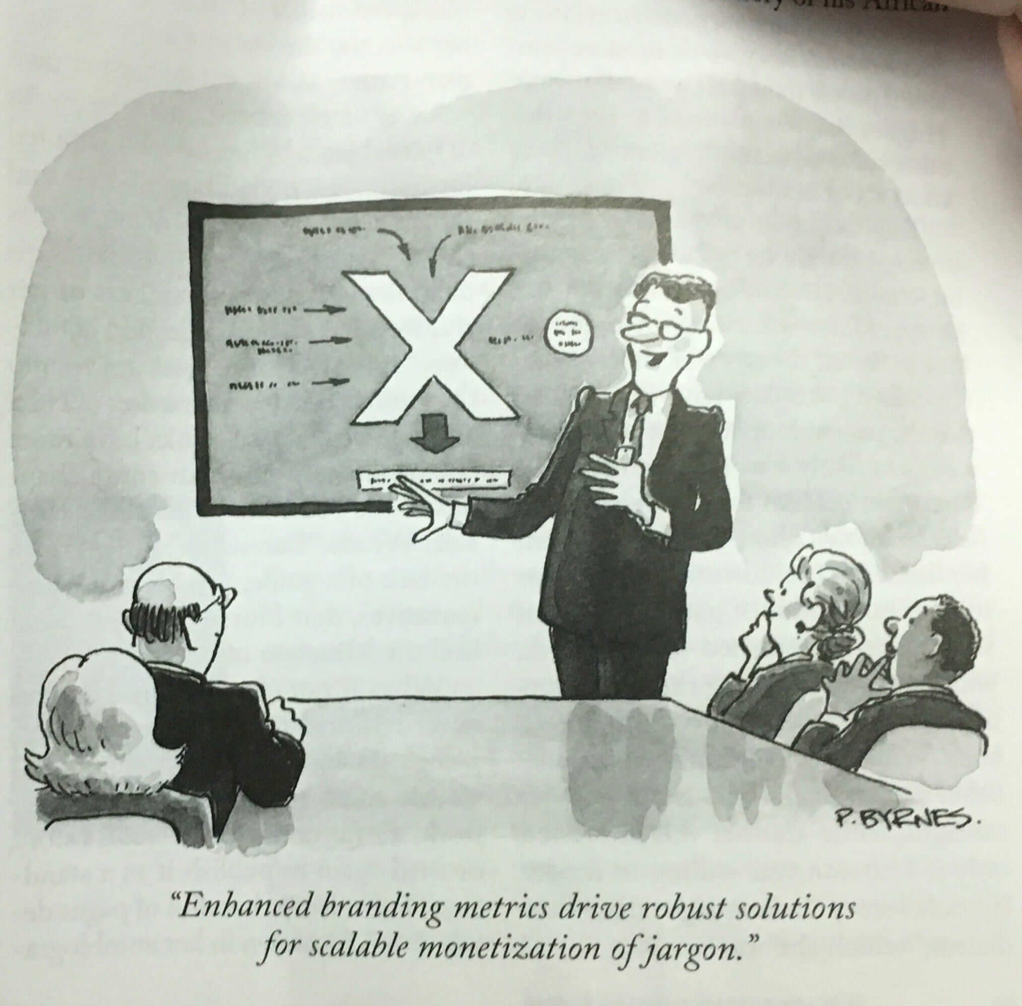
Speaking of which, last week’s New Yorker had a cartoon about corporate marketing. It pokes fun at the entire marketing/branding world, but I think it’s particularly applicable to sports marketing, which it captures in a nutshell:
(My thanks to Phil for the Brazilian item.)
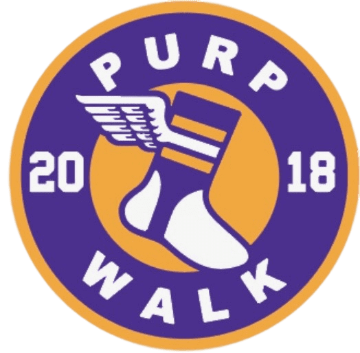
Purp Walk reminder: Tomorrow, May 17, is this website’s 12th birthday. That means it will also be time for our annual Purple Amnesty Day celebration, when I grudgingly salute the world’s most accursed color.
For 24 hours, I’ll be accepting orders for purple-inclusive Uni Watch membership cards, and we’ll also have a Purp Walk cap available. In case you missed it yesterday, full details on the cap are available here.
The 24-hour Purp Walk window will open at midnight Eastern tonight. Thursday’s blog entry will be published at that hour (instead of our usual morning pub time), the cap will be available for ordering, and purple membership orders will be welcome. Then the window will close exactly 24 hours later and I can go back to hating purple for another year.
Click to enlarge
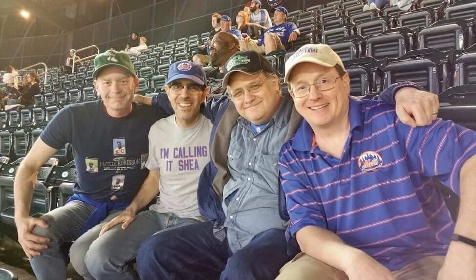
Four Metskateers: It was a rainy scene at Shea last night, but that didn’t keep a bunch of us from attending the Mets/Jays game. From left, that’s Uni Watch deputy editor Phil Hecken; yours truly; Faith and Fear in Flushing co-editor Greg Prince; and prolific Mets-centric author Matt Silverman.
As you can see, Phil was wearing his brand-new Uni Watch ballcap, which looked my-t-fine on his noggin. At one point we were walking through the concourse and someone recognized the cap and said, “Hey, wait, are you the Uni Watch guys?” That was pretty cool.
I had a bit of fun by suggesting that we see how the cap might look if it were available for sale at one of the ballpark’s retail shops (click to enlarge):
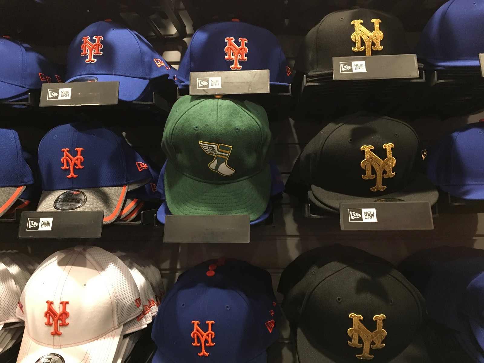
Not bad — fits right in! (And yes, I digitally removed New Era logo from the sales display thingie. Didn’t seem right to show it with our cap.) Now if my own cap would just show up in the mail already.
As you probably know, we’re sold out of all the fitted sizes, but you can still get the adjustables, which come with a handsome brown leather strap and a burnished metal buckle, here.
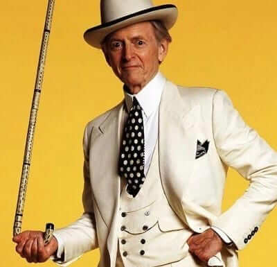
White privilege: I never got around to reading much work by Tom Wolfe, who died yesterday at the age of 88, but he’s uni-notable because he wore a uniform of sorts: He usually appeared in public wearing a white suit (often with a double-breasted lapelled vest, like the one shown at right). The white suit became so closely associated with him that one prominent media outlet mentioned it in the headline of their Wolfe obituary yesterday.
Standard menswear protocol stipulates that white should only be worn in summer, but Wolfe wore the white suits year-’round.
According to Wikipedia:
Wolfe adopted wearing a white suit as a trademark in 1962. He bought his first white suit, planning to wear it in the summer, in the style of Southern gentlemen. He found that the suit he purchased was too heavy for summer use, so he wore it in winter, which created a sensation. At the time, white suits were supposed to be reserved for summer wear. Wolfe maintained this as a trademark. He sometimes accompanied it with a white tie, white homburg hat, and two-tone shoes. Wolfe said that the outfit disarmed the people he observed, making him, in their eyes, “a man from Mars, the man who didn’t know anything and was eager to know.”
All very interesting. R.I.P.
The Ticker
By Alex Hider

Baseball News: More uniform policing by MLB, which has told Cubs C Wilson Contreras that he can no longer wear his Venezuelan flag compression sleeve. … Nats OF Bryce Harper owns a glove with “Your Sister” stitched on it. Not sure if he’s used it in a game or not (from Lemay Terry). … 10 MLB teams will give away rainbow caps to fans at LGBT pride events this season (from Jim Buzinski). … Speaking of giveaway caps, the Rangers will give away purple caps for Tarleton State University night on May 24 (from Ignacio). … The Onion has served up another classic about MLB merch for women (from Mike Chamernik and Brice Wallace). … This blog classifies all 160 minor league team names (from Phil). … The Toledo Mud Hens will dress up for Harry Potter Night on June 30. … Jack Krabbe found these old Padres cards, which show pitchers Ed Wojna and Lance McCullers wearing what appears to be practice uniforms under their game uniforms. … Kentucky baseball has been wearing merit decals on their batting helmets this season (from Austin Guill). … Some players for NCAA D-III Franklin College have been wearing some pretty spiffy striped stirrups (from Derek Linn). … Quite the contrast between Georgetown High School and Brenham High School in Texas: One in camo, the other in tequila sunrise (from ZJ Williams). … Mets C Devin Mesoraco was traded from the Reds over a week ago but is still using his old red-trimmed mitt. … University of Portland P Eli Morse wears a protective mask on the mound after having suffered a facial injury. … Kent State and Youngstown State went ketchup vs. mustard yesterday (from David Dermer).

NFL News: Texans WR Sammie Coates will be going JrOB this season — without punctuation (from Clint Richardson). … Speaking of the Texans, here’s how DL JJ Watt’s jersey will look with the Walter Payton Award patch, which he can now wear after having won the award back in February (from Ignacio Salazar).
College Football News: Iowa State will unveil new uniforms within the next couple of months (from Phil). … A football that President Trump signed during Alabama’s visit to Washington last month created some drama in the White House. … If you were hoping to see Texas wear blackout uniforms this fall, AD Chris Del Conte says you should forget about it (from Griffin Smith).

Hockey News: Patches! Patches galore for the Blainville-Boisbriand Armada, a junior team in the Quebec Major Junior Hockey League (from Moe Khan). … New sweaters for the Minnesota Whitecaps of the NWHL (from Marc Viquez). … Mark Gillingham was at the IIHF World Championships on Sunday, and noticed that on skaters’ jerseys, the TV number was placed above the ad patch. But for goalies, the TV number was placed below the ad patch. He said this was consistent for every team he saw.

Basketball News: Rockets owner Tilman Fertitta has told the Houston Chronicle that the team may tweak its uniforms for the 2019-20 season (from Steven). … This is what participants at next week’s NBA Draft Combine will wear during their workouts. … New floor design for North Dakota (from Greg Enkers).

Soccer News: New first kit for Scottish Premiership team Aberdeen (from our own Jamie Rathjen). … Someone in Italy started a Change.org petition to clean up the ad on Juventus’ new jerseys. Why stop there when you can just remove the entire ad? (From Tony). … Birmingham Legion FC, who will join USL in 2019, will be outfitted by Nike when they take the field (from Josh Hinton).

Grab Bag: ESPN is getting set to launch a new show called High Noon (9 AM Pacific) but as Greg Franklin points out, they’ve been inconsistent with their use of AM. FWIW, in AP Style, it is written a.m. … Ad creep is coming to Department of Veterans Affairs ID cards, as all new cards will have the Office Depot logo. … FIVB, the international governing body of volleyball, picked a strange font to use for on-air graphics for Volleyball Nations League broadcasts (from Jeremy Brahm). … Tarpon Springs High School in Florida has one hell of a nickname: the Spongers (from Russell Goutierez). …Staying in weird nicknames, Hickman High in Missouri goes by the Kewpies (from @pwilla). … Stars-and-stripes mania has extended to golf balls (from James Gilbert).
“Kent State and Youngstown State went ketchup vs. mustard yesterday”
I relish games like that!
Nicely done.
Frankly, and at the risk of sounding like a wiener, that might actually be a stomach-churning uni combination…
Just needed the hot dog races.
Apparently those Callaway golf balls come in an array of colors!
link..0.23523.24638.0.24787.6.4.0.2.2.0.85.280.4.4.0….0…1c.1.64.img..0.6.290…0i67k1j0i24k1.0.0d6e5tgUXfo
I forgot how awful the Walter Payton patch looks. The jerseys are getting way too cluttered, why not just stickers on the helmets for captains, WP winners, etc?
Hint: Rhymes with “retail merchandising.”
First time I saw it I thought it was Darth Vader
It’s Dock Ellis. The article managed to get it wrong.
is it possible for you to change the autoplay settings on the Yankees Mother’s Day video from 2 days ago? When I open the site, the video plays at full volume until I scroll down to shut it off and it doesn’t always let me do it right away.
If you are using Chrome you can right click the uniwatch tab and select “mute site”. This will mute any audio on videos that autoplay.
whoa! Never knew that option existed! Thanks
I actually liked the Seattle Pilots uni, and before Amazon, Starbucks,etc, there was Boeing – so the name fit the region.
The Minnesota Whitecaps uni could use a little more cow bell, I mean color, make one of the stripes a vibrant color and the uniform would be so much more (IMO)
With the gradual darkening grey stripes and their placement, the Whitecaps jersey appears to be a nod to the 1980s Minnesota North Stars black prototype jersey.
link
The Dock Ellis item just reminds me of how often modern managers get by just wearing a team sweatshirt or jacket. I can’t imagine Francona, for example, is actually wearing the full uniform under those sweatshirts. That coaches wearing uniforms has stuck in baseball is still just odd to me.
Watching the Caps/Lightning game last night I had a very similar conversation, regarding the nature of what coaches wear in different sports. I think baseball coaches/managers wearing the uniform is there in part because of tradition dating back to player/managers and also because of all the uniforms it is the only one that looks somewhat similar to real clothing. It is pants, a belt, and a shirt with buttons.
In addition, baseball managers routinely go on the field of play (to change pitchers, to argue a call), and their coaches are routinely in the coaching boxes along the baselines. Coaches in other sports don’t (or at least aren’t supposed to) enter the field/ice/court.
Also, baseball managers and coaches are involved in pre-game activities, BP, infield and outfield practice, fungos, etc. You can’t do those things in a shirt and tie. That functional reality, together with the long history of managers wearing uniforms, Connie Mack excepted, is a small part of what makes the game great.
Connie Mack is hardly the only manager to have worn civvies. Many, many early managers did so.
Mainspark, I’d argue that basketball and football coaches do the same. They just change their clothes before the game, or at least they used to. The suit and tie football coach seems to be the exception rather than the rule anymore.
What are your thoughts on coaches in other sports and their attire? Do you think they should have some sort of team branded attire (NFL coaches) or does the suit and tie of basketball and hockey work for you?
NFL: I would prefer to see coaches go back to business attire instead of serving as models for the latest overpriced merch.
NHL/NBA: I’m fine with things the way they are.
To those NHL coaches out there. If you get sick of the suit and tie, you can always rock the sweater like Robbie Ftorek:
link
Birmingham Legion FC, not Birmingham FC.
Regarding the Hickman Kewpies item, if you do a google image search for that, those mascots can give you some nightmare fuel.
Any idea why the MLB is just now cracking down on things the players have been wearing for years?
One of those whac-a-mole pendulum swings when they suddenly care about this stuff for 10 minutes. The pendulum will swing back the other way, you’ll see.
The one thing that they don’t have a rule about, but should, is both teams wearing similar color jerseys. I hate watching Navy vs Navy jersey games.
Todd Radom’s boook looks amazong! And Todd, if you thought those Reds uniforms looked like denim, just wait until you see link
Am i the only one that finds it odd the Nike allows Under Armour to advertise during the NFL & NBA combine? I would think that they would also cover that in addition to game jerseys.
Nike does not “allow” anything, nor are they in a position to do so. Nike has the contract for NBA on-court apparel; Under Armour has the contract for the combine. Simple as that.
(Same thing in the NFL, incidentally.)
While that’s true, I agree with Anthony’s sentiments — I guess the question would be more like “how did Nike get outbid for the combine contract?” You’d think they’d want to keep everything NFL-related (and that is photographed/seen on cable by I’m guessing a somewhat sizeable audience) to the swoosh.
They were not outbid. Leagues like to maintain some diversity in their partnerships and not have all their eggs in one basket.
Yeah, why did Majestic “allow” their MLB uniforms to be upstaged by Nike’s swoosh at the front collar of the base layers?
Heh.
Ticker Typo: Mets C Devin Mesoraco was traded fro the Reds…. from.
Devin Mesoraco is not going to going to change his catcher’s mitt simply because he was traded. It often takes MLB players a full season or more to break in a new glove. He’s going to use what is comfortable.
link
That said, it looks like most of the red color in his glove is in the lacing which could easily be replaced.
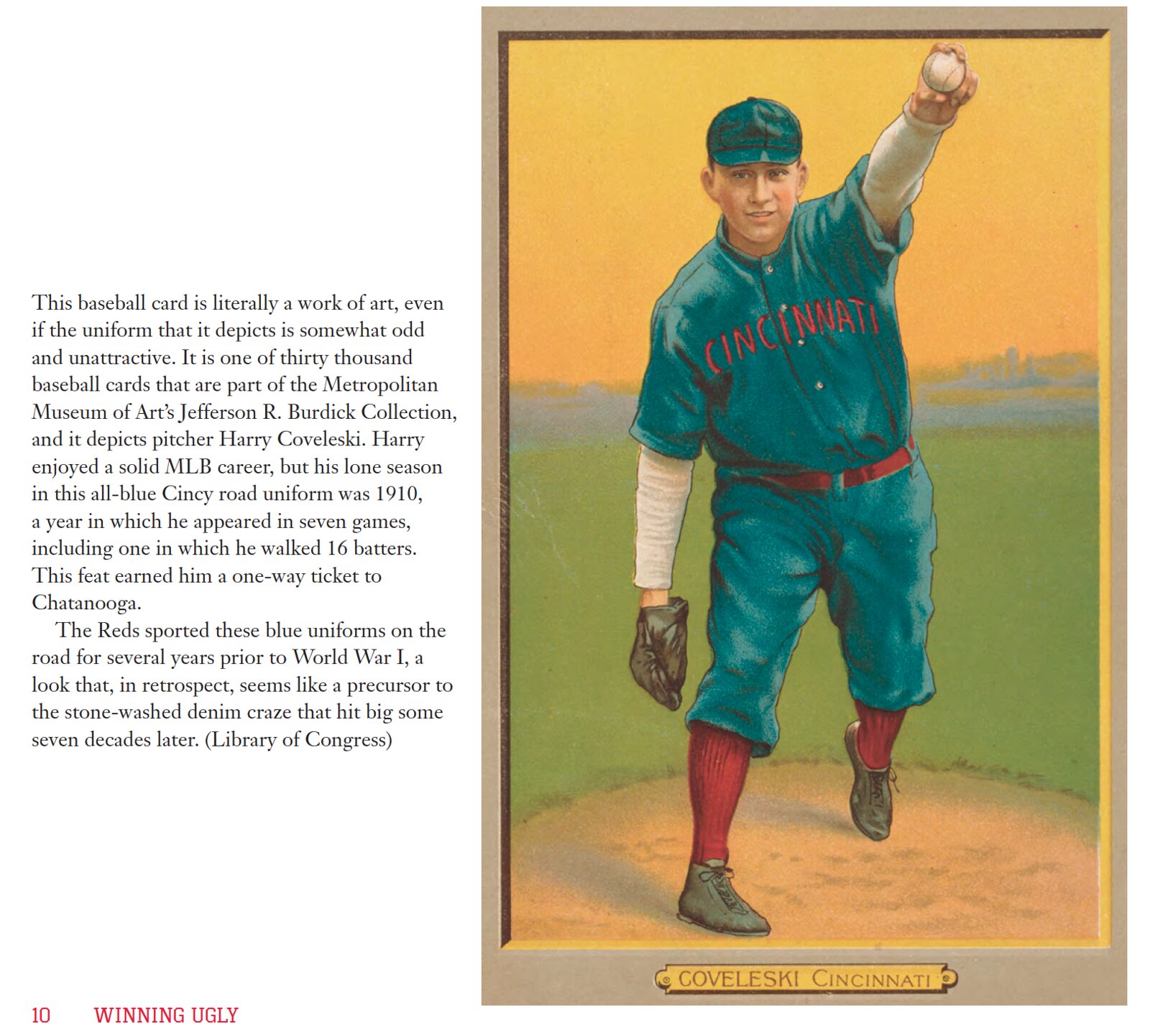
Radom’s uniform book looks great! But I have to ask, was the misspelling of Chattanooga in the text accompanying the Coveleski photo intentional? Perhaps an era-appropriate spelling, a la “Pittsburg”? Or just a typo?
Yeah, I spotted that right off, wondered if it was era-spelling…
-Jet
I also noticed but was afraid to comment since the book has already been printed
Wolfe is definitely worth reading if you haven’t gotten around to him, especially The Right Stuff, which is still possibly the best non-fiction book I’ve ever read.
Always meant to read I Am Charlotte Simmons, one of his more recent works.
Now I know what Blondie meant–Tom Wolfe really WAS The Man From Mars!
link
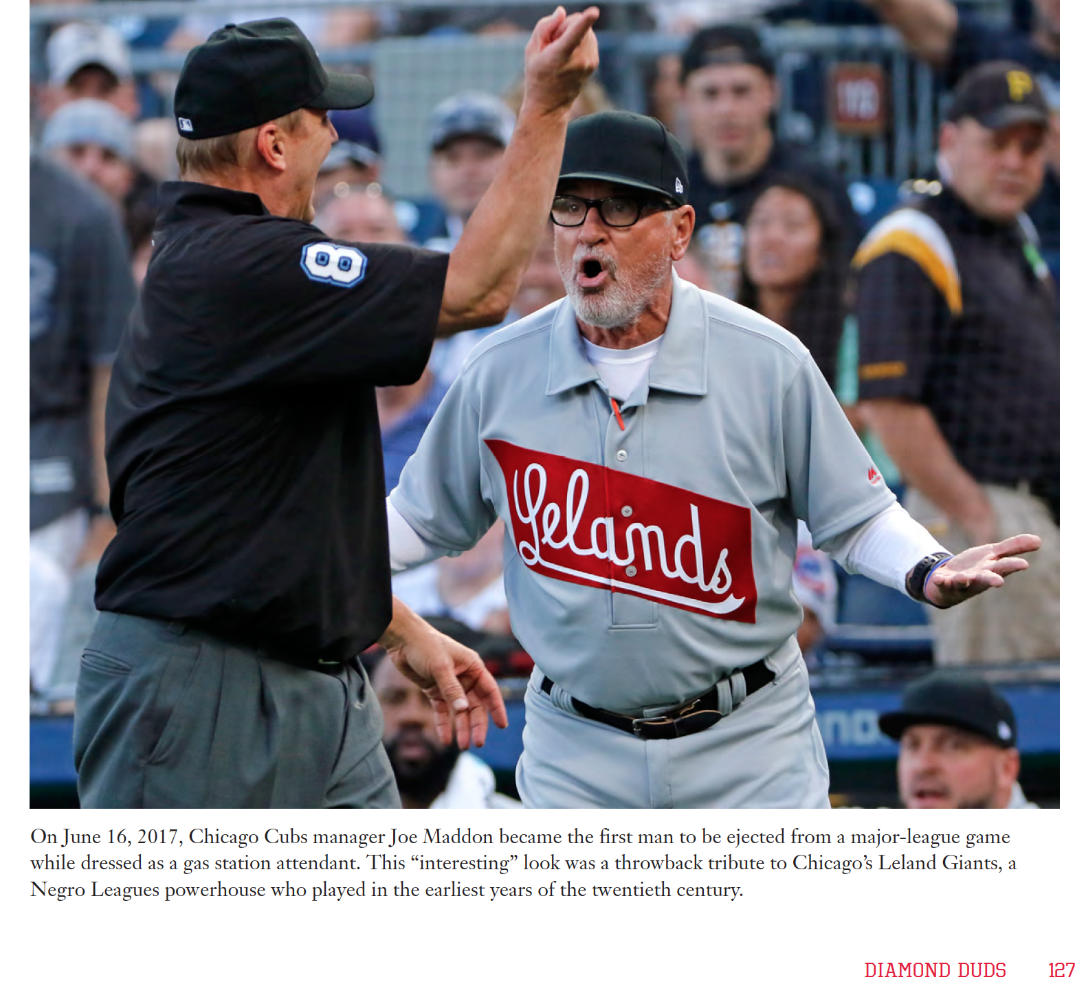
Really liked that Leland Giants uniform with the white undersleeves. Something that cannot happen in modern baseball under normal circumstances.
Love seeing a Pilots uni, in any context. However, I’ve never seen any evidence that their home uniforms sported the 100th anniversary patch on the sleeve, only in the M&N reproductions does it appear.
Proofreading:
Rockets owner Tilman Fertitta has told the Houston Chronicle that the team make tweak its uniforms…
RIP Thomas Wolfe…
In addition to his writing, perhaps the most impressive thing about him is how he managed to wear an all-white suit all the time and presumably keep it clean while wearing.
If I tried that, I’d have dirt, food stains, dog hair, and who knows what else all over it in the first 20 minutes.
I have trouble enough with light-colored t-shirts… very impressive, indeed.
Two things about the Rockets article:
1) sadly it seems Rockets will eventually have an ad even if Fertitta is in “no hurry”.
2) “Correct the font”…? Curious, would love him to fix that un-flyable Rocket we have for a logo. But I guess that would not be a tweak. :(