The video embedded above pretty well captures the absurdity of yesterday’s MLB Ma’s Day uniforms. This year, thankfully, they didn’t go with pink-trimmed jerseys, but that just made all the other pink attire (caps, undershirts, socks, cleats, and various accessories) stand out in higher relief, because it didn’t match the teams’ color schemes. The umpires, with their pink caps and masks, looked ridiculous as well. The A’s/Yankees game was probably the worst-looking of the bunch, because the pink clashed particularly badly with the A’s colors and because the Yankees are, you know, the Yankees.
On the plus side, MLB teams only wore the holiday-themed gear on the actual holiday, not for the entire weekend like they did last year. Between scrapping the holiday jerseys and scaling things back to one day, it seems like MLB is tacitly acknowledging that they took things too far in recent years, even if they’d never admit that publicly.
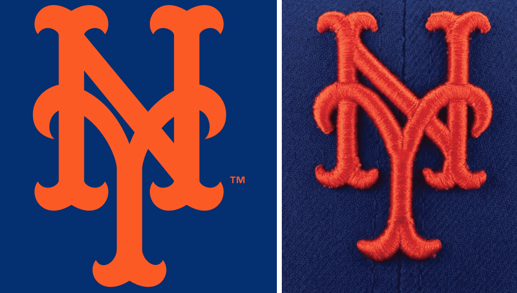
The games were pretty unwatchable, but there was an interesting observation that, thankfully, had nothing to do with pink. It came from reader Niko Goutakolis, who noticed that the “NY” logo on his Mets Ma’s day cap had the N overlapping the Y, while his other Mets caps have it the other way around:
Interesting little error on the embroidery on the #Mets Mother’s Day cap that I have. They overlapped the “N” over the “Y”, when on all regular caps, it’s the “Y” that overlaps the “N”.
Curious, though, which way is correct?@UniWatch @PhilHecken @Mediagoon @metspolice pic.twitter.com/JLcSnunPoO
— Niko Goutakolis (@NikoMetsPlus) May 13, 2018
That led to some interesting chatter on Twitter:
Seems like Y over N is the rule, to which there are exceptions… Sort of like I before E except after C, which is weird because its not wierd. pic.twitter.com/IvvgQ07O83
— Andy Harris (@paperboyarchive) May 13, 2018
Here is a cap worn by Casey Stengel during the 1962 season. I think that give the definitive answer. Y over N. pic.twitter.com/prNy15RogK
— FromTheRedSeats (@metsnark) May 13, 2018
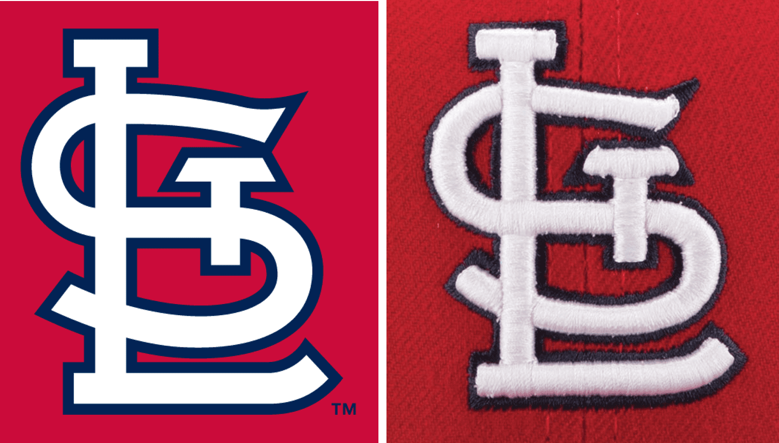
My feeling is that there’s no such thing as a “right” or “wrong” way for the letters in the Mets’ logo to overlap, because the official logo itself is flat, all in one plane. The letters don’t overlap; they just intersect (as opposed to, say, the Twins’ logo, which clearly has certain areas overlapping others). But embroidery doesn’t exist in two dimensions — it exists in three dimensions. Stitches have to go somewhere, and when parts of a design intersect, some stitches inevitably end up above or below others. It’s really up to the embroiderer to find the most feasible way to make it work, but the net result is that the embroidery is a representation or approximation of the official logo:
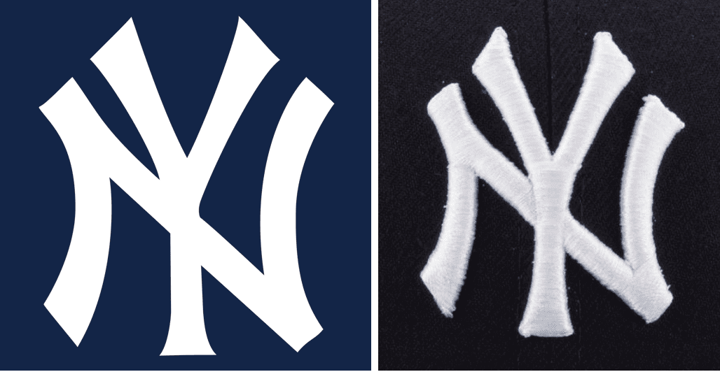
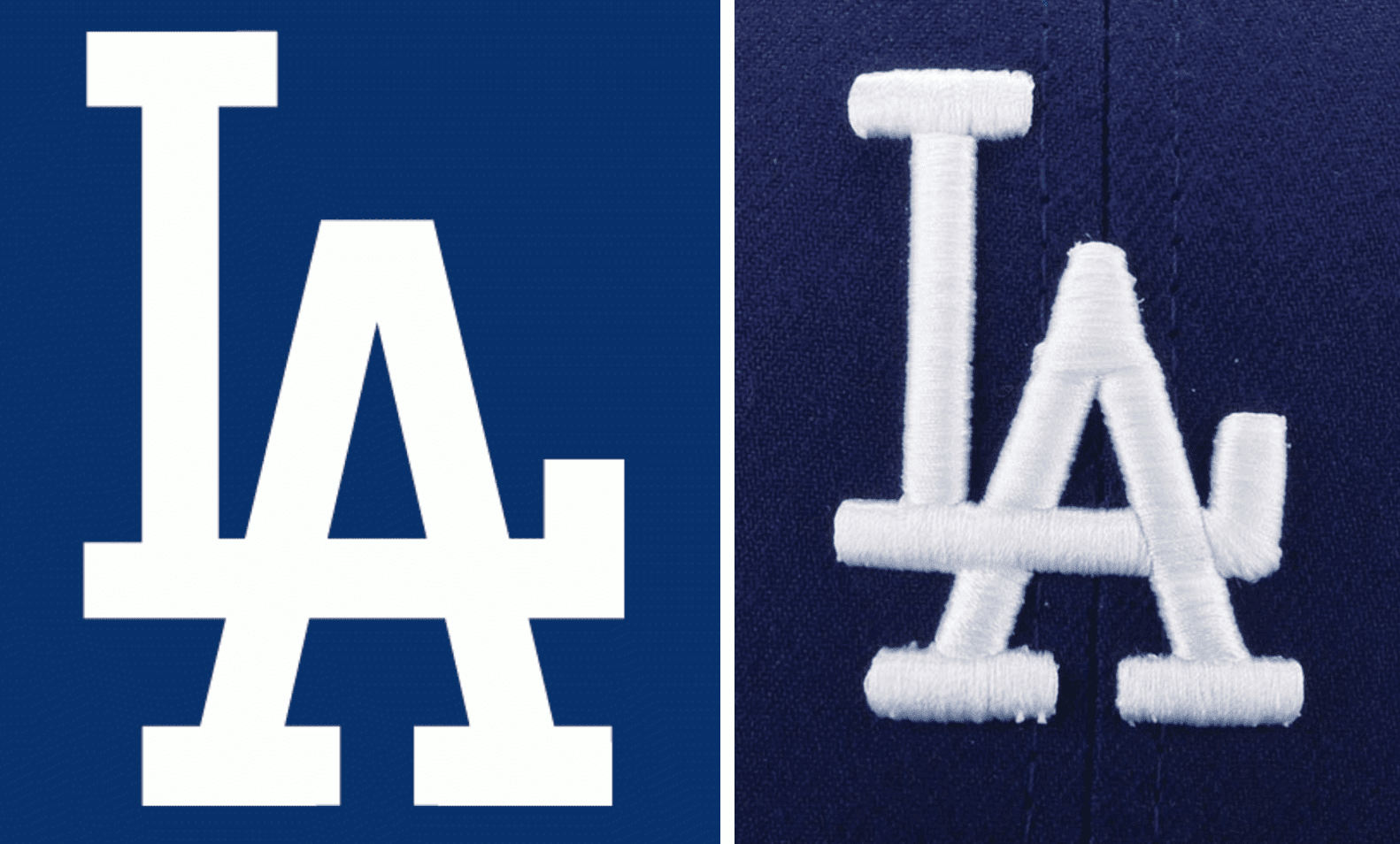
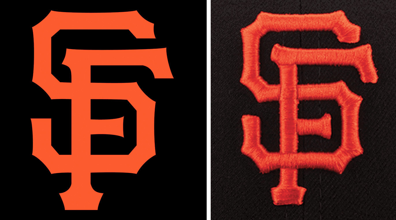
The same is true of many other teams’ logos and their respective caps. On the logos, the letters just intersect, but on the caps, it’s unavoidable to have certain parts overlaying others:
I suppose it would be nice if a team’s top and bottom embroidery layers could always be consistent from year to year, but that’s probably unrealistic. Materials change, embroidery machines change, factories change, even embroidery formats change (like the change to puff embroidery in the 1990s). That means the embroidery layers will likely change at some point as well. Which just reinforces my point that there’s no right or wrong way to do it.
Interesting topic! And so much better than talking about all the pink nonsense.
Cap update: Our Ebbets Field Flannels cap, which was released on Friday, was a big success right out of the chute. In fact, it was too successful — by the end of the first day of sales, we had already sold out of every fitted size. We do still have plenty of the adjustables, which have a very nice leather strap (I got one of those for myself), so you can still order one of those. Please do!
The good news is that I’ve already ordered new inventory, so we’ll be restocked on all of the fitted sizes. The bad news is that it will take about six weeks for the new caps to arrive — sorry about that. Obviously, I underestimated the demand. Unlike our T-shirts, stickers, and membership cards, all of which are made to order or on demand, the caps require a significant upfront investment, so I played it safe when deciding on the quantity — too safe, as it turned out.
Anyway: Big thanks to everyone who ordered. Can’t wait to see the photos of people wearing their Uni Watch caps!
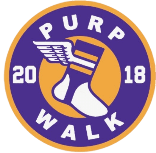
Purp Walk update: This Thursday, May 17, is this website’s 12th birthday. That means it will also be time for our annual Purple Amnesty Day celebration, when I grudgingly salute the world’s most accursed color.
For 24 hours — and only for 24 hours — I’ll be accepting purple-inclusive membership card orders, and we’ll once again have a special piece of merchandise to mark the day. This year it’s an unstructured snapback cap. It will look something like this:
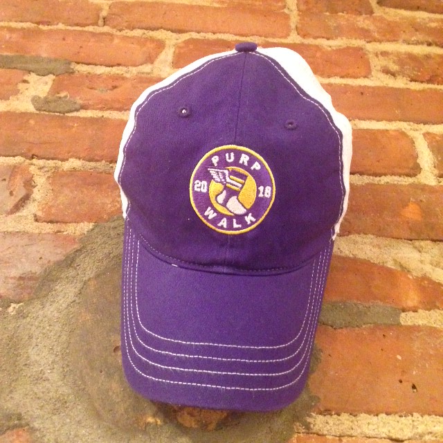
Designer Bryan Molloy and I are still finalizing a few details (right down to the wire!), but it looks like the full package will include a Purp Walk sticker and custom hang tag. The price will likely be in the $25.99 range, plus shipping. I expect to have more info and better photos tomorrow.
As has been the case with past Purp Walk merch, this cap will only be available for 24 hours, beginning at midnight Eastern on Wednesday night, and then it will be gone forever (thank god).
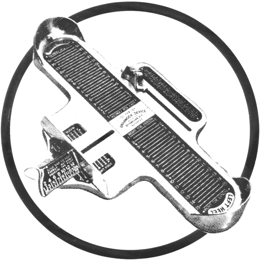
Brannock update: You know how I have a Brannock Device tattoo? I’ve ordered a bunch of temporary tattoos, using the same artwork that was used as reference for my tat (shown at right), for the Brannock-themed game in Syracuse on May 31. So people who come to our meet-and-greet on the first base terrace will be able to have their own Brannock tattoo, which should make for a fun photo op.
Meanwhile, I’ve been tossing a ball around to get my arm in shape for the first pitch I’ll be throwing out. It had been a loooong time since I’d thrown a baseball (as opposed to a softball), but it turns out that it’s like riding a bike. Of course, I’ve had two fairly serious bike accidents in recent years, so let’s hope the analogy only goes so far.
And speaking of first pitches: If you’ve ever thrown out a first pitch at a ballgame — major league, minor league, Little League, whatever — I’d like to hear from you. Please shoot me a note and I’ll get back to you soon-ish with some questions for a story I’m working on. Thanks.
Ink on paper, what a concept: Does anyone out there still read magazines? If so, here’s a new way for you to save some money and help out Uni Watch while you’re at it (and support print journalism to boot).
We’ve partnered with Blue Dolphin Magazines to offer the lowest available prices for a few dozen magazine titles, many of them sports-related. Uni Watch will get a small commission for anything you subscribe to.
If there’s a magazine you’re interested in that isn’t shown on the ordering page, feel free to give me a shout and I’ll try to get it added.
My thanks, as always, for your consideration.
The Ticker
By Jamie Rathjen

Baseball News: Indians SS Francisco Lindor, who’s a switch-hitter, came to bat right-handed yesterday while wearing his left-handed helmet (from Mike Chamernik). … Some Astros players showed municipal solidarity by wearing Houston Rockets apparel on their current road trip (from Ignacio Salazar). … For yesterday’s Padres/Cards game in San Diego, the scoreboard mistakenly showed Nationals logos for the Cardinals’ lineup (from @bignatsnut and Mike Chamernik). … Mariners P James Paxton had some strange NOB spacing yesterday (from multiple readers). … The Portland Pickles, a team in the collegiate summer West Coast League, started a poll to decide which cap they’ll wear for Trail Blazers Night on July 12 (from Alan Miller). … An Ohio banquet hall has poached the Rockies’ logo (from @snakevenomken11).

Football News: The entire history of football — or at least a lot of it — is summed up in one excellent image by Alex Bennett. … The Canadian U Sports East-West Bowl, a spring game for CFL draft prospects, got new mono-black and mono-red uniforms. Each player’s helmet also featured multiple team logos plastered all over it (from Wade Heidt). … Sometime in the past few years, Syracuse added a “44” on the Carrier Dome 44-yard line for running back Ernie Davis (from Max Weintraub). … Reader Chris Huff sent us a YouTube channel featuring an ongoing effort by Southern Methodist University to digitize ’60s and ’70s newsreels of all kinds, including footage from many different sports. Here’s an example featuring a 1973 TCU/Rice football game.

Hockey News: Uni Watch cookie baker Elena Elms is back with Capitals jersey cookies. … Caps winger Alex Ovechkin wears a patch memorializing the 2011 Lokomotiv Yaroslavl plane crash in the center of the front of his pads. In fact, it’s plainly visible but not mentioned in a 2015 UW entry on Ovechkin.

Basketball News: Also posted in the baseball section: The Portland Pickles, a baseball team in the collegiate summer West Coast League, started a poll to decide which cap they’ll wear for Trail Blazers Night on July 12 (from Alan Miller). … Also-also posted in baseball: Some Houston Astros players wore Rockets apparel on their current road trip (from Ignacio Salazar).

Soccer News: New kit time: English League One’s Plymouth Argyle (first kit), Scottish team Kilmarnock (first), French teams Guingamp (first, second, third, and two goalkeeper kits) and Stade de Reims (first), and German teams TSG 1899 Hoffenheim (first) and SC Freiburg (first), the last of whom appear to have given up their status as the Bundesliga’s only sleeve ad-free team. … Additionally, Leicester City’s first shirt appeared on Adidas’s online store (from Josh Hinton). … Also from Josh: Liverpool debuted next season’s first kit yesterday, but will still have to wear this season’s version when they play in the Champions League final. … Still from Josh: Newcastle United winger Matt Ritchie had sleeve patch issues. … Josh again: Last week in the Asian Champions League, Guangzhou Evergrande center-back Zhang Linpeng needed a blood shirt, but was briefly given teammate Zhang Wenzhao’s No. 15 shirt with the NOB and the “1” covered with tape. … Manchester United gave retiring midfielder Michael Carrick a No. 464 shirt, the total number of appearances he made for the club in all competitions (thanks, Anthony). … North Carolina Courage goalie Katelyn Rowland is the only player in the NWSL to wear No. 0, which is rarely seen at the pro level and is more common in the NCAA. … Joining the ranks of MLS teams changing at home this season were the Columbus Crew, who forced the Chicago Fire to change as well. … The Portland Timbers wore a patch for their 100th all-time matchup with the Seattle Sounders, including the teams’ incarnations in previous leagues. … Center-back Andreas Granqvist and winger Joãozinho played their last games for Russian team FC Krasnodar, which honored them by mowing their numbers into the pitch (from Jeremy Brahm). … At the Eurovision Song Contest in Lisbon, Icelandic voting representative Edda Sif Pálsdóttir (at right) appeared wearing an Iceland national team shirt.

Grab Bag: The U.S. Quidditch team revealed its uniform (singular, as I’m not aware of teams in the sport having more than one) for the World Cup, to begin June 27 in Florence, Italy. … Overwatch e-sports team Philadelphia Fusion’s development team, Fusion University, had its uniforms banned because of an unfortunate acronym (from Mike Chamernik). … NASCAR driver Dale Earnhardt, who drove wearing old-school open-faced helmets, was once seen trying on a conventional full-faced helmet. … Somewhere in the bowels of English field hockey exists a goalkeeper kit straight out of the ’90s and then some.
Re: the Syracuse/44 note… I always thought it started with Jim Brown, no?
Maybe so, but the number on the field only appeared after the field was renamed after Davis.
After UNC legend Charlie ‘Choo-Choo’ Justice died in 2003, two large ’22’s were painted on Kenan Stadium field (at the 22-yd lines) for last 3 home games.
In recent years all 22-yd hashnarks have been painted Carolina Blue.
*hashmarks
Here’s a little something on Syracuse and the #44 Legend: link
The University even had the zip code changed from 13210 to 13244 some time back! link
Do you have a manufacturer in place for the cap so I can look up the size for the Purp Walk hat? I have a giant head and snapbacks are very hit or miss for me…though, what am I saying, I’m getting anyways. Looks great so far!
Fascinating observation about the letters overlapping on baseball hats. I’ll never not be looking for it now.
Manufacturer is Richardson.
Thank you
Re: first pitch
I’m always reminded of this first pitch which was all over the internet for a couple of days after it happened. “South Korean rhythmic gymnast Shin Soo-ji’s first pitch.” Best first pitch ever?
link
Those SMU films are great. Stumbled across this one, with Tom Landry looking very casual (Now I think Ed Harris should play him in a movie…)
link
and this one has some great shots of Super Bowl tickets
link
And Cowboys playing baseball
link
And this one of training camp.
link
“Francisco Lindor, who’s a switch-hitter, came to bat right-handed yesterday while wearing his left-handed helmet ”
It also looks like he starts switching his leg protector to the other leg. He all mixed up.
After a busy, eventful soccer-filled weekend, the last thing I want to see when I turn on Sunday night baseball is the Nats and DBacks wearing red accented jerseys with pink everywhere. Imo, and I get why some disagree, if you are gonna go pink, might as well make it all pink instead of red accented gear. Or just not do it in the first place.
That purp walk hat is amazing, (minus it being purple). If there was a non-purple version, especially a fitted option, I’d be all over it. Great work, these hats have been fantastic. Can’t wait to see the final design on the alt-cap.
(Digression sparked by how very much I like everything about today’s lede and its deep dive into the best kind of minutiae.)
I appreciate the philosophical stance that the cap embroidery is an approximation of the team’s real actual logo, in a sort of Socratic relationship between the real thing that exists in an unreachable ideal state and the actual world which exists as visible shadows on a wall. I tend toward such idealism myself.
But, as with Socrates, the appealing idea collapses upon contact with observable reality. The non-NY embroidery examples all follow patterns of implied intertwining within the emboirdery. The LA and the STL are each quite thoughtfully arranged, and stitched in a way that requires there to have been thoughtful deliberation about the proper sequence of stitching. They do not consist of an L embroidered over an A, nor of a T and an L embroidered atop an S. That’s the norm. Appropriately so, since the flat stylebook standard is an ideal, whereas the ballcap is the real thing that truly and actually defines the team’s logo and identity in the material world to the actual real humans who are the point of the whole thing. The flat logo in the style guide is the blueprint. The embroidered cap logo on the cap is the building. Philosophically, what is the real building, the blueprint or the physical structure? The latter, obviously. Thus so here.
What the examples in the lede show us is not that the embroidered logo is merely an approximation of the real logo and so anything goes; what they show us is that the Mets are lackadaisical in caring for and presenting their logo.
What the examples in the lede show us is not that the embroidered logo is merely an approximation of the real logo and so anything goes; what they show us is that the Mets are lackadaisical in caring for and presenting their logo.
You’re assuming that the teams exercise a lot of agency here, and I’m almost certain it all comes from New Era.
And speaking of observable realities: If you go to the MLB Style Guide and look up the Mets’ headwear mark (or the Yankees’ or the Dodgers’, etc.), you can observe that it’s flat. The style guide does not indicate how the embroidery should look. Conclusion: The flat version is the logo. The embroidered version is indeed a representation or approximation.
I’ll have to look at the NFL style guide when I get a chance, as I’m curious as to whether that same logic applies to the KC Chiefs, given their discrepancies that you’ve covered here before.
Seems like teams would still want to have consistency in the representation regardless.
You are overestimating the degree to which most teams pay attention to such things. Trust me.
Now if the Mets could go ahead and use that dark Blue tone from the 1962 Casey Stengel cap today, all would be right with the uni world. As it stands now, the tone of blue the Mets use today… Is wow… Loud!
Re: that England men’s field hockey goalie.
OK, that one wins. Worst sports kit ever. Worse than Tuscon Toros, worse than Caribous of Colorado, worse than the Dallas Mavericks’ Hefty Bags.
Technically, that kit is illegal because all field hockey players are supposed to wear a solid-color shirt.
I’d wear that.
I’d wear that.
That keeper is going to haunt my dreams forever. If I were making a comic book he would be my arch-villain: 90s-Man.
Logically speaking, if we go back to the earliest days of each logo, are you sure Paul that they existed first as a printed logo and then were embroidered second? Couldn’t they have existed as a cap or jersey embroidered logo first, and then shown up on stuff like letterhead and programs second? In which case the embroidered logo would be the standard, not the printed one.
Just theorizing, because I’ve always considered the embroidered version correct. The three non NY logos as mentioned have been very thoughtfully done. New Era may be calling the shots now, but initially it was each team.
(For what it’s worth…Looking through my caps, it appears the Padres have changed their look from the brown and gold years to now.)
Logically speaking, if we go back to the earliest days of each logo, are you sure Paul that they existed first as a printed logo and then were embroidered second? Couldn’t they have existed as a cap or jersey embroidered logo first, and then shown up on stuff like letterhead and programs second?
Actually, early cap logos were felt appliqués, not embroidered.
In any case: As I’ve already mentioned in another thread, if you look up the official headwear logos in the MLB Style Guide, they’re flat. There’s no indication of what the embroidery should be. So the embroidered versions are essentially interpretive.
Looking over that “history of football” image is going to be a fun time killer today. Love that it includes Ohio State’s Zack Dumas absolutely destroying Auburn’s Stacy Danley. I remember it like it was yesterday. If you haven’t seen it, it’s on YouTube and definitely worth watching.
Great article about attention to stitching today. I was impressed to see how each induvidual team is approached and for most teams, it appears as if theyve eithet tried to make the letters appear intertwined or they make it look as it would be written. This gives it a really cool look on the Os and Nats caps.
Also wowee wee wow USA quidditch has cool uniforms but I cant approve of a quidditch kit with no cloak.
Cincinnati mayor Mark Malloy’s horrible first pitch has to be the worst. Opening Day 2007.
Won’t touch Sports Illustrated anymore.
Any idea on if teams like St Louis, Los Angeles, and San Francisco have had similar inconsistencies on stitching? With the interlocking nature of those logos it seems like there was obviously some thought into what was the correct way and thus how it should look in three dimensions. The overlap non-interlocking look of the Yankees and Mets seems to open the door more to these inconsistencies. And had never really noticed whether the N or Y was on top, now when I see it the Y on top seems the obvious “correct” version.
Forget the overlapping NY debate. I want to know is the MLB logo batting left or right? Is it a silhouette from the front or the back!?!?!?!
I want to know is the MLB logo batting left or right?
Yes.
Is it a silhouette from the front or the back!?!?!?!
Yes.
Well whatever it is, he’s taking that pitch.
If I had to pick a “right” way to embroider I’d say the first letter on the bottom. So Y over N in New York’s case.
But I enjoy this little inconsistency. Whatever works for a certain embroiderer at a certain period of time works for me.
See, I think the opposite. N before Y. New before York. The way they have it it with the Y coming first, and the N after it’s York New.
Uni Watch cap arrived today. What a beaut!
link
Anything on the Braves at Cubs makeup game today? I know it was too late for the posting, but I didn’t watch. Both teams (everyone) wore #42, so I assume this was a rained-out game from JR Day? Still, love seeing it no matter the reason!
Yes, that’s exactly the case.
Topps put out a card in its Topps Now line today “commemorating” yesterday’s Mother’s Day promotion…and one of the pictures used shows Yasiel Puig wearing last year’s pink-trimmed Mother’s Day uni, so obviously an old photo.
link