Click to enlarge
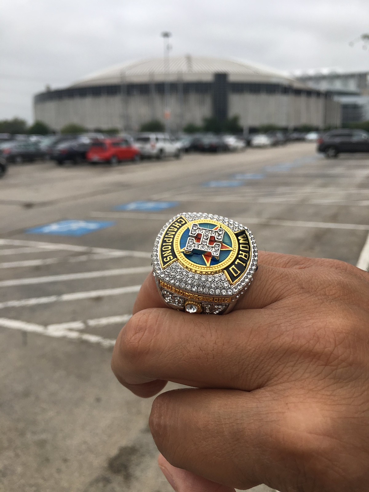
[Editor’s Note: Reader Ignacio Salazar (that’s his ring-bejeweled finger shown above) attended the recent Domecoming event in Houston and put together a first-hand report. Enjoy. — PL]
By Ignacio Salazar
On April 9, the Astrodome celebrated its 53rd birthday and opened its doors to the public one last time before a $105 million makeover begins this fall to convert the Eighth Wonder of the World into an underground parking garage and event space.
Twenty-five thousand Houstonians came out in full force to partake in festivities, reminisce about the past, and have one final look. I was lucky enough to arrive early and enter immediately at 5pm, but some fans waited patiently for up to three hours before entering.
Once I was inside, I took the steps down to the Astrodome’s floor. It wasn’t the first time I’d been there — back in 1997, when the Astros clinched their first division title since 1986, I followed the flow of the crowd and stormed the field. It might be the first and last time that’s ever happened at the Dome.
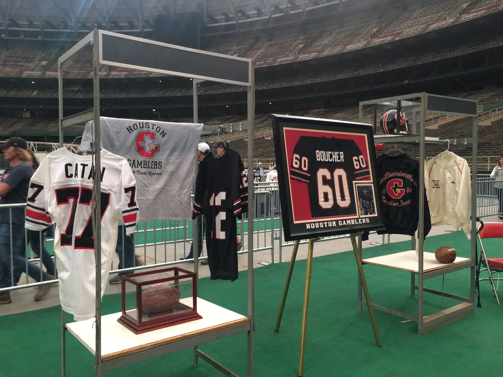
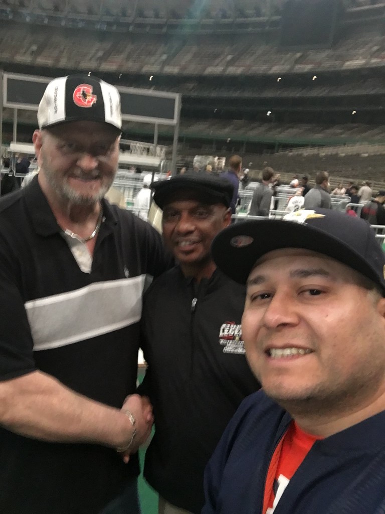
Down on the floor, there was a tour featuring a maze of memorabilia and former players. I stopped and talked to former Houston Gamblers offensive lineman Scott Boucher and wide receiver Gerald McNeil. Their eyes lit up talking about their USFL days, the demise of the league, and how you can still catch full games on YouTube. It was quite the pleasure talking to them.
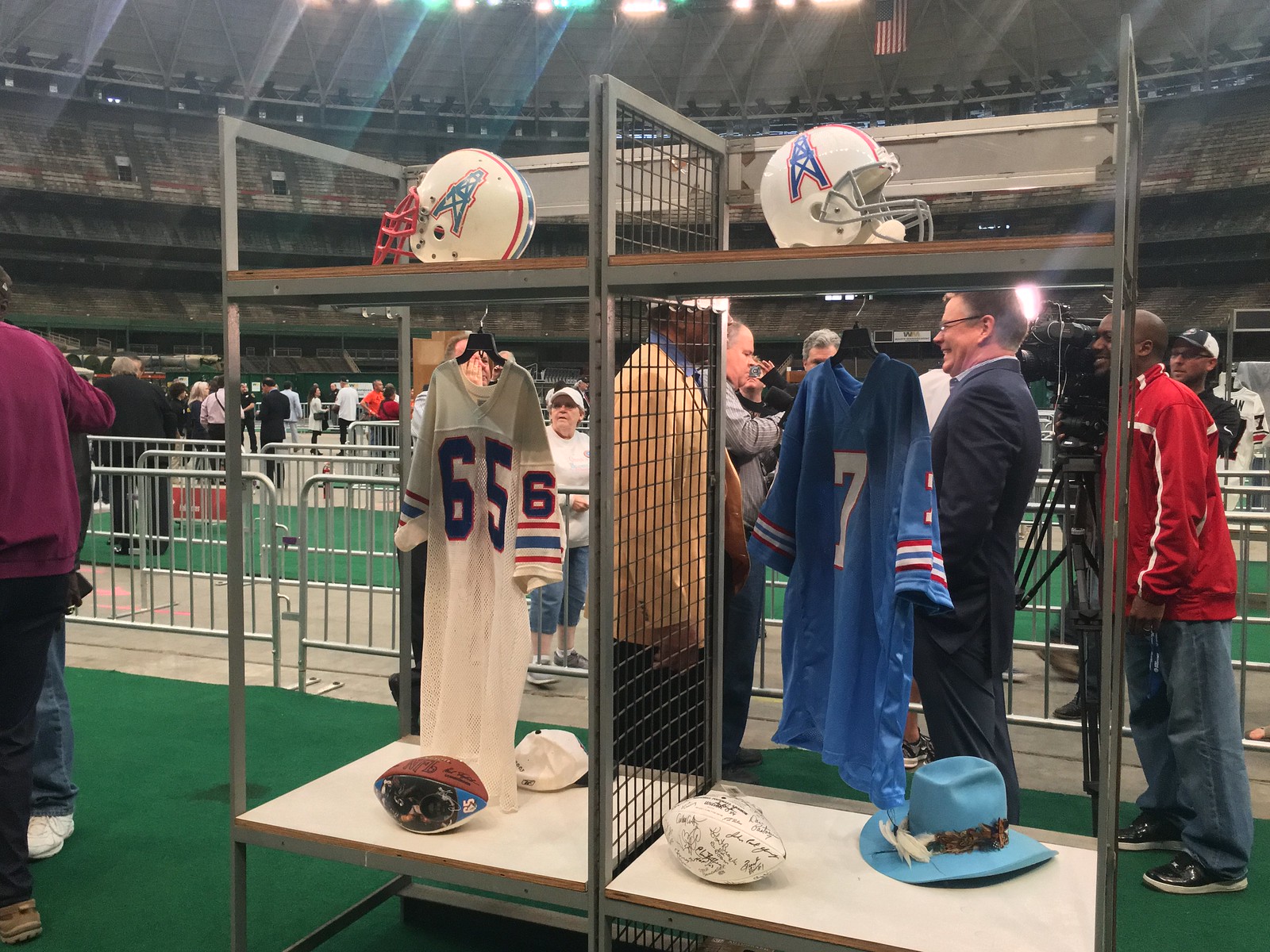
I also saw Pro Football Hall of Fame defensive end Elvin Bethea and quarterback Dan Pastorini — both from the “Luv Ya Blue”-era Houston Oilers — giving interviews and mingling with fans next to a locker with their jerseys and helmets on display. Many fans presented them with original Oilers memorabilia for them to sign.
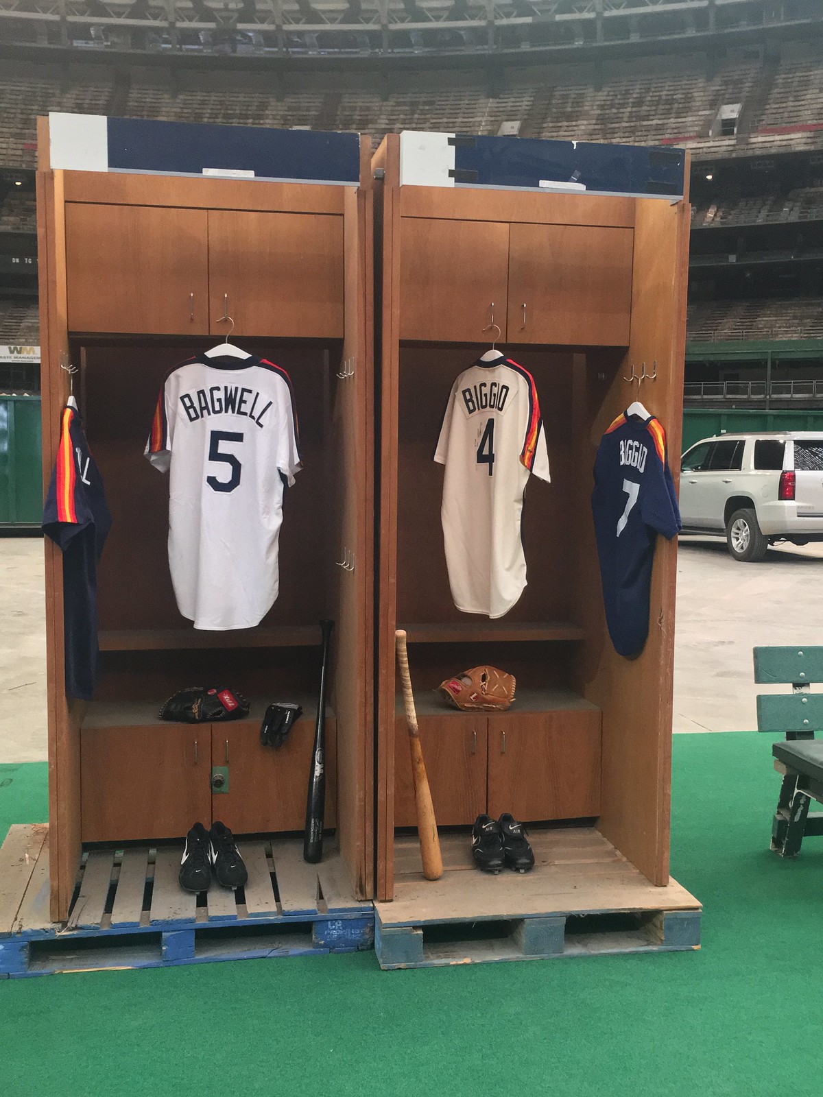
Also along the route, Astros jerseys from throughout the team’s history filled the aisles. Former Astros fireballer J.R. Richard greeted fans as they came by, posed for pictures, and signed autographs.
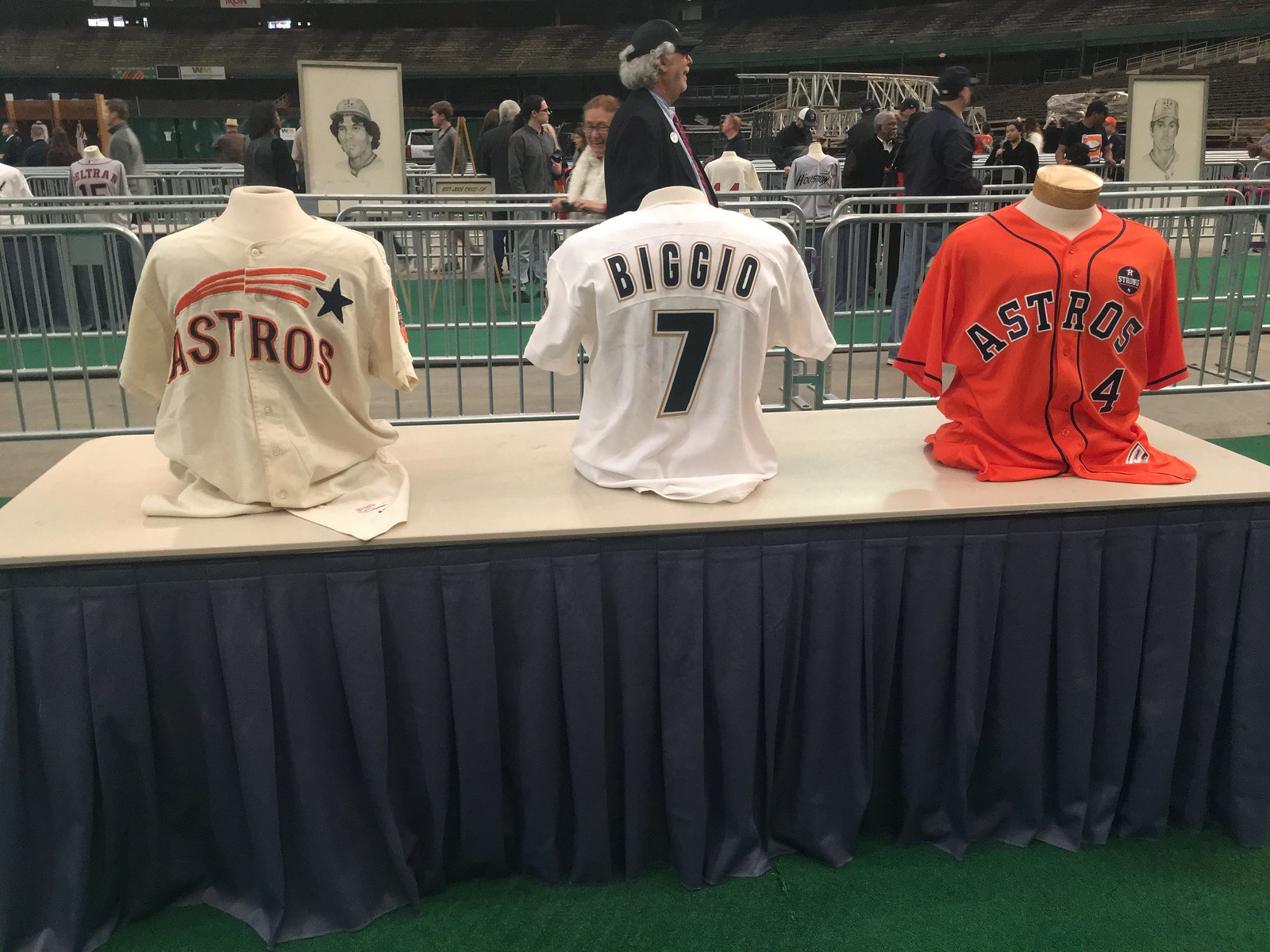
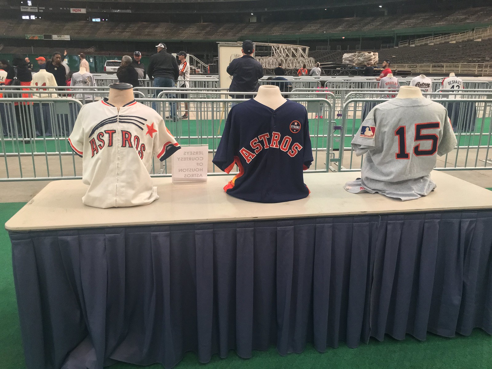
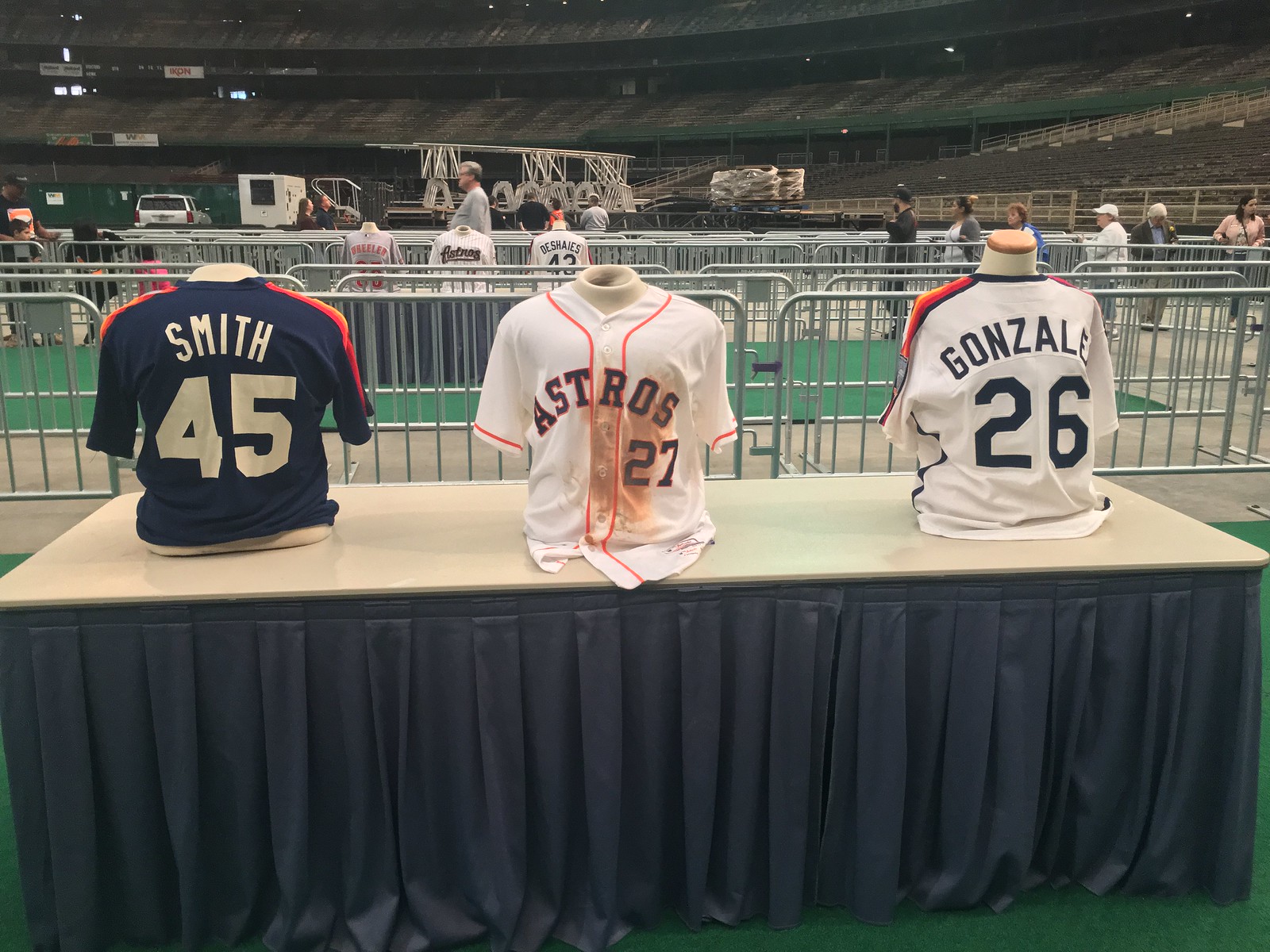
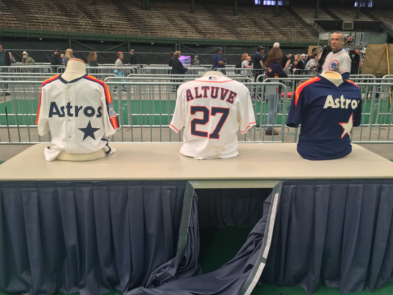
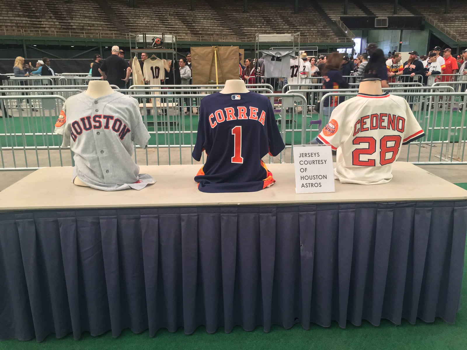

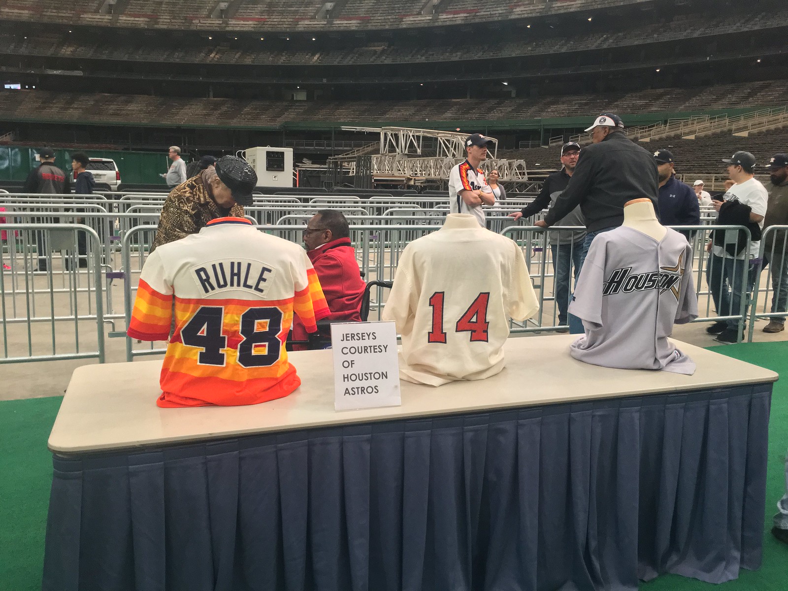

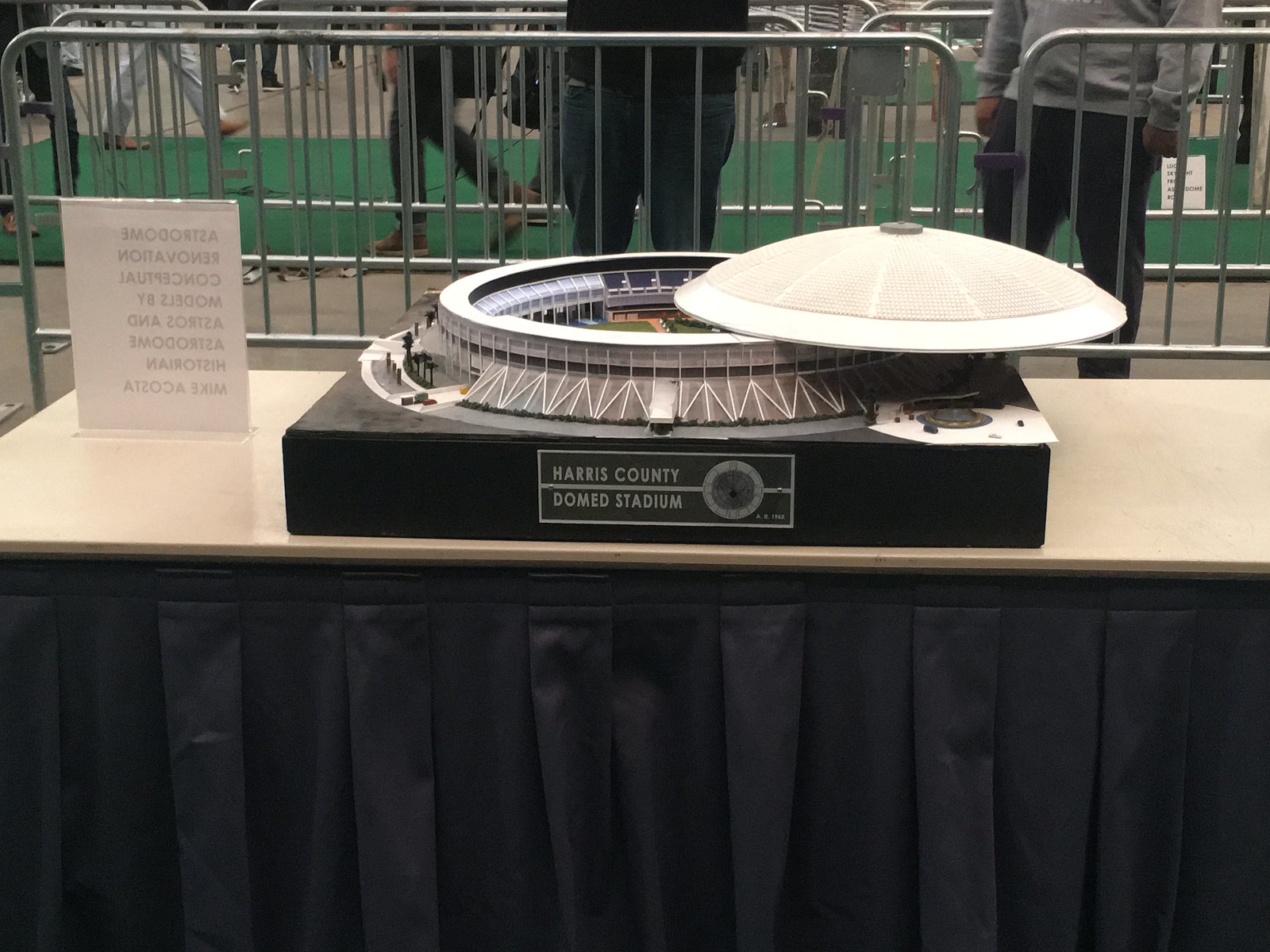
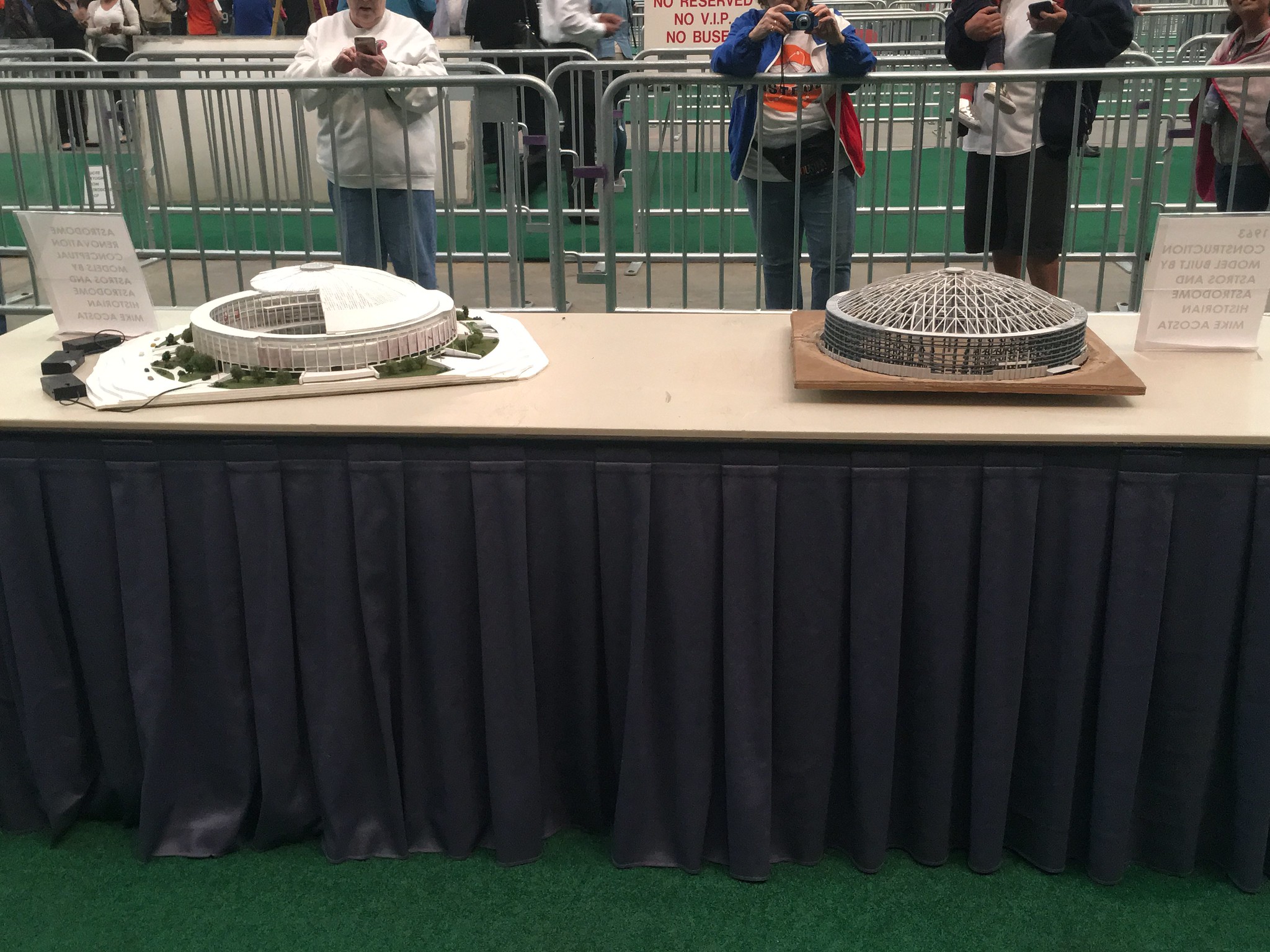
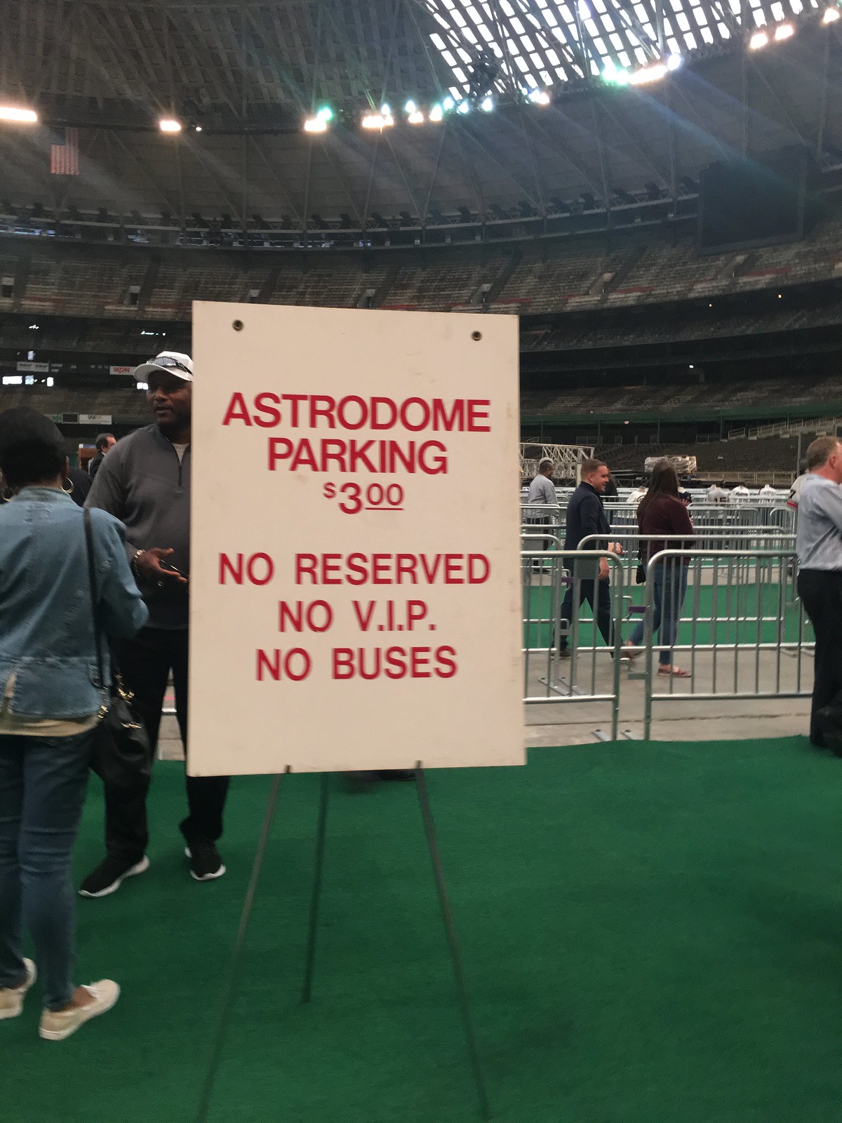
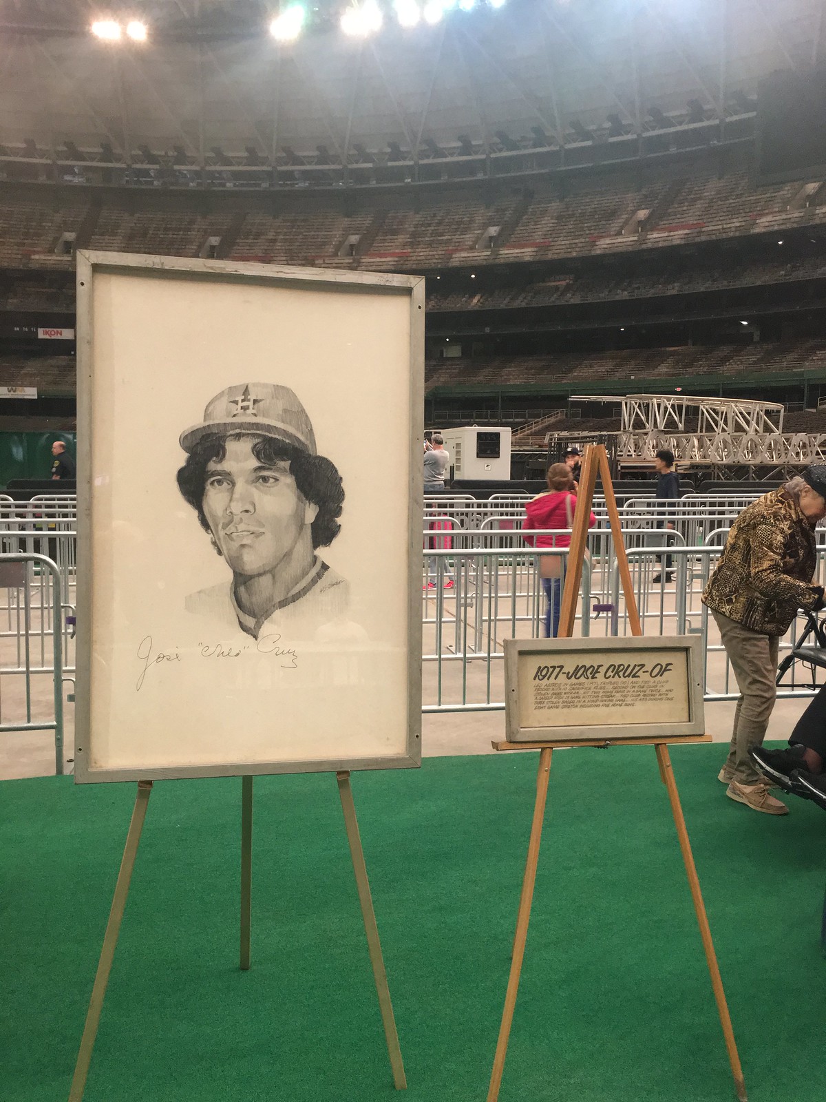
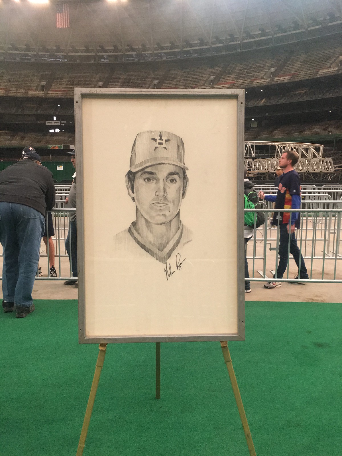
Along with jerseys and helmets, there were original models of the Astrodome, a vintage Astrodome sign advertising $3 parking, and original art showing former Astros stars Nolan Ryan and Jose Cruz.
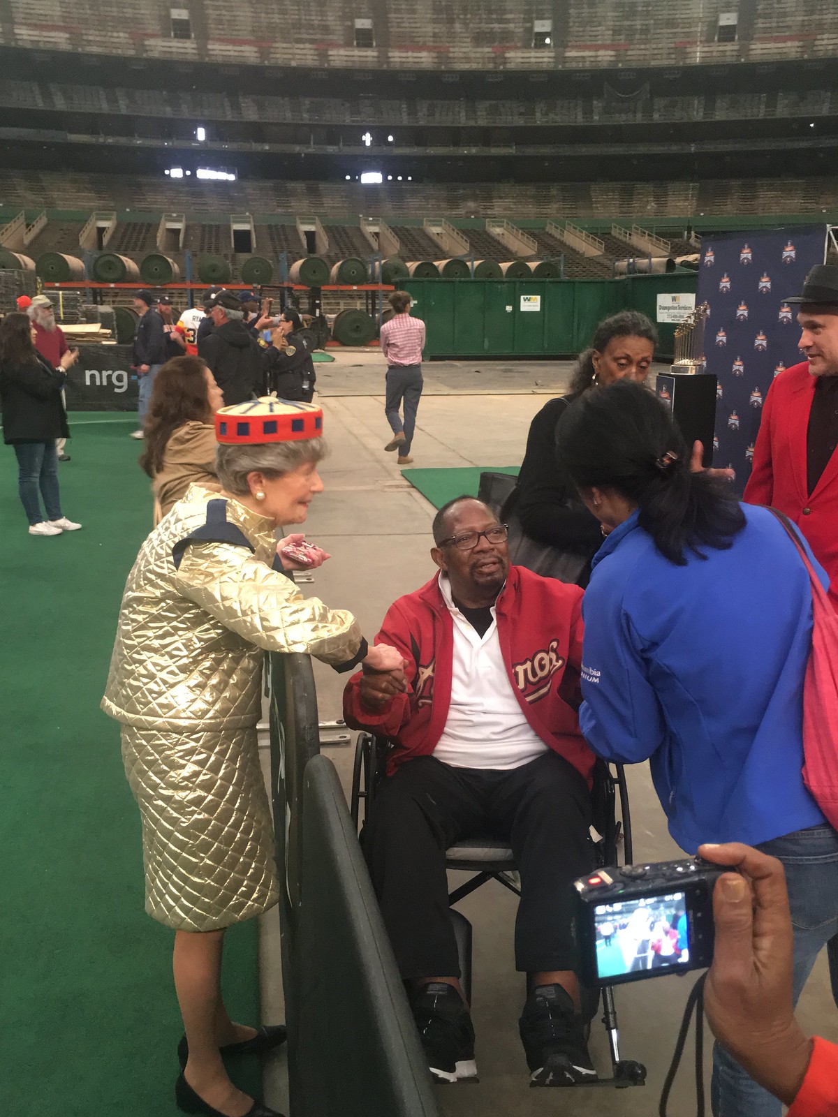
There was also an original “Spacette” suit worn by female ushers. And at the end of the tour, there was an actual former Spacette, Barbara Hauser, who was wearing her original Spacette uniform and touring the Dome with her husband. She told her story of how special it was to work at the Astrodome on Opening Day in 1965. She vividly remembered President Lyndon B. Johnson and wife, Lady Bird, being in attendance and told her story like it happened yesterday.
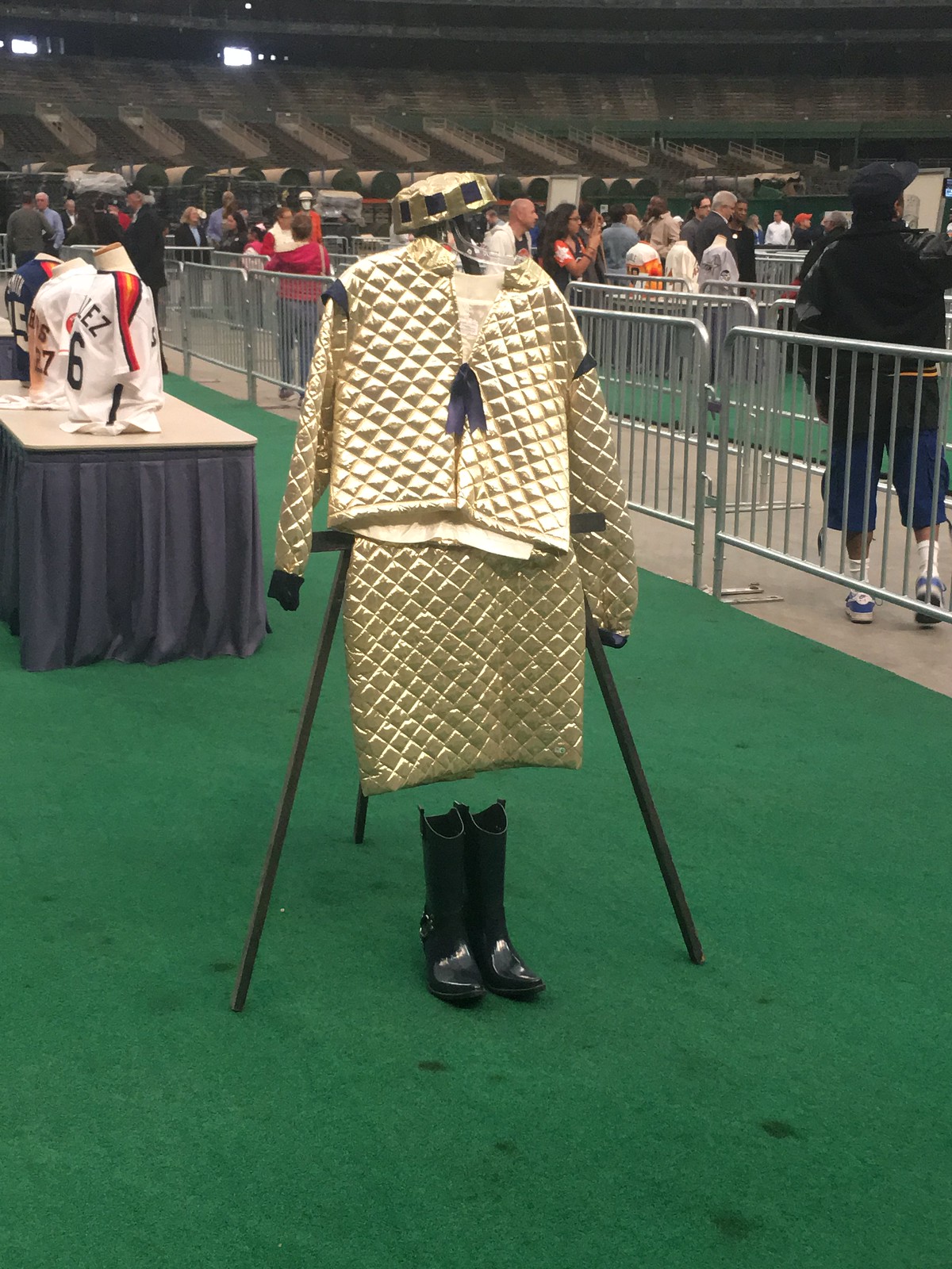
[As an aside, it turns out that this wasn’t the first time Ms. Hauser had worn her old Spacette uni in recent years. — PL]
I didn’t leave right away when I finished the tour, I hung around for two more hours to soak it all in. That was what Domecoming was all about — fans coming in one last time to catch the energy and magic that was The Astrodome. It was like nothing else ever seen in modern sports and it changed the way the world saw sports forever.
The Freak provides a freakish play: It’s amazing how long you can watch baseball and keep seeing things you’ve never seen before. The latest case in point: Last night Tim Lincecum, currently pitching in the minors for the Round Rock Express, had his glove fly off of his hand during a pitch on Monday night — and still ended up throwing a strike! Dig:
Tim Lincecum loses his glove, still gets the strike from r/baseball
You might be wondering if that’s legal — after all, the airborne glove could distract the batter — but there’s no rule against it. Would’ve been interesting if the batter had hit a comebacker, or if Lincecum had needed to cover first base.
(Big thanks to Uni Watch alum Mike Chamernik for this one.)
Click to enlarge
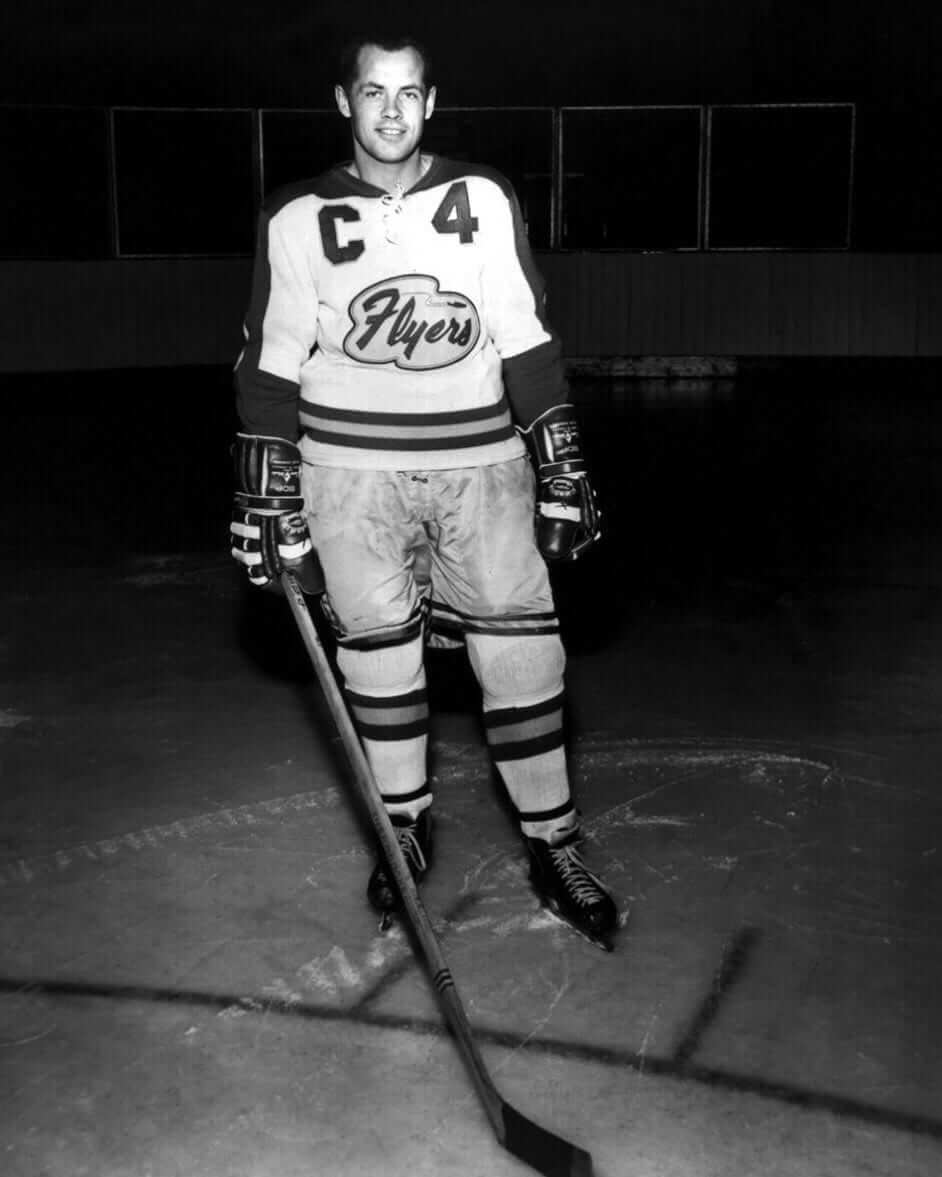
Too good for the Ticker: Our resident DIY genius, Wafflebored, posted this early-1960s Edmonton Flyers photo on Twitter yesterday. Hard to describe how much I love this one — the classic midcentury cloud shape of the crest, the little airplane zipping along above the letters (you have to view the full-size photo to see it clearly), the massively oversized captaincy designation and completely unnecessary front number. It’s an embarrassment of riches! Anyone want to take a crack at colorizing it? Here’s a team portrait that you can use as a color guide.
Here’s another shot, this time without the captain’s “C” (click to enlarge):

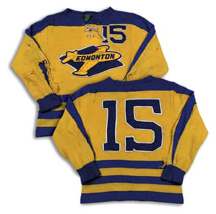
The Flyers had at least one other beauty of a jersey in their history — this one, from the mid-1950s:
You can get a repro of that one, as it happens, from Ebbets. But I think the early-1960s one is even better.
(My thanks to Mike Styczen, Chris Mizzoni, and Jeff Barak’s Third String Goalie site for their contributions to this section.)
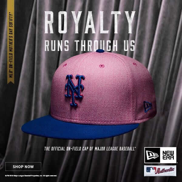
Royally screwed: Someone really needs to tell the people at MLB and New Era that America was founded on the basis of a revolution that opposed the concept of a royal monarchy. First they ran an ad for Memorial Day caps that referred to veterans as “Kings,” and now they’ve come up with an ad for Mother’s Day caps that refers to “Royalty” (see above).
I probably shouldn’t be surprised, given that this is coming from people who don’t know the difference between the Declaration of Independence and the Constitution, but it’s still pretty sickening to see this marketing campaign that basically equates our holidays with everything our country supposedly opposes.
Can hardly wait for the Independence Day cap ads.
(My thanks to Phil for letting me know about this one.)
The Ticker
By Alex Hider

Baseball News: Marlins 2B Starlin Castro must have left some bats in New York, because Yankees 3B Miguel Andújar was recently using a bat with Castro’s name (from Matt DeMazza). … Giants CF Andrew McCutchen showed off a pair of Hunter Pence socks on Twitter. Now, he needs to wear those puppies in a game (from Brinke). … The Reds used an Old English “C” on the mound last night (from Cole Flashenberg). … The Rochester Red Wings will dress up as the Rochester Hop Bitters on May 26 (from Ted Schwerzler). … The Dunedin Blue Jays are asking fans to help pick a specialty jersey that they’ll wear on the field later this year. … MLB has been cracking down on shoes in non-team colors. According to that article, players got away with it in April but were warned that fines would start being issued in May (from Phil). … This is interesting: The Padres have announced that they’ll be adding memorial patches for former GM Kevin Towers and former coach Rob Picciolo, but only on their late-1990s throwbacks, which they’ll be wearing six times, beginning this Saturday (from Phil). … The Mets and Reds, currently in the midst of a three-game series in Cincy, completed a trade yesterday, as P Matt Harvey went to the Reds in return for C Devin Mesoraco. Mesoraco promptly got into last night’s game for the Mets but was still wearing his Reds batting gloves.

NFL News: The Jaguars posted a mini documentary about the design process of their new uniform set on their website (from Mike Chamernik). … New Pats CB Jason McCourty will go FIOB this season — will his teammate and brother Devin go FIOB as well? (From @AayCeeBeee.) … Meanwhile, here are the rest of the new uni numbers for the Pats’ draft class (from Jeff Israel). … Twitter had fun roasting Odell Beckham Jr. after his new personal logo leaked on Monday (also from Mike Chamernik). … Bleacher Report mocked up some potential NFL trades, and drew their new uniforms in either MS Paint or Snapchat — which I find oddly refreshing (from Gare Bear). … Weird to see the Atlanta “Hawks” on NFL Network (from Russell Goutierez). … Vince Lombardi’s “A Football Life” episodes offer rare glimpses of QB Bart Starr wearing Nos. 51 and 27 (from Shaun Meulemans). … Chris Tripucka, the son of former Bronco Frank Tripucka, made a replica of his father’s ring of honor sign for his porch (from @addieberube). … What if the Ravens started as an AFL franchise? Cool concept created by Sportslogos.net forum poster Oldschoolvikings. Honestly, slap that on a helmet and start using that now (from @RayBarrington).
College Football News: NC State has a new font that they’ll use across all athletic programs. … SB Nation has published a comprehensive guide to college coach fashion. Awesome stuff. … The University of Iowa is adding its Tigerhawk logo to a landmark water tower adjacent to Kinnick Stadium (from Kary Klismet).

Hockey News: Penguins G Matt Murray had a stick knob malfunction in Monday night’s playoff game (from The Goal Net). … The Idaho Steelheads of the ECHL have melted the ice at their arena after their season ended (from Mike Chamernik). … Looks like these are the crests that will appear on Arizona State’s practice uniforms next season (from JC Crawford).

Soccer News: Couple of jersey leaks from Josh Hinton: Man City’s 2018-19 home kit and Hamburg’s 2018-19 home kit. … New uniforms for FC Monmouth of the NPSL (from Ed Zelaski). … What if all MLS jersey advertisers were restaurant chains? This thread has a few concepts. … The Wolverhampton Wanderers will have their kits made by Adidas for the next four seasons (from Josh Hinton again).

Grab Bag: At least five more top executives are leaving Nike after an investigation into complaints of harassment and bias (NYT link). … A Houston gun designer made a Rockets-themed firearm for rapper Paul Wall (from Ignacio). … Boathouse Row Sports, a Philadelphia sporting goods company, has an interesting section on its website about their sublimation process (from Tim Wood). … Attention Chicago sports fans: The 1980 movie Ordinary People includes a shot of a bulletin board with two sports patches — Cubs and the WFL’s Chicago Fire (from Peter Fredrickson).
Mid 50s Edmonton hockey team was not the Oilers (comment right before that nifty yellow sweater)
Fixed.
I was under the false impression that the Astro Dome was a National Historic Landmark. Perhaps it is one and the idea that National Landmarks are untouchable to reconfiguration is the false impression. Anyway, cool stuff for a day…
The Jags making a mini-doc about their uniform redesign is hysterically laughable since their new design is basically a uniform template with teal added in places. If it’s longer than 30 seconds it needs to be edited down bunches.
The Astrodome is on the National Register of Historic Places, but it’s not a National Historic Landmark.
Thanks for the clarification.
It is a commonly misunderstood designation. Listing as a National Register or National Historic Landmark does not prohibit building alterations or even demolition.
NRHP
link
“Can I modify, remodel, or renovate, my historic house?
From the Federal perspective (the National Register of Historic Places is part of the National Park Service), a property owner can do whatever they want with their property as long as there are no Federal monies attached to the property. You can find this on our website at:
link
However, before this occurs, you can, or the property owner should contact the State historic preservation office (SHPO.) The SHPO is the state agency that oversees historic preservation efforts in their state. There may be state or local preservation laws that the owner should be aware of before they undertake a project with a historic property.
You can find contact information for the SHPOs at:
link
If Federal monies are attached to the property then any changes to the property have to allow the Advisory Council on Historic Preservation (www.achp.gov) to comment on the project. ”
NHL
link
“How will Landmark designation affect my ability to make changes to my property?
Listing of private property as a National Historic Landmark or in the National Register does not prohibit under Federal law or regulations any actions which may otherwise be taken by the property owner with respect to the property. The National Park Service may recommend to owners various preservation actions but owners are not obligated to carry out these recommendations. Property owners are free to make whatever changes they wish if Federal funding, licensing, or permits are not involved. (Questions regarding Federal involvement are answered in the next section.) Federal laws that involve National Historic Landmarks are listed in the Federal regulations governing this program, specifically in 36 CFR § 65.2 “Effects of Designation.”
Owners should keep in mind that state laws or local ordinances may affect National Historic Landmarks if these legal mechanisms recognize and protect Landmarks, independent of Federal law. Return to the top”
That NC State font is dreadful, but the write up at least gave me some good laughs this morning.
Georgia Tech called and wants its spikes back…among the 20 other schools hopping this trend in recent years.
The folks working for Nike and Adidas on these projects are laughably untalented, painfully unaware and/or unprofessionally stuck in a fad and unable to break free due to lack of experience or willingness to challenge the status quo.
The link provided for the Man City 2018-19 home kit takes you to the current season’s kit (17-18). Here’s the link for the new one:
link
Thanks. Fixed.
OKAY, I WANT THE RAVENS TO GO WITH THAT AFL DESIGN NOW!!!
Look at the date: the Caps-Boeing article is from 2015. Besides, anyone actually paying attention would know this year’s slogan is “ALL CAPS”. (On a personal note, Go Bolts.)
There’s still the same advertiser this year, though – the submitter tweeted this year’s schedule.
link
“Royalty Runs Through Us” like the Royals ran through the Mets in 2015. That was painful to see this morning.
$105 million? I have done the math, it works out to $75 per SQUARE FOOT for those parking spaces. Houston needs infrastructure, not millions thrown at a building that was groundbreaking and futuristic when built, but is an eyesore now. The stadium had to build outdoor silos to make it handicapped-accessible (they were ripped down in 2014), so more money will be spent to rebuild them, I’m sure. The problem is no one wants to be the guy whose legacy will be ‘I tore down the Astrodome’. Take it to the structural steel skeleton so it can be admired, studied, hell, even parked under. The writer also fails to mention his beloved ‘Dome had a bond issue that the people of Harris County approved to make improvents to the stadium so the Oilers would stay, and were still paying for 20 years after they left town. I apologize for not keeping my comments uni-centric (the photos were great), but the people of Harris County need a crapload more after Hurricane Harvey than expensive parking spaces for Texans’ games and the Livestock Show and Rodeo (20 days straight).
That is what happens around here where I’m from. Stuff gets torn down… And turned into parking
Build something of use, not saying parking isn’t of use, but still
That is the going rate to construct an underground parking garage. Partly why my place of employment decided not to do so.
It is not a parking lot – it will be an event center that includes parking… so tired of everyone saying it will be a parking lot.
And…. it would cost as much to tear it down as it will cost to make it a revenue-making venue!
That Was really cool! I liked the old jerseys
About the New Era ad, they could be trying to appeal to the people in England, to get them to buy merchandise for the games in London next season.
Or (This may sound slightly treasonous) as King George says in the Musical Hamilton, when talking about the US, “You’ll be back”
I’d say you’re overthinking it.
The other day you mentioned a hope that Fratboy Matt Harvey would go to a team in a small market lacking notable nightlife. Looks like you got your wish.
And the worst team in the league, to boot. Couldn’t happen to a nicer guy.
Harvey’s in Baltimore now?
I said worst team in “the league” (i.e., the National League), not worst in MLB.
Playing devils advocate here, but one could argue that the Reds are worse than Baltimore. I live in Kentucky with a bunch of Reds fans (Let’s go Cubbies!!!) and based off what they say, Cincinnati would have a losing record in single-A
I love it when people are provincial. Cincinnati has a very active nightlife. Certainly not New York but comparable to Denver, for sure. link
Cincinnati is a great town. It’s Milwaukee south.
I didn’t make any comparison about Denver and Cincinnati nightlife. Just said that Cincinnati seemed to fit what Paul had said the other day. Would have said the same thing about any number of other small markets.
“The Wolverhampton Wanderers will have their kits made by Adidas”
Okay, this is going to sound ludicrous, but for UK teams any plural team name or nickname derived from part of a team name is always written without a “the.” The word “Wanderers” is arguably an adjective modifying “football club” in the team’s name, not a noun.
Wolverhampton are often just “Wolves,” as in “Wolves won 3-0.”
Tottenham Hotspur are frequently just called “Spurs.”
However, nicknames not derived from team names, such as “Reds” or “Blues,” are written with a “the.”
American outlets like ESPN and NBC stick to this as well.
You’re right. It does sound ludicrous.
Just like “The” Ohio State University, but I guess in the opposite vein.
In hindsight, I probably should’ve sent it in as Wolves (but I didn’t include “the” in the email when referring to the club’s full name), but I figured on the Ticker it might get written as “The Wolves…”.
Not to defend it because I don’t like it either, but “The” Ohio State University is technically okay, as in it’s “the” state university of Ohio.
Calling it “The” Ohio State University is different in that it’s the name of the school. Similarly, UK universities do the same. However, a team’s name is the UK doesn’t have “the” in front of it. Wolverhampton Wanderers is the full team name, just like Manchester City or Sheffield Wednesday. People don’t go around calling it “The Manchester City” or “The Sheffield Wednesday”
This just doesn’t make sense to me. It’s like English grammar goes weird when talking about soccer. “Wanderers” isn’t an adjective, it’s a plural noun. Are you saying “Wolverhampton Wanderers” really means “Wandering Wolverhampton”? I understand that that’s just the way it is, and they’ve been talking this way for ages, but it makes no sense.
Not to speak for Jamie or Winter, but I was reiterating that instead of referring to them as “the Wolverhampton Wanderers”, as would be the case in American sports (e.g. the Kentucky Wildcats, the Tampa Bay Rowdies, the Chicago Cubs), the proper way to refer to the club is simply “Wolverhampton Wanderers”, omitting “the”.
I’m not arguing against omitting “the”. I’m questioning how “wanderers” could be considered an adjective instead of a noun.
Yeah, I should have said “functioning as an adjective.” Nouns can modify other nouns.
Jamie, it doesn’t sound ludicrous, you are 100% correct. I am happy you have pointed it out and a little disappointed you are getting push back rather than folks saying “huh, didn’t know, thanks for the info!”.
Oh well.
Lee
Indeed. Jamie is 100% correct. Not sure exactly what the argument against it is.
I wasn’t pushing back. I just find it silly.
I’ve heard English sportswriters (such as Rory Smith of The NY Times) mention one of the hardest things he has had to adjust to when writing for an American newspaper is the whole singular/plural involving sports teams and/or their names.
Thanks to Ignacio and Paul for sharing the report from Houston. Great photos, great stories.
Man, those Flyers jerseys were awesome. As much as the Golden Knights unis have grown on me, the Edmonton designs remind me of how much better Vegas could have been, given how mid-century retro chic is still a current visual language in Sin City.
Monarchist cap marketing: Obviously, New Era is expressing a sentiment that completely betrays America’s founding values. But I’m not convinced that New Era is contradicting America’s real, actual, current values. Late-stage capitalism tends toward aristocracy (which we call “oligarchy” because late-stage capitalism also refuses to call things by their right names), and for most people in a polity, including most of the aristocratic governing class, monarchy is preferable to aristocracy. I’d say there’s a better than one-in-five chance that overt monarchism will emerge from the fringes of the alt-right, where it’s currently a thing now, within the next three years to enjoy a mainstream moment. If so, New Era’s unfortunate sloganeering will prove to have been ahead of its time.
Anyway, if New Era’s monarchist slogans are inappropriate, why do we accept such deeply anti-American team nicknames as Royals, Kings, and Spartans?
Well, you know the Royals aren’t derived from the color or the political belief system…
Anyhoo, spot on about late-stage capitalism and the oligarchic machinations of recent vintage. I don’t think I’d take your 5:1 odds either…I’d maybe put it at 5:2.
Phil, what are the “Royals” derived from? Their logo has a crown in it.
(from wiki, but you can find this in numerous places):
“Pharmaceutical executive Ewing Kauffman won the bidding for the new Kansas City team. He conducted a contest to determine the best and most appropriate name for the new franchise. Sanford Porte from Overland Park, Kansas submitted the name Royals, in recognition of Missouri’s billion-dollar livestock industry. His suggestion was that the American Royal best exemplified Kansas City through its pageantry and parade, so the new team should be named the Royals. The name was selected out of 17,000 submissions and the Royals Board voted 6-1 to adopt the name. The one dissenting vote was Mr Kauffman’s. He eventually changed his mind after the name grew on him. (Some sources say it was in honor of the Kansas City Monarchs, a Negro League team.) The team’s logo, a crown atop a shield with the letters “KC” inside the shield, was created by Shannon Manning, an artist at Hallmark Cards, based in Kansas City.”
The cattle auction may have inspired the name, but we’ve seen in multiple excellent articles here that the team actively considered, and actively rejected, a logo and branding that overtly referenced cattle. Instead, the team adopted a crown. That makes “Royals” a reference to the monarchical form of sovereignty, not to the cattle auction.
What the Royals really need to do is retcon their origin story to be a reference to the Negro Leagues monarchs, which is what a lot of fans assume it to be anyway.
A minor point, but the article is not used with the names of English football clubs. The correct way to say it is ‘Wolverhampton Wanderers”, not “the Wolverhampton Wanderers”. Likewise with “Bolton Wanderers” and “Queens Park Rangers”; never with “the”.
Already addressed.
Fun to see some Edmonton Flyers content on the site. Looks like they were rocking yellow pants in the photo?
There is a current team that wears the same front number and captaincy letter placement today as the Edmonton Flyers did back then. The maroon-clad Flin Flon Bombers of the Saskatchewan Junior Hockey League. The Bombers have a jersey number on the front on not on the sleeves:
link
The captaincy letter placement is not so strange compared to the Bombers years back during their major junior years, as seen here on the shoulder of Reggie Leach:
link
link
New helmets for swiss guard.
link
The fact that Ms. Hauser can still fit in something she wore in her early 20s is incredibly impressive to me. I’m 27 and can’t fit into something I wore two years ago! :P (gotta get working on that…)
I don’t quite understand the intense dislike for the use of royal imagery for MLB promotions. Obviously, there are too many ridiculous one-off promotions in the MLB, and these ones are certainly ugly. And I get why using royalty imagery for Memorial Day seemed particularly a bit off.
But while America was founded on the concept of rejecting royalty, we certainly embrace it now — millions in this country are fascinated by every move of the royal baby/upcoming royal wedding; we love movies about royalty; the “princess” costume is the most popular Halloween costume; Queen Bey; etc. Also, it’s not like sports are not already replete with royal imagery (two Kings teams, the Knights, the Royals themselves). You don’t think those are inappropriate as well, do you?
while America was founded on the concept of rejecting royalty, we certainly embrace it now — millions in this country are fascinated by every move of the royal baby/upcoming royal wedding; we love movies about royalty; the “princess” costume is the most popular Halloween costume; Queen Bey; etc.
1) Not all of us think that this fascination is such a great thing.
2) A fascination with other cultures, like the UK’s royal family, is very different than defining one’s *own* cultural holidays with royal-based language and marketing.
3) Personally, I’d prefer not to have American team names based on royal iconography. But at least those team names aren’t specifically geared toward celebrating our cultural holidays like this ad campaign is. Holidays are (or are at least supposed to be) part of what binds us together as a society and culture. Makes no sense to celebrate those holidays with language that’s antithetical to our cultural heritage.
Right, but while you may not like America’s fascination with royalty/the UK family (and that’s obviously a valid position to take), the ubiquity of royal imagery indicates that a love of royalty *is* a thing that much of a society shares. So using that language to celebrate certain holidays – such as Mother’s Day, when many would refer to moms as “Queens” – doesn’t seem anthitecal or an appropriation of any language.
the ubiquity of royal imagery indicates that a love of royalty *is* a thing that much of a society shares.
The mere ubiquity of something does not automatically make that thing appropriate or proper. Part of our role as thoughtful citizens (and part of my job as a cultural critic) is to have precisely these types of discussions. We don’t just rubber-stamp things because they exist.
If you want to *defend* the use of such language, go for it. But saying, “It’s a thing, therefore it’s OK” is not a defense or an argument. It’s actually a way of *avoiding* the argument.
Do “many” refer to their mothers as “queens” on Mother’s Day? I’ve never encountered such a thing, but I’m also pretty firmly rooted in the white suburban middle class.
But whether that’s a common thing or not, its use by a corporation to sell retail merchandise is the definition of “appropriation.” I mean, literally, that’s what the word means. New Era isn’t a person. It doesn’t have a mother, or emotions, or personal attachments or values of any kind.
I know I’m a day late and probably nobody will ever see this comment, but I think it bears mentioning:
Saying, “It’s a thing, therefore it’s OK” is a valid defense if your argument is that royalty references are appropriate in the US because they are a significant part of US culture *now*.
Anyway, I have no strong opinion one way or the other on the issue itself. I just read this and felt like Michael’s point was missed.
Actually, no. Ubiquity does not equate with appropriateness.
Hypothetical example: Lots and lots of Americans consume pornography; that doesn’t make pornography appropriate for an ad celebrating our holidays.
I am not equating royalty with pornography. I am simply demonstrating that the mere existence or even prevalence of something does not automatically make it suitable for an ad campaign celebrating days that supposedly reflect our civic values.
Regarding the Domecoming piece: the guy in the photo with the Spacette is Jimmy Wynn. Also the guy in the red coat (which happens to be an original Astrodome blazer complete with embroidered logo) is my friend Opie Otterstad who is the official MLB artist and full-time Astros team-member. He does all the world series paintings among countless other baseball and sports figure paintings and commissions.
I have trouble recognizing Jimmy when he’s not wearing a jersey that says “CANNON.”
That Jaguars doc said two things:
1) Teal was the most important color in their scheme, and that it was important to have it be represented well on their uniform
2) Players like wearing the all black look
To me, both of those statements suggest to me that they should’ve gone teal for the primary and black for the alternate. I know the prevailing sentiment on this site agrees, but it was stark to hear them basically defend that idea themselves…and then go in the exact opposite direction for reasons unknown to any of us.
The uniforms suck. Didn’t need a documentary to polish that turd. Would it hurt them to give a splash of gold somewhere? Piping? Number trim? SOMEWHERE!!! The old uniforms were okay EXCEPT for that awful helmet. Classic case of over-correcting to avoid the car accident only to smash into something else – another bad (this time plain/boring) design.
The Reds old English C on the mound looks way better then their current Chicago Bears logo C.
No logo at all on the mound would look even better.
There’s distinct differences between the wishbone C’s used by the Reds and Bears:
link
I’m a little surprised there’s nothing illegal about a pitcher “losing” his glove in the middle of his delivery. I would’ve thought, surely, at some point in baseball’s history, some pitcher would’ve resorted to doing that regularly enough, to distract a hitter facing a 2-strike count or force a baserunner into a mistake, that it would be punished now–perhaps akin to a balk, or an automatic ball?
Does the Mets line-up fiasco from today fall under the site’s remit? Maybe if there is a photo of the lineup card?
About the Tim Lincecum thing, I’m a season ticket holder for the Express (ok my parents are, but I go to more games than they do) I was going to try to make that game, but I had track practice and just didn’t feel like going out. Man that would have been cool to watch.