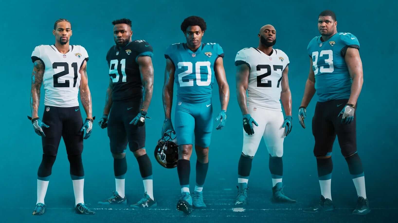
Click to enlarge
Well, it could have been worse — but it also could have been so much better.
That’s the short version of my take on the Jags’ new uni set, which was unveiled yesterday. The slightly longer version is that they improved almost every part of their uniform (especially the helmet, obviously), but the overall effect is very underwhelming, especially for a franchise that once had one of the best and most underrated looks in the league. The whole thing feels like an overcorrection, as if they realized they were too Oregon-y and made up for it by being too Penn State-y (I’m exaggerating in both instances, but you get the idea). You can get my full assessment in this ESPN piece, which was published yesterday afternoon, and you can see additional photos of the new uniforms here.
In addition, the Dolphins made two small chromatic changes yesterday — deepening their shade of orange and eliminating the blue outlining on their numbers, NOBs, helmet striping, and pants striping — and got a surprising amount of bang for their buck. You can see my assessment of that, including some side-by-side comparisons of the old and new uni elements, here.
I spoke yesterday afternoon with Surf Melendez, the Dolphins’ Managing Director of Brand and Creative, and mentioned to him that it was unusual to see a team making such a small tweak in this era of flashy uniform unveilings and big, sweeping brand statements. He replied (I’m paraphrasing here), “Well, we like our uniforms, so we didn’t feel the need to make a big change. But we thought we could make some improvements with the colors, so we did.”
I don’t entirely agree with him about their current uni set (the number font, in particular, really needs to go, but now we’re stuck with it at least through 2022, because yesterday’s tweaks reset the five-year clock), but it was refreshing to hear someone talk about small changes instead of big, sweeping overhauls. Also, while the Dolphins’ changes are small, they nonetheless went the extra mile by producing this nifty interactive page, which among other things includes a fun slider mechanism that lets you compare the old and new helmet striping. Well done.
Meanwhile, here are two small details — one from each team — that didn’t make it into my ESPN stories:
• I asked a Jags representative if there was any particular significance to the new curved/angled sock stripes. His response was priceless: “According to Nike, it’s shaped like a ‘jaguar’s claw.’ I left that out of the [press] release because I didn’t really understand the significance of it, or ‘how it is actually shaped like a jaguar’s claw,’ but I’d love for you to include it [in what you write].” And now I have. It’s pretty hilarious when Nike’s “storytelling” is too much even for the team/client, right?
• Although the Dolphins excised the blue from their uniform, several fans noticed that the blue outlining was still present in the rear helmet numbers that appear in the press photos. I asked Melendez about that, and he said, “We noticed as well. The decals are still in production. We made the call to keep them on for the photo shoot as opposed to not having numbers on the back of the helmet.”
And that’s a wrap. I hope the next two NFL teams to unveil new uniforms don’t do it at the same time of the same day — that was seriously hectic!
Click to enlarge
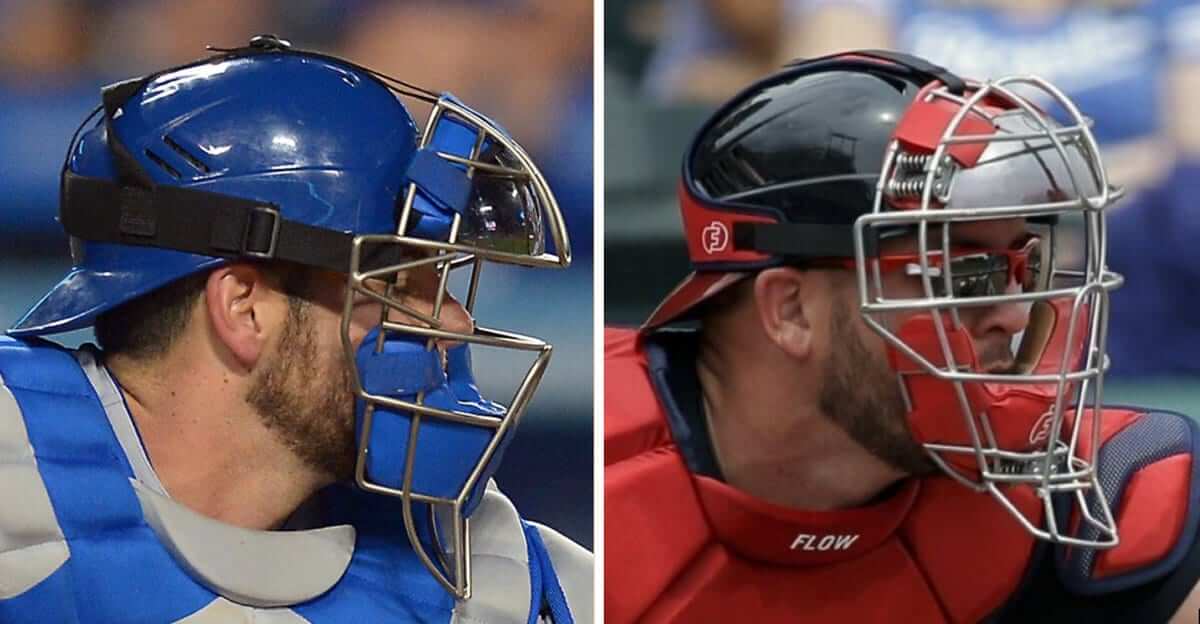
Meanwhile, over on the diamond: The catcher on the left is wearing a traditional mask. The one on the right is wearing a new-ish model called the Defender, which features spring-cushioned shock absorbers. You can see the springs at his temple, and there are additional springs at his chin and his other temple.
More and more MLB catchers are wearing the Defender, but it’s a tricky situation, because the mask is manufactured by a small startup company and most catchers have lucrative endorsement deals with the big sportswear brands. I’ve written about this for ESPN today, and I think you’ll find it really interesting — check it out here.
Click to enlarge
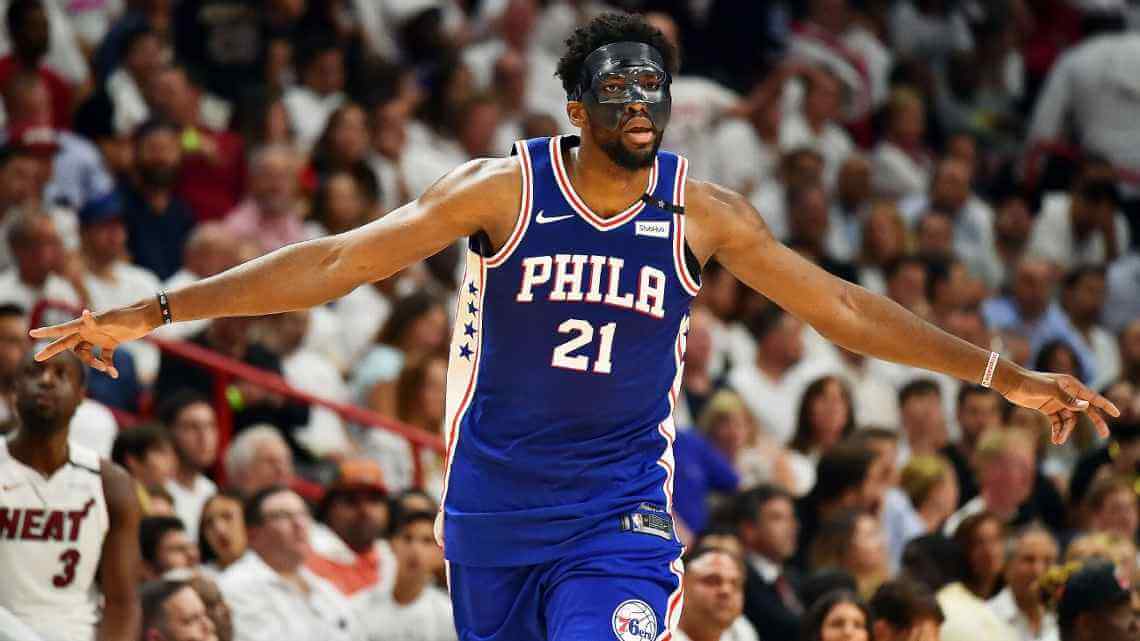
And speaking of masks: 76ers center Joel Embiid, who broke an orbital bone a few weeks ago, returned to action for last night’s playoff game against the Heat and wore a mask. There was some controversy when the mask came off at one point and Miami’s Justise Winslow appeared to go out of his way to step on it and break it:
Justise Winslow tried to break Embiid's mask. pic.twitter.com/K9aE91qy2h
— Yahoo Sports NBA (@YahooSportsNBA) April 20, 2018
Winslow did not get a technical foul, and Embiid simply got a new mask. He later said that he has about 50 of them.
(My thanks to Mike Chamernik for this one.)
Click to enlarge
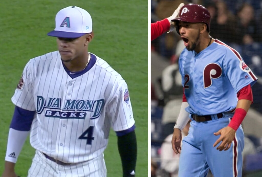
TBT: It was Throwback Thursday in the National League last night. First up were the Phillies, who debuted their new powder blue alternates. There were lots of inaccuracies and problems here: The original powder blues were zipper-fronts with vertically arched NOBs, while the current versions are button-fronts with radially arched NOBs; as you can see in that last photo, the side piping is broken by the belt tunnels, which is wrong; if they’re going to wear maroon trimmed uniforms, they should get maroon undershirts and jackets to match; and of course there’s the larger issue of wearing a road uniform at home. (Fun fact: They did that for one game in 1972, and it didn’t go well.) Also, while this wasn’t exactly an error, it seems like powder blue uniforms would be better on an Astroturf field, no? Still, it was fun to see the old look. Additional photos here.
Later on, in Arizona, the D-backs wore their inaugural-season throwbacks (part of their 20th-anniversary retro program), complete with the white caps! I think this set has aged surprisingly well, purple and all. Additional photos here.
For all photos, click to enlarge
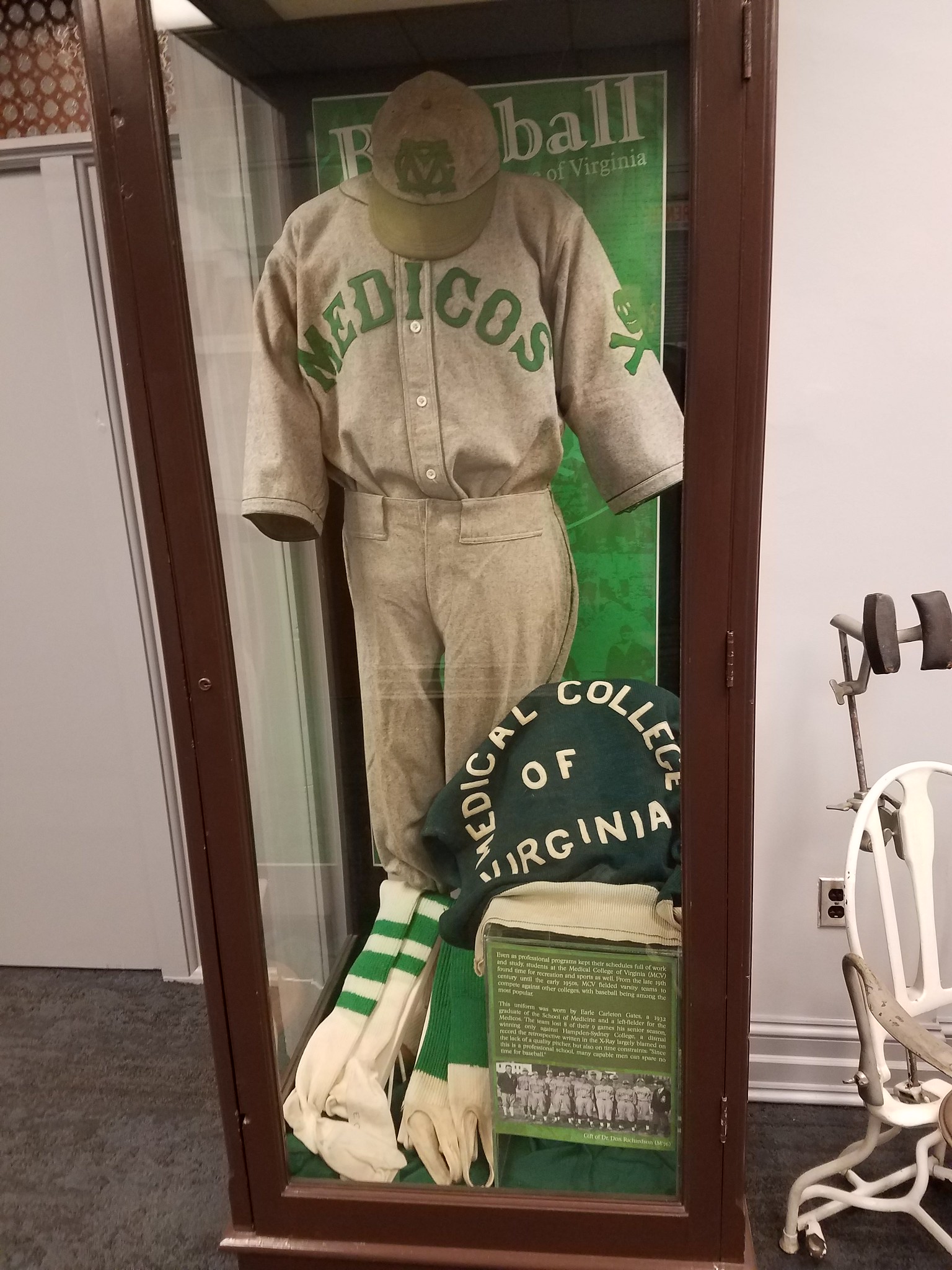
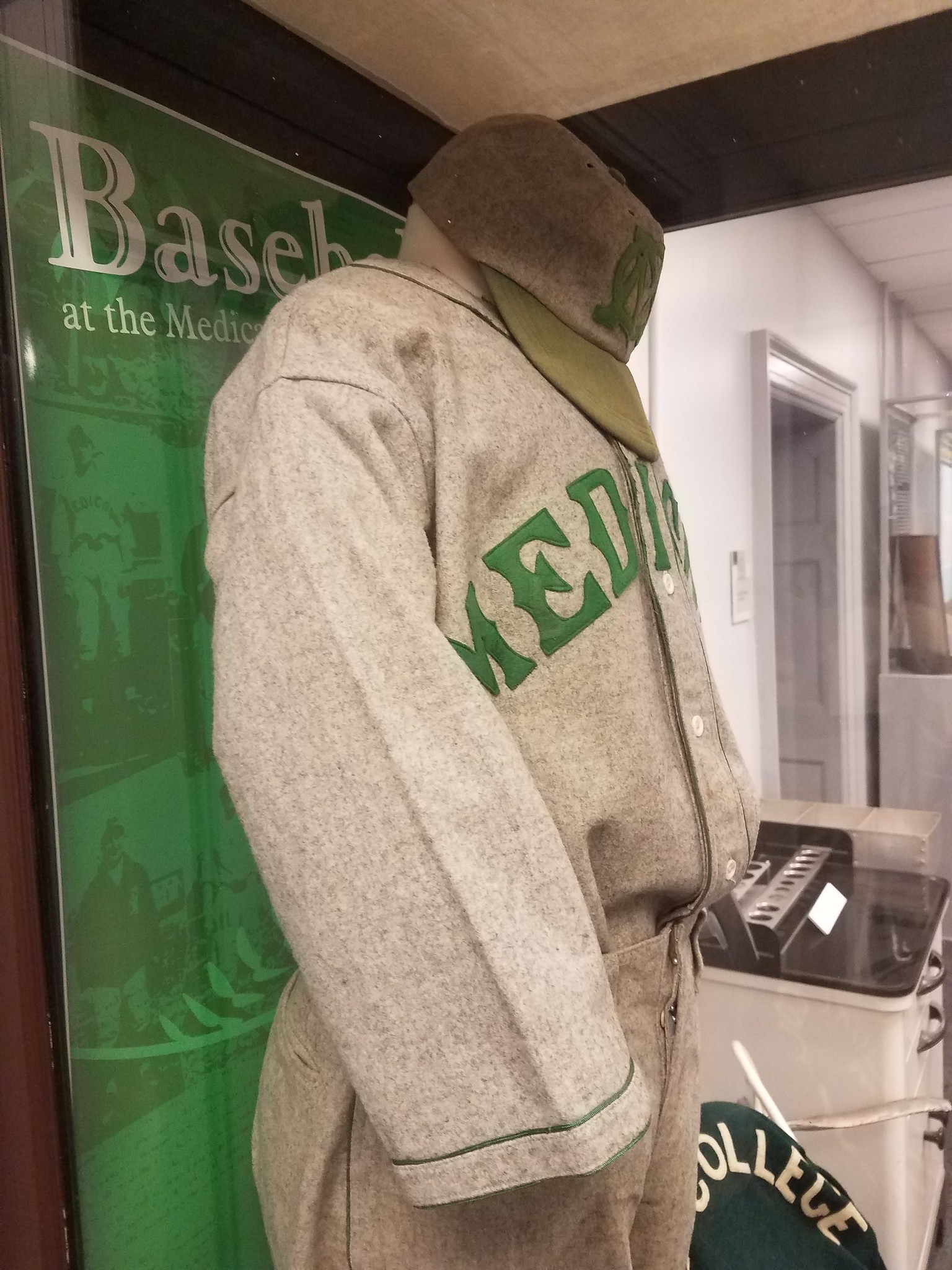
Too good for the Ticker: Reader Eugene Stolow recently visited a friend at the VCU School of Medicine in Richmond and saw this fantastic baseball uniform display in the school’s library. The accompanying placard says the uni is from 1932. Note the skull and crossbones sleeve patch!
The chest lettering reminds me of the Red Sox’s home jerseys and the Mets’ road jerseys. Here’s another view:
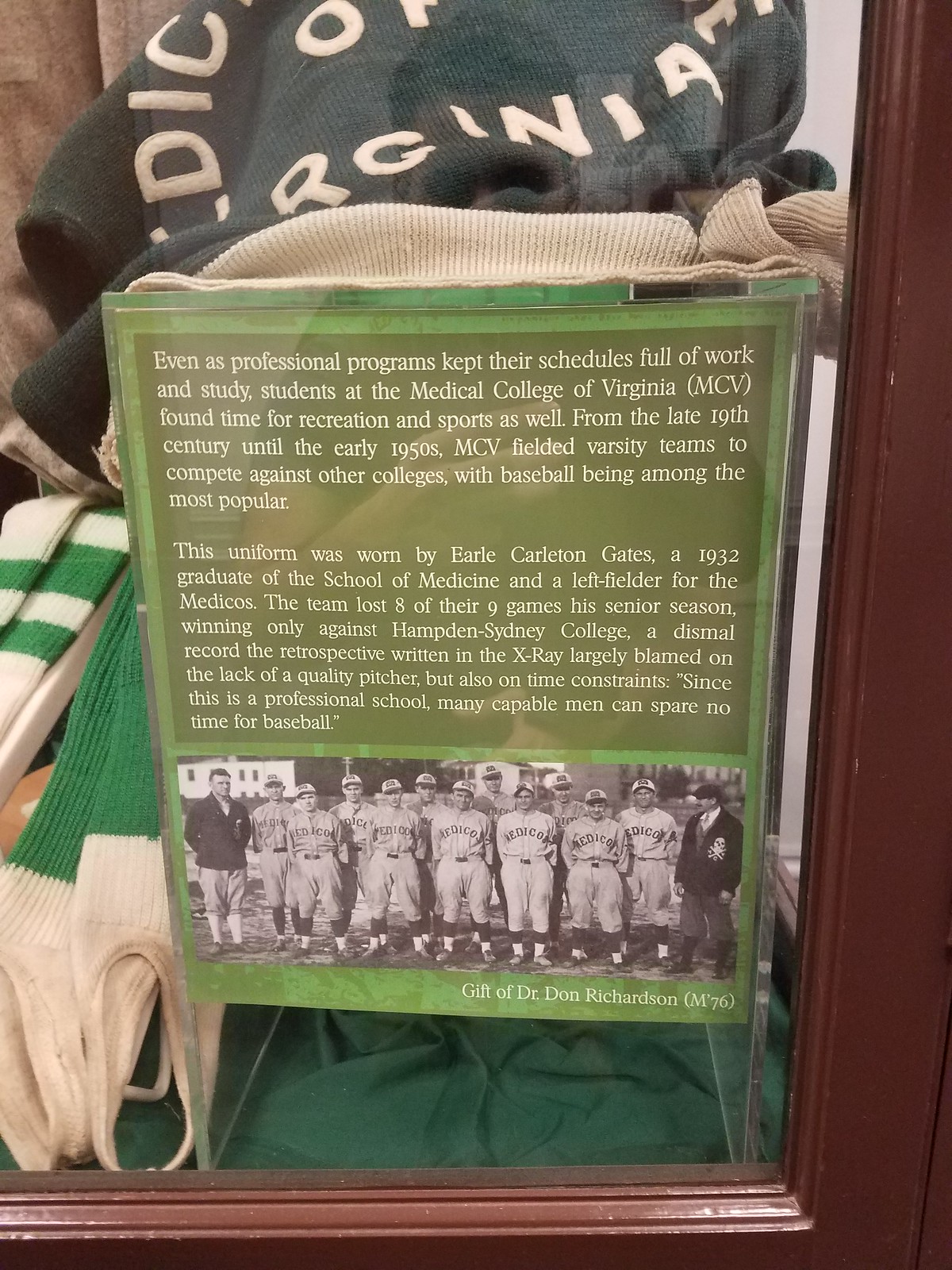
The placard explains that the team had a dismal record, owing in part to the time constraints placed on medical students. Also, check out the team portait, which shows a coach, or maybe a trainer, wearing a jacket with the skull and crossbones:
Sensational stuff. Big thanks to Eugene for sharing this one.

Assorted reminders: In case you missed it earlier this week, we have news on a variety of fronts. One at a time:
• Our friends at Ebbets Field Flannels are raffling off a New York Knights T-shirt to a lucky Uni Watch reader. Today is the last day to enter this raffle! Details here.
• There’s updated news regarding the upcoming Uni Watch cap program, which will likely feature at least three different designs. Details here.
• And we also have news regarding the Syracuse Chiefs’ upcoming Brannock Device Night promotion, where I’ll be throwing out the first pitch. Details here.
The Ticker
By Kris Gross

Baseball News: Mariners CF Dee Gordon looking good in stirrups last night (from Michael Rose). … The Mets have not worn their alternate jerseys yet this season (from JM Rondello). … Has anyone seen these Lego hats before? (from Brady Phelps.) … Scroll to the bottom of this article for a note stating that the Cubs broadcasts now include an advertiser for their uniform descriptions. Yuck (from Douglas Ford). … If you’re in the Milwaukee area, get to the Brewers game on June 17 for a mini-bullpen car giveaway. … The Orioles have announced their list of theme nights (from Andrew Cosentino). … The Louisville Bats, Triple-A affiliate of the Reds, will become the Louisville Mashers on “Cheers to Bourbon Night” (from Caleb Jenkins). … The city of Amarillo, Texas, is getting a Double-A team, and there’s a contest to name the team (from Bradley Maybin). … LSU softball will wear teal helmets tomorrow to show support for a Mississippi State player battling cancer (from Brian Ogden). … Sticking with a softball, here’s a great-looking matchup between Utah and BYU from Wednesday (from Alex Allen).

NFL News: For the Win lists 10 teams that desperately need a uniform change (thanks Phil). … Check out this video showing the Eagles equipment staff getting the helmets and jerseys ready for the Super Bowl (from Joseph Wolper). … Some NFL inconsistencies spotted by @NFL_Journal: Seemingly different NOB spacing from this old Rams footage, and different fonts on these Saints sideline jackets. … This footage from a 1994 Bills/Broncos game features a Bucky Brooks FNOB. Head to the 0:26 mark (from @EichelTower615). … Awesome: Bucs LB Richard Wood wore a Batman elbow pad in 1979 (from Ray Hund). … As part of the NFL schedule release last night, the Bears created a superhero-style video to unveil their opponents, while the Vikings used team cleats (from RJL, Brinke Guthrie). … This article on the Steelers’ website includes the following news from owner Art Rooney: The team will wear its mono-black uniform for a Thursday-night game against Carolina, and the team will unveil its new throwback uni at the end of May (from Jerry Wolper).
College Football News: LSU will celebrate 125 seasons with this logo, which will be worn as a jersey patch. You can read more about it here (from Griffin Smith). … In advance of their switch to Jumpman jerseys in the fall, Florida Photoshopped the Nike logo out of their latest season tickets promo (from Michael R Carroll). … Georgia Tech’s spring game is today, and there are lots of changes, including a new shade of gold; fewer display options for the “GT” logo; a new color palette for the Buzz mascot; and a new wordmark. More info here.

Hockey News: The Nipawin Hawks, whose colors are black and yellow, continue to wear green helmets in honor of the Humboldt Broncos during the Saskatchewan Junior Hockey League Finals (from Wade Heidt).

Basketball News: Want to help choose Ohio State’s new court design for the 2018-19 season? The Buckeyes have 10 potential designs in the hoppers and are inviting fans to vote for their favorite.

Grab Bag: Have you ever seen a tennis player wearing a uniform number? Jason DeDonato spotted Fabio Fognini wearing a No. 17 shirt at the Monte Carlo Rolex Masters. … Indiana has a long history of very creative high school mascots (from Marc Viquez).
Yesterday was a happy day in the NFL uni-verse for me. Both upgrades for Dolphins and Jaguars. Yes, they could have been better, but what we got is better than what we had before.
I think the Jaguars would look good using the black jersey over teal pants combo. Hopefully we will see that at some point.
I love the Fins’ redesign. I felt they integrated blue into their Jimmy Johnson-era uniforms a lot better than they did with the uniforms they just retired. I wish they brought the aqua face masks back, though. As for the Jaguars, while I like the socks and helmet, I think they missed on the jerseys and pants, which I think are too plain. Using gold to outline the numbers wouldn’t have hurt. Also, I would’ve preferred to see them use their teal jerseys as their primary dark jersey instead of black.
I agree that both the Jags and Phins came away with improvements to some horrible uniforms. Not crazy about the Jag’s number fonts, but at least they’re not abominations like the Bucs or Titans. I would have liked to have seen a uni set with gold pants. I think that would have looked cool with the Teal jersey. As for Miami; happy to see a turn back to the tradtional turquoise and orange. I never understood why they introduced blue into such an iconic color scheme. I still hate those number fonts though. Can’t ANYONE updatng their look go with classic block numbering? For some reason everytime a team goes with new duds, they feel that HAVE TO come up with a font unique to themselves. The Giants, Raiders, Packers and Chiefs all essentially have the same classic block numbers, and I don’t see anyone confusing they 4 of them!
Agree with everything said on both the Jags and Dolphins.
My fear with the Dolphins is if they go mono-aqua too much, that’s one horrific look regardless of the expunging of the blue.
The Jags is a definitely a case of getting it right the first time and being in various degrees of uniform wasteland ever since, 4 years and 364 days to go.
I think Georgia Tech did a great job. It simplified its look and that will make reproducing its stuff with a gold base much easier. Having yellow and gold was never gonna work. I can’t wait to see how the Institute’s teams will look going forward.
“Well, it could have been worse — but it also could have been so much better.”
Exactly. The Jags will now be a good looking team. But wit only minor tweaks to what they unveiled they could have been a great looking team. The main thing is that their colors are not sufficiently integrated across their uniforms. Not enough teal on the white and the black unis. Not enough black on the teal unis. Not enough gold anywhere, but that’s a very minor complaint compared to the problems with teal and black.
Teal numbers on the black and white jerseys, black numbers on the teal jerseys, a teal or gold helmet, and pretty much all problems solved. Or just wear teal pants with the white jersey and make the black jersey numbers teal. Easy fixes, but the basic problem is that the team is presenting itself as a three-color team with a lineup of two-color uniforms.
Cubs link is the A-Rod-one in ticker
Like it says, if you scroll down to the bottom, there’s the Cubs item.
Should have warned us it was a Mushnick column. That guy is a bitter, bitter fellow.
Not sure if it has been mentioned here but Darron Lee of the Jets has been posting on twitter, #JetsNewUnis the last few months. The other day he tweeted;
For those #JetsNewUnis latest update? Attend taste of the Jets if you want the latest scoop! #JetsNewUnis
Also wrote, Failure wasn’t an option.
Event is 5/17, obviously not something dramatic but sounds like something could be changing going forward. Who knows?
That’s Purple Amnesty Day. Purple Jets uniform coming?????
Mighty Ducks & Milwaukee Bucks early-mid 90’s…Green & Purple aren’t the worst combo..ha
Don’t forget Utah Jazz in purple and green (with yellow). Like that better than the present Jazz uniforms.
Imagine if Purple Amnesty Day was an April Fools-style holiday where a bunch of teams pretended to unveil purple uniforms just to troll Paul…
No. Just, no.
The Jets don’t need new unis. If they want to bring back the 1978-89 version as a throwback or Color Cash option, fine. And I’m certainly not averse to ditching the green pants and white socks. But otherwise, leave it alone.
New York teams tend not only to wear traditional uniforms but also to not do well with classic-to-modern uniform changes, which when made rarely last more than a few years (the Mets’ racing-stripe and black eras being the exception in terms of longevity, but even those were not radical departures from their traditional look). Note that right now, every New York team is wearing essentially the same uniform it was wearing in 1965 (plus the Islanders who now have essentially the same uniform they had in 1973). Only the Yankees (and to a lesser degree, the Knicks) have been consistent since then, but this is a good thing.
The point is, with every New York team having a traditional uniform, I don’t think any one of them is likely to break with that trend any time soon.
I would like if they get the same color green throughout the uniform, or change to a Kelly green. Nothing drastic I’m sure. White face-masks looked nice for the color rush.
Given your observation about New York, I’m wondering what the best uniformed sports city would be. New York would be high on my list. If Flying Elvis didn’t exist, Boston would be up there, too.
It’s Pittsburgh. And I hate the Pens and Pirates. But all matching in the city colors of black and gold, all fairly traditional uniforms… it all works so well.
Now they just need a NBA team and a MLS team…
Just reminds me how I’ve never understood why Pittsburgh, St. Louis or KC don’t have or can’t keep NBA teams.
I feel like you are giving the Dolphins way too much credit for making a small tweak rather than a huge change, Paul. Relatively speaking tweaks seem like more the rule than the exception these days, I’d say. Look at the Jags’ redesign – yes the changes are easily noticeable, but they have the same logo, same colors (even if the prominence ratio is slightly different now), etc. Same thing with the Titans a little while back. Teams in all sports seem more reticent these days to totally blow everything up like they would in the ’90s or ’00s – everything seems gradual or incremental to some degree.
I think a small tweak that makes a large visual improvement deserves a great deal of credit.
Most of the league’s bad uniforms could be easily fixed without blowing everything up. Heck, just using block numerals, eliminating side panels, and replacing goofy pants stripes with regular pants stripes would upgrade at least a half-dozen teams.
I agree. Complete overhauls are rarely necessary. For example, with the Rams and Eagles, fans would love it if they switched to royal blue/yellow and kelly green respectively. It doesn’t require a complete redesign, just a color swap.
While Miami could have made other changes to improve their uniforms, the small changes made a big difference.
See below for more examples.
The Nipawin Hawks’ opponent, the Estevan Bruins, have a rather curious mash-up of Boston Bruins eras going on with their jerseys. The basic design is based on Boston’s 1974-1995 uniform, but the logo on the front is the 1995-2007 version.
Also, the Estevan’s shoulder patch is based off Boston’s primary crest from their 3rd jerseys of 2008-20016.
Sorry about the typos – can’t type this morning.
Interesting in the 1972 newspaper clipping about the Phillies wearing the powder blues road unis at home, that they were considering making it a regular weekly occurrence. Had they won the game (or not lost so poorly), and/or the reception from the players/fans been better, then the Phillies very well may have done the weekly all-powder-blue alternate thing, and — I’m really projecting here — since this was near the dawn of the powder blue era, maybe other teams do something similar at home in the ensuing seasons? Maybe the Phillies wearing the throwback powder blues at home this season — and the Blue Jays doing the same several years ago — looks more-appropriate, since it would have been a more-familiar concept? There’s a little “what-if” potential there, possibly.
It really is amazing how much better the Dolphins’ uniforms look with these minor adjustments, which illustrate how easy it is to get right what so many teams (and/or their uni designers) get wrong. Most of the league’s clown suits could be upgraded to football uniforms with a minor tweak here or there, rather than a complete overhaul.
Exhibits A and B are the Titans and Jaguars, respectively. For the Titans, take the new set, give it standard block numerals (or any less-ridiculous font than the one they chose) and regular pants stripes, and it would at least be a football uniform instead of a clown suit.
As for the Jaguars, I agree with Paul that they “overcorrected”; as I said yesterday, they did manage to upgrade from a clown suit to a football uniform, which is laudable, but like so many other teams in the last ~20 years they missed a golden opportunity to come up with something great and ended up with something very meh. Put gold trim on the numerals, move the TV numerals down to the sleeves, and add teal-gold-teal pants stripes, and you have a winner.
Imagine the Bucs’ uniforms with their previous helmet decals, and block numerals.
Imagine the Browns’ uniforms with full pants stripes (no wordmark), white-on-brown and brown-on-white numerals, and the sleeve stripes only on the sleeves.
Imagine the Broncos’ and Bengals’ uniforms without the side panels, and with straight pants stripes.
I have no idea if this new logo was just for a schedule day promotion but the Chicago Bears have a new logo for their Instagram profile picture as well as in some promo art on the page. I was just wondering if you knew anything about what the use of that will be.
Not sure if it’s been explained before, but how much involvement does the team have with Nike in the design process? From the explanation about the socks it sounds like the Jags felt like they were stuck with something they didn’t like.
Also, do you think there’s any chance that the league will make adjustments to the 5 year rule? Maybe some case by case flexibility for things like the Rams mismatch or seriously bad choices.
1) Nothing happens without the team’s involvement and approval.
2) The Jags are not unhappy with the socks. The team rep just thought the explanation was a bit much.
3) Five-year rule: Impossible to read those tea leaves, sorry.
Paul, re: the 5 year rule, how does this apply to which jersey is designated home and which is alternate? I seem to recall that Tennessee had their columbia blue jerseys as the primary for a season or two, and then when back to navy being the primary. So could Jacksonville theoretically decide to keep the same set, but make teal the primary sooner than 5 years?
I *think* so — but not positive.
Personally, I’m not crazy about the Jags uniforms. It is nice to see them go back to a better helmet (though, what wouldn’t be a better helmet than that monstrosity?), but they’re just too plain now. I think they should’ve kept the gold, and at least added some simple striping on the pants and maybe an outline on the numbers. The pants are just boring, and when they go white over white, there will be hardly any teal. I also think the logo on the jersey worked better when it was in the shield before – now it just looks like an afterthought. I think it’s funny that Nike still managed to get a little of their “storytelling” in with the socks, as the rest of the uniforms are so drab they’d really be stretching it trying to make up anything. In conclusion, I honestly think they’d have been better keeping the old uniforms and just changing the helmet.
Typo alert – Joel not Justin Embiid.
Right. Got it.
With regards to that FTW list on NFL teams needing uniform changes… well, can’t argue too much with the list. Though they did get a bit about the Rams wrong – that mismatched all-blue look was worn on the road, as they went white-at-home.
The Panthers would be fine keeping their uniforms as-is… IF all of the jerseys were like Cam Newton’s, with link. Instead, most of the players have link. For that reason, yeah, they should make an update.
And, of course, I’m amused that the Jags were listed number 1 in spite of their new unis.
Panthers fan here…one interesting note is that Jerry Richardson stated that he would never change the uniforms as long as he owned the team. And he hasn’t…aside from a minor logo upgrade and the addition of the blue alternate, the Panthers still wear what they wore on day one.
Now, as a Panthers fan, I am okay with the look but I agree that there are some changes that might make it look better…but I also tend to think that there is something to the idea that never changing the uniforms at all brings a sense of stability to the franchise and that any design, if left alone long enough, will become a classic.
Is there some reason why the Jags have a second layer, which is the same color as the jersey, under the digits? It’s invisible from a distance and doesn’t seem to add anything.
I remember the Dodgers having this layer because supposedly a remnant of the blue “real” numbers would stain the jersey and make it impossible to take a number off and replace it with something new. But then they introduced some new jersey material (Cool Base, maybe) and no longer needed to have the white layer, so they dropped it.
Some other teams had extraneous white layers too: the Phillies in their maroon-trimmed home uniforms; the Mets at home in the mid-’90s. A colored jersey with a same-color border around the number is pretty rare, though. Why did the Jags do this?
The “Lego” hat was probably self-made as it combines Lego and Oyo (the figures) elements.
Agreed. Oyo has a MLB contract.
They even make bullpen carts with driver!!
link
other stuff too:
link
In the Eagles equipment video it looks like they are also working on Flyers(?) jerseys at the same time. ????
I see orange and black. Name: Mercado. Is that someone?
Fair assessments on the jags and dolphins new sets. Nike is really pushing a minimalistic look lately and its hurting a lot of looks. Illinois, VT, and now JAX have all released uniforms that would be better with an outline. I will also say that i am personally a fan of simple pants designs. It puts more emphasis on the jersey and helmet and leaves room for more sock combos.
The skull and crossbones on the VCU Med uni are legit. Love the colors and the material of the uniform. True Classic.
University of Maryland baseball wears a white hat with white pinstripes. They look like the ’98 DBacks unis that were wore last night.
I saw that the Amarillo double A team is naming their new team. I know for a fact that 5 years ago they had a team in Amarillo called the Sox. I stayed in the same hotel as them and went in for breakfast the next morning and saw a sign in sheet for Sox players. I signed that bad boy and got a free breakfast. Good times.
I’m all for simple, but JAX went too far. A simple, traditional, pant stripe would have been nice. Maybe even a shoulder stripe. Also I’d like the teal to be the primary jersey, with black being the twice a year alternate. I also hope they wear the teal pants occasionally with their white jerseys. Also some gold outside of just the logo would have been good. I like their black helmets, but a gold helmet with matching pants could have been good, as long as it wasn’t the mustard gold they had for their Color Rush uniforms. Lastly don’t like the Jaguar head logo on the jersey. I get that without something distinguishing the team at the store it would be hard to know this was a Jacksonville jersey, but maybe centering it over the NOB like the Cardinals would have been better. Or maybe having “JAX” centering on the front would have been a good option like on the helmet bumper.
Before you mentioned the JAX on the chest I didn’t notice that this jersey does not include the small chest wordmark. Just about every new NFL jersey in the last two decades (sans the Jags previous one also) seems to have included one. Makes this even more minimalist. I definitely would have preferred the wordmark over the patch.
I love the Jags’ changes, in that I’m a Penn State aesthetic guy all the way, with my favorite uni’s in the league being the Giants, Raiders, and Jets.
Now if only the Browns would “over-correct” that way. How much longer do we have on the five years of those uniforms again?
the Cubs broadcasts now include an advertiser for their uniform descriptions.
The Browns did that about a decade ago on radio. Don’t know if they still do or not. I think it was Cintas, the uniform company, that was the advertiser.
Don’t teams advertise just about everything on TV and radio broadcasts anyway? Mushnick hasn’t liked the game of baseball since Babe Ruth broke it with all those home runs.
“In advance of their switch to Jumpman jerseys in the fall, Florida Photoshopped the Nike logo out of their latest season tickets promo”
Fucking WHY??? It’s the same company! Jordan Brand is not different from Nike! This is so stupid.
1) That Padres Lego hat is awesome!
2) It could be even better, but I guess they don’t make brown Legos. (Or they do, but ownership refuses to acknowledge them.)
LEGO makes brown bricks: link
But yeah, ownership probably refuses to acknowledge brown LEGOs!
Love that the Medical College of Virginia’s school newspaper (I assume from the placard in the picture) was called the X-Ray.
The Jaguars new uniforms are definitely an upgrade, and the black home uniforms will look great on the field. The black jersey/teal pants combo should look great, and the mono-black should look good too. I would have wanted them to include gold, however. I feel like they pulled a Carolina Hurricanes. Unis went from overly busy to extreme minimalism, and then the new adidas uniforms are in-between, to a great result. I hope the next Jags unis will be somewhere in between also.
The Dolphins uni changes are fantastic. It’s amazing what a simple color change can do. Any word on what their color rush will be? I’d be open to an orange getup in their new orange, spice it isn’t as bright and creamsicle-y.
I still don’t love the Dolphins narrow numeral font, but the thick orange border makes the numbers appear more substantial.
The Phillies did wear powder-blue jerseys with buttons for a few seasons (1972-1973, 1987-1988).
Not ’73; only ’72. And in that year, and also in 1987-88, the “P” chest logo had the little baseball stitches/curlicue thingie. By not including the stitches last night, the Phils clearly located the jersey in the zippered era — but didn’t use a zipper.
Rule 3.03(g) of the official rules of Major League Baseball states,
No part of the uniform shall include a pattern that imitates or suggests the shape of a baseball.
As such, the Phillies likely would not have been permitted to wear the original logo with the little stitch-shaped curlicue. Using the 1973-86 logo doesn’t necessarily situate the throwback in the zippered era; it situates it as something being worn in 2018.
Um, have you noticed the cap?
I always preferred the Phillies P with the line in it that made it look like baseball stitching:
link
I think I’d prefer a return to the Ashburn-era jerseys so that the lettering doesn’t seem as stiff as the current set and the red isn’t as bright.
link
The Jaguar head patch is 100% because of retail. Without the patch the jersey has no team identifier at all. With the helmet you don’t need the patch. But a fan, of course, isn’t wearing a helmet.
Of all the things the Phillies got wrong with those throwbacks, the absence of a helmet squatchee may be the most disappointing.
The Phillies should absolutely own maroon and go back to that look. The stylized P with the baseball is so much better than the “Phillies” chest mark, and as noted above, their current red is too bright.
Today’s ESPN column is up:
link
A couple of months ago, I stated that the Dolphins could do four things to improve the current unis and two of those did happen (different shade of aqua and make orange more prominent).
Eliminating the marine blue and making the orange outline a little darker and bolder really makes the numbers stand out just like on their aqua throwbacks. I still would’ve preferred the aqua facemask and a jumping Dolphin logo, but the changes that were made are a huge improvement.
Singular outfit for Fabio Fognini debut in the Masters 1000 of Montecarlo 2018 . The taggiasco, in the match against the Belarusian Ilya Ivashka, came down wearing a shirt with the number 17 on his shoulders. In commentary on Sky Sport Pero and Bertolucci, through the words of Volandri, have unveiled the arcane: ” It ‘a lucky number for both Fabio and the owner of the brand (Hydrogen, ed) and, since today is day 17, they decided to use it ” . Bertolucci’s statement is very nice: “Let’s hope that tomorrow will put 18, then 19 and 20”, wishing a good journey of the Ligurian in the tournament.
The D-Backs original white hat with purple bill is my favorite. Looks great, it’s different than everyone else, and it’s a great hat to have when playing golf in the Arizona heat.
Here’s a potential article subject: the “Steve Yeager” throat protector, how it came to be, but also how it seems to have disappeared from the scene as part of mask design.
Like the updates from the Dolphins and Jags but I think they could still use a few improvements. I am not a fan of the white face mask for the Dolphins, should be aqua in my opinion. The logo… well that’s been discussed many times. I prefer the old cartoon dolphin they used. But getting rid of the blue was a big step up from what they have worn the past 5 years. Interesting in the NFL 2K5 game there is an alternate jersey with the blue. Kind of an interesting look.
The Jaguars I actually think just about nailed it. Notice they have no piping whatsoever on the jersey or the pants. A very retro look. The numbers too. The absence of the gold does stick out. I think adding it to trim the numbers and names on the back would be a nice touch. I though for sure they would make teal the primary jersey and go back to black as the alternate but if I remember correctly, the owner is a big fan of the black jerseys. The helmet is a massive improvement over the two-toned matte thing they were wearing. A throwback if there is such a thing for this franchise. Amazingly they have now changed their uniforms three times and the Panthers have stuck with their original look since coming into the league in 1995.