
Lots of people, myself included, were surprised when the NBA didn’t have Christmas Day uniforms this season, a development that was widely attributed to Nike’s resources being stretched too thin as the company took over the league’s uniform program. That won’t happen again next season.
According to a source who I trust, the Christmas uniforms will return to the court this December. No images yet, but here are some details:
• As usual, there will be five Christmas Day games. All 10 teams will have new uniforms for the occasion. The home teams will only wear the Christmas uniform on Dec. 25; the five road teams will have an additional opportunity to wear their Christmas uni for one home game at a later date.
• Unlike the Adidas-era Christmas uniforms, which were basically templated cookie-cutter designs (some of which were pretty good, others not so much), these new designs will be team-specific. Similar to the “City Edition” uniforms, they will represent something from the team’s and/or city’s history and heritage.
• The NBA schedule won’t be released until later this summer (it usually drops in August), so it isn’t yet clear who’ll be playing on Christmas Day, but it’s safe to assume that it’ll include the Warriors, Celtics, Lakers, and whichever team LeBron James is playing for. Nike has come up with designs for 17 teams, just in case.
In the big scheme of things, these Xmas uniforms aren’t really that big a deal. I mean, most of us will be busy doing something other than watching basketball that day, right? Still, it’s fun to have an NBA scoop ahead of Conrad Burry, who’s usually the first one with this type of news.
Big day for NFL uniforms: The Jaguars and Dolphins will reveal their new uniforms today. The Jags’ live event will begin at 11am Eastern, although I’m hearing that the actual uniform unveiling won’t take place until sometime closer to 12:30pm. The event will be livestreamed on the team’s website.
Naturally, there was a last-minute leak. It happened last night, when some people spotted workers putting up a display featuring the uniforms at Jacksonville International Airport. You can see several additional photos here.
If those really are the uniforms, I’m disappointed by the lack of gold, but we’ve known for a while that that would probably be the case. In any case, we’ll get a better look in a few hours.
As for the Dolphins, whose uni change will reportedly be more of a tweak than an overhaul, they’re not doing a live event, so the new designs will apparently be announced via press releases and social media. The time frame, as I understand it, is likely to be somewhere in the noon-12:15pm range.
I’ll have my say on both new uni sets over on ESPN.com at some point in the early afternoon, along with follow-up coverage here on the blog tomorrow morning.
This past season, we shared our 25 Defining Moments in Dallas Stars history. This one didn't make the cut, although it is legendary in its own way… pic.twitter.com/ObxLMJYNA6
— Dallas Stars (@DallasStars) April 18, 2018
Moooood uplifter: Lots of teams have lousy uniforms at one time or another. But it’s not often that a team can admit that it had a lousy uniform, and even rarer that a team will go out of its way to poke fun at itself over its lousy uniform.
That’s what the Dallas Stars have done in the video shown above, which is about the team’s early-2000s Mooterus jersey. They even use the term “Mooterus”! The whole thing is playful, creative, fun, and four of the most enjoyable minutes you’ll probably have today. Kudos to all involved.
A confession: I always kinda liked the Mooterus uni. Of course, you can’t unsee the fallopian connection once it’s pointed out, but I still thought it was a handsome design, and I still don’t understand why Mooterus was singled out for ridicule while another notable Texas sports logo was not:
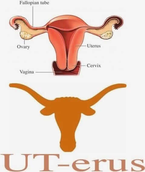

Click to enlarge
Just another morning at Uni Watch HQ: Uni Watch girl mascot Caitlin has always been a little monkey, climbing hither and thither. Every now and then she’ll get ants in her pants and jump up on top of the Coke machine. (Yes, there’s a Coke machine.) I have lots of oddball canned goods and other display items up there, so I’m always worried that she’ll knock some stuff over, but she never does.
Caitlin, incidentally, has a birthday fast approaching. But we’ll have more about that in a few weeks.

Assorted reminders: In case you missed it earlier this week, there was news on a variety of fronts. One at a time:
• Our friends at Ebbets Field Flannels are raffling off a New York Knights T-shirt to a lucky Uni Watch reader. Details here.
• There’s updated news regarding the upcoming Uni Watch cap program, which will likely feature at least three different designs. Details here.
• And we also have news regarding the Syracuse Chiefs’ upcoming Brannock Device Night promotion, where I’ll be throwing out the first pitch. Details here.
The Ticker
By Paul

Baseball News: MLB has a logo for interleague play. It isn’t used very often, but it showed up on a bunch of chairs in the visiting bullpen at Yankee Stadium during this week’s Yanks/Marlins series (good spot by Gabe Billig). … The Royals are selling a bunch of old bullpen and dugout phones (from Alex Manners). … Detroit has a pennant to celebrate pennants! (From Doug Tribou.) … Turns out there was one A’s player who wore the classic 1968-style stirrups during Tuesday night’s throwback game: relief pitcher Emilio Pagan, who was warming up but didn’t get into the game (from unprotectedsox). … Former Mets 1B and current broadcaster Keith Hernandez was wearing a 1986 Mets uni for some sort of video shoot yesterday (from webmaster John Ekdahl). … Late-’90s Padres-inspired fauxbacks upcoming for the El Paso Chihuahuas (from @DrummerbrinSD). … The Dodgers and Padres will play a three-game series in Mexico on May 4-6 and will wear commemorative cap patches for the occasion (from Max G.). … Phillies 1B Rhys Hoskins has a chip in the brim of his batting helmet. … Yet another pin-wearing MLBer, and a weird one: Tony LaRussa with a Green Bay Packers Super Bowl XLV champions pin on his cap (from Josh Tremblay).
College Football News: Good video on how Indiana used to have different helmet colors for eligible and non-eligible receivers back in the 1940s, which eventually led to an NCAA rule change (from Ryan Cotter). … New centennial logo for Western Kentucky (from @FletchTopper).

Hockey News: The is pretty awesome: Old and new Penguins logos passing each other on the Pittsburgh Incline. … Speaking of the Pens, equipment manager Dana Heinze lines up the players sticks in uni-numerical order (from Phil Johnson). … Check it out: Over 100 Blues program covers (from @mrmichael21). … Avs G Jonathan Bernier took a shot to the mask and had to switch to a plain white mask.

NBA News: Celtics G Terry Rozier has been wearing sneakers designed by a New Hampshire teen-ager (from Bryan O’Nolan). … Here’s how the Jazz’s 2017-18 record breaks down by uniform (thanks, Phil).

College Hoops News: It was announced yesterday that soccer teams Manchester United and Liverpool will be playing a game this summer at Michigan Stadium in Ann Arbor. As part of the announcement, Man U and LFC players exchanged jerseys with Michigan basketball players.

Soccer News: With the USL’s Carolina Railhawks changing their name to North Carolina FC, the team is offering to replace any posters or merch that local businesses have in their stores (from James Gilbert). … New away kit for Croatian team NK Varteks (from Ed Zelaski). … New home kit for Liverpool (from Moe Khan). … Also from Josh: New home kit for the Deer Park Rangers. … Real Salt Lake is debuting new black kits this Saturday (from Paul Cherrington). … Cross-listed from the college hoops section: It was announced yesterday that Manchester United and Liverpool will be playing a game this summer at Michigan Stadium in Ann Arbor. As part of the announcement, Man U and LFC players exchanged jerseys with Michigan basketball players.

Grab Bag: Volkswagen plans to change its logo next year. … I don’t know jack about eSports, but apparently you can now get personalized OWL jerseys. … Pittsburgh police detectives have been ordered to bring riot gear and full uniforms to work until further notice, in case there are riots if President Trump fires special counsel Robert Mueller.
Volkswagen, not Volkswagon, had its best logo in 1939, but there are definitely reasons to keep that era’s look on the shelf.
Ja Wohl! Recently seen that logo on a logo quiz game app.
Volkswagen not VolkswagOn
Yup. Got it.
Also disappointed by the lack of gold, as well as the stripeless pants, unadorned sleeves, and monochrome variants (which I understand are inevitable). Numeral font is so-so. Assuming a solid black helmet with the current logo, I’d rank this a 2 on the 1-to-4, football-uniform-to-clown-suit scale; i.e., a significant upgrade.
Looks like the photos do show the black helmet (gloss, not matte) with the current logo.
I’m also not a fan of the socks; I’d prefer to see teal-, white-, or even gold-topped socks with the black pants.
I’ve got a feeling they’ll use gold for the Nike makers mark and that’s about it. I’ve noticed on many of the new nike sets (Seattle, Tennessee, Miami, etc) they use a contrasting color for the nike swoosh (and sometimes other design elements) to draw attention to it, making it part of the uniform design, rather than just on the uniform.
Like the Titans did with the red Nike swoosh.
What annoyed me more than the crest on the front of that Stars jersey was the addition of red trim. I just never thought it fit at all with the green-gold-black color scheme.
Agree. I kinda liked the new logo. It was the addition of red was the killer for me.
Good grief the Jags uniforms are JUST AS BAD as before. See you in five years.
Not even remotely “as bad as before.” These actually look more like the previous-but-one set, but without the “whisker” stripes and (presumably) without the interesting helmet paint (i.e., the black metallic paint that shines teal in sunlight, not the atrocious half-moon two-tone design that replaced it).
With this, bland as it is, they’ve upgraded from a clown suit to a football uniform. They deserve some credit for that. It’s not a great football uniform, and the mono variants, stripeless pants and black-socks-with-black-pants look rather clown-like, but no way is this “as bad” as the team’s last two sets.
I guess it’s too much to hope that they’ll simply go back to link.
I’m entitled to my opinion… and YES, these practice pennies they’ll be wearing is just as bad as before. The ONLY improvement is the single color helmet.
As am I.
I think the helmet is an improvement, the numeral font is an improvement, the removal of the odd shapes on the pants is an improvement, and moving from an overly-busy design to an overly-bland design (or an over-designed uniform to an under-designed uniform) is an improvement.
Your mileage may vary, of course.
And at least the former road uniforms had teal numerals lined in gold. T
That’s impossible. The most important part of a football uniform, the helmet is a complete upgrade. The next thing, number font,while not completely a proper font, isn’t as bad as it was. When a team has the worst uniform in the history of the planet, ANY change must be an upgrade.
I’m into “less is more” when it comes to football uniforms, but this Jags uni is really bland. Looks like practice uniforms.
In the Jags case I think bland uniform beats really bad joke of a uniform any day. Of course if they keep the same hideous helmet it won’t really matter.
I still think they’ll be in the bottom 5 as far as ugly uniforms go but at least they might not be in last place. They just have a palette of very ugly colors that look even worse when combined. Dropping a few couldn’t hurt at all
I can’t say I agree with you on the Mooterus jersey, Paul. My main problem it not the logo’s look alike, it that it’s a bad design overall. The Stars have never had a bull in their branding. Also, what’s with the red? It would have been a much better jersey with gold instead of red a color that was actually part of their scheme at the time. It also a fairly monochromatic and uninteresting jersey to begin with.
The Stars have never had a bull in their branding.
Yeah, and the Rangers had never had Lady Liberty, and the Oilers had never had a gear, etc. I’m not praising or critiquing any of those designs; I’m just pointing out that the whole point of the NHL third jersey program in those days was to introduce new visual elements and create new creative visions for the teams. Not all of them succeeded, but I don’t think there was anything wrong with the basic premise.
In short: Nobody ever had anything — until they did.
I still can’t fathom why Dallas tried to inject red into that color scheme at all. It just doesn’t look good, and it doesn’t look right either.
When the Blues added red in the 1980s, they did so subtly, with thin trim stripes, outlines on the cresting, and a presence on their tri-colored collars. (Of course, they also had the less-than-subtle “BLUES” on the front for a few years.) I actually miss that late 80s-early 90s Blues look.
The Stars’ Reebok Egde jerseys from ’07-’13 were their worst IMHO. Bland and amateurish, plus I despise front-numbers for hockey uni’s link
Yeah, while I don’t like the logo or the red, the alternate jersey at least had a decent enough stripe design that it could’ve worked with some tweaks.
There was no saving those Edge unis, though.
Anything is an upgrade over the previous Jags set, but those are awfully bland and uninspired. And what is with this trend for the chest logo patch thing? Put the logo on the sleeves or not at all. Ends up being awfully clunky slapped on the chest.
I think it would look fine on the chest if there was something on the sleeves (see: Jets, Steelers). Not a fan of unadorned sleeves (see: Giants home blues), esp. the way jerseys are tailored these days.
I’m big on symmetry with jerseys, so the patch really throws things off for me. Not to mention patches are usually for anniversaries, etc. So once you add in one of those one-off patches to the existing logo patch, it becomes very cluttered.
Symmetry doesn’t concern me; baseball jerseys in particular should be asymmetrical (viz., logo patch on left sleeve, not right; front numerals on one side; &c.) and look better that way.
Football jerseys are almost invariably asymmetrical because the primary adornment on the front is the player’s number, which unless it’s 8 or 88 (or 1 or 11 if the numerals have no serifs) is always asymmetrical. The Steelers’ and Jets’ jerseys (and the Steelers’ helmets) don’t bother me at all.
I agree re: the clutter that forms when additional special-event patches are added, but that’s a separate issue; it doesn’t mean a design is bad just because it might occasionally get cluttered up with extra accessories.
Another thing about logos on jerseys, be it chest or sleeves: Prior to the mid-late 1980s, very few teams had any logo anywhere on their jerseys; just colors, numerals and stripes, and everyone except the Bears used block numerals. This, inter alia, made NFL jerseys very easy for DIYers to copy, esp. compared to MLB, NBA and NHL jerseys.
I don’t have any evidence or documentation of this, but it seems to me that once we hit the 1990s and retail jerseys became a major thing, NFL teams started putting logos on their jerseys (and creating custom numeral fonts) to make them harder to copy and for DIYers to cut into the market.
Recall that many USFL teams (1983-85) had logos on their jersey sleeves. But I don’t recall USFL jerseys being sold at retail. Still, as with instant-replay and the 2-point conversion, the upstart league was way ahead of the curve vs. the NFL.
If we look at 1985 for example, interesting to note that logos on the jersey sleeves (or shoulders) were more prevalent in the Canadian pro game vs. USFL or NFL.
In 1985, 4 of 14 USFL teams had the logos on their jerseys:
link
By 1985, all 9 CFL teams had logos on their jersey sleeves/shoulders (though only 5 of 9 CFL teams do today):
link
In ’84, five (5) of 18 USFL teams had sleeve logos. Three of those folded (Blitz), merged with another team (Wranglers), or moved and changed their entire brand (Federals) for the ’85 season. The Outlaws (having merged with the Wranglers) and Express added sleeve logos in ’85; the Bandits and Bulls were holdovers.
Always glad to read an update on the official Uni-Watch mascots, long may their reign continue!
Hopefully the Jags are just playing with us with a last minute Schwerverino.
If not, horrible, is the only word that comes to mind.
Congrats on the scoop, Paul! It’ll be interesting to see what they come up with for the Christmas uniforms. I wonder if we’ll ever see the designs that are developed for the teams that don’t end up playing on Christmas. Actually, they’ll probably end up offering them for sale even if they aren’t worn on the court.
The “new” RSL black kit is part of a league wide initiative recognizing Earth Day and a cleaner environment. All clubs will be wearing eco-friendly kits in either black or white in this weekend’s matches.
They are one-off kits for this weekend only.
Ha, trying to promote Earth Day with single use, disposable products. Not exactly sustainable.
Kinda feel for the Jags as they’d done a great job in keeping leaks to an absolute minimum only to be undone by some maintenance guys putting up signage at the airport LOL.
I like what they’ve done but with a few minor tweaks these could’ve been so much better. I think my first impression is that I’m distinctly underwhelmed. You never know, now the helmet is all black they may surprise us all and unveil some awesome throwbacks from the Brunell era
Why didn’t the Jags ditch the helmet logo too while they were at it. Seriously, I’ve never seen a more plain (modern era) NFL uniform. It makes sense though. They said Tom Coughlin had a hand in designing these. He’s about as exciting as dry toast on a paper plate.
Nike: “Ok Tom, what do you want for the Jags uniforms?”
Tom: “Teal at home, white for the road.”
Nike: “You need a third color option, Tom.”
Tom: “Ugh, well if we must. Black.”
Nike: “What about numbers?”
Tom: “Block.”
Nike: “You want us to slap the logo on the helmet?”
Tom: “Um… I suppose.”
Nike: “Here you go. That didn’t take long.”
Tom: “No it didn’t… but the build up and reveal will.”
I think both the Giants’ home blues and the Raiders’ home blacks are just as plain as these.
Nike: “Do you want us to ‘craft the why’ or would you like to write it?”
Tom: (Blank stare)
Good stuff, Bob!
-C.
If those really are the Jags new uniforms, I find them to be an upgrade over what they’ve been wearing, but overall they’re kind of bland. Their April Fools design was better. Why are NFL teams and Nike so bad at this?
Interesting to see what the whole uni looks like once we get a proper 360 degree view, especially of the pants and socks.
The Jacksonville Jaguars are the first NFL team to use a uniform design template as their actual uniform.
Ha yeah very good. Thrown in some pant stripes, proper sock stripes, gold outline on the numbers and lose the chest logo and they’d look finished
Yep. Which is to say, just make them look like a traditional NFL uniform and they will look good. It is like they said “Well a crazy overdone design didn’t work, how about a blank design instead?”
I’d say they’re at least the third, after the Raiders and Giants.
I always thought the criticism of the Stars’ old 3rd jersey was unfair. Yes, it looked like female reproductive organs, but that’s because female reproductive organs bear a remarkable resemblance to the head of a bull. ANY logo that features a head-on view of a bull is going to look at least a little like the female reproductive system, and I think it’s unfair that that specific logo got so much arbitrary criticism for it.
Personally, my only gripe with the jersey was simply that, in general, I don’t like the combination of green, gold, and red. But that’s just my opinion.
Re: different colored helmets for eligible receivers
I wondered lately why uni numbering is so complicated in the NFL, particularly on offence. There really only aught to be two categories: those who are eligible receivers and those who are not. Do we really need separate number categories for Running Backs, Quarterbacks, Wide Outs and Tight Ends? Is it important that the Center have a (slightly) different number range from the Guards and Tackles?
There was a high school football team in my hometown that wore black helmets, and their wide receivers had huge white diamonds on their helmets to set them a part. this was in the late 60s so it could have been a holdover from the Indiana experiment.
Nobody at the airport thought to put up some screens when putting those Jags pictures up? Some temporary walls (like you see in malls to close off stores that are being remodeled) would have helped prevent this leak.
Or, you know, just WAIT TWO DAYS TO PUT THEM UP.
Jags uni’s are a major, major improvement. I don’t mind the minimalist look, would rather have this than some random Nike piping. I wish they’d kept the number font and outlined numbers from the old jersey, but other than that I dig these. I really like the teal on the socks. The teal jersey over black pants is a great look.
I don’t understand how one can complain about the Jags uniforms being boring and bland, and at the same time talk about the Giants and Raiders as iconic.
Jaguars new uniforms link: link
Thank you!
Lee
Jags unis are HEAVILY influenced from Coughlin’s Giants days… actually look great
Dolphins upgraded dramatically. Ditch that lame-O number font and stick to a collegiate block and they’d be all set.
Jags gonna Jags. Is it an upgrade? Yes. Does it look good? No.
Check it out: Over 100 Blues program covers (from @mrmichael21). …
Thanks for posting this…got to enjoy viewing during my lunch break.
All the “Giants and Raiders” comparisons are way off. Both of those teams have stripes in their uniforms. Stripes are aesthetically pleasing. These Jags uniforms are a helmet decal away from a Penn State uniform, which (btw) has a helmet stripe. Crikey they’re bad.
I would have liked a pant leg stripe or something. I miss the touch of gold.
The Giants and Raiders have no stripes or trim colors on their primary home jerseys. Their helmet logos are also plainer than Jacksonville’s.
Stripes may be “aesthetically pleasing,” and I agree that they are, but plainness and stripelessness are two different things.
The DOLPHINS steal the day with their “tweak” which improves the uniform. Could have maybe added the aqua (or gray) face mask since those two colors are in their heritage, but still great job Miami, the colors are right.
Doubly shocking in this day and age: An NFL team improved its uniforms, and an NFL team didn’t make a big deal out of announcing changes to its unis.
The Jags look to be 1-for-2 on those two criteria. An improvement, but also oversold.
Yeah. And that a team did a tweak to upgrade rather than going full on overhaul. That is the way to go, fix what doesn’t work, you don’t necessarily have to blow up and start over.
Jacksonville uniforms are very good. Could use just a hint of gold but not a big deal. Glad they got back to the basics and I always like the mix and match variety their uniforms offered. Nearly every one of their 9 combinations work (even if they’ll only be wearing the 5 shown in the press release.) Good work Jaguars.
Exactly my reaction. Could the new Jax unis be better? Yes! But they’re quite good as-is, and so they’re an improvement in almost every way over the previous uniforms.
The new Jags unis are a solid B-plus. They’re also a few minor tweaks away from being high-A unis.
My main disappointment is the black helmet. I was hoping for the unexpected in the form of a teal or gold helmet.
Wow, 2 teams improve their uniforms drastically on 1 day!
I am not a fan of the leotard look, but I have to say, Jacksonville in black from head-to-toe doesn’t bother me.
Wish they had teal socks when they wear the white jersey over black pants.
I can see people thinking these are too plain, but I don’t think they are “ugly” or “horrible” or any other drastic pronouncement. (Just like I wouldn’t buy it if anyone said they are the “greatest uniform ever!” or similar.
They no longer have a clown suit, they have a football uniform. Thats a win.
And Miami dumping most of the navy (which was/is always dumb) is also a win.
Lee
Congrats Jags! You now the 31st best uniform in the NFL!!
The Jaguars leaped ahead of at least these teams:
Tampa Bay
Cincinnati
Atlanta
New England
Cleveland
Tennessee
Philadelphia
Arizona
both Los Angeles teams
Jacksonville is now solidly middle of the pack.
Lee
Agreed. And I’d throw in Seattle, Houston and Denver.
agree with Lee except for as to Titans, Eagles, and Chargers
Jags overcorrected and went a little too plain, but still look much better. As others have noted, they needed to add some gold and some standard pants striping. But number font is much better, and I always like single color numbers. Unfortunately, we’ll likely see the leotard look most of the time, though. How hard would it be to get contrasting sets of socks?
I’m really surprised by how much better the Dolphins look. I knew the blue was part of their problem, but had no idea it was their MAIN problem. The logo still sucks, and the number font is awful, but it’s still a massive upgrade.
Jacksonville upgrades from a 4 to a 2, Miami from a 2 to a 1, on the 1-to-4 football-uniform-to-clown-suit scale.
As an avid Stars, the biggest problem was red isn’t one of our colors.
As for UT, I never thought of it as a reproductive system. It’s just a longhorn head. They are all over. The city of Fort Worth uses a long horn on city logos. It’s on police cars. One council person is wanting to get rid of it though. I think the curved downward horns on the Stars doesn’t help. The horns should point up.
Now Tampa is over here saying “Wait, I thought all Florida teams were going to try a look as silly as possible?”.
“Silly” would be a huge upgrade for the Bucs. Back when they has great uniforms, they were the silliest looking team in American sports.
So Dolphins helmet logo will still have marine blue even though NOTHING ELSE will. Looks odd. Jaguars needed a touch more gold otherwise they look like the current RAMS situation. One element of the uni has gold and the rest doesn’t. I guess i’m just partial to more uniformity, no oddities like that.
Nothing wrong with using blue as an accent color for the Dolphins logo, and only the logo. You only see orange, gold and blue as part of the Blackhawks crest, and yellow and green on the crest and shoulder patches.
I can’t wait until 2035 when the Jaguars two toned helmet and accompanying unis are considered retro and beautifully ugly right up there with the Astros tequila sunrise jerseys.
Oh, I bet I won’t take that long for the two-tone helmet to seem endearing in nostalgic hindsight. There’ll even be people clamoring for it to return as a throwback! (Insert obligatory one-shell rule comment here.)
Clicked on the link for the “Late-’90s Padres-inspired fauxbacks upcoming for the El Paso Chihuahuas” and noticed they have a 5-year logo (patch?) shown on their twitter homepage.
Struck me as an atypical anniversary celebration. No more 10-year wait for an initial anniversary logo? Or maybe my observation is atypical and this has been or is becoming more common for athletic teams.
It’s definitely atypical for major league teams. But in the minors, where cities often gain and lose teams and there is a constant shuffle of franchises between different leagues, some teams try to celebrate whatever they can.
Royals phone link is broken. :/
From the thread yesterday, there was a discussion of A’s outfielder Mark Canha wearing a ski mask in less-than-frigid weather, and speculation that it was for good luck. According to Cut4 on MLB.com, that’s exactly what it is (but no quotes from him):
link
When Canha wore the mask/balaclava yesterday (4/18), he was playing CF on a sunny day in Oakland. The temperature seemed to be in the high 40s / low 50s at worst.