Yesterday was Jackie Day. As usual, all MLB uniformed personnel wore No. 42. I know some of you don’t like that, but I love it. Just for one day, everything looks like we’re in an alternate reality. Sure, the broadcasters hate it, but for me that’s part of the fun. I enjoy the weirdness of it (as well as the underlying message, of course).
Some notes:
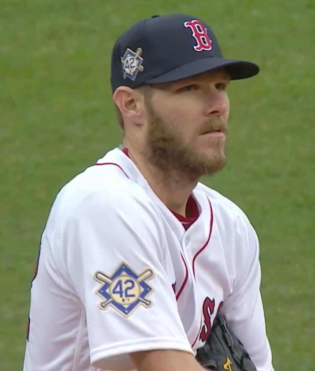
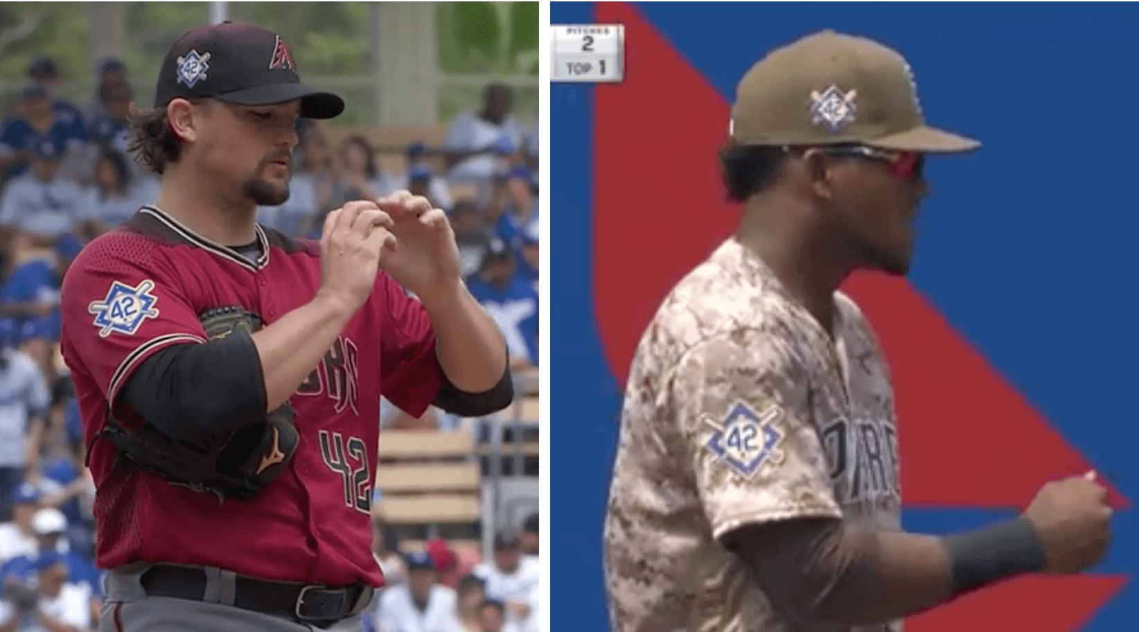
• The big difference this year is that, for the first time, a Jackie Day patch was added to all caps and jerseys:
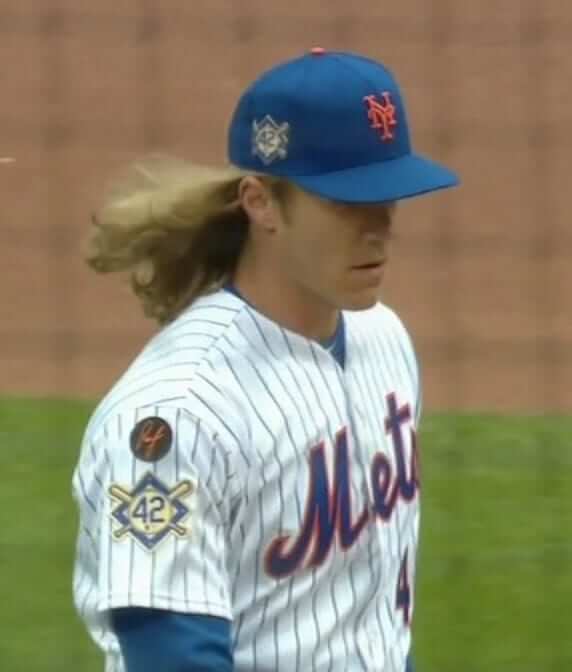
• Most teams with right-sleeve patches simply removed those patches and replaced them with the Jackie Day patch. But the Mets opted to keep their Rusty Staub memorial patch, which they moved upward to make room for the Jackie Day patch. It looked a bit awkward, like the Staub patch was added as an afterthought. If the plan all along had been to include both patches, the spacing would likely have been different:
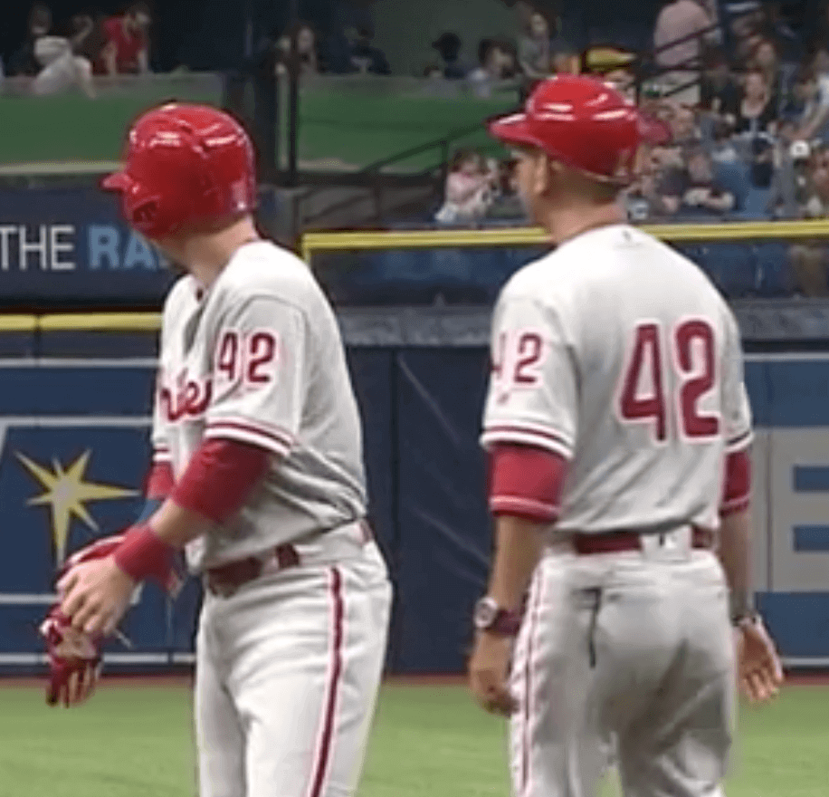
• As usual, the Phillies’ uniforms were the most fun, because they’re the only team that wears TV numbers:
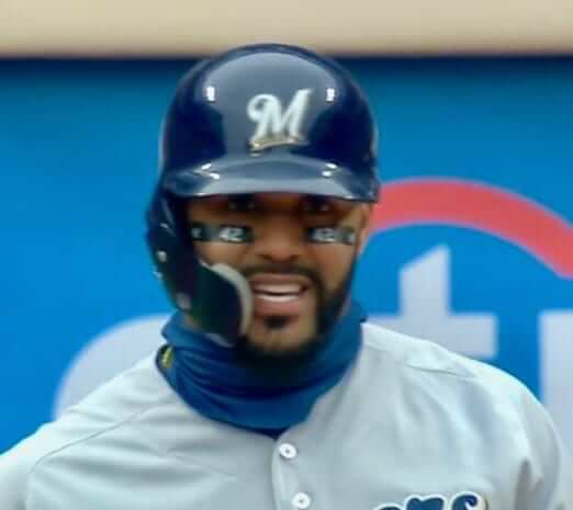
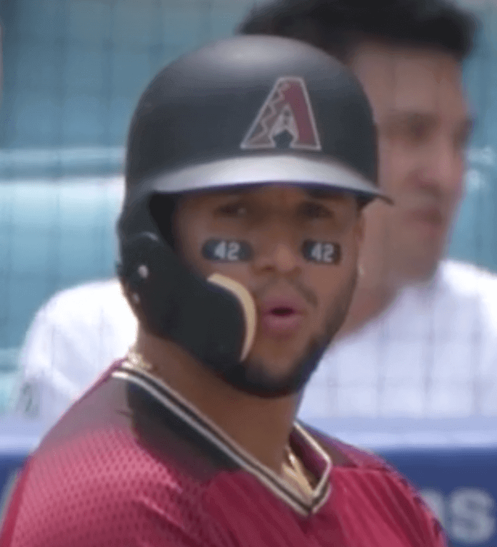
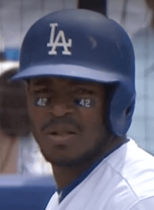
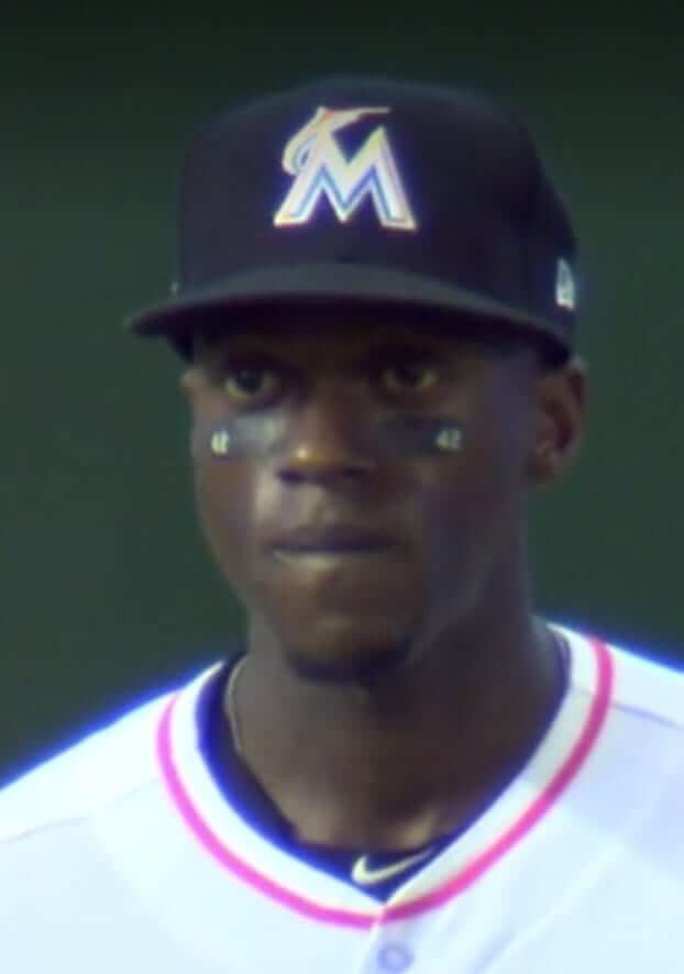
• Several players wore “42” eye-black stickers, including Brewers second baseman Jonathan Villar, Diamondbacks left fielder Davird Peralta, Dodgers right fielder Yasiel Puig, and Marlins left fielder Cameron Maybin:
• Almost all of yesterday’s games were white vs. grey. The only teams that deviated from that protocol were the Diamondbacks and Padres:
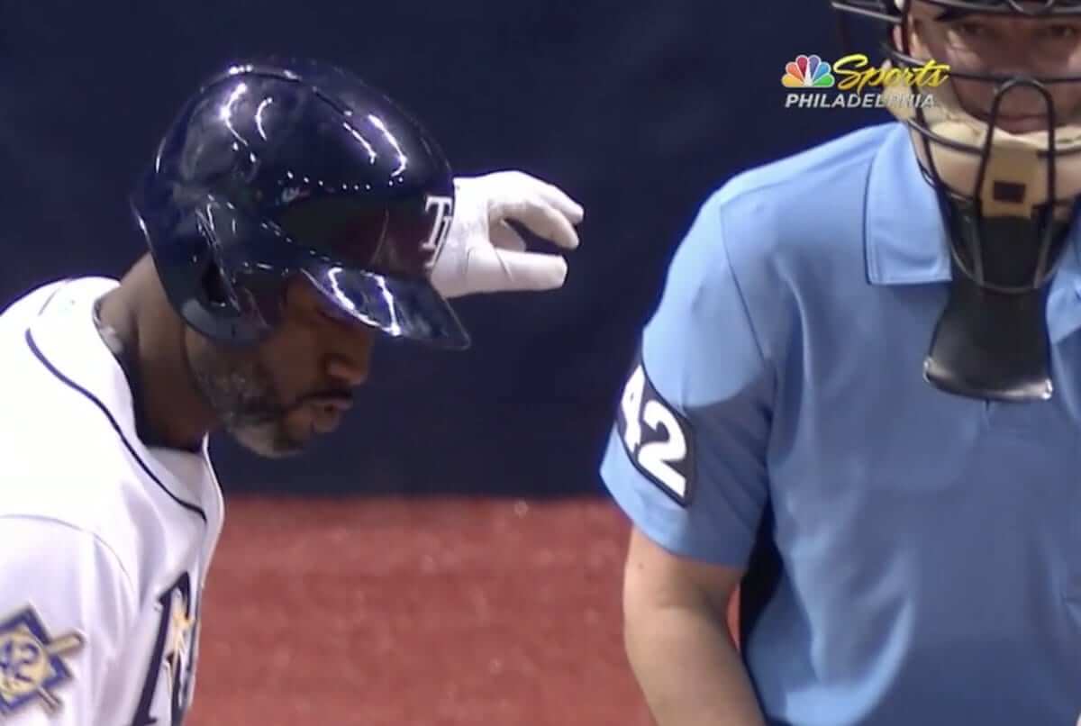
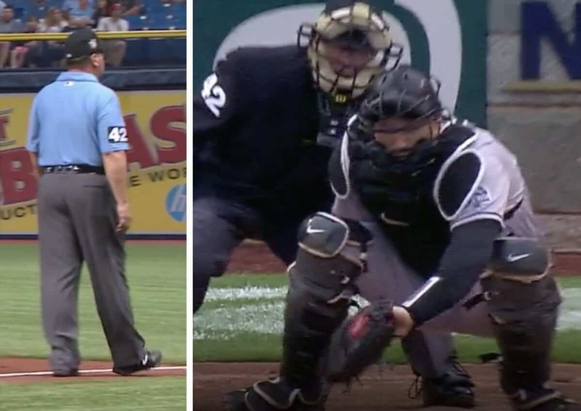
• The umpires wore No. 42 as well:
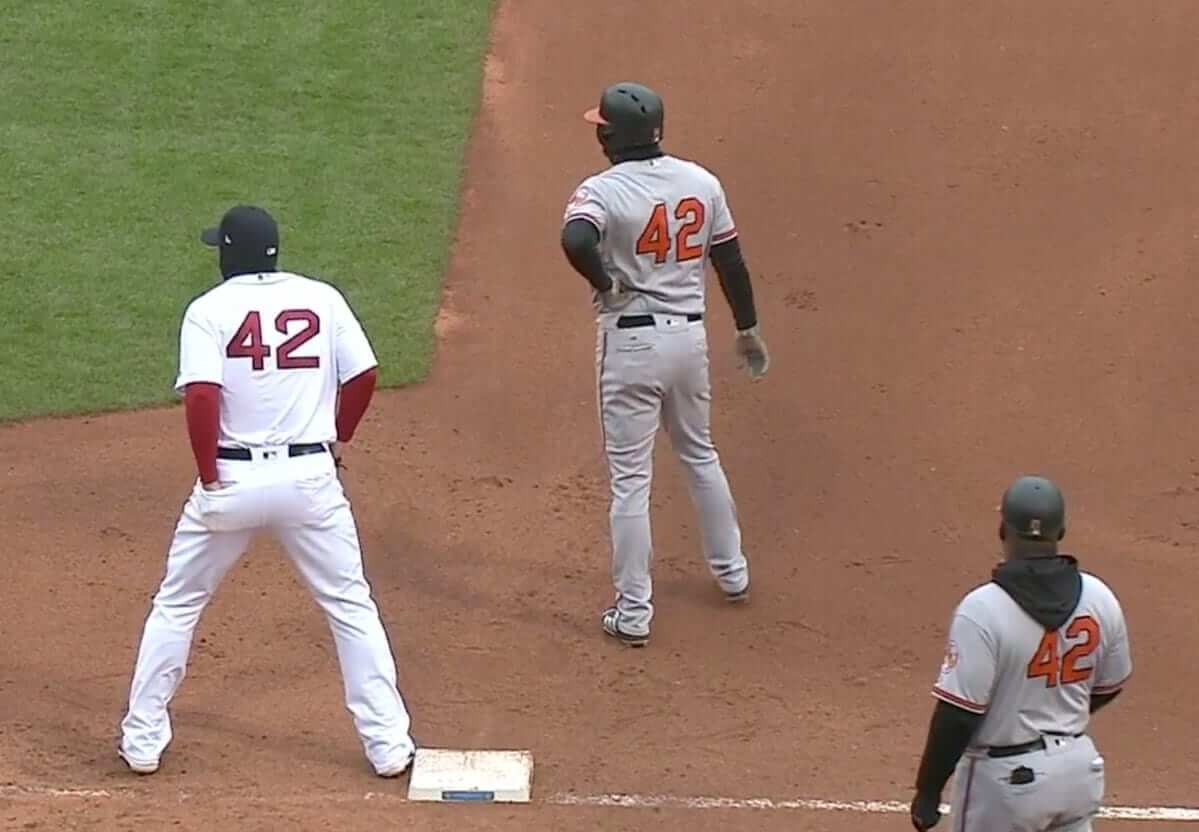
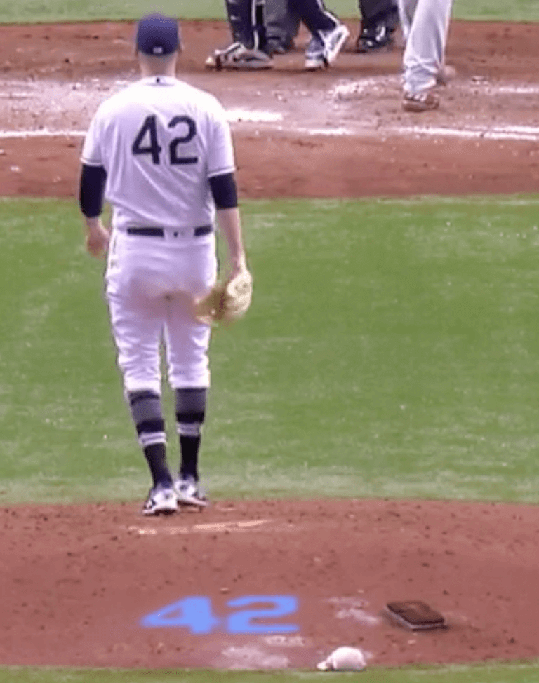
• The Rays added a 42 to the back of the mound, which seems like a bit much:
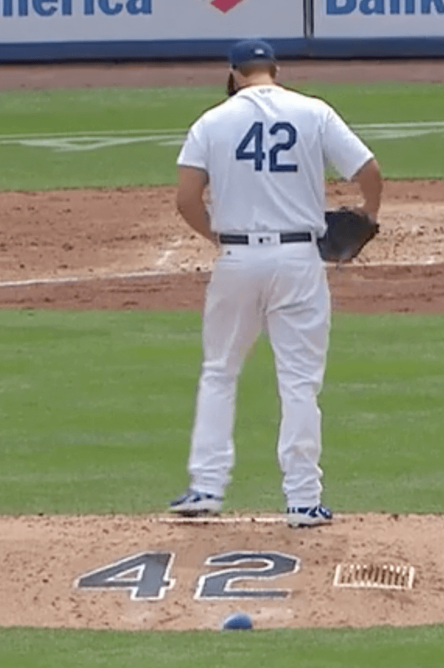
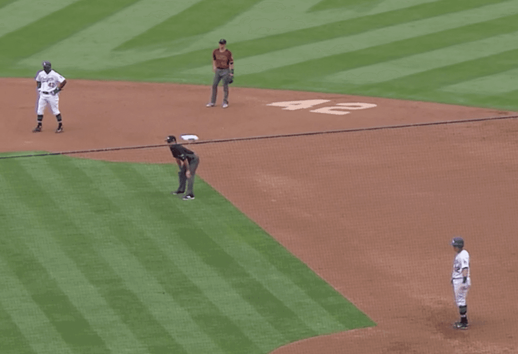
• The Dodgers went further, putting a 42 on the mound and another one at the back of the infield:
• Jackie Day extended beyond MLB, as minor league teams also wore No. 42. An exception was the Daytona Tortugas, who play in Jackie Robinson Stadium — so named because Daytona Beach was the first Florida city to allow Robinson to play during the 1946 spring training. Robinson was with the Montreal Royals at the time, and he wore No. 9 for them, so yesterday the Tortugas all wore No. 9:
Happy #JackieRobinsonDay. Today we celebrate Jackie breaking the color barrier hare in Daytona Beach, 72 years prior while wearing the number 9. Actual footage to be shown of Jackie’s hit on City Island in 1946. Tortugas to be only team in @MiLB to all wear the number 9. #Jackie9 pic.twitter.com/KDFmC3CUKA
— Daytona Tortugas (@daytonatortugas) April 15, 2018
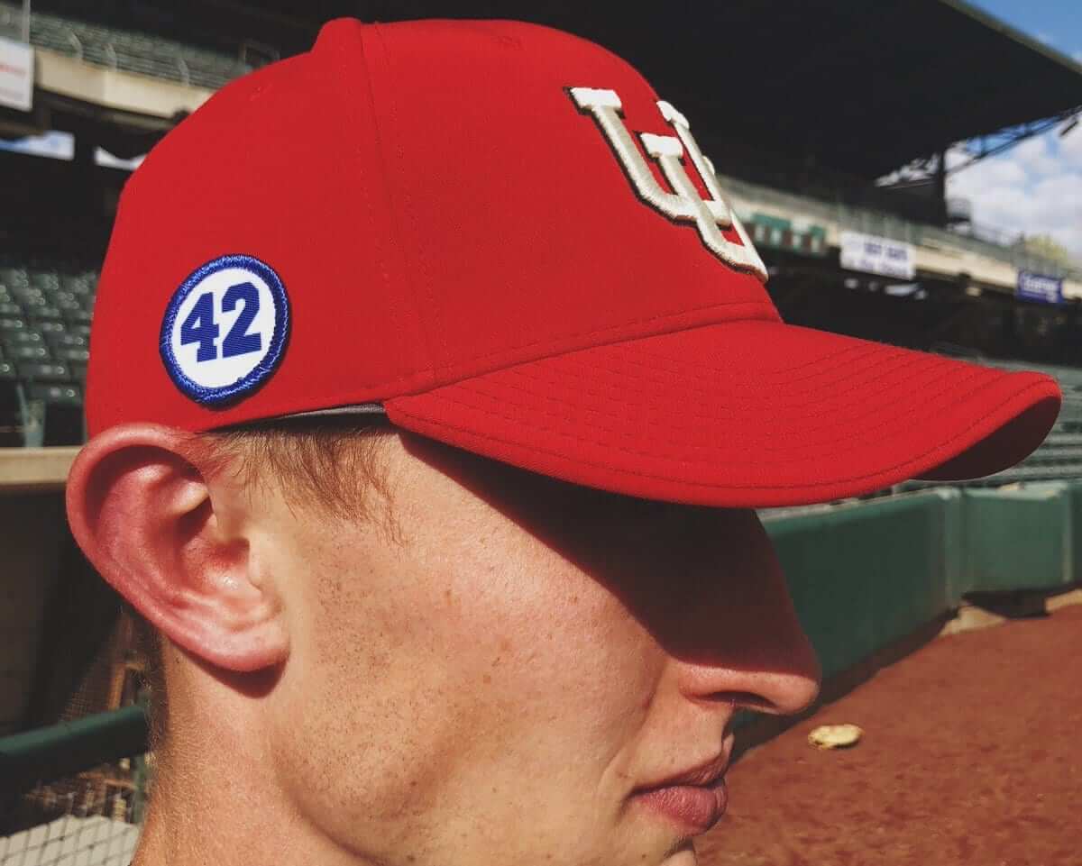
• At the college level, UCLA — Robinson’s alma mater — wore No. 42 caps, and Utah wore cap patches:
A closer look at the 4️⃣2️⃣ hats the Bruins are wearing in honor of #JackieRobinsonDay #Jackie42 pic.twitter.com/iwCGXKELki
— UCLA Baseball (@UCLABaseball) April 15, 2018
• Players also wore No. 42 at the high school level:
"One day we will all wear 42" @rtxbaseball honors the late late Jackie Ronbinson for giving all players the opportunity to play this great game. Thank you Mr. Robinson for showing the world this game is not about the color of your skin. #42 #JackieRobinsonDay @MLB @kid_cutting pic.twitter.com/9OXBN0A8Ej
— RHS Baseball (@rtxbaseball) April 14, 2018
Big Red Baseball beats Woodward 9-6 at the @redshsshowcase game at the @Reds Urban Youth Academy!
Today – we all wear #42!!! #42 #JackieRobinsonDay pic.twitter.com/GqH3Nv8swV— Hughes Big Red (@BIGREDATHLETICS) April 14, 2018
• The phenomenon has even spread to youth league baseball:
Today’s DH has been rained out.
Luckily we saw the upcoming weather and celebrated #42 on Friday. #JackieRobinsonDay pic.twitter.com/9L5SU3udsj
— HYBO 13u Blue (@HYBO13uBlue) April 15, 2018
9U #LoudounAces Blue, honoring #JackieRobinson tomorrow on #JackieRobinsonDay #42 @MLBNetwork #PlayBall pic.twitter.com/sjBjYL8EoX
— Caldwell Clarke (@FFCaldwell) April 14, 2018
• Speaking of youth leagues, I heard from reader Andre Torres, who told me about how his local youth baseball organization handled the occasion:
The Training Legends youth baseball organization in Cartersville, Ga., came up with the idea a year ago to have a Jackie Robinson-themed event for our teams. We thought it would be nice to honor his legacy in a manner similar to what goes on in MLB every year. With support from sponsors, we were able to put over 1,000 players in No. 42 jerseys for games on Saturday, April 14. We used different color shirts in order to tell the teams apart, which made for a very colorful day. The response from parents and players was great! Everyone was happy with the day, and of course the kids love any chance to dress like their big league heroes.
• Meanwhile, off the field, the MLB online shop was briefly selling Chief Wahoo caps with the Jackie Day logo, until some genius figured that maybe that wasn’t such a great idea. Cleveland’s game was rained out yesterday (one of several weather-related postponements), so it’s not clear whether the team planned to wear the Wahoo cap on the field. They did wear Wahoo caps for last year’s Jackie Day (and for many previous years), but the cap didn’t have the Jackie Day logo then.
(My thanks to Shannon Shark, @The_Maddin, and @DisMagicBands for their contributions.)
The hits just keep on coming: Last Friday I ran a little item about a Delaware radio station whose employees had a basketball team — with completely awesome uniforms — back in 1973. Now reader Rufo Donato, who provided that photo, has sent along a shot of how the team looked in 1972:
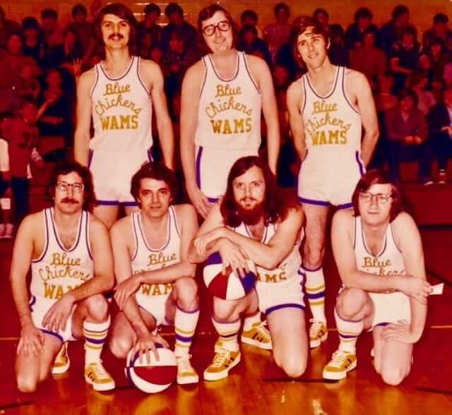
So much to like there! The guy who looks like a House of David refugee is a particularly nice tough, right? I really need to get my hands on one of those jerseys, stat.
As a bonus, here’s a shot of the station’s Corvair:
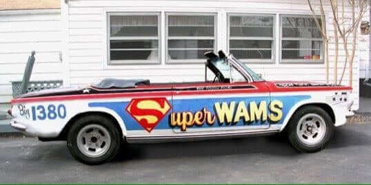
Click to enlarge
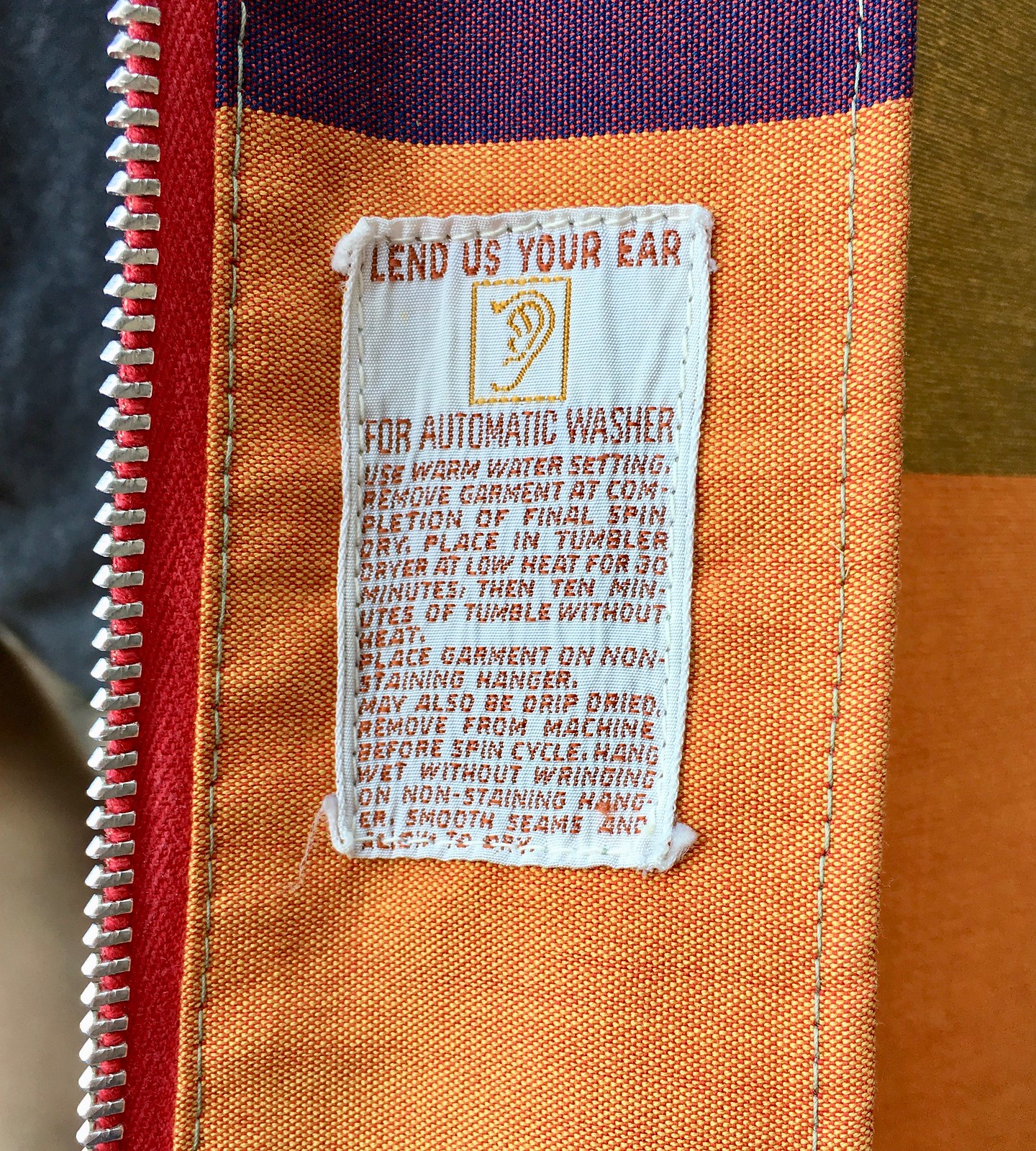
Best care label ever: We had really nice weather on Saturday, so I had a few people over in my backyard. Made some lamb chops and some St. Louis-style pork steaks (aka sliced pork shoulder; eat your heart out, Marty Hick!). But my favorite part of the day came when I was admiring my friend Matt’s jacket and noticed the care label on the inner placket.
“Lend us your ear” — with a little ear illustration! Is that great or what? Every care label should be like this.
Signal flare: If anyone out there works fairly high up in sports jersey retailing (buyer, store owner/manager, etc.), I’d like to speak with you. Confidentiality assured. Thanks.
The Ticker
By Jamie Rathjen

Baseball News: NC State wore pinstriped 1968 throwbacks Saturday. However, the originals appear to have had white hats, rather than red. … Georgia Tech and Pitt played a blue-vs.-blue game (from Brandon Boehman). … Phillies CF Odúbel Herrera was missing his 3-D helmet logo yesterday (from multiple readers). … Reds bat boys have been wearing logoless helmets all season so far (thanks, Alex). … Orioles balaclavas, which several players were wearing for yesterday’s game in Boston, have the team’s logo (from Andrew Cosentino). … Artist Joe Petruccio, who Paul has interviewed before, drew an MLB logo featuring Mr. Met (from Gordon Blau). … “Was visiting Charlotte’s Mint Museum of Art with my mother today and came across this really nice (and huge) painting, entitled Phillip The Fair by Kehinde Wiley,” says Dan Tarrant. … Some of the Reds’ Big Red Machine-era players once posed with a literal big red machine: a tractor (from Ray Hund). … Also from Ray: Brewers players being introduced at the team’s first Opening Day in Milwaukee in 1970. … Also-also from Ray: Pirates outfielder/1B Willie Stargell was known for warming up with a sledgehammer while waiting on deck. … New uniforms for the Japanese national softball team (from Jeremy Brahm).

NFL News: Back in the 1984 season, the Rams wore a “42” memorial decal for defensive back Kirk Collins, who had died of cancer earlier that year. … Speaking of the Rams, here’s a great shot of equipment manager Todd Hewitt drawing the Adidas stripes on Eric Dickerson’s non-Adidas shoes. … For some reason a Buffalo sports shop created a graphic showing former Bills RB Fred Jackson against a Yankee Stadium backdrop (from @TheBillKenney).

Hockey News: In last night’s Blue Jackets/Capitals playoff game, backup official Garrett Rank had to enter the game when linesman Steve Barton was injured. Rank is normally a referee, but he couldn’t wear his usual ref’s jersey while subbing as a linesman, so he wore an old CCM linesman’s jersey instead of a current Adidas model (from Charles Pannunzio). … Humboldt Broncos update from Wade Heidt: the Saskatchewan Junior Hockey League resumed its playoffs Saturday with the Broncos’ opponents, the Nipawin Hawks, advancing to the league final. For Game 1, the Hawks and the Estevan Bruins both wore ribbon patches, and the Hawks wore green helmets instead of black. Also, no photo, but SJHL officials wear NOBs instead of numbers, and all the officials wore “Broncos” NOBs. … Will Scheibler sent us some pictures of Loyola Marymount University’s hockey team, which operated in the 1930s and early 1940s (the first NCAA national championship was in 1948), as well as this poster of cartoon-ized NHL mascots.

Basketball News: The Knicks held training camp outdoors in Ellenville, N.Y., before the inaugural 1946-47 season of the BAA, one of the NBA’s predecessors. Here’s a closer look (from Ray Hund). … The NSWL’s Seattle Reign’s current Twitter avatar may look familiar to SuperSonics fans. … It’s a little hard to see, but the Coachella set by the Portland-based band Portugal. The Man included a bunch of backing vocalists wearing Trail Blazers jerseys (from Charles Garnsey). … San Diego State, a Nike-outfitted school, will wear the Jordan logo beginning this fall (from oh_swick). … Rockets G Gerald Green showed up at the arena last night wearing a Yao Ming throwback jersey.

Soccer News: This article highlights picturesque USL stadiums (from Josh Hinton). … The Scottish Cup semi-final participants got sleeve patches this weekend. … The latest MLS team to change at home were the New York Red Bulls. In fact, the Red Bulls haven’t worn their would-be first-choice kit at home yet this season, something Sporting KC did yesterday for the first time. … We don’t get to see players’ shinguards ever, basically, but here’s a rare glimpse of some D.C. United players’ elaborate custom ones. … Cross-listed from the basketball section: The NWSL’s Seattle Reign have been getting creative with logo concepts. Their current Twitter avatar may look familiar to SuperSonics fans. They also came up with another concept based on the 1974-83 NASL incarnation of the Seattle Sounders.

Grab Bag: This article from The Atlantic article argues that the development of women’s cycling pants parallels and symbolizes improved gender equality (from Jason Hillyer). … The U.S. women’s field hockey team played a four-game series against Chile in Lancaster, Pa. this week in which all the games looked identical, as both teams wear red and dark blue. Each team wore red twice and blue twice.
When did high schools start getting massive budgets for sports uniforms? I was in high school in the early 1990s, and we had all hand-me-downs that were at least 10 years old. Still rocked the short shorts at the dawn of the baggy shorts era. Home white, road black for basketball, reverses for football. For baseball, we wore black pullovers home or away (gray polyester pants, one purchase removed from flannels!). Varsity baseball was given white alternates, but we were only allowed to wear them if the temperature rose above 90. All NNOB in every sport, too. Now, these schools get multiple customized uniforms every year. Is this where my taxes are going?
I strongly suspect that funds for multiple uniforms are raised via booster clubs, parental donations, etc.
Richardson is an affluent Dallas suburb. Combine that with the overall high school sports culture in Texas and it’s not a big surprise they’d be able to pull this off.
A whopping ten teams didn’t get to participate in Jackie Robinson Day thanks to the crappy weather in the Midwest.
In addition to the Blue Jays-Indians matchup, games that were postponed were White Sox-Twins, Angels-Royals, Braves-Cubs, and two games for Yankees-Tigers. (Oddly enough, they cancelled Saturday’s game in Detroit in the morning and moved it to Sunday as a doubleheader in anticipation of the bad weather, but the weather ended up being just chilly on Saturday, so they probably could’ve gotten a game in.)
In the meantime, the link. So no “Boston” at home today, if they were still doing that.
Patriots Day game cancelled but the Boston Marathon still went ahead.
According to friends down there its just awful. Driving rain and gusting winds
link
The Braves and Cubs will be celebrating Jackie Robinson Day at their make-up game on May 14.
link
From that article, Wrigley Field is the only remaining MLB stadium Robinson played in.
The Cincy picture more likely shows the Big Red Machine posing with a small blue machine. First, that’s a small tractor, as tractors go. But more importantly, it’s almost certainly blue, not red. First, we can see from the shading that the color of the tractor is nothing like the red of the players’ helmets or the red elements of their jerseys or the pennant. But more to the point, it’s a Ford tractor. In 1963, Ford switched from a distinctive red and gray color scheme (red chassis, gray top) to its current signature bright blue. The tractor looks like a 3000 model, which was introduced in 1965 and never sold in the old red paint scheme. At the time of the switch and for a few years after, Ford dealers ran promotions offering free steam cleanings and repainting of older tractors to the new color scheme. By the 1970s, not many Ford tractors were left with the old color scheme.
What we really need is a photo of the Big Red Machine posing with an International Harvester tractor!
You beat me to it, Scott! Something, something, you can take the boy out of Iowa, but something, something…
The only thing I can add now are these Google image links to Ford and IH tractors, because who doesn’t love pictures of old tractors?
Ford:
link
International Harvester:
link
The Rays added a 42 to the back of the mound, which seems like a bit much
So the multiple “42s” a player wears among back jersey number, sleeve patch, cap patch and, in some cases, front jersey number (and in the Phillies’ case, TV numbers; BTW, what number did Jackie Robinson wear?), but the mound “42” seems too much? Since we’ve already gone way too far with this, why draw this arbitrary line at the mound?
After all, MLB has merchandise to hock, and, thus, they’ve now turned this into a money grab like all of the holiday garbage. link{wt-static_graphic}{pt-home}{al-B3_Spot}{ct-JACKIE_ROBINSON}
Where do the proceeds from these “42” merchandise sales go? Do all of the proceeds go to charity or is MLB still skimming some off the top? What about the authenticated stuff the teams will sell in their ballparks? Will those sales all go to charity or will the teams get their cut, too?
I’m sorry, this is nothing against Jackie Robinson. I get frustrated every holiday because all I want to do is watch my team. My team wears navy and orange, and yet I’m subjected to some form of powder blue, pink or olive green. This is about the pure, unadulterated greed of Major League Baseball. Hey, it’s the 28th of April, buy our April 28 jersey. But you want to watch your favorite team even though your local cable system doesn’t carry the team’s cable network? I’m sorry, we’re still blacking out the game. Put pressure on your local cable system to pick up the team’s network. So what if we’ll never get the younger audiences because they can’t watch games the way they want. We’re fine now being the No. 3 sport in this country.
Since we’ve already gone way too far with this, why draw this arbitrary line at the mound?
Because a uniform number is, you know, *part of a uniform.* Not part of the field. Seems like a simple enough concept.
It would have been better to say that the line, “which seems a bit much,” was deliberate self-parody, and leave it there. There is no defense of that statement as a serious bit of criticism that does not undermine the defense of the rest of the 42 flimflammery. “Part of the uniform, not part of the field” necessarily also condemns displaying the number 42 on outfield walls, by definition part of the field of play, which just about every team has been doing since long before wearing 42 on the day.
It’s the ratchet effect at work. Any honest tribute, if perpetuated on a routine basis, becomes an exercise in rote and therefore tacky gimmickry, and the display naturally escalates to the point of ridiculousness. As with flag displays, so too with 42 displays.
“Part of the uniform, not part of the field” necessarily also condemns displaying the number 42 on outfield walls
Incorrect, Scott. The 42s you refer to are not uniform numbers — they are *retired* numbers, and retired numbers are customarily put on the outfield walls (or in other similar positions). You’re mixing oranges and kumquats here.
I stand by my original position: 42s on the uniforms are great; 42s on the mound and infield are a bit much.
If you ask me (and no one did) the patch was the “bit too much”. Every man on the field wearing 42 and you need a 42 patch to add….? Clutter? That’s what it added: clutter. No contemplative rest for eye. My Scandinavian blood does NOT approve.
I guess with the shoulder patch, every team kinda had TV numbers yesterday.
Why do people even call sleeve numbers “TV numbers”?
I might be able to understand it in football, where television shows the line of scrimmage from the side and so sleeve numbers are more visible from television’s angle than any other angle, but it doesn’t make a lot of sense to call a uniform number in any other position
(In Japan, high schools often put their link. Should we call these things by the absurdity “TV cities”?)
Yes, the term comes from football. Shorthand for sleeve numbers.
Paul,
you mentioned that the broadcasters don’t like the tradition of all players wearing 42. Is this your speculation or have you heard this complaint? Any idea if they find the Phillies TV numbers helpful (on non-Jackie days)?
Broadcasters mention this all the time (usually good-naturedly). They say Jackie Day is challenging for them — and understandably so.
I’ve never heard any broadcaster comment on the Phillies’ TV numbers.
an abbreviation for a word or words should be shorter than the original.
SLEEVE NUMBERS has 3 syllables and explains what they are
TV NUMBERS has 4 syllables and doesnt
just sayin
KEEP UP THE GREAT WORK AND THANKS FOR UNIWATCH TODAY!
If I’m not mistaken, the reason why the Rams trainer was drawing Adidas stripes on Eric Dickerson’s shoes was that they were covered up with tape… thus hiding the Adidas stripes.
Bryce Harper from the Nationals wore “Jackie Robinson” Cleats. link
Proofreading: “The did wear Wahoo caps…”
missing ‘y’
Thanks. Fixed.
There comes a point when there are so many 42’s all over the place that it cheapens the concept. Not sure if MLB is there yet, but it’s getting close.
GREAT CALL!
Why dont we just chant ‘FORTY TWO” the entire day!
With the patches on the caps and uniforms MLB “is there” now. MLB is treating 42 like Nike treats swooshes.
If the point hasn’t been crossed before this year, it surely has now.
Just waiting for a team to have a dolphin do a double-backwards-somersault through a hoop whilst whistling the ‘Star Spangled Banner’
Back in 1997 when the number 42 was retired (which is to say, “banned”) by every team, I didn’t like it at all. There are far too many retired numbers to begin with; teams Robinson didn’t even play for were forced to “honor” a rival and lost autonomy.
But seeing it on every player’s back now almost makes it worth it. Not just the players; even the coaches and staffers, some of whom (like bullpen catchers) might never have the chance to wear a normal-looking number, got to be the same as everyone else (and indeed, the same as a great legend of the game from 70 years ago) for one day.
We also get to see teams that have put ugly names on their backs go back to their roots (Cubs, Dodgers), and we finally get to see a beautiful NNOB look from teams that have always, or almost always, had names, like the Diamondbacks. Look how much cleaner the pointed, shadowed numbers look on a Texas uniform now that the big clunky name is gone!
Some of these teams mis-position the number — look at Boston, who gets it right, versus Philadelphia who leaves too much space at the top; in the early years of this promotion there were bigger failures — but for the most part it looks really nice on every team. If I were moving to a new city (with a NOB team) and wanted to buy a jersey to wear when going to the games, I’d go for a Jackie Robinson Day jersey. Timeless and elegant.
Portugal. The Artichoke
Proofreading:
“because of” should just be “because” on the caption with the Phillies uniforms.
“whose employees had a basketball” is missing the word team.
Thanks for such a great site.
Got it. Thank you!
What are the odds that the tractor in the Reds picture is actually blue since it’s a Ford?
They could’ve painted it. Though a quick search for “Cincinnati Reds Ford Tractor” only came up with another black-and-white picture of that scene (this time from Getty) and a bunch of unrelated photos.
So, I haven’t seen evidence one way or the other.
(Inadvertently submitted my above comment before finishing my thought, due to an interruption.)
I know many of you like to bash Chief Wahoo but it’s important to remember it was then Indians owner Bill Veeck who signed Larry Doby, the first African-American in the American League. I point this out becomes Doby, being the 2nd player to break the color line is often forgotten when the reality is he faced the same challenges Jackie Robinson did.
By the way, Veeck also got rid of 3 Indians players who refused to shake Doby’s hand & signed Satchel Paige the next year. Less than 30 years later Frank Robinson became the first African American manager when he was hired by Cleveland. Bash Wahoo all you want, but the Indians organization has been at the forefront of making the game inclusive.
MLB is using all the gate proceeds & merch sales from Jackie Robinson day to benefit African American baseball organizations aren’t they?
Please take that into account when
I was expecting Paul to take the Padres to task (correctly) for conflating Jackie Robinson Day with yet another Military Appreciation Day. They have so many of them, you would think they could just let JR Day have the occasion to itself.
It’s their standard Sunday uniform. I wish they hadn’t worn it yesterday, but whaddaya gonna do. On the other hand, Jackie served in the U.S. Army, so there’s that. I don’t know if the Padres mentioned that as part of yesterday’s festivities, but it would be nice if they did.
I think some of us can agree with Paul that it shouldn’t be their Sunday uniform at all. Aside from the debate about military pandering, wearing a camo pattern rather defies the concept of “Sunday best”, don’t ya think?
That pic of Al Lang Stadium in that USL link is so beautiful!
Did I miss it? Paul, you didn’t mention the “42” baseball socks. I was watching the Phillies Rays game and was wondering why the Phillies players weren’t wearing red socks. Then in a closeup I notices the 42 logo on the socks. Don’t have a picture, but they were black and gray (ugh) with two stripes and the logo as I recall.
At least they could have made them Brooklyn Dodger blue.
That picture of Pops Stargell warming up with a sledgehammer made Monday much better.
link Of course, team officials deny it was anything official.
What’s uni-notable is that it’s a picture of Sid in the original Reebok Edge uniform… and while I wouldn’t go so far as to take a leak on that jersey, it is, in my opinion, the worst the Pens have ever had.
I disagree. By far the worst Penguins jersey is one they wore at Chicago for an outdoor game a few years ago. It looked like a Bruins knockoff, bland and boring.
Ehh, I rank that second worst. At least it had some stripes on it, and the chrome effect livened up the otherwise dull Vegas gold logo. I really dislike the blobby patches on the Reebok template that Pittsburgh shared with Ottawa and Tampa Bay (which were derived from the original Edge 2007 All-Star uniforms with some template modifications).
Really, the only good Vegas gold Pens unis were the originals from 2000-07, with the diagonal stripes that featured a metallic sheen to the gold. Even if it did have the robopenguin on the shoulders.
They should go back to those original powder blues, permanently.
Nothing to do with Jackie Robinson Day, but check out this link.
Some highlights:
We get to see Babe Ruth take batting practice with his famous number 3: the Yankees used the McAuliffe font for their jersey numbers at that time, and didn’t have any logo at all on the fronts of their jerseys that year. The catcher handling the BP doesn’t seem to have a number. Field coaches got numbers in that era; how about staffers?
And the Red Sox are wearing their gray pinstriped road cap with the red sock on it. I think 1931 was the year the Red Sox got numbers, which means this is the first game they ever played with numbers on their backs.
It’s a 14-minute video with sound! Go watch it!
Absolutely love the McAuliffe font… and wish the Yanks would return to it.. home and road! I use the McAuliffe font for the uniforms of the HS team I coach.. Interesting story on the process to make that happen… maybe something to share with Paul!
Long story short, I had to send all 10 numerals to the company I used for our unis and have them custom-create the look.. Expensive, but WELL worth it!
That would definitely be a story worth sharing, Coach!
I tweeted pictures of our road unis to the Red Sox…as well as Paul and Phil…We use the old Red Sox stirrups as well. Looks sharp with the road greys/McAuliffe numerals.. Very positive feedback.. I just redesigned our home unis as well.. Fortunately ‘my guy’ at the local sporting goods store enjoys my eccentricities!
“speaking uni” is definitely its own language!
I have a whole entry devoted to this entry. Been in the hopper for a week. Waiting to find time for it!
Every time I see those old time wind ups and swings, I wonder about the speeds of the pitches and swings relative to today. Both Ruth and Gehrig look so relaxed swinging.
this was supposed to be in response to Mark’s posting of the Yankee Opening Day video.
Quick question for Canadian Uni Watchers:
When I go to link, and scroll to the bottom of the playoff bracket, the page shows the logos of the various US national broadcast networks. Since the website can detect that I’m viewing the page from the States, I’m wondering: do you get the same result in Canada, showing the American networks, or does it change at all?
Thanks!
Hey Rob,
It shows the Canadian networks. 4 logos. Hockey Night in Canada, Sportsnet, Sportsnet 1 and Sportsnet 360.
Thanks! Forgot to check this later in the day yesterday.
FYI: the Red Bulls have worn their first choice shirts at home three times this year — they’ve just all been in CONCACAF Champions League play (twice in the mono-white, and once in the first-choice kit: white/red/white).
PANAMA
A MAN
A PLAN
A CANAL
Someone on FC Dallas was wearing a concacaf champions league patch on their jersey during this weekend’s game against the New England Revolution. FC Dallas was eliminated from that competition back in February.
Mmmm…. pork steaks….
Curious how you cook yours. Just thrown ’em on the grill, or anything else extra?
I *never* buy bbq sauce — but I did this time, because that’s the St. Looey way. Painted it on the pork steaks as they cooked.
Jags teasing their new helmet on twitter. Seems it will be monotone. But then we all could have assumed that.