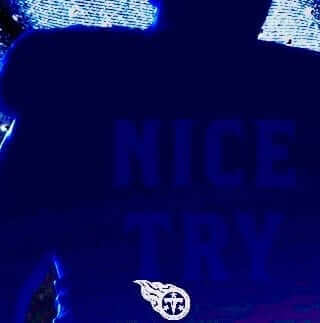
As you may recall, a few weeks ago it was discovered that someone from the Titans had put a hidden “Nice Try” message in one of the teaser images for the team’s then-upcoming uniform unveiling. The hidden message was intended for uni-obsessed fans who sometimes use Photoshop to play with the levels of teaser images, hoping to find hidden uniform details — a clever little inside joke.
I wrote about the hidden message the day after it was discovered, saying that I thought it was awesome. Later that day I received an email from a Titans employee named Bryan Rumfola, who thanked me for the positive coverage and said he was the guy who’d embedded the hidden message.
I asked Bryan if I could interview him. He said sure, but it would have to wait until after the team’s unveiling. Now that that’s out of the way, he and I had a fun chat the other day. Here’s how it went:
Uni Watch: First, tell me a bit about yourself. How old are you, how long have you worked for the Titans, and what is your job with the team?

Bryan Rumfola [shown at left]: I’m 38. I was previously with the Memphis Grizzlies for five years. I started with the Titans in October of last year. I’m the graphic design manager for the team, so I’m in charge of creative for the organization.
UW: Are you particularly into uniforms? Would you describe yourself as a “uniform guy”?
BR: Yeah, that’s definitely one of the best things about working in sports — getting to be involved with the uniforms and logos, kind of geek out on the designs and all that.
UW: Okay, let’s talk about the “Nice Try” message. First, was that teaser image of a player cloaked in shadows already going to appear on the website anyway, before anyone got the idea of adding the “Nice Try” message to it?
BR: Yes. That’s actually [Titans offensive lineman] Taylor Lewan. He was the first person we photographed in the new uniform.
UW: So that isn’t just a generic football player — it’s an actual Titans player, wearing the actual new uniform.
BR: Yes. We intentionally shot him with that kind of rim lighting, to be sort of mysterious about it. That was the plan — to use that for some of our tease creative. And then I was talking to someone in our marketing department, and he mentioned that the Lions had done a similar thing last year, and then people took the graphic and blew out the levels and were able to see the details. Our owner, Amy [Adams Strunk], had been adamant that no images would get out through us, so I decided, “I’m not gonna be the guy who leaks this,” and I didn’t want us to end up like the Lions, so I went in and painted out all the details to keep that from happening.
And then kind of as a last-minute thing, before I sent it to our web guys for them to post, I thought, “Hmmm, I wonder if there’s any way to hide a message in there” — just messin’ with people if they do try to get in there with the file. So I did that, and they posted it, and then I kinda forgot about it until people found it!
UW: Before your colleague mentioned the Lions situation to you, did you already know that fans sometimes try to play with the image settings in order to learn more things about a teaser photo? Because the Lions aren’t the only team it’s happened to.
BR: Yeah. Honestly, I’ve done it myself. I probably shouldn’t tell you that! But I was so new to the team and was just trying to get my feet under me. I was busy just getting the photo shoot taken care of, so I hadn’t even thought about how uniform fans sometimes do that. And then when our marketing guy mentioned it, it was like, “Oh yeah, that does happen, people do that. I’ve done that.” So then I was like, “Nope — not gonna let that happen to me.”
UW: So you painted out the details…
BR: Yeah, I used a real soft-edged brush.
UW: And then you decided to add the hidden message..?
BR: Yeah. Then I took the color I’d been using [when painting out the background] and made it just a couple of shades lighter. Just barely lighter. Then I typed it in and started playing with the levels on my machine to make sure it would work. I did it on a laptop, too, in case there was some weird screen-difference thing. And it was like, “Yup, this works! I’ll send it out, see what happens.” I didn’t know if anyone would find it, and I didn’t really tell anybody that I did it.
UW: So you didn’t tell your boss, or get it approved by anyone?
BR: I probably should have. But I didn’t.
UW: Did you consider any other messages before you settled on “Nice Try”?
BR: Oh, yeah. I was trying to figure out a way to say, “Do you look for your Christmas presents, too?,” or something like that. We had originally planned to do multiple images, but we had scheduling problems getting all the players in. My original plan was to do more teases like that, and I was going to change up the message in each one, but the timing didn’t work out. So if I was only going to do one, “Nice Try” seemed like a safe one.
UW: Did you think there was a good chance that people would actually find the message, or did you think it would probably remain, like, your little secret?
BR: I thought there was a chance, but for some reason I didn’t think it would be found. So it was like, “Yeah, I’ll put it in there, and I’ll know it’s there, and maybe I’ll tell a few friends of mine down the line.” But I definitely didn’t think it would blow up like it did.
UW: What was the timeline on this, from when you did the photo shoot, to when the teaser image was posted on the team’s website, to when the hidden message was found?
BR: The photo shoot was in February, the image was posted on March 8th. And then the message was discovered on March 20th.
UW: By that time, had you forgotten about it?
BR: I had! And here’s the thing: We have some digital billboards here in town that used the same image. And after I sent them out, I had this moment of panic: “Oh no, what if the billboards’ LED light does something slightly different to the image and the message is visible on all the billboards!” But that didn’t happen. Once I saw one of the billboards and realized I was safe, I kinda moved on to the next thing and forgot about it.
UW: How did you learn that the message had been discovered?
BR: A friend of mine texted me and said, “Did you do this?” It was a link to the Titans Uni Tracker tweet where they found the message, and at first I was like, “Oh, no — what did I do wrong?” I thought maybe I’d somehow been responsible for a leak. Then I clicked on the link, and it was, “Oh, they found it!”
UW: You said before that you hadn’t told anyone about this. But once it was out, were your colleagues and boss okay with it?
BR: Thankfully, everyone thought it was a fun way to play with the fans, to add a little bit of mystery and intrigue to the whole thing. For the first few days, I got several emails a day from different people in the organization: “Did you really do this? Was this you? Was this a real thing?” So that was kinda fun. And also a big nerve-wracking at first, because I thought I was going to get in trouble, but thankfully everyone understood the intention, and it all went over really well.
UW: So you’re pleased with how it all played out?
BR: I’m shocked, actually, that it went so well. I wasn’t even sure anyone would see it. So now, to see places like your website writing about it, that’s crazy — I can’t believe how it turned out. And then I ran into some guys from the league during our unveil, and it came up during conversation, and they said, “That was you? We loved that!” So that’s all great, except now I don’t know how I’m going to follow it up.
UW: It seems pretty likely that some other team will copycat this idea. Would that piss you off, or would you be happy to see that your idea has caught on elsewhere?
BR: Honestly, it was such a little, throwaway idea — there’s no way I’d be upset about it. It would be a huge compliment if I saw anyone else doing it. It’s very flattering that everyone has enjoyed it so much — I’m very grateful for that.
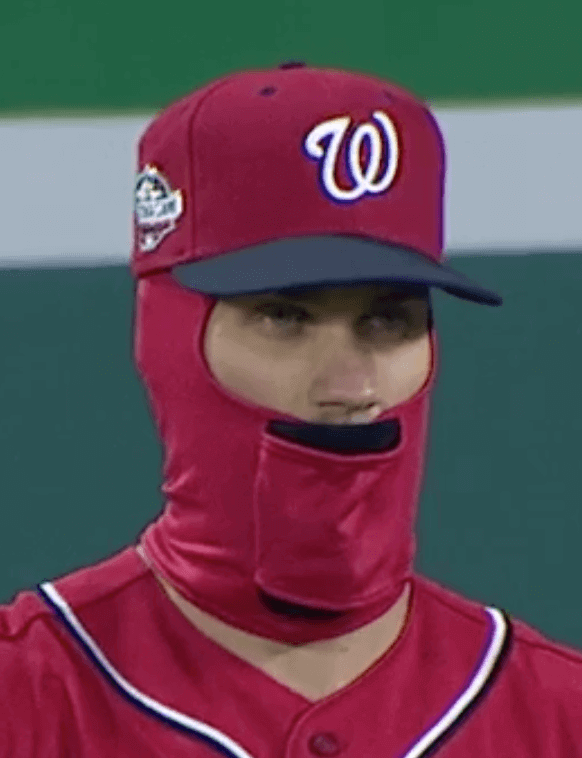
DC intrigue: There were two headwear oddities in last night’s Mets/Nationals game in DC. First, the Nats were wearing their alternate cap, which has a red crown with navy eyelets (click to enlarge):
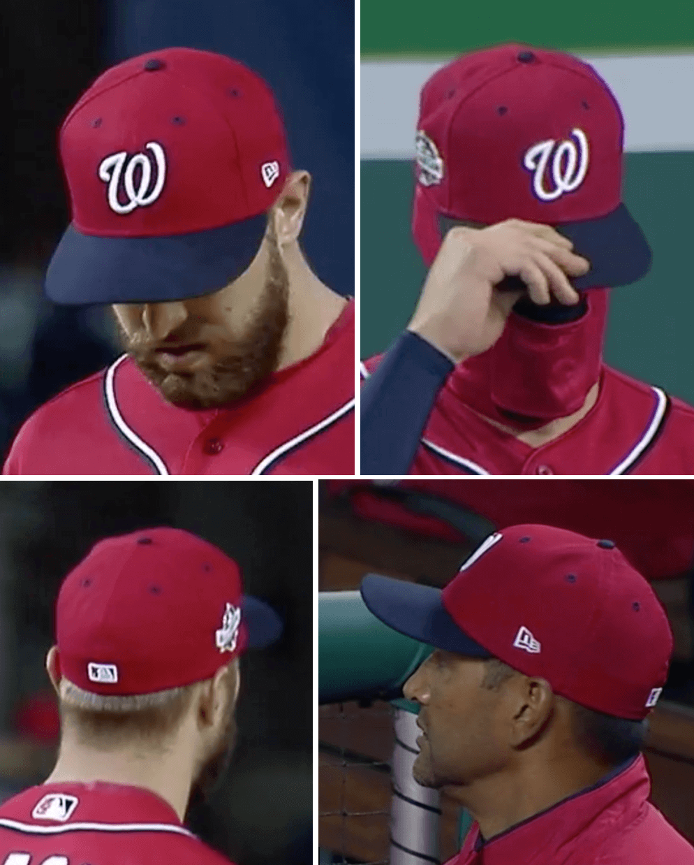
But eagle-eyed reader Cliff Corcoran, in one of the all-time great uni-watching spots, noticed that Nats starter Tanner Roark’s cap had red eyelets:
In case you’re wondering: Roark had started only one other game this season, and in that game the Nats wore a cap that doesn’t have contrasting eyelets to begin with.
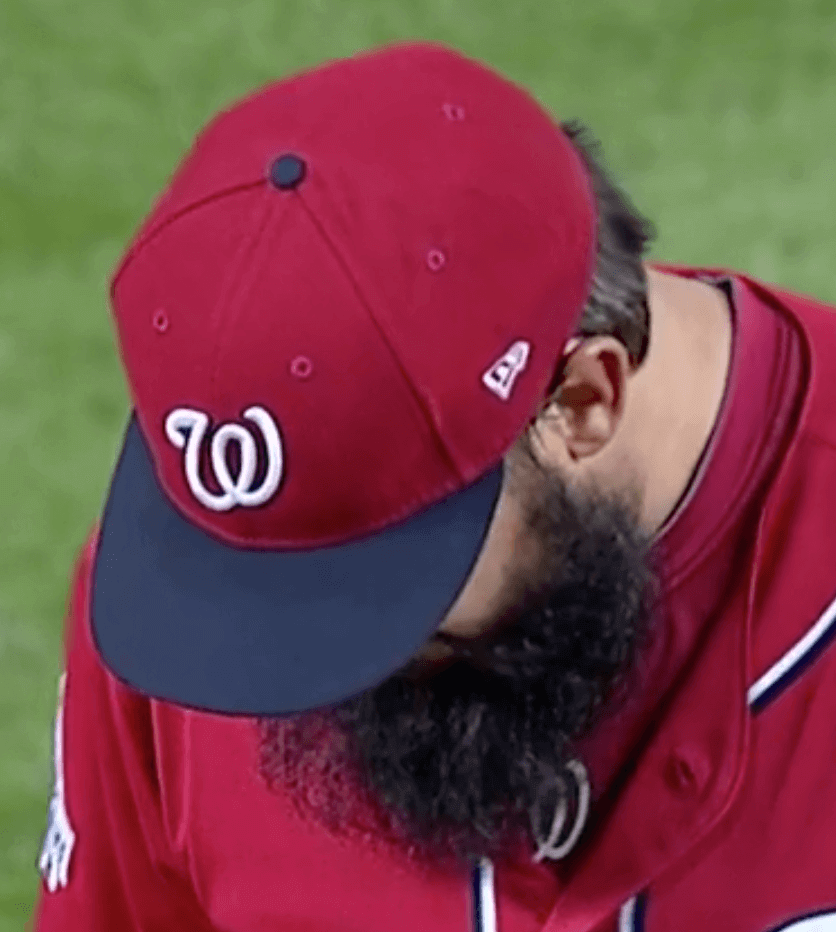
Meanwhile: At least two Nats players — outfielder Bryce Harper and infielder Trea Turner — were wearing an odd balaclava that appeared to have a vertical cylinder of fabric sewn into the front:
It almost looks like you could slide a flagpole in there or something. Not sure what that’s for. Maybe it’s a handle so the player can easily remove or adjust the balaclava? Looks really weird, at least to me.
NBA Uni Tracking
By Collin Wright (who’s back from his honeymoon!)
Over the past several weeks, the season-long percentages for each of the three types of uniform matchups have continued to move toward balancing out. Here’s our latest chart:
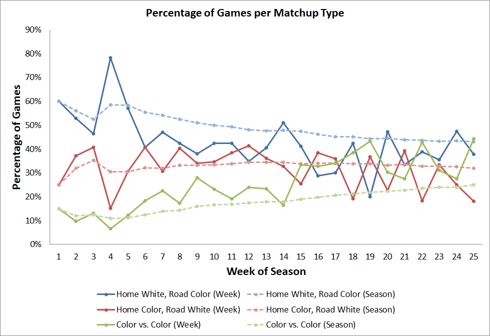
Over the past week, games with the home team in dark and road team in white were few and far between. Only 18% of all games featured such a pairing, the second-lowest percentage for any single week this season.
Since my last update, several games have seen pairings or uniform combinations happen for the first time this season:
• The Thunder wore their grey uniform with white tights for the first time on March 16.
• We had our first grey-vs.-orange game when the Spurs hosted the Jazz on March 23.
• Cavs players wore both red and blue tights on March 21.
• The Kings wore their purple uniform with white tights and white socks for the first time on March 25.
• On that same date, the Thunder wore their navy uniform with white tights and navy socks for the first time.
• The Clippers and Suns provided the season’s first blue-vs.-purple game on March 28.
• And the Raptors wore their white uniform with red tights and black socks for the first time on April 5.
The regular season will wrap up this week, so I’ll have one more report, including final totals and for each of our three matchup types, a full 82-game image for displaying the uniforms worn by every team in each game, and the pie graphs that I’ve been working on throughout the year.
Classy bunch: The Indians’ home opener was on Friday, and as usual it drew a contingent of Native American protesters who called upon the team to change its name and eliminate Chief Wahoo (the latter of which will happen next season, of course, at least from team’s uniforms). A Cleveland.com videographer captured a bunch of fans’ responses to the protesters, and let’s just say they didn’t exactly cover themselves in glory.
I can’t decide if my favorite part is the guy who calls the protesters “Marxist assholes” and “Trotskyite motherfuckers” (kneejerk red-baiting as an all-purpose default — an oldie but a goodie) or the guy who tells the protesters to “get a fucking job” — as he’s walking into a ballpark on a weekday afternoon.
But hey, at least it wasn’t as bad as Opening Day four years ago.
(My thanks to Phil for bringing this video to my attention.)

Click to enlarge
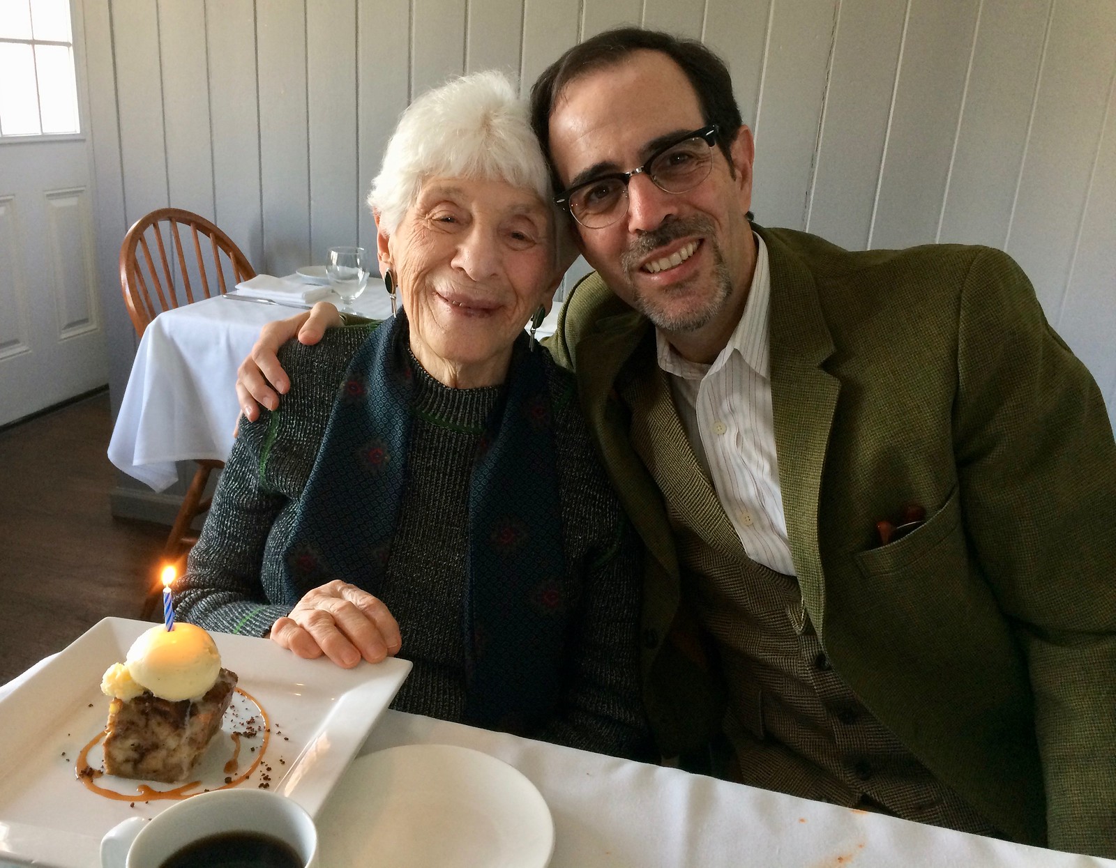
Family affair: Today is my mom’s 94th (!) birthday, so my brother Roy, the Tugboat Captain, and I took her out for lunch yesterday at her favorite restaurant. A very nice day.
I feel like I say this every year, but she shows no real sign of physical or mental decline. Will she make it to 100? Seems very possible, maybe even probable. Pretty amazing.
The Ticker
By Jamie Rathjen

Baseball News: Reds CF Billy Hamilton was missing the 3-D logo on his helmet Saturday (from multiple readers). … New black jerseys for the University of Houston, which, for good measure, have black numbers and say “Coogs” (also from multiple readers). … Japanese Pacific League team Saitama Seibu Lions revealed the jerseys they’ll wear during the team’s festival in the summer. … A 1967 season preview claimed such changes as interleague play, divisions, expansion, and nighttime All-Star and World Series games were imminent (from Ray Hund). The book also proposed four five-team divisions based on how the leagues existed then. … Douglas Ford sent us a vintage 1973 Vanderbilt program cover. … White Sox OF Nicky Delmonico played catch with a fan in the stands who was wearing a Nicky Delmonico jersey (from Paul Friedmann). … The perfect confluence of circumstances: Gerrit Cole plays for the Astros and wears No. 45, which has led to this excellent T-shirt design (from Nick Lineback). … The U. of Arizona wears merit decals on their batting helmets (from John Furstenthal).

NFL News: Peter King’s latest column includes the following: “[W]hat’s up with ‘uniform launch parties’ or ‘uniform unveilings?’ I see the Jaguars are having one April 19, on the heels of Tennessee drawing 20,000 for theirs last week. I don’t get unveiling uniforms being a news event. How did we get to this point? You know, it’s okay to not have everything be a big event. It’s okay for teams to say, ‘We’ve got nothing going on this week. Go cover something else.’ And it’s okay for media to say, We’ll run a photo of your next uniform on our site. That’s enough.’ And be done with it” (from David Cline).

Hockey News: The NHL is having teams wear a new playoff helmet decal this year (from Jerry Wolper). … Predators winger Filip Forsberg scored a hat trick on Saturday, when the team had a visor giveaway, so you can guess what happened next (thanks, Alex). … Several readers noticed that Sabres winger Alex Nylander, who was briefly called up from the AHL’s Rochester Americans this week, wore a jersey that still had the NHL centennial patch. … The Oilers replaced their logo on the Rogers Place scoreboard with the Humboldt Broncos’ logo. … Other tributes: The Swift Current Broncos (WHL) wore a helmet decal. Besides sharing a name, the WHL Broncos suffered a similar bus accident in 1987 in which four players were killed, and for which the team wears a permanent clover-shaped memorial patch. The WHL Broncos’ social media avatar is currently said patch, while the Jets and Flames changed their logo avatars to Humboldt colors.

Basketball News: From the “how can we possibly make people talk about plain black and white uniforms?” department: Both the practice and game uniforms at the Jordan Brand Classic high school all-star game had sideways numbers (from multiple readers).

Soccer News: Among the teams to wear black armbands for former England captain Ray Wilkins, who passed away last week, were eight Premier League teams, Scottish team Rangers, and the English Championship’s Queens Park Rangers and Millwall. Wilkins was a well-traveled midfielder, playing in England, Scotland, France, and Italy. … More Premier League: Stoke City replaced their sleeve advertisement with a charity patch this week. … Southampton center-back Jack Stephens nearly had part of his shirt torn off, leaving it flapping in his wake (from Josh Hinton). … Also from Josh: Atlanta United became the latest MLS team to change at home. … Also-also from Josh: Here’s a roundup of all the stadiums to host the World Cup this summer. … Italian team Udinese wore 11 different shirts based on those from past seasons yesterday, though they were all solid black on the back (from multiple readers). Here’s some of them, which were auctioned off for the benefit of 11 fans with a dream or project they want to fulfill. … The balls used in the U.S./Mexico women’s friendlies this week are apparently individually numbered. … On Saturday, Bayern Munich clinched a sixth consecutive Bundesliga and celebrated with a replica of the league’s trophy, die Meisterschale. Bayern are to receive the actual trophy at their last home game of the season. … Dutch team Ajax are to rename their stadium after club legend Johan Cruyff, with a logo forthcoming April 25.

Grab Bag: Masters champion Patrick Reed, along with all of the other Nike-outfitted golfers yesterday, was told by Nike not to wear red (from several readers). … We’ve received several questions as to what these pins are on players at the Masters. They’re to distinguish players from non-players (picture from Matt Lally). … Also at the Masters, reader Jeff Cook counted as of Saturday no less than 12 swooshes on Rory McIlroy, though they’re not all visible at once. … The cycling race Paris-Roubaix is known, even if it’s sunny as it was yesterday, for its gloriously muddy conditions. Parts of the race are run on cobbled segments which may look more like dirt roads. … Most of the teams at the Commonwealth Games field hockey tournaments appear to be wearing white or yellow when the designated home team, if possible; in fact, all of host Australia’s matchups so far, bar one, on both the men’s and women’s sides have have been yellow vs. white. … Cool design thing: Washington Metro escalators now have colored railings indicating which lines stop at the platform to which the escalator takes you (from @OlegKvasha).
A very happy birthday to your Mom Paul. Amazing life she must have lived with all the things she has witnessed in her 94 years.
I second that. A very Happy Birthday to your mom!
That holder on the balaclava is to insert a hand warmer style heat pack. I’ve seen them where the holder is on or near the ears.
I was thinking it was some sort of buffer for breathing. I know sometimes these balaclavas can direct your breath up into your eyes, or at least the humidity from your breath can make the material wet and cold right by your mouth.
By having the material looser around the mouth, you eliminate a lot of that.
I would never have thought you would put a hot pack in there, up against your face like that. Seems odd.
Happy Birthday to your mom, Paul! Let’s all hope she makes it to 100 as well as she appears to be!
The season preview got it right about the AL East, though the transfer of Detroit would be necessary with the addition of the Kansas City Royals and Seattle Pilots. Still can’t figure out why Atlanta and Cincinnati had to go west.
Gerrit Cole T-shirt design is not bad. How about another one inspired by a certain malt liquor?
The Mets wanted the Cubs and Cardinals in the East-better draws than the Braves and Reds. The Mets were concerned about lower overall attendance due to fewer Dodgers and Giants games.
Had there been no such switch the Mets might have faced the Cubs in the first NLCS. Honestly I don’t think the Mets expected the Miracle of 69 when the division setup was being discussed.
That proposed division re-alignment looked interesting and sensical. No one wonder it was never implemented.
I always thought the NL alignment (prior to 1994) was completely nonsensical. You had an even distribution of teams in the east time zone, and non-east time zone teams. As I understand it St Louis and Chicago were in there because they wanted to stay with the east coast teams and also they were worried about the strength of each division based on which teams were good at that time they split to east and west.
By comparison, the AL proposal was pretty much spot on, and the only difference in real life was that the Tigers ended up in the East due to the expansion Royals and Pilots, which still made sense when the latter became the Brewers.
I always wondered, though, why it was Milwaukee moved to the East when the Senators became the Rangers, rather than the White Sox.
Amazingly, with respect to Atlanta, Los Angeles and San Francisco, the nonsensical pre-1994 NL alignment matched the NFL from 1967-1994 with all three teams in the NFL Coastal (1967-69) and the NFC West (1970-94).
Should have asked why the new titan’s uniforms look so terrible…..
“…and I didn’t want us to end up like the Lions…”
Truer words have never been spoken. No one wants to end up like the Lions!
A very Happy Birthday to your lovely mom, Paul.
Not surprising Peter King doesn’t “Get It” because Peter King is an elitist dolt. But I’m glad you posted that paragraph to illuminate his ignorance to a broader audience.
I actually think much of what he said was accurate. Unveilings are ridiculous productions that could easily be much smaller and simpler.
Amen. And considering all the work they put into the pre-release hype and fan parties after the fact, it seems odd that they put very little into talking to the fans before rolling out the new uniforms.
Or at least based on the poor response and ASAP redesigns in places like Miami, Jacksonville, and Cleveland, that they don’t bother to find out what fans do and do not like.
He’s also pretty spot on with his previous point in the article, about how custom number fonts are getting too complex for their own good.
I disagree somewhat as I believe there is value in hyping a new uniform set. For example, which is more memorable, The Titans huge party, or when the Anaheim Ducks released their thirds a few years back without any fanfare, tweets, or a press release?
Another upside to hyping and having elaborate unveilings is that the internet is buzzing with speculation, leaks, and the like that really get the team publicity and news coverage in the doldrums of the offseason.
If nothing else, from the team’s perspective, it makes the fans want to buy the jerseys more.
For example, which is more memorable, The Titans huge party, or when the Anaheim Ducks released their thirds a few years back without any fanfare, tweets, or a press release?
I’m not sure why you think the “memorability” of the unveiling is a good standard to apply here. I don’t care how “memorable” it is; I care about how good the design is. All the rest is just noise that distracts from the design.
Another upside to hyping and having elaborate unveilings is that the internet is buzzing with speculation, leaks, and the like…
Many of us, myself included, would not describe this as an “upside.” The signal-to-noise ratio in this “buzzing” leans heavily toward noise. It’s largely a waste of everyone’s time and contributes to the dumbing down of dialogue in the uni-verse.
If nothing else, from the team’s perspective, it makes the fans want to buy the jerseys more.
Three strikes and you’re out. You have now demonstrated, fairly conclusively, that glitzy, overhyped unveilings are basically a bunch of bullshit. Congrats, and thank you.
AMEN, Rich!
Peter thinks uniform parties are a waste but can 19,000 people be wrong?
Yet Peter King has no problem charging $10 a ticket to watch and talk about the NFL Combine.
link
Yes, 19,000 people can be wrong.
But in this instance, he’s not wrong.
link
Actually, for the topic he was addressing, I’d argue that he indeed does get it.
Lee
Good stuff today. Your mom looks amazing at 94.
The Titans’ O-lineman is Taylor Lewan.
Typo fixed. Thanks!
Peter King has the nerve to complain about overkill?
Peter King who writes TEN THINGS I THINK I THINK?
Peter King who is one of the all time BIGGEST GASBAGS on the planet??
Peter King who writes in his football columns about his favorite coffees and beers?
Peter King should get over himself and stfu
Happy birthday to Mom. She seems like a very special lady.
I think Peter King can chill a little bit. I don’t mind the unveiling events. A little over the top? Absolutely. But pretty much everything — everything — about the NFL is over the top.
I like that the Nats have the blue eyelets. Trying to think if any other team has the contrasting eyelets like that.
I somehow missed seeing that cap until now. It’s wonderful.
and I didn’t want us to end up like the Lions
Words to live by in more ways than one.
New black jerseys for the University of Houston, which, for
goodbad measure, have black numbers and say “Coogs”There you go…
Both the practice and game uniforms at the Jordan Brand Classic high school all-star game had sideways numbers
Very un-classic. And a very lazy and non-sensical way to try and look “innovative.” Not that you continually need to be innovative…just be functional and durable.
The happiest of birthday’s to your Mom Paul.
Call me crazy, but I kind of like the sideways numbers. Maybe I was expecting to be horrified by them but wasn’t.
The Swift Current Broncos bus crash was actually in late 1986 (Dec 30).
The four-leaf clover logo (Four Broncos logo) features the numbers of the players who died in that crash.
The Broncos have always worn the shoulder logo throughout various uniforms changes since the late 1980s.
link
link
link
Even on alternate fauxback uniforms:
link
Saw a BBC article yesterday claiming that every WHL team wears the Swift Current patch. That’s not the case, is it? I don’t think it is because the graf in question was removed from the article.
No, they don’t.
The UH jersey may be the greatest collection of uniform wrongs currently in existence. BFBS? CHECK. Digital camo? CHECK CHECK. Black-on-Black ghosted numbers and names to make player identification (the very purpose of the numbers) impossible? CHECK x3. A nickname of the team nickname? QUADRUPLE CHECK. Half-placket? CHECK STRAIGHT FLUSH. We’re just an unnecessary diagonal half-stripe down the pant legs (in anthracite of course) and chrome helmets from having it all!
Bonus points – black-on-black ghosted numbers with RED outlines. White outlines would have at least stood out somewhat.
Couldn’t agree more. Absolutely ghastly design.
I agree. No matter the sport U of H always screws their unis up.
I worked as a beer vendor during the inaugural season of the Kiel Center. (Yes, I Still Call It That.) One game I worked was Hat Day, and the giveaway Blues hats were white. Sure enough, Brett Hull scored a hat trick, and the free hats went flying. It looked like it was snowing inside the arena.
The pouch on the front of the Balaclava is for one of those hand warmer hot pouches.
A heating pack over the lips and nose sounds like a recipe for disaster.
I’m probably late to this, but I really dig the throwback look Bryce Harper is sporting with the tighter pants and the thin sliver of stirrup showing.
link
Could not agree more!
I’ve been saying for a few years now– really surprising to me that this throwback look hasn’t taken off, and that players insist on wearing ill-fitting pants. “Fit is king” as they say, and you’d think that guys with money (like in other leagues) would be more in tune with this line of thinking.
If you read the comments on the link, I think the “fan” that was playing catch with Nicky Delmonico may have been his brother!
yes that is his brother
All the best to your mom; she seems like a wonderful lady!
I was happy to see the scrum between D-Backs and Cardinals had St. Louis in the home whites instead of the cream alt. The charcoal/red visually looked good.
Happy birthday to your mom – glad you’ve had so many years together, and hope for many more!
Great piece today – really appreciate Rumfola’s sense of humor.
Thanks, Chance. I really enjoyed this one! Hope the readership enjoys it too.
The Nats odd balaclava looks like a beer cozy sewn into the front ;)
YES! That’s what I should have written. Good call!
Regardless of how you feel about Wahoo, isn’t it a bit silly to protest against something that’s already on its way out?
Some of us think it should be eliminated now (not next year), and that they shouldn’t keep selling Wahoo merch (which they’ll be doing even after this year).
And they’re also protesting the team name.
Hmmm… So Paul posts a video from Cleveland regarding the name & logo, the fans respond in the manner they do, and your takeaway is that the protesters are “silly”.
Interesting.
Lee
People want their blood and they want it now -they have no concept of nuance and compromise. Plus, this is the only time they get any attention, and seemingly the only time they show up to protest, which to me seems disingenuous.
But you capitulate to a vocal minority and all it does is stoke their egos and then they don’t want the attention to go away so they shift focus to the name of the team.
1) Some of us think that issues of racial insensitivity are not the place for “nuance and compromise,” Rich.
2) Please stop using inflammatory language like “wanting their blood” or you’ll be blocked from commenting. The reality is that the protesters were engaged in peaceful protest.
3) Yes, of course they want attention — that’s the whole point of social protest, to gain attention for whatever cause you’re advocating. Duh.
Rich, I’ve deleted your most recent comment because you’re now veering into wild accusations and and baseless conjecture. You’re ascribing motives and feelings to people you know nothing about. You no longer care about the message; you’re obsessed with the messenger.
Well-reasoned intellectual debate is always welcome here, even if I don’t agree with the point being advocated. Straw men, distortions of reality, and wild accusations, and focusing on the messenger instead of the message are not. Please stop. Thanks.
Wahoo was never the sole problem. People have been advocating for the team to change its name as well as its logo going back at least as far as the early 1990s.
Great featured story today! Always fun to read your interviews with people on the inside of the industry. If only it had a happy ending and the Titans actually unveiled good looking uniforms.
Happy Birthday to your mom, let’s hope she gets to the big 100.
I would have liked to know Bryan Rumfola’s thoughts & feelings when the image from the retailer came out only like 2 days before the unveiling, as well as his thoughts in general as to how uniform unveilings have become this over-the-top ‘thing’ they are these days.
Lee
I would have liked to know Bryan Rumfola’s thoughts & feelings when the image from the retailer came out only like 2 days before the unveiling…
I did ask him about that as we were wrapping up. Basically, he said it was disappointing for everyone, but whaddaya gonna do.
…as well as his thoughts in general as to how uniform unveilings have become this over-the-top ‘thing’ they are these days.
That’s not really his department. He’s a graphics guy, not an event guy.
That’s not really his department. He’s a graphics guy, not an event guy.
While not his department, he is closer to it than I am (or Peter King).
Just general thoughts was all I’d ask for, not justification.
Lee
What do you really expect him to say — that it’s way too over-the-top and that he thought the team (his employer) overdid it?
Or maybe he thinks they’re great/not great, but what’s so fascinating about it from behind the scenes is XYZ…
Who knows?
Just something I’d have liked to have asked, not demanding a follow-up or anything.
Lee
I’m happy to try to answer at least in part. Paul’s right, we did talk about the leak a little. It was understandably really disappointing to all of us as we were days out. There’s only so much you can do on the retail side. I’m just glad we all did our jobs and kept a tight lid on it internally.
As far as the reveal events, in general, I don’t know that I can speak to that with any kind of authority. In our case, it’s the first big change that’s been made to the uniforms in 20 seasons, it’s an anniversary year for us, and we have a new coaching regime. Taking into consideration the local excitement around all of those things it seemed like the right time to have an event. We regularly have smaller events for our season ticket holders but this felt like a way to include everyone.
For years, Peter King has been on the “everything I like is what people should like, and people shouldn’t like anything I don’t like” train. It’s frequently an amusing point of view coming from someone who prizes access so highly that he refuses to be remotely critical of anyone who will give him an interview.
Isn’t that the same train that most of us here are on, only we’re sitting in different cars of the train?
As usual, I’m more interested in the message, not the messenger. Let’s please stick to that. Thanks.
Few bad apples at the Indians home opener, and Cleveland baseball fans are collectively assholes.
The people at the game were idiots. I am pro-Wahoo, pro-Indians and think that people have the right to be offended, just as I have the right to think it’s more of a part of the PC bully era we live in….but the OVERWHELMING MAJORITY of fans here respect / understand / acknowledge that people are offended by the logo and (in the last few years all of a sudden) the name.
Just want others to know that those fans are the ones that the protesters want to see so badly.
Few bad apples at the Indians home opener, and Cleveland baseball fans are collectively assholes.
Actually, nobody said all Cleveland fans are collectively assholes. I think what’s pretty clear is that the fans in the video are assholes — that’s all.
Also, the response to Wahoo is not “all of a sudden.” It’s been going on for many years, as we’ve documented many times.
Please stick to reality and don’t create straw men or distort facts. Thanks.
I, for one, saw a cleveland.com article that had a headline generic enough for one to assume “all Cleveland fans”. The actual story was more specific, but that’s the point of a headline to get you to click, and it worked on me so I fell for it.
No such headline appeared here on this site, nor was any such story linked to.
If you want to complain about other media outlets that have nothing to do with Uni Watch, maybe you should complain to, you know, those other media outlets.
Sorry, I didn’t mean to point the finger at Uni-Watch at all. Just saying the headlines were out there. Again, I’m sorry if it sounded like I was blaming Uni-Watch. I did not mean that at all.
(in the last few years all of a sudden) the name.
I know the Wahoo thing’s been debated for a while, I can remember it back to the 1995 WS vs. Atlanta.
But the NAME has now become the new target and that’s been in recent years. So no, I am in fact “sticking to reality” and in no way shape or form “creating straw man or distort facts”, Paul.
Sigh.
When you claim that “all Cleveland fans” are being targeted (when in fact, as I’ve already explained, that is not the case), yes, that is the definition of creating a straw man. Don’t do that, at least on this website.
And lots of people have been upset about the name for many, many years, whether you realize it or not. So yes, claiming that it’s a new thing is, in fact, distorting reality. Don’t do that, at least on this website.
Let’s please move on. Thanks.
Native Americans have protested the racist chief wahoo logo since the early 1970s. It’s not a recent phenomenon.
Yes, people will always be offended. However, offending people over immutable characteristics is the point at which it becomes racist and destructive. So, should we not try to be tolerant and peaceful, and not pick fights and incite violence and anger for no reason at all. There is no upside to picking fights. So yes, people will be offended, but we should work toward minimizing the offense at all opportunity.
I understand the Indians uniform and logo changes and it is expected given the times we live in.
Just please do not replace the hat logo Chief Wahoo with that silly, boring, cookie-cutter “C” from the “Civil Rights Games”.
Good Heavens – if you are going to honor the History and principles of Civil Rights, let’s do a lot better than those horrible excuses for a uniform.
They remind me of a REALLY low budget sports movie that was too cheap to pay to use the official logos and team uniforms ….
I think that placing an Easter Egg in any uniform reveal image should from now on be known as pulling a Rumfola!
I am not at all a fan of Nike telling it’s athletes what color to wear on each day. That annoys me.
For the NBA and other team sports, where it should be the teams dictating what’s worn, I agree. But for individual sports like golf, that’s on the athletes choosing to sign with Nike and being required by their contract to play under their terms.
That’s not to say I approve of Nike’s tactics here. If they won’t let an athlete even sign on with them if the athlete won’t let them dictate what to wear, then yes, they’re being corporate douchebags. But it’s ultimately up to the athlete whether or not to sign with them. And if they’re so taken in with the swoosh (and the check) that they’re willing to let the corporate monolith dictate terms to them, then like I said, that’s ultimately on the athlete.
Whoever you think is *more* to blame (golfer or company), I think it’s fair to say that the whole thing reeks of a ridiculously corporatized culture that’s highly problematic.
Agreed.
I agree. I hate watching tennis matches these days and seeing all the players wearing essentially the same thing. There is no individualism there anymore. I don’t want to see golf go in that direction as well.
Must not enjoy Wimbledon then? :)
Why do you think an apparel company sponsors an athlete? If they are sponsored and playing their sport or doing sport related events they have a scripted look. If it doesn’t include red then it doesn’t include red. Tiger Sunday red was scripted. If you have created value in a color and a moment you don’t dilute it.
You have provided an *explanation* for why it happens, but that is not the same as a *justification* for why it happens.
Here, read this: link
I’m venturing to guess that the balaclava worn by the Nationals is just some modification for a semi-open mouthpiece, not totally dissimilar to the one below.
link
I cannot speak for athletes, but I manage a frozen warehouse. At 10 degrees below, a good chunk of my workforce wears some form of clava. The mouth piece is intended (results vary as much as the individual designs to) to allow some of the moisture to escape from the balaclava and away from the face.
Traditional gaiters/masks tend to hold a lot of moisture from one’s breath on the inside of the piece, close the face, causing a cold, wet, snotty mess and considerable facial irritation after hours of wear. Some are even designed to avoid glasses from fogging/frosting in icy environments, although I’ve never found one that can do that for any real length of time.
I will say, that is one of the oddest shaped mouth pieces I have seen.
This is the correct answer.
Not to mention it would help facilitate spitting seeds.
Still don’t know why people care what other people enjoy. If your team wants to throw a uniform unveiling party, that’s plenty fine with me. Knock yourselves out and have a good time. It was plenty fine with 19000 people who showed up to the event, right? So why does Peter King care if this is what THESE PEOPLE choose to do with THEIR time? Really? Mind your own business and do what makes you happy so long as it doesn’t hurt others. Seriously, who cares what Peter King thinks? I personally wouldn’t go to a uniform unveiling party unless I was employed by the team and my attendance was mandatory – BUT I also don’t care that 19000 WANT TO GO either. Gotta love it when people of ego like King want to control what an organization does.
“Seriously, who cares what Peter King thinks?”
Apparently you do, or you wouldn’t have commented.
“Gotta love it when people of ego like King want to control what an organization does.
Gotta love it when a random commentor of ego like you thinks anyone cares what you think.
On the guy going to the game in Cleveland making a job comment in mid afternoon. He may actually have a job. He could have:
-Taken a day off from his job to attend the opener
-Be on his “weekend” or normal day off from work
-Own his own business
-Has a job/schedule which allows him to set his own schedule.
But then again, he could also just be your typical refugee from the Dog Pound…
On the guy going to the game in Cleveland making a job comment in mid afternoon. He may actually have a job.
Oh, for sure. But the same is true of the protesters he was telling to get a job. It works both ways.
Agreed.
Simply hurling F-bombs at protesters (or anybody you don’t agree with) is about as weak and lazy as it gets.
Speaking as an Indians’ fan, I am embarrassed and ashamed by the behavior of these troglodytes. Good will is a precious commodity in this day and age.
“…Good will is a precious commodity in this day and age.”
I agree. And it’s depressing, at least to me. That video makes me sad.
Picked up a 2018 batting practice cap in a half-off deal. My goodness the new design is terrible.
Pro: The new material allows for very saturated and bright fabric colors, much more so than previous wool and poly 5950 materials.
Cons:
– The new material is very fragile, and prone to ripping or tearing.
– It feels like satin. As in, it feels on the head like an EFF reproduction of a 1940s satin cap. It’s still February here in Wisconsin, so maybe some sort of magic happens to make the cap comfortable in the heat, but it’s really not a comfortable material so far.
– The new material really sticks to the glue New Era uses in the structured buckram-backed front, so destructuring the cap is crazy difficult.
– As far as texture goes, the new material lacks any character. Traditional wool and poly has been a twill weave, so it has that distinctive diagonal texture. Twill runs the threads over two, under two, offset by column on each row. It’s how denim is woven, or most plaids. And the previous BP cap material had an interesting sort of honeycomb effect. The new BP material is an over one, under one weave, the simplest and flimsiest way to make a sheet of fabric. No character at all.
– Related to the fragile point, the new material picks up and holds on to stains. Touch the cap with even a little dust on your fingers, you put a smudge of dusty discoloration on the cap. Scratch it, as with your fingernail, and the fabric discolors.
The vivid colors on the one I picked up make it a very attractive cap from a distance, but as an object to own, the new BP cap design is a nightmare. An absolute design failure.
The tugboat captain knows we know her as mary by now
Has it occurred to you that maybe I call her that because I enjoy calling her that?
Jeez.
I happen to think that The Tugboat Captain is a pretty cool handle.
Good point
Am I the only one who finds MLB players wearing these ridiculous hoods under their caps and in some cases ski hats over their caps? You’d think they were playing in sub zero temps. NFL players will stand on the sidelines sleeveless in single digit Green Bay in December, but these wimps can’t hack the mid 40’s without gear suited for a Mount Everest expedition!
If you’re trying to demonstrate that football players are tougher than baseball players, well, that’s probably true. I think most of us knew that already.
But can a football player hit a curveball?
The post had nothing to do with athletic skill. It was about the over all wimpiness of some pro athletes handling above freezing temps.
As you like to say, let’s stay on topic.
The pin on Patrick Reed’s hat is what all players wear to identify them as participants in the tournament. Some wear them on their hat, some on their shirt collar, but all players have to wear them.