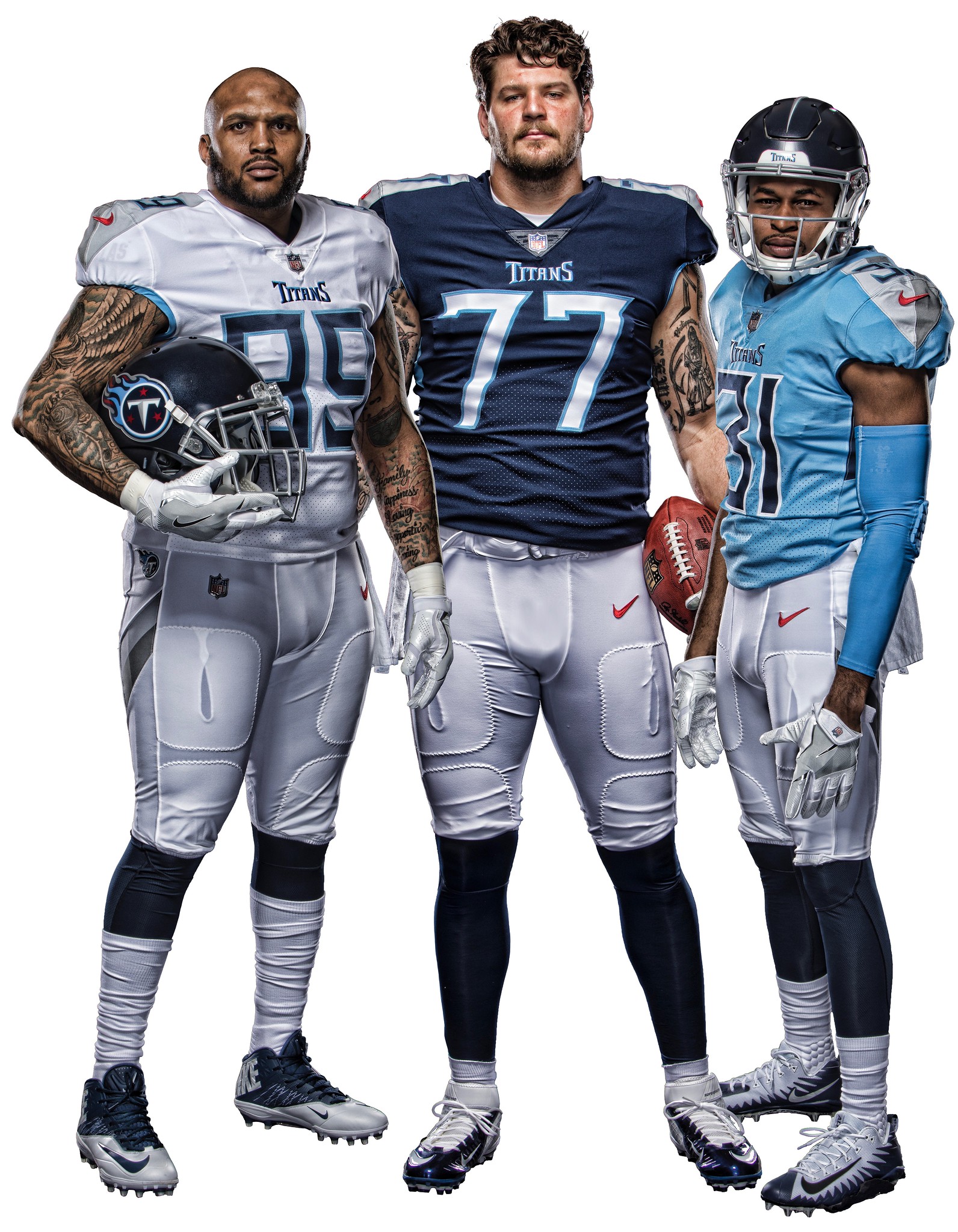
Click to enlarge
The Titans revealed their new uniform set last night. I gave my assessment of the new look in this ESPN piece, which was published last night. (In retrospect, I wish I’d made the overall grade B-, not B, but that’s what happens when you have to write very quickly with an instant reaction.) There’s some additional info and imagery on the team’s website.
Once you’ve digested all of that, I want to talk a bit more about the number font. As you’ve probably heard/read by now, it’s supposedly based on stone-carved Greek lettering, plus they added a little triangular serif to sticking out to the right side of each numeral to symbolize the northeastern corner of Tennessee. Here’s how it looks as a digital font:
Here's the full set of the new Titans numerals for the uniforms. I don't mind them. Was a little worried after seeing the 8, but I can live with them. pic.twitter.com/xtPb71xlc0
— Conrad Burry (@conradburry) April 5, 2018
Now, when viewed on a computer screen, with no surrounding context, that’s not terrible. It’s not wonderful either, but it certainly isn’t a disaster.
But on a football jersey, as I mentioned in my ESPN piece, it doesn’t work. For starters, the strength of stone-carved lettering (or stone-carved anything) comes from its monolithic solidity, its rock-solid intransigence — all of which is completely lost when you apply the font to fabric, which will be stretched and twisted and wrinkled and puckered. Plus the numeral strokes are too thin for a football jersey, especially on larger players. Plus-plus — and this is something I didn’t mention in my ESPN piece — it’s pretty obvious from the press photos that certain numeral combinations will work better than others. Like, if this is how No. 31 looks, what are they going to do with 33?
Sound familiar? It’s the same problem that came up with the Vikings’ font. For the unveiling and the press photos, they used numeral pairings that nested together nicely. But in reality, a lot of the pairings are extremely clunky.
All of this is quintessential Nike. Come up with a “storyline,” graft a design concept onto it, hype the hell out of it, and then move on to the next thing. Wait, what’s that, the font doesn’t look as good on the field as you thought it would? No worries — in five years we’ll give you a new one and you can sell a new batch of jerseys to the same suckers.
If you want to have a good laugh, check out this video that’s supposedly about the making of the Titans’ new design. But it’s not really a video about design; it’s a video about lifestyle marketing, and about Nike marketing itself. Watch the video, think about the design process they’re describing, and then ask yourself: Were most of your favorite uniforms — uniforms that you consider good designs, from any sport — created via that type of process? On balance, has that type of process, which we’ve been subjected to for quite a while now, resulted in more good design work or bad design work? And would the Titans have ended up with this number font if not for this process?
Meanwhile: If you look at the rear view, you can see that the sword-based center striping on the Titans’ new helmet is two-tone:
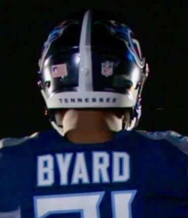
Reader Ron Ruelle points out that this is one of the very rare chromatically asymmetrical helmet stripes. He came up with three other examples: 1976 Cowboys, 2010 Arizona, and 2014 Maryland. Can you think of any others?
Okay, I’m all Titan’d out. Fortunately, we have a lot of other stuff to discuss today! Let’s get to it.
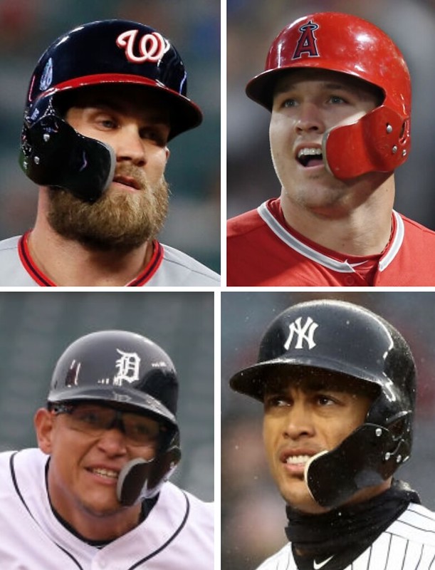
New ESPN column: As you may have noticed, the C-Flap — which is that faceguard attachment that’s been rattling around on the margins of MLB for three decades now — is catching on with more and more players lately (including, clockwise from top left, Bryce Harper, Mike Trout, Giancarlo Stanton, and Miguel Cabrera). It’s reached the point where you rarely see a game, or even an inning, without somebody wearing it, so today on ESPN I’ve done a deep dive on the C-Flap’s history, including interviews with the guy who invented it and the player who was apparently the first big leaguer to wear it. I’m a bit surprised that nobody else has written a story like this before, and even more surprised that I haven’t done it myself until now. Anyway, it was a really interesting piece to report and write. I hope you’ll check it out here.
Click to enlarge
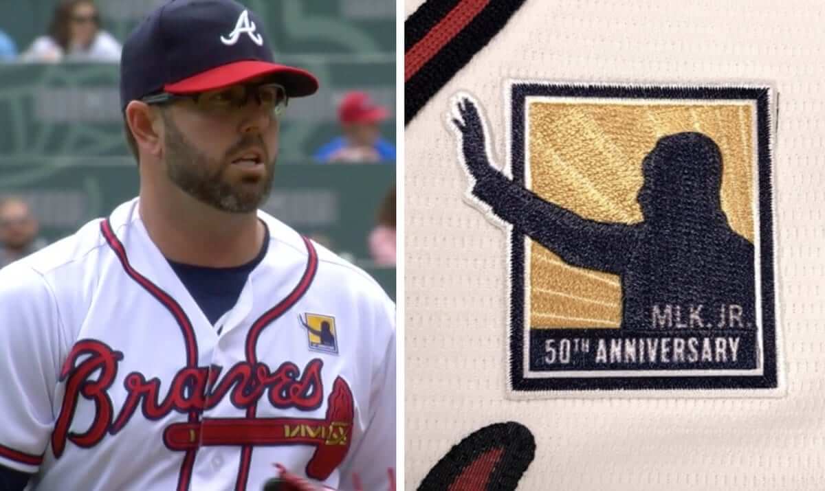
Now let’s do something about the tomahawk: Surprise move yesterday by the Braves, who marked the 50th anniversary of Martin Luther King’s assassination with a jersey patch. If you’re wondering why the Braves did this instead of some other team, King lived much of his life in Atlanta and is buried there. The city is also home to the King Center for Nonviolent Social Change.
I’m surprised that the NBA didn’t do anything King-related last night. The Grizzlies wore their MLK uniforms, but that’s the only thing I’m aware of. Did any players even write something on their sneakers? (To be clear, I’m not saying they should have; I’m just surprised that they didn’t.)
Speaking of the NBA and Atlanta, the Hawks played last but they didn’t wear a King patch. Then again, they don’t have much room for one.
Thigh high: I know it’s a cliché, but it really is amazing how you can watch baseball your whole life and keep seeing things you’ve never seen before. That’s what happened during yesterday’s Mets/Phillies game, when Phils first baseman Carlos Santana, who goes high-cuffed, slid into home and emerged with his left pant leg riding up around his thigh, exposing his black compression shorts. I’ve never seen that before!
Here’s a video clip of the play. The key moment comes at about the 13-second mark, and then there are several replays where you can watch it happen in slow motion:
While we’re at it: In that same game, Mets reliever Hansel Robles was wearing two undershirts — a standard blue one, and then a white one under that (or maybe his undersleeve was rolled up and it was white on the underside — hard to be sure). The Phillies complained that the white one was a potential distraction, so Robles had to bunch up his undersleeves so they were hidden by his jersey sleeves.
The Ticker
By Paul

’Skins Watch: The Vox podcast Today, Explained recently ran an episode about the Indians ditching Chief Wahoo next season, and whether they should also change their team name (from Kary Klismet).

Baseball News: Fans at Yankee Stadium say they’re fine with the new extended netting but don’t like the poles (NYT link) that hold up the netting. … The Louisville Bats will wear Halloween-themed uniforms — on April 7 (from Josh Hinton). … UGA had three different headwear colors two nights ago (from Michael Rich). … Love this 1973 shot of Tigers slugger Norm Cash taking BP in a ski mask. … Phillies INF J.P. Crawford’s bat knob decal shows a dog — I assume it’s his dog — wearing a Phillies cap (from Josh Claywell and Mike Williams). … Yesterday’s lede asked about the early instances of players wearing balaclavas on the field. Here’s our earliest example yet: Cubs INF Jose Vizcaino in 1993. … Looks like Mets 3B Todd Frazier was breathing Ethier yesterday (from Shannon Shark). … I don’t think this is new, but MLB pants include QR codes with the players’ tailoring preferences. … Babies born at a DC-based hospital chain “on special days of the season” will receive a Nationals goodie bag (from William Yurasko). … Speaking of William, he’s done a great job of compiling newsreel and video footage of Opening Days in DC, from the old Senators days to the current Nats. It includes lots of great old uniforms and good shots of presidents throwing out the first ball. … Lots of specialty jerseys this season for the Round Rock Express. Further info, including dates, here. … A designer named Matthew Henderson has come up with a very visually appealing way of showing the Blue Jays’ entire schedule, complete with the result and score of each game (from @MRWCannon).

NFL News: Back in the 1970s, you could get a T-shirt featuring a photo of your favorite NFL star (from Emily Gordon). … Va-va-voom: Check out this sensational 1947 shot of Doc Blanchard and Charley Trippi before a game between the College All-Stars and the NFL champions at Soldier Field. White nighttime ball, too (from Ray Hund). … The NFL has given $20,000 to a Baltimore helmet company to test the company’s new helmet technology. … Keith McKenzie spotted a gumball helmet machine advertising some outdated helmet designs. “I didn’t have any Canadian change to see if the helmets in the machine were from the same era as the picture,” he says.
College and Amateur Football News: Virginia Tech has announced the schedule for its 2018 “effect” games, most of which will presumably have matching uniforms (from Andrew Cosentino). … Jeff Hutchison plays in the National Public Safety Football League, whose 25 teams consist of cops, EMTs and firefighters. “Our day jobs as first responders aren’t quite dangerous enough, so we pad up and play full-contact NCAA-rules football,” he says. He’s annoyed that the home uni for his team, the Central Texas Wolf Pack, has two different shades of gold and illegible NOBs. “Maybe if you mention it on Uni Watch, I can get them to change it,” he says. Good luck, Jeff! … James Gilbert found an NCAA memo from January. It reminds teams and officials that, starting this fall, pants must have knee pads and must cover the knee.

Hockey News: Small note in this story indicates that the Milwaukee Admirals will wear ALS-themed jerseys on April 14. … A new ring is being added to the Stanley Cup, which means an old ring is being removed and sent to the Hall of Fame (from Mike Chamernik).

Pro Basketball News: Big3, which is about to begin its second season, has inked an outfititng deal with Adidas. The league did not have an official outfitter for its debut season (thanks, Phil). … Grizz Gaming, the Grizzlies’ NBA 2K affiliate, will have uniform ads from the U.S. Navy. … Speaking of NBA 2K, the league has its own draft caps, if you care about that kind of thing (from Joel Weyrauch). … Here are some secondary logos for next year’s NBA All-Star Game in Charlotte (from Ryan Dye). … As had long been rumored, the Warriors will keep the “Golden State” descriptor when they move from Oakland to San Francisco (from Mike Chamernik).

Soccer News: “Back in 2001, Bayern Munich brought their home kits for an away game against Koln, forgetting that their opponents had changed from white home jerseys to red,” says Denis Hurley. “So Bayern had to wear white training bibs over their kit.” … Club America was forced to change their underwear on Tuesday night against Toronto FC. “Underwear must match uniforms, and CA’s didn’t,” says Ed Zelaski. … Mike Pendleton took a stab at creating a crest wore their third kit jacket before their UEFA Champions League quarterfinal against Liverpool, but they wore their home kit in the game (from Josh Hinton).

Grab Bag: This is great: There’s a guy out there who’s achieved a measure of internet fame by knitting sweaters themed after various places or landmarks and then having himself photographed wearing the sweaters at those places (NYT link) (from Michael Rich). … A certain beer’s very annoying catchphrase has been banned from the Masters (from Kary Klismet). … Following up on yesterday’s Ticker item about a high school named for Robert E. Lee getting a new name, here’s a good roundup of the current situation regarding schools named after Confederate figures. … Speaking of renaming, a North Carolina middle school that recently changed its team name from Vikings to Railblazers is drawing concern from railroad safety advocates. … New logo for QC Construction Products. … A proposal to adjust the rules surrounding Montreal police uniforms to accommodate Sikhs’ and Muslims’ religious attire is stirring up controversy in Quebec. … The old-fashioned lowercase “g” — the kind with two bowls and a connector — is now so rarely used that people can’t pick it out of a lineup (from Adam Herbst).
I’ve never had a problem with the flaming thumbtack and I kind of like the two-tone beveled-sword motif, but the numerals, side panels, stripeless pants (those are parallelograms, not stripes) and especially the monochrome variants put this design squarely in clown-suit territory. I rated the leaked jersey a 3 on the football uniform/clown suit scale, but on seeing the whole uniform downgraded it to a 4.
I’m with you; HORRIBLE uniform. I hated the Titan’s original font; but this abomination is only superseded by Tampa Bay’s digital clock numbering. The gray shoulders seems shoehorned in. No need for any gray IMO. I was hopeful they’d go back to a more retro Oilers style. Unfortunately this is Nike calling the shots. If it was up to them, all 32 teams would have their own specific (shitty) font. What a disappointment this is.
Couldn’t agree more!
This is a dumpster fire.
Superfluous silver/grey, tacky illegible numbers, and they kept the worst logo in football.
Get your popcorn ready now for the 2023 unveiling.
While it is an example of a chromatically asymmetrical lid, that Illinois helmet was just a concept & was never actually worn on the field.
Thanks. Will adjust text.
Yet again a Nike overhaul has left me feeling distinctly underwhelmed. The Titans new navy helmet feels like a missed opportunity – the striping when viewed from the front is almost non existent – I’ve seen a few concepts online that have the “sword” striping coming to a point at the very front of the helmet and it looks a lot better. The one they’ve gone with looks more like a fencing sword than a broad sword. Also not a fan of the navy with navy look – looks like a leotard or perhaps some PJs. What really winds me up though is the obnoxious use of the red to draw attention to the Nike logo. IMO manufacturers marks should blend in and be a non factor when it comes to aesthetics of a teams uniform. After all the hype, such a let down though the Columbia blue jersey looks ok. The Lions overhaul last year was ok ish and Seattle’s has grown on me but every other Nike redesign has been pretty awful. If only they’d realise that more classic designs are far more popular AND likely to stand the test of time…or is that the game? Come out with something that fans will be clamouring to change in just a few short years…
Logo creep has never bothered me like it does with these unis. Normally, it’s just a contrasting color found somewhere else in the uniform. Red is a team color. The ONLY place it’s found on the jerseys and pants is the swoosh. Nike made their logo an actual “element” of this uniform and the Titans went along with it.
It’s pretty ridiculous how the swoosh represents the only use of red on the uniforms, besides that awful logo.
When I read the ESPN article, I felt that I’d dock the uniforms a grade for such egregious logo creep.
The two-tone “swords” are much too precious for me. If I’m thinking about swords instead of football while watching a game, that’s a failure.
Agreed! How I yearn for the days of classic block numerals! Raiders, Giants, Skins, Packers, Jets and Niners are carrying the flame still.
I remember when the Bears were basically the only team to wear non-block numerals (and I think they borrowed the basic style from their neighbors the Cubs, who also had a non-serifed “1” back in the day).
Nowadays seemingly every team is doing something ridiculous with custom number fonts. I like variety, sure, but some of it looks like garbage. The Titans and Vikings look particularly awful.
Happy with some of the Titans’ changes and not just because I thought of adding (different) sword gimmick to their uni in link.
dangit, I wanted to include link: link
I’m not a fan of the Titans uniforms. I don’t think it’s an improvement of the old ones. And again, Nike tries to get too cute with the uniform number font.
I was hoping the Titans would pick ONE blue to make their primary blue (navy or sky blue). I realize the sky blue is the “alternate,” but it still feels like they’re trying to wedge both in there. They aren’t the Houston Oilers anymore. Move forward with the Titans identity and forge new colors with that name. I think it might have been better if they had the home and road to establish the navy as their primary color (especially with the navy helmet) and then introduced the sky blue alternate in 2019 or 2020 once the navy blue color took hold.
Now I’m worried about the Dolphins and Jaguars uniform tweaks.
The only ray of light for the Jaguars uni is that Tom Coughlin has been involved and apparently wants to keep things more traditional looking. Anything resembling their original uniform would be a step in the right direction. Actually if you want to improve the Browns go back to the Kosar era uniforms, Vikings the Tommy Kramer era, Jags Mark Brunell era, Dolphins – their current throwback uni, Lions – lose the word mark on the sleeves and use a blue face mask ala Barry Sanders era and take the Bucs back to the previous uniform (or even better the Bucco Bruce uniforms)
That’s true, Coughlin is the only thing giving me hope for the Jaguars uniforms. I’m a Giants fan so in Coughlin I trust.
All of these uniforms…it’s amazing how their “traditional ones” are consistently the best ones. The Dolphins 1966 throwbacks are literally perfect in every way yet they continue to wear the garbage uniforms they have now.
I hope the Browns can make some Rams-esque tweaks before they change things up in 2020. Dump the orange jerseys, put a stripe on the pants instead of the wordmark, and change the socks. The jerseys will still be crap but at least the overall presentation can be cleaner.
The University of Virginia used an asymmetrical helmet stripe in the 80s and 90s as well.
link
Beat me to it. Here’s another pic:
link
Virginia Tech wore asymmetrical stripes on their one-off helmet against uva in 2009: link
Arrrrrrrgoooooos! (the Titans dark blue look)
The original Titans uniforms emulated the Argonauts anyway. The double blue with white helmet/navy jersey/white pants was 1960s Argos:
link
While we are comparing, Argos do it better these days:
link
And the Argos can still wear the white helmet as an alternate as well:
link
Wish Titan would have celebrated the old Oilers look. Going primary Columbia blue with red included for a trim colour.
Wade, I knew I would draw a response from you.
Don’t disagree with what you’re saying, but the Argos for most of their existence have worn a darker blue helmet similar to the Titans new lid, so I think this is the closest they’ve looked the same.
True to that.
Minor correction needed for the C-flap bit. “…you rarely see game…”
Got it.
I stand by my thoughts from last night. The Titans’ new unis give me a mid-1990s World League vibe, like if this were an entry from Athens.
I mean, did it really take four years (based on that ridiculous “story” video) to come up with that?
As I said last night, they remind me of Anthora coffee cups.
Notre Dame wore an asymmetrical helmet stripe for their game in Fenway Park a few years back.
link
Good one!
Maybe the most frustrating thing about bad designs like this is that they would be so easy to fix.
How much better would the jerseys look with link (from the anniversary patch and marketing materials) instead?
How much better would the pants look if they had a vertical hip-to-knee two-tone beveled-sword stripe (like the one on the helmets)?
How much better would the sky-blue alternate jerseys look if the front and back numerals were white outlined in red, or even white outlined in navy?
Change those three things, and you might have a football uniform instead of a clown suit.
White outlined in Navy would be the correct choice. Color against color numerals are awful on TV. SEE: Browns ‘brown’ jerseys with orange numerals. YIKES!
Jags’ current (soon-to-be-replaced) teal alts as well; black numerals on teal jersey. Ych.
Despite these (below) supposably being the Titans colors, I am struck by the absolute tinyment of Red in the whole look. Considering the Tennessee flag is predominantly Red.
link
They’re better but still a failure. Here was a chance to polish their absolutely awful logo [flaming thumbtack] and they didn’t. The flames don’t look like flames, the three red stars are barely visible against the blue background and the ‘T’ is thin and weak. Now it’s on a navy blue helmet. While I like the move away from white simply because there are too many white helmets, the move to navy make zero sense. Now we’ve got the Bears, Broncos, Seahawks, Texans -AND- Titans with navy domes. Great. So they missed the chance to be the ONLY team with the powder [or Titan] blue helmets. Then there is the obvious, they’re going with “unitard” looks. Navy top, pants, socks etc. Nice of Paul to show the pic of the looks with the white pants. The strongest being the powder tops with white pants… which will sadly be relegated to alternate status. It’s frustrating to see a team build up hype and then basically give you something you’ve already seen with a unique typeface. Congrats to the Colts, you’re still the best [looking] team in that division.
Crap, the Rams too have a navy blue helmet. More reason to have done something truly original [in an NFL sense]. Oh well. Tweaked in 5 years???
I can see the wisdom in requiring a C-Flap.
It also occurred to me in re: the Stanton discussion the other day is that given he wears it for lefties and not righties, given the Yankees have matte helmets on the road and gloss at home, that requires the equipment managers to have four different helmets just for Stanton.
Boy, my sentence structure sucked there.
He actually wears it for rights, not lefties. (And four helmets for a player isn’t so unusual. That’s the case for any switch-hitter on a team with separate home and road helmet designs.)
Thanks for the correction, Paul. As evidenced by my posts lately, I shouldn’t type this early in my day.
I miss the days when switch hitters would just wear a two flapped helmets.
Thigh High: Santana plays first base not catcher.
Actually, he *also* plays catcher. But you’re right, yesterday he played first base. Will fix!
last time he played catcher was 4 years ago, then was made to move due to concussions. i wouldn’t call him a catcher any more
Fair enough!
His last game at catcher was 4 years ago.
Titans’ new set is a downgrade. I grew to like the old set, especially with the light blue pants. Their white helmet will be missed. Paul’s suggestion that no great design comes from this Nike process is dead-on. New font is goofy too.
And of course, the god-awful Nike-speak, which has become standard boilerplate in every uniform redesign, ruins everyone’s day.
I’d love to hear the uni-verse’s thoughts on white helmets in general. I was immediately disappointed with the Titans set because I’ve always been a huge fan of white lids. I loved it when the Chargers and Bills when back to white and I really think uniforms pop when they go white-primary color-white at home and then all white or white-white-primary colored pants on the road. Is this just me? They just seem so clean and balanced. I’m a Wisconsin Badger fan and I was annoyed when Gary Andersen introduced those red shells for a few games every year. At least if your primary jersey color is so dark, a lighter helmet shell is nice on the eyes!
Never liked white lids except for a few college teams (‘zona, AFA, Texas, Aubie). Probably because there were too many of them in the early 70s NFL and those teams got a disproportionately high share of time on the boob tube.
Hmm, maybe this is a generational thing? I’m one of those “Millennials” so I never had the chance to get bored of white helmets in the 70s…
White lids work for teams like the Jets, who have only one other color (and the Colts, if you don’t count the facemask), and teams whose colors are light, like the Dolphins, 1960s Chargers, and late-’70s/80s/90s Oilers. They work for the Bills because they traditionally wore them and they have large decals and thick stripes; ditto the pre-Elvis Patriots.
I think they worked for the Titans, partly because of tradition (even though the Oilers wore colored shells until the Luv Ya Blue era), and partly because of the light blue in the color scheme and the white pants.
I think they would have worked for the Texans, and I think they would have worked for the 1995 Jaguars.
The Colts gray facemask is a throwback to the original. Much better than the blue or white for tradition lovers.
As far as white helmets, there are too many – but so too with navy helmets – too many. The Titans missed the mark and the opportunity to have something no one else has. The light [Titan] blue helmet
Oh, I’m fine with the Colts’ gray facemask.
Navy helmets: Texans, Seahawks, Rams, Broncos, Bears, Titans. That’s 6 out of 32, 3 in each conference.
White helmets: Jets (works), Colts (works), Bills (works), Dolphins (works), Chargers (doesn’t work with current set), Cardinals (ditto). That’s another 6.
That’s 12 of 32 teams whose helmets are either navy and white. That is a lot.
For the record, though, 6 teams have silver (or silver-ish) helmets (Raiders, Cowboys, Panthers, Patriots, Buccaneers, Lions).
3 teams have black helmets (Steelers, Ravens, Falcons).
2 teams have gold (or gold-ish) helmets (Saints, 49ers); 2 teams have orange helmets (Bengals, Browns), and there’s only one yellow helmet (Packers), one green helmet (Eagles), one medium-blue helmet (Giants), one purple helmet (Vikings), one maroon helmet (Washington) and, for another week at least, one two-tone black/gold helmet (Jaguars).
Absolutely Chargers’ white helmet works. Especially with the one shell rule, there’s no way to wear powder blues with a navy helmet.
I just think it doesn’t work with the navy set.
[correction:]
2 teams have gold helmets (Saints, 49ers); 2 teams have orange helmets (Bengals, Browns), and there’s only one yellow helmet (Packers), one green helmet (Eagles), one medium-blue helmet (Giants), one purple helmet (Vikings), one red helmet (Chiefs), one maroon helmet (Washington) and, for another week at least, one two-tone black/gold helmet (Jaguars).
Chiefs are the lone red helmet (unless you prefer to lump them in with the Redskins).
When I think about a huge proportion of helmets being 1 colour – I think back to the USFL. In 1984, there were 18 teams. 7 of them wore silver helmets (1 was technically champagne silver).
link
Where white is one of a team’s two primary colors, a white helmet works for me. Such as for the Colts. Where a team has primary colors other than white, I generally don’t like white helmets. Such as for the Titans.
Although I hugely prefer the new navy Titans helmet to the old white, I agree with Louis that light blue would have been better. Heck, even a two-tone dark/light gray helmet would have been better than navy.
Not sure if this makes sense. Every team has a white jersey, so technically every team has white as a primary color. And every team but the Jets and Colts has at least two other colors, only one of which is primary.
White helmets are awesome,but also require a different set of rules. The pants or shirt MUST also be white. Otherwise,you look like a 5th grade team.
Big fan of white helmets, especially when worn with all white uniforms. One of my favorite is when the Colts wear their white road jerseys. I wish the Cardinals would wear white at home, but only if they would fix their uniforms and go with something simpler. Dump the red shoulders and weird pant stripes.
The improvement of the helmet justifies all the faults of the rest of the Titans uniforms. And the faults below the helmet aren’t all that bad. Paul is right about the numbers, but this is the NFL. The alternative isn’t clear block numbers like the 1961 Packers, the alternative is the current Bucs or Vikes. The Titans numbers are better than those. The shoulder blades are fine; gimmicky, but again, the alternative isn’t no gimmick, it’s an even worse-executed gimmick like the Browns’ pants stripe. The underarm panels are a poor choice, but on par with modern NFL jersey designs. The pants are the real mistake. Nike’s gobbledygook about a scabbard would have been an OK basis for designing the pants striping, but the odd slashes don’t accomplish that at all.
So, judged against the standards of the mid twentieth century, the Titans new unis are garish clown suits. Judged against the standards of the 2010s NFL, the Titans will have better-than-adequate, middling to slightly above-average unis. And they’ll be wearing a terrific helmet. A solid C-plus or even a generous B-minus in a league that lately produces a lot of D work.
Scotty, mi amigo…
I am wont to agree with you in about 84.3% of your arguments, but I disagree 92.3% with you here.
I dismiss your premises that the only alternatives to an overall bad new uniform (Titans) are even worse ones. I’m not saying I want every “new” uniform to look like the 1962-current Packers, but that doesn’t mean new unis can’t retain some of the classic elements while still looking, as the kids used to say, “fly.”
Yes, I suppose Nike’s designers (and the Titans staff who approved the changes) deserve some credit for not giving the team Bucs’ numbers, but that’s damning with faint praise. These uniforms could have been so much better. Instead of us lauding them for “not being so much worse” we should be criticizing them for producing what is, IMHO, a uniform that will be dated and need another revamp in 2022/3.
One thing, in particular, that I have noticed with Nike uniforms (particularly in college) of recent: anytime a team gets a uni (either new or tweak), the numbers are GIANT. This is not necessarily a bad thing, but giant numbers with these fonts are not good. Instead of trying to create unique fonts for each and every team (looking at you, WVU), they should stick with the standard, legible fonts that work well and have for years. Go crazy if you must on the colors and even different striping/elements, but at least keep the numbers somewhat normal and legible.
In sum, then, Scotty — I’m sure we’ll agree more than we disagree, but I can’t praise or even condone uniform changes that simply aren’t “as bad as they could have been.”
Fair enough, but one quibble. I don’t mean to judge in terms of whether they’re “as bad as they could have been” in any broad sense. I mean that it’s most reasonable to judge a new uniform in a given league against what other uniforms are actually worn in that league, and particularly with regard to more recent new uniforms in that league.
The Bucs numbers, for example, aren’t just some abstract acme of how badly designed football uniform numbers can be. They also illustrate specifically what Nike “designers” and NFL executives believe represents acceptably good design. The Titans’ numbers aren’t terrible, they’re just not great. C-minus or D-plus on an absolute scale where 1960s block numbers are a solid A-plus. But on a scale relative to what we know “designers” and sport executives consider acceptable, the Titans’ numbers are average to above-average – a straight C to possibly even a B.
It’s not that any element of the Titans unis could be worse, it’s that we already know that any given new NFL uniform design element is likely to be worse than the Titans actually were.
But my intended distinction between “could be worse” in the abstract and “compared to observed reality, which is mostly worse” in the specific may seem like a fine hair to split.
I’m going to disagree with this too; on my 1-to-4 football-uniform-to-clown-suit scale, there are far more NFL teams that score a 1 or 2 than 3 or 4.
In my estimation, in no particular order within each category:
1 (football uniform) – Jets, Raiders, Giants, Packers, Bears, Washington, Cowboys, Colts, Chiefs, Bills, 49ers, Saints, Steelers, Eagles, Texans, Panthers.
2 (more football uniform than clown suit) – Dolphins*, Browns, Vikings, Patriots, Lions, Rams*, Ravens.
3 (more clown suit than football uniform) – Chargers, Cardinals, Falcons.
4 (clown suit) – Bucs, Jaguars*, Broncos, Seahawks, Bengals, Titans.
[* – pending redesign. Rams would score 1 but for current transitional mismatched elements.]
Your mileage may vary, of course. But if you combine 1 and 2 as football uniforms, and 3 and 4 as clown suits, the former outnumber the latter 23-9.
Got to disagree with you on Vikings, Chargers, and Seahawks. All have the absolute perfect blend of modern and unique-to-that-team design elements that set them apart but still look respectable. We should not praise a uniform set just because it’s different, but we also shouldn’t have the mindset that anything other than block numbers and a simple design is any less of a football uniform and more of a clown suit. There is a fine line balance there.
To each his own, and of course I disagree. The Vikings have a solid football uniform with goofy numerals. The Chargers were a tough call between 2 and 3; the numerals and twisty lightning bolts pushed them down.
Seattle was an easy call; that’s a clown suit. It may be an attractive clown suit, or an appealing clown suit, but it’s still a clown suit, not a football uniform.
Your mileage may vary, of course.
I agree with your assessment with one exception. The eagles don’t have a block number font and thus cannot be top rated.
A block number font is not necessary for a rank of 1, viz., for an outfit to be a football uniform. Neither do the Steelers have that, nor do the Texans, nor of course do the Bears.
It certainly helps, but it’s not required.
The Eagles uniform ranks as a 1 because it is simplicity in itself, every element works, and it has nothing on it that it doesn’t need. It is in every sense a football uniform; if it had standard block numerals it would be an even better football uniform.
It also looks to me like the Titans might be altering numeral widths depending on the number (Paul’s 31 v 33 query in the lede).
the 3 in the 31 on the uniform looks MUCH wider than the 3 on the font sheet. Maybe it is stretched by the fabric? Maybe it is stretched to cover/fill the chest?
Either way i don’t care for it.
What on earth does the Todd Frazier “Breathing Ethier” comment even mean?
Andre Ethier was the first MLBer to remove the logo from the front collar of his undershirt. Frazier did the same
link
I’m a long-time Astros fan who has no love for Bud Adams and the way his demands for more football seats resulted in the demolition of the Astrodome scoreboard and took most of the character out of the place. That happened about seven or eight years before he moved the Oilers out of Houston anyway. So let me get that out of the way first. And the following rant is not meant as an insult to the people in Tennessee who deserve a team and appear to support the Titans really well.
But let’s not completely blame Nike for the Titans’ mess. The Titans organization deserve its share of the blame for agreeing to this crap. They always have and still do look like a bunch of CFL rejects. The logo is awful and they didn’t really change that. The number fonts somehow got worse than the bad numbers they were already wearing. Hopefullly, they’ll pick a shade of blue and stick with it.
Not surprised because Bud Adams was a joke, and you’d hope the children would be better than the parent. I’m just sorry his daughter didn’t have better judgment before OK’ing this garbage.
“They always have and still do look like a bunch of CFL rejects”
That’s funny – cause I was thinking that the new uniforms look like a lot of the crappy ones that exist in the NFL right now.
Oh, for sure — in the end, none of this happens without the client’s OK.
But I think it’s fair to say that the worst aspects of this design all started with Nike. Maybe the team would have approved any crappy number font. But only Nike could have given them *this* crappy number font.
The Titans new number font looks very similar to the LA Kings number font.
As a Bengals fan, I can’t express enough how dumb different colored side panels are on your uniform.
I hope these unis become known as the “pitstains”. I imagine that’s gonna stand out on this set.
In comparison to the retail “leak” yesterday, it doesn’t really match up well. Goes to show why Paul rarely posts anything without 100% confirmation. (Unless the retail is a fashion variation, especially with the stars on the inside collar)
Am I missing something here? The leak is pretty dead on, of course accounting for the differences in cuts (which are to be expected since it is a retail version).
I think one of the biggest issues with the Titans new uniforms is that they’re trying to cram too many colors into their “identity.” Using the two grays (which are basically their fifth and sixth colors, if you count white) in a more prominent fashion than the red is silly. It also really bothers me that neither of the blue pants include the other blue, and the white ones have no blue whatsoever. And those side panels! Not a good look on anyone. I predict these will not age well.
I was hoping the Titans would put three stars on the sides of the helmets a la the Tennessee flag. Simpler presentation, and more formal. Oh well, can’t have everything.
Well, Nike and the Titans screwed this one up. As a Broncos fan, I’ve been hoping for new uniforms since I think their current set looks pretty dated. But after seeing what’s happened to the Bucs, Jaguars, Browns, and Titans, their uniforms would probably only get worse. Suddenly I’m OK with sticking with what they’ve got!
The 3 looks terrible on the Titans font. The 7 looks ok. The 2,5,and 8 are bad. This whole thing could be made much better by using proper block number font.
Also if the Titans are going to say their coach is the fifth in their history, then please return the Oilers property to it’s rightful owner.
I think the decline in quality of the game & NFL TV ratings is directly tied to Nike produced uniforms. If you had to wear what the Browns wear on the filed you’d suck at your job too.
MLB & the Dolans have said the name “Indians” isn’t changing. It’s also not accurate to say Chief Wahoo is going away. While no longer present on the uniforms, Wahoo will still be available for purchase on merch at the stadium.
To me, retiring Chief Wahoo is a quid pro quo for being allowed to keep the “Indians” name. But Wahoo merch should not be authorized by MLB.
More likely Wahoo leaving the uniforms is quid pro quo for Cleveland hosting 2019 All Star Game. By all accounts there has been zero conversation about the Indians name being changed nor should there be.
Here’s the thing about the “stone carved” numbers that bugs me.
There’s no round corners. The ancient Greeks absolutely made round letters in stone.
link
So the Ancient Greek reference is just nonsense. Really the numbers are just coming out of the same “jagged” Nike aesthetic that produced Arizona and West Virginia’s uniforms.
Also if you look at the photos they can’t seem to to figure out how to align two digit numbers with the seam now running down the middle of the sword yoke.
Shout out to Matthew Henderson. Bravo! Great concept. You should copyright it.
The C-Flap article is up. It is, in my opinion, much more interesting than anything regarding the Titans.
link
Not having C-Flap mandatory on any level of baseball/softball makes as much sense as vehicle manufacturers making seatbelts optional. Enlightening article.
You know what I like about the name “C-Flap”? The flap is only C-shaped for left-handed batters, and righties will have to picture a left-handed hitter in order to see the “C” shape, which is a backwards C for them. Usually terminology is designed by and around them with no consideration of lefties!
I definitely can see that the “C” in C-Flap being thought to be the letter C. Then reading Paul’s ESPN entry, I see it was for inventor Dr. Robert Crow.
Paul,
I really enjoyed the article on the C-Flap. Where you hit it out of the park was your discussion of NOCSAE standards and the device with respect to youth baseball.
I umpire Little League. Based on LL’s current rules, the current C-Flap is illegal, despite the clear safety advantage it offers. Sadly, until Rawlings introduces their R-Flap helmet, I doubt that you will see this safety innovation in Little League. Thanks in large part to the litigious climate we live in, in Little League equipment either fits in the NOCSAE bucket, or it’s out.
One of the fastest ways to fire up a debate among Little League umpires is to ask if team logo stickers on batting helmets are acceptable. Good luck with the C-Flap.
The Nike marketing BS video is hellacious. Can’t believe Nike allowed this to be released as a promo?!? Are they not able to hear the douche-ness they are uttering?
To Paul’s question about “What are they going to do with number 33?”, if you click through the gallery of photos on the Titans’ website, you can see numbers 77, 82, 99, 27, 98, 89, and 23 in the new font, which gives you a pretty good idea of what that would look like. Try Photo #294 of 310, which shows a bunch of players lined up with different numbers.
my point, and his about the 33 is when you look at the 3 in 31 in that photo it takes up all of the space to the left and continues over the mid line on the chest, so to duplicate that 3 from that photo would make it impossible to fit on the jersey. Which makes one question, do they have different widths of numerals based on which numeral they are paired with??
Many Japanese baseball teams have three or four (or five?) number widths: the default one for two digits, a wider one for single digits, then a special thin one for three digits and possibly a slightly-thicker number “1” just for the guy wearing number 1. And then with teams that make special link, there’s an even thinner font.
You can link (You can see varying widths of the NOB font, too.)
In Asian typography there is a tradition of sometimes stretching words out so that there is a common width. You can see it in link This is probably the inspiration behind those varying-width font numbers. Can’t say I’d be a fan of it catching on in US sports.
These Titans unis aren’t bad, but I really didn’t have a problem with their current set. Nice update, not much of an upgrade, I’d put them in the solid B category.
UVA football, throughout the 80s and early 90s, had chromatically assymetrical helmet stripes. Blue and orange and a white helmet. Otherwise the uniforms were basically a Penn St set with orange and blue.
If you give them an inch, they’ll take a mile. Amy Adams Strunk went into Nike headquarters and they rolled out the red carpet for her. Nike knows how to manipulate owners who are there to feel special. Each time a new owner has gone in there to get a new look, Nike has manipulated them to make drastic cartoonish changes (Cleveland, Jacksonville, Titans). At the end of every presentation, the owners are shown how much money they are projected to make from jersey sales…SOLD!
The only teams to keep a Nike redesign longer than 5 years:
Seattle: went to 2 Super Bowls, won 1
Denver: won 3 Super Bowls
Minnesota: NFC championship game (simplified their uniforms), still could decide to change.
Tampa Bay: as soon as Jameis flames out they’ll change again.
The only teams to keep a Nike redesign longer than 5 years…
This is a silly category, since Nike has only had the NFL uniform contract since 2012 (and, prior to that, had only redesigned the Broncos back in 1997).
I’m neither defending nor advocating for Nike’s work. I’m just saying that the standard you’re applying here isn’t a good one.
My point is, what’s Nike’s batting average with re-brands? The only reason people put up with it is because of winning.
Redesigns, not rebrands.
Denver, Jacksonville(2), Tampa Bay, Miami(2), Cleveland(2), Minnesota, Tennessee, Seattle…that’s 1/4 of the the NFL. That’s 2 divisions…not a small number
Maybe it’s the lighting, but why do the pants look like they’re inside out? I’ve never noticed all the seams that much, but it’s really bad at the thigh; in fact, it looks like the pockets for inserting the thigh pads are on the outside.
Take a look at the shoulders in this photo:
link
How are they supposed to make the numbers work with the seams? Not only does a number with a “1” in it throw the seam off the gap between the digits but its crooked. The verticals of the number don’t line up with the seam.
I wonder how many people at Nike really think about how their product looks in practical terms as opposed to a computer screen.
That is something that any designer would consider. As a matter of first-principles and as a professional obligation. Which illustrates that it’s important not to confuse what the people who work for Nike do with design.
Also the numbers do not have the gimmick serif on the shoulders
Who/when will be the first to have a “backwards” shoulder colors snafu?
Hate that Nike thinks more is better. The best uniforms are simply, with normal straight pant stripes and no side yokes on the jerseys. I’m OK with the grey shoulder, but hate the red Nike swosh on both sleeves. I’d rather see one on the chest, and not in a color that stands out so much. I mean, there is no other red on the uniform except for the other Nike swosh on the pants. The only other red is a very limited amount on the helmet.
A few thoughts on the Titans new look:
1. I have noticed from years of reading UW and the comments that readers almost never like a uniform overhaul unless it is when a team goes from a “modern” uniform back to a more traditional look.
2. It seems like fans do (in most cases) gradually warm up to the new look as time goes by and they get used to seeing them on the field.
3. It seems like Uni-Watchers almost never like custom number fonts. Some of them I agree are pretty bad (see the Bucs’ current choice) but also readers kind of overstate things…for example, the Titans’ numbers here are not really anything too radical. Personally, I don’t want a Uni-verse where every team is wearing the standard block font just because that’s the way it’s always been done.
4. I have been thinking for a while that there were too many white helmets in the NFL so I’m glad the Titans moved away from them. Too bad they didn’t go with the lighter blue, however, as that would have been totally unique.
5. I think the two-tone silver stripes and shoulder yokes are a good example of an innovative and fresh design element that is still pretty subtle and doesn’t overwhelm things.
6. I’d give the Titans old uniforms a D and these a solid B+.
Not necessarily.
The problem with “modern” isn’t so much whether it breaks from tradition.
As far as I can tell the Uni-Watch community has responded extremely well to the current Bucks and Blue Jackets designs, both of which are thoroughly modern.
The problems tend to be that designers (especially Nike’s NFL people) sometimes think that modern means overloading a design with gimmicks. The Titans have the same problem.
The swords might be a decent idea but throw on top of that the contrasting arm pits, the tiny and slating pants cutouts, the unitard look, the helmet stripe that doesn’t match the should swords, and the whole thing becomes jumbled.
Which is a problem because sports uniforms aren’t static. They move putting too much extraneous detail into places that flex and bend just doesn’t look right.
I do tend to agree with you that a lot of modern designs are a bit too busy. If it was up to me, I probably would simplify this set as well, which is why I didn’t give it an A.
But I do think that the number font is improved over the old ones and the silver shoulder yoke is more subtle than the old blue ones.
Also, I give them credit for not putting a logo on the sleeves…really the new uniforms are not much “busier” than the old set.
It’s still one or two bumper stickers too many. Which is really annoying because there’s a good idea buried in there.
Which is extra annoying to me because its the same problem as the Browns, Bucs, Jaguars, and Dolphins.
The problem is that the Nike swosh is bright red on both sleeves and the pants. There is no other red on their uniform, except for a very little amount on the helmet. The Nike advertisement is what jumps out with this uniform.
1982 SC Gamecocks had asymmetric stripe.
link
Arizona sported the red/blue asymmetrical look in the 80s and 90s. That 2010 version was sort of a throwback. link
Did anyone else look at the back of the Titans’ new helmet and see the Washington Monument instead of a sword? In the context of all their other sword imagery, this one is too thin.
Yes. Very wizardly of them.
Agreed. I don’t hate it as-is, but I’d like it even more if it started thicker, retained its width a bit or even grew toward the top, and then narrowed sharply to a point over the nose bumper. Like the shape of the sword in the logo that it’s supposedly drawn from.
Duquesne also used asymmetrical striping:
link
The worst thing about the Titans new look is that they have reduced what had been the graphic element most associated with the franchise (columbia blue) to a mere accent color.
I’ve already tweeted the Raiders to NOT CHANGE A THING to their uniform when they relocate to Vegas or i’ll go bananas. No new logo, no added colors NOTHING!!!! I won’t have it.
I would say you can probably rest easy on this one.
The looptail “g” story is fascinating. How many times have I read or written in Times New Roman and was STILL not able to pick out the right one.
After seeing the Titans new number font, it is clear that nobody in the whole redesign process ever considers what the numbers will look like in distant camera shots on TV or what they look like from stadium upper decks. The Dolphins’ redesign in 1997 is a prime example. The thick navy drop shadow effect looked great (at the time) on the orange/white/aqua numbers up close. But on TV, it was difficult to tell the difference between a 3, 6, 8 and 9. Thankfully they did narrow it some a few years later.
Dolphins’ fans can forget about the Dolphins ever returning to the great looking throwbacks full time. Doing so would be Nike admitting that THEIR ideas for a jersey redesign was a failure and that sure isn’t happening.
Virginia Tech used an asymmetrical helmet stripe twice.
2009 Pro Combat – link
2014 Military Appreciation – link
Here is my assessment of the Titans new uniforms:
Helmet: Great. The asymmetrical design doesn’t bug me, as its hated to see anyway. The navy blue is a huge upgrade over the white. Paul, is the helmet matte finish? It doesn’t look quite matte but is also definitely not gloss.
Home unis: good, but pretty monochromatic and drab. This is where the side panels make sense, as they give an otherwise dark uniform a splash of bright color. The sword on the pants works best with the navy blue, resembling a sword in it’s sheath.
Away: Looks great when paired with the navy pants. That white/navy I look is one of the best in the league. The white pants don’t work nearly as well.
Alt: The Columbia blue jersey makes the sword design pop and it the best of the bunch. The Columbia over white pairing looks much better than with navy or Columbia pants. Speaking of which, the Color Rush is garish, as they always are.
Overall: will take some getting used to, but I believe we will come to revere these unis in a few years. Amy Adams Strunk said the unis would be the talk of the league, and she was right. They certainly are.
Can’t disagree with much there.
I think I saw somewhere that the helmet finish was satin.
Regarding Nike’s number fonts: As a graphic designer, I’ve always been taught to start with the worst-case scenario and work back from there. I think its awful that they cherry-pick good looking combinations, and then pay little attention to problematic combos.
I’m really digging all the examples of chromatically asymmetrical helmet stripes. That’s a separate Uni Watch story I’d love to read! Is there any history or commonality there, any consistent aesthetic flow or trends, or is it just a series of unrelated one-offs?
I’m usually almost viscerally bothered by asymmetry – as in, the sight of the Millennium Falcon’s offset cockpit can give me shivers – but I find that I rather enjoy some of the chromatically asymmetrical helmet stripes. When they work, they really work!
Meanwhile, in patch news- Boeing Ops Team Reveals Mission Patch for Starliner Orbital Test Flight
link
Bland, btw.
I do believe that Terry Steinbach was the second member of the Oakland Athletics to wear the C-flap in 1988. I think second baseman Glenn Hubbard was wearing it first.
I’ve never seen a photo of Hubbard wearing the flap. Not saying you’re wrong — you could very well be right! — but I’d like to see visual evidence.
link
link
Here are a couple. Doing this from my phone so I hope it comes through.
As I recall he broke it in Spring Training of 1988 and missed the beginning of the season and came back with the C-flap. There are not a lot of pictures of Glenn Hubbard with the A’s but all of them where he is wearing a helmet have the C-flap.
Nice!
Getty’s captions are notoriously unreliable, but one of those two shots is listed as being from 1989, and the other is from “1988-89.” So it’s not clear if Hubbard predated Steinbach, who began wearing the flap in 1988. And remember, Steve Vucinich told me that Steinbach’s flap was the first one he ever dealt with (although his memory could be off).
I’m about to run out of the house and will be gone for the rest of the day, but see if you can find some verification of when Hubbard suffered a facial injury, and/or find a photo with a verified date.
link
This is from the 1988 World Series game 1. Hubbard bats at about the 31 minute mark. Doesn’t prove who had it first but they both had it in 1988. I’ll keep looking!
Interesting! And Vin Scully specifically mentions that he (Hubbard) broke his jaw in spring training, so he would presumably have worn the flap upon his return to action — which, according to Hubbard’s 1988 game log, was in mid-April:
link
So if he did indeed wear the flap all season long, that would have predated Steinbach by about two months.
Incidentally I missed that World Series game, so maybe I can be forgiven for not remembering this. I was at a minor league hockey game at the time, but I heard Kirk Gibson’s home run on the radio while driving home.
Great work, Mike!
OK, heading to Queens now for a meeting….
link
And this was from a 5/30/88 game. Hubbard bats at the 3 hour 4 minute mark and has the C-flap. Steinbach didn’t play from 5/5 to 6/3 while recovering from injury. Being a detective is fun! Thanks for all your great work, Paul.
Great work, Mike!
— Paul, checking in from a subway platform in Queens
Since 2012, has any team with a redesign ever chosen NOT to use Nike as designer? I would love for some more teams to do this on their own, or with another company, and just use Nike as a distributor or “league partner.”
These looks are garish. Very few have been improvements, with the Vikings being the only team I can think of with a significantly improved look. Many others (Browns, Jaguars, Bucs) were massive, epic downgrades.
So, just to get things straight, the NBA 2K League has a standard draft, where you are drafted to a team and play as that team in the video game matches (I’d say games but that’d get confusing), and the team that they play as can have a different jersey sponsor than the real team, and the 2K user has to wear a jersey when playing?
As a marketing professional, I look forward to uniform unveilings SOLELY for the accompanying corporate hyperbole and video content ripe for parody. Nike certainly did not disappoint. If you didn’t know they were talking about uniforms, you might think they were talking about the space race due to all the secrecy.
My favorite lines from the clip:
“The Tennessee Titans have a truly incredible mythology” (0:54)
“This is a revolution” (2:13)*
“I went to the Parthenon” (2:37)
(*winner)
I get that this type of narrative is necessary because it’s come to be expected. And I credit the Titans for their restraint in painstakingly describing what each color and stitch stands for (The red represents the blood spilled outside the Tequila Cowboy on Broadway after a late-night tussle).
B- for uniform redesign
A+ for hyperbole
Hahaha! Those quotes are amazing. Thanks for the laugh.
Well, Nashville does have a Parthenon, and it’s in way better shape than the one in Greece.
Titans new unis are worse than bad. Nike is hellbent on making professional franchises look less than professional. All of Nikes NFL redos have left teams with bad striping and ugly fonts. We have gotten progressively worse from the Bucs to the Browns to the Titans. I would be scared to let Nike touch my unis. THEY ALREADY RUINED THE NBA!
Also not sure if it counts but in 2012 I believe Notre Dame came out with a horrid assymetrical helmet. Question is do you call that a stripe or just leave it at nightmare?
Troy has a couple of asymetrically striped helmets and even did the beveled sword thing first.
link
link
Portland State did the spear thing about ten years ago.
link
So two things of note…
1. Not helmet strip related, but in the late 90’s, I believe 1997 and 1998, the University of Miami jerseys made by Nike had asymmetrical collars with half of it green and the other half orange to represent the split “The U”. This was only featured on their white away uniforms.
link
2. Also, just visited the Virginia Tech link about the upcoming “Effect” promotion, and noticed the banner at the top of the page advertised a “Beamerball” ticket package. Although this is not uni-related. Does anyone else remember when a school continued to use marketing such as that for a coach that left the school almost three years ago? I know there are the naming of courts or fields and other tributes… but do you think Justin Fuentes finds it interesting that under his head coaching they are still focused on “Beamerball”?
Off topic but if we ever do have to pay to read Uni Watch, the people who like the new Titans mess should have to pay more. Am I right?
Minnesota’s (University of) Paddle/Oar stripe isn’t symmetric either.
Oh yeah, and my Orlando Rage (XFL) had a lightning bolt stripe.
link
The mention of the Vikings’ font, specifically comparing it to the #97, makes me wonder if they designed it with selling AP jerseys in mind. Because the #28 really does look good with the font. And what with all the instances of the tail wagging the dog, so to speak, maybe Nike & the Vikes chose the font given the scores of Peterson jerseys they expected to sell.
“Were most of your favorite uniforms — uniforms that you consider good designs, from any sport — created via that type of process? On balance, has that type of process, which we’ve been subjected to for quite a while now, resulted in more good design work or bad design work? And would the Titans have ended up with this number font if not for this process?”
Very well said, Paul!
It’s worth mentioning Joe Bosack was commissioned to design a custom typeface for the Tennessee Titans! It was actually used to promote this redesign but for whatever reason was not used on the actual uniform itself. The numerals are better designed: link
I also had some ideas on the helmet too: link
Two thumbs up on your helmet designs. Simpler = Better.
Thanks, John
The unveiling is a chance to highlight the uniform with the most flattering views and angles. It’s amazing to me the publicity shot shows the jerseys, pants, even socks, so wrinkled. It does the exact opposite of making the players look fast and sleek, rather they look unkempt and lazy. I can’t honestly remember another instance where a uniform structurally looked so poor at an unveiling.
Excellent article on the C-flap! You’re not joking about Markwort being small… I’ve basically lived in the St. Louis area my whole life–including a couple years just a mile or two from their suburban HQ–and this is the first I’ve ever heard of them! Sucks that Rawlings & Easton are probably going to get certifications at amateur levels, though hopefully pro teams and players will continue to use them.
I like the Titans’ new togs. I dig the sword cowl inserts, and the hip parallelograms need more color. Love the use of the Navy lid, just wish the sword stripe was wider.
Titans uniforms looked like a CFL team before Nike took over so it’s not a Nike thing. I love the helmets although I found it odd that they didn’t have a raised nose bumper logo.
Just sad and ridiculous for the Braves to have MLK doing the tomahawk chop on their memorial patch.
Disgusting!
Just in case your comment is not a joke, the tomahawk chop uses a vertical thumb to pinky hand position. The MLK patch looks like he is waving, not chopping. If it was a joke, then LOL (I think).
The Titans now look like a cheap version of themselves, like a little league team.
“This is a revolution, and that is not a word to be taken lightly.”
More high profile c-flap wearers this year.
Cano’
Cruz
Likely because they saw Haniger got hit last year and missed a good number of games
UVa had asymmetrical blue and orange stripes on Their Helmets From 84 to 93
Im going to a Triple-A baseball game tonight, and I’ll be sure to look for the C flap.
re Titans font: “to symbolize the northeastern corner of Tennessee.” Why bother? No one on that side of the state cares about the Titans. It’s Vols Vols Vols in east Tennessee.
Those Titans unis look like cheap knockoffs of their old unis. Like something you might see someone selling outside the stadium after the game.
And for all the goofy sword imagery, they whiffed on the one spot it was needed – putting the ‘T’ sword on the helmet.