By Phil Hecken
Follow @PhilHecken
It’s hard to believe it’s been 20 years since both the Arizona Diamondbacks and Tampa Bay Rays (or Devil Rays as they were then known) entered the league. Last night, both teams celebrated their 20th anniversaries (March 31, 1998) with throwback games and there were some interesting parallels to both teams approaches.
I thought the most interesting aspect was both teams inviting former participants back to recreate the first ever pitches. First, the Rays:
We’ll recreate the first pitch in franchise history tonight! Celebrate with us. #Rays20 // https://t.co/ZQbAbcSXtz pic.twitter.com/2WjNBJKE8j
— Tampa Bay Devil Rays (@RaysBaseball) March 31, 2018
#Rays first pitch 1998 Devil #Rays style – Wilson Alvarez throwing, Mike DiFelice (standing in for @flash17yes) catching, Richie Garcia umpiring: pic.twitter.com/nNaRlcVPdA
— Marc Topkin (@TBTimes_Rays) March 31, 2018
And then, the Diamondbacks:
First pitches, two decades apart. #GenerationDbacks pic.twitter.com/nP4kC1kGpF
— Arizona Diamondbacks (@Dbacks) April 1, 2018
On March 31, 1998, with Andy Benes on the mound, Jorge Fabregas behind the plate and Mike Lansing in the box, the #Dbacks officially made their @MLB debut.
20 years later, we recreated that first pitch in franchise history. #GenerationDbacks pic.twitter.com/gqU7nimeKr
— Arizona Diamondbacks (@Dbacks) April 1, 2018
Both teams also produced videos looking back at those 1998 teams and early games:
We honor our inaugural 1998 Tampa Bay Devil Rays! https://t.co/0rStdJn5Sl
— Tampa Bay Devil Rays (@RaysBaseball) March 31, 2018
A trip down memory lane. A look back at the Opening Day ceremonies before the #Dbacks debut game. #GenerationDbacks pic.twitter.com/1CPfI6Hqjt
— Arizona Diamondbacks (@Dbacks) March 31, 2018
There are more videos, of course, but those two were the best.
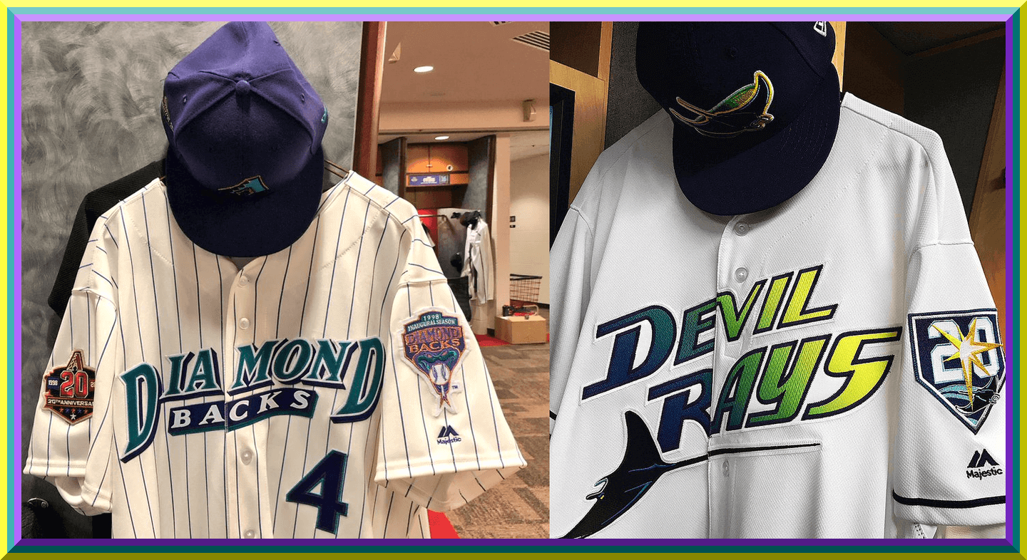
And of course, both teams wore throwbacks. First the Rays:
The 1998 throwbacks were pretty spot on to the originals, with the exception of the anniversary patches on the cap and sleeves. Back in 1998 (and still, today) I never liked the uniform. I was amazed at how many people seemed to love it (and many of those were probably actually alive back then). I always thought it was, I donno, just NOT a real baseball uniform. I never liked the gradient or the font, and the cap with the ray was, well, different. But I give the team credit for trying to think out of the box. Considering where we are in baseball fashion today, they’ve actually aged fairly well.


The team nailed the throwback pretty well and even had special throwback helmets (or at least decals) created for the game, which was a nice touch. The squad looked pretty good.
You can see the special 20th anniversary patch on the cap here:

And on the shoulder here:

There was even throwback dugout gear:

Overall, well done, even if the jersey screamed 1998 then (and still does now):


For their part, the Diamondbacks also wore (one of their) original 1998 uniforms, opting to wear the purple cap — this was the combination they wore on March 31, 1998, so it was a true throwback. It came complete with a patch designating the first game in D-backs history.

Like the Rays, the Diamondbacks did a nice job with the reproduction. They, too, wore a special patch designating their 20th anniversary on the right sleeve.

Zack Greinke started last night for the D-backs, and the team did up a nice graphic sorta-superimposing his release with that of Andy Benes — their 1998 starter:

Like the Rays, the D-backs also had purple throwback helmets so as to complete the 1998 look:


Nice job by both teams. The fans really enjoyed both games, even though both home teams lost. It was fun to see the unis once again (and it won’t be the last time for either — although the Diamondbacks will be throwing back six times this year, this will be the only original 1998 uniform; the Rays will wear these again). Purple, teal, gradient — all products of the 1990s — are back, if only for a few glimpses. Maybe they’ll grow on me with time, but right now, let’s be glad the colors and styles are just for throwback games.


With the NCAA’s 68 team tournament now down to just two teams, I’m back with the original (and still the best) Jimmer Vilk, who will give us one of his famous “5 & 1’s” (only this time it’s a double-stacked 10 & 2) — as he has done for umpteen straight years, Jimmer is back this year with his roundup for the top ten, two bad, and two honorable mention uniforms for the NCAA Tournament.
Enjoy it folks. This is more than likely Mr. Vilk’s FINAL list of any kind on Uni Watch.
Here’s Jimmer:
One Final Moment
By Jim Vilk
For my final Shining Moment I wanted to get as many schools in as possible, so there will be no repeaters as I sometimes had in the past. It made for some tough choices. including one Phil’s not going to like. Didn’t do it on purpose, buddy.
Here’s Luther to get you in the mood. Ready? Let’s do this.
Honorable Mentions to Oklahoma/Rhode Island

At least the Sooners’ BFBS trim and swoosh make the important stuff stand out more.
And to Texas Southern/North Carolina Central

So long, Russell Athletic…I’m going to miss you!
10. Iona/Duke

The Gaels’ uniform mesmerizes me.
9. UMBC/Virginia

I would’ve picked this matchup even if it didn’t end in legendary fashion.
8. Loyola/Miami

Glad to see the Ramblers’ script going DEEP into the tourney!
7. Davidson/Kentucky

Kentucky is the Croatian soccer team of NCAA basketball and that’s a good thing.
6. Texas A&M/North Carolina

Phil REALLY wanted A&M/Michigan instead, but even in maize I don’t like how the Wolverines look these days.
5. St Bonaventure/Florida

BROWN!
4. Alabama/Virginia Tech

The second of three Swoosh vs, Swoosh games I actually like.
3. Seton Hall/Kansas

This beat Duke/Kansas because I liked the Hall’s script and double blue better.
2. West Virginia/Villanova

Nova’s throwbacks and this matchup make me want to tweet #BringBackTheEasternEight
1. Clemson/Auburn

Both Tigers were stripe-a-licious!
The next to worst: Florida State/Xavier

Question: What’s worse than BFBS vs tiny printing?
The really bad one: Houston/Michigan

Answer: Low-contrast BFBS vs. *irritatingly* tiny printing.
Thanks, and take care.
For reasons not worth getting into (and I honestly don’t even know them all myself), this will be Jim’s final list on Uni Watch. He’ll still be contributing in other ways to the blog, so we haven’t gotten rid of him just yet ;), but enjoy the last one from the original…and still the best…Jim Vilk.
Thanks, mi amigo!

Old Time Base Ball Photos
Readers will recall I featured Ronnie Bolton (who posts on Twitter as @OTBaseballPhoto and who you should definitely follow) earlier this year with some great football played on baseball field photos and writeups, and more recently with some MLB Opening Day specials. As his twitter handle implies, Ronnie’s specialty is old baseball photos.
Since the Devil Rays and Diamondbacks both threw back to their original uniforms last evening, I asked Ron if he could crank up the way-back machine and grace us with some photos and information for games played much earlier than 1998 (the inaugural year for Tampa Bay and Arizona) for those two locales. He didn’t disappoint.
Enjoy. Here’s Ronnie:
Al Lang Field, 1947

This waterfront ballpark was built in 1947 and is located just over a mile from where Tropicana Field sits today. It was named in honor of Al Lang, the former mayor of St Petersburg. Lang’s work was instrumental in bringing MLB baseball in the form of spring training, not just to this city, but the state of Florida. Earning him the moniker “Father of Spring Training”.
The first game at the new ballpark was played in 1947 as the Cardinals beat the Yankees. The highlight of the game was a Stan Musial home run, the first at the new ballpark. Over the next 60 years the ballpark was home to at least six teams, including the Yankees, Cardinals and Giants. In 2008 the 7,227-seat ballpark would host it’s final spring training game and then would be transformed into a soccer stadium for the USL Tampa Bay Rowdies.


Warren Park, Bisbee, AZ, 1909

Built in 1909 for the town miners and their families, the Warren Ballpark is still around today making it one of the oldest active ballparks in the country. And it wasn’t long after it was opened that it began to host games between town teams and on November 7, 1913, the New York Giants and the Chicago White Sox were the first big league teams to play a game there, Jim Thorpe would hit a memorable home run as his Giants routed the Sox 9-1.
Over the years several minor league teams called it home as well as the Bisbee High School Pumas, who started playing their football and baseball games at the complex and still do today.

Thanks, Ronnie. He’ll be back periodically with more wonderful old photos and the backstories that go with them.
Uni Watch News Ticker
By Phil

Baseball News: Chief Wahoo will retire from Indians uniforms following the 2018 season, but the Indians’ classic logo remains popular with fans. One local designer has just the thing for them: The “Hiding Wahoo” t-shirt (from Alex Hider). … On Friday night, one of the Rockies was wearing some Spring Training equipment (from Curtis Galvin). … Many of us are concerned about how Under Armour will handle MLB uniforms beginning next season, but if they can create road unis with this heathered gray texture, it might not make the logo on the chest as painful (from Kevin Jones). … Tweeter Kyle asks if “Marcus Stroman still using a #BlueJays hoodie from 2015?” … Nice touch, Mets: the team will honor Rusty Staub by wearing a patch featuring his autograph in orange on the right sleeve of their home and away uniforms for the 2018 season (from Walter Young). … “Devil’s Backbone Earned Run Ale will be available in curly W clad cans at retail,” writes William Yurasko. “The Virginia craft brewer was bought by AmBev in 2016. AmBev has pouring rights for the Washington Nationals.” … Also from William Yurasko, a DC brewer Atlas Brew Works also created a beer a few years back for Nationals Park that is also sold at retail – the 1500 South Cap Lager. … Youngstown State baseball wore pink yesterday to “raise awareness for breast cancer” (from Robert Hayes). … Looks like those new “lets speed up the game by providing relievers cool bullpen carts to get them to the mound” isn’t having the effect envisioned: All 13 relievers declined a ride on the new bullpen carts on Friday (via Paul). … We know in Cleveland it’s the pitcher’s decision on jersey, but the Indians have gone with midnight navy again (from Robert Hayes). Tweeter Kyle Good points out that of the 5 man rotation, Trevor Bauer is usually the only one that doesn’t choose the Navy jersey. … The Giants are selling these shorts with a bunch of different patch designs throughout their history in the MLB online shop (from Joe Farris). I’d wear those. … It was “Kid’s Opening Day” in Cincinnati yesterday. The Reds were using hand-drawn photos submitted by kids on the scoreboards instead of team photos (from Alex Hider). … In yesterday’s Pitt-UVA game, UVA Baseball went with a single-digit pitcher: Number 9, Daniel Lynch (from Wayne Jones). … Yesterday, the Phillies had a Villanova style hat to cheer them on before their Final Four game (from Blake Fox). If you read the tweets that follow, you’ll see many MLB teams cross promote colleges and universities in their State. … Shockingly a Cubs-centric blog thinks the Cubs have the best uniforms in the NL Central. … Oops: which Indians cap is the correct one? After this year, they won’t have that problem (pic from Brian Lobban). … “Sorry if was already covered, and I missed it,” writes RIP Ace, “but I’ve never seen a @Royals player with sock stripes until Thurs (John Jay).” … Manny Machado wore orange shoes last night. “I can’t remember him ever having done so before, especially with the high socks,” says Andrew Cosentino. “Additionally, it appears that the Orioles will continue their tradition of wearing their orange jerseys on Saturdays.”

NFL News: Gone but never forgotten: Ignacio Salazar spotted this old truck complete with vintage Houston Oilers logos around Houston yesterday. … Some neat vintage finds from Chris Pajewski: an AFC and an NFC lunch box (or is it lunchboxes — not sure if it’s two separate ones of the flip side on one). … “Jamal Adams posted this picture of himself wearing a throwback Kelly Green Jets uniform,” writes Greg Kissler. “I know the Eagles get all the love when it comes to kelly green uniforms, but come on, the Jets were just as nice.” … (Cross posted in NCAA Hoops as well): Yesterday, Tom Brady posted this edited picture on his IG of him on the Michigan Wolverines Basketball team. No Jordan Brand, NCAA and Big Ten Logos (from Martin).

Hockey News: The Vegas Golden Knights are less than one season old and already they’re retiring a number. But it’s not what you think. They’re retiring #58 and last night raised a banner with 58 stars to honor victims of Oct. 1 mass shooting (from Steve Sher). Here’s some video of the ceremony (from James Gilbert).

NBA News: The Grand Rapids Drive had a player, Zeke Upshaw, collapse during the final minute of last weekend’s game. He died a couple days later. On Friday night, the team wore a patch in their only playoff game in his memory (from John Chapman). … In addition to the NFL lunch box found above by Chris Pajewski, he also found these vintage Pete Maravich kicks, in McKinney Texas. … If Conrad Burry’s reporting is correct, the Orlando Magic will wear their classic blue pinstripe unis next season.

College Hoops News: (Cross posted in NFL section as well): Yesterday, Tom Brady posted this edited picture on his IG of him on the Michigan Wolverines Basketball team. No Jordan Brand, NCAA and Big Ten Logos (from Martin).

Soccer News: The following three items are all from Josh Hinton: (1) Here’s a good article on USL club names. … (2) The Sky Bet Championship, the 2nd tier of English soccer, put out this tweet that noted how tight the race for the playoffs were (3rd-6th make playoffs, 1st and 2nd automatically promote to the Premier League). (3) However, the image they used for the standings uses the wrong Brentford logo. This is the correct logo. … Yesterday there was a number malfunction for Liverpool’s Sadio Mané (from BandaBear). … In yesterday’s match, Paris Saint-Germain wore golden NOB and numbers during the french league cup final once again (they did it in ‘16 and ‘17 as well). From Florian McGill.

Grab Bag: When your equipment gets stolen, you make do: “We’re lining up against the Roosters in our Heritage jersey tonight due to the theft of our away jerseys and equipment.” (from Jonny Foreigner). … Syracuse lax has some interesting sleeveless jerseys (from @EBrooksUncut).
Happy Easter to all who are celebrating today.
Are those Tampa Bay caps really authentic? I thought that 98 team had black caps, not blue. Yesterday’s caps looked like the same blue they use now. Maybe I’m wrong, I never saw them in person, only on 1998 televisions. But to me the blue caps looked anachronistic.
The original hat was black. This new navy blue retro cap is supposed to be a blending the old and new design.
On a day when the Rays had no competition from the Lightning, one of their top draws in town with Boston, and the 1998 anniversary promotion, Tampa Bay drew only 17,838 fans.
Correct. The team’s uniforms for the first few years had black hats. The logo was also a TB, also with a gradient, with the swimming stingray below. Regardless of how you feel about the whole uniform, it was a pretty solid hat, and it was distinct.
For these throwbacks they just put the clunky ray-only logo on the current color hat, probably in an attempt to sell more hats by blending it with the current uniform. They should’ve gone with the true throwback as that hat looked much better.
Also, the original Rays through 2007 had “Tampa Bay” on the road uniforms, as it should be. That’s been gone since 2008, and it bothers a lot of people around here who feel local pride. If they get a new stadium here, one of the conditions of using any public money should be a return of Tampa Bay to the road uniform.
I remember the TB/ray hat, but I think they did have a ray-only hat without the TB on it early on, like this one:
link
Not sure if this was an alternate, or if they moved to the TB after the first year?
Totally agree about “Tampa Bay”. Every team should have city name on their away jerseys. For my money their early 2000s green sets were their best.
The blue caps are anachronistic – the 98 Devil Rays wore black.
But the blue caps are also a huuuuuuge upgrade. Makes all the difference between the originals, which were a dated-in-their-time near miss, and a beautiful throwback uniform.
Oh, I agree, I like this blue. Really makes the yellow highlights pop nicely.
I always love the Jim Vilk uniform rankings. I like the Clemson-Auburn selection because I love orange. And the Iona uniforms are weirdly cool. And I like the UMBC uniforms, except for the script, and that leads me to my next comment.
But I don’t get the fascination with the Loyola script (I’ve seen other people also make positive comments about the script). First, it’s too small. Second, it looks like the cheapest font the local sporting good stores down the street had for youth league uniforms. UMBC’s script has the same feel, even if those scripts are completely different. I love the Loyola story, and I rooted for them all the way. The color scheme is great, but I’m not a fan of the script.
I always love the Jim Vilk uniform rankings.
I would respond to this comment, but after this part, the rest of it sounds like Charlie Brown’s teacher: “Wa wa waaaa, wa wa wa wa….”
OK, some of the rest of the comment finally sunk in. Yes, the script is too small, but small script is better than no script. And at least it was bigger than Michigan’s micro-block lettering.
I’ve heard of Al Lang Field but never knew it was that close to the water.
Interesting aerial photo; for a venue built in 1947 there are several vintage vehicles (Model T’s?) parked along the street.
That first photo appears to be of Waterfront Park, Al Lang Field’s predecessor. Waterfront Park was demolished and a new grandstand built further inside it to create the new field in 1947. Compare the two here.
link
link
Thanks Robert, I am not surprised that someone in the Uni Watch community would have the explanation.
In those days they made cars – and ballparks – to last.
While Trevor Bauer is the only active Indians starting pitcher to go with the road grays, DL’d starter Danny Salazar is the only member of the Tribe staff to opt for the navy jersey/red block C cap at home. Any link between Salazar’s injury history & his lack of fashion sense is purely coincidental.
That terrific NFL lunch box taught me something! I noticed it has both Seattle and Tampa Bay, but they are shown in the “wrong” conferences. I never knew that Seattle was initially assigned to the NFC West and Tampa Bay to the AFC West in their inaugural 1976 seasons, and the teams had a special schedule where they’d play every team in their conference once, then each other. In ’77 they flipped conferences and did the same thing. That way the new teams could play all other teams in the league over their first two seasons. In 1978 they assumed their regular schedules.
Those lunch boxes are definitely from 1977 since the Seahawks wore plain silver helmets in 1976
(Insert eye-rolling emoji here)
YES!!
COTD For Stan stirring the plain helmet pot!
A lot wrong with that Jamal Adams Jets fauxback; no need to get into them here. I think I’d like to see the 1978-89 unis as a throwback, if and when the NFL rescinds the stupid one-shell rule. But they are in no way superior to what they have now, or what they had prior to 1978.
My preference for the Jets is the present uniform, just lightening the green to a kelly green. Like the pre-1978.
Not sure if it was popular or not liked by Jets fans, but I did not mind the 1990-97 unis in the kelly green with a bit of black trim:
link
If we are talking alternate Jets helmets for a throwback, would love to see this:
link
For those that miss the presence of kelly green in the NFL, here it is in abundance in a little trip down memory lane:
link
Jets kelly green < Eagles kelly green look. The Eagles paired the green with silver pants. And the silver wings on the helmet beat the futuristic wordmark.
You can assume it is one lunch box. Look at the latch.
I think Robert is right, that is Waterfront Park and not Al Lang Stadium, I thought the cars looked outdated for 1947. Will have Phil make correction.
Now fixed.
Thanks for all the contributions, Mr Vilk. The beauty of UniWatch is to see the pics and then find out that it is truly in the eye of the beholder.
I think maybe we’re missing the point. It seems to me Vilk’s strength as a contributor was that he didn’t take us by the hand. He treated us like adults. He respects us enough to forget us.
That took courage.
Later, JV!
Thanks.
As I always said, these lists weren’t THE authoritative lists…they were my lists. If anyone agreed, great. If not I welcomed their thoughts. Looking forward to seeing someone else’s take next year.
The more I see of St. Bonaventure, the more firmly I believe that the Cleveland Browns should drop the orange, entirely.
The more I see of St. Bonaventure, the more firmly I believe that the St Louis Browns need to rejoin the American League. ;)
And while I like orange, I wouldn’t mind seeing a concept of your idea.
Keep in mind that Bonaventure used to have one of the more over-the-top mascots, not just Indians but link.
Manny Machado’s shoes look like he borrowed them from Mickey Mouse.
Watching the Indians play the Mariners this weekend, their “dark blue” looks almost black.
The Vegas Golden Knights retiring No 58 seems a little forced to me.
It’s not at all forced for those of us who live here.
He is Risen! Happy Easter to all!
Great pictures of the historic fields in St Pete though I am surprised you didn’t mention that the NY Mets played exhibition games @ Al Lang! They took the place of the Yankees (who left to go to Ft Lauderdale because of St Pete’s Jim Crow bigotry – irony of ironies) & shared the park with the Cardinals from 1962 to 1987. The primarily wooden structure was completely rebuilt using all concrete at the same location and renamed Al Lang Stadium in 1977. Soon after Stu Sternberg bought the team, the Rays proposed the idea to build their new stadium using the Al Lang location but it was shot down by the city council (mostly because the site is way too small for a MLB stadium). Also, I may be wrong, but the picture of the sliding pit was probably taken at St Pete’s Miller Huggins Field (aka Huggins-Stengel) or Busch Field (the Cards split their players between them)(and the Mets worked out at the Payson Field complex). And as a PSA, if you haven’t visited downtown St Pete (the Dali & Chihuly museums, fantastic restaurants and vibe – you can even go to a few games at the Trop) or relaxed on our beaches, come on down and have a great time! You will not be disappointed…
ESPN wrote about several players on Michigan who wear pink shoes: link
Obviously the MLB Pastel Colors was a prank, but the whole idea feels so well thought out compared to most of MLB’s holiday garb. Aside from Houston and Minnesota, the color choices for the jerseys work really well. MLB could do, and has done, worse.