The 2018 MLB season kicked off yesterday, with 13 games on the schedule (down from 15 due to a pair of rainouts). Here’s a rundown of all the uni-notable developments:
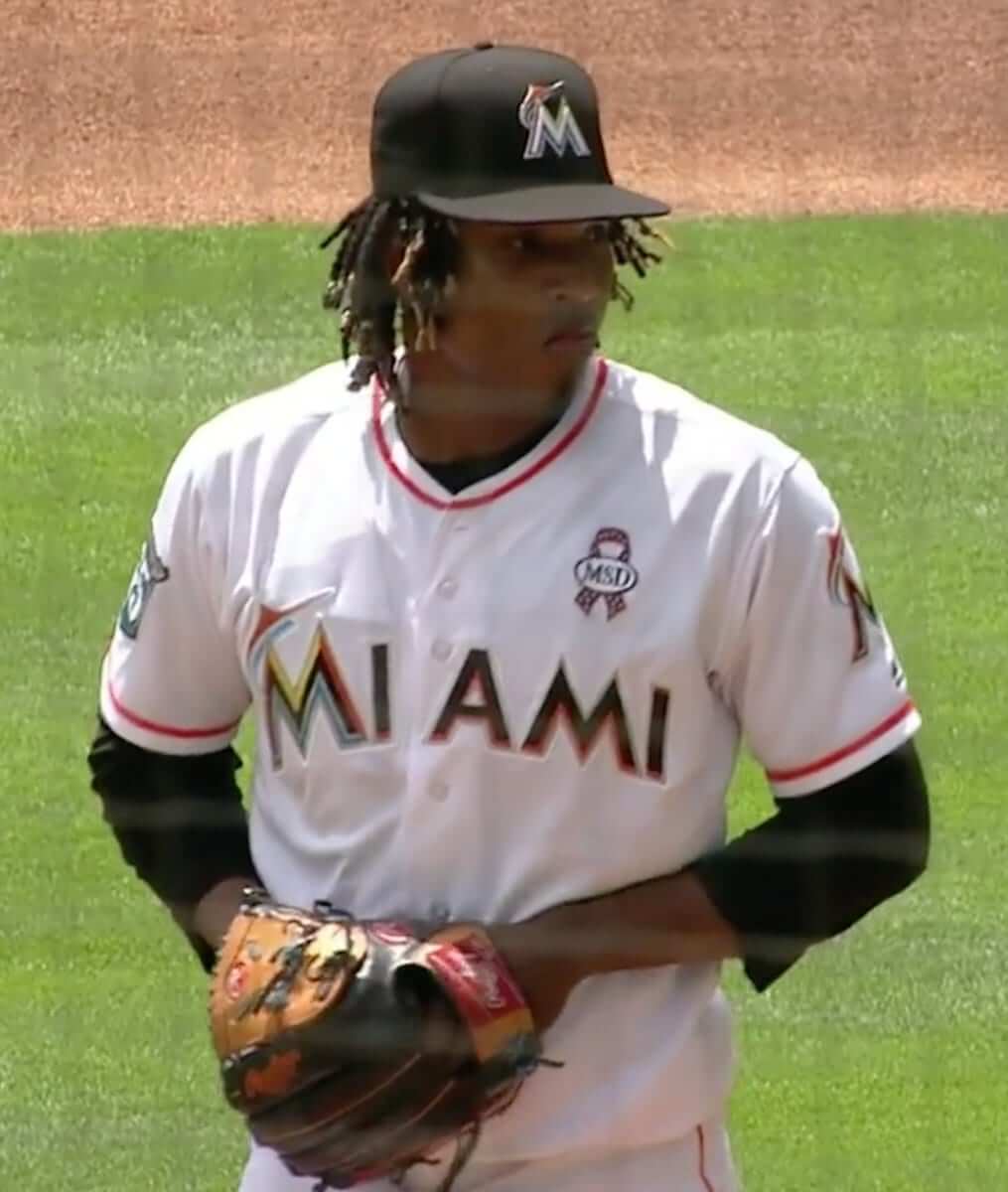
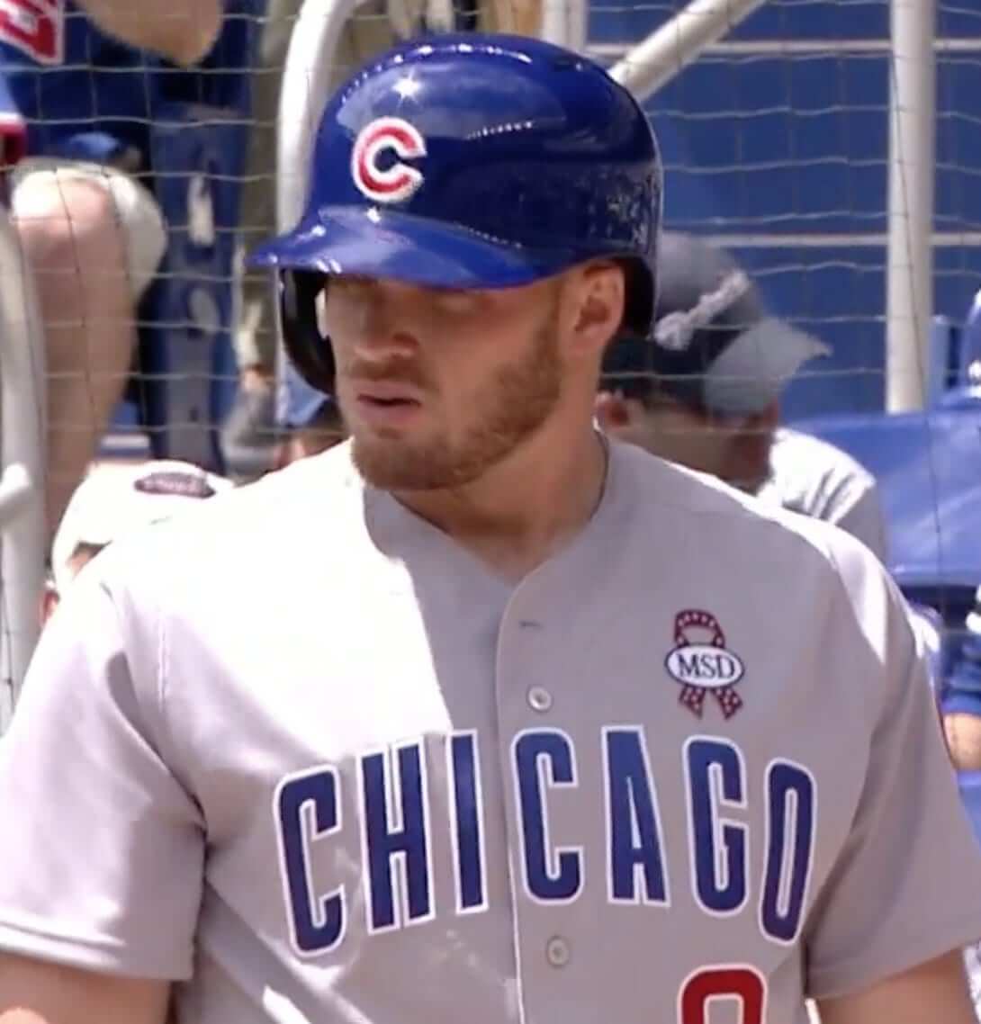
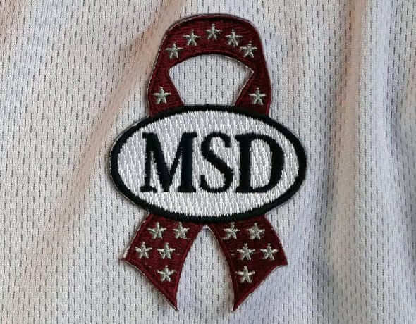
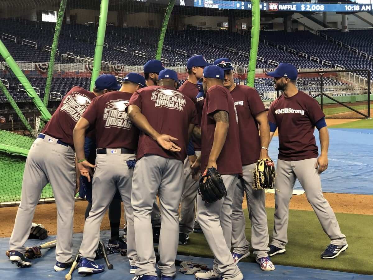
• In Miami, the Marlins and Cubs both wore ribbons for the recent shooting victims at Marjory Stoneman Douglas High School. The ribbons had 17 stars — one for each victim. They also wore special batting practice shirts (click to enlarge):
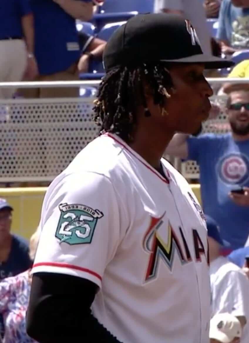
• We also got our first look at the Marlins’ 25th-anniversary patch on a jersey. We’d seen the logo before, but it hadn’t been worn as a patch until yesterday:
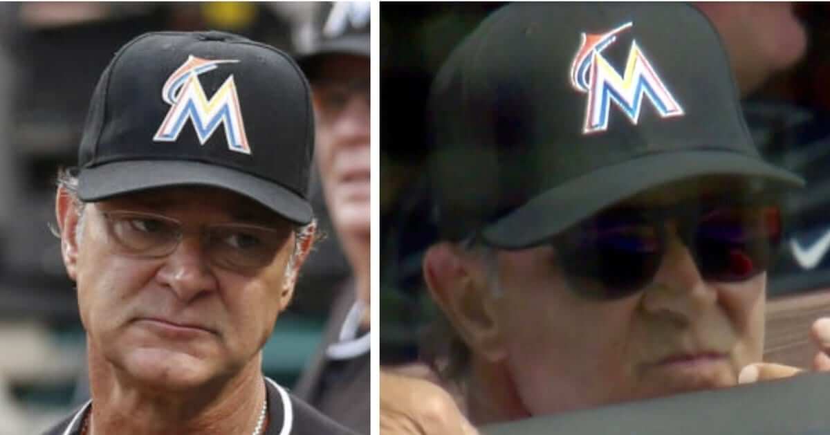
• More Marlins: Although there’s been no official announcement and no change shown in the MLB Style Guide, the Marlins appear to have reduced the size of their cap logo. The photo on the left is from last season, and the one on the right is from yesterday (click to enlarge):
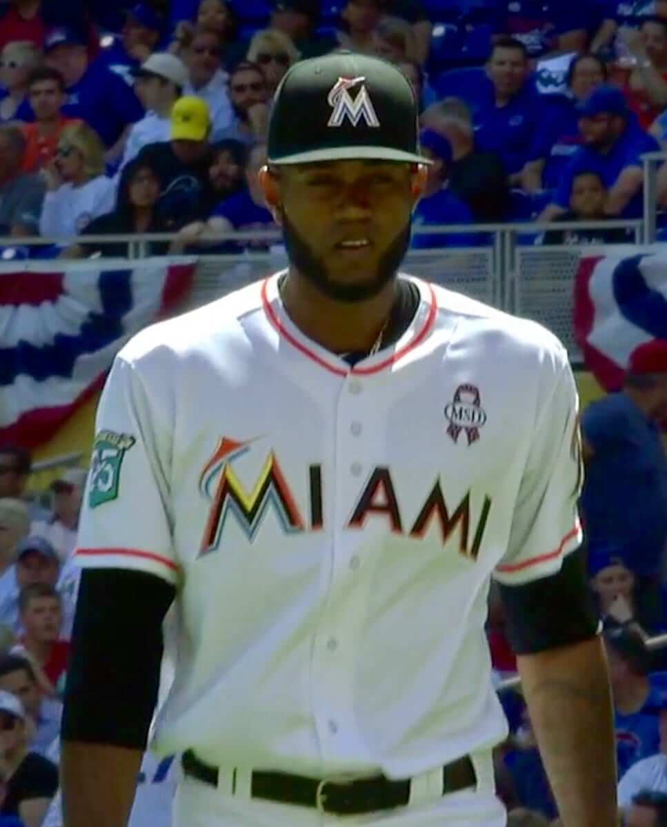
• And still more Marlins: Pitcher Tayron Guerrero had an unusual placket on his jersey yesterday, with three buttons above the lettering instead of the usual two (click to enlarge).
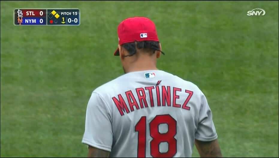
• Cardinals starting pitcher Carlos Martínez had an accent on his NOB. That’s new for this season — he didn’t have it last year.
Although I don’t have a photo, Cards infielder Jose Martínez has had an accent added to his NOB as well. (No first initial for either Martínez.)
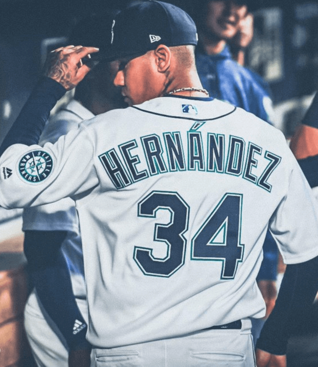
• Speaking of accents, Mariners pitcher Felix Hernández now has one. In past seasons, he didn’t have it.
• The Mets added a white “10” to their mound in memory of former player Rusty Staub, whose death was announced earlier in the day. He’ll always be No. 4 to me, because that’s the number he wore during his first two seasons with the Mets (including in the 1973 World Series, which I still remember like it was yesterday), but it’s true that he wore No. 10 for most of his Mets career, so that’s the appropriate number for them to have used.
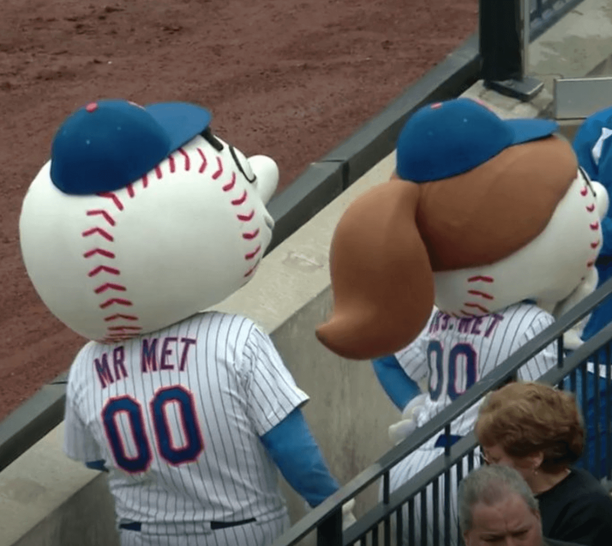
• Speaking of the Mets, mascots there was a major — major! — NOB inconsistency between mascots Mr. and Mrs. Met. He didn’t have a period on his NOB, while she did (click to enlarge):
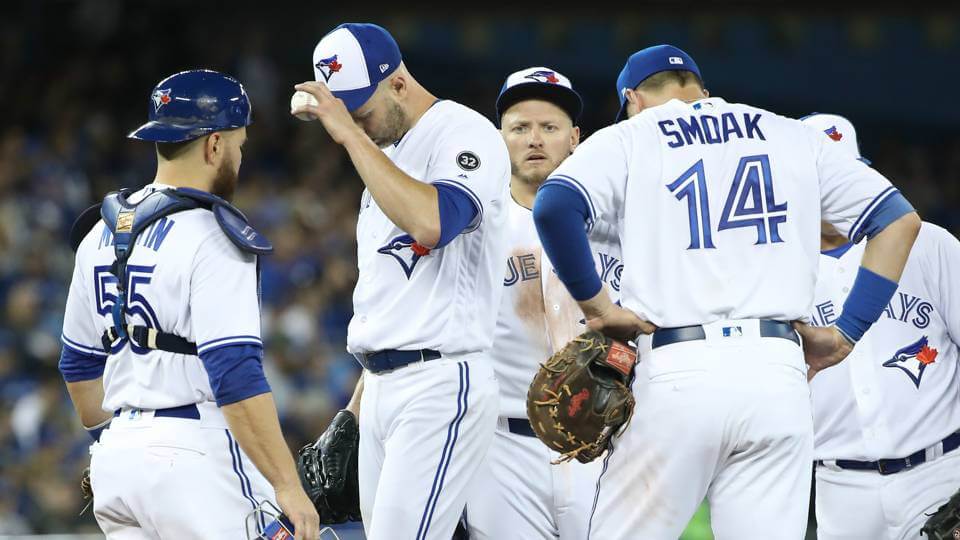
• The Blue Jays retired Roy Halladay’s number prior to their game. They used the team’s current number font, which Halladay never wore during his time with the club:
Roy Halladay's number 32 retired by #BlueJays pic.twitter.com/yw30jBo3Yo
— Chris Creamer (@sportslogosnet) March 29, 2018
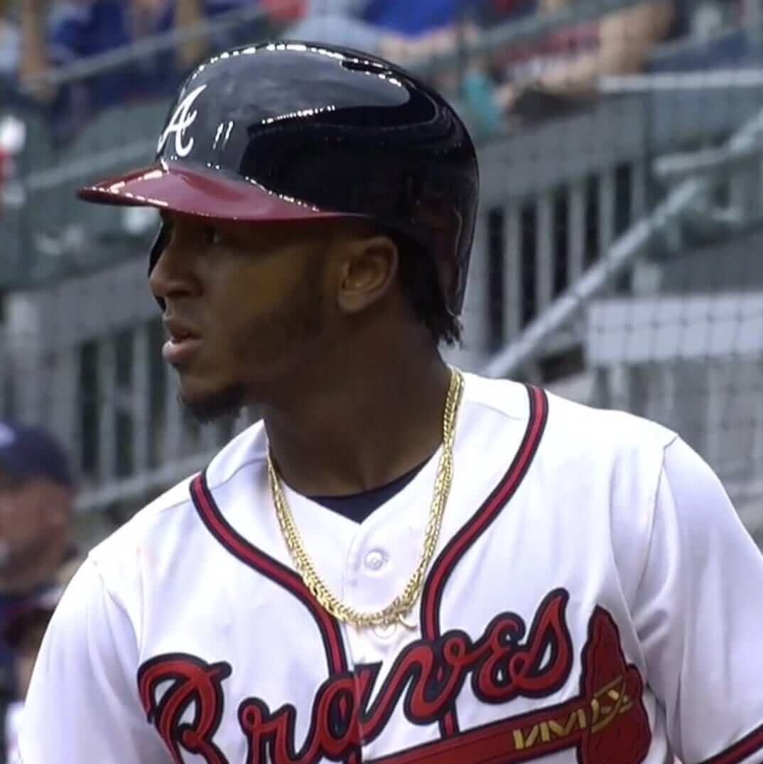
• Last year the Braves switched to a raised helmet logo. One year later, they’ve gone back to a flat decal:
• Padres reliever Adam Cimber made his MLB debut and became the first player in MLB history to wear No. 90:
When Phillies pitcher Pat Neshek makes his debut, he’ll become the first player to wear No. 93. That will leave 80, 86, 89, and 92 as the only unworn uni numbers.
• The Blue Jays wore their alternate caps with the white front panel:
• Traditionalists will be glad to hear that all 13 of yesterday’s Opening Day home teams wore white. Nine of the 13 road teams wore grey, the exceptions being the Twins, Angels, White Sox, and Cleveland.
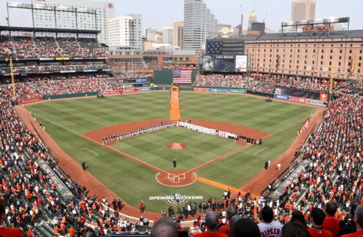
• As is customary in Baltimore, players lined up for their pregame introductions on the infield, not on the baselines. I’m not aware of any other team that does it this way (click to enlarge):
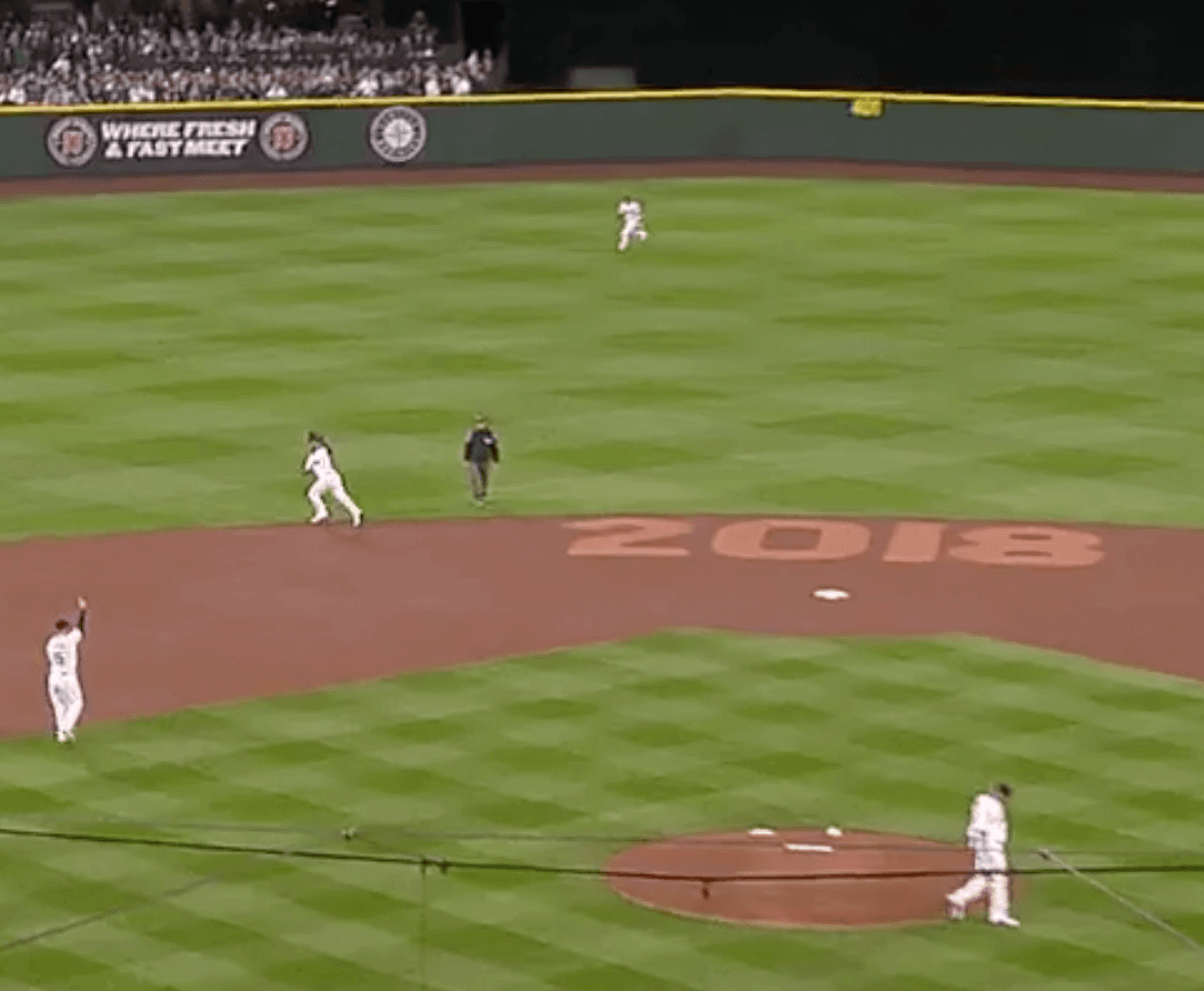
• Here’s something I don’t recall seeing before: In Seattle, the Mariners had a big “2018” stenciled onto the infield. Do they do this every year?
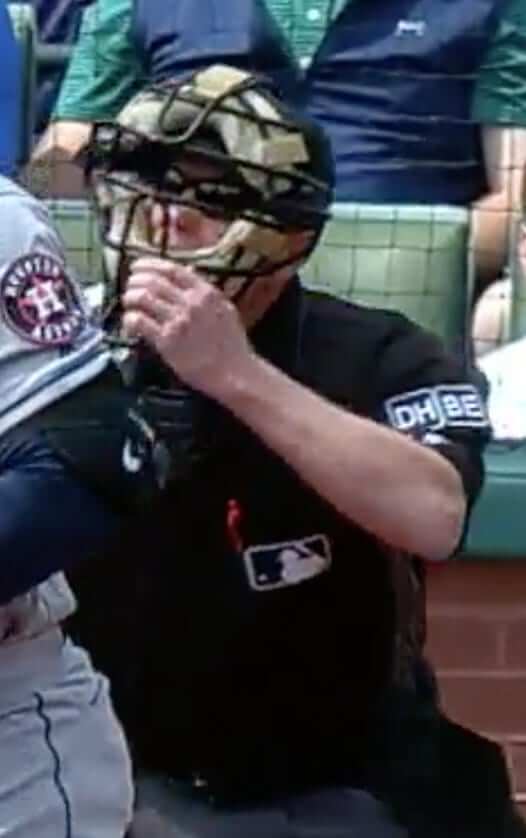
• By the end of last season, MLB umpires were wearing four memorial patches for retired umps who’d passed away during the year. Those are all gone now, but they’ve been replaced by two new patches — “DH” for Doug Harvey and “BE” for Bob Engel.
• The Diamondbacks used five relievers — and all of them chose not to use the team’s new bullpen buggy. (Update: The Tigers are also adding a bullpen buggy.)
As for me, the Mets’ magic number is down to 162, so I’m happy. How did your team do? Oh, and for those who are wondering, the tantalizing uni-related tidbit that I mentioned at the end of yesterday’s post ended up not happening after all. The source who told me about it turned out to be wrong.
(My thanks to all contributors, including Cliff Corcoran, Tim Dunn, Eric Garment, Wade Heidt, Alex Hider, Louis Levin, @MBDChicago, @quirkyresearch, Chris Richards, @smoresarefun, and John Stark.)

Mobile site question: About 10 days ago I started inserting new ads in between sections of each day’s post (like the ads that appear before and after this “Mobile site question” section, for example). Around that same time, some readers reported having problems with the site on their smartphones. The page would freeze, or the page would try to scroll directly to one of the new ads.
I was unable to duplicate this problem myself — the site worked fine for me on my iPhone — but yesterday we changed the ad code to a different media network. For those of you who were having problems, over the past week or so, have yesterday and today been any better?
Thanks for your feedback — it’s apprecated.
Todd Radom print reminder: In case you missed it earlier this week, I’ve collaborated with uniform designer/scholar Todd Radom on a museum-quality art print that’s similar to the T-shirt design he recently did for us. It’s being produced in a limited edition of 150, with each print hand-numbered and signed by Todd and myself. And we’ve already sold through more than one-third of them, so move fast.
The design is filled with lots of little Easter eggs that are of personal significance to Todd and me — full details here, or you can go straight to the ordering page. My thanks, as always, for your consideration.
The Ticker
By Alex Hider

Baseball News: Here are some good shots of the new “Reds Threads” exhibit at the team’s Hall of Fame and Museum — a display of old jerseys worn by the Reds and other teams throughout history. Phil will have a full-blown treatment of this soon (from Keenan Singleton). … Speaking of the Reds, C Devin Mesoraco had a set of bats made from wood harvested from his property in Pennsylvania — and even used a few of them in games! … The Giants have added a uniform history page to their website, dating back to the move to San Francisco (from Brinke). … Here’s a good look at past Astros uniforms (from Phil). … Yankees P Josh Rogers donated new uniforms to his alma mater, New Albany High School in Indiana (from Josh Claywell). … Mario gets it (and goes first NOB, though there is some controversy surrounding it) (from Patrick Lindsey). … New umpire uniforms for NPB in Japan (from Jeremy Brahm). … The Nassau County Police Department on Long Island had its own baseball team back in 1933. Look at those sweaters! (From Brian Wulff.)
College Football News: Sure looks like UAB stole a photo of Colorado State’s stadium and photoshopped the Birmingham skyline behind it for a social media graphic (from Joel Mathwig).

Hockey News: This is an interesting concept: One blogger thinks that if the Golden Knights win the Cup this year, the players should show up to the championship parade in the jerseys of the teams that let them go in the expansion draft (from @NotHotTakes).

NBA News: According to a report by Conrad Burry on Sportslogos.net, the Hawks, Hornets, Jazz. Magic, Pacers, Timberwolves and Warriors will wear throwback uniforms next season. … Speaking of the Jazz, someone baked a cake based on their tequila sunrise alts (from Benji King).

Soccer News: Couple of submissions from soccer expert Josh Hinton: Atletico Madrid 2018-19 home jersey design has reportedly leaked, Brazilian club Palmeiras has unveiled their home kit for next season. … The resurgence of ’90s fashion is having an impact in the world of soccer (from Ed Zelaski). … New uniforms for FC Isloch, a team in Belarus (also from Ed Zelaski). … Bleacher Report has done an in-depth feature about the sculptor who made the widely ridiculed bust of Cristiano Ronaldo last year, complete with an unveiling of the second bust he created in response to the criticism (from Kary Klismet).

Grab Bag: Fortune has published a history on one of the fiercest sneaker rivalries in the world: Adidas vs. Puma (no, not Nike) (from Josh Hinton). … It’s already been announced that this year’s Southern 500 on Sept. 2 would feature throwback paint schemes. Yesterday, Brad Keselowski announced his car will be modeled after Rusty Wallace’s 1990 car (from Stockton). … Golfer Soyeon Ryu was wearing one striped sock and one solid sock during her round yesterday (from Ethan Ganot).
Happy Good Friday and Passover to all who are observing today and tonight, and happy Easter to all who are celebrating on Sunday. Have a great weekend and I’ll see you next week. — Paul
Tayron Gurrero is missing the link to the picture.
Coding glitch. Now fixed.
Kind of bizarre, but for me the headline says “friday” instead of “MLB Opening Day Recap.”
My fault. Fixed!
Site is working much better. Thanks for looking into and fixing
Ditto that. No issues here.
Same here. Much smoother and faster now.
Seems to be working better on my phone too. Thanks!
Ms. Stoneman Douglas’ first name is spelled “Marjory”
Ah, thanks for that. Fixed.
From yesterday: “…I’ll be alert for any uni-notable stuff that pops up in the various season openers (including one tidbit that I’m already aware of but am not allowed to talk about).” So what was the tidbit?
Actually, the person who had tipped me off to that tidbit turned out to be wrong. Didn’t happen (at least for now).
Perhaps the tidbit was rained out and, therefore, not allowed to be made official?
No.
Interesting that the Marlins reduced the size of their cap logo, while the Tigers increased the size of theirs. Wonder if there is now a required dimension for cap logos that both failed to meet? Or is it just arbitrary?
I think there is a league limit so if one team makes theirs larger somebody else has to make theirs smaller
How’d my team do? Phils new skipper Gabe “Welcome Back” Kapler blew their opening game win by micromanaging. Only 161 more to go. Yay.
Yeah and my Red Sox blew it by doing the opposite. I still don’t understand the point of your best reliever not pitching to be used later for a half inning that never comes.
Closer use is asinine in the majors. Drives me crazy.
At least y’all’s teams didn’t give up two runs off errors to one of the worst teams in MLB (Miami). Granted we won the game but I can’t stand giving up runs off errors.
Boo hoo. You still won.
My team beat the Devils in overtime. (Baseball? I don’t think I’ve ever been less excited.)
That was one wicked play. Not quite a baseball bat swing, maybe more of a bunt (a full swing would be kinda illegal and dangerous anyway), but it worked.
True, the pitch count should be a factor nit the determination of when your starter is done! This asinine over managing is killing baseball!!!
Grrrr… don’t get me started. 5-0 against a lousy team with your ace in command. C’mon, Gabe. Don’t #BeBold, if to #BeBold is to #BeStupid.
Site was crashing all week until your changes. I couldn’t get through a section before the page would go away. Glad it’s fixed.
Thanks
I can say with 100% certainty that the Mariners do not put “2018” on their infield every year.
Well played
You can say with certainty that the Mariners have not put “2018” on their infield in the past, but you can’t say that about future years. If this is the year they win it all, they may want to commemorate it down the line.
While everyone’s trying to out-pedant each other, can anyone answer my actual question about whether they’ve put the year on the infield before?
Video link: link
They did it last year, at least. Though it’s absent at the start of the video, there’s also no chalk lines down on the infield dirt yet, but there’s a cut to a later point in the pregame at about 30 seconds in, and as the scene pulls out, you can see the 2017 on the edge of the dirt behind 2nd.
Ah, so I see. Good find. Thank you!
“2017” is under the annoying Getty wordmark in this photo:
link
Slide show from the San Jose Mercury News: link
The year was there in 2016 as well. Not as clean a look at it, as the photos are at ground level, but you can see the markings behind Junior from his ceremonial first pitch. (Also, unrelated to the year markings, there are a couple shots of some nice striped socks in that game.)
2015, at about 32 seconds in this video: link
2014, at about 25 seconds: link
2013, right off the bat: link
Faaascinating — so it’s a Mariners ritual. Interesting!
Good work, Rob.
See also my reply to Tim below, who also found some pics from 2015 and 2016.
As I noted down there, I haven’t seen anything from 2012 yet, but there was something different in 2011.
I don’t know, I was somewhat enjoying the pedantry.
In addition to Rob’s findings downthread, the M’s also do this sort of thing for special events like this one:
link
2003
link
2007
link
2009
link
2010…you can make it out barely behind the Big Unit throwing out the first pitch
link
Yes — every year. They’ll stencil in various things there throughout the year for big honor days, too — they had “24” on the day that KG suddenly retired a few years ago, “THANKS” on fan appreciation weekend, and so on.
“THANKS”, 2017 link
“24”, link
I did a search on Getty Images, and found that it goes back to at least 2005, as that’s the earliest I can find a shot of that area of the infield on that site.
It’s very hard to tell in link, but it would appear that they did not mark the year on the infield in the first full-season home opener at Safeco in 2000.
That’s all for me on this one!
Did the Braves also change the brim of the helmet back to red when they made the switch to the traditional decal?
Home helmet vs. road helmet.
I primarily visit the site on desktop (Chrome, Windows 10), and those intersectional ads don’t show up for me even though I have the site whitelisted in my adblocker. However, most of the time, I visit the site at the school where I work, so maybe the ads don’t show up because they’re blocked by the school’s web filter. Weirdly, sidebar ads that are presumably blocked by the filter show up as unloaded elements and embedded tweets (social media is blocked) show up as text. Here are screenshots of what I see: link
Another notable home opener item. The Blue Jays wore their alternate white front panel caps instead of the solid blue. I wonder if this means they will be wearing the white front panel caps at home more this year? I sure hope so.
link
Oh, yes — I meant to include that and got distracted! Will add it to the entry now.
Do the Blue Jays normally wear all blue caps at home?
I think the white front panel caps looked pretty good with the white jersey set yesterday.
Lee
I was having trouble with the site this week, but I haven’t had any yesterday or today. Thanks.
My team lost to your team, but I’m glad baseball is back.
What was the little MLB tidbit you were keeping mum on yesterday?
Ended up not happening after all.
“UAB stole a photo of Colorado State’s stadium and photoshopped the Birmingham skyline behind it ..”
Yeah whatever.
The real story is the header photo behind the post (main page?). It ‘s one of the most frightening things I’ve ever seen!!
I’m curious what the criteria is for which NBA teams get to have throwbacks, especially since three of the teams on that list are also on this season’s, albeit with different designs. You’d think Nike would want to give every team that option, since it would help them accomplish their ultimate goal of selling more merchandise. I’ve gotta say, their tenure has thus far failed to impress.
link
Paul, I saw where you retweeted this about MLS and the kits lacking creativity. This is an issue that’s international with soccer kits; probably more so in Europe than in MLS. The issue is that big kit manufacturers(Nike, adidas, etc.) are making the kits based off their templates, which typically results in boring and dull kits. If MLS were to let each club get it’s own deal with a kit manufacturer, like how the rest of the leagues in the world do (including the USL, the American 2nd tier, and I will say that USL kits are more creative and typically better than MLS) then this would not be as big of an issue, but it would likely still occur because of the likelihood that clubs sign with bigger kit manufacturers.
There is one creative and far from dull kit that has celebrated, legendary status around here in Vancouver. The 1979 Soccer Bowl championship kit with the drop down nameplate within the jersey stripe.
link
Who as a Whitecaps fan would not like to see this as an alternate? Seems no way we will see this return if adidas refuses to adjust their template outside the box. Instead, we get presented with the plain, all the rage for now dark grey kit. Not much effort.
Indeed, Wade. Since MLS essentially did away with all third kits, which further drives the gap between global soccer and American sports (MLS tries to be both), they also did away with almost all of the city-inspired or retro-inspired kits.
Paul, the mobile site is working much better than two days ago. It would freeze, the only thing I was able to see were ads, and when I tried to comment it would freeze up entirely. Now that you changed the code, I works much better.
Happy Passover/Easter!
Mobile site working better now. I was having the same issues as others.
Paul also, not sure if you ever reallly cover hockey goalie pad design, but EBUG (emergency backup goaltender) Scott Foster played last night with all-Black pads, accept his mask was AC/DC themed. He obviously was given leeway to design his mask, but did he also choose the all-black pads, or were those just the generic ones given by the team to all EBUGs? Do emergency backups have leeway to design their pads or not?
I’d bet that his equipment is his that he purchased on his own as a beer leaguer, and if he’s comfortable with it for beer league, might as well use it in the NHL. Frankly, if he likes AC/DC, he probably went for black out equipment for the look.
Emergency call ups wear their own pads. Just thinking back to the 2 emergency call ups that dressed for the Canucks (but did not have to make appearances in the game). Both were Canadian University goalies for the UBC Thunderbirds. They both wore their blue and yellow clad Thunderbirds pads.
Chris Levesque in 2003 (back when the Thunderbirds wore navy):
link
Matt Hewitt in 2016:
link
This feels like low hanging fruit, but I feel like there’s a joke to be made about Mrs. Met having her period. anyone wanna take a crack at it?
No. It’s not 1975 anymore.
Lee
This isn’t “Teen” Uni-Watch.
It sure looked the Braves ditched the carbon fiber pattern on the home helmet, in addition to no longer used a raised logo. Is there confirmation on that?
They only wore it for the season-opening series last year, not for the full season.
Thanks!
Site is working much better and I definitely noticed a difference yesterday too. Good work. Thanks.
Does it bother anyone else that Mr and Mrs Met wear the same number?
Equality!
Mr. & Mrs. Met should wear 19 and 62.
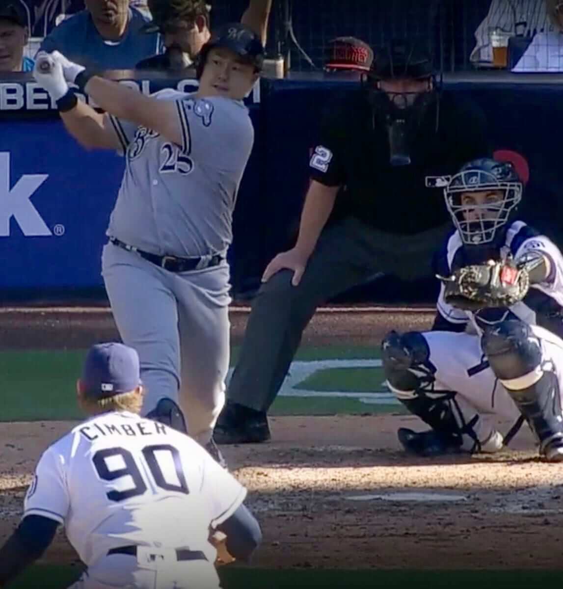
Anyone else notice that Giancarlo Stanton didn’t have the face guard on his helmet for his first home run but did for the second?
He wears it against right-handed pitchers but not against lefties. Been doing that since 2015. Pay attention! ;)
My bad, for some reason watching a shitty Marlins teams was never high on my priority list!
The Jeter-era Marlins are becoming a graduate seminar in why I never liked Jeter in the first place. The comically oversize cap logo was one of the few redeeming elements of the team’s current, mostly dreadful, uniform. It showed an accidental sense of whimsy and self-effacement completely at odds with Jeff Loria’s intended self-seriousness. Of course one of the first things the Jeter-run team does is shrink the cap logo so it looks more serious. Fun and whimsy must be stamped out! Idiosyncrasy is the enemy! Quirks must be cured! Jeter may have better baseball judgment than Jeff Loria, but if anything his aesthetic taste and class is even more Lorean than Loria.
The fun and whimsy will come as Jeter leads the Marlins to their next World Series championship. And when it does, the Marlins will dismantle themselves, and get ready to chase their next title after that.
Marcus Semien was wearing a Spring Training undershirt during his interview on MLB network after the game, you can clearly see it through his jersey.
link
Watching the Yankees game yesterday, thought it odd that Stanton didn’t wear the face guard his first at bat (and maybe during the second).
He wears it against right-handed pitchers but not against lefties. Been doing that since 2015. Pay attention! ;)
As the person above said (which I also should have been paying attention to ) I didn’t watch many Marlins games.
In another matter, I have trouble with the site constantly reloading on Firefox. Freezes the screen quite a bit. I don’t know if it has anything to do with it or not, but I tend to turn off all autoplay/HTML5 stuff.
I stopped using Firefox a year and a half ago because *everything* was freezing.
Yes the Mariners do the year of the season in alternate dirt color regularly. From
2015
link
2016
link
Based on the thread further up, we’re covered as far back as 2013. I’ve yet to find a good look at 2012, though.
However, in 2011, they put “MY OH MY” there, in memory of Dave Niehaus. link
Are the White Sox finally going to decide what uniform is home, away and alternate? If they are going to wear away jersey’s in grey, wear grey. If not, then just dump them and wear the black ones ( which I prefer). But wait, let’s wear the black ones at home! I know they used to let the pitcher choose but you never know what uni is going to show up for each game. As a life long fan, if they are sticking with these uniforms, I’m going pinstripes at home, black away, throwbacks on Sunday home games. Of course if I had my choice, I’d choose red pinstripes for home and powder blues for away and that’s it.
So you would prefer the Sox to wear black jerseys with grey pants on the road full time or are you suggesting that black pants be invented?
I understand having a preference for a particular combination or feeling another is overused but I think the club has had a pretty clear notion of which jersey is designated (home white, road grey, black alternate for either) for 25 years.
Yes! Mono-back for the White Sox!
Except for the socks!
What I would prefer is that the Sox pick a jersey. Is the white pin stripe home? Or is it the alternate black one they seem to wear 2/3 of the time. Is the grey the away? Or is it the black one? I get alternates but it seems to me that they wear the black jersey more than they wear the pin stripes or grey. Alternates for any team should not be worn more than the primary uniforms, kinda takes the specialness of wearing the alternate away. I stated I really like the black alternates and would not mind if they were to replace the grey uniforms.
Sorry I guess I didn’t answer your question clearly, I don’t care if they wear the black with grey or the white pants, I don’t want to see mono black.
The larger ‘D’ on the Tigers caps looks wack
The larger ‘D’ does scream out. Did they used to have it this size? I seem to recall they downsized the D the same year as the Indians downsized WaHoo on their caps but I could be wrong.
Looking at the cap version of the Tigers’ “D” on the jersey, its clear that the cap “D” is much less dense than the traditional jersey “D” with thinner brush strokes and fewer stems.
Which has the effect of making the jersey look extra bare. The old “D” seemed to carry enough heft that it gave the otherwise minimal uniform gravitas.
I’m sure I’ll get used to it but for now it just makes me appreciate the old design that much more.
Agreed.
Looking at Zimmerman on the round; the larger cap D makes the players look smaller. Like children in adults clothing.
Other observations from this game:
The Pirates cap logo looks yellow but their uniform trim looks ‘atheltic gold.’
Home plate empire has “American Flag Creep,” with the flag visible on his chest protector.
It’s odd to me that Hernandez and Martinez wanted accent marks anyway. I’m sure it’s their family custom, so I won’t question that, but typically in Spanish the accent is placed on the second to last syllable unless there is an accent mark. It just seems a bit unnecessary on those names.
I was about to post that. The next-to-last syllable is the default and I was taught *not* to write accent marks on words with that stress pattern in Spanish and Italian.
The Mariners do stencil in the year for each Opening Day. I have been to 6 of the last 8, and a group of my friends have gone the last 11 home openers.
Here are some photos from past years:
2018 – link
2017 – link
2016 – link
2013 – link
Paul,
Site working better. Noticed an improvement when the ad at the bottom went away.
The SF Giants uniform history page indicated that an alternate black home jersey debuted in ‘77. It wasn’t until ‘78 that it was introduced, along with the orange script “Giants” road jersey. The orange jersey was also worn at home at least once in ‘78. The black jersey was shelved for ‘79 then worn from ‘80-‘82 as their primary road jersey. The orange jersey returned as a home and road alternate in ‘82
A ‘79 Giants program cover shows both the orange and black jerseys worn at home the prior year: link
The next-to-last syllable is the default for words ending in a vowel, an N, or an S. Otherwise the default is the last syllable, thus an accent is necessary for these names to have their expected pronunciation.
The Grand Rapids Drive debuted their Zeke Upshaw memorial patch in their playoff opener:
link
Thanks for the Good Friday, Passover and Easter greetings. Very nice. I wish a happy holiday to all of you