
Click to enlarge
When the ABA’s Los Angeles Stars moved to Utah in 1970 and became the Utah Stars, they wore two flag patches on their shorts — an American flag on the left side (as shown in the photos above) and a Utah flag on the right side (as seen here). That prompted an interesting response from a local chapter of the Daughters of the American Revolution, as spelled out in this AP squib that I recently came across while researching another story. It appeared in many newspapers on Sept. 22, 1970, about three weeks before the Stars played their first regular season game:
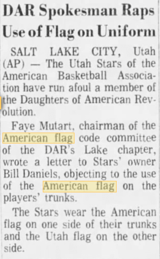
The DAR’s objection was rooted in the U.S. Flag Code, which states, “No part of the flag should ever be used as a costume or athletic uniform.” The Stars apparently didn’t pay any mind to the DAR’s request — they kept wearing the flag on their shorts for the next several years — but the episode highlights the fact that wearing the American flag on a sports uniform used to be a fairly uncommon thing. Nowadays, of course, it happens all the time, especially in the NFL (where every player wears a flag decal on the back of his helmet), college football (where flag decals aren’t quite universal but are extremely prevalent), and college basketball (where flag jersey patches are very common), plus flag patches and flag-based designs routinely show up for various holidays and promotions.
I wondered what the DAR thinks about that, so I contacted their national office, where a spokesman told me (I’m paraphrasing here), “We prefer that people follow the Flag Code, but we don’t engage with sports teams and ask them to remove the flags from their uniforms. If one of our chapters did that back in 1970, that was completely up to them. We have no policy on that.”
Personally, I think there are lots of good reasons not to wear the American flag on a uniform, but the Flag Code is not among them. The Flag Code has no enforcement mechanism and parts of it have properly been struck down as unconstitutional abridgements of free speech. At this point it’s basically a suggested etiquette protocol that we’re all free to follow or ignore as we choose — and the sports world has clearly chosen to ignore it.
NFL extends Nike contract: Big news out of the NFL owners’ meetings in Florida, as the league announced that it’s extending its apparel contract with Nike. Depending on whose report you choose to believe, the new deal will run through 2028. Or maybe 2025. No, wait, 2028. Either way, for better or worse, Nike will be the NFL’s uniform outfitter for the foreseeable future.
While we’re at it: The NFL also instituted a new uni-related rule, as lowering your helmet to initiate contact will now be a penalty.
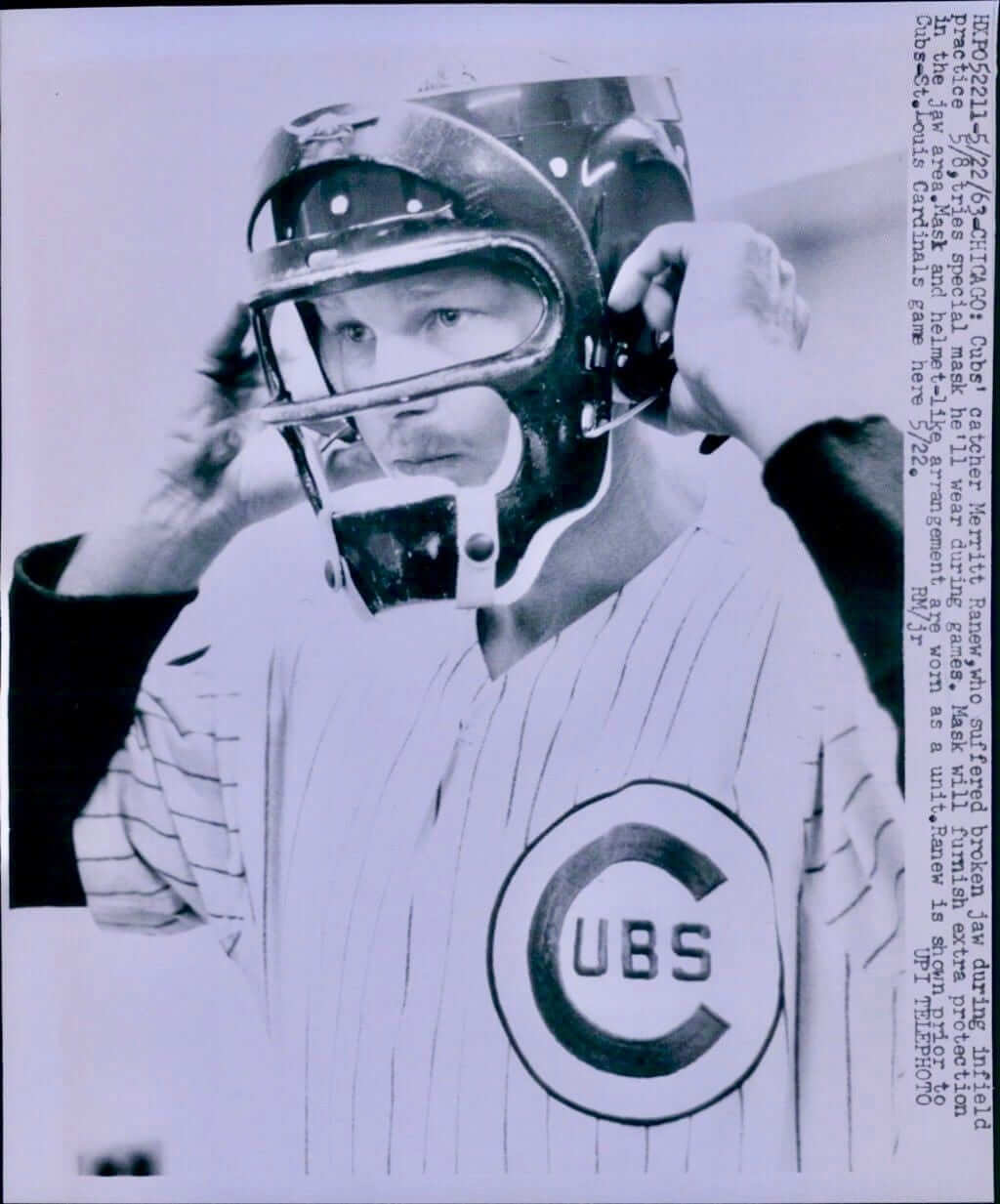
Click to enlarge
Masked man: Reader Stephen Purcell sent me this interesting UPI wire photo yesterday. It’s hard to read the sideways caption, so here’s a transcription:
5/22/63 CHICAGO: Cubs’ catcher Merritt Ranew, who suffered broken jaw during infield practice 5/8, tries special mask he’ll wear during games. Mask will furnish extra protection in the jaw area. Mask and helmet-like arrangement are worn as a unit. Ranew is shown prior to Cubs-St. Louis Cardinals game here 5/22.
The interesting thing there, aside from the explanded lower-jaw protection, is the way that mask and helmet are worn “as a unit.” That’s sort of like a primitive version of today’s hockey-style catcher’s mask, which combine the mask and helmet in one piece of equipment.
I wish we could see if Ranew wore a cap under the helmet. I’d also like to know if the mask/helmet assembly was painted in Cubs colors. So far, though, I’ve been unable to find any game pics showing Ranew wearing this rig.
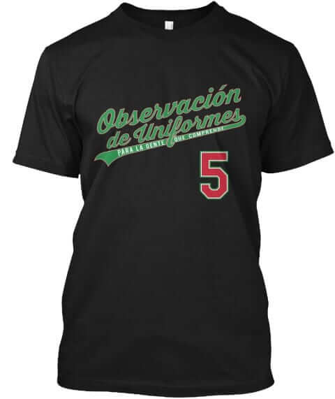
Shirt update: Don’t look now, but Cinco de Mayo is sooner than you probably realize. So I’ve reactivated our Cinco de Mayo T-shirt, which was originally part of the 2015 Uni Watch T-Shirt Club. It says “Observación de Uniformes” (Uni Watch) and “Para La Gente Que Compreende” (For People Who Get It). It also has a “Cinco de Mayo” NOB on the back. It’s available in a wide range of colors.
If you just want the Spanish-language front script, with nothing on the back, that’s available here.
My thanks, as always, for your consideration of our Uni Watch merch.
Click to enlarge
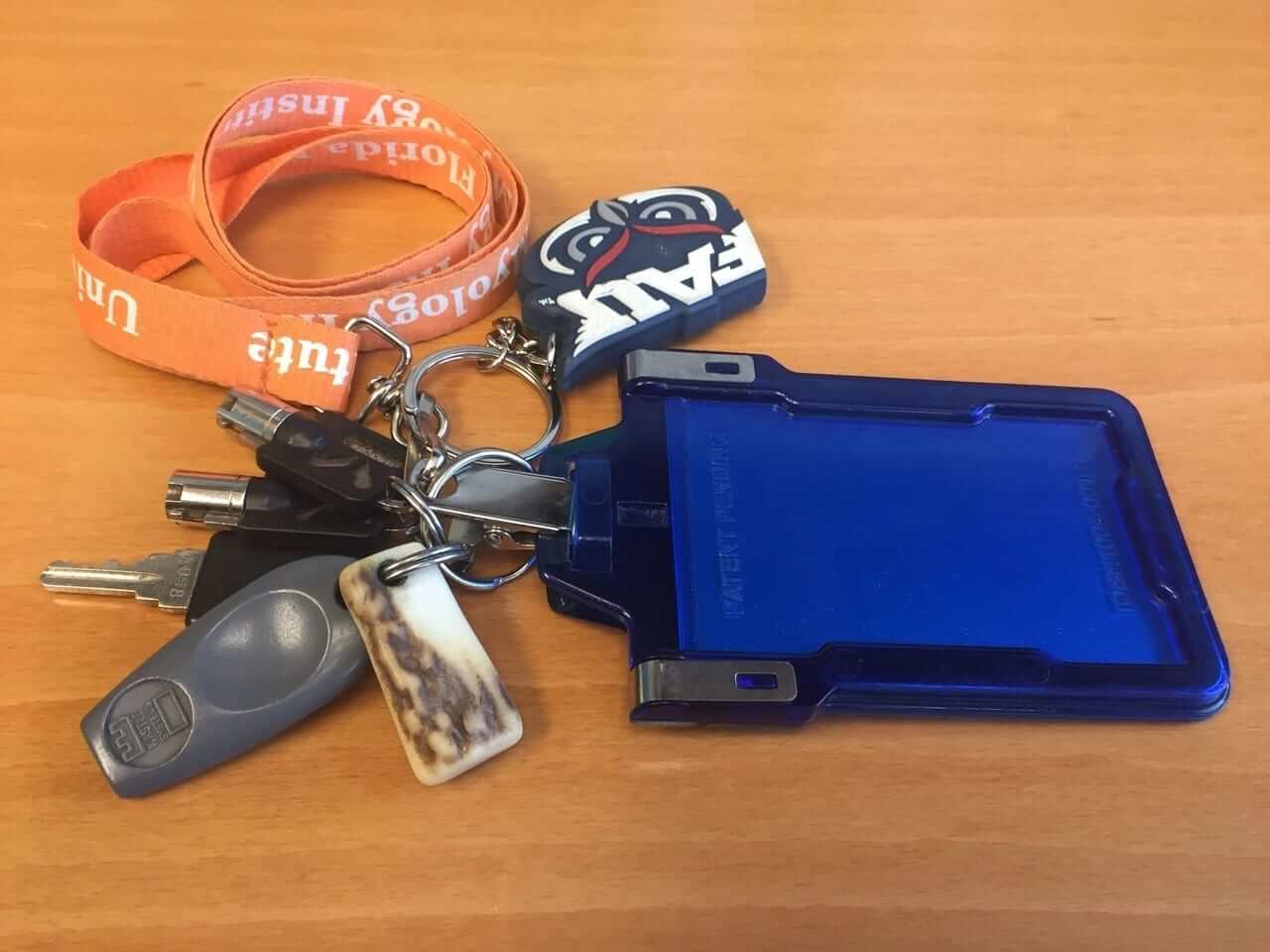
KRC update: The latest installment of Key Ring Chronicles is about a little piece of antler (that white/brown thingie in the foreground). Check it out here.
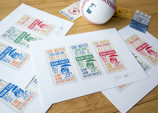
Todd Radom print reminder: In case you missed it earlier this week, I’ve collaborated with uniform designer/scholar Todd Radom on a museum-quality art print that’s similar to the T-shirt design he recently did for us. It’s being produced in a limited edition of 150, with each print hand-numbered and signed by Todd and myself. And we’ve already sold through more than one-third of them.
The design is filled with lots of little Easter eggs that are of personal significance to Todd and me — full details here, or you can go straight to the ordering page. My thanks, as always, for your consideration.
The Ticker
By Kris Gross

Baseball News: The Braves played against their prospects last night and both teams wore the same jerseys (from Big Daddy J). … This video shows every single uniform in MLB The Show 18. (thanks Phil). … Red Sox infielders have been wearing note cards under their hats to help with defensive shifts (from Todd Radom). … The White Sox have moved retired numbers from behind the plate (from Scott Held). … Harvey the Rabbit, the A’s robotic ball-delivery device, is making his return for Oakland’s 50th anniversary (from Daniel Diaz). … If you like ketchup on your hot dog, you won’t like this White Sox T-shirt. … New home uniforms for Ohio (from Mike Ashcraft). … The Orioles will give away a Darren O’Day (O’Day-Wan Kenobi) bobblehead on May 11 (from Andrew Cosentino). … Tommy Bahama released their 2018 Major League Baseball collection (from Tom Turner). … Texas A&M and Texas A&M Corpus Christi met in a high-cuffed affair last night (from Tom Tagliabue). … Montini Catholic High School in Lombard, Ill., with some good-looking jerseys. And all high-cuffed too! (From Ryan Redbeard.) … The Yankees have been warned not to sell beer that features portraits of active players in the foam. Active MLB players are not permitted to be involved in the advertising or promotion of alcohol. … New gold-trimmed uniforms for the SoftBank Hawks (from Graveyard Baseball). … Here’s a video clip on the North Carolina Baseball Museum (from James Gilbert). … Several throwback games in the works for the Orix Buffaloes.

NFL News: Jags owner Shahid Khan said the new jerseys will have “more teal.” That story also informs us that the Jags’ unveiling will be on April 19 (thanks, Phil). … Speaking of, the Jaguars are offering fans a chance to get a sneak peek at the unis (from @JohnEkdahl). … Uniform change for 2018: The Bears are apparently scrapping their Monsters of the Midway throwbacks and are going back to the orange throwbacks from 2004 through 2011 (from Adam Anderson). … Eagles CEO Jeffrey Lurie is working to bring back the Kelly green uniforms (thanks, Phil). … New Titans corner Malcom Butler will wear No. 21 with Tennessee (from Nathan Dearman). … Reader Bill Schaefer was collecting photos of the old Brooklyn Dodgers football team. He came across quarterback Ace Parker wearing this strange device on his leg. “It’s too high to be a practical ankle brace, and too low to be a knee brace,” Bill says. Anyone know anything about this? … More confirmation that the Browns will be getting new uniforms in 2020 (from Robert Hayes).

Hockey News: The Predators have THOB (Twitter handle on back) warmups (from Mick Kern). … The Arizona Coyotes are hosting a Grateful Dead night on Saturday (from @mikeobs). … Blues defenseman Joel Edmundson wore a sweet old-school hat while meeting with reporters yesterday (from Mike Dean). … Here’s a great story on the AHL’s Beast of New Haven, who had the most haunting logo in history (from @jeffreybigmoney).

Basketball News: The 76ers minor league affiliate, the Delaware 87ers, are being renamed as the Delaware Blue Coats — a reference to the 1st Delaware Regiment, known for wearing blue combat uniforms during the American Revolution. Here are the team’s new logo, uniforms, and court design for 2018-19. … Check out these must-have Sister Jean socks (from Josh Hinton).

Soccer News: All notes from Josh Hinton: The Spanish National team debuted their “Halo Blue” away kits last night. … Leicester City FC could be moving from Puma to Adidas this summer. … Goalkeepers are not fans of the new World Cup ball.

Grab Bag: Here’s what Jordan Spieth will wear at the Masters. Additionally, here’s what Adidas’s golfers will be wearing (from jwpatt).
Those orange Bears jerseys are excellent alts. Big improvement over the current alt.
Disagree. I think the Monsters -of-the-Midway unis are one of the best ALT designs of all time! Sad to hear it, Chicago!
I wish they’d just stop with the alternates—they have the best regular uniform set in the league…
Concur. As a Packers fan I must agree that the Bears, along with the Packers, have two of the best uniforms in the NFL. Both need to dump their desire to have alternate/throwback nonsense. To be fair, I wish all the teams would dump this nonsense.
Darren O’Day bobblehead link is broken / missing.
Fixed.
RE: MLB The Show Uni
i wish the Indians would wear the ’89 throwbacks before they have to get rid of C.W
No ketchup in Chicago = no Jim Vilk in Chicago
You’re in luck, Jim. While ketchup is banned in Chi-Town, catsup is still permitted.
Is that a threat or a promise?
I went on a whole Twitter rant yesterday in two parts regarding this – one, that people should be able to enjoy their hot dogs with whatever toppings they choose, wherever they are, without being judged; and two, I can’t stand mustard because it actually makes me sick.
You’re wrong on #1… of course people should be able to judge. Especially if people are making bad choices.
Lee
Unless you object to consuming meat products on moral grounds, STFU and let people enjoy their damn food.
Eat your ketchup covered hot dogs, just know I am judging every disgusting bite you take.
Lee
PS – I don’t object to the consuming meat products on moral grounds. I eat hot dogs often myself.
The Bears’ alt orange jerseys were not throwbacks. The ones they wore on Thanksgiving one year in Dallas were. Two different jerseys.
I agree that the alt orange jerseys are not throwbacks, wonder why that wording is used.
As for the 2004 orange jerseys worn on Thanksgiving, I don’t think they were a “throwback” either. They were designed like the throwbacks, but in a different color. Almost like alternate throwbacks I guess.
link
Lee
In 2004, they used a throwback helmet logo, so I was basing it on that:
link
But yeah, it could end up as just an alternate.
The 2004 jersey wasn’t the same as the 2005. The 2005 was a modern style, just in orange. And they wore regular helmets with them.
Did people really call basketball shorts “trunks” in 1970?
Can’t speak for 1970, but from the late ’70s through the ’80s, yes.
Proofreading:
“Additionally, what Adidas’s golfers will be wearing..”
Should be: “Additionally, here’s what adidas’ golfers will wear at the Masters.”
(Or “Additionally, here’s what adidas’ golfers will wear…”)
NO.
Okay, after that outburst, let me clarify my stance:
1. The S after the apostrophe is only omitted when it comes after a plural ending in S. Adidas is a proper name, and thus is singular, therefore, the ‘s is grammatically correct.
2. Adidas may prefer having their name rendered in lowercase, but unless you’re actually using the Adidas typeface to render the name like they do, I say to hell with that noise.
Uni Watch style is to capitalize Adidas and to use apostrophe-s for singular possessives.
In other words: The text is right. Josh is wrong.
Okay, I wasn’t sure about how UW handled adidas and apostrophes exactly; my main point was that the word “here’s” was omitted from the second item in the grab bag
If that’s the Titans’ new numeral font, I don’t love it, but it’s an improvement.
“Goalkeepers are not fans of the new World Cup ball.”
Every World Cup ball since 2006 has had the panels used to make it sewn together in some nonstandard pattern, so the ball flies through the air funny and people complain about it being “unpredictable” every time.
Had the same thought – I think goalkeepers will be fine after a few practice sessions with the ball.
True, but it’s still an issue nonetheless, although I do agree that it may not be as big of an issue in the World Cup.
As a goal keeper myself I can tell you the only ball design we like is a 25ib iron orb that can’t leave the 1/2 way circle
Every world cup ever goalies have complained about the ball
I’ve been trying to post this comment for the past few days, but every time I’ve tried the site has crashed and reloaded before I had the chance to finish typing. Finally, I typed it somewhere else and copied and pasted it.
Is anyone else having issues with the the site crashing? I can’t go more than a minute without it reloading. Is it because I’m using an old iPhone or is it something else?
not me.
For what it’s worth I have similar problems. It doesn’t crash, but the site is incredibly slow and the comment section is basically unusable. (iPhone 6, running the newest iOS on Safari)
Same here, iPhone 7, still on ios10. Site has encountered a problem and has reloaded. Happens just from scrolling the page. Annoying and frustrating.
I’m typing this on my iPhone with no problems. Not sure what to tell you.
I found this webpage. It states that Parker wore the brace to protect a broken leg: link
Amazing what a three-word google search can yield.
Actually it was 4. ;)
Jags uniforms.
IMHO more GOLD would be better than more teal. But if more teal means less black, I am OK I think.
It’s not for better or worse that nike has the contract, because is there any big company out there that won’t do what reebok, nike, adidas and others have done when they get a new contract? Where new jerseys look gaudy to include some gaudy element the company likes? So perhaps its sadly better that Nike just keeps it for a bit.
Jeffrey Lurie wants the Eagles in kelly green… Well Jeffrey Lurie shouldn’t have put them in drab midnight green in the first place. – Just announce it now Jeffrey Lurie and bring them back full time for the 2020 season.
The current Eagles uniforms are Midnight Green. The 1985-1995 “Reggie White” version was Kelly Green.
So what color are the dark green uniforms worn during the 1974-1984 “Ron Jaworski” era?
link
According to that site, they still called it Kelly Green. It was just tweaked a bit over the years.
I like the midnight green. I am a fan of the kelly as well, but I would prefer they stick with the midnight green uniforms. I am not a fan that they look more teal under Nike though. That kid of blows.
I’d figured their SB win would force the Iggles’ current set to stay under the “Seahawks Rule”.
Winning the Superbowl didn’t stop the Greatest Show on Turf from changing their uniforms. The world needs more vibrant colors. Too much drab. Rams going back to a retro look [eventually] Eagles should too. Always hated the “midnight green” – Teams always go darker, never brighter. The A’s in baseball should go back to kelly green as well. Heck, even their dark green gets darker by the season. Look at WS highlights from 88-90 era and now.
LONG LIVE BRIGHT GREEN!!!
if you want “vibrant” they should go back to those blue and yellow jawns they wore once or twice.
The Jets where green, I would rather not look like them.
Would be great too if they brought back those sweet silver pants.
link
I wonder if the #21 in the Malcolm Butler picture shows the new number font for Tennessee?
BTW… wanted to add that that font is the same font used on the 20th anniversary patch/logo
The Titans Instagram account shows Malcolm Butler signing his new contract in a navy blue suit, with a light blue shirt, and …
a RED handkerchief. Possible confirmation that red will play a larger role in the new unis.
“Goalkeepers are not fans of the new World Cup ball.”
That sentence is maybe the most evergreen headline in all of sports reporting. I’ve read stories to that effect literally every World Cup since I started paying attention in the 1990s, and I’ve seen reporting of keepers complaining about the official ball going back to 1974.
True, but nevertheless it’s still a relevant issue for the keepers.
The way I read it, it really comes of to me as “Goalkeepers are a bunch of whiny little bitches.”
Yeah, I’m feeling extra cranky today.
I would have thought that the behavior of the current federal administration would have led folks to regard norms and standards of conduct that are not enforced by law as more important, not less. Yes, the U.S. Flag Code cannot be enforced as a matter of law, and so it functions entirely as a voluntary, normative code of conduct. As such, we’re all free to choose to follow it or not follow it. Which makes the choice to follow it all the more important, and worth applying social pressure against non-followers in order to uphold it more widely.
The proper wearing of baseball stirrups has long been purely voluntary, a normative standard that players have been free to follow or not follow. Just in the last year or two the battle to uphold the old standards has been decisively lost. Was it therefore wrong to have pushed for upholding proper hosiery in the years prior? Of course not. And so with proper flag etiquette.
The 1970 stand by the DAR may be the one good thing that most mud-stuck of fuddy-duddy groups has ever done. Shame on today’s DAR for washing its hands of upholding flag etiquette.
I would have thought that the behavior of the current federal administration would have led folks to regard norms and standards of conduct that are not enforced by law as more important, not less.
That assumes that the norms and standards in question were reasonable to begin with. The flag code comes closer to idolatry than I’m comfortable with, and I felt that way long before the current administration.
Proofreading: Missing ‘e’ in helmet in the “Masked Man” caption transcription.
Got it.
Delaware 87er’s never rolled off the tongue, so I am pretty happy to see a name change there.
Agreed. The “Seveners” part is just clunky.
Proofreading
It’s comprende without the h
Right. Fixed.
So not really related to todays article, but the Chicago Bears are bringing back their old orange alternates for next year. Personally I’m kind of excited. although I hope they don’t get rid of the throwbacks.
Update, they can only have 1 alternate so they are scrapping the throwbacks.
link
Technically, you can have four uniforms – regular dark jersey, regular white jersey, alternate, and Color Rash.
Add navy pants with three orange stripes to the throwback, and call that your color rash!
Probably too sensible, as they have most likely sold as many of the throwbacks as they’re going to sell, they want to create a market for an entirely new jersey.
Ugh.
Lee
Someone didn’t read today’s Ticker very carefully.
;)
I like the throwbacks much more than the orange. The orange jersey looks like one of those color-inversion-for-its-own-sake things, likw the Mets’ orange BP jerseys a few years ago.
Dig a little deeper on the Utah Stars flag patch topic, and you’ll learn about Willie Wise. He did not wear the flag patch on his shorts, as I believe it was an extension of his Jehovah’s Witness beliefs. It’s mentioned briefly here: link
Kinda makes you wonder how, say, the NFL would deal with a JW player today.
Proofreading:
Jags owner SHAHID Khan
Got it.
Bill Schaefer- any pictures of Paul Schlissler coaching the Dodgers? He’s from my hometown.
Nope. Most are game photos rather than posed. Had a few of Coach Dr. ‘Jock’ Sutherland, though.
Interesting that Red Sox infielders have been wearing note cards under their hats to help with defensive shifts rather than wrist bands, ala quarterbacks/some catchers.
Wonder if that was first proposed but shot down by the players as too hot or movement restricting.
Lee
Good stuff today. Im not wild about the new T-shirt because it reminds of the new minor league baseball craze. As ive stated on the site before, I am anti-name change for one game . In Uni-terms I believe that means I am Anti-NCFOG. That being said, its a well executed shirt and i like how the official script looks in Spanish. I also apreciate you not making up a name for one day and sticking with your original damn name! Ok rant over.
P.S. I think you guys have great grammer
I am not thinking of the Cinco de Mayo tee as a NCFOG, but rather like a commemorative promo night.
I would also describe myself as very Anti-NCFOG.
Hoping the Cinco de Mayo tee doesn’t fall into the NCFOG bucket, yeesh, I had actually considered buying it.
Lee
RE: Eagles and kelly green
You know, the NFL teams basically have unlimited budgets – at least it seems that way in GB, where we KNOW they make $50 million a year profit.
So, that said, is it really beyond the available technology to re-paint the helmets? Lot of work? Sure. Worth it? I guess that depends on the team.
Maybe I am missing something…
Site is unreadable on mobile. Video ad forces it to jump to the spot on the page it is located. I’m constantly scrolling to the place I was at, only for it to jump to the video ad again.
I’m having the same issue. It keeps going to the middle of the article and showing an ad above the KRC section.
OK. I’m going to remove the two ads surrounding the KRC section and see if that helps.
I’m not having that problem, but oddly enough today embedded pictures refuse to load. I can see the top maybe 15% of every image on the site, but no more. This happened both early this morning on iPad and just now this evening on a desktop PC. Very odd.
Sigh.
Site is fine for me on desktop and iPhone. (I don’t own a tablet.) Hmmmmm.
Yeah, i didn’t have any trouble on mobile today.
Help! Is anyone else having trouble using the site? While I was trying to read (and even now as I type) the screen just keeps jumping to an ad for audible/proflowers. It will stick to what information im reading for about 3 seconds and then keep jumping to the ad. I cant even type a sentence without it going back. not sure if it matters but its the ad right after KRC. Im using android if that matters. I assume it was a great article today
As you move to the Post Comment button, if that is at the bottom of the screen just above the ad, the ad grows a bit to cover it up. If you scorll more so that the Post Comment button is well out of the way of the ad, you should be fine.
(Now I have an image in my head of watching a soccer game around the year 2050 and they’re wearing some kind of high-tech futuristic uniform fabric that displays an advertisement on the uniform as the fan’s eyes turn toward that player. Terrifying.)
RE: Blues Hat. Mid-1990s is old-school, now eh?
mid 90’s was 20 yrs ag, so, I guess?
also, I think this is just a throwback snapback hat
link
I think it is amazing that even with all the new high tech football helmets costing anywhere from $500 to $1500, designed to help prevent concussions, and with all the rule changes already in place for helmet to helmet hits, that concussions are at an all time high for the 2017 season.
Having played football back in the old days, I was amazed at how much bigger today’s helmets are than older models when I played.
The helmet manufacturers make the helmet shell bigger in order to put more padding inside the shell, and in drop test I am sure they perform better, but I think the bigger shell makes the head more vulnerable and harder to not to hit with your helmet, thus more concussions.
Just my take
Nope. Most are game photos rather than posed. Had a few of Coach Dr. ‘Jock’ Sutherland, though.
I wonder if the offensive player with the ball who lowers his head prior to contact gets the same penalty…
Never really thought of it much before but looks like the ‘Daughters of the American Revolution’ is a real thing.
Only references to the DAR I’ve ever run across before in my life is in ‘Gilmore Girl’ episodes.
There’s also a Sons of the American Revolution.