During the past few NBA Finals series, lots of people have complained about the Finals logo not appearing on the court as it had during previous seasons. That won’t be a problem this year.
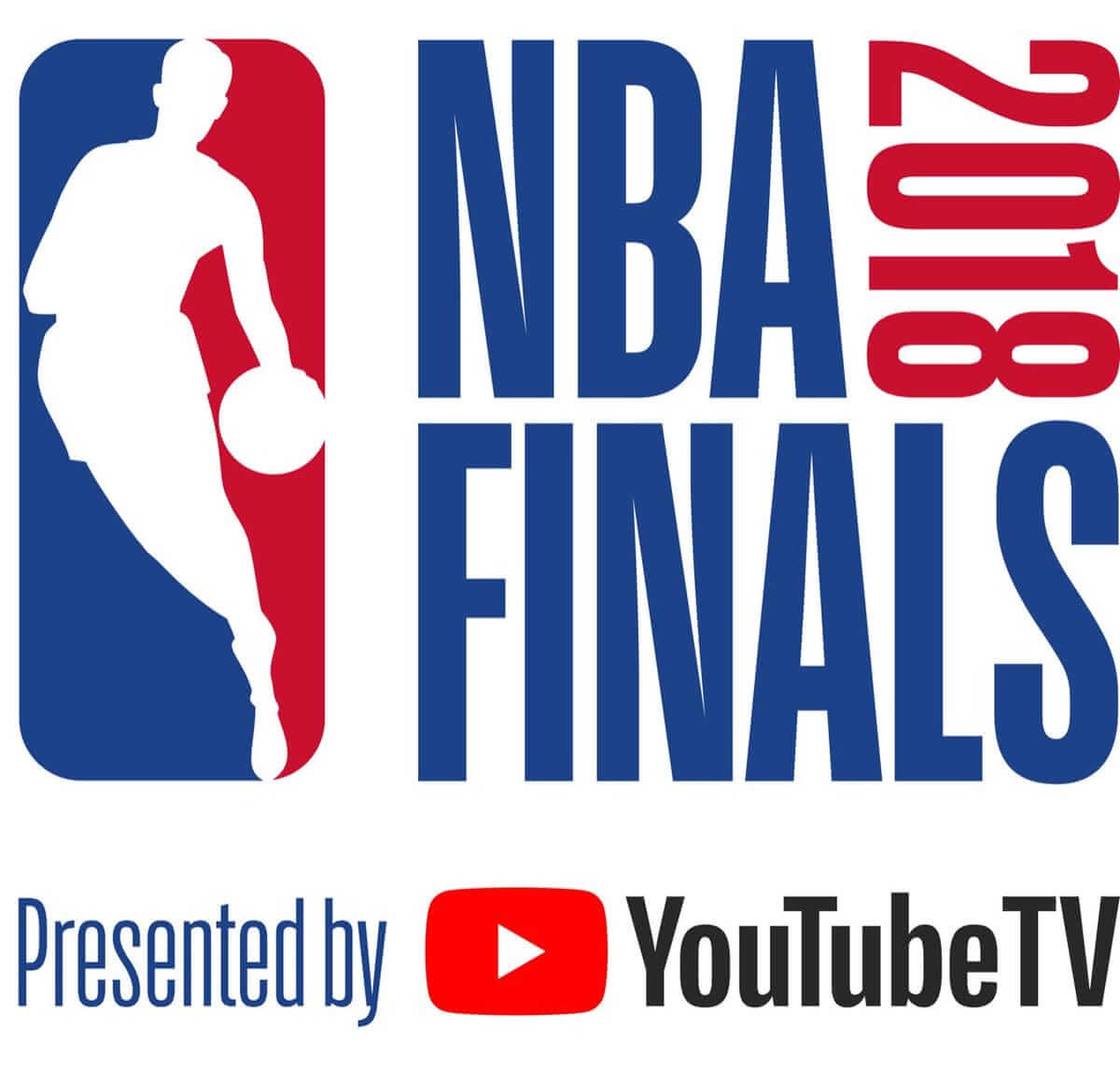
The NBA announced yesterday that it has entered into a partnership to make YouTube TV the “presenting partner” of the Finals. The deal includes a new logo (shown at right; here are some additional iterations) which will appear on the court, among other places. YouTube TV will also have “presenting partner” status for the WNBA Finals and D League Finals.
A few quick thoughts:
• “Presenting partner,” much like “sponsor,” is just whitewashed synonym for “advertiser.”
• The word we heard over the past couple of years was that they stopped putting the Finals logo on the court because players were slipping on the big logo decal. So they’ve either solved that problem (I’m sure there are ways to apply the new logo without a decal) or they’ve just stopped caring.
• MLB began a similar arrangement last year, with YouTube TV serving as the “presenting partner” for the 2017 World Series. The YouTube logo didn’t appear on the field, thankfully, but it did appear behind home plate in a way that made the screen look annoyingly like a video waiting to be played. You just know they’re trying to figure out how to achieve that same effect when a player’s shooting a free throw, right?
• Between the uni ad patches, the D League’s corporate-advertised renaming, and now this, the NBA is really going all in on advertising.
• Leaving aside all the corporate machinations, that is one uninspired logo, no? During a discussion last night on Twitter, Todd Radom showed some of the logos he had worked on for the 2003 Finals. They were never used, but they sure are a lot better than the new logo:
What might have been: commissioned logos for the 2003 NBA Finals, a fun, retro-influenced look, done at a time when retro was ascendant. pic.twitter.com/ZIFs3gBvoc
— Todd Radom (@ToddRadom) June 2, 2017
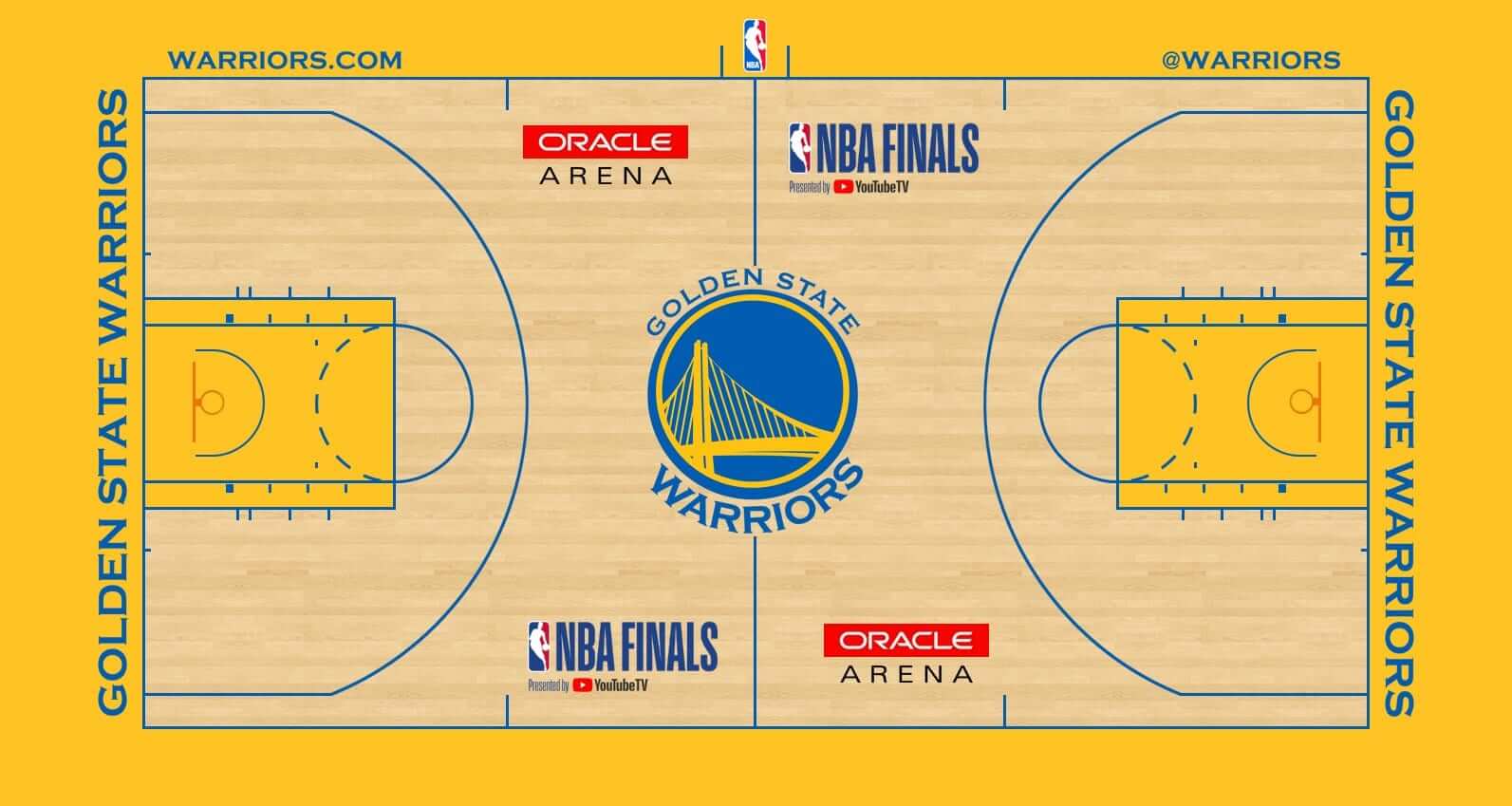
• And how will the new logo look on the court? Here’s one possibility, as rendered by @HitTheGlass (click to enlarge):
The NBA Finals are scheduled to begin on May 31 (which, coincidentally, is the date when I’m going to be throwing out the first pitch for the Syracuse Chiefs’ Brannock Device Night, so I’ll have to miss this milestone in NBA court design — what a shame).
Click to enlarge
Collector’s Corner
By Brinke Guthrie
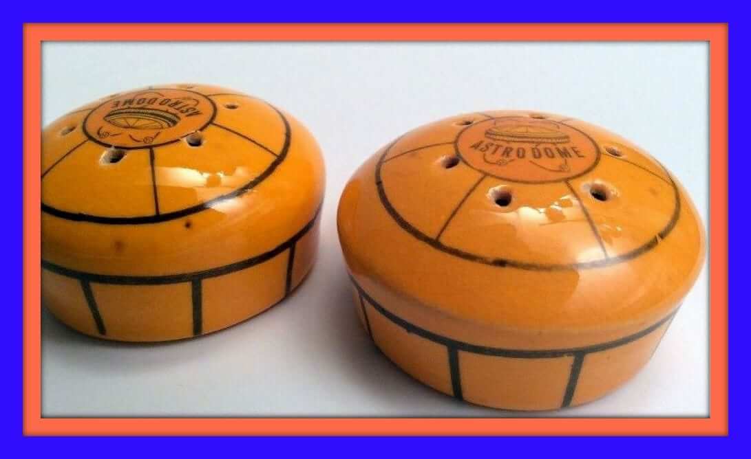
Baseball is back! Opening day is just two days away, so we’re all baseball this week. With the Astros winning their first World Series title last fall, check out this set of 1960s Astrodome salt and pepper shakers. I initially thought they looked like one of the new Google Home Minis, right? Or an orange ceramic donut.
Now for the rest of this week’s picks:
• Couple more for the ’Stros, beginning with this 1960s Astrodome smoked glass plate. Looks super-futuristic, right? Or sorta like the new Apple headquarters in Silicon Valley. And how about this 1960s Astros bank? These weren’t just for the Astros — an eBay search revealed a few different teams in this design template, just like the bank-sponsored NFL helmet banks from the 1960s and ’70s that we’ve seen before.
• Speaking of banks, here’s a very cool 1960s Louisville Slugger bat bank!
• This 1960s “Junior Major Leaguer” sweatshirt features American League stars like Yaz, Yogi, and Brooks Robinson.
• Here is a very nice-looking 1960s San Francisco Giants bobblehead! In pretty close to perfect condition, too.
• This 1970s St. Louis (baseball) Cardinals thermal mug was sponsored by (surprise!) Bud Light.
• Here’s another 1970s thermal mug, this time done up in period-proper Brady Bunch hues of brown, yellow, and orange for the San Diego Padres.
• Speaking of the Friars, Coca-Cola offered this 1970s “Tips From The Stars” flexi-disc, featuring the voices of Padres manager Roger Craig, outfielder Dave Winfield, and hitting coach Billy Herman. (Record player not included.)
• This 1970s Lafayette brand watch features the Big Red Machine’s “running man” logo. And this variation of the running man has him listening to the Reds on Radio, on this stadium cup. Sponsored by Nu-Maid margarine.
• One more for the Redlegs; This rain jacket was obviously a promo giveaway item. Nice plastic-y vinyl for those humid Midwestern evenings, too!
• This men’s watch features the face of the Milwaukee Brewers’ “Barrel Man” mascot.
• Bonus non-baseball item: Kids, this is before your time, but there used to be something called the World Football League. Let’s just say this belt buckle, submitted by reader Anthony Emerson, has lasted longer than the league did.
Seen an item on eBay that would be good for Collector’s Corner? Send any submissions here.
Todd Radom print reminder: In case you missed it yesterday, I’ve collaborated with uniform designer/scholar Todd Radom on a museum-quality print that’s similar to the T-shirt design he recently did for us. It’s being produced in a limited edition of 150, with each print hand-numbered and signed by Todd and myself.
The design is filled with lots of little Easter eggs that are of personal significance to Todd and me — full details here, or you can go straight to the ordering page. My thanks, as always, for your consideration.
The Ticker
By Alex Hider

Baseball News: The Cubs usually play their spring ball in Arizona, but since they start their season in Miami, they played an exhibition game against the Red Sox in Florida last night. The Cubs still wore their spring training jerseys, which include a Cactus League patch (from Mike Nessen). … Twitter has unveiled team-specific hashtags and emojis for the upcoming MLB season. … The bleacher seat at Dodger Stadium where Kirk Gibson’s famous homer landed in the 1988 World Series has been painted blue. …The NHL’s Tampa Bay Lightning warmed up in Rays-themed sweaters last night in honor of the Rays’ 20th anniversary (from @BandaBear15). … “Marlins Man,” the guy who has become known for showing up on-camera at major sporting events while wearing an orange Marlins jersey, may not show up at Marlins games this year due to a spat with the team’s ticketing department (from Kary Klismet). … Red Sox P Eduardo Rodriguez is switching his number to No. 57. Third base coach Carlos Febles gave up the number in exchange for Rodriguez taking the entire team out to dinner (from Joe Giza). … Cleveland is giving away a Carlos Carrasco bobblehead in July. Interestingly, the bobble shows him dressed in last season’s Player’s Weekend jersey (from Michael Curry). … The Orioles will honor the UMBC men’s basketball team on April 20 by giving away UMBC-branded Orioles caps (from @gimmethewooby). … A men’s clothing store in Bahrain is poaching the Nationals’ logo (from Chris Armstrong). … Cool promotion by Navy, who will be giving away team-branded crab mallets this weekend. … Pitt debuted stars-and-stripes caps on Sunday (from Noah Kastroll). … Reader Paul Allan needs help identifying a vintage baseball uniform that showed up in his office last week. It was manufactured by Aldrich & Chancellor. … New Spanish-language jerseys for the Hillsboro Hops (from Andrew Tice). … Indians minor leaguers added a memorial cap patch for clubhouse manager Matt Pruzinsky, who died over the winter. … The D-backs’ new bullpen cart has made its on-field debut. … The DC Metro will no longer have Nats-branded SmarTrip cards this season. … Speaking of the Nats, their ballpark has a bunch of new food and beverage options (from Tommy Turner). … Tim Dunn found a bunch of auction houses selling game-used KC A’s jerseys from the 1963 season, all of which feature the players’ first names. Here they are, for Ed Lopat, Tony LaRussa, Diego Segui, Ed Charles, Jay Hankins, and Mel McGaha.

NFL News: Titans owner Amy Strunk answered questions recently about the team’s new unis. Money quote: “I wouldn’t say it’s drastic by any means, but I’d say it’s pretty big. It’s significant” (From Phil). … New Cowboys WR Allen Hurns says he’ll be wearing No. 17 this season (from our own Kriss Gross). … Can you believe that the yellow first down line turns 20 this upcoming season? Here’s a good story on its history and the technology behind it (from @TeebzHBIC). … Former Browns QB Johnny Manziel is attempting a comeback in football, and will be playing in the Spring League this year. He’s selling his team jersey for $70 on his own website (from Phil). … A Saints cheerleader says she was fired for posting a photo of herself wearing lingerie on her private Instagram account. The New York Times did a little digging and found lots of double standards in the team’s cheerleader policy.
College Football News: These bloggers are ranking the top 130 uniforms in college football (from Phil). … Also from Phil: Florida State players will not be wearing single-digit numbers during spring practice, because new coach Willie Taggart says the players have to “earn” them. Some fans are saying Taggart stole the idea from Temple.

Hockey News: Cross-listed from the baseball section: The Lightning warmed up in Tampa Bay Rays-themed sweaters last night in honor of the baseball club’s 20th anniversary (from @BandaBear15). … The Idaho Steelheads and Rapid City Rush of the ECHL wore Captain America and Iron Man jerseys on Saturday night (from Brett Thomas).

College Hoops News: Sister Jean Dolores Schmidt, the Loyola Chicago team chaplain who’s become an internet sensation, has given the school permission to license her name and image (from Brinke). … New Memphis coach Penny Hardaway had his own line of Nike sneakers back in the ’90s. Now, he says he’s pushing for his personal logo to “be a part of (the) program,” saying he wants to “put my imprint on the program as far as putting my logo on the jerseys.” (From Nick Armstrong). … Cross-listed from the baseball section: The Baltimore Orioles will honor UMBC at an April 20 game by giving away UMBC-branded Orioles caps (from @gimmethewooby). … Check out this extra-wide shot clock used during the 1992 NCAA Tournament regionals. The extra width was added so it could count down tenths of seconds, according to this video (from Cam Norris and @QuirkyResearch). … Sneakerheads will appreciate this Georgetown Twitter thread of team-branded kicks (from Dalton Stolze).

Soccer News: New badge for Oxford United, a third-tier soccer team in England’s League One (from Josh Hinton). … Also from Josh: New home kit for Benfica. “Like most Adidas kits, it’s straight out of the catalog,” says Josh. … Denmark has released a new special-edition national kit that’s a patchwork of previous Denmark kits (from Phil).

Grab Bag: Olympic gold medalist Aly Raisman has slammed calls to ban leotards in women’s gymnastics as a form of victim shaming (from Kary Klismet). … We’ve shared a few of these photos before, but there are some great colorized historical photographs in this story (from Bryan O’Nolan). … UTEP athletics is transitioning to a lighter shade of orange (from Phil).
Two things in the college football news section: 1) the first two links run into each other 2) The single-number article is about FSU not Miami.
Thanks. Got it.
The Script “NBA Finals” will never be topped. There was no reason to change it.
Willie Taggart is the head football coach at Florida State-not Miami. It is FSU that is not making players earn single digit numbers. And this may have been stolen from Temple which has done this for several seasons.
WEbsite is having lots of problems loading on my IPhone
Mine was yesterday but today it seems OK. Typing is a little slow, though.
Marlins Man not showing up in that god-awful thing that looks like it should be an Orioles BP jersey? I consider that a win.
Don’t worry – it just gives him more time to show up at other events. Because it’s all
about him.
I’ve never been a fan of the Rays current script, but gosh it looks great on a hockey sweater.
The Thunderdome patch makes me want an “I Still Call it Thunderdome,” shirt in Lightning or Rays colors. Maybe an “I Still Call it The Ice Palace,” too.
Well, there are Ice Palace shirts available:
link, link link
Rob, we’ll have to hire you as a Naming Wrongs sales associate!
link
Here’s a link to the Denmark kit for anyone who doesn’t want to read the S*n
Hardaway wanting to put his logos on the jerseys leaves a bad taste in my mouth. I’m not sure I can articulate why, but I don’t like the idea of personal branding when it comes to a team sport.
I’m still feeling the aftertaste of that P.J. Fleck nonsense with the Gophers football unis. “H.Y.P.R.R. Elite”… *blecch*
I see it more as a way of raising Memphis’s visibility in terms of recruiting. Exclusive shoes and apparel are important to many high school players (of all sports), and Memphis will gladly play the Oregon South role if it gives them a boost.
Yeah, it’s fairly presumptuous of Hardaway. I hadn’t thought of him at all once his semi-mediocre NBA career ended. I doubt whether too many high school players are eager to go to Memphis because Hardaway is the coach so they can wear his logo.
Pet peeve: The Astrodome salt and pepper shakers are identical. I like to be able to tell them apart before dispensing my condiment.
That’s why God invented the Sharpie.
Look closer – the upside down one on the left is salt and the one on the right that is right side up is pepper.
:)
From the same article about the Titans uniforms: “[Strunk] said some elements of the uniform are specific to the state of Tennessee.”
Hmmm?
My initial reaction would be some use of the tri-star circle from the state flag.
All the fabric dyes are filtered through charcoal?
Is Paul Allan’s jersey from the Mankato Merchants of the Southern Minny League of the late 1910s-1920s? Couldn’t find any pics unfortunately…
VERY nitpicky, but shouldn’t “made the screen look annoying like a video waiting to be played” be “made the screen look annoyingLY like a video waiting to be played.”
I could be wrong, it just sounded off to me.
Not nitpicky at all — you’re 100% correctly. Now fixed.
Re: pro basketball finals did you mean “G League”?
Not sure what you mean — the term “pro basketball finals” does not appear in today’s entry.
The NBA announced yesterday that it has entered into a partnership to make YouTube TV the “presenting partner” of the Finals. The deal includes a new logo (shown at right; here are some additional iterations) which will appear on the court, among other places. YouTube TV will also have “presenting partner” status for the WNBA Finals and D League Finals.
Sigh. James, I still don’t know what you’re trying to tell me. The term “pro basketball finals,” which appears in your first comment from this thread, still does not appear in the text you’ve now quoted (or anywhere else in today’s entry).
He is referring to the last sentence in the second paragraph today, as you refer to it as the D League instead of the G League. Of course, you could intentionally be avoiding that advert name change.
I’ve been calling it the D League for a while now, for fairly obvious reasons.
Or did I miss the “I still call it the D League” t-shirt? ; )
Yes, yes I did. : (
Shouldn’t the NBA Finals logos on the far side of the court be facing the other way so that fans on that side can read them?
They don’t care about the fans. They only care about how it looks on TV.
Exactly.
Bring back symmetrical courts!
As much as I agree with you, NBA teams don’t. Check the Oracle logo on that side of the court. It’s annoying, yes
Re: NBA court ads
This is just terrible. Any chance of the NBA getting rid of uni ads or at least limiting them to one patch is out the window. Uni advertising is the reason I have no respect for soccer kits, and in a few years the NBA will look exactly like that. My friend was watching a Maccabi Tel Aviv basketball game, and their uniforms were completely overrun with ads. The worst part is, Fox, which is a department store in Israel, is their uni advertiser, and I have just learned that the team I actually called Maccabi Fox, so the team is named after the advertiser! I consider this the pinnacle of corporate ruining of uni advertising.
It could be a matter of ownership; New York Red Bulls, New York Red Bull II, RB Leipzig, and RB Salzburg are all owned (either partially or mostly) by Red Bull and feature Red Bull’s logo as the primary kit sponsor and in the club badge (that’s soccer for logo).
Oddly enough, due to the nature of their name and logo, Red Bull New York actually have better uniforms than all other MLS teams. Such an odd dynamic, a team with the most corporate branding actually looks the best since said corporation has logos that look athletically themed, compared to all other teams who just have random corporate ads plastered all over their uniforms.
I 100% agree; NYRB typically are one of the better kits released every year. There is a bit more German in their kit, specifically with the team name written on the back that adds a lot to the kit imo. Sponsor looks good and clean (compared to Philly/Bimbo, LAFC/YouTube TV, etc.) and their color combination is classy
I often hear here (see what I did there…) about how soccer kit sponsors ruin the kit but I have a question: what should teams do with the extra space? What is the appeal of putting giant numbers on the front and the back; some football uniforms (Colts, Packers, etc.) don’t even have a team name on the front, and maybe a small logo on the sleeve but Green Bay doesn’t even have that. However, there are HUGE numbers on the front, sides/ shoulder pads, and back of the jerseys. I’ve never understood how that looks any better aesthetically than a sponsor (assuming the sponsor logo wouldn’t clash with the kit, a la Borussia Monchengladbach and Postbank) on the shirt. Other than the philosophy of selling space on the kit for owners to profit, which I understand the complaints about, are there any other reasons why jersey sponsors are an issue, Paul and the Uni-verse?
Josh, there’s no “extra space”. The numbers fill up the jersey space so that they can be read from as far away as possible. When you’re sitting in the upper deck — or you’re stiting much close but have bad eyesight — you want to see players’ numbers; certainly not some advertiser.
I really could not care less about the NBA but I have to admit I like that new Finals logo even if has a sponsor. I think it is clean. No offense to Todd, but I think his 2003 logos are not in my taste. That all being said, I won’t be watching a minute of the NBA Finals with or without the logo.
This is the part where I say, “It doesn’t have a sponsor; it has an advertiser.”
For a second I thought there was a YouTube video at the top of the story.
Found on eBay: link, and link.
The decade on that Cardinals mug listing is wrong–Bud Light was not introduced until the 1980s.
Looking forward to seeing the Titans’ new unis; as always I’ll be rating them on a 1-to-4, football-uniform-to-clown-suit scale.
1 = football uniform
2 = more football uniform than clown suit
3 = more clown suit than football uniform
4 = clown suit
Of the three (3) teams from whom we expect new uniforms soon, I’d rank the current uniforms of the Titans a 2, the Dolphins a 2, and the Jaguars a 4. Let’s see if they up-/side-/downgrade.
It is pretty much impossible for the Jags to be worse right? Unless they go full Bucs/Browns disaster with their jerseys and pants to counteract the certain upgrade in going to solid colored helmet.
I’d actually rate the Browns’ current set a 2; above the thigh it’s practically a 1.
The Bucs, OTOH, are a 4. Which is a shame, because their previous set was a solid 1.
I’m just hoping the [alleged] leaked photos of the Jags new uniforms is a hoax because, they’re still a clown suit… a uni-tard clown suit to be exact. Those leaked photos also show numerals that will be hard to read on TV
I hope so too; it’s a 3, at best.
Thanks for the links to the 1963 A’s uniform auctions. Earlier today I read an article about how the A’s are bringing back Harvey the Rabbit (www.sfgate.com/athletics/article/A-s-pulling-a-rabbit-out-of-their-past-for-50th-12783097.php) and on the page is a link to a youtube video of some color footage of the A’s in ’63. It reminded me of a story that Lon Simmons used to tell about how in the ’63 All Star game, manager Ralph Houk kept the only A’s player (Norm Siebern) out of the game so as not to embarrass him for being seen in that uniform. Maybe that’s a well known story, I don’t know. I couldn’t find anything online about it. I did find this which was pretty funny and has some good uniform stuff in it: link
On opening day, when the players filed cautiously down the runway into the dugout, Gino Cimoli told a reporter, “Say-one word and I’ll deck you.” Now, after one month, the players have almost stopped wincing when the opposing bench jockeys yell, “Hi there, beautiful.”
Anyway, maybe if the auctions stay low enough I can land me one of those uniforms.
Ok, all those auctions ended years ago so maybe I won’t be landing one. Ha ha.
John, if you’ve got $700 to spare, e-mail eBay regular Kruk Cards and ask to buy (or have them relist) this beauty: link?
The Astros bank is cool!