Judging by a tweet that was issued yesterday, the Titans will apparently be revealing their new uniforms on April 4. We already knew that the unveiling would be in April, but I had assumed it would be timed to coincide with the NFL draft, which begins on April 26, so the early-April date is a surprise, at least to me.
The Jaguars have also said that their unveiling will take place in April, and I had once again assumed that this was code for “at the draft.” But hey, maybe not.
Speaking of the Jags, today is the final day to enter our Jaguars-redesign contest. Entries are due at 7pm Eastern tonight. Full details here.
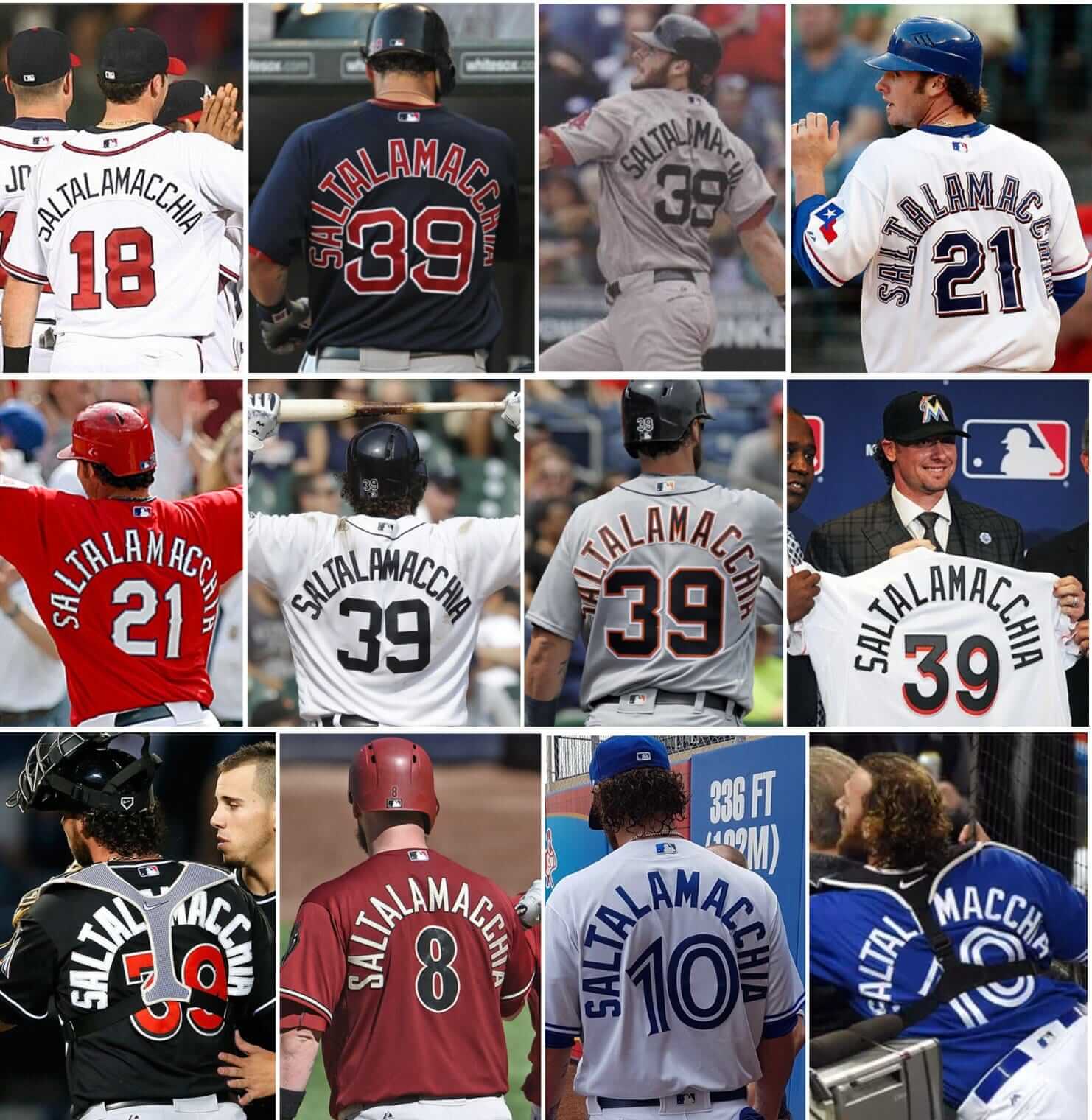
Name game: With Kansas City Chiefs offensive lineman Laurent Duvernay-Tardif bidding to become the first athlete to have “M.D.” added to his NOB, my latest ESPN column takes a look back at many notable moments in NOB history (including the many attempts to fit Jarrod Saltalamacchia’s name onto a jersey, as shown above). Check it out here.
Photo by Jack Kirr; click to enlarge
Do you believe in miracles? Eight years ago, some guy from Duluth named Tyler George emailed me out of the blue and asked if I wanted to write a story about curling. After I convinced my ESPN editor to let me do it, Tyler arranged for me to take a few lessons in New Jersey from a world-class Canadian player named Dean Gemmell. Then I went out to Duluth, where Tyler gave me some additional lessons and let me play in a bonspiel (and where I wore a great curling sweater that Phil got me as a birthday present).
I had a great time, wrote a fun article, and later signed up for curling when leagues became available here in Brooklyn — all because of Tyler. That’s him posing with me in the photo above, during my Duluth visit back in 2010.
This year Tyler made the U.S. Olympic curling team. After a shaky start, he and his three teammates are now one victory away from winning the gold medal. I couldn’t be happier for them, or prouder to have been brought into the curling fraternity by such a great guy.
The championship game will be late tonight, at 1:35am Eastern. I’ll definitely be staying up to watch.
The Ticker
By Kris Gross (except ’Skins Watch, by Paul)

’Skins Watch: The Agua Caliente Clippers of Ontario — that’s the L.A. Clippers’ D-League affiliate — will hold Native American Cultural Night on Monday. The team will wear uniforms featuring a basket weave pattern similar to those used by the Agua Caliente Band of Cahuilla Indians, and there will be ceremonies and performances honoring the tribe.

Baseball News: Here’s a good look at the Roy Halladay patch the Blue Jays will wear this season (from Derek Marusyk). … The Twins and Minnesota Gophers played in an exhibition game yesterday and went color on color. Additionally, the Twins debuted their new matte helmets (from Osterbuer Sellers, Sam Fredin). … Giants broadcaster Mike Krukow’s very bad solution to speed up games: Take ads out of the commercial breaks and put them on the uniforms (thanks Phil). … Texas flag-themed socks for Rangers OF Willie Calhoun on picture day (from Mike Klug). … A slew of number changes for the Mariners (from Tim Dunn). … Troy Tulowitzki – the newest Blue Jays pitcher? (From Mike Chamernik.) … Because of new P Yu Darvish wanting his usual No. 11, the Cubs now have two pitchers with single-digit numbers (from Chris Pisciotti). … New pinstriped uniforms for Illinois (from Erickson). … No NOBs for Loyola, but they do have a giant wolf head on the back of their jerseys (from Fletcher Mackel). … Jonathan Shaw spotted these full-blown G.I. Joke unis — pants as well as jerseys — for Southeastern Louisiana.

NFL News: ESPN’s QB carousel lets you put free agents and rookie quarterbacks in different uniforms (from Jeff Perilman). … Mark Johnson spotted this maker’s mark inconsistency on a 1994 Niners photo. … Following up on Paul’s piece on the Packers logo from yesterday, Larry Morris sent in photos of the plaques he owns with the old logo. … We need more FNOBs, as Billy Joe of the 1966 Dolphins modeled here (from John Schaefer). … Here’s the story behind why the NHL’s Buffalo Sabres used a Bills jacket at two Winter Classics (from Steve). … The Packers have begun to replacing the turf at Lambeau (from Mike Chamernik). … See this long-sleeved Browns jersey with the contrasting yoke? Brad Grzyb says he recalls seeing Browns players wearing it on the sidelines during the Butch Davis era, possibly only 2003 and maybe even only during the preseason. “It was worn on the sidelines by players that weren’t playing in the game, but this is the only photo I’ve been able to find,” he says. Anyone know more?
College Football News: A Reddit user has done the math on which directionally named schools are most directionally correct (thanks Alex Hider). … In a graphic revealing next year’s schedule, the MAC used Utah’s alternate white helmet (from @BBgunn42).

Hockey News: Goalie Petr Mrazek wore his Red Wings pads in his debut with the Flyers (from Bill). … The Panthers replaced board ads with tributes to Stoneman Douglas High School last night (from Jerry Wolper). … Here’s a good story on one fan’s most prized possession — a 1958 Bobby Hull jersey (from Brinke Guthrie). … Cross-listed from the football section: Here’s the story behind why the Sabres used a Buffalo Bills jacket at two Winter Classics (from Steve). … The Saginaw Spirit of the OHL will wear neon jerseys for their annual “Hockey for the Homeless” game on March 3 (from Jason Lewis). … We’ve got a super uni mixup as Jarome Iginla is wearing a Avalanche helmet, Kings pants, and a Providence Bruins jersey (from Shawn Humphrey).

NBA News: The Mavs will wear a “Mr. C” jersey patch to honor original team owner Don Carter, who passed away last week (thanks Phil). … New Cav Larry Nance Jr. announced he’ll start wearing his dad’s No. 22, which had been retired, next week. The retired No. 22 banner will still hang in the rafters (from Mike Chamernik). … Here’s a weird one: Kelly Oubre of the Wizards was spotted untying Cavs G Rodney Hood’s sneaker (from Mike Chamernik).

College Hoops News: Northwestern wore senior night uniforms last night, inspired by the seniors and the city of Chicago. The pinstripes are made up of words and numbers, although I’m not able to gather the theme. … BFBS for College of Charleston last night, and for TCU tomorrow (from Nic Crocitto, Daren Stoltzfus). … We have a missing NOB from last night’s Florida/Tennessee game (from Derek Brownlee). … The South Carolina and LSU women went color-on-color last night (from Joshua Meetze). … SEC Network’s starting five graphic for Auburn featured three different jerseys (from Griffin Smith).

Soccer News: San Antonio FC has unveiled their primary kit (from Aaron Zamora). … A new home kit for Sacramento Republic FC of the USL (from Ed Zelaski). … Due to Östersunds FK’s kits clashing with Arsenal’s home kit, both teams wore away kits (from Colin Dilworth). … A South American soccer player used the corner flag to defend himself (from Mike Chamernik)

Olympics News: One of the Canadian women’s hockey players is catching heat for removing her medal during the presentation ceremony (from Kary Klismet).

Grab Bag: The Marlboro e-cigarette will be a new car advertiser on the 2018 Ferrari F1 car (from Doug Kalemba). … Who says only teams can celebrate with anniversary logos? Scott Rogers says the U.S. Africa Command, “the most recently established of the Defense Department’s regional combatant commands,” is celebrating their 10th anniversary. … Highland Brewing in Asheville, N.C., has a redesigned logo (from Matthew Moss). … Two golf items from Zachary Loesl: Rickie Fowler attracted some attention by wearing a pineapple-themed cap, and Tiger Woods wore a ribbon on his cap to support the Florida school shooting victims.
Congrats, and Best Wishes, to Tyler George.
The UNI-VERSE is pulling for you.
That is a fantastic story about you and Tyler! Hope they can bring home the Gold!
I don’t have cable and have only gotten to watch a few minutes of curling, so I totally missed hearing about the success the US has had. I remember the ESPN article and am ecstatic to know Tyler and the US are so close to gold. Will have to find a way to watch that match. Good luck Tyler!
How about a post-Games interview and uni-breakdown?
Excellent idea. I’ll look into that.
There were some legitimately good uniforms on the curling sheets this year. Looking at you, Switzerland, whose yoked shirts would have been credible in a soccer World Cup game. For the US, the shirts weren’t terrible, and the men did uni-good by switching up their pants without going full-on Norway crazy. The white and gray pants in particular had an appropriate-for-USA baseball vibe. It’d be interesting to know how the team approached their uni choices, and whether that was something any individuals felt more or less strongly about.
As a Canadian who cursed a blue streak when our skip had an unfortunate 8th end yesterday, I’m nevertheless quite happy to see how Curling has gone from mostly ridicule when it first appeared in the Winter Olympics to acceptance and genuine interest.
“… maker’s mark inconsistency on a 1994 Niners photo.”
and where are the TV numbers?? (probably discussed here before I would imagine)
Those throwbacks didn’t have TV numbers. Only jersey without TV numbers ever to be worn in the Super Bowl.
Hey Paul, is the Search feature of your site ever going to return?
Will ask the webmaster right now.
and why are their socks completely different?
“Highland Brewing in Asheville, N.C., has a redesigned logo ”
and it’s horrible.
The new colors are fine, and the star-H glyph is terrific. But yeah, what a downgrade. The old logo could have stood some improvements, particularly with regard to typography, but it was a great brewery logo. It had charm and character, and it actually communicated something about beer. It was distinctive and memorable. The new logo lacks all of those virtues, which seems a mistake. What with the whole point of a commercial logo being to distinguish oneself from competition and be recognized and remembered by customers.
Proofreading:
“wrote a run article” Is that a term I don’t know, or a typo?
“The Packers have begun to replacing the turf at Lambeau”
Looking at all those Saltalamacchia jerseys, I can only wonder why none of these teams use the link rather than having one of their players look like a clown. The four layers (including the shadow) that the Rangers use look particularly ridiculous. (And yet they’d look great with NNOB; the complexity of the font would enhance the look of the jersey instead of weighing it down.)
And congratulations to Tyler George!
Agree. With a name like that you need to use a condensed font, like the Mets used to use for Strawberry, Fernandez, etc…
Sid Fernandez would have made an ideal “first player to wear a 1## jersey in an official MLB game”, as would CC Sabathia today.
This reminds me of something that I’ve also anted to ask Uni-Watchers about: it looks like they’re gearing up for eventually having three-digit numbers, because jersey numbers seem to be kerned together these days. Has anyone noticed this? There was more space between the two digits just a decade or so ago; look at any player wearing number 11. It’s another thing that looks ridiculous.
link: a gap of about one pinstripe’s width.
link: digits right on top of each other.
Same with Chicago: this was link a little while ago. Nowadays there is link
And here is a genuine kern: link
I think they’re getting ready for three digits. link
That’s a great point. It would look so much cleaner and professional. A NOB that goes halfway down the back of the jersey has always looked minor league to me.
“Minor league”? When have minor-league jersey backs ever looked like that? Never, in my experience. “Minor league” in this context means either no name on back, or nameplates.
What so many of Salty’s jerseys look like to me is cheap foreign knockoff retail merchandise, or when teams present jerseys to politicians.
Loved the ESPN NOB story Paul – great stuff!
Didn’t realize this hadn’t been submitted, but the Panthers also wore “MSD” patches: link
Re: Arsenal, seeing them wear mono-blue at home was bizarre yet entertaining as a Tottenham fan.
The MSD patches (and helmet decals) had been reported a day or two earlier.
Sorry about that, I found it.
Another interestingly unique nameplate situation. Brought up by me before but probably an appropriate time to rehash.
All players for the CFL Ottawa Rough Riders wore their first initial on the nameplates, regardless of them having different last names.
Was done from 1989-1993 for 2 different versions of the Rough Riders’ uniform.
1989-1991 mono-black with classic “R” logo (though 1 of these photos is from pre-season with no logos/stripes on the helmet:
link
link
And 1992 and 1993 during the days of the controversial “Double Flaming R” and silver road jerseys:
link
I think it would help the Chiefs’ NOB legibility (and Duvernay-Tardif’s in particular) if they were to drop the gold outline, and just go back single-color NOBs like they had before 1973.
I generally prefer single-color NOBs anyway. It’s just a much cleaner look.
Looks like the Tennessee Titans are retaining their flaming T logo. Too bad, that should be changed.
I believe (not 100% positive) they had already indicated that they wouldn’t be changing the helmet logo.
Lee
I have two-ish questions for the curling community, maybe you guys could answer them or maybe your Olympian friend could answer them if he ever gets interviewed here.
I’ve only really watched curling the past 3 Olympics, and it’s obvious that the venue/IOC provides the stones rather than teams bringing their own like they bring their own brooms. But I’m curious as to why the colors of the stones have always been Red and Yellow. My questions are this:
Does the red/yellow signify anything regarding the match itself, similar to the road team batting first in baseball/road team calling the coin toss in football? Like does the higher ranked/’home’ team get to pick which color? Or is something along the lines of Red signifying who shoots first in the first End? Or is it just randomly assigned/has no pattern?
Secondly, are the stones ALWAYS red and yellow like they have been the past 3 Olympics? I would imagine part of the reason the Olympics has always picked those 2 colors is because they’re distinct enough to see across the ice/have minimal colorblindness issues for broadcasts, but are there other colors used at other levels at all? Is it mostly red/yellow with only a little bit of other colors in various places? Or is it a lot more diverse in other pro leagues and rec leagues than the Olympics have lead me to believe?
I’d say that’s a valid question. I’ve only seen it stated that red and yellow are the most common colors used, but not much else.
I’ve never paid close attention to curling when I’ve seen it on TV (usually CBC), so I couldn’t tell you if there’s any significance to which team uses red and which team uses yellow. I don’t even know if “home” and “road” designations are applied in tournaments at a regional, national, or international level.
Here’s how I understand it.
In the round robin, the game starts with a coin flip. The thirds traditionally flip the coin. Winner gets hammer in the first end and loser gets choice of rocks.
In the playoffs, at least in the Canadian and world championiships, the higher ranked team gets the hammer in the first end and the lower ranked gets the choice of rocks.
That said – I’m not sure about the Olympics – the “higher ranked” rule definitely applies where the Page playoff system is used, but the Olympics doesn’t use the Page playoff so I’m not 100% sure the same rule applies.
link
Most clubs I’ve curled in are red vs blue, or red vs yellow. I’ve seen green a few times. I’ve seen lots of black vs yellow on TV but never in person.
link
link
link
link
Red and yellow seem to be designated for Olympic competition, but colors vary in club play.
My club uses red and yellow stones, and also uses red and blue rings. Which can sometimes make red stones in the house difficult to see from the hack, and even on our clubhouse TV screens showing the far houses.
Men’s (Brier) and women’s (Tournament of Hearts) national championships in Canada are big-time important curling event with rich history. You will always see red and yellow rocks with the house (rings) being in red and blue.
More peripheral events in Canada, like All-Star Curling Skins Game, may feature different rocks and colours of rings in the house.
link
That MAC schedule also has CMU alternate helmet as their main one. The official one is just a maroon helmet with C, no stripes.
Fire Up Chips!
The Gator Baseball team is now wearing a Stoneman Douglas High School ribbon.
link
I really hope the Titans unis are nice. It’s probably to much to hope for an Oilers throwback, but I do hope they incorporate the red more that’s in their color scheme.
re: the Browns sideline jersey item. It’s pretty standard that inactive/practice squad/IR players wear some sort of team issued matching garb on the sidelines during games. I’m at most Texans games and there are always 15-20 guys with matching team color baggy tee shirts or hoodies and equally baggy shorts standing around the sidelines. I’ve never seen them with numbers but I’m guessing that’s what’s going on in that picture.
Some use blue; sometimes a club will use certain colors. Yellow and Red are now traditional, shows up well on television, contrasts with the ice, and rare to be a combination that is a problem for eye sight.
Agua Caliente Clippers of Ontario are in the G League, not D League.
I prefer not to say G League, because that’s just an advertisement. It’s still the NBA’s development league — D League.
Pretty sure Paul knows that and still chose to call it the D League. #nocorporateleaguenames
Whoops! My page hadn’t refreshed yet to see that Paul had already responded. Oh well, a little piling on always helps to strengthen one’s argument, right?
Right?
Not being a basketball fan the first time I heard ‘D’ league (a few years back) the first thing I thought was why would they care about a ‘D’ league – you’d think A through C leagues would get more attention.
Clicked in later that day that D must stand for something – and then I looked it up.
USA Womens Gold should be in the hockey section also. Bobby Hull was a wife beater. Long before the term “trolling” came about. I met Hull in a Sears store autograph event. I had him sign a card depicting him joining the Winnipeg Jets. He was not happy. Then again, I was wearing a Red Wings cap. Go Team USA Curling!
Is the link to the 2010 curling article working? Sounds like an amazing experience. Very interested in reading.
Link is working fine for me.
Here’s the story, just in case: link
Thanks for the link Paul. What a fantastic experience! Look forward to a post-Olympics follow up. Maybe even a design Tyler’s new shoes contest : )
Man I miss the old Browns uniforms, especially the striped socks. Sigh.
Yep. Whoever said “yes” to their re-design should be ashamed.
Lee
The curling sweater is very sharp.
Maybe a clarification on the Loyola uniform that it’s Loyola of New Orleans (or is it)? There is a Loyola Marymount (Lions, Los Angeles) and Loyola of Chicago (also Wolves)
Further confusing things – it seems like all of them have burgundy/maroon and yellow/gold as their school colors. It must be a Jesuit thing…
When I saw the pic, I immediately thought of Loyola HS or U. in Chicago, where I’m from.
LUC does not have baseball, New Orleans is in the pic, the fluir-de-lis is a dead giveaway.
Jonathan Shaw spotted these full-blown G.I. Joke unis — pants as well as jerseys — for Southeastern Louisiana
Hideous camo aside, are you sure this should be in the baseball section? Based on the link, dude looks like he’s ready to jump out of a plane and do some link.
I think that the Browns sideline jersey is a pregame sweatshirt that NFL teams had from Reebok that year. I purchased one at the 49ers facilities before they had any kind of team store.
Because of new P Yu Darvish wanting his usual No. 11, the Cubs now have two pitchers with single-digit numbers (from Chris Pisciotti)
Paul, why is it because Yu Darvish took #11 that the Cubs have two single-digit pitchers? Carl Edwards has had #6 since he joined the team, but Jen-Ho Tseng wore #39 last year and wasn’t shifted to 1 because of Darvish. (Unless he had requested 11 and took 1 as his second choice, in which case I will stand corrected.)
Another notable moment in NOB history – for major junior hockey.
The Regina Pats of the WHL wore drop-down NOB below the numbers in the early 1980s. Only major junior hockey team to do so in North America to my knowledge. Have never really found out the reason why. I guess they were akin to the NBA Sacramento Kings in the 1980s, the one team in the league that uniquely wears the NOB below the number.
Here is some footage of the Pats and the drop-down NOB during the 1984 WHL Finals. Skip to the 1:00 minute mark.
link
All are more poor quality views than Brad’s photo, but here are some more shots of the Browns sideline shirts:
link
link
link
link
Looks like there were both white over brown and brown over white versions.
Is that guy in your third picture wearing number 0? I thought the NFL wouldn’t allow 0 or 00 anymore.
Curling time!!
Wow, Paul personally knows an Olympic gold medalist. Fantastic! Congratulations, U.S. Curling Team.
The Browns gave all game day inactive those shirts/jerseys for a couple of years. That photo is from 2003 (Tim Couch last season) when he was benched for Holcomb. My buddy uesd to work in Browns EQ room and had a couple of those. I believe they actually had players last names on the back as well.