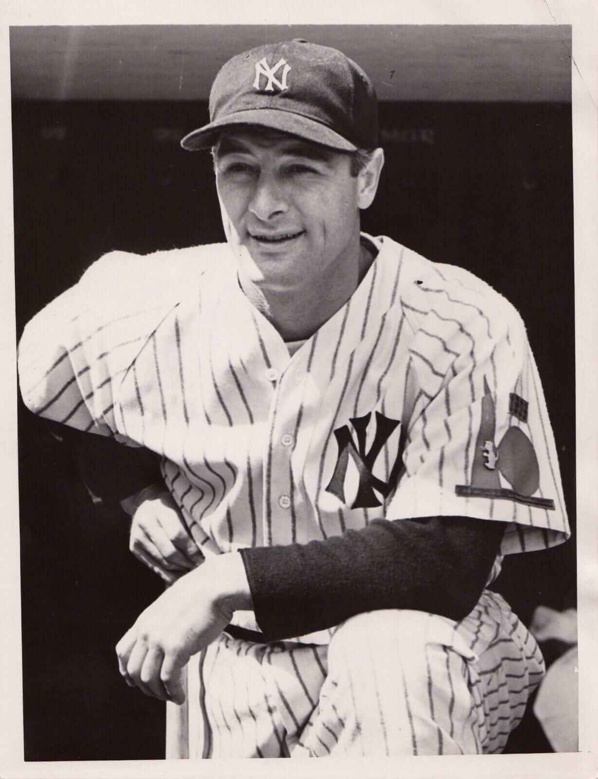
Click to enlarge
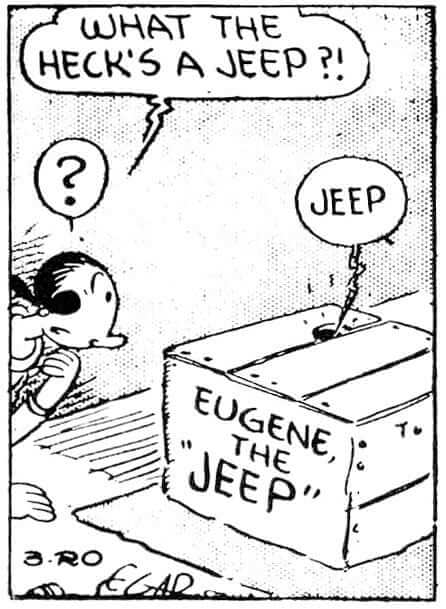
A fascinating little MLB mystery unfolded yesterday on Twitter. It began when Matt Dahlgren (author of the baseball memoir Rumor in Town) posted the Lou Gehrig photo shown above. We can tell that the photo is from 1938 because Gehrig’s left sleeve has the World’s Fair sleeve patch that all three New York-based MLB teams wore that season. But what is that little pin on the patch?
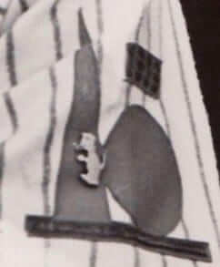
Let’s take a closer look:
Dahlgren, who said he first spotted the photo on eBay, tweeted the photo at uniform designer/historian Todd Radom, who said he’d never seen Gehrig wearing the pin and had no idea what it was. I had no idea either.
Fortunately, one of my Twitter followers, Greg Kasprzak, recognized the pin — it’s Eugene the Jeep:
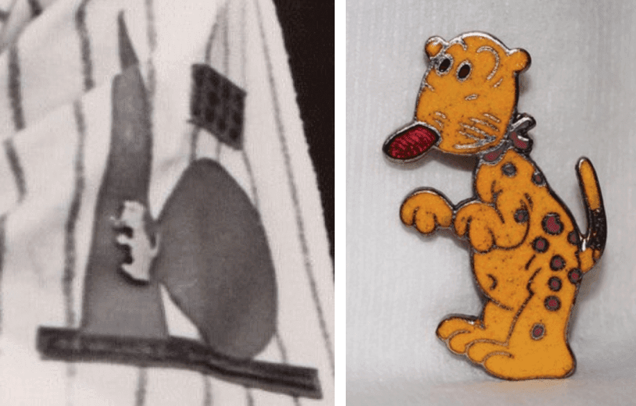
For the uninitiated, Eugene the Jeep is a character from the old Popeye newspaper comic strip. A fun-loving dog-like animal from a “fourth dimensional world,” the Jeep (whose entire vocabulary is the word “Jeep!”) was introduced in 1936 — two years before the Gehrig photo was taken — and soon made the jump to Popeye animated cartoons, as seen here (although the second video looks dead, it’s not — trust me):
I’ve always loved the Jeep character and really should have recognized it when I saw the Gehrig photo. The bigger question, of course, is why Gehrig would be wearing a Jeep pin in the first place. Todd Radom noted that Gehrig starred in the movie Rawhide in 1938 and wondered if it might be some sort of Hollywood studio promotion, but @BeautyOfAGame responded that Rawhide was made by 20th Century-Fox while the Popeye cartoons were done by Paramount, so there’s no connection there. Hmmmm.
In any case, Gehrig now joins the list of MLBers who’ve worn pins on their uniforms, a roster that includes Manny Ramirez, Nomar Garciaparra (more info here), Joey Cora, Reggie Jackson (more info here), Craig Biggio (more info here), several members of the 1983 Giants (here’s a closer look at that pin; additional info here), Billy Martin, and Bucky Dent. Am I missing anyone?
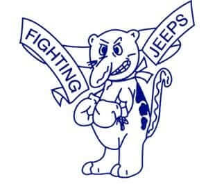
Meanwhile, Wikipedia informs us that there are two high schools that use the Jeep as their mascot! One of them is Northeast Dubois High School in Indiana, whose teams are known as the Fighting Jeeps. Somewhat predictably, they’ve given the Jeep a snarl and a furrowed brow, along with a pair of boxing gloves:
Sure enough, the word “Jeeps” appears on the school’s baseball jerseys, track and field jerseys, and varsity jacket patches. There’s also a costumed Jeep mascot character. Naturally, there’s “Fear the Jeeps” merch, and a local campaign to keep the school district solvent via a property tax increase used the slogan “Save the Jeeps.”
The other school to adopt the Jeep as its mascot is South Webster High School in Ohio. They’ve left the Jeep in his more cuddly original state, although they’ve colored him red:


According to this page, South Webster began being associated with the Jeep in the 1940s. It’s a complicated story — read that full page to get the details. (Another Indiana school, in the town of Wheatland, also used the Jeep as its mascot, but that school no longer exists.)
Not a bad rabbit hole for a simple black-and-white photo, right? Just goes to show that there’s always new stuff to learn and new mysteries to unravel, even for someone as famous as Lou Gehrig.
(My thanks to Tara K — aka @pennyfore — for letting me know about Matt Dahlgren’s tweet of the Gehrig photo.)
Click to enlarge
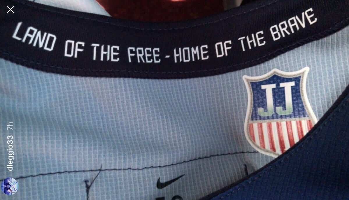
Subtle tribute: Interesting move by the Team USA Olympic hockey team, which has added a little inner-collar memorial patch for former player and USA Hockey exec Jim Johannson, who passed away in late January.
The interesting thing here is the patch’s placement (which I assume is due to some IOC rule that forbids memorial patches and/or late-breaking uniform changes). Has there ever been an inner-collar memorial patch before? If so, I can’t think of one. Anyone..?
(Big thanks to @TheGoalNet and our own Alex Hider for this one.)
Collector’s Corner
By Brinke Guthrie
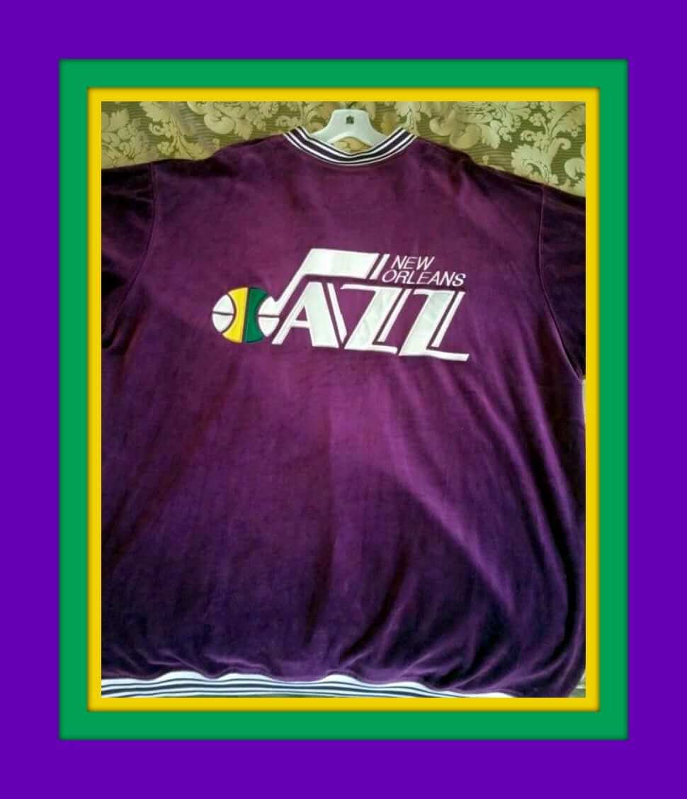
Today happens to be Mardi Gras in New Orleans, so we’re starting off this week’s Collector’s Corner with something from the New Orleans Jazz. (Yes, kids, they were in New Orleans first. The team name made a lot more sense in that city, right?) This purple suede pullover looks like it has a zip front and is would fit right in at any Mardi Gras parade.
Now for the rest of this week’s picks:
• Your Valentine’s Day “Can be a home run” tomorrow with this set of MLB Valentine’s cards and poster.
• This display contains two dozen MLB team lighters from Feudor.
• This Cliff Engle Bears sweater isn’t the same design that Coach Ditka wore, but still cool anyway. Nice pinstripes.
• Boy howdy, this Cincinnati Bengals helmet buggy is in great shape. I attended every Bengals home game from 1973 through 1977, and I don’t think there was ever one of these at Riverfront. We did have “BenZoo” the tiger on the sidelines, though.
• Check out this vintage NFL gumball helmet set. The listing says this was a mail-order deal from Sears. It can’t be any older than 1976, due to the presence of the Bucs, and that facemask for the Cowboys is questionable. The seller also says 1968 for the set, but that might just be the copyright date, since this is obviously not a 1960s set.
• Dodgers Fever…Catch It! reads this 1970s team button.
• Nice set of 1980s NHL logo pucks. Looks like the Bruins one has taken a few too many slapshots.
• Note the graphics on this set of 1970s NFL Sears bedding. These images were used for several different products. For example, I have the Bengals art shown on a light switch plate that I got back in 1972 or so. I’d use it now but we don’t have any light switches like that!
• The distinctive look of former SuperSonic Slick Watts is shown on this T-shirt.
• Apple Watch? Who needs an Apple Watch? In the 1970s, this Dallas Cowboys digital watch was state of the art, people.
The Ticker
By Alex Hider

Baseball News: The Blue Jays will retire No. 32 in honor of the late great Roy Halladay on Opening Day. They’ll also wear a “32” memorial patch for the entire season (from Mike Chamernik and Moe Khan). … It appears that the Giants’ and Blue Jays’ St. Patrick Day caps have been leaked (from Niko Goutakolis and Kevin Mann). … The Nats are holding spring training in Florida this year. However, this New Era ad includes a Washington hat with an Arizona spring training patch (from Kevin). … Not sure if it’s new or not, but it looks like Dodgers OF Yasiel Puig has his own personal logo (from Kary Klismet). … It appears Mets C Travis d’Arnaud is now wearing Nike cleats. He’s worn Under Armour in the past (from Wes). … Due to a slow offseason, a number of MLB free agents remain unsigned as spring training approaches. The MLBPA has offered these players a Spring Training session to keep them fresh, so designer Jesse Alkire gave these players their own team name and uniforms (from Mike Chamernik). … The Class A Tampa Tarpons unveiled their new uniform set yesterday. More photos here (from Kara Adrienne). … New softball uniforms for Auburn (from Clint Richardson). … Max G. came up with a North Korea concept jersey for the World Baseball Classic. … New home uniforms, with an unusual sleeve design, for West Virginia (from Travis Embacher). … Olympic speedskater Jonathan Garcia, who’s from Houston, wore an Astros cap for training yesterday. … The Marlins’ makeover continues: Having already fired the guy who plays Billy the Marlin, they’ve now scrapped the team’s sea creature race.

NFL News: The Jags announced yesterday that they will remove the tarps from the upper decks of their stadium for all regular season games next season (from Robert Hayes). … A 1967 guide to NFL home uniforms shows the Saints as the only team wearing white. The Gridiron Uniform Database’s listing of teams wearing white at home, the Saints did indeed wear white in 1967, but so did several other teams, including the Browns, Cowboys, Giants, Rams, and Steelers. That’s nearly half the league.
College Football News: A housing development in a Des Moines suburb called “Hawkeye Estates” has a large statue of the University of Iowa’s mascot, Herky, at its entrance (from Kary Klismet).

Hockey News: Last month, a couple of Canadian radio hosts discussed whether NHL teams should consider dying the ice a different color. Brad Pramberg says he remembers the ice at the Islanders’ Nassau Coliseum used to be “a shade of blue” in the early ’90s, but doesn’t have any pictures to corroborate. I know the Predators once dyed the ice at Bridgestone Arena yellow for an open house event, and lots of minor league and junior teams have done “pink in the rink” promotions. Any other examples of colorful ice? … Speaking of the Preds, yesterday marked the 20th anniversary of the unveiling of their original uniform set. … Charles Barkley dropped the puck at last night’s Coyotes game in a ’Yotes sweater (from @OlegKvasha). … Check out the lengths the Mighty Ducks and Teemu Selanne went to not cover up the makers’ mark with his helmet logo in the late ’90s (from @JBeck132). … Ken Murray sends along a photograph of a WHA matchup between the New England Whalers and the Minnesota Fighting Saints. Note the top-to-bottom plexiglass boards in the Minnesota arena. … The link in Rangers LW Chris Kreider’s Twitter bio is a Korean pop music video featuring a bunch of singers wearing his jersey (from Al N. Kreit).

Basketball News: This is a good recap of NBA jersey retirement ceremonies through the years (from Mike Chamernik). … They’ve begun to assemble the NBA All-Star Game court in L.A. (from Moe Khan).

College Hoops News: Bucknell and Colgate played a wild maroon-vs.-orange game last night (from Chris Mycoskie). … Texas Tech will wear throwback uniforms tonight against Oklahoma (from Phil). … The University of Utah is honoring members of the 1998 Final Four squad this weekend by giving each player a pair of custom-painted Under Armour shoes. As @QuinneyUte points out, the ’98 Final Four took place 12 years before Under Armour began selling basketball shoes. … Towson wore light-blue unis on Saturday for Autism awareness (from Drew Harrah).
Olympics News: Curling cartoons? Yes, please. … A Chicago TV station mistakenly used a “PF Chang” graphic instead of a PyeongChang graphic during an Olympics story (from Griffin Smith). … There was some talk that the goalies for the US women’s hockey team might be forced to remove the Statue of Liberty from their masks, as the IOC was viewing Lady Liberty as a “political symbol,” but the mask designs have now been approved and will not have to be altered. Team USA goalie Mike Richter had worn his Rangers Liberty mask without incident at a previous Olympiad. … Meanwhile, Korea’s goalie had to remove the image of a Korean naval commander from his mask (from @teebonemike). … It appears the IOC has loosened the restrictions on makers’ marks appearing on hockey equipment (from JR Boucicaut). … US figure skater Marai Nagasu had either USA printed on her stockings or USA KT tape on under her stockings on Sunday night (from Harry M. Roth. … Cross-listed from the baseball section: Speedskater Jonathan Garcia, who’s from Houston, wore a Houston Astros cap for training yesterday. … American snowboarders have a list of English-to-Korean translations sewn into their jacket linings (from Miles Johnson). … Great Britain’s skeleton team is wearing revolutionary new suits that were originally developed for the British cycling team. The suits can supposedly shave as much as a full second off of a skeleton run (from Mark Coale).

Grab Bag: The John Hancock Center, one of the most distinctive skyscrapers in Chicago, is getting a new name (from Darren Rusakiewicz). … Soccer fans should look out for this book when it goes on sale in May: True Colours: International Football Kits, will feature 1,300 illustrations of more than 20 team’s kits dating back to the mid-60s (from Josh Billman). … Municipal officials in Houston will vote today on a $105 million proposal to renovate the Astrodome, which has been vacant for a decade (from @igTXSalazar). … Last but definitely not least: This Twitter thread about an old WWI uniform is incredible — absolutely worth reading all the way through (from Michael Planey).
Typo/usage alert in the baseball section of the ticker: “the “Dirt Patch” Era in the MLB” should be “the “Dirt Patch” Era in MLB”, without “the”. “The Major League Baseball” would be the ball they use, not the league.
(I’ve seen the phrase “the MLB” multiple times recently but never until the past few years; was there some kind of advertising campaign, like with “The Show”? Is this a meme that I should know about? If it’s just a reference I’m not getting, then never mind.)
The “the MLB” usage seems to be a common conflation with other leagues. The top football, basketball, and hockey leagues all require the article, so one encounters people following that usage to say “the MLB” and “the MLS.” Not a reference or a meme, but an error.
Right, the other leagues have “league” or “association” as the noun, with the sport modifying that, so they take “the”. I just didn’t want to go shouding “WRONG!” when it could have been something like Atlanta being called “The A-T-L”. And no one ever made this mistake even five or ten years ago. It’s weird to suddenly see it now.
In my experience, MLB is relatively new. I don’t recall it at all prior to the mid-1990s, and it didn’t seem all that common to me until the early 2000s. Now, it’s ubiquitous. Used to be more common to hear or read “big league” or “major league” or even just “baseball”.
I think it might only be a recent thing because in the past you may have seen things like “In the AL”. While Major League Baseball has really been one entity for a long time, prior to interleague play in the 90s there really seemed to be more reference to the AL and NL as opposed to MLB.
That’s one of the things I really hate about interleague play — since it came in, even intra-league games are often shown as “MLB” games instead of the league they’re in. Yahoo now lists the day’s games without any split at all, making it that much harder to find the teams you care about.
The Blue Jays have had an all-dirt infield since 2016. It has been 2 full seasons without sliding pits around bases.
link
Right. Removed from Ticker.
I got confused at first, because when I hear “all-dirt infield”, I think of a link, like many fields in Japan have. (This photo is of the legendary Koshien, home of the Hanshin Tigers.)
“…the Jags may be dropping gold from their color scheme ”
This makes no sense to me. Jaguars are, you know, gold-ish.
link
Certainly more so than teal-ish.
Though I guess the color inversion of gold is kinds teal/blue. Maybe? Bueller?
Agreed, I always found it odd how their logo was mostly gold, but their uniforms were teal and black, with gold accents. I think teal and gold, with black accents would be the way to go. But I’ll happy with anything instead of their current design abomination.
It’ll be interesting to see what direction their new uniforms go, since this is really the first time Nike’s going to be changing one of their own ridiculous designs. Removing gold entirely from the color scheme is not a good start, however.
I think it’d be a shame if they drop the gold. Their last uniform before the most recent downgrade had practically no gold on it, and link.
I don’t know about the other turfed MLB fields, but I know Three Rivers started with an all dirt infield. The dirt patch era may have been an early/mid 70s thing instead of late 60s.
The link to further info on the Croix de Candlestick pins is dead.
Working fine for me. Here, one more time: link
I just get
Not Found
Sorry, but you are looking for something that isn’t here.
Maybe it is cached on your computer?
Ah, I found the problem. Somehow it had been tagged as “Private.”
Try this link now: link
Now it’s working! Thanks, Paul! I wish I still had my pin from when I was a kid. Candlestick was a dump, but it was where I saw my first MLB game.
re: John Hancock Center – def need a Naming Wrongs shirt…
ed
I agree, I also still refer to Sears Tower not Willis Tower. I understand why they are doing it but they both have been around for so long, how could you possibly call them anything else? Can you see them changing the name of the Empire State Building?
“The Salesforce.com Tower at Empire State Building, presented by Fiat”
The problem is that the original name was a corporate name and I think that that is against the “Naming Wrongs” rules, IIRC
Eugene the Jeep was created by cartoonist E.C. Segar, who died in October 1938. He may have had a connection to Christy Walsh, business manager of Lou Gehrig, Babe Ruth and many other sports figures. Christy was a cartoonist in his earlier days, with a focus on baseball.
Great sleuthing Bruce, could be it
Also, turns out the word “jeep” was used to denote a newbie, such as a raw Army recruit or a new piece of equipment, long before the famous quarter-ton WWII truck took over the nickname. Jeep, the truck, is not an initialism for “General Purpose”, which was the story I’d heard as a boy and believed ever since.
Proofreading – The bigger question, of course, is clear why Gehrig…
Fixed.
That WHA picture is also notable for being a shot of Fighting Saints player Jack Carlson – a.k.a. the Carlson brother who did not get to be a Hanson brother in Slap Shot, due to his being in the playoffs at the time of the film’s production.
Nice! I knew there was a third brother, that had to be replaced because he was in pro hockey at the time, but couldn’t say, or never knew, which team. Also interesting to realize that the glasses weren’t just a prop! I wonder if the “third brother” had prop glasses, or if he really needed them as well.
PaulS
The three real Carlson Brothers (Jack, Steve and Jeff) all wore glasses while playing professional hockey early in their careers (prior to Slapshot). Dave Hanson (who took Jack Carlson’s spot in the movie) did not wear glasses; so yes, he wore prop glasses.
Maybe the Jags aren’t dropping gold.
link
“There will be no change in our color palette. It’s the same as it’s always been with teal and white and black and gold,” (team president Mark) Lamping said.
Ah, thanks for that. Will remove that item from the Ticker.
That said, all the tea leaves have pointed to the removal of gold. It’s what any astute uni-watcher would’ve concluded. :)
That quotation doesn’t preclude the possibility of eliminating or all-but-eliminating gold from the uniforms other than on the helmet logo. Which the evidence so far suggests may be what’s coming.
Here is some of the blue ice back in the 1980’s in the NHL
Mario Lemieux first NHL Goal at Bruins
link
The “Cooperall”game
link
Ken Morrow’s OT winner vs RANGERS
link
Also the Devils Rangers Flyers Caps and Canadiens had at one time had blue ice
P.S. Don’t forget 1980 Lake Placid miracle on ice
The “blue ice” was, from what I can find, the result of the transition to color television, as the solid white paint was too bright for early color TV. As TV technology got better in the 80s and 90s, the surfaces were eventually whitened again.
The ice during the “Miracle on Ice” was also blue if only in patches
link
I recall that in the late 60s and 70s, the ice at the Montreal Forum was pale blue; possibly because it looked better when broadcast on the then-new color television.
I remember some rinks having the goal area in the net painted yellow many years ago. Like at the Aud in Buffalo in the early 1980s:
link
Also at Saskatchewan Place in Saskatoon, which can be seen here during the 1991 World Junior Hockey Championships:
link
A test game was done in buffalo during the year the NHL players were locked out. Two AHL (i assume one was the sabres affilate) teams played a game on blue ice with an orange puck.
That North Korea concept jersey is awful. First, North Korea doesn’t refer to itself as North Korea. They call themselves just Korea or the DPRK (Democratic People’s Republic of Korea). Secondly, the Dallas Stars and/or the NHL are not going to lend their branding to another unrelated entity, much less a brutal dictatorship.
Agreed. Seeing the North Stars logo defiled like that is just sad.
Max G., whoever you are; please do not ever do anything like that again.
Incidentally Eugene the Jeep is also the likely etymological source for the ubiquitous Willy MB army truck, also known as Jeep which in turn forms the basis of the SUV brand.
Generally, I’m not a fan of “bowtie” uniform typography, but those Tarpon unis are delicious.
Re: JJ memorial on inside of jersey –
Only case I can think of (other than Team Canada having their federation crest on the inside of the jersey for Vancouver 2010) was when the Winnipeg Jets’ Connor Hellebuyck switched to #37 – a number that hadn’t been issued since their Atlanta Thrashers days (Dan Snyder was the last to wear it and passed away in 2003)
They added an internal memorial patch. Don’t know if it’s still present.
link
Good call.
I think we need “I still call it Sears Tower” and “I still call it the John Hancock Building” T-shirts.
I still call it the Pan Am Building.
I posted this in another comment, but I’m pretty sure that Paul has said that he won’t make a “Naming Wrongs” shirt for something that originally had a corporate name such as John Hancock or Sears because it goes against the “down with corporate names” ethos of the project. Can’t find the original link to where he wrote that, though, so I might be wrong.
You’re not wrong.
So what would be an appropriate name for a corporate building, if not a corporate name. When the Sears and Hancock buildings were built, they were named for the companies who built and occupied them. Same for all the other notable skyscrapers in Chicago, including the Tribune Tower, Prudential Building, Trump Tower, etc. We have already had the Standard Oil Building renamed as the Amoco Building and again as the Aon Center, with much less uproar than the Sears Tower. There are some buildings that are known simply by their address, such as 333 S. Wacker, and the Hancock will temporarily be officially called by its address until the owner sells the naming rights to another company. But that would be really boring and much less memorable if all the buildings were simply known by their street address. Is that what Paul is proposing? Or should all these tall buildings come up with non corporate names like the Empire State Building? You could have the Windy City Building, the Land of Lincoln Building, etc. Kind of like how housing subdivisions are all named things like Hawthorne Woods, and Greenbrier Estates. The fact is that these private commercial buildings end up on a public, civic role in the community as landmarks. I don’t know what the answer is, but I’m not sure of a better solution than the current corporate names, which will occasionally change as buildings are sold.
I’m not judging any of these names (some of which, I agree, are more vanity names than corporate names). I’m simply saying we won’t do a shirt for them. That’s all.
Deeper down the “Jeep” rabbit hole:
The radio show A Way With Words talked about the word “jeep” in one of their shows.
link
These 1967 NFL divisions made no sense. Capital, Century, and Coastal? The Central Division is the only thing that made sense, and they are still all together. The Capital Division should have had New York and Baltimore Colts with Philly and Washington, instead of the Cowboys and New Orleans. The Century Division should have had Atlanta with Cleveland, Pittsburgh, and St Louis instead of the Giants. And the Coastal should have had Dallas and New Orleans with LA and SF, instead of Baltimore and Atlanta. And have different names for these divisions except for Central. Of course the NFL had already agreed to a merger with the AFL, so they knew these divisions were ending in a few years.
You think that’s confusing? The Giants and Saints switched divisions for 1968, and switched back for 1969!
NFL divisions have always been out of whack–especially when they began expanding WAY west.
Growing up with the Falcons and Braves in the western division of their respective league/conference made me very confused about Atlanta’s geography.
Here’s my current day realignment:
NFC
East – NYG, Philadelphia, Washington, Carolina
South – Dallas, Houston, New Orleans, Tennessee
North – Chicago, Green Bay, Minnesota, Detroit
West – LAR, SF, Seattle, Arizona
AFC
East – NYJ, New England, Baltimore, Buffalo
South – ATL, Miami, Tampa Bay, Jacksonville
North – Pitt, Cincinnati, Cleveland, Indy
West – LAC, Raiders (soon to be Las Vegas), Denver, KC
Houston and Tennessee would move to the NFC, with Atlanta and Tampa Bay moving to AFC.
If you didn’t want any teams to switch conferences, then the South conferences would look like this…
NFL South – Dallas, Atlanta, Tampa Bay, New Orleans
AFC South – Miami, Jacksonville, Houston, Tennessee
Please present this at the next owners meeting.
The white Eagles helmet in the gumball set was last used by the Birds in 1973, so, my guess is that this is a hodge-podge. Still cool, though.
The Marlins’ makeover continues: Having already fired the guy who plays Billy the Marlin, they’ve now scrapped the team’s sea creature race.
Stay the course Derek…stay the course!
Now if they would get rid of those hideous “South Beach” uniforms…
I have a feeling it will be just a matter of time.
Someone tell the Jags that they can’t rely on playoff starved Bills fans to fill their extra seats seven times a year.
The Jazz came from New Orleans?? It all makes sense now
And the Lakers came from Minnesota!
“The Minneapolis Lakers moved to Los Angeles where there are no lakes. The Oilers moved to Tennessee where there is no oil. The Jazz moved to Salt Lake City where they don’t allow music.”
They do have a pretty big choir there. I think you’re confusing them with the town from Footloose.
Nice Baseketball reference Rob
I find it interesting that the IOC took issue with the Statue of Liberty. The rule that was cited focuses on words on the helmet but what they told the Korean goalie differs from that.
I want to say the USHL (junior hockey) Waterloo Blackhawks have done green ice for St. Patrick’s Day… but I can’t find a photo
@JBeck132 Where else would they put the wordmark sticker on Teemu Selanne’s Jofa helmet?
The wordmark on the JOFA helmets was raised (molded into the plastic} and then painted. The sticker wouldn’t do very well on there.
A Jeep with a Jeep!
link
In terms of plexiglass boards in hockey, it was a very cool concept of my youth. The 1972 Winter Olympics from Japan had them as well
link:
Henrik Lundqvist also had the Statue of Liberty on his Olympic masks…. link
Blue ice: Here’s the story, and yes as someone mentioned, it was for TV purposes. 1966 Stanley Cup final came to mind and this link includes video from one of the games at Detroit’s Olympia Stadium. Enjoy!
link