People, I’ll be frank with you: I spent most of yesterday at a social event in New Jersey and watched not one single moment of the NFL Pro Bowl (shown above) or the NHL All-Star Game. Judging from the photos I saw after I got home, the Pro Bowl was pretty rote — red vs. blue, nothing remarkable, except for the color-vs.-color format (which is what the Thursday-night concept should have been, instead of the mono-vs.-mono gimmick).
The most noteworthy aspect of the game was this tweet from Jaguars beat reporter Mark Long, who covers the team for the Associated Press:
Say goodbye to this piece of (art). The Pro Bowl will be the final game for Jaguars in the widely mocked, two-tone helmet pic.twitter.com/4C3p2awA2Z
— Mark Long (@APMarkLong) January 28, 2018
Halle-freakin’-lujah!! It’s not a surprise, as word of the Jags getting new uniforms has been circulating for months, but it’s still great to get confirmation that the new set will include a new helmet. Whatever it is, it can’t help but be a big improvement.
Long went on to say that the new lid would probably be solid black and that the new set would be unveiled in April (which presumably means it’ll coincide with the draft, which takes place on April 26-28).
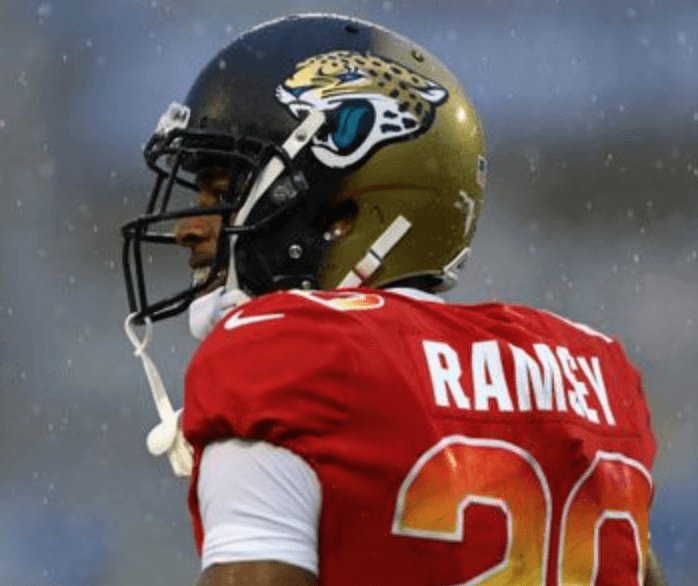
Here’s one last look at the worst helmet in NFL history, as worn yesterday by Jags cornerback Jalen Ramsey:
Meanwhile, the NHL All-Star Game also took place yesterday. The big surprise was that the Pacific team dressed in solid-white uniforms, which prompted broadcaster Doc Emrick to refer to them as “costumes”:
@UniWatch @PhilHecken #nhlallstargame announcer Doc Emrick just said the “solid white costumes are worn by the Pacific division”. Well said. #uniwatch pic.twitter.com/nLBgoZQ7qN
— Al N. Kreit (@tierknala) January 28, 2018
You can see lots of photos from the NHL game here, and additional Pro Bowl photos here.
(My thanks to Uni Watch alum Mike Chamernik for letting me know about Mark Long’s tweet regarding the helmet.)
NBA Uni Tracking
By Collin Wright
This past week marked the first time all season that color vs. color games occurred more frequently than games where the home team wore dark and the road team wore white. Fourteen games featured both teams in dark sets, which was 32% of all games played for the week. Thirteen of those games came after teams began wearing their fourth uniform sets on Thursday (more on that in a second). Here’s our updated chart, which you can click to enlarge:
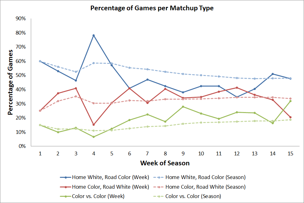
Fifteen teams have debuted their fourth uniform design. So far the fourth sets have been worn 19 times across 17 games. Two games saw both teams wearing the four designs: Kings/Heat on Jan. 25 and Bulls/Lakers on Jan. 27. The latter marked the first time all season that the Bulls wore a color other than red in a home game.
Twelve teams have debuted their fourth uniform during a home game. Only the Heat, Lakers, and Bucks wore them for the first time on the road. Eight of the games with at least one team wearing the fourth set were color vs. color matchups.
A few firsts occurred this week as well:
• On Saturday the Timberwolves became the first team to wear green at home against a team in grey (Nets).
• On Sunday the Spurs became the first team to wear grey at home against a team in purple (Kings). That was the first time a team wearing purple played an opponent wearing any color other than white or yellow
The Ticker
By Jamie Rathjen

Baseball News: New gear for Oregon, including helmets and caps (from Joe Nocella). … New uniforms for Auburn (from Clint Richardson). … The Brewers’ racing sausages now have advertisements on their backs (from Zachary Loesl). … Also from Zachary: Brewers third base coach Ed Sedar said he’ll switch to No. 80 from No. 6 next season. … New Mariners first baseman Ryon Healy will wear No. 27 (from Tim Dunn). … Following up from last week, Chris Flinn found another kids’ book that “gets it.” … Alan Borock sent us some vintage Padres cookbooks found on Amazon from 1984 and 1996. The latter one features the team’s swinging friar mascot wearing a chef’s hat. … Bruno Mars wore an A’s jersey and cap at last night’s Grammy Awards.

Football News: Reader Kevin Clark was watching Super Bowl VII highlights and noticed the difference in piping between the front and TV numbers on Dolphins DL Vern Den Herder (left) and LB Nick Buoniconti (right). … In a related item, that Super Bowl also saw the Dolphins wearing at least three different number fonts — note the various “2”s (from Dave Bertola). … In the 1986 Pro Bowl, Rams OL Kent Hill and Cowboys WR Tony Hill both wore FNOB, even though they didn’t do so normally (from @BackAftaThis). … Here’s a piece on the Ohio factory that makes the Super Bowl footballs. Longtime readers may recall that Paul wrote about that factory several years back (from Jason Hillyer).

Hockey News: Both the men’s and women’s teams from NCAA Division III Lebanon Valley (Pa.) College played outdoors at Hershey, Pa., on Saturday and wore special uniforms for the occasion. The men wore cream, while the women wore blue (from Mike Williams). … Italian Serie B team HC Merano wore a pretty bizarre combination of green helmets, pink jerseys, and black pants this weekend (from Matthew Klimberg). … The Oilers’ AHL team, the Bakersfield Condors, wore Star Wars-themed uniforms on Saturday (from Brent Nelson). … Czech Extraliga team HC Sparta Praha wore camouflage yesterday (from Gary Abbott). … Lightning coach Jon Cooper is wearing a lapel pin to honor the lymphoma-stricken son of a team employee (from John Muir).

Basketball News: Wake Forest’s jerseys and shorts were two different shades of gold in Saturday’s road game against Louisville (from @DJinLOU). … Iowa State, which wore GFGS against Tennessee, was presented with a surfboard commemorating its participation in the Maui Invitational next season (from Kary Klismet). Kary also tells us that a fan was seen putting on a Tennessee jersey over his Iowa State jersey at halftime. … San Jose State once had to borrow opponents Duquesne’s away uniforms when their own failed to arrive for a game on Dec. 21, 1972 (from Jerry Wolper). … From Andrew Cosentino: Virginia Tech’s women’s team went BFBS yesterday, which made for another color-vs.-color game with Miami (Fla.). … Kansas State women wore throwbacks for the team’s 50th anniversary (from Randy Petersen). … Idaho State guard Geno Luzcando was wearing the Big Sky Conference’s 50th anniversary patch on Saturday. The problem? That patch is from the 2013-14 season (from @GRTx3).

Soccer News: The sleeve patch shenanigans continued in England’s FA Cup, where 17 fourth-round teams wore the patch and 15 (including four Premier League teams) didn’t. The teams that did wear the patch only wore it on one sleeve, unlike in the last round, with the notable exception of Middlesbrough goalie Darren Randolph. … We mentioned Chelsea midfielder Callum Hudson-Odoi’s double-decker NOB last week; well, it became one line yesterday in the font Chelsea use for cup and European competition (from @j_canales87). … Swiss Super League team FC Lausanne-Sport was recently bought by the British chemical company Ineos, which altered the team’s crest to include some of its logo. Besides Red Bull, who are well known for remaking the teams they buy in their image, another example in the same vein is that English team Reading wore an away kit several years ago in the colors of their then-advertisers, the supermarket Waitrose. … Jordan Morris suffered a torn jersey during the USA’s friendly against Bosnia-Herzegovina yesterday.

Grab Bag: The U.S. women’s field hockey team is in the midst of a four-game series against the Netherlands at Stanford University, which has produced two different uniform matchups so far: blue/orange and red/black. Also, U.S. midfielder Erin Matson is wearing No. 1 during the series, which is rare for any non-goalie to wear in sports that have goalies. … Syracuse tennis has mascot Otto the Orange on its balls (from Michael Alper). … Roger Federer just won the Australian Open this weekend, but you can already buy a commemorative racket and shirt for his 20th Grand Slam title (thanks, Brinke). … Golfer J.B. Holmes was wearing what Zachary Loesl called “an arm band” during this weekend’s Farmers Insurance Open.
That Michigan/Purdue pic looks old…looks like Michigan Adidas gear
Guessing your post got queued up for moderation, since I didn’t see it when I put in my reply to Rich’s post.
That Michigan-Purdue photo link looks blue vs. white to me.
It’s also an old picture, from the 2015-16 season, Michigan’s last wearing Adidas.
Photos from the actual game on Thursday can be found link, showing the gray-vs.-blue matchup.
Bakersfield Condors: That’s how you do a Star Wars (or any pop culture tie-in) uniform. Not sublimated graphics showing the property, but dressing in some way as if one is in the world of th property.
Also, what terrific team names in the matchup. If I lived within 50 miles, I would watch a Condors-Gulls game in any sport, any time.
Proofreading:
The tagging in the Jon Cooper item is broken.
The last basketball item (“Jordan Morris suffered a torn jersey”) is actually a soccer item.
Fixed.
Another soccer team that uses a corporate logo in its badge is Bayer Leverkeusen. link
And, in the NHL All-Star Game, I occasionally had trouble picking up the all-white uniforms on the background of white ice. Now I know how much dark pants matter.
Format problems aside, neither football nor hockey lend themselves to all-star competitions. Baseball and basketball, you can assemble a collection of good players who don’t normally play together and more likely than not, they’ll play a game at least good enough to watch. But assemble a group of non-teammates for football or hockey, and the game itself will usually be bad football or bad hockey. A mismatched high-school blowout in either sport will be more fun to watch than a pro all-star game. The kids may not be great players, but they’ll at least be trying to win and they’ll play as a team.
Football and Hockey are sports with a high incident of violent collisions were all-star participants are loath to compete at full, or game speed or intensity.
Something else I saw in the USA/BIH game, but I didn’t get a picture of it, is that Bosnia were still wearing the European Qualifiers sleeve patch:
link
(the logo, without the text)
I love that you say “Bosnia were” rather than “Bosnia was.”
Excellent.
Turned on the NHL All-Star game. First I thought something was wrong with the color settings on my TV. Then I just cried out “MY EYES, MY EYES”.
Honestly, white breezers, white jerseys, orange and black wide-striped socks?
What drugs were the uniform consultants on, and where can I get some?
How about a chrome gold Jags helmet?
link
I’m not into the chrome and matte finish gimmicks, but this looks great. (maybe teal facemask instead of black?)
My preference is still for link, but the all-gold isn’t bad either.
The logo will gets lost in a gold chrome helmet.
I’m not advocating for any chrome, but if you went with one, a teal chrome helmet would be best.
Something like this…..
link
I’m hoping for a full matte black with a teal facemask as matte helmets are underused in the NFL, with only Minnesota, Seattle, and the Jags using them.
The Jaguars logo as would would not work on any kind of goldish type helmet. Contrast. Within their color scheme, the helmet,for those that get it,must be black or teal.
That should say “as is”
Seahawks have a primarily navy logo on a navy helmet. Same for the Texans. I get what you are saying though.
I just think the gold helmet works better from a color scheme perspective. If you are going teal as the primary jersey color again, whatever the helmet color is becomes the default secondary color, I’d rather see them as a teal and gold team with black, than a teal and black team with some gold.
Might be one of the few who watched parts of both all-star “games”. Put on the NHL and those PAC uniforms looked like Good Humor was sponsoring the team. The arm bands, I couldn’t tell what color they were supposed to be. Color looked different from various camera angles and distances. Just a terrible choice. The other 3 uni sets were pretty nice, all things considered. NFL game would have been better (no, not if it wasn’t played) if the numbers did not have the color gradients Just looked cheesy to me.
When will the NHL learn that white pants are not the way to go.
I always enjoyed the NHL ASG as a kid (though I guess I’m in a small minority because I never liked the orange & black unis). It was fun to see a totally different kind of hockey once a year, with scores like 14-12 and no hitting. But they lost me when they went to the 30-minute games. I don’t mind 3-on-3 at all, but to me, 30 minutes is half a game, not a whole game. It seems a bit silly as I watch myself type this out, but that just really bothers me.
“When will the NHL learn”
It’s not like the NHL has been stuffing the concept down our throats. That’s the first time (I believe) that the NHL has tried the white pant look since the first half year of the Washington Capitals (1974?)
To me it was worth a try, no it doesn’t work – but it’s a meaningless ASG – who cares
They tried white pants with the Kong’s stadium series in 2014, and it failed miserably, but the pacific sets worked well in my opinion.
*Kings not ‘kongs’
There was another. Vancouver Canucks did wear off-white (cream) pants when dressed in the vintage uniform of the Vancouver Millionaires.
link
In the late 70s/early 80s the Pro Bowl might’ve been my favorite game of the year. It was fun. The uniforms were great (not sure which I liked better, the conference helmets or the individual team helmets) and although they held back a little the players wanted/needed the bonus money and still played at a decent level to earn it.
The NHL ASG was definitely my favorite hockey game because they didn’t fight. And I liked the orange/black color scheme.
Adding the NBA ASG to the list of things I used to watch starting this year. On top of the terrible uniforms I don’t like the gimmicky players draft. Just give me East/West red/blue offense/defense. I have a copy of the ’87 game…those guys played hard on both sides of the ball. Yeah, there was some flash added but you had to really earn your fancy basket.
There is just so much money now (and therefore so much to lose) that it’s no longer possible to have a relevant and fun All Star Game. Baseball comes the closest and I’ll still watch that one.
I think a good part of the lack of appeal in modern all-star games is the fact that we have access to constant exposure of these star players, whereas back in the day, we hardly ever got to see the stars that didn’t play in our own town.
We’ve gone from having very few out-of-market games available to us to having the ability to watch every game literally at our fingertips. Even if we don’t subscribe to these expensive packages, we still have access to highlights at any time.
Yes. I think this is especially true in baseball. Prior to national tv deals, baseball also had the hard AL/NL split, so the all star game was the only time outside the World Series you would see some of these players.
Also the more physical, contact sport nature of football and hockey make all star exhibitions nothing more than an injury risk.
The note about Carson Belec, the 6-year-old with Burkitt’s Lymphoma, hit home. Our younger son had Burkitt’s Leukemia when he was 3 years old. Everything in the article about the aggressiveness of Burkitt’s matches what we were told. Our son went through a lot of difficult chemo like a champ. He’s 20 now and perfectly healthy! I’m hoping and praying for the same outcome for Carson. The only good part of Burkitt’s is that while it responds strongly to positive stimuli, it appears to respond just as strongly to negative stimuli and thus is eminently treatable–even 17 years ago.
I’ve noticed a lack of consistency of the Dolphins in the 70s.
Pictures from Super Bowl VIII show that the helmet logos aren’t the same. Sometimes the dolphin’s head is inside the ring, sometimes outside.
link
The Dolphins are pretty well known for their uniform inconsistencies in the early 1970s.
Any ideas why?
Were teams unaware? Did no one give a flip? Was ownership/management too frugal?
I think it probably came from two factors:
Lax specifications meant each manufacturer put its own spin on team gear; and
Players would wear things for more than one year.
I see this a lot in photos from the 1960s; link weren’t always link.
Jags helmet: Glad to see new unis. Ugly as the helmet was, there is part of me that gives the designers credit for trying a unique approach. And I think the black jerseys were worse than the helmets — just too many elements. Teal sleeves. “JAGS” patch. Gold accents.
Pro Bowl: I still watch the Pro Bowl to see QBs throwing passes to WRs from other teams. The tackling is terrible, so just lower your expectations and enjoy a backyard version of football.
J. B. Holmes in the ticker is actually wearing a piece of kinesio tape.
Re: field hockey.
Traditionally, the USA has left high numbers for the goalies. The No. 1 shirt has been given to a high forward for the last several years:
1996-2000: Michelle Vizzuso
2009-2012: Lauren Pfeiffer
2016-2018: Erin Matson
Goalies have been wearing high numbers in recent years
4 — Peggy Storrar
6 — Alesha Widdall
25 — Amy Tran Swensen
31 — Jackie Briggs
Actually, field hockey goalies nearly always wear 2-digit numbers, and as a general rule they are high 2-digit numbers. If you look at any college roster in numerical order, the goalies are typically (though not always) the last several players listed, or one of them is the very first b/c she wears 00.
Forwards, on the other hand, are the position players you’ll usually find wearing #1.
Historically speaking in soccer of course, a player’s position actually dictated his jersey number.
Is there any remotely coherent sock policy for the Pro Bowl? I saw players in solid color, solid white, color on top with white on bottom, white on top with color on bottom…
I get that it’s an exhibition game but it’s part of the broader problems the NFL has with players’ aesthetics below the knee.
The only time players seem to get close to lined up is on Color Rash days when teams hand out solid socks.
I remember when Uni Watch would report on fines for things like improper socks. Either the league stopped fining, or the fines became so commonplace, and are so small in contrast to player salaries, that there was no longer a point in reporting them.
We will always report on uni-related fines when the info is made public. But it is usually *not* made public.
Okay, I didn’t know that. Maybe the NFL got tired of making sock fines public, then?
The league almost never makes fines public. But players sometimes do.
I think we may have talked about this in the past but it could be just a move to hose becoming “equipment” rather than part of the “uniform.” Much like hose has come to be viewed in baseball, as an accessory rather than an essential.
Oddly, it seems the NBA has been pushing greater uniformity by trying to get tights and compression sleeves to be one color for each team on the floor.
There were people who lived at the time the Eiffel Tower was built who absolutely hated it. Especially artists. Now its generally considered to be the symbol Paris. So when it comes down to folks expressing their likes and dislikes about the look of something, I often think to myself: We’ll see (if we live long enough).
So if Otto the Orange was wearing a navy-colored alternate jersey, would Syracuse tennis be playing with blue balls?
I do still enjoy watching the pro bowl and NHL all star game lol…just always have since I was a kid
I know it’s a tiny little uniform detail, but that ‘b’ in Auburn’s new baseball set really looks sharp. It’s distinctive enough, is classic cursive/script text, and so subtle that it just catches your attention. I love it, and I’m a Carolina fan. Just an overall great look.
Watched the NHL All Star games – I thought the white unis were fun, as a one-off. Only the grey set struck me as ‘blah’.
Wouldn’t like to see white pants on a regular team, but for this exhibition – why not?
Love the NBA tracking all season, Collin Wright!
The jersey tears across several sports don’t exactly make me want to buy Nike products.
The shitty designs across several sports don’t exactly make me want to buy Nike products.
;)
Oh that’s certainly a major factor too, but not only is it a bad design, it’s of poor construction too!
The NHL game is actually pretty good these days. The 3 on 3 tournament format is a nice wrinkle to counter the no-contact, no defense aesthetic that has consumed most modern all-star contests.
The interesting part from a uni-perspective is that the game includes 4 unique designs so there are a few different potential color matches depending on who makes the final.
The new format is pretty enjoyable.
Going with four uniforms the simply solution seems to be black, white, red, and blue teams. Maybe orange instead of red as a nod to the old NHL logo. Cannot figure out why they went with white AND gray, aside from some nonsense about the host city’s color, but that doesn’t hold water considering the use of neon green/yellow and orange.
I suppose that with the current format, I might give it a try next year… assuming I don’t forget and get preoccupied with something else, and also assuming that the game isn’t cancelled on account of a sudden labor dispute or the Apocalypse.
You know, if the NHL had a team that wore white like the Pacific Division all star uni, and put ads on the unis, the wings could camouflage themselves along the boards for more scoring opportunities :)
Or, just put a big vertical blue or red stripe on the side, and blend in with the boards at the top of the zone.
Sorry, those uniforms just got to me.
As a matter of fact, our whole family watched the NHL ASG. Not crazy about the white pants. Black pants would have been a huge improvement. Even worse was the video game fly-by-wire camera angle NBC was using. Gave me a little motion sickness at first.
I wrote some thoughts on what to expect for the new Jaguars uniforms
link
This Jags fan is praying for teal primary jerseys.
Was at NFL Experience yesterday in downtown Mpls, and the Jag uni on the “stand behind it with your head showing for a photo op” figure was wearing teal jersey with white pants (combination in photo at the end of the article’s link).
Certainly not their new uni, but I thought, “Hmmm, looks like turn away from the black pants.”
The “for years” link, that is
The Racing Sausages have had advertisements on their back for years – it’s just that they switched sponsors from Klement’s to Johnsonville.
link
At the risk of starting an argument that Paul will inevitably tell us to stop…
…and since Uni Watch is always concerned about being correct in matters, no matter how trivial…
…it is not correct to call a uniform a “costume” no matter how much you dislike it.
Mainstream dictionary definitions agree with you. Cambridge has two:
1) a set of clothes worn in order to look like someone else, esp. for a party or as part of an entertainment.
2) A costume is also the set of clothes typical of a particular country or period of history.
So, an athlete wearing a uniform to play a game: Never a costume. A fan wearing a part of a team’s on-field uniform, particularly if it has the name or number of an actual player: Always a costume, under definition 1. Actors wearing mock Senators uniforms in a stage production of “Damn Yankees”: Always a costume, under definition 1 and 2, since the play is usually staged as a period piece.
Thanks…although maybe I’m a little disappointed that we didn’t have an argument.
Now, I guess I could dispute your take that a fan wearing a replica player’s jersey is a costume, because usually the intent of the fan wearing the jersey is not to look like the player in question; otherwise, they would also include the pants, helmet, etc.
So I’d say that technically a fan wearing just a jersey of their favorite player with regular pants is not “in costume” but rather wearing a shirt that happens to replicate the player’s jersey, if that makes sense…
Except for the Metro division, loved all the ASG unis. Yes, even the Pacific with the white pants. The Atlantic has the best set in my opinion. And to those who say that the Pacific division looked like the browns, the Pacific won two games, more than the browns have won in the entire Hue Jackson era, so they most be doing something right.
It’s official: The 2018 season will be Chief Wahoo’s last.
link ($)
This lends credence to my theory that Jim Thome will wear the Block “C” on his Hall of Fame cap rather than Chief Wahoo. Can’t imagine the league would want that as a continuing legacy of a logo they’re determined to put in their rear-view mirror.
Agreed. That’s why I raised the question the other day
That doesn’t follow for me. The HOF is independent from MLB, it has a documentary/educational mission, and the plaques are generally meant to be representative. The Indians only wore the block C for, what, one of Thome’s seasons with Cleveland? (And not one of his good seasons.) For the most part, Thome either wore Chief Wahoo or a script I on his head when playing for the Tribe, so I’ll be very surprised if Cooperstown considers anything else.
Obvious solution: Put a White Sox logo on Thome’s plaque.
That’s a ridiculous solution; he played 20% of his career for the White Sox. If they don’t want to show a period appropriate Indians cap then just use his side profile like the did for Greg Maddux.
Agreed that the Block C is not the most historically representative cap of Thome’s Cleveland career. But I think the social pressure to present something other than Wahoo on a plaque that will last far into posterity will outweigh any compulsion toward rigid adherence to historical accuracy the Hall might feel.
Within 24 hours we’ve learned that Jacksonville is retiring the fool’s gold helmet and that Cleveland is retiring Chief Wahoo. Has there ever been a more eventful day for the advancement of aesthetic and moral decency in athletic design?
I just wonder at the delay. Why still have it this year?
To get rid of merchandise in stock (and sell lots of it before it is gone forever). Also it is a slow phase out, having to do with copyright issues. They’ll continue to sell Wahoo gear even after it is no longer “on-field” or part of their official logo set.
And predictably…
link
I think “logically” would be the better adverb here.
I looked, logically, for what I thought was predictable…an article/tweets relating this to the DC Football Team.
Personally I think name should go if the logo goes. Change it to one of the historic names like the Forest Citys, Spiders, Blues, Napoleons/Naps.
Chief Wahoo will be gone from the Indians’ uniforms and hats at the beginning of the 2019 season: So says the Captivate monitor in my office building’s elevator. I guess you can call it gospel!
I used to watch the Pro Bowl, when it was after the Super Bowl.
It made a difference. It was the last game of the season. Even though it was meaningless it was the last football we’d see for months and it felt important to get our last fix.
Plus, it was in weirdball Aloha Stadium. I’d spend half the game watching for crowd and blimp shots and trying to figure out what the stadium actually was.
Its not the last game anymore and that makes a huge difference to me. I don’t need a football fix yet.
The Nets wore grey? They don’t have grey uniforms
Charcoal-ish.
link
So what’s the reason to wait until 2019 on Wahoo?
Probably the same reason the Rams and Chargers couldn’t get new uniforms pronto when they changed cities: Too much retail merch in the pipeline. Also, I suspect the team wanted to give fans some advance warning.
I get that. Guess it just smacks of a “farewell tour” to me.
I guess it doesn’t matter, as long as it’s gone.
Is it a half-measure? They will still sell merchandise, even after 2019
Not sure if anyone mentioned this yet, but there was a moment in the NHL All Star Game Final where apparently a string ripped off Jack Eichel’s jersey and got caught up on Johnny Gaudreau, who actually ended up scoring a goal during the whole exchange. It was kind of funny to watch him attempt to pull it off of him during his goal celebration, and the announcers initially thought it might have been a microphone wire.
I can’t find video of it, nor do I care to dig too deeply to find it. Just wanted to mention.
Here you go
link
That was a LOT of string.
I have fond memories of Chief Wahoo, but I felt pangs of remorse knowing the character brought pain to certain fans. Retire him, and file him under “Looking backward through rose-colored glasses”.
I enjoyed watching both games yesterday, though it helped to have multiple options (golf, college basketball, etc.) to flip back and forth between.
NHL – Plenty of wide open, end-to-end action with the 3 skaters per side. Obviously fewer (no?) stoppages for penalties, but fewer icing & offsides stoppages, as well. Worst part for me sort of had to do with the Pacific’s white breezers–namely, that it made the Metropolitan (grey) the only team whose pants weren’t the same color as the sweaters.
NFL – No issues with the unis. And the players seemed to give a decent amount of effort. My only qualm was with the apparent decision to blow any play dead once there was a reasonable amount of contact between an offensive player with the ball and at least one member of the defense. Notably, when Doug Baldwin caught a pass from Jared Goff in the 4th quarter and got away from the DB/LB just as the whistle was blowing the play dead. He could’ve conceivably scampered to a TD that would’ve almost certainly sealed the game for the NFC. To a certain extent that also affected how much effort it looked like players were giving on certain plays, but that’s only because they knew damn well the refs weren’t going to let them push the pile a yard or two forward or back.
I was just going back through the history of the NHL All-Star uniforms (gotta love the (unofficial) NHL Uniform Database!), and it’s really something to think of how much things have changed in the uni-verse.
Back in the sixties, the NHL regularly reused their uniforms from past seasons. For the Original Six teams, this often meant recycling down to the minors or juniors, often re-crested on front. For the All-Star Team, though, this meant reusing the same sweaters from year to year until either they wore out, or the NHL actually made a change. (I don’t know about the red, white, and blue unis from 1947-1959, mainly because of the added touch of the current year at the bottom of the NHL shield on those unis.)
Since the jerseys were getting reused, this meant that for the 1969 game, when they added names to the back of the jerseys, the white unis worn by the East Division team had to have giant nameplates to cover up the stars on the upper back.
Compare and contrast to today’s game, where players may even have jerseys for each period of a game, and especially in the 2016 NHL ASG, when each player had two sets of jerseys (white and black)!
I remember being shocked and disgusted when the L.A. Kings changed from purple to gold breezers. The 74-75 Kings had a great season with 105 points but I couldn’t take them seriously when I saw their home gold unis.
link
Following up on that; I just checked to see how long they wore the gold pants and I’m surprised to see it was all through the 70s. We hardly ever saw their home games back then so I was under the impression that it was a short term thing. I first saw them in the 1975 opening round playoff season against the Leafs. Toronto upset the Kings 2 wins to 1 in the best of 3.
The 1972 Dolphins — perhaps a testament to what was once perceived as Joe Robbie’s stinginess — we’re equipped with a mishmash of white jerseys. Most of the team, particularly the linemen, linebackers and most running backs — wore new-for-‘72 tops by Sand Knit, which include that manufacturer’s odd penchant for full serif numerals on the front of the jerseys and different, abbreviated-serif numerals on back. (See also: 1969-73 Eagles, 1970-71 Falcons, most late ‘60s-early ‘70s UCLA basketball.) But some Dolphins skill players wore older Wilson jerseys all season — no stripes, plumper block numerals — like Griese and Twilley. Yet even that doesn’t fully explain things, as Morrall, Morris, Kiick and Warfield wore Sand Knit whites throughout, as did Yepremian; Scott wore only Wilson; and Csonka wore Sand Knit for most of the season but Wilson in the Super Bowl …
“Illogical” is actually more fitting here. While the team name may be (actually, is) an affront, the logo itself is (and pretty much always has been) dignified and respectful.
Well, that’s some BS. Not meant to be posted here, but in reply to above,
I would have to agree here, the Jags helmet is the worst in modern NFL history. I have been watching football since 1970 and have never seen an NFL helmet that bad.
The question was asked if anyone watches the Pro Bowl? The last time for me would have been when Dan Fouts was the QB, that would be a good 30 plus years. I don’t know what would be more boring, the Pro Bowl or having to sit through the academy awards? Either choice would be four hours of my life I couldn’t get back.