Click to enlarge
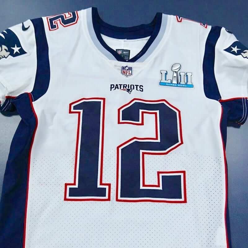
Very surprising news yesterday, at least to me, as the Patriots, who are the designated Super Bowl home team, announced that they’ll be wearing white for the big game. As you can see in that tweet, they’re citing their 3-0 Super Bowl record while wearing white under Bill Belichick (as opposed to 2-2 in blue).
If you were thinking the Eagles might switch things up by wearing their black alts, forget about it. They’ll be wearing green:
Midnight green in Minnesota.#SBLII | #FlyEaglesFly pic.twitter.com/puDs42IrsU
— Philadelphia Eagles (@Eagles) January 23, 2018
A few quick thoughts:
• Although it’s not mentioned in the Pats’ announcement, they may also have been swayed by the fact that 12 of the last 13 Super Bowl winners have worn white. The one exception was Green Bay in Super Bowl XLV, seven years ago.
• This marks the second time in three years that the Supe home team has opted to wear white for superstitious reasons. The other recent example was Denver, which chose to wear white in Super Bowl 50 against the Panthers. Much like the Patriots, the Broncos were looking to their own history, which featured a winless slate of Super Bowls while wearing orange.
• Although the Super Bowl isn’t a true home game, it’s nonetheless extremely rare for the Pats to wear white by choice. According to the Gridiron Uniform Database’s listing of teams wearing white at home, New England has gone that route only five times in the past 27 seasons (and one of those was a throwback game).
• This move by the Pats means that we’ll essentially have a uniform rematch of Super Bowl XXXIX from 13 years ago. Interesting that neither team has changed its uni since then.
• Overall, I’d say this will make for a better-looking game. Philly looks better in green, and I prefer the Pats’ white-over-navy look, plus we’ll get to see their striped socks. A win-win! (Yes, of course it would be better if the Eagles went with kelly green instead of midnight, but I still like it a lot better than their mono-white look.)
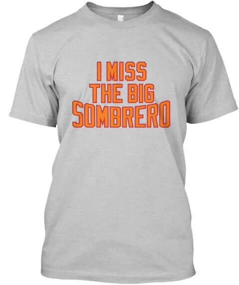
Naming Wrongs reminder: In case you missed it earlier this week, we have a bunch of new Naming Wrongs shirts (including some very cool Big Sombrero designs, like the grey shirt shown at right). Check them out here.
The Ticker
By Alex Hider

Baseball News: The Dodgers have unveiled the patch they’ll wear honoring the team’s 60th anniversary in Los Angeles. … Speaking of patches, one of the first on-field looks we’ll get of the Royals’ 50th-season patch will come on the TV show Modern Family (from Mark Johnson). … Michigan State will look sharp this season if they wear these unis for every game (from Brent Yarina). … The Brewers’ sausage race will have a new advertiser next season (from Drew Brown and John Muir). … Whoops: Topher Flounder found a Dallas Cowboys iPhone case in MLB packaging. … A.J. Lorrigan needs help identifying a cap logo. He believes it’s a Midland Cubs cap, but isn’t sure. It’s a New Era cap, and he suspects it was made in the mid-’90s. … Jason Johnson was visiting the Grand Canyon recently and found these shots of Grand Canyon baseball teams at a little museum next to the Fred Harvey Hotel where he was staying. … 1970s throwbacks on tap for the Hanshin Tigers.

Pro Football News: The end zones in Minneapolis are already painted and ready to go for Super Bowl LII (from J.S.). … “Underdogs” has been a rallying cry for Eagles fans during their playoff run, thanks to Lane Johnson’s and Chris Long’s dog masks. Now, the NFL Shop has agreed to donate all proceeds from “Underdog” shirts to Philadelphia schools. … I think we know who Pennsylvania Amish Country will be rooting for in the Super Bowl (from John Flory). … David Gilmour of Pink Floyd is pictured in this 1970s photo wearing a strange green and red Cowboys shirt (from Robert Hayes). … Repost: Topher Flounder found a Cowboys iPhone case in MLB packaging. … It’s not every day you see a Steelers/Kentucky Wildcats logo mashup T-shirt (from @juicegriffey). … NHRA Funny Car driver Cruz Pedregon wears an Oakland Raiders helmet when he races, one of six different helmets he wears (from David Firestone). … Speaking of the Raiders, a trucking company is poaching the team’s logo (from Scott Steffes). … Austin Gillis was at Monkey Joe’s (a Chuck E. Cheese’s-type restaurant chain) and found this photo of a restaurant’s mascot in a Packers-inspired uniform. … The Albany Empire, an expansion team in the AFL, unveiled their logo yesterday (from Jamie Burditt).
College/High School Football News: It’s common for team photos, but it’s jarring to see Wyoming QB Josh Allen in a jersey with no numbers (from Rob Montoya). … Moeller High School in Cincinnati will now wear Jordan uniforms. They have been wearing Nike the past few seasons.

Hockey News: We finally have photos of the three Mighty Ducks-themed uniforms that the Cincinnati Cyclones will wear in a single game on Feb. 5. They’ll change sweaters in between periods (from Mike Chamernik and Mark). … Also from Mike: Those who want to memorialize the Hartford Whalers can now buy a Whalers vanity plate in Connecticut. … Here are the jerseys for Bobby Orr’s and Don Cherry’s teams for the 2018 CHL/NHL Top Prospects Game (from Wade Heidt). … The Knoxville Icebears wore Spongebob uniforms earlier this week (from Mike Cathcart). … The College at Brockport’s hockey team will wear special uniforms to support the fight against brain cancer on Saturday (from Marshal Scheidt).

NBA News: Months after the whole world had already seen them, the Heat finally “unveiled” their Miami Vice alternates. … The Suns’ “Los Suns” alternate will make their on-court debut on Friday (from Phil). … The Westchester Knicks of the G League blurred out an advertising patch when shooting an ad for another company (from Erik Franke). … The set for TNT’s halftime show includes an old Adidas jersey. … Celtics F Jayson Tatum wore shamrock-speckled sneakers last night.

College Hoops News: Hofstra will wear 1950s throwbacks on Feb. 1 when they play UNC Wilmington. More here (from Phil). … ESPN used throwback logos on set last night during halftime of the Kansas/Oklahoma game (from Sam Wescott). … Repost: It’s not every day you see a Kentucky/Pittsburgh Steelers logo mashup T-shirt (from @juicegriffey).

Soccer News: New Arsenal midfielder Henrikh Mkhitaryan will wear No. 7 for the Gunners during the Premier League. But because another player wore No. 7 for Arsenal during Europa League play earlier this year, Mkhitaryan will have to wear a new number during Europa games (from Casey Garms and Andy Riley). … Chelsea midfielder Callum Hudson-Odoi wears a double-decker NOB (from Connor). … The Portland Timbers unveiled their 2018 secondary kit yesterday (from Ed Zelaski). … This blog speculates what FC Dallas’s 2018 could look like (from Peter Welpton). … New away kit for Reno 1868 FC (from James Jefferson). … A new Manchester United retro kit has leaked (from Charles George). … New badge design for Leeds United (from mortified Leeds resident Thomas Courtman, who refers to the design as “this horrific thing”).

Olympics News: The gloves Team USA will be wearing during the Opening Ceremonies are … interesting (from our own Anthony Emerson). … Wired breaks down the science behind Team USA’s speedskating suits in this piece. … In a related item, after the debacle four years ago, the American speedskaters and Under Armour completely reassessed their relationship (NYT link).

Grab Bag: Wow, check out this 1936 patent drawing for bendy straws (from John Overholt). … Not uni-related, but North Carolina State’s bell tower will finally have bells installed — nearly 70 years after the tower was built (from James Gilbert). … This story about a school for ancient European fighting techniques includes a photo of a guy wearing lacrosse gloves (from Cassian Wykes).
This afternoon I’ll be heading to the airport and flying off to an undisclosed location, where I’ll be spending the next couple of days doing research for an ESPN story. Things should proceed as usual here on the blog, although Thursday’s and Friday’s posts might end up being published a little bit later than usual, because I’ll be in the Mountain time zone. Thanks for understanding, and play nice while I’m up in the air later today, okay? Okay. — Paul
Proofreading:
“a Kentucky/Pittsburgh Steelers logo mashup T-shirts” in both places
While refreshing to make sure no one had beaten me to this, I got the damn anti-AdBlock popup. When I removed the pound sign from the URL, the contents of the comment had disappeared. Grrr.
Fixed. And sorry. We’ve actually been unable to isolate where that’s coming from (really!).
Next time you see it, if possible, right-click on it and choose “Open Image in New Tab.” Then send me the URL for the image. Thanks.
I decided to take a look at it, and unfortunately the pop-up itself doesn’t contain any images.
However, clicking on the “How to whitelist” link changes the pop-up window and shows images of icons for four possible ad blockers (including the Apple logo for iOS). The domain hosting these images is cdn.sovrnlabs.net, but while that domain doesn’t produce any useful information, a Google search turns up link, which is the home page of the web advertising service Sovrn.
Thanks. We’ll take it from here. I just sent a note to our Sovrn rep.
The Steelers were the first Super Bowl home team to superstitiously opt for white jerseys, against the Seahawks in Super Bowl XL. They had made their entire playoff run in white. An unfortunate choice from an aesthetic perspective, since the link of the Seahawks’ uniforms of that era looked so much better than the gunmetal-blue, given the team’s irrational insistence on the link combination, ruining an otherwise link.
Yes, I did like the gunmetal blue-over-white better compared to the mono-gunmetal blue for the Seahawks.
The blue-over-white was originally intended to be the primary look, but they ended going mono-colour as the primary early on. Switching the white pants to the road and blue pants to home as primary looks. Has been mono as primary home uniform ever since.
link
I think the white over gunmetal was one of the underrated combos of that era.
Agreed; I liked it a lot. The mono-gunmetal combo was always terribly disappointing to see. Kind of like link.
Well lets not cast that must dispersion. I found the all gunmetal Seahawks a little drab (especially since its so often cloudy in Seattle) rather than just jarring like the black Mets.
Meanwhile the Seahawks current navy over grey combo (and white over grey) is the most criminally underused combo in the NFL.
Slick Uni…
The whole “gunmetal” era of Seahawks unis were awful. They should go back to something like this.
link
link
Whether the gunmetal-era unis were superior or inferior to what came before is a separate question from whether they looked good on their own merits. I think they looked very good, except for the all-dark combo.
AJ Lorrigan, is there a Minor League licensing tag sewn inside? Is it a green under-brim, or grey? A quick Google image search shows no “Midland Cubs” caps with that type of logo. Could be a college cap.
They were the Midland Angels and then the RockHounds in the 90’s. They haven’t been the Cubs since the early 80s. So my guess is that its another team completely.
I lived in Midland when they were the Cubs, never used any logo like that. Perhaps a fauxback or one-off stunt by the Rockhounds if you are convinced it is a Midland MiLB cap?
Guess we’ll never know if the Pats would be doing this if they were playing the Vikings. Perhaps they wouldn’t want the Vikings to feel too much “at home”…
More proofreading: Should be “FC Dallas” instead of “Dallas FC.”
Re: the Man U retro shirt, I don’t imagine that that will be worn in a game – one can frequently buy retro shirts from their team/other places on the Internet.
Fixed.
What’s amusing about the Patriots’ white-at-home history is that they apparently went white at home for the entire 1985 season, but then wore red in Super Bowl XX against the Bears.
Re: the Westchester Knicks video – if they were going to edit that logo out in post anyway, why not just make it a white spot altogether? It would be less jarring than the blur. Of course, they could’ve just used some tape over them, and not have to edit anything…
Proofreading:
The Westchester Knicks of the G League blurred out an advertising patch when shooting an ad for an another company
– an ad for another
Fixed.
From the look of it, I’d say that’s less a trucking company poaching the Raiders’ logo and more an owner/operator who’s a Raiders fan.
Not sure anyone realizes this, but the Heat “vice” unis borrow their design elements from their original home, Miami Arena. The Miami across the chest mimics that found on the arena, and the shades of pink and blue are likewise the colors used for signage and accent lights on the old building.
I still think they should be using the Broadway font for the numbers, rather than their current non-throwback font.
Re: The new Leeds crest
I have never seen the complete and total rejection of a re-design. Getting anybody to agree on anything is impossible these days… except for this. The revulsion is unanimous and the anger reaches an unprecedented level.
Paul, if you need a column for tomorrow, all you have to do is look at the responses to Leeds’ tweets. This makes other dud unveilings look tame.
link
To make matters worse, the club is heading for its 100th anniversary next year. This could be what they wear for their “centenary” season. Though, considering the state of the club and its checkered history, maybe that’d be appropriate.
… why is there a thread of crappy Connect Four edits in response to that logo? Good grief, Twitter…
As for the logo itself, it’s definitely unappealing. Depicting a fist over the heart just comes off as a questionable decision at best.
Reading that Twitter thread, plus scouring other sites, I have yet to see a single positive comment about that Leeds badge.
I thought for sure it was either a joke, or only to be used in material other than on the shirt.
Oh my. That’s embarrassing.
I am not even a Leeds supporter, and I feel bad for their fans.
Lee
This definitely is a huge story in England. Other English teams are even trolling Leeds over the logo including this hilarious marketing ploy from Aston Villa… link. That being said, I personally think it is still an improvement over the current Leeds badge (link) which looks like something that was designed in an early version of MS Paint. I’ve always felt that Leeds and Bournemouth (link) had the most amateur-looking badges in English football.
Leeds management is already walking back on the badge redesign:
link
Lee
Paul, I find it interesting that you think the Pats white vs Eagles green is a better matchup than the alternative. I would have pegged you for preferring the Eagles in white (less dated 90s “midnight green” being better) and the Pats in silver/navy/silver which seems a more traditional and clean look than silver/white/navy combo.
My favorite color is green, so I’m all in favor of the Eagles wearing green jerseys (even if it’s midnight green).
Also, I like the Pats’ white-over-blue look (absurd jersey side panels notwithstanding). And I *really* like their striped socks.
Those socks are killer!
Wasn’t sure where you stood on the current Eagles green. Let’s just hope they go back to kelly green soon.
Interesting that the only team wearing a dark jersey to win a superbowl lately was the Packers in green. Maybe the green will actually “help” the Eagles.
I think the health of certain key players will play a bigger role in the outcome than the jersey colors.
In any case, I stand by what I said yesterday – I don’t like the Pats’ blue pants at all, and would rather see them wear their link for once. (Photo edit by me)
That, without the side panels, would be a good look.
On the jersey?
Right; remove the side panels from the jersey, keep the pants striping but change the pants to grey, and voilà.
I’ll second the notion that the side panels really bring down the Pats jersey.
When the Pats broke out their current uni look at a H of F game – approx 20 years ago, I was thinking they were reverting to San Diego Padres territory of the 70’s – too frequent and gradually diminishing in term of esthetic appeal, looks, with the thinking the uni wouldn’t last.
Then what happen, they go on and dominate the next 15 years like few teams in any sport have and we’re stuck with a bland look (IMO) with duct tape shoulder stripes on their blue uni, and a really annoying and dated side panel on their white uni. You know if the only saving feature is socks – there is a problem.
It would be nice if they could quietly drop the side panel.
While I like striped socks as much as the next person, the Patriots socks make 0% sense when looked at against the whole of the Patriots (awful) uniform set.
Sorry, it’s true.
Lee
Since Adidas designed the current Pats set, I’ve always wondered if the 3-striped socks were a way for them to put their own mark on the uniform.
OH my God you’re right! They were done through Adidas.
And the Patriots still have the original gallery from the 2000 unveiling up on their website!
link
Would be even better if the Eggles wore Kelly Green.
Alright people, where do you think Paul is heading? He said Mountain time, any other clues I missed?
the small jet may be a misdirect, but I’m guessing Boise
So the Cincinnati Cyclones are going to commemorate one of the biggest uni fouls of all time. In “D2: The Mighty Ducks”, the champions of the first movie represented the United States at the Junior Goodwill Games. They were trailing Iceland in the championship game and, after a rousing locker room moment, came out for the third period wearing new Mighty Ducks uniforms, a callback to their championship days, and a nod to the newest NHL team.
And the crowd was all right with this?! There was no one who had a problem with Team USA abandoning their USA uniforms (terrible as they were) to pay tribute to something that was apparently well known to everyone?? Even the scoreboard was on board, saying, “WE WILL, WE WILL, QUACK YOU”!!
For this, and many other reasons, it has become one of my favorite movies to hatewatch.
I find it silly that the 3rd period uniforms even had the NHL logos on the hemline. And while the movie came out during Anaheim’s inaugural season, I always thought the movie was supposed to be set before the creation of the NHL team in the series’ timeline.
Also, way to rip off the nickname for Terminator 2, Disney.
Gee, thanks for the spoiler, buddy.
Lee
Dude, that movie’s 24 years old. There has to be some kind of statute of limitations.
1. I assume the end zones are midnight green and navy but it’s hard to tell from that video.
2. So HUDSON-ODOI has to go double decker but AZPILICUETA fits straight across, no problem, for the same team?
Patriots end zone: link
Eagles end zone: link
Sorry for the double links, couldn’t find one with both. The MN Star Tribune site may have it but it tells me “You’ve reached your monthly viewing limit” though this was my first visit. Guess they found my IP address is coming from Philly.
Bring back the old end zones w/ conference and NFL emblems!!!!! This off centered look is bad!
Chris Creamer has apparently seen the SB LIII logo. According to him, it’s the same template as the last two but with navy blue accents.
link
Someone suggested that it might have something to do with the host team being in the NFC, and that got me thinking.
Super Bowl LII will be the 30th Super Bowl to be hosted in an NFC (or pre-merger NFL) market, not counting four games held in markets with teams in both conferences at the time of the game. In contrast, only 18 games have been held in AFC-only markets.
There are more dome or warm weather teams/stadiums in the NFC. Not counting the cold weather NYC SB from a few years ago, most cold weather climates are avoided. This hurts the AFC markets chances in hosting. IMO
Interesting stat. Note that 3 of the 4 domed stadiums outside the Sun Belt that have hosted Super Bowls (Minnesota, Detroit, Atlanta, Indianapolis) are home to NFC teams. Also, L.A. and the San Francisco Bay Area were NFC-only markets when the Raiders didn’t play there (pre-1982 and 1982-94, respectively), but were never AFC-only markets. (Accordingly I think that number should be 5; the three games played at the Rose Bowl during the Raiders’ tenure in L.A., plus the game at MetLife in Jersey and the one at Levi’s Stadium in the Bay Area.)
Further, the NFC has had most of the Sun Belt markets for most of the Super Bowl era: New Orleans, Dallas, Tampa Bay since 1976 and Arizona since 1988. The AFC also has four Sun Belt markets but they’ve had them for less aggregate time; the only constant has been Miami although it only lost San Diego a year ago, but it’s only had Jacksonville since 1995 and there was a five-year gap in Houston. And there’s never been a Super Bowl in Seattle.
All that should account for the disparity, but given how many games have been played just in Miami and San Diego, it still seems like an odd stat.
I guess it would help to be a bit more specific with my statement – the 30 games refers to A) games held in a stadium that hosts an NFC team at the time, or B) games held in a neutral-site stadium in a market that has only an NFC team at the time, and vice-versa for the 18 AFC-hosted games. By that criteria, SB50 counts as an NFC-hosted game, since
Levi’sthe Santa Clara Stadium is not a shared stadium likeMetLifethe Meadowlands Stadium is.Agreed that there is a disparity with geography between the conferences. It’s not helped that the three teams that crossed over from the NFL to the AFC in the merger are more northerly teams.
Hmmm… OK. But Santa Clara is roughly equidistant — just under 40 miles — from San Francisco and Oakland; if anything it’s a bit closer to the latter. So even though it’s not a shared stadium it’s still a shared market. Given that Giants Stadium and its Meadowlands successor are the only shared stadia the NFL has ever had in the Super Bowl era, I think the market is the point rather than the stadium especially if we take non-NFL stadia into account. Why use two different criteria when one will do?
Here’s another interesting stat: The only multipurpose outdoor stadiums that have hosted Super Bowls are Joe Robbie/Dolphin/whatever in Miami, which was a purpose-built football stadium retrofitted for baseball when the Marlins started play 6 years after it opened, and the Murph/Qualcomm in San Diego — neither of which hosts baseball anymore. No Super Bowls were played at, e.g., Candlestick Park, Oakland Coliseum, Anaheim Stadium, or Atlanta-Fulton County. Nor was one ever played at the Astrodome, although that seems odd in retrospect; maybe it had something to do with the terrible field surface there.
Also, the Metrodome is the only indoor multipurpose facility to host a Super Bowl; the Superdome can be configured for baseball and once hosted a minor-league team, but not MLB.
How many bits do we want to pick here? Well before my time, but to my knowledge, the Superdome hosted N.O. Jazz NBA games, so Jazz + Saints = multi-purpose. But I don’t know how the years line up…did the Superdome ever take a Super Bowl during the Jazz era? Wouldn’t happen today, as the New Orleans Arena exists next door to hold the they-were-the-Hornets-during-my-childhood-and-New-Orleans-upbringing.
Nits to pick. Like nitpicking.
Technically, Minnesota’s new stadium does have a baseball configuration, but it’s only used part-time as such by the Gophers, not by the Twins.
The Silverdome hosted Super Bowl XVI when both the Lions and Pistons played there.
OK; I guess by “multipurpose” I should have been more specific as to “football and baseball” (or NFL and MLB). I was thinking about this in light of the link piece that appeared here over the weekend.
Need I mention the Dodgers playing at the Coliseum?…
The Dodgers were long gone from the Coliseum by the time Super Bowl I rolled around.
More Proofreading:
Wyoming QB is “Josh” Allen, not “Jake”
Fixed.
So glad they are going for the game. Much better looking uni
I want to print and frame that bendy-straw diagram. In fact, I kinda want to ask it out on a date.
It’s only January but I’m fairly certain LC won the internet for 2018 with that comment.
The David Gilmour Cowboys shirt has been addressed in the Ticker of these very pages (back in 2014). There is also a shot of Keith Moon where the same shirt.
link
It’s been covered here a few times, actually.
And it’s still weird that the shirt even existed, much less being worn by Gilmour and Keith Moon!
worst thing about the Superbowl aesthetics is the purple stands surrounding the game.
Interesting to note in the Hofstra video the stills of a number of past players wearing non 0-5 digits (e.g., 17, 18, 19, 26, 27, 80, 82, 89, 92, 93). Was the 0-5 rule not as strictly enforced in the league in which Hofstra played? Also of note is that the jerseys that the throwbacks apparently throw back to were sleeved.
Evidently, the “0-5” rule was not yet in effect at the time; I don’t know when it did. But if Hofstra did wear sleeved uniforms back then, the throwbacks should also have been sleeved.
FNOB alert: Jose Tartabull’s first name fit on the back of the A’s golden sleveless jerseys a lot better than his last name would have: link.
Here are my official thoughts on the Super Bowl unis.
Patriots: Ugly and bad. The away whites are better than the home blues, but it’s still a bad design. First off, why navy blue? The pats had a royal/sky blue on their 80s reds, so why deviate from it? To look more modern? Second, grey is added to their color palette for no apparent reason, it just makes the whole design clunky and dirtied. While the shoulders are overly busy with the logo, numbers, and stripes, the side panels are extremely minimalistic, making it seem as though the designers waited till the last minute to finish the jerseys.
Eagles: Blah. Drab. In a move I will never understand, in the 90s the Eagles decides to darken their colors, with the kelly green becoming midnight green (which is not even an actual color as the midnight sky is blue) and the silver/grey became black, to the overall detriment of the brand. However, I do think that the white jersey over green pants works well, but whatever, it’s still worse than the kelly green.
I had always thought they changed to “Nautical blue” because it was closer to “Old Glory blue”, the official shade of blue of the U.S. Flag.
One thing to think about, though, for those fans who long clamor for New England to return to red jerseys – don’t you think it’s just a bit odd for a team calling themselves the Patriots to dress in the colors of the Redcoats?
Just sayin’.
No, I think it’s odd for a team with unique uniforms to change into another boring ol’ blue team with silver helmets. The Pats surrendered a nice identity in favor of hive mentality.
Red jerseys, white helmets? The Cardinals called…
I’m not saying it’s a bad look, I’m just looking at the historical implications here.
But the Cardinals have (almost) never had blue in their color scheme. Also, the Cardinals unis are and were a different shade of red than the Pats had, and the Cardinals unis are so darn ugly now that the Patriots would never be blamed of plagiarism if they decided to revert back to the classics reds.
Also, regarding the throwback look… I actually don’t miss the white helmets, mainly because white is actually the most-used helmet color today, with seven teams, and three of them are the Pats’ rivals in the AFC East!!! And this was a division that once had five white-helmeted teams for eight years.
The white lids are still better than the silver ones they currently have. However, I wouldn’t be opposed to a blue one to pair with the red jerseys.
But the Cardinals have (almost) never had blue in their color scheme etc. ets.
“Sarcasm, what’s that? Can you eat it?”
No, they don’t need a blue helmet. Of that much, I’m certain.
In case you missed it, I was the one being sarcastic/facetious about the Cardinals.
Unfortunately, one doubts it’s ever coming back. The Pats’ uni change coincided almost perfectly with their run of greatness, so superstition will dictate it remain permanent.
Blue helmets with red jerseys for the Patriots? Ugly.
Take their Color Rush jerseys, add silver complementary pants, and that would be anice change
The end zone looks a bit plain without the logo representing each conference. I hope they at least add them to the playing field.
They stopped putting the conference logos on the field with Super Bowl 50.
Seeing the U.S. Olympic gloves made me think of this:
link
My favorite Eagles uniform combo is the black jersey with white pants. Then again, seeing them in midnight green jerseys instead isn’t so bad.
This is the worst possible take, excluding midnight green helmets over black jerseys and pants. The Eagles are one of the worst examples of BFBS in all sports. Green and white worked since the 1930s, the black doesn’t pair well with green helmets and it’s a bad idea.
You have your preference and I have mine, which I stand by. Different strokes for different folks, my friend.
I would like the black on black if they would only pair it with white helmets. The green helmets look silly with the black on black set. But alas, the NFL’s one shell rule does not allow for alternate helmets. All the NFL’s uni-restrictive rules are just stupid. I get it, they don’t want every team to be the Oregon Ducks, but if a team wants to get creative with uniform combos, the league usually bars it.
Super? No one calls it that.
Meant Supe. Even autocorrect thinks it’s weird.
I don’t really care if anyone else calls it that. *I* call it that.
I could see it being used in the body of the work, but not in the headline. It’s unique but I’m not a fan.
It is however a billion times better than NC2A. That’s the real awful one.
Late to the discussion, but why does it bother you so much what Paul uses?
Only real difference in uniforms this time around with the Pats and Eagles would be that the Pats have a new wordmark on their uniforms than the ones they had back in 2004.
Any difference we can spot in this Super Bowl uniform rematch will be obvious relative to Super Bowl 46 compared to 42!
The NFL shield at the base of the collar is another difference, for both teams – back then it was an embroidered NFL Equipment shield (and using the old curly-serifed font); now, it’s a plastic chip with just the modern NFL shield.
Does it bother anyone else with the clear plastic border all around the edges of the patches on the supe jerseys? Looking back at last years, I see that there was the same (at least on the Falcons, can’t really tell on the Patriots).
If anyone has a lead on one of these Chromaflex patches, please let me know, I have an exacto, jersey, and seamstress to put one on my overpriced polyester Wentz jersey.
#Flyeaglesfly
“Supe” is finally catching on
Aren’t those patches applied to the jerseys via heat-press? That might account for the plastic border.
I believe I saw (at least on the Iggles jerseys) them being sewn on.
‘Supe is so much easier to type than Super Bowl.
Why is the ‘home’ team painted in north end zone and road team in south end zone. Super Bowl XLIX, Seahawks was south end zone, Broncos two years ago and Falcons last year.
Yeah that really bothers me too