Back in the fall I received an interesting note from reader Scott Crawford, as follows:
I was watching the highlights for the Georgia’s recent win over Tennessee. One of the video clips showed Georgia running back Sony Michel, who wears No. 1 [as seen above], running over a Tennessee defensive back. Coach Kirby Smart commented that many people make the mistake of thinking Michel is a small running back because he wears that ‘skinny’ number. I believe Coach Smart was referring to the physical size of the number, not its numerical value.
That got my mind racing. Is there anything to it? I think of big running backs who wore big numerals across the chest, such as Herschel Walker or Earl Campbell, both of whom wore No. 34. On the other hand, I remember Christian McCaffrey wearing No. 5 at Stanford and Reggie Bush wearing No. 5 at USC. Did the single-digit number make them look faster?
This is an interesting question. We’ve often discussed how certain uniform numbers feel more appropriate for certain positions, but I don’t know if we’ve ever discussed how certain numbers might make a player seem faster, or bigger, or whatever. Hmmm.
Regarding Sony Michel, who we’ll see more of in next Monday night’s national championship game, I’m more of an NFL fan than a college football fan, so the idea of a running back wearing No. 1 seems odd to me. But having now looked at some photos and video clips of Michel, the number does make him seem like more of a sprinter than a bruiser, at least to me. Part of it, I’m sure, is that I’m used to seeing kickers wear No. 1. Double-hmmm.
What do you folks think of all this? Can a number make a player seem faster (or slower) or bigger (or smaller) than he really is? Can that kind of thing be leveraged for a competitive advantage? Can it apply to other sports besides football?
Discuss.
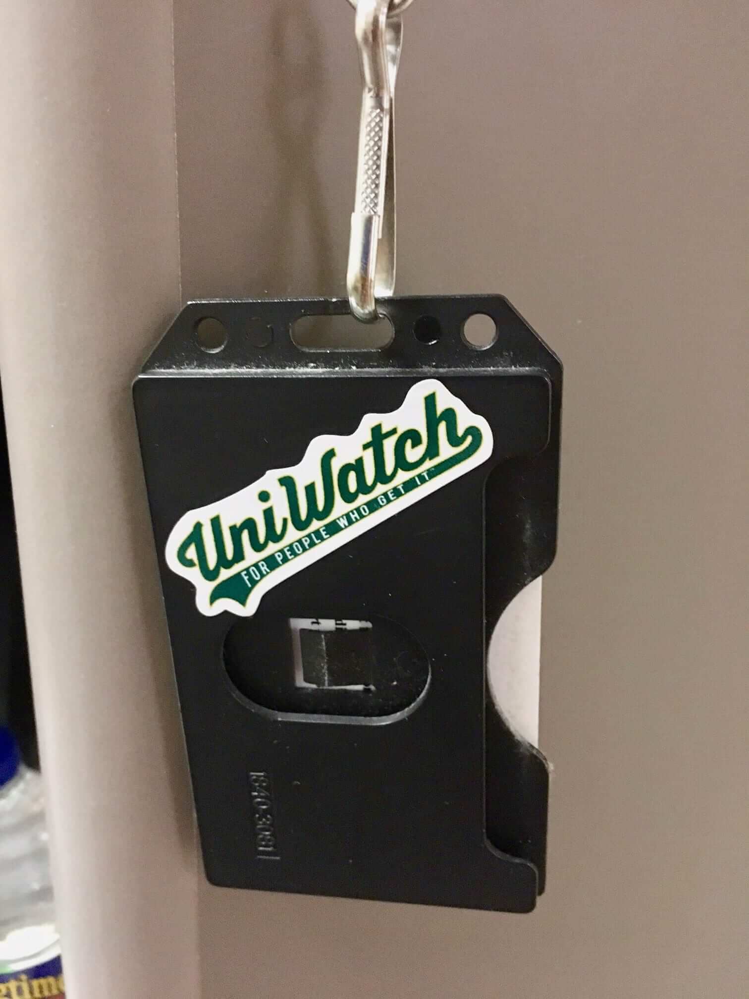
Sticker sighting: Got a nice note yesterday from reader Greg Allred, who works at a hospital in Alabama. Take it away, Greg:
I ordered some of the Uni Watch stickers a few weeks ago and put one of them on the back of my hospital ID [see photo at right; click to enlarge]. I was recently riding the elevator to the 10th floor, which is where the majority of my patients usually are, and a young lady pointed to my name tag as she and her husband/boyfriend exited the elevator and said, “Look, he gets it.” I grinned, but we didn’t have time to carry on the discussion.
They were both wearing Atlanta Braves jackets, so I assume they probably were familiar with Uni Watch, based on the way she said it. Cool moment.
That’s pretty awesome. If you’d like to experience something similar, you can buy Uni Watch stickers (and magnets!) from our friends at StickerYou.
Click to enlarge
Collector’s Corner
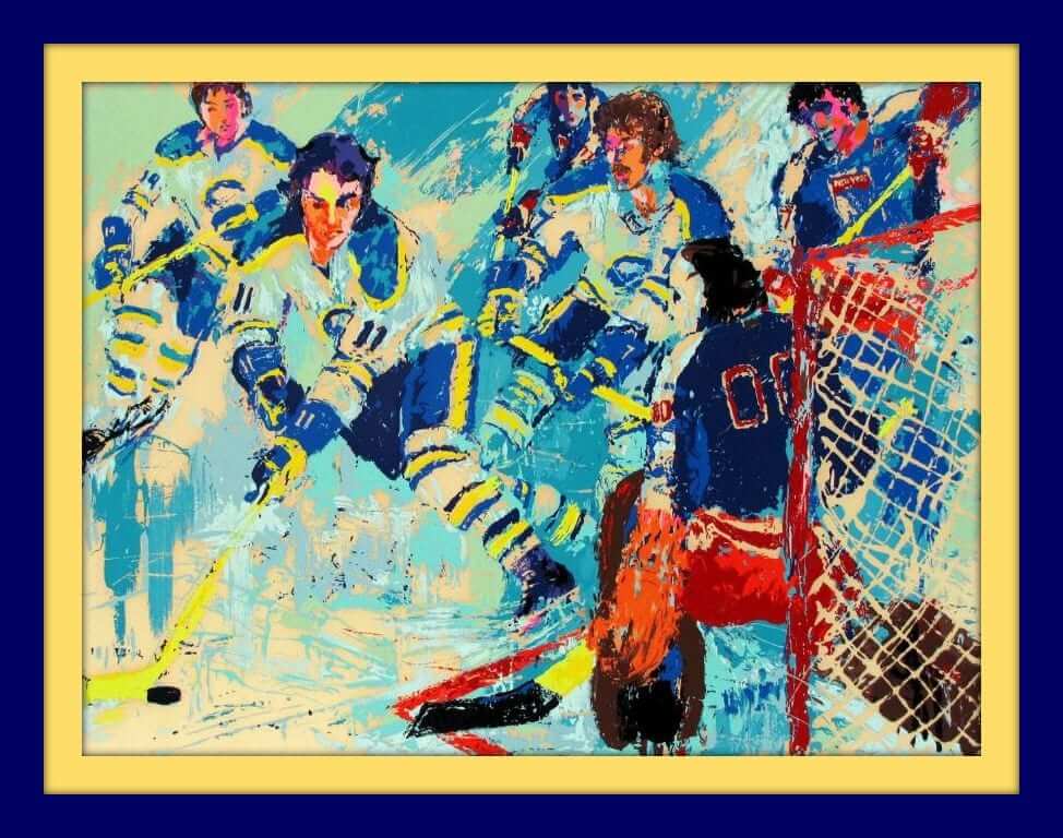
And we’re back with the first Collector’s Corner of 2018! We’re leading off with hockey today, in honor of the Winter Classic earlier this week between the Rangers and Sabres. So here’s a 1977 print by legendary sports artist LeRoy Neiman, featuring the Sabres’ famous “French Connection” line of Perreault/Robert/Martin.
Two years later, there was an event held at Madison Square in February of 1979 called the NHL Challenge Cup — NHL all-stars faced off against the USSR national team (the Miracle of Lake Placid was still a year off). Neiman produced this beautiful poster art for the event.
Now for the rest of this week’s picks:
• This seller has several excellent early-1970s NBA posters to choose from.
• This 1970s L.A. Lakers gear bag is done up in grey and red. No purple/yellow anywhere.
• They went with generic football artwork on the cover of this 1967 NFL preseason program for a game between the Pats and Jets in Bridgeport, Conn.
• Looks like someone’s mom took his 1970s mail-order MLB patches and sewed ’em on a shirt, and now that shirt has ended up on eBay.
• Here’s a nice selection of 24 NFL team pins from the 1970s.
• Good golly, this is one fine vintage Vikings zip-front kids’ sweater from the Sears “Put-On Shop.” And here’s a Vikings jacket, too.
• Nice-looking 1960s Detroit Lions plaque from Acrometal.
• Ah, will you look at the sleeves and socks on Dandy Don, gracing the cover of this 1967 Dallas Cowboys season preview magazine.
• These used to be quite popular with baseball fans way back when: Slurpee-issued MLB team cups, like these for Pirates stars Richie Hebner and Steve Blass.
• This patch is for the Memphis Tams, an ABA team from 1972-74. “Tams” was an acronym for “Tennessee-Arkansas-Mississippi,” and the green-gold mimicked the Oakland A’s, as the team was owned by Charlie Finley.

Advertiser shout-out: After a brief absence, the jersey-rental operation Rep the Squad is back as a Uni Watch advertiser. They’ve added a bunch of NBA teams to their inventory, and they’re still offering a two-week free trial.
If you don’t like the idea of shelling out big bucks for overpriced polyester shirts, Rep the Squad is a good option. My thanks, as always, for considering them and all of our advertisers.

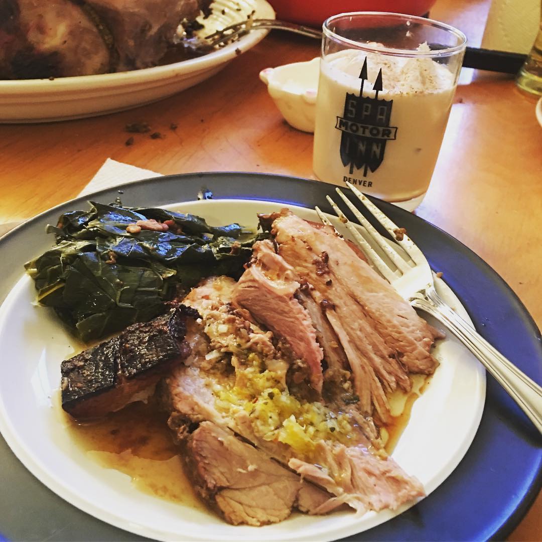
Culinary Corner: The Tugboat Captain and I rang in the new year on Monday with an unconventional form of surf and turf: some fresh-shucked oysters and a pernil, or Puerto Rican-style pork shoulder.
Here’s the pork shoulder, which weighed in at just over nine pounds and had a gorgeous covering of skin on one side (for all of these photos, you can click to enlarge):
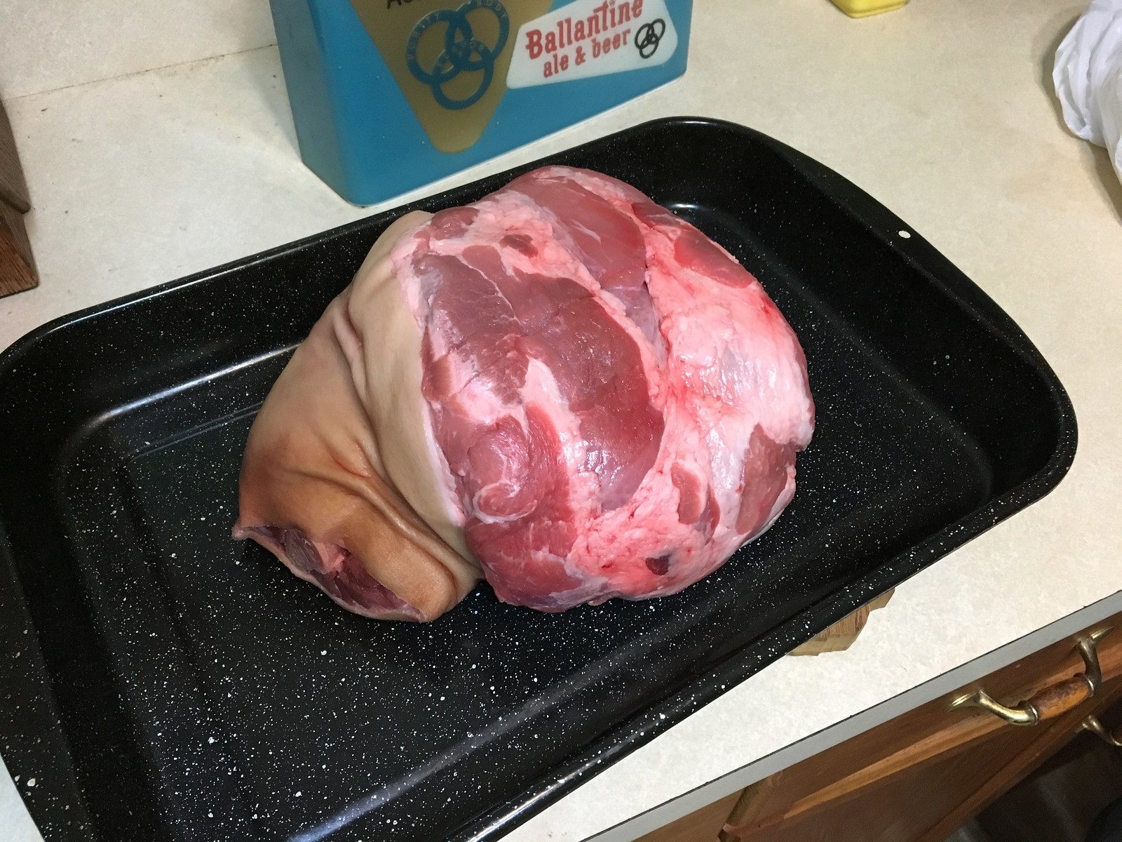
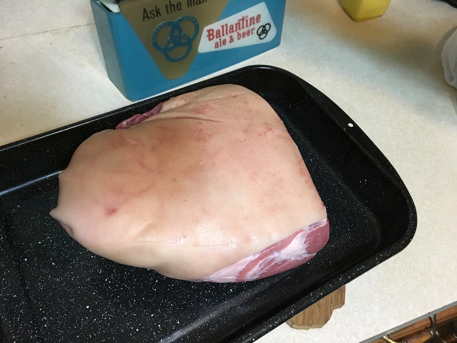
We made a paste/marinade by following the recipe shown here (NYT link), but we changed the prep method in two key ways: First, we slathered the pork with the paste the night before, and we also cut lots of holes in the pork and worked the paste into those channels. So the paste wasn’t just on the outside of the meat — it was also on the inside.
We cooked it in a very low oven (250º-ish) for about six hours. Here’s how it looked when it came out of the oven, along with some of the oysters we shucked. As you can see, I scored the skin in a honeycomb pattern, which resulted in some excellent cracklins:

We invited a few friends over and served the pernil with two sauce options: a bowl of pan drippings and a Cuban-style mojo sauce (orange juice, lime juice, a shitload of garlic, paprika, cayenne, cumin, olive oil, and maybe one or two other things I’m forgetting).

My friend Sujan took this photo of her plate, featuring pork with mojo sauce, cracklins, and some collard greens with bacon that the Captain made as a side dish. Sujan’s beverage was my very last glass of this year’s batch of Irish cream, with a bit of fresh nutmeg grated on top.
It all made for an excellent start to the year. Hope your 2018 had a similarly auspicious beginning.

Birthday boy: Please join me in wishing the happiest of birthdays to our own L.I. Phil Hecken (who’s turning 39 yet again — he’s really good at it!). In addition to holding down the Uni Watch fort every weekend, Phil is the most loyal and supportive friend a fella could ask for, an excellent curling skip to boot, and pretty much the nicest guy in the world. Here’s hoping you get everything you wish for when you blow out the candles, buddy!
The Ticker
By Alex Hider

Baseball News: The Reno Aces (Triple-A affiliate of the Diamondbacks) teased their 2018 Theme Kit yesterday (from Vince Ruffino). … Ferdinand Cesarano was watching a 1983 Rodney Dangerfield special that featured Robert Urich in a strange Cubs uniform, with generic white pants a red belt, and red stirrups. Watch the whole thing here.

NFL News: It was a season to forget for Browns fans, but there are already amusing T-shirts being sold to commemorate Cleveland’s 0-16 season (from Jason Hillyer). … Joey Greenstein was watching Super Bowl XXVII recently and noticed Bills lineman Howard Ballard wearing a helmet decal honoring Jets DE Dennis Byrd. Earlier that season, Byrd suffered a spinal injury which left him paralyzed. … Texans special teams coach Larry Izzo was fired yesterday, and many media outlets used this photo of Izzo in a mystery jersey. Brian Spiess did some research and discovered Izzo was wearing a Patriots jersey. … Here’s a new logo/uniform concept for the Los Angeles Rams. … The Broncos’ stadium still has signs from a corporate naming advertiser, even though that advertiser — the Sports Authority — went bankrupt and no longer exists. Now the signs are finally coming down (from Brinke). … Marc Swanson was poking around in his basement and found a Nov. 1981 issue of Pro! magazine that includes a good article about the Bengals’ then-new uniforms.
College and High School Football News: Here’s a time lapse video that shows workers at Raymond James Stadium preparing the field for the Outback Bowl hours after a Tampa Bay Bucs game (from James Gilbert). … Marion Local (Ohio) High School lets its players do whatever they want with their merit decals. Some players even used them as helmet numbers (from Tom Pachuta). … Joel Berry II, a point guard for the UNC basketball team, warmed up in an Alabama football jersey the other day (from James Gilbert).

Hockey News: The fans have spoken and chosen the Blackhawks’ current uniforms as the best of all time, edging out the classic Whalers set and the jade and eggplant Mighty Ducks 0f the ’90s (from Joshua Tretakoff). … Maple Leafs players warmed up in No. 1 Johnny Bower sweaters last night. Bower, a four-time Stanley Cup champion goalie with the Leafs, died on Dec. 26 (from Mark Coale). … Here’s a blog that offers every NHL arena a nickname (from Bryan Palmer). … Kieffer Bellows is a winger on the US’s World Junior Championship team and the son of former Minnesota North Star Brian Bellows. Last night, Bellows scored a goal and skated in front of a fan wearing his father’s jersey (from Rich Franklin). … Fanatics is selling a version of the Rangers’ Winter Classic jersey without the NY/Shield chest patch (from Tim Baker). … The Edmonton Oil Kings of the WHL debuted new alternate uniforms on Monday (from B.Q. G).

Basketball News: The Delaware 87ers, the G-League affiliate of the Sixers, will wear Spongebob Squarepants uniforms for Nickelodeon Night tonight. … The Kansas City Tornadoes will open their inaugural season tonight with a logo that contains an apostrophe catastrophe (from Scott Nuzum). … When Rockets G Gerald Green was signed by the team last week, he borrowed teammate Trevor Ariza’s shoes for his first game (from Mike Chamernik). … Repost from the college football section: North Carolina PG Joel Berry II warmed up in an Alabama football jersey the other day (from James Gilbert). … Northwestern will be sporting some new shoes for the new year. … Spurs G Patty Mills, who’s from Australia, wore shoes last night that celebrated the Australian Mabo Day holiday (from @ThatTallRussian).

Grab Bag: Formula One driver Valtteri Bottas is holding a contest to design his new racing helmet (from Kenny Ocker). … North Carolina is hosting a wrestling meet against Duke at an on-campus performing arts center in February (from James Gilbert). … Speaking of North Carolina, the school’s archives shared this photo of some awesome old letterhead (also from James Gilbert). … New promotional kit for Providence City FC, an amateur soccer club (from Ryan). … Sneakerheads will enjoy this New York Times Q&A with some of the industry’s biggest names from Sneaker Con (from Tom Turner).
I think a skinny number can only help so much: link
I second this: link
Single-digit numbers don’t always help hockey players, either.
link
There’s the other direction to non-skinny numbers in Hockey. Gretzky wore 99
I think it was the WR Roy Williams (a quick search cant confirm) who stated he wore #11 because a) it made him look skinny and b) made signing autographs easier
re: Skinny Numbers…when I was in little league and kid soccer league, the uniforms came in size order: 1 was smallest, and 15 (or whatever) was largest. This may have something to do with the perception that single digits go with smaller folks…?
ed
When I played basketball in high school it was very similar especially in the lower teams. I was always 34 or 44 because I was one of the bigger players.
And then the lazy coaches would tell the kids to bat in numerical order, which meant the my (big) boys always batted last. Until I asked the coaches to mix things up after a few games. I would explain that you could still go in number order so the lazy coaches don’t have to actually keep track, just start at a different number each game.
My Little League also, but Coach took #1. I was #2 for a few years (before my growth spurt!).
On the first basketball team I ever played on, it was the opposite for some reason: big numbers first. I don’t think there was a 1 or a 2; it was 3 or 4 to 15. Being one of the smaller guys, I was issued number 10 and was wishing that I could have a single digit because my back was small.
Then the next year we had “correct” numbering (no digits over 5) and no single digits. I think we had 10 to 15 and 20 to 25 only, but I can’t remember which ones had which sizes. I was just happy to get 14, my favorite baseball number!
Back in the day, the Chiefs had a kick returner named Nolan Smith. He was short of stature, so Hank Steam gave him uniform number “1” to make him look taller.
Noland Smith… with a D at the end of his first name.
link
Lee
You now raise the item of non 20-30-40 numbers on running backs…the Chiefs had good examples with Warren McVea (6) and Ed Pololak (14).
Jimmy Rollins chose number 11 for the Phillies cause he thought it would make him look taller.
I grew up with the ECHL New Orleans Brass, captained mostly by 100 NHL game alumnus 5’9″ tall Jeff Lazaro–#11 in our scorecard. In retrospect, I bet he felt the same way.
I believe that there is certainly something to the thought that a skinny, single digit number (skinny in size – like 1, or 7) makes a player seem slimmer on a subconscious level. Look at this link with Nick Chubb and Sony Michel standing next to each other: link
Michel is listed as an inch taller and 10 pounds lighter (225 vs. 215) than Nick Chubb. Visually, that difference in size should be not be easily distinguishable. But I would argue that at first glance, it is very easy to make the assumption that Michel is the speedster and Chubb is the bruiser.
The Chiefs in the late ’60s had a diminutive running back named Warren McVea who wore #6. He and Paul Hornung (#5) are the only pro running backs since 1960 that I’m aware of who wore single-digit numbers.
I also recall WR Keyshawn Johnson wearing #3 at USC, then having to get special permission (I think?) to wear #19 with the Jets, which I think was the beginning of the trend that has seen wide receivers wearing numbers in the teens instead of/as well as the 80s. I personally am not a fan of this trend (Don Maynard and Lance Alworth notwithstanding), but I guess it makes sense as a team can only have so many QBs and kickers, leaving a lot of numbers from 1-19 unused. It also seems to me that since WRs have been wearing numbers in the teens, more and more QBs, kickers and punters have been wearing single-digit numbers (more, at least, than they did 25 years ago), but I have no stats to back that up.
Anyway, given the foregoing trend, maybe there is something to this idea that “skinny numbers” make a player look faster.
I also recall WR Keyshawn Johnson wearing #3 at USC, then having to get special permission (I think?) to wear #19 with the Jets
I don’t think he needed special permission; I think the team did some finagling on his behalf, assigning all the other 80s numbers to other WRs and then being “forced” to give him a number in the secondary 11-19 range. This was one of the things that led the NFL to just open up 11-19.
(Just now I wrote “10-19” but googled it and discovered that that range is actually 11-19. Is there some reason that 10 is excluded? With all the other number ranges, it’s x0 to x9, not x1 to x9.)
I can’t imagine that 10 is excluded, given Santonio Holmes, Jermaine Kearse, DeAndre Hopkins, Tyreek Hill, DeSean Jackson, Emmanuel Sanders, Pharoh Cooper, &c.
I remember when Eric Bienemy wore #1 at Colorado, but I didn’t think of him any differently from how I thought of any other running back.
I’ve always thought kickers wear single-digit numbers as a visual reminder to other players that they are relatively small, fragile guys who aren’t supposed to be hit.
My father’s theory was that Joe Namath started wearing white shoes so it would be easier for his linemen to spot him when their heads were down to block, or if they were on the ground.
Cam Newton wears #1. Anyone think of him as “skinny”?
Cam chose 1 because when he was drafted, Jimmy Clausen had 2 and would not let go of it. Cam had one of the best rookie years in NFL History with 1, and when the next year Clausen decided to move from 2 to 7, Cam was apparently superstitious and kept 1.
link
Cam was the first that came to mind for me as well. There’s nothing that would make his 6’5″ 245 lb frame look small lol
Happy birthday, Phil! One of the all-time greats when it comes to life, and I’m happy to know you. Keep up the awesome work!
Thanks Teebz!
Happy Birthday Phil. Hope you have a great one!
Thanks Lou!
I always wondered if Tim Lincecum wore #55, which definitely seems like a “fat” number, in an attempt to counteract his slight frame.
For most of my life, I was fairly skinny, so jersey numbers higher than the teens seemed too wide. When I played sports as a kid, I always tried to get a 1 – 19. I got 3 in basketball (Bullets!) the first year I played and my favorite number, 11 (Knicks) my last year. Other than the year i wore 8 on the Red Sox (which was funny because the coach had a vanity plate BRNX NY) I got stuck with higher numbers.
My fan jerseys have been 11 NNOB when I could get them. The nice thing about baseball and hockey is the jerseys look fine w/o a number
A former Defensive Coordinator I worked with refused to put his DB’s in anything over 30 because he thought it made them look slow. No matter what, he would not have a DB wear 30 or up. This became problematic one year when we had to put one in 38 for a team memorial award we give out each year. The coach did end up breaking his own tradition for the sake of the much larger, important tradition. That kid had a really good year and is having a really nice NFL season oddly enough wearing 31. I could see where he was coming from in one sense, it does look faster to me to wear a single digit, but I know it asinine to think a number truly effects that. This also occurring with in the DL in high school and college football with the big guys wanting single digits to look faster and slimmer, so it ends up taking up some numbers that would normally go to DB’s and LB’s. It’s a touch and go situation, and recruiting has largely caused the issue of single digit shortage on the defensive side of the ball.
I assume 1 or 11 may create the same slimming illusion that is attributed to vertical stripes?
Works in reverse too. I see lots of college kickers wear numbers in the 90’s to look bigger.
Well, you may see them wearing numbers in the 90s, but you presumably don’t know why they’re doing it, right?
(Also, what advantage would a kicker have by looking bigger, or smaller, or anything else? A kicker’s effectiveness is based solely on his kicking ability, not on how he’s visually perceived, no? Or am I missing something?)
Vanity? Sometimes kickers look like kids in Halloween costumes compared to other players.
There might be an aspect of irony in picking a high number. A comparatively small guy might find it funny wearing a number typically worn by defensive linemen.
Glancing at Wikipedia (a reliable trove of knowledge), apparently kickers wear numbers in the 90’s and 40’s because they are the numerals least in demand. Which makes sense that with defensive players, running back, and receivers looking for numbers in the single digits or teens, kickers would get the least popular choices.
The “rash” is spreading to the AHL link
Not sure if it’s just my browser not loading the pic or what, but I don’t see the last dinner plate picture. It’s like the biggest tease too as your description sounds amazing!
Try it now.
Happy Birthday Phil!
Fun Fact: Phil shares a birthday with Frenchy Bordagaray, who rocked an amazing mustache/goatee during Spring Training with the 1936 Brooklyn Dodgers!
(photo link) link
Thanks, B!
The meal looks great, as most of yours do. I recently made collards as well. They are so good and deserving of being eaten on days other than New Years, which is he only time I make them.
As much as I love the Blackhawks jerseys, dammit the Whale were so close. BRING THEM BACK (even though they have nowhere to play) LOL
Somewhat related. Tony Dorsett of the Dallas Cowboys used to wear a 10″ number on his back instead of the usual 12″ number (as well as a defensive back (Everson Walls?). I later met Dorsett and asked him about that variance, and he told me it made him look faster. I don’t know (or remember) how much of his career he wore those smaller digits (nor did I ask). Just thought that was interesting.
Didn’t know that. Good one!
I always thought it was strange seeing Jerome Bettis at Notre Dame wearing #6, this giant guy with a single-digit number. He looked like a refrigerator with a little #6 magnet on it.
link
Coincidentally enough, when Lou Holtz took over at Notre Dame, one of the changes he made to the jerseys was to make the numbers on the front and back smaller….supposedly so that the players would look bigger.
Speaking of Notre Dame, in recent years they seem to have an even bigger gaping hole above the numbers on their backs. I sometimes wondered if it was intentional, to show that they’re going to put names there if they go to a bolw game, but in recent years (just Googled) the players have voted against putting names on the backs in a bowl. If so, position the numbers correctly!
Best wishes for a happy birthday, Phil. Stay warm.
(That KC apostrophe catastrophy is brutal.)
Thanks!
I remember reading a piece in Sports Illustrated over 20 years ago in which NFL players talked about how some numbers were “fast” and others “slow.” The consensus was that running backs preferred numbers in the 20s and low 30s because they were “fast,” whereas numbers in the upper 30s and 40s were better suited for big backs and fullbacks because they connoted strength and size over speed and quickness.
Apparently, 34 was seen as the convergence point of this continuum. It could be worn by power backs with deceptive speed (Earl Campbell) speed backs with surprising power (Walter Payton), backs who were freakish blends of speed and power (Herschel Walker and Bo Jackson), or versatile backs with well-rounded skill sets (Thurman Thomas).
Nevermind the article about the Bengals’ “new” uniforms, I can’t get over that beautiful photo of Doug Williams on the cover of that Pro! magazine. The sleeves, the perfectly folded towel, the two-toned socks…it all looks great.
Agreed!
There is no way that anyone with a straight face could say the current Buccaneers uniforms are better that what Doug Williams was wearing when that photo was taken.
Lee
Happy birthday Phil!!!!!
The CFL, like college football, is much more lenient with what positions can wear what numbers. I think it looks really odd to have a linebacker or defensive lineman wear low numbers, which they do from time to time.
Yeah – I can think of a defensive back in Saskatchewan that wears # 1 (Jovon Johnson).
link
At some point in CFL history, WRs were assigned numbers in the 70s. (I know this is relevent to just about nothing being dicussed today).
Very odd to see your #1 receiver wearing 70 or something.
link
Lee
Damn. Missed this one earlier. Thanks!
Happy birthday, Phil!
Thanks Jamie
Have a good birthday Phil!! Appreciate your work every weekend for the site.
Appreciate it! Thanks
Happy birthday, Phil! 39 looks good on you! And since 39 and apostrophe catastrophes are both topics of conversation today, here’s a little bonus birthday gift for you: A Jack Benny Middle School 39ers cap with link.
I bet an Italicized “1” would look even faster!
Haha! Comment of the day!
Mike Adamle wore #1 for KC Chiefs back in the day. A Northwestern guy, he once told Chicago media that it made him feel taller.
Many happy returns, Phil – I wish the happiest of birthdays to a great blogger, writer, editor, and artist!
Thanks David…not sure who you’re talking about but… ;)
Speaking of single digit abnormalities… is anyone else bothered by pitchers wearing single digits? I don’t know why it’d matter to anyone… but it just doesn’t seem right.
I find them a little weird, but much more acceptable than seeing a number in the 60s; this scourge is everywhere these days. Stop retiring numbers!
When the maple leafs retired a bunch of numbers last season JVR had to give up his #21. He went with 25 and the reason he gave was because the GM told him he’d look bigger. It came up in an on-ice interview before a game early in the season.
I had an idea. On the NFL throwbacks, put the era appropriate NFL logo on the uniform in place of the NFL logo on the collar.
Has anyone mentioned rugby, where the biggest guys wear the smallest numbers?
Defenders in soccer typically do so also and they aren’t exactly small.
Soccer has stereotypes that associate positions with numbers, because numbers used to be *for* the position, not the player who happens to play a position. Hockey certainly has that too…#1 is a goalie, and it’s really weird to see a forward in #2 through 6.
Bringing it to me, I was a goalie once and for house league, #1 *was* the goalie jersey so I took it because it fit. But honestly, I never liked #1, though as a Jan 1 birthday, you’d think I’d be obsessed with the number 1! Goalies are supposed to look and feel big, and #1 just looks too wispy over that large chest and arm shell to me. I used to jump at every opportunity to take a double-digit number, which didn’t come often–especially a multiple of 3 (my favorites since I was young, but I appreciate #29 nowadays too), but never #33 (such a waste to double up a digit…showcase more of the font).
I think that whether or not a number seems faster depends on who you associate those numbers with. I associate the number 34 with Earl Campbell, so I expect someone who wears this number to be an Earl Campbell-type bruiser back. I associate the number 1 with Cam Newton, and Alex Smith (even though he wears 11) so so it would make sense to me that Michel would be fast considering that both Cam and Smith are fast. Or Smith used to be, anyway.
Re: The football stadium in Denver. It makes me sad that the bankruptcy forced a great joke into retirement: “Sports fans are like sporting goods stores…some are Sports Authorities; others are Dicks.”
Great marketing opportunity…Edibles Field!
How about the case of a skinny number combined with a non-skinny number…like 51, 61, 71, 91? Should those be worn by more lithe lineman/backers?
That being said, I don’t think Butkus would be considered lithe…
Ohio State used to wear HUGE numbers on their football jerseys – front, back, shoulders/TV – for the very purpose of making their players look larger than they were. Look at Eddie George (link) who was 6’3″, 235 lbs. according to Wikipedia, and LB Malik Harrison (link) who is listed at the same height and weight by Ohio State.
Really? Is there is story or write up? My curiosity is piqued. Where did you hear this?
I don’t know if anyone metioned this, but in the Rose Bowl, amidst a sea of red (of varying shades) was one guy wearing a Minnesota Vikings #10 jersey.
Of course #10, Fran Tarkenton, played at Georgia from 1958-60.
You can see Vikings Guy at the end of the play that starts at 2:33. Vikings Guy first comes into view at 2:46.
link
You mentioned Robert Urich’s strange Cub uniform. His wife, Heather Menzies, just died. She was well known as one of the Von Trapp children in the movie version of The Sound of Music.
Yeah, #6 didn’t exactly make Jerome Bettis or Tyrone Wheatley look like scat backs. But there is a mental connotation. It jars me to see the occasional CFL receiver with a number in the seventies. I wore 73 in my playing days as a 300lb D-Lineman (in the USA), so I guess I am just thankful I never played in Canada or I’d have had to lose 100 pounds or change numbers, haha. I still wear 73 on the occasion that I play rec league softball. I’m still a pretty big guy, so I suppose it themes well.
I was just watching some college basketball and started thinking, why do ‘monochrome’ uniforms work in basketball? And in baseball? In fact, whenever teams in these sports wear contrasting jerseys/pants it certainly looks weird.
But for football, and hockey, monochrome uniforms definitely look odd. Is it the helmet that throws everything off? Maybe the long socks? Or is it unsightly just because it’s not what we’re used to?
Anyway, just something I was thinking.
Hockey does monochrome well too – think Red Wings or Leafs colored sets.
I guess you’re right! Wonder why it’s only football then.