With NFL season about to start, let's look at the NFL logo. Here's how it's evolved over the years. pic.twitter.com/PUuPfvi9sU
— Paul Lukas (@UniWatch) September 6, 2016
In September of 2016, I did an ESPN piece about the various ways in which the NFL logo has appeared on team uniforms. As part of that piece, I included a tweet that showed the logo’s three iterations over the years (see above).
I got those date ranges from SportsLogos.net’s page for the NFL logo. That site is usually pretty reliable for this type of thing, but not this time. It turns out that there was a fourth version of the shield — a variant on the middle design — and I’m pretty sure of the date ranges are wrong as well. (Update: Chris Creamer has now updated that SportsLogos.net page in response to this Uni Watch entry.)
First, let’s look at the proper chronology of the shield’s evolution, with the missing version now added (click to enlarge, and ignore the washed-out colors on the second shield):
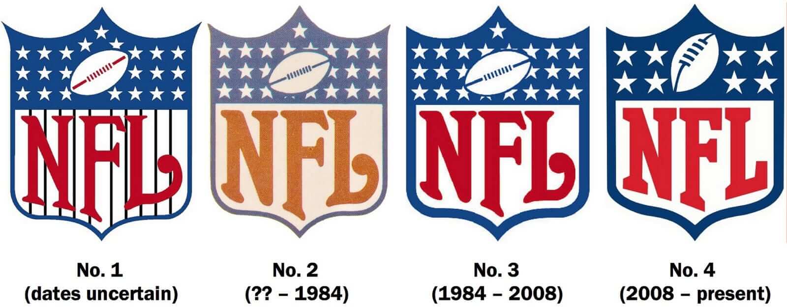
As you can see, version No. 2 is sort of the missing link between the first and third versions. It has a thinner blue border, much like the first version, and also has outward-flared tips at the upper corners, also much like the first version. The third version thickened the blue border and straightened out the flared tips.
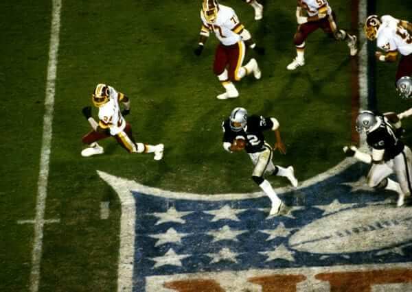
This may seem like a very subtle variation, but No. 2 was used throughout the 1970s and early ’80s. Its final appearance appears to have been Super Bowl XVIII (Raiders vs. Washington) in January of 1984. That was the Supe featuring Marcus Allen’s famous 74-yard touchdown dash. Here’s a shot of Allen crossing the midfield logo, clearly showing the flared tip and thinner border:
You can get a better view of the entire logo in this video clip showing Allen’s run (sorry, this video isn’t embeddable).
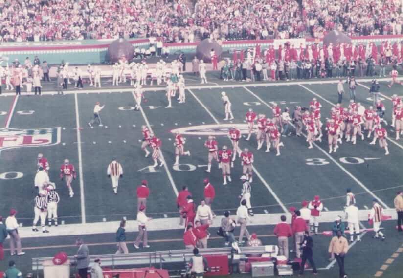
One year later, in Super Bowl XIX (49ers vs. Dolphins), the logo had changed to No. 3 — thicker blue border, no more flared tips. Here’s a shot from that game, followed by video that provides a clearer view of the full logo:
Once I became aware of the distinction between the second and third designs (and I’ll tell you how I became aware of it in a minute), I realized that No. 2 appears on all sorts of old publications and memorabilia that I own. It’s the version I grew up with. But I somehow never noticed the subtle change between Nos. 2 and 3 until now. Chris Creamer over at SportsLogos.net apparently never noticed either.
Even stranger, the NFL itself has sometimes erased No. 2 from the league’s historical narrative. As you may recall from recent years, NFL broadcasts used to include a copyright notice that included an animation showing the shield morphing from one version to the next. But the animation only showed three versions, not four, presumably because the difference between the second and third versions is so subtle. So they just skipped the second version:
Maybe you all knew about this “missing link” version of the shield, but I didn’t become aware of it until it was brought to my attention by a guy named Jim Noel. He’s an attorney based in Seattle, but back in the early 1980s he was the in-house attorney for NFL Properties. He recently told me that the transition between No. 2 and No. 3 was executed by Dave Boss, who ran Properties at the time. He said Boss did this largely on his own, although presumably in consultation with then-commissioner Pete Rozelle, and that Boss announced the logo change to the league staff via a matter-of-fact memo, apparently sometime during the 1984 offseason.
(Noel, incidentally, is an intriguing guy with some very interesting stories to share. I’ll have more on that in the near future.)
So now we know that No. 2 was replaced by No. 3 in 1984. But when was No. 2 introduced? SportsLogos.net says 1970, but that can’t be right. Take a look at these ticket stubs from Super Bowls I, II, and III, which took place in 1967, ’68, and ’69 — they all show logo No. 2 (click to enlarge):
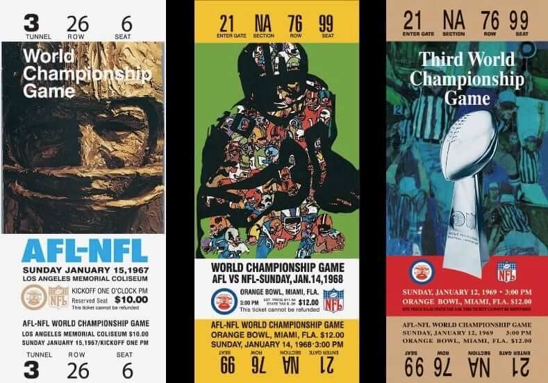
So No. 2 was in use at least as early as 1967. If we go back a bit further, we can see that No. 1 was used on this ticket stub from the 1963 NFL Championship Game. So the transition from No. 1 to No. 2 apparently took place somewhere from 1964 to 1967. I haven’t yet found anything to narrow it down, but I’m sure it’s out there. Anyone..?
And when did No. 1 debut? SportsLogos.net says 1960, but I have reason to believe it may be earlier than that. Again, anyone..?
Moral of the story (and not for the first time): Don’t automatically believe something just because it’s listed in an online database.
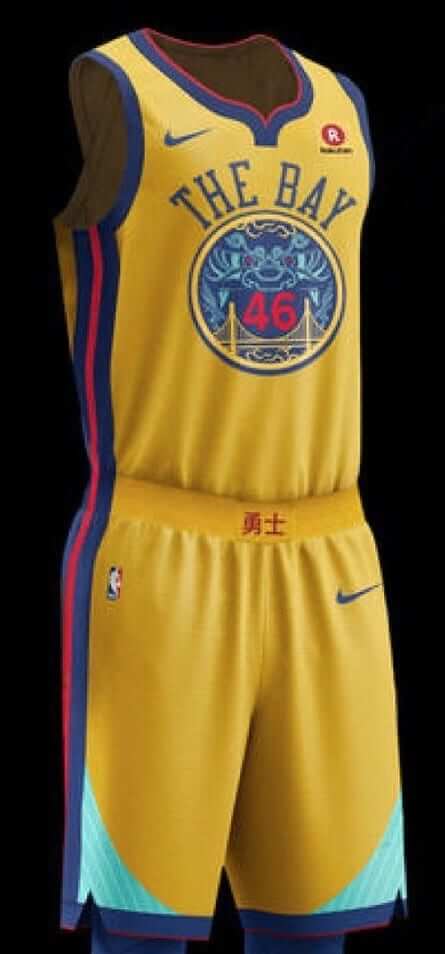
ESPN/NBA update: The NBA finally revealed most teams’ second alternate uniforms yesterday (including the Warriors’ excellent design, shown at right). I’ve ranked and graded them all in a new ESPN column, but it didn’t get published until late yesterday afternoon, so you may have missed it. Here’s the link.
In addition, my ESPN colleague Zach Lowe has done a deep dive on the Lakers’ and Jazz’s new designs.
These “City Edition” alternates are not built to last. They’ll all be used only for this season and then will be replaced next year by a new set of merchandise uniforms. So even if you think, say, the Jazz’s design is a brilliant salute to the southern-Utah landscape, or if you love how the Bulls’ design evokes the Chicago city flag, they’ll have to come up with new concepts next season, which seems like a recipe for diminishing returns.
The Lakers have already figured out how they’ll address that problem: Each year they’ll use their second alternate to salute a great player from their past. This time around it was Kobe Bryant; next year it’ll probably be Magic, or Kareem, or Jerry West; and so on. They have a pretty deep bench of all-time greats, so they can probably riff on that concept for a while (or until Nike abandons the idea of having a new second alternate every season and comes up with a new gimmick).
It’s not clear whether some of this year’s second alternates might be redesignated as one of the team’s other uniforms, but that wouldn’t surprise me. For example, maybe the Jazz’s “City Edition” will replace their current “Statement Edition” next year. The labels have always been meaningless anyway, so it doesn’t much matter which design gets categorized with which rubric.
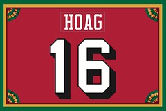
Membership update: Four new designs have been added to the membership card gallery (including David Hoag’s, shown at right, which is based on the throwbacks that the 49ers wore in 1994). If you had promised yourself that you’d finally sign up in 2017, you only have a few days to make good on that!
Remember, a Uni Watch membership card entitles you to a 15% discount on any of the merchandise in our Teespring shop. (If you’re an existing member and would like to have the discount code, email me.) As always, you can sign up for your own custom-designed card here, you can see all the cards we’ve designed so far here, and you can see how we produce the cards here.
The Ticker
By Kris Gross

Baseball News: Reader Joshua Benson recently moved to Israel, where he found Yankees band-aids. “They appear to be licensed by MLB, and as far as I can tell, all of the logos are correct.” … Due to the record snowfall in Erie, Penn., on Christmas Day, the Erie Seawolves are asking for retweets to change their name to “Erie SnowWolves” for a game next season (from Alex Cheremeteff). … Roger Clemens showed up to the Texas Bowl in a burnt orange Astros cap (from Ignacio). … After the NBA’s Washington Wizards unveiled their new “The District” alternate uniforms yesterday, Nationals OF Bryce Harper said he wants “The District” jerseys for the Nats. … A football player on the cover of… Baseball Magazine? (Thanks, BSmile.)

NFL News: The Bills will wear throwback unis in their matchup with the Dolphins this weekend (from Bill Schaefer). … With the Dolphins wearing throwbacks as well, this will be the first time we’ve seen this uni matchup since 1972, says Robert Hayes. … The Titans are opting for mono-navy again (from Lee Wilds). … New Patriots LB James Harrison will wear No. 92, which was given up by DE Geneo Grissom, who will now wear No. 96 (from Mike Chamernik).
College Football News: Florida State went mono-garnet in the Independence Bowl. … FSU RB Jacques Patrick lost his Nike logo in that game (from William Cho). … Texas DE Breckyn Hager usually wears No. 44 but instead wore No. 60 during the Texas Bowl last night in honor of former Texas LB Tommy Nobis, who passed away a few weeks ago, As you can see in that photo, however, Hager still had No. 44 on his helmet. All other Texas players wore a “60” helmet decal for Nobis (from Mike L). … Players were switching from cleats to sneakers because the field was frozen at the Pinstripe Bowl. … Speaking of the Pinstripe Bowl, one of the scoreboards at Yankee Stadium still had the Yankees and Astros listed. The Yanks lost this past season’s ALCS to the ’Stros. … Virginia will wear a helmet decal for former coach George Welsh, who also coached at Navy (thanks Jamie). … Not a small jersey patch for Michigan State in the Holiday Bowl. … Cross-listed from the baseball section: Roger Clemens showed up to the Texas Bowl in a burnt orange Astros cap (from Ignacio). … A ref at the Independence Bowl had and off-brand uniform instead of Under Armour (from Tim Fletcher). … Clemson’s team bus has the playoff and Sugar Bowl logos (from Brad Darby). … Interesting NOB style for Arizona OL Berhard de Beer.

Hockey News: NHL ref Eric Furlatt normally wears No. 27. But he had to wear a No. 35 jersey while working last night’s Penguins/Blue Jackets game, because his luggage was lost in transit. According to this list, no NHL on-ice official currently wears No. 35.

NBA News: Rockets G James Harden will wear “Free Meek” shoes tonight in support of jailed rapper Meek Mill. … Lakers television analyst and former NBA journeyman Stu Lantz “carries around an old NBA program to remind himself and other of crazy schedules of the past,” Michael Hersh says. Check out the old logos! … Here’s an old ad featuring Clyde Frazier in a backwards jersey. “I assume Frazier had to wear it backwards because they couldn’t use NBA team logos,” says Steve Flack.

Soccer News: It appears the La Liga ball for the 2018-19 season has leaked (from Josh Hinton). … This 46 minute video details the history of soccer kits in the UK (from Roger McCann).

Grab Bag: Take an inside look at how Madison Square Garden hosted three sporting events in one day (from Josh Hinton). … Brother’s Taco in Houston supports all Houston teams, including some from the past (from Ignacio). … Some hero takes to the streets of the United Kingdom at night fixing grammar mistakes on business signs (from Anthony Burke).

What Paul did last night a few days ago: Last weekend I saw a new movie that, from what I can gather, has generated exactly zero buzz: Hostiles, a western set in 1890s New Mexico and Colorado and starring Christian Bale. I really, really liked it — good story, good themes, good acting, spectacular camerawork. The violence is realistic and disturbing, the way violence should be. Really great U.S. Army uniforms, too — a feast for any uni-savvy viewer. One of the better movies I’ve seen this year. Here’s the trailer (they’ve pandered by using a shot of a gun-toting Rosamund Pike as the video still, looking all rootin’-tootin’ and Annie Oakley and so on, but that image isn’t particularly representative of her role or of the movie’s general tone):
As of now, Hostiles is only playing in New York and L.A., but it will open in some additional cities next Friday and will go nationwide two weeks after that. Recommended.
This 1964 NFL Championship Game seat cushion shows the striped logo:
link
This 1965 game program shows version 2:
link
but just to add to the headache, here’s version 2 from 1963:
link
So there was an overlap in use?
I think that’s still version 1, just without the stripes. Look at the alignment of the center 3 stars on top.
I will SEE your football player on “Baseball Magazine” and RAISE you THIS cover…
Not sure what sport(s) is/are being played here. ???
link
Great find on the NFL logo. They switched to #3 right around when I was born, and I never really noticed the difference when watching old highlights.
Regarding the switch from #1 to #2, I am betting you’ll be hard pressed to find an exact year. Since logos and branding weren’t quite as significant back then, I am think there will be overlap. They’ll be a year when #2 was introduced, and a year when #1 went out of use, but they’ll be different years.
I always knew, but I guess didn’t contribute, that the NFL logo that’s claimed to be 1960-1970 was not accurate. A look at the wealth of early Super Bowl era documentaries, Lombardi era documentaries, etc makes it clear this was not the case.
Nice research on the NFL shield evolution, Paul!
It looks like the logo use in the early ’60s was not very consistent. On these game programs from 1964, the stripes are gone from the logo, but there’s not border and the upper tips are not flared. It could be another version, or simply the printer deciding that there wasn’t enough contrast between the blue border and the black background of the program cover.
link
link
link
On this 1964 49ers program, the logo is set against a light blue background. Also no border…
link
This Bears/Browns game program has a different NFL shield.
Perhaps it is only intended to be used on “National Football League Illustrated” items. ??
link
Potentially unpopular opinion:
The new Magic jersey is pretty much the greatest basketball jersey I’ve ever seen in my life.
I don’t watch the NBA at all and really only watch college in March, and I think a big part of that is because basketball unis never interested me. But I really want to see of pics of this thing on the court. It’s so cool. And really, it’s a design/concept that I don’t think would work at all in any other form, whether it be football, baseball, hockey, etc.
I’m also curious to see how the starfield design will look. Though the big honking logo on the jersey instead of a wordmark automatically makes it brutal.
No way see I’m all about the logo. A)I think it’s one of my favorite NBA logos to begin with, but B)the logo makes it feel even more unique/interesting compared to when most NBA teams would go the wordmark route, and C)it sort of feels like a hockey crest to me (in a good way), but is high enough and small enough on the jersey to be clear that it’s still meant for a bball jersey. High marks all around.
Where’s the Hidden Mickey?
Paul, the Dave Ross mentioned in the Shirld article, is that the same Dave Ross who painted the awesome team posters in the 1960s?
Boss, not Ross. But yes, same guy.
Ah yes, Boss. Wow, never heard he was head of NFL Properties. Thanks.
I’m not sure that the NFL meant to crown somebody champions of the “Third World”, but that’s how I immediately read that ticket
Chris Creamer’s site isn’t anywhere near a reliable source as far as dates or designs of logos and uniforms. Lots of holes there and he doesn’t respond or update anything when you point those holes out.
While I do like the Creamer site (and some others), many STILL have this piss-poor version of the ‘Skins “circle-R” logo.
link
link
The “R” is supposed to look like this:
link
You mean like link which I commented on six years ago and has never been fixed, even though there’s been an example of the correct font link?
Since the Dolphins’ throwbacks are based on the 1966 season and they went stripeless in the early 70s, I don’t think 1972 would be the last time we saw a Bills-Dolphins game with those styles.
More like 1969.
You could write a dissertation on the mismatched Dolphins sleeve styles from 1970 to 72. By 1973, they were uniform, wearing the same style through 1986.
Technically, 1966 is the only correct answer here because (A) these are replicas of Miami’s 1966 unis, but also (B) in 1967, Miami changed the striping on their pants to a solid orange/aqua/orange pattern which they used until 1986.
Not a fan of the Suns “Los Suns” City uniform. If you’re going to have a Spanish language uniform, and Phoenix is a great place for this, they should have it say “SOLES” with no “Los”.
Typo in hoops section:
“NBA’s Wahington Wizards”
And for my money, it isnt the nfl shield logo if the L doesnt have the curly tail on it
Selah, uniWers!
Fixed.
My dad used to have a retro Browns sweatshirt (from the early 2000s) with the missing link logo on the jock tag. It is my favorite iteration of the shield.
And as a bonus in the Walt Frazier ad, Jim Bouton during his brief spell as a local TV sports anchor.
I remember Frazier and the rest of the Knicks wearing backward jerseys on the 69-70 Topps basketball card set. That same year a bunch of players wore number only jerseys or warm ups with no team name or logo.
That Miami Vice uniform is really sharp. I want that on a T-Shirt
Hey Paul, I always enjoy your work as a fellow uniform enthusiast! However, I do believe that the star field changed to eight stars in 2002 with realignment and kept the curly typeface until 2008. Thanks and keep up the good work!
Jeff Mason
Nope, it definitely was 2006, after Super Bowl XL. link (see at 1:14) The end zones also have the old conference logos.
*after 2006. For some reason I had that date in my head even though Paul’s article says 2008. Anyway, more evidence: link (again, skip to 1:15 to see the old logo).
Looks like you’re right Rob. Thanks for clarifying!
Nice column today Paul. Between the NFL shield story, and the detailing of the NBA uniform philosophy, some good stuff.
I really look forward to future columns featuring more Jim Noel information.
Thanks
Lee
As a Charlotte native and resident, I have a major beef with the Hornets’ “City Edition” uniforms. And it’s not even because they are BFBS.
It’s because “Buzz City” is a totally made up nickname for Charlotte that the Hornets came up with. Nobody ever referred to my hometown as “Buzz City”, even during the time when the original Hornets were here. Never mind that “Buzz City” makes it sound like we’re a big drinking town, which we’re not, really.
Charlotte has long been known as the Queen City, after its namesake. That would have looked cool on a jersey.
I’ve been researching official Super Bowl buttons and while the the early ones had shield #2 link
Later they added an “official NFL” logo that confuses things link
Button comparisons link
(Sigh) Today’s ticker mentions that the Bills will wear throwbacks this week. For a site that focuses on minor variations in design, I’m always dismayed when the Bills are not called on the pretend “fauxback” they claim is their late sixties/early 70’s white jersey.
Re: the referee ‘off’ brand. That is the logo for Honig’s. They are/were a huge official supplier. They used to have a huge corner on the market for officials, but Smitty’s and Under Armour have passed them by in football. They always had great quality stuff, but delivery issues and other issues sealed their fate. Since most officials do not use cold-weather gear very often, the official was either getting a last use out of it, packed the wrong gear, or he chose not to purchase an Under Armour long-sleeve placket shirt.
Under Armour does not make a foul weather shirt so officials are allowed to wear any brand.
Can anyone explain to someone who never deals with snow how sneakers are better in snow than cleats?
If the field is frozen a cleat will not dig in so there will be very little contact area with the ground. The entire surface area of a sneaker will make contact.
This is also why players often slip when coming out of the tunnel when wearing cleats on solid concrete. Or Reggie Bush in St Louis.
For those really icy fields, a good option has been a broomball shoe. Broomball is played on ice so the soul provides greater traction:
link
link
Can see the broomball shoes being worn by a Winnipeg Blue Bombers’ offensive lineman in this shot from the 1984 Grey Cup. Many players wore the broomball shoes in that game on both sides to deal with that really frozen tundra of Commonwealth Stadium in Edmonton:
link
Makes sense, thanks guys.
Two things:
Brother’s Taco seems to be missing the two time WHA Avco Cup champion Houston Aeros logo.
Coffee giant Tim Hortons lack of an apostrophe is absolutely maddening.
I know what you mean, but they have a valid reason. See item number four:
link
Bucks have already sold out of their city jerseys
Interesting that the Bills chose their O.J. Era throwbacks for a game they have to win to make the playoffs. As far as I know they never made the playoffs in those duds (not counting old AFL days). They should have gone with the Kelly era red helmet look.
When will the NBA finally realize that added the Spanish word for “the” while leaving the team nickname in English is not translating the team name into Spanish. Rather than honoring Latinos, it strikes this non-Latino as insulting, demeaning and pandering – not to mention lazy. It’s admittedly a pet peeve butI can’t for the life of me figure out why they do it.
Well because it is insulting, demeaning, pandering, and lazy. A cash grab is all it is.
I’m watching the USA vs. Canada pregame right now and (this may have already been mentioned) the fact that the pants on the USA/Bills tribute uni are solid blue without the white/red/white stripe the Bills wear is driving me crazy!!!!!!
It looks like version 1 of the NFL shield was used at least through 1966 based on this picture of a 1966 Pro Bowl program:
link
I thought to look up pictures of the Pro Bowl and Pro Bowl programs, because the NFL shield used to be on the helmets for the Pro Bowl.
At least back to 1961 on the 1st shield as shown on this electric football game:
link:
Better link for 1961 electric football game showing 1st shield:
link