As you’re probably aware, Russia was banned from the upcoming PyeongChang Winter Olympics due to a doping scandal, but individual Russian athletes may be permitted to compete as independent “Olympic Athletes from Russia,” or OARs, if they can demonstrate that they’re clean. Yesterday we got the first indication of what those athletes will be permitted to wear.
First, the International Olympic Committee (IOC) released the logo shown at right. That logo, along with the words “Olympic Athlete from Russia” and/or the letters “OAR,” may appear on the uniforms worn by the approved Russian athletes. If the logo looks really plain, well, that’s the idea — they don’t want to glorify Russia.
Still, I’ve heard from many people — people who know more about the international sporting scene than I do — that the inclusion of the word “Russia” is going to be a major sore point for many nations and their athletes, because it somewhat defeats the purpose of banning Russia from the Games. Independent athletes at previous Olympics have worn uniforms without any country identifier. The rumor supposedly floating around is that the IOC didn’t want to omit the word “Russia” for fear that Russian athletes would boycott the Games altogether.
The IOC also announced a list of uniform OAR uniform guidelines. Among the highlights:
• When using the “Olympic Athlete from Russia” wording, the type size must be consistent throughout. Although not explicitly stated, the clear intent here is to prevent the word “Russia” from being larger than the other words.
• Wording should be in English and should be — I love this — “as generic as possible.”
• Uniforms must be rendered in one or two colors. This seems specifically intended to prevent a design using the three colors of the Russian flag.
• Similarly, any use of blue or red “may not be in exactly the same pantone” as the official Russian flag colors. The IOC is suggesting darker shades of those colors.
• Any spot that would normally have a coat of arms or a national team logo must instead have the new OAR logo.
That still leaves lots of questions. First and foremost, who will design the OAR uniforms? According to this item, “Kit designs are currently being drawn up by individual Russian national [sport] federations before being sent to the IOC for approval.” And once the designs are approved, who will manufacture them? Will there be a single manufacturer, or will it vary by sport? According to this story (NYT link), Nike is unlikely to be involved except for hockey, where Nike is the official outfitter.
Speaking of hockey, the OAR hockey jerseys that supposedly leaked earlier this week (we linked to that item in yesterday’s Ticker) are probably not legit, because they don’t have the OAR logo, although they could presumably replace the skater’s silhouette with the logo.
The whole thing sounds like a clusterfuck. But hey, what would the Olympics be without a clusterfuck? At least the Russian figure skaters won’t be affected, because they just wear costumes, although they’re presumably have to stick to the two-color limit. It’s unclear whether they’ll be banned from using music by Russian composers, like Stravinsky or Balakirev.
LAST CALL for the year-end raffle: Today is the final day to enter the annual year-end raffle. I will stop accepting entries at 7pm Eastern tonight. Full details here. The winners will be announced on Christmas Day.
Just in time for Christmas: Lots of people, myself included, have been getting something special in the mail over the past few days — the Uni Watch Athletic Club shirt designed by Bryan Molloy. Here’s the full package, including the custom-designed mailer in the top-left corner (for all of these photos, you can click to enlarge):
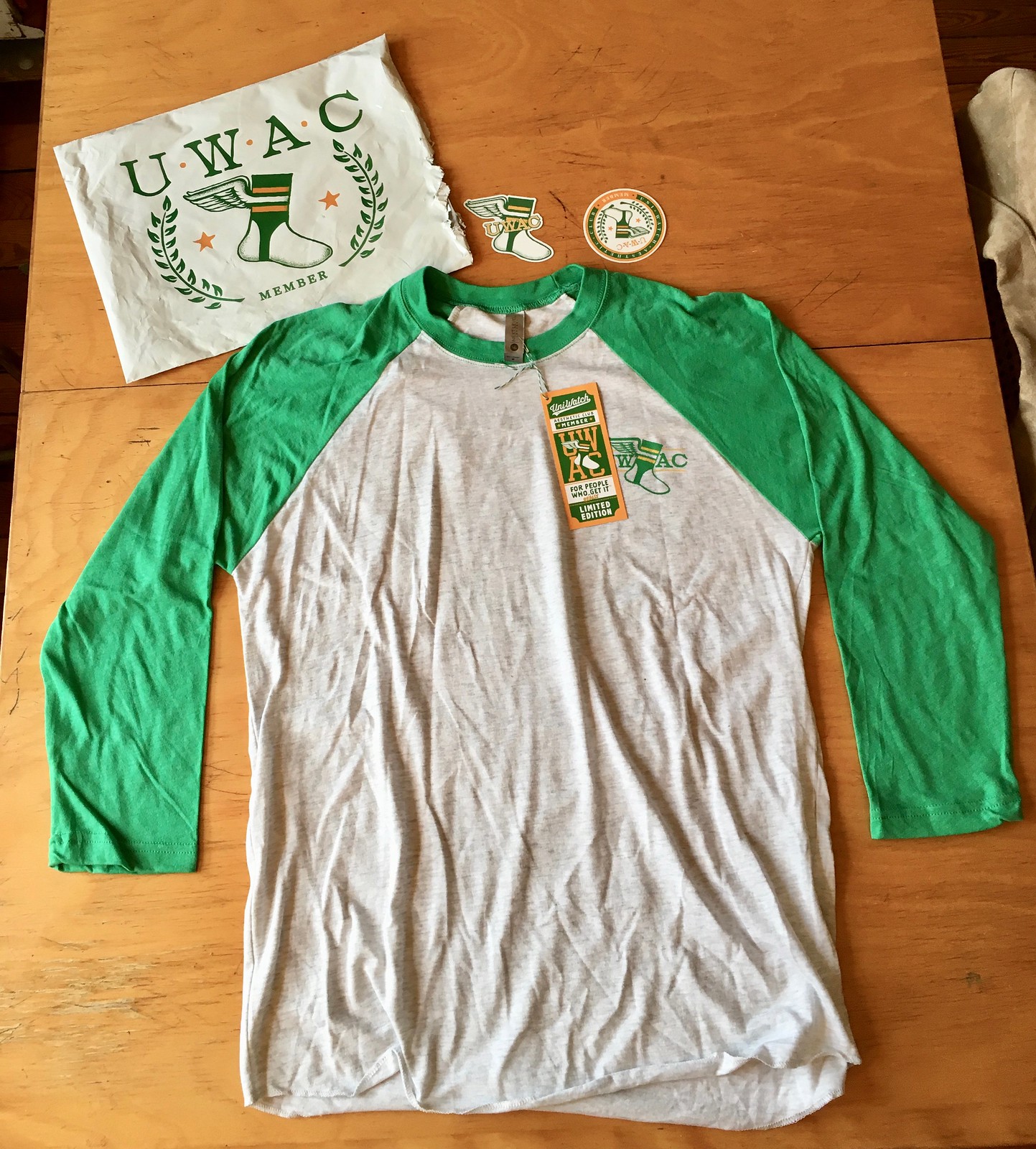
In case you’ve forgotten or need a refresher, this design is based on the design for this year’s Purp Walk shirt, which in turn was based on the New York Athletic Club logo.
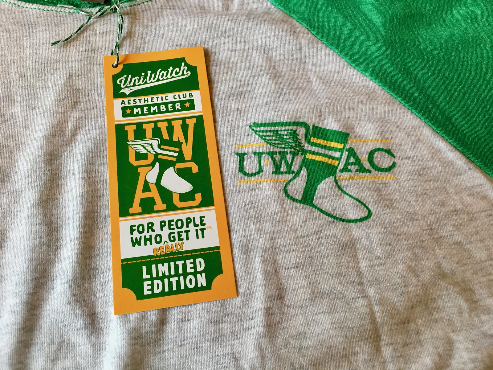
The front of the shirt has the winged stirrup foot on the upper chest, plus this photo also shows the custom hangtag (attached with color-appropriate bakery twine, don’tcha know):
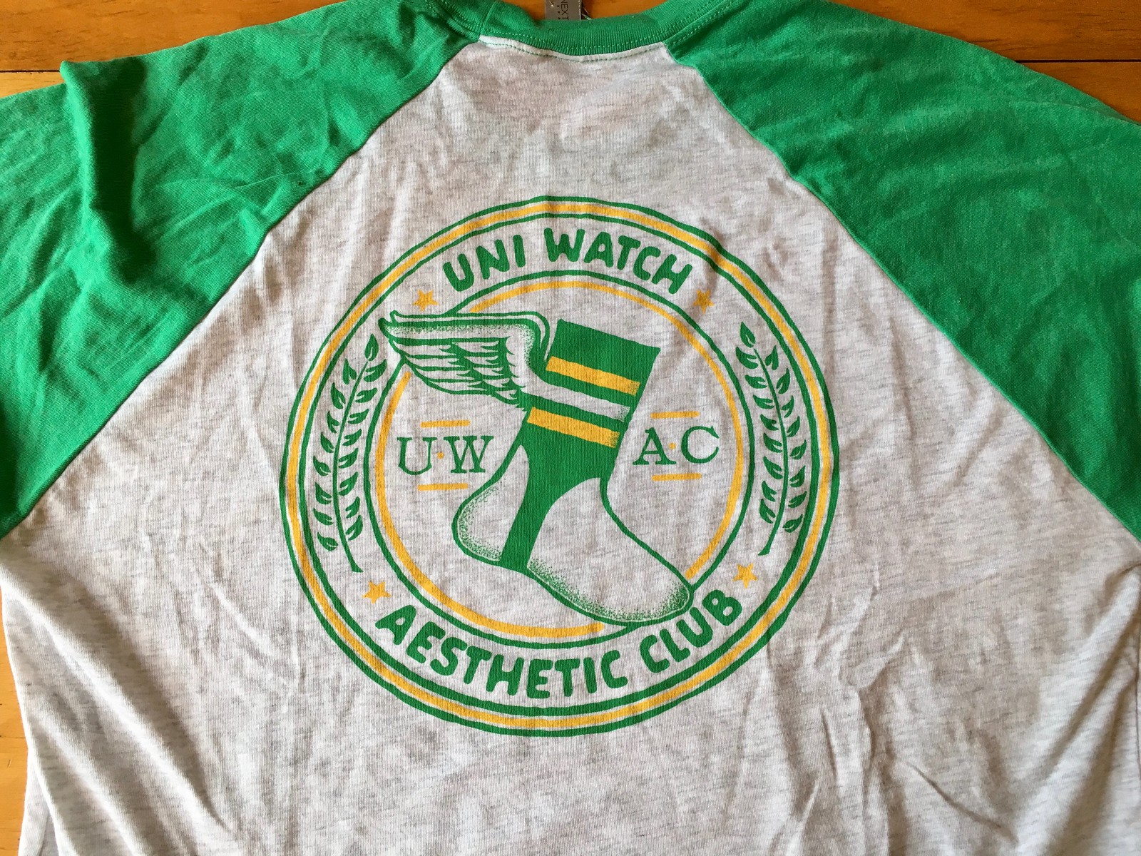
The back has the full-size UWAC logo in all its glory:
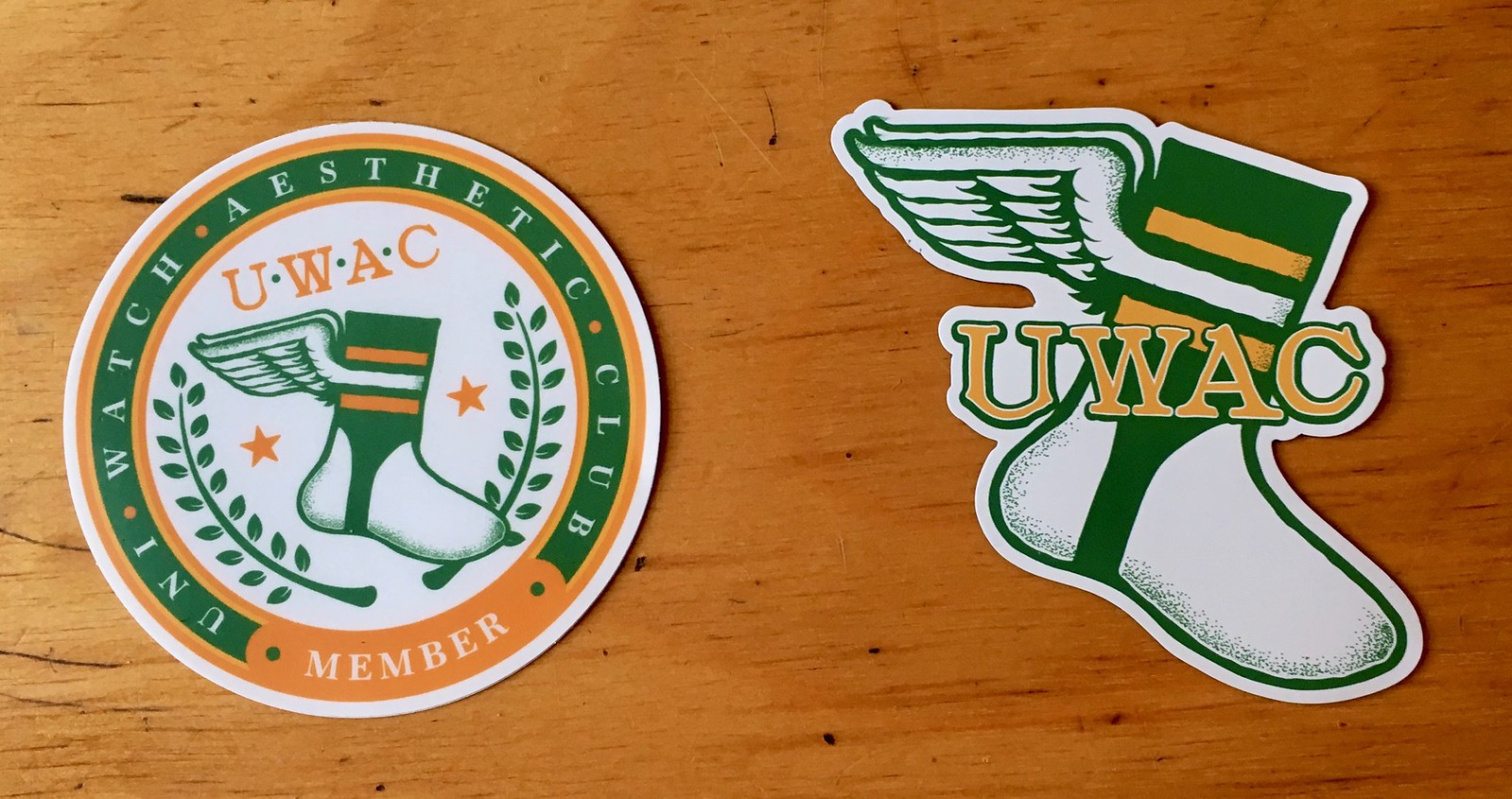
And then I also got the bonus sticker (left) and magnet:
Tremendous job by Bryan with this project. Also, he and I have been thinking that the winged stirrup logo would look good in some other applications — including on a baseball cap. More on that soon.
One-two-three-four!: Everyone’s favorite (okay, only) hockey-rock band, the Zambonis, have a new song, called “Joey Saves (Dee Dee Scores).” It’s a tribute to the Ramones, and I’m proud to have the song’s video making its world premiere here on Uni Watch. If you’ve ever wanted to see an animation of Johnny Ramone shooting a hockey puck with his guitar — well, you probably didn’t realize you wanted to see that, but it’s still pretty cool. Dig:
A vinyl 7″ will be released in a few months, but for now you can support the Zambonis by downloading the tune here.
The Ticker
By Paul

’Skins Watch: Walter Goldbach, who drew Chief Wahoo when he was a teen-ager, died last week (from Jason Hillyer). … The Springfield Thunderbirds — the AHL affiliate of the Florida Panthers — will wear Springfield Indians throwbacks, complete with an Indian head jersey crest, on Jan. 6 (from Steve Forni).

Baseball News: Here’s a old article indicating that the first “Hit/Error” scoreboard indicator was installed at Sportsman’s Park in St. Louis in 1938. The article also states that yellow baseballs and batting helmets were proposed for that year but not pursued (great stuff from Jerry Wolper). … Here are Nos. 5 and 6 in Phil’s Negro League uni ranking countdown. … With the upcoming NHL Winter Classic being played at the Mets’ ballpark, New York Rangers goalie Henrik Lundqvist’s leg pads and catching glove for the game features the Mets’ skyline logo background (from Mike Engle). … Here’s a pretty easy MLB uni number quiz (from Derek Linn). … Check it out: Reggie Jackson, then with the A’s, on the Cincinnati Bengals sideline during a Bengals/Raiders playoff game (from Douglas Ford). … Back in the day, MLB teams sometimes played midseason exhibition games against their minor league affiliates. Russ Havens has ticket stubs from several of those games, including the Orioles vs. the Rochester Red Wings, the Angels vs. the Salt Lake Gulls, the Red Sox vs. the Trenton Thunder, and the Reds vs. the Denver Zephyrs. … Looks like something went seriously awry with this Australian Baseball League coach’s jersey (from Tom Pope).

NFL News: Good article on the Cowboys’ chief brand officer (NYT link), who happens to be owner Jerry Jones’s daughter. … papaceelo notes that Bucs QB Jameis Winston didn’t have his usual captaincy patch for Monday night’s game against the Falcons. … Cross-listed from the baseball section: Reggie Jackson, then with the Oakland A’s, on the Bengals sideline during a Bengals/Raiders playoff game (from Douglas Ford).
College Football News: Here’s a look back at Auburn’s Peach Bowl uniform history. … All of Pitt’s graphics for National Signing Day use a throwback motif. Hmmmmm.

Hockey News: Cross-listed from the baseball section: With the Winter Classic set to be played at the Mets’ ballpark, Rangers G Henrik Lundqvist’s leg pads and catching glove for the game features the New York Mets’ skyline logo background (from Mike Engle). … Ron Liebhart notes that former NHLer and current Asian Leaguer Matt Dalton is another goalie who routinely uses a backwards stick blade. … Check out this 1979 Oilers/Canucks preseason game footage. “Oilers have mismatched pants, some players in white helmets, and all Oilers players are NNOB,” says Stephen Schapansky.

Basketball News: I didn’t realize this until Michael Raskin pointed it out the other day, but every single NBA arena has a corporate-advertised name, except for Madison Square Garden. Gross. … Good analysis of how the Celtics (and the NBA in general) became a lifestyle brand (NYT link). … Now that Kobe Bryant has had two numbers retired, here’s a piece speculating on who might be the next NBA player with two retired numbers. … Spalding made a pair of black basketballs to give to Kobe Bryant. … LaVar Ball, father of Lakers G Lonzo Ball, wants to launch a new pro basketball league, with a silhouette of a dunking Lonzo serving as the logo. Key quote from LaVar: “We don’t need a logo of a guy dribbling. Nobody does that anymore.” … Looks like the Rockets and Warriors went color vs. color back in the day. Judging by the uniforms, that game had to be from somewhere between 1969 and ’71. … Throwbacks tomorrow for Old Dominion (from Ted Chastain).

Soccer News: The latest MLS expansion team will be in Nashville. No word yet on the team name, colors, or even when its first season will be (from Wade Heidt). … “Sandro Wagner, a forward from TSG Hoffenheim, will be joining Bayern München in the winter transfer window,” says Anthony Zydzik. “He chose jersey No. 2, which is unusual for a non-center back to wear. He says he chose it because there weren’t many numbers available to choose from, and he liked the symbolism of it being his second stint at Bayern.”

Grab Bag: Senators in Malaysia think that AirAsia’s new uniforms are too revealing. … New uniforms in the works for the Mozambican police. … New uniforms for the Victoria and Albert Museum in London. … New uniform outfitter for Major League Rugby (from Andrew M.). … Love this 1920s maps showing sheep and wheat production in Australia. How often do you see a map with “Some Sheep” and “No Sheep” labels? (Big thanks to @OlegKvasha). … Here’s a review of 2018 world tour cycling kits (from Mitch Teich). … The founders of chess.com tried to see if it’s possible to play a game of chess while sitting like the figures shown in the new 2018 World Chess Championship logo.
That Reggie Jackson shot is great. I have distinct memories of those Bengals unis with Ken Anderson and Pete Johnson.
Makes me wonder — Is the Bengals helmet orange with black stripes or black with orange? If it’s orange with black, then could they throw back to the wordmark helmets? Or is that just too much trouble given their current helmet design?
Looking at it closer, it’s pretty obviously orange with black.
So throw back already, Cincy.
Not 100% positive, but I *think* Bengals helmets are painted, not decaled.
They’re painted. This is link:
So, throwbacks are probably a no go.
I admire them going the extra mile for quality control, though.
Thanks for that info, Phil; I didn’t know the Bengals had stopped using decals for the tiger-stripes.
Great info. Thanks Phil. Such a divisive helmet. I absolutely hate it, but I run into many people who love it, and many who became Bengals fans because of it. I can’t imagine what a pain it would be if they were still using decals.
They could just throw back to the 80s, back when they were good enough to make it to the Super Bowl.
They must use better paint that Notre Dame does.
link
In regard to the old Bengals helmet, stating the obvious it was one of the most boring helmets of its time. It was basically saying we’re too cheap to hire a creative person, which has pretty much captured the Bengals frugal ways ever since.
It’s not paint, per se. It’s water transfer printing.
Just saw a picture from the Lakers – Rockets game last night. Something not right about seeing the Lakers in white on a Wednesday.
A silhouette of Ball dunking is appropriate since he can’t shoot straight. Only way to show him making a basket.
Can’t see the league playing in arenas. Not NBA ones, at least. Probably 2-3000 seat venues.
At least it’s not a full-length logo highlighting his Big Baller Brand shoes.
The problem with minor league hoops has always been that there are very few cities of any size that don’t have a college hoops presence.
Hershey/Harrisburg
Albany(I guess SUNY Albany now)
Yakima
Rapid City
Rio Grande Valley
Prescott
Notice a theme?
I’m in Prague right now, Sparta has some hockey sweaters for the ages.
Circular “OLYMPIC ATHLETE FROM RUSSIA” logo reminds me of a battling helmet I got from a gumball machine when I was a kid. It was red and came with circular stickers so you could personalize it with the team of your choice. All the teams with red helmets (i.e.: Phillies, Reds) were represented with their correct logos, except for the Cardinals, which had “ST. LOUIS” in an arc. Was their logo too complex?
World Chess Championship logo is missing a vinyl mat with circles of different colors under the seated figures.
Maybe I missed this when it was first launched, but are the UWAC logo inconsistencies intended? Like a meta-design representing the nuance and attention to detail often discussed here at Uni Watch?
In a single photo you have:
1. UWAC imposed over the stirrup
2. with stirrup between the UWAC
3. with UWAC above the stirrup with each letter separated by stars
4. Stirrup over a stacked UWAC
5. Two variations of the laurel design in the roundel
6. The mailer version
All great designs…just seems still undecided.
The one that really kills me are the laurels. The ones on the shirt look great and fit the overall illustration style, but the ones on the sticker look too refined and out of place.
Oh well. I didn’t buy the shirt, so it doesn’t matter a whole lot to me, but I agree with JT.
And UWAC is written in yellow with a green outline, yellow, and green.
I don’t mind any of them – and think it looks great, but the inconsistencies are interesting.
I lived in Pawtucket RI growing up and remember those midseason exhibition games. I remember they were during the all star break featuring players that did not get an invite. Also the Boston team would feature players that were likely to be called up in September.
As a Pitt alum and fan of the throwback, I actually like the idea of keeping those as throwbacks and holding onto their regular uniforms(though I hate the number font and would like to see a return to the block numbers they had in their prior uniform iteration.) Maybe there’s just been too many changes the past few years and I’m burned out and yearning for consistency…check that, if they return to those colors full time I’ll be all about it. I’ll cringe at what other uniform iterations Nike would come up with for alternates when they come.
Also, I love the idea of a baseball cap with the winged stirrup! I just hope whatever manufacturer you find can produce it on a hat that will fit and look normal on my big 7 3/4 head.
I have a source within the football program that all but confirmed they’re making their throwbacks the full-time uniform. I guess we’ll see what unfolds.
It was never a smart idea for Pitt to change their branding and color scheme back in 1997. Going with “Pittsburgh” instead of “Pitt”, didn’t help in a city with three major pro sports franchises. And many Pitt fans have great memories of the old color scheme with the players and teams associated with it.
Fellow Pitt alumnus here and I wholeheartedly agree with you about changing the numerals to the traditional block style. The ones they came up with are bipolar in design — rounded on the inside for some silly marketing reason and blocked outside for another. Yuck. -C. (Class of ’93)
OAR logo would make an awesome kick drum head!!
Indian Head link in Hockey ticker is dead.
Sorry, it’s in the ‘skins watch section.
Fixed. Here’s the proper link, so you don’t have to scroll back up:
link
Brilliant! Thanks, Paul!
The green and yellow [gold per yesterday’s debate] on the athletic club gear looks great… Is it a coincidence that the athletic club gear matches MLB’s “Athletic” club AKA A’s? Which, as an A’s fan I would love for them to go back to these shades of green and gold [yellow].
Ha, yes, coincidence.
Bengals “game worn” helmets might be painted, but if you buy an authentic one from Riddell the stripes are decals… thus making it not authentic. A PARADOX!
I would think that masking off a helmet to paint/repair would be just as time consuming as replacing a decal.
But hey, I ain’t no ‘quipment manager.
I remember such a game in 1987 between the Mets and Tidewater. Tom Seaver, attempting a comeback, started for the Mets and got shellacked, thus abandoning said comeback.
As a side note, IIRC the Mets wore their one-year cursive-“New York” road jerseys in that game; any photo showing Seaver wearing that would be a great find…
Look link!! :)
Really upset now that I didn’t jump on that UWAC shirt..
Ditto, great shirt and I loved the Purp Walk adds that were included as well.
And even MSG has a “sponsor” — Chase. Their corporate wordmark is right under MSG’s on the basketball court. If memory serves, they use the god-awful formulation of “Madison Square Garden Presented by Chase” or something equally abominable.
Chase also is part of the Rangers’ on-ice advertising.
Advertiser, not sponsor.
Hence the quotes.
“Only” hockey rock band? The Hanson Brothers owned that title until the Zambonis came along:
The Hanson Brothers are a Canadian punk rock band formed in 1984 in Victoria and later based in Vancouver. The group was an offshoot of the punk rock band Nomeansno. The Hanson Brothers’ band name references characters in the cult ice hockey film Slap Shot.
Don’t forget Two Man Advantage from Long Island: link
Not even close: There’s the band Hockey who recorded Mind Chaos, and let’s not forget Five For Fighting.
“Also, he and I have been thinking that the winged stirrup logo would look good in some other applications — including on a baseball cap.”
And a long sleeve raglan tee. . . ?
Proud to say the Zambonis are from my home state of Connecticut, all fans of the greatest AHL team of all time, the New Haven Nighthawks.
Which by the way is an awesome nickname that I can’t believe any pro teams have jumped on.
Hmmm, Paul I usually agree with you but when it comes to rock bands & hockey, the best hockey band is/was The Tragically Hip who often wove hockey into their music, including the awesome “50 Mission Cap” about the legend of Bill Barilko. The song was written from a hockey card. Can’t get more Canadian than that. ;-0 Check out a snippet of the lyrics below….
“Bill Barilko disappeared that summer
He was on a fishing trip
The last goal he ever scored
Won the Leafs the cup
They didn’t win another till nineteen sixty two
The year he was discovered
I stole this from a hockey card
I keep tucked up under
My fifty mission cap”
(Words by Gord Downie)
Mr zevon would like a word with you
link
Lyrics
He was born in Big Beaver by the borderline
He started playing hockey by the time he was nine
His dad took the hose and froze the back yard
And Little Buddy dreamed he was Rocket Richard
He grew up big and he grew up tough
He saw himself scoring for the Wings or Canucks
But he wasn’t that good with a puck
Buddy’s real talent was beating people up
His heart wasn’t in it but the crowd ate it up
Through pee-wee’s and juniors, midgets and mites
He must have racked up more than six hundred fights
A scout from the flames came down from Saskatoon
Said, “There’s always room on our team for a goon
Son, we’ve always got room for a goon”
There were Swedes to the left of him
Russians to the right
A Czech at the blue line looking for a fight
Brains over brawn-that might work for you
But what’s a Canadian farm boy to do
What else can a farm boy from Canada to do
But what’s a Canadian farm boy to do
What else can a farm boy from Canada to do
Hit somebody! was what the crowd roared
When Buddy the goon came over the boards
“Coach, ” he’d say, “I wanna score goals”
The coach said, “Buddy, remember your role
The fast guys get paid, they shoot, they score
Protect them, Buddy, that’s what you’re here for
Protection is what you’re here for
Protection-it’s the stars that score
Protection-kick somebody’s ass
Protection-don’t put the biscuit in the basket just
Hit some, Buddy! it rang in his ears
Blood on the ice ran down through the years
The king of the goons with a box for a throne
A thousand stitches and broken bones
He never lost a fight on his icy patrol
But deep inside, Buddy only dreamed of a goal
He just wanted one damn goal
There were Swedes at the the blue line
Finns at the red
A Russian with a stick heading straight for his head
Brains over brawn-that might work for you
But what’s a Canadian farm boy to do
What else can a farm boy from Canada to do
But what’s a Canadian farm boy to do
What else can a farm boy from Canada to do
In his final season, on his final night
Buddy and a Finn goon were pegged for a fight
Thirty seconds left, the puck took a roll
And suddenly Buddy had a shot on goal
The goalie committed, Buddy picked his spot
Twenty years of waiting went into that shot
The fans jumped up, the Finn jumped too
And coldcocked Buddy on his follow through
The big man crumbled but he felt all right
‘Cause the last thing he saw
was the flashing red light
He saw that heavenly light
There were Swedes to the left of him
Russians to the right
A Czech at the blue line looking for a fight
Take care of your teeth-that might work for you
But what’s a Canadian farm boy to do
What else can a farm boy from Canada to do
But what’s a Canadian farm boy to do
What else can a farm boy from Canada to do
Written by Warren Zevon, Mitchell David Albom • Copyright © Universal Music Publishing Group
I remember The Guess Who wearing hockey sweaters while playing on Midnight Special back in the early 70s and I believe that one of their greatest hits album had a hockey themed cover.
BTW, Johnny Ramone would have been a goon.
In Phil’s Negro League top uniforms, it’s interesting that the Atlanta Black Crackers team picture has players in both the “ABC” uniform and the “ATLANTA” uniform. Because it’s in black & white, can’t really tell if one is a white home uniform and the other is a grey road uniform.
Why are The Ramones playing for the Kings? Isn’t 53rd & 3rd a lot closer to The Garden?
Since they’re limited to two colors, the OAR teams should use the maroon and gold the national soccer teams have used in the past.
IOC:
Irrelevant
Obsolete
Corrupt
Corrupt? Sure.
Obsolete? I guess you argue the board’s structure is…
Irrelevant? I disgaree. Any entity that stages an event with the amount of interest and expense that the Olympic Games generate is anything but irrelevant. Ask the athletes. Ask the sports federations. Ask the politicians. Ask the cities. Ask the taxpayers. Ask the media. Ask the fans.
I fully understand not liking the IOC, but I don’t irrelevant is accurate, IMO.
Sorry this is probably old news, I haven’t been able to keep up for a little while. Leaked Bucks jersey? Either way very sweet. link
Guy who posted that photo on Twitter told me he took the photo at a shop in Milwaukee. It matches the video game leaks that Conrad Burry reported last week. In short, this appears to be legit. I believe the official unveiling will be next week.
Very cool.
Add Old dominion to the list of teams with better throwbacks than current sets. There is something about that light blue/dark blue that is just so smooth. Last week i commented about teams using state silhouettes in their team logos and ODU is no exception. In football they placed their big cat logo inside of the state of virginia on the 50yd line. I want to say it made it to a helmet too but its been a couple years.
Arab countries hosting international competitions have prohibited Israeli athletes from wearing uniforms with national insignias and refuse to play the national anthem when Israelis medal.
Particlarly humilating (for the hosts) when Israelis win gold (judo in UAE in the summer).
Re: 1979 Oilers/Canucks pre-season footage. Canucks were wearing the “V” striped socks they had the 1 year in 1978-79:
link
Looks like they wore those old socks in the pre-season of 1979.
When the 1979-80 season started, they had changed that striping on the socks:
link