It’s that time of year again — the time when I give something back to you folks, literally. Or, if you prefer to be more cynical about it, the time when I clear out all the freebies that have accumulated in my apartment over the past year. Either way, it’s the day I run a big raffle that all of you can enter.
As in past years, some of you may recognize a few of these items as gifts that you thoughtfully sent my way over the past 12 months. I realize regifting may seem tacky, but sometimes I have duplicates on certain things, or I don’t have room for everything, or something is too big or too small for me to wear, or I’ve gotten some enjoyment out of an item and am now ready to let someone else enjoy it. No offense intended, and I hope none taken. Thanks for understanding.
The listings that follow are pretty self-explanatory, except for this: For shirts and jerseys, you’ll see a size followed by a measurement (L, 21″, for example). In each case, that’s the tagged size followed by the pit-to-pit measurement across the chest.
Ready? Here we go:
1. A complimentary Uni Watch membership card.
2. A reproduction 1958 Army football football helmet, autographed by Heisman winner Pete Dawkins, courtesy of Gridiron Memories.
3. A painted bat of your choice from the Mitchell Bat Co..
4. A “Roots of Seattle Hockey” T-shirt of your choice from Rocco’Shop.
5. A 16″ BobbleDugout of your choice from BobbleHouse Industries.
6, 7, and 8. A 2018 calendar of your choice from Asgard Press. They’re giving away three calendars, and each one is a separate prize.
9. An Alltimers VIP Lounge hockey jersey. Huge maker’s mark on left sleeve, “League Player” on the other. Blank on back. 50, 22-3/4″.
10. Same as above, but 52, 24″.
11. A New York Rangers cap. Mesh fabric. NHL logo on back. L/XL.
12. A Harlem Globetrotters jersey. No. 1 on back. L, 24.5″.
13 and 14. A pair of Jacob deGrom giveaway jerseys. Sublimated graphics. deGrom’s name and number on the back. Annoying ad on right sleeve. XL, 24″. Each jersey is a separate prize.
15. A pair of Uni Watch socks that a manufacturer prepared for me as a sample. Tried on once, for about 45 seconds. Sublimated graphics look badly distorted when socks are worn. Magnifying glass logo on the back. A one-of-a-kind collector’s item.
16. A pair of Hartford Whalers socks. Graphics repeated on the other side.
17. Three StripeRite sock prototypes that were created for our review as we were setting up the StripeRite project. The white stripes are not truly white — more of a heathered light grey. Not sure how the Pirates sock ended up with that color but hey, that’s why you go through the prototyping process.
18. A four-pack of Adidas low-rise socks.
19. A Mets “New York” giveaway T-shirt. Annoying ad on the back. XL, 23″.
20. A Jose Reyes giveaway T-shirt. Annoying ad on the back. XL, 23.5″.
21. A Jacob deGrom giveaway T-shirt. Annoying ad on the back. XL, 23″.
22. A Uni Watch 2017 Purple Amnesty Day shirt. Blank on back. Sorry, no hangtag or sticker — just the shirt. M, 20″.
23. A SportsLogos.net 20th-anniversary patch, which I believe was made by the Emblem Source.
24. A pair of Adidas running shorts. Extremely lightweight. M, 7″ inseam.
25. A “The Mets” snapback baseball cap, based on the Metropolitan Museum of Arts’ cap.
26. A Mets giveaway T-shirt. Slightly less annoying ad on the back. L, 21.5″.
27. A pair of “9” front-jersey numerals. Glacier twill pattern, just like the Mets used during the black drop-shadow era, but without the orange border. Perfect for the Turk Wendell DIY jersey you’ve been planning to make. Numerals are 4-1/8″ high.
28. A pair of Dodgers 3-D batting helmet logos — one rigid (like the ones they wore for the first part of 2016) and one flexible (like the ones they’ve worn since then).
29. Some sort of New England Patriots mini-uniform kit. I have no idea what this is supposed to be for, but several of the pieces appear to have some sort of adhesive on the back.
30. Same as above, but for the Atlanta Falcons.
31. A $20 gift card for Hari Mari, which is a flip-flop brand.
32. An Adidas backpack, or knapsack, or sport sack, or whatever they’re calling them these days. Solid black on the other side.
33. A Jim Palmer giveaway throwback jersey. Palmer’s name and number on the back. Sublimated graphics. M, 22″.
34. An Orioles “My Home, My Team” T-shirt, supposedly designed by pitcher Bud Norris. Blank on back. M, 19.5″.
35. An Orioles T-shirt featuring Manny Machado and Jonathan Schoop. Photo is blurry; shirt is not. Blank on back. M, 18″.
36. A Washington Capitals “#RockTheRed” rally towel.
37. A pair of vintage bowling alley service manuals — one from 1949, the other from 1971. Interior pages feature lots of tech diagrams.
38. An Adidas zip-front hoodie. Large maker’s mark on left sleeve. Blank on back. Zippered pockets. M, 23.5″.
39. A Richmond Flying Squirrels giveaway T-shirt, designed by longtime Uni Watch pal Rob Ullman. Annoying ad on back. XL, 23″.
40. An Ardillas Voladores T-shirt (that’s Spanish for “Flying Squirrels”). Mexican flag-themed colors. Blank on back. L, 21.5″.
———
And there we are. To enter the raffle for these items, here’s whatcha do:
1) Send an email to the raffle address. If you’re having any trouble with the link, it’s uniwatchraffle at gmail dot com.
2) In the body of the email, please indicate (a) your name and shipping address and (b) your top 10 prize choices, in order of preference, by number. If you’re only interested in, say, seven items, then just list your top seven choices; if you want to list more than 10, you can do that too, but I don’t really expect anyone to go that far. I’ll do my best to accommodate all the winners’ choices.
3) One email per person. Overseas readers are welcome to enter, although I may ask you to chip in on the shipping charges if you win something heavy. Entry deadline is next Thursday, Dec. 21, 7pm Eastern. The winners will be announced on Christmas Day.
Again, my thanks to all of you who contribute in various ways to Uni Watch. I wish I could provide gifts for all of you — honest.
ESPN update: My ESPN column on figure skating costumes, which I thought was going to run yesterday, was pushed back to today. It’s available here.
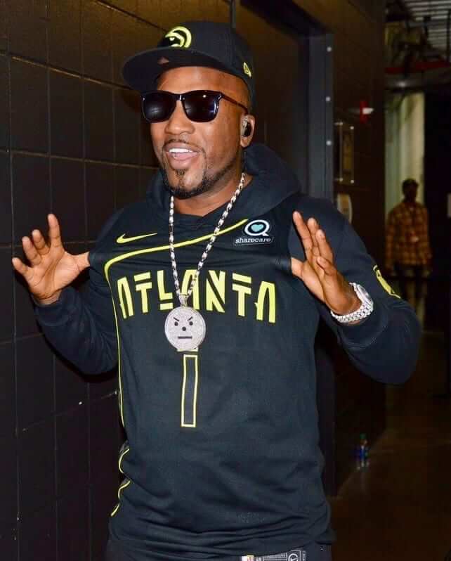
Lots of NBA news: The Hawks became the first NBA to officially unveil their second alternate jersey by having the rapper Jeezy wear it during a halftime performance last night (click photo at right to enlarge; here’s the rear view). No word yet on when this uniform will make its game debut.
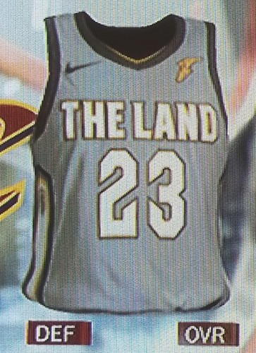
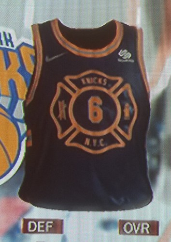
Meanwhile, NBA uni sleuth Conrad Burry obtained video game screen shots that appear to show 28 of the 30 new alternates. It’s always good to have a healthy skepticism about video game leaks, but Burry is usually pretty reliable about this stuff, and the Hawks design matches the one that was unveiled last night, which suggests that these are probably legit.
It’s a lot to process, but here are some quick thoughts on the more notable designs:
• Everyone’s been expecting the Cavs to wear something featuring “The Land,” and now they’ve gone ahead and done it:
• The Knicks’ design is a shout-out to the New York City Fire Department:
• The Celtics’ design appears to have a subtle parquet floor pattern (which is a nice touch but dressing this team in grey is still a huge mistake):
@UniWatch leaked Celtics jersey has their parquet floor design. pic.twitter.com/mGvwGtQzhM
— Josh Coole (@Coolwhp21) December 14, 2017
• The Grizzlies’ design is based on signs from the 1968 Memphis sanitation workers’ strike, a landmark civil rights moment:
The Grizzlies City uniforms are based on the Memphis Sanitation Strike of 1968 @conradburry pic.twitter.com/RjIuhihcPg
— Jonathan (@realjonathanp) December 14, 2017
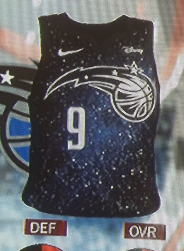
• The Magic’s design appears to have a sublimated pattern showing the Milky Way, or the cosmos, or something like that:
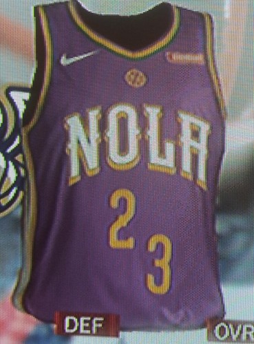
• The Pelicans are going with a Mardi Gras-style design. I don’t understand the misaligned numerals, but I’m sure we’ll be hearing the “story” behind that design element soon enough:
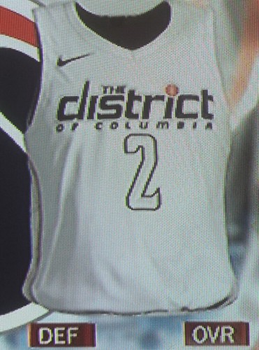
• Has there ever been a DC-based team that wore “The District of Columbia” on its jerseys? There is now, thanks to the Wizards’ new design:
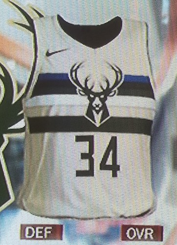
• Looks like the Bucks are going with a cream uniform — an NBA first, I’m pretty sure:
• I have no idea why the Jazz are going with an orange design, but I’m sure we’ll find out soon:
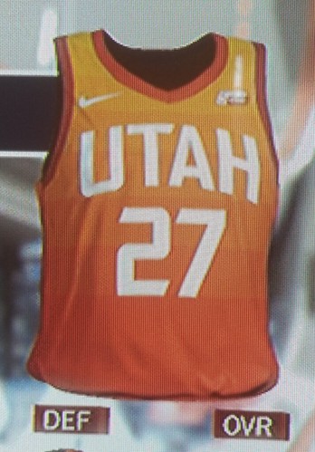
Update: Reader/commenter Joey pointed us toward this explanation for the orange jersey.
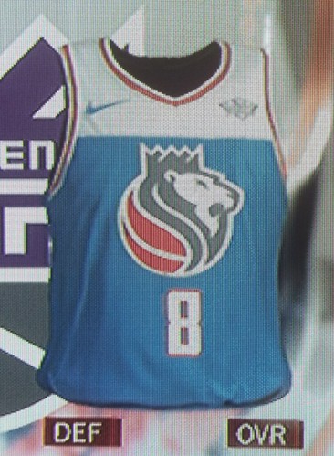
• The Kings’ design is sure to be polarizing, but I kinda like it:
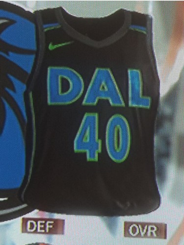
• Ugliest design of the bunch is probably the Mavs’ — woof:
You can see cleaner versions of all 28 of the leaked designs here. I’ll have more to say about these when they’re officially released and we can see the shorts that go along with them.
Uni Watch Hit Parade: Back in the 1990s, Mike Janson was in an indie-rock band called the Lynnfield Pioneers. I never much cared for them, but these days he’s fronting a new band called Scupper, and holy shit are they good. Their debut album, Some Gauls, is one high-velocity earworm after another. If you like Guided by Voices, you’ll like this. Hell, if you like good rock and roll, you’ll like this. Enjoy.
The Ticker
By Paul

Baseball News: The Tigers will retire the numbers of new Hall of Fame inductees Jack Morris and Alan Trammel in August. … South Carolina’s baseball team has a new website with a page devoted to uniforms (from Joel Mathwig).

NFL/CFL News: The Colts and Broncos went mono-blue vs. mono-orange last night, and it was one of the better-looking Thursday-night pairings. Additional photos here. Interestingly, most of the Colts wore the new jersey template, but a few players, including RB Frank Gore, wore the old version with the Nikelace. … We already knew the Lions were planning to wear their ugly mono-grey Thursday-night uniforms for tomorrow’s game against the Bears. Now it turns out that Bears will be wearing their navy jerseys (and maybe pants as well — not sure about that part). So this will be an NFL rarity: a game with neither team wearing white, and not on a Thursday (from Adam Grad). … The team hoping to bring a CFL team to Halifax has trademarked the term “Atlantic Schooners” (from Wade Heidt). … According to this item, the 1950 and ’51 Packers used repurposed helmets that had originally been used by the Colts. The Colts didn’t like them and sold them to Green Bay, where the players had to repaint them themselves (thanks, Phil). … Bills QB Tyrod Taylor appears to have a new facemask. Here’s the old one for comparison (from Michael LaFave). … Disappointing news out of KC, where the Chiefs will go mono-red against the Chargers tomorrow night (blame Phil).
College Football News: Reprinted from yesterday’s comments: MGoBlog, a UMich-centric sports site, has published its annual list of “translated” college football bowl game names. It uses the common name of each bowl, without the corporate gobbledygook, and even includes a ad-less logo for each. … Here’s how SDSU’s jerseys look with the Armed Forces Bowl patch. … New bowl patches for Appalachian State, Auburn, FAU, and Notre Dame, too (from John Miller, @DallasEmpire78, Jake Elman, and Matt Bond, respectively). … Oregon is going mono-neon with chrome helmets for tomorrow’s Las Vegas Bowl. … The four CFB teams will once again have the diamond version of the Nike logo. … New bowl patch for USC, too. … I love this old photo of a kid with a go-kart wearing a Michigan-style winged helmet (from Ray Hund).

Hockey News: Ugly sweater jerseys tomorrow for the Reading Royals (from David Fine). … Sens goalies Craig Anderson and Mike Condon have new masks for tomorrow’s NHL100 Classic (from James Beattie).

NBA News: The Magic’s NBA 2K League team will be called Magic Gaming. Here’s a look at five of the other team logos. … The 2021 NBA All-Star Game will be hosted by the Pacers (from Josh Claywell). … Celtics G Kyrie Irving wore shoes with little lobsters on them the other day. … The Sixers’ red alternates — the ones with the chest script that looks like it says, “Suxers” — will reportedly make their season debut tonight (from Uni Watch alum Mike Chamernik). … Two nights after Wizards G Kelly Oubre wore a Supreme leg sleeve, Cavs G J.R. Smith wore a Supreme arm sleeve. According to this item, he did it “because I thought it looked dope and matched our uniforms” (from Chris Perrenot and Jason Hillyer).

College Hoops News: UMKC has some great pinstriped uniforms for Kansas City Day. It doesn’t specifically say they’re based on the unis worn by the KC Royals of the old Negro Leagues, but it sure has that feel (from @powerandfinesse).

Soccer News: Anyone know more about these sports bra-like thingies that some soccer players wear under their jerseys? (From Chuck Johnson.)

Grab Bag: The car brand Mini has a new logo. … The U.S. Army is testing a new combat uniform. … This is so awesome: There’s a new-ish book called Alternative Moons, which consists of photos of very moon-like objects — all of which are actually pancakes. Genius! (From my old pal the Rev. Nørb.) … Interesting look at the bulletproof clothing industry (from Tommy Turner).
Just a correction on the CFL ticker item, the group making the bid for the CFL expansion franchise has trademarked Atlantic Schooners, not Halifax Schooners.
The team is to be based in Halifax, but the regional name for the team is Atlantic (ie when the Schooners host Montreal – the schedule will say Montreal at Atlantic).
Fixed.
There was some fairly serious talk about the CFL expanding to the Maritimes back in 1982. The team was already going to be named the Atlantic Schooners back then. A Schooners group hosts the Down East Kitchen Party at the Grey Cup every year.
Here’s the Schooners wiki page:
link
Hopefully soon, the Schooners’ group of fans will not be able to say they are still undefeated – and that is a good thing for them!
Would not be a fan of them going with the colours that were selected in the 1980s (Navy with gold and silver trim). Too similar to recent Blue Bombers uniforms when they wore navy.
I think maroon would be a good option. No other CFL team wearing that colour and it is a nod to the university team in Halifax (Saint Mary’s Huskies) who wears maroon. Maybe some powder blue trim.
… “TKTK”?
Oops, forgot to fill in the measurements on that one. Now fixed.
The sports bra things soccer players are wearing monitor distance, sprints, heart rate, etc. and transmit the data to a laptop on the sideline for real time performance monitoring
Paraguay wore the bra-thingys in the 2016 Copa America Centenario (the one in the US with CONCACF and CONNENBOL teams). Wore with grey jerseys. Actually was my first ticker submission, on I think June 5, 2016. Memories…
link
Here’s the link. Soccer ticker.
They wore tank tops but those served the same purpose
Typo: The team hoping to bring a CFL team to Halifax has trademarked the term “ATLANTIC Schooners”
The sports bra like things hold censors that allow the team to track heart rate, distanced traveled, top speed and stuff like that.
Here’s one targeted at amateur players
link
ESPN link doesn’t seem to work.
Yes, I know. But when the piece is published, that’s the link it’ll be at. So you can keep checking periodically.
Oh ok, thank you! Sorry I breezed right through the description.
Interesting article and great observation to look into this. Would definitely be worth having a standard uniform to put the competition on a standard level.
Paul – you forgot to mention in your article how Scott Hamilton went against the figure skating norm and competed in what could be a unitard and won competitions.
Actually, I didn’t know that (although I do know that Debbie Thomas wore something akin to a unitard in 1988).
Re: the question in the lede “has any DC team wore ‘District of Columbia’ on its jerseys,” D.C. United had a small “District of Columbia” at the top of the back of the shirt I think in 2016 but I can’t find a picture right now. It was on their white away shirts.
Interesting choice to use the historical and eventually anachronistic “District of Columbia” instead of the state names that represent the city, whether that’s the placeholder “Washington, D.C.,” or the popular “Douglass Commonwealth.” Hopefully to be updated soon!
UWDC, but isn’t that also the current and accurate choice?
The government has gone back to using “Washington, D.C.,” to lessen confusion, and the statehood referendum used “Washington, D.C.,” so those seem as current as anything else. Might as well use the publicity to advocate for the cause!
Whatever they “use”, it’s still officially the District of Columbia, though, isn’t it?
It was actually this season’s away shirt, but here:
link
MLS kits are carried over so they are used two years and then replaced. It was most likely ‘16 and ’17
That one was new for this year. The 2016 away shirt didn’t have it.
The “sports bra thingies” for soccer players are heart rate monitors, GPS system, etc. combined.
Gives great statistics to the player and coaches on the player throughout the game.
Shoot. Looks like I’m third to the party or so. Need to refresh more often!
I believe the bra thing the soccer players are wearing tracks a players vitals during the game.
Nevermind, already answered.
That Mavs jersey is rough. Looks like something 12 year old me would sketch in a notebook in the mid-90’s.
I would’ve thought the Nuggets would take the opportunity to make their fourth jersey light blue, but no, a second navy.
The Celtics missed a primo opportunity to wear the best jersey of all time, if only they’d used the color of the parquet floor, instead of gray (though I suppose that may have made the players hard to see on tv).
But you gotta love how that parquet grey really makes the GE logo pop. ;)
Proofreading:
“the 1950 and ’50 Packers”
Fixed.
The reason for Utah’s jersey
link
Thanks. I’ll add that to the text.
The OKC jersey looks like clip art style. Most of their jerseys do, so I shouldn’t be surprised.
I actually like the Bucks’ jersey a lot. That would make a great tshirt.
Atlanta’s jersey looks like they’re trying too hard to be…something. I don’t know what, but something.
U of South Carolina uses “Carolina” on the baseball uniform. U of North Carolina uses “Carolina” on its jerseys. Are there other schools that drop the directional designation? Does North Dakota drop North? South?
This past NCAA tourney, South Dakot State wore only “State” on their jerseys. Not sure necessarily about directional things. Long Beach State might to “The Beach”, if i remember correctly. And a while back Louisville football had “The Ville”.
I will say on a side note that a lot of colleges use the word “State” and totally eliminate the states name. Its a cool word to emphasize but it would be weird to play a team doing the same thing. Speaking of South Carolina, they have a naming battle in the football world with USC! I wonder if that influenced their current “SC” logo
I thought that THE USC sued, and won, usc over the use the initials.
News to me brotha ill look it up
South Carolina Baseball has been using the “SC” logo since the late 90’s if I’m not mistaken. I want to say Ray Tanner adopted it first.
The name battle with “The Other USC” was over the use of the three letter “USC”, which South Carolina used rarely if ever on it’s uniforms. I think maybe the football team used it on the shoulders of their uniforms during the Holtz era, 1999-2004.
Regardless, according to the University of South Carolina’s Trademark and Licensing page, they hold the trademark for the use of the interlocking “SC” logo.
Link is below:
link
What is a USC Trademark?
USC’s trademarks include the words University of South Carolina, Gamecocks, Gamecock, South Carolina Gamecocks, Carolina, Carolina Gamecocks, Fighting Gamecocks, Lady Gamecocks, Cocks, Cock n Fire, It’s The Garnet Way, The Garnet Army, Williams-Brice Stadium, and USC. In addition to those words, Logos and trademarks include: Block C with Gamecock, Gamecock logo without the Block C, Interlocking USC, Interlocking SC (baseball/softball), Cocky (mascot), University Academic Marks (institutional logo with words University of South Carolina), Emblem, and University Seal.
I noticed also that some of the Colts had old-school varsity serif numerals on their jerseys, whilst some had standard block numerals. I don’t have pictures, though (sorry…)
Some of the Colts who wore standard block numerals were #23 Frank Gore, #67 Jeremy Vujnovich, and #73 Joe Haag.
I’m from northern Virginia and people do refer to D.C. as “The District.” It’s probably the most common way I hear people refer to it, with D.C. coming in a reasonably close second and Washington a distant, distant, third.
So as long as Nike (like Adidas used to) is trying to emphasize city or region-specific things for alternates, this is a good choice IMHO.
Must be relatively recent occurrence that “The District” is now a thing.
I grew up in Alexandria. Spent 30 years of my life there and rarely heard it called the district. maybe on the TV news.
“DC” or perhaps a specific area (Georgetown, Northwest, etc.) is the norm i recall. But i am not very hep.
In the 1990s and since, the ubiquitous usage in the city and in Virginia has been to refer to the metro area as “Washington” but the city itself as “the District.” So if you lived in Alexandria, as I did for much of the period 1992-2008, if a stranger on an airplane asked where you’re from, you’d say, “Washington, DC.” If a neighbor asked what you were doing on Friday night, you’d say, “I’m going to a new restaurant in the District.”
Hey Paul, I’d like to ask this question in the spirit of curiosity. How are the raffle winners determined in this type of ranking system? I’m guessing you have an excel sheet with some kind of formulas…would you be willing to give a synopsis or provide a link to a page that describes how to run a raffle like this?
There are 40 prizes. Let’s say, hypothetically, there are 1,468 people who enter the raffle via email.
I go to random.org and use their random number generator to choose 40 random numbers between 1 and 1,468. Then I correlate those numbers to the order in which the emails came in.
That makes sense. And then once you have the 40, you compare the rankings and allot as best you can? If multiple people have the same #1, do you again use random numbers to select the winner?
(BTW, thank you very much for answering. I work with the elderly and deal with raffles often, so I may try this method. Also, thanks in general. Every year, it’s fun to see the items and it’s generous of your time.)
Basically, yes.
I go down the list of randomly selected numbers. The first winner, obviously, gets his first prize choice. Then I go to the second winner — if his first prize choice was already selected, I go to his second prize choice. And so on. Once I’ve allocated everything, I start packing up the prizes and addressing the packages.
It’s a bit of work, but I’ve developed a rhythm for it over the years.
The sports bra like thingy is a “manssiere”, or if you, prefer, a “bro.”
“You know about the cup sizes and all?”
Generally, most cups are 3 ft or taller. In soccer, which is the context of your comment.
Some cups, like the FA Cup or the EPL Winner trophy may be larger, depending on the wealth of the league.
What size is the #26 Mets shirt in the raffle?
Sorry to have omitted that: L, 21-1/2″.
Paul, any comment on the Globe report on sexual harassment at ESPN?
link
I don’t work in Bristol and don’t know any more about this stuff than you do. Just know what I read, same as you.
I do periodically have to take “learning” courses on various company policies, including sexual misconduct in the workplace, just like every other Disney employee.
Whoever designed that new black Mavericks jersey may or may not have had Indian curry lentils the night previous. Hey, black is a good color if you don’t want turmeric stains!
The ESPN column is up:
link
I agree with everything you said in that article. I have difficulty with any thing being called a sport that has an ‘artistic component’.
I didn’t think it was such a good looking rash game last night. Too much orange and the Colts royal blue made for a game that was too freakin’ bright for my liking.
I do think the Broncos helmet and jersey would look great with white pants, though. It would be similar to their pre-1997 unis which I really like.
Tigers need to retire Lou too
I hate to THAT GUY, Paul, but he’s just Jeezy now. He dropped the “Young” part a few years back.
link
Fixed.
How bout an “I STILL CALL HIM YOUNG JEEZY” T shirt
I don’t think any Trap Or Die fan is gonna wear that in public. Sorry.
Paul did you forget about Christmas 2015 and it’s obsession with cream?!
link
Oh, good point!
I believe item 29 and 30 (mini Pats and Falcons uniforms) are for the scrap booking. That’s what the adhesive is for.
That is correct.
link
Just a guess, but perhaps the misaligned numbers on the NOLA jerseys pictured are supposed to resemble the street address numbers on French Quarter/Bourbon Street buildings?
The Grizzlies are playing at home on MLK Day against the Lakers. One hopes they have the good taste not to wear the Sanitation Strike alternatives that day.
Listen to the land…
Regarding the UMKC post, the KC Negro League team was the Monarchs, not the Totals. The font and style are close to what the Monarchs used at various times however.
I have a simpler system for bowl names. Basically, any bowl that’s not part of the playoff system gets referred to as a Who Cares? Bowl.
Because I sure don’t. :P
Concur
Royals, not Totals
Mavs jersey looks like something you’d see in a basketball video game that couldn’t get the rights to the NBA.
That Orlando Magic alternate uniform with the starscape background looks just a little bit like a Utah Stars design I included in my submission to the L.A. Clippers re-design contest a few years back… link
I just realized none of the NBA uni pics with ads on them got Mr. Yuk’d!
As was clearly stated at the outset of the Mr. Yuk project, we’re only adding Mr. Yuk when a new ad patch is announced. Not adding it to every single NBA image that appears on the site.
Well, I knew it wouldn’t be for game action or stuff like that, I just didn’t recall the full details. My bad.
Had to comment from my phone today because I threw up all over my computer when i saw those NBA jerseys. Im waiting on a “Woof City” alt to surface. The obsession with making game jerseys look like practice jerseys is going to unforseen heights and its only getting worse. As a DC hoops fan, I cant get excited about something that says District of Columbia if I cant even read it from my seat. Same with the number.
Last Comment- The Memphis Grizzlies alts are based off of protest signs…not the LA Clippers…glad they clarified
Maybe it’s just my age showing, but could someone please try to explain to me the allure of “esports”? I enjoy live sporting events, and I’ll even play the occasional video game; but to me, I can’t find any reason why I would sit down and watch someone else play a video game, let alone PAY to see it. My wife has been bugging me about the number of times I use the word stupid to describe people or their behavior, so let’s just say… juvenile.
It has the same appeal of cards, or darts, both of which have healthy professional circuits with strong followings. I think someone has to have grown up in the “culture” of it to really get it, but it has an appeal to those people because they do it a lot and like seeing it done at a very high level.
I like the Wizards uniforms except for the white numbers on a white uniform. You’re right about the Mavs. Black isn’t one of our colors. Would the Spurs wear blue? Come on. Plus if they are going to abbreviate the name, why not go with DFW?
The ‘Atlantic Schooners’ CFL expansion dates back to 1983!
Pacers uni reminds me a little of early 70’s Marquette
I am a known hater of the color rash jerseys. I am with Washington in the desire to banish them. But last night’s game was nice, my favorite remain’s the pair last year between the Broncos and Chargers. The Colts’ look actually was very sharp with the mono-blue unlike the Titans’ mono navy. That said only handful of these rash uniforms remain “acceptable” in my book. I am ok with the Buffalo Bills, Tennessee Titans, Indianapolis Colts, Pittsburgh Steelers, Denver Broncos, LA Chargers, NY Giants, Green Bay Packers (the all-white look is nice even though I am a traditionalist) Carolina Panthers, New Orleans Saints (basically a throwback with the early 70s road top and white bottoms from the late 70s/early 80s), and LA Rams. The rest can go in the garbage can.
The red jerseys outside of the Bills’ are some of the worst. Sorry, the Chiefs’ don’t count. On just about all of the red jerseys the numbers are next impossible to see. The Seahawks can be seen from the International Space Station. And the BFBS jerseys are so 1992. I know they test for the color blind but man, some of thee jerseys are just plain hard to read.
I still would like Thursdays to become TBT nights but due to the single shell rule that will never happen. Here’s a little known fact. The Bengals stripes are actually built into the helmet. Thus they can’t do a throwback to the Paul Brown days when they had the Bengals lettering on the side. That is likely one of the reasons why they went with the white tiger look for color rush. The other alternative was probably and all-orange look of sorts.
You are officially out of the abolish the color rash club for making comments saying anything good about any of it. The nfl doesn’t need gimmicks to make money. While we are at it, they don’t need to be on Thursday or Monday at all. Offer more games on different networks on Sunday. Saturday college football is great. If a person chooses even a modest cable/satellite package you get a variety of games in 4 different time blocks. One game gets boring, you switch. But on Sunday, sometimes I only get 3 games total. I live near GB so if the Packers aren’t on at noon, for example, the local network will play a divisional rival game, even if it’s lame like Lions at Browns. And I’m stuck with that. Even if it’s a blowout. Why not give espn games to air on Sunday afternoon so we can choose, I be more likely to watch. I certainly don’t watch games aired in the middle of the night( it is to me, I need to be asleep before halftimes because of work, even GB games). So, I hope my point comes across, I started rant and may have rambled. I also apologize for going way off topic and being completely off a uniform topic. It felt good to get it off my chest and I figured since I’m late to reading this days content my comment isn’t likely to be read by many folks.