[Editor’s Note: Greetings from Virginia’s Eastern Shore, where I’m currently enjoying a mini-vacation. More on that later. Today we have a guest entry from Ticker intern Jamie Rathjen — his first main entry for the site. One reason I hired Jamie is that he’s very strong on a sport that’s one of my big weaknesses: soccer. He’s done a nice job with this piece. Enjoy. — PL]
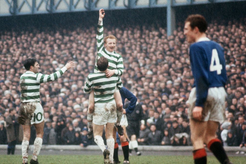
The Scottish soccer team Celtic embraced an unusual tradition from their founding in 1888 until 1994: The backs of their shirts were completely blank except for the familiar green and white hoop stripes. There were no numbers or NOBs (the latter of which would not become common in soccer anyway until the early 1990s).
The club’s website notes that the first time Celtic used numbers at all, at a time when every other Scottish team had been wearing them on their shirts for about 10 years, was in a friendly against Dutch side Sparta Rotterdam on May 14, 1960. But those numbers were on the shorts, which is where they remained for the next 34 years, in an oversized and rounded font, always on the left front and right back:
An exception to the no-numbers-on-back style occurred in European competition after 1975, when organizers UEFA first required black numbers on the back of the shirt. In such instances, the same kit was worn, just with the black numbers added, resulting in two sets of numbers being visible from behind, as seen in this example from 1988:
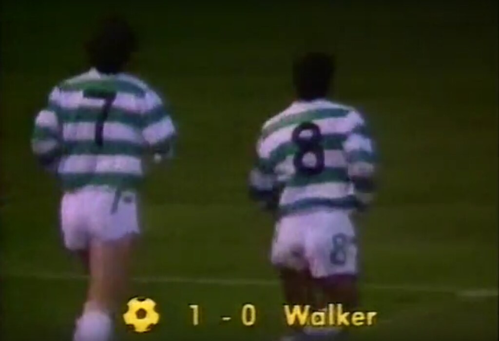
Here’s a better look at one of those jerseys, with numerals added per UEFA regulations:
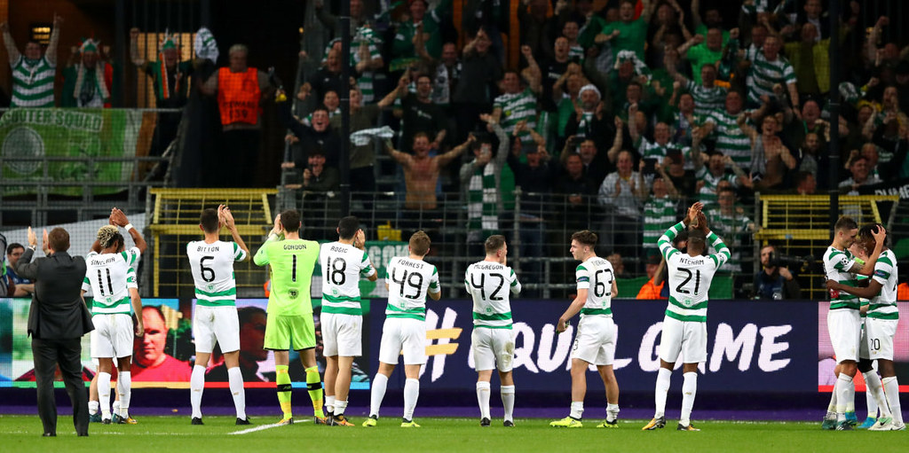
To the present day, Celtic’s first-choice shirts are still slightly different for European competition in that most of the back of the shirt becomes a plain white square. This is to comply with a more recent UEFA regulation requiring the numbers be placed on a solid color, but the white square first appeared in the mid-1990s and has grown over time. Here’s the team’s European kit for this season as an example (click to enlarge):
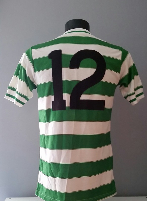
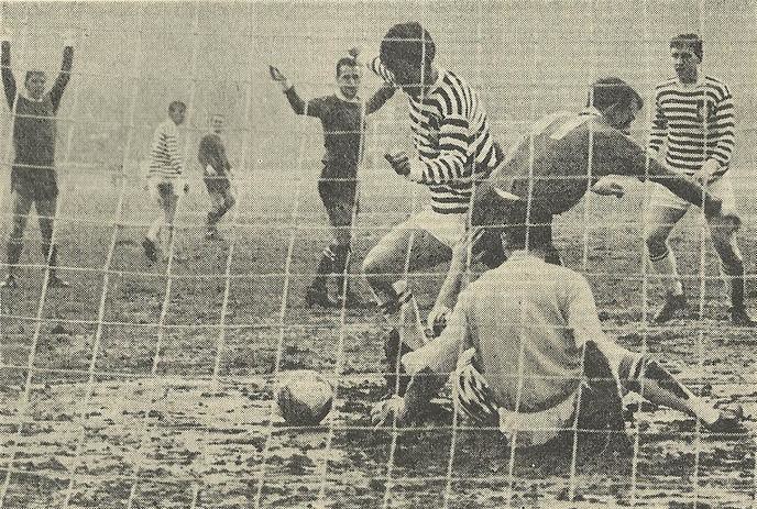
Celtic’s alternate kits at first did not have rear-shirt numbers during the 1960-1994 period, as they had used the same change shirts since 1955 and initially placed numbers on the shorts as with the first-choice kit. A mid-season change of alternative kit in 1965 saw green shirts with numbers-on-back worn at home (in Scotland, the home team changed if there was a kit clash until the end of the 1980-81 season) against Queen’s Park in the Scottish Cup on March 11, 1965:
Future alternative shirts continued to carry numbers-on-back, as seen on this yellow example from 1990.
The team’s goalkeeper shirts did not have numbers-on-back for a much longer period, but YouTube footage of Celtic’s Old Firm rivalry with Rangers reveals that goalkeeper numbers-on-back appeared sporadically beginning in 1980 and regularly starting in 1984. Again, this seems to have been precipitated by a change in goalkeeper kit: Past shirts had been plain yellow or burgundy, while the first regular numbers-on-back kit was grey with green sleeves, shorts and socks. As makers’ marks, club crests, and shirt advertisements became more commonplace throughout soccer in the 1970s and ’80s, the front of Celtic’s shirts became more crowded, while the back remained pristine.
The numbers-on-shorts era finally ended at the beginning of the 1994-95 season. According to the Historical Football Kits site, a referee claimed to have been confused by the numberless shirts, causing him to issue a yellow card to the wrong player. After being directed to add numbers to the shirts, the club complied, but did so with small black numerals high up on each sleeve, much in the same position as hockey TV numbers, while maintaining the numbers on the front of the shorts, like so:
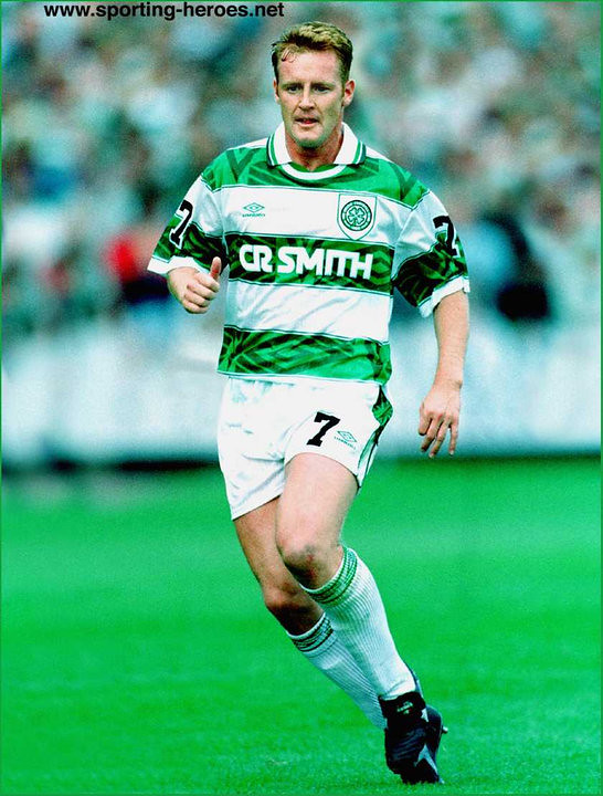
The Scottish Football Association finally had to specify that the numbers needed to be on the back of the shirt. The numbers eventually appeared there a few games into 1994-95 season, although they were green, perhaps so as to blend in as much as possible with the green hoops (click to enlarge):
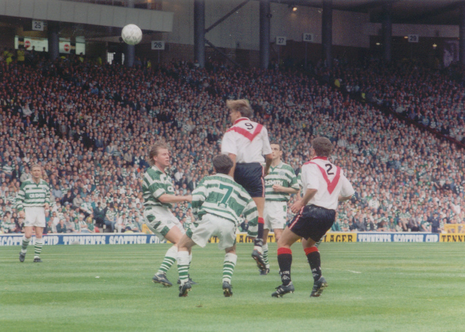
The green numbers-on-back arrangement persisted until the 1998-99 season, when the numbers became black and the team added NOBs for the first time.
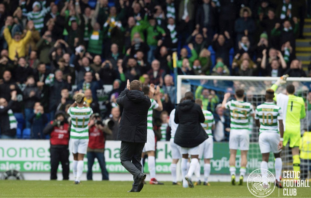
This season, the numbers, along with the rest of trim on the kit, are gold for domestic competition, to honor the 50th anniversary of the 1966-67 team that won the European Cup (now the Champions League). As the kit is so steeped in history, it may be fitting that it uses gold on green and white. This unintentionally evokes the old no-numbers-on-back appearance, as the gold numbers are illegible from a distance (click to enlarge):
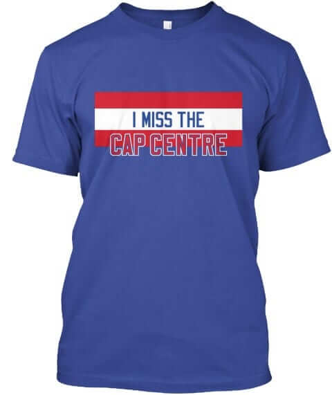
Assorted reminders: In case you missed it yesterday, we have a bunch of new Naming Wrongs shirts (including the very cool Cap Centre design shown at right). Check them out here.
We also have a new Uni Watch T-shirt, designed by Rob Ullman. Full details here, or go straight to the ordering page. The design is also available in a modified version, as a coffee mug.
In addition, the Uni Watch mini-helmet is now available for ordering. Full info here, or just go straight to the ordering page.
The Ticker
By Alex Hider

Baseball News: The Single-A Frederick Keys will have a 30th-season logo next year, which is based on the Orioles’ 60th-anniversary logo from 2014 (from Mark Johnson). … In this blog post, the author describes how his fandom for the Astros began because they had the “coolest uniforms” (from John Chapman).

NFL News: The Chargers will be going mono-navy on Sunday (from Brock Jackson). … Keith Winney found this 1986 NFL VHS board game he played as a kid. “The game is in pristine condition because it was so terrible and I never played,” he said.
College Football News: Cincinnati will be going white on black with black helmets and white facemasks this weekend against East Carolina (from Brian Spiess). … Virginia Tech will go white/maroon/white against Pitt on Saturday (from Andrew Cosentino). … Navy is promoting an on-campus Thanksgiving celebration by putting a bib on its mascot, Billy. They’ll even give away “Billy’s bib” to the first 250 students at the feast (from Alex Toltzis). … Yesterday’s entry mentioned that Akron DB Shawn Featherstone lost his helmet decal in the Zips’ win over Ohio. Steve Schneider sent along a screenshot of Featherstone’s decal hanging on by a thread earlier in the game. … Clips from Emu’s Pink Windmill Kids, an ’80s Australian kids show, has become a meme of sorts on the internet. In one video, Dan Baglio spotted a kid wearing an SMU football uniform.

Canadian Football News: The NHL’s Calgary Flames did their best impression of the hometown Stampeders, as the CFL playoffs begin this weekend (from Jeff Ingalls). … Miles Filbert sends along some photos of some 1960s Winnipeg Blue Bomber collectibles.

Hockey News: The Cincinnati Cyclones will wear three different jerseys in one game on Jan. 27 — jerseys representing the sweaters worn by the Mighty Ducks in the movie trilogy (from Jeffrey). … ICYMI from the CFL section: The Calgary Flames did their best impression of the crosstown CFL team, the Stampeders, as the Stampeders begin their playoff run this weekend (from Jeff Ingalls).

NBA News: The Hornets wore their ’90s throwbacks last night (from Eric H and Ryan Maquiñana). … It was comic book night at the Pelicans game on Wednesday, and C DeMarcus Cousin gave away some signed comic book-themed posters on Twitter (from Chris Edwards). … The Celtics and Nets went color-on-color on Tuesday (from Israel Zwick). … After that Celtics/Nets game, Boston PG Kyrie Irving gave his jersey and shoes to military personnel in attendance (from Brinke).

College Hoops News: Marist has new road uniforms this season. … Indiana G Devonte Green lost his shoe during play last night, and still ended up recording a steal while holding his shoe in the other hand (from Kenny Ocker). … Players for NCAA D-II Pittsburg State wore “Equality” shirts during warmups last night (from Matt Newbery). … Not everyone his happy with the abbreviations ESPN is using on its new scorebug (from Josh Hinton).

Grab Bag: This company is selling cycling shoes that look like classic Nike basketball shoes (from Ted Taylor). … Mario Rini sent along this photo of a 1950s UCLA megaphone .
Happy birthday to our own Brinke Guthrie. May all your eBay searches turn up cool stuff, buddy!
I had the college version of the VCR football game. I played it so much that I didn’t need the tape anymore because I knew the plays by heart.
I had that NFL VCR game. It wasn’t that bad, but I wasn’t expecting much, either.
Yep. There were days where my brothers and I would be bored enough to play VCR football. My one clear memory was a clip of a player (maybe a 49er) scoring a touchdown and then casually tossing the ball into the stands. Then the video prompted you to pause and choose from three options to determine the penalty. If memory serves, the ball toss was considered “unsportsmanlike conduct.”
I have the VCR Football, Hockey and Basketball games. Best of all, I still have a VCR!
This is to comply with a more recent UEFA regulation requiring the numbers be placed on a solid color
Not necessarily. Look at the two-color back that Barcelona wore in their match against Juventus in this year’s Champion League group stage:
link
The UEFA regulations permit this if the color of the number is sufficiently contrasting to the colors of the stripes. So, to illustrate, Barcelona can wear yellow numbers on top of royal blue and crimson stripes. Milan or Inter could wear white numbers on top of their red (blue) and black stripes. But if your stripes include white, you’ll probably need a solid-color back.
Yeah, that’s right, actually. I came across a 70s (I think) Juventus kit that was almost solid black on the back, much like this year’s – another example of the same principle of needing a solid-color back.
Some clarification re: ticker item. Calgary Stampeders’ first playoff game is this weekend, but CFL playoffs did start last weekend. Calgary has a bye to host Western Final as they finished first in West.
And because of the rather unique makeup of the CFL, the normally Western Conference members Saskatchewan Roughriders are playing in the Eastern Conference final vs. the Toronto Argonauts and could represent the East in the Grey Cup in what is known as a “crossover” .
Go Riders!!!
Wade, plenty of good tickets still available (CFL is really struggling in the Toronto market)
I know color on color is a non-event these days, but the Cleveland/Charlotte MBA game was quite striking
And in the unstiking category – last week’s Yates Cup – to crown the top university football team in Ontario. Hard to imagine a more purple infused match up. I guess the Golden Hawks of Laurier could have purple as opposed to gold numbers
link:
The Hornets link doesn’t appear to be working. All I get is a black page.
More accurately, it works on mobile but not on a desktop browser.
I had the VCR Clue game. Poorly acted and virtually impossible to play using a top-loader VCR with analog tracking. Still played it because I was ate up with Clue as a kid. I had Clue, Clue Master Detective, Clue Museum Caper and of course the Clue VCR game.
BTW: We’ve gone too far with this PC stuff as it has invaded the Clue board game. Mrs. White, a classic character from Clue has been replaced by Dr. Orchid. WTF!?!? Because [I guess] you can’t be a maid these days? That’s fine. But why remove her completely?!?!?! Make her Dr. White if you must… you know, maybe she worked at the Body Mansion to put herself through med school because [as it is] it looks like they just fired her.
BTW: there is a design flaw in every Clue game that can help a savvy person [who can be smooth with it] win every time so long as they get to shuffle the deck. They print the word “Clue” on the back of every card. All you have to do is have all of them turned one way, and your “mark card” turned the opposite. Do a simple, overhand shuffle of the cards and stop when the “mark card” lands on top. Turn your head and tell another player to put the top car in the confidential case. Do it for the suspects, weapons and rooms and presto, you know whats in the confidential case and no one is wiser. They think, hey, watched him shuffle, he turned his head, I put the card in the case, he didn’t cheat. If you have multiple players have a different one put each card in the confidential case. If someone pipes up wanting to select from fanned out cards, come up with some BS about taking the top card after shuffling cuts down on the possibility of seeing the remaining cards when it’s pulled out or blah, blah, blah [this rarely happens unless you have a reputation for cheating] Trust me though, you do this smoothly, with confidence, and can be patient to wander around the game board until you see someone “getting close” to winning and they’ll never catch on. Yeah, if you go straight to the Study, and say Prof. Plum, In the Study, With the Knife – and it’s correct – they’ll suspect you cheated. Ya gotta be patient!
Cheating at a game of Clue. You must be so proud.
Its only cheating if he gets caught. Maybe Hasbro should correct the games design flaw mentioned? His cheating is exposing a lazy design.He should be commended!
here’s an interesting Slate piece on the switch: link
it includes this theory for the replacement: White’s termination may have been a result of her uninspired name. It could be also that, seeing the modernizing shifts traditional toys have made in the name of diverse and realistic representation—Barbie, for one, can now be “curvy,” a game developer, and a political black film director with hair twists—Hasbro higher-ups opted to pre-empt any protests of its matronly servant in a maid’s outfit by swapping her out for someone with a sexier STEM career.
By the way, you reference Body Mansion (one of my all time favorite trivia questions used to be “what’s the name of the victim in the board game Clue?”), but the article refers to “the game’s mansion-owner, Samuel Black” and Hasbro’s game guide (link) explains that “Samuel Black was found murdered in his mansion!”
Dr. Black was the name of the victim in the original British version of the game.
Also, I always found it weird that it’s named “Cluedo” over there in reference to the game Ludo, but bears no resemblance to any “cross-and-circles” game like Ludo or Parcheesi whatsoever.
Well, she wasn’t a maid in the 80s movie (the maid was a separate character)…
My favorite VCR game, though has to be the one for Star Trek: The Next Generation with Robert O’Reilly as not-Gowron. “Experience Bij!”
I still have that game but no VCR. It was fun as hell.
The 1980s Clue movie is the best thing ever and is oh-so-quotable.
Next time you’re watching an Astros game and Brad Peacock comes in to pitch, say to the people around you, “This is WAR, Peacock!” and you will discover who has taste.
I get that the Mrs. White game piece might have been the least popular, but there will always be a “least popular” game piece regardless of the game. Nothing against thimbles but I don’t want to use it in Monopoly, yet there it is… They could have made Mrs. White a novelist or any other intriguing profession, including doctor, but they got rid of her altogether.
As for Hasbro, they have a “Monopoly” now on the board game market and it shows. The games are cheaply made and fall apart! I’ll stick with my old, 1972 Parker Bros. version of Clue. Mrs. White included and the characters smoked!
I’m still calling her Mrs.White.
We need Clue shirts now.
This is the most brilliant thing ever said on this blog. You sir, WIN!
I started rooting for the Astros in part because of the uniforms, too, but it was because I hated them. I had to wear rainbow gut jerseys for a couple of years in little league, so I rooted for the Astros in the NL. But it was more a sense of feeling like I’d paid my dues by wearing what I regarded at the time as an awful uniform. Which was mainly a factor of our team being teased mercilessly by the other ten-year-olds who didn’t wear rainbow shirts to play ball.
In the end, Nolan Ryan being my favorite pitcher had more to do with my rooting for the Astros, but the uniform thing was in the mix.
My esteem for any team begins with its uniforms (the second factor is poor play; I like to watch a team improve) demonstrating the old saw that first impressions are often correct. The snazzy costumes were responsible for my rooting for the Astros, Padres, Indians, Pirates, Blue Jays, Buccaneers, Falcons, Seahawks, Steelers, Saints, Canucks, Blackhawks, Flames, Blues, Rangers, Trail Blazers, Bulls, and Suns. By and large, I prefer garish uniforms to plain ones, and modernistic designs over traditional ones, so the teams I pick tended to be outside the heavy TV rotation grouping; it added an element of defiance to my choices.
Well, the bad play probably kept them off TV more than the uniforms.
I’m the exact opposite in a way. The plainer the uniform, the more I’m apt to like the team. I kind of like the idea that they’re there to do business, with looking pretty being beside the point. Probably comes from being an offensive lineman mentality of not needing to be the showpiece. So Penn State, the Browns (in the past, not so much now), Army, etc. Anyone with a no frills uniform tends to have my sympathy.
Looks like Pittsburg State’s opponents are wearing the Equality shirts.
I noticed that too.
Pittsburg State is yellow and red. The “Equality” shirts were being worn by purple/yellow team. Advertiser board in background also has adidas on it and the “Equality” shirt team is wearing Nike.
link
Happy Birthday, Brinke!
(that link seems appropriate — sports uniform, eBay, collectible, and, of course, Go Orange!)
+1 for more soccer ledes! Interesting stuff today.
Correction on the Nike basketball/cycling shoes: They’re not shoes, but rather shoe covers. Like this:
link
Paul, I hate to be “that guy” but as a lifelong DC Area resident, your “Cap CENTRE” shirt is a naming wrong.
It should be “Cap CENTER”. This ain’t Canada. Landover, MD is waaaay below the Mason Dixon.
Please fix this so I can order mine pronto.
It was officially named the Capital Centre
link
link
It would appear you might be link
Even the mall that took the arena’s place is named link, even if one of the streets leading into it is signed as “Capital Center Blvd” (or was, as of August 2012, based on Google Street View).
Jay,
The only thing worse than being THAT GUY is being THAT WRONG GUY. Will you still order the shirt?
A few interesting things about the Celtic F.C.. They are pronounced “Sel-tik” instead of “Kel-tik”, and singular. They were formed in Glasgow where there was/is a large Irish/Catholic population. They rival in Glasgow, Rangers, are supported by Protestants. Both teams are collectively known as “Old Firm”. Historically their matches have had much violence, with religious and Irish independence causing the problems.
The /s/ pronunciation (which was used in French) fell into common use in English by the 17th century, actually, and it was only in the mid-19th century that the /k/ form (which was used in German) began to gain ground again.
/k/ is the original one from ancient Roman times and c has retained that always-K pronunciation in Irish until this day; I had thought that the soccer team was also “Keltic” because of that.
I’ve always admired the team for its stubbornness with the uniform numbers and thought that the giant number on the shorts was a great compromise. What a disappointment to see that they’ve completely capitulated to the majority (and even added names, and have players wearing monstrous numbers like 63 — and in that hideous font!).
Proofreading:
Not everyone his happy with the abbreviations ESPN is using on its new scorebug
Great piece, Jamie! Even though I consider myself to be reasonably conversant in European soccer history (especially compared to the average American sports fan) I learned all kinds of things I didn’t know about Celtic’s uniform history from you article. Thanks for a thorough and informative read!
Agreed, great job Jamie! I too learned something new. Good stuff.
Lee
Thanks, guys!
Ticker correction: The equality shirts are being worn by Haskell Indian Nations University, which was playing at Pittsburg State last night.
Grab bag correction: those aren’t cycling shoes, they’re shoe covers. If you look carefully, it’s a stretchy cloth cover over top of a standard cycling shoe. There’s a cutout on the bottom for the pedal cleat.
Shoe covers are used in competitive cycling because they give a small aerodynamic advantage; there’s also shoe covers that are designed to add weather protection.
I totally ordered (even though I have no need for shoe covers) bc they are so freakin awesome. I tried to get all my cycling buddies to buy too. Can’t wait!
Happy Birthday Brink! I always love the retro items you uncover on your Tuesday post.
Liking the uni matchup tonight, imagine the Steelers in yellow with how Tennessee looks tonight? A hit out of the ballpark IMO. A color game with actual color
I really like this Steelers uniform.
And I don’t mind the Titans uniform.
But I don’t love the two together. Black/yellow v. Powder/navy just doesnt look good to me. It’s like they forgot to ask about their date’s outfit so they could coordinate.
I was trying to come up what would look better. Not sure about Yellow v. Powder – for one, they won’t bc of color blind issue from a few years ago.
Actually, it was Haskell Indian Nations University, not Pittsburg State, that wore the Equality shirts on Wednesday night. HINU is the other college in Lawrence, Kansas.
Disappointed at no great debate about the 4 letter’s continued ruination of everything it touches.