Click to enlarge
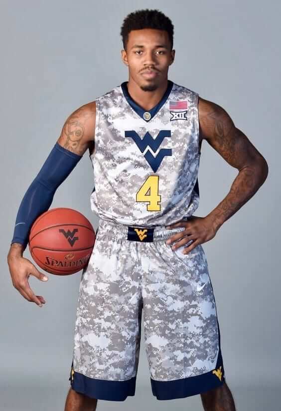
Don’t look now, but the college basketball season begins this Friday. That means it’s time for the annual Uni Watch College Hoops Season Preview, which will have all the news on the uniform changes for 2017-18 (including the absurd G.I. Joke uni, shown above, that West Virginia unveiled last night for the season-opening Armed Forces Classic game on Nov. 10). Check it out here.
I’d like to give a special shout-out to readers Adam Childs, Ethan Kleinberg, Derek Linn, and Matt Wilcott, who provided invaluable assistance with a tedious clerical task during the early stages of the work on this year’s college hoops piece. Thanks, guys — greatly appreciated.
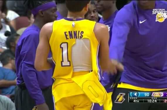
NBA jersey tear update: As torn NBA jerseys continue to pile up, Nike has issued a lengthy statement on the matter, although it basically amounts to “Yeah, we know. Working on it.”
On some level, this isn’t so surprising, right? We keep hearing that jerseys are getting lighter and lighter, plus they’re made from recycled plastic bottles or whatever, so maybe we finally reached a point where something had to give — literally.
Meanwhile, it’s worth keeping in mind that plenty of jersey tears happened during the Adidas era as well (although not concentrated in such a short time period). I’ve provided a rundown of many of them in this ESPN piece.
Click to enlarge
Collector’s Corner
By Brinke Guthrie
Starting off with the Dolphins this week, beginning with this Dolphins sticker. The seller says 1982 for this one, but it sure reminds me of the bold NFL graphics from the early to mid-1970s. We’ve also got an “I’m a Dol’Fan” bumper sticker from your Dade Broward Chrysler Plymouth Dealers, and a WIOD 610 “I’m a Season Ticket Holder” sticker rendered in blue and orange. A little BFBS on the back of this 1990s Dolphins men’s jacket, made by Mirage. Nice font on the front, though. And one more for the Fins: this hoodie has Sears NFL Shoppe written all over it.
Now for the rest of the week:
• Here’s a full Cleveland Indians blood clot jersey/pants set worn by Fred Beene, and it’s on eBay as part of a live auction this Saturday, Nov. 11.
• Check out this 1960s sweater with “St. Louis (Cardinals) Quarterback Club” on the front.
• The Bills did a one-off white facemask for last Thursday night’s game, but the white mask showed up on this 1970s Bills sticker, too.
• Rawlings didn’t quite get the lightning bolts right on this 1970s Chargers jersey.
• These stickers prove that the 1970s NHL Kansas City Scouts had a terrific logo, did they not?
• Here’s a 1970s Cowboys canvas duffel bag. This one doesn’t feel like a licensed item.
• This powder blue 1970s Houston Oilers jacket from “Active Generation” shows the Oilers helmet in the rare left-facing position.
• This pair of 1960s Philadelphia Eagles “kissing bobbleheads” is in excellent shape.
• Speaking of bobbles, here’s one for the one-and-done 1969 Seattle Pilots, without the usual aging cracks under the chin or under the hairline.
• Take a look at this 1970s-80s L.A. Rams “Tailgate Helmet.” You open up the top, and you can hold picnic supplies and ice.

Gift Guide reminder: I’ll soon begin work on my annual Uni Watch Holiday Gift Guide. If you have any suggestions for items or companies that should be featured, I’m all ears. Thanks.
The Ticker
By Alex Hider

Football News: A few Lions players found a way to break up the unitard look last night. RB Ameer Abdullah showed some skin between the top of his socks and the bottom of his pants, and WR Marvin Jones inverted the base color and stripe of his sock (from Gene Sanny). … ESPN mistakenly listed Packers QB Brett Hundley as No. 11 in a graphic last night. He wears No. 7 (from Trent Probst). … ESPN also used a very old Dolphins helmet in a promo for an upcoming game (from Scott Mason). … The Eagles don’t play at home again until Nov. 26. In the meantime, they’re replacing the stadium’s playing surface (from Blake Fox). … Cowboys WR Ryan Switzer will show support for the Special Olympics with his “My Cleats, My Cause” shoes during week 13 (from James Gilbert). … Spotted at a charity auction: This Steelers “bumblebee” concept helmet (from Sam McKinley). … Andrew Cosentino found these Ravens/Baltimore Orioles mash-up socks available for sale on Etsy. … UMass, combining two trends into one uni design, will wear stars and stripes blackout uniforms this weekend when they play in Fenway Park. … The ACC Tracker has been updated for week 10.

Hockey News: New Predators C Kyle Turris will wear No. 8. … The Sault Ste. Marie Greyhounds of the Ontario Hockey League wore Remembrance Day uniforms on Sunday. Here they are in action (from Wade Heidt). … Not sure if we’ve brought this up before, but Canadiens G Charlie Lindgren has been wearing an old mask from the St. John’s IceCaps — the Habs’ old AHL team that doesn’t even exist anymore (from Moe Khan).

Basketball News: Auburn will have new shoes for this Friday’s season opener. … Seen in this story about Globetrotters punching bag the Washington Generals — these juicy stirrups (from Michael Mariniello). … New home and road uniforms for Tulane.

Soccer News: Here’s a look at eight Adidas-outfitted national teams, including powerhouses like Argentina and Germany, that have unveiled their kits for the 2018 World Cup (from Phil). … Additional views of the Germany kit are available here.

Grab Bag: The contestants on Jeopardy!’s Tournament of Champions will wear blue colon cancer ribbons throughout the tournament to honor Cindy Stowell, a former champion who died late last year just days before her episodes were set to air (from Jay Winkler). … Ball State has new university logos and a new slogan (from Jared Law). … An entire high school cross country team in Michigan was disqualified from competing in the state finals because they wore mismatching shirts under the team jerseys (from Vince Guardado). … New team logos for the Whitby Steelhawks, an arena lacrosse team (from Michael Sullivan). … Penn State’s Nittany Lion is being inducted into the Mascot Hall of Fame. … The IOC might punish Russia for doping violations by not playing the Russian anthem (NYT link) at medal ceremonies during the 2018 Olympics. … The logo for Megyn Kelly’s morning TV show looks a lot like the North Face logo.
I would guess the use of the very old Dolphins helmet in the promo means they are wearing their throwbacks on Monday night.
Dolphins are on the road for that game though. Maybe it was an error by ESPN.
But you would guess wrong:
link
I’ve been seeing this a few times this season, using throwback helmets for graphics… I feel like there was a saints one not too far back with a grey mask. I like to think there’s someone who works there that’s like us, and they slip in a look they like better than what the team currently wears :)
Proofreading:
L.A. Rams ““Tailgate Helmet.” – extra quotation mark
Fixed.
The college hoops preview is up:
link
It seems like more of the Adidas NBA jersey tears were deliberate on the part of the player wearing it, while more of the Nike tears have happened in the course of play.
At least as compiled in that piece, yes.
I know there was a serious Bucks jersey tear a couple of years ago (or maybe it was just a numeral peeling off the back of his jersey), but I couldn’t recall who the player was or find a photo. Dang.
Wow that West Virginia uniform is bad. Completely haphazard design. Nothing about it looks right. I’ll even be generous and give them the camo with WV being a rural state that I’m assuming has a higher percentage of hunting enthusiasts. But about the only thing in that uniform design that goes together is navy collar and navy trim on the short. Gag.
Interestingly, the Nike maker’s mark almost disappears into the camo pattern, quite possibly the only good thing one can say about the design.
The camo is more for the Armed Forces Classic being played over Veterans Day weekend.
I didn’t even see the Nike logo in there, +1 for that.
Yeah, I figured it was some sort of military tribute, but as is often discussed here, GI Joe costumes are particularly appealing nor do they seem a great tribute. I’d be more willing to accept a camo design if it were referencing the affinity for hunting among the region/fanbase.
I like the Scouts’ uniforms and color set but the logo, while nice in and of itself, always bothered me. The “KC” monogram at the bottom right looks like an ill-conceived afterthought. A small thing but isn’t that why we’re all here?
Without it, the Scouts’ crest is merely a posterized photograph of the Scout Statue. One might get the impression the team was declaring ownership of the sculpture, and the monogram gives it some separation.
Question about “WR Marvin Jones inverted the base color and stripe of his sock”. Will he be fined by the NFL for not wearing his uniform correctly?
Possibly. Most fines are not publicly announced.
Honest question: Why do you care if he’s fined? The players are gazillionaires, so the fines are the equivalent of you or I being fined 50¢.
I’m not saying you *shouldn’t* care. I just don’t understand why anyone *would* care.
I don’t really “care”. I’m interested. I agree that fines wouldn’t really deter rich athletes. Just curious how the NFL reacts to this? I just wonder how they keep the players from deviating from their rules?
It’s been obvious for years that they *don’t* keep players from deviating from the rules, at least pertaining to socks.
The sock rule, which requires a “one-piece sock,” is badly out of date. Players routinely wear a combination of socks, tights, leg warmers, etc. In most sports, socks are now treated more like equipment than like part of the uniform. Not saying it *should* be that way, but that’s where we are.
I feel like (offensive though its been on multiple levels) the Color Rash has at least presented the possibility of using solid, one color socks which mitigates some of the inconsistency problems.
Hang in there, Thomas.
There are a lot of college teams wearing the new Nike template. Will be interesting to see what happens if the issue with tearing is a problem there. Smaller schools who have made the move to the new template are likely on a tighter budget than NBA teams and will have more trouble replacing torn uniforms.
That mash-up Ravens/Orioles logo on those socks is a train wreck, although pretty much synonymous with the seasons those teams have had recently.
I actually like the new side stripes on Iowa State’s basketball unis. It’s a fitting design for a team named the Cyclones.
Look at how low the wordmark is on this Pakastani national team baseball jersey.
link
Also, if that kid is U-15 I’m U-15 too.
I actually like the Lions blue road pants but I feel we’re really missing out if they don’t pair the white jersey with the silver pants at least a few times.
I think I’d like the blue pants better with either silver or striped socks. Though I generally prefer the silver pants anyway.
The Lions’ home uniforms are a huge improvement over the past ones, but yeah, as somebody who believes that the pants should either match the helmet or be a lighter shade than the helmet, I think the blue pants throws the white uniforms out of balance.
Oh my God yes. Silver helmet teams should have silver pants. Done and done. Same with gold helmets.
Absolutely agree that the Lions should wear silver pants with the white jerseys
uniforms don’t need to be lighter. this is the biggest load of BS to come out of the jersey game in the last decade.
rule changes often change how the game is played. that affects athletic performance, not “lighter jerseys”
this is just a scam to charge you more or the same for less textile usage. its cheap and im tired of it by now.
we don’t need fucking air jerseys….what is next jerseys so light that they are just holograms surrounding the body????
how was michael jordan so damn good in that heavy ass jersey????
72-10 but bogged down by the saggy sweaty mesh???
There is so much faulty logic in this comment, it’s hard to know where to start.
That’s not to defend the ever-lighter jerseys. But we can come up with better critiques than this one.
Paul-
As always, great job on the College Basketball preview. The amount of detail that you go into for even the more obscure college teams is amazing, I can’t image the amount of work you put into features like that, and it is appreciated.
I’m curious why as jerseys get lighter the numbers, names and decals are still stitched on rather than printed or sublimated.
Merchandise tail wagging the dog. The authentic jerseys are supposed to be expensive and they can only “justify” the price with “quality” stitching on. Screen printing has a connotation of being cheap and you wouldn’t be able to charge as much for cheap stuff, even if it’s the real deal to pro specifications.
I like the retro “Dukes” insignia Duquesne has. However, don’t like that Nike slapped their standard drop shadow numbers on there without realizing that the shadow on the word mark is on the opposite side. I have no interest in duquesne, but that jumped out at me when reading through the article.
Those Nova uniforms with Rollie’s face on them are a step down a road I hope people forget exists. That’s one step away from the wolves howling at the moon t-shirt.
Great job on the college basketball preview, as always!
There are some truly awful designs, and college basketball is an aesthetic mess these days (why can’t they figure out lettering? Too small, too big, illegible, trying to cram two words over the number instead of the classic top/bottom treatment, etc). That said, there were some really nice looking gems in there:
UMBC, Duke (moving the retro to primary), George Mason, Columbia, Western Michigan (those look gorgeous), Denver, and UMKC adding the skyline for the home whites.
Did you catch the PSU players wearing a scarf around their necks during the PSU/MSU game?
Why do the KC Chiefs not have a name or anything on their helmet bumpers?
Hey Paul, regarding the Nittany Lion making the Mascot Hall of Fame, seems University of Florida’s Albert the Alligator (and Alberta!) should have been in already!